Colors have tremendous power if used in the right way. The color combination that you come out with may bring consistency to the design or it may wreck it. The colors tailor made for the design form a color scheme. Their purpose is to establish style and characteristic or to convey a type of mood. The most primitive color scheme may be built using just two colors that look engaging together.
Color is one of the most crucial things in the creative industry. Finding good colors for palettes is a challenge task as it requires plenty of experimentation. Planning a successful color combination has to be backed by a solid understanding of color relationships.
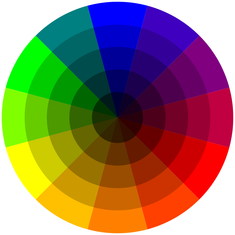
The color wheel and color schemes

To figure out the ideas behind color schemes, we first have to appreciate the color wheel. It is a circular color diagram invented by Sir Isaac Newton in 1666. It is a visual portray of color hues arranged in a circular manner according to their chromatic relationship.
Color wheel is a starting point for combination of colors. Color schemes are just logical combinations made with knowledge of the color wheel. It is an simple method to visualize the relationships between colors.
Types of color schemes
Monochromatic color scheme
This scheme is composed of different tints, shades of tones of the same color. These color schemes are relatively easy to use and comprehend.

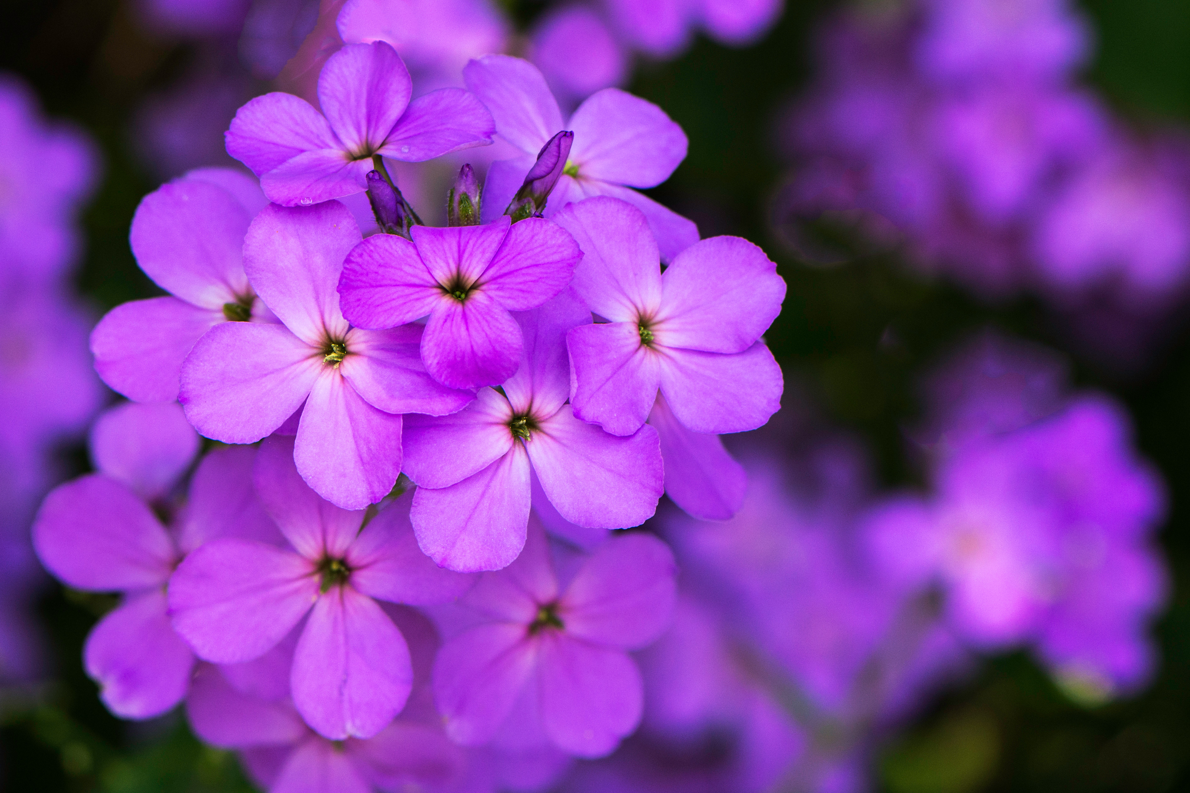
Analogous color scheme
These are colors that are next to each other on the color wheel. They usually match quite well.

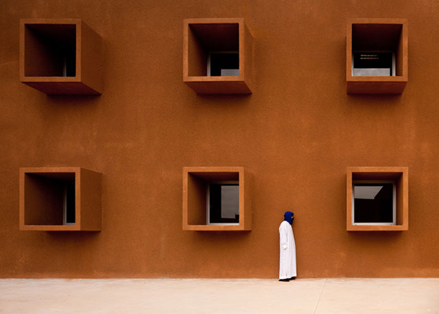
Complementary color scheme
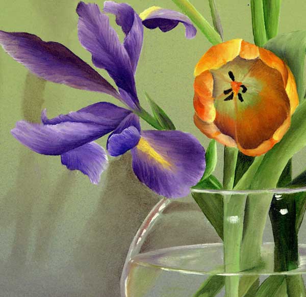
Colors located across from each other on a color wheel, for example: blue and orange, yellow and purple. They usually create a vibrant look due to high contrast between them.

Split-Complementary color scheme
It is composed of the base color and two colors adjacent to its complement. That gives it strong visual contrast but without the tension of the complementary color scheme.
Triadic color scheme
This scheme is made of colors that are evenly spaced along the color wheel. A vibrant palette is produced.

Tetradic color scheme
This scheme is composed of four colors comprising of two complementary pairs.