

ADM Bus Stop
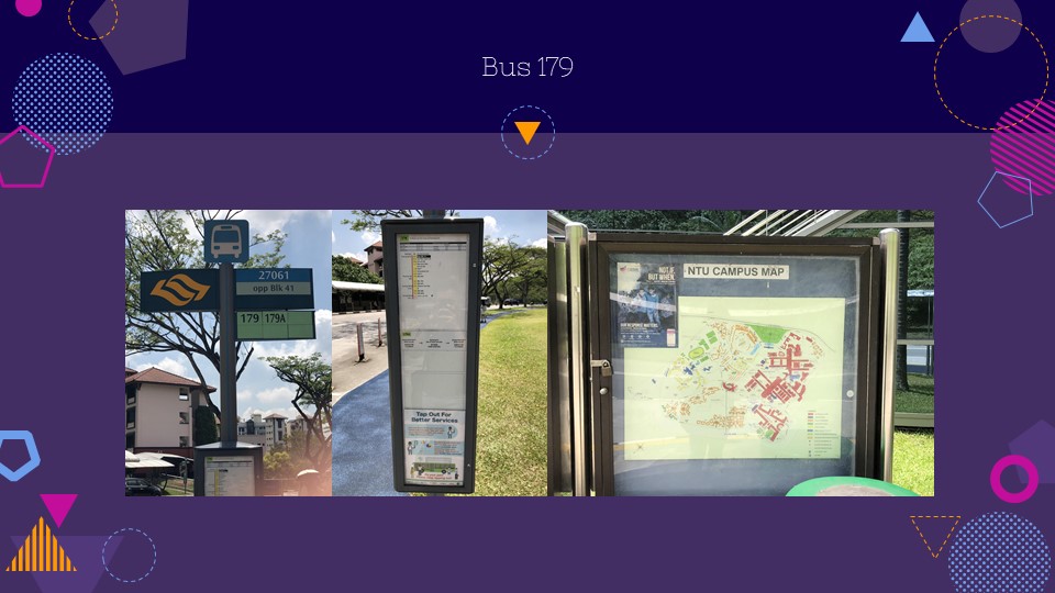
While waiting for the bus, there are signs visibly placed all around the premise to tell the users which bus stop thy are at, what bus services are available there and the timings where they start and end, and the routes these bus services take them to. The information given for the bus routes also helps non-frequent users differentiate between bus services 179 and 179A. First-time users might be confused and board 179A without knowing that it skips every bus stop in between NTU and Boon Lay Bus Interchange. There is also a campus map to help users navigate effectively in cases where they intend to find a particular building/location.
At the bottom of the sign with the diagram of the bus routes, there is a mini illustration to encourage users to tap out their cards when they alight the bus even if they are on concession so that the bus company could provide better services based on user data. This indicates that many passengers did not tap out upon alighting, which resulted in inaccurate data for bus deployments during peak hours and eventually complaints from passenger for the lack of buses during these hours.

Safety Signs
Upon entering bus 179, there are a multitude of signs seen everywhere – on the walls, the floor, the glass and the ceiling. Most of these signs are to ensure the safety of the passengers when the bus is moving. They are coloured in bold red and yellow to grab the attention of users and caution them about the dangers to look out for in a moving bus. Grab poles and handle bars are usually coloured in purple whereas those that are not meant to be held on to are coloured in yellow with warning signs in different languages. There are also signs to tell passengers not to stand on the steps or the upper deck, and to wear seat belts if they happen to be seated in places that are exposed to some sort of hazard. There are signs to tell users to keep clear of the doors that swing inwards (affordance) and also a sign for users to mind their heads due to the low ceiling of the upper deck that may injure taller passengers. There is also an LED sign at the exit door to tell passengers that the door is closing. I see this to be very useful especially for passengers standing close to the doors when it is crowded and for those who are alighting. Another LED sign by the entrance to the upper deck informs users of the amount of seats available since it is dangerous to have any passengers standing there.
In a small island like Singapore, having to face large volumes of people is inevitable when you are in a public space. Public transports are always crowded during peak hours. So when a lot of people want to get on the same bus, safety rules need to be implemented to make sure that the bus is not overloaded and that every single person commuting contributes to the safety of the rest. There were cases where passengers get injured in the bus due to carelessness. Warning signs are also necessary to allow users to get around the design of an object. For example, minding their heads in lower ceilings, wearing seat belts when it is advised for them to, and watching their steps on raised platforms to make sure that they do not trip and fall.

Passenger Conduct Signs
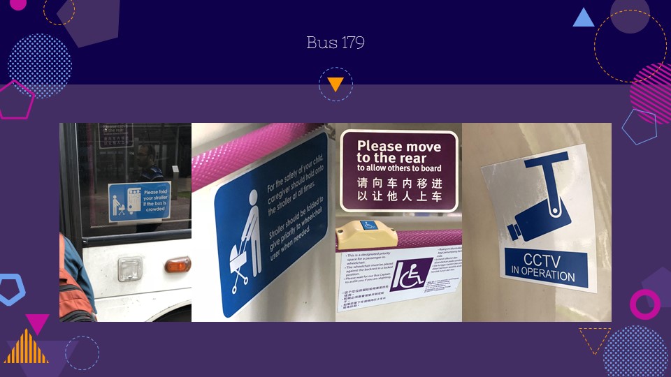
There is a sign on the outside of the bus to tell passengers with strollers to have them folded before boarding if the bus is crowded. And upon boarding, there is a sign just next to where the bus captain is to tell passengers to move to the back of the bus in order to allow more passengers to get on the bus. This tells us that frequent overcrowding of the bus were caused by people not wanting to move in or make more room for other passengers to get on board.
The bus service company has also catered to the disabled and those with young children by providing a designated space for them to park their wheelchairs and strollers. There are signs to reserve these spaces for those who need it more along with ramps at the back exit of the bus to ease the movement for disabled passengers. There are also bus bells labelled in blue specially made for easy access for those in wheelchairs to alert the bus captains when they wish to alight so that they could be assisted.
CCTV signs that were placed in hidden areas in the bus to monitor the passengers acts as a deterrent to discourage users from performing any misconducts such as vandalism, public defecation/urination or eating/drinking in public transports.

Passenger Conduct Signs
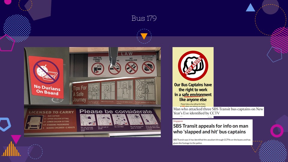
Other conduct signs such as ‘No Durians On Board’, ‘Do Not Occupy More Than One Seat’, ‘Do Not Litter’, ‘Give Up Your Seat…’ tells us that they are all implemented because these things happen too frequently and has caused a lot of inconveniences among passengers on board. Durians are known to give off a pungent stench and were banned from being carried around in enclosed public spaces.
Signs like ‘No Assault On Bus Captain’ provides the right for bus employees to work in a safe environment due to several reports of attacks on bus captains in the past. In 2006, SBS launched a campaign to protect bus drivers from assault after several cases of abuse by passengers.
Vandalism also become less recurrent over the years when it is made punishable by law.

Emergency Signs
- Signs to tell where to find first aid kits and AED in medical emergencies.
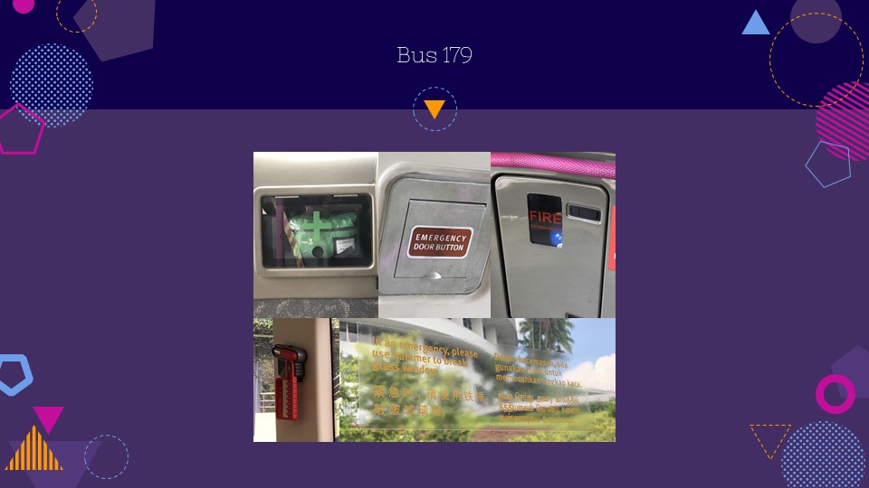
- Signs to tell where to find the fire extinguisher both on the lower deck and the upper deck in case of fire.
- Signs to tell where to find the emergency door buttons in emergencies and technical failures.
- Signs with instructions on how to use the glass hammer to break windows and be used as an exit in emergencies.
- Safety/Emergency features were rather hard to spot and signs could be made more obvious.

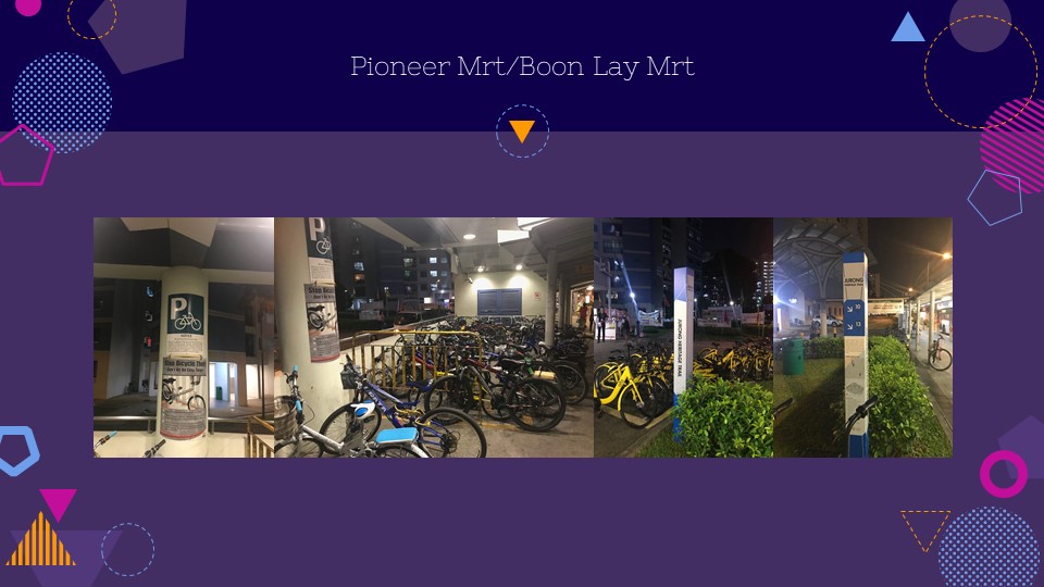
Right off the bus, we can see that the biking community is strong in Jurong. These signs found at the MRT station at pioneer is bike-centric and this particular location is meant for people to park their bicycles. Judging from the sheer number of bikes parked there, I would assume that people would assume that it is safe enough to park. However, there is a poster warning people of the risk when parking at such an area as SMRT would not be liable for any bikes stolen. There is also a large number of bikes available for sharing within this area, further signifying the use of bicycles in this area. This Jurong Heritage Trail is strategically placed in front of the bike sharing area, possibly encouraging the riders to explore Pioneer using bicycles.

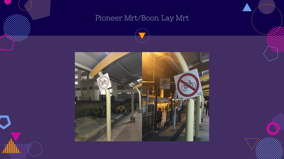
Affordance vs signifiers. There is a bike parking station filled with OFO bikes, yet there is a sign that says no riding and dismount and push. This is a clash between perceived affordance and signifiers, whereby the affordance of the multitude of bikes would tell users that this area is fit for the riding of bikes, and yet the sign seems to restrict and signify that you are not allowed to cycle. “Here are a bunch of bikes for you to use, but you’re not allowed to cycle.”

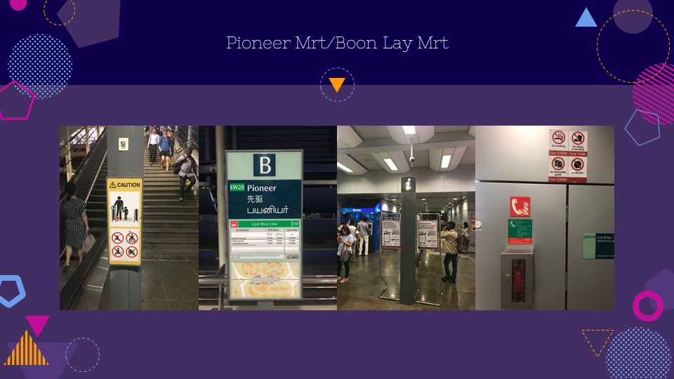
As you make your way into pioneer MRT, you are greeted many information and warning signs. The most prominent one is right beside the escalator, warning commuters of the proper uses of the escalator to ensure that people people do not get injured during the journey. The use of bright colours which creates contrast draws the attention to this sign and shows its importance. I never noticed this, however, there is a sign board stating the operating hours of the train station which includes the respective first and last trains. I have walked past this sign countless of times but never really paid much attention to it. Despite how importance of the information on this sign is, it is not stated at the information boards or anywhere else in the station. Vital safety equipment such as the phone to use in case of a fire is over shadowed by other signs which use red and have a more prominent placement.

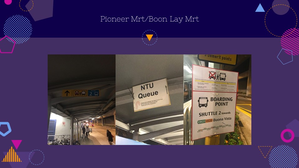
This is a series of directions to the bus stop from the lift. As you can see, it is difficult to view the directions to the bus stop as the sign is badly lit. It could be argued that the increasingly lit section towards the bus stop could be a perceived affordance, whereby the user’s eyes are drawn towards it and thus, becoming able to identify that it is indeed the bus stop. The sign for the NTU Campus Rider proved to be one of the more challenging signs to find, especially if you are new to the area. I remember…. This sign is just printed on a piece of A4 paper and stuck to the top of the shelter. Its size makes it difficult for people to locate the pick up point for the Campus Rider.

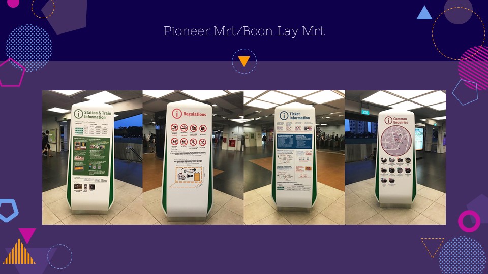
In contrast to the signage provided at Pioneer MRT, the one at Boon Lay provides a more localized information board, displaying and consolidating all the necessary information of the station within this small space. The form and design of this sign makes it intriguing, which provides both form and functionality.

At Boon Lay Station, there are two main escalators, one from each side, sandwiching the lift. Using mapping, these two escalators direct the exiting passengers to opposite corners of the station, thusly separating the crowd and preventing a congestion.
As the exiting passengers travel down the long escalators, they converge to the center of the station.
Upon traveling down the escalator, there are clear signifiers that direct the passengers to jurong point.
Secondary signifiers like Dr Cindy’s medical aesthetic clinic advertisement also alert passengers that jurong point is within the vicinity.
Using natural mapping, the passengers who converge to the center will congregate in front of the gantries, thus enabling ease of traffic flow. The exit gantries also face Jurong point directly.
Upon turning my head back, I realised that there was a sign notifying passengers to travel to a different location to enter. This de-escalates any potential confusion and attempts at entry, working with natural mapping to allow for smooth, uncongested directional flow of human traffic.
However, I have to point out that the sign is small and only present on the left side of the platform, a distance away from the gantries.
This may lead to some confusion as people are more likely to head to the gantries first, rather than take notice of the small sign on the left


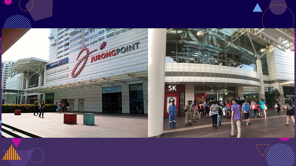
When we first see Jurong Point upon exiting the MRT, there is no clear signifier that the building which we see is Jurong Point.
There is no clear identifier like a name or a large sign in the entrance directly facing the MRT, and what passengers will see is just a generic mall.
The reputable brand shops like SK and Innisfree are clear signifiers that it is a mall. The sliding class doors affords viewers the ability to see through the building and clearly signifies the building as a mall.

From the video just now, we can tell that the path from the MRT to the bus interchange is very straightforward. There is a clear leading line of sight from the MRT exit gantry to the bus interchange sign, the pathway unobstructed by any shops or barriers. The shops like Godiva and popcorn are also neatly arranged to the sides flanking the clear pathway to the bus interchange. The sliding glass doors leading to Jurong Point act as a clear signifier to show the crowd that the building is a mall, and also clearly shows the signages that lead the people to the bus interchange.
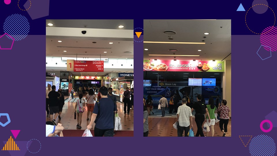
When we walk the path to the bus interchange, there will continually be signages pointing directly to the bus interchange straight ahead. In the first few meters within entry of the mall, there is a split in path where the passengers find themselves with the choice to either continue ahead, turn left, or turn right. However, there is an overhead sign directly before the point of intersection, which clearly labels the direction of the bus interchange, to prevent any misunderstanding.
Usage of the arrow directional guides also help to direct the passengers there. The clarity is further enhanced by visual logos of the bus.

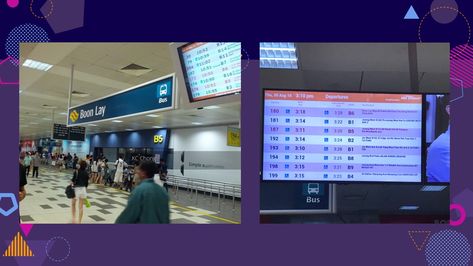
Closer to the bus interchange,there is a screen which displays the bus arrival timings, listing down each bus number and arrival berth.
These are small and are not strong signifiers of the bus interchange from afar, but they include very important information to passengers hoping to navigate the bus interchange.
The written sign which states “Boon Lay” is a signifier for the boon lay bus interchange. However, its design and implicit understanding is largely dependent on people’s naturalised habitat and knowledge. The identifying factors of the signboard are its distinctive shade of green and the transport logo- which indicate to people that this sign is the location of a mode of transport. Because this knowledge is contingent on being Singaporean or having brought up in Singapore, the sign isn’t as informative and can be even confusing to people without the same knowledge
In addition, the placement of the signboard is behind the illuminated screen, thus being shrouded in darkness and also having some of its words covered.


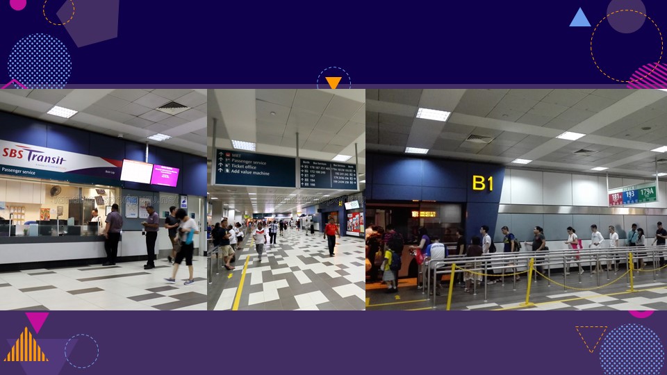
As you can see from the map just now, the passenger service booth was situated right next to the main entrance, and thus makes it easy for any lost or confused passengers to seek help and receive directions.
Furthermore there are many large signboards at regular intervals throughout the station, directing people to their particular bus berths.
Each berth will also have clear signs in primary colours denoting the bus name to prevent any misdirection. The colour choice and design is particularly clear and precise.
Link to Google Slides:
https://docs.google.com/presentation/d/1JUO_G4dkWfSUqeNEhCKMy9vzqu3dfKOumic_YweA3Fk/edit?usp=sharing
Contributors: Anam, Joel, Yuolmae

