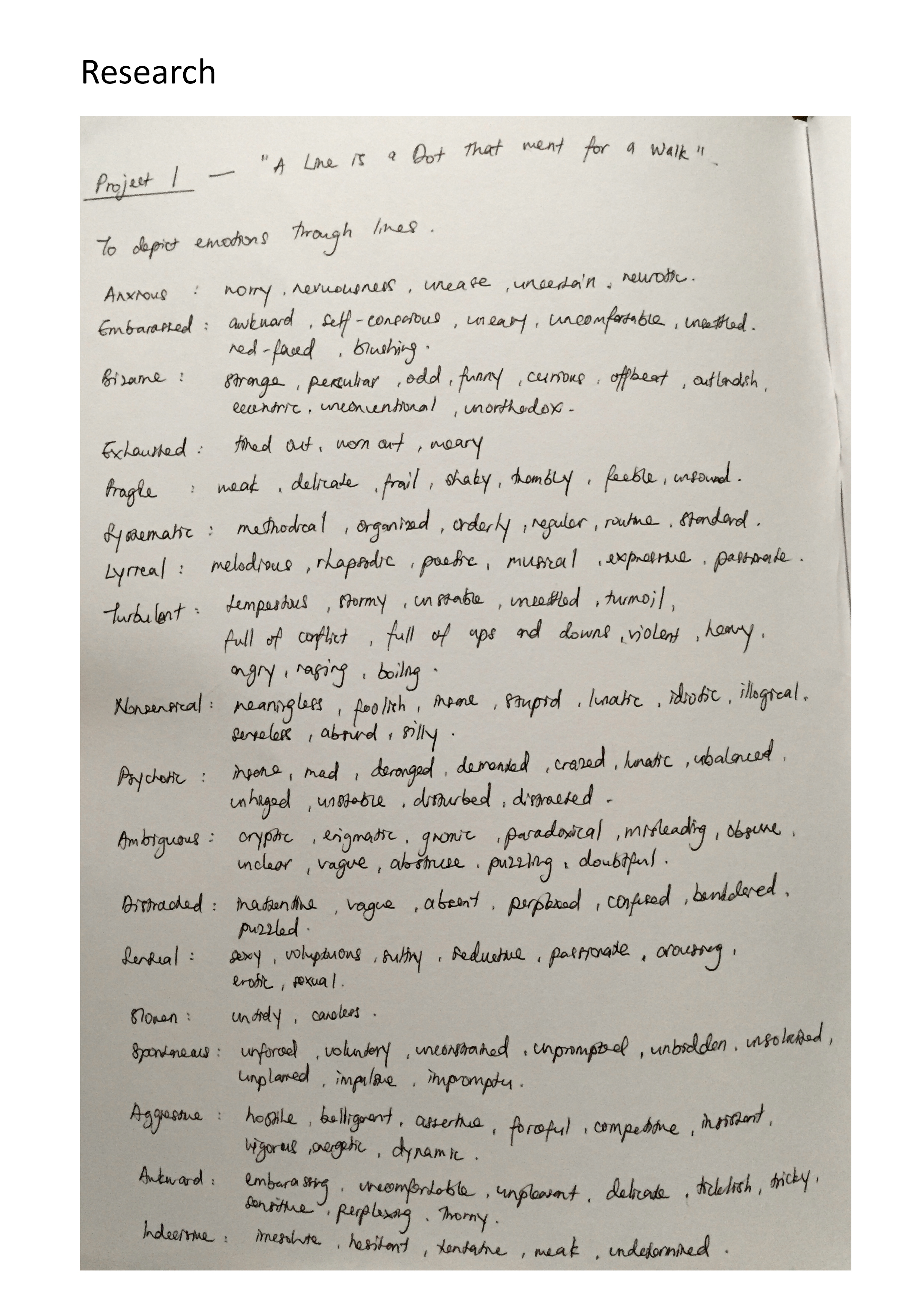
Anam’s Ego

Greetings!

I am exceptionally pleased to share with you a little bit about myself through this final assignment.

Ego [/ˈiː.ɡəʊ/]

The “I” or self of any person; a person as thinking, feeling, and willing, and distinguishing itself from the selves of others and from objects of its thought.

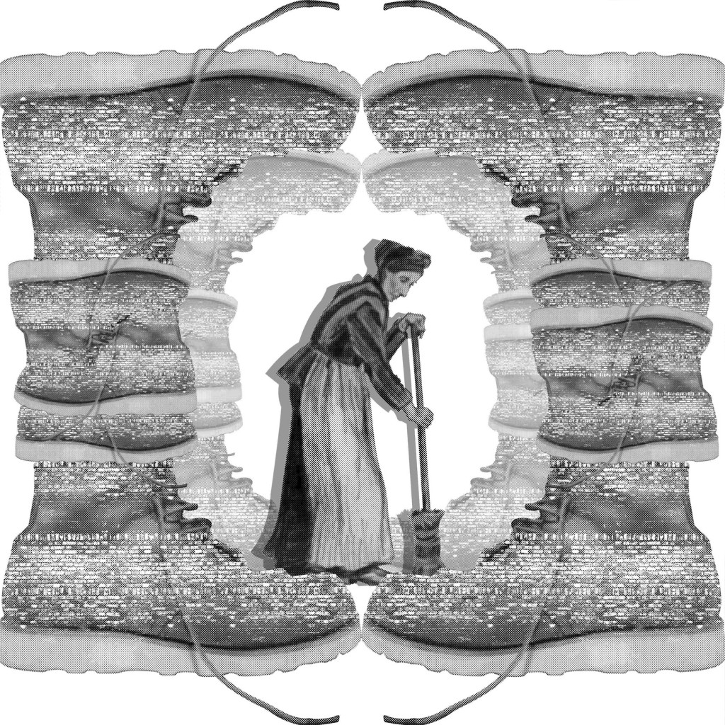
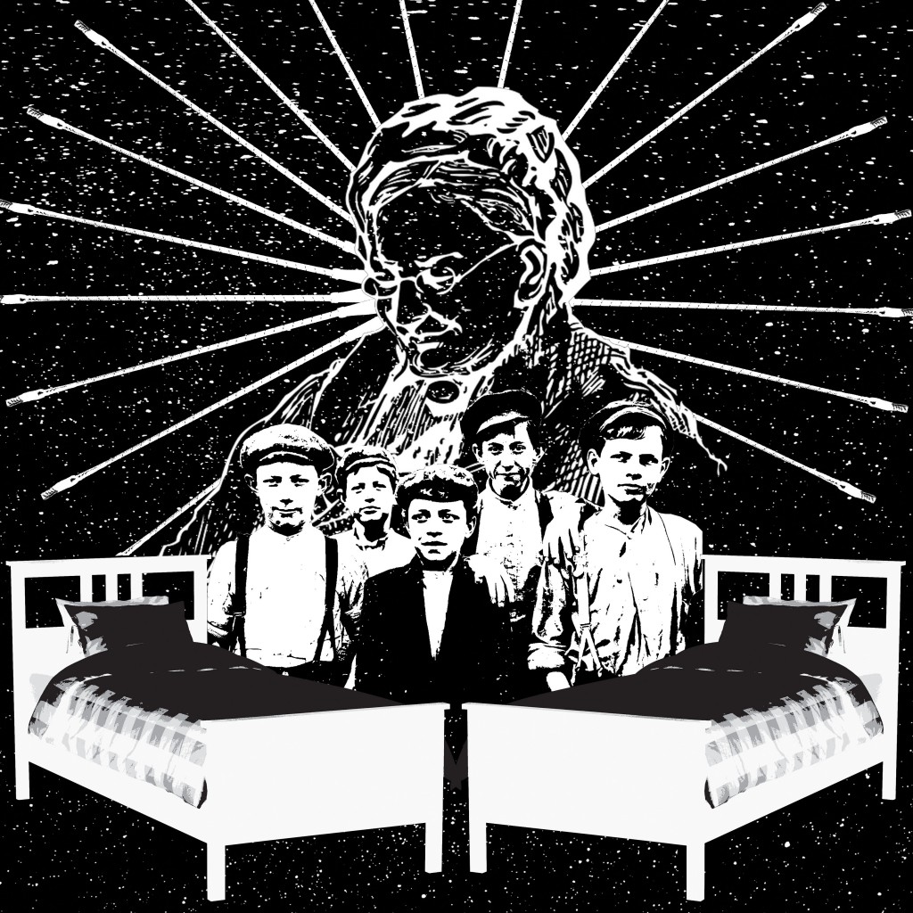
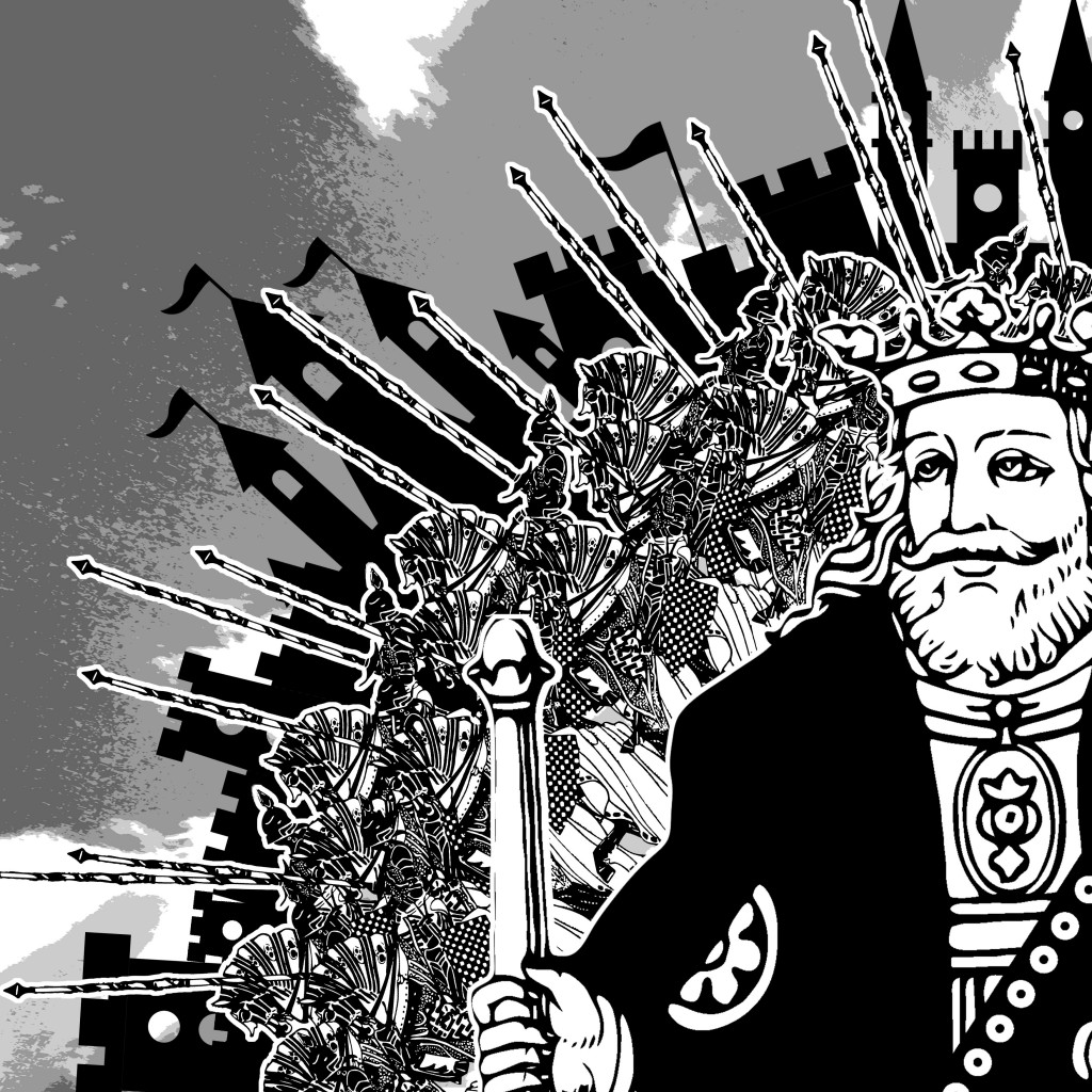
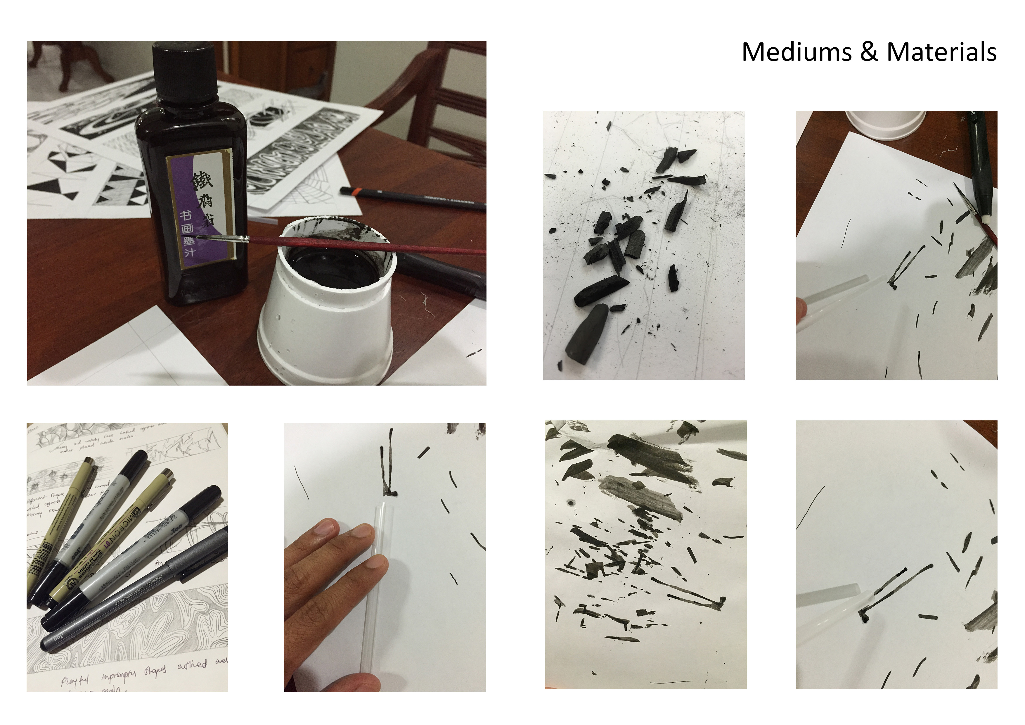
I find myself highly eccentric and congenial, and I have attempted to make that evident in my equations for this project. I have chosen to display my panels in digital illustrations as I am more proficient in Photoshop and I am given more liberty to experiment with colors without discounting quality and obscuring the message behind the images.

My overall theme for these equations revolve around plants and light. Plants are generally viewed as an organism where growth, stability, and potential are innate in them, even as seeds. And light is the ultimate source of energy that allows plants to reach their full potentials. I feel that I am a plant, and time and my life experiences are the light. Every opportunity and challenge pushes me to greater heights. That is where my ego lies. That is the factor I feel best distinguishes me from so many others.

I have also incorporated my knowledge of design elements and design principles from previous assignments to come up with the ideal composition for my panels, with colors carefully taken into consideration.

Project 3 Submission Template
For the first equation, I have added “Creativity” and “Drive” to represent the current stage I am in my life – “Growth” (me).

Creativity:
I have always thought of myself as someone with great ideas and someone who often thinks outside the box. In the first panel, I portrayed myself as a brain-seed, germinating, and paving through the earth to reach for the light beneath the grass. I have employed and analogous color harmony for this composition to give a calm and naïve beginning to my set of equations.

Drive:
Drive is motivation to propel you forward and upward. It provides the necessities in one’s growth and show the amount of potential that one has. That is why I have chosen gardening tools and essentials, such as a spade and fertilizer, to represent this aspect of my equation. When potential comes to mind, I think of vibrancy. And what could better infer that than a complementary harmony. I have contrasted yellow and purple to show energy and nobility in the objects present in the composition. I have also arranged them in a way to produce harsher diagonals to increase dynamism.

Growth (me):
Growth is a stage by stage process of development. I have painted a self-portrait, with an expression ready to face the world, while cladded in the roots and branches of a Bonsai tree. The Bonsai symbolizes harmony, peace, order of thoughts and balance. This is why I have employed a symmetry to the composition to further elevate the balance aspect of the image. I have also used a split-complementary color harmony to create a relaxed overall ambience.

Project 3 Submission Template

For the second equation, I have subtracted my “Insecurities” from my “Ambition” to derive into an improved version of my current self – “Aggrandizement” (a better me).

Ambition:
We often set goals for ourselves. And our goals are seen as something beyond reach. So with the idea of soaring high and having a huge desire for success, I feel that a giant beanstalk could best embody those traits. I have made the beanstalk colossal, shooting to the skies and vanishing into the clouds. The composition consists of a strong diagonal cutting across the panel and slowly diminishing into the corner. I have also used bold colors such as orange and red to represent confidence and passion, and I contrasted it with a sea-green to make the beanstalk more emergent.

Insecurities:
Everyone has struggled with insecurities. They are the little things inside you that constantly remind you of how unsure, undecided and how incompetent you are. And that is the aspect that I wish to rid of. I have paired the vulnerability of a fetus inside a sprouting seed (me) with dozens of aphids surrounding it. The fetus is encapsulated in a blue womb to show protection and comfort while the outside is yellow to hint danger. And the green leaf represents life. Aphids are regarded as a garden’s worst enemy since they destroy plants. But if the aphids were viewed from a distance, they could be seen as sunlight, which on the flipside, nurtures the garden instead. So what I thought could kill me would only make me stronger. This panel has an analogous color harmony.

Aggrandizement (a better me):
Aggrandizement is where you acquire a higher or better position of yourself. And at this point, I wanted to show how much I’ve grown from the previous panel. I have made another self-portrait of me, now bearing flowers. I used red for the flower to display power and strength, over a calmer and cooler green in the background. I have changed the color of the light source to be blue, to show how my growth has transpired over to a later time of day. A sense of maturity and change.

Project 3 Submission Template

For the third equation, I multiplied “Receptivity” by “Network” to evolve into the ultimate form of myself – “Influential” (an ideal me). For this 3 panels, I would like to include external factors that could possibly evolve me into the person I see myself to be in the end.

Receptivity:
Part of development largely consist of taking in criticism, critique and judgement. No matter how much it might tear you apart at the start, it only builds you up to make you better and stronger. And the willingness to learn, to accept others’ views and opinions, and to take in their advice would put us at a higher pedestal. I have combined metal railings and solar panels in the shape of a tree to represent receptivity. The solar panels, being the receptors, absorb the solar energy to power up the rest of the tree. I have used an analogous color harmony for this panel.

Network:
Wherever you go, network is key. Whether if it boils down to finding a job or finding your other half, network is everything! Bees are nature’s network. They fly from flower to flower resulting in pollination – the starting source of an entire ecosystem. I have employed a triad color harmony to make purple and red more dominant in the composition.

Influential (an ideal me):
Ultimately, I want to be known for the work I produce and I want to be able to inspire others through my success stories. Another self-portrait! Only now, I am featured in Time magazine and I happen to have grown a bushy beard (literally)! This panel is heavily inspired by Cal Redback’s photography. And I have used a complementary color harmony for this panel.

Project 3 Submission Template

For the final equation, I wanted it to be subjective so you could read it as either add or subtract. “Success” could be with or without “Humility”, and that would determine one kind of “Empire” (me in 5 years) I wish to become.

Success:
Fruits of success! It’s the easiest bet and has the most relevance to the theme that I am going for. Success is when I start bearing fruits. Seeing how much I have grown and how my hard work and effort finally paying off. I have drawn the fruits in geometrical shapes to give it a more futuristic look since it would be me in 5 years to come. I have gone with a square color harmony to increase the vibrancy of the whole image. And I have built a triangular composition as a peak/hallmark of my career.

Humility:
For this panel, I referred back to my very first image to show how much I have grown. We can see how my legs are rooted to the ground while I dispersed more seeds into the ground, hoping that there would be more I could do and provide for others. The color scheme is earthier and much more humbling in this composition. While the harsh and elongated shadows created from the setting sun reveals a victorious end to the day. I wanted to display a sense of maturity and wisdom in the panel as well.

Empire (me in 5 years):
This composition makes us all feel very small. That one little seed that we saw germinating in the first panel has finally grown into a colossal garden of hopes and dreams. Part of me wants to see how much I would have overcame in the coming few years, while a smaller part of me is fearful of the kind of person I will turn out to be with all the success in the world. That is all represented by the hidden sun, seeping light behind the leaves and branches. Somewhat ambiguous but somehow exciting. The leaves are orange to show the birth of a new season, and an end to all the hardship and milestones I have conquered. Orange is the color of success, and sadly it is also the color of ignorance…

Exhibition

This is how the panels look like put together. If you noticed, I used a fair amount of textures in every of my compositions to make them more visually appealing and give a sense of space and form to the objects and environment. And that’s it, folks! I hope you enjoyed going through my panels and learning more about the story and concept behind it. And I hope through this project, you have learned so much about me.

Thank you for your time.

P.S. You can follow me on instagram: anammustaein. My ego’s bigger there!

Regards,
Anam

The Color Spectrum

how-women-and-men-see-colors

It’s funny how one’s perception of color could differ to others. For me personally, I associate myself to be just like the man in the picture above. I am sensitive to colors and I am fully aware that there are millions of them visible to the human eye. However, I prefer identifying colors in a more generic way, classifying the different shades and tones of these colors to their more commonly-known terms.

These are the colors I would generally identify:
Red, Yellow, Blue
Orange, Green, Purple
Brown, Pink
White, Gray, Black (Yes, black is a color and chemists have proven it! Your argument is invalid.)

Colors and Their Meanings

Red:
Love, Immediacy, Energy, Sale, Passion, Anger, Hunger

Yellow:
Cheer, Attention, Childish, Fresh, Warmth, Energy, Optimism

Blue:
Trust, Smart, Calm, Faith, Natural, Stable, Power

Orange:
Health, Attraction, Stand Out, Thirst, Wealth, Youthful, Happiness

Green:
Soothing, Eco-friendly, Natural, Envy, Jealousy, Balance, Restful

Purple:
Royal, Mysterious, Arrogant, Luxury, Childish. Creative, Sadness

Brown:
Organic, Health, Comfort, Nature, Durability, Order, Casual, Reliable, Genuine

Pink:
Tenderness, Sensitive, Caring, Emotional, Sympathetic, Love, Sexuality

White:
Freshness, Hope, Goodness, Light, Purity, Cleanliness, Simplicity, Coolness

Gray:
Security, Innovation, Neutrality, Enhancement, Future, Self-control

Black:
Sophistication, Power, Mystery, Formality, Evil, Death

Nursery Rhyme (Project 2)

In this assignment, I have carefully thought about how I could play around with the elements in the given nursery rhyme while staying true to the integrity of its design. I envisioned my work to be portrayed in an out-of-this-world context and have a little fun in recreating the original story of the rhymes.

The 4 examples that I am about to share are amongst the best out of the several drafts and experimentation I have done. The design elements and principles were never neglected in the process of creating these images.

The main theme and highlights of my artwork is the energy and level of activity present in the following imagery. I hope to direct the flow of the eyes for the people who view my images by the use of lines, tones and textures. Each of these images has it’s own special texture.

Print

  1. “The cow jumped over the moon.”
    from the nursery rhyme “Hey Diddle Diddle”.

    In this design, I have employed Hierarchy and used it to the very best. Notice that your eyes are more glued to the cow placed in the bottom left of this image despite having other cows filling up the remaining parts of the canvas? That’s because I have intentionally enlarged the size of that cow to give it a higher hierarchical importance.It is even placed on a third, so naturally your eyes would be more drawn to it. Additionally, that cow is placed exactly at the center of the moon (a circle) as opposed to the rest being arranged along the rims. This adds to its importance in comparison to the others.

    I have also incorporated some Rhythm into the design. I have multiplied the cows and arrange them along the curve of the moon creating a repeated pattern. And that pattern has been repeated to additional curves that pulsate outwards. It is literally music to the eyes.

    Project 2_05

  2. “There was an old woman who lived in a shoe.” 
    from the nursery rhyme “There was an old woman who lived in a shoe”.

    For this design, I have decided to focus more on Symmetry. The shoes that were arranged to form a shelter for the old woman is mirrored to create a balance on both axis. This image feels rather harmonious creating a sense of home for the old woman who resides in it. The symmetry also gives a sense of familiarity and comfort, which further represents how a home should feel like.I have played with the transparency of the inner shoe-pillars to create a sense of depth and space. With it being shrunken and faded, it fools the eyes into creating perspectives in the imagery.

    I have left the center white to play with space and give contrast to the old woman so that her silhouette becomes even more prominent. The difference in tonality also plays a huge part in determining which objects are closer.

    Project 2_08

  3. “Then whipped them all soundly and put them to bed.”
    from the nursery rhyme “There was an old woman who lived in a shoe”.

    I have made the usage of Axis more pronounced in this artwork. I have used the whips and have arranged them in a circle around the old woman. Since these whips are arranged in such manner, it portrays a sense of stability and order around the old woman. Symbolizing power and authority over the children. The whips were also used as movement for the eyes. You could see that they act as leading lines to bring the old woman into focus.I have also used imaginary lines from the arrangement of the objects to create Reinforcement. The bed, the children, and the old woman are placed in a way that they form a triangle/pyramid. And as we all know, triangles are often associated to power and fear. And since the old woman is at the top of the pyramid, it puts her at a much higher level of authority.

    Negative space has also been implemented here to further bring out the silhouettes of the characters and objects present in the artwork. It also portrays the night sky, showing that it is bedtime for the children.

    Project 2_11

  4. All the king’s horses and all the king’s men.”
    from the nursery rhyme “Humpty Dumpty”.

    Rhythm plays an important role in this image. The king’s men and horses were arranged repetitively in a staggered manner and the silhouette of buildings in the background is also arranged orderly within the quadrant. However, the king is placed in the bottom right, breaking the chain of repeated patterns. When patterns are broken, it makes the subject much more special and important.The king is also enlarged to symbolize power and order over the men and the horses. He appears to be in charge of everything that is going on in the image.

    And if you notice, the staffs, buildings and the king’s eyes are all directed out of the canvas. It leaves some sort of mystery on what they are about to uncover. But due to the way they are arranged, it generates a lot of energy from inside out.

Design Principles

  1. Axis

    1

    Axis is the most basic and most common organizing principle. Simply stated, axis is an imaginary line that is used to organize a group of elements in a design. In diagrams, axis is represented as a dashed line.

    • Alignment

      Axis is mainly used to align elements. When elements are arranged around an axis, the design feels ordered. As with most things in life, we enjoy things that are ordered because they feel more stable, comfortable and approachable.

    • Movement

      When we encounter something linear, such as an axis, we naturally follow the line in a direction. If we arrive on a street, we walk down the street. If we open an elevator into a long hallway, we walk down the hallway. Lines prompt movement and interactions. The direction of movement depends on the end points. A defined end point signals a place to start or stop.

    • Reinforcement

      Although axis is an imaginary line, you can make it more apparent if the edges of surrounding elements are well defined. A common example of this concept in architecture is a city street. The city street is an axis that is reinforced by the buildings on both sides. If a portion of the street is missing a building on one or both sides, the street’s axis would not feel as strong.

    • Continuous

      If an end point is undefined, you will follow the axis until you reach something of interest or are tired of interacting with the axis. While the concept of an undefined end point in architecture is uncommon since it’s difficult for something architectural to go on forever, it’s becoming more popular in product design with infinite scrolls.

  2. Symmetry

    2

    Symmetry is when elements are arranged in the same way on both sides of an axis. Perfect symmetry is when elements are mirrored over the axis and exactly the same on both sides.

    • Balance

      Symmetry adds balance to a design. When elements are the same on both sides of an axis, the design feels harmonious. If we design a street with five houses on one side and five on the other, walking down the street would feel comfortable because the arrangement of homes is balanced.

    • Asymmetry

      Designs are asymmetrical if the arrangement of elements are different on both sides of an axis. If we design a street with five houses on one side and one on the other, the street will feel unbalanced and perhaps uncomfortable.

  3. Hierarchy3

    Hierarchy is when an element appears more important in comparison to other elements in a design.

    • Size

      An element will appear more hierarchical if it is larger than other elements in a design. We naturally look first at the largest element in a design. If there are five windows on the front of a building, and one is twice the size of the others, our attention will focus on the biggest window first.

    • Shape

      An element can also appear more hierarchical if it is different than other elements in a design. We naturally look first at the irregular shape in a design. If there are five of the same windows and one door on the front of a building, our attention will focus on the door first.

    • Placement

      Last but not least, we can place elements in more hierarchical positions. Within a circle, the center is the most hierarchical. The end of an axis is naturally more hierarchical than points along the line.

  4. Rhythm

    4

    Rhythm is the movement created by a repeated pattern of forms.

    • Pattern

      The best way to understand rhythm is to think of a song. Songs have rhythm when a piece of the song repeats. When listening to a song with good rhythm, we recognize the pattern and begin to expect beats.

    • Breaks

      A break in rhythm will appear more hierarchical. Think about a song. When a song has a repeated rhythm and the rhythm is broken, something quite special usually happens.

A Line is a Dot That Went For a Walk

My concept of expressing these 18 emotions was heavily inspired by how the physical body reacts and feel in coherence to evoking them. For instance, when you’re anxious, you tend to scruff your hair, grit your teeth, bite your finger nails, your cheeks would blush and you might have that tingly, uneasy feeling in your skin. With these reactions in play, I have portrayed them with the simple use of lines, shapes and tones. Below are the designs elaborated further:
Final_3

  1. Anxious
    Noodles sliding and latching onto the hills and valleys (the ups and downs when you are feeling anxious) of the drain. There is no sense of balance as gravity is acting on both the upward and downward forces giving the lines an uneasy, squeamish and uncomfortable feel.
  2. Embarrassed
    Tiny black, unstable triangle hiding in the comfort of surrounding tiny triangles, away from the bigger black ones in the outer parts of the spiral to show how one would want to flee from embarrassment. The triangles are arranged within the Fibonacci curve as it loosens in density as it spirals outwards.
  3. Bizarre
    Disoriented triangles of different sizes were placed against the organized, uniformed triangles at the bottom to make the contrast between normality and the outlandish much more prominent. More patterns such as scales, curls, waves and dots to amplify the eccentricity of the strip.
  4. Exhausted
    Slow-moving, heavy and sluggish drips of paint running across the strip to show the feeling of worn out and weary. Lines were added inside the individual drips to give it more weight and volume.
  5. Fragile
    Sticking much closer to how fragile nature is, I have decided to draw out a spider web to show the frailness of this particular emotion. You feel vulnerable, weak but delicate. The reason why I have put in two different focal points was to display the contrast between the tighter and the looser areas of the web where it is more susceptible of being destroyed.
  6. Systematic
    When I imagined this emotion in my head, I could distinctly see myself as a string of emails/information flowing through cyberspace to be delivered to another place. The organised and orderly movement clearly shows systematic. I have drawn the planes moving towards a vanishing point to bring out some dynamism as opposed to leaving it flat.
  7. Lyrical
    To project such an emotion, my body is required to pulsate a positive and harmonious vibes. Which explains why I have used curves instead of straight lines to show a much fluid movement with the tiny bits floating in space, acting as the remnants in the debris from the pulsation.
  8. Turbulence
    I envisioned this strip to be nothing but utter turmoil and violence. I wanted quick and storm-like movements  with a hint of danger as it spirals inwards. The sharp pointy lines were added to create a much angrier texture.
  9. Nonsensical
    My main focus for this design was to push the boundaries of how foolish and idiotic it could possibly get. Random shapes and lines were overlapped on top of one another to distort the balance and symmetry that would make it too conventional. Bigger shapes were made darker to build a sense of heaviness in the background without forgetting how light and agile the lines in the foreground are.
  10. Psychotic
    Taking inspiration from lava lamps and the effects made when paint, oil, and soap are mixed, I have came up with a slightly insane and deranged pattern. This is how I would imagine our abstract minds to be when we experience demented thoughts. A myriad of tonal values were used in this strip.
    Final_4
  11. Ambiguous
    When your thoughts are blurred, unclear, vague, or you simply cannot seem to make up what you dreamed of last night when you were soundly asleep. I used ink and blew the drops with straws to create a frilly trail downwards. I have left a lot of space empty to symbolize what our minds could not comprehend or decipher when our thoughts are obscured.
  12. Distracted
    Flashing directional arrows that conflicts with one another to portray distraction. The smaller one is of darker tonal range to show contrast against the bigger one. This is how I see our train of thought when something distracting occurs.
  13. Sensual
    Tapping into and taking inspiration from the works of Norwegian photographer, Solve Sundsbo, I have produced an abstract piece that closely resembles with his photographs of projecting light trails on women’s bodies. The curvy, voluptuous and voluminous lines crammed so close to one another displays “sensual” prominently.
  14. Sloven
    I would like to call this strip an “structured mess” mainly because my interpretation of “sloven” is to be careless. So when you are careless, despite being very organized, you would be able to see the untidiness within. I have used circles to show some order while I filled the insides with messy lines and paint splatters to orchestrate sloven.
  15. Spontaneous
    Fast lightning bolts shooting out from the corner of the strip to show spontaneous. I have made the bolts differ in thickness, opacity and frequency to illustrate speed as they complement each other. And I wanted to create the illusion of light dispersing from the corner. Hence, leaving the rest of the space white and empty.
  16. Aggressive
    Being heavily inspired the breaking and smearing of charcoal pieces, I captured the aggressiveness in the strokes that they leave behind when being dragged across the surface. The broken pieces emulate a sense of force and insistence which does not necessarily mean angry, but aggressive!
  17. Awkward
    When you are feeling awkward, you tend to get this tingly, uncomfortable and unsettling feeling on your skin. Very much like how I would imagine acupuncture to feel like where needles are pierced into the skin to relieve some tension built. I have created layers of lines with different tones to illustrate a sense of density. Thorns were added to the needles to give them a much unpleasant effect.
  18. Indecisive
    A path that starts with a crossroad and slowly inclines into a maze of trails to show how indecisive one could get only to end up from where they started. I used the patterns on pebble paths with different tones to show how close or distant they are from the foreground.


Research

Research


For my research and development, I first looked up for the meanings as well as synonyms of each emotion to fully understand how I could effectively evoke them.

Afterwards, I went to google to find images of different patterns, expressions and objects that I find relatable and significant to the art I was expressing. Some of these images displayed obvious and more prominent emotions while other images goes deeper into showing microscopic organisms that are invisible to our naked eyes, but shows a lot of aesthetics.

I have had some references from other artistes as well. A few of whom were Dutch painter, Piet Mondrian, and Norwegian fashion photographer, Solve Sundsbo, where he reflected light patterns on the human body (see “Sensual”).

Below are the mood boards I have created, in addition to the definition I have found on the internet, to allow me to brainstorm more ideas and have a clear understanding before executing my designs:

Ref_1Ref_2Ref_3Ref_4Ref_5Ref_6Ref_7Ref_8Ref_9

Experimentation, Process & Documentation

The initial stages of this project consisted of the methods that has led to how I would achieve the results that I have envisioned to express the 18 different emotions. I have decided to go with a flatter, much cleaner way of translating these emotions onto paper.

The concept behind the designs was how the physical body reacts and feel in coherence to evoking these emotions. For instance, when you’re anxious, you tend to scruff your hair, grit your teeth, bite your finger nails, your cheeks would blush and you might have that tingly, uneasy feeling in your skin. With these reactions in play, I have portrayed them with the simple use of lines and tones.
Mediums & Materials
For this project, I have worked with Chinese ink, brushes, straws, 0.1mm & 0.5mm graphic pens, brush pens, markers, pencils and ball-point pens to achieve the final results.

Exp_1Exp_2Exp_3Exp_4Exp_5Exp_6I have drafted out three or more sketches of the each emotion in my journal to bring out the best aspects of that particular design and develop further on the final ideas. After much consultation, some ideas were scrapped while others were combined and cross-incorporated to become my finalized design.

With each design, I have given a brief explanation as to why I chose to express the emotions in that particular way.

Process