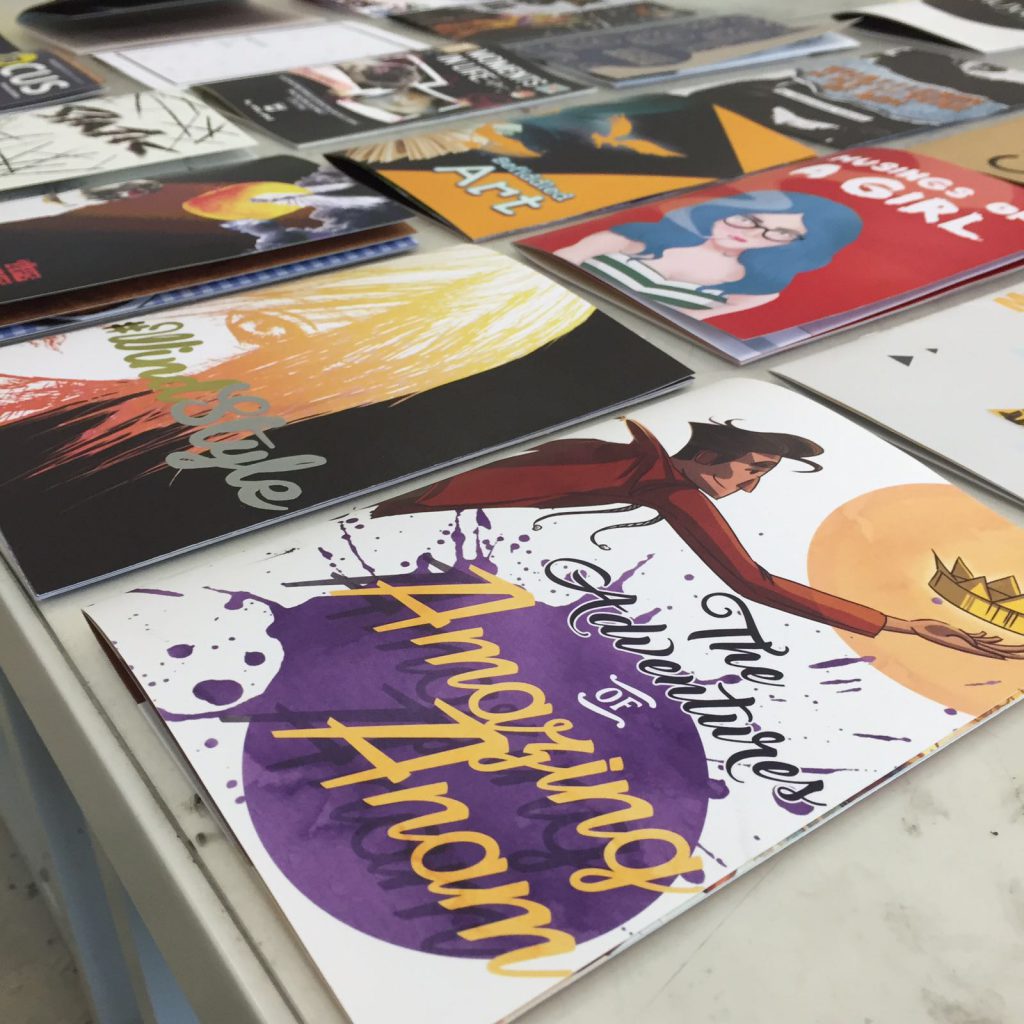
Zine
In the light of our final project for this module, I have decided that it would be best to show how much I have grown in terms of personal style, ideation, conceptualization and tactfulness when it comes to dealing with elements of 2D. These past two semesters was a necessary stage of evolution for me, as I delved deeper into my creations, heavily considering and applying the things I have learned throughout. My zine consists of pre-2D works, early 2D works and recent 2D works to show the progress and improvements I have made with careful guidance.
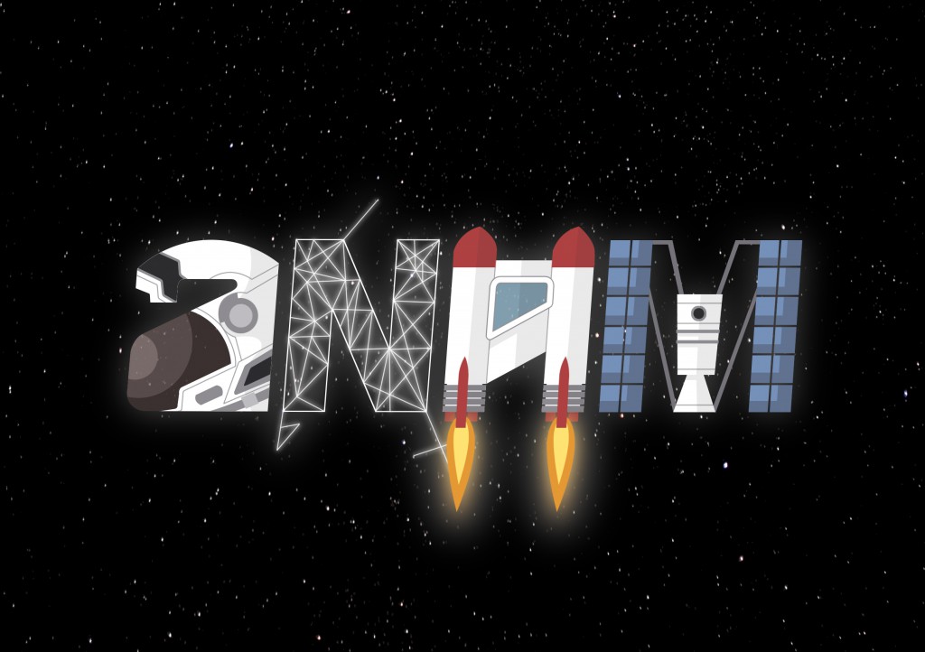
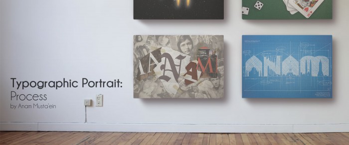
The Adventures of Amazing Anam
The first thing I wanted to do with my zine when we were first briefed on the assignment was to give it character. I needed my zine to scream me, to grab the attention of readers and to leave them with a lasting impression of myself. Therefore, I narrowed it down to featuring my illustrations. I feel that creating digital illustrations was by far my strongest ability in Foundation 2D as I have a distinct personal style. With the theme of progress and personal style revolving this project, I have decided to name my zine “The Adventures of Amazing Anam”.
Amazing Anam
As narcissistic as it may sound, “amazing” was not an attribute I have deemed myself. My fellow peers were the ones who gave me this nickname at the start of college, and it has since then grew to me. Furthermore, it has a nice ring to it, don’t you think so? With the pressure of living up to this name, it has only propelled me to do better in my work.

The Zine in Flesh
Cover Page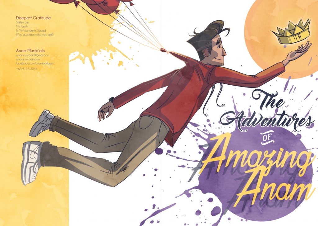
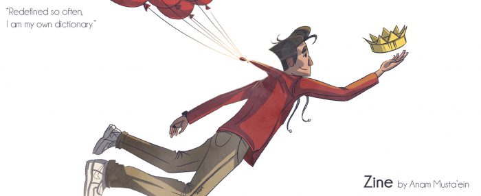
I have created new illustrations for the sole purpose of this assignment. One of these is a caricatured version of myself in my own drawing style. I have also dressed this character based on my intended outfit for the day of presentation to better relate and to accentuate the aspect of personalization in my zine.
Within the cover, I have pervaded subtle messages with the use of symbolism. Red balloons are often associated to passion and strong feelings we have as a child. And the action of letting go of a red balloon is to forgo the dreams and aspiration you have as a kid. But for me, I have latched myself to the strings of the balloon, allowing myself to ascend with it, an indication that I am still connected to the visions I had as a child.
The crown that my character is reaching for is veiled in an orange halo, representing the goals that I wish to accomplish in life. Bright yellow is used throughout the zine as I closely relate to it since it represents optimism, happiness, and energy. The purple splat is not only used to complement the yellow used in the composition, but it symbolizes creativity, power and authority – something that I wish to exude, but not abuse.
My cover page is designed in a strong diagonal composition with my character taking center-stage. I have taken hierarchy and contrast into consideration to make certain objects stand out more prominently than others. The typeface used for the title is playful and bursting with energy. I have also varied the alignment and orientation of the texts to make it more interesting and dynamic.
The overall look that I desire to achieve with this zine is the painterly look. This explains why there are blobs and splats of paint across the pages and why there is a watercolour finish to the images.
Page 2 & 3: Inspiration
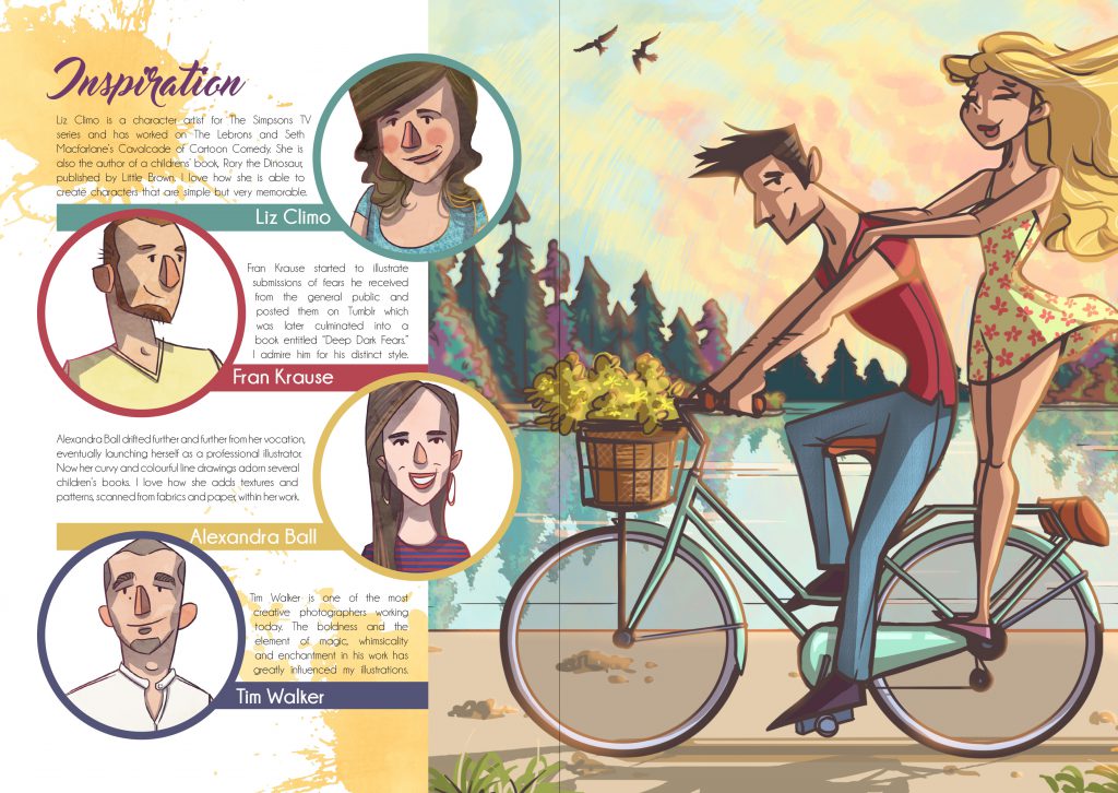
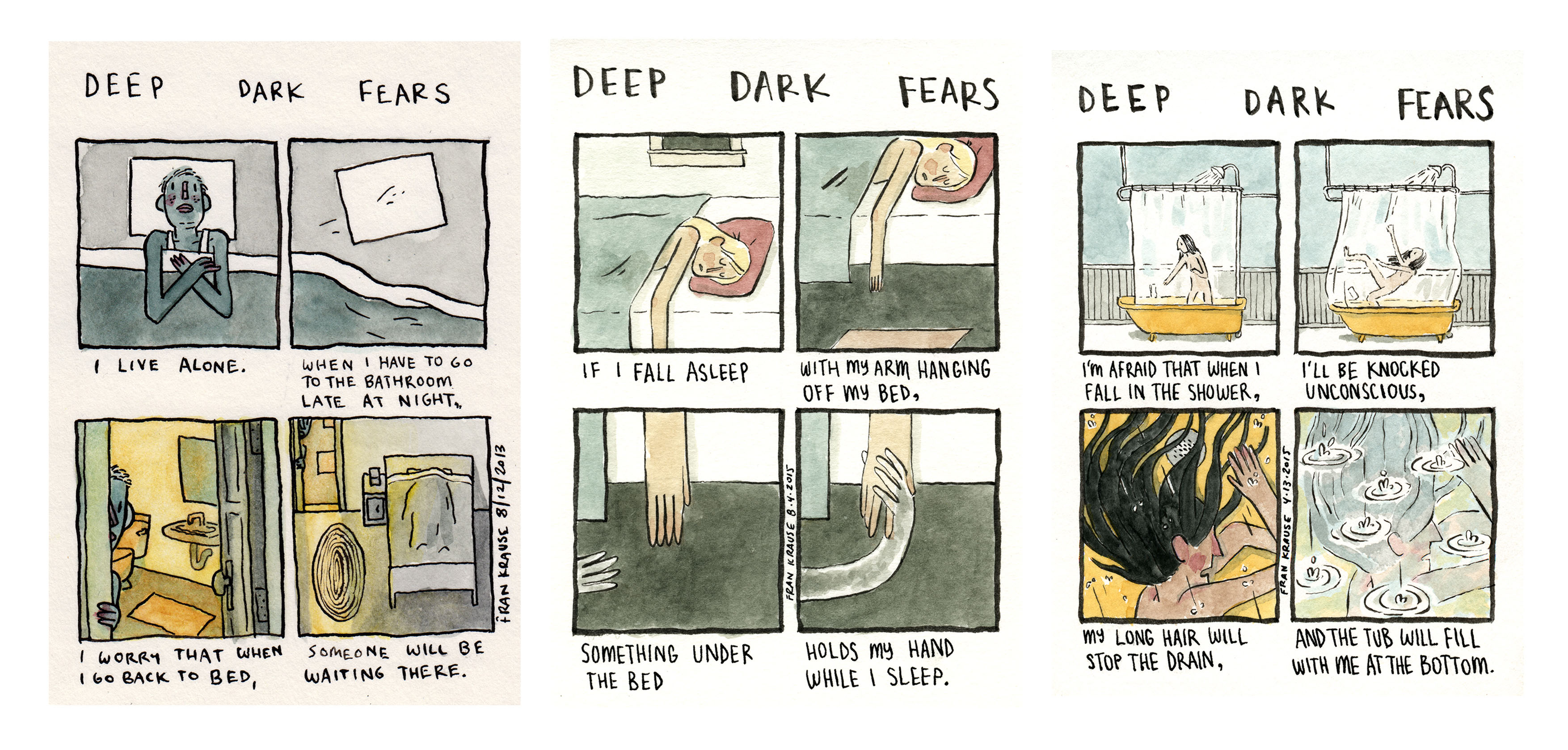
I started of the zine by featuring 4 of the most amazing artists that have greatly inspired my work. I thought that it was only appropriate for me to credit the artists who have contributed extensively to my style of illustration. They were all drawn in my personal style, encapsulated in a circle with their descriptions placed next to them.
To give better variation, I have mad each of their circles of different colours but kept the design consistent and pushed them to the leftmost side of the spread. The rest of the spread is heavily filled with my illustration “Soft & Sweet”, one of my earliest digital works which represents the early-comings of a beautiful story. With the paired visuals, this whole spread highlights my early beginnings, displaying great potential and desire to excel.
It was suggested for my “Soft & Sweet” illustration to fill 2/3 of my spread to give a better sense of composition.
Page 4 & 5: Earlier Artwork

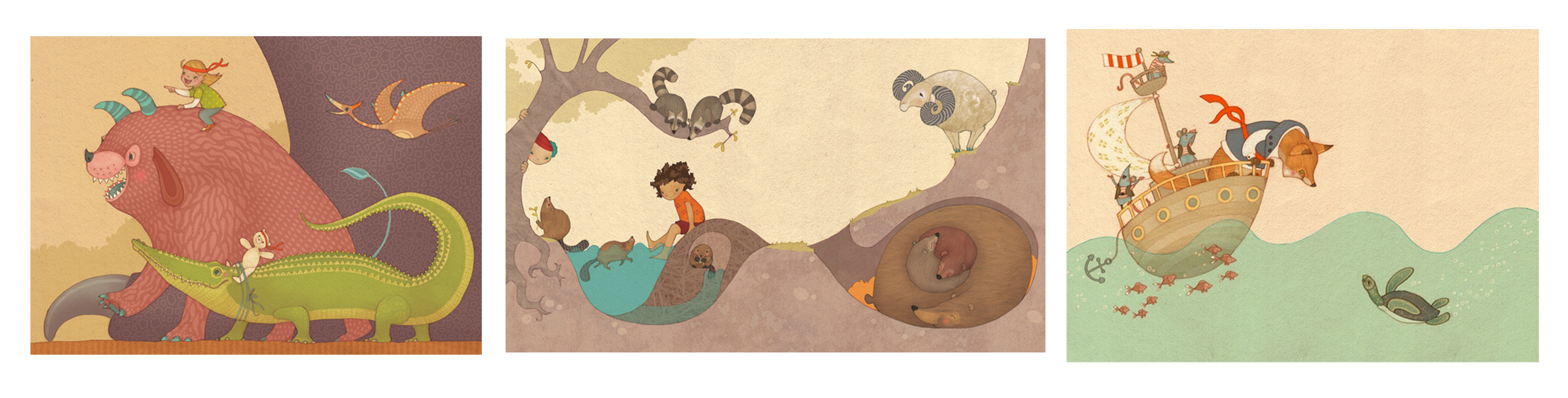
The following spread emphasized my growing stage of discovering my style, where I started to mimic the styles of other artists to see how they could fit the look that I was going for. While this exploration takes place, I have made yet another illustration called “Russet & Gold”, where it represents change and maturity with the autumn as the season used.
I also realized that the subjects of my illustrations revolved around nature. I embraced the complexity of trees and leaves, infusing them into my characters to better tell my stories.
At the side, I have written a short description on my earlier works in Foundation 2D. I have used works from my Ego assignment from last semester as this particular project allowed me to use my own illustrations to express my ideas. Although I was more comfortable using safer colours back then, I still take complementary, analogous and harmonious colour combinations into considertaion.
This spread also has a 2/3 composition with my “Russet & Gold” illustration filling majority of it. However, the difference between it and the previous spread is that the big illustration is pushed to the left instead of the right.
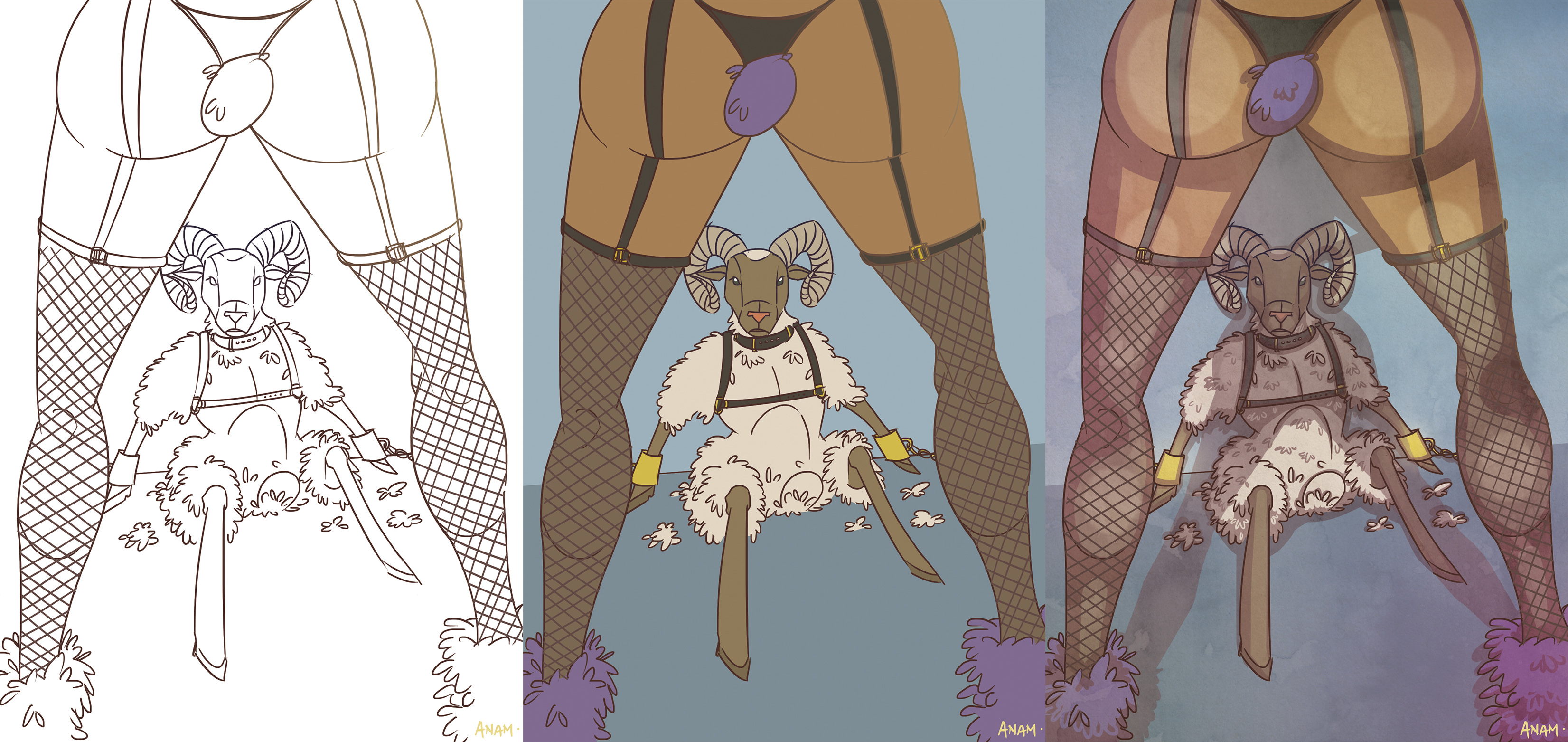
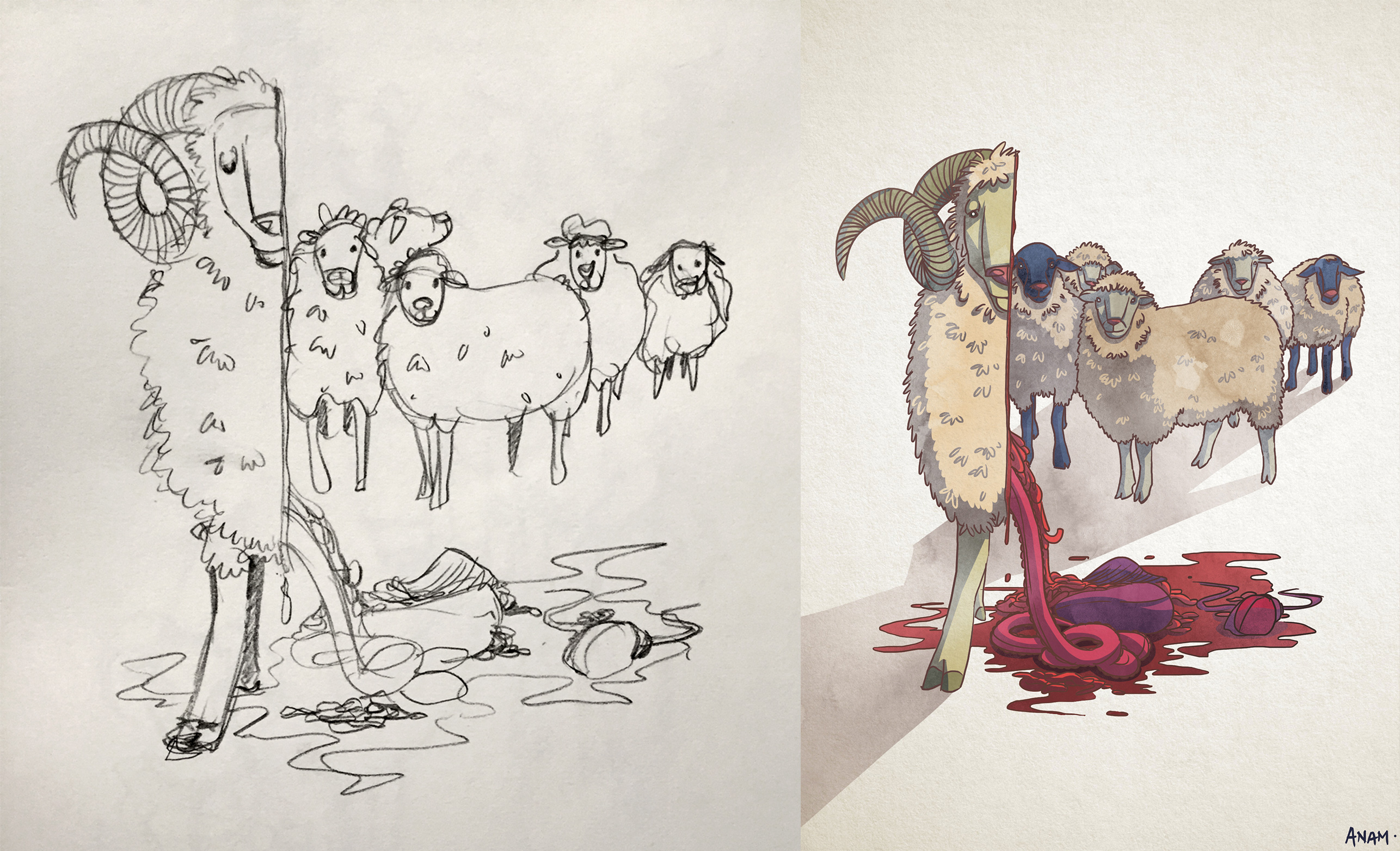
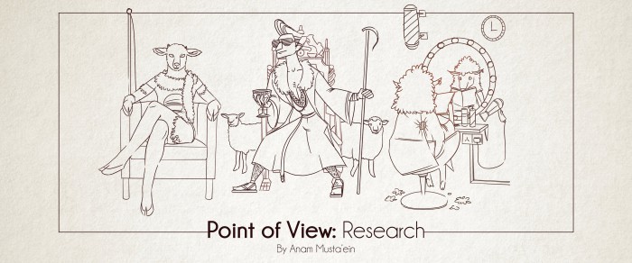
Page 6 & 7: Distinct Style
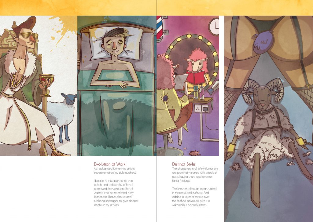
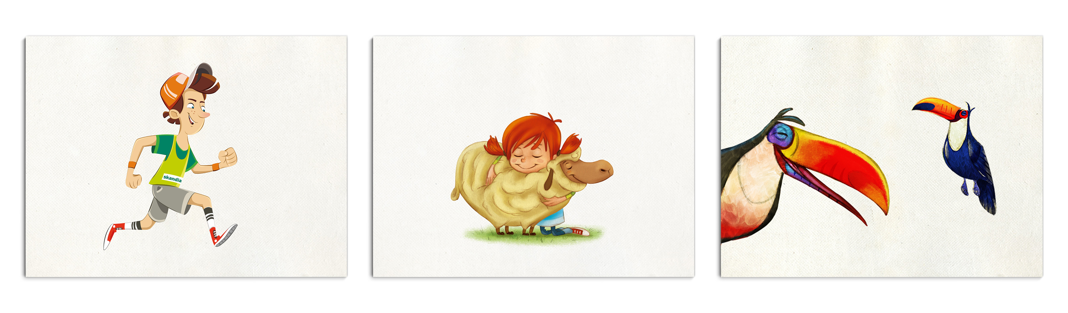
For the final two pages, I have decided to make it different from the previous pages, arranging the images in a more consistent and constant alignment. The illustration on the far right however is of a higher hierarchy as I feel that its composition is much more interesting compared to the rest.
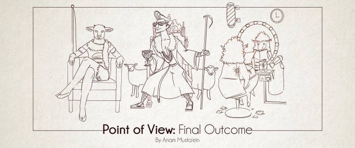
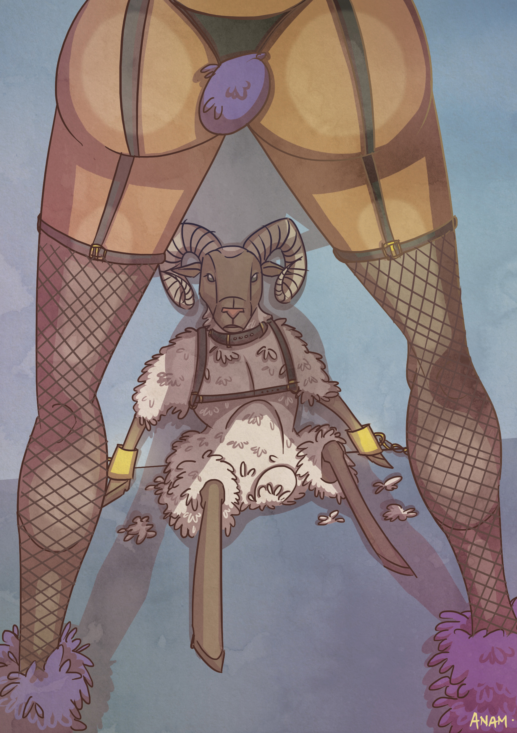
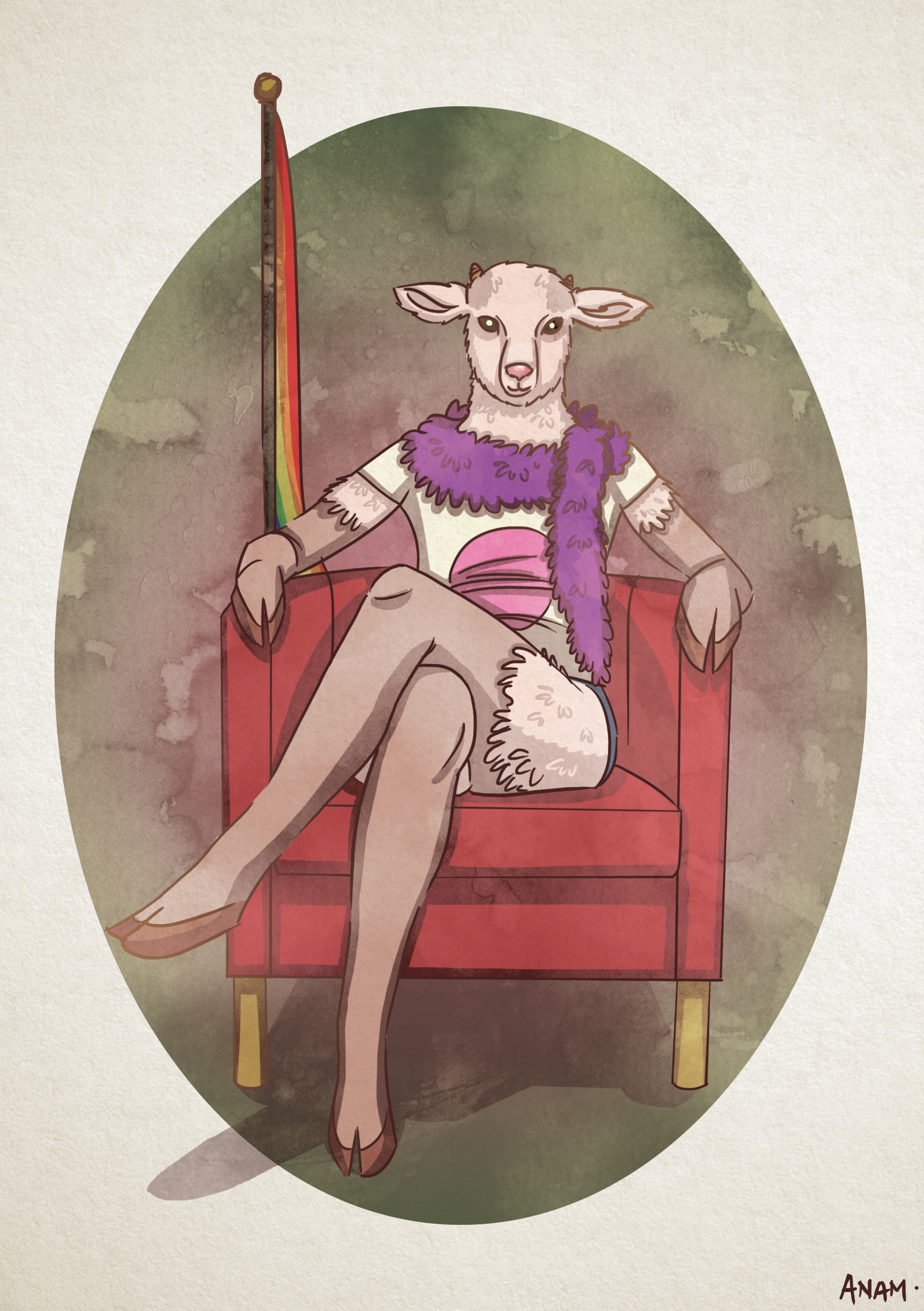
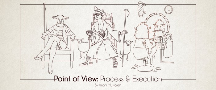
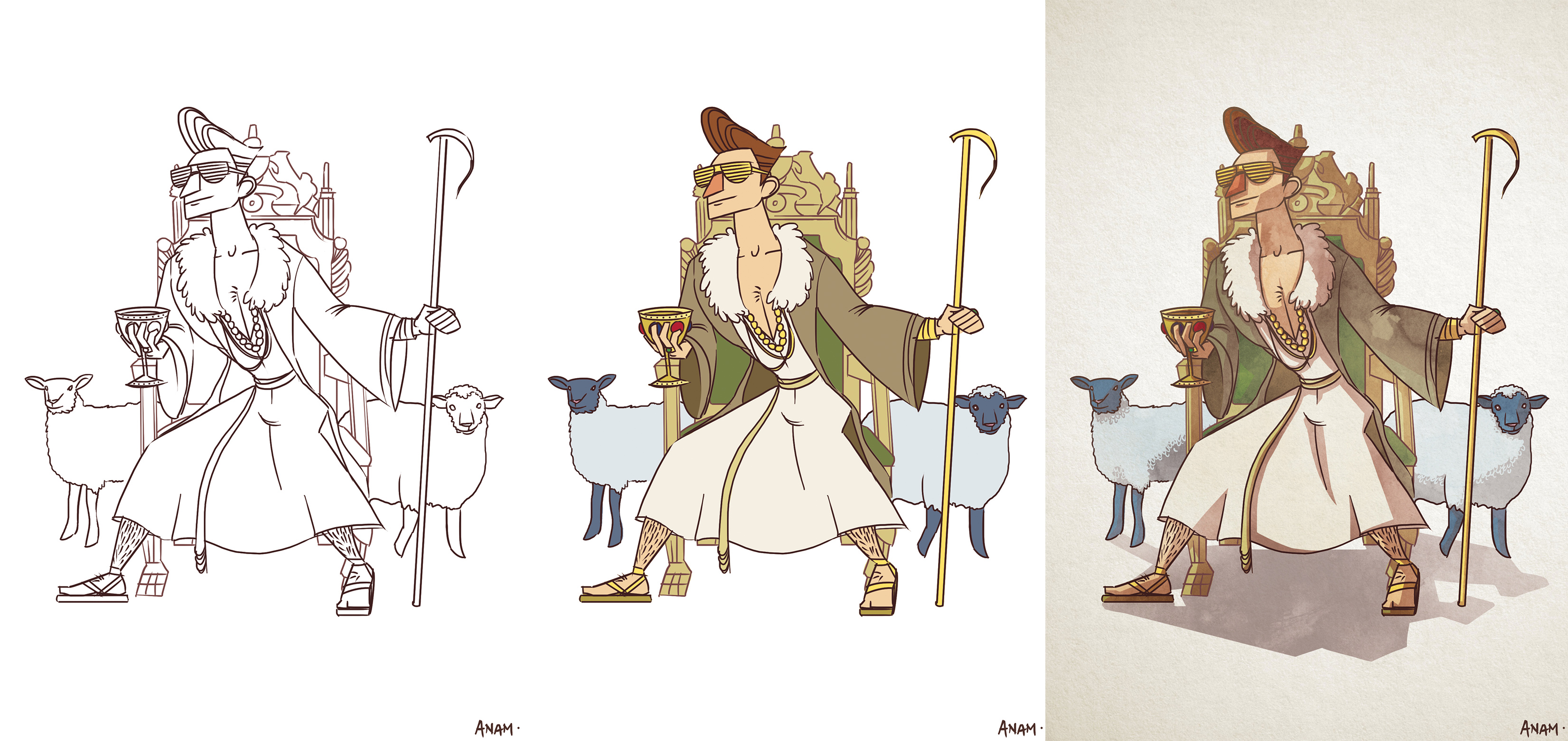
I discussed about how my work has evolved over time and how I finally settled with the style that I have always desired. It is prominently shown how all the characters in my illustration, whether man or animal, has a slightly reddish nose to distinguish them from the rest of their facial features. It took me several tries to get it right, and only with the previous “Point of View” project, was I able to finally showcase the style that I have been developing over the course of Foundation 2D.
I have also transgressed my comfort level of using colours and went with louder and odd colour combinations. And although this was a departure from the safe and warm colours I used in earlier works, it has proven that these weird a different colours could still work in a single composition.
These illustrations have much deeper and much well-thought out underlying messages in them. I have became more tactful in how I execute my ideas to better translate to others.
The placement of images and texts in these two pages are more editorial. But I have left out some spaces empty, as suggested by Shirley, to give some breathing space to the page.
Conclusion
All in all, I am very impressed with the amount of improvement I have showed as this module transpired and I’m really thankful for the guidance that has been provided by both my professor and peers. I am excited to reveal my distinct style to a larger audience and I hope this is only the start of my evolution.
Thank you for taking the time to read my final post on Foundation 2D. To all my peers reading this, here’s to a brighter and more fulfilling academic year ahead! Cheers!