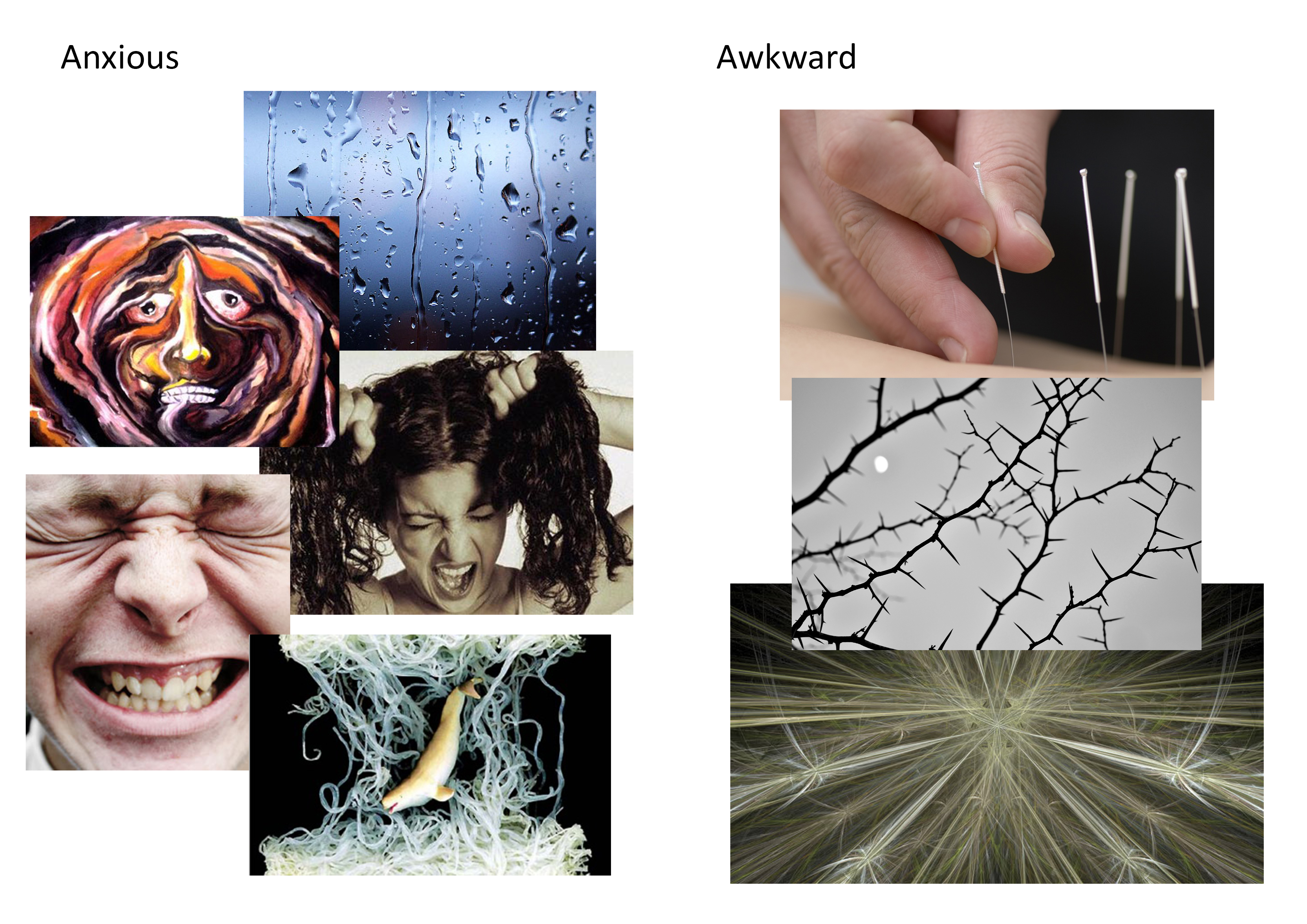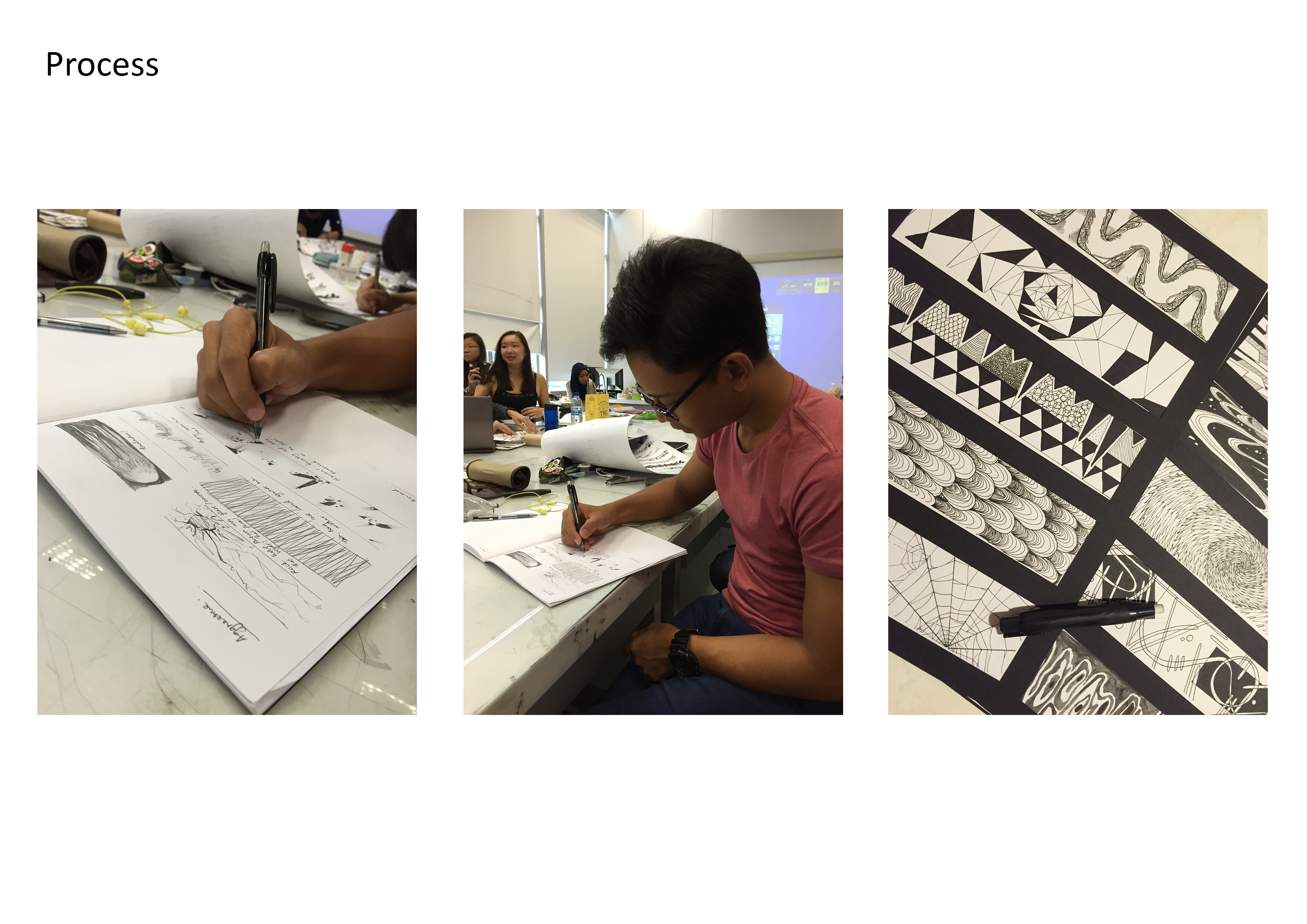

My concept of expressing these 18 emotions was heavily inspired by how the physical body reacts and feel in coherence to evoking them. For instance, when you’re anxious, you tend to scruff your hair, grit your teeth, bite your finger nails, your cheeks would blush and you might have that tingly, uneasy feeling in your skin. With these reactions in play, I have portrayed them with the simple use of lines, shapes and tones. Below are the designs elaborated further:
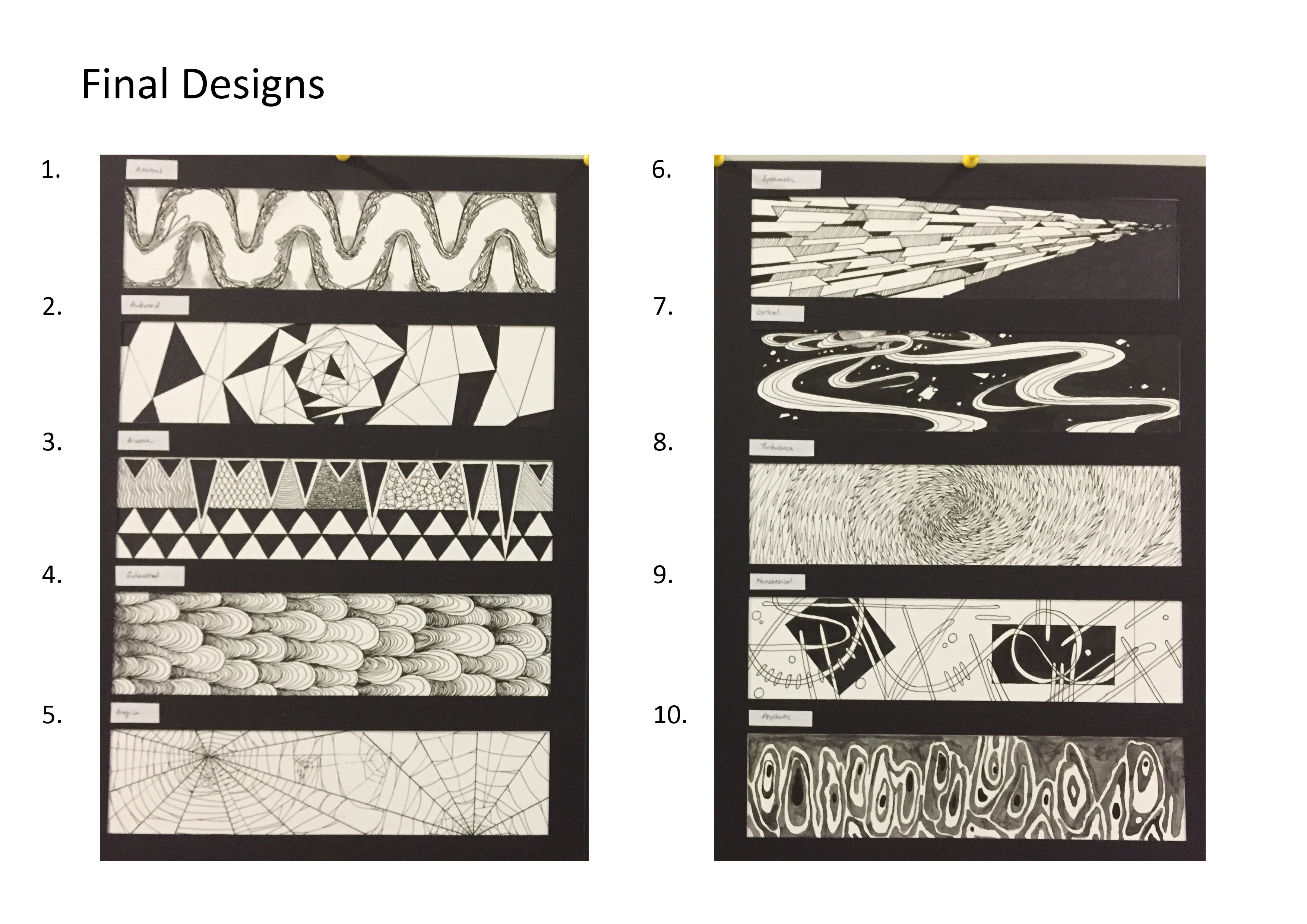
- Anxious
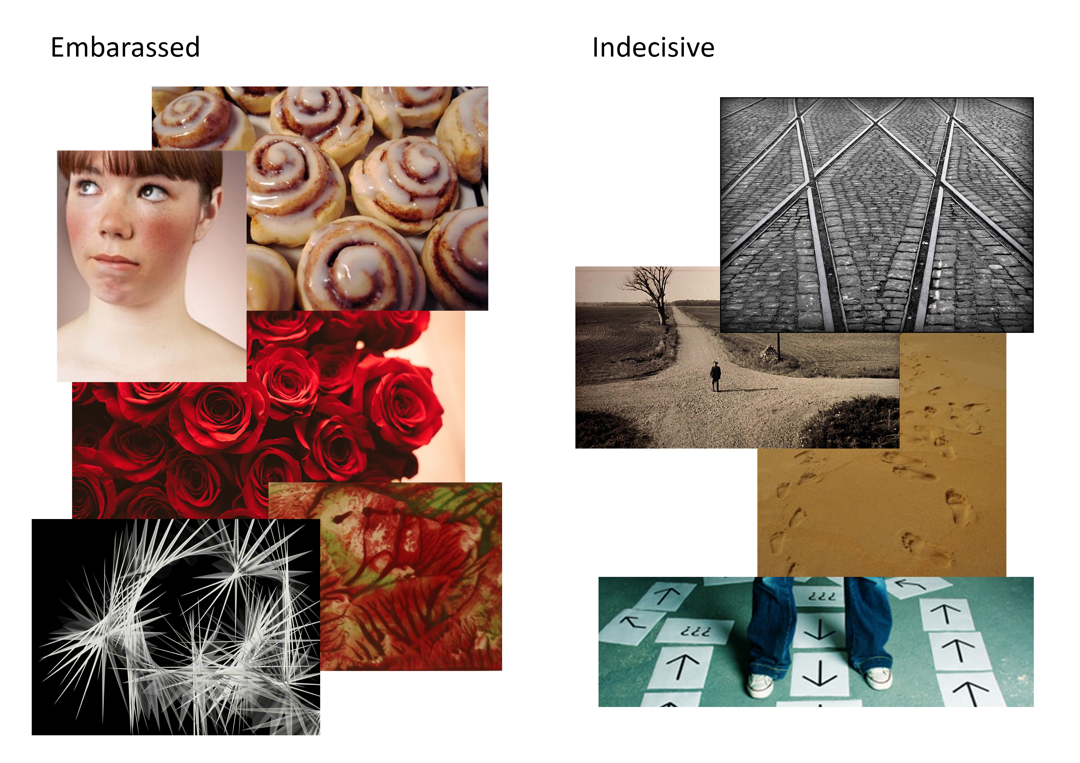
Noodles sliding and latching onto the hills and valleys (the ups and downs when you are feeling anxious) of the drain. There is no sense of balance as gravity is acting on both the upward and downward forces giving the lines an uneasy, squeamish and uncomfortable feel. - Embarrassed
Tiny black, unstable triangle hiding in the comfort of surrounding tiny triangles, away from the bigger black ones in the outer parts of the spiral to show how one would want to flee from embarrassment. The triangles are arranged within the Fibonacci curve as it loosens in density as it spirals outwards. - Bizarre
Disoriented triangles of different sizes were placed against the organized, uniformed triangles at the bottom to make the contrast between normality and the outlandish much more prominent. More patterns such as scales, curls, waves and dots to amplify the eccentricity of the strip. - Exhausted
Slow-moving, heavy and sluggish drips of paint running across the strip to show the feeling of worn out and weary. Lines were added inside the individual drips to give it more weight and volume. - Fragile
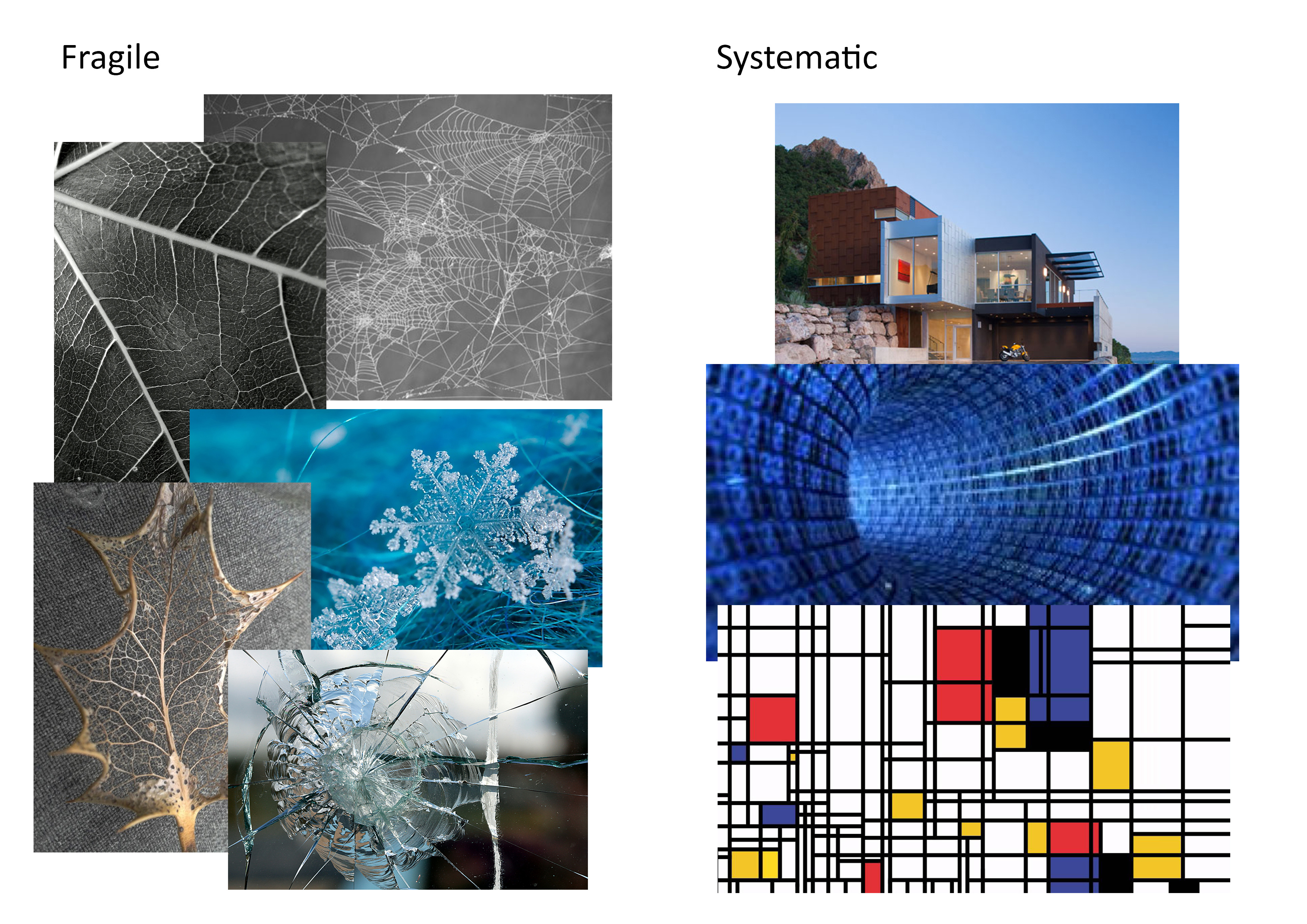
Sticking much closer to how fragile nature is, I have decided to draw out a spider web to show the frailness of this particular emotion. You feel vulnerable, weak but delicate. The reason why I have put in two different focal points was to display the contrast between the tighter and the looser areas of the web where it is more susceptible of being destroyed. - Systematic
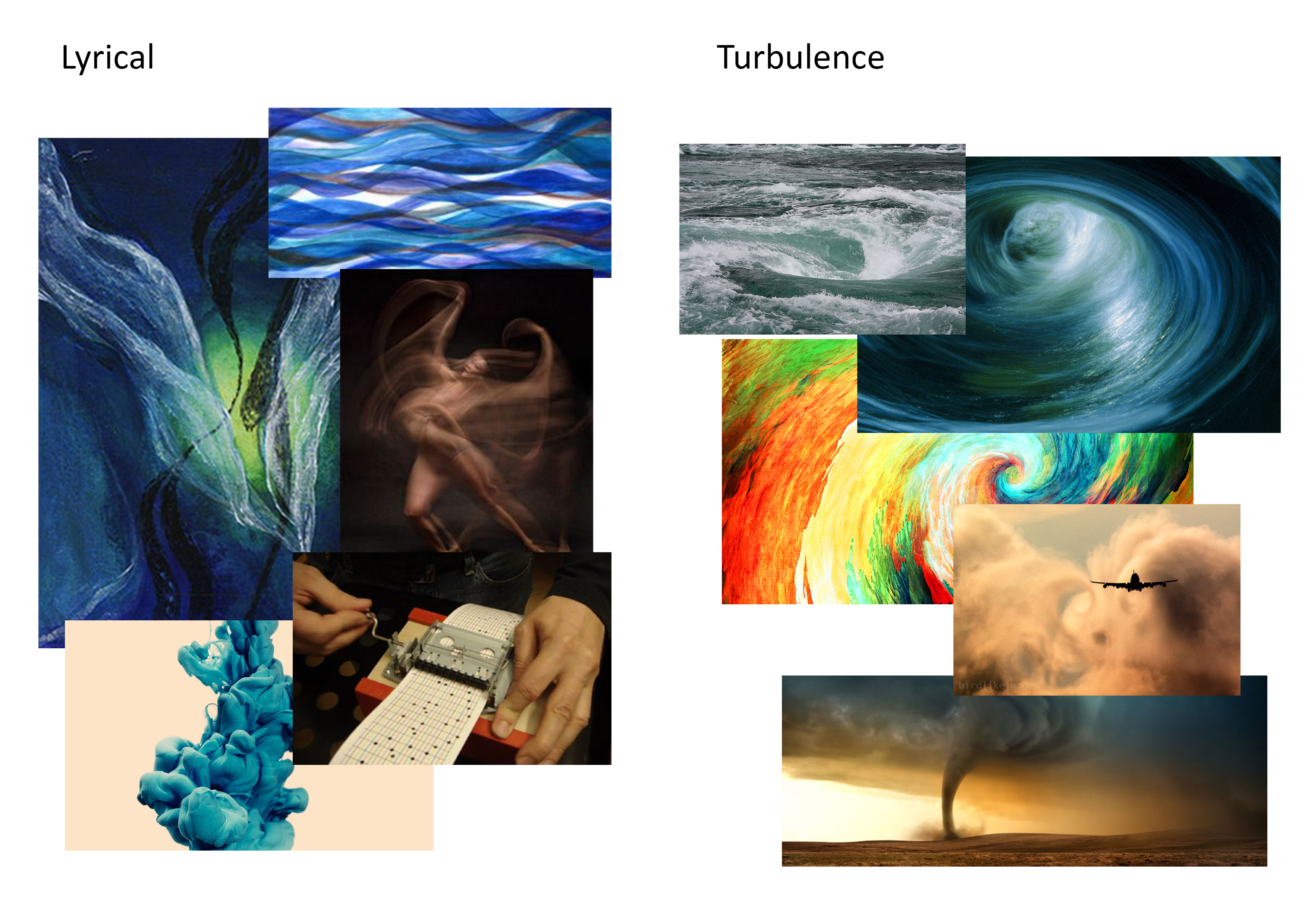
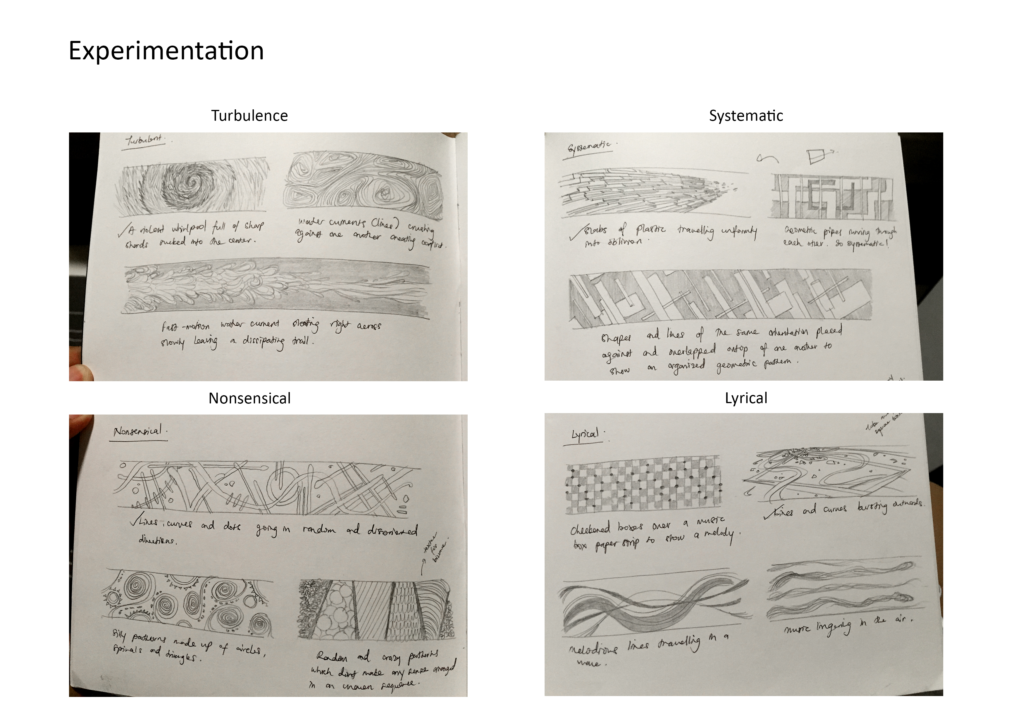
When I imagined this emotion in my head, I could distinctly see myself as a string of emails/information flowing through cyberspace to be delivered to another place. The organised and orderly movement clearly shows systematic. I have drawn the planes moving towards a vanishing point to bring out some dynamism as opposed to leaving it flat. - Lyrical
To project such an emotion, my body is required to pulsate a positive and harmonious vibes. Which explains why I have used curves instead of straight lines to show a much fluid movement with the tiny bits floating in space, acting as the remnants in the debris from the pulsation. - Turbulence
I envisioned this strip to be nothing but utter turmoil and violence. I wanted quick and storm-like movements with a hint of danger as it spirals inwards. The sharp pointy lines were added to create a much angrier texture. - Nonsensical
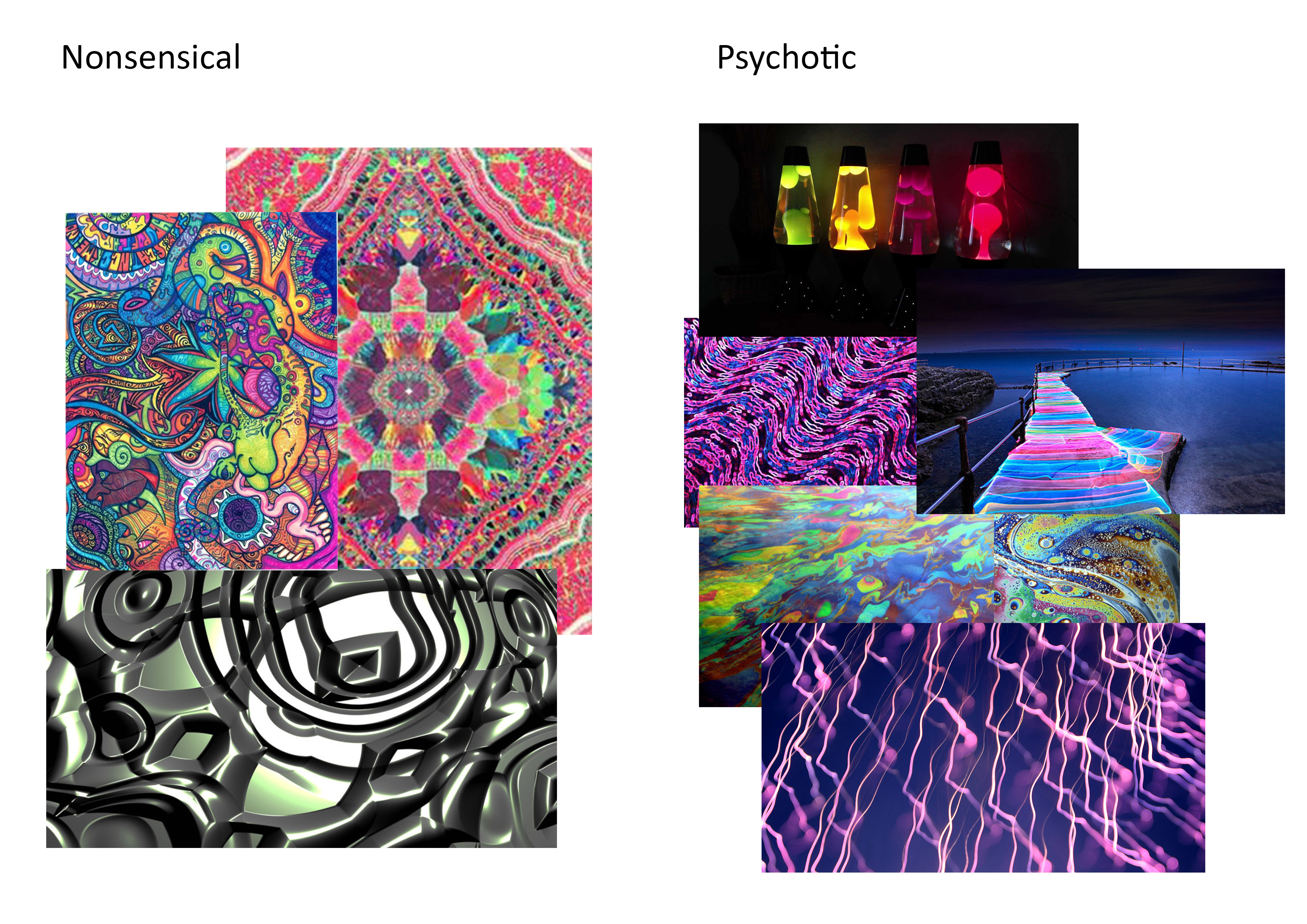
My main focus for this design was to push the boundaries of how foolish and idiotic it could possibly get. Random shapes and lines were overlapped on top of one another to distort the balance and symmetry that would make it too conventional. Bigger shapes were made darker to build a sense of heaviness in the background without forgetting how light and agile the lines in the foreground are. - Psychotic
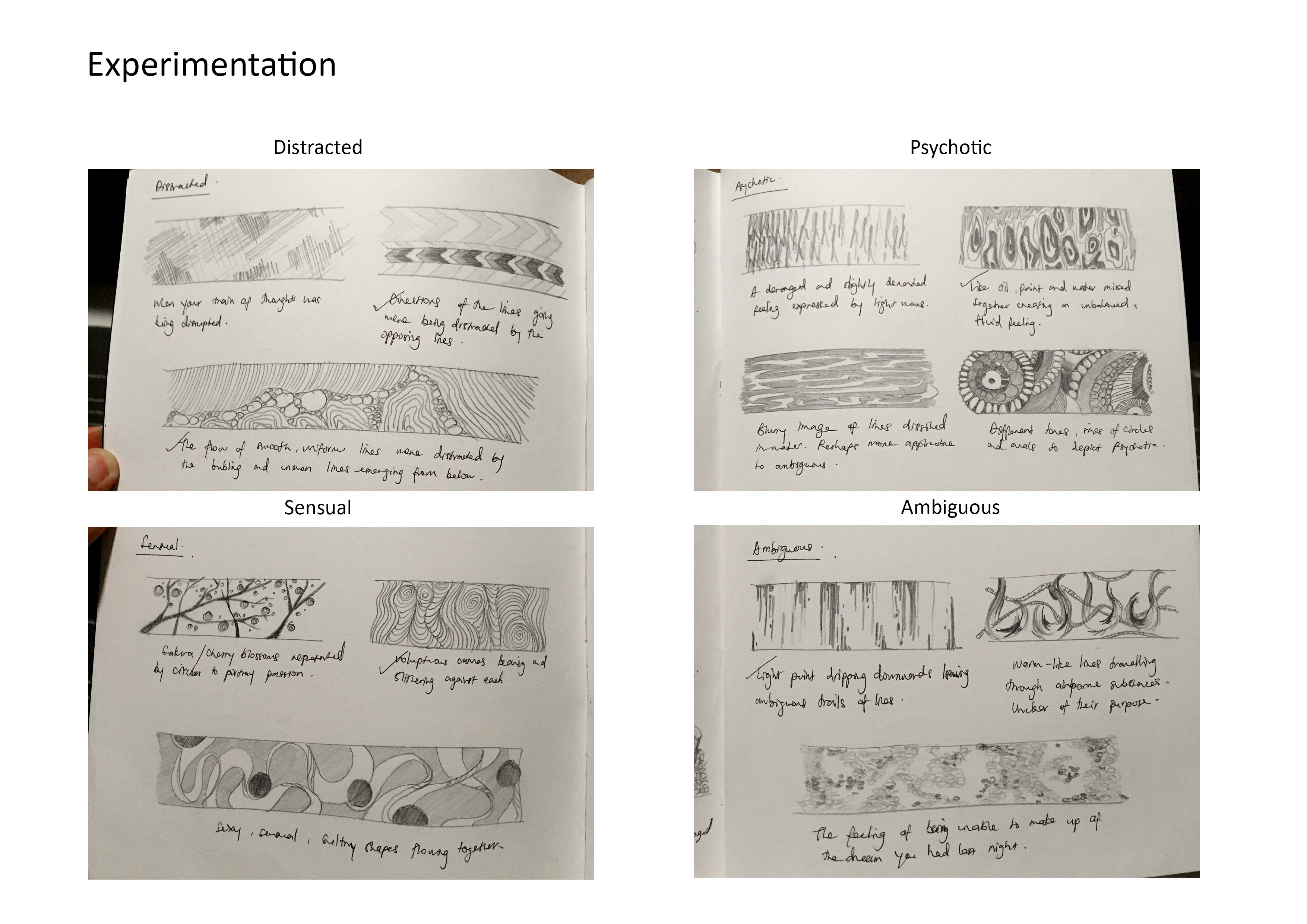
Taking inspiration from lava lamps and the effects made when paint, oil, and soap are mixed, I have came up with a slightly insane and deranged pattern. This is how I would imagine our abstract minds to be when we experience demented thoughts. A myriad of tonal values were used in this strip.

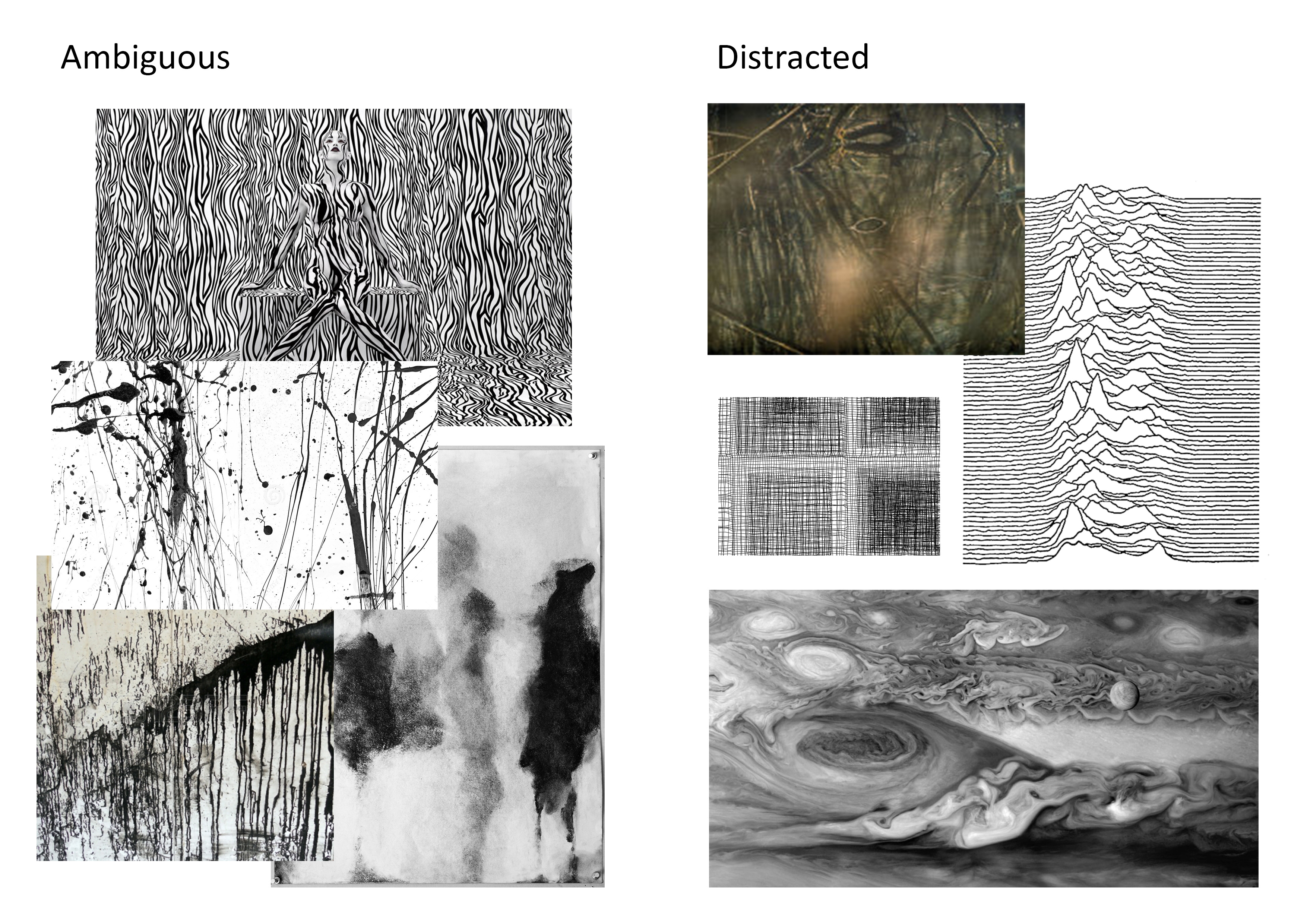
- Ambiguous
When your thoughts are blurred, unclear, vague, or you simply cannot seem to make up what you dreamed of last night when you were soundly asleep. I used ink and blew the drops with straws to create a frilly trail downwards. I have left a lot of space empty to symbolize what our minds could not comprehend or decipher when our thoughts are obscured. - Distracted
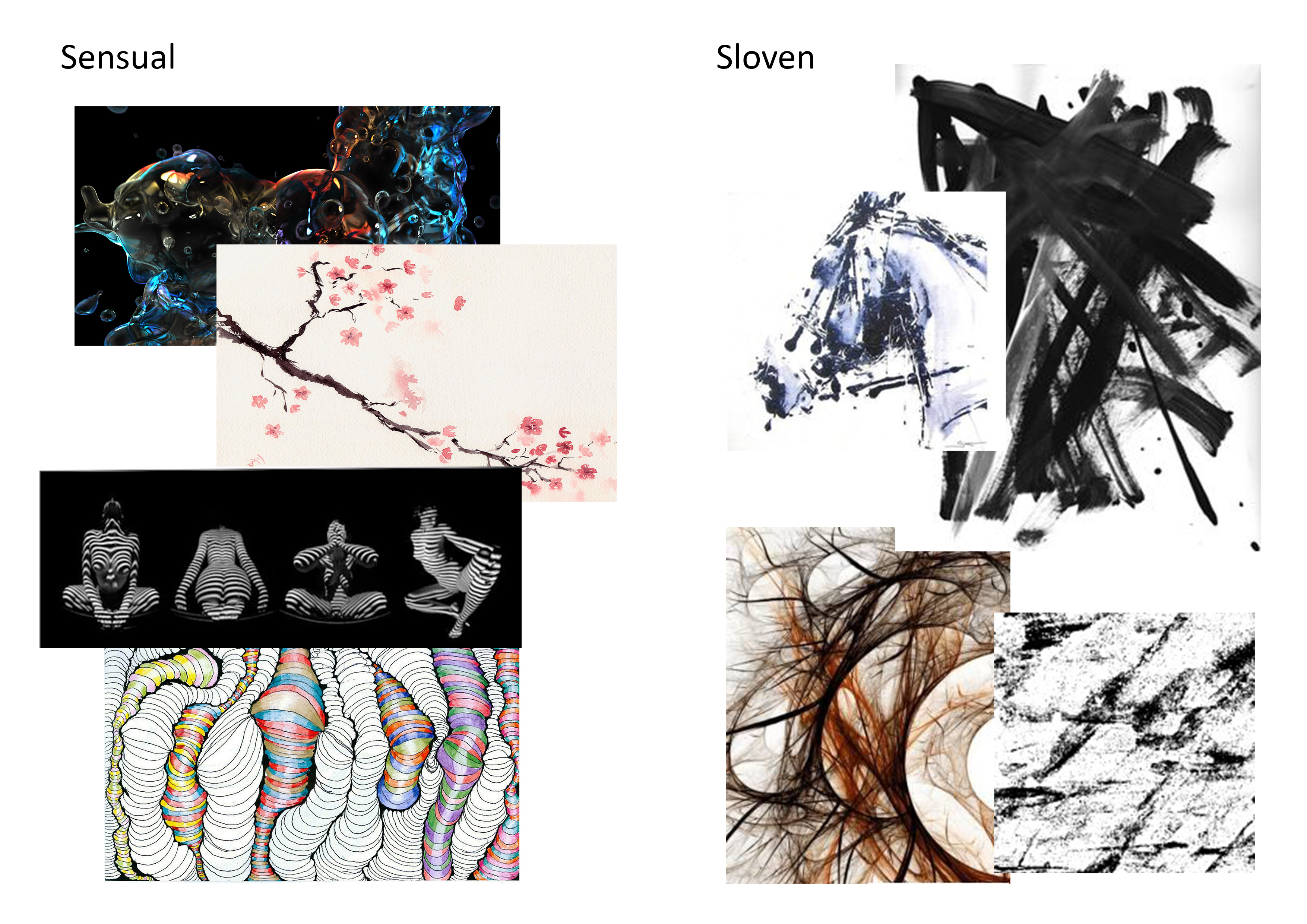
Flashing directional arrows that conflicts with one another to portray distraction. The smaller one is of darker tonal range to show contrast against the bigger one. This is how I see our train of thought when something distracting occurs. - Sensual
Tapping into and taking inspiration from the works of Norwegian photographer, Solve Sundsbo, I have produced an abstract piece that closely resembles with his photographs of projecting light trails on women’s bodies. The curvy, voluptuous and voluminous lines crammed so close to one another displays “sensual” prominently. - Sloven
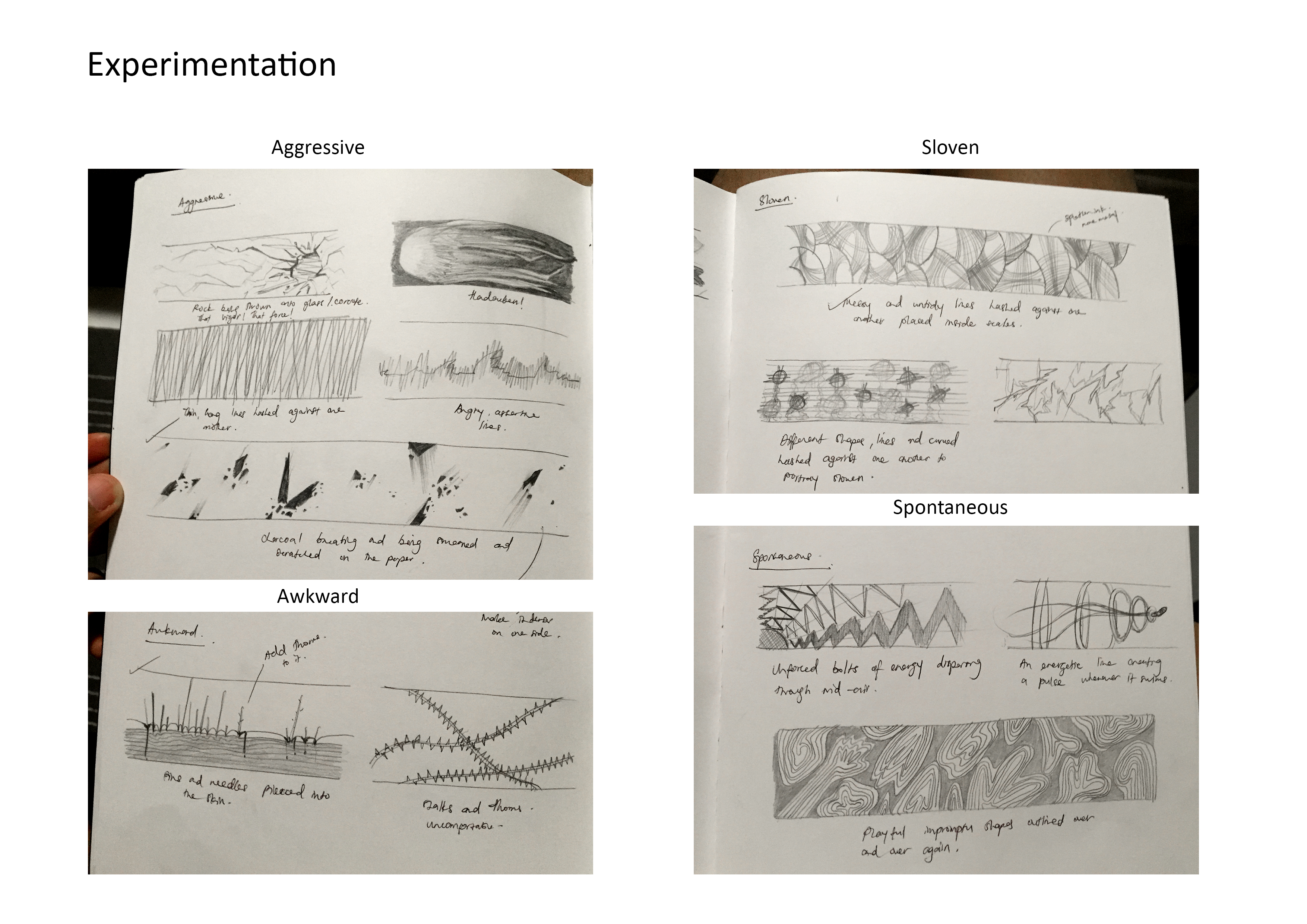
I would like to call this strip an “structured mess” mainly because my interpretation of “sloven” is to be careless. So when you are careless, despite being very organized, you would be able to see the untidiness within. I have used circles to show some order while I filled the insides with messy lines and paint splatters to orchestrate sloven. - Spontaneous
Fast lightning bolts shooting out from the corner of the strip to show spontaneous. I have made the bolts differ in thickness, opacity and frequency to illustrate speed as they complement each other. And I wanted to create the illusion of light dispersing from the corner. Hence, leaving the rest of the space white and empty. - Aggressive
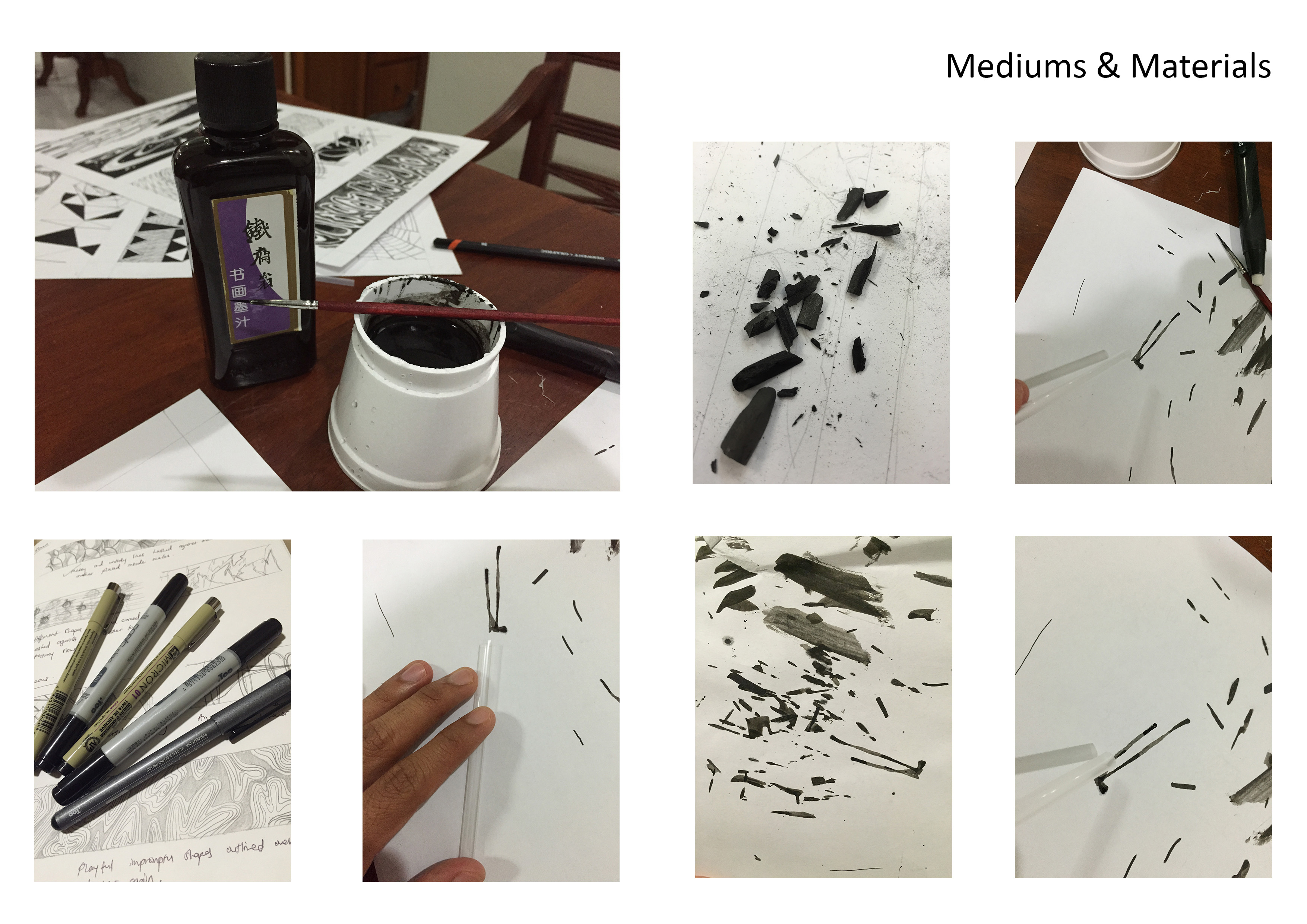
Being heavily inspired the breaking and smearing of charcoal pieces, I captured the aggressiveness in the strokes that they leave behind when being dragged across the surface. The broken pieces emulate a sense of force and insistence which does not necessarily mean angry, but aggressive! - Awkward
When you are feeling awkward, you tend to get this tingly, uncomfortable and unsettling feeling on your skin. Very much like how I would imagine acupuncture to feel like where needles are pierced into the skin to relieve some tension built. I have created layers of lines with different tones to illustrate a sense of density. Thorns were added to the needles to give them a much unpleasant effect. - Indecisive
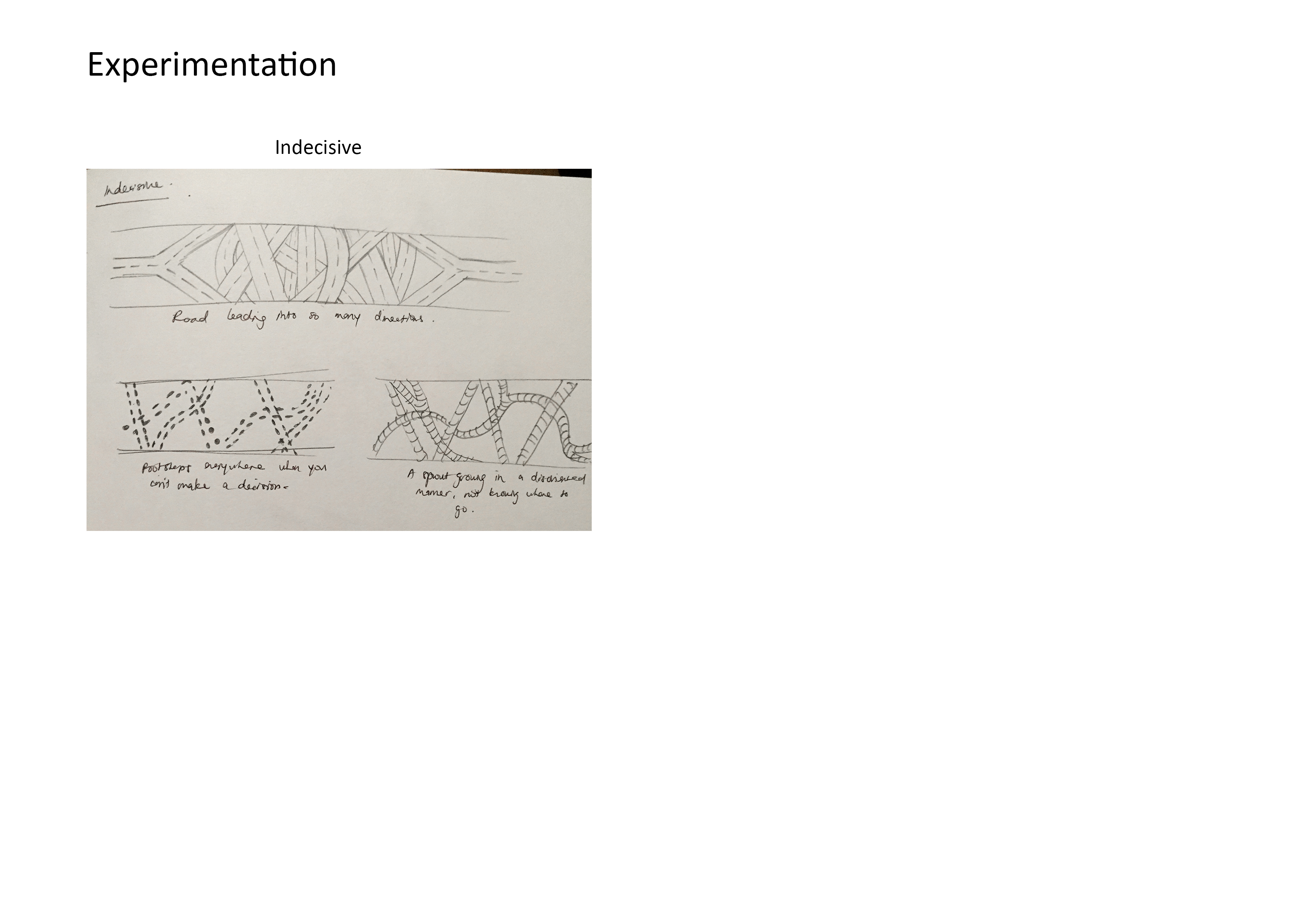
A path that starts with a crossroad and slowly inclines into a maze of trails to show how indecisive one could get only to end up from where they started. I used the patterns on pebble paths with different tones to show how close or distant they are from the foreground.