Typographic Portrait: Process & Execution

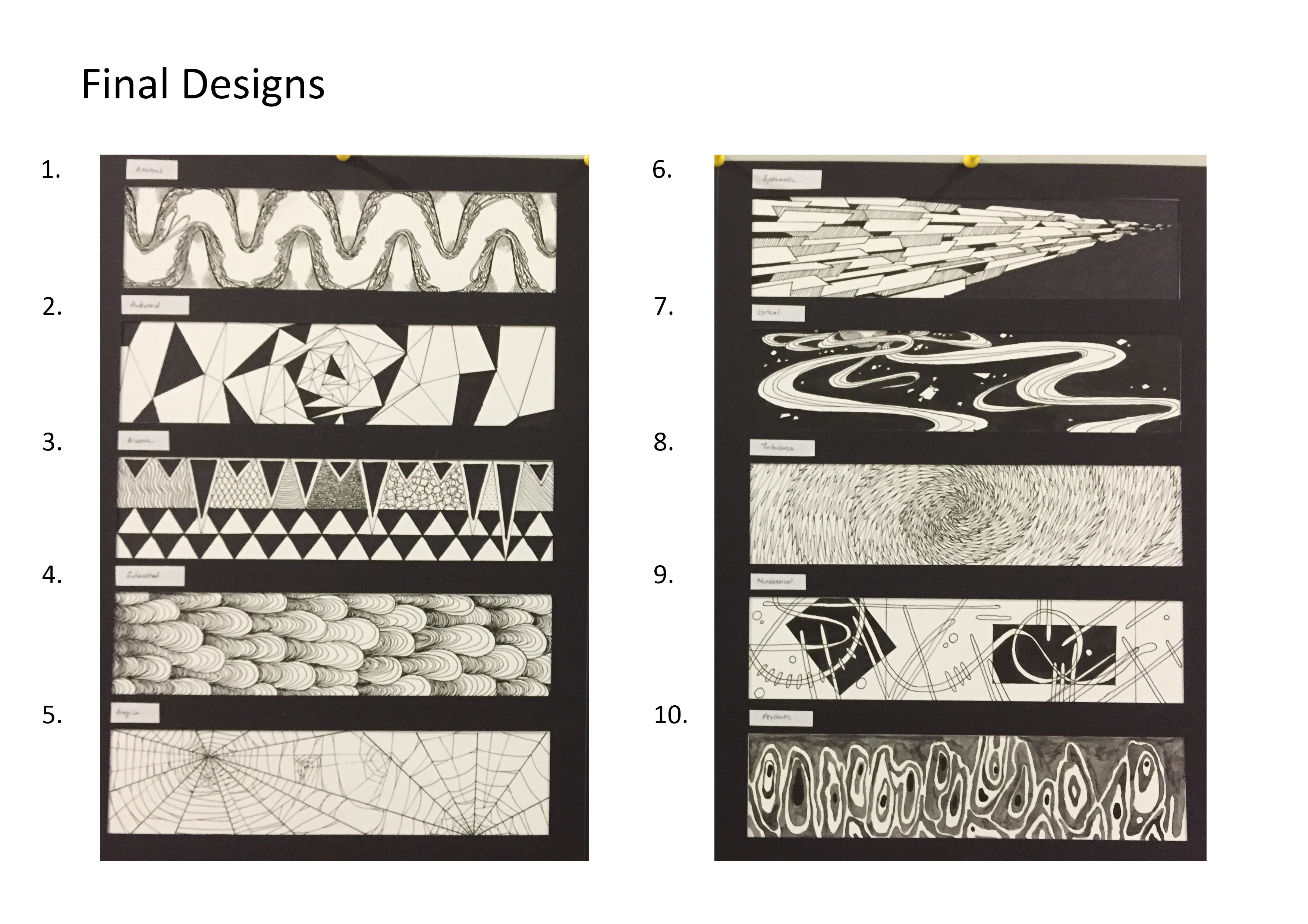
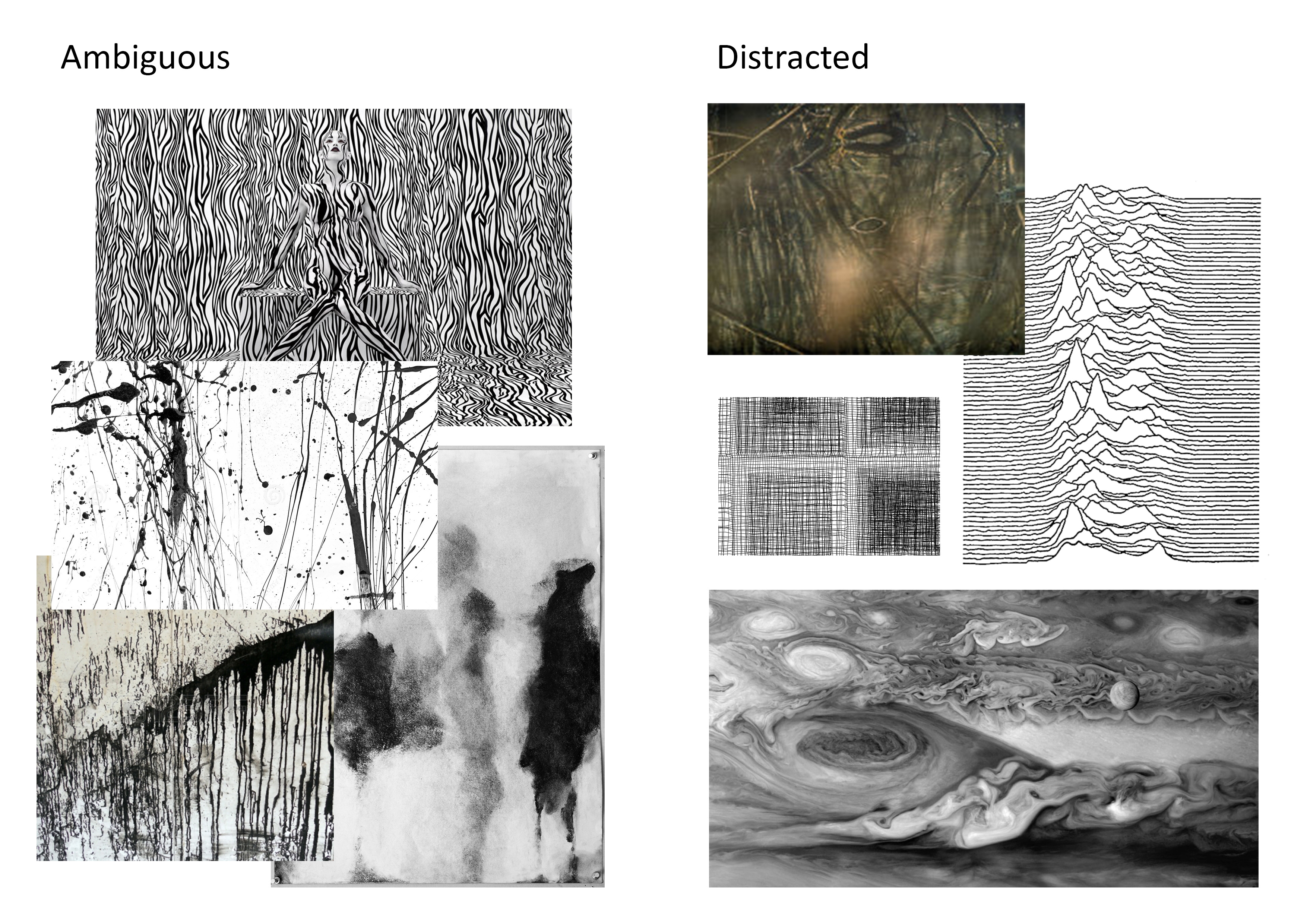
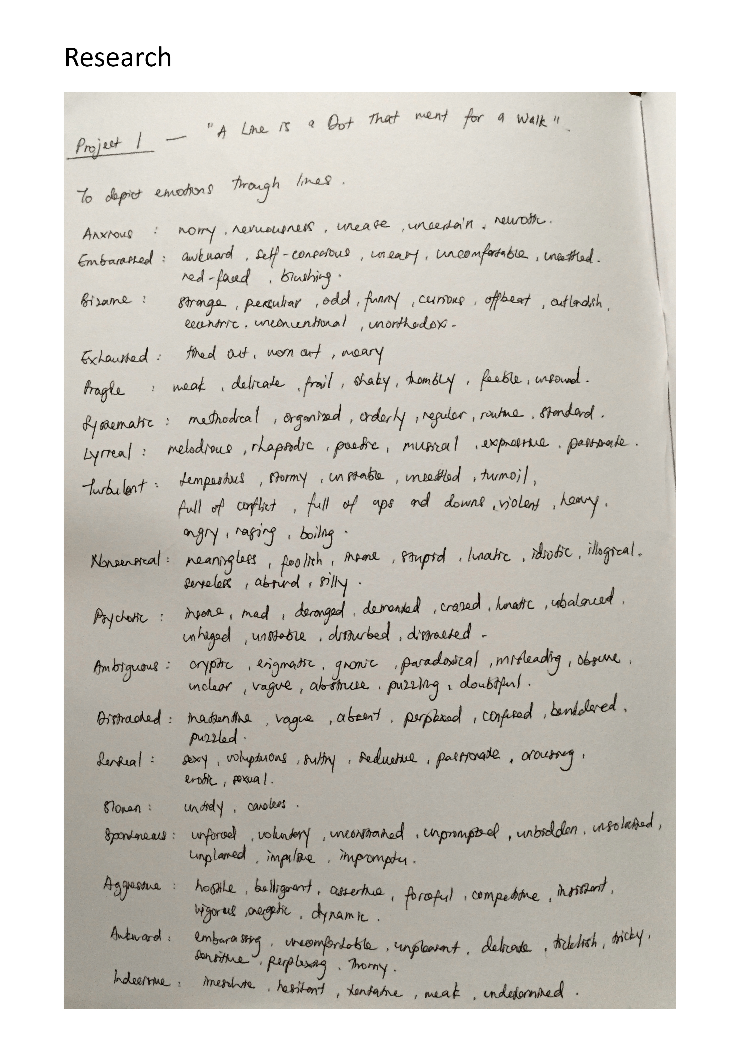
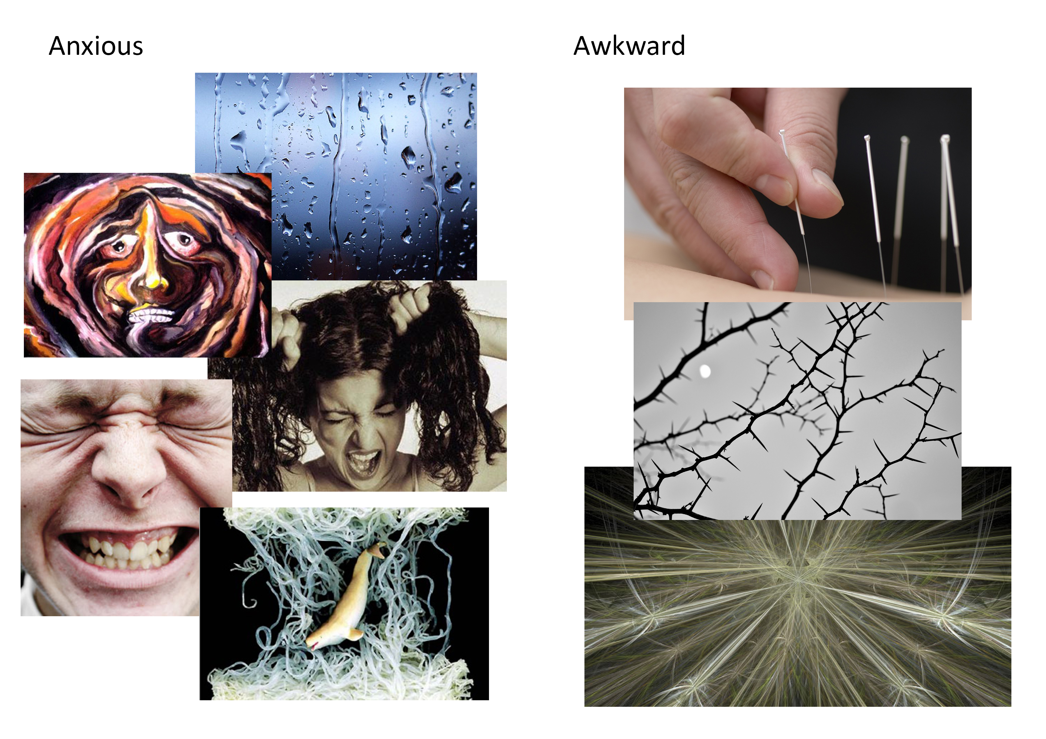
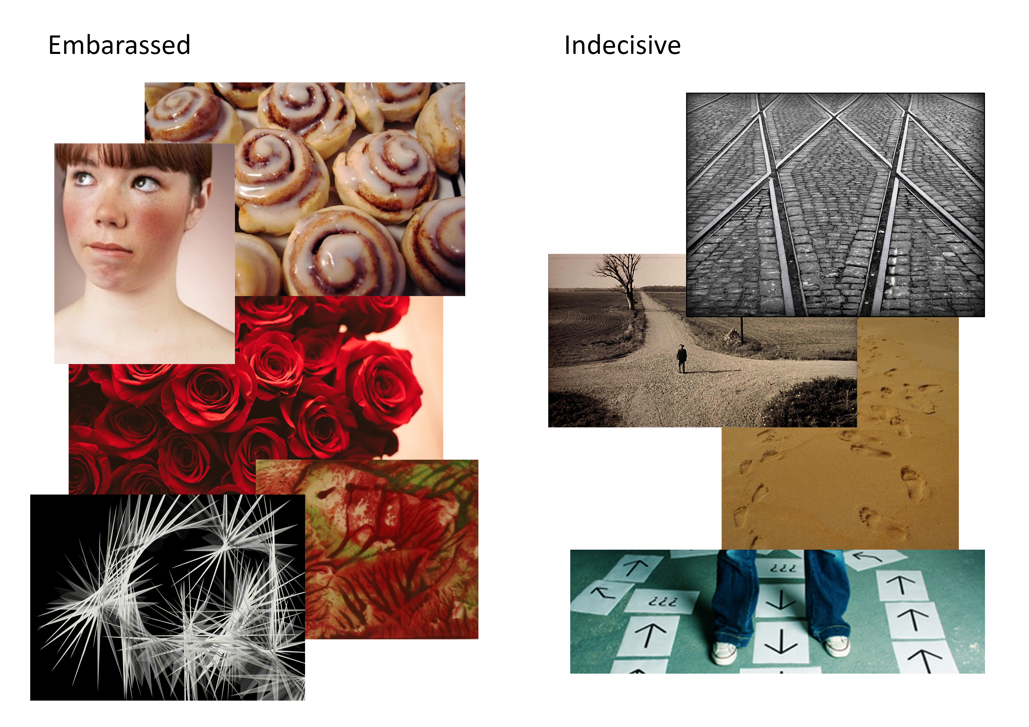
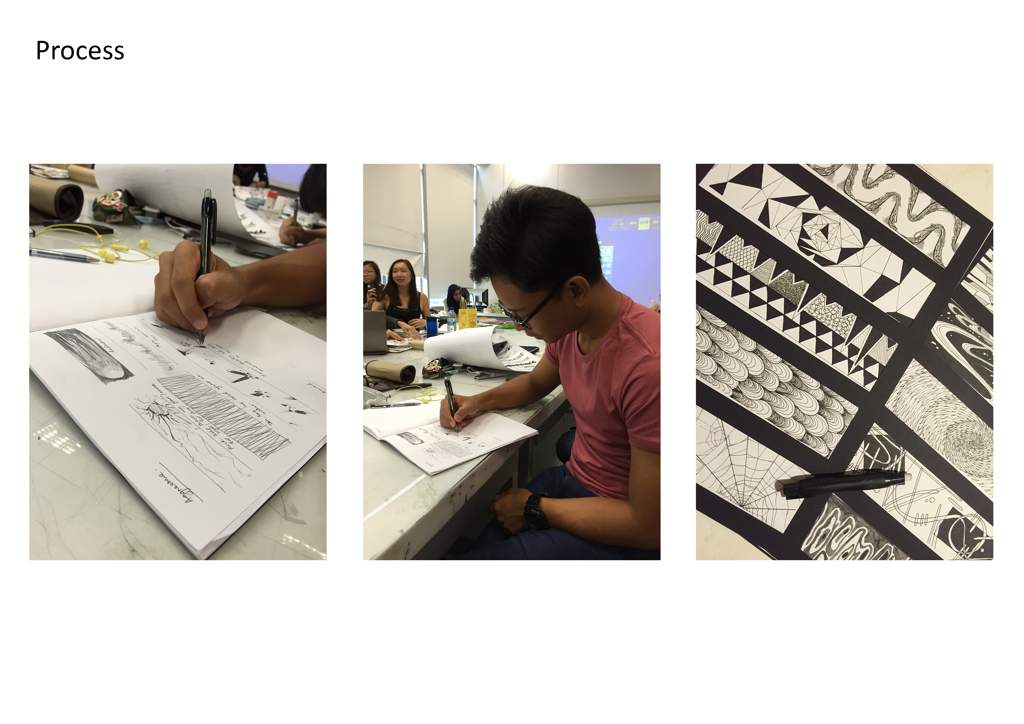
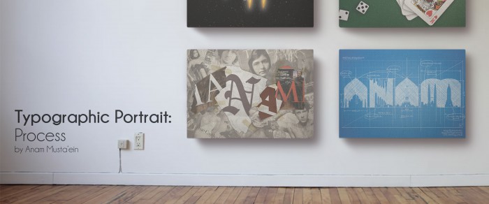
The ideation process was key to how I was able to diversify my styles in the 4 final designs for my typographic portrait, all of which were entirely worked in Photoshop. As mentioned in my research, I did not wish to maintain the same boring style throughout like how I did for previous projects. I wanted to do something out of my comfort zone. After all, I am all about experimentation.

1. Astronaut:Astronaut

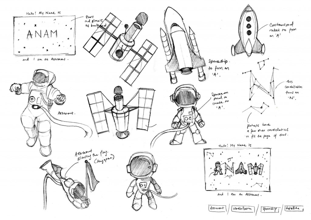
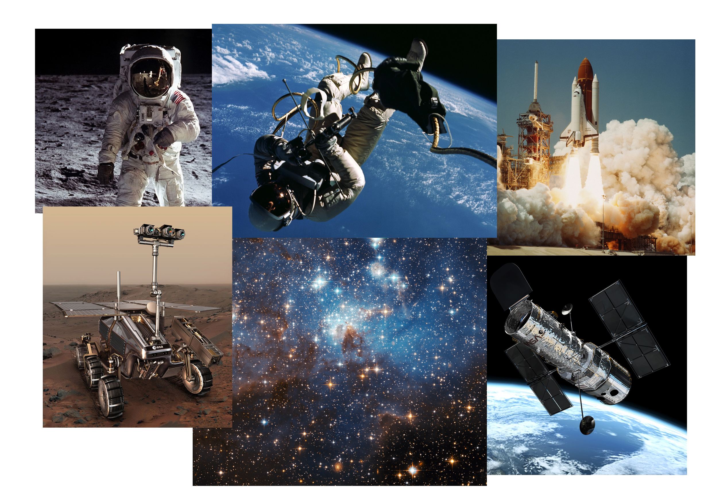
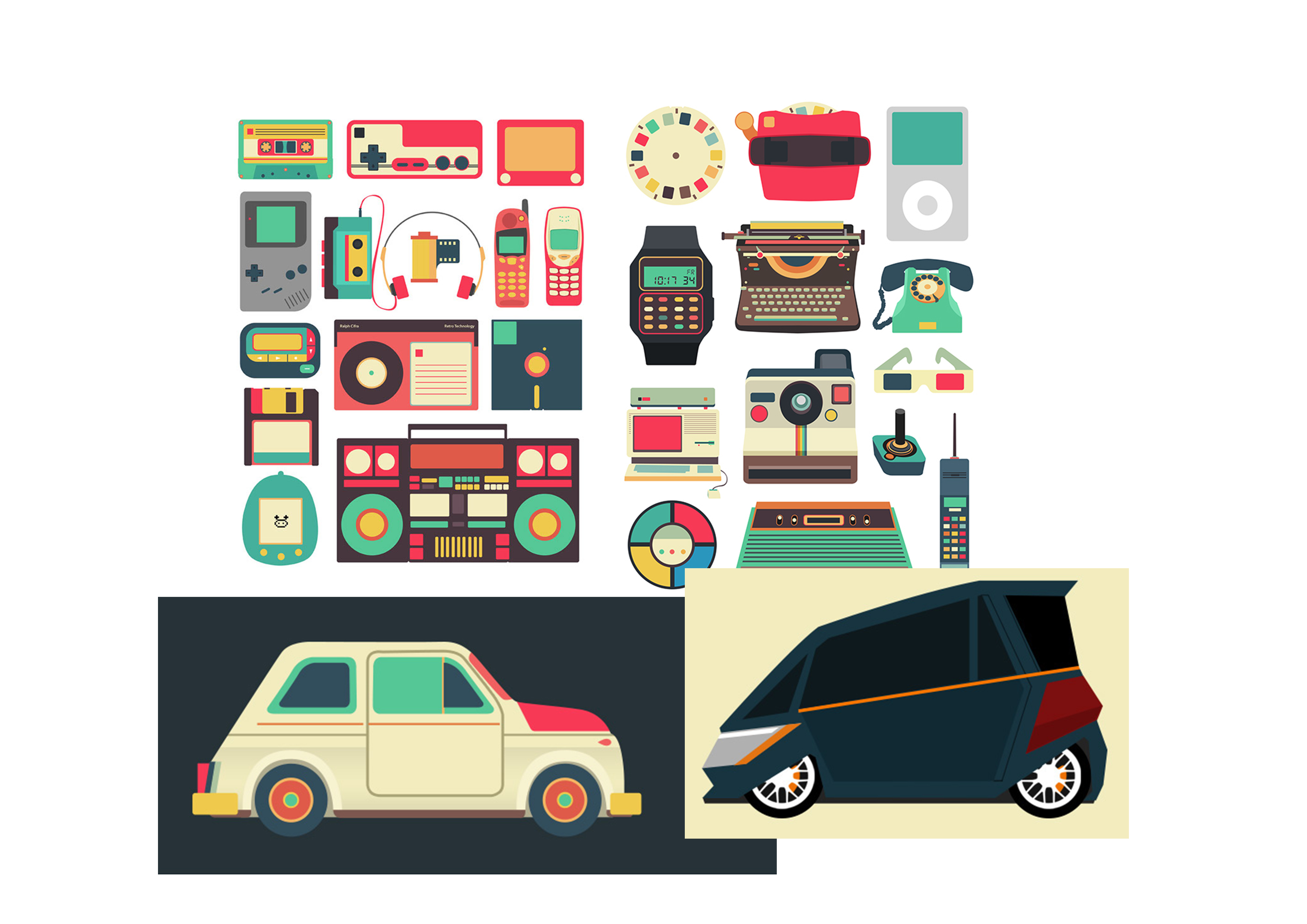
For the Astronaut idea, I aimed to go for a playful and sleek look to my illustrations. I wanted the typeface to be fused with astronomical features so I began drafting out rough sketches to see how they could be incorporated in my typography. I took a lot of inspiration and references from Ralph Cifra so that I could create something that is bold, easily identifiable (in terms of silhouette), but simple and clean. My sketches mostly consist of my attempts to force objects such as a satellite, an astronaut suit, and space shuttles, into my typeface.

Composition Breakdown:

https://oss.adm.ntu.edu.sg/a150067/wp-content/uploads/sites/176/2016/02/Typographic-Portraits-Astronaut.gif

Once I had a solid idea of which direction I was heading to, I began looking up for fonts that would best suit the characteristics of an Astronaut. It should be a sans-serif font since I wanted that “Space Invader” kind of look. So I finally settled with a font called Spaceport One. As seen from the image above, this is how I have constructed the composition. I altered the overall silhouette of the type and went to add on the essence of an astronaut with a dark starry background to complement the brightly-lit word. The ‘a’ is of a space helmet, the ‘N’ is of a constellation, the other ‘A’ is of a space shuttle, and the ‘M’ is of a satellite. I was heavily influenced by the works of SNASK.

2. Gambler:

Gambler

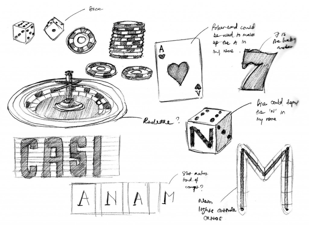
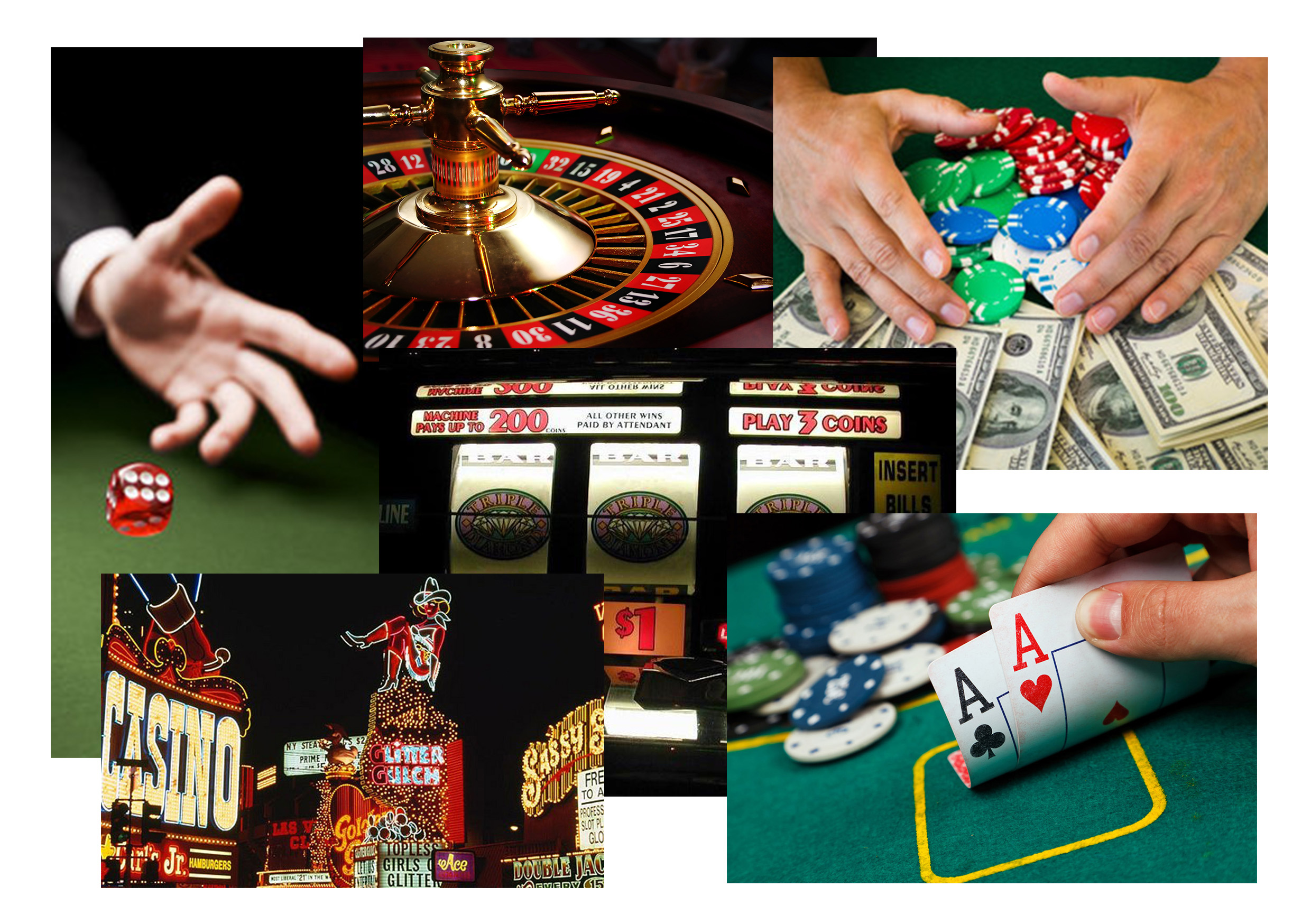
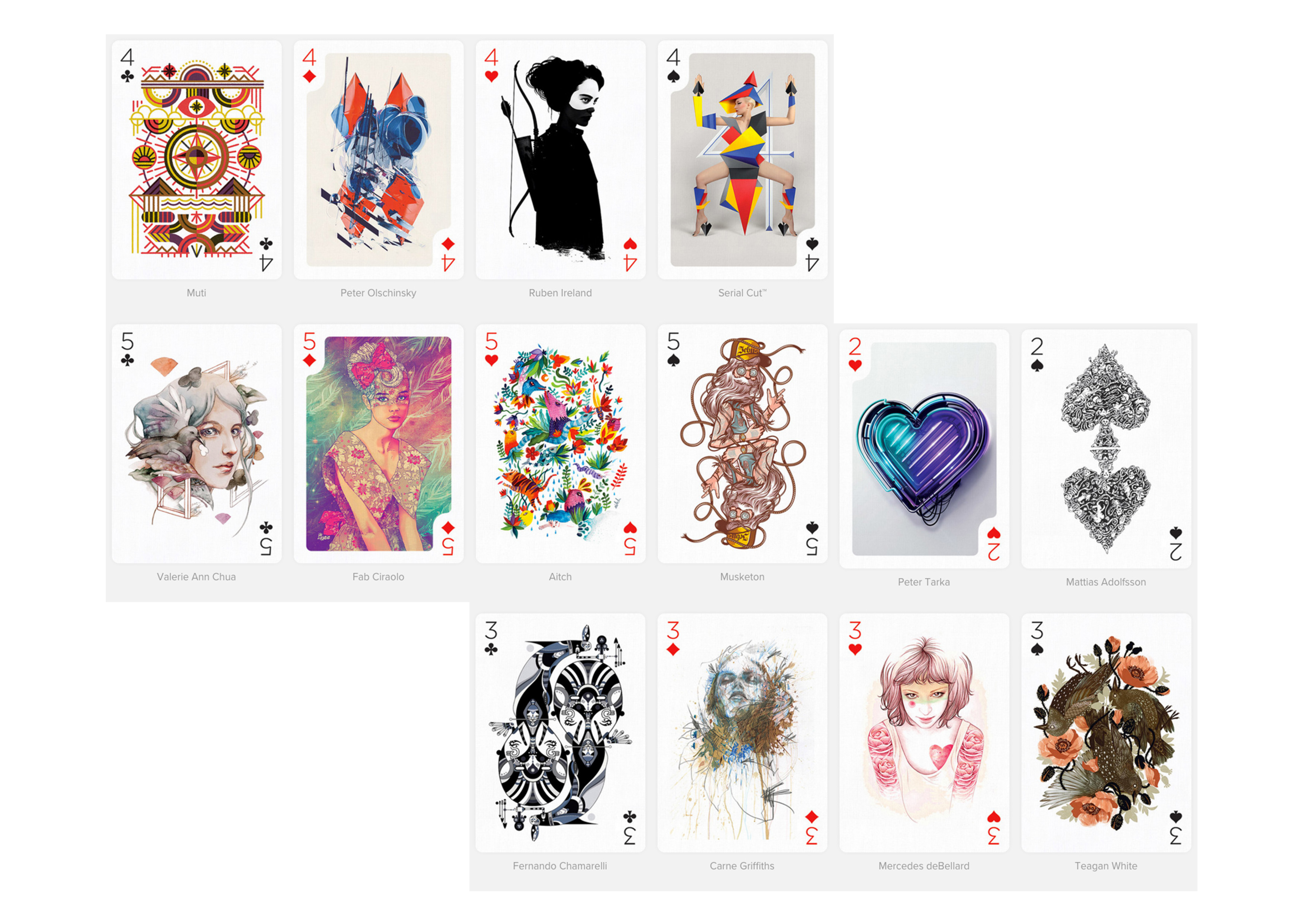
For the Gambler portrait, I had a casino theme in mind where all the objects should revolve around poker cards, poker chips, dice, roulette, slot machines and neon lights. I initially wanted to have different objects to represent each letter of my name but thought that it would be too similar to my Astronaut portrait. Then I decided to go with a style that looks more photo-realistic and more “in the moment”. However, I find the need to force my personal touch into it.

Poker-Cards

So I took a template of poker cards from the internet and alter the characters in these cards to look like my own. Much like how Mattias Adolfsson did with his illustrations. These characters are better representations of me, having a more friendly and jolly outlook. The Jack and King of Hearts were replaced with ‘N’ and ‘M’ instead to spell out my name in the deck. The difference is shown in the image above. The font used was

Composition Breakdown:

Typographic-Portraits-(Gambler)

After getting all the source images in, I arranged them in a manner where it appears like I am playing the game. It is more of stacking the objects on top of one another, starting from the “carpeted” table top all the way to the realistic lighting. I added shadows to bring out the objects to focus.

Insights:

The objects are arranged to be translated metaphorically, where the cards are what I have to offer (my personal strengths and attributes) in exchange for the reward of chips (success and monetary gains in life), while the dice represents the risks that I dare take to accomplish and win the game. The cards take a heavier portion of the composition to show that no amount of rewards could overwhelm my qualities (staying true to oneself and not sell out).

3. Editor-in-chief (Journalist):

Magazine-Covers

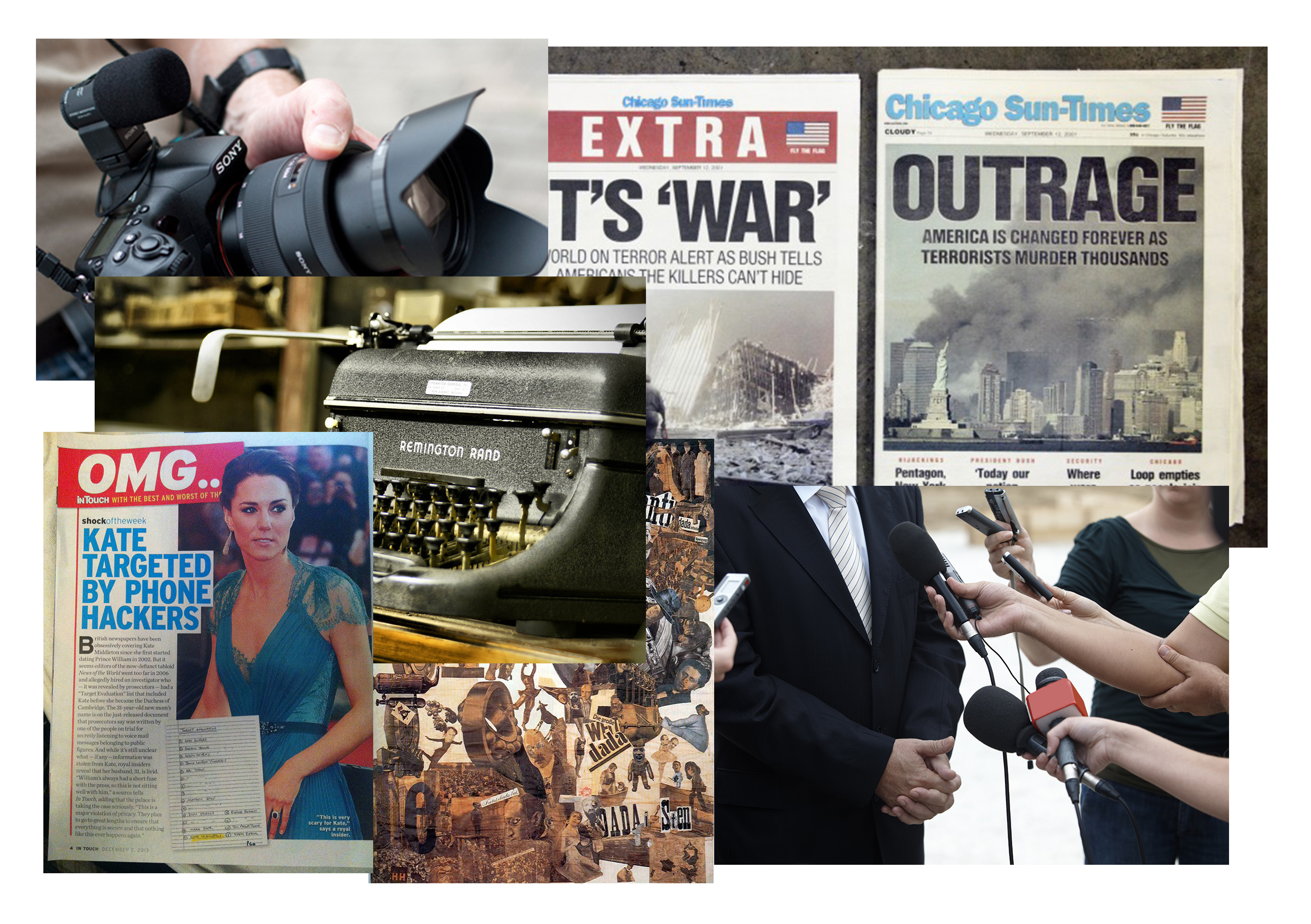
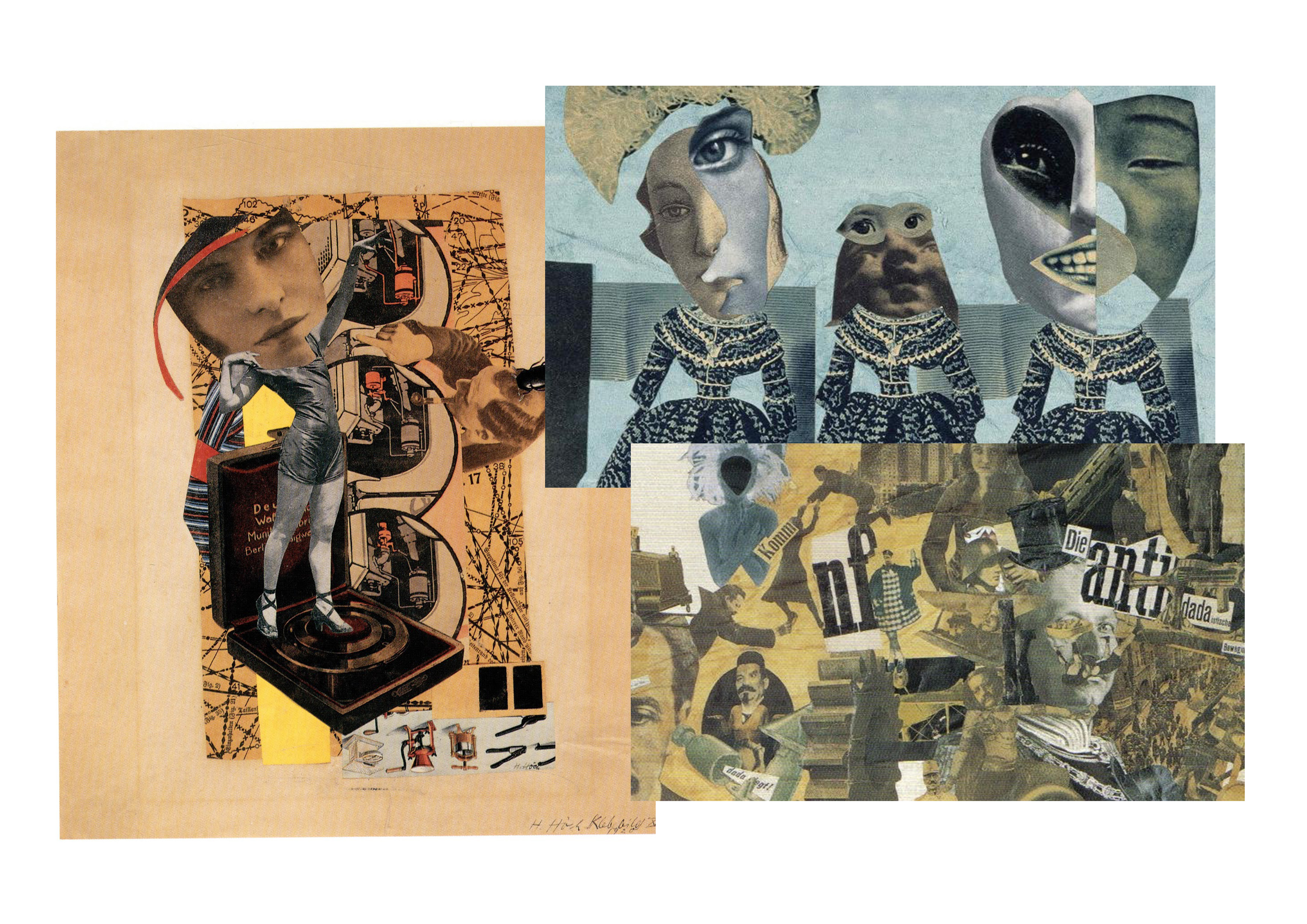
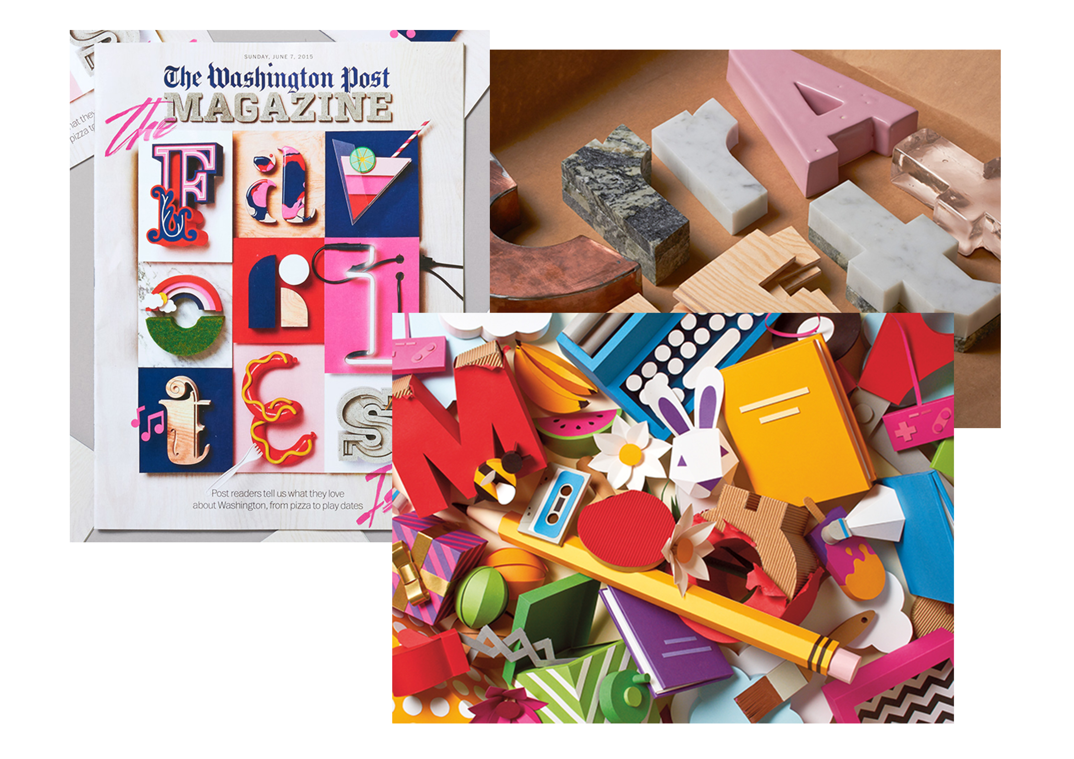
When you think about an Editor-in-Chief, you think of somebody in control of what he/she does and what he/she wants their readers to see or read. Power and influence com to mind when I was generating ideas for this typographic portrait. And what could be more powerful and influential than the massive number of highly controversial magazine covers of our time. I have pieced up and made a collage of magazine covers that has trended and became the hottest topics of discussion among the youths of our generation, be it good or bad. I have adopted the style of Hannah Höch of photomontaging for this piece of art.

Composition Breakdown:

https://oss.adm.ntu.edu.sg/a150067/wp-content/uploads/sites/176/2016/02/Typographic-Portraits-Journalist.gif

Upon compiling the magazine covers, I made cutout templates with the effect of ripped paper for the images and arranged them in a disoriented manner across the page. This was then enhanced with a crumpled-paper texture and sepia-tone filter to give it an old and vintage feeling. I have cut out letters of different fonts from several publications such as Maxim, The New York Times, Paper Magazine, and Times Magazine, to spell out my name in the typographic portrait. I’ve added shadow and tape to make the texts stand out.

4. Architect:

Buildings2
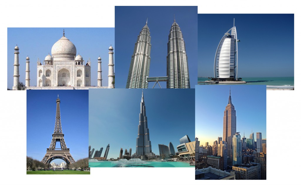
I had a clear idea of how I wanted to portray the Architect in me. I wanted the text to be written on a blueprint like how floor plans are done. But I felt the need to add more to the overall aesthetics. So I listed out some of the most iconic works of architecture in the world such as the Taj Mahal, The Eiffel Tower and Burj Khalifa. I also wanted it to look very tedious and detailed in terms of the textual information that is accompanied by the main typeface. I was also going for a sketchy texture to it.

Composition Breakdown:

https://oss.adm.ntu.edu.sg/a150067/wp-content/uploads/sites/176/2016/02/Typographic-Portraits-Architect.gif

After much thought put into it, I stuck with the integrity of a genuine blueprint where it is white ink over a blue background. The font that I started with was called Architecture, a sans-serif typeface. Once that was done, I blocked them out into simplified and unified shapes before adding the silhouettes of the iconic buildings which I have mentioned above. I went on to add the “sketchy” texture and overlaid the blueprint (with the grids) on top of the text before adding the accents such as lines, arrows and actual measurements of the buildings.


Thank you for taking time to read on my process & execution, do check out my
Research and Final Work here.

Typographic Portrait: Research

My name is Anam, and I am a …

My name, which was given by my late grandfather, in full translates to “a vessel in the sea” in Arabic. It is a metaphor for someone who explores the vastness of this world only to bring people closer together. And I believe that I am living up to the meaning of my name. I am someone who is goal-oriented, but somehow have not gotten a clear idea of what I truly aspire to be. Throughout the 22 years I have lived, my aspirations constantly change. With new insights of entirely new prospects, I come to realize that the reason for doing so was because I crave to try something new and to take risks. This is why I have decided to pursue Interactive Media as a major instead of going with my initial plans of sticking to Animation.

I have chosen my first name, Anam, to be expressed as Typographic Portraits in conjunction with six different occupations. And four of which (Astronaut, Gambler, Journalist and Architect), are professions I wanted to be in earlier in my life. While the remaining two (Optometrist and Air Traffic Controller) were ideas drawn from the aspirations of two of my very close friends.

But why? Well, I felt that every person is an embodiment of their pasts, be it good or bad. These are the things that have shaped us to be the person we are right here, right now. And this is the very reason why I have decided to work on them.

Idea Generation:

  1. Astronaut (Age 5-9)

    • An astronaut or cosmonaut is a person trained by a human spaceflight program to command, pilot, or serve as a crew member of a spacecraft. Although generally reserved for professional space travelers, the terms are sometimes applied to anyone who travels into space, including scientists, politicians, journalists, and tourists.
    • Personal Story to Share:
      At the age of 5, I had dreams of becoming an Astronaut. I guess it was due to my fascination with space, adventure and aliens that sparked my interest in astronomy. I used to watch Hanna-Barbera’s “Space Stars” and “The Jetsons” when I was younger. And I was lucky enough to have supportive parents who bought me astronomy encyclopedias to feed my adolescent mind.
    • Symbolic attributes: Adventurous, brave, curious
    • Aspects: Spacesuit, Rockets, Planets, Stars, Space Shuttle, SatelliteMoodboard_7_Astronaut
  2. Gambler (Age 10)

    • A gambler is someone who wagers money or something of value (referred to as “the stakes”) on an event with an uncertain outcome with the primary intent of winning additional money and/or material goods. Gambling thus requires three elements be present: consideration, chance and prize.
    • Personal Story to Share:
      People usually associate gambling with something negative such as greed and addiction. But as a 10-year-old, Hong Kong Triad movies were seen as something cool and bad-ass. And as I grew up, I realized that these bad-ass qualities turned out to be made of very positive attributes that I have shared below. However, my parents were not so keen on letting me thrive with such an influence. So my fad with it died down pretty fast.
    • Symbolic attributes: Intuitive, risk-taker, confident
    • Aspects: Casino, dice, poker cards, gambling chips, money, jackpot machineMoodboard_6_Gambler
  3. Journalist – Editor-in-Chief  (Age 11-13)

    • A journalist is a person who collects, writes, or distributes news or other current information. A journalist can work with general issues or specialize in certain issues, however, most journalists tend to specialize, and by cooperating with other journalists produce journals that span many topics.
    • Personal Story to Share:
      When I was 11, I began reading a lot, especially magazines like Reader’s Digest, National Geographic, and Times magazine that my parents subscribed to. Soon enough, I got into writing (which was paired well with my drawing skills). There was once I wrote a short story for a competition, and it got featured in my school’s magazine. From then onward, I was pretty keen on pursuing a career in Journalism.
    • Symbolic attributes: Audacious, charismatic, creative
    • Aspects: Camera, typewriter, microphone, newspaper, magazines, tabloids, articles Moodboard_3_Journalist
  4. Architect (Age 14-16)

    • An architect is a person who plans, designs, and oversees the construction of buildings. To practice architecture means to provide services in connection with the design and construction of buildings and the space within the site surrounding the buildings that have as their principal purpose human occupancy or use.
    • Personal Story to Share:
      As I grew older, I began to draw even more and write much less. I enjoyed perspective drawings. It was not until my aunt said that my sketches looked pretty architectural that I got more interested in the subject. I considered Architecture as a course of study after my ‘O’ levels. But I decided to take up Animation instead.
    • Symbolic attributes: Realistic, ambitious, organized
    • Aspects: Blueprints, buildings, construction site, drafting tools Moodboard_4_Architect
  5. Optometrist (inspired by a close friend)

    • An optometrist is an eye doctor. Optometrists examine eyes for both vision and health problems, and correct refractive errors by prescribing eyeglasses and contact lenses. Some optometrists also provide low vision care and vision therapy.
    • Symbolic attributes: Insightful, meticulous, observant
    • Aspects: Eye chart, glasses, contact lenses, phoropter, retinoscope, eyes Moodboard_1_Optometrist
  6. Air Traffic Controller (inspired by a close friend)

    • Air traffic controllers are people trained to maintain the safe, orderly and expeditious flow of air traffic in the global air traffic control  Controllers apply separation rules to keep aircraft at a safe distance from each other in their area of responsibility and move all aircraft safely and efficiently through their assigned sector of airspace, as well as on the ground.
    • Symbolic attributes: Vigilant, foreseeing, collected
    • Aspects: Airplanes, radar screen, aircraft marshaling, plane plotter Moodboard_2_ATC

Artistic Approach:

In terms of the artistic style that I have adopted for this project, I have studied and gained inspiration from the works of Hannah Höch, Ralp Cifra, Mattias Adolfsson and SNASK. I did not want to stick to a common style for my 4 panels as I wanted to delve into much diverse means of expressing my ideas. So I have decided to make each panel different from each other.

Hannah Höch is a German Dada artist most notable for being the pioneer of the art form known as photomontage. Many of her pieces sardonically critiqued the mass culture beauty industry at the time, gaining significant momentum in mass media through the rise of fashion and advertising photography. Many of her political works from the Dada period equated women’s liberation with social and political revolution. In particular, her photomontages often critically addressed the Weimar New Woman, collating images from contemporary magazines.

1

SNASK is an internationally renowned creative agency (based in Stockholm, Sweden) that makes kick ass branding, design & film. I was reading an article and chanced upon their work. And I was so amazed at how bold, simple, and yet elegant their typography works were. And their biggest and most renowned project so far was done for The Washington Post. I wanted to incorporate their crafty sense of design and bold use of colors for this project.

4


Mattias Adolfsson is a Swedish illustrator whose work have truly inspired part of my drawing style. He has a very distinct way of expressing the characters in his artwork. And while he has a lot of wonderful works in his gallery, I was really drawn to his poker card designs which were cleverly personalized and are bursting with emotions. I was keen to showcase some of my illustration styles in this project without overly using them and ignore exploring other means of artistic expression.2

Ralph Cifra is a Philippine-based visual artist, illustrator, and graphic designer. His illustrations were beyond awe-inspiring. He has a really good sense of colors and he is known for making simple, yet vivid and prominent silhouettes when it comes to illustrating everyday objects. His vibrant interpretation of these everyday objects has made his designs pleasantly eye-catching. I desire to achieve such traits with my type designs.

3Thank you for taking time to read on my research, do check out my
Process & Execution and Final Work here.

A Line is a Dot That Went For a Walk

My concept of expressing these 18 emotions was heavily inspired by how the physical body reacts and feel in coherence to evoking them. For instance, when you’re anxious, you tend to scruff your hair, grit your teeth, bite your finger nails, your cheeks would blush and you might have that tingly, uneasy feeling in your skin. With these reactions in play, I have portrayed them with the simple use of lines, shapes and tones. Below are the designs elaborated further:
Final_3

  1. Anxious
    Noodles sliding and latching onto the hills and valleys (the ups and downs when you are feeling anxious) of the drain. There is no sense of balance as gravity is acting on both the upward and downward forces giving the lines an uneasy, squeamish and uncomfortable feel.
  2. Embarrassed
    Tiny black, unstable triangle hiding in the comfort of surrounding tiny triangles, away from the bigger black ones in the outer parts of the spiral to show how one would want to flee from embarrassment. The triangles are arranged within the Fibonacci curve as it loosens in density as it spirals outwards.
  3. Bizarre
    Disoriented triangles of different sizes were placed against the organized, uniformed triangles at the bottom to make the contrast between normality and the outlandish much more prominent. More patterns such as scales, curls, waves and dots to amplify the eccentricity of the strip.
  4. Exhausted
    Slow-moving, heavy and sluggish drips of paint running across the strip to show the feeling of worn out and weary. Lines were added inside the individual drips to give it more weight and volume.
  5. Fragile
    Sticking much closer to how fragile nature is, I have decided to draw out a spider web to show the frailness of this particular emotion. You feel vulnerable, weak but delicate. The reason why I have put in two different focal points was to display the contrast between the tighter and the looser areas of the web where it is more susceptible of being destroyed.
  6. Systematic
    When I imagined this emotion in my head, I could distinctly see myself as a string of emails/information flowing through cyberspace to be delivered to another place. The organised and orderly movement clearly shows systematic. I have drawn the planes moving towards a vanishing point to bring out some dynamism as opposed to leaving it flat.
  7. Lyrical
    To project such an emotion, my body is required to pulsate a positive and harmonious vibes. Which explains why I have used curves instead of straight lines to show a much fluid movement with the tiny bits floating in space, acting as the remnants in the debris from the pulsation.
  8. Turbulence
    I envisioned this strip to be nothing but utter turmoil and violence. I wanted quick and storm-like movements  with a hint of danger as it spirals inwards. The sharp pointy lines were added to create a much angrier texture.
  9. Nonsensical
    My main focus for this design was to push the boundaries of how foolish and idiotic it could possibly get. Random shapes and lines were overlapped on top of one another to distort the balance and symmetry that would make it too conventional. Bigger shapes were made darker to build a sense of heaviness in the background without forgetting how light and agile the lines in the foreground are.
  10. Psychotic
    Taking inspiration from lava lamps and the effects made when paint, oil, and soap are mixed, I have came up with a slightly insane and deranged pattern. This is how I would imagine our abstract minds to be when we experience demented thoughts. A myriad of tonal values were used in this strip.
    Final_4
  11. Ambiguous
    When your thoughts are blurred, unclear, vague, or you simply cannot seem to make up what you dreamed of last night when you were soundly asleep. I used ink and blew the drops with straws to create a frilly trail downwards. I have left a lot of space empty to symbolize what our minds could not comprehend or decipher when our thoughts are obscured.
  12. Distracted
    Flashing directional arrows that conflicts with one another to portray distraction. The smaller one is of darker tonal range to show contrast against the bigger one. This is how I see our train of thought when something distracting occurs.
  13. Sensual
    Tapping into and taking inspiration from the works of Norwegian photographer, Solve Sundsbo, I have produced an abstract piece that closely resembles with his photographs of projecting light trails on women’s bodies. The curvy, voluptuous and voluminous lines crammed so close to one another displays “sensual” prominently.
  14. Sloven
    I would like to call this strip an “structured mess” mainly because my interpretation of “sloven” is to be careless. So when you are careless, despite being very organized, you would be able to see the untidiness within. I have used circles to show some order while I filled the insides with messy lines and paint splatters to orchestrate sloven.
  15. Spontaneous
    Fast lightning bolts shooting out from the corner of the strip to show spontaneous. I have made the bolts differ in thickness, opacity and frequency to illustrate speed as they complement each other. And I wanted to create the illusion of light dispersing from the corner. Hence, leaving the rest of the space white and empty.
  16. Aggressive
    Being heavily inspired the breaking and smearing of charcoal pieces, I captured the aggressiveness in the strokes that they leave behind when being dragged across the surface. The broken pieces emulate a sense of force and insistence which does not necessarily mean angry, but aggressive!
  17. Awkward
    When you are feeling awkward, you tend to get this tingly, uncomfortable and unsettling feeling on your skin. Very much like how I would imagine acupuncture to feel like where needles are pierced into the skin to relieve some tension built. I have created layers of lines with different tones to illustrate a sense of density. Thorns were added to the needles to give them a much unpleasant effect.
  18. Indecisive
    A path that starts with a crossroad and slowly inclines into a maze of trails to show how indecisive one could get only to end up from where they started. I used the patterns on pebble paths with different tones to show how close or distant they are from the foreground.


Research

Research


For my research and development, I first looked up for the meanings as well as synonyms of each emotion to fully understand how I could effectively evoke them.

Afterwards, I went to google to find images of different patterns, expressions and objects that I find relatable and significant to the art I was expressing. Some of these images displayed obvious and more prominent emotions while other images goes deeper into showing microscopic organisms that are invisible to our naked eyes, but shows a lot of aesthetics.

I have had some references from other artistes as well. A few of whom were Dutch painter, Piet Mondrian, and Norwegian fashion photographer, Solve Sundsbo, where he reflected light patterns on the human body (see “Sensual”).

Below are the mood boards I have created, in addition to the definition I have found on the internet, to allow me to brainstorm more ideas and have a clear understanding before executing my designs:

Ref_1Ref_2Ref_3Ref_4Ref_5Ref_6Ref_7Ref_8Ref_9

Experimentation, Process & Documentation

The initial stages of this project consisted of the methods that has led to how I would achieve the results that I have envisioned to express the 18 different emotions. I have decided to go with a flatter, much cleaner way of translating these emotions onto paper.

The concept behind the designs was how the physical body reacts and feel in coherence to evoking these emotions. For instance, when you’re anxious, you tend to scruff your hair, grit your teeth, bite your finger nails, your cheeks would blush and you might have that tingly, uneasy feeling in your skin. With these reactions in play, I have portrayed them with the simple use of lines and tones.
Mediums & Materials
For this project, I have worked with Chinese ink, brushes, straws, 0.1mm & 0.5mm graphic pens, brush pens, markers, pencils and ball-point pens to achieve the final results.

Exp_1Exp_2Exp_3Exp_4Exp_5Exp_6I have drafted out three or more sketches of the each emotion in my journal to bring out the best aspects of that particular design and develop further on the final ideas. After much consultation, some ideas were scrapped while others were combined and cross-incorporated to become my finalized design.

With each design, I have given a brief explanation as to why I chose to express the emotions in that particular way.

Process