Point of View: Final Outcome

Voila! Here are the final 6 illustrations for my Point of Views.


The sheep from the point of view of an insomniac is 1…2…3…

Point_of_View_1


The sheep from the point of view of a shepherd iz dolla bill$!

Point_of_View_2


The sheep from the point of view of a shear is his 3 o’clock client.

Point_of_View_3


The sheep from the point of view of his wife is  baaad boy!

Point_of_View_4


The sheep from the point of view of Damien Hirst is half a sheep.

Point_of_View_5


The sheep from the point of view of a goat is her gay best friend.

Point_of_View_6


Thank you for taking time to check out my work. In case you missed it, do check out my Research and Process & Execution here.

Sincerely,
Anam Musta’ein

Point of View: Process & Execution

After studying the works of Fran Krause, Alexandra Ball and Andreas Besser, I tried to fuse their styles together and incorporate that into my existing style. What I tried to achieve over the process of my work was a style with clean line work (varying in thickness and swiftness), a misty and grungy look in terms of color and texture, as well as a painterly finish in all my illustrations.

These artists all have one thing in common – they all did illustrations for children’s books. And I guess that is what my style is more appropriate for. Coming back to the point that the sheep is associated with child-like characteristics, it is obvious as to how I would like to execute my final images. However, due to the mature content of my POV ideas, it creates humor and irony as the style clashes with the message. And I guess that is the very factor that makes my artwork for this project more interesting.

Sketches:

Sketches

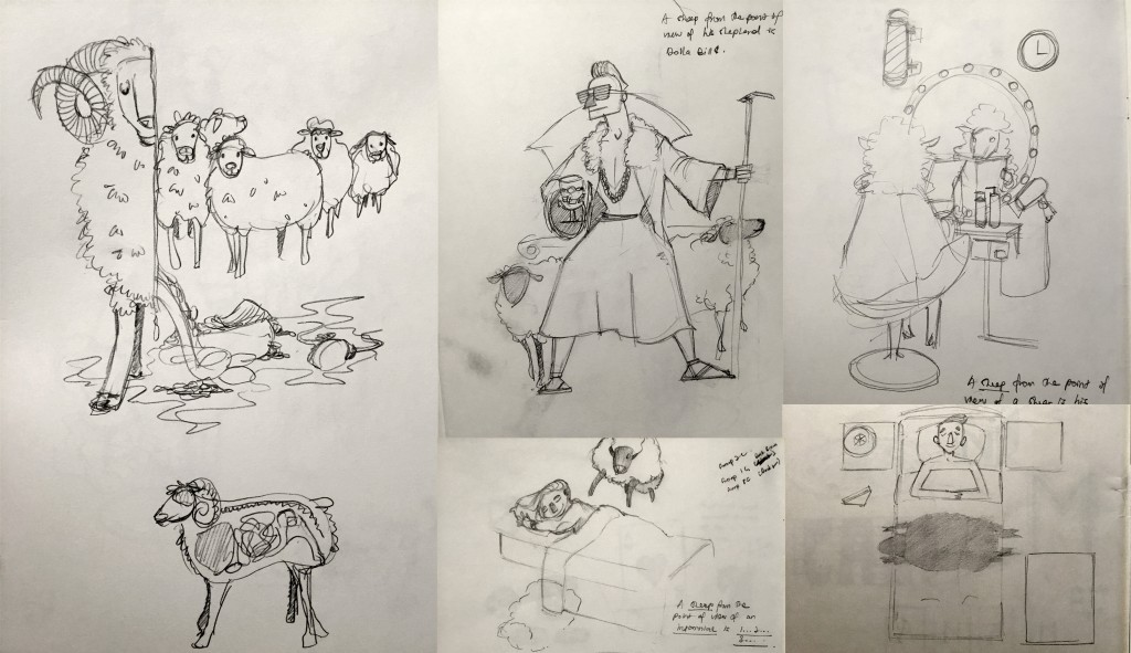
I started out with basic sketches in my sketchbook. With the POVs finalized, I had a clear idea of what objects I would like to feature in each and every image. There were drafts that were scrapped and there were some which were scanned, traced over in Photoshop, and further developed.

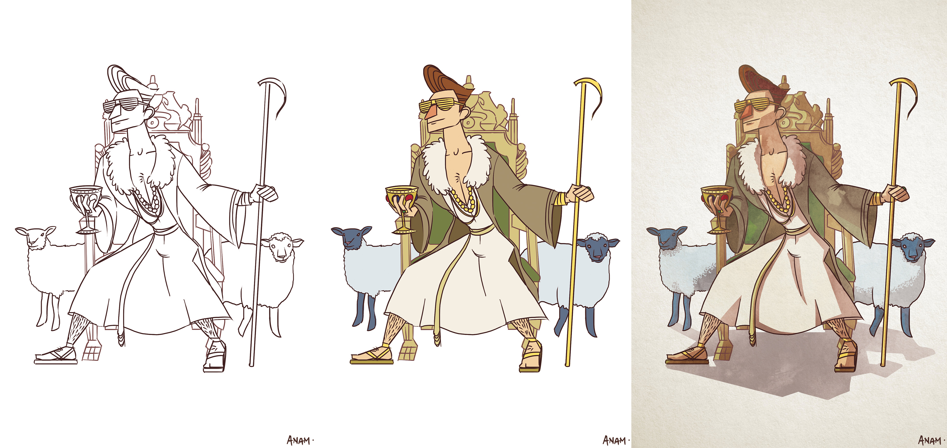
Below are all breakdowns of how the final look of the image is achieved. For almost all of the POVs, I started out with a basic sketch eventually turned into a cleaner and more refined line work, before adding the basic colors in and eventually visually enhanced with light, shadow, texture, and gradient.

The painterly effect was achieved by overlaying a mono-toned water color layer over the refined image. This gave the illusion of the illustrations being hand-painted instead of being digitally-drawn. This effect gave the illustrations a dark, comical and yet demented look due to the grungy texture of the paint blobs.
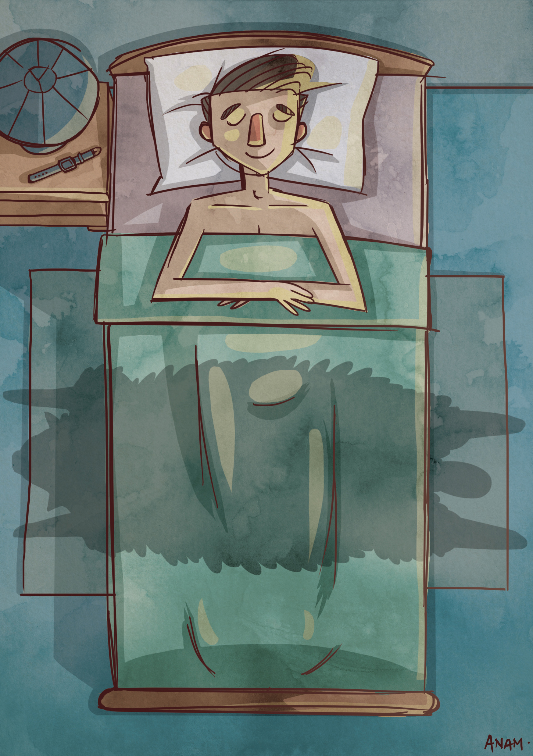
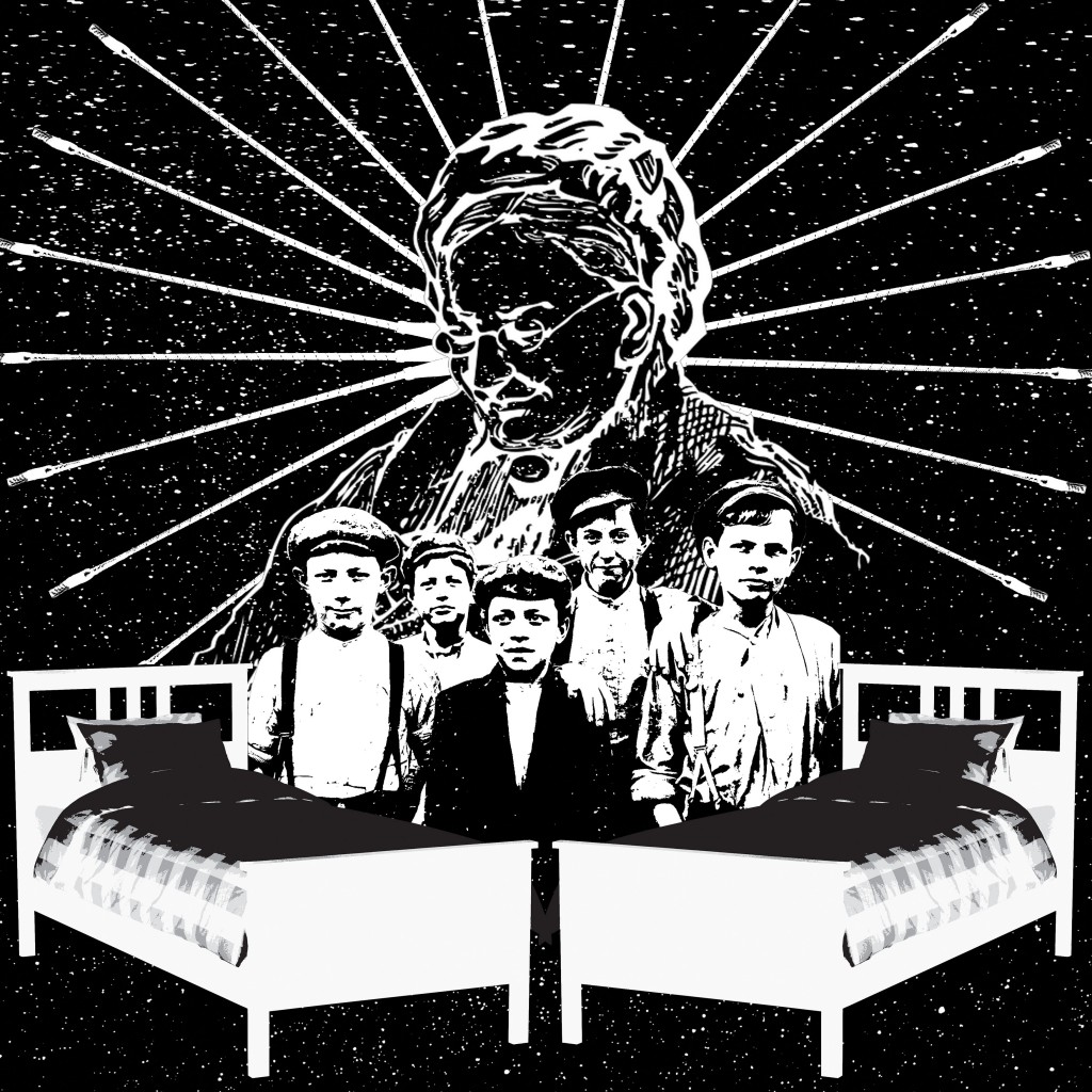
1. The Insomniac:

Point_of_View_1

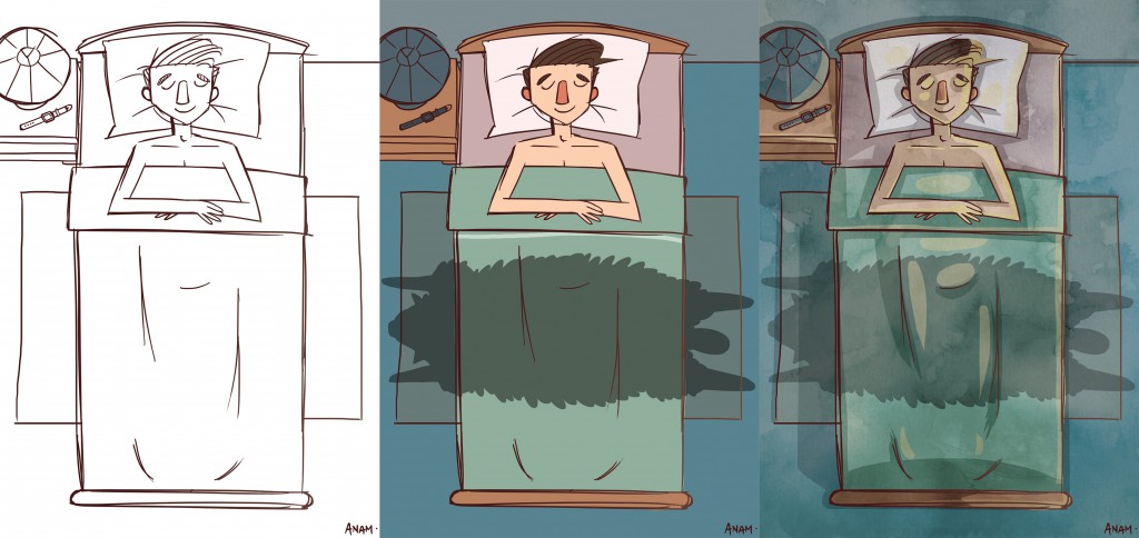
“The sheep in the POV of an insomniac is 1…2…3…”

Initially, I was thinking of portraying the insomniac through the cross-section of his bedroom with the sheep featured in it. But I decided that it would be better if the sheep was depicted as a play of the insomniac’s imagination. Therefore, only the sheep’s shadow is seen as it leaps over the insomniac’s bed. It is a bird’s eye view of the insomniac’s room creating a more axial composition. Cool colors were used with a hint of orange to give balance to the composition.
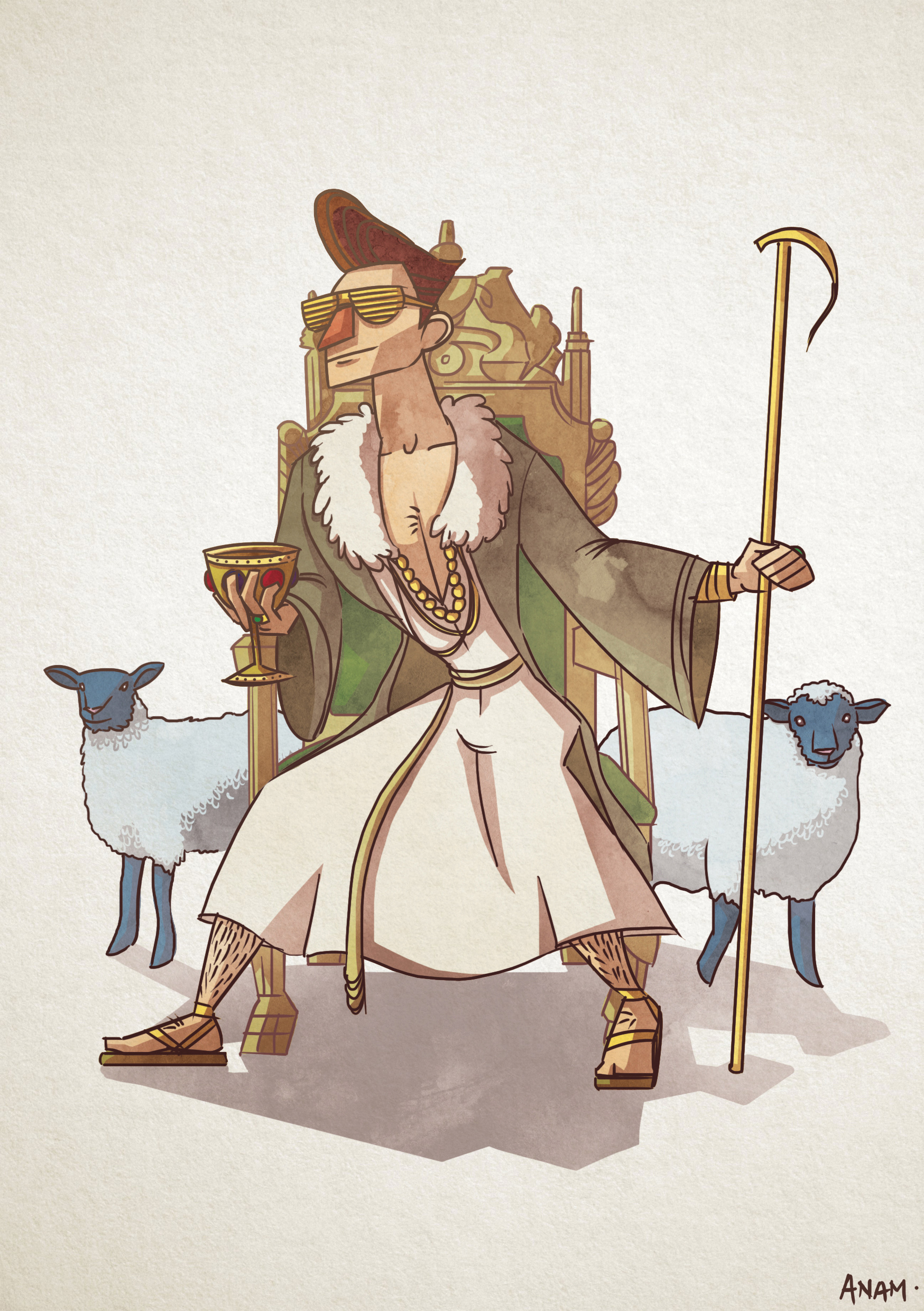
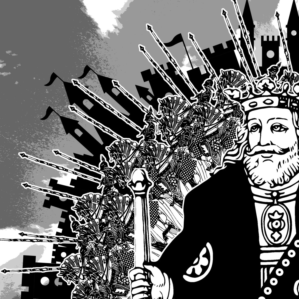
2. The Shepherd:

Point_of_View_2

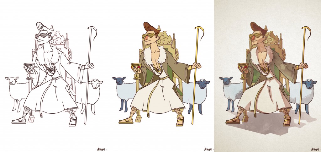
“The sheep from the POV of a shepherd iz dolla bill$!”

This is a play with words where pop culture has influenced the terminologies that replaced money and wealth. Since the shepherd is often referred from biblical times, I have decided to modernize it and give him gold shutter shades, gold chains, bling-blings, a throne, a bejeweled chalice and a golden cane. The sheep surrounds him like peasants. And in this arrangement, it created a triangular composition where the shepherd is at the top of the hierarchy. Yellow tones were used on the shepherd to accentuate his wealth and happiness over the sheep.
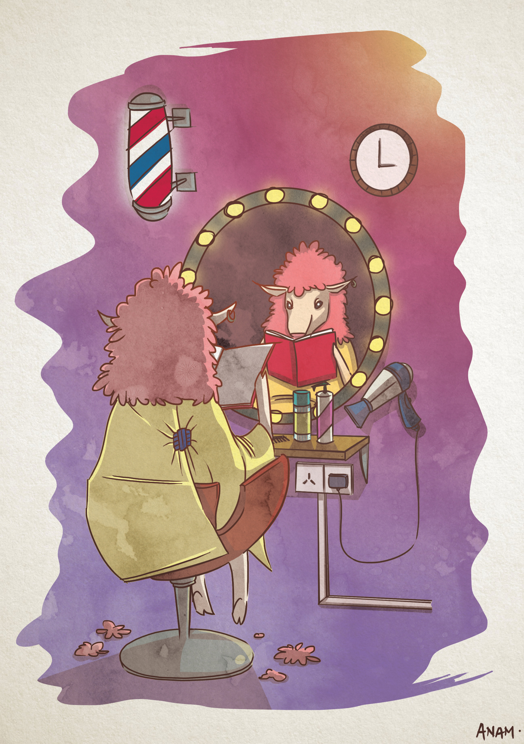
3. The Shear:

Point_of_View_3

“The sheep from the POV of a shear is his 3 o’clock client.”

As you know, the shear is used to shave the wool off the sheep by farmers. If I were to personify the shear, he would definitely be the barber/hairdresser to the sheep. So in this illustration, I have made the sheep a regular customer of the shear. More vibrant and louder colors were used in this image to display a sense of fab and to create the ambiance of a salon. I have emulated the same type of framing as the one used by Andreas Besser.
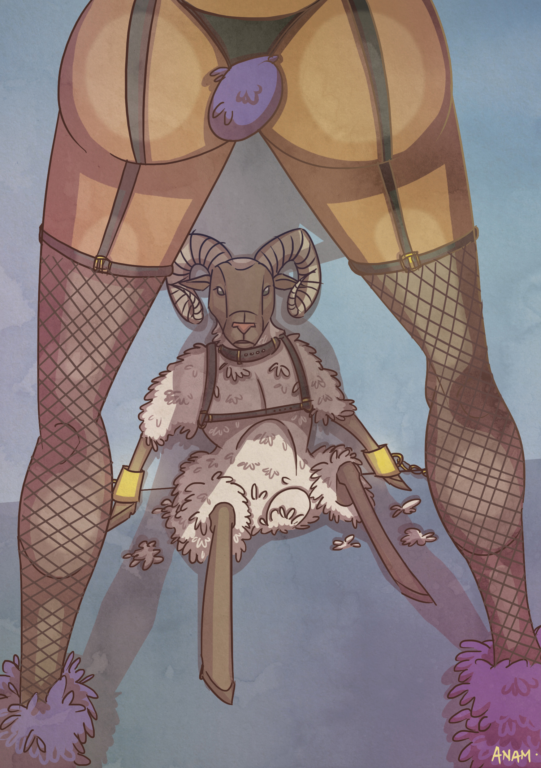
4. The Wife:

Point_of_View_4

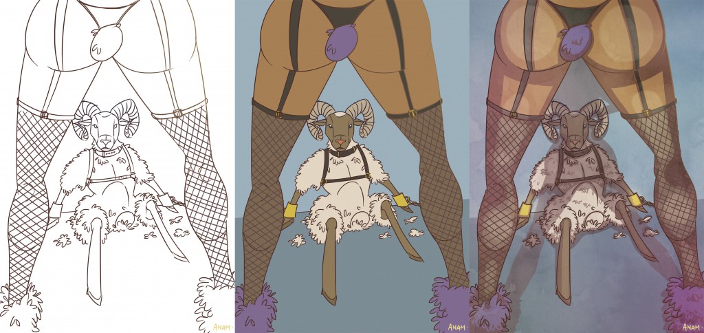
“A sheep from the POV of his wife is a baaad boy!”

This is a pun used to humanize the relationsheep of the sheep and his wife where they get a little bit playful in their private space. There is also pop culture references in this illustration such as the BDSM-ensemble the characters have put on as well as the large behind (excuse my language) of the wife. Purple stands out the most in the image, with mists of pink, to create a more sensual and sultry scene. Dramatic lighting is used to push the shadow casting on and framing the sheep in a triangular composition.
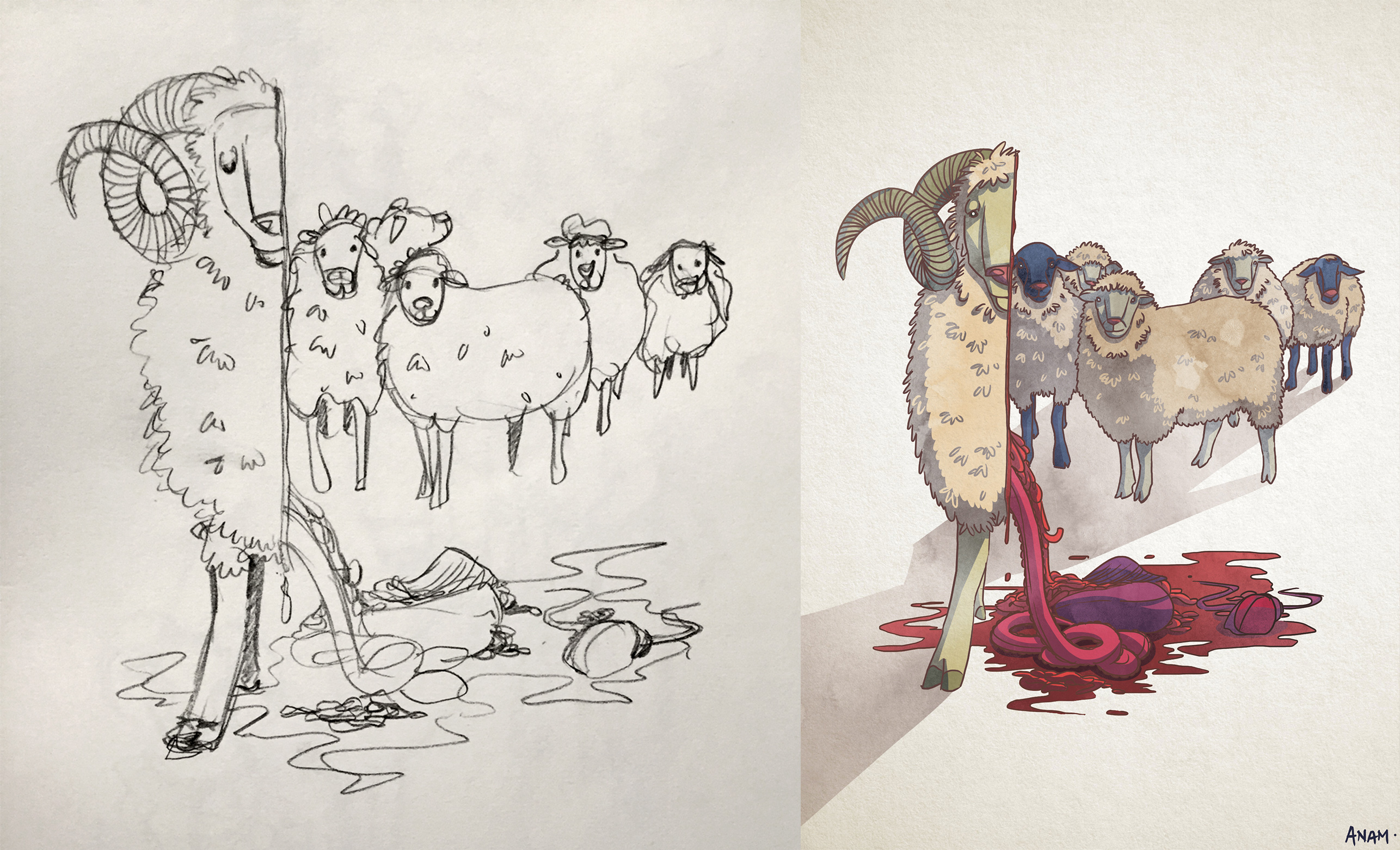
5. Damien Hirst:

Point_of_View_5

“The sheep from the POV of Damien Hirst is half a sheep.”

Damien Hirst is a famous English artist known for dissecting animals and cutting them into half for his displays. Although his artwork are usually seen from the cross section of the animal, I have decided to put the sheep in a different view where you see its organs slipping out of its body. All that happening while his sick sheep-friends watch. I wanted to achieve a gruesome and a slightly deranged humor in this illustration. The shadows of the sheep are placed in a position that creates the illusion of elevation.
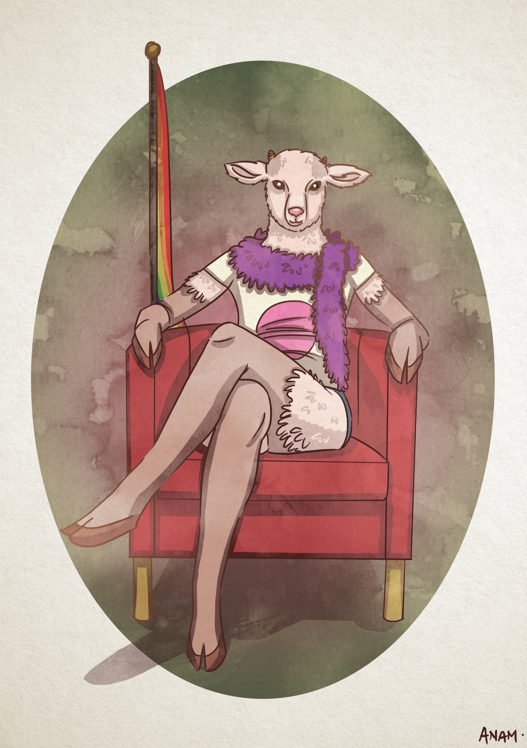
6. The Goat:

Point_of_View_6

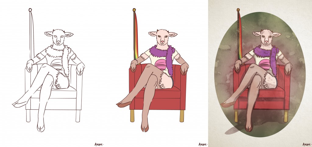
“The sheep from the POV of a goat is her gay best friend.”*

Since the sheep is blessed with the gift of its fleece, I thought that it would be funny if it is compared to the fur of a goat, where it is seemingly non-existent next to the sheep. In a way, it makes the sheep much more fabulous in comparison. And that is why I have associated it with “the gay best friend”. There are also hidden innuendos in the illustration such as the flag and the shirt. The sheep is encapsulated in an egg-frame to show sureness and confidence.

*Disclaimer – No intent in discriminating against any social groups.


Thank you for taking time to check out my work. In case you missed it, do check out my Research and Final Work here.

Nursery Rhyme (Project 2)

In this assignment, I have carefully thought about how I could play around with the elements in the given nursery rhyme while staying true to the integrity of its design. I envisioned my work to be portrayed in an out-of-this-world context and have a little fun in recreating the original story of the rhymes.

The 4 examples that I am about to share are amongst the best out of the several drafts and experimentation I have done. The design elements and principles were never neglected in the process of creating these images.

The main theme and highlights of my artwork is the energy and level of activity present in the following imagery. I hope to direct the flow of the eyes for the people who view my images by the use of lines, tones and textures. Each of these images has it’s own special texture.

Print

  1. “The cow jumped over the moon.”
    from the nursery rhyme “Hey Diddle Diddle”.

    In this design, I have employed Hierarchy and used it to the very best. Notice that your eyes are more glued to the cow placed in the bottom left of this image despite having other cows filling up the remaining parts of the canvas? That’s because I have intentionally enlarged the size of that cow to give it a higher hierarchical importance.It is even placed on a third, so naturally your eyes would be more drawn to it. Additionally, that cow is placed exactly at the center of the moon (a circle) as opposed to the rest being arranged along the rims. This adds to its importance in comparison to the others.

    I have also incorporated some Rhythm into the design. I have multiplied the cows and arrange them along the curve of the moon creating a repeated pattern. And that pattern has been repeated to additional curves that pulsate outwards. It is literally music to the eyes.

    Project 2_05

  2. “There was an old woman who lived in a shoe.” 
    from the nursery rhyme “There was an old woman who lived in a shoe”.

    For this design, I have decided to focus more on Symmetry. The shoes that were arranged to form a shelter for the old woman is mirrored to create a balance on both axis. This image feels rather harmonious creating a sense of home for the old woman who resides in it. The symmetry also gives a sense of familiarity and comfort, which further represents how a home should feel like.I have played with the transparency of the inner shoe-pillars to create a sense of depth and space. With it being shrunken and faded, it fools the eyes into creating perspectives in the imagery.

    I have left the center white to play with space and give contrast to the old woman so that her silhouette becomes even more prominent. The difference in tonality also plays a huge part in determining which objects are closer.

    Project 2_08

  3. “Then whipped them all soundly and put them to bed.”
    from the nursery rhyme “There was an old woman who lived in a shoe”.

    I have made the usage of Axis more pronounced in this artwork. I have used the whips and have arranged them in a circle around the old woman. Since these whips are arranged in such manner, it portrays a sense of stability and order around the old woman. Symbolizing power and authority over the children. The whips were also used as movement for the eyes. You could see that they act as leading lines to bring the old woman into focus.I have also used imaginary lines from the arrangement of the objects to create Reinforcement. The bed, the children, and the old woman are placed in a way that they form a triangle/pyramid. And as we all know, triangles are often associated to power and fear. And since the old woman is at the top of the pyramid, it puts her at a much higher level of authority.

    Negative space has also been implemented here to further bring out the silhouettes of the characters and objects present in the artwork. It also portrays the night sky, showing that it is bedtime for the children.

    Project 2_11

  4. All the king’s horses and all the king’s men.”
    from the nursery rhyme “Humpty Dumpty”.

    Rhythm plays an important role in this image. The king’s men and horses were arranged repetitively in a staggered manner and the silhouette of buildings in the background is also arranged orderly within the quadrant. However, the king is placed in the bottom right, breaking the chain of repeated patterns. When patterns are broken, it makes the subject much more special and important.The king is also enlarged to symbolize power and order over the men and the horses. He appears to be in charge of everything that is going on in the image.

    And if you notice, the staffs, buildings and the king’s eyes are all directed out of the canvas. It leaves some sort of mystery on what they are about to uncover. But due to the way they are arranged, it generates a lot of energy from inside out.

Design Principles

  1. Axis

    1

    Axis is the most basic and most common organizing principle. Simply stated, axis is an imaginary line that is used to organize a group of elements in a design. In diagrams, axis is represented as a dashed line.

    • Alignment

      Axis is mainly used to align elements. When elements are arranged around an axis, the design feels ordered. As with most things in life, we enjoy things that are ordered because they feel more stable, comfortable and approachable.

    • Movement

      When we encounter something linear, such as an axis, we naturally follow the line in a direction. If we arrive on a street, we walk down the street. If we open an elevator into a long hallway, we walk down the hallway. Lines prompt movement and interactions. The direction of movement depends on the end points. A defined end point signals a place to start or stop.

    • Reinforcement

      Although axis is an imaginary line, you can make it more apparent if the edges of surrounding elements are well defined. A common example of this concept in architecture is a city street. The city street is an axis that is reinforced by the buildings on both sides. If a portion of the street is missing a building on one or both sides, the street’s axis would not feel as strong.

    • Continuous

      If an end point is undefined, you will follow the axis until you reach something of interest or are tired of interacting with the axis. While the concept of an undefined end point in architecture is uncommon since it’s difficult for something architectural to go on forever, it’s becoming more popular in product design with infinite scrolls.

  2. Symmetry

    2

    Symmetry is when elements are arranged in the same way on both sides of an axis. Perfect symmetry is when elements are mirrored over the axis and exactly the same on both sides.

    • Balance

      Symmetry adds balance to a design. When elements are the same on both sides of an axis, the design feels harmonious. If we design a street with five houses on one side and five on the other, walking down the street would feel comfortable because the arrangement of homes is balanced.

    • Asymmetry

      Designs are asymmetrical if the arrangement of elements are different on both sides of an axis. If we design a street with five houses on one side and one on the other, the street will feel unbalanced and perhaps uncomfortable.

  3. Hierarchy3

    Hierarchy is when an element appears more important in comparison to other elements in a design.

    • Size

      An element will appear more hierarchical if it is larger than other elements in a design. We naturally look first at the largest element in a design. If there are five windows on the front of a building, and one is twice the size of the others, our attention will focus on the biggest window first.

    • Shape

      An element can also appear more hierarchical if it is different than other elements in a design. We naturally look first at the irregular shape in a design. If there are five of the same windows and one door on the front of a building, our attention will focus on the door first.

    • Placement

      Last but not least, we can place elements in more hierarchical positions. Within a circle, the center is the most hierarchical. The end of an axis is naturally more hierarchical than points along the line.

  4. Rhythm

    4

    Rhythm is the movement created by a repeated pattern of forms.

    • Pattern

      The best way to understand rhythm is to think of a song. Songs have rhythm when a piece of the song repeats. When listening to a song with good rhythm, we recognize the pattern and begin to expect beats.

    • Breaks

      A break in rhythm will appear more hierarchical. Think about a song. When a song has a repeated rhythm and the rhythm is broken, something quite special usually happens.