Assignment 2: ‘The Oceanic’ Exhibition Report

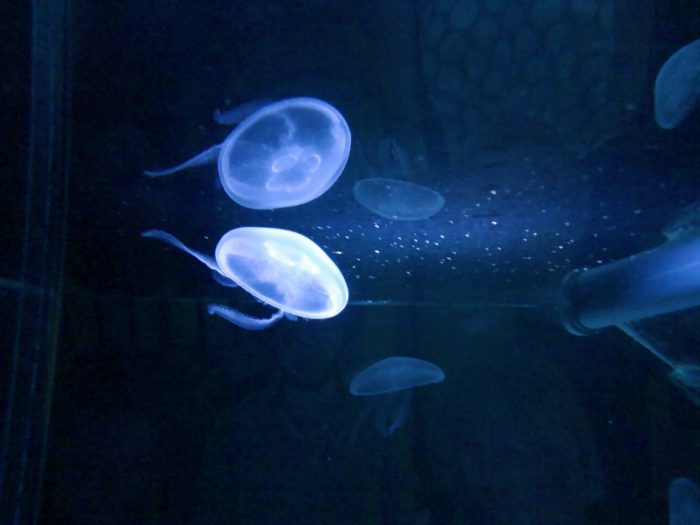
“Tue Greenfort, Tamoya Ohboya, 2017.”

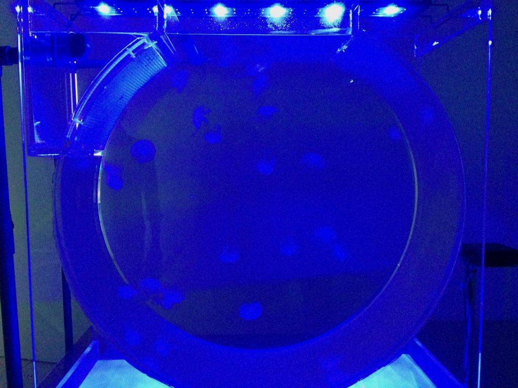
Stepping into The Oceanic exhibition at the NTU Centre for Contemporary Art Singapore, the Tamoya Ohboya, an installation by Tue Greenfort, caught my attention. The neon cyan light that glows beyond its display with the very organism that the piece was named after, hovering and floating inside the aquarium was a visual ecstasy. It exposed me to the feeling of calmness yet a certain degree restrain as it immerses its viewers into an artificial habitat.

The Tamoya Ohboya is a species of box jellyfish that is native to the waters of the Dutch Caribbean islands. The species have been in existence for over 500 million years, and thrives only in ideal temperatures and water conditions. Due to the warming of the ocean’s temperatures, researches have observed an increase in the migration of these organisms to new geographical waters.

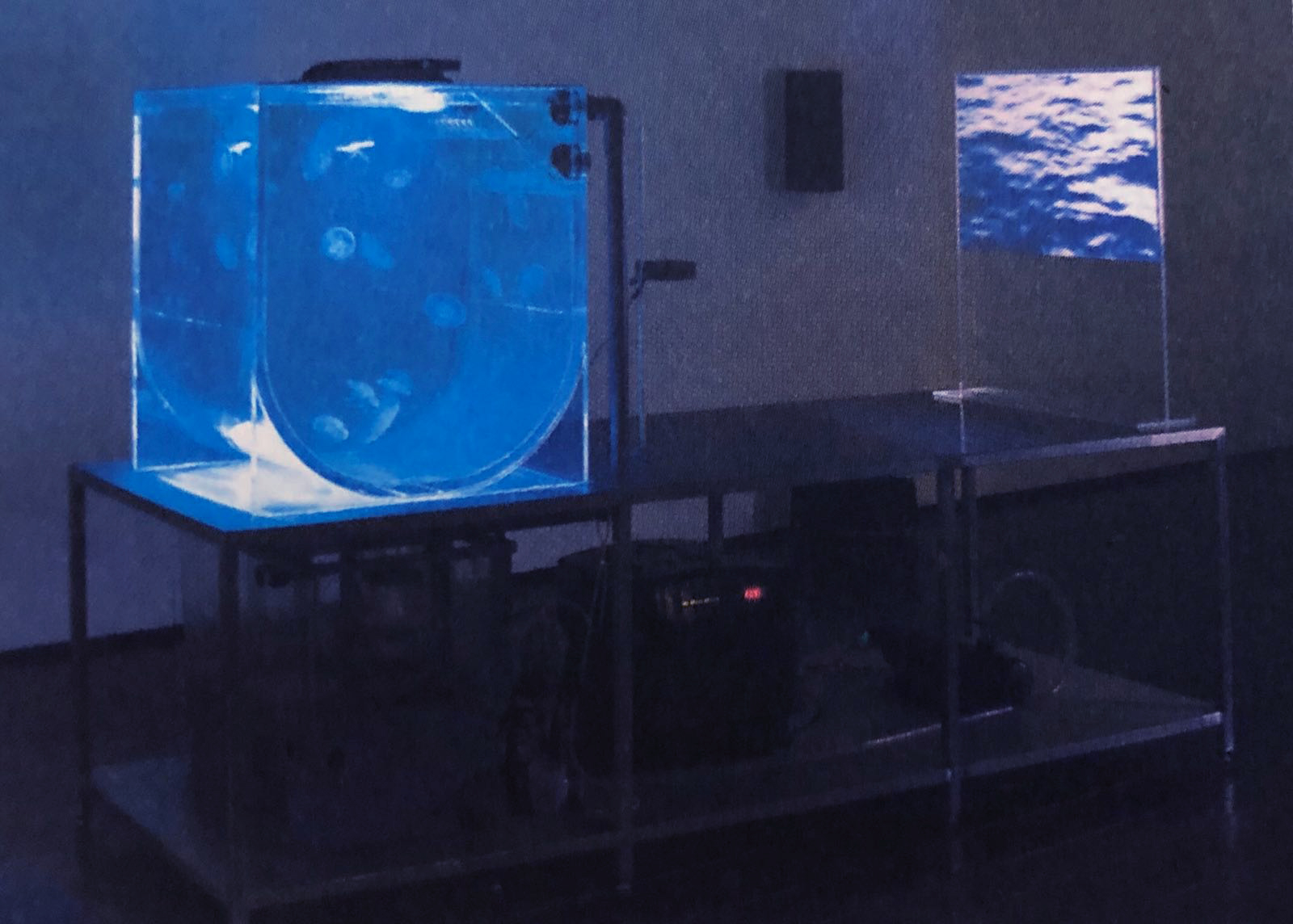
Greenfort, a Danish artist mostly known for his works revolving around the themes of ecology and the environment, delved into replicating the ideal habitual conditions to sustain the Tamoya Ohboya. By combining art and technology, he was able to create an artificial habitat for these jellyfishes with a tank that was designed to closely resemble the ocean, and devices that maintains and regulates the perfect temperature. This piece was a response to how the environment is changing and proposes a way we, as humans and as a community, could take to preserve delicate life-forms like the Tamoya Ohboya from dying out due to years of destructive human interventions with nature. The concept ties in well with other pieces in the exhibition that urges environmental and economic issues.

Although I find the work compelling in its ways of creating awareness to the mass while highlighting the importance of conserving the environment and how it correlates to the human society, stripping the jellyfishes off its natural habitat and confining it in a small aquarium in the name of art is not an appropriate measure to take. Greenfort’s attempt to display these creatures could be seen as an adverse response to the problem itself rather than the message that he initially intended to tell.

But is there an ethical issue here that needs to be straightened out when it comes to having works like this publicly displayed? Was it necessary for the artist to take live specimens of the creature itself to bring across a message? With the concept of tapu being discussed in the lectures and how we are very informed that there are certain rules and prohibitions practiced in the Polynesian culture concerning the conservation of the very home we live in, are we really protecting the environment? Or is this just another evidence that we are simply causing more harm to it?

Process: Delving into Houdini

Visual Inspiration

I was mesmerized by this video that I came across over the weekend. The look and feel of the visuals are pretty similar to what I have envisioned for myself. However, I was not really able to catch the steps involved to achieve it because I am not particularly familiar with Houdini just yet and the video was overly sped up.

Experimentation

I have started getting myself orientated to Houdini since I’ll be rendering most of my visuals for the media art wall from it. I’ve watched some tutorials online and tested out deformation of objects as well as fluid particles. The videos below are what I have achieved and progressed so far. However, I’ve not yet figured out the exact components that could be used to achiever the look I’m going for for the final project.

I am still figuring out how to work around the software and how I could incorporate the features available into my project. After consulting with Pamela, I have gotten more insight on the interface of the software itself and other components that might come in handy to produce the look that I aim to have. She has also provided me useful links to online forums and tutorials that could help me with experimenting more looks to go about with the textile patterns and motifs.

Research Critique: Hole-in-Space (1980)

“Hole–In–Space suddenly severed the distance between both cities and created an outrageous pedestrian intersection. There was the evening of discovery, followed by the evening of intentional word-of-mouth rendezvous, followed by a mass migration of families and trans–continental loved ones, some of which had not seen each other for over twenty years.”

“The Social Machine: Designs for Living Online” by Judith Donath

Hole-in-Space has allowed the public to be comfortable to interact with strangers. The project by Kit Galloway and Sherrie Rabinowitz was a remarkable milestone in showing how telecommunication could bridge the physical distance between people from different places, and bring them together to interact in one cohesive space, live. The public communication sculpture, that went on for a total of three nights, consisted of two huge screens , a two-way satellite hookup, and two cameras that were set up in two different cities in the United States – one in Los Angeles, and the other in New York.

Without any prior information or any artist’s statement for the installation, the video that went live on the first night caught pedestrians and passer-by’s by surprise. The people were able to see and speak to each other with no media interruptions or any self-viewing cameras that might have made them overly self-conscience and impede them from genuine communication.

Viewers from the first night were so enthralled from the encounter that word-of-mouth and local news reports soon brought long-distant friends and families, whom in some cases have not seen one another in years, together in one space. For some, it led to several planned meetings on the second and third nights, bringing joy to many who were finally able to see their loved ones. While for others, the virtual space became a medium to integrate other forms of interaction fearlessly and spontaneously.


“A virtual space creates social situations without traditional rules of etiquette. The absence of the threat of physical harm makes people braver. Virtual space diminishes our fears of interaction.”

“Welcome to ‘Electronic Cafe International’: A Nice Place for Hot Coffee, Iced Tea, & Virtual Space” (1992)

The reading highlighted one very important point Physical interactions often complies to the rules of social norms. The consideration of whether a certain behavior is socially acceptable or not often comes with everyday physical interactions. Some people might even be a little shy and awkward to express themselves when it comes to such. And these social bounds that we have contrived ourselves into hinders us from free expression. However, interactions in the virtual space breaks that mold. People tend to be far more spontaneous and candid with their social interactions in the third space.

Take Hole-in-Space for example; passer-by’s in the streets would not usually stop to communicate with each other. It took a huge screen, with people from a different geographical location, to allow them to be comfortable with saying “hello” and to express themselves. Virtual space is allowing people to be comfortable to interact with strangers.

Research: Case Study 1 and 2

Case Study 1 – Theme

Theme: Malay Textiles

Reference:
“Cultural Treasures: Textiles of the Malay World”
by National Museum, Janpath, New Delhi

Malays are the race of people who inhabit the Malay Peninsula and portions of adjacent islands of South-East Asia. The Malay culture itself has been strongly influenced by the Siamese, the Javanese, the Sumatrans and the Indians. Hinduism had an impact upon the Malay community before they converted to Islam in the 15th century.

The Malay society has long understood the value of textiles, not just as a utility item, but for its commercial value as a major trade commodity. Textiles were also recognized as means of strong wealth, readily convertible form of currency, which could be used in the settlement of business and social debts.

Textiles played a significant role in the social, economic an religious life of the people in the Malay world. Opulent fabrics and dress are used to display the authority, prosperity and to gauge a person’s social grade, profession and religious affiliations through their costumes. Clothing is a mark of identity in where it could be indicative of a person’s age, gender, marital status, place of origin or even occupation.

Garments and fabrics have significant value, expressed by the colors and ornamentation used for their design. Motifs may have religious, ceremonial functions or indicate the power and the social status of the owner. Symbolic meaning behind a design or motif is as important as its ornamental value or sometimes even more so, since it carries an extra dimension for those who believe on its special significance.

The Limar Cloth
The Songket Cloth
The Pua Kumbu Cloth
The Batik Cloth
The Telepuk Cloth

 Case Sudy 2 – Artists

Artist 1: Marino Capitanio

“Botanica” is a collaborative multimedia live performance by Italian music group Deproducers and visual artist Marino Capitanio. The performance highlights the beauty and artistic wonder of plants by merging music and scientific data.

I got really inspired by how they have managed to bring so much character to plants with concepts that delved into a plant’s a perception of time and even how beauty is essential for the survival of a flower. The visuals consisted of kaleidoscopic effects that represents different parts of a plant as well as intermittent pulses of illumination that reveals the forms of flowers.

I could visualize how “Botanica” could be applied to my theme of Malay textiles. Geometrical forms, shapes, patterns, and motifs that are present in the textiles I choose to work with could also be made to come to life and animated in a similar fashion as Capitanio’s works.

Artist 2: John Greene (a.k.a. Fleen)

John Greene creates his generative works by repeating black and white patterns through an algorithmic system to resemble hand-woven rugs and Moorish tile patterns. All the polygons in his works were all generated from a computer software.

The most enthralling part of his artworks would definitely be how he is able to turn shapes as simple as triangles and squares into ornate colonies of design. The process of starting off with basic shapes and slowly elevating it into a complex design could be a technique that I would like to adopt in creating the textiles in my artwork. I feel that if I could incorporate this into my piece, there are so many possibilities to tell a story as well as displaying the emotions that I wish to evoke on the media wall.

Artist 3: Raven Kwok

Raven Kwok is a new media artist who has created cell-division-like animations purely with Processing. His passion for exploring different forms of expression at the intersection of computer programming and visual arts resulted in a series of clever, playful animations. One of the ways he has achieved this with was to distort and augment typography that appears almost like moving, generative graffiti.

What I love most about his artwork is how slow and gentle everything seem. The patterns appear to be hovering in the air, or even floating in water, as they move in a peaceful and cohesive manner. It could be a possible look that I might go for to create the motifs on my textiles.

 Case Sudy 2 – Techniques

SideFX Houdini:

Adobe AfterEffects:

Point of View: Research

A ______ from the Point of View of ______ is ______.

I have decided to go with the Sheep as my subject of interest for this assignment mainly because I wanted an embodiment of humor, innocence and indifference. After much research, I realized that people who tend to associate the sheep as their spirit animal are child-like, gentle, vulnerable, self-accepting and can be very conforming to social norms. With these attributes taken into consideration, I have revolved them in my point-of-views (POVs).

Here are the POVs that I have brainstormed on:

  1. A sheep from the point of view of an insomniac is 1… 2… 3… 
  2. A sheep from the point of view of grass is a satanic predator.
  3. A sheep from the point of view of grandma is a knitted sweater with love.
  4. A sheep from the point of view of a wolf is a candlelight dinner.
  5. A sheep from the point of view of Mary is a BFFL.
  6. A sheep from the point of view of a Border Collie is a recruit.
  7. A sheep from the point of view of the herd is Carl the idiot who messes up the formation.
  8. A sheep from the point of view of a shepherd iz dolla bill$
  9. A sheep from the point of view of a shear is his 3 o’clock client
  10. A sheep from the point of view of a goat is her gay best friend
  11. A sheep from the point of view of an eagle is a target.
  12. A sheep from the point of view of Damien Hirst is half a sheep
  13. A sheep from the point of view of Sir Ian Wilmut is his proudest discovery.
  14. A sheep from the point of view of his wife is a baaaaaaad boy.
  15. A sheep from the point of view of New Zealand is over-population.
  16. A sheep from the point of view of the Scottish is a delicacy.
  17. A sheep from the point of view of Steve (of Minecraft) is a bed.
  18. A sheep from the point of view of an alpaca is his short-necked cousin.

I have listed 18 ideas and the ones in bold are the six that I have worked on for my final images. I have chosen these six POVs because they bring out the different aspects and qualities of the sheep by greatly personifying them. And this is enhanced even more from how I wanted to embody the sheep as mentioned earlier.

Notable artists that I have drawn inspiration from for this project:

Fran KrauseFran KrauseFran Krause, a professor at California Institute of Arts, began cartooning irrational fears of his own, then started to illustrate submissions of fears he received from the general public and posting them on Tumblr. Early in September Krause culminated this long running Tumblr project in a book entitled “Deep Dark Fears.” The book is centered on the irrational obsessions and fears that people battle every day as shown in his illustration above.

His style is rather distinct. He incorporates both simplicity and a dark-creepy grotesque style to further accentuate his rather sketchy illustrations. And his choice of colors are mostly cool and analogous, having a consistent palette throughout his panels of illustrations. His illustrations have a painterly finish to them, which makes them more amusing to see.

Alexandra BallAlexandra BallAlexandra Ball is a professional children’s book illustration artist based in Guildford. She loves line drawings, spending the early stages of a project working on fluid, hand-sketched compositions. These are scanned into the computer for coloring, and textures are added to give the overall feel of a collage. Looking at her illustrations, you can tell Alexandra’s style is influenced by nature and the four seasons.

What I love most about her illustrations is that they are made up of very simple yet distinct shapes. And they are then further worked on with added details and vibrant colors. This clever use of shapes and colors help give her illustrations more developed and compelling compositions.

Andreas BesserAndreas BesserAndreas Besser 2Andreas Besser, a professional Illustrator based in Berlin, Germany. He specializes in children book, character design, and black & white illustrations.

I admire how he is able to bring so much dynamic into an illustration without much use of a background. They feel isolated, but the story within feels very much complete. And even with works that is presented with a background, he has a unique way of framing the composition with the use of thick brush strokes. His line work is pretty extravagant as they varied in thickness and swiftness.


Thank you for taking time to check out my work. In case you missed it, do check out my Process & Execution and Final Work here.

Typographic Portrait: Research

My name is Anam, and I am a …

My name, which was given by my late grandfather, in full translates to “a vessel in the sea” in Arabic. It is a metaphor for someone who explores the vastness of this world only to bring people closer together. And I believe that I am living up to the meaning of my name. I am someone who is goal-oriented, but somehow have not gotten a clear idea of what I truly aspire to be. Throughout the 22 years I have lived, my aspirations constantly change. With new insights of entirely new prospects, I come to realize that the reason for doing so was because I crave to try something new and to take risks. This is why I have decided to pursue Interactive Media as a major instead of going with my initial plans of sticking to Animation.

I have chosen my first name, Anam, to be expressed as Typographic Portraits in conjunction with six different occupations. And four of which (Astronaut, Gambler, Journalist and Architect), are professions I wanted to be in earlier in my life. While the remaining two (Optometrist and Air Traffic Controller) were ideas drawn from the aspirations of two of my very close friends.

But why? Well, I felt that every person is an embodiment of their pasts, be it good or bad. These are the things that have shaped us to be the person we are right here, right now. And this is the very reason why I have decided to work on them.

Idea Generation:

  1. Astronaut (Age 5-9)

    • An astronaut or cosmonaut is a person trained by a human spaceflight program to command, pilot, or serve as a crew member of a spacecraft. Although generally reserved for professional space travelers, the terms are sometimes applied to anyone who travels into space, including scientists, politicians, journalists, and tourists.
    • Personal Story to Share:
      At the age of 5, I had dreams of becoming an Astronaut. I guess it was due to my fascination with space, adventure and aliens that sparked my interest in astronomy. I used to watch Hanna-Barbera’s “Space Stars” and “The Jetsons” when I was younger. And I was lucky enough to have supportive parents who bought me astronomy encyclopedias to feed my adolescent mind.
    • Symbolic attributes: Adventurous, brave, curious
    • Aspects: Spacesuit, Rockets, Planets, Stars, Space Shuttle, SatelliteMoodboard_7_Astronaut
  2. Gambler (Age 10)

    • A gambler is someone who wagers money or something of value (referred to as “the stakes”) on an event with an uncertain outcome with the primary intent of winning additional money and/or material goods. Gambling thus requires three elements be present: consideration, chance and prize.
    • Personal Story to Share:
      People usually associate gambling with something negative such as greed and addiction. But as a 10-year-old, Hong Kong Triad movies were seen as something cool and bad-ass. And as I grew up, I realized that these bad-ass qualities turned out to be made of very positive attributes that I have shared below. However, my parents were not so keen on letting me thrive with such an influence. So my fad with it died down pretty fast.
    • Symbolic attributes: Intuitive, risk-taker, confident
    • Aspects: Casino, dice, poker cards, gambling chips, money, jackpot machineMoodboard_6_Gambler
  3. Journalist – Editor-in-Chief  (Age 11-13)

    • A journalist is a person who collects, writes, or distributes news or other current information. A journalist can work with general issues or specialize in certain issues, however, most journalists tend to specialize, and by cooperating with other journalists produce journals that span many topics.
    • Personal Story to Share:
      When I was 11, I began reading a lot, especially magazines like Reader’s Digest, National Geographic, and Times magazine that my parents subscribed to. Soon enough, I got into writing (which was paired well with my drawing skills). There was once I wrote a short story for a competition, and it got featured in my school’s magazine. From then onward, I was pretty keen on pursuing a career in Journalism.
    • Symbolic attributes: Audacious, charismatic, creative
    • Aspects: Camera, typewriter, microphone, newspaper, magazines, tabloids, articles Moodboard_3_Journalist
  4. Architect (Age 14-16)

    • An architect is a person who plans, designs, and oversees the construction of buildings. To practice architecture means to provide services in connection with the design and construction of buildings and the space within the site surrounding the buildings that have as their principal purpose human occupancy or use.
    • Personal Story to Share:
      As I grew older, I began to draw even more and write much less. I enjoyed perspective drawings. It was not until my aunt said that my sketches looked pretty architectural that I got more interested in the subject. I considered Architecture as a course of study after my ‘O’ levels. But I decided to take up Animation instead.
    • Symbolic attributes: Realistic, ambitious, organized
    • Aspects: Blueprints, buildings, construction site, drafting tools Moodboard_4_Architect
  5. Optometrist (inspired by a close friend)

    • An optometrist is an eye doctor. Optometrists examine eyes for both vision and health problems, and correct refractive errors by prescribing eyeglasses and contact lenses. Some optometrists also provide low vision care and vision therapy.
    • Symbolic attributes: Insightful, meticulous, observant
    • Aspects: Eye chart, glasses, contact lenses, phoropter, retinoscope, eyes Moodboard_1_Optometrist
  6. Air Traffic Controller (inspired by a close friend)

    • Air traffic controllers are people trained to maintain the safe, orderly and expeditious flow of air traffic in the global air traffic control  Controllers apply separation rules to keep aircraft at a safe distance from each other in their area of responsibility and move all aircraft safely and efficiently through their assigned sector of airspace, as well as on the ground.
    • Symbolic attributes: Vigilant, foreseeing, collected
    • Aspects: Airplanes, radar screen, aircraft marshaling, plane plotter Moodboard_2_ATC

Artistic Approach:

In terms of the artistic style that I have adopted for this project, I have studied and gained inspiration from the works of Hannah Höch, Ralp Cifra, Mattias Adolfsson and SNASK. I did not want to stick to a common style for my 4 panels as I wanted to delve into much diverse means of expressing my ideas. So I have decided to make each panel different from each other.

Hannah Höch is a German Dada artist most notable for being the pioneer of the art form known as photomontage. Many of her pieces sardonically critiqued the mass culture beauty industry at the time, gaining significant momentum in mass media through the rise of fashion and advertising photography. Many of her political works from the Dada period equated women’s liberation with social and political revolution. In particular, her photomontages often critically addressed the Weimar New Woman, collating images from contemporary magazines.

1

SNASK is an internationally renowned creative agency (based in Stockholm, Sweden) that makes kick ass branding, design & film. I was reading an article and chanced upon their work. And I was so amazed at how bold, simple, and yet elegant their typography works were. And their biggest and most renowned project so far was done for The Washington Post. I wanted to incorporate their crafty sense of design and bold use of colors for this project.

4


Mattias Adolfsson is a Swedish illustrator whose work have truly inspired part of my drawing style. He has a very distinct way of expressing the characters in his artwork. And while he has a lot of wonderful works in his gallery, I was really drawn to his poker card designs which were cleverly personalized and are bursting with emotions. I was keen to showcase some of my illustration styles in this project without overly using them and ignore exploring other means of artistic expression.2

Ralph Cifra is a Philippine-based visual artist, illustrator, and graphic designer. His illustrations were beyond awe-inspiring. He has a really good sense of colors and he is known for making simple, yet vivid and prominent silhouettes when it comes to illustrating everyday objects. His vibrant interpretation of these everyday objects has made his designs pleasantly eye-catching. I desire to achieve such traits with my type designs.

3Thank you for taking time to read on my research, do check out my
Process & Execution and Final Work here.

The Color Spectrum

how-women-and-men-see-colors

It’s funny how one’s perception of color could differ to others. For me personally, I associate myself to be just like the man in the picture above. I am sensitive to colors and I am fully aware that there are millions of them visible to the human eye. However, I prefer identifying colors in a more generic way, classifying the different shades and tones of these colors to their more commonly-known terms.

These are the colors I would generally identify:
Red, Yellow, Blue
Orange, Green, Purple
Brown, Pink
White, Gray, Black (Yes, black is a color and chemists have proven it! Your argument is invalid.)

Colors and Their Meanings

Red:
Love, Immediacy, Energy, Sale, Passion, Anger, Hunger

Yellow:
Cheer, Attention, Childish, Fresh, Warmth, Energy, Optimism

Blue:
Trust, Smart, Calm, Faith, Natural, Stable, Power

Orange:
Health, Attraction, Stand Out, Thirst, Wealth, Youthful, Happiness

Green:
Soothing, Eco-friendly, Natural, Envy, Jealousy, Balance, Restful

Purple:
Royal, Mysterious, Arrogant, Luxury, Childish. Creative, Sadness

Brown:
Organic, Health, Comfort, Nature, Durability, Order, Casual, Reliable, Genuine

Pink:
Tenderness, Sensitive, Caring, Emotional, Sympathetic, Love, Sexuality

White:
Freshness, Hope, Goodness, Light, Purity, Cleanliness, Simplicity, Coolness

Gray:
Security, Innovation, Neutrality, Enhancement, Future, Self-control

Black:
Sophistication, Power, Mystery, Formality, Evil, Death

Design Principles

  1. Axis

    1

    Axis is the most basic and most common organizing principle. Simply stated, axis is an imaginary line that is used to organize a group of elements in a design. In diagrams, axis is represented as a dashed line.

    • Alignment

      Axis is mainly used to align elements. When elements are arranged around an axis, the design feels ordered. As with most things in life, we enjoy things that are ordered because they feel more stable, comfortable and approachable.

    • Movement

      When we encounter something linear, such as an axis, we naturally follow the line in a direction. If we arrive on a street, we walk down the street. If we open an elevator into a long hallway, we walk down the hallway. Lines prompt movement and interactions. The direction of movement depends on the end points. A defined end point signals a place to start or stop.

    • Reinforcement

      Although axis is an imaginary line, you can make it more apparent if the edges of surrounding elements are well defined. A common example of this concept in architecture is a city street. The city street is an axis that is reinforced by the buildings on both sides. If a portion of the street is missing a building on one or both sides, the street’s axis would not feel as strong.

    • Continuous

      If an end point is undefined, you will follow the axis until you reach something of interest or are tired of interacting with the axis. While the concept of an undefined end point in architecture is uncommon since it’s difficult for something architectural to go on forever, it’s becoming more popular in product design with infinite scrolls.

  2. Symmetry

    2

    Symmetry is when elements are arranged in the same way on both sides of an axis. Perfect symmetry is when elements are mirrored over the axis and exactly the same on both sides.

    • Balance

      Symmetry adds balance to a design. When elements are the same on both sides of an axis, the design feels harmonious. If we design a street with five houses on one side and five on the other, walking down the street would feel comfortable because the arrangement of homes is balanced.

    • Asymmetry

      Designs are asymmetrical if the arrangement of elements are different on both sides of an axis. If we design a street with five houses on one side and one on the other, the street will feel unbalanced and perhaps uncomfortable.

  3. Hierarchy3

    Hierarchy is when an element appears more important in comparison to other elements in a design.

    • Size

      An element will appear more hierarchical if it is larger than other elements in a design. We naturally look first at the largest element in a design. If there are five windows on the front of a building, and one is twice the size of the others, our attention will focus on the biggest window first.

    • Shape

      An element can also appear more hierarchical if it is different than other elements in a design. We naturally look first at the irregular shape in a design. If there are five of the same windows and one door on the front of a building, our attention will focus on the door first.

    • Placement

      Last but not least, we can place elements in more hierarchical positions. Within a circle, the center is the most hierarchical. The end of an axis is naturally more hierarchical than points along the line.

  4. Rhythm

    4

    Rhythm is the movement created by a repeated pattern of forms.

    • Pattern

      The best way to understand rhythm is to think of a song. Songs have rhythm when a piece of the song repeats. When listening to a song with good rhythm, we recognize the pattern and begin to expect beats.

    • Breaks

      A break in rhythm will appear more hierarchical. Think about a song. When a song has a repeated rhythm and the rhythm is broken, something quite special usually happens.

Research

Research


For my research and development, I first looked up for the meanings as well as synonyms of each emotion to fully understand how I could effectively evoke them.

Afterwards, I went to google to find images of different patterns, expressions and objects that I find relatable and significant to the art I was expressing. Some of these images displayed obvious and more prominent emotions while other images goes deeper into showing microscopic organisms that are invisible to our naked eyes, but shows a lot of aesthetics.

I have had some references from other artistes as well. A few of whom were Dutch painter, Piet Mondrian, and Norwegian fashion photographer, Solve Sundsbo, where he reflected light patterns on the human body (see “Sensual”).

Below are the mood boards I have created, in addition to the definition I have found on the internet, to allow me to brainstorm more ideas and have a clear understanding before executing my designs:

Ref_1Ref_2Ref_3Ref_4Ref_5Ref_6Ref_7Ref_8Ref_9