Dada and Punk Rock – Concert posters/brochures
Dada or Dadaism was a form of artistic anarchy born out of disgust for the social, political and cultural values of the time. It embraced elements of art, music, poetry, theatre, dance and politics.– www.artyfactory.org/art_appreciation/art_movements/dadaism.htm


These two go hand in hand since the both embody anti-establisment vibes. Works were photocopied and it had such a grunge feel. Very in-your-face. Typographically speaking, the fonts used are kind of pop-arty or comic book like somehow. There was no hesitation of mixing fonts together because the question asked was ‘why not?’ at that point of time.


Honestly, I just enjoy the red/black combination in graphic design. It can be kind of cliche but it does the job of being eye-catching. However if I were to use red, the connotations and context of the colour would have to be thought of about first. Could it be passion? Anger? passion for anger? i don’t think that’s what i’d want to portray in my final works…. but then again you never know.


Works by Wang Guang Yi. His style is considered one of the most recognizable and most appreciated in the Chinese contemporary art world. Using flat planes of colours like that from the Pop Art movement, he makes social commentaries IN RESPONSE to western consumerism in his own country. I guess i appreciate his compositions and style for these, the typography seems very clear cut in bold, so yeah. He painted the words though, so that’s a different style I guess.


Textures within font, hand-drawn? Can be quite interesting. I’d use fabric instead though. something textile would be quite cool. Or…..hot glue gun? I’ll have a go at trying then i’ll get back to you.


I’d like to do this but i’d like it to be more interactive though. Could play w/ perspective or context or digitalise it as a gif/vid thing.


Ink/watercolour + drawing kind of addition to fonts. The bottom two are actually just paintings of animals and children interacting w/ them, but it does give rise to a certain effect that’s quite ghostly, could be used to make abstract forms of fonts…


Some more examples, both very abstract w/ line works, cutting of paper (playing w/ light and shadow), post it notes or using found objects to enhance the meaning of the word. More things to play with.
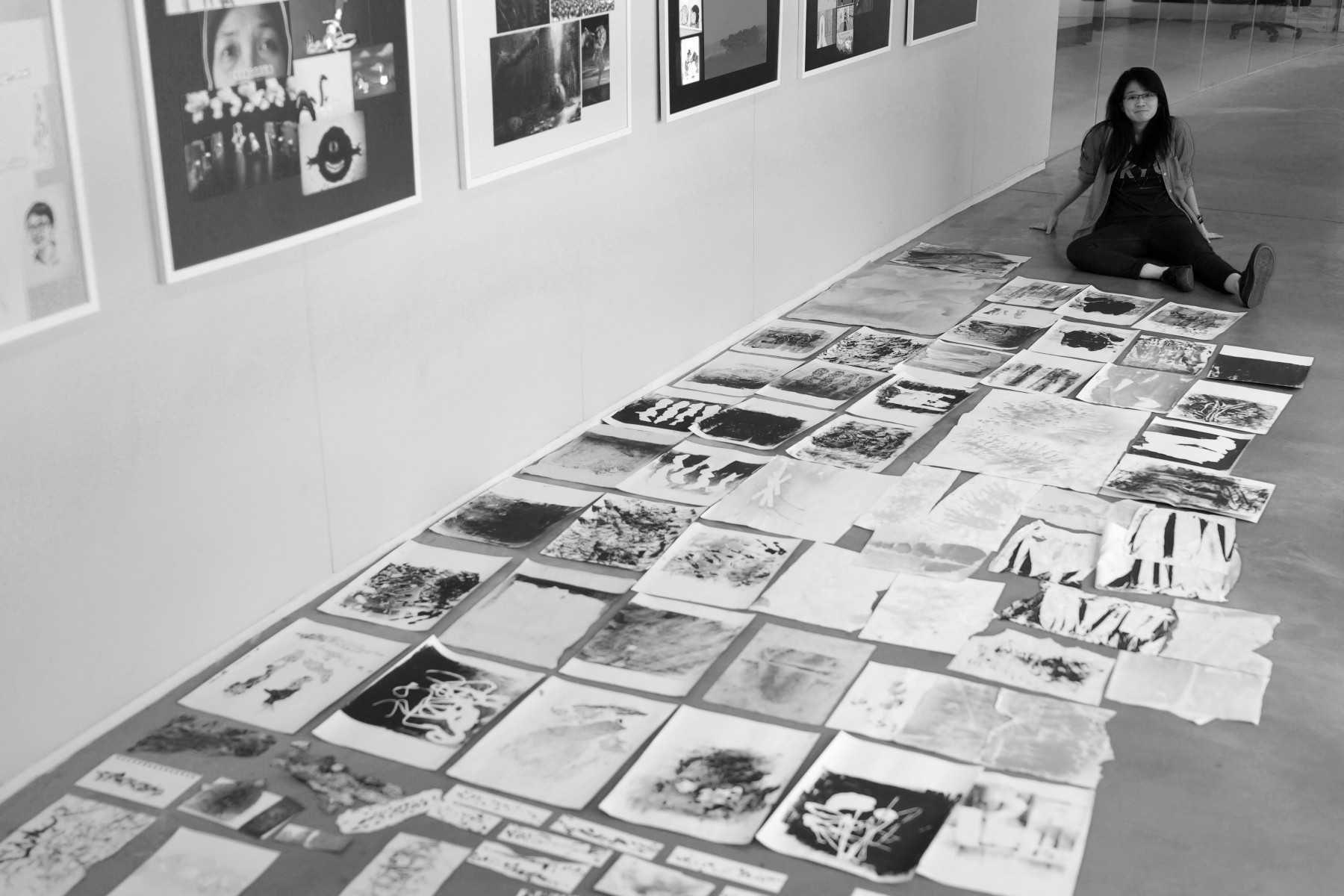
I’m probably going to experiment with ink/watercolour, thread, the cloth idea and something relating to fire. I just kinda wanna burn some things. For science. (and art)