


first five motifs!
referencing anatomical drawings from books about corpses…. casually…
at first i was not as comfortable drawing from imagination so I decided to reference bones and parts of bodies that also looked like faces or scary things. (i know, great description right?) an issue here was that I drew them with pen and with cross hatches so when I started to play around in the composition it was limited to being monochromatic.
after discussion with gillian,
she mentioned that all my elements were quite geometric. i would probably need /a lot/ of motifs to fill a whole banner up. i felt like it didn’t quite fit my theme of sleep paralysis or nightmares as an extension of the supernatural. i mentioned I wanted to draw snakes because i’ve had dreams with snakes all over me once and i couldn’t wake up. my mom’s zodiac sign is also the snake so i think it was #tooreal. i also had a dream after watching harry potter with that scene of Ron Weasley puking slugs. my brain tends to remember weird things and they reappear in my dreams. on that weird note, gillian pointed me towards tattoo artists who did more oriental fluid scary snakes on people. think: yakuza.
we both thought that the organic shapes of the snake would contrast with the geometric drawings i’ve done. but i also needed a central figure to ground my banner as well.


for the next two weeks i’ve been drawing more motifs and trying out chinese ink as a medium. it gives a translucent effect that i cannot really get if i used a pen to draw a snake.
for all my drawings i was the most embarrassed about the girl because gurl listen i don’t know how to draw from my imagination that well. i guess it turned out alright, could have been a lot worse. to make her not stand out too much, I started to layer different drawings over the girl and made it less out of place. I scanned them in at 600dpi on a school printer but i tore my snake paintings up accidentally because they weren’t dry. Snake 2.psd was created by scanning two torn snake paintings together as a composite image. IT WORKED. now they look like a bundle of snakes (and another motif i could use)
Overall, those are the motifs that I have created for this project.
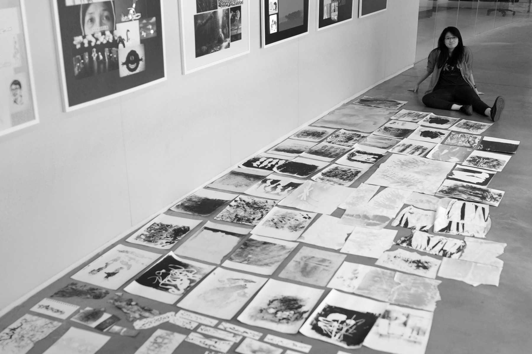
The images below are sample swatches that I have created so far.


With those i’ve started to compose things into my banner.

the progression of my banner composition starts from the left to the right.
I would probably pick the last one on the right as my final, but i’m still tweaking around and seeing what else I could do. I wanted to add colours to my banner because I felt like my theme was dark and the black on white didn’t really give that feeling. Playing with the layering options on photoshop, it gave an effect that felt like an x-ray that i’m going to keep for the final piece.
still workin’.
recess week update:
i’ve chosen the one on the far right and zoomed in to clean up the edges of some overlays. file size remains really huge, not sure how to compress it!