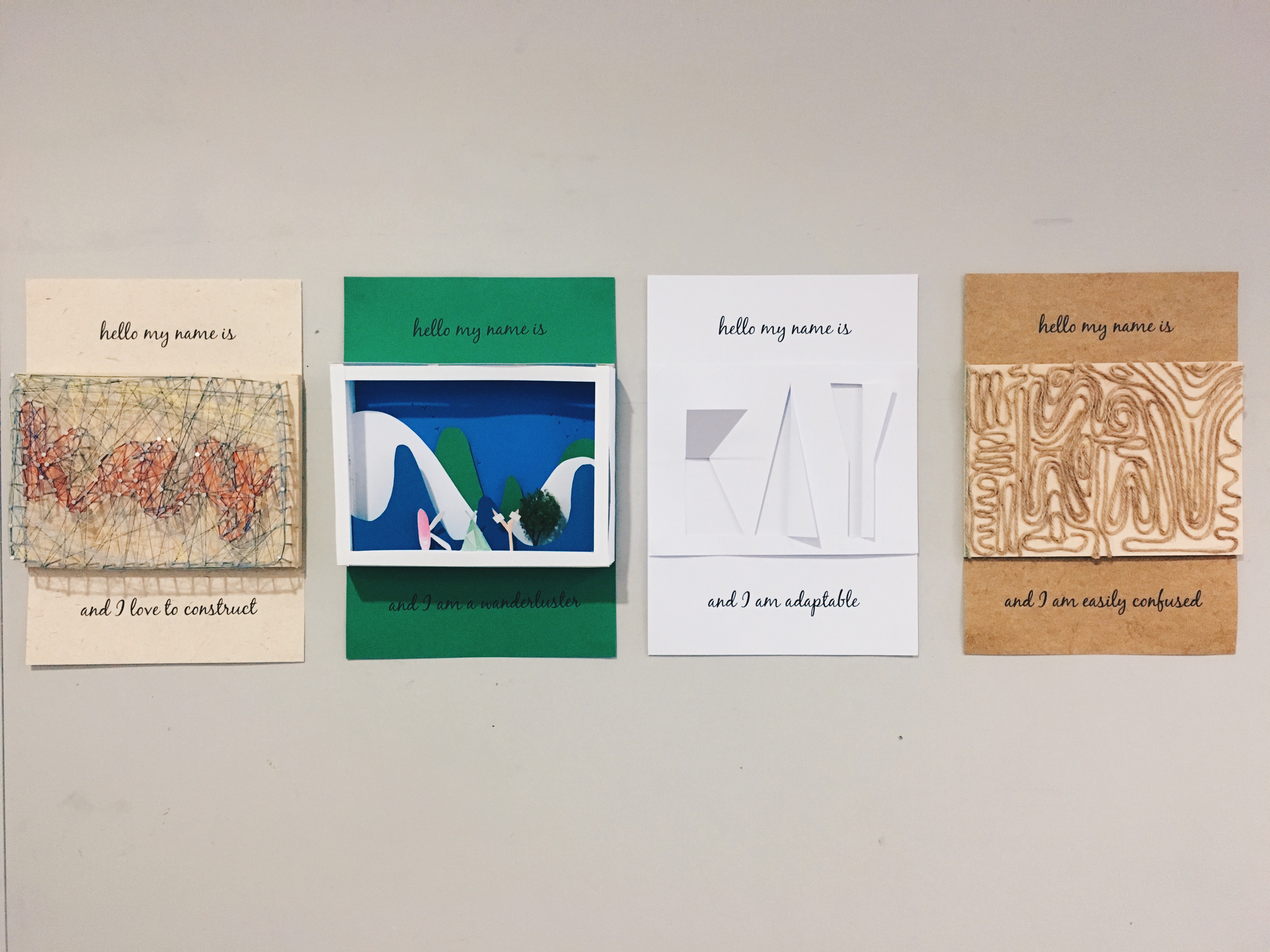
So after much contemplation and adjustments, these are the final 4 pieces that I’ve chosen and done.
For this project I focused more on the techniques and the way the typography was done and how this shows the different qualities of myself.
MY NAME IS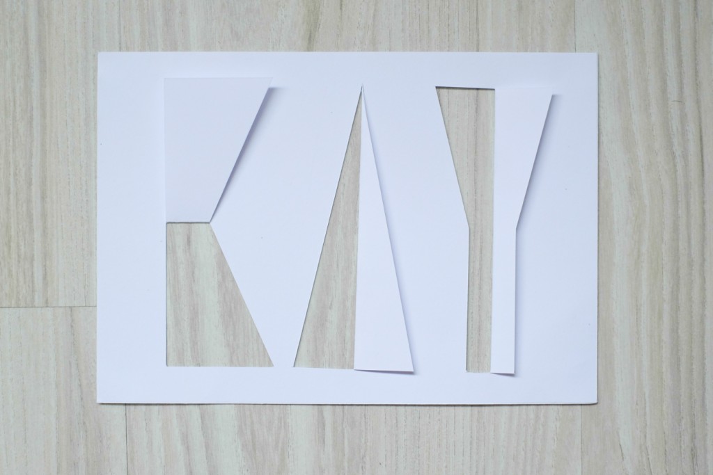
AND I ADAPT EASILY
I adapt easily. Using just a single sheet of paper and slicing my name out shows how my name is part of it’s surroundings.
MY NAME IS
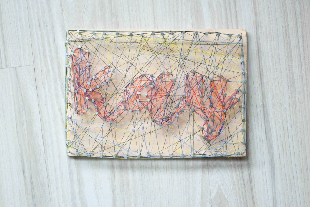
AND I LIKE TO CONSTRUCT
As someone who likes to construct, this was the one piece that I needed to spend a lot of time and energy doing- from cutting the wood, to nailing and threading. It is constructed layer by layer.
MY NAME IS

AND I GET CONFUSED EASILY
I get confused easily and so I decided to incorporate my name in a confusing way, where if you look from far you won’t be able to make out anything but if you look closely, my name can be found.
MY NAME IS
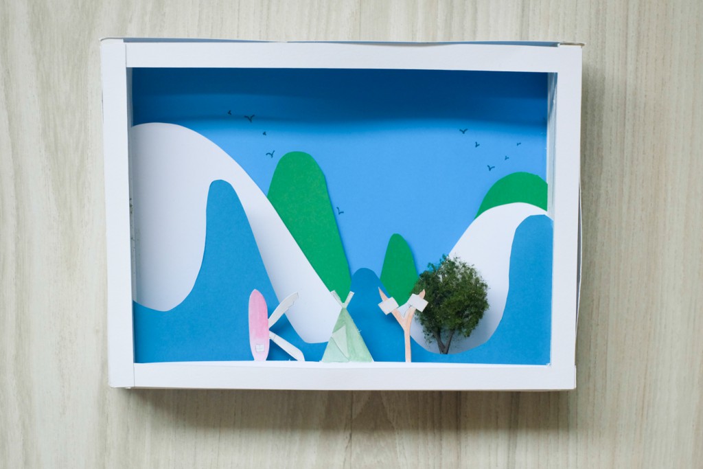
AND I AM A WANDERLUSTER
I am a wanderluster, which means that I have a strong desire to travel and I feel that pop ups look best if done on a scenery. Also, I love to travel to the countryside, where mountains and nature makes me feel relaxed and happy.
I like the first one because it is very minimal! 🙂
Aw, thanks Ummi! I like that too 😀
It is great to see how your research triggered ideas for such a nice creative output. Mixing and matching ideas for this project will generate i stimulate novel ideas…
you can consider focusing on one for your ZINE Project
(more i can explain in class)
Please consider for this page in OSS:
– increase the images- thumbnails are too small
– include larger caption or title for each image with a sentence ” MY NAME IS…and I AM…” you did include description but we still do not know the main sentence/concept
– use one of the images in High Res as a featured image for your post