Typographic Portrait: Process III

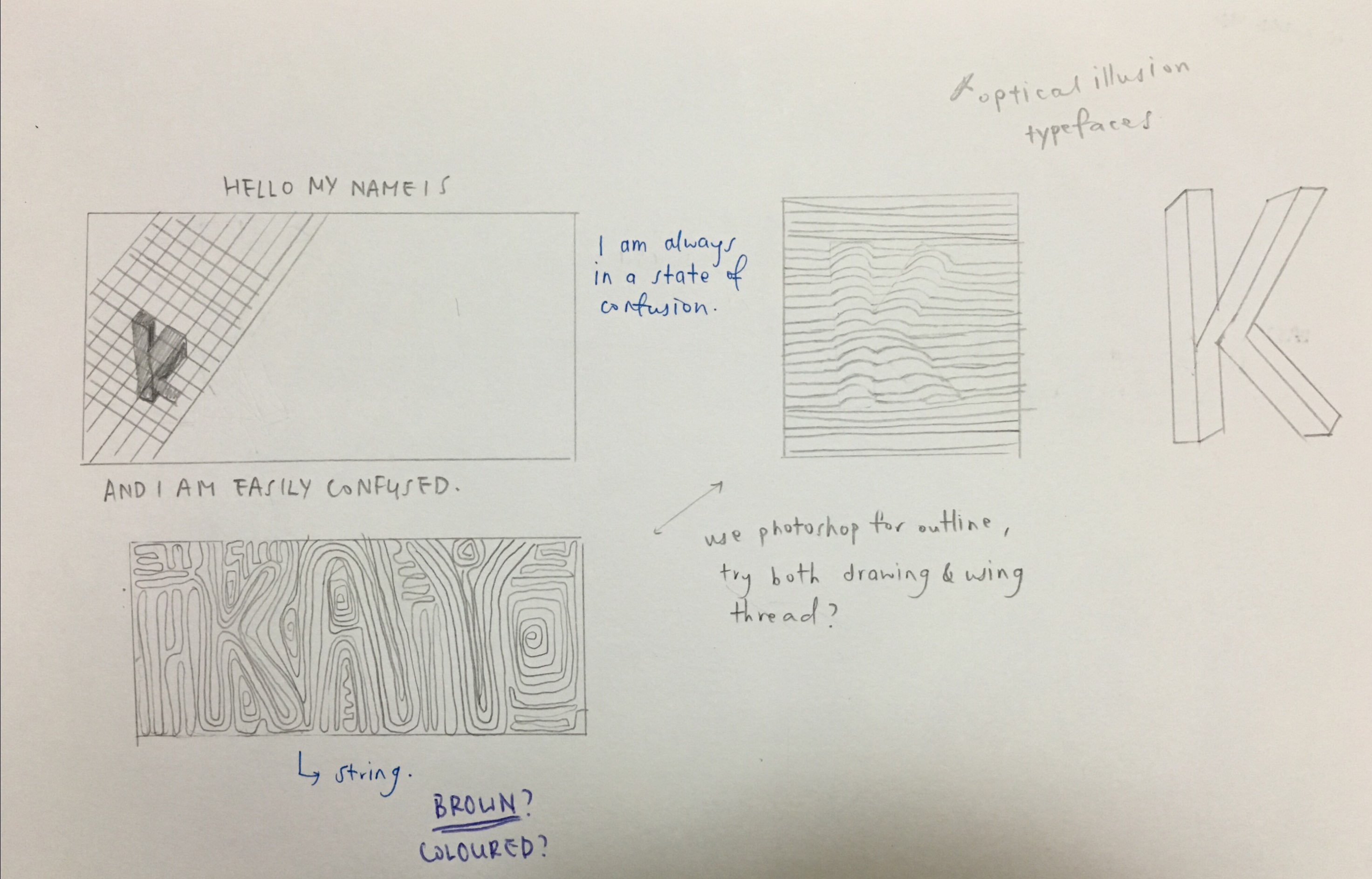
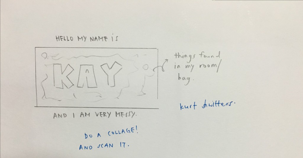
After finalizing my ideas on my sketchbook, it is time to do a hard copy of them!


DSCF1129-2

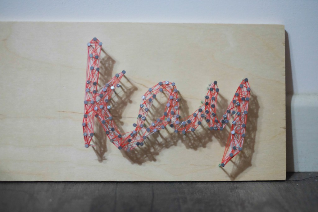
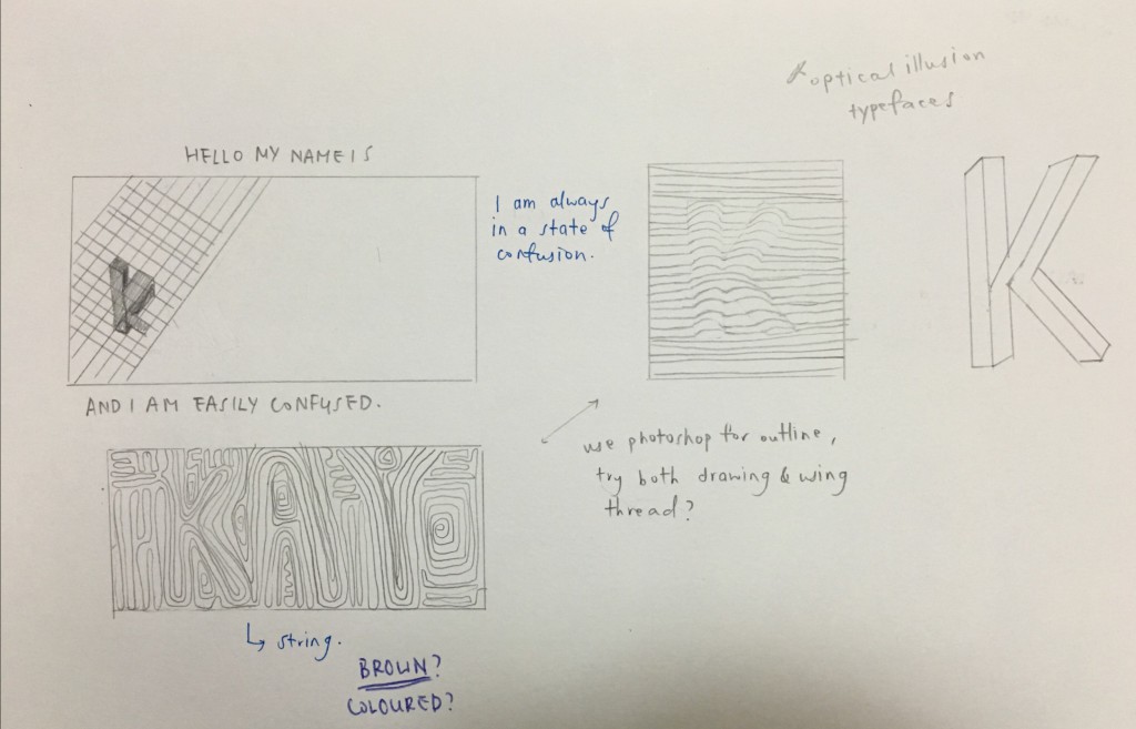
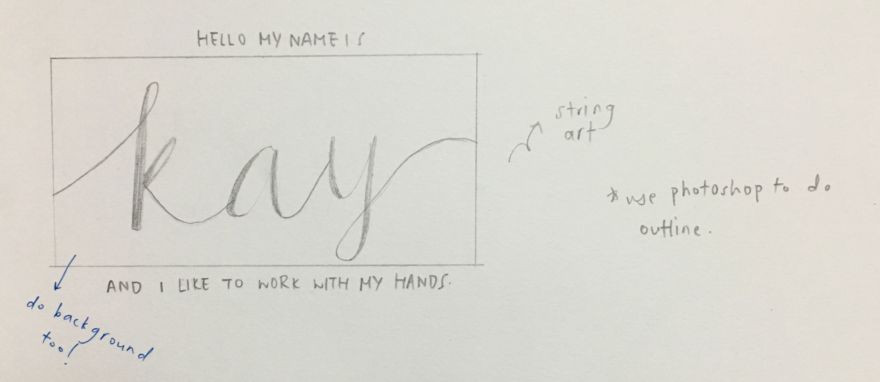
The string art turned out really nice! (During consultation Ina pointed out that this was good too.) However this looked a little too plain for me so I might add more colours for the background during my final piece.

DSCF1130-2

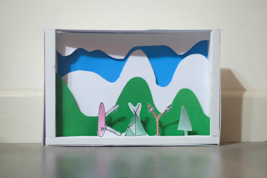
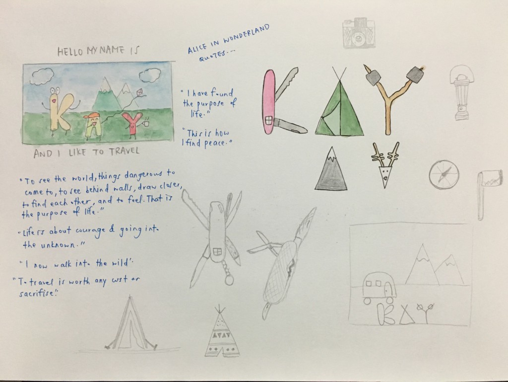
After sketching out different objects, I decided to go with the swiss knife (K), camping tent (A) and marshmallows on twigs (Y) and it turned out quite good, just that I might need to do a little amendments because the cutting wasn’t so good.  (Ina pointed that out too.)

DSCF1131-2

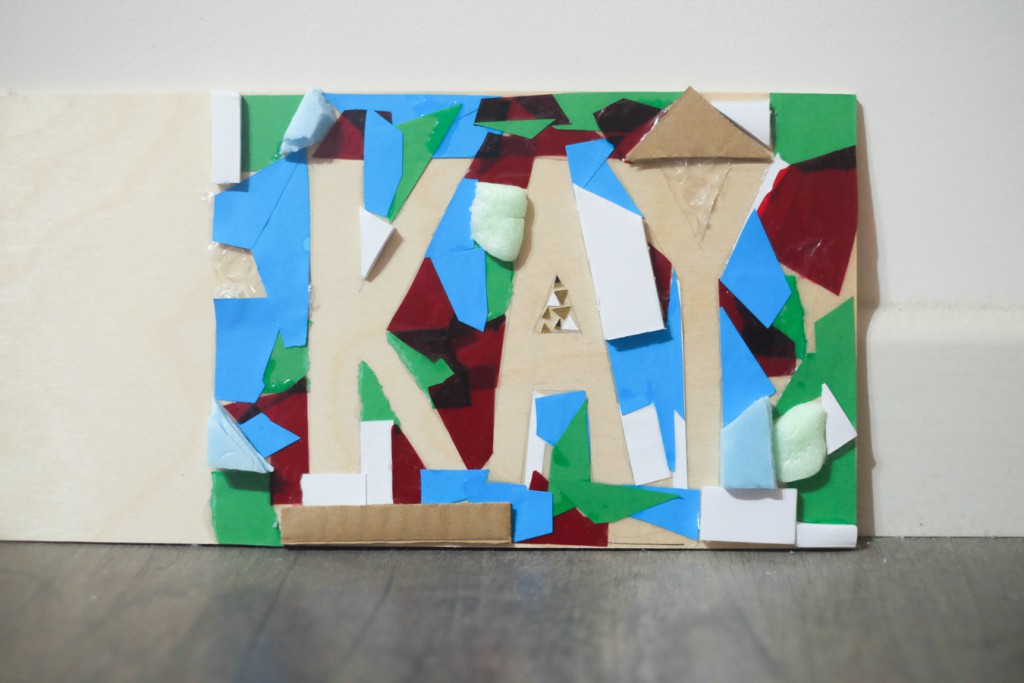
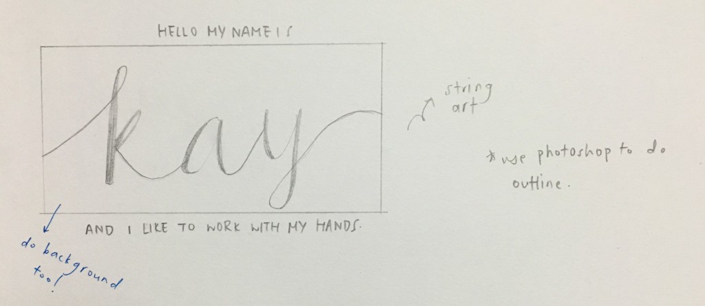
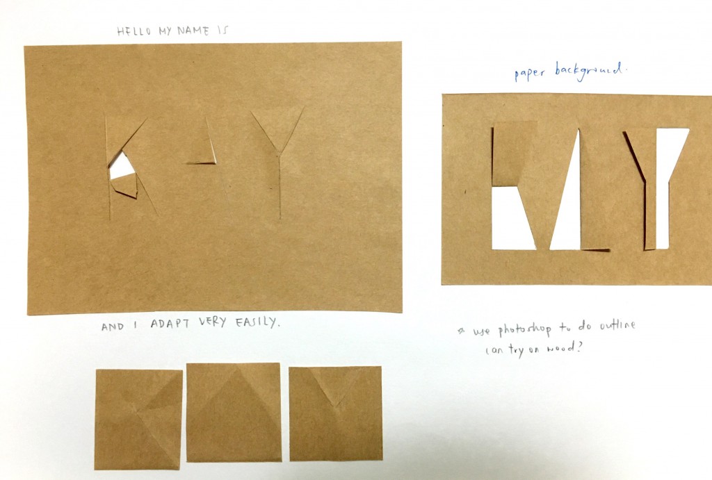
I wasn’t really feeling this after seeing the outcome, it looked a bit too simple, and it was probably because of the material I used.

DSCF1132-2

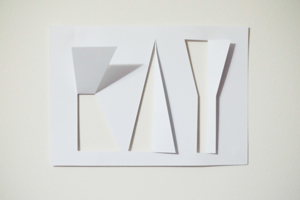
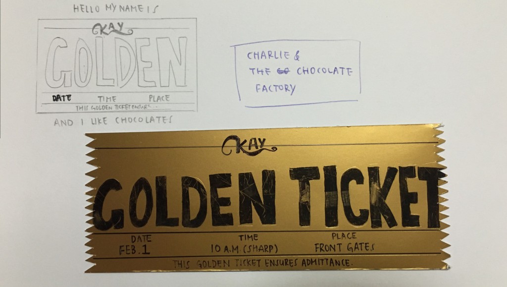
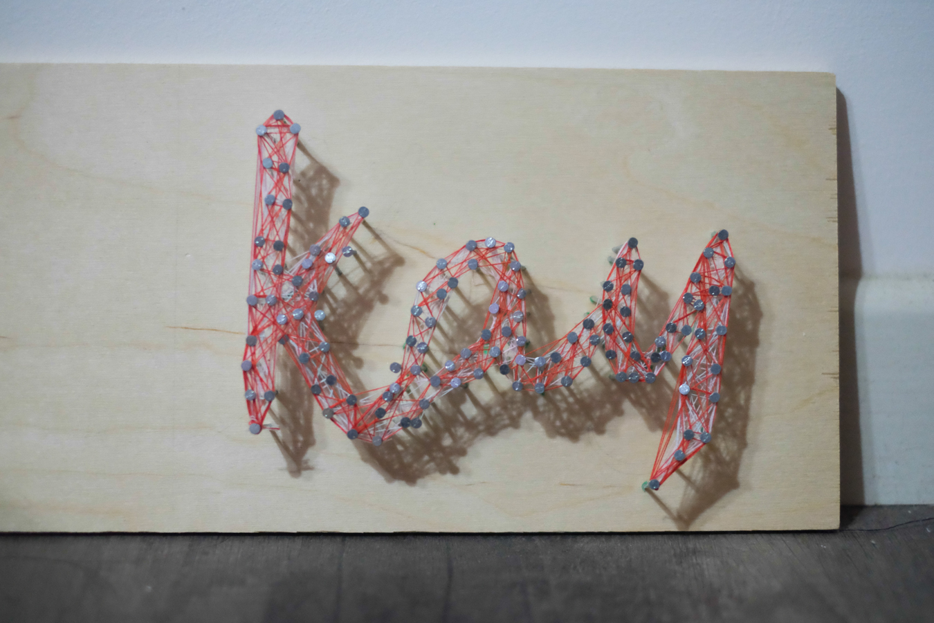
This came out pretty good and it’d look best if pasted on another plain white paper. I really like how the letters are not alphabets as it is supposed to look like and how even though it looks plain, the shadows formed is becoming part of its aesthetics.

DSCF1133-2 DSCF1135-2

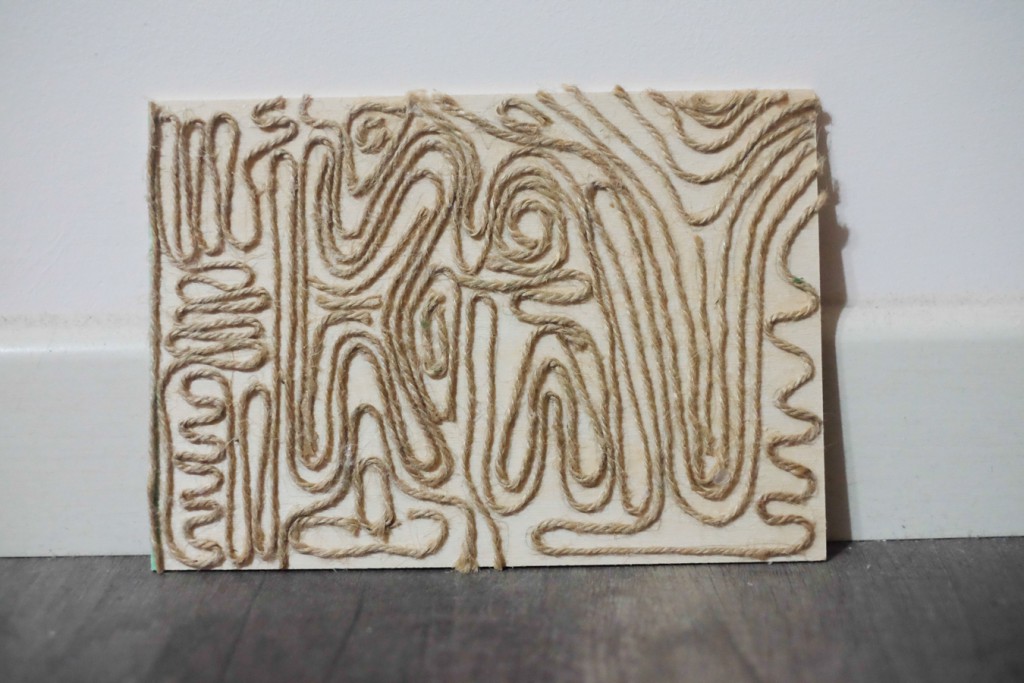
Ina really liked how this was done- simple, using just brown string. The effect of this came out pretty well too, at first glance it may look confusing but if you take a closer look you can actually see the letters of my name.

Typographic Portrait: Process II

So after researching and brainstorming for ideas, I wrote (or rather, vomited) all my thoughts onto my sketchbook. Some pages were quite blank because I thought that it’d be easier if I were to start making them straight away so that I could do some troubleshooting if anything were to happen.


Here are the pages of my sketchbook:

new doc 1_1

new doc 2_1

new doc 3_1

(I figured that the golden ticket wasn’t going to work because I felt that although it looks okay to me, I didn’t really feel like exploring into this because I wanted to do something more adventurous and exciting.)


new doc 4_1

(I added some more detailed sketches as a means to explore out different variations and types of objects you see when you travel out in the wild. Also, during consultation Ina suggested I come up with more stylized illustrations for my swiss knife.)

new doc 5_1

(I really like this series because I usually am a sucker for minimalistic pieces. Might choose to do the one on the right though.)

new doc 6_1


Typographic Portrait: Process I

Hello my name is Kay (for short), and I

  • like to work with my hands

As someone who is kinesthetic, I learn best through carrying out physical activities and it is also because of this trait that I began to love making/painting.

The technique I would like to use for this is string art, something that I’ve wanted to try for the longest time.

  • am easily confused

It usually takes a while to understand things that are not straightforward.

The technique I am looking into for this is making use of optical illusions, creating confusing typography yet at the same time is able to be read.

  • like chocolates

I think this is pretty straightforward. I like chocolates.

And because chocolates remind me of Charlie and the Chocolate Factory, having a golden ticket to express this would be nice.

  • like to travel

Travelling is something that I’ve enjoyed since I was a child and I especially love car rides to the countryside.

I would like to venture into paper pop ups in this case, because I feel that this technique will bring out the best of the layers of mountains.

  • adapt very easily

I adapt to my surroundings easily so the technique that I would like to use for this is simple- paper.

  • am very messy

Being someone who’s messy, I would like to create a typographic portrait that is made from scraps, things (or rather, rubbish) that can be found in my room.