My-ga-zine

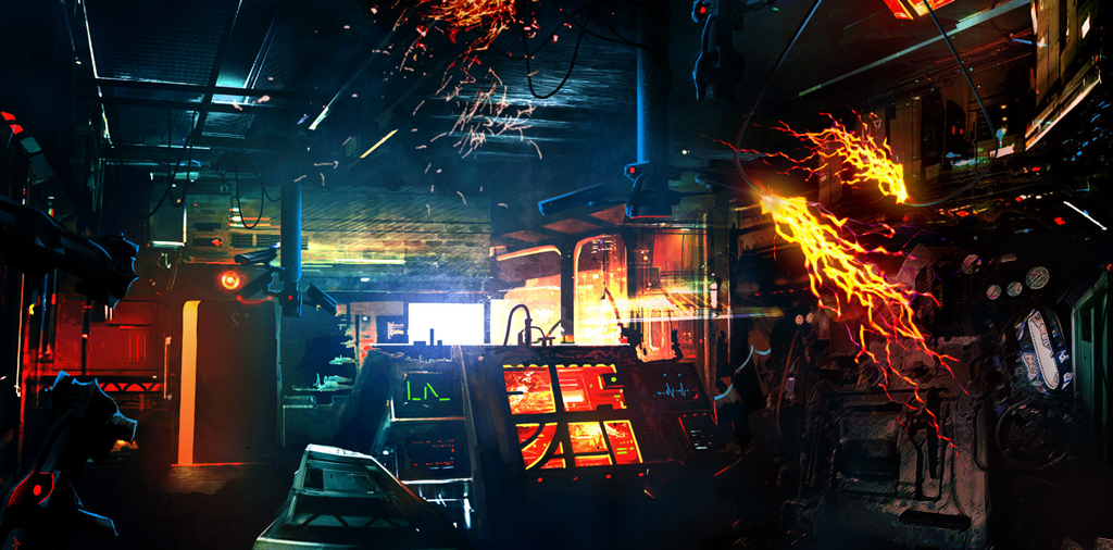
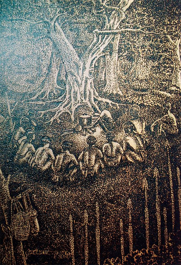
If you have seen this lightning image before, yep, it was featured on a newspaper, website and in the Esplanade before.

Although I have been in the media field for quite a while now, I have never made any publications or dealt with publications. All my works are usually digital, namely videos, websites, 3D artworks, shirt designs, etc, but this zine was the first.

THE CONCEPT

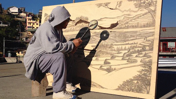
As you all know, my past works are all digital, either in photos, photo-manipulation or vectored “papercuts”. I wanted to base this project on photo-manipulations, with reference from reddit’s photoshopbattles sub, but decided against it due to the time constraints.

So, as mentioned in my previous project when I drew reference from my “chasing the sun” vlog, I wanted to go along those lines for this project. I have decided to go with “storm chasers” concept, based on my expedition to the US in August 2011 to chase and record these storms. This will be made into a “intro” booklet to provide information and maybe invoke some feelings in photographers alike – through the landscape photos – to want to go for a “YOLO” adventure too.

REFERENCES

For this zine, since I will be primarily showcasing landscape photos, I felt that it was rather difficult in composing each page layouts. From the “draft” layout I showed Joy on the previous consult, she suggested that I had to look into more references (photography zines), take note of the layout hierarchy and improve on the typographic elements.

natgeo2
A typical full page landscape photo spread. Notice that the dividing line is usually place to separate the subjects in the frame. (Cr: Nat Geo US 03 2016)
natgeo1
Another full-page spread of a landscape photo. This time a white border is placed to create a frame. (Cr: Nat Geo US 03 2016)
natgeo3
Here a different layout/hierarchy is used. I paid close attention to the colours and type used in the maps for reference. (Cr: Nat Geo US 03 2016)

EXECUTION

For the execution, I wanted the booklet to go from preparation to execution in catching the lightnings. Therefore, I have orgainised the spreads respectively.

TITLE

Originally, I have used a black sans-serif typeface but I felt that it needed something more. So I came up with a slightly thinner and angled it so that it seems like the text is running/chasing. I have added wind lines (when there is storm there is wind!) to give it an extra movement feel.

spread0

In this spread, I wanted to give an introduction by using the 5W1Hs, so it consists of the location, the aim, the people, the time and duration.

spread1

In this spread, its a day shot of the scenery from inside the transport we used. I have intentionally added a white border as a frame to show that it is an “inside-the-van” view.

spread2

In this spread, I wanted to give advice and info to the audience, from the equipment, to techniques, and to the things needed in the trip. For this, I have created an infographic page on the left, on the typical items that can be found in the bag.

spread3

This full-page spread of a sunset shot marks the transition of the journey, as many of the lightnings we tried to catch failed.

spread4

In this last full-page spread, it is the execution and destination of the storm chasing journey, with fruitful results. I have also intentionally composed it so that the middle line did not break the lightning, separating 2 lightnings on each side.

last

The last page I have actually added a quote to seal the deal, hoping that it connects to the photographer in the reader that they should try it out too.

REFLECTION

First, I would like to apologize for my lengthy post. My short presentation on Monday lacked many of these details as I was really stoned due to barely getting any sleep for.. say 3 days hahahaha…

refelc

With only a little knowledge of inDesign in creating a interactive CV in the past, I found it rather different when I had to do a publication. Apart from the bleed and trim, I also had to take note of creep, gutter and grids, which was really new to me. Some improvements that were suggested was that I should have a clear aim and a better conclusion.

Overall, I really liked the outlook of my “professional-looking” zine (as described by my peers, thank you!) and it gave me a enriching experience in publication making!

From the POV of the Assignment

With this post, I am concluding this assignment of Point of views. yay!! laughing

THE SUN

Why did I choose the Sun? Well, I really like the hues of a sunset and it is a beauty in many ways. Its like… well… a little hard to describe but lets hear it from someone else point-of-view, describing it to a blind person:

THE CONCEPT

My concept is to show the contrast between the positive side vs negative side of the sun split with 3 compositions on each side. Also, I have used the same subject matter for each row in contrast.

THE STYLE

Based on my reference pyrograph artist who uses sunlight and a magnifying glass as a condensed form of energy in burning wood to create his artworks, I have decided to emulate the same style of pyrography in digital means with a landscape as a backdrop. I have also used the play of “shadows” in the form of silhouette papercuts layered over my compositions. I used more positive space in the “positive” side and more negative space in the “negative”. I have also subtly added the sun to be in the east on the right side vs the west on the other side.

layout

THE COMPOSITIONS

THE SUN FROM THE POINT OF VIEW OF A BEACH IS PARADISE.

f-05

In this composition, I wanted to show a sunset at the beach, where it would look the most amazing when the sun hits the waters, making them sparkle as it dips below the horizon, coupled with the sand on your feet and breeze in your hair.

THE SUN FROM THE POINT OF VIEW OF A DESERT IS TORTURE.

f-06

In this composition, I have composited a desperate crawling man being tortured in a desert with immense heat, depicted using the heat waves in the papercut as a form of framing overlay.

THE SUN FROM THE POINT OF VIEW OF A TREE IS GROWTH.

f-07

In this composition, I used a backdrop of a farmer working on his crops in the background with a tree in the foreground growing towards the direction of the sun, as the sun is a source of food for its growth.

THE SUN FROM THE POINT OF VIEW OF LAND IS DROUGHT.

f-08

In this composition, I used a barren land with lifeless trees and dried shrubs in the background, with a layer of floor cracks due to the drought in the papercuts.

THE SUN FROM THE POINT OF VIEW OF AN EX-CONVICT IS FREEDOM.

f-09

In this composition, I wanted to show freedom in the form of “everything under the sun”. The cityscape is used in juxtoposition with the barbed fence representing the prison.

THE SUN FROM THE POINT OF VIEW OF A BLIND PERSON IS (STILL) BLEAKNESS.

f-10

Last but not least, in this last composition, after all my research on blind people, I have tried to simulate what they actually see of the sun. A partial blind may still see either bokehs or parts of blocked vision in black; a once-born-already-blind has never seen the sun, but can feel it from a slight increase of brightness and the warmth; and a once-able-to-see blind will only have a memory of the sun. Hence, I have composited these theories together to create a abstract image of a blind’s perspective.

THE REFLECTION

Having the sun as my subject, it was really too broad and I have came up with so many ideas (too many actually) that could not be linked together easily into six. Conceptualizing was the hardest challenge for me, but I’m really glad that I could finally piece them together. To end this post, here is the machine at home that I use in cutting the papercuts. cool

POV: Researched

Sorry this is way overdue but here is more research and maybe a finalization of ideas…

Honestly, I felt that the previous POVs that I have came up with was not good enough so I have revised it:

Then Sun from the Point-Of-View of

  • farmer is harvest
  • Forrest Grump is a destination?
  • (in contrasts)

beach is paradise
desert is torture

body is vitamins
skin is UV damage

ex-convict is freedom
blind man is feeling

  • (west vs east)

west is luxurious tan
east is avoidance (asians)

White Skin Asian debate

west is sunset
east is sunrise

apollo vs Amaterasu

  • (or in military context)

recruit is sunburn
trooper is never ending journey
sergeant is torture
officer is first light
wet feet is sunbath


so… I have decided on going with the contrasting concept.

1. ex-convict is freedom vs blind person is …

2. skin is sunburn vs face is UV damage

3. crops is growth vs land is drought

POV: Process

So…. With the concept in mind, I have started experimenting with some styles and compositions that I am going for.

For the idea of “Skin is sunburn, Face is UV damage” here are some reference images I am looking at:

UV damage
Sunburn skin peeling

So I have came up with some mock up compositions..

face-wip
UV Mapping of a human head texture
20160315_220901
my failed experimentation

With this mock up, I have originally planned to use the pyrography technique to try to burn holes into the face to show the damage done.. So I have experimented with burning a stick and poking it into paper, but it only resulted with burnt marks….

head-wip
photo manipulation of a head texture

As for “skin is sunburn” I have decided to also follow the style of a “head mapping texture” and also to recreate the peeling skin on the scalp. I thought of using those Daiso Charcoal / nose skin cleanser products (when dried) as they give off that peely effect but it seems like Daiso was out of stock.. hahafrown


Next up, I tried composing the shot for “ex-convict is freedom”, and with some sketchy-style images I found + drawing with a mouse, I have managed to recreate the pyrography style in Photoshop. (yay to photomanipulation)

excon
The sun from the point of view of an ex-convict is FREEDOM without silhouette.

I kinda really loved the result of this image.. so I have decided to create the other compositions in this style… For the silhouettes, I have fired up Illustrator and started creating the prison/barbed fences… then went to process the papercuts out.

exconfull
composed image on Illustrator
IMG-20160314-WA0007
barbed wires papercut

So to end this post… here is the sneak peak of the “draft” of all of the compositions after adding the silhouettes counterparts in Illustrator.

all

Chapter 2: Discovery

After the break in at ELMT HQ, both of you still have no clue on who and what are The Horsemen. You both have then became best work partners and have been doing well in ELMT.

On the last day of 2030, both of you were in the taxi to HQ when FRISM has issued a threat notice from your handheld terminal, which says:

THREATCON Y
Suspected terrorist workplace
Location: Abandoned Factory along 13 Holo Lane
Mission: Recce and capture all suspects
THREAD WITH CAUTION

With a tap of a security key on the taxi’s contactless reader, it activated a MANUAL MODE and the steering wheels emerged from the dashboard.

Both of you started speeding over to the location swiftly.


You were both the first to respond to the scene. 13 Holo Lane was dead, with no trees, humans nor sounds. There was only a small rundown factory which seemed to be abandoned a long time ago. With your weapons by your side, both of you approached the main entrance.

Once the door was breached, a security alarm had gone off. In the room, there were very old looking machines that were of older technologies. On a closer look, it seemed to be a makeshift laboratory with all the tech tools and devices. Loose and broken electrical wires were hanging above the ceiling and they were starting to short out with the high voltages passing through them. There was also a door at the far end that was probably faulty, as it kept on opening and closing.

It seemed that the suspected terrorists knew that you were coming, and left in a hurry. The lights and that the machinery were still powered on.

Just as your reinforcements arrive, the shutter came to a shut and locked both of you inside the factory.

Will you explore the area and find some clues on the terrorists or find a way to let your reinforcements in? (please use the image above to navigate)

Point of View Ideation

EDIT: Jump to updates.

Subject

The Sun


  1. Sun pov of Japan is origin/Flag
  2. Sun pov of a Shinto is Amaterasu (goddess)
  3. Sun pov of vampire is death
  4. Sun pov of soldier is heat stroke
  5. Sun pov of night is the other side
  6. Sun pov of photographer is f-stop/exposure
  7. Sun pov of a lens is a flare
  8. Sun pov of a beach is paradise
  9. Sun pov of sunset is egg yolk
  10. Sun pov of winter is early sunset
  11. Sun pov of artic circle is midnight
  12. Sun pov of eyes is blinding
  13. Sun pov of sunglasses is muted colours
  14. Sun pov of Ramadan is fasting
  15. Sun pov of compass is time
  16. Sun pov of plants/trees/flora is food/growth
  17. Sun pov of a body is vitamins
  18. Sun pov of power is solar energy
12323182_1741437119423850_430842285_n
CHASING THE SUN VLOG on Facebook (sorry, not possible to embed in WP)

Reference Artists

Photographer Jasper James – City Silhouettes

Nikolai Tolstyh


After consultation updates

Some takeaways from the presentation sharing was:

  • maybe consider “golden hour” as my subject as it has the element of time to play with
  • “the sun” is in between “golden hour” (too restricted) and “light” (too broad) so maybe sticking to the sun is much better

More research

Jordan Mang-osan – Filipino pyrograph artist that uses sunlight and a magnifying glass to create his artwork by “burning”

… and apparently there is even a tool on Kickstarter to help with this technique: FEBO on KICKSTARTER

The results of these artworks are so pretty and might try to replicate this NOT by using the sun, but a similar look. (kraft paper + inked + silhouette cutouts????)

more ideations:

  1. the sun from the pov of beijing is hidden
  2. the sun from the pov of a heliophobic is trauma
  3. the sun from the pov of photophobic is fear|discomfort|pain
  4. the sun from the pov of a nightshift worker is home
  5. the sun from the pov of a scientist is a different light
  6. the sun from the pov of teletubbies is a face
  7. ego from the pov of the sun is blinding

Also, I will try to conceptualize my ideas by playing with duality of with/without light, with/without sun or day and night.

LORE: Architecture

Brief History

In just 25 years, Gright was transformed from a developing country into a first class nation with extensive networking and infrastructure. Due to the intensive research put into design and technology, they were the pioneers in pushing boundaries and creating physics defying architectures. The outlook of the cities is filled with futuristic high-rise buildings, mostly glassy and shiny, or decorated with lights. Due to the short span of 25 years, new infrastructures were just built over old ones, leaving the old infrastructures still intact.

Some landmarks that can be found in Gright:

  • Downtown Gright
  • Gori Building
  • Gright Broadcasting Channel (GBC) Tower
  • Orion Circle – an o-shapped art museum building
  • Aquacitee – an underwater town beside Downtown Gright

LORE: Authority

20

FRISM

FRISM is an independent system. It does not belong to the government, but only a selected few from the government knows of its existence. It is so secret that anyone unauthorized who knows of its existence will disappear without a trace.

ELMT

ELMT is formed by FRISM, and with it being an independent system, the government has no control over it. ELMT is an independent covert group and it has the most power.

LAW ENFORCEMENTS

Although there is the normal police and military upholding the law of the country, FRISM does assist them in what was considered the “small, insignificant threats”. With such a strong, hidden backer, the law enforcement has a commendable statistics of a 99.89% crime solving rate, deterring and possible criminals of GRIGHT from doing anything stupid.

The military, on the other hand, supersedes the police and has the second most power in the country. Although they are the ones handling the bigger, real threats, there seemed to be none in the recent years. This is partly due to the involvement of the ELMT.

Typographic Portrait Final

Finally! All compositions are completed. Here is long awaited breakdown of the final project:

Overall Concept: A milestones based on my Visual Effects artist timeline.

Style: From digital art works to traditional mediums or vice versa.

1. 3D ARTIST

3d

This composition is based off my secondary school days, as I was quite lucky to be the pioneer batch that took 3D Animation as an GCE ‘O’ Level Subject – where I learnt and used Cinema 4D. The idea of using low-poly art, made from a few simple polygons, was also to show that I started from something basic.

IMG-20160214-WA0023

This composition is made up of 2 layers, 1 transparency and 1 printed artwork.

Originally, as a 3D Artist, I wanted to incorporate a popup element in the design but the design was too complex. Hence, I have experimented with layers of transparencies, and it was an accidental success with these 2 layers, when overlayed, creates an illusion that the name “pops-up”.

IMG-20160214-WA0021

2. LOVE DETAILS

details

For this concept, it is based on my Poly days, when I was interning and was tasked to primarily texture paint. My colleagues then taught me well – to observe any single details of the textures around me and even study some of the physics involved.

IMAG0031

IMG-20160214-WA0008

For this design, I have used a thumbprint as the background as it represents the macro details that can be found. I have modified a script font by using illustrator and painfully incorporated it to fit the lines of the thumbprint. Also, the medium for this was paper cutting as I felt that paper cutting is an intricate and delicate process that will truly bring out the concept of intricate details.

3. ART STUDENT

IMAG0032

With Secondary and Poly days aside, this piece is based on my current status of an Art Student in ADM. This was originally a hand drawn handmade font done with graphite, then scanned and digitized and painted in Photoshop. This was to show that at this stage, I am trying my best to do things in both digital and traditional mediums. The coffee stain was added as a representation of the long late nights students spends doing studying or doing their assignments.

4. VISUAL EFFECTS ARTIST

oss2

Last but not least, being a Visual Effects Artist is the GOAL. Whenever someone asks me “what course are you in” or “what do you do”, I usually tell them visual effects, but some of them still does not know what is visual effects. So I usually use Iron Man as an example, and with that, I have decided to go for a HUD (Heads-Up-Display) style based digital “holograms” for my typeface.

Just like the breakdown video of the Swedish Idol Title sequence in my previous post, many layers are needed to create realistic visuals. With this concept in mind, I have created my typeface in 3 layers, with 1 background layer:

oss

On the topmost layer, I have added a bunch of text on the right corner, of the programs that most vfx artists will use, to complement the balance of the composition of the bold and heavy typeface of my name. Also, with 4 layers in total, I have decided to give it a little depth, in z-space, to create an illusion that the text is in 3D. (from the parallax differences)

Last but not least, with all goals in mind, the ultimate goal is to see my work on a big screen.

So to start small, I have incorporated the last effect, the “negative filter”. Due to the some limitations (access to white ink, etc), I could not create the same effect in print, therefore I have thought of going back to digital – through the phone camera.

IMAG0025
“POSITIVE”
IMG_20160218_174501
View of NEGATIVE FILTER from my phone camera

Creating this piece was a real challenge as I had to design this while looking through the camera filter, tweaking it in a way that the “positive” image will still look good.

Also, to create the depth, I had to find a transparent alternative to foam tape so after much thought, I have finally came up with using transparent straws and I have spent 2-3 hours gluing them onto the transparencies.


If you noticed, my compositions are also arranged (my opinion) from the most basic to the most intricate:

digital 3D < papercut < drawing < multi-layered “3D”

Overall I really enjoyed pushing my boundaries of sticking to digital work and experimenting with transparencies, tracing paper, papercuts and other traditional mediums for this project – some which was rather tedious as compared to doing purely in digital. I hoped you enjoyed it as much as I did!!

2D Typo: Last update!

With less than 72 hours to submissions… here is my final update.

3D ARTIST

Based on the reference image above, I have started researching on a easier and/or more generative way of creating this in 3D. I have finally decided attempt this style, a trend in 2015, called LOW-POLY ART.

MountStar – Behance

I chanced upon a tutorial on a simplified way of creating these, and seemed like Cinema 4D is the way to go. With reference to the first image, I fired up C4D and created my name on a landscape, and here is the output.

3d
JUSTIN low-poly

The typeface is created from selecting random polygons and extruding them, so its kinda like a handmade font. I am now attempting to convert or incorporate this into a pop up card for the final piece so… yep, I still have a little more to go..


VFX ARTIST

For the VFX image, I have already completed and printed onto my transparencies. (pardon the photo quality, my phone broke)

vfx-almost

I am still thinking of a way to mount these together to create a some z-space in between each layers to create a parallax effect. Since its transparencies, I cannot use thick double sided tape and might have to use the left over transparencies instead.


LOVE DETAILS/EYE FOR DETAILS

Yep, I might be changing “love details” to “have an eye for details”. These will be based on papercuttings, definitely. I have yet to start on them, so here is some research.

Emily, paper cut ? #papercut #art #silhouette #portrait

A photo posted by Sari Friedman (@sari.friedman.art) on

Papercuttttts #papercut #design

A photo posted by David Ackerman (@ogbigdv) on

As allways, freehand cut within the shape of a circle ◉

A photo posted by Kristine Benum Braanen (@kristinebraanen) on

I should be going for a more geometric look (purely shapes or lines) for these patterns found on the cutouts. The lines will be fairly thin, creating a intricate overall design.


STUDENT

Here is some research on coffee painting that I might be referencing.

• ☕️?• . . Good morning Sunday !

A photo posted by Ranveig (@ranli_) on

I might start my base of this piece with splatters of coffee, then adding these things I have used (the things I have already collected) throughout the entire period of creating all the other compositions in this “student” piece. This will only be done last after I have completed the other 3/4 of the typographic compositions.

With this, I’ll end off here with a cool website called Type to Design that I have chanced upon. The next post will be on my completed product! Stay tuned.