Final Year Project Research & Process I

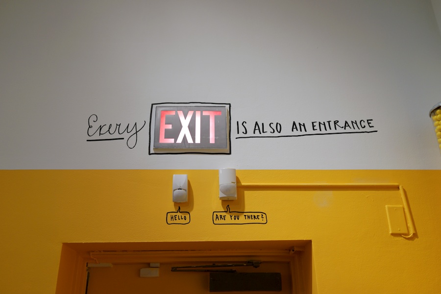
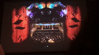
The Happy Show by Stefan Sagmeister

https://sagmeisterwalsh.com/work/all/the-happy-show/

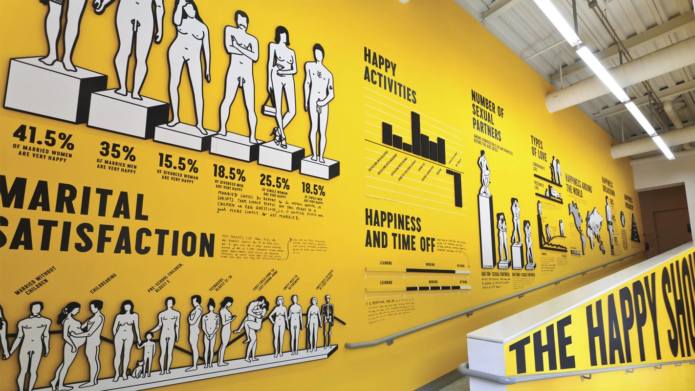
Stefan Sagmeister is a graphic designer storyteller that based on New York, he put up on a exhibition “The Happy Show” that provides diverse experience for the visitor to peek into his exploration on what makes people and himself happy for 10 years.  Also his attempts to increase his happiness through various means such as cognitive therapy and mood-altering pharmaceuticals. The designer showcase through films, print, infographics, sculpture and interactive installation that I find it very interesting as they provides range of experience for the visitors. Sagmeister also uses very bold overall look and feel that I felt is very effective and eye catching.

https://sagmeisterwalsh.com/

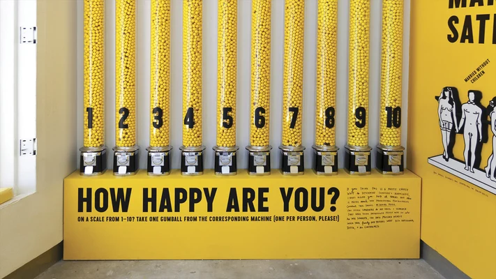
I really like this participatory piece he did, people are able to grab one of the gumball according to the level of happiness they are in and it reflected the real live statistic of happiness from the visitors.

https://sagmeisterwalsh.com

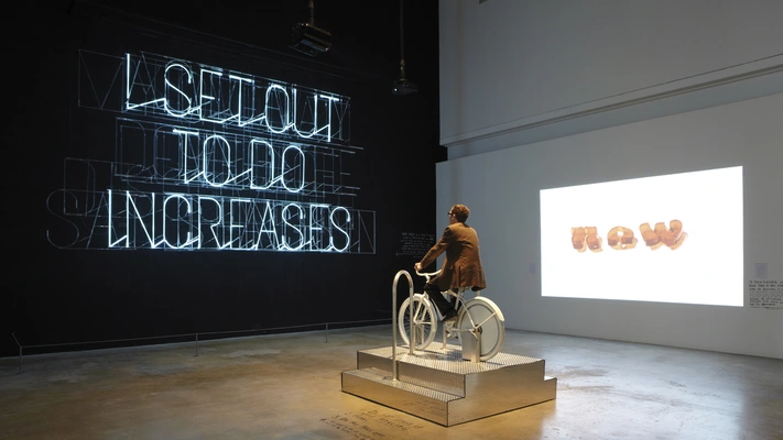
Another highlight in this exhibition requires a bit of hardwork in cycling a bicycle. The more you pedal the visitor would get a giant message in front of them that involves doing the things you set out to do would increase your sense of well being.

http://www.minimallyminimal.com/

He also make use of the existing objects in the museum to create some interesting and inspiring quotes for the visitor.

“Almost anything, will have some sort of influence on your happiness”

In an interview Sagmeister mention about almost anything, will have some sort of influence on your happiness. He also stated that he don’t think that anybody would be happier after this exhibition but he that his experience would be compiling enough that the visitor would try out the strategy themselves.

Reference: 

  • https://www.moca.org/exhibition/stefan-sagmeister-the-happy-show
  • sagmeisterwalsh.com/
  • http://www.minimallyminimal.com/blog/the-happy-show-at-moca

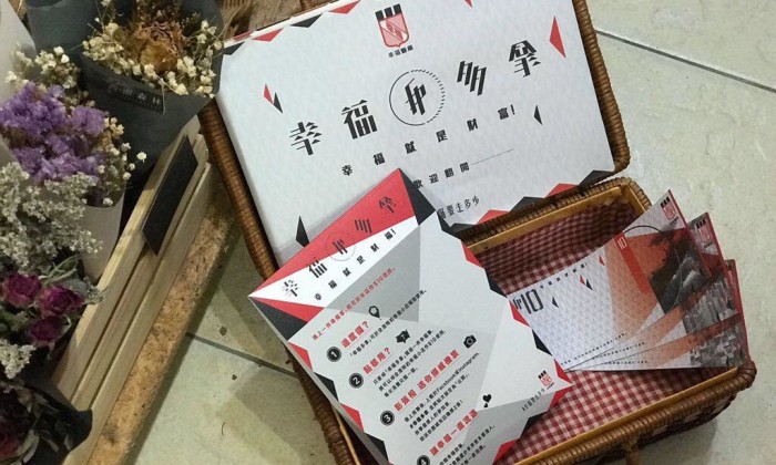
Another project I found was this Happiness Currency campaign by Hong Kong Pharmaceutical company, to rediscover the meaning of fortune. As statistic shown that Hong Kong residents focus more on their wealth but their happiness level were relatively low.  Through this campaign they hope to remind them that happiness is also a fortune. The public can get voucher from any participated 40 local stores write and  submit their happy stories to get “Fortune Dollar” that equals to HKD $15. Fortune Dollar can be used at those participated store to exchange for real goods. After that they made a short film of people coming from different background to talk about their definition of happiness. Ending with the your happiness is your greatest fortune.

I find this project rather relevant in today’s society. Sometimes we got lost in what we want in life and focus more on the material happiness. I find the part where they film people from different backgrounds to talk about it was quite interesting and there is about 6.3k views in facebook.

Reference:

  • http://www.marketing-interactive.com/fortune-pharmacal-rolls-out-happiness-currency-to-highlight-the-greatest-wealth/
  • http://m.lbzuo.com/cehua/show-14406.html


Response to Refik Anadol Lecture (With Xin Feng)

Refik Anadol is a media artist that currently based on Los Angeles. He work with site-specific public art using data sculpture approach, also creating audio/visual performance. Anadol explore between digital and physical relationship of architecture and media arts.

Using Lights as material

In his early works, he transform the Santralistanbul Art and Culture Center Main Gallery building in to animated 3D geometric building.

Quadrature

His uses lights to create different shade on shape to transform the building into 3D which I find it really amazing. Turning the surface of the building into canvas and apply the theory of light and shadow. From Rose Bond lecture she also did projection on buildings but Anadol in a different approach. Rose Bond drew the animation and uses more colour to bring out the narrative but Anadol uses geometric shapes and technology to create the animation.

Physical and Visual

Ethereal / Architecture as a Canvas Light as a Material

Anadol bring further his expertise and incorporate real-time data analysis into computational algorithms in this Ethereal project. It uses multiple projections around the building and are control by computers. Music performance in the building will also change the visual of the projection. This project was to experiment on large scale projections on architecture can be transform, create expand, amplify and interpret space on using audio/visual techniques.

Using the physical building combine with relevant information in to visual also link up with the performance inside the building to create a interesting and relevant context.

Archive Dreaming

Archive Dreaming are data of 1,700,000 documents that are archives turns into an immersive media installation. Anadol wanted to to change the conventional way of viewing experience of a library and cinema projection on screen and constructed 3 dimensional kinetic space. He uses mirror reflection in his project for the top and bottom to create this 3 dimension effect.

From his presentation, he started off working with light and shadow and slowly evolves into more and more complicated projects. I find his works are really impressive and interesting as he keep challenge himself to do better work. Starting from a flat surface architectural, into irregular shape projection like Ethereal in to data visualisation in 3 dimensional.

Exercise 3 — If we were born this way [Xin Feng & Su Hwee]

We wanted to do something that will prevent our joints to move so as to experience a different walking and moving experience. We started off using the leftover styrofoam as guide for the legs and tie together with the hardboard in front.The overall experience was quite interesting, we need to adjust the way we walk at the same time balance ourselves. The styrofoam retrains us from walking the speed like we used and you have the feeling of keep falling off. However, it don’t work really well as there is still some leeway in between that allows your knees to bend a little. Also for safety issue we decided to try out other options and make some comparison.

On the second try we tried using a harder cardboard and tie the string on the bigger surface on our leg. It works well at first but slowly the string would slide down and once again become lose. So we tried another way using just the bandage and surprisingly it was really secure and able to maintain it for a long time. Moreover, the bandange was more comfortable as compare to the string that sometimes might be too tight.

Using strings to tie the device onto the user’s joints proved to be time-consuming and troublesome as it would slip off every time they took a step. We decided to make use of velcro strips to secure the device and lessen the amount of time needed for each user to try it on. We also made use of crepe bandages in order to further secure the device on the users. It also helped to immobilise the joints aiding in our little experiment.

Reflection – Rose Bond Lecture

The Canadian artist Rose Bond shared about her experience of screens installation and how she started as an animator. I was fascinated by the film Nexus she showed us was done painted directly to the 16mm film at that  time before After Effects are invented. The frame by frame provides the interesting effect of changing lines which personally I really like.

Rose Bond, Illumination #1

Instead of the normal screens, she explore using multiple screens on the window. She shared that the projectors are place inside the building and projected to the window. The animated artwork shows historical past of the Portland Seamen’s Bethel Building showing them through the window created an interesting narrative. It attracted passerby around the building and many stop by to look at the artwork where Rose Bond refer this as active viewing.

The most interesting project was the collaboration with the Oregon Symphony Turangalila. They combine the visual experience and music together according to the music which I find it similar to the Russian painter Wassily Kandinsky.

File:Vassily Kandinsky, 1913 - Composition 7.jpg

In art history, our lecturer showed us this accompanied by a piece of music on the background and it seems like everything in this painting is moving. I got the similar feeling when I saw Rose Bond’s project.

At last she talk about there is still many possibility can be done with screen, awaiting us to explore even further. I do agree with her as technology advance, many different kinds of screen such as haptic touch screens and bendable screens. I also learnt that her persistent developing ways to work with screen on windows and walls other than the convention method. On the backend, I am sure many preparation time is needed in order to produce the visuals especially synchronising with the music, setting up the projector also mapping to the the ideal area. Setting up before hand would be very tedious and coordinating with the technical people to ensure everything goes right. I can see there is no last min work to create such detailed planned project.

Documentation Part 1

Safety is the top concern in this project due to the candy will be hanging at the top. I did some research in the method of the rope and also Fabian told me about a method clove hitch knot that can be self-tighten.

I did a 2 time trial with the weights and uses 2 types of knots, clove hitch and figure of 8. Figure of 8 are used by rock climbers to tie on to their harness which I feel it will be helpful and secure my project.

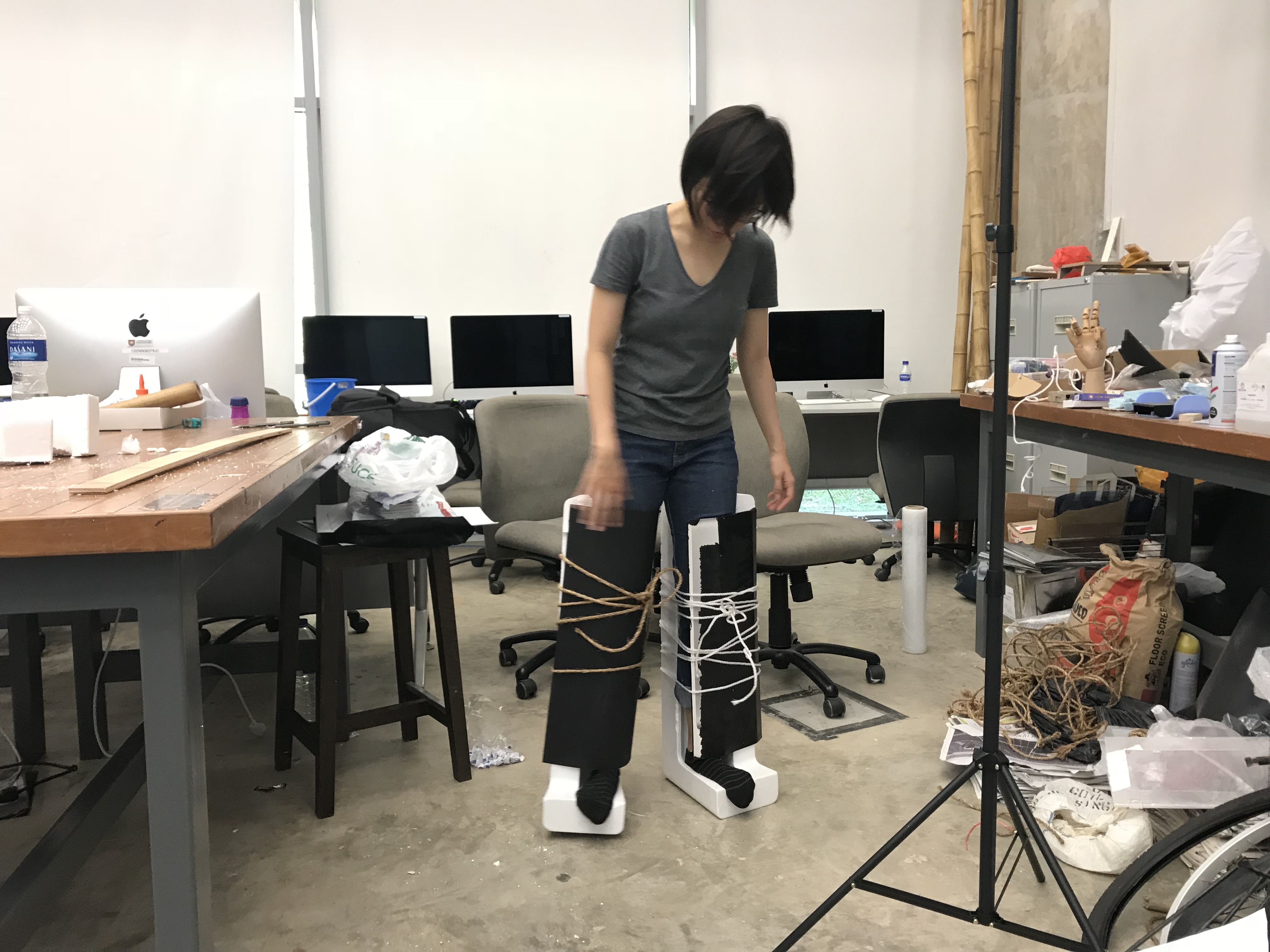
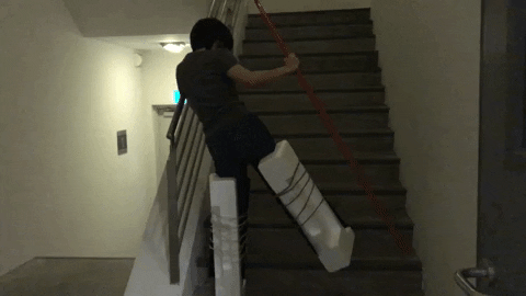
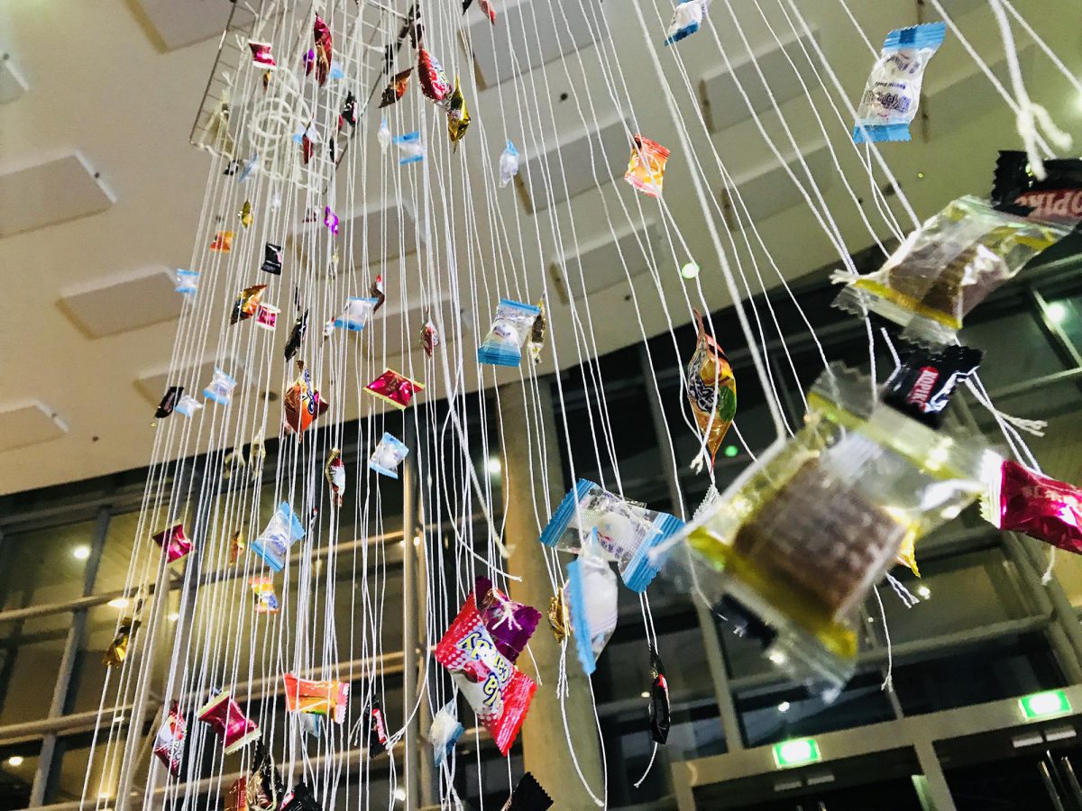
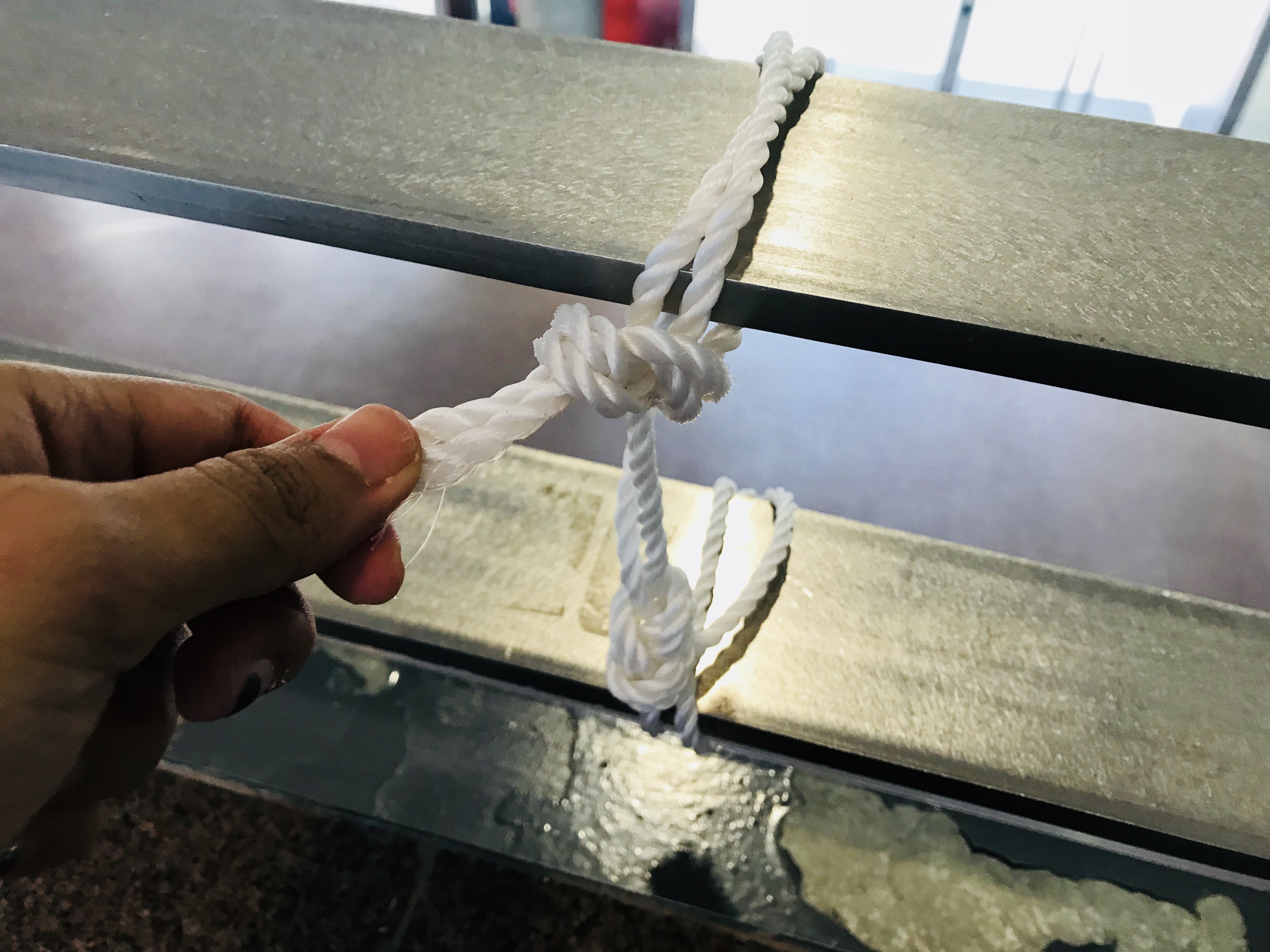
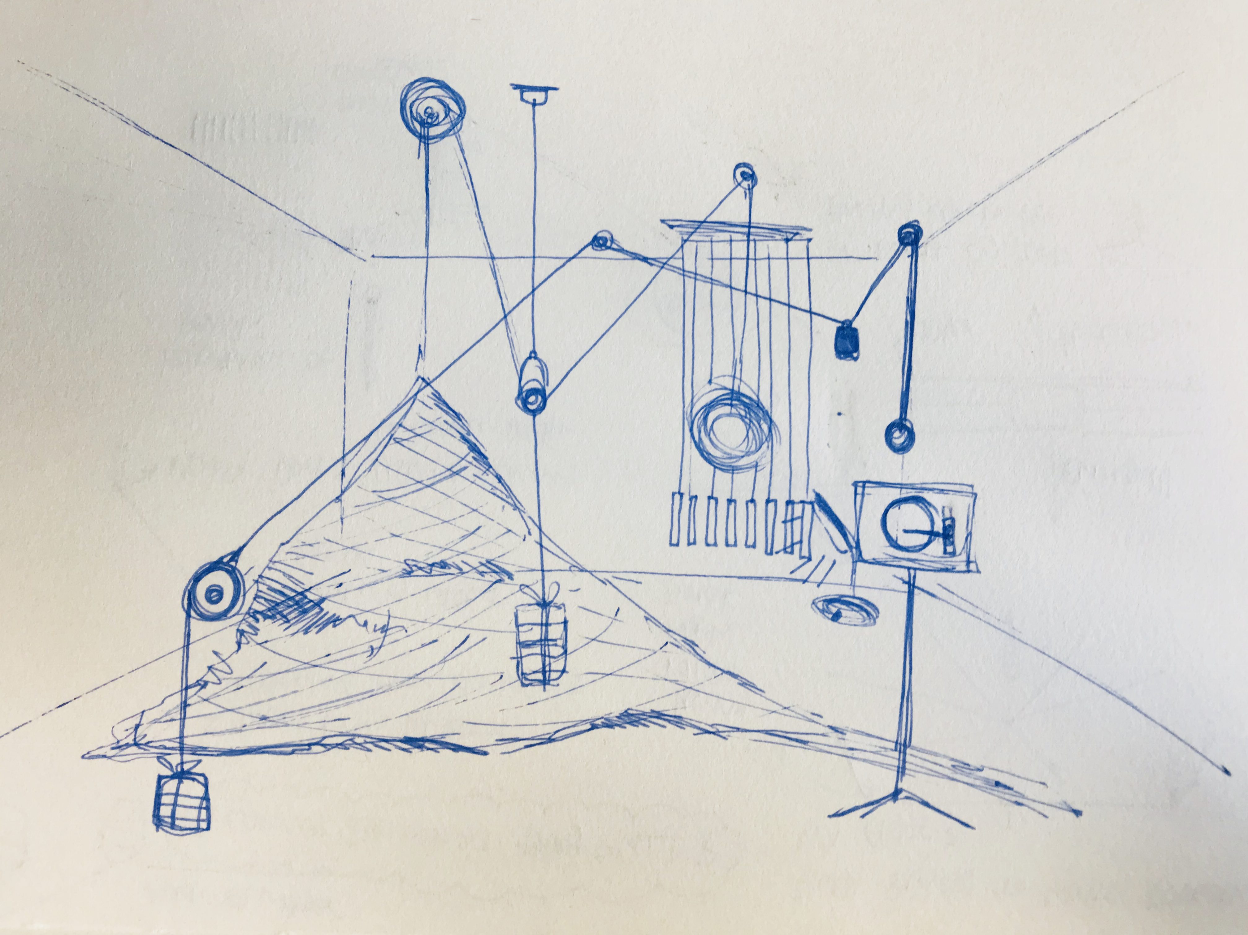
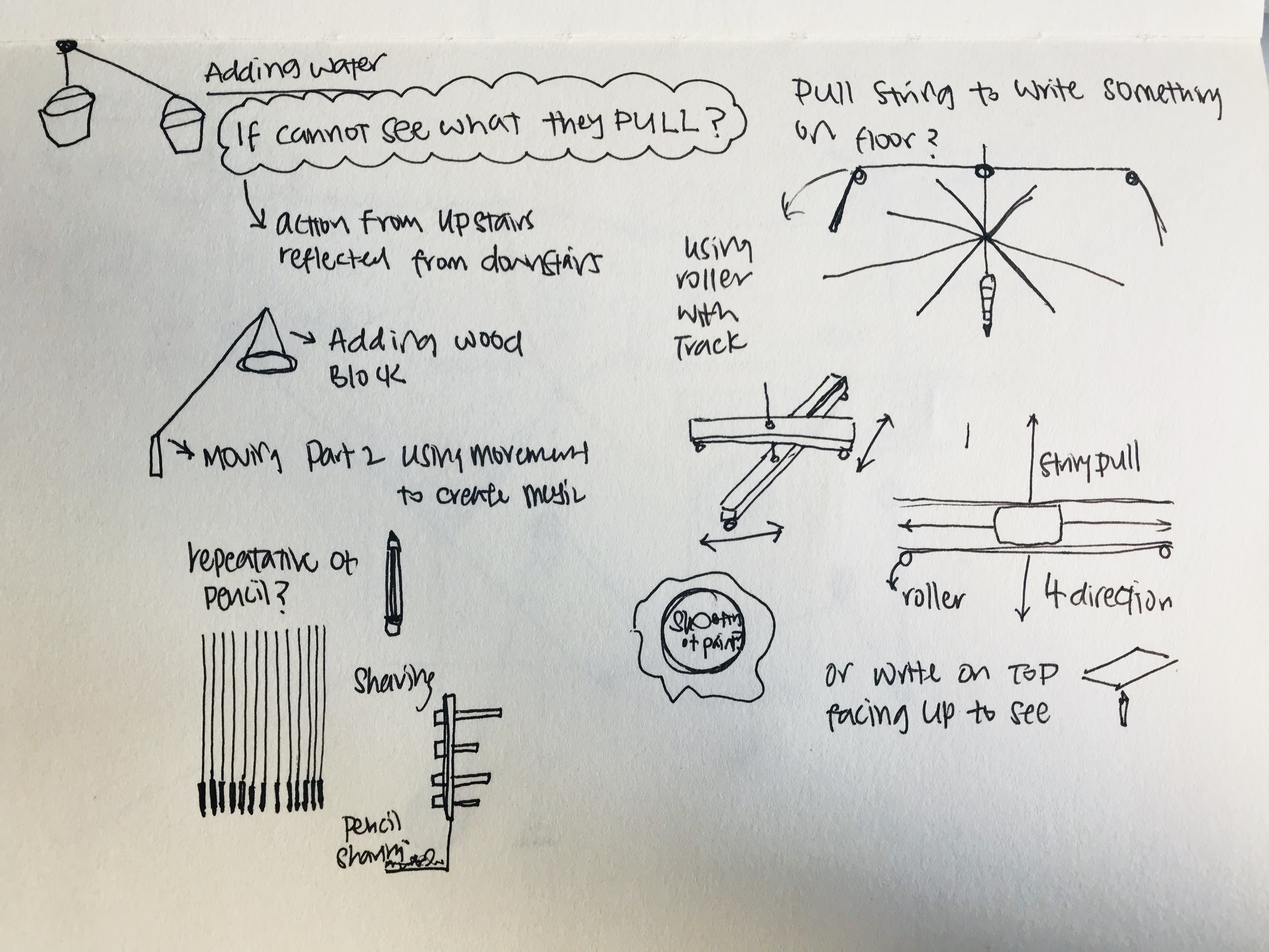
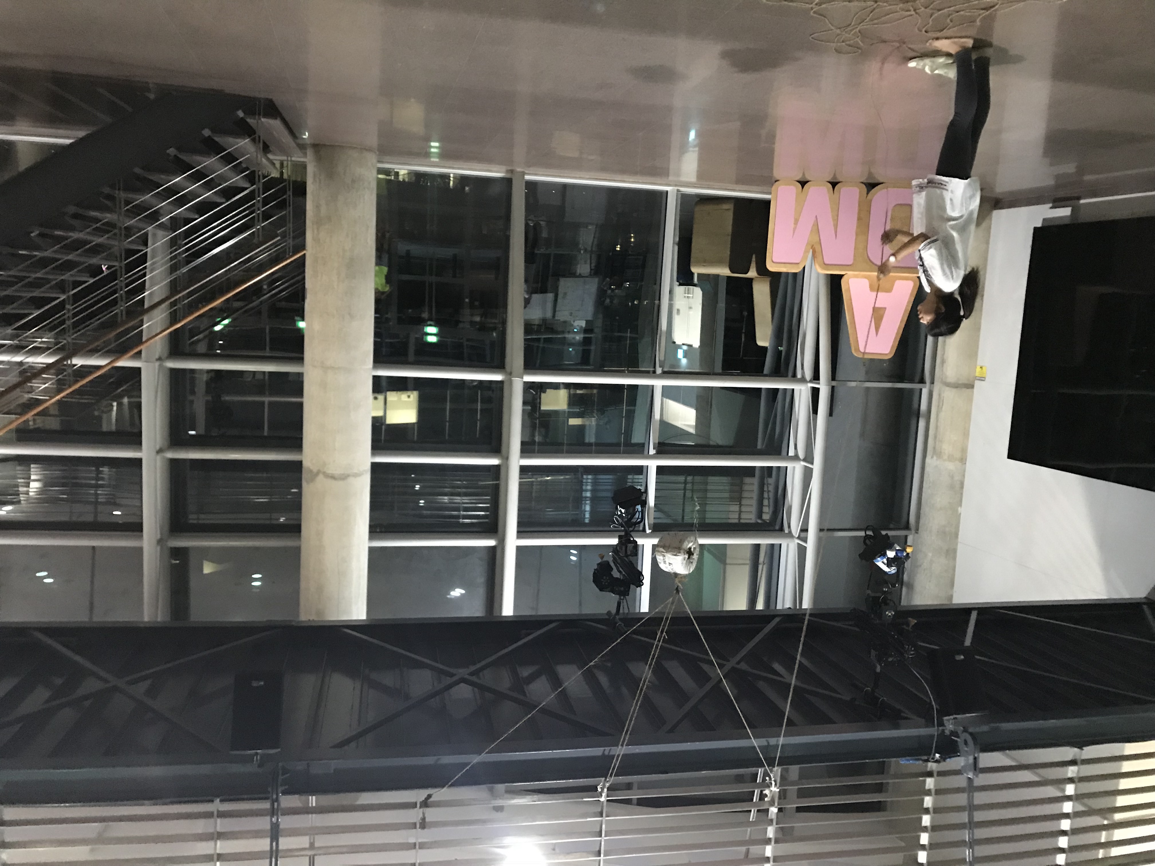
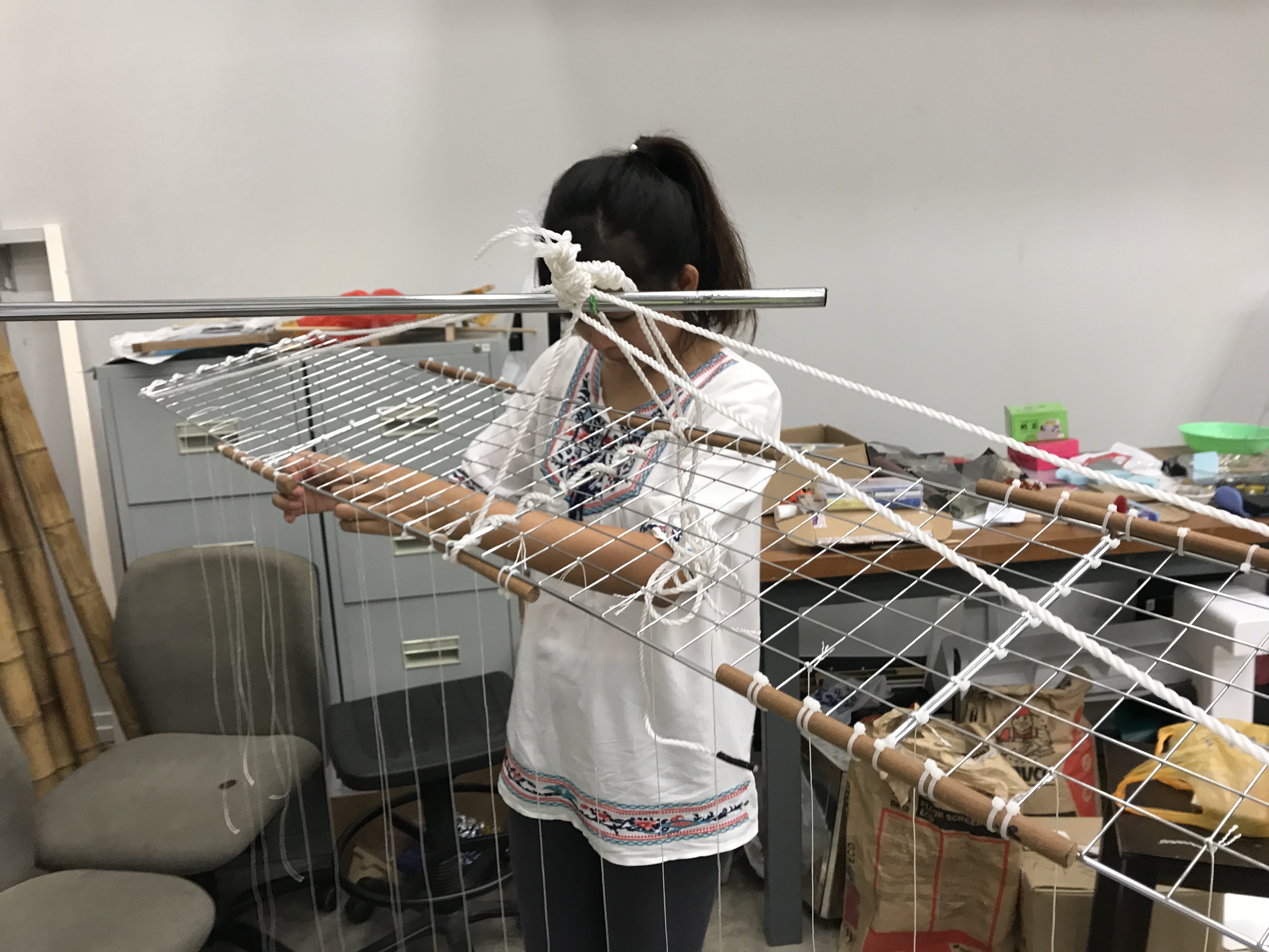
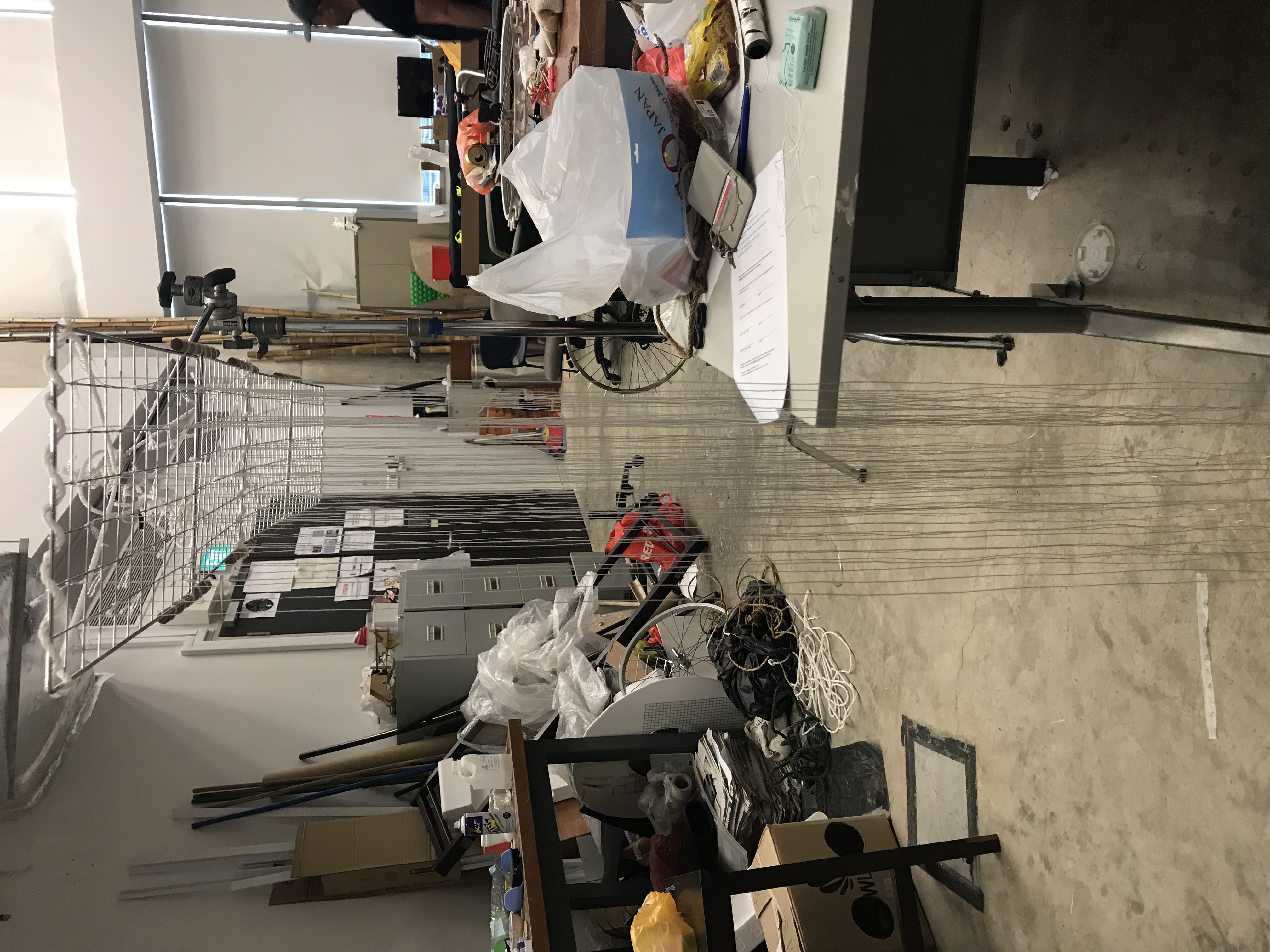
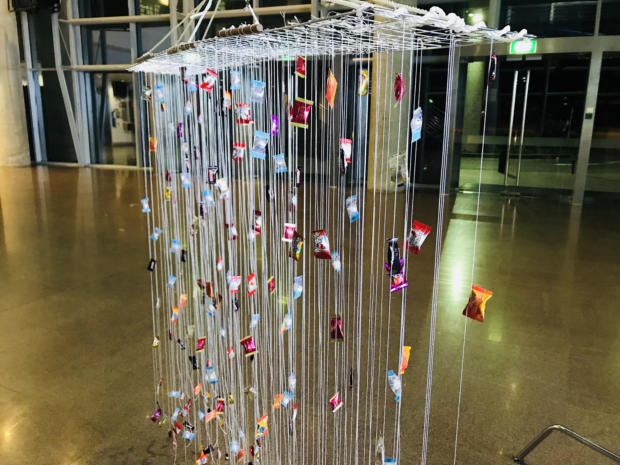
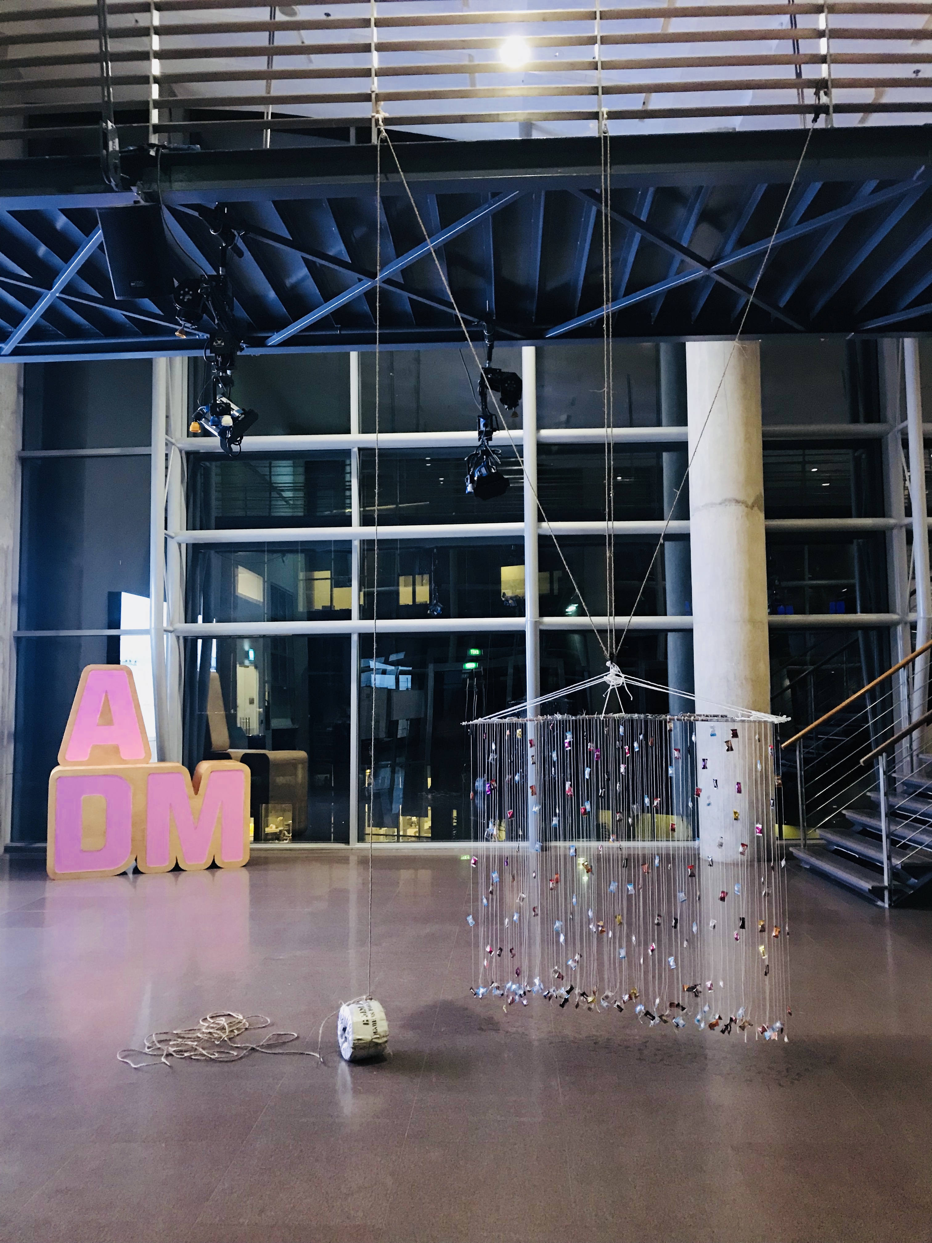
After settled all the knots, 1 pulley are tied to the railing to create this simple pulley system. However, the test out wasn’t the effect I thought of because the lowing speed was really fast when short amount of rope are being pull, this will make my dangling candy shorter.

So moving on to second trial was using compound pulley.

This method make it slower but as for my height it still reachable so I need to add on of more pulley to lengthen the distance. At first the second pulley was place near to the start of the rope, it make the pulley system really hard to move. So it was shifted near to the centre afterwards and the lengthen helps to slow down the whole process. More ropes are needed to lower the weight. I also added twin pulley instead of the separated pulley 1 and 3, it helps to reduce the friction between the ropes.

In reality
In diagram
The final setting with twin pulley

As for the frame for the candies, it was made up of 4 metal wire frame from diaso. It was combine together by cable tie and also the wooden stick to stop the bending. Strings are tie to the wire frame to attached the candies later on.

Final form with the candies!

Documentation Video:

Proposal For Final Year Project

http://www.bilkulonline.com/

Happiness

The definition of happiness are very different from each and everyone of us. But what really make us happy? Most of the time we are so tied down by our work that blinded us to appreciate small thing and enjoy small happiness.

  • From this probably can act as an reminder
  • Seeing definition of happiness of other people’s
  • Probably through some interactive experience “Bring back the child-like personality”
  • or making comparison
http://www.collaborationforimpact.com/beginning-with-the-right-mindsets-for-complex-systems-change/

Stereotype Mindset [Labelling people?]

Putting the viewer in another perspective, by asking “What do you think other people think about you?” Probably have an interactive panel that they can click and choose those options so in the end there is statistic of what most people usually think about.

  • Guerrilla Projects place outside to see how people would react to certain conditions [public’s reaction]
  • playing with different perspective
unboundedwisdom.com

Nature

I was really inspire by Martha Atienza, the way she keep on going just because she really love the sea and wanted to understand more about it. Nature is a subject that I am really interested in which probably I could learn a bit from her to continue doing what I like. I have touch on subject like conservation and also vegetarian diet so this time probably I might go for a different direction.

  • focusing on the patterns or structure
  • Traditional Chinese Medicine
  • Smell? like flowers or even meaning of flowers

Project Update 1 : Like Taking Candy From A Baby

Concept

The concept behind this interactive installation was derived from an idiom “like taking candy from a baby” which referring to an easy task to be done. However, in reality we all have different good point and bad points in achieving things. From this installation will be using candy place at a high level where participants will need to lift up 1 KG of rice in order to lower down the candy so they can grab it. Yet it is not achievable for most people unless you are taller than the general height. From this I hope to bring out the irony of the idiom like taking candy from a baby, its easy to certain people but all people will find it easy.

Research of Candy


Research of The form for the installation

wire frame

Initially, I wanted to use wire frame and place the sweets in the square hanging but I felt it was quite flat.

I came across this anonymous trio of artists, known simply as three that exhibit at Shiseido Egg Gallery . It was hang in a shape of house that includes 7000 candy. They also invite the visitor to pick of to eat and discard it at a corner beside this installation. It was to reflect the damage cause by the earthquake and tsunami that his the artist’s hometown in Japan, Fukushima from house being damage into waste.

I really like the concept and the use of colourful and different kinds of colourful candy in this installation. The candy are pack into a strips of plastic and with perforated in between for visitor to detach. The overall form was neatly arranged in rows which something I can reference for my installation.

As for this they group the same colour of lollipops together which shows contrast between the two colours. It was hanging in rhythmic order that creates a more lively overall which was very different in the previous example.


I also could use the wire frame as the support for all the candy that will be attached to the pulley and 1KG rice. Hanging them at the same level also looks interesting.

Something to note from my previous experience with 100 things, small things might look very little from far. Candy might be too small in size to be like this. I might need a lot of candy.

This example hand its object in spiral and playing around with colours. Probably not that suitable in my projects as I felt it might mislead people with the form itself.

I really like how in this installation show its complexity and quantity that similar to the first candy installation. This was much more complicated and in random which I feel its more natural.

Interactive Spaces Part I [Analog]

Ideas Generation:

My first ideas was using pulley to create a space for people to interact with the space. There are a few section where the viewer can pull the string to see what happen next, such as using fishing net and turning on a light. After receiving feedback from the class, this ideas was a bit too direct and might only keep the view for awhile.

I continue to develop more ideas using with pulley and also explore other material. I though of object like using repetitive pencils and explore different ways of writing using strings. Or creating a maze with corrugated boxes or using strings to create a swings.

In the end I arrive with this idea where the viewer would need to participate to get something. The wire frame are attached with many different kind of sweets, it will be hanging on top and using pulley to stabilise, on the another end I will be using 1KG rice both will be placing at distant apart. In order to get the sweets the views must work together, one person to lift up the 1kg rice another to take the sweets.

WK 5: Response Ch1 Kim Goodwin, Design for the Digital Age

Very often, people did would categories design together with art and did not knowing what are the difference between them. Kim Goodwin pointed out that,

In order for design to be design and not art, it must serve human needs and goals.

Design has a purpose when we designed for product which will help human to improved their life. Whereas art is an expression or application of human creative skill and imagination also, an end product that reflects the inner vision of the artist. This kept me thinking that will there be  a combination of both art and design? The designer can craft a ceramic to fulfilled its purpose such as a candle light holder but aesthetically expressive and unique created through creative skills?  I also agreed with Kim that design is a broad term which are very difficult to define exactly what is it.

Interestingly design involved learning about human senses, cognition and ergonomics, focuses or understanding to create a good design that solves the problems. It would help the designer to build on its details while designing for a problem. Designers also design beyond just its function but the aesthetics which are also important human goals.

Kim introduce us with the Goal Directed Design that provide a fundamental premise to design a successful product is to focus on achieving goals. It touch on the design of a product’s behavior, visual form and physical form. This method provides a framework for designers to help keeping them on track but not a set of rules and constraints.

I do agreed focusing on Goal-Orientation Design would be effective in many ways. As during design process will involved many people from different backgrounds. This method would reduce conflict and increase effective communication and efficiency. Also based on the process it provide concrete based to work on to strengthen the ideas.

Kim pointed out that not all organisation are able to take the full advantage of design strategic values which I agreed as well. There are unforeseen circumstances such as the culture in the company, relationship between the employers and the decision makers. Each department play a significants roles which will affect the outcome of the design. It also takes time to practise this method as an individuals or in organisation.

From this, I wonder how company like Cooper manage their work load in the reality as the process are really long. In reality design companies might neglect or skip some steps such as research or framework definition part due to client’s deadline or pressure.

Lastly, Goal-Directed Design are very important which most of the time are neglected by designers. It allows us to learn and understand the product better and allow us to stay on track. Yet, I feel it was not a rule to follow strictly but during certain circumstances designer should be flexible by knowing what to be scarifies and working within the given condition and timeline.

WK 3 – Response to CH 1 from Jonas Löwgren and Erik Stolterman, Thoughtful Interaction Design

In this reading, Löwgren discussed about what is good and bad design, if a fast and efficient digital artifact is not a good design if its not intuitive or easily understand by the users. Also if it did not meet the basic function of user’s need are also impractical.

Working with design means that you continuously need to define and redefine what you think of as good design. It is a never-ending process of thoughtful reflections.

Löwgren pointed out that designers need to think what is good design in order to improve her design ability. As a designer, we need to know that the world is changing people’s needs and wants are also constantly  changing. What we design 5 years back might not be effective for todays’s society because many context and things have changed. With constant redefining and reflection will help designers to improve her design ability.

I though of the Nikon DSLR screen interface design and its functionality. The older version was shown in a complicated design filled with numbers, which might cause confusion for the beginners. This prevents the users to learn and also will affect the product usability.

www.technobuffalo.com [Older displays]
However, in recent years they have changed their interface design to a more prominent to bring focus to the important and commonly used settings by using icons.

i.ytimg.com/ [Newer Displays]
These changes can help the user to understand better this complicated device to create better experience. By using icons to focus on the important and design them neatly to reduce confusion. Some cameras also added touch screens to align with the current technology, as most of us are using touch screen phones to make it more convenient.

A good thoughtful design has to understand the design process, design ability, the designed product and design as part of a larger context. Being reflective helps to examine the purpose, outcomes and benefits of doing it in different ways. Also Löwgren pointed out that even professional design is a result of conscious action of a designer does not mean that all properties and characteristics are intentional design decision. This reflected the imperfection within the product or design that happens out of what the designer expected. We also need to take into consideration that the designer has a bigger picture to consider for the design and constrains she might face to produce an effective and balance design.

https://www.dbs.com.sg/


One of the thoughtful interaction design I felt was POSB/DBS mobile application. It was really simple and clear to use as compare to OCBC app. They even designed quicklinks like “slide and hold to peek” your account balance to provide connivence for user to check their account. The designer also uses bold fonts to create the contrast within the app to increase readability. It also uses simple terms and icon to help user understand more about the functions. Overall there were lots of thought put in to create this clean and clear design where the user can easily navigate around.