Sketchbook experimentation

initial ideas

initial ideas
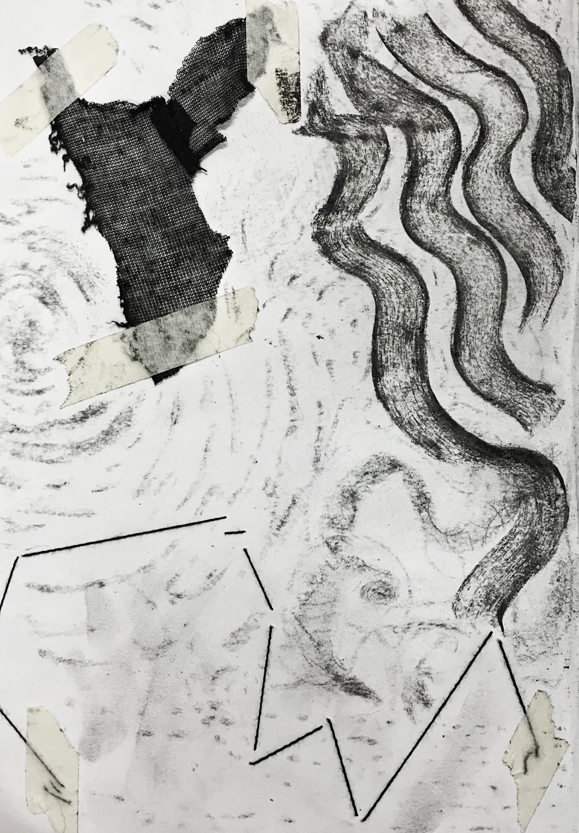
sheer knit fabric, thread and charcoal

more experiments in charcoal

doodles while brainstorming

brainstorming materials and chinese ink action painting

texture with chinese ink
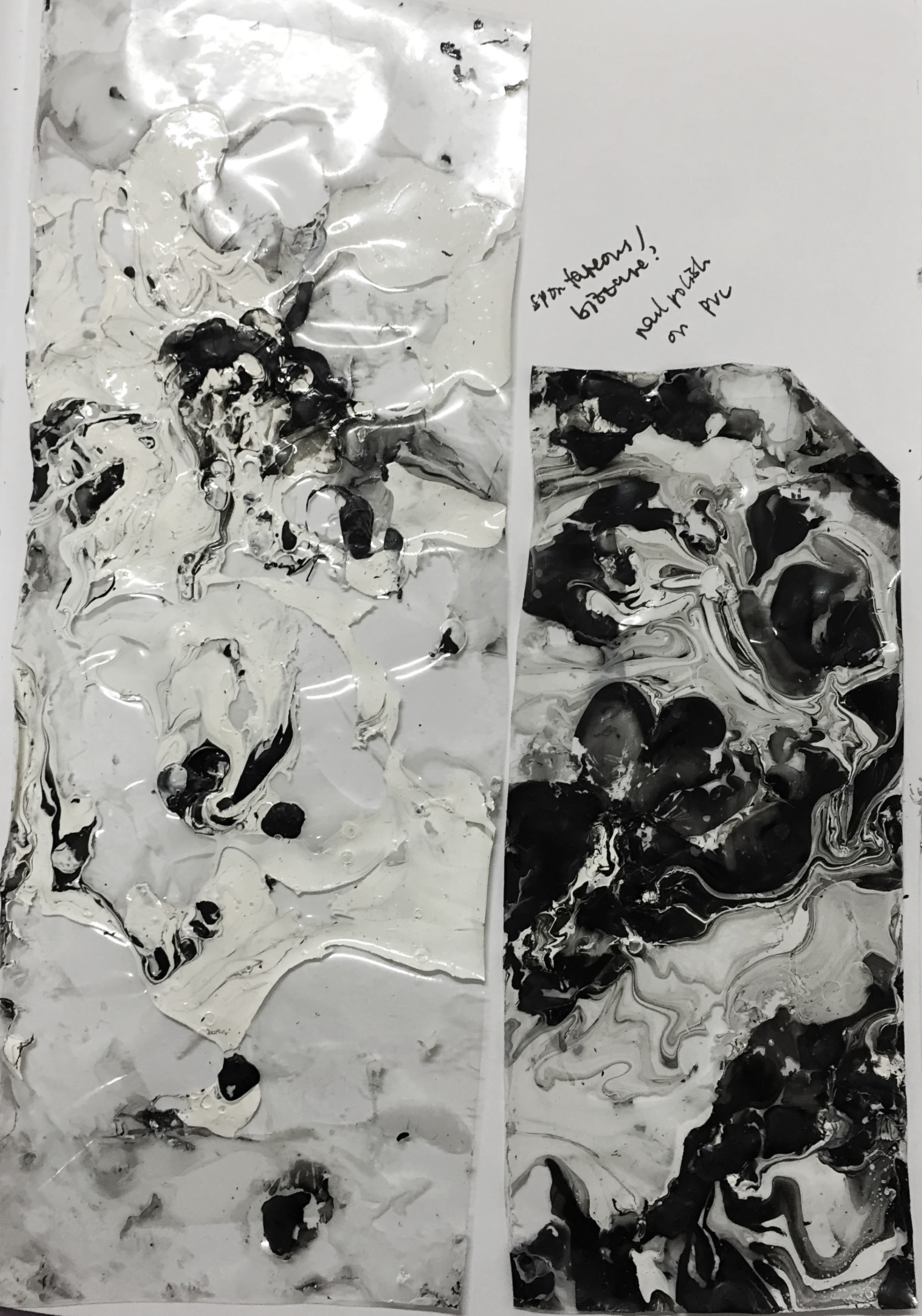
first attempts at marbling
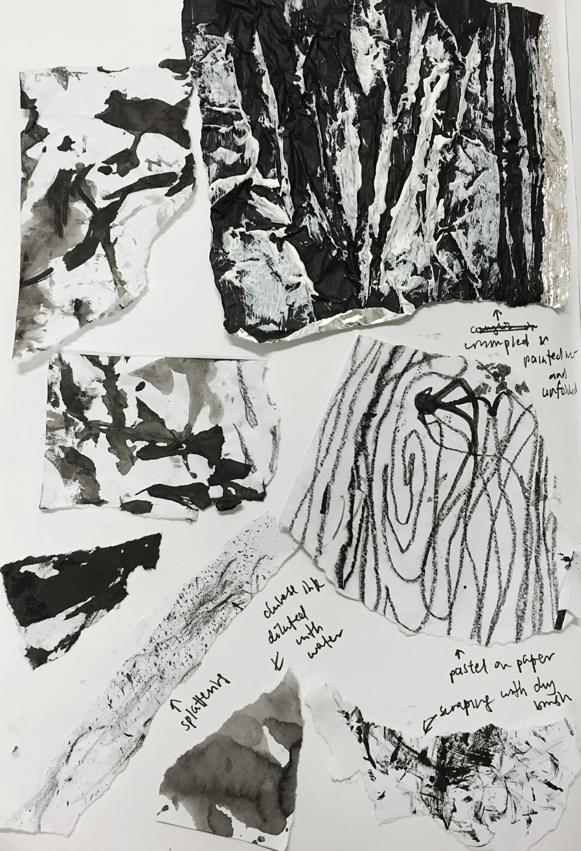
texture on paper and tin foil (chinese ink, crayon and acrylic paint)
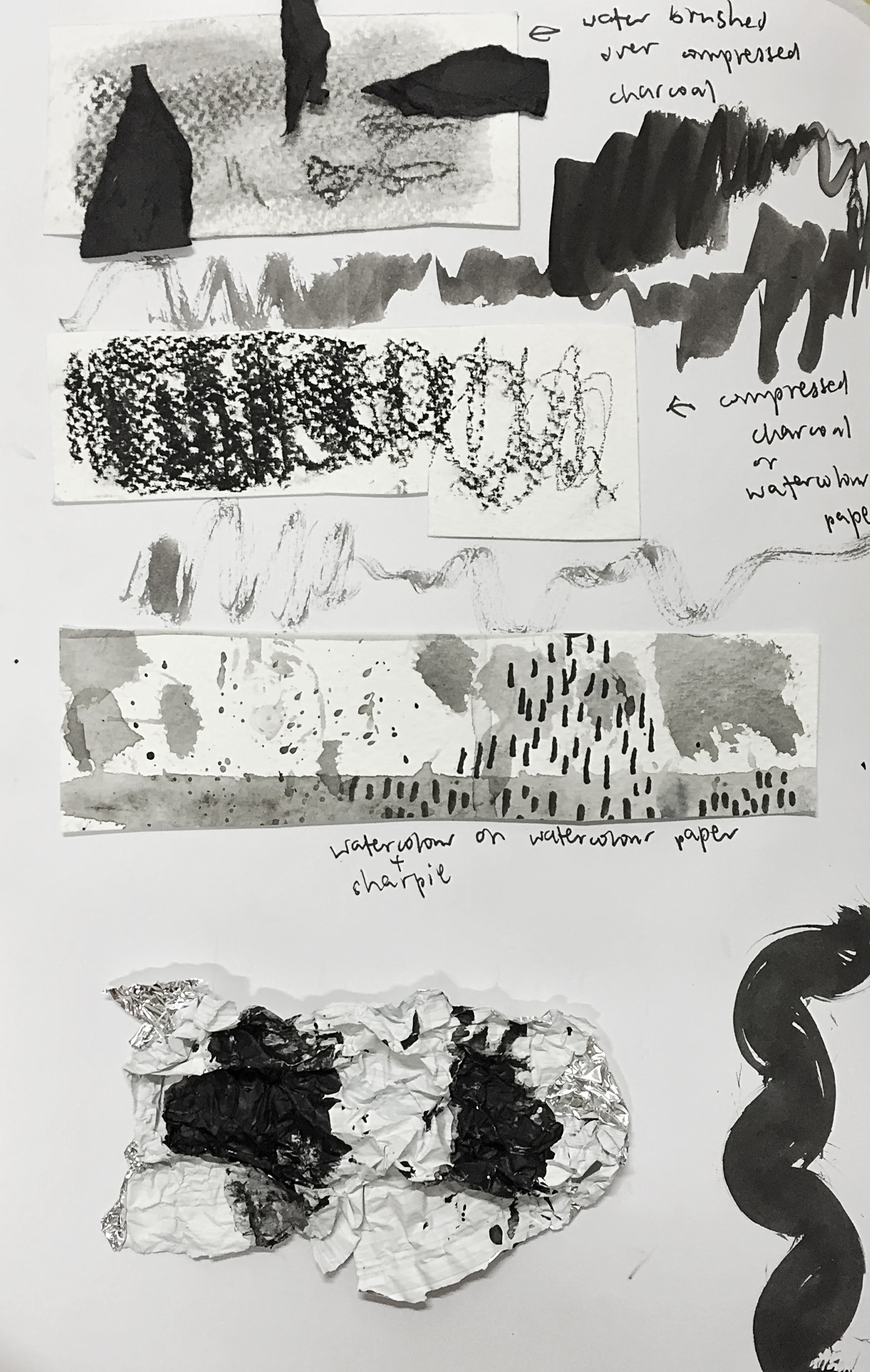
experiments with watercolour paper

patterns in chinese ink and watercolour
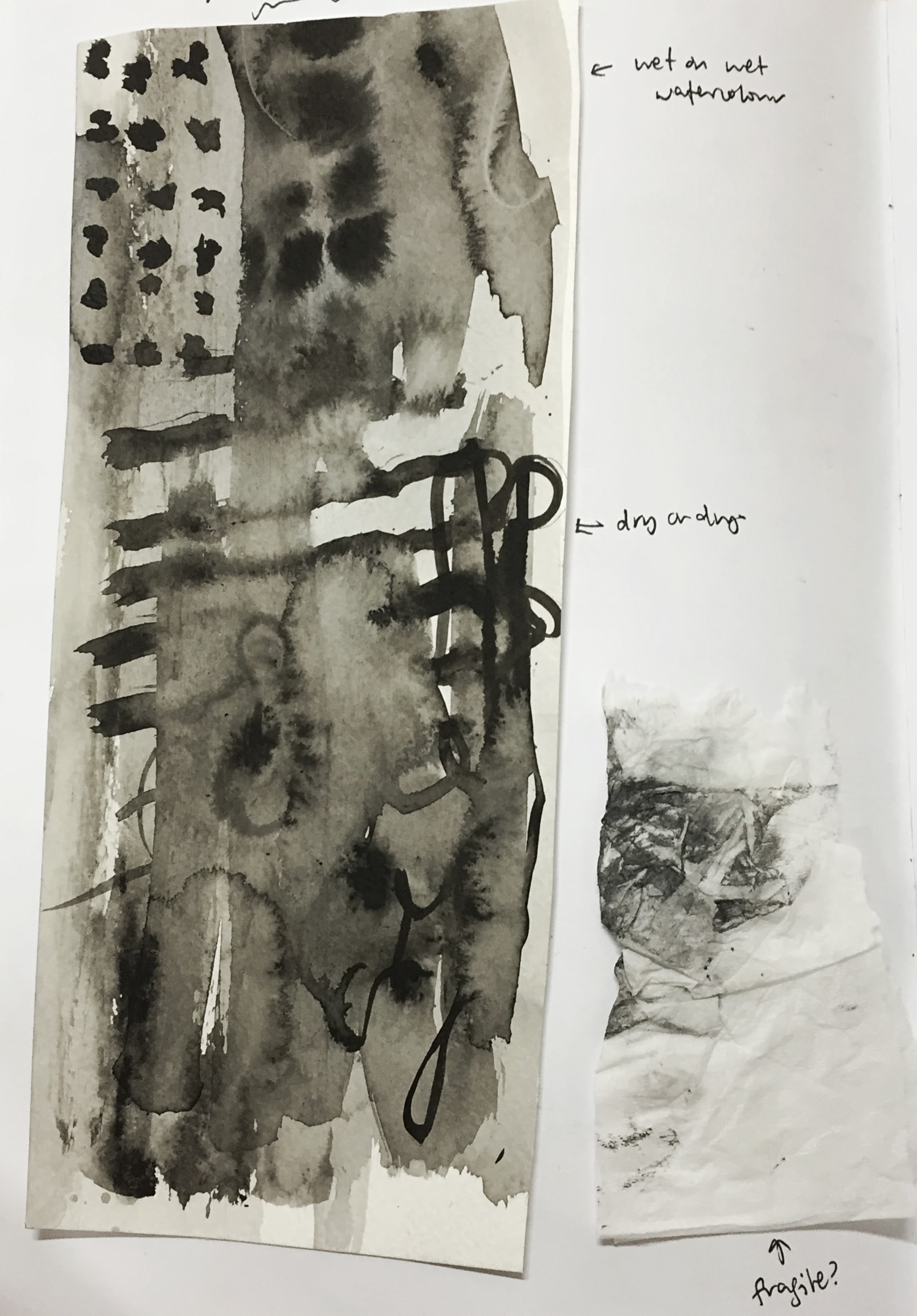
watercolour and ink on watercolour paper

acrylic on tin foil
Final analysis and inspiration
1. Awkward
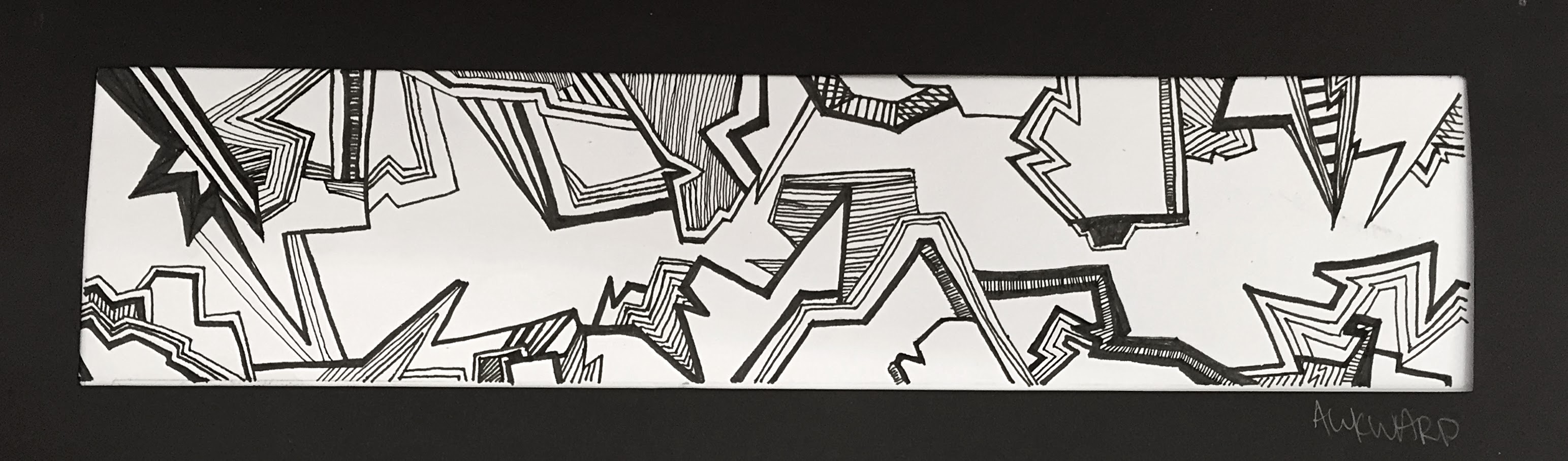
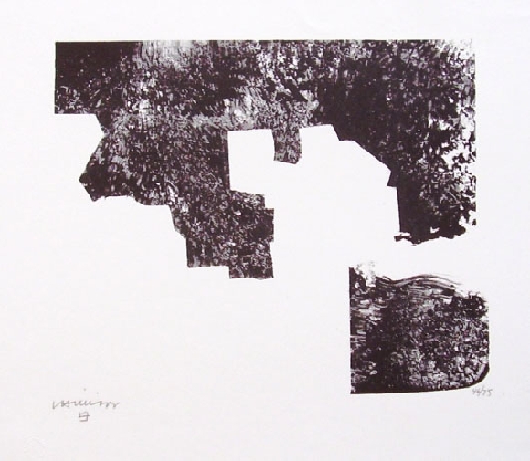
Eduardo Chillida, original lithograph, 1969
For this emotion, I was inspired by Eduardo Chillida’s lithographic prints, and how the uneven edges protruded starkly against a white background as it creates a jerky and hesitant feeling.
The final chosen medium was archival ink on paper as I felt that it was the cleanest and most precise method to achieve distinct fine lines, among a variation of different line thicknesses.
2. Bizzare 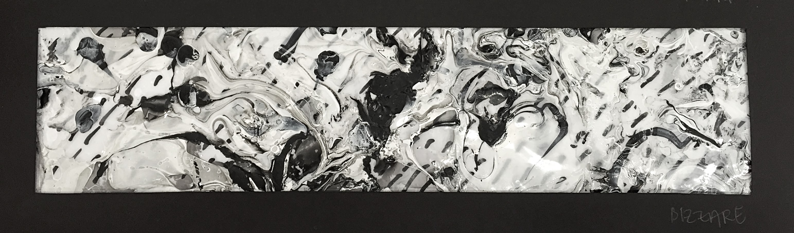

Paul Juno, series of agate paintings
Paul Juno’s series of agate paintings are very layered and dynamic with movement, and this was an essence I wanted to capture in my final outcome.
I chose to use, fittingly, a slightly more unconventional method of creation. This is clear PVC pressed into a shallow basin of water with nail polish dripped on the surface and swirled together to create a 3-dimensional, textured outcome. PVC was then layered over marker ink on paper so that some parts would show through and create the sense of a bizzare composition.
3. Spontaneous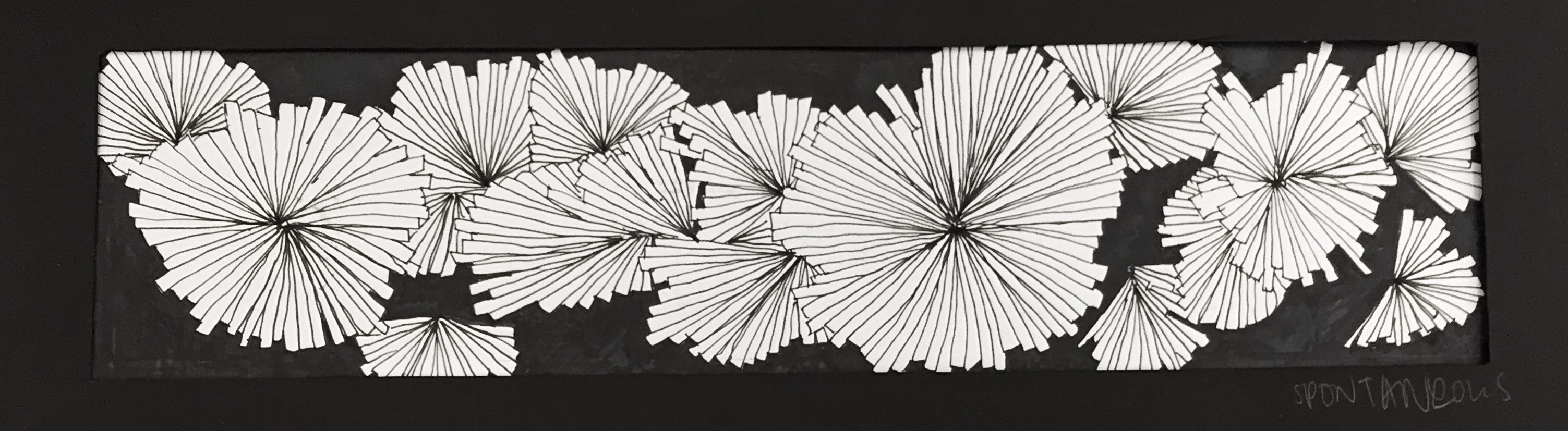

Shawn Kuruneru, Fireworks (2010) Ballpoint pen and ink on paper
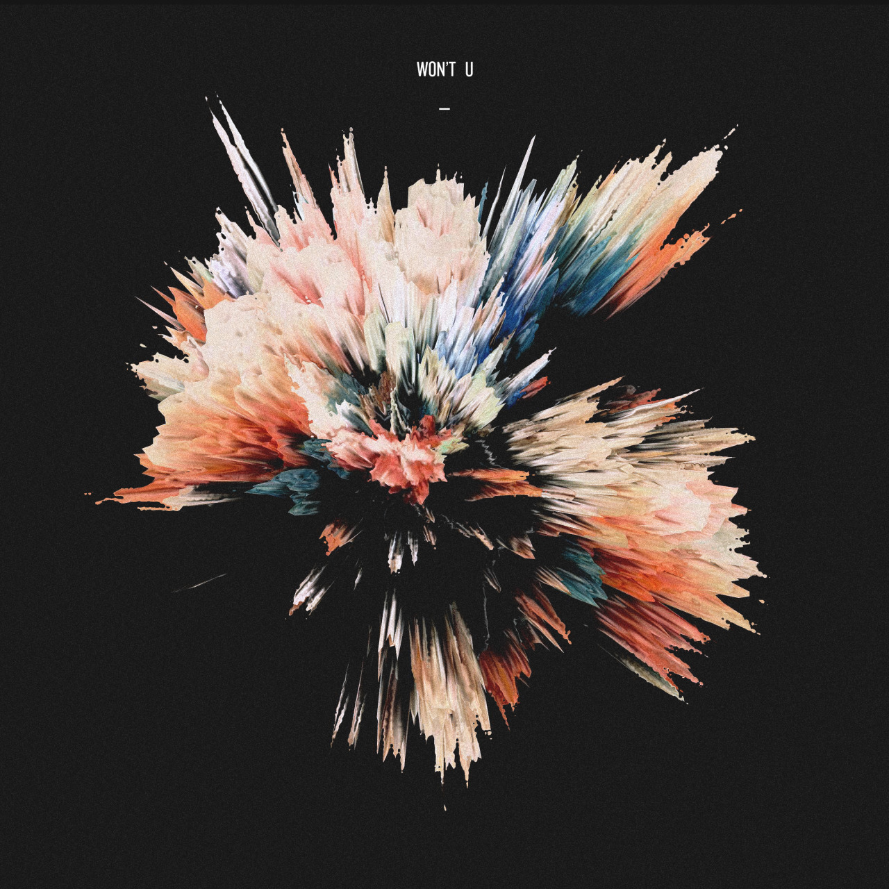
Theartofmikeyjoyce.tumblr.com
These illustrations captured perfectly, to me, a sense of spontaneous combustion and unpredictability.
Final chosen medium was archival ink and marker on paper due to precision and ease of use.
4. Distracted
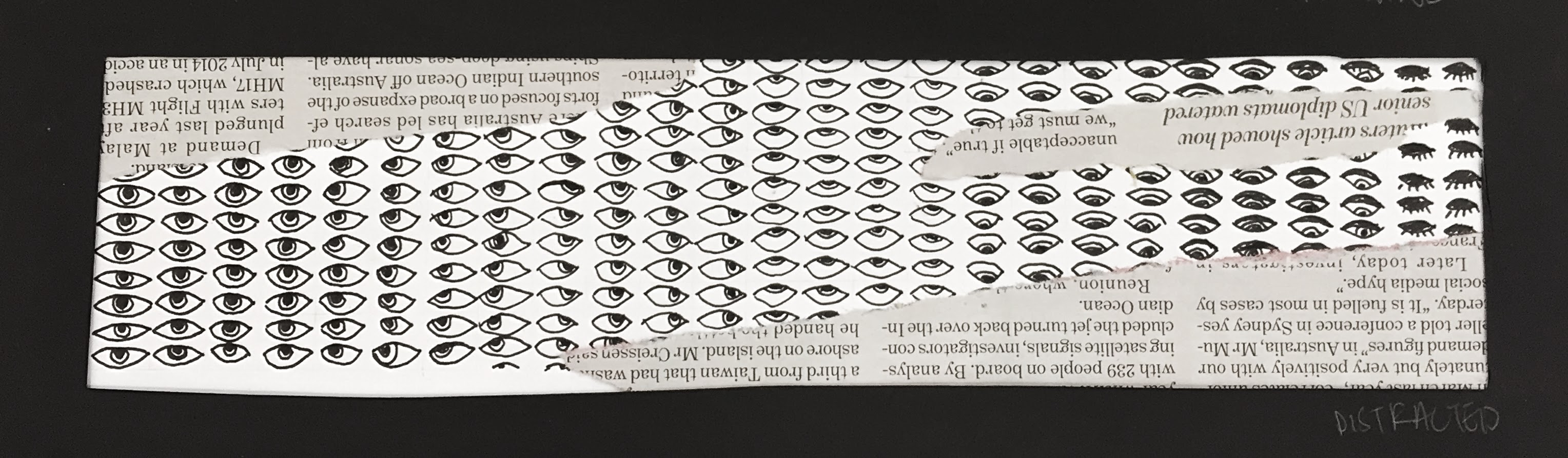
Woodcut by Martha Fromme
The gradual loss of interest is apparent in this woodcut, and from this I took inspiration for the overall direction of my work.
I chose to use a fine point Micron archival ink pen because of the details of the eyes, and pasted newspaper scraps over the illustration to hint at an inability to focus on the task at hand.
5. Embarrassed
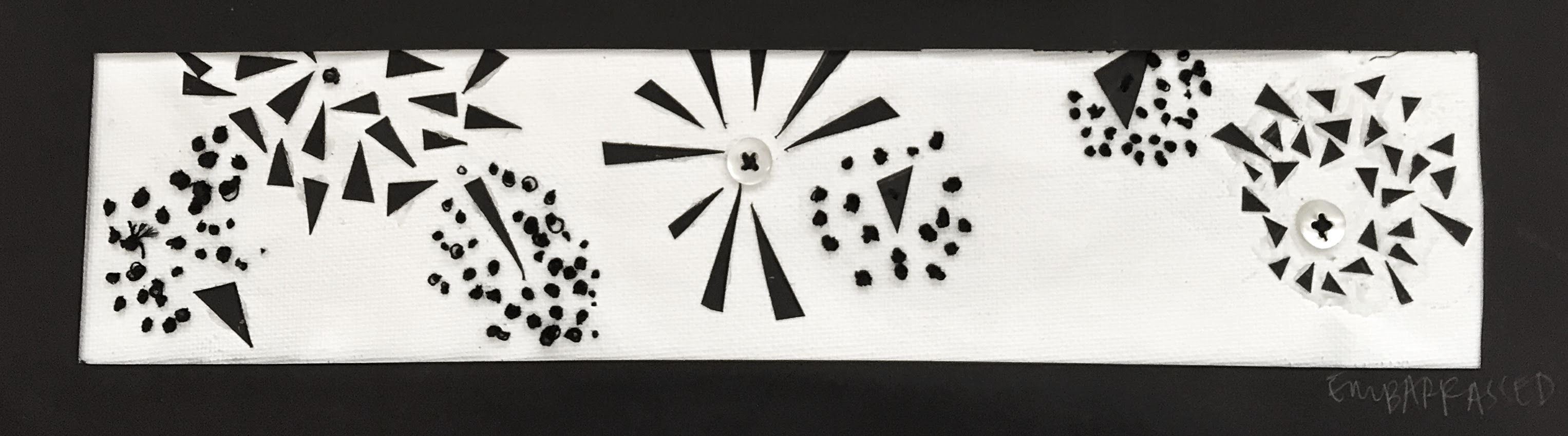
The background is canvas painted white with acrylic paint, with varied materials for details to highlight the differences. These include cotton thread, black paper, buttons and glue.
6. Anxious


White Noiz by ThoughtCloud
I felt that the angular, three-dimensional lines of this print by ThoughtCloud was an interesting take on anxiety. It is chaotic, densely packed and harsh, much like the internal feelings of an anxious person.
I wanted this strip to be three dimensional and not lay flat like the others. I painted a strip of tin foil with black and white acrylic paint, and left it to dry. When it was dry, I pushed it together and crumpled it to create texture before attaching to the background.
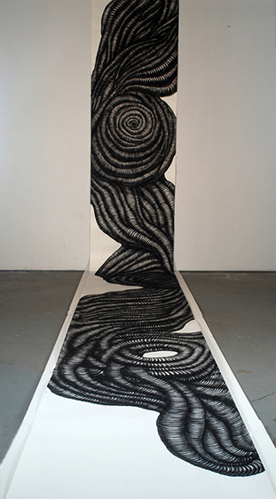
7. Lyrical
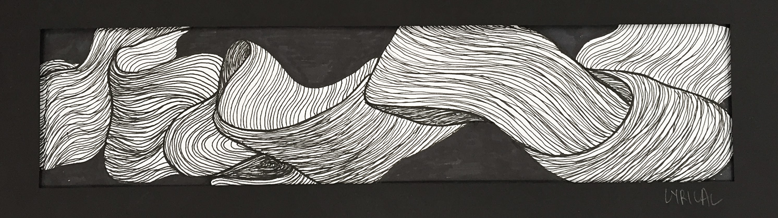

Sky Kim, untitled-detail, 2009 Marker on paper
The lines in this piece by Sky Kim come together to have a fluidity and movement as a cohesive whole, and is reminiscent of silk billowing in the wind or smoke unfurling from a fire.
I chose to use a fine point Micron archival ink pen for the details and sharpie marker for the background, once again for reasons of precision.
8. Sloven
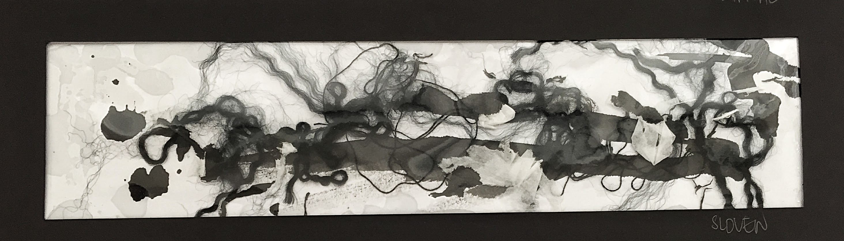
This piece is one of the most interesting in composition. It consists of pieces of unraveled yarn, cotton thread, scraps of tissue paper and a sprinkle of eraser dust, laid atop Chinese ink splatters. This was intentionally done in mimicry of the perpetually messy state of my work station, a shining example of sloven.
9. Systematic
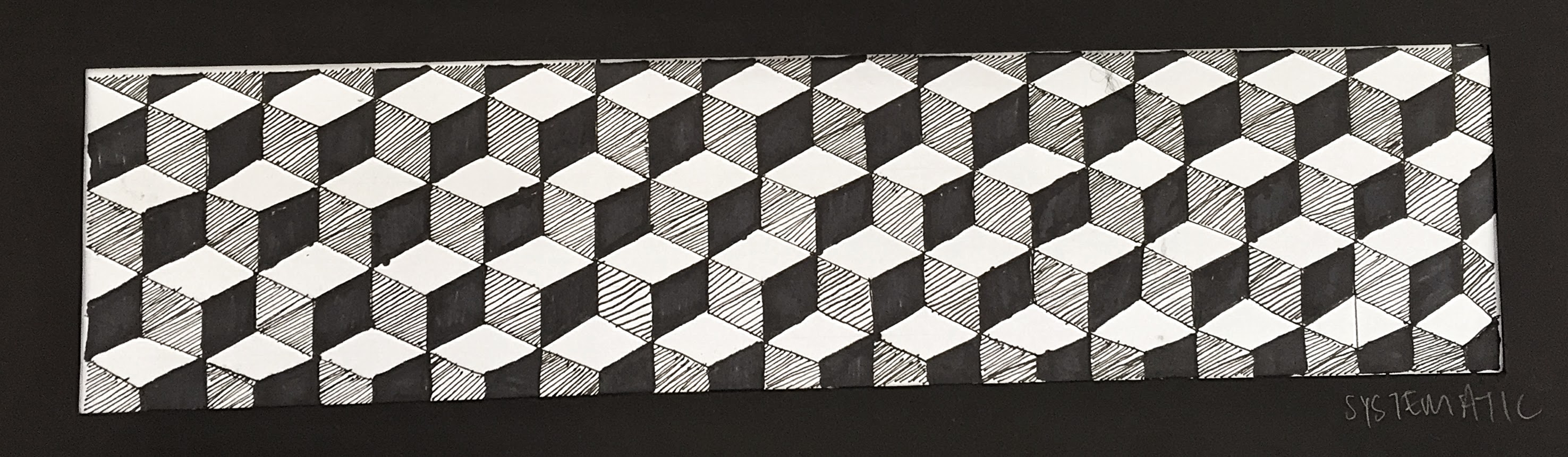

www.zilverblauw.nl
I was inspired by the famous three-dimensional cube print because although it is rigid and repetitive, the optical illusion created still gives it an edge of interest. This was once again done in a fine point Micron archival ink pen and sharpie on paper.
10. Psychotic
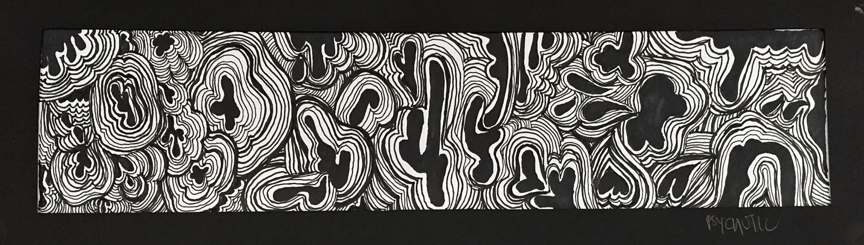
This is one of my favourite pieces because of it’s absurd and ludicrous nature. It’s what I imagine an acid trip to be, with pulsating globs and radiating lines obscuring your field of vision. Created in sharpie and fine point Micron archival ink pen on paper.
11. Fragile
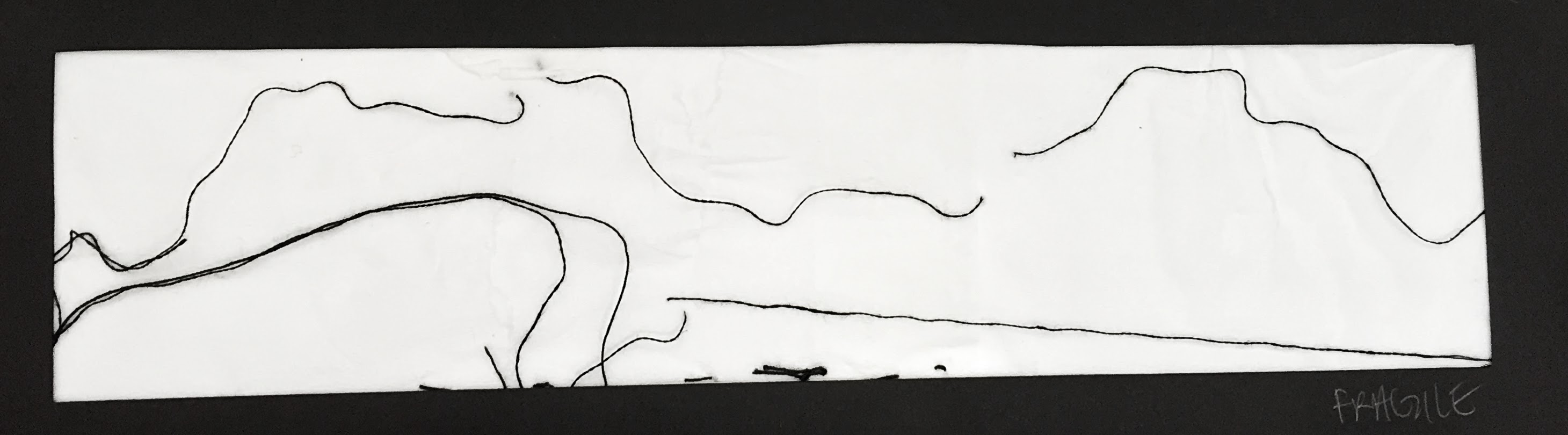
This is a very literal interpretation of the word fragile, seen through the use of delicate materials like thread for the details and tissue paper for the background. I wanted the association of these objects to frailty and a need to handle with care to speak for itself.
12. Ambiguous

This was created in watercolour on paper. Different values of paint were used to draw fairly uniform but still varied shapes curving in different directions to set the mood for confusion and ambivalence.
13. Indecisive
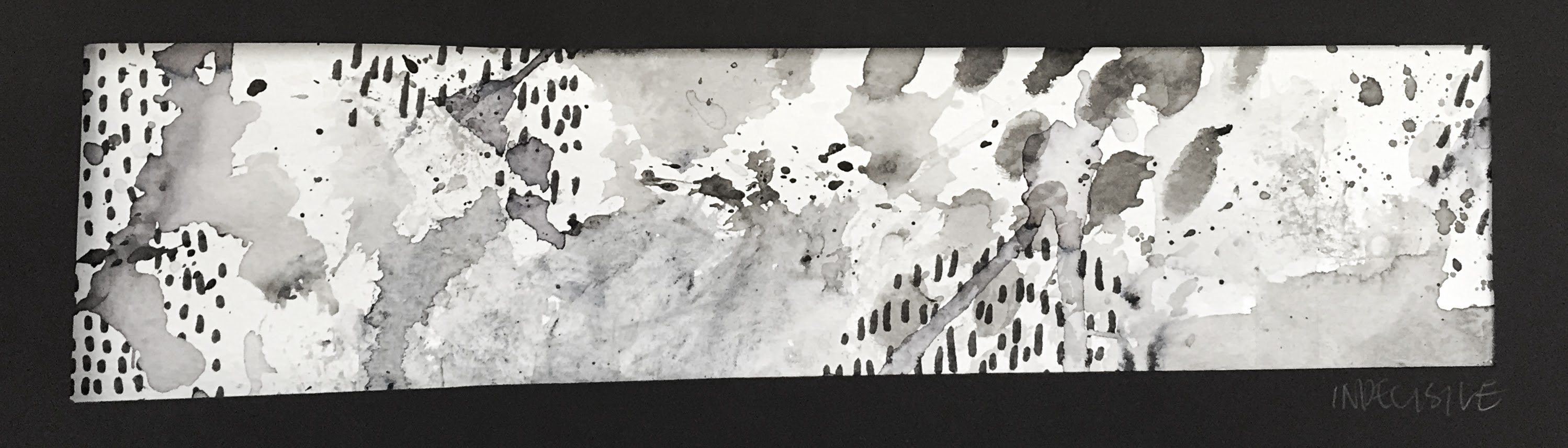
A wet on wet watercolour technique was used to create light splashes on watercolour paper. Splatters were created by brush and dotted lines drawn in sharpie. This mix of textures and mediums is intended to illustrate indecisiveness in choosing a final method for the piece.
14. Turbulent
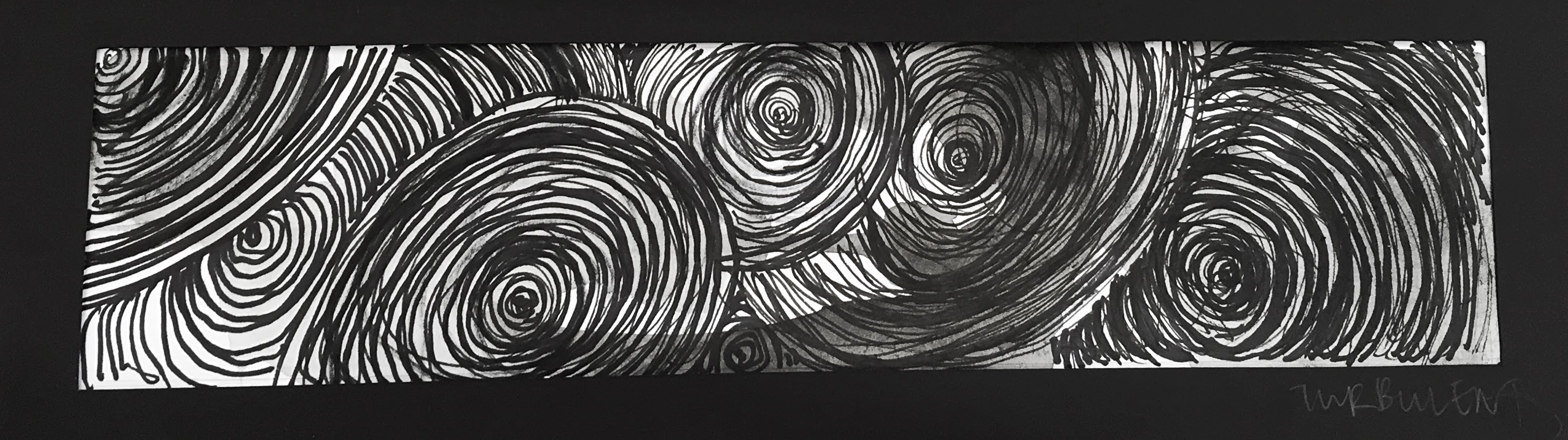
Untitled, Sky Kim, 2011
Watercolour on paper
Turbulent was inspired by yet another Sky Kim work, this time twisted and throbbing with dark energy. Turbulence has always had negative connotations to me (bad experiences in plane rides) so I wanted the piece to be gloomy and foreboding. The final piece is sharpie and ink on watercolour and is dense with a riot of movement.
15. Nonsensical

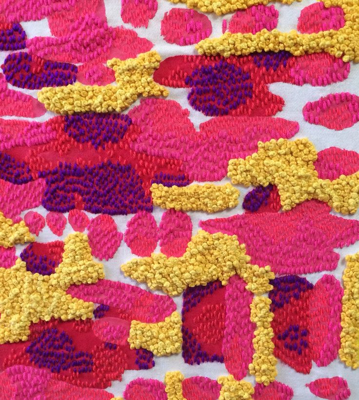
Fasten, Liz Payne

Friday, Liz Payne
Liz Payne’s embroidered pieces are rich with patterns and textural diversity, creating a whimsical, creative and unrestricted vibe and instantly catching one’s eye. I wanted to emulate her use of different materials, patterns and shapeless forms in my final piece. The background is acrylic paint on canvas, embellished with cotton thread, beads and a single button.
16. Sensual
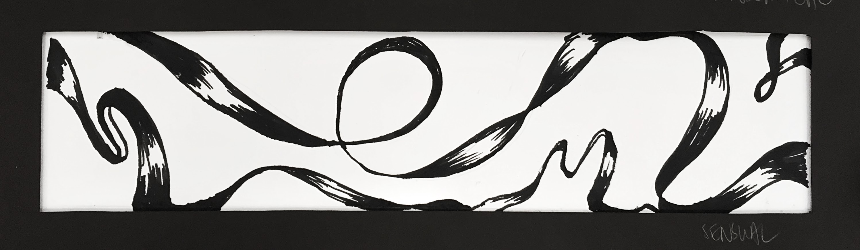

psd-indr.com
Sensual reminds me of the feeling of silk and it’s languid, graceful movement. I attempted to capture this in marker on paper.
17. Exhausted

Exhausted was created late at night after a long day with compressed charcoal on paper. It starts of with heavy and coarse strokes that gradually decrease in strength and thickness, tapering off at the end as one would run low on energy.
18. Aggressive 
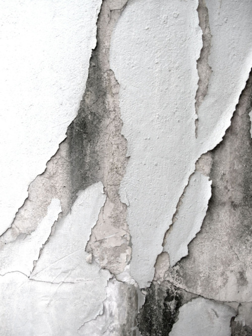
http://drkshdw.tumblr.com/
I was inspired by this photo I came across online because of the rough edges present in the image. It looks like torn off paint or wallpaper with faint scratch marks, making you wonder what it went through to end up in this forlorn state. I wanted to capture the frenetic rage and brute force of a cornered but dangerous wild animal. Paper was first scored and scratched by penknife, the forcefully rubbed over with charcoal to create tears. This was then laid over black watercolour so that the torn holes are more prominent.
Reflection
This assignment forced me to think out of the box, using different materials, mediums and techniques to express an emotion. The limitation of black and white was a help rather than a hindrance as I had originally thought, as it narrowed the options available and prompted more innovative ways to use objects and substances. Through my experiments and research, I learnt different ways and skills of using materials such as watercolour paint and charcoal. It was an interesting experience to ask yourself what something means to you, and then attempt to capture your intangible feelings onto a tangible platform, and also to see how differently people view the same emotions.
Citations
- DRKSHDW. Accessed September 15, 2015. http://drkshdw.tumblr.com/post/3670025258.
- “Agate Paintings.” Paul Juno. Accessed September 14, 2015. http://www.pauljunoart.com/.
- “Broderie Pop.” COLLECTIF TEXTILE. April 12, 2015. Accessed September 15, 2015. http://collectiftextile.com/broderie-pop/.
- “CHILLIDA Eduardo , Original Prints, Lithographs, Etchings , Paper.” Husgallery. Accessed September 14, 2015. http://www.husgallery.com/44-EN-CHILLIDA_Eduardo.html.
- “Eye Eye Poster (50x70cm).” Human Empire Shop. Accessed September 15, 2015. http://www.humanempireshop.com/Poster/Illustrative-Poster/Eye-Eye-Poster-50x70cm.html.
- “Fireworks (2010).” Shawn Kuruneru. Accessed September 14, 2015. http://shawnkuruneru.com/.
- “Purple Ribbon Layered Material.” PSD-indir.com. Accessed September 15, 2015. http://www.psd-indir.com/en/psd-download/purple-ribbon-psd-layered-material-psd-download-1-2924.
- “Wallpaper Hexagonal Black.” Zilverblauw. Accessed September 15, 2015. https://www.zilverblauw.nl/shop/wallpaper-hexagonal-black/.
- “White Noiz Art Print by ThoughtCloud.” Society6. Accessed September 15, 2015. https://society6.com/product/white-noiz_print#1=45.
- “Won’t U.” THE ART OF MIKEY JOYCE. Accessed September 14, 2015. http://theartofmikeyjoyce.tumblr.com/post/86044052229.
- “Untitled – Detail, 2009.” Still Images – Sky Kim. Accessed September 15, 2015. http://www.skykim.net/scrolls-11a51#/id/i2479961.
- “Untitled, 2011.” Still Images – Sky Kim. Accessed September 15, 2015. http://www.skykim.net/scrolls-11a51#/id/i2479970.
You must be logged in to post a comment.