Project Brief
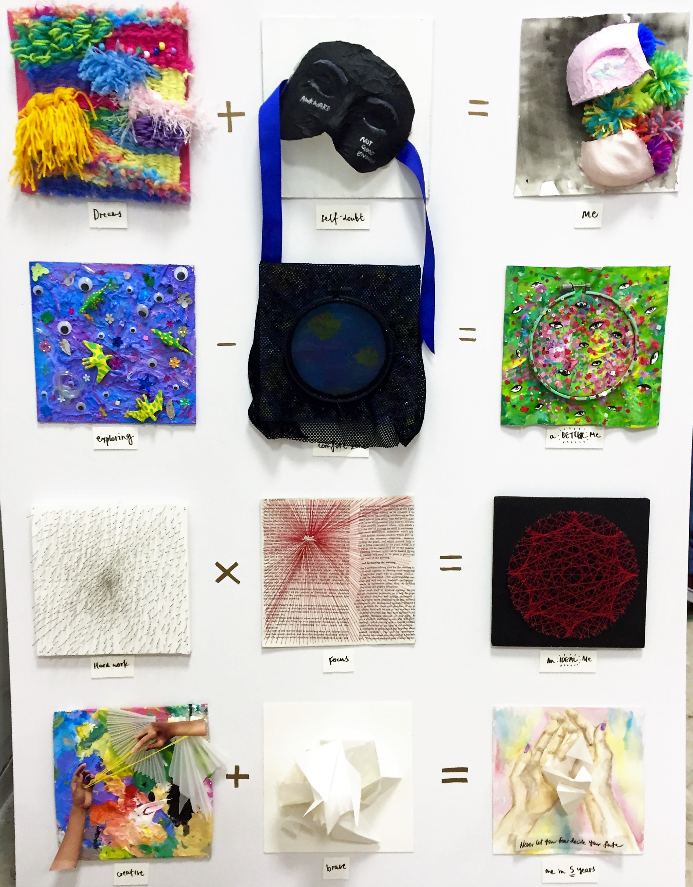
For the concluding assignment of this semester, we were challenged to capture the essence of our personalities in twelve 20cm x 20cm cubes, arranged in mathematical equations. For this assignment, we were not restricted in our choice of medium and – most importantly – colours.
Overview
I admittedly got a little (too) excited when we were told we could (basically) do anything we wanted. I really like colours, and it’s been a long semester of black and white images. All 12 of my compositions have some crafty element because it’s what I feel (and have always felt) happiest doing, and also what inspires me most.
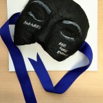
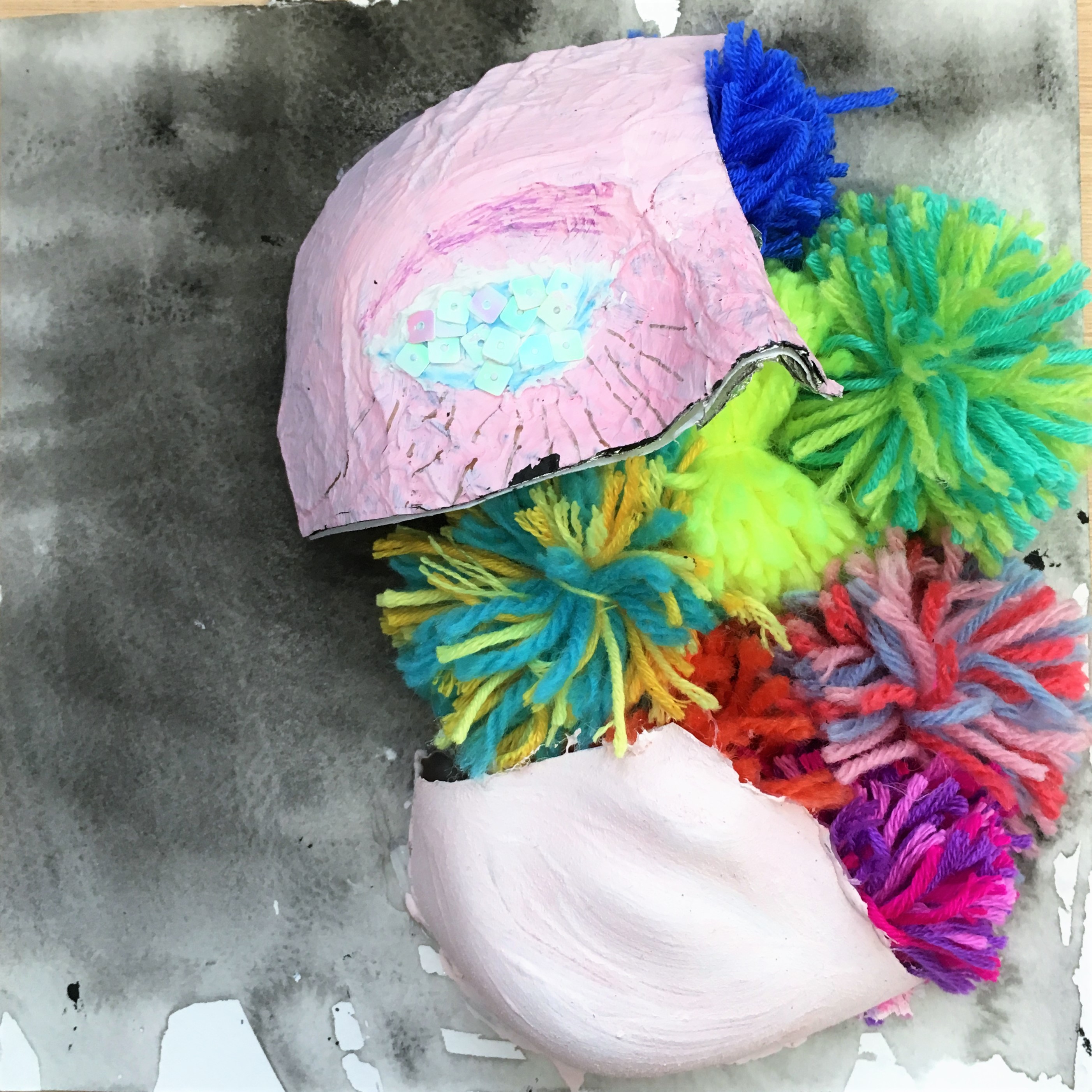
DREAMS + SELF-DOUBT = ME
 +
+  =
= 
I had quite a lot of difficulty finding a suitable representation for dreams because it’s such an intangible, subjective concept, but I feel that it’s an integral part of a person – you can tell a lot about someone from what they aspire to do or to be. I initially planned for a pictorial representation of what I wanted (mostly cats and travelling and good books and food) but that was a bit too restrictive, and I felt like I was limiting myself to material desires when there is really so much more than that. How do you capture the feeling of happiness and contentment, and excitement and gratitude?
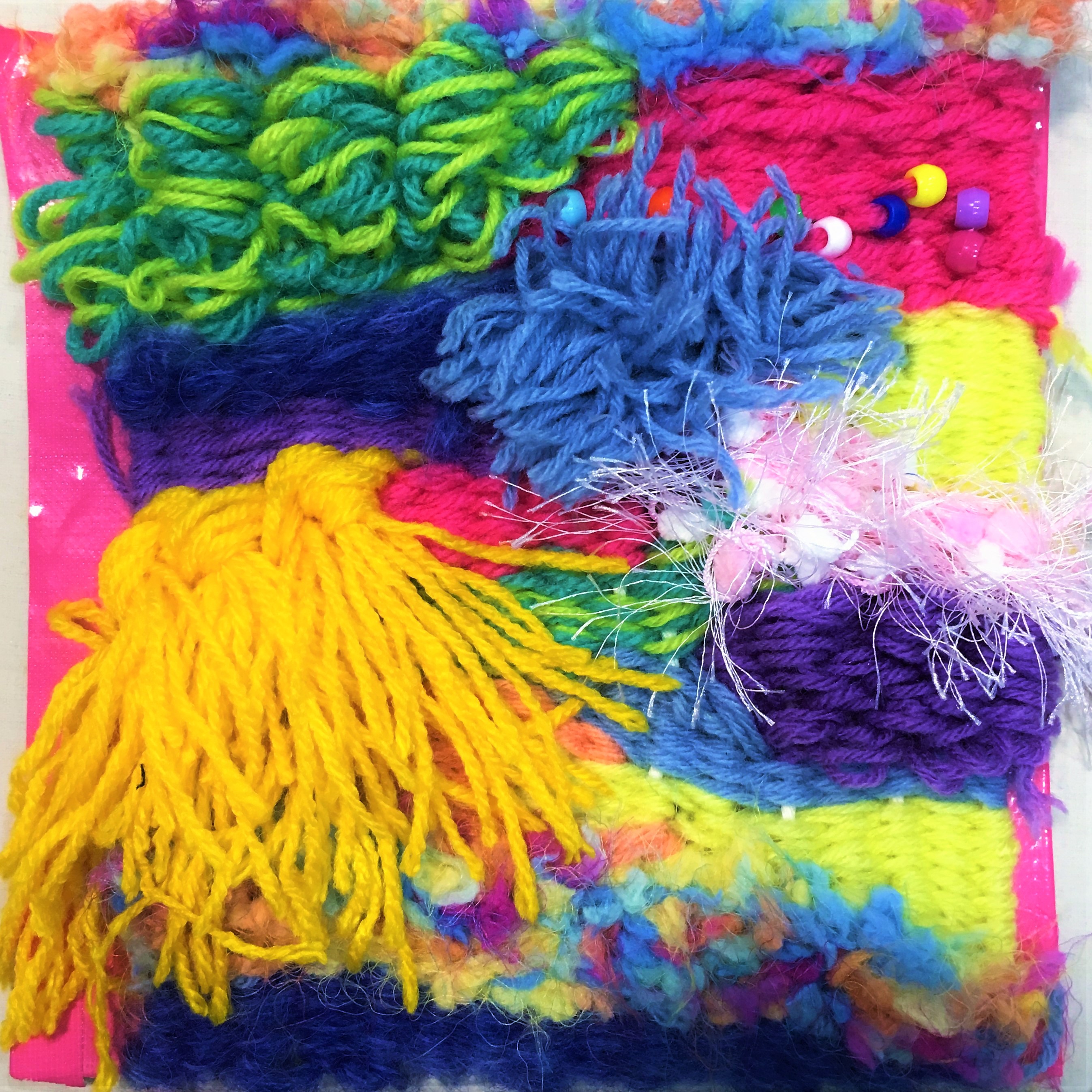

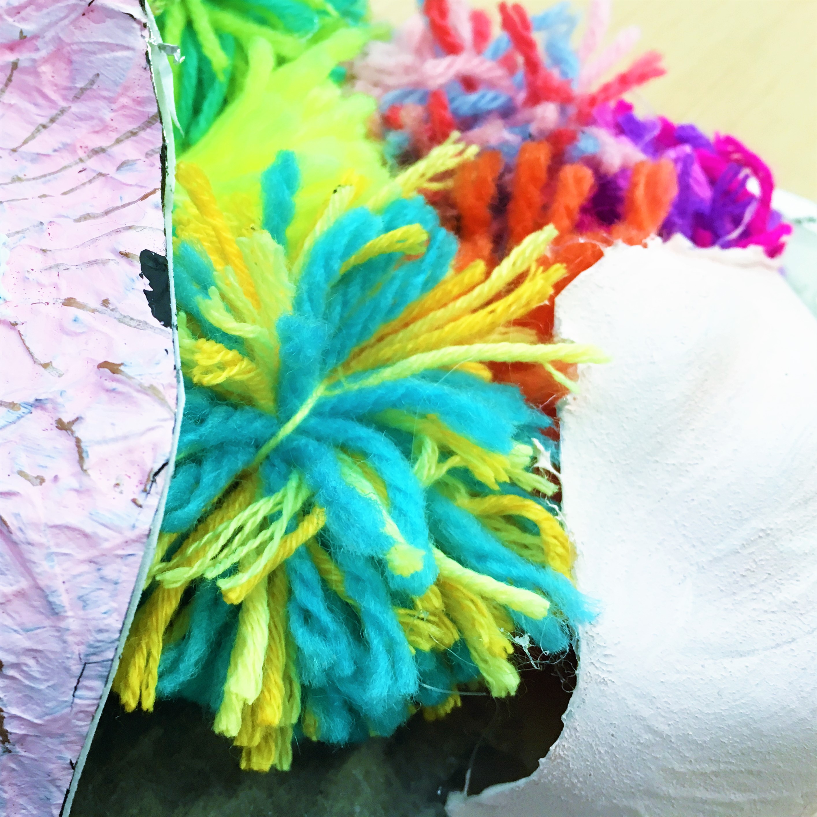
Eventually I chose to create a weaving with yarn and wool of different densities and textures, accented with some beads. It’s kind of a far cry from the initial plan, but I think it worked out great. I picked yarn and wool for it’s softness, like a bed that cradles you while you dream, and also because it’s soft and fluffy and makes me happy – like a dream. It’s also a literal representation of what I want to do (kind of my dream job in a way although it’s not a specific job per se) – make and create, constantly try new things and also have lots of expressive freedom.
For this square I used the spectrum of vibrant colours to illustrate excitement and joy and creativity. I also experimented with different weaving techniques to create contrast and interest. This is definitely one of my favourites by far, because the process of making it was as enjoyable and satisfying as the outcome.

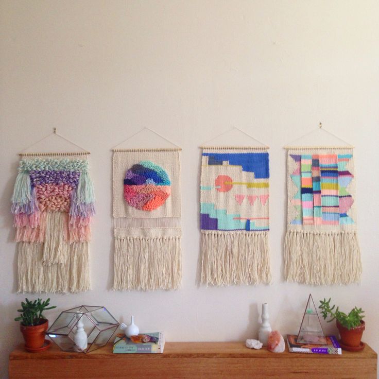
For inspiration and guidance I looked at the works of Maryanne Moodie, an artist and weaver known for unexpected colour combinations and contrasting textures.

Self-doubt is represented by a mask, because it makes you question yourself and hide away for fear of being judged. I chose a neutral colour scheme to contrast with the vibrancy of the other square. The mask is accented with blue ribbons because sometimes doubt can be binding, and it leaves you feeling blue about yourself. It’s made out of aluminium foil coated with acrylic paint, and has the words awkward and not good enough because these are the things I worry about most.
The amalgamation of these two different aspects creates me, shown by combining the two elements – a mask overlaying yarn. I arranged the mask breaking apart because I want to be free of my fears and strike a balance between how much of myself to show and how much to hide.
EXPLORING – COMFORT ZONE = A BETTER ME
 –
–  =
= 
This set revolves around my firm belief that there’s always room for improvement, and that you should constantly learn new things and widen your perspective to become a better person. It’s a lifelong journey, but rewarding and also necessary in order to grow and develop as a person.

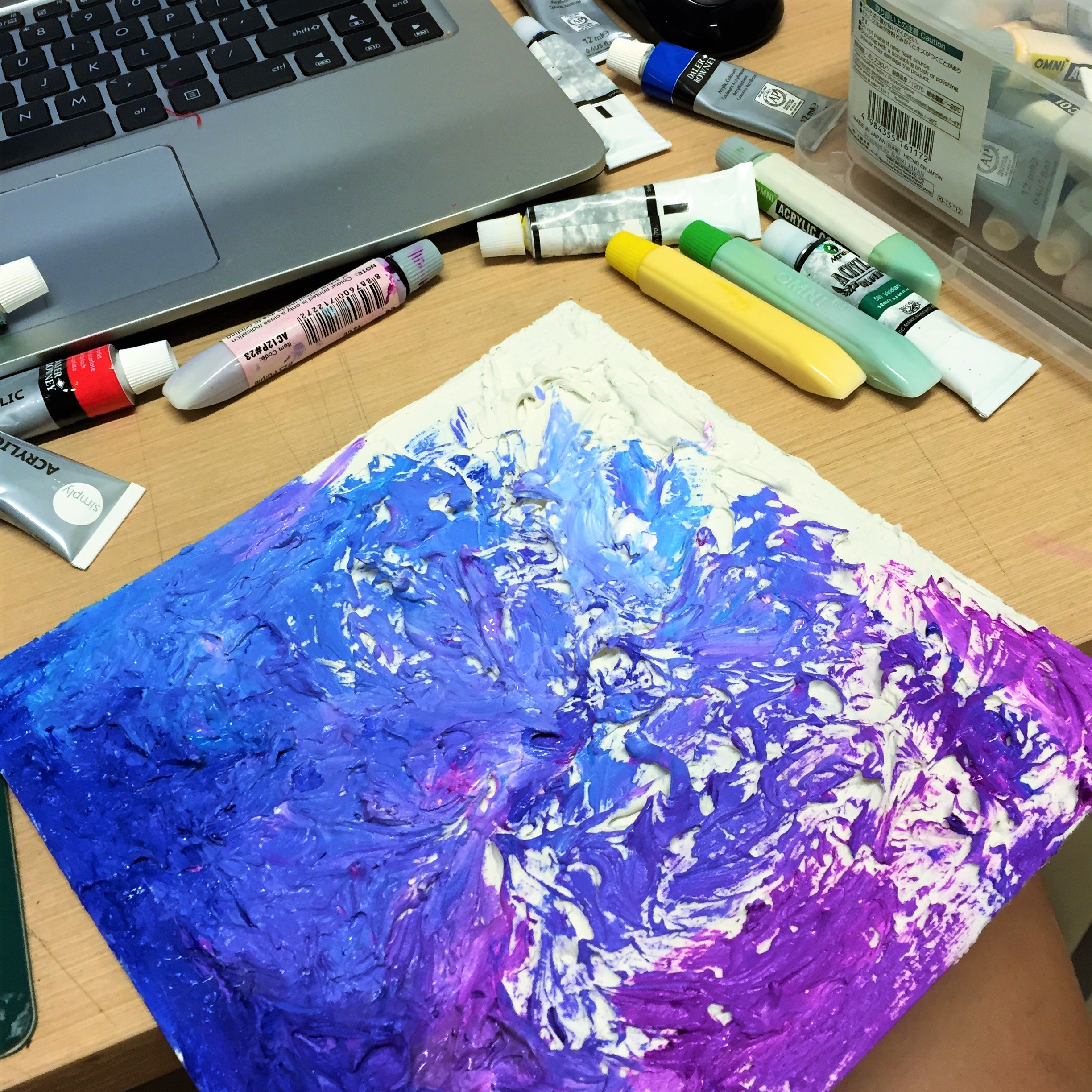
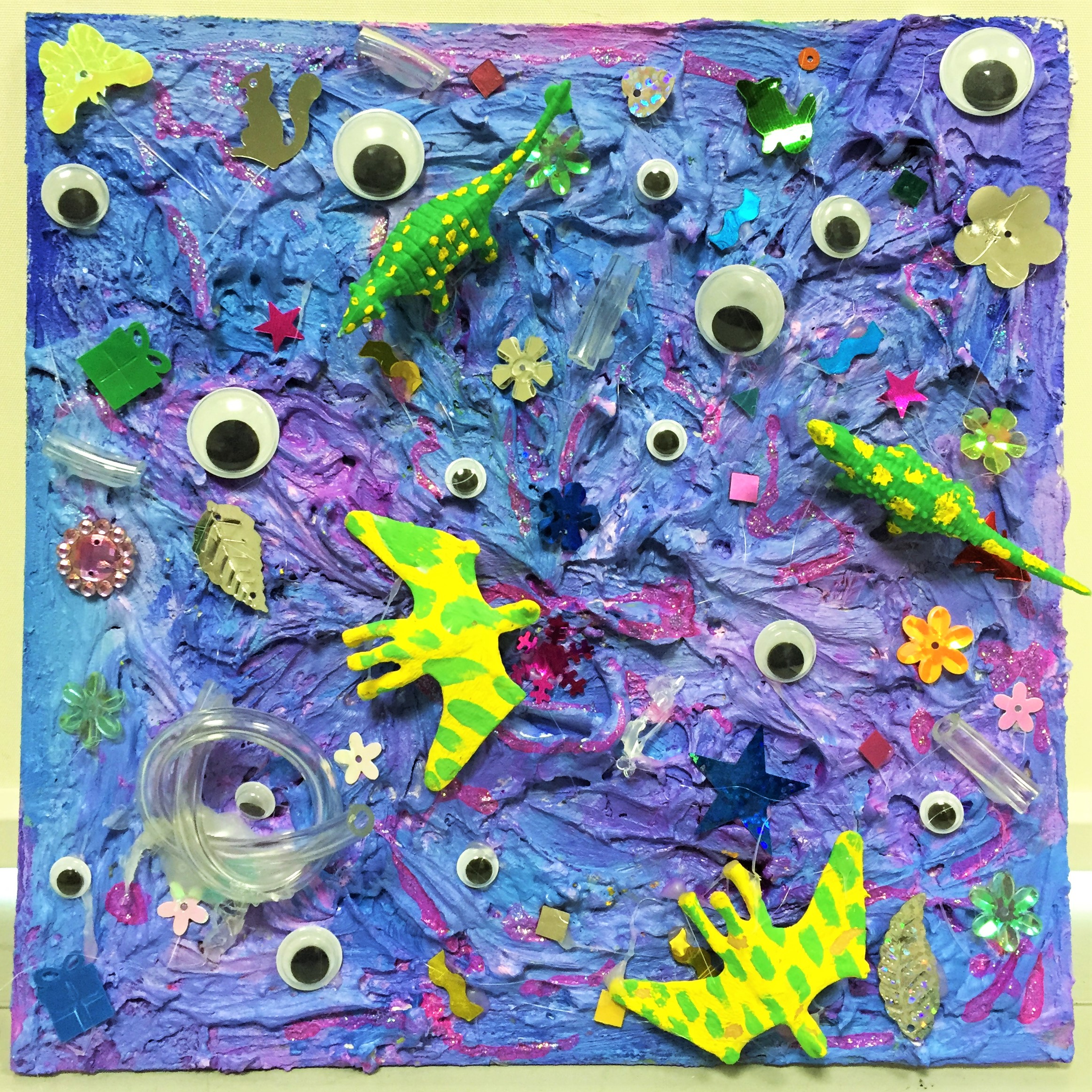
To illustrate the notion of exploring, I tried a new medium that I’ve always wanted to experiment with but never got to – texture paste. I used it to create an irregular, swirly three-dimensional surface, reminiscent of waves in a turbulent sea. Then I embellished with googly eyes (because you see new things), sequins and clear tubing (I think it adds to the interest), and plastic dinosaurs because who knows what amazing things you’ll find when you explore. I painted in with the cool-toned, analogous colours of blue and purple to counterbalance the otherwise overwhelming effect of a textured base and other embellishments.

The inspiration for this square comes from Louise Zhang, an artist who creates flowing, blob-like paintings and sculptures that are irregular and intricate up close.
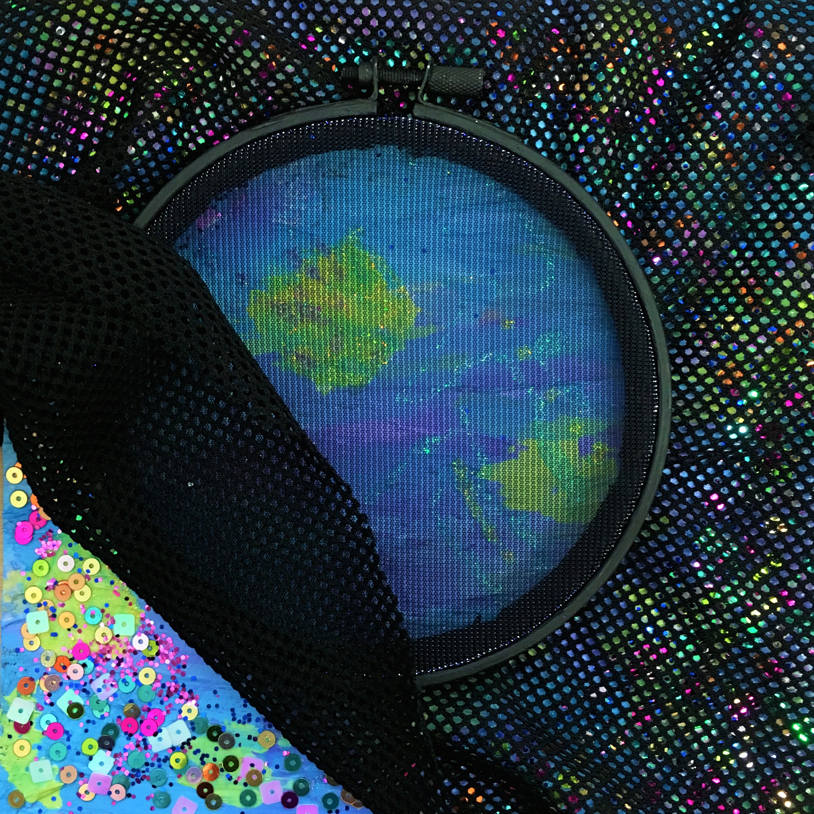
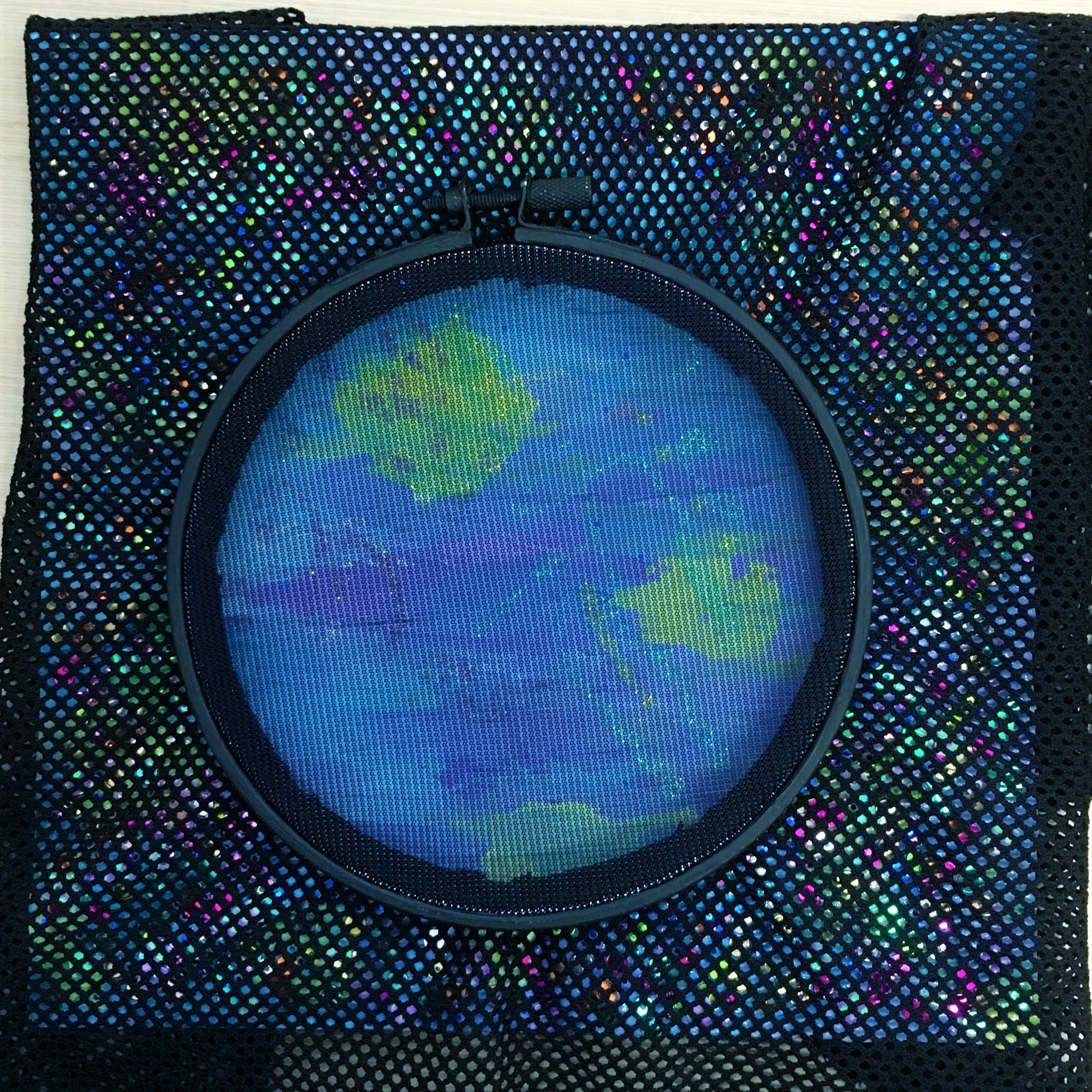
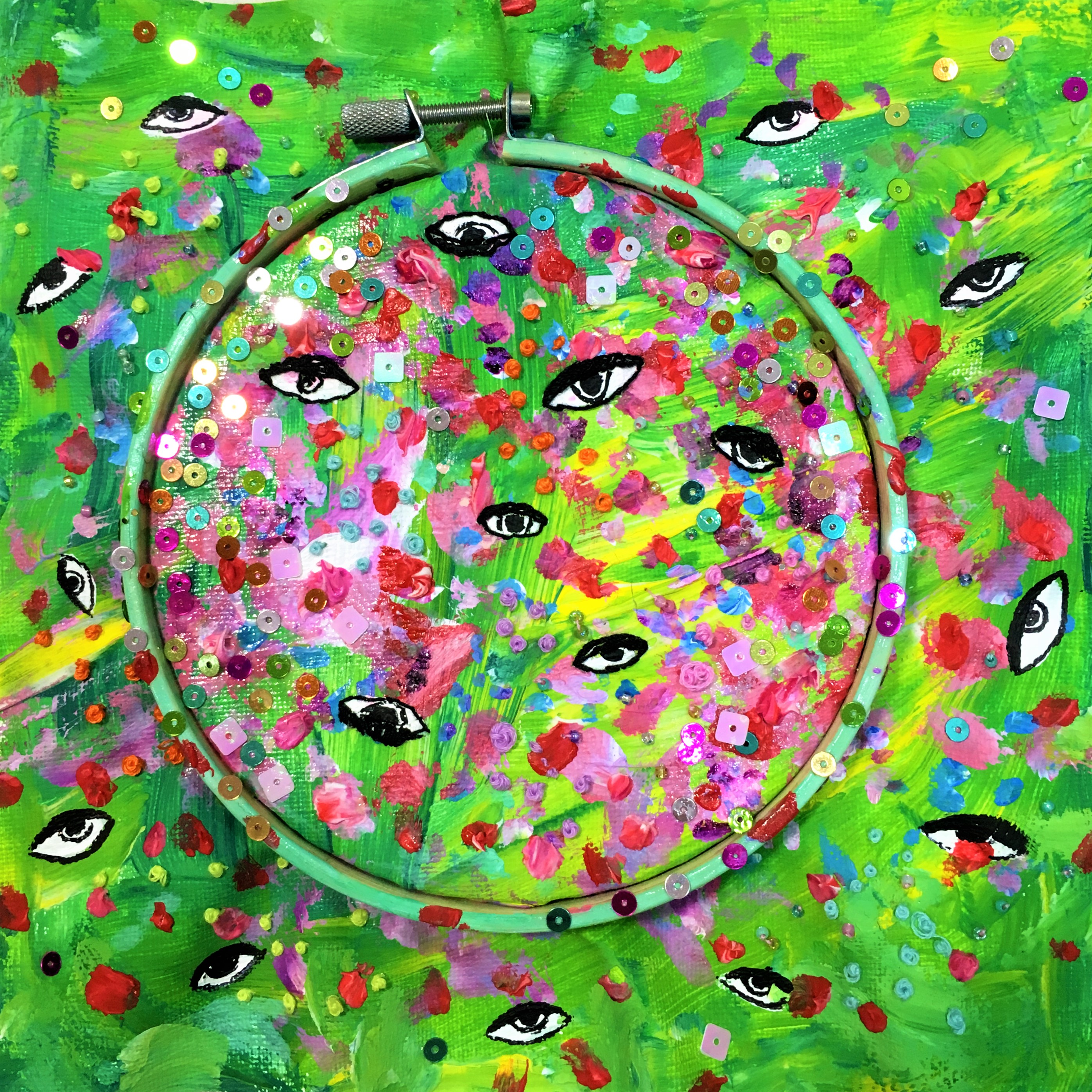
In my head, I visualise comfort zone as an invisible, self-imposed boundary that prevents you from realising the new and wonderful things you miss out on by constantly keeping only to what you already know. To recreate this, I used an embroidery hoop with translucent fabric in the middle and slightly more opaque fabric surrounding it. The part of the base that’s visible through the center of the hoop is plain, but the surrounding is decorated with sequins in a riot of colours. As the sequins are partially visible through the fabric, you get a sense that you’re not seeing the full picture, and that there’s something else waiting for you out there.

A better me is therefore someone who’s more adventurous and experienced, who is unafraid to go forth into a great unknown. This is represented by colours, sequins, embroidery and tiny beads that overrun the boundaries of an embroidery hoop. The main colours in this composition are analogous green and yellow, chosen to look like a blooming garden, and also because it’s double complementary to the purple and blue of the first square.
HARD WORK x FOCUS = AN IDEAL ME
 x
x  =
= 
One of the main things I would change about myself is my short attention span – I get distracted easily, leaving things half done and not seeing it through to the end. Therefore, an ideal me would be hardworking and focused. Because of the slightly more serious nature of this set, I decided to keep it neutral with accents of red.
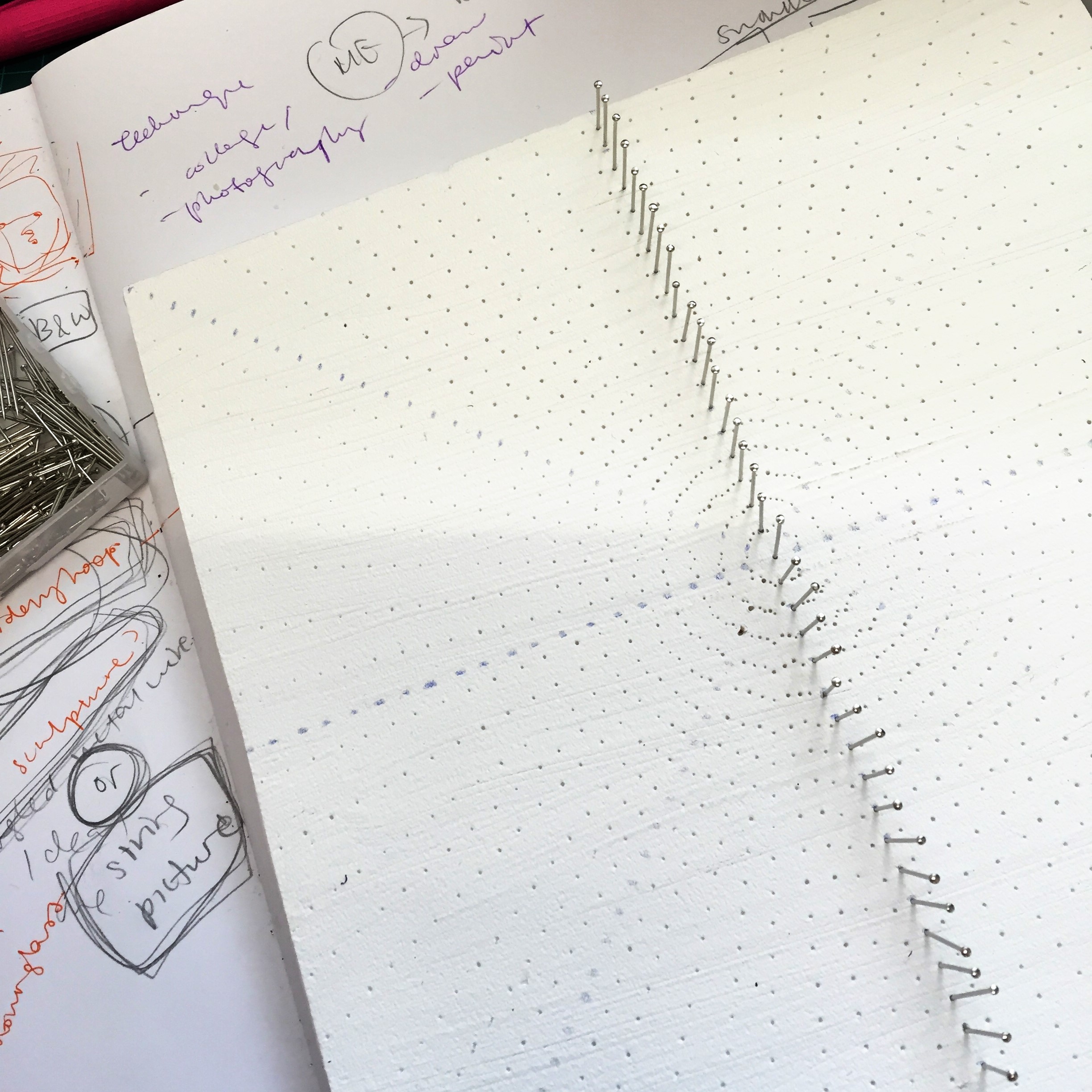
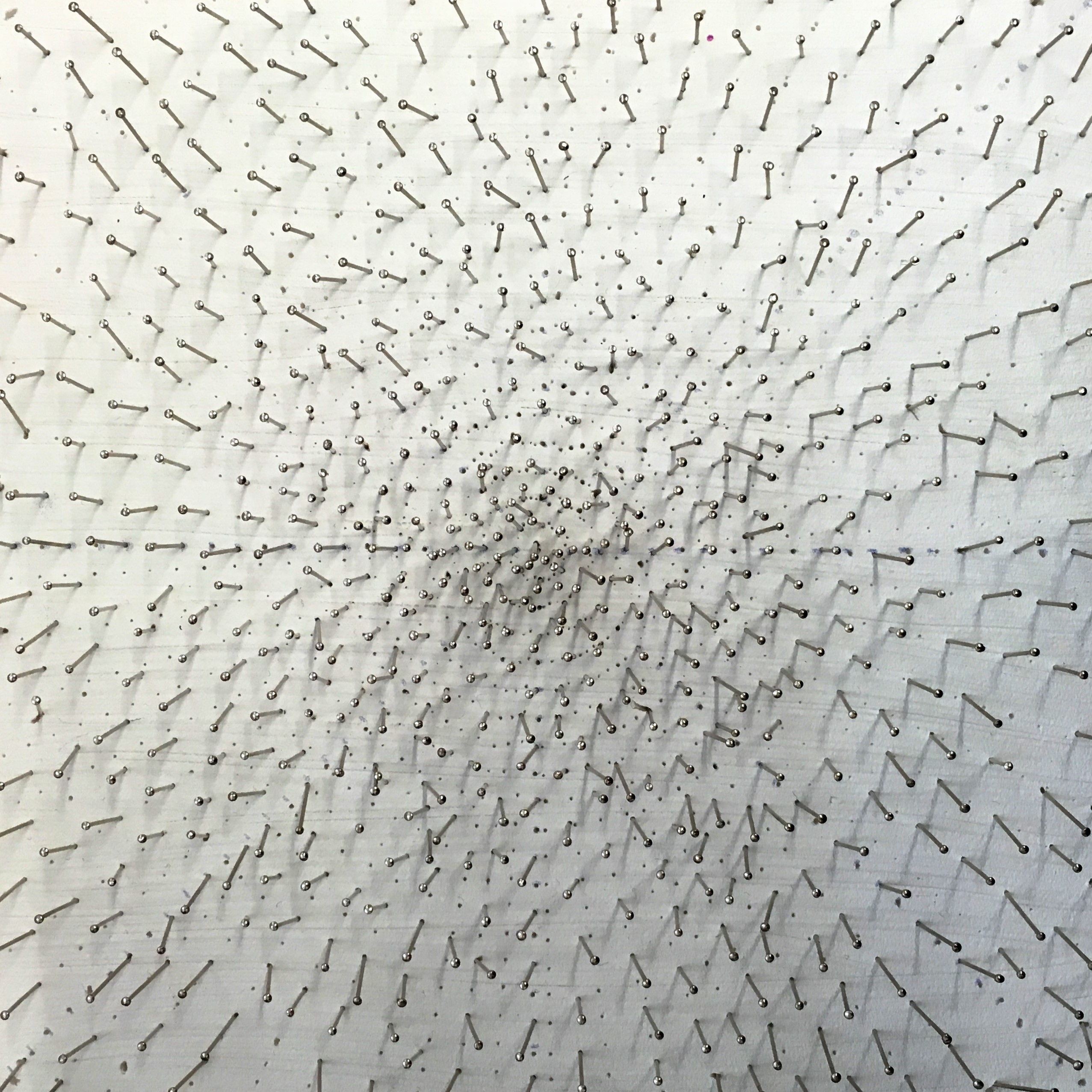
I thought of hard work in the traditional sense – the labour needed to build things. To reflect this, I used sewing pins that looked like nails and kind of hammered (more like shoved) them into a foam board painted white.
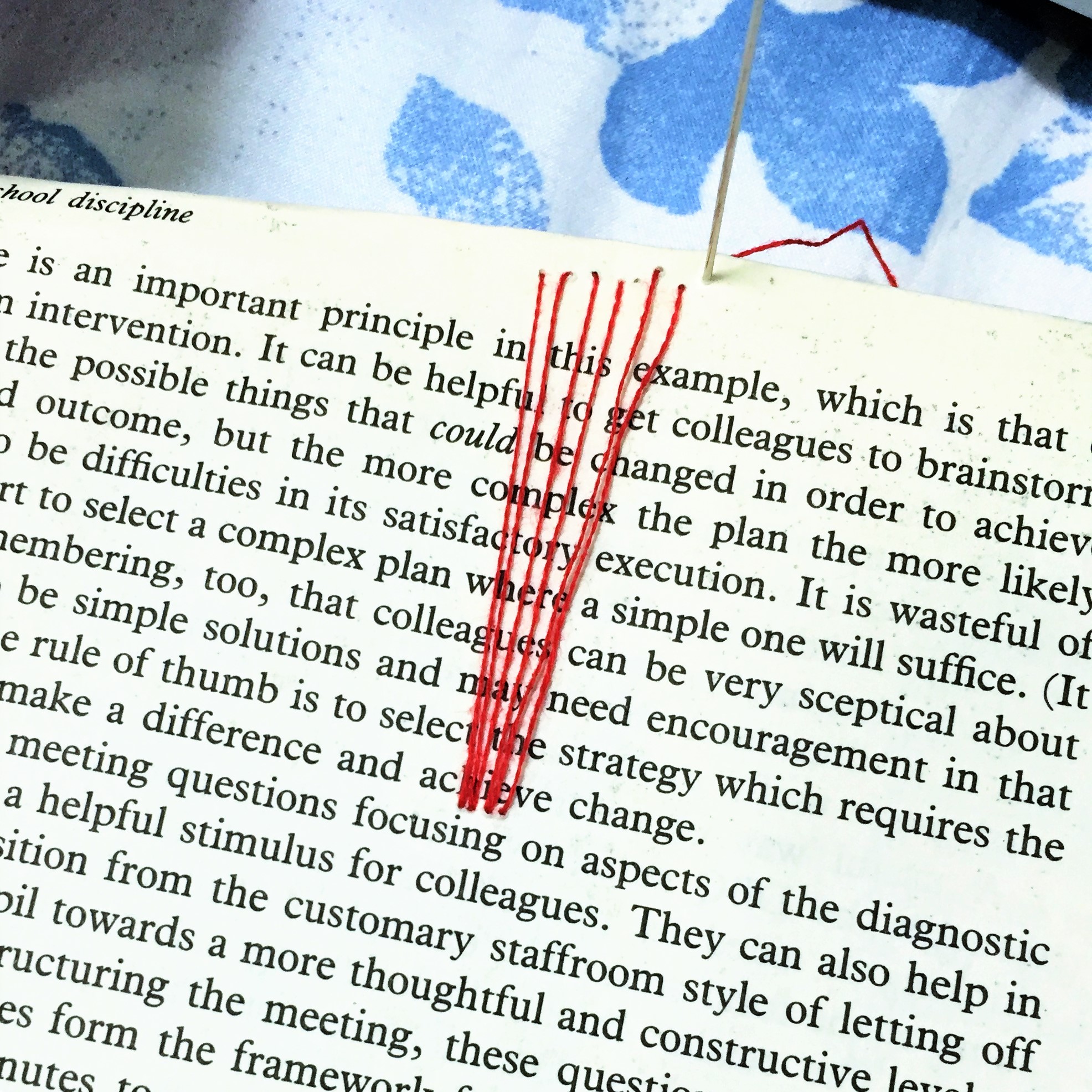
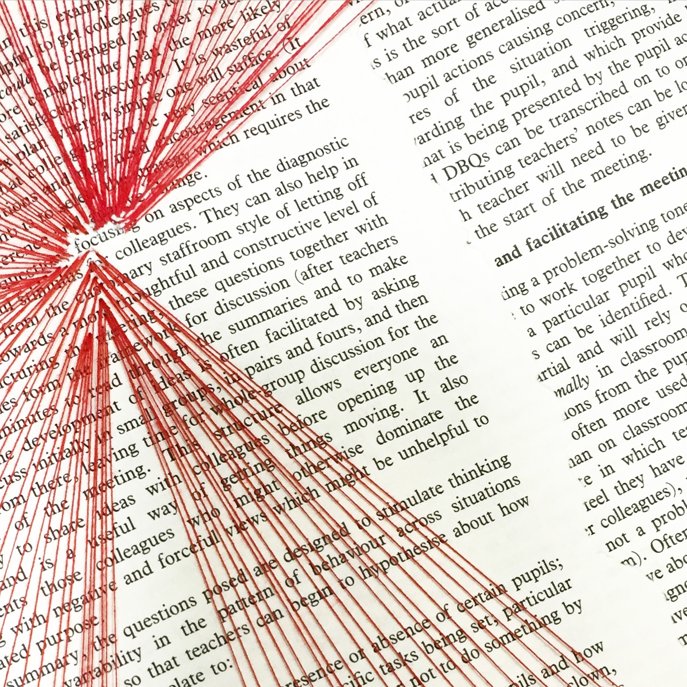
To show focus, I wanted to recreate the feeling of reading an essay or studying for an exam, activities that require a lot of concentration. I found and subsequently mutilated an old book that had the word focus on one of it’s pages, and used converging red thread to direct the viewer’s gaze to the word.

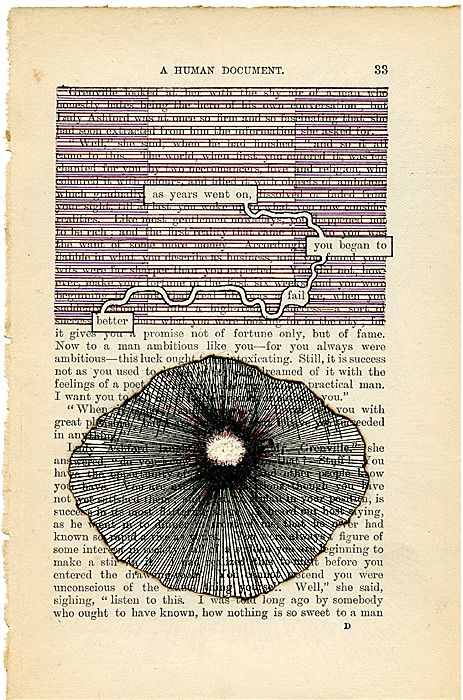

I was inspired by Tom Phillips’ ‘A Humument’, a project that uses pages from a second-hand book to create works of art. Some of the pages have been drawn over to show only certain words – this is the concept that inspired me.
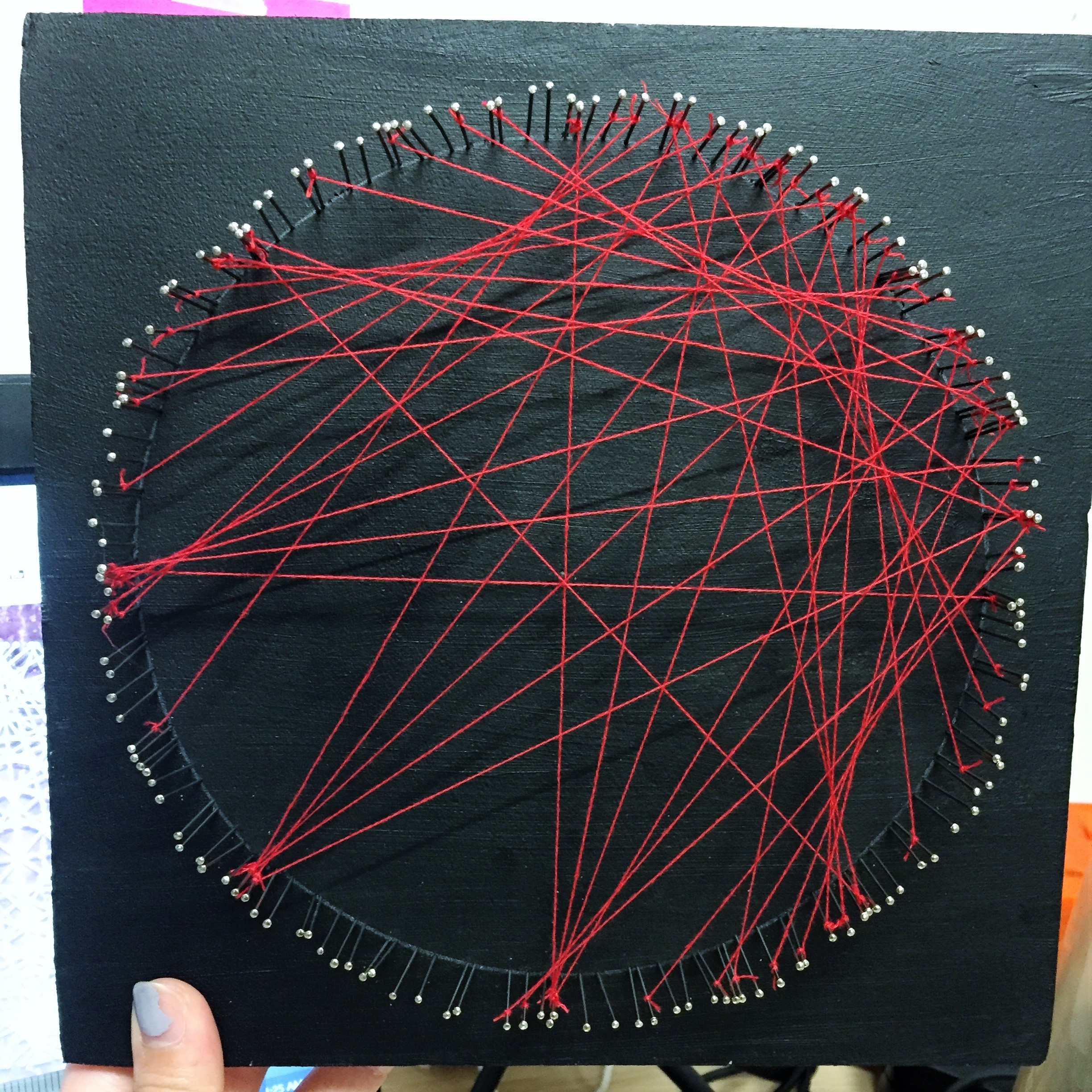
I used elements from both squares – red thread and pins – to create a complicated string art circle to show (also to myself, kinda) that I can accomplish things previously thought difficult, or impossible, with enough hard work and concentration.
CREATIVE + BRAVE = ME IN FIVE YEARS
 + =
+ = 
This last set required us to envision ourselves in five years. Since I still don’t really know what I’d like to do in the future, I decided to focus instead on the kind of person I’d like to be in five years. After having (hopefully) graduated from ADM, I’d like to be even more creative (away with the comfort zone!) and also brave (no more masks!).
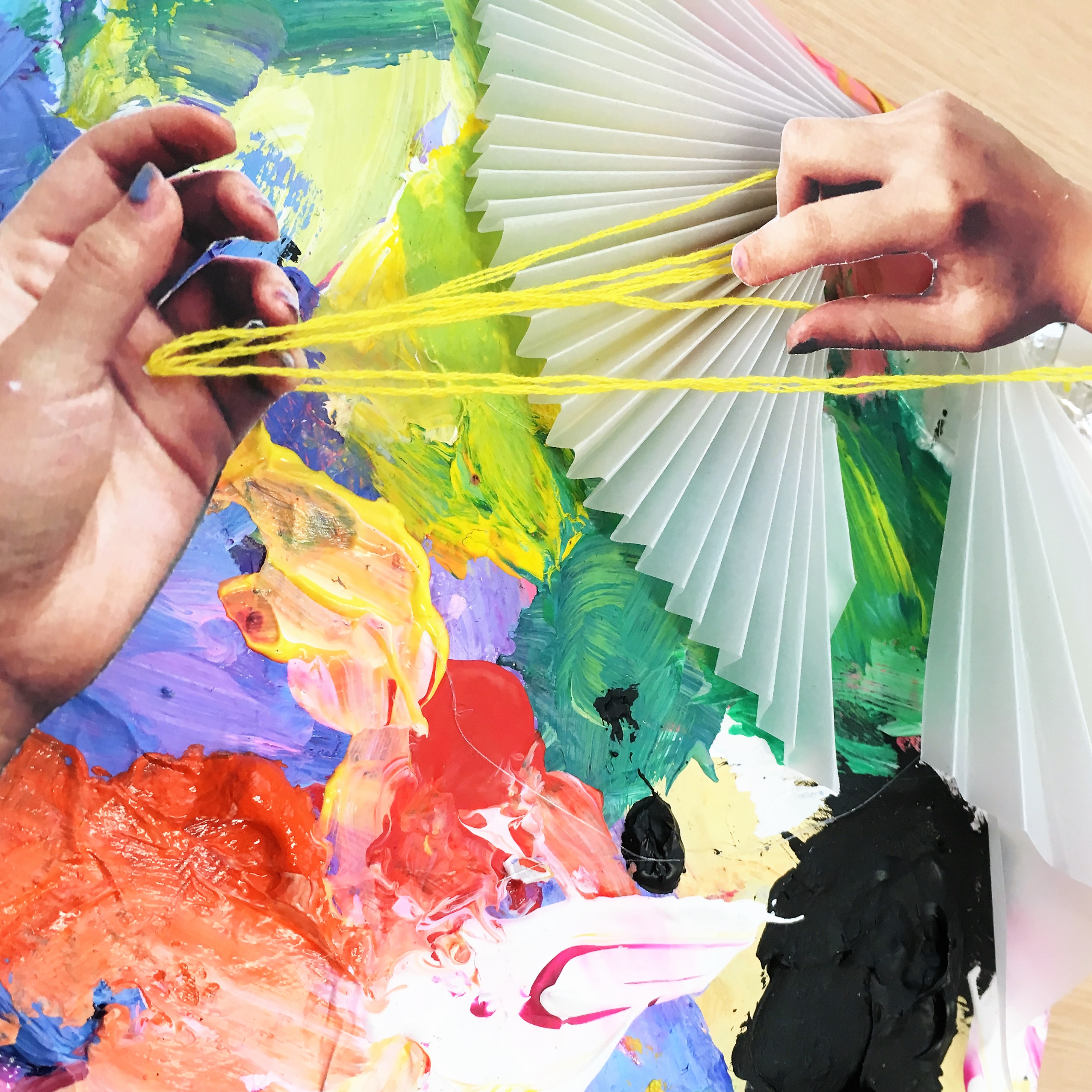

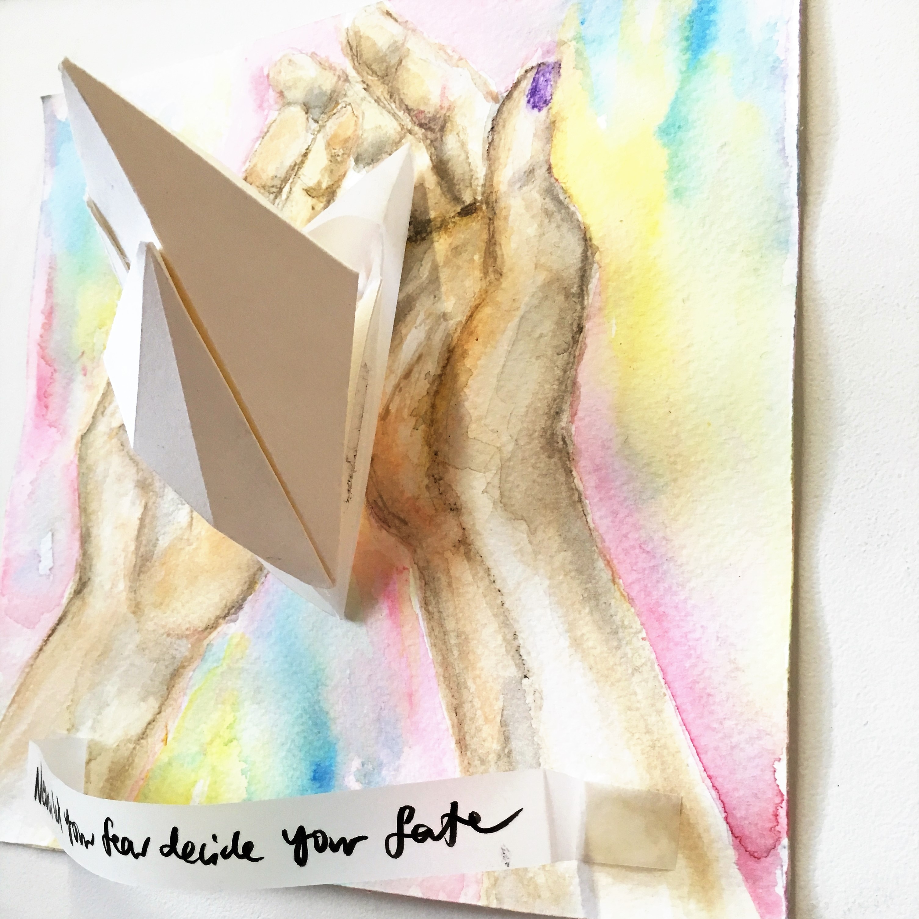
I used splashes of paint to recreate the look of an artist’s paint palette as the background. To give it a more collage-like look, I folded little paper fans out of tracing paper and used a photo of my hands and strung yellow thread.

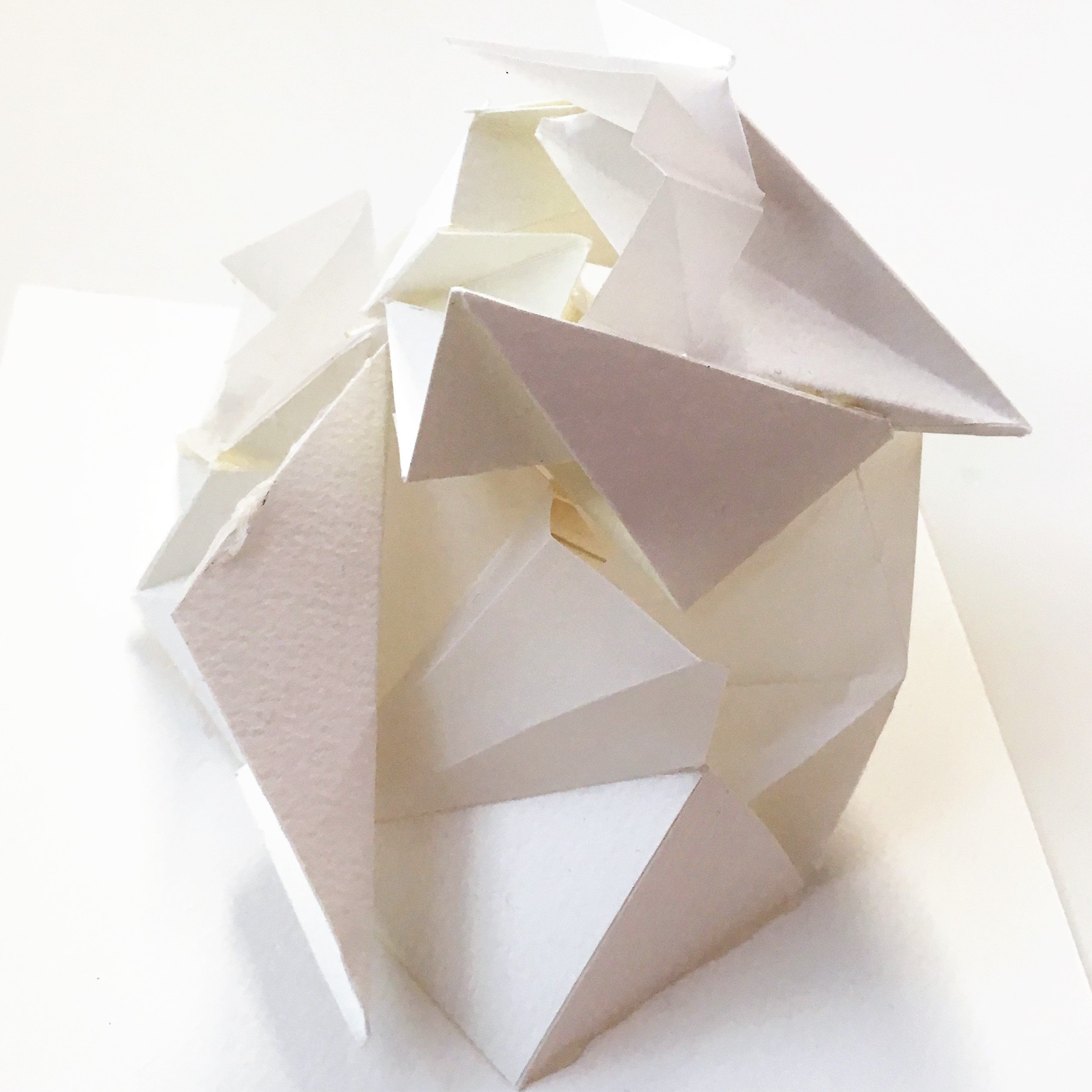
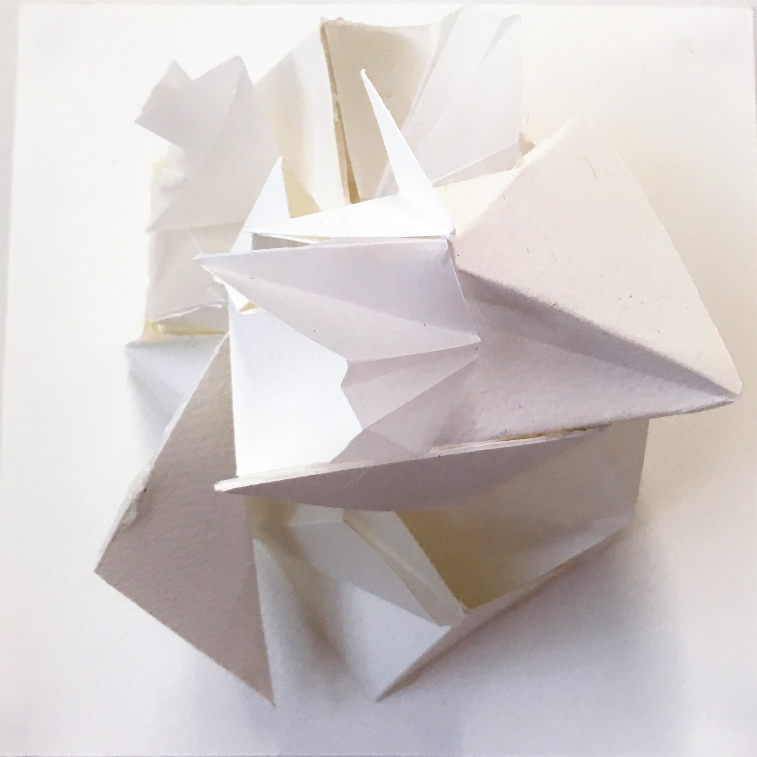
As bravery is yet another intangible concept, I decided to make the composition all white because to me that’s bold and pure and idealistic. However, I used paper with different thicknesses and textures to ensure that it’s not entirely boring despite being one uniform colour. The angular paper structure was conceptualised because the minimalist, futuristic look reminded me of Alodous Huxley’s novel Brave New World.
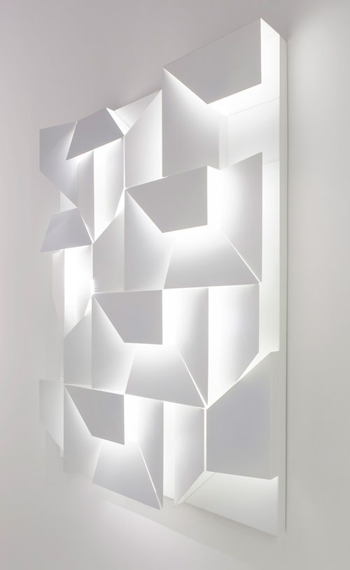
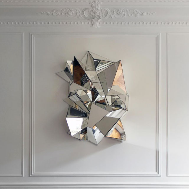
For this, I was inspired by Charles Kalpakian’s shelving unit and Mathias Kiss‘s mirror installation.
Reflections
Although this was without doubt by far the most intensive and time-consuming assignment, it was also the one I enjoyed most. I felt like I tried quite a few new things and also learnt a lot about the significance of colour, and how it’s use or misuse could affect the entire composition. It was interesting to see how everyone distilled themselves into a mere 12 squares, and the different methods and mediums used.
You must be logged in to post a comment.