The Dada art movemement
“Everybody can Dada”
—Dada-Fair, Berlin, poster, 1919
Introduction
Born in 20th century Europe, Dada is an art movement that was born out of an immediate reaction to the horrors of the First World War.
Dadaists believed that the overemphasis on the importance of logic created an environment of conformity, classism and nationalism that paved the way for the First World War. As such, they adopted forms of artistic expression that appeared to reject logic and embrace chaos and irrationality.
Artists in the Dada movement rebelled against the norms of traditional art, critiquing traditional conceptions of the artist as master of his medium and challenging conventional definitions of artistic media. They believed that art should serve as a commentary and critique on the evils of contemporary life. According to Hugo Ball, one of the leading Dada artists, “art is not an end in itself . . . but it is an opportunity for the true perception and criticism of the times we live in.”
Creating a new form of radical, anarchic and anti-war art, Dada artists helped shape the face of modern art that was not handicapped by traditions and restrictions of established values.
Art techniques in the Dada movement
1) Collage
- often abstract
- utilised tickets, wrappers and other unconventional everyday paraphernalia
- created a visual diary of modern life
2) Cut – up technique
- popular literary technique
- a finished, coherent body of text would be cut up, with a few or single words on each slip
- pieces are then rearranged into a new text, with new meanings
3) Photomontage
- variation on the collage technique
- utilized actual or reproductions of real photographs printed in the press
- for instance, Max Ernst often used military photographs in his photomontages
4) Assemblage
- three-dimensional variations of the collage using found or everyday objects
- nailed, screwed or fastened together in different fashions

Raoul Hausmann, Mechanical Head (The Spirit of Our Time), 1920
5) Readymades
- everyday manufactured goods that are deemed to be art merely by virtue of the artist’s selection of them as such
- questioned basic definitions of art as well as the role of the artist in creating it

Marcel Duchamp, Fountain, 1917/1964.
- for instance, Marcel Duchamp added signatures and titles to common household goods, calling them “readymade aided” or “rectified readymades”
6) Typography
- uncoventional typographic design
- frequently mixed fonts, unorthodox punctuation, and printers’ symbols
- printed both horizontally and vertically on a single sheet

Tristan Tzara, Une Nuit d’Echecs Gras, 1920
7) Sound poems
- poems without words
- language is broken down into its abstract parts such as syllables and individual letters and reconfigured as meaningless sounds
8) Abstraction
- a way of gaining access to a more instinctive inner consciousness
9) Chance
- critique of the traditional notion of artistic mastery and technical excellence
- letting go of conscious control
10) Overpainting
- painting or drawing over pages of found print materials

Max Ernst,
la bicyclette graminée…(The Gramineous Bicycle…), 1921
Artists
1) Raoul hausmann
Hausmann used nontraditional forms of art, notably photomontages, as he believed it was closer to the work of the common man, not needing any refined artistic techniques as in traditional mediums. As a significant figure in the Berlin Dada movement, Hausmann was disgusted with the more traditional art styles and the lifestyles that they represented, and his collages were used as tools of satire and political protest.
2) Hannah Höch
Along with Hausmann, Höch was one of the originators of the photomontage, often using mass-media photographs in addition to elements of women’s crafts such as lace and handiwork pattens.

Cut with the Kitchen Knife Dada through the Last Weimar-Beer Belly of the Cultural Epoch of Germany, 1919

The Beautiful Woman, 1919
She was interested not just in politics, but in women’s roles in both society and the world of art. Her work largely revolves around the issues of gender and identity. She explored the concept of the “New Woman” in postwar Weimar Germany, where women’s social and personal identities were in a process of change and redefinition.

From an Ethnographic Museum, 1930.

Made for a Party, 1936
Höch also often used techniques such as the fusion of male and female bodies to attack the ideals of femininity and tackle issues like the objectification of women, sexuality, and humanity.
The Russian Constructivists
Introduction
Constructivist art originated around 1919 as when Russian artists questioned the fundamental properties of art, and asked what its place should be in a new society. Abstract, modern, and minimal, constructivist art was used as a tool for social improvement. Themes are often geometric and experimental, but rarely emotional, creating a new form of art in line with the democratic and modernizing goals of the Russian Revolution.
It rejects the idea of art for arts’ sake and the traditional bourgeois class of society to which previous art had been catered. Instead, constructivist art is functional, rejecting art’s traditional concern with composition and replacing it with a focus on construction. The Constructivists compared the artist to an engineer, arranging materials scientifically and objectively, and producing art works as rationally as any other manufactured object.
Artists
El Lissitzky and Rodchenko were both well known for their graphic design and typography, which made use of bold lettering, stark planes of color, and diagonal elements.

Aleksandr Rodchenko, Design for an advertisement for the Mossel’ prom (Moscow agricultural industry) cafeteria, 1923

Alexander Rodchenko, Maquette for a trade union poster (Trade Union is a Defender of Female Labour), 1925
Lissitzky used color and basic shapes to make strong political statements. He believed that art could greatly affect society, and identified the graphic arts, particularly posters and books, as effective means for reaching out to the public.
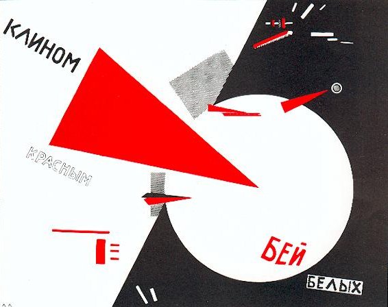
Beat the Whites with the Red Wedge, 1919

USSR, Russische Ausstellung, 1929
Typography
Introduction
Typography is the art and technique of arranging type to make written language legible, readable, and appealing when displayed. It entails the study of how letterforms interact on a surface. In contemporary use, the practice and study of typography is very broad, covering all aspects of letter design and application, both mechanical (typesetting, type design, and typefaces) and manual (handwriting and calligraphy).
On the other hand, lettering can simply be defined as the art of drawing letters. It is different from typography in that lettering concerns itself with the creation of letterforms, often hand-drawn using tools such as pens, graphite, or brushes.
Hand-made typography
The increasingly popular modern trend of hand-made typography combines both traditional typography and lettering to create a final design that stands out visually in this digital age. Although legibility is still a concern, it is no longer as important a consideration – expressed by Wolfgang Weingart when he says
“What’s the use of being legible, when nothing inspires you to take notice of it?”
hand-made typography is often used to evoke notions such as:
- a raw, organic, earthy quality;
- a retro, pre-computer age;
- juvenile and teenage years;
- comics, zines;
- handmade, homegrown;
- unique, funky, quirky;
- indie and revolutionary
Examples of handmade typography


food (edible???!) typography at it’s best


Illustrated typography
3. Ryan Hamrick


hand-lettered typography


embroidered typography
5. Pei-San Ng


matchstick typography sculptures
6. DANGERDUST


micro watercolour typography
DIY movement
DIY, short for “Do-it-yourself,” refers to contemporary artists who foreground self-reliance and the self-made in opposition to mass production and mass culture. Similar to the Dada movement, DIY arose as a part of 20th century counterculture, pioneering alternative ways of living, thinking and doing.
Essentially, the DIY movement is a reactionary response on an individual scale to the mass production mentality of modern society.
These artists often explore alternative modes of exhibition or distribution, such as zines, artist books, artist-run spaces, video art, workshops or pop-up shops that blur the boundaries between living and working.
The current DIY Movement is increasingly becoming a social and political ideology as well as a hobby or fashion aesthetic, offering an alternative to modern consumer culture.
An example of the DIY movement is Jordskred, an independent publishing platform focusing on autonomous publications by artists, illustrators and designers, as well as musicians.


Jordskred Två, a publication by Louis Reith, 2012
170 x 240 mm, 24 pages, stencil printed, hand-stitched, numbered edition of 22
Jords Katter, supplement to Jordskred Två
100 x 140 mm, 8 page booklet + poster, digital printed
Photography for the poster by Gerard Wennink
Image sources:
DADA
- http://www.kenney-mencher.com/pic_old/20th_century/dada_hoch.htm
- http://www.fastcodesign.com/3024729/the-best-of-hannah-hoch-arts-first-punk#3
- http://scrapexchange.org/2009/11/26/marcel-duchamp-hanna-hoch-readymades-and-collage/
- https://en.wikipedia.org/wiki/Raoul_Hausmann
- http://guity-novin.blogspot.sg/2011/08/chapter-44-dadaism-meeting-point-of-all.html
- http://onesurrealistaday.com/post/97181358/the-gramineous-bicycle-garnished-with-bells-the
Russian Constructivists
- http://www.theartstory.org/artist-lissitzky-el.htm
- http://www.tate.org.uk/whats-on/tate-modern/exhibition/rodchenko-popova/rodchenko-and-popova-defining-constructivism-8
You must be logged in to post a comment.