The first assignment of this semester requires us to create typographic portraits out of our names (or part of) to describe various aspects of our personalities.
IDEATION
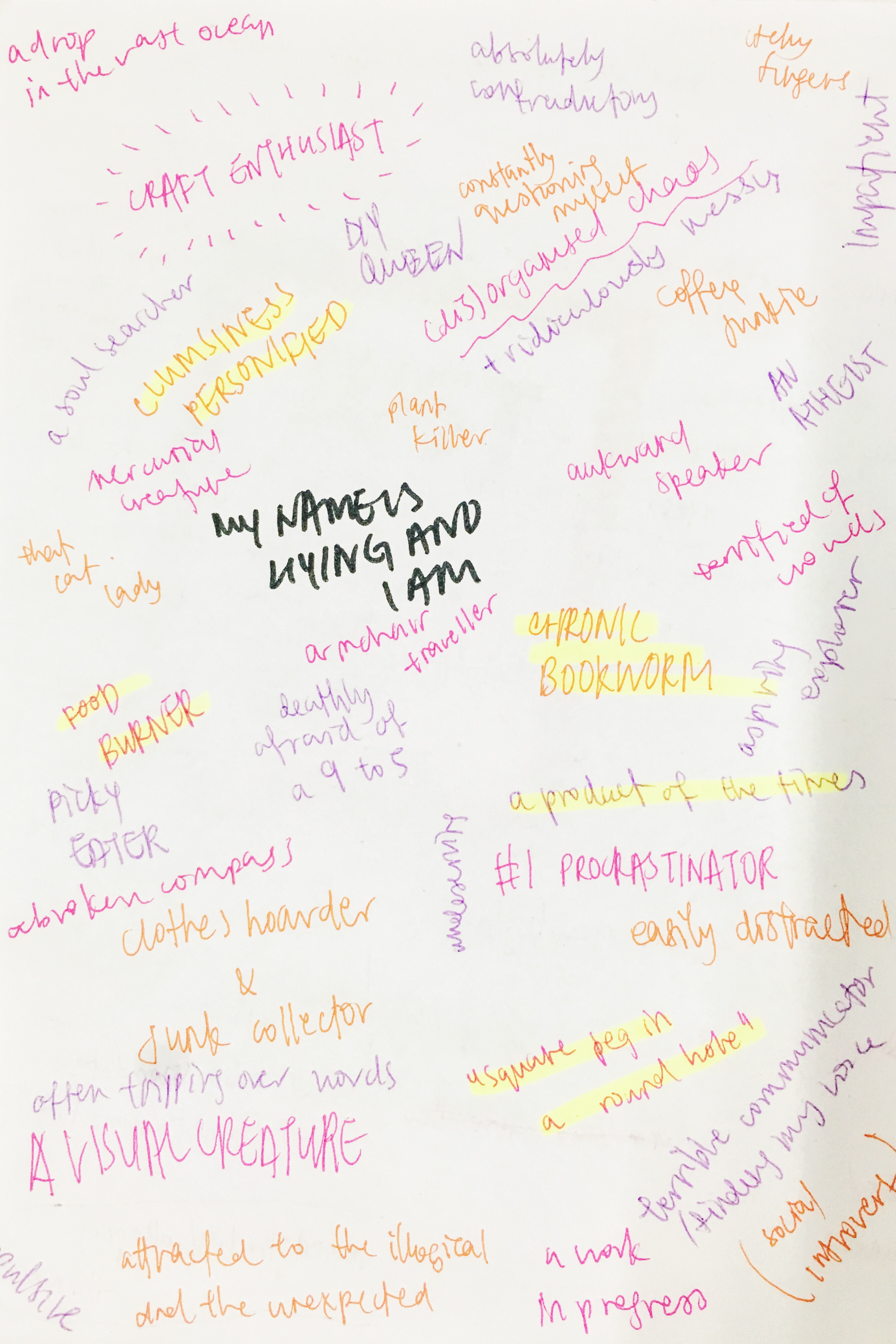
For the first step of my ideation process, came up with a bunch of words and common expressions to describe what I regard to be my personality quirks – both the good and the not so good. From this cloud of words and phrases, six were selected because I felt they were apt, (hopefully kind of) interesting, and can be appropriately portrayed.
THEME / MEDIUM
To create visual coherence, I intend to create all of my compositions with a kind of collage/mix media technique – haphazard, but with a clear vision in mind. Kind of like an organised chaos. I’m also thinking of arranging the portraits in order of increasing intimacy – from traits that are easily observable, to traits that you only know after spending some time around me. Kind of like the process of getting to know someone.
My name is Liying and
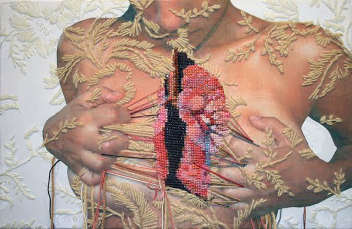
I am all thumbs (clumsiness personified)
To express this unfortunate trait, I intend to create a photomontage such as those favoured by the Dada artists as a kind of visual diary. It should be based around scabs and bruises and skinned knees – minor, accumulated injuries and a sure sign of a clumsy creature.
For this composition, I looked at the embroidered works of Eliza Bennett and Ana Teresa Barboza with their unusual use of thread and needlework. Bennett and Barboza both bring an unexpected, almost macabre touch to a conventionally feminine and delicate crafting technique.
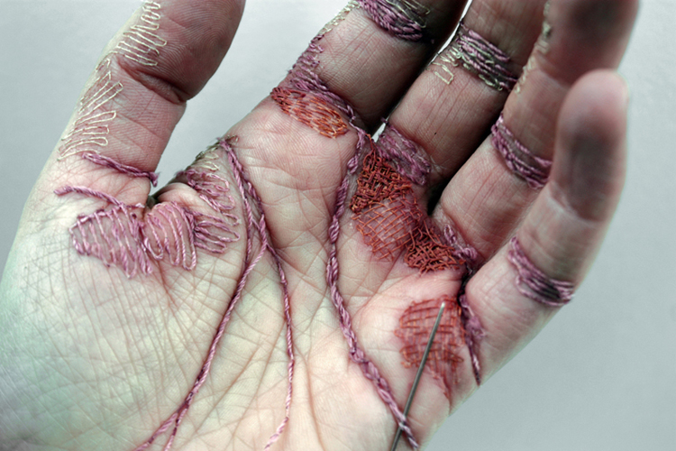
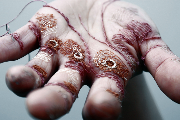
A Woman’s Work Is Never Done by ELIZA BENNETT
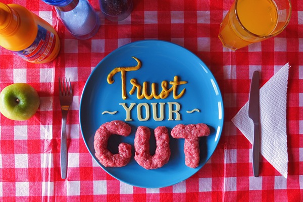
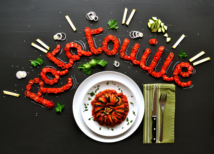
I eat my feelings
I really love food and it’s a constant struggle, partly because I really can’t cook. Food typography would really suit the idea behind this, and it’s also something I’ve always secretly wanted to try. (an excuse to play with food)
Some artists I’ve looked at are
I am a product of the times
This is meant to take a slightly more critical look at society – how conventional beauty is a social construct, perpetuated largely by mass media and the current culture of fervent consumerism. We paint our faces to look a certain way, I’m definitely guilty of that. I thought it would be interesting to explore the idea of the face as a canvas, using make up products and tools to create type.
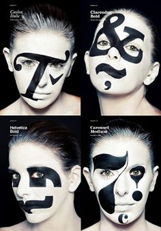
Typography experiment by Miao Sum
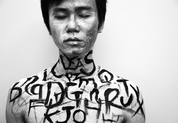
A chronic bookworm
I grew up reading actual, paper books and while I do still love them, I recently haven’t been able to part from my kindle. I thought it would be interesting to look at how books have been digitalised from their paper predecessors, while paying homage to my favourite pastime as a kid. I plan to use paper from old books, set against a lightbox to mimic the light from a kindle touch screen surface.
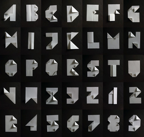
Folded font by BUSK

Letterform Light by Iain Glynn
A square peg in a round hole
Growing up, there were (many) times when I felt like the odd one out – a square peg in a round hole. The geometric imagery of this expression reminded me of the Russian constructivists and their use of shapes and colour to create interesting compositions, a technique I hope to explore in this work.
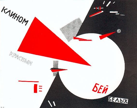
Beat the Whites with the Red Wedge by El Lissitzky
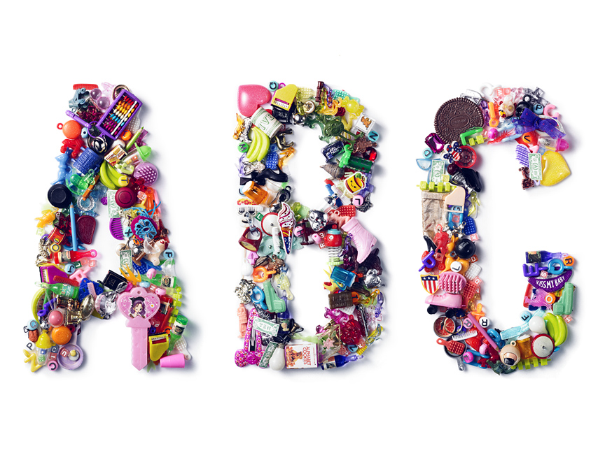
I am a compulsive hoarder
I like collecting junk and sometimes I get too sentimental (read: have issues parting with my stash). I thought that using found objects to create type would be a literal and also kinda fun way to express this unfortunate habit.
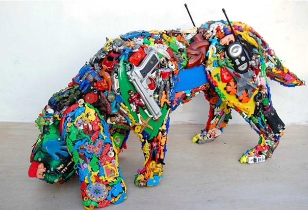
Paris Sniff by Robert Bradford
You must be logged in to post a comment.