Assignment 3 [applied illustration] final edits + a bit of a reflection! Hello hello!! Continue Reading →
Assignment 3 [applied illustration] outcome APPLICATION #1: POSTER VARIATION While I was adding noise to the illustration I found that it created this really nice, desaturated effect! Continue Reading →
FINAL ARTWORK After some discussion in class, I decided to pick the orange masthead because it adds to the whimsicality of the piece. Continue Reading →
PROCESS initial digitized sketch / sketch cleaned up with minor edits colour + texture / more detail Final artwork!!!! Continue Reading →
Editorial illustration #4: pencil compositions These are some really rough pencil comps I did to flesh out the ideas from the previous post: I digitized them to better see how they would look: This idea wasn’t outlined in a previous post, but came to me in class. Continue Reading →
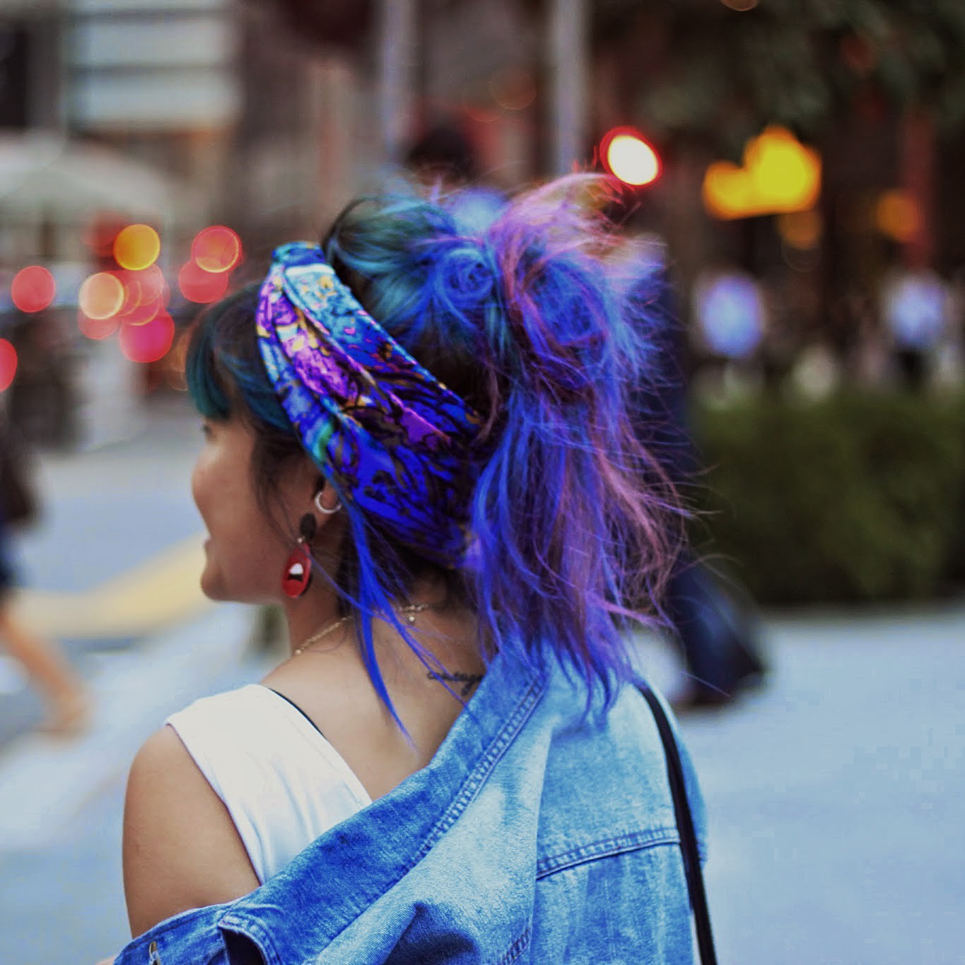
editorial illustration #3: user persona & target demographic Varoom magazine’s audience are: Millennials & post millennials → 20’s & 30’s, possibly late teens? Continue Reading →
editorial illustration #1: reference artists + theme REFERENCE ARTISTS #1 Qwaya_ / scottwon1 Here’s a Korean artist I first encountered and immediately fell in love with at the (very inspiring and absolutely life changing!!!) Seoul Illustration Fair last summer. Continue Reading →