After some revision, I’ve either dropped or combined certain traits and I think I’ve settled on these 6

Hi, I’m Makoto and I’m  _______

  • Reserved
  • A Foodie
  • A Druggie
  • An Audiophile
  • A Watcher of Movies
  • A Reader

Most of the ideas feel quite finalized.

Not sure if I should talk about them here, as opposed to the day/final post itself.

Done tests on burning some cotton for Reserved. The pictures seem to be headed in a promising direction. Fire shows up well but my concern is the drippage of the lighter fluid if I angle the baking tin. left my SD card reader at hall though… Will update with pictures soon.

For Foodie, I tried rolling rice in cling film to keep a more controlled form, but I’m not too keen on the plastic sheen/reflection that it gets.

Taking a look at the examples on Blackboard, makes me feel like I could approach these traits from more perspectives. I just don’t feel like I’m delving deep enough into the possible visualizations.

I’ve been wanting to do an aspect that doesn’t have such a apparent visualization in my head. Less visually tangible traits.

I’ve also been considering the aspect of contextual elements in the pieces. I’ve been quite intrigued since I heard about it. It was quite an “oh yeah” moment, so rudimentary and so accustomed to accepting things as per “our” context, that we often forget the possibilities of other perspectives. A little tough to insert that in so far though.

As usual, I found myself worrying about the executability and fidelity of my work. Making me contemplate bailing from some ideas, especially the real world ones.

But I figured, now’s the time to experiment and explore.

EDIT: Since it’s only four A5s now, I’ve narrowed it down to

  • Druggie
  • Audiophile
  • Reserved
  • Reader

These four I feel I gravitate to the most, and I really do like the concepts I have behind them and am excited to try out the ideas behind them.

In Motion

Main Character: John

Setting: Suburban House, peaceful, relaxed atmosphere. Warm Tones

Plot: John wakes up in his house in a pretty upbeat mood and goes to make breakfast. While doing so he steps out to check his mail. In his mailbox, he finds a note, written in a cryptic but poetic manner. Surprised and a little confused, he looks around cautiously and steps back into the house.

He ponders over the note while eating his breakfast and shortly after, he sets out around his house searching in little pockets and along the shelves. Eventually, he finds another note. This sets him off on a search for around the house/town.

Through the day he gets increasingly stumped by the notes and in the evening, he returns to his room, feeling done for the day.

The next morning, he gets up, in the same chirpy manner, and while making breakfast, he finds a cryptic but poetic note. It reads almost exactly the same and he ponders over it while eating his breakfast.

We cut to a woman discussing with a psychiatrist how else they can jog his memory.

——–

Visual References


#1 – One-shot House Raid black comedy
Side in sideways from door into a HDB house
From this angle, you can see straight from the living room to the dining table to the kitchen and there’s a toilet at the right hand side (HDB layout)
Then a guy walks into the toilet casually, people/family sitting at the aforementioned places
while he’s in the toilet, a group of masked people, come in and kill the family/take them away
after all this chaos, the house is in a mess and the atmosphere is completely changed.
the guy then strolls out of the bathroom and is struck by the sudden event.

My focus here is mainly on the shift in atmosphere that takes places, as well as the dark comedy pay off at the end.


——
#2 – Animation – Dungeon
(Black and White/Stylized)
A kid wakes up in a sort of dungeon type place, doesn’t know what’s going on, can’t remember anything. He basically investigates around the place, finds some clues, deals with traps and other stuff. He eventually makes his way out, but when he gets out, he sees a whole bunch of people that are like him, but they all seem to be trapped in this other place (sort of hinting at a bigger story)


———


#3 – Mind

(Black and White)

Guy wakes up, neat place, he goes to make breakfast, but while doing so finds a note, written in a cryptic but poetic manner. The message piques his interest, and ponders over it, while munching on breakfast. Going around various spots in the house, he eventually gets it right. We see him spending the day following the messages around the place, eventually he seems to get stumped at one and decides to stop for the day and go back to sleep.
The next morning he gets up and goes to make breakfast. While doing so, he finds a note.

Cut to a psych, discussing his case trying to figure out how to jog his memory again.

(Wondering how to make the ending slightly more satisfying, especially why the notes are written the way they are. Thinking of making his wife be the one writing the notes and they’re both poets and in doing so, hopefully jog his memory as he can’t remember anyone anymore.)


I kind of want to also do a more abstract type of film. Visually a mix between Tetsuo the Iron Man and Mothlight. Slightly jittery and sporadic. But feels a little too far out and indulgent to work on with another person. Hence I’m trying to do so, in doing one take shots, black and white or stylizing the whole thing.


N A M E T A G

Abstract

Abstract

When I heard that I could drop some degree of meaning or sense from abstraction, I lept on to the opportunity to deviate from what I usually do, having the tendency to have meaning in the elements.

This squiggly sort of doodle also stems a little from what I wanted to do for typography, a Tim Burton-esque type font. While this is quite distant from “meaning” I still feel a strong connection to these squiggles, as I like to doodle and I often doodle in a similar manner and let my hand wander. A look at this does give me the vibe that it is a representation of me.


Typography

GOOF

GOOF

As previously mentioned, I wanted to go for a font/type reminiscent of Tim Burton’s spooky branch-like aesthetics. Due to lack of ability/training, as you’ll see in the tests I’ve done on paper, that fell by the wayside. I then decided to go with a cryptic/occult style font to keep with le spooky aesthetic that I wanted, mixing about with my Conceptual ideas (The Witch house genre of music, taking points from the aforementioned styles.) The outcome, clearly falls short of my ideas and even probably turned out better in the test doodles that I did.


Concept

Concept
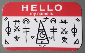
The aesthetic of music is often an aspect that, while not exactly overlooked, is something that we sort of absorb unconsciously. Digging into the Witch House genre of music for their A E S T H E T I C . Themes of, as the name implies, witchcraft as well as horror, glitchy elements and other ‘dark’ styles. Musically, the most well known would be Grimes, Crystal Castles and Purity Ring. Artists in this genre often utilize unicode in their names as well eg. Horse MacGyver (formerly ///▲▲▲\\\). My aims were to be able to capture all that, in a conceptual name tag without relying on copying symbols (except for the band Xiu Xiu’s logo/symbol, which I put in cause I like these sort of low-key, somewhat irrelevant references and getting away with it.)

Test 1These were the ideas I doodled down, there’s no particular route that entails chronological order though. I did start with the eye and the Triangle Eye Symbol next to it. Tried to dip into blackletter, but I wasn’t satisfied with the quality that I was putting out. You can also see the typography that was to be that never was :T.

Test 2

More tests, and trying to finalize a layout for Concept, trying to get the typography down too.


ASSIGNMENT 1

The attributes that I’m considering are

  • Hungry
  • Reserved/Anxious
  • Messy
  • Mental
  • Slow
  • Inquisitive – I’m thinking of challenging myself with a word that isn’t so apparent with visuals
  • Tired
  • Driven
  • Asian/Japanese/Indian
  • Audiophile
  • Drugs

I’m planning to take a real-word-handmade-photography approach. Thinking of dabbling in some perspective illusion type things too.

Something that really helped me jog my mind, was the point about context. I have yet to generate ideas that toy with that idea, but I really really want to play around with that aspect.

This is a compilation of visual references that director Paul Thomas Anderson used in his movie ‘The Master’

It made me realize that it was okay to take reference/inspiration from other sources. A huge problem I had before, was trying to brainstorm of something new, and that took more time than I had.

Another video I like is

I like the stylization and how great it is at such short a length.

I was reminded of this video from the Blackwater Gospel animation, which I like a lot too.

MIchel Gondry’s music video for The Chemical Bros – Star Guitar is also really nice in concept and execution.

add. vids I like are Chris Cunningham’s various Aphex Twin music videos. They can be NSFWish at times, but they’re so unique and bizarre that I find myself drawn to them.


Typo Crop

One way I learnt you could roughly explain typography, is a bunch of rules that you can apply to the alphanumeric characters.

I personally really like when the type seems to focus more on concept/abstraction than on legibility, but I also like when even through all that, it’s still very functional.

The one above feels like it’s dipping in that territory. It’s also reminds me of the font associated with Tyler the Creator, often referred to the ‘boxcutter’ font, reminding me that concepts can come from anywhere.

tyler-pln-slideshow-copie-970x350

Now for some ‘handmade’ fonts.

Candy Crop

55695777efdee359d87af4735e9ae242

tumblr_n77eebtBXE1qgnue7o3_540-535x500

nico-krijno12

9c578837dd74720a35c27890fdc0f085

Onsen Crop

MTI5MDIyODg4ODE5ODI5Mzc5

9d6baa97cc0ff3e639cab6c02a140d5b

6d84107b783d43283a5d83c9849fc7af

As seen above, playing with depth, embossing, shadows, alternative materials and environments are just some of the ways that ‘handmade’ typography has it’s own distinctive qualities.

Having typography manifest in the ‘analog’ world gives it a very tangible and captivating aspect, which doesn’t quite seem to occur with me in digital typo.

As with most projects, I’m often worried about my ability to execute the ideas I have, and cultivating the discernment to know where my boundaries lie is something I’m having to discover out every time.

With the references I’ve collected so far and those that I have yet to amass, I hope to be able to find the apex of inspiration and ability :T

Also, as much as possible, I’ve linked the artist’s page/WIP/similar works in the images, so just click on the images to get to those pages~