My initial idea was ‘Water’ , but as the list went on, I didn’t feel like the outcome was going to be good, even the top 6 didn’t feel particularly interesting to me.
I decided to try Money as a topic next. Considering how many connotations money has and just how subjective it’s value is I thought this would be a particularly interesting subject to centralize the ideas upon.
Money from the POV of The Poor is A Goal
Money from the POV of a Farmer are Potatoes
Money from the POV of a Tribe is Meaningless/Useless
Money from the POV of The Rich is A Solution
Money from the POV of Drug runners is Desperation
Money from the POV of a Scanner is Illegal
Money from the POV of Politics is Power
Money from the POV of a Tree are Slices of Skin
Money from the POV of a Piggy Bank are Intestines
Money from the POV of a Bank Teller is Numbness
Money from the POV of a Counterfeiter is details
Money from the POV of a Beggar is Cans
The issues I have with this is that in my mind, I see money ending up being the goal or end. Hence some of these feel awkward, eg. drug runners/potatoes as they’re doing it for money, but I’m not sure how far I can push the phrasing, which I’d rather not do cause it feels disingenuous if past this point. The other issue being I’ve run out of ideas for money [said no rich person]. Despite the malleability of how money is perceived, it seems to be distilled into, “it’s important” or “it’s not important” to this particular group. I’m afraid it might be a little too one note though.
Hence, I thought of using Time, particularly ‘The Past’, to give myself a better bearing and a more solid place to start or focus on. I chose time because I wanted to try something intangible.
The Past from the POV of an Old Person is Youth
The Past from the POV of a Collector is Money
The Past from the POV of a Hipster is Novelty
The Past from the POV of A Kid is Boring
The Past from the POV of The Past is Abstract/Conceptual
The Past from the POV of A Clock nothing
The Past from the POV of a Company is Heritage
The Past from the POV of a Witness is Subjective/Fuzzy
The Past from the POV of Someone who’s lost an item is Missing/Inaccurate
The Past from the POV of Fruits/Plants was a Fortunate Event
The Past from the POV of a Fraud was a mistake/slip-up
The Past from the POV of
The issues brought up in class were really in helping me make these idea’s less subjective to me. I didn’t realize this at first, but some of my terminology was subjective; “boring”, “The Past”
It helped shape my perceptions of my concept a little better and opened a few more ideas on how I could work with this.
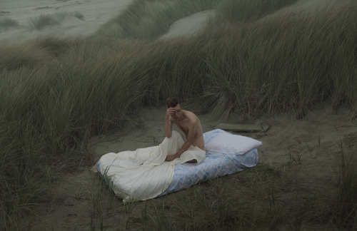
For my references, I’ll be using Kyle Thompson
I often refer to him as I really like the atmosphere in his pictures and for this project I aim to capture similar sentiments
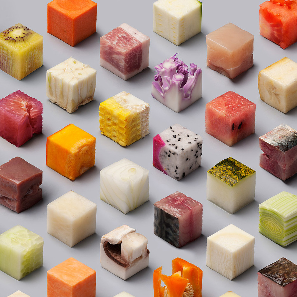
I am also referencing Dutch artists Lernert and Sander. They did this concept below for de Volkskrant, a Dutch newspaper.
My focus on for this image is just how abstraction, or changing the form of something makes the viewer look at it from a different perspective. Familiarity of the form breaks down and certain aspects appear more prominent. I really just enjoy unexpected ways of altering perception. This is something I aim to do in this project as well.
Similar to Andy Warhol, through the use of repetition, meaning can be taken away or made vague. Much like how when a word is repeated over and over, it starts to sound strange and loses it’s linguistic “form”
Representing The Past seems like it’s going to be a fun challenge. Being so open ended, I feel like there is much more to explore in terms of execution and topic. Hopefully this recess week, though busy, is a good chunk of time for me to refine these ideas much further.
For once I kept my presentations short haahaha, time to plonk all the stuff I didn’t say into this post~
Reserved
When I first meet people, as much as I’d like to connect with them right away, I always hesitate. Even for class feedback, I have things I’d like to say but I reserve my comments and usually never say them. Even since I was a kid, the first time I went to a nearby playground, I watched other kids playing and really wanted to join them, but it took me 3 – 4 days before I eventually talked to one of them and joined in.
It’s still pretty much like that, though I’ve improved greatly. This conflict between wanting to communicate and having my reservations about doing so, is what I’m trying to convey illustrate through this image.
The cotton represents the ‘soft’ me, feeling very vulnerable before that initial contact. The fire represents the conflict and the desire to reach out and interact with people.
This concept was the first in my mind to spring out, and it’s been pretty solid from conceptualization to execution.
Execution of this image was a lot of fun, tho when I started out I was pretty worried about this going horribly wrong.
Tested some cotton burning and took some pictures with them, roughly taking note of the settings. For the final shoot, I used cotton wipes, cut the letters out and soaked them with lighter fluid.
I knew that for the letters I didn’t want something particularly bold, and trying to get a consistent look between the letters was a little bit of a challenge. I wanted a kinda slim but not frail set of letters. K was a real pain to cut. I frayed the ends of the letters for a distressed look, but of course all that went away as soon as they were set alight.
I used my mothers baking tray for the dark background and sadly, I realized that the heat does visibly damage the tray ;____;
Fortunately, I didn’t have to do this too many times. For the end result, I photoshopped the background to this dark state. I decided to clone the tray and not just fill the background with just black, cause for one, it looked pretty obviously two separate colours and I erred on the side of caution that it’d show up in the print more obviously.
READER
I wouldn’t consider myself an avid reader, but I do enjoy a good book and when I was younger, I used to read quite a lot. The books on this ‘shelf’ are books that I’ve read that I feel have had an impact or influence on me. From music to subversive/cultural issues to humour, if my personality or brain was a bookshelf, this would definitely be quite a comprehensive portion.
Originally I thought of breaking down each book’s significance, but I think I’ll leave that up to people to ask~
An alternative idea I had for this was to go to the library and line the shelf with titles I like and photoshop the names to spell my name out. Unfortunately, I wasn’t able to do that. This however, didn’t turn out that bad either.
Googling for specific book spines was also way too niche to get many good high resolution results. I ended up going to my shelf, taking a picture of my books and photoshopping them alongside each other, some in batches, the end result is not too shabby I’d say.
DRUGGIE
“More Pharmaceutical, Less Narcotics”
This idea came about as one of my initial ideas, was to make a scene that looked like the viewer stumbled upon remnants of a cult ritual in an abandoned house. I also already had a similar idea to do one for medicine/drugs. I was worried that the two might look too similar, though I think the two would have worked well together thematically. When the project was cut down to 4 pieces, I dropped the ritual idea for this one, as this had more significance to who I was.
Having dealt with medicine for quite some time and at this point, rather familiar with a wide variety of them, this was also rather fast to pop into my head. I’ve also had a fascination with the narcotic side of drugs as well, this was a great opportunity to mash up the two.
To explain my fascination with narcotics is in more grey areas of legislation and use. The reality of someone under influence of drugs and an onlooker are two completely different worlds, therein showing just how subjective “reality” or the individual experience is. A point I wanted to make during the presentation was that “while I right now I think that I’m doing a presentation in school, there’s also a chance that in actuality, I’m somewhere completely different, like an asylum, staring at a wall going “drugs, drugs, drugs”. The same point is illustrated below.
Like with ‘cults’ my direction with this idea was also a “stumbled-upon” type aesthetic. I used my 11b to draw these cocaine lines (made of cornflour of course) for the irony as well as for the visual gag. In the background, there’s a spoon with Meth (Sea Salt), a syringe filled with brown liquid (Tea), some random pills strewn about the place (one of which people do get hooked on very easily). Which is why I’m not a fan of all aspects of pharmaceuticals either; but there’s a very interesting dynamic between the companies, the people, and the laws dictating them. These are all pretty dynamic and multifaceted issues though, and I don’t think it’s possible to give a blanket statement. This is just one of the reasons I keep gravitating back to the topic and issue of drugs through my different projects.
As for the visual aspect, I knew I wanted a slightly aggressive angular look to the words to add a harsher look to the whole image. I wanted a unkempt, grungy look with the lighting to look like a harsh spotlight with heavy fall off at the sides, sort of like a lot of urban exploration photos. I was planning to do this on a wooden table that I thought looked pretty bad but had the look of a druggies dresser top. I shifted to the glass table eventually, cause I thought the fingerprints and stains on the table would add to the dirty look more. It worked pretty well and the scratches really add to the image, but the issue was that I had to position my light pretty carefully otherwise I’d get a very bright distracting reflection in the image.
I also was planning to take a picture of the image using my handphone on the screen, especially after the talk on fidelity of the image. Inspired by a hoaxed video of a UFO in Israel, it used this technique of filming the screen which added that look often found in cryptid/paranormal videos. Some samples are below.
The outcome wasn’t as good I’d have liked it to be, though in the middle picture you can see the pixels on the screen, which was an aspect I really wanted. The final image though, I’m pretty satisfied with.
AUDIOPHILE
I’m pretty big on music, which is also why it’s a common theme through my projects, even while drawing my cocaine lines, I had a song to make them with, like how Liwen has specific playlists for things. I’m constantly on the search for music and I really do enjoy the creative aspects and the personality, thoughts, concepts and atmosphere that comes through in a song; the search for new music brings new perspectives, ideas and vibes in my head as well.
When I listen to music, there are, as mentioned in the previous sentence, vibes in my head. There is an almost tangible atmosphere and texture with the audio in my head. Like in Ratatouille there were visualisations when Remy ate the food. It’s similar to that, except a little more abstract. Similarly, I’ve also been intrigued by the visualization of music, bringing it closer to what more people would consider a more tangible medium.
Inspired by visualizations and musicians who put images in their songs (ref. to previous posts on Venetian Snares and Aphex Twin). I decided to go with graphical visualizations of my name.
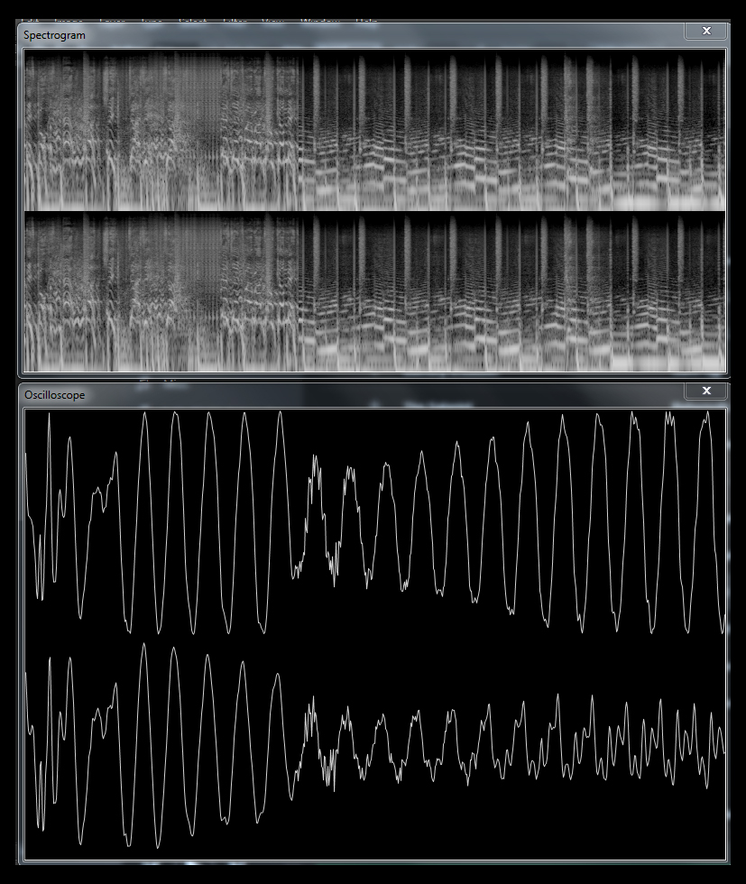
I chose to use my mother’s voice as I feel like it would be the most accurate at pronouncing my name. I experimented with different software to figure out the best way to go about this (detailed more in previous post). After I had acquired the graphical representations, I was a little at a loss with what to do with them. I contemplated switching over to slotting my name on vinyl records labels for a while.
I then accidentally stumbled upon making the audio waves into loops, I thought they looked a little like vinyl records (as Jun Yuan mentioned). The ideas sort of fell into place from there, with a lot of experimenting with placement and orientation. I was also inspired by rap videos where the aspect ratio black bars were instead replaced by more visuals in those spaces, thus I put the spectrograph reading of my mothers voice at the top and bottom, the only issue was that it didn’t come out too well in the print.
I was also concerned with readability. I was afraid they were too abstract looped as compared to when they were flat. Which was funny because neither of them were “readable” text per say. On the other hand, language and the alphabet was learnt in the first place, so they too, without prior education are just as abstract as these. I thought that was pretty cool.
OUTRO SONG
In closing, I’d like to say that this project, despite some of the bumps along the way, came out pretty satisfactory, even with all my usual worries about ability and fidelity of execution. Some feedback was that the READER image stood out by being too bright compared to the rest. It was on my mind as well, but in the time I had, I wasn’t sure how to fix it at the moment. The backing colour was also something I was thinking about. As much as I like a dark background to bring out the image, with most of my images being dark, I was sure that it’d make the edges of my frame a little too muddled and hard to catch, hence the lighter backdrop. Additionally, Joy commented that the abstract concepts could be taken even further, which is something I’m going to contemplating. ALSO, THANKS VERY MUCH TO THE THURSDAY CLASS, thanks for giving feedback to a stranger with your supportive words and feedback on the post-its. Hopefully I can use the momentum of this project for all the future ones.
For audio, as stated previously, I wasn’t very satisfied with the visuals of the software I was using – ‘CoagulaLight1666’ I realized I didn’t include an example, mainly because I didn’t think it looks good enough.
If you want, you can click the above image and it’ll link you to the full sized image.
The software so far I have found to be focused on turning images into audio.
The link above is an example of an image put into a song, the last track on the Venetian Snares Album ‘Songs About My Cats’. The song, ‘Look’, only really makes sense when run through software and as you can see, is pictures of his cats!
Though, this project is typography based, so imagery out of sound isn’t exactly the way to go it seems.
This section reminds me of Vaporwave‘s (a genre of music) A E S T H E T I C S, which some might consider the be gaudy.
However in further tests of the software’s capabilities, I wasn’t able to find a suitable use for the look.
Below, I tried just writing my name out using the various brushes. Some, like the stuff at the bottom I do like, but it’s not very feasible to draw consistently with the mouse, unless that’s the look you’re going for.
The software also is very difficult to work in A5 formats. It very clearly wasn’t made to handle files of that size. For one, I can’t zoom out to fully view the canvas in it’s entirety.
Moving on from that, I recorded my mom’s voice saying my name, ‘Makoto’ for maximum authenticity haahaha.
There’s the section that I decided to use.
In waveforms, I had to catch it in 3 syllables as seen below
Ma
Ko
To
I’m still contemplating how to lay these out interestingly. One idea was to spell the words with vinyl records, but that looked a little too awkward than what I envisioned in my head.
Click to open in a new window
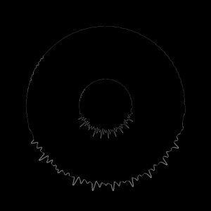
I accidentally stumbled upon this idea of making the waveforms look like records, though my concern is if this is too much a deviation into abstraction. Though, it was mentioned that waveform representations were alright, looping them into circles worries me that it’s pushing too far away from the conventions. I do like where this is going though. Had a few ideas on how to layer these as one set of loops in the picture below is one syllable, one line for each channel (Left and Right)
This however, since my screen is 1920 x 1080 at most, I can’t screenshot or export any higher in the current oscilloscope visualizer, hence A5 is a little scary to work in, as there’s going to be visible artefacts from scaling the image up.
Trying to vectorise the waveform in Illustrator makes it a little jittery and a little too paint-like for my liking.
These are the spectrogram visualizations of my name as said by my mom, except, one set of the 3 peaked patterns is my name once, they’re a little too short and I can’t figure out how to stretch them out at the moment.
So, with these elements I’m still wondering how to piece them together, but I’m not satisfied at the moment, fortunately I have a few more ideas I haven’t tried out, hopefully the answer lies there.
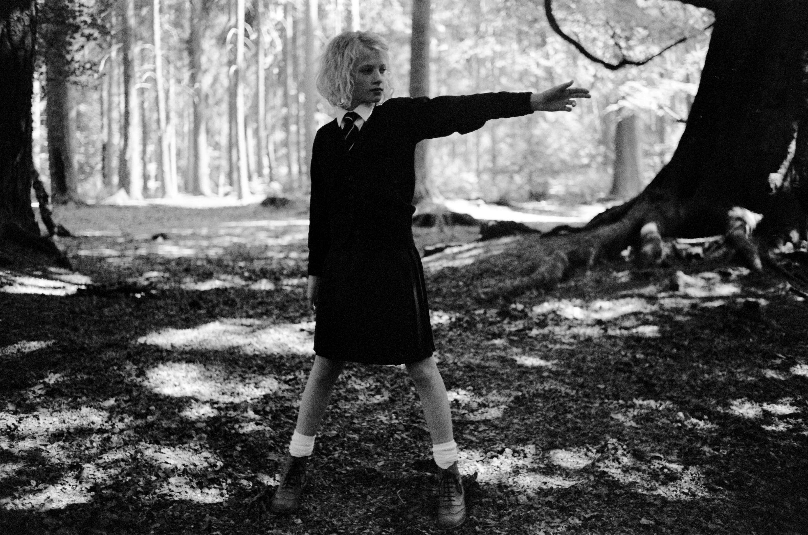
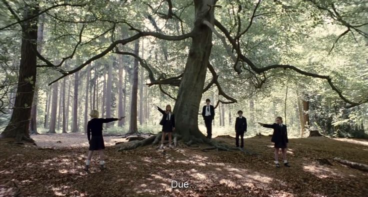
I’m going to be attempting to breakdown the short film ‘Necktie’
3 ACT STRUCTURE
Act 1: We are introduced to the first character, a young girl with blonde hair, standing in the woods. We are shortly after, shown the two pairs of legs next to a tree, whom we find out are two young boys. As they walk towards the girl, we also see another pair of girls legs by the tree.
The boys present the girl with a choice of two guns. She picks the one on the left.
END OF ACT 1
Act 2: The boys walk to the other side and while we don’t see the exchange actually happen, there is another girl whom is presented with the remaining gun.
We can at this point also see that they’re all wearing school uniforms, which besides the almost ritualistic manner in which they are carrying out this event, adds a certain air of decorum.
They are readied for the stand-off, and are signalled to shoot by the girl next to the tree.
They fire off their pistols and the blonde girl is shot and collapses.
END OF ACT 2
Act 3: The girl, now wounded, laying on the ground delivers a line and then appears to die. She is then carried off down a dirt road along with everyone else walking out of the woods.
END OF ACT 3
I chose Necktie, as it came off as a Black/Dark comedy to me. Especially with the over the top line delivered at the girls death, the sudden dramatic music blaring in, and the way the credits speed by. The surreal nature of the whole event, especially how the children react and even came to do such a peculiar event, also pushes this idea of a black comedy to me.
I’ve tried running some small tests but unfortunately, I have not been able to locate my SD card reader. I’ve snapped some pictures of the pictures to give a rough idea of what’s been going on.
A breakdown of the ideas:
Druggie
For this, my aim was to recreate the atmosphere of a druggie’s den, where the focus was as much on the surrounding environment’s mood as much as the typography itself.
I tossed together a list of what I’d find in such a place and set out to piece this narcotic diorama.
Why I chose druggie, I’ll explain during the presentation. Settling on druggie though, I decided to combine the aesthetics from the cryptic/cultish idea I had, which was meant to look like you stumbled upon the activities of a cult in an abandoned building and such. I dropped it as I didn’t feel like I connected as much personally with the idea. Through druggie I was able to go along a similar style and explore the ‘dressing’ of an environment. A point brought up during my consults with Joy, was that perhaps, fidelity or lack thereof could add to the visuals as well, and I have an idea for that inspired by a hoaxed UFO video I saw a while back, I’ll be talking more about this during the presentation itself. Below are shots I took with my phone of my camera’s screen/wip. Sorry, they’re a little blurry.
Reserved
For reserved, I’ve set some cotton on fire with zippo fluid on a black baking tray. A very apparent worry is that the flames sometimes appear to affect the legibility of the words. Also the angles that I can approach the fire with the camera is also quite limited, as while I’d like to get the words as straight on as possible, I would not be able to shoot from the top down. Setting the tray vertically is also not very easy either as the flammable fluids would drip and distort the text (along with being a little dangerous). I’ll be doing more tests on this one.
Audiophile
Over time, I’ve felt a little more unsatisfied with certain aspects of what I’ve made so far, the tools for drawing within the audio imaging software are a little visually lacking, which isn’t much of a surprise considering the focus of the program isn’t graphic design. Been having a little bit of technical difficulty on this one trying to balance aesthetics with medium’s capabilities. Here’s an example for those that haven’t seen the sort of visuals I’m aiming towards.
The potential for rhythmic visuals are quite possible however I have set to figure out how to incorporate the typographical aspects with them. The aesthetics of music as seen above, I feel are a possible solution to the dissatisfaction I have with the current plain typography I have.
I’ve also considered dropping this entirely and splicing my name onto a vinyl record’s label. An idea jogged by Joy when suggesting the alternate forms that music is represented besides concert tickets that are better suited to fill the A5 format for this assignment.
Reader
This is a relatively newer idea, the current idea for this is to make a Dadaist type collage using various written mediums, specifically comic books to spell my name out. I’d really like to do this with hands on materials as it’d totally have a much nicer aspect of tangibility, but monetarily I’m unsure if I can sustain buying and chopping up novels and comic books at the current moment.
Going forward, I’ve realised that there were a lot more aspects to making real life typography that I first expected. For example, the framing and orientation, if slightly off, takes a little more patience and attention as opposed to digital means (for me, currently). Trying to form the words out of cocaine lines with a card required way more effort than I realized. The thickness of the lines, the legibility, keeping within a set of rules/visual order for each letter whilst making it look cohesive, and dealing with the powdery medium in conjunction with nearby elements, some of which are wet and would totally mess the look up, are just some of the issues I faced. While challenging, it was pretty fun.
Hopefully the rest come out as enjoyable as druggie has!


 This section reminds me of

 Ma
Ma Ko
Ko To
To
 This however, since my screen is 1920 x 1080 at most, I can’t screenshot or export any higher in the current oscilloscope visualizer, hence A5 is a little scary to work in, as there’s going to be visible artefacts from scaling the image up.
 Trying to vectorise the waveform in Illustrator makes it a little jittery and a little too paint-like for my liking.
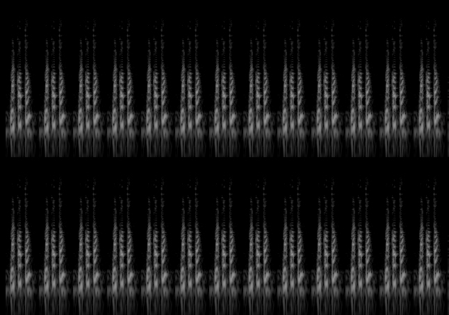 These are the spectrogram visualizations of my name as said by my mom, except, one set of the 3 peaked patterns is my name once, they’re a little too short and I can’t figure out how to stretch them out at the moment.