Finally on to the gimmick of this project!
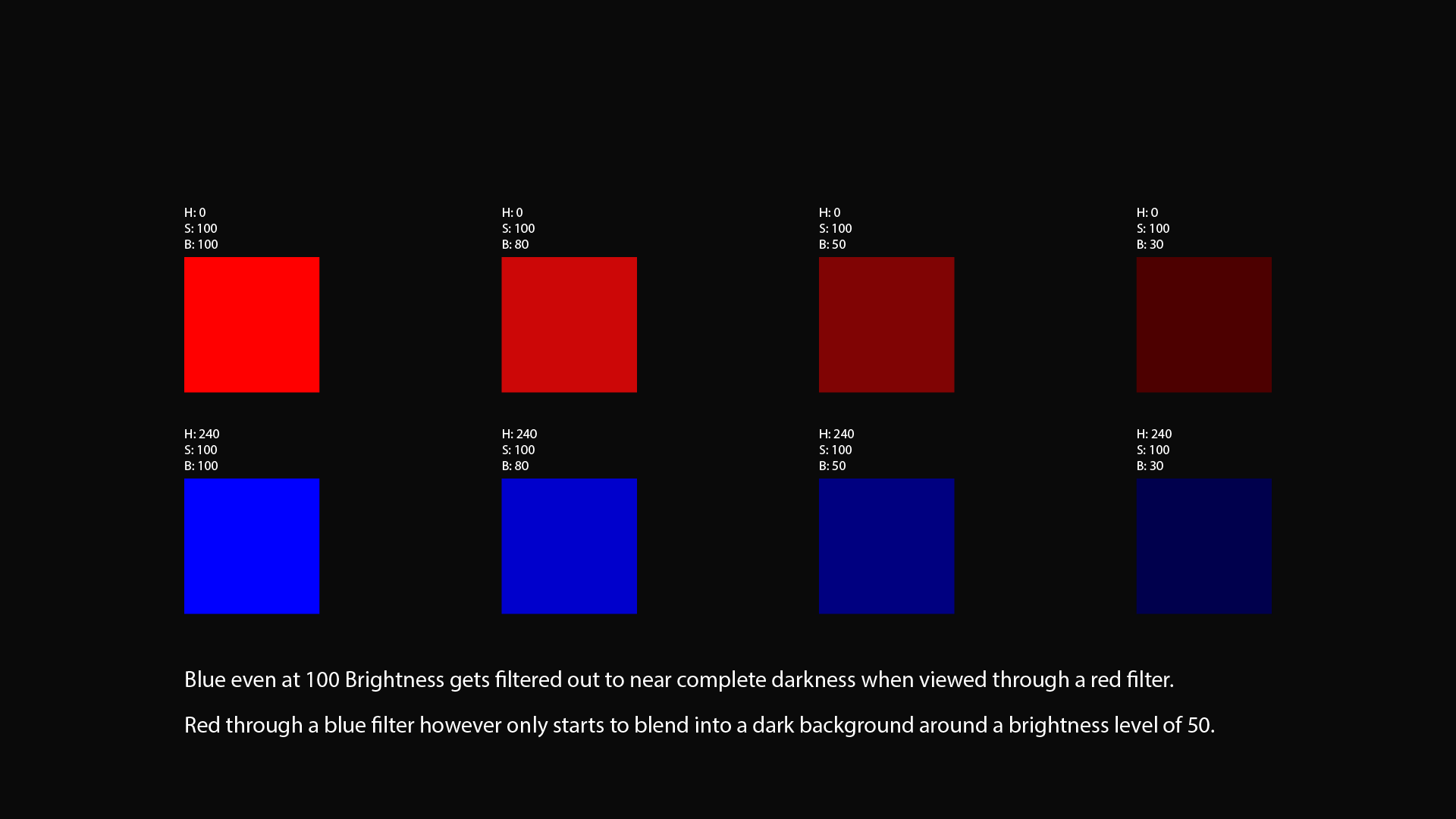
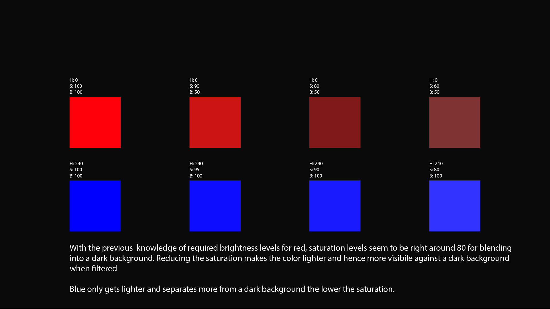
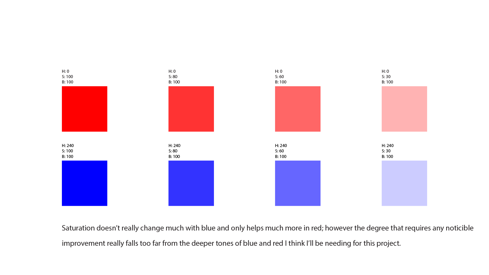
To start, I set out into Illustrator to test out the limits of red and blue’s hue, saturation and brightness.
(Feel free to patronize this Carousell dealer for R/B Glasses https://sg.carousell.com/p/nvidia-3d-glasses-191668084/)

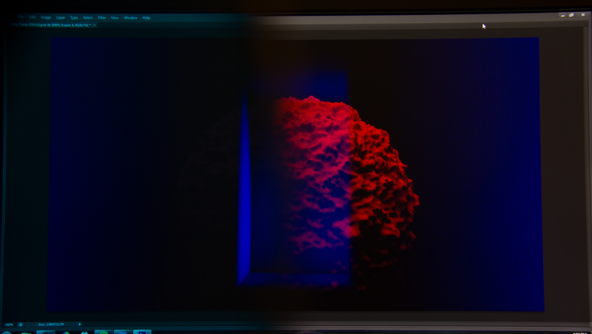
After that I started to apply the same principles to the files i already had rendered, first with stills and then with video.
-

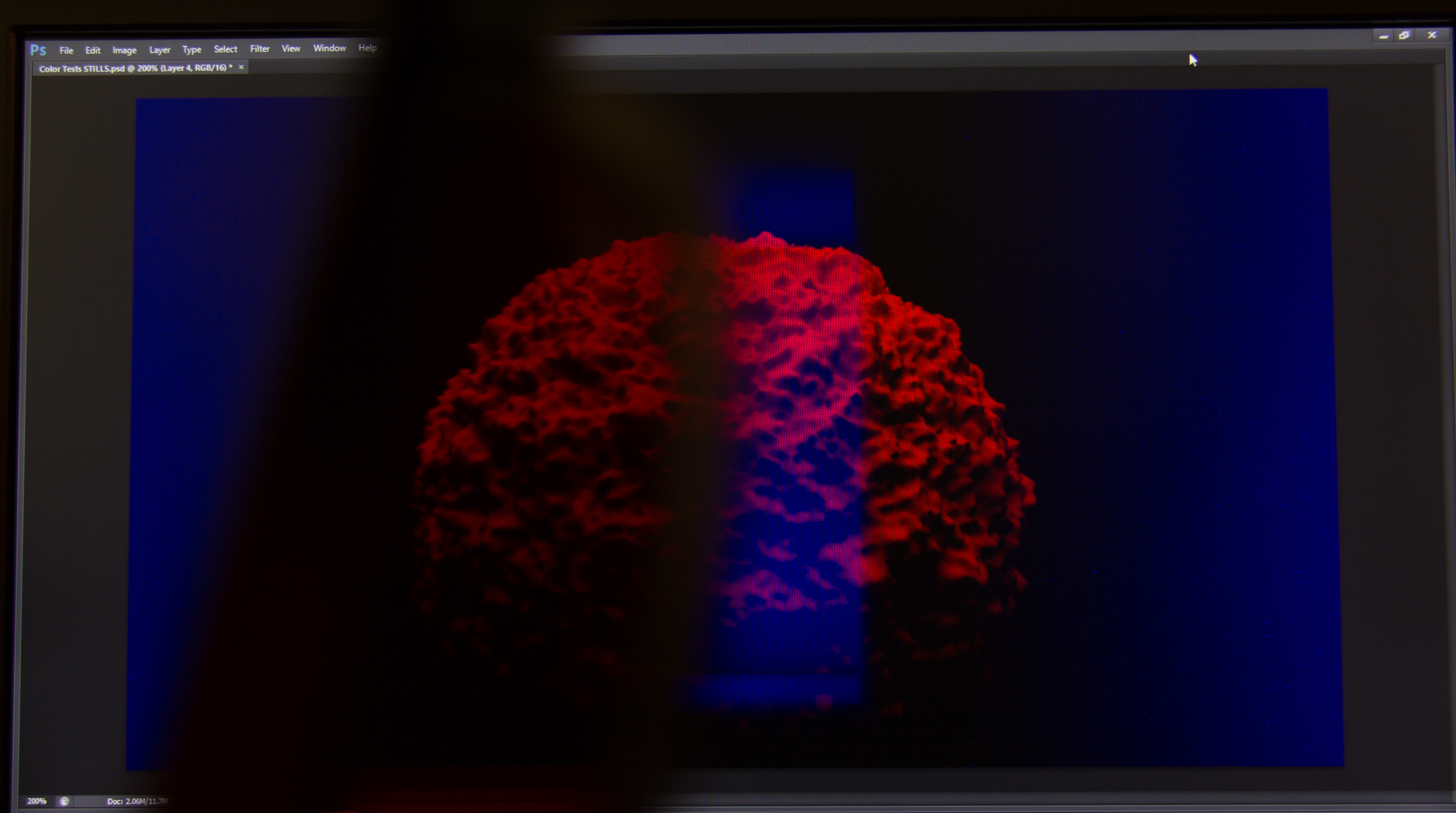
- The 2 images overlayed

-

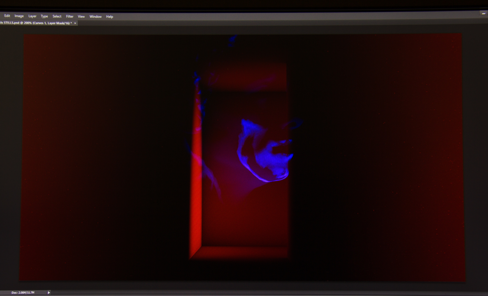
- With Blue Filter (partial)

-

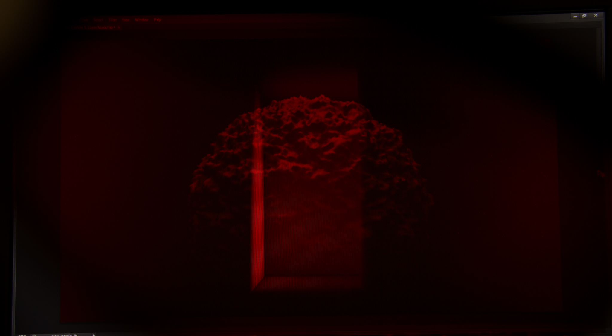
- Full Red Filter (Bright parts of blue layer still visible)
-

- Alt. Blue Layer
-

- With Blue Filter (partial)

-

- Full Red Filter (Blue layer only partially visible)
-

- Full Blue Filter (can see a tiny bit of the red layer, but it’s more than subdued enough)

-

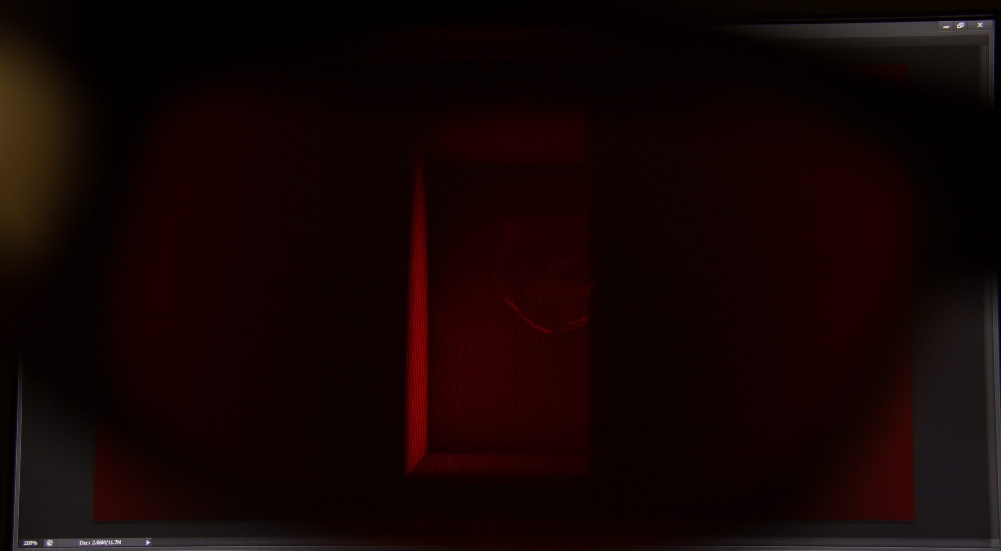
- Full Red Filter (blue layer pretty much gone)

-

- Swapped layer colors (Blue is now Red etc.)

-

- Partial Blue Filter
-

- Partial Red Filter
Something that was really interesting to me was that some layers just worked better being Red/Blue. Case in point, the last 3 pictures show that when the blue ball is tinted red instead, it really disappears very well when viewed through the coloured filter (as compared to when it was blue and the highlights still peeked through).
Here’s a video example of the effect.
Lastly here’s the draft shown at the semester presentation in early/mid November
I’m not satisfied with the panning shots at 0:20 at all as they seem very flat (as previously mentioned in my other post).
Going forward video-wise I’m going to shoot some footage and make an edit and mash it up with my rendered footage to see if it works or not. Also plan to get a closer version of what the edit would be like in the final video.
Next up, AUDIO.