
Welp! It’s finally here, the final 2D post of Sem. 1 :’D
CONCEPT
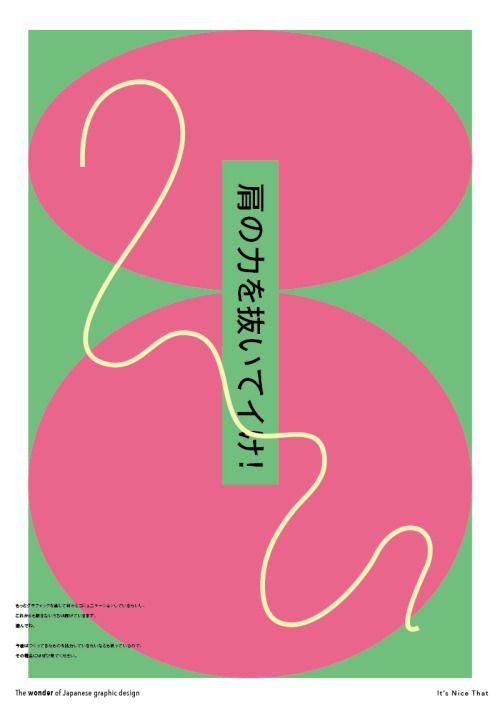
I was initially inspired by Japanese Packaging/Brand Design from stores such as Kinokuniya and MUJI.
Their effective use of simple shapes and colours caught my interest and I delved into reading about Japanese Graphic Design.
In my research I was trying to look for distinct identifying features of the style, but I couldn’t figure just what exactly it was
Things that did stand out to me though, were their use of typography, simple shapes/designs, abstractions, and their ability to (seemingly) haphazardly toss things together and still make it work.
Not finding the “thing that makes it Japanese” so to speak, made me constantly worry if the designs I made were or were not going to be of the aesthetic. My fears were eased a little after Joy shared some links and a quote saying
“People ask me to define Japanese graphic design, and I can only respond, “Well, it’s kind of difficult, and here’s a long explanation as to why.” It’s hard to narrow it down to one definitive characteristic because it’s just so diverse. ”
And this open-endedness leads to the challenging aspect I was facing, but also, large room for interpretation.
I also have this want to have some degree of variety in the designs cause I’m afraid it’ll come off as “Hey look he doing the same thing over and over again”. Which is kinda funny, cause inevitably there’d usually be some recurring aspects to everyones work.
Another thing that I was afraid of, was as my reference material had so much Japanese typography, I was afraid of relying on them to tie the piece together, and so I made it a point to make sure the designs were solid enough before I added the typographical aspects in. With that, now onto –
THE SQUARES

MIND X CREATIVITY = ME
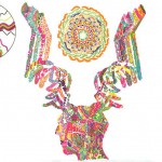
MIND
I find myself constantly thinking constantly, analyzing especially OVERanalyzing. The different aspects of my thoughts are portrayed by the collage of different brains and it also signifies the messiness of my mind as well. The green rectangle is my pursuit to think outside the box. A quote “As above, so below” which means that things are a reflection of things elsewhere, inspired me to make an illusion to trick the brain with word MIND reflected at the bottom. However, this isn’t actually the case, and only seems like it at first glance, even if rotated, the words below is actually DNIM.
CREATIVITY
The first thing that came to my mind when thinking of creativity is a burst of ideas. I tried to capture that visual in my head with this very motion graphic inspired look, with a radial flare of shapes and colours. The blue squares in the middle represent the creative process going from a pale idea to something more solid and vibrant. Currently, I associate creativity with school, and the corner elements represent tape that people use to stick up their art work on walls.
ME
These aspects come together in the form of a venn diagram, but these aspects alone do not make up ME as a whole. As with a map’s compass in the corner, the ME’s around the square point outside the square to direct people to other aspects of me around in that squares reality/mindscape.

ABILITY – DOUBT = A BETTER ME
ABILITY
I wanted to parody Japanese coffee ads as they usually have a very macho undertone to them. I portrayed this with a buff arm, and a very strong red (with a subtle gradient). The price of 70 cents is how much I’d value my own ability, which I’m constantly satisfied with and hence, is like “cheap” coffee. I also debated for a long time where to put the price, I was told it was odd on the forearm and should be on the bicep or below the arm. After a while I realized I wanted it to be different and decided that I was just going to leave it where I initially placed it.
DOUBT
I often doubt my work, ideas and many other aspects in my life and for this square I wanted to create the illusion of a three dimensional space using simple shapes. Doubt makes me feel small and vulnerable and so, in this space, I put a reclusive, shy, red “embarrassed”, little man to portray how I feel. There’s also a small little notice on the wall, that has the Japanese word for doubt. The blueish-greyish combo helps contribute to the feeling of the cold, isolated and sad vibes in this image.
A BETTER ME
At first I wanted to parody newspaper ads that always tell people to eat this and do that to improve themseves and be a better person. But me, not wanting to repeat the idea of an ad, went with another representation, mutants! Mutants are like humans, only “BETTER”. Hence, I had a head shooting out lasers, like Cyclops of the X-men. I managed to reference the ads I mentioned at the start, by placing the head on a snow-caped mountain. The “snow” however, is made of newspaper. The head on top of the “ad” mountain represents me rising above the need/want of manufactured self-improvement. Behind the head is a radiant wobbly aura of coloured light, showing my advancement into a higher state.

OUTPUT X PSYCHEDELICS = AN IDEAL ME
OUTPUT
The factory represents my idea of just PURE output of work, a factory. And I went with a muddy toxic-waste green with no depth to further push the idea of flat soul-less work. I was also inspired by manhole covers in Japan, and my mind relates them to industrial imagery. There’s a little reference to my inspiration in the symbol next to the factory as these manholes have the city’s logo on them. The symbol in this square, is of Kagoshima, My mothers hometown.
PSYCHEDELICS
This one was a little tongue-in-cheek with the drug reference. My previous research of psychedelics, I read about peoples profound changes in perspectives and their life. I thought that this could be what combats the dull, emotionless factory-like nature of output. I used sharp, bright and electrifying colours to bring a feeling of excitement or liveliness. In trip reports of LSD, people see angular geometric shapes. They also sometimes get moments or sounds, playing repetitively in their perceptions, hence the background. Reports also tell of meeting higher beings that tell them about life and ego (hey hey hey!) and I represented this with these funky cat people. However, I am not advocating drug use of any sort, these are substances that require supervision, discernment and are not to be trifled with. It can exacerbate mental issues that people have, and speed up the development of these issues. Bad trips also happen where the person experiences hours of terrifying imagery and sounds and have to wait it all out till it’s over. Hence, I put this foreboding skull peeking out behind the head to signify these looming dangers of psychedelics.
AN IDEAL ME
Cold hard output, overcome by changes in outlook and mindset creates a me where ideas flow freely and coming from me with genuine thoughts and feelings. These concepts flowing out of my mind in vibrant colors, my eyes glazed over in visuals of food. The environment further pushing the vibes of calm, blissful tranquility. However, an ideal is not what I’d consider an end. In the Japanese dramas that i’ve seen my mother watch, at the end of an episode, there’s always a “to be continued” in the bottom right corner. Referencing that, I’ve place the words “ideal” (in japanese) in the same spot signifying that this is always going to have an aspect of progress.

SETTLED X MOBILITY = 2020 (ME IN 5 YEARS)
SETTLED
When I thought of settled, the first thing that popped into my head was an image of a bowl and a red ball fitting snuggly inside. It exuded vibes of being settled and calmness, sort of like when you’re wrapped up warmly in bed. A bowl of rice is also rather settling in a End-of-the-day-sitting-down-and-eating-dinner-with-the-rest-of-the-day-behind-you type feeling. Other things that give me a sense of calmness is being high up in the sky. Peaceful, wide open space. So a bowl of rice, high up in the sky, encapsulates all these ideas and feelings into one. Most importantly though, is that in 5 years, I want to feel calm and settled in my work, not necessarily at an end goal, but with a clear and definite direction that it’s going to (ideally).
MOBILITY
I was inspired by a play I saw, Kafka on the Shore, an adaptation of a Murakami book. In the play, the sets where in large transparent boxes on wheels. When the scene change or evolved, the stagehands could roll the set pieces around dynamically. Going with this as a portrayal of mobility, I used images of nature, to represent the aspect of calmness as well. Moving is often a rather stressful event, but I want to be mobile but not frazzled by it. The names the squares sometimes to do entirely encapsulate the vibes that often overlap in my mind. The dots represent my want to be able to assimilate into whatever location I’d be in, like the green dots, trying to blend into the green background.
2020 (ME IN 5 YEARS)
I’ve often thought about going elsewhere and setting up shop elsewhere in the work. Being settled in my work + the ability to be mobile would allow me to do so as with a clear path, I’d know where my boundaries lie. This square shows me going about the globe, and I’d hope to be doing something related to the arts when I do so. I didn’t just go with the visual of a map and a plane flying around as I also wanted to emphasize the aspect of soothing calmness, and I find that space gives me that same feeling. The stars sparkling in the sky always gives me that sense of calmness and awe that I’d also want to feel in that stage of life (+ every other stage. Wouldn’t we all hahaha?)
In closing, I’d like to say thanks to everyone for all the nice comments and support. The post-it notes really help and are always heartwarming and always encouraging :’D
AND
MUCH THANKS TO JOY!! for being such a supportive and nurturing lecturer to our artistic sides (and our stomachs). I really appreciate the help you’ve given!
HAVE A GREAT BREAK EVERYONE!


 Prior to the assignment, we were asked to research on some artists. I chose Franz Kline as his artwork was the sort of Abstract art I grew up disliking cause I didn’t understand why it was so highly prized. For me, understanding the mindset and thoughts of the artist, helps me understand their artwork, and this was the perfect opportunity to do so.


