I made 14 the first time but none subsequently, so I figured I’ll post 14 here rather than split them 10 – 4.


2D Project 2: Rhymes

I made 14 the first time but none subsequently, so I figured I’ll post 14 here rather than split them 10 – 4.


As mentioned previously I’ve decided to go with Jack and Jill for my rhyme due to it’s dark undertones.
It’s dark themes stem from an interpretation of Jack and Jill, which says that it was a portrayal of King Louis XIV and his wife Marie Antoinette. They were overthrown by the people, unhappy with their rule, stormed the castle and beheaded both of them. Hence, “Jack fell down and broke his crown, and Jill Came Tumbling after”
I set myself a rule of not using any wingdings out of what was already created for the Google Drive. Things still worked fine, even though there wasn’t a bucket, there was a grail/goblet, which fit in great with the Royal themes in my designs.
As you can see, I went with a very symmetrical look. I was afraid that people might, at first glance think the designs look too alike and skim over the details that I had included. Another issue I had, was adding elements often cluttered up the image. Finding a balance between interesting and clean was however, a fun challenge and I quite enjoyed making these from start to finish.
SQUARE 1 – JACK AND JILL WENT UP A HILL TO FETCH A PAIL OF WATER
I used clouds to represent the height at the top of a hill and the trees for the element of nature. The hands reaching out for the cup, as the end goal and patterns of the foot to represent the journey up the hill.
SQUARE 2 – JACK FELL DOWN
The downward oriented crown represents the fall of the crown – the fall of King Louis. Onto a sword, it’s hilt the scales of justice, the judgement of the people, their arms reaching out. The arms have wrists, to show that even though the king was doing things for personal gain secretly, the peasants could still see what they were up to. The negative space made from the arms form the disgruntled peasants. The tombstones foreshadowing the impending death.
SQUARE 3 – AND BROKE HIS CROWN
The tree bursting out of the kings head, to signify both, breaking his crown (head) and the beheading of the king, the roses and ring are a reminder of Marie Antoinette being an ever present participant of the events that transpired. Hence they were also in Sq. 2.
Square 4 – AND JILL CAME TUMBLING AFTER
Signifying the death of Marie Antoinette, a recurring visual of death all around. Skulls, wilted trees. The royal goblet, spilt over, emptying out, the end of an era. The ears represent the head of King Louis, split open. At the bottom, hellfire with the hands of the peasants reaching out to pull her to her judgement. The negative space at the bottom, forming a goats head, similar to those seen in pentagrams, another reference to the impending fires of hell.
P.S Apologies for the late post, didn’t realize I didn’t have this posted on OSS already.
Previously I was deciding between ‘Jack and Jill’ and “It’s raining, it’s pouring…’
I’ve chosen to go with ‘Jack and Jill’ cause I feel like theres were more elements to the story, especially in subtext. The subtext being of the demise of King Louis XVI, and his Queen, Marie Antoinette.
Also, as mentioned in a previous blog post, I chose poems that had a darker aspect to them. Both for my initial poem, as well as this subsequent English Poem.
My choice of wingdings were to show visual aspects mentioned in the poem, and showcase certain aspects.
For Jack and Jill, I tried to work within the constraints of the wingdings my classmates had created as much as possible. Thus far, I have been able to do so, which though a little tough at times, has proven to be a fun challenge.
I gravitated unconsciously to symmetrical layouts. I was concerned that if all the squares were symmetrical, that people would have a tendency to gloss over after seeing the first few. A suggestion from my Lecturer, Joy, was to add a certain element that joins over to other squares when placed next to each other. I’ve also been wondering about other methods to gain/keep the viewers interest in checking out all the details. I’m also trying to vary up the shapes that appear in the symmetry.
I’m also not a fan of too dull/bare a background. Hence, i’ve resorted to using a dingbat as a texture in the background or experimenting with a black background.
I had feedback that certain elements felt like they were there for the sake of being there. I figured that it was because the elements didn’t appear to interact with other elements visually. This was another challenge for this project, being aware of the viewers perceptions, as to me, I’d understand my purpose for an element, but not necessarily the viewer.
Something that I kept finding myself having to be aware of too, is to play with scale. In previous design projects I’ve had the issue where I lose focus of varying up sizes. This project I’ve come to see first hand, how much more flavor messing with the scale helps. In helping my other classmates, I’ve seen this help immensely.
I’ve quite enjoyed this project thus far, though I sometimes feel like having a theme feels restrictive a times, it does help to add flow throughout the separate squares.

I’m considering to use Jack and Jill for my poem,
Jack and Jill went up the hill,
To fetch a pail of water.
Jack fell down,
And broke his crown;
And Jill came tumbling after.
The poem apparently refers to King Louis XVI, and his Queen, Marie Antoinette.
He, “Jack” was beheaded (broke his crown) first, then she, “Jill” came tumbling after.
I’m sorta still trying to go for the sinister undertones vibe, but in looking for an olde english poem, I’ve found that a lot of them do have this element.
eg.
It’s raining, it’s pouring
The old man is snoring
He went to bed and he bumped his head
And couldn’t get up in the morning
(Contemplating using this one too)
Trials/Testing for the squares.
The first one is a more literal attempt at visually representing the poem whereas the second one is aiming to be more abstract.

I’m not a fan of the white background. So in the second one, i tried using one of the wingdings with 6% opacity to add some texture to the background.
I think it helps quite a bit.
The “literal” representation has some bits here and there to signify some real-life aspects of the poem. eg. the king, the eyes on the hill
I’m trying to mash the parts I like about both together at the moment.
—————
Tried something new, with a black background. I seem to end up leaning towards symmetrical designs, it makes me I feel like I should try more asymmetrical layouts subsequently.
Black background brings something interesting, but a much gloomier vibe. I quite like the look though. Also tried playing with negative space to create some forms.
Perhaps for a resonant point, I’d switch to a different background to make a stark contrast to the other lines?


Dada or Dadaism was born as a response to World War 1 and it’s perceived causes. Influenced by a couple of movements such as Cubism and Constructivism, Dada is known to be difficult to define and is debated between the Dadaists themselves. Visually, Dada is often, but not limited to, an amalgamation of objects or visuals achieved through ‘photomontages’ (images),
‘assemblage’ (everyday objects, more 3-dimentional), and collage (flatter objects, eg. tickets, maps and wrappers). The mindset behind Dadaism, was against the conforming and unquestioning behavior of society as well as the corruption and nationalization prevalent at the time.
Interestingly enough, Dadaism, in trying to be so counter-culture or anti-art, some Dadaists’ themselves are heard saying,
“Dada is anti-Dada”
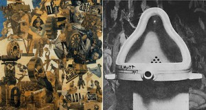
Examples of Dadaist Art, “Cut with the Kitchen Knife Dada Through the Last Weimar Beer-Belly Cultural Epoch in Germany” + “Fountain”
These days, the classification of Dada still seems to pop up, living on in similar mindsets of the more unconventional individuals. One of my favorite bands was considered to originate as a ‘Dadaist Thrash Punk’ group, which I found pretty interesting, the aspect of music being classified as Dada.
Probably one of the most recognizable art styles to come out of Russia, Constructivism was an Art and Architectural movement that appeared around the year 1919. Similar to Dadaism, it came about because of World War 1. Their aims were to break the autonomy of the art they were surrounded by at the time, they wanted art that would bring stir thoughts of social change or that would serve a social purpose, pushing towards a utopic community.
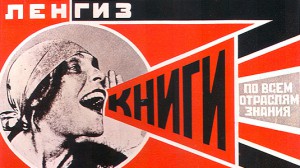
Some of the style of Constructivism came though the artists want to display the properties of materials. With a focus on functionality and “truth to materials”, Constructivism has a very industrial vibe to it. Geometric, bold, bright and striking. The reach and influence of Constructivism is still prevalent today in graphic design and architecture. Most famously, Shepard Fairey, most well known for his Andre the Giant ‘Obey’ graphic, as well as his ‘Hope’ poster of Obama.
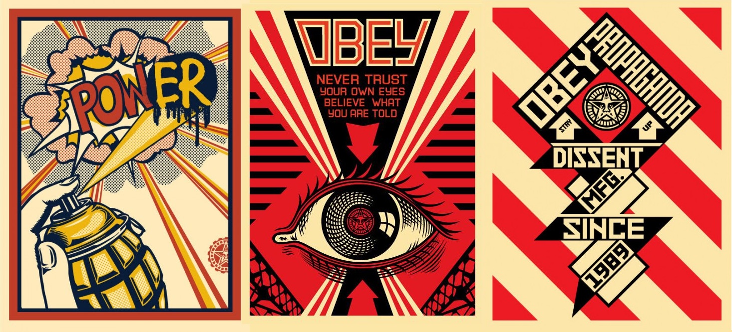
I have always been fond of the visuals of Communist Propaganda posters in their strong, stylized look, and I would hopefully like to see if I can bring some of that vibe into some of my poem squares.
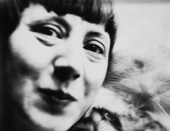
Hannah Höch was a Dadaist artist from Germany. She is known to be one of the people whom photomontage emerged from. Using clippings from mass media (such as magazines and newspapers), Höch, through her art brought up issues about race, gender, and even about the Berlin Dada group themselves.
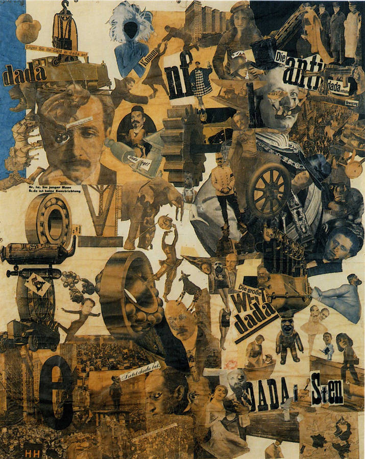
“Cut with the Kitchen Knife Dada Through the Last Weimar Beer-Belly Cultural Epoch in Germany”
She preferred metaphorical representations of her message. For example in one of her most famous photomontages, “Cut With the Kitchen Knife Dada Through the Last Weimar Beer-Belly Cultural Epoch of Germany”, there’s a small map in the lower right corner, showing the European countries which woman could vote in. I really like, that while at first glance to the uninformed viewer, it would seem to be a mess of figures and objects, she actually had a message and purpose for the pieces. She even stuck a little picture of her face on the corner of the map instead of signing it.
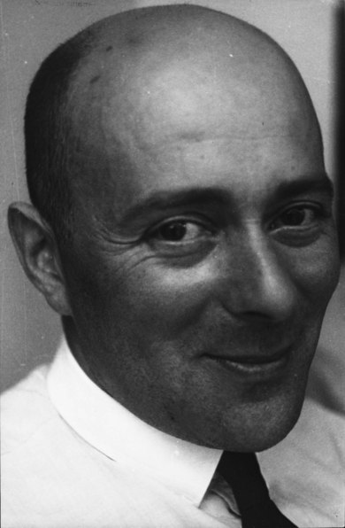
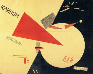
El Lissitzky
El Lissitzky, a Russian multidisciplinarian (artist, photographer, architect, etc.), was a large influence on the Constructivism art movement. He was known to work for the Soviet Union designing propaganda (though not solely).

Proun – The Game
He developed a style with abstract geometric shapes which he called “Proun”. Which happens to be a name of a game. It’s aesthetic and name’s influence now make sense to me.
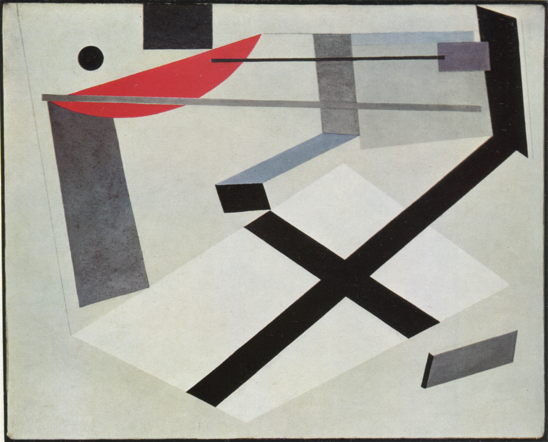
Proun – The Visual Style
Proun had an emphasis on simplifying 3D shapes of various perspectives.
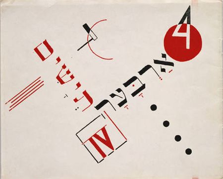
Book cover for Chad Gadya by El Lissitzky
His influence on graphic design is prevalent till today in the way he utilized colour, basic forms and text. I personally am fascinated by the way these objects, arranged purposefully can bring about a certain vibe to the image.
– My Rhyme –
I’m still deciding between an Edward Gorey series of poems or a H.P Lovecraft poem.
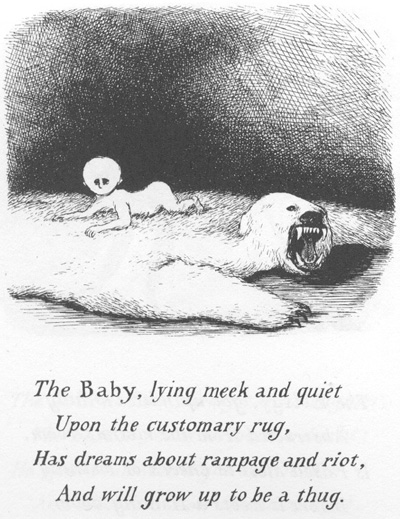
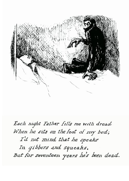
These are just a few examples of some Edward Gorey poems. I like them cause they’re kinda humorous and seem child-like in their presentation whilst having more sinister undertones that I could possibly play around with in the assignment.
H.P Lovecraft poems:
There is snow on the ground,
And the valleys are cold,
And a midnight profound
Blackly squats o’er the wold;
But a light on the hilltops half-seen hints of feastings un-hallowed and old.
There is death in the clouds,
There is fear in the night,
For the dead in their shrouds
Hail the sin’s turning flight.
And chant wild in the woods as they dance round a Yule- altar fungous and white.
To no gale of Earth’s kind
Sways the forest of oak,
Where the sick boughs entwined
By mad mistletoes choke,
For these pow’rs are the pow’rs of the dark, from the graves of the lost Druid-folk.
The steeples are white in the wild moonlight,
And the trees have a silver glare;
Past the chimneys high see the vampires fly,
And the harpies of upper air,
That flutter and laugh and stare.
For the village dead to the moon outspread
Never shone in the sunset’s gleam,
But grew out of the deep that the dead years keep
Where the rivers of madness stream
Down the gulfs to a pit of dream.
A chill wind blows through the rows of sheaves
In the meadows that shimmer pale,
And comes to twine where the headstones shine
And the ghouls of the churchyard wail
For harvests that fly and fail.
Not a breath of the strange grey gods of change
That tore from the past its own
Can quicken this hour, when a spectral power
Spreads sleep o’er the cosmic throne,
And looses the vast unknown.
So here again stretch the vale and plain
That moons long-forgotten saw,
And the dead leap gay in the pallid ray,
Sprung out of the tomb’s black maw
To shake all the world with awe.
And all that the morn shall greet forlorn,
The ugliness and the pest
Of rows where thick rise the stones and brick,
Shall some day be with the rest,
And brood with the shades unblest.
Then wild in the dark let the lemurs bark,
And the leprous spires ascend;
For new and old alike in the fold
Of horror and death are penned,
For the hounds of Time to rend.
I chose these Lovecraft poems cause I like because they conjure up a dark atmosphere in the mind of the reader, and it’s potency for imagery is what draws me to them.
I’m not sure which one would be better for the assignments purposes, one with more descriptive imagery or one with a series of simple short poems. Both of which I feel I could play around with various aspects.
Dadaism and Constructivism, along with the two aforementioned artists, have stirred up some ideas in my mind to dabble with purposeful placements to invoke stronger reactions to the images, as well as personal quips I could toss in à-la Hannah Höch. Representations of materials or textures, from Constructivism, could come into use to add depth to the pieces as well.