From the moment I heard about the Assignment, the idea of doing a Zine on music was my goal. However I wasn’t sure if I’d be “allowed to” due to a requirement to expand on something explored in a previous assignment. But fortunately, it was alright as I had touched on music on pretty much every assignment I had done thus far!

Initially, I had the idea to do a music magazine that introduced some of the bands that I listen to. Whilst joking about with my room mate we stumbled upon the idea of making the music zine with Peppa Pig. We’d both seen a video where someone spliced in the music of Sunn O))) into a Peppa pig segment [LINK BELOW]

I was set on expanding this concept into the zine

The bands I chose were almost certainly going to be the darker, heavier end of the spectrum from the music I listen to, just cause I thought it’d be pretty funny.

There was a rhythm that I was going for in the zine. Each band’s aesthetic, visually and aurally, has a rhythm/vibe/atmosphere, and I don’t mean in a musical sense.

The issue was that for the audience that might not be so familiar with the bands (and probably even for those that are) this would be very subjective and they might not pick up on the flow that I was intending/feeling.

That made me wonder if I should make it more blatant by putting in some much lighter and cutesier music (Kyary Pamyu Pamyu) just for that very obvious shift in rhythm.

Fortunately, I managed to figure out a way to make it slightly more apparent but still remaining rather subtle.

The bands I featured were

Sunn O))) 

Sunn-2014-8120

Swans

swans-photo-by-Jennifer-Church

Death Grips

Death-Grips-Featured-1

clipping.

clipping. Band Photo

clipping. Band Photo

Marilyn Manson

7b3c15632c69952d0dcb991ad5d6b93b

and

Ghost

Ghost-20151-resized

and they appeared in the Zine in that order

Whilst sonically, they are all very different from each other there are similarities within the pairs as seen in the page groupings.

Zine A5 v3 spreads

Welcome to Peppa Pig’s Musical Extravaganza!

Zine A5 v3 spreads2

Sunn O))) and Swans have long compositions, but Swan’s has a more traditional sound when compared too Sunn’s O))) more drone oriented sound

Not exactly the most accessible band in the world hahaha, but they do have a somewhat different sound on their albums compared to their live set; such as a 16 minute tribute to Alice Coltrane (Wife of Jazz musician John Coltrane, Great Aunt of modern producer, Flying Lotus) in which the instrumentation is more horn-based as opposed to heavy distorted guitars.

Very primal and aggressive at times, Swans has been around since the 1980s, emerging from the N.Y No wave era. The name, from Michael Gira’s summation of the name follows along the lines of: “Swans are majestic, beautiful looking creatures. With really ugly temperaments”.

Zine A5 v3 spreads3

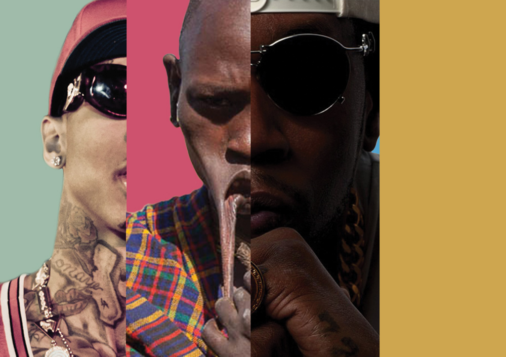
Death Grips and clipping. are both harsh experimental hip-hop/rap, but clipping. has more elements of noise, though vocally “cleaner”

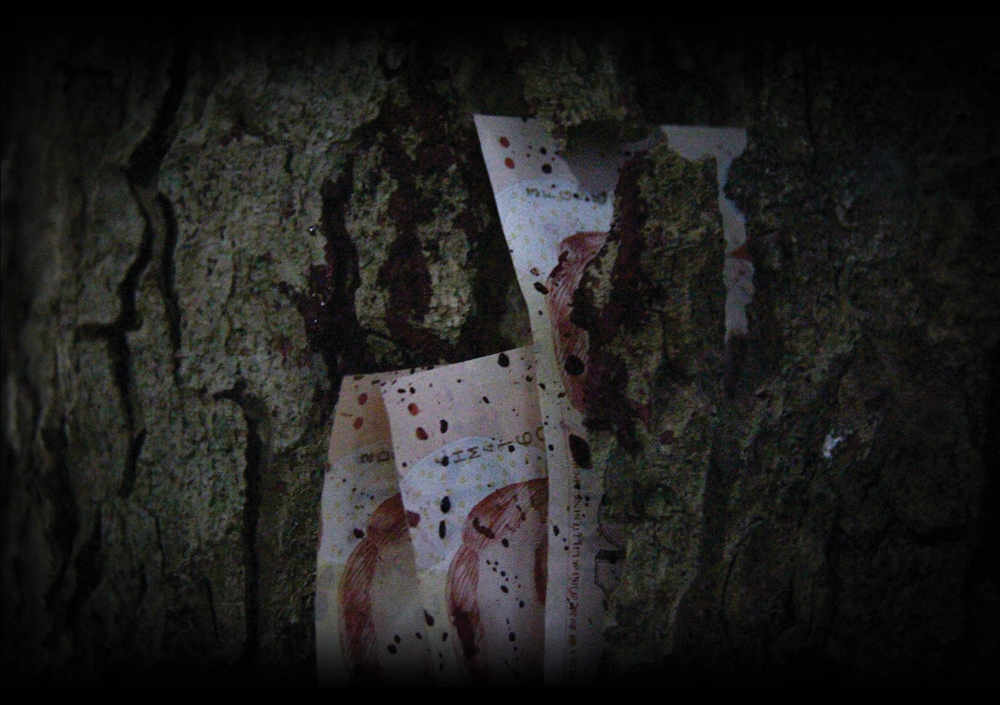
From Death Grip’s No Love Deep Web album, censored artwork of course. Though stylistically vastly different through their albums, this particular one being more dark, brooding and “noided” or paranoid. Vocalist Stefan Burnett has a very jarring, cryptic and yelly vocal style, sometimes likened to an angry hobo. But the atmosphere and themes come across very well in this delivery style.

clipping. on the other hand has a clear more conventional flow, though both them and D.G have a narrative aspect to their songs. clipping.’s instrumentals though, have more elements of noise as seen (heard?) in the video above. Daveed Diggs, the vocalist, is also involved in a Broadway musical called “Hamilton” and sings the roles of Thomas Jefferson and Marquis de Lafayette.

1035x679-HamiltonBway0341r-Daveed-Diggs-as-Thomas-Jefferson-and-the-ensemble-of-HAMILTON

Surprise, surprise!

Zine A5 v3 spreads4

Marilyn Manson and Ghost  both come off as somewhat Operatic Rock-and-Roll. Though Ghost, despite their intense look, are rather light on the ears (as you can hear below in the song “He is”)


As i mentioned, I mean Peppa Pig mentioned in the zine, it’s pretty interesting that Marilyn Manson is still around all these years; despite heavy controversy following him throughout his career. Also he’s gone through some transitional years and obviously has grown older, now often resembling Nicolas Cage. Fortunately his recent album has been hailed as a return to form, musically of course.

Ghost is also doing surprisingly well, having appeared and won for their song Cirice at this years 2016 Grammys!

FUN FACT! Dave Grohl of Nirvana and Foo Fighters has performed as a Nameless Ghoul with Ghost! The perks of masks and anonymity in a band!

The band members have also kept their personal lives and music careers very separate.

ANYWAYS

The other aspect of the zine was the text. I wasn’t sure how I’d go about talking about the bands. During the group consults, Leon suggested that Peppa Pig was being overshadowed by the bands. I then decided that the text was going to be like a children’s book narrative.

The story sort of came along as I went, though I had a rough idea, that Peppa Pig would be dealing with the Apocalypse. How cute~

I tried to phrase the encounters in a manner that would give the reader a real decent taste of each of the bands sound and persona. On top of that, it’s peppered (or peppa’d) with more in-depth references to lyrics or running themes that the band has, that only those more familiar with the band would pick up on!

I also made Peppa imitate aspects of the band to go along with their imagery or style, which was pretty fun to do!

Layout of text and background was pretty tricky. Especially in making the pages look and feel cohesive, which led to some very sudden changes in B.G.

I was thinking of incorporating interactive aspects, but most of the other spreads weren’t made with that in mind, and in the interest of time, I dropped that idea.

The BG having to compliment or not intrude in on the text was also a challenge.

Thankfully enough, the idea came through very nicely! There are certain aspects I can improve on though, but for another time.

Outro Music for catharsis


For the final project, I eventually settled on the POVs of money!

2D


Money from the POV of Scanner is Illegal

Scanned-Money-#1

I was mashing up the idea of scanning money, and the repercussions of doing so. Hence the visual of money being “scanned” turning into handcuffs, denoting the illegal nature of the activity.

Suggestions were given to have two bars of light a-la a real scanner, but upon trying, I just didn’t seem to like the aesthetics as much. Hence I stuck with the single bar of light in the middle. I did however go with the suggestions of making it a little thinner, and adding some chromatic aberration. Though, I think I could make the aberration a little better.

Money from the POV of a Beggar is a Can

Beggars-v3-(reflections)

Another thought I had was about how people collect cans to trade them in for small amounts of money.

So quite literally the can is “money” with the design of a one dollar US note, showing just how minimal the sum of money they could get amounts to.

If I could though, I’d like to have made it with the look of coins instead, with the embossed face sticking out from the can, which would also probably be closer to the amount of money they get per can.

Money from the POV of a Drug Smuggler is Risk

X-ray-v2

People who smuggle drugs across borders usually do so through their luggage, through objects, or even themselves. In a way, people are smuggling themselves through the system. I thought it’d be pretty cool to do a play on that imagery.

As Gary mentioned, I do think my previous iteration looked better. I also just realized, that I could have added the on-screen info around the edges of the frame for more “immersion”.

Here is the WIP that I think, as Gary also mentioned, looks much better

X-ray-v1

I didn’t use this as the scale of the object just didn’t feel right, and the bag didn’t feel very “luggagy”

Money from the POV of a Tree is Skin

Blood-Money - OSS

Though money in Singapore isn’t made of paper, I still wanted to give this idea a try. Since paper is from trees, thin slices of paper would translate to being the “skin” of a tree. I also had the idea of drawing parallels between the “skin” of the tree, and the skin that people often have at the sides of their fingers, that if pulled too much, results in some bleeding. Hence the blood across the notes and dripping on the tree. I think, I was technically limited in the gear, but with what I had, it was pretty fun. I was really worried though, that it wouldn’t fit with the rest of the images. Though funnily enough it was picked as out of place for having a different currency than the rest of my image (USD).

TREEMONEY

Personally, I think some of my other shots, like the image above, looks much better, but I thought one portrait layout was out of the rest of the layouts and there wasn’t enough time to warrant a redo of the other ideas.

BLOODHANDS

I also accidentally left the money in the tree and went home. When I ran back and saw a police car turning in to my estate I was paranoid for a second considering someone seemed to be looking at me from the second floor (roughly the same height as the slope I was shooting at.

Money from the POV of a Counterfeiter is Detailed

Counterfeit - OSS

Money has all sorts details spliced in to hinder counterfeiters. Thus, a counterfeiter would have to take note of all these minute bits and pieces to successfully fake a note. Hence, like a fingerprint, some of these details wouldn’t be apparent until closer scrutiny. It also signifies the criminal aspect of the deed, with the allusions to “dusting for fingerprints”.

Money from the POV of a Tribe is Redundant

Tribes-v3

My initial idea was to show that to tribe, money would hold no significance to them. Similarly, rappers try to portray themselves as rich and that money “ain’t a thang”. My first visual idea was that I’d show a someone from a tribe, having all sorts of “bling” and chains around their neck. Surprisingly, when sourcing for images, I found out that the tribes had copious amounts of adornments embellishing themselves all around. It was hard to make the chain standout and have any significance, let alone finding a spot to put the chain in the first place.

Some suggestions were to show the comparisons of their commodities. Hence I went with a comparison of their different adornment and their plants of choice, so to speak.


I kept the faces out as I wanted the focus to be on their jewelry, and the square formats further enhanced that aspect by abstracting their forms. The presentation of an object in a different manner or outside of it’s “natural habitat” was something done by Michael Grecco, a photographer. He photographed dildos and such for a “coffee table book” but in a manner closer to product photography, on a plain white background, with just the object places in the frame. His aim was to draw attention to the objects in a different way and that was a similar mindset I was going with for this one.

Here are some of the WIPs that didn’t exactly work out, especially the colourful backgrounds that were too vibrant. It was also the first one I started working on, hence the huge deviation from the dark looks of the rest.

Tribes-v1

Tribes-v2

These pictures were pretty fun to make, and I do like the aesthetic, tho it reminds me and others of PSAs in their dark and somewhat sterile nature.

Apologies that I don’t have the pictures at the moment, they’re all at home, and I deleted the copies in my thumb drive to make space for 4D footage ;____;

EDIT: PICTURES ARE IN

Watch me get this money…

For once I kept my presentations short haahaha, time to plonk all the stuff I didn’t say into this post~

Reserved

Reserved Final compressed

When I first meet people, as much as I’d like to connect with them right away, I always hesitate. Even for class feedback, I have things I’d like to say but I reserve my comments and usually never say them. Even since I was a kid, the first time I went to a nearby playground, I watched other kids playing and really wanted to join them, but it took me 3 – 4 days before I eventually talked to one of them and joined in.

It’s still pretty much like that, though I’ve improved greatly. This conflict between wanting to communicate and having my reservations about doing so, is what I’m trying to convey illustrate through this image.

The cotton represents the ‘soft’ me, feeling very vulnerable before that initial contact. The fire represents the conflict and the desire to reach out and interact with people.

This concept was the first in my mind to spring out, and it’s been pretty solid from conceptualization to execution.

Execution of this image was a lot of fun, tho when I started out I was pretty worried about this going horribly wrong.

Tested some cotton burning and took some pictures with them, roughly taking note of the settings. For the final shoot, I used cotton wipes, cut the letters out and soaked them with lighter fluid.

I knew that for the letters I didn’t want something particularly bold, and trying to get a consistent look between the letters was a little bit of a challenge. I wanted a kinda slim but not frail set of letters. K was a real pain to cut. I frayed the ends of the letters for a distressed look, but of course all that went away as soon as they were set alight.

I used my mothers baking tray for the dark background and sadly, I realized that the heat does visibly damage the tray ;____;

Fortunately, I didn’t have to do this too many times. For the end result, I photoshopped the background to this dark state. I decided to clone the tray and not just fill the background with just black, cause for one, it looked pretty obviously two separate colours and I erred on the side of caution that it’d show up in the print more obviously.

READER

Reading Final compressed

I wouldn’t consider myself an avid reader, but I do enjoy a good book and when I was younger, I used to read quite a lot. The books on this ‘shelf’ are books that I’ve read that I feel have had an impact or influence on me. From music to subversive/cultural issues to humour, if my personality or brain was a bookshelf, this would definitely be quite a comprehensive portion.

Originally I thought of breaking down each book’s significance, but I think I’ll leave that up to people to ask~

An alternative idea I had for this was to go to the library and line the shelf with titles I like and photoshop the names to spell my name out. Unfortunately, I wasn’t able to do that. This however, didn’t turn out that bad either.

Googling for specific book spines was also way too niche to get many good high resolution results. I ended up going to my shelf, taking a picture of my books and photoshopping them alongside each other, some in batches, the end result is not too shabby I’d say.

DRUGGIE

“More Pharmaceutical, Less Narcotics”

Druggie Final compressed

This idea came about as one of my initial ideas, was to make a scene that looked like the viewer stumbled upon remnants of a cult ritual in an abandoned house. I also already had a similar idea to do one for medicine/drugs. I was worried that the two might look too similar, though I think the two would have worked well together thematically. When the project was cut down to 4 pieces, I dropped the ritual idea for this one, as this had more significance to who I was.

Having dealt with medicine for quite some time and at this point, rather familiar with a wide variety of them, this was also rather fast to pop into my head. I’ve also had a fascination with the narcotic side of drugs as well, this was a great opportunity to mash up the two.

To explain my fascination with narcotics is in more grey areas of legislation and use. The reality of someone under influence of drugs and an onlooker are two completely different worlds, therein showing just how subjective “reality” or the individual experience is. A point I wanted to make during the presentation was that “while I right now I think that I’m doing a presentation in school, there’s also a chance that in actuality, I’m somewhere completely different, like an asylum, staring at a wall going “drugs, drugs, drugs”. The same point is illustrated below.

2013-02-27-Mushrooms

Like with ‘cults’ my direction with this idea was also a “stumbled-upon” type aesthetic. I used my 11b to draw these cocaine lines (made of cornflour of course) for the irony as well as for the visual gag. In the background, there’s a spoon with Meth (Sea Salt), a syringe filled with brown liquid (Tea), some random pills strewn about the place (one of which people do get hooked on very easily). Which is why I’m not a fan of all aspects of pharmaceuticals either; but there’s a very interesting dynamic between the companies, the people, and the laws dictating them. These are all pretty dynamic and multifaceted issues though, and I don’t think it’s possible to give a blanket statement. This is just one of the reasons I keep gravitating back to the topic and issue of drugs through my different projects.

As for the visual aspect, I knew I wanted a slightly aggressive angular look to the words to add a harsher look to the whole image. I wanted a unkempt, grungy look with the lighting to look like a harsh spotlight with heavy fall off at the sides, sort of like a lot of urban exploration photos. I was planning to do this on a wooden table that I thought looked pretty bad but had the look of a druggies dresser top. I shifted to the glass table eventually, cause I thought the fingerprints and stains on the table would add to the dirty look more. It worked pretty well and the scratches really add to the image, but the issue was that I had to position my light pretty carefully otherwise I’d get a very bright distracting reflection in the image.

I also was planning to take a picture of the image using my handphone on the screen, especially after the talk on fidelity of the image. Inspired by a hoaxed video of a UFO in Israel, it used this technique of filming the screen which added that look often found in cryptid/paranormal videos. Some samples are below.

The outcome wasn’t as good I’d have liked it to be, though in the middle picture you can see the pixels on the screen, which was an aspect I really wanted. The final image though, I’m pretty satisfied with.

AUDIOPHILE

Audiophile Final compressed

I’m pretty big on music, which is also why it’s a common theme through my projects, even while drawing my cocaine lines, I had a song to make them with, like how Liwen has specific playlists for things. I’m constantly on the search for music and I really do enjoy the creative aspects and the personality, thoughts, concepts and atmosphere that comes through in a song; the search for new music brings new perspectives, ideas and vibes in my head as well.

When I listen to music, there are, as mentioned in the previous sentence, vibes in my head. There is an almost tangible atmosphere and texture with the audio in my head. Like in Ratatouille there were visualisations when Remy ate the food. It’s similar to that, except a little more abstract. Similarly, I’ve also been intrigued by the visualization of music, bringing it closer to what more people would consider a more tangible medium.

Inspired by visualizations and musicians who put images in their songs (ref. to previous posts on Venetian Snares and Aphex Twin). I decided to go with graphical visualizations of my name.

I chose to use my mother’s voice as I feel like it would be the most accurate at pronouncing my name. I experimented with different software to figure out the best way to go about this (detailed more in previous post). After I had acquired the graphical representations, I was a little at a loss with what to do with them. I contemplated switching over to slotting my name on vinyl records labels for a while.

I then accidentally stumbled upon making the audio waves into loops, I thought they looked a little like vinyl records (as Jun Yuan mentioned). The ideas sort of fell into place from there, with a lot of experimenting with placement and orientation. I was also inspired by rap videos where the aspect ratio black bars were instead replaced by more visuals in those spaces, thus I put the spectrograph reading of my mothers voice at the top and bottom, the only issue was that it didn’t come out too well in the print.

I was also concerned with readability. I was afraid they were too abstract looped as compared to when they were flat. Which was funny because neither of them were “readable” text per say. On the other hand, language and the alphabet was learnt in the first place, so they too, without prior education are just as abstract as these. I thought that was pretty cool.

OUTRO SONG


In closing, I’d like to say that this project, despite some of the bumps along the way, came out pretty satisfactory, even with all my usual worries about ability and fidelity of execution. Some feedback was that the READER image stood out by being too bright compared to the rest. It was on my mind as well, but in the time I had, I wasn’t sure how to fix it at the moment. The backing colour was also something I was thinking about. As much as I like a dark background to bring out the image, with most of my images being dark, I was sure that it’d make the edges of my frame a little too muddled and hard to catch, hence the lighter backdrop. Additionally, Joy commented that the abstract concepts could be taken even further, which is something I’m going to contemplating. ALSO, THANKS VERY MUCH TO THE THURSDAY CLASS, thanks for giving feedback to a stranger with your supportive words and feedback on the post-its. Hopefully I can use the momentum of this project for all the future ones.