HERB LUBALIN


Herb Lubalin was an American Graphic Designer, best known for his immense typographic abilities and groovy posters.

He designed the ITC Avant Garde Font and focused the typefaces ability to dramatically impact the message.

He worked on a new magazines by Ralph Ginzberg in the mid-60s

Eros, Fact and Avant Garde.

Most of which was met with some backlash. For example, Eros that as the name implies involved more risque content.

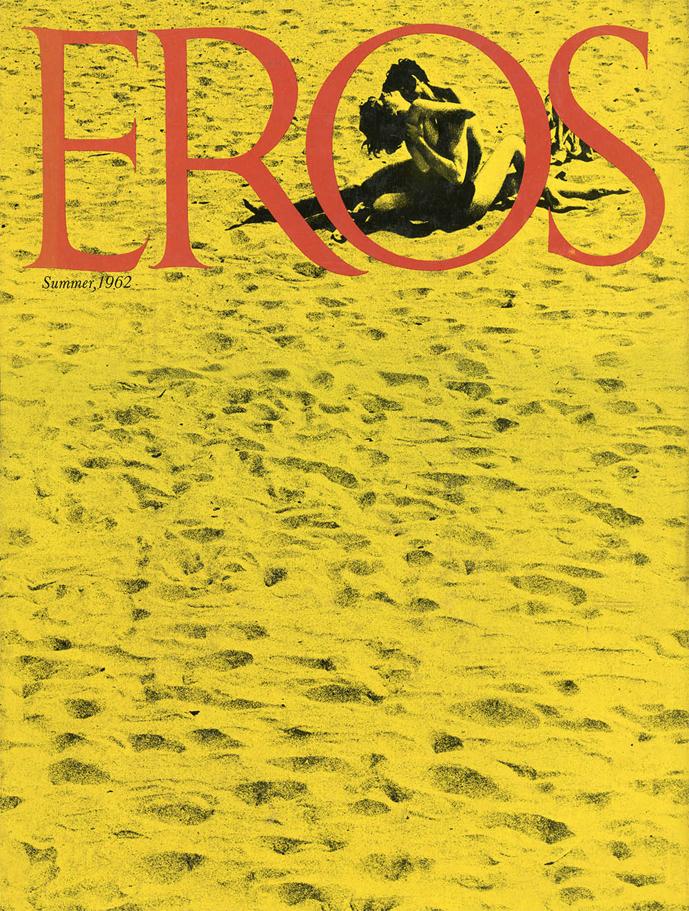
13″ x 10″ resembling a book more than a magazine, it covered topics like politics, art, literature and of course, sexuality. It shut down rather quickly from an obscenity case that the US Postal Service brought up.

Fact magazine was another that incurred some controversy, commenting on controversial topics. Suggesting that a presidential candidate, Barry Goldwater, was mentally unfit to be president. A lawsuit was filed against them and won; the charges totalling $90, 000 ($650,000 today) put a halt on their ability to continue.

fact_magazine

Covering their own magazine Eros

The magazines, despite being shut down, were able to publish as they willed because there was no advertising; meaning, they didn’t had to adhere to any rules set by those companies, allowing them this freedom of publication.

Herb himself is interesting on his own, idea’s aside, he was color-blind and ambidextrous.

Occupationally, he had a rough time searching for a suitable job. After acquiring a position at a design firm, though after he requested a two dollar raise on his weekly salary, he was fired.

He rejected Swiss Modernism, feeling like it wasn’t suited to the American Imagination; instead favoring more human and decorative approaches to visuals.


Sometimes you sacrifice legibility to increase impact.

– Herb Lubalin

I love watching these sorta documentaries, especially all the nuances that I start to realize though the various expositions from the interviewees. All the little nuggets of info from all the people affected, influenced or who distance themselves from the different trends through the years really are such a great peek into their mind and the times that have gone by.

Once again, there are always two sides, and never a black and white issue. With efficiency and time, how an ideal evolves to stand for many different things.

With all the different perspectives, this leads to questioning the base or source of these reactions. Is there a “right” or “wrong” perspective, and I guess this is quite post-modernist philosophically. This leads to me to a mindset that we should all be quite aware, as much as possible, as designers of the possible reception of the work we put out. I don’t mean in a way to make the subject matter agreeable to all, which i think leads to nowhere progressively; I think that just the mindfulness alone leads to better work in that we might inherently make more intentional decisions.


Art Nouveau was an all encompassing style. It made it’s appearance not only in conventional displays of art, but in the external world as well. Buildings and products of all kinds also embodied the aesthetics of Art Nouveau.

The whiplash is one of the iconic motifs instantly recognisable in Art Nouveau. This elegant curvy stroke often seen in the locks of illustrated women in works by artists such as Alfons Mucha.

Mucha

Inspired by natural forms and structures such as plants and flowers, the style has a very organic sense to it. This was also evident in the architecture of the time where there was a focus to harmonize structure and nature.

As Art Nouveau was a reaction against the “rigid” and “academic” art of the 19th century, it was only natural that counter-culture movements and mindsets were starting to unearth. One sign of this can be seen in the prevalence of female artists (which is uncommon) such as Margaret Macdonald Mackintosh. Even in the artworks, females are predominantly featured and on top of that, the manner in which they were depicted was a sign of the times. Lively, free and unabashed, woman appearing in works such as Jules Chéret’s posters further pushed for this societal shift.

cheret3


With the law of posting in the streets being revoked, the artists flocked to this new “public gallery” of sorts and was possibly what helped these themes reach such a wide audience. A very peculiar shift, was also in the societal power-flip with the rich and poor. Being rich was seen as embarrassing due to the consensus that generational wealth was undeserved. Artists such as Lautrec who was from a wealthy family himself, split from his family who left the city away from this public disdain. On the other hand, the side of the city known for it’s poverty and unfavourable activities became a magnet for artists, such as Lautrec who often spent his time drawing the people there.

Something interesting to me are the fluctuating social trends that continue to this day. For example, wealthy families held high regard in the days prior to Art Nouveau. (Though William Morris, who wasn’t too pleased with his familial riches, was possibly a sign that different mindsets were afoot.) But when Art Nouveau went “out of style” wealth up to this point, regained it’s societal power. Perhaps, akin to William Morris, the movements of today which denote wealth (for one) as a sign of privilege also seem to ascribe a touch of depreciation for the disparity between those without such affluence.

In-style, out-of-style, many things don’t appear to have the staying power to last indefinitely from the popularity of the Japanese Ukiyo-e prints in European countries, to the liberation that women had along with Art Nouveau. These things have been seen to appear, fade away and re-surge from time to time in history. Be it the rush of popularity and the excitement of “something new” dying down or perhaps a state of permanence being unattainable, whatever the reason, there is something to learn from this Kafkaesque atmosphere that we live in.

PROGRESS AND NOSTALGIA

The pre-industrial age was one of great disparity. The economical and social distance between the upper class and the lower class was astronomical, in fact there’d barely been a middle class. The industrial revolution changed all that by having a place that vastly altered the flow of people, money and social power.

With the industrial age, efficiency and massive quantities of output was the main aims for many. This affected the aesthetics of the time to suit this demand or “need”. How ever this progress was not always appreciated by all, William Morris was one such example.

William_Morris_by_Sir_William_Blake_Richmond

William Morris was a multi-disciplinary artist from the 19th Century. Aside from the many various fields of art he was involved in, he was also known for his distaste of the objects being manufactured by factories at the time; considering them cheap and ugly.

He was much fonder of the older style of design from the medieval ages. It is this style that he sought to adhere to as much as possible with the designs and products he churned out.

wm

Fascinatingly with the idea of how much he romanticised the designs of old, he branched off into this emulation that sprouted into an influence that carries on today. William Morris is not without his ironies however, for example despite his political views as a Socialist, his business was run more for personal gain and despite his Atheism, wanted to be buried at a Church. And possibly worst of all (for him I’d say) was that despite being a huge purveyor of having affordable, beautiful or functional things, the items sold by Morris were simply too expensive to be available to the public as a whole. An interesting parallel in William Morris’ life; in his fixation on Medieval/Gothic Cathedrals and their collaborative style of design and construction; similarly he and his friends were also called to paint the ceiling of a Union building. Funnily enough, it was only passed to him due to his friend (and biggest detractor) Dante Gabriel Rossetti being unable to get the job going himself, yet another irony in Morris’ life.

Despite all his shortcomings, his “wife’s” infidelity, his odd friendships, and eclectic personality and life-choices, William Morris to this day has had a lasting impact on the world in many fields, and fortunately, not just posthumously.

*apologies, didn’t link this to the History of Graphic Design page*