Tag Archives: DN1006 // 2D II

OSS Gallery // DN1006 – Pin Yi

p r o j e c t

( o n e )

My name is PY and I am a birdkeeper

My name is QUEK PIN YI and I am a construction worker

My name is PIN YI and I am a police officer

My name is PY and I am a landscape architect

p r o j e c t

( t w o )

Revisiting the old textbooks of the 1970s-1980s period; combining these aesthetics with content relevant to Jalan Kayu and its surroundings, as well as a tribute to its heritage.

DN1006 – Assignment 2 – The Process

So I decided to base my new zine concept on the fact that not so long ago, there used to be a school in Jalan Kayu and of course, it was named Jalan Kayu Primary School.

Right at the start, I decided that I wanted to use a more retro style, which led me to look for imagery that I could emulate and adapt for my own zine.

I looked up old Singaporean school textbooks…

http://mothership.sg/wp-content/uploads/aws/mothershipfiles/Jonathan+Lim/20+nostalgic/CDIS+Workbook+1.jpg
https://remembersingapore.files.wordpress.com/2014/09/old-cdis-geography-textbooks.jpg?w=640&h=409

… old photos of Jalan Kayu and its environs……..

After that, I thought of a couple of potential concepts for the content of the zine itself:

  • A school publication, could be a yearbook…..
  • …or maybe a student’s handbook…….
  • …or it could be a sort of old school textbook that a student of the time would experience and use……

I decided to use the school textbook as the overall concept for my zine and to use the style of a simple English reading book for its content.

Some guidelines that I stuck to for this zine:

Colour scheme: A cheap colour scheme (i.e. greyscale content) with pastel colours of an 80s feel, not too clean nor minimalist

Typography: Slightly distorted by still simple serif typeface for the body text as if taken from an old textbook

Cover design: Emulate a 1980s Singaporean school textbook

Internal layout: Simple layout without too much variation, something not too modern


DN1006 – Assignment 2 – The Switch

Remember how I wanted to complete my zine using prata as the key theme from Jalan Kayu?

After spending days and weeks thinking and thinking and thinking and thinkinggggggg, I finally came to a decision that it felt a bit too frivolous and I wanted to do something a little more meaningful with regards to Jalan Kayu as a place.

With this notion, I went on to do more research on the place and found that there used to be a school in Jalan Kayu during its kampung days – Jalan Kayu Primary School.

Unfortunately, the school closed down in the 80s, so there I was, limited to online sources as the only place for me to glean something about it.

(You can find out more about the school yourself as its alumni have a Facebook group! https://www.facebook.com/groups/19956218133/)

I decided that this was a useful place to restart my investigation (with two weeks to go…) and went ahead with it…


DN1006 Assignment 1 – Process

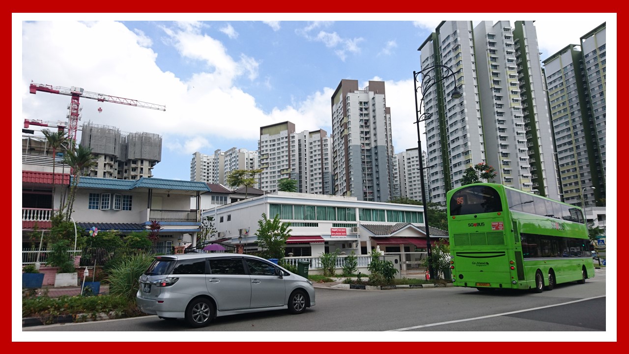
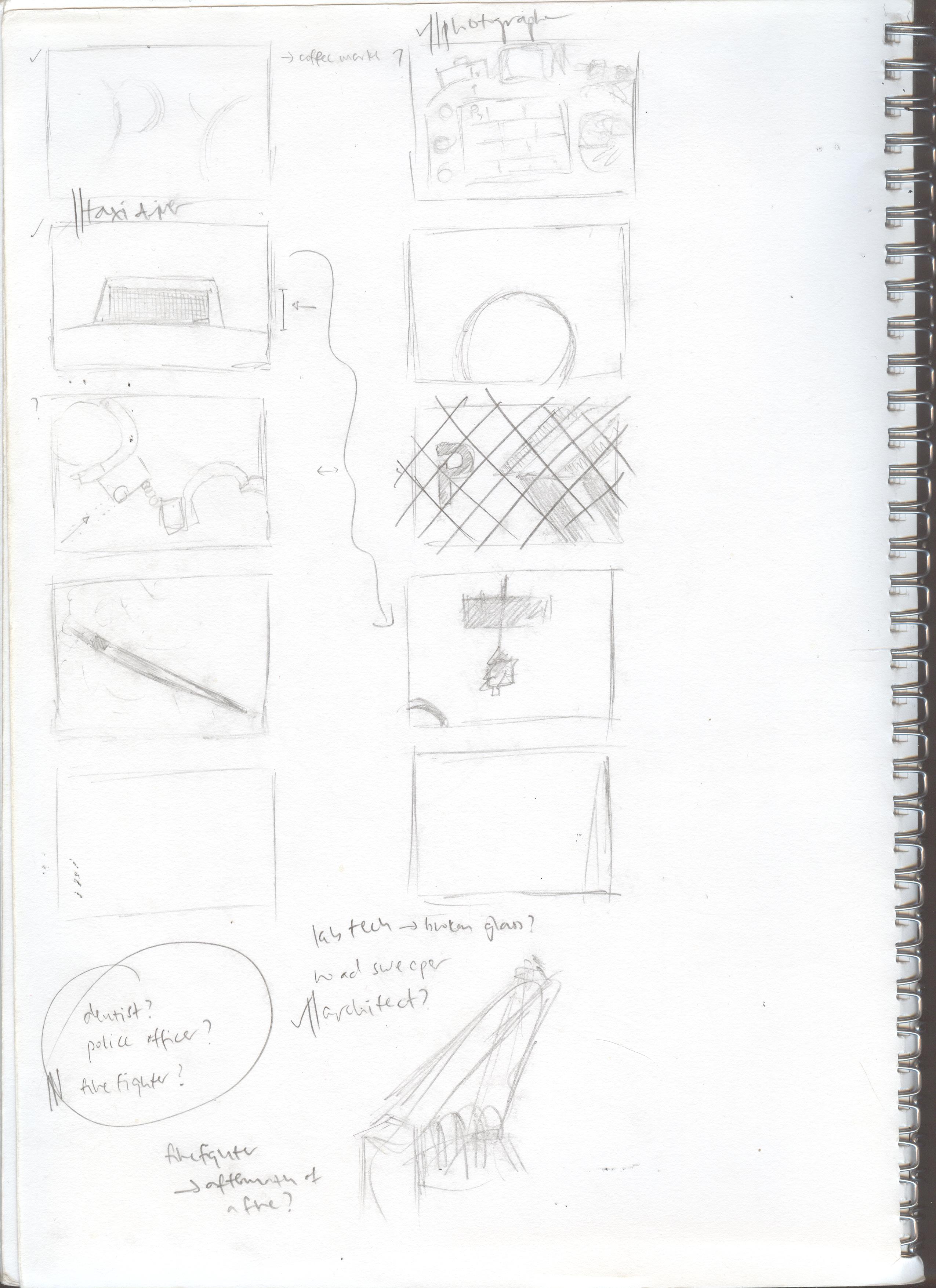
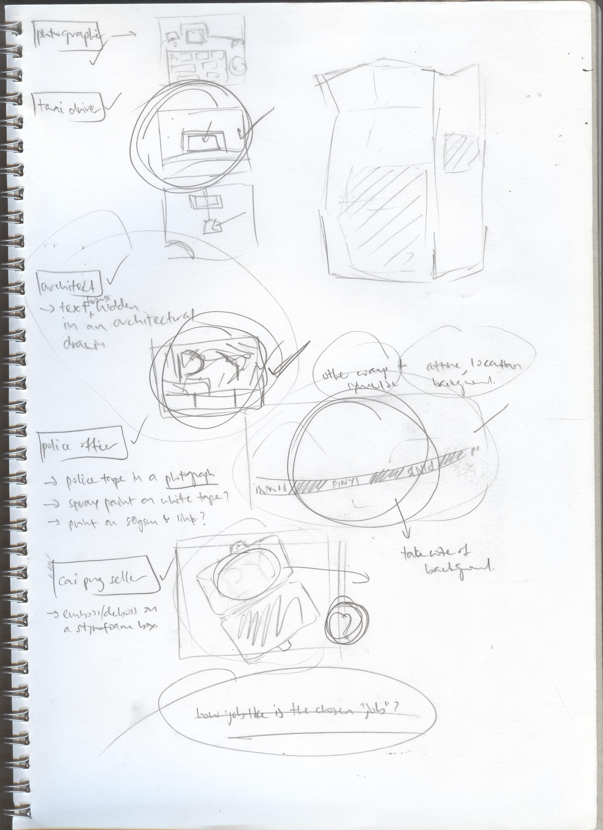
As described in my Research post, I would be working on the following themes: construction worker, police officer, architect, bird keeper…….

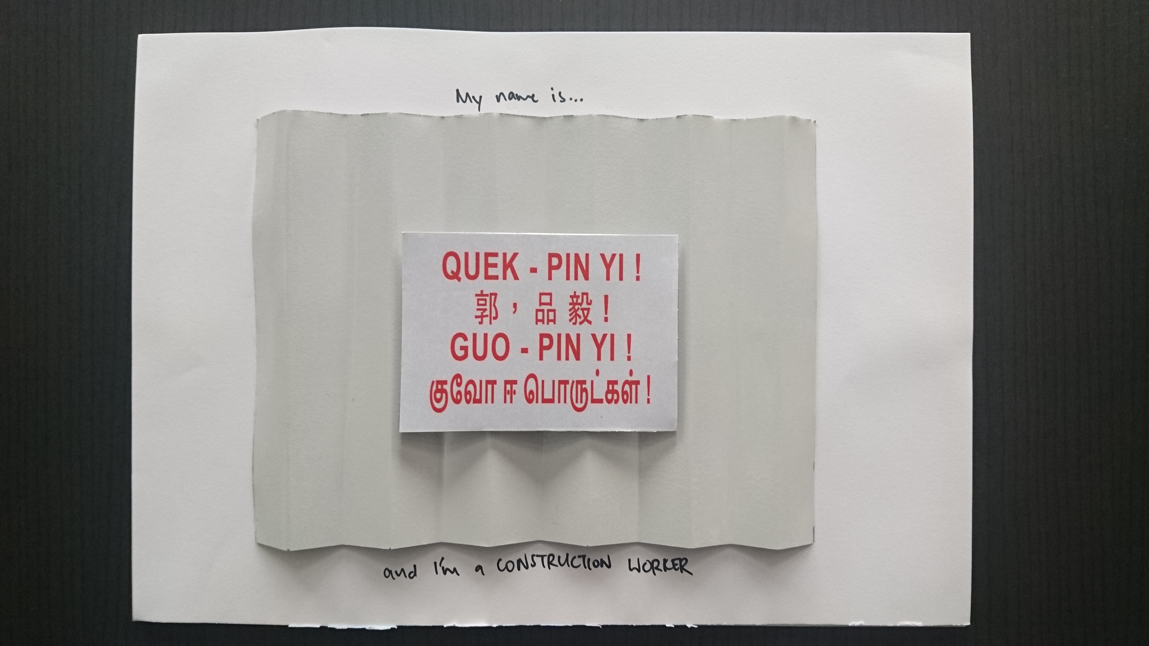
Composition 1: Construction Worker

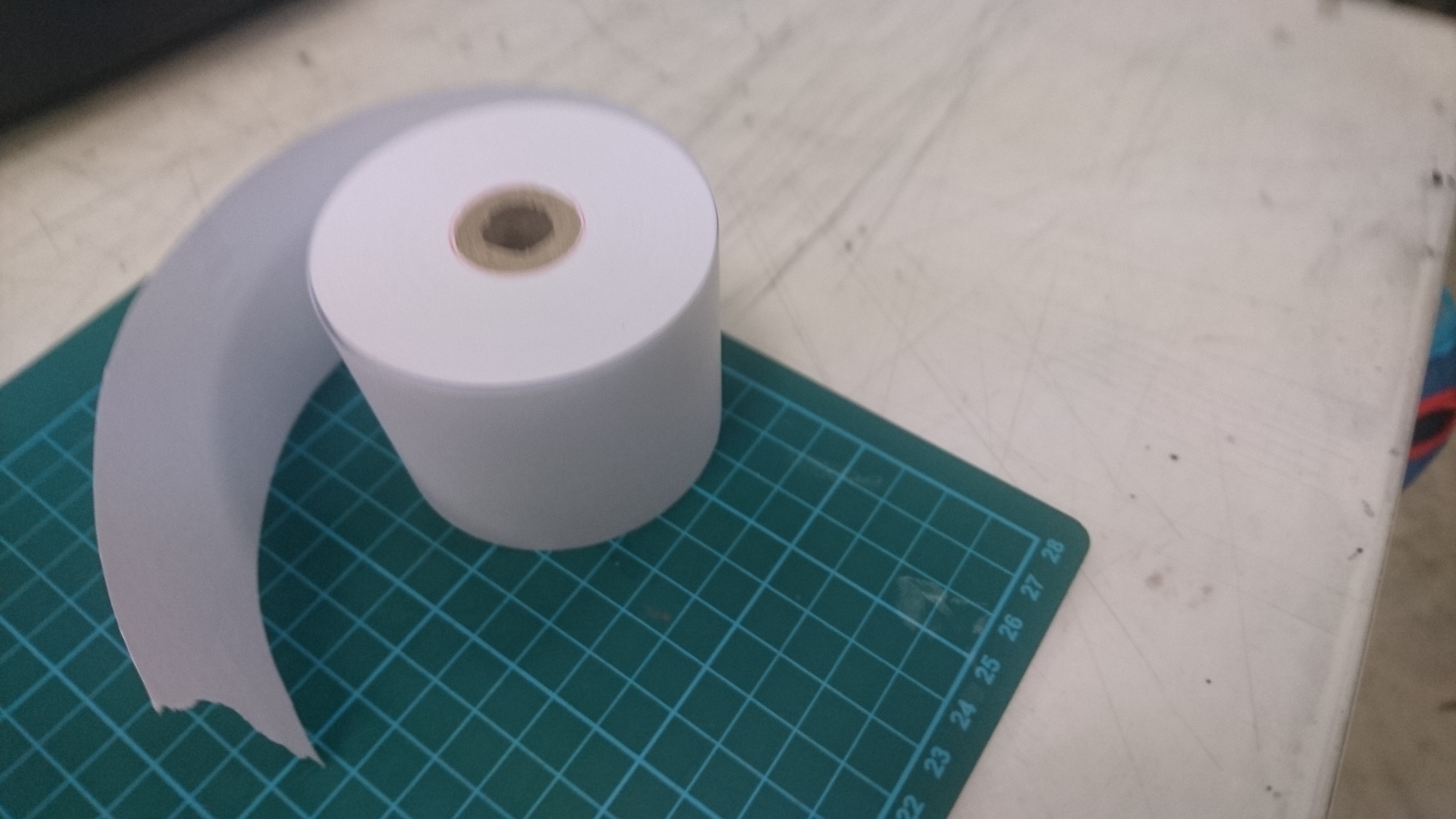
Initially, I wanted to use aluminium foil to form the “hoarding” used in this concept. This took a lot of effort, however, and did not look aesthetically pleasing:

dsc_1162dsc_1161

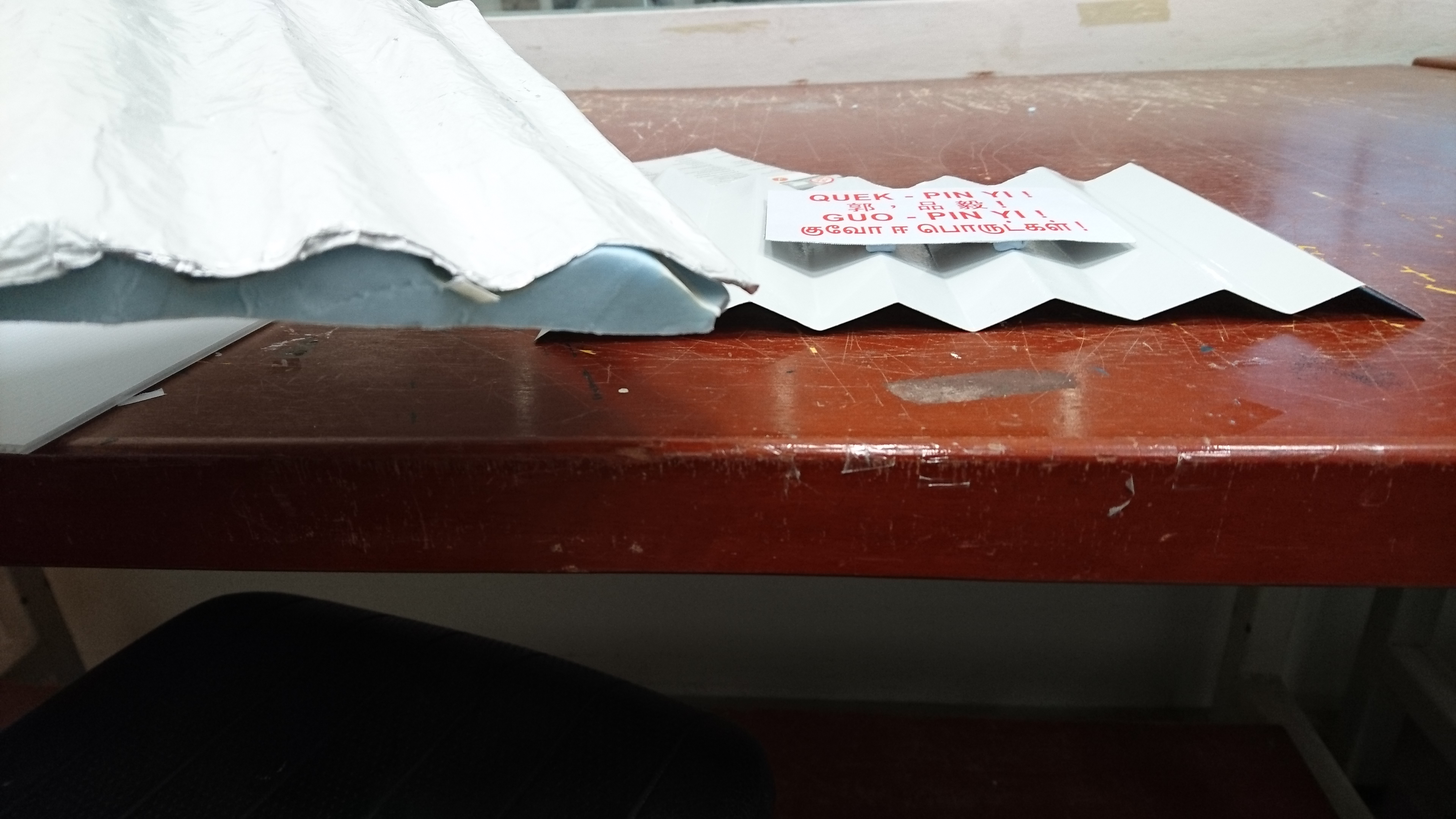
I chanced upon aluminium sheeting in Art Friend which looked much more realistic, although at the start I was still not sure of how to shape it… but all I needed was a steel rule to put it into shape!

dsc_1239

The shaped aluminium sheet was then trimmed to shape and spray painted to give the texture of an actual construction site hoarding:

dsc_1243

A smaller piece of aluminium was then covered with a printed label and then placed onto the shaped aluminium to come up with the final piece of work:

dsc_1244

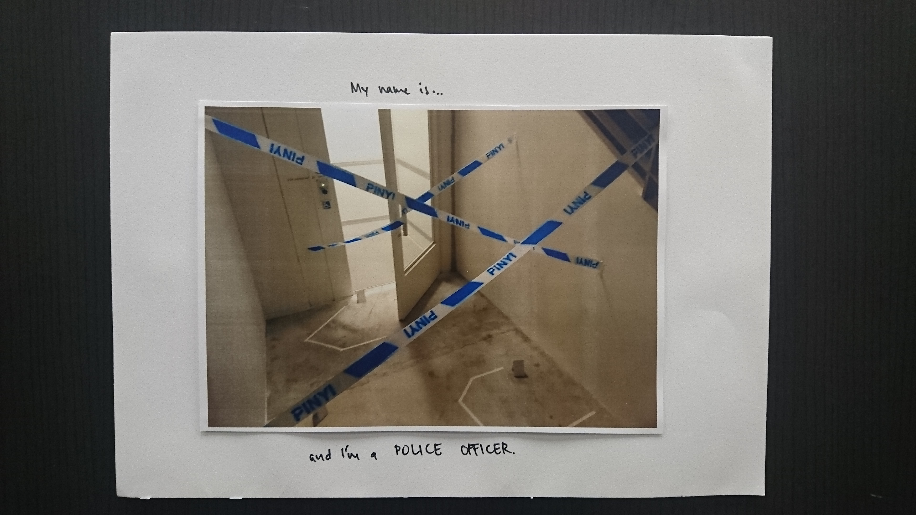
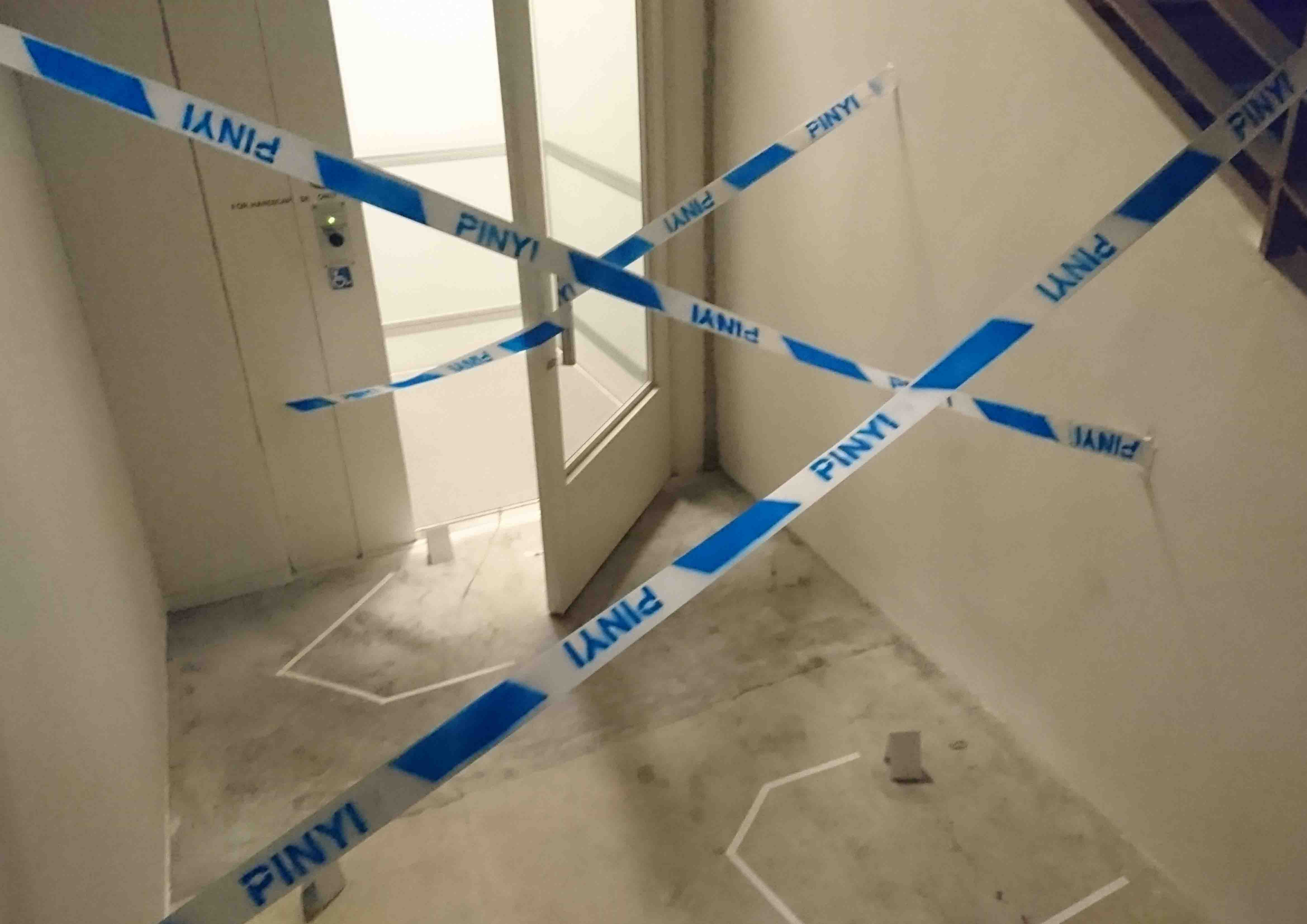
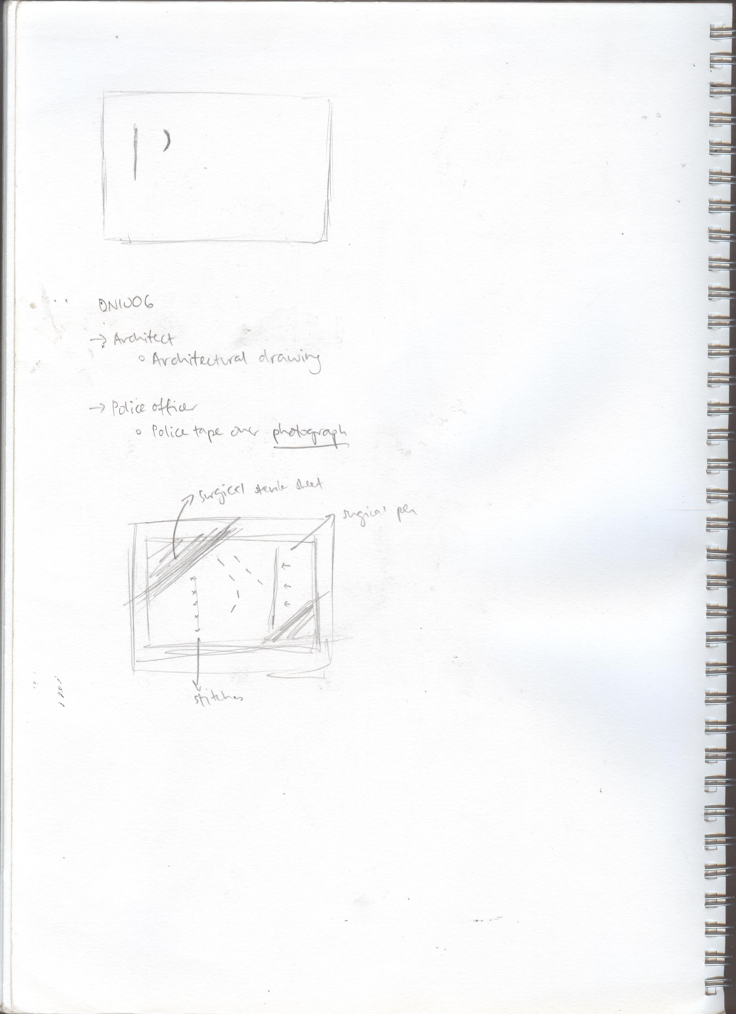
Composition 2: Police Officer

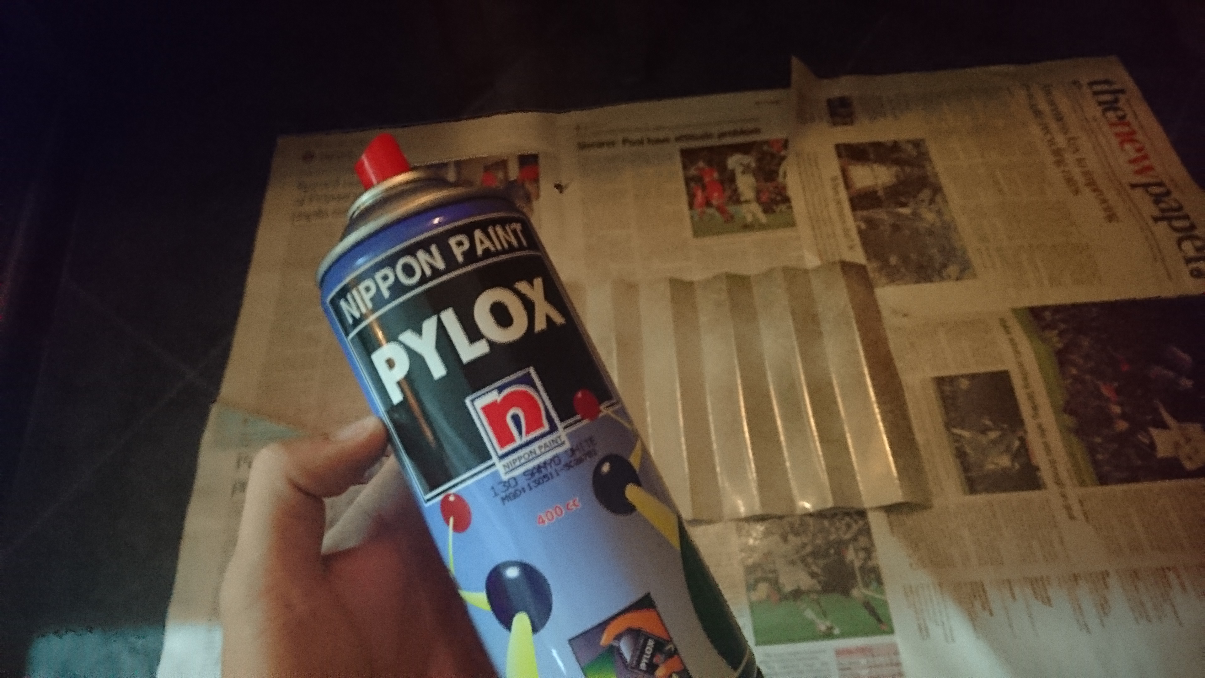
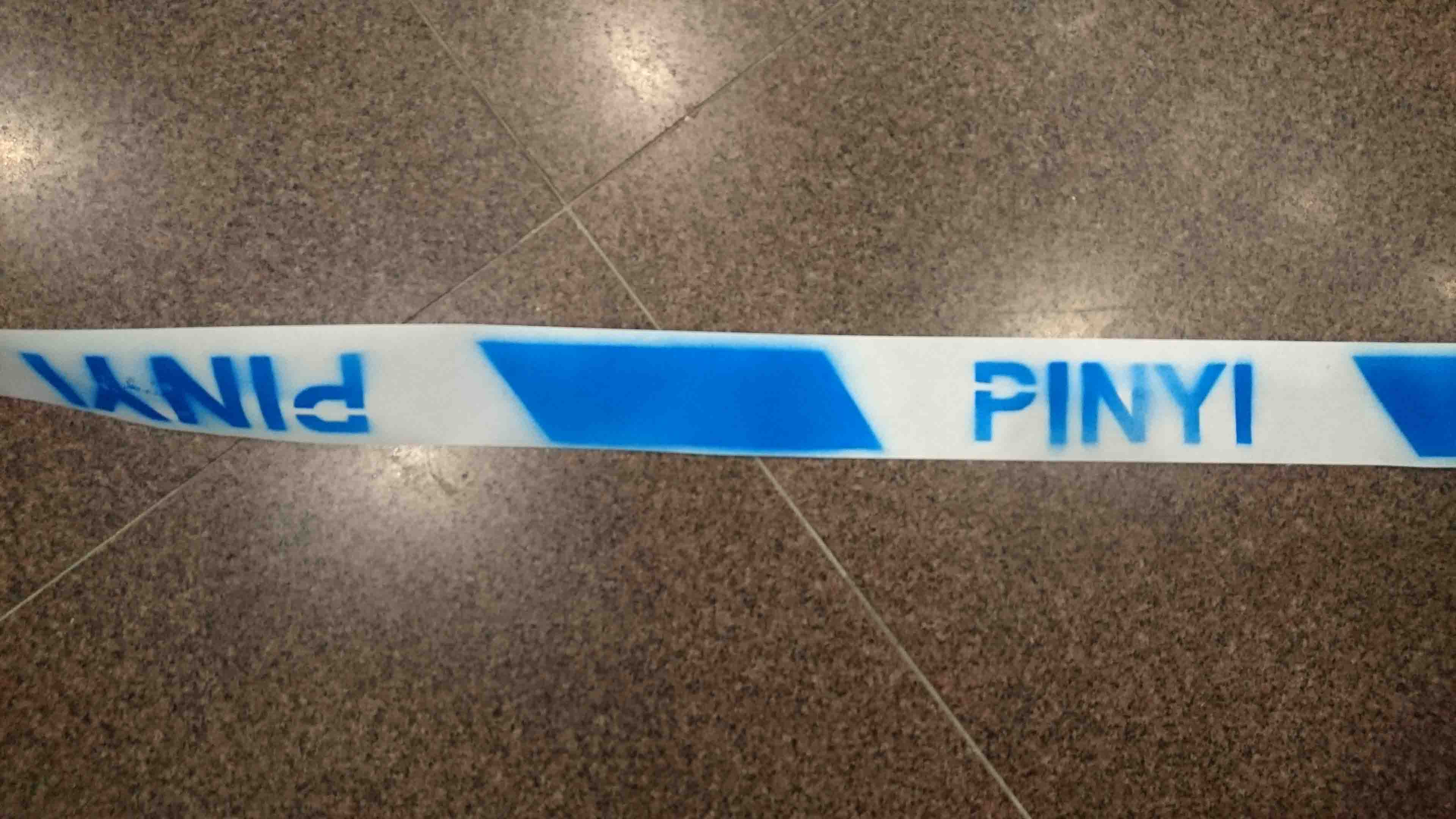
First, I made a stencil digitally and trimmed out the unwanted portions with a craft knife. Blue spray paint was then used to colour in the cordon design on a receipt paper roll.

dsc_1164

dsc_1166 dsc_1251-1

The scene was set up outside the ADM handicapped lift to replicate a crime scene. However, I tried to use a simpler set up so as to highlight the “cordon” as the more dominant part of the image. Hence, I avoided using the more cliched imagery such as blood splatter and such markings.

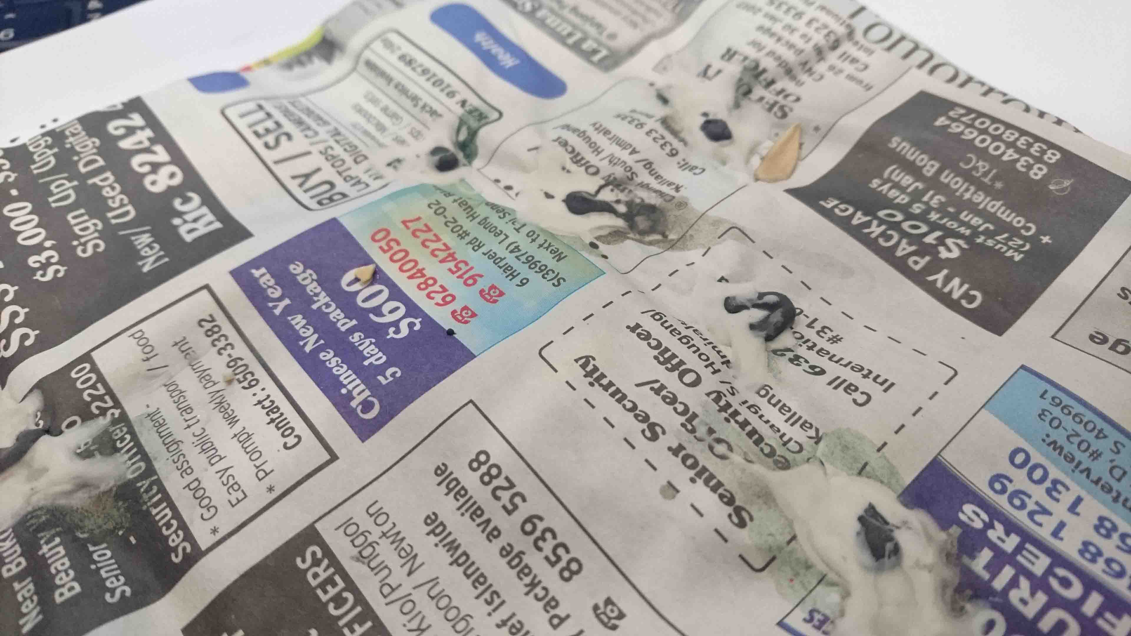
Composition 3: Bird Keeper

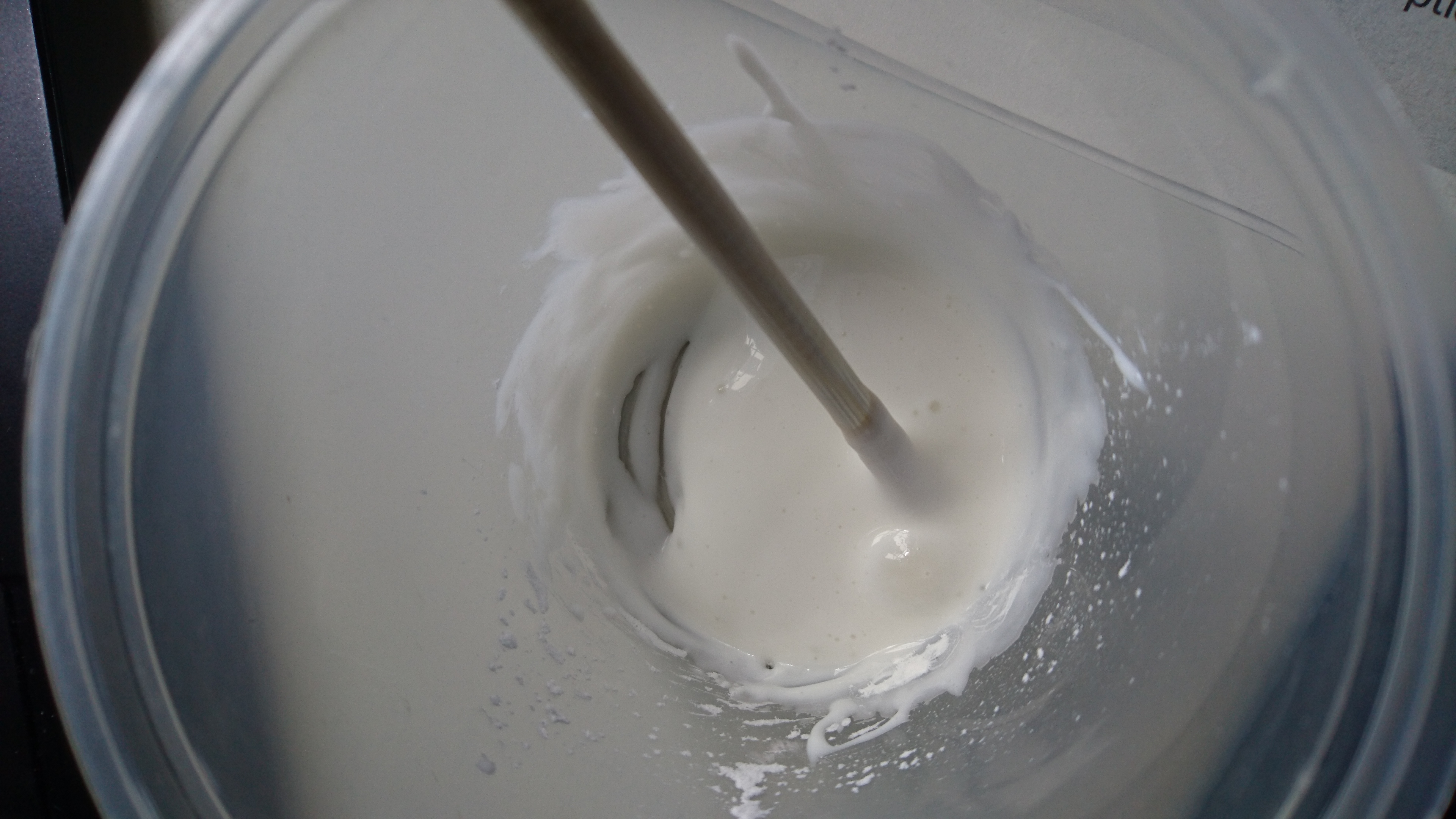
I used cornstarch and white glue to form the white part of the bird poop, while polymer clay coloured with black acrylic paint was used to form the darker part.

dsc_1157

The bird poop was placed specifically to form my initials but without being too obvious.

Watercolour helped to make the bird poop look a little more realistic by staining it, as well as the newspaper below and making the latter slightly crumpled and aged.

dsc_1252-1

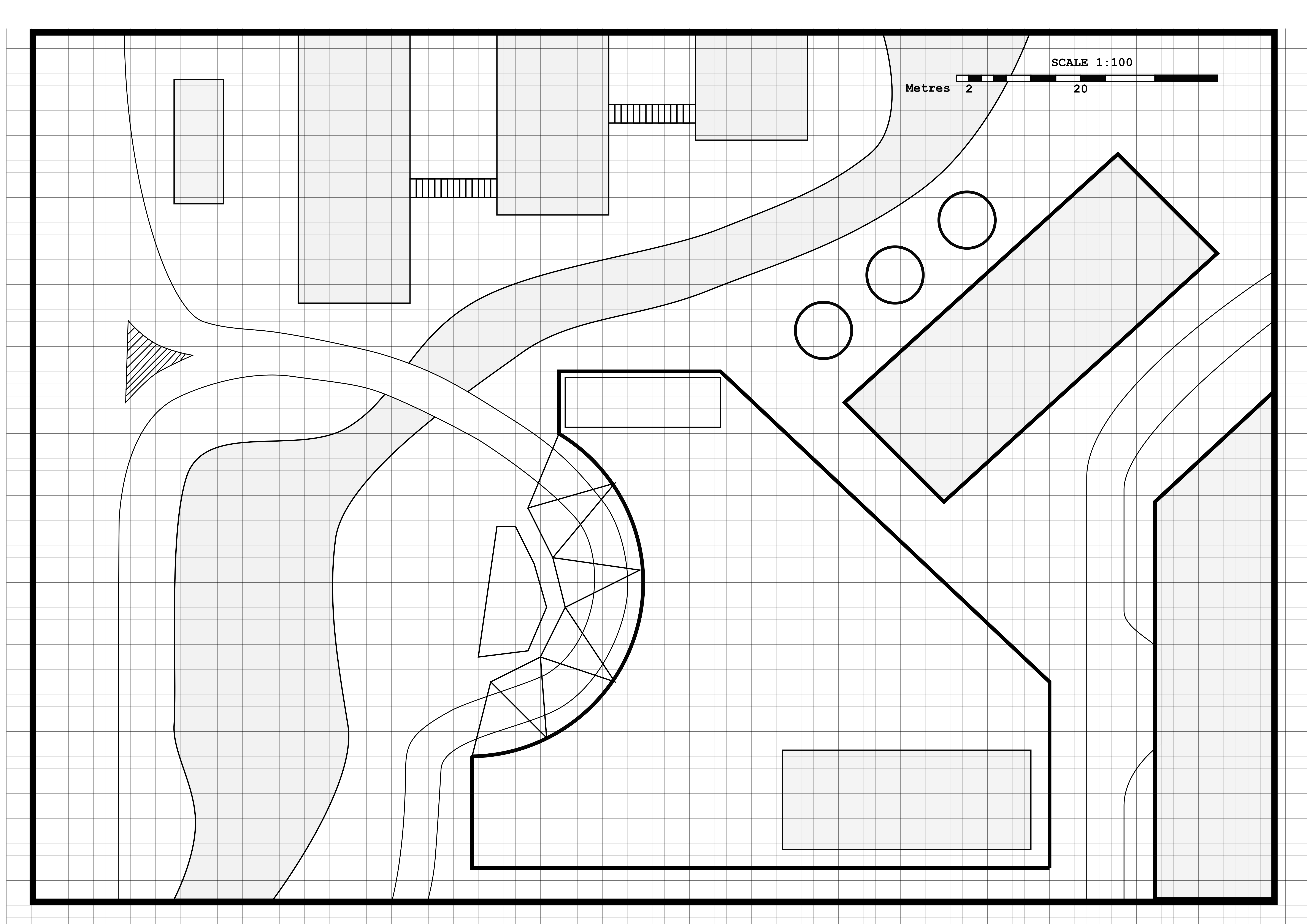
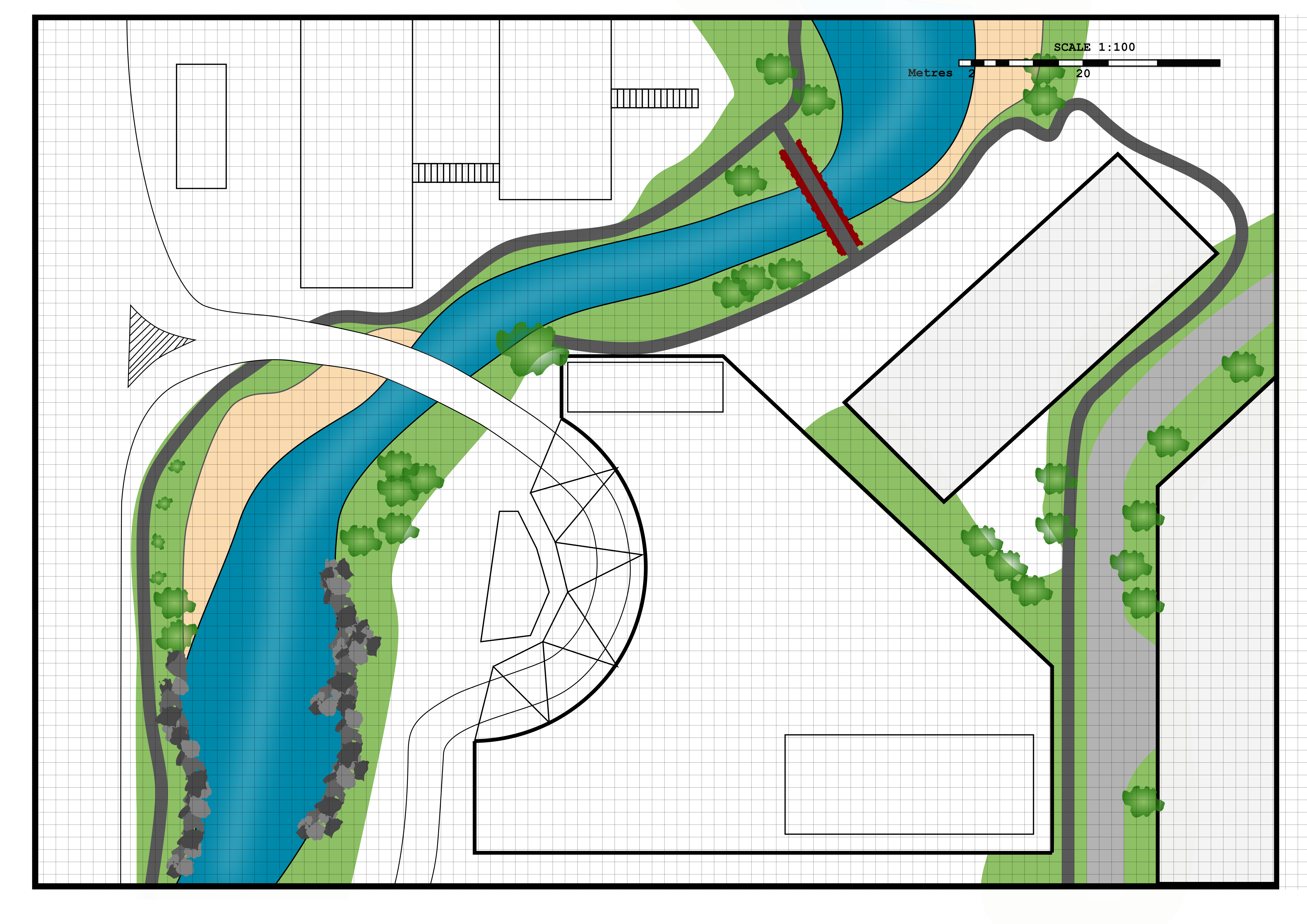
Composition 4: Landscape Architect

This composition was initially supposed to be of an architect only, but I wasn’t able to attain a suitable look and got stuck with it. With a suggestion from a schoolmate, I tweaked it slightly to change the composition into that related to a landscape architect instead.


The illustration was done using Inkscape.rect5149-5 rect5149-6


DN1006 Assignment 1 – Research

For this assignment, we were supposed to create 4 typographic portrait compositions using our name, initials, or parts of those based on a probable future job or occupation.

I started identifying potential ideas by sketching out some thumbnails.

1 2 3

At the end, I decided on the following “occupations” for this assignment: Construction Worker, Police Officer, Architect, and Birdkeeper.

For the construction worker theme, I decided to explore making things (partially given that I am heading to Product Design as my major and that I really like hands-on work) and came up with the idea of using the ubiquitous “Danger – Keep Out” signs as a starting point:

https://upload.wikimedia.org/wikipedia/en/9/9f/Danger-keep-out-sign.jpg

To add on to the symbolism of this sign, I decided to include a related texture in the form of the metal hoardings commonly found at construction sites:

http://s0.geograph.org.uk/geophotos/03/34/53/3345321_4b257feb.jpg

For the police officer theme, I decided to use the police cordon tape as an element:

I decided on a photographic method for this theme, which would then be based on a crime scene cordoned off with police tape. In this theme, I would replace the “POLICE” text with my name.

For the architectI explored the use of architectural blueprint-like drawings to illustrate my initials as part of the building… however, this would not turn out the way I hoped it would be, and so I decided to change it….. this is further explained in my Process post for this assignment!