Tag Archives: typography
DN1006 Assignment 1 – Process
As described in my Research post, I would be working on the following themes: construction worker, police officer, architect, bird keeper…….
Composition 1: Construction Worker
Initially, I wanted to use aluminium foil to form the “hoarding” used in this concept. This took a lot of effort, however, and did not look aesthetically pleasing:


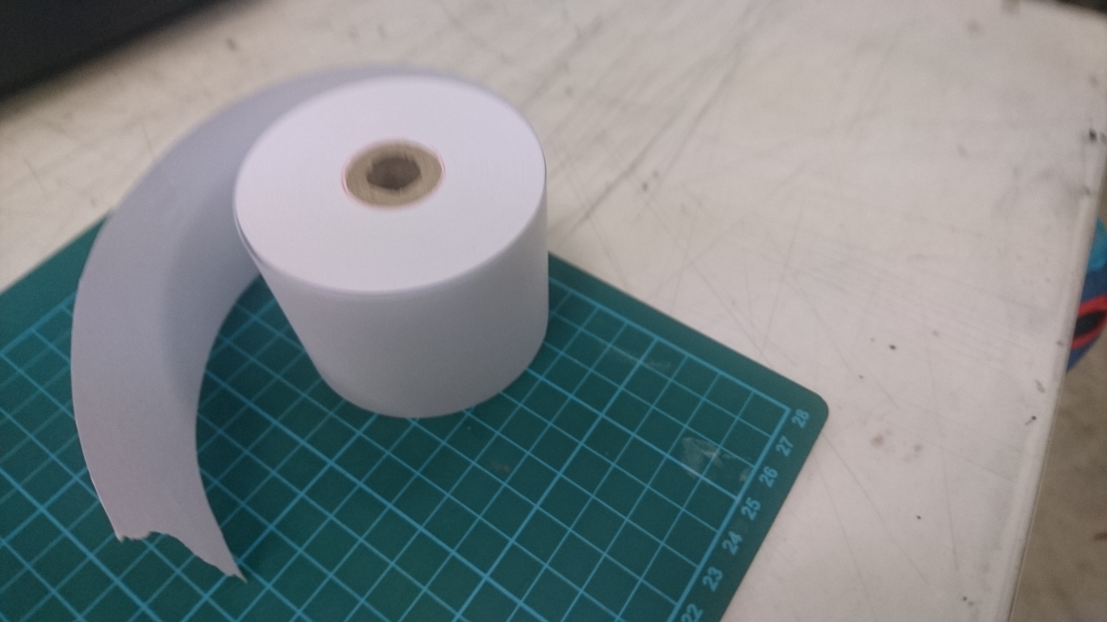
I chanced upon aluminium sheeting in Art Friend which looked much more realistic, although at the start I was still not sure of how to shape it… but all I needed was a steel rule to put it into shape!

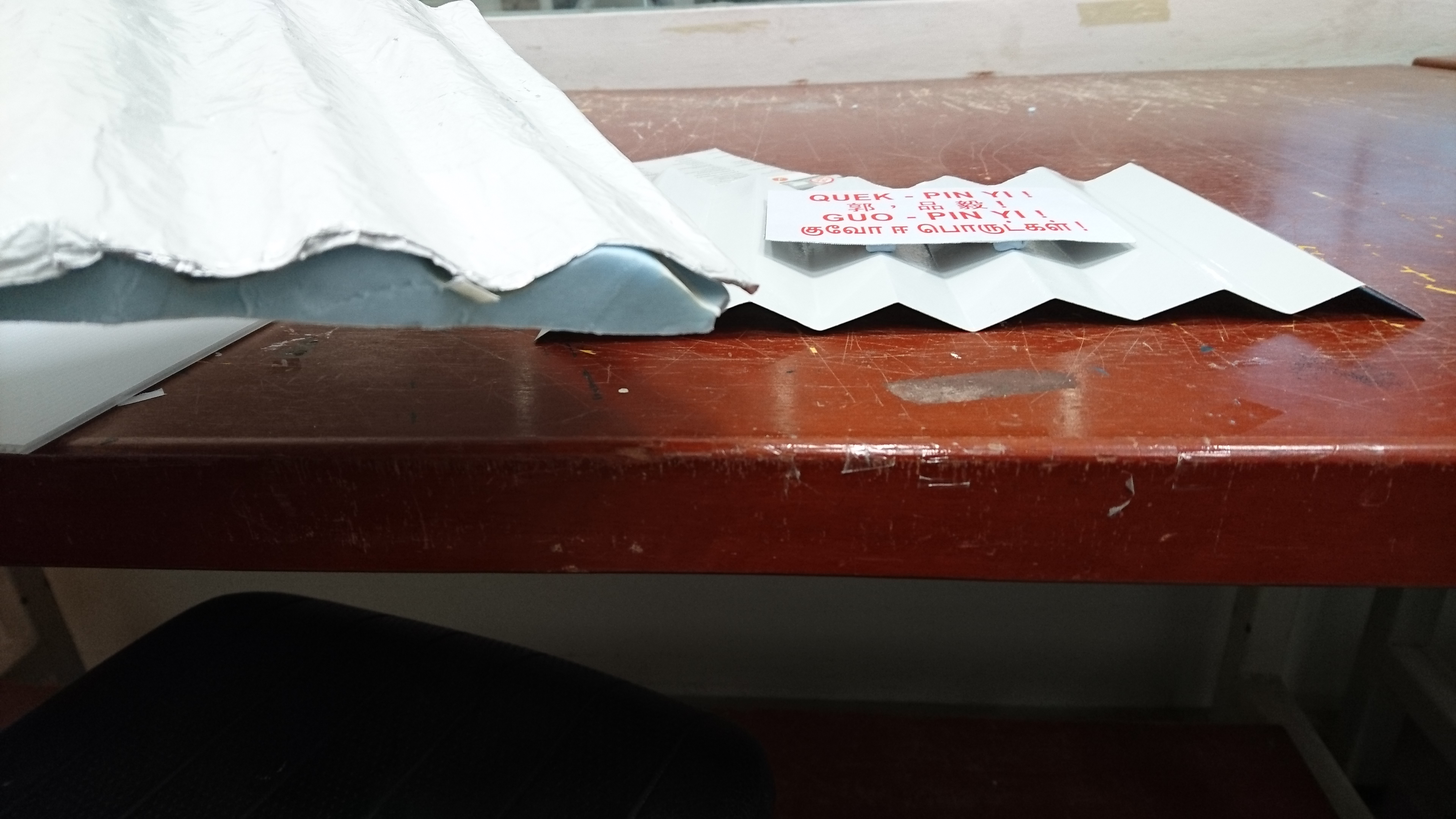
The shaped aluminium sheet was then trimmed to shape and spray painted to give the texture of an actual construction site hoarding:
A smaller piece of aluminium was then covered with a printed label and then placed onto the shaped aluminium to come up with the final piece of work:
Composition 2: Police Officer
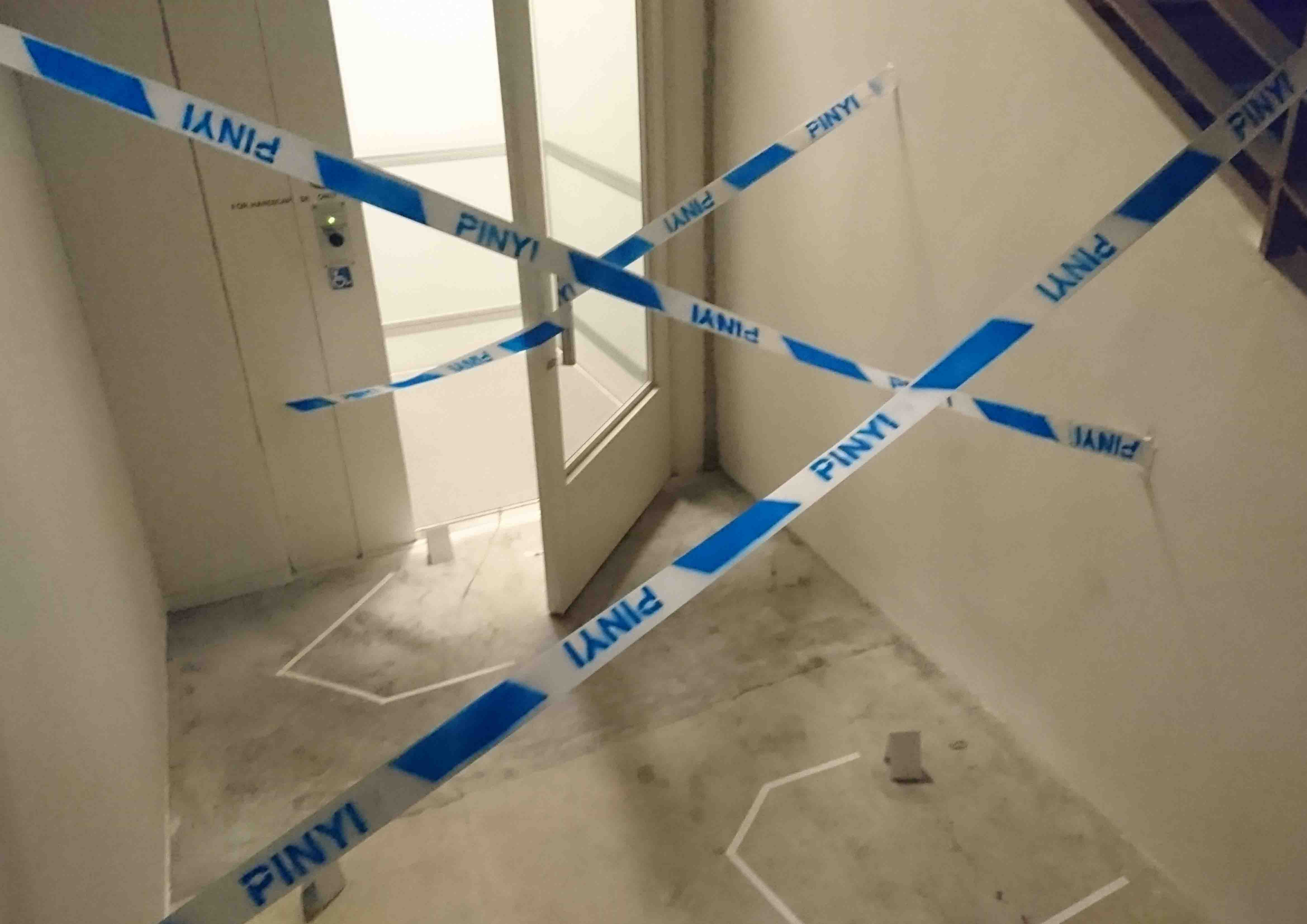
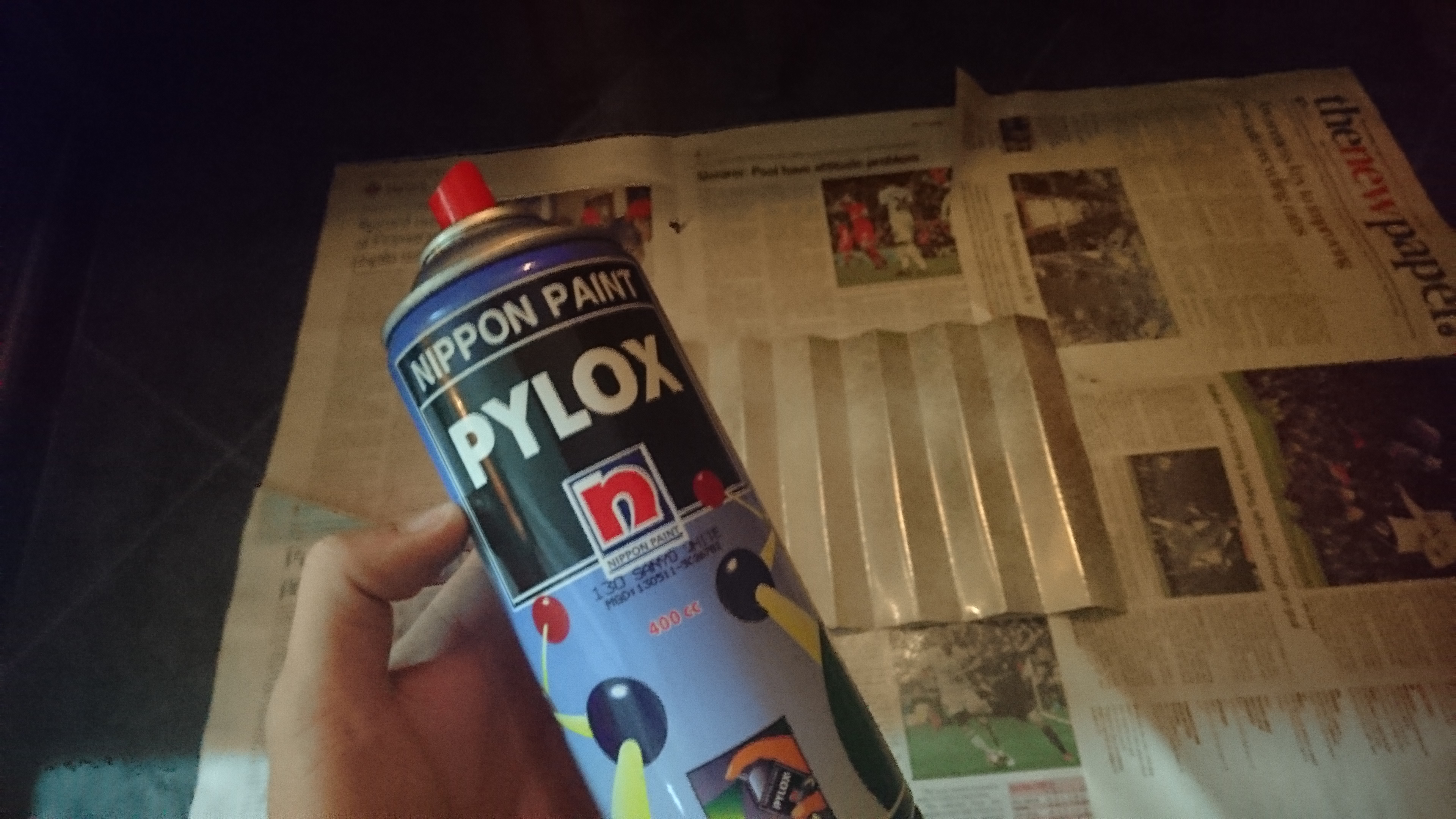
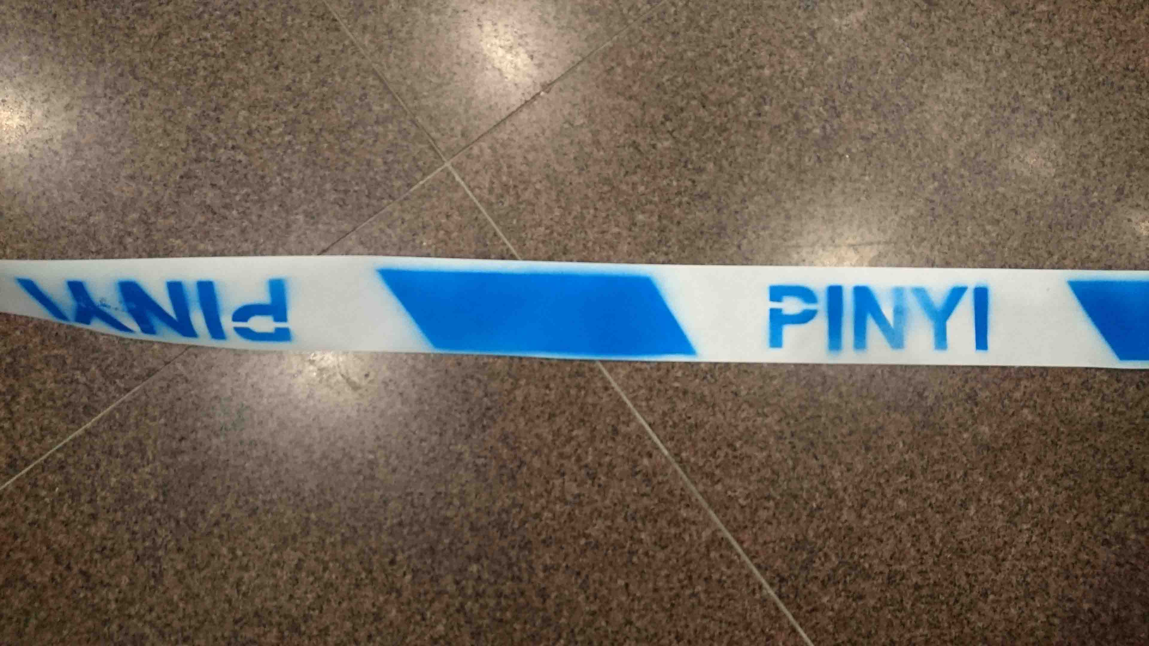
First, I made a stencil digitally and trimmed out the unwanted portions with a craft knife. Blue spray paint was then used to colour in the cordon design on a receipt paper roll.

The scene was set up outside the ADM handicapped lift to replicate a crime scene. However, I tried to use a simpler set up so as to highlight the “cordon” as the more dominant part of the image. Hence, I avoided using the more cliched imagery such as blood splatter and such markings.
Composition 3: Bird Keeper
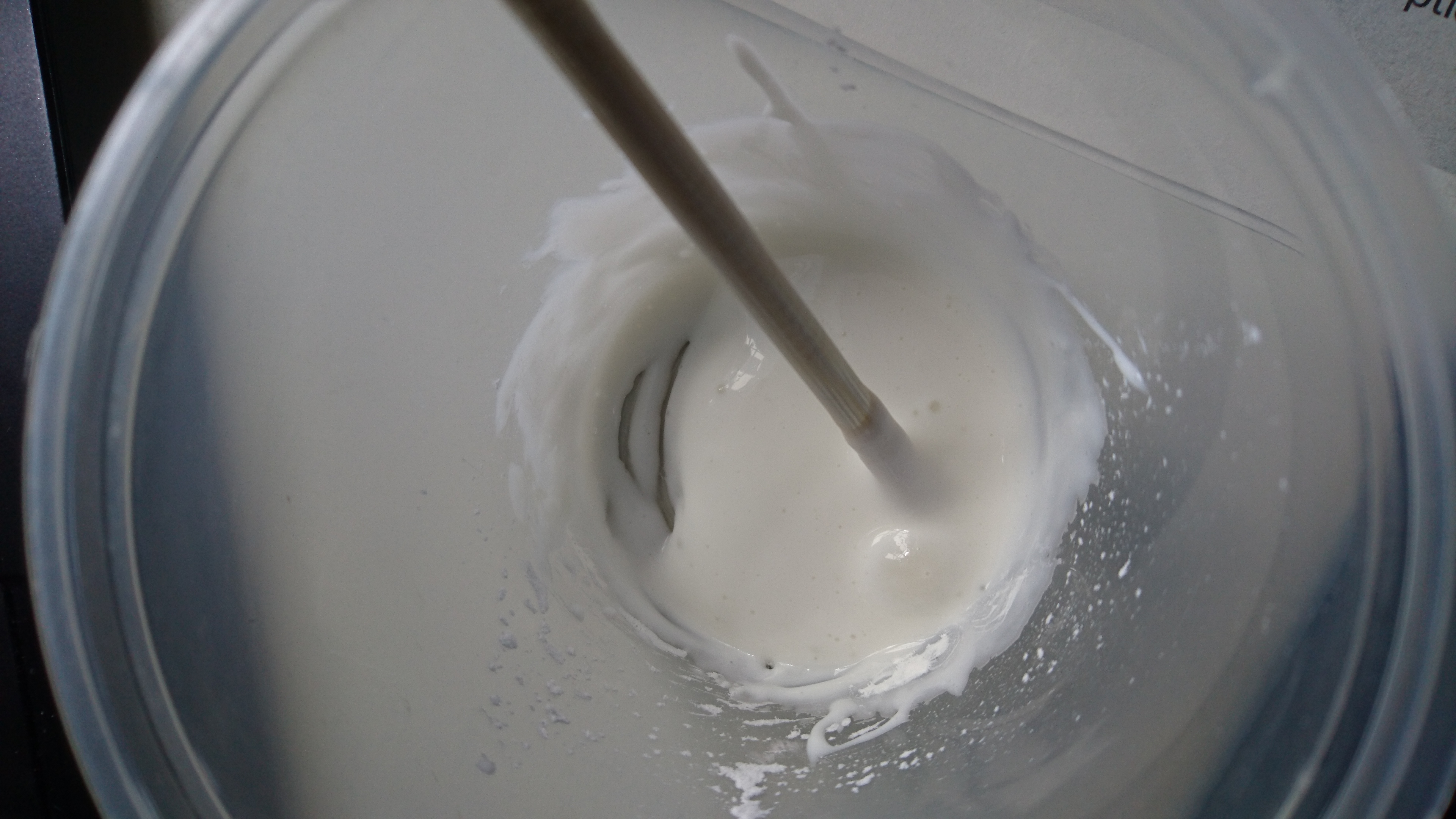
I used cornstarch and white glue to form the white part of the bird poop, while polymer clay coloured with black acrylic paint was used to form the darker part.
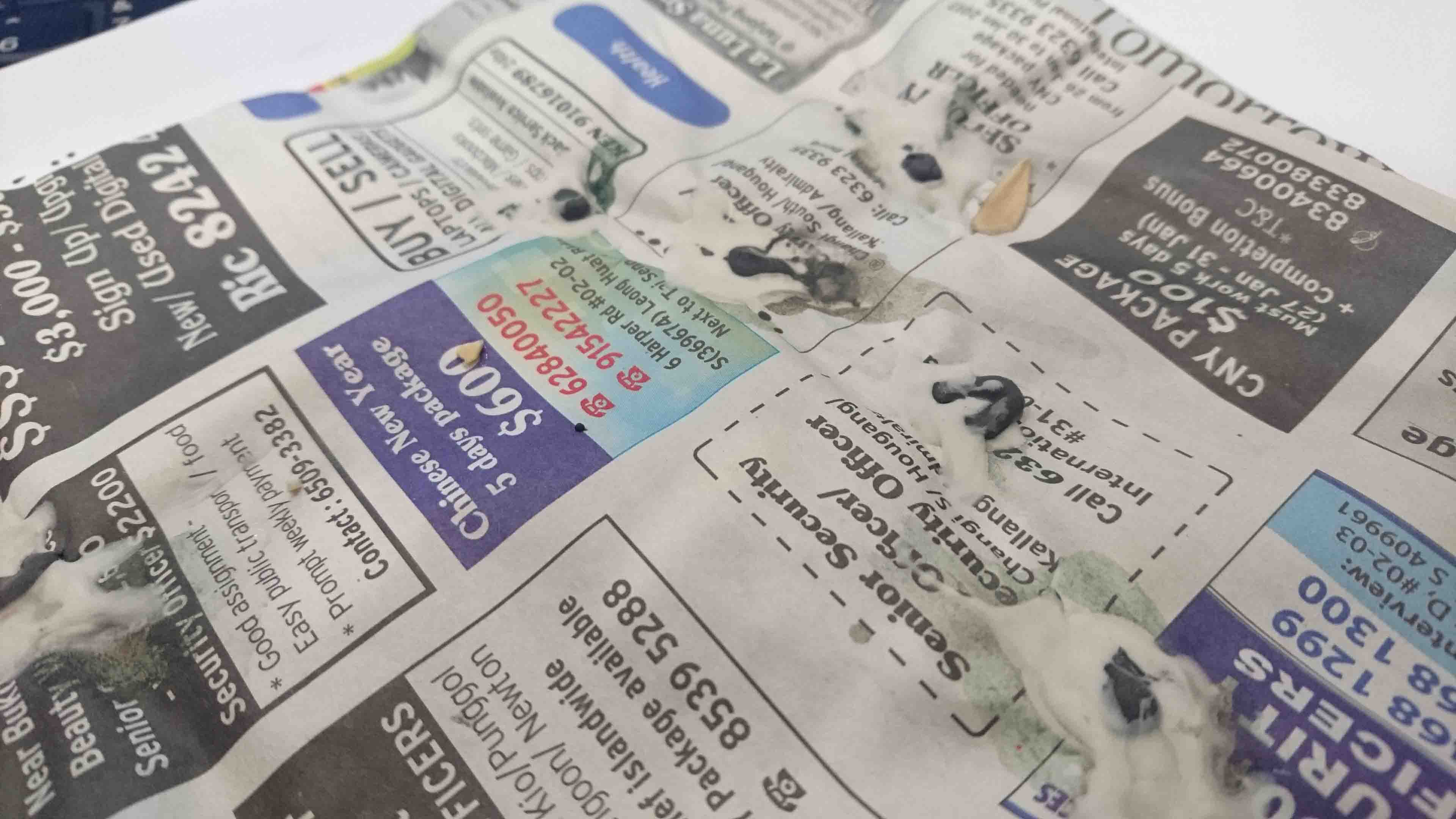
The bird poop was placed specifically to form my initials but without being too obvious.
Watercolour helped to make the bird poop look a little more realistic by staining it, as well as the newspaper below and making the latter slightly crumpled and aged.
Composition 4: Landscape Architect
This composition was initially supposed to be of an architect only, but I wasn’t able to attain a suitable look and got stuck with it. With a suggestion from a schoolmate, I tweaked it slightly to change the composition into that related to a landscape architect instead.
The illustration was done using Inkscape.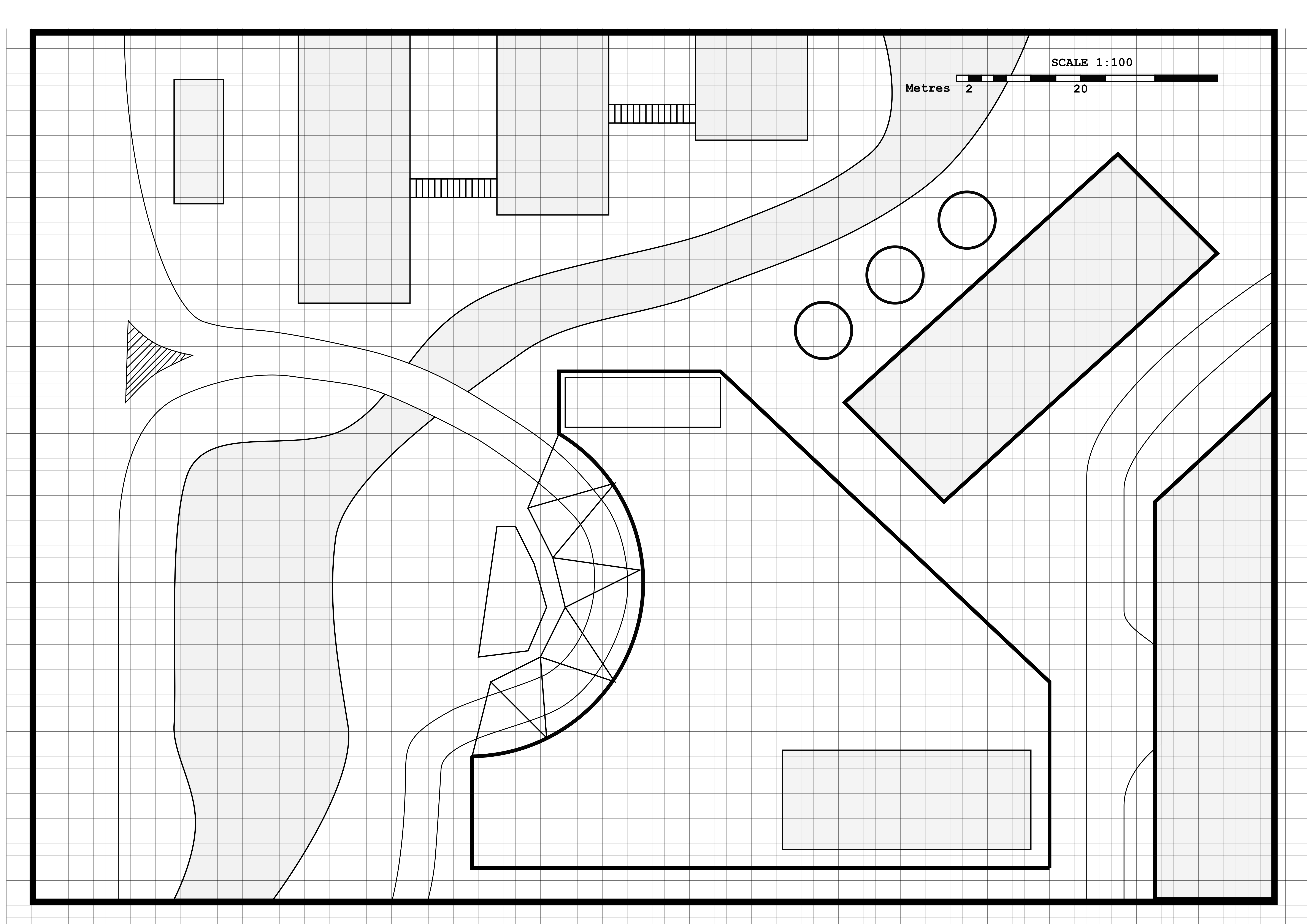
DN1006 Assignment 1 – Research
For this assignment, we were supposed to create 4 typographic portrait compositions using our name, initials, or parts of those based on a probable future job or occupation.
I started identifying potential ideas by sketching out some thumbnails.
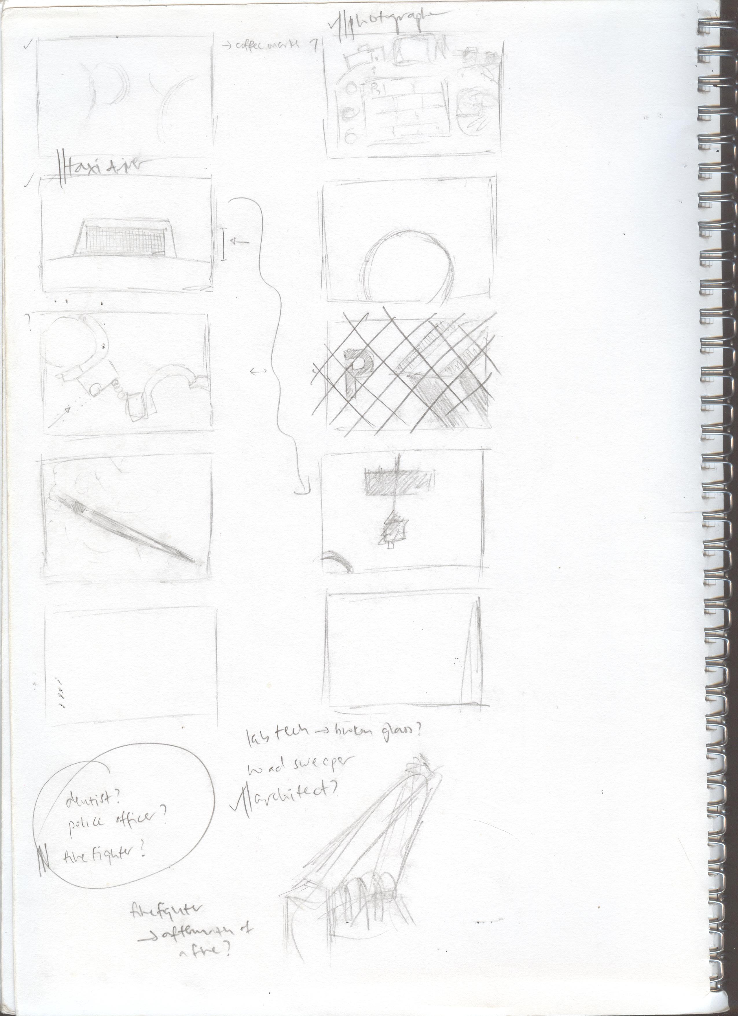
At the end, I decided on the following “occupations” for this assignment: Construction Worker, Police Officer, Architect, and Birdkeeper.
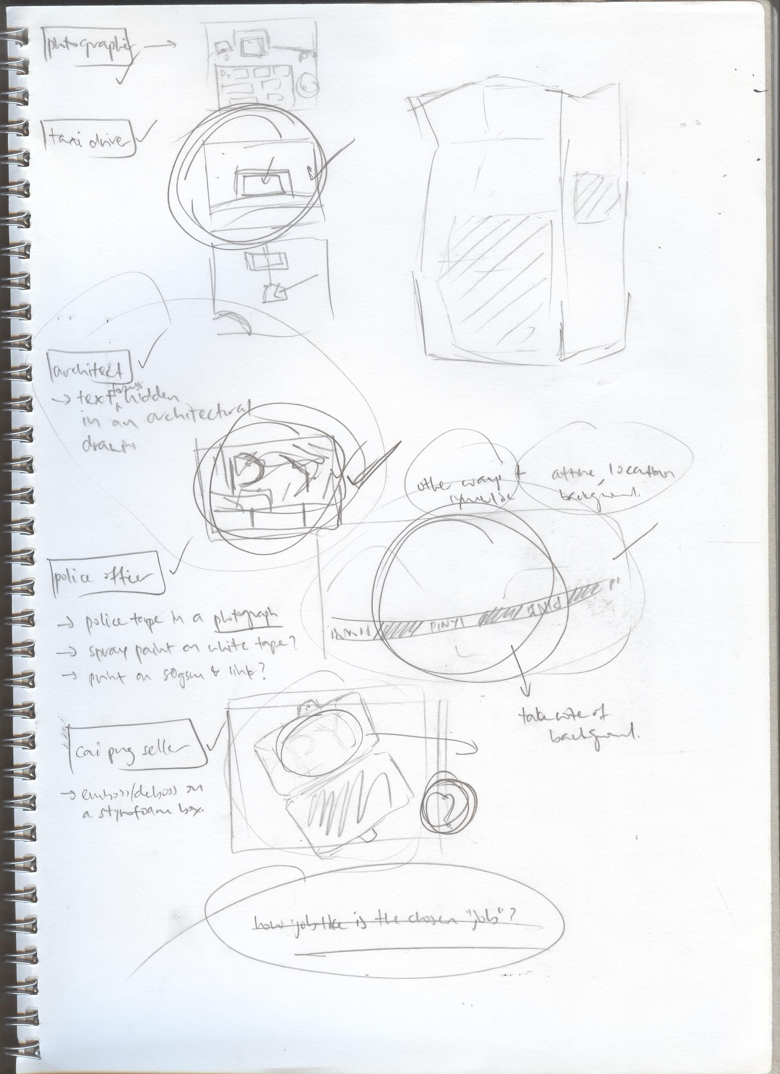
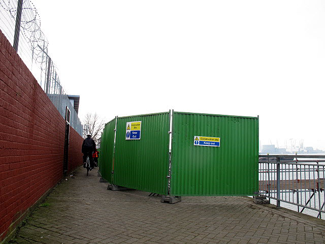
For the construction worker theme, I decided to explore making things (partially given that I am heading to Product Design as my major and that I really like hands-on work) and came up with the idea of using the ubiquitous “Danger – Keep Out” signs as a starting point:

To add on to the symbolism of this sign, I decided to include a related texture in the form of the metal hoardings commonly found at construction sites:
For the police officer theme, I decided to use the police cordon tape as an element:

I decided on a photographic method for this theme, which would then be based on a crime scene cordoned off with police tape. In this theme, I would replace the “POLICE” text with my name.
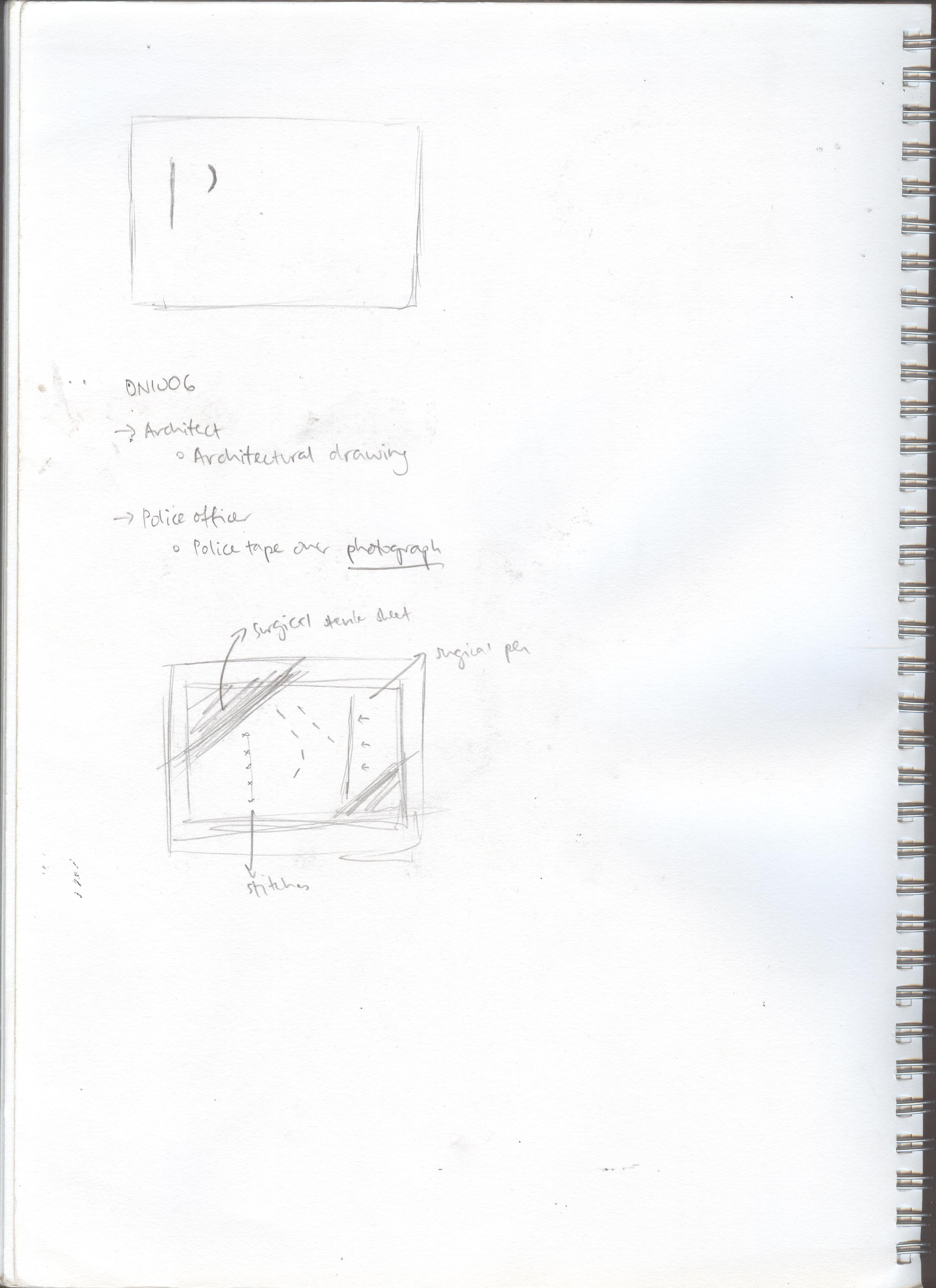
For the architect, I explored the use of architectural blueprint-like drawings to illustrate my initials as part of the building… however, this would not turn out the way I hoped it would be, and so I decided to change it….. this is further explained in my Process post for this assignment!