
Following up on my previous post, this one will focus on how I have developed my zine with accordance to the theme of my grandmother and nostalgia, Mimi’s comments and my updated changes!
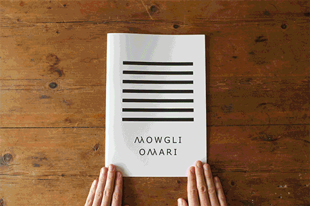
I went ahead with the said design of the jotter book. Thus, what came first in the design process was the cover pages. Noticeably, it is the most iconic part of the jotter book. This was what I came up with. Some of the detailing on the front cover I kept totally, like the blanks for you to fill out the details. Others, I changed to suit the idea of me creating my own zine and jotter book, adjusting things such as the dimensions written on the front cover to suit the A5 size of my zine.
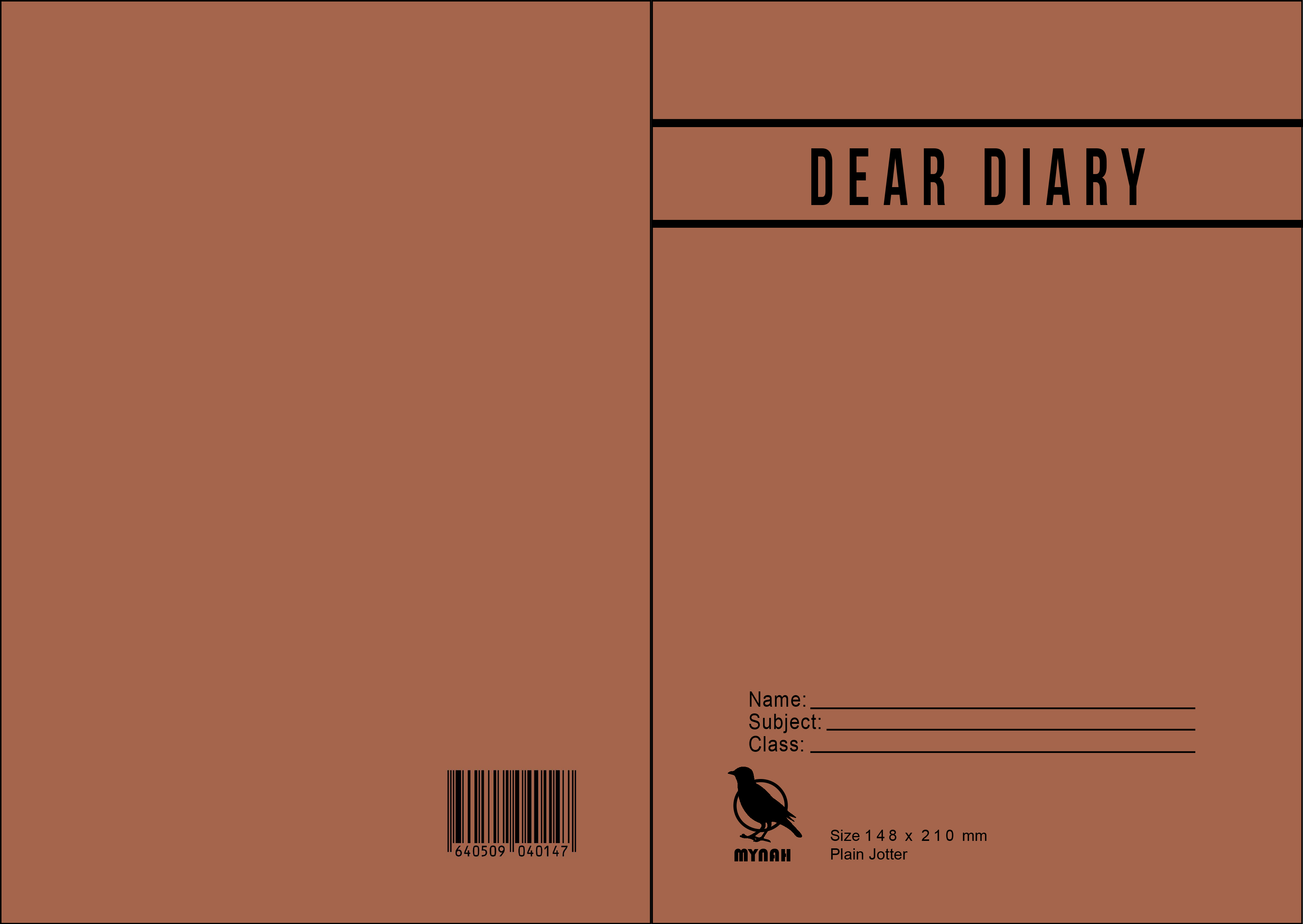
I added the subtle things like the barcode at the back, as well as the detailing of the size and the “Plain Jotter” description. The logo of the falcon has also been changed, to a Mynah because I wanted to choose a Singaporean bird. I also altered the JOTTER logo right at the top to be the title bar for my work, “Dear Diary”.
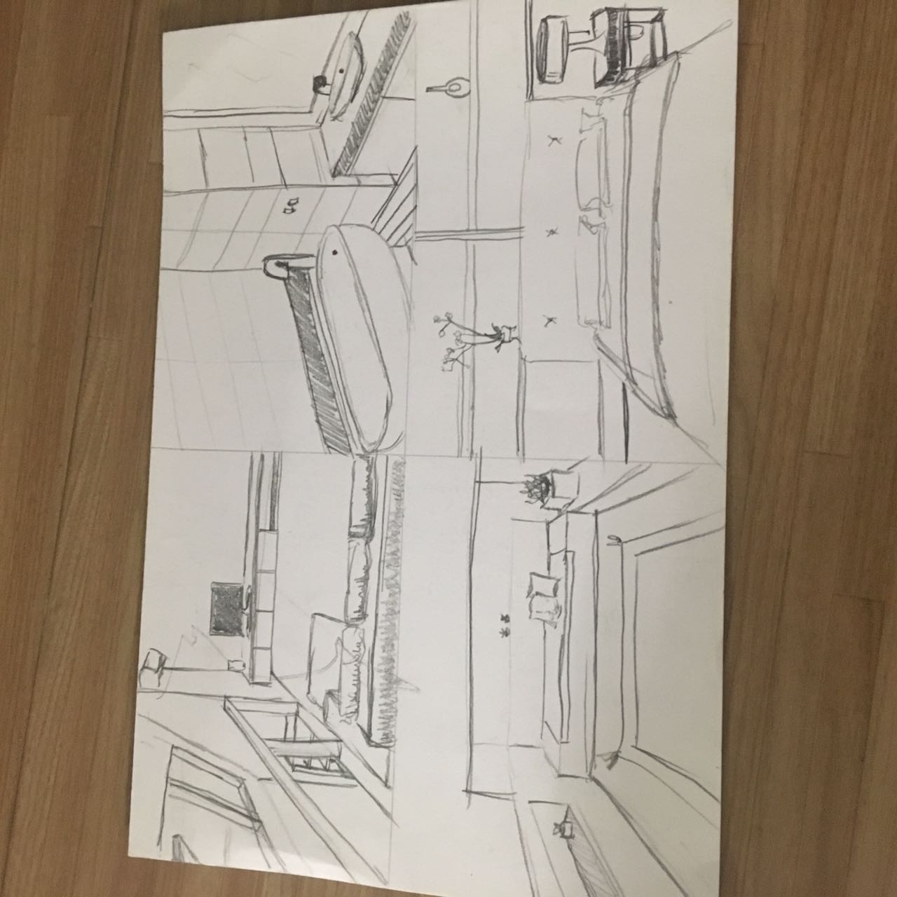
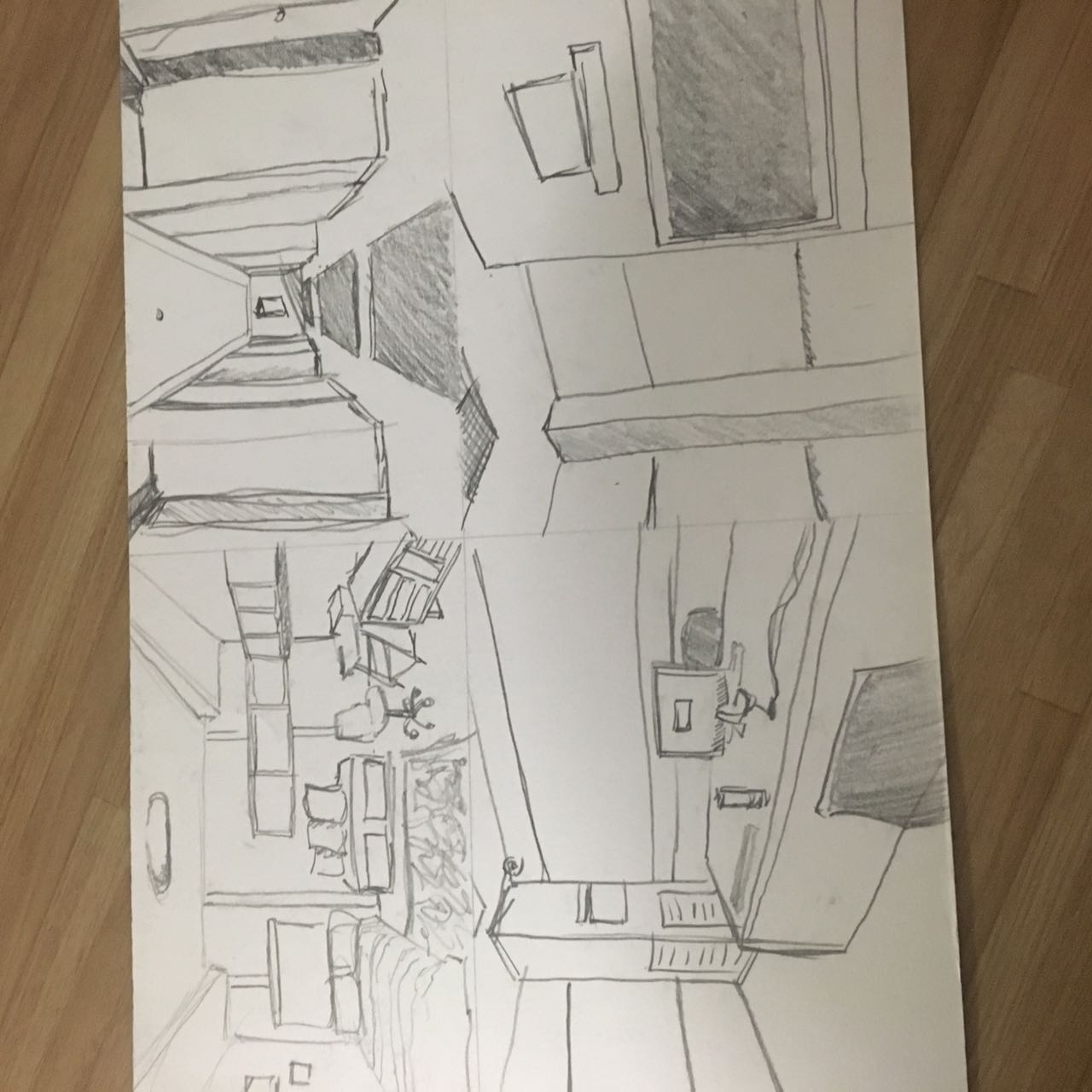
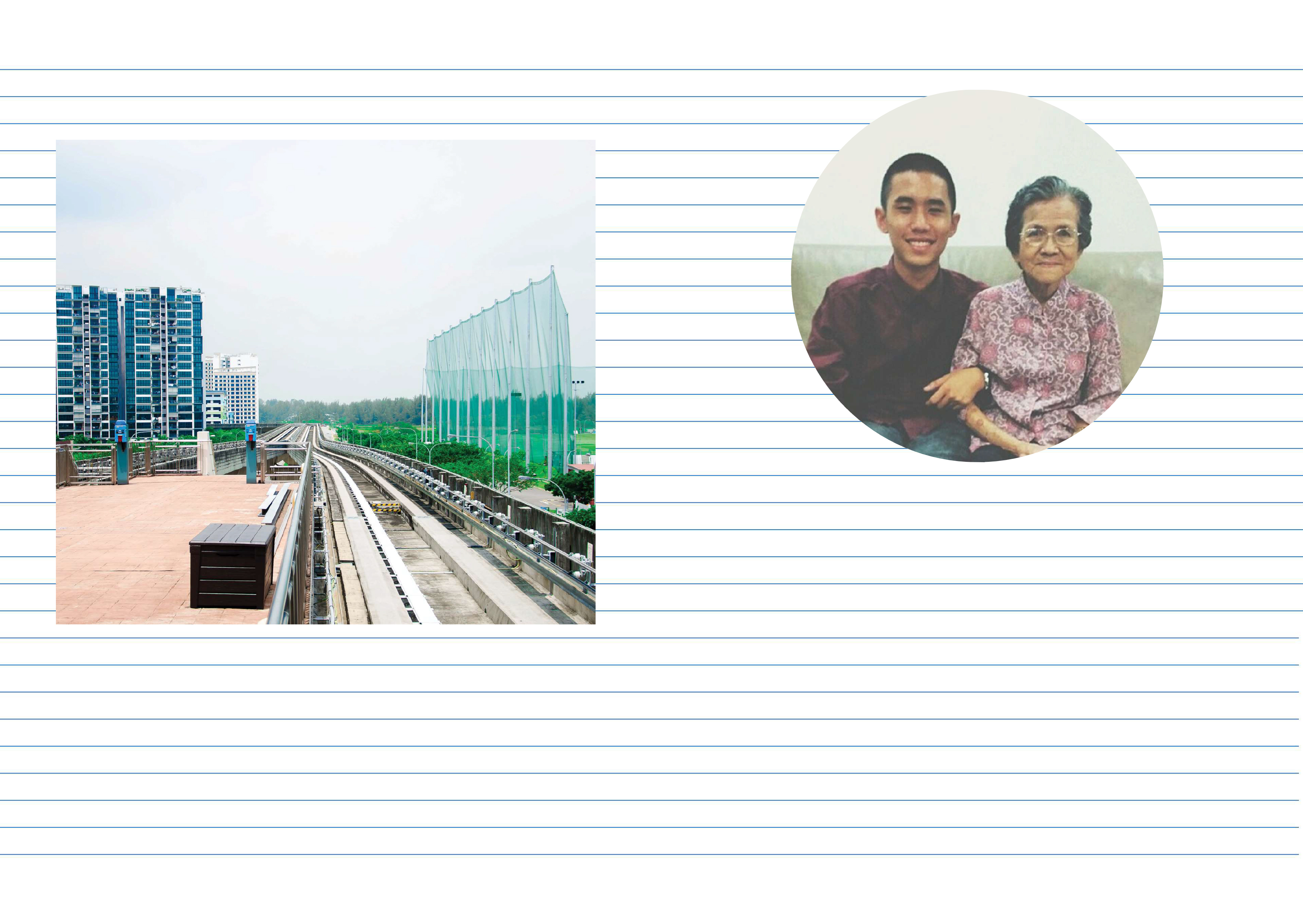
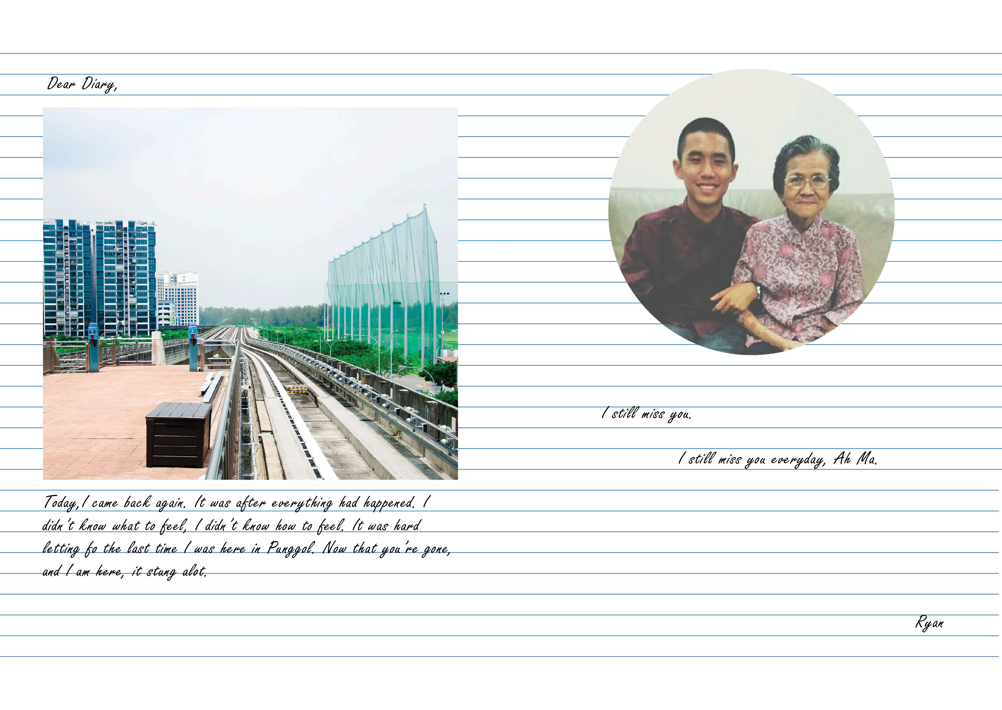
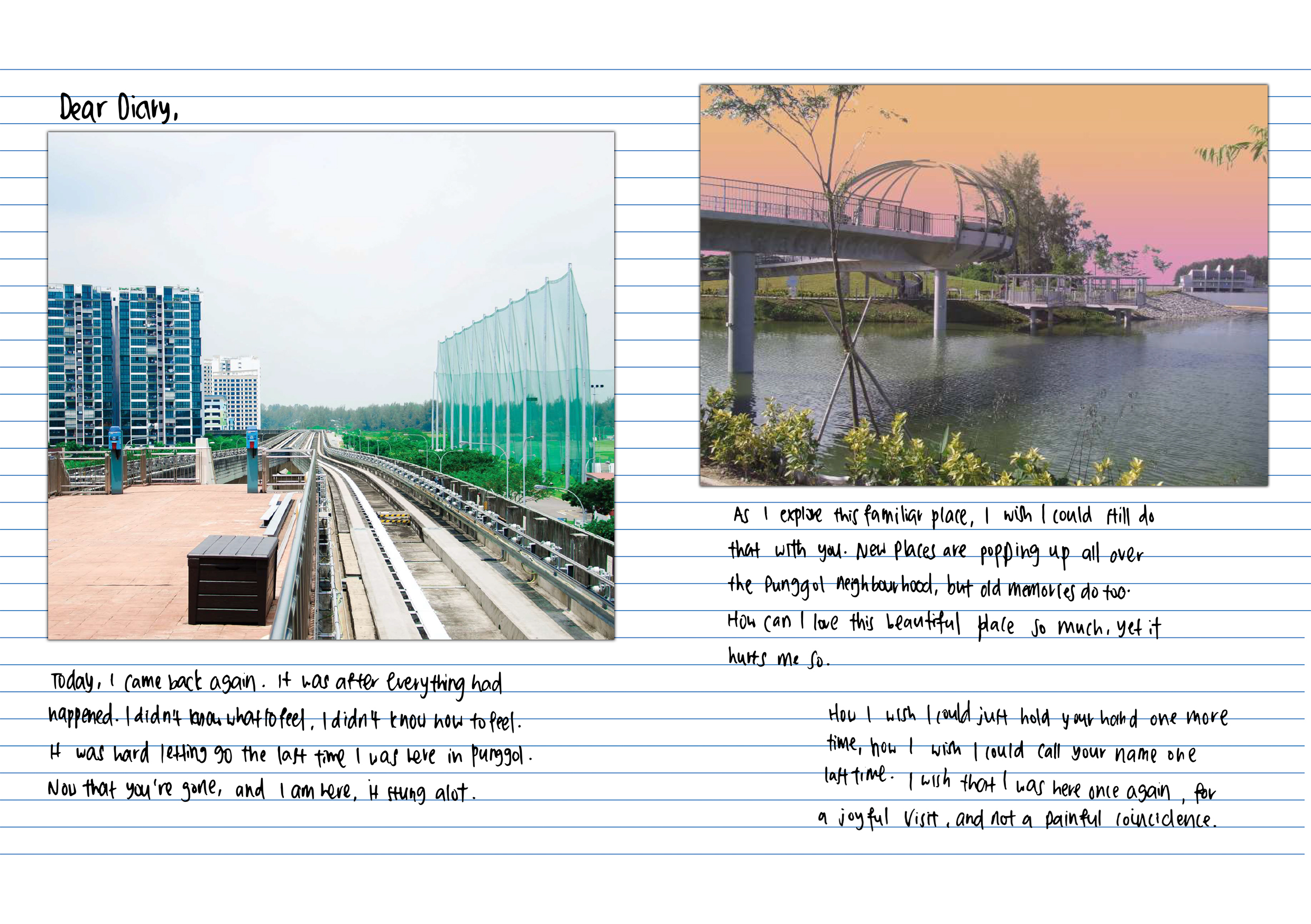
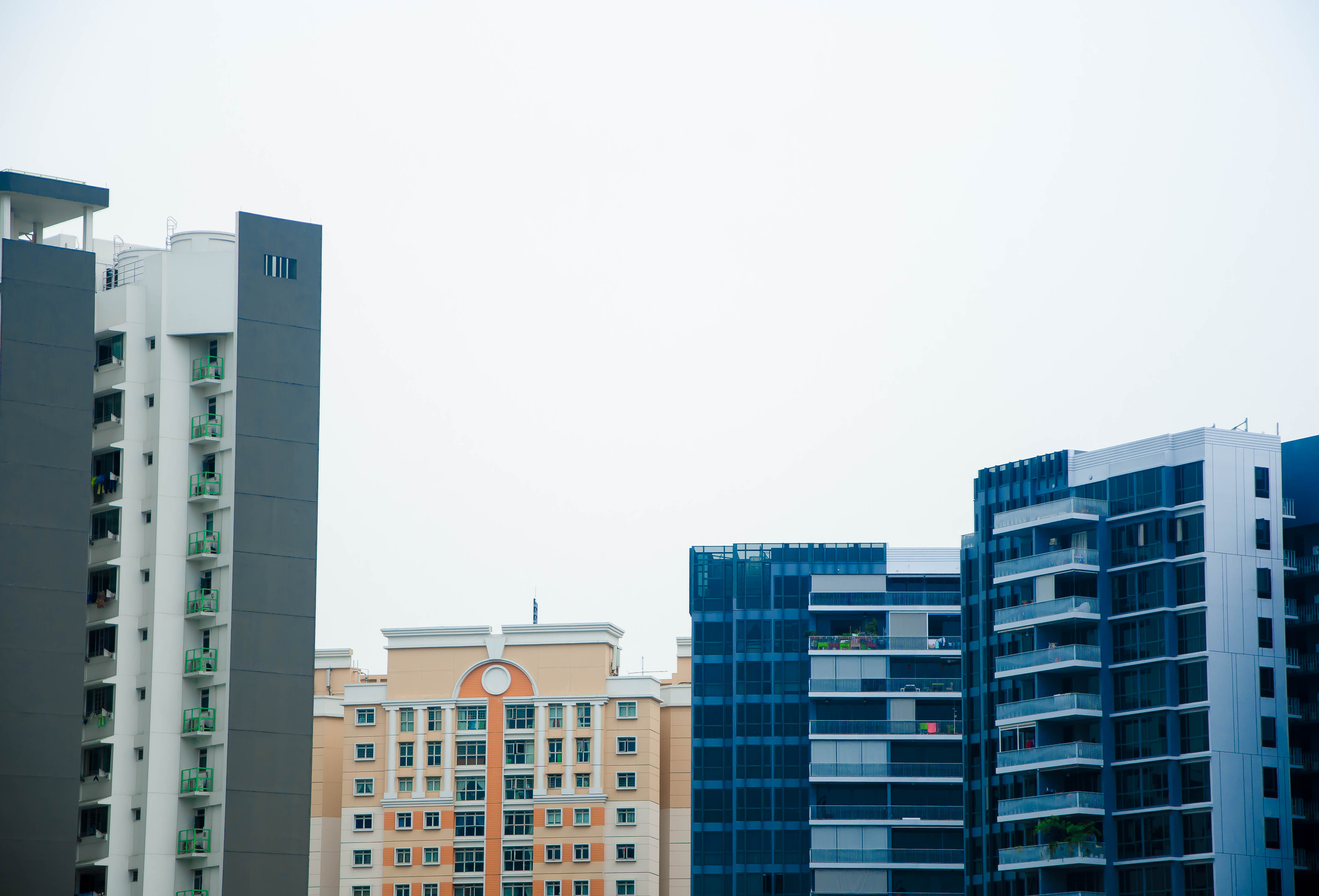
For page 2, I chose a picture of the LRT tracks because I wanted to show how I arrived in Punggol, also it was how I got to my grandmother’s house every Saturday, by taking the LRT after the MRT.
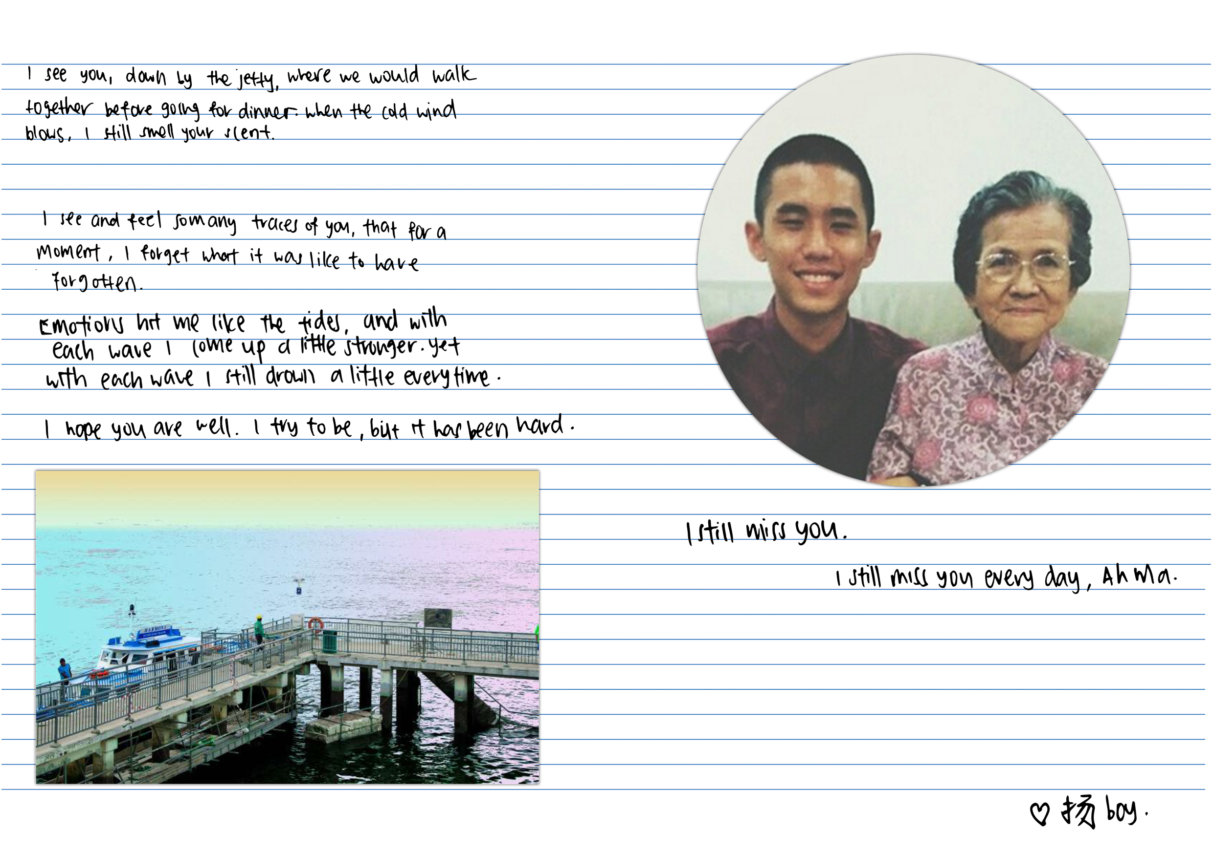
The facing page, page 7 was the final page before my back cover page. Up till that point, I did not mention who I was talking about in a bid to keep the viewers in suspense of who I was talking about.
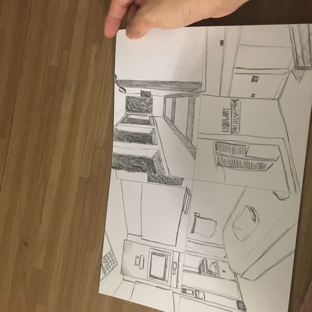
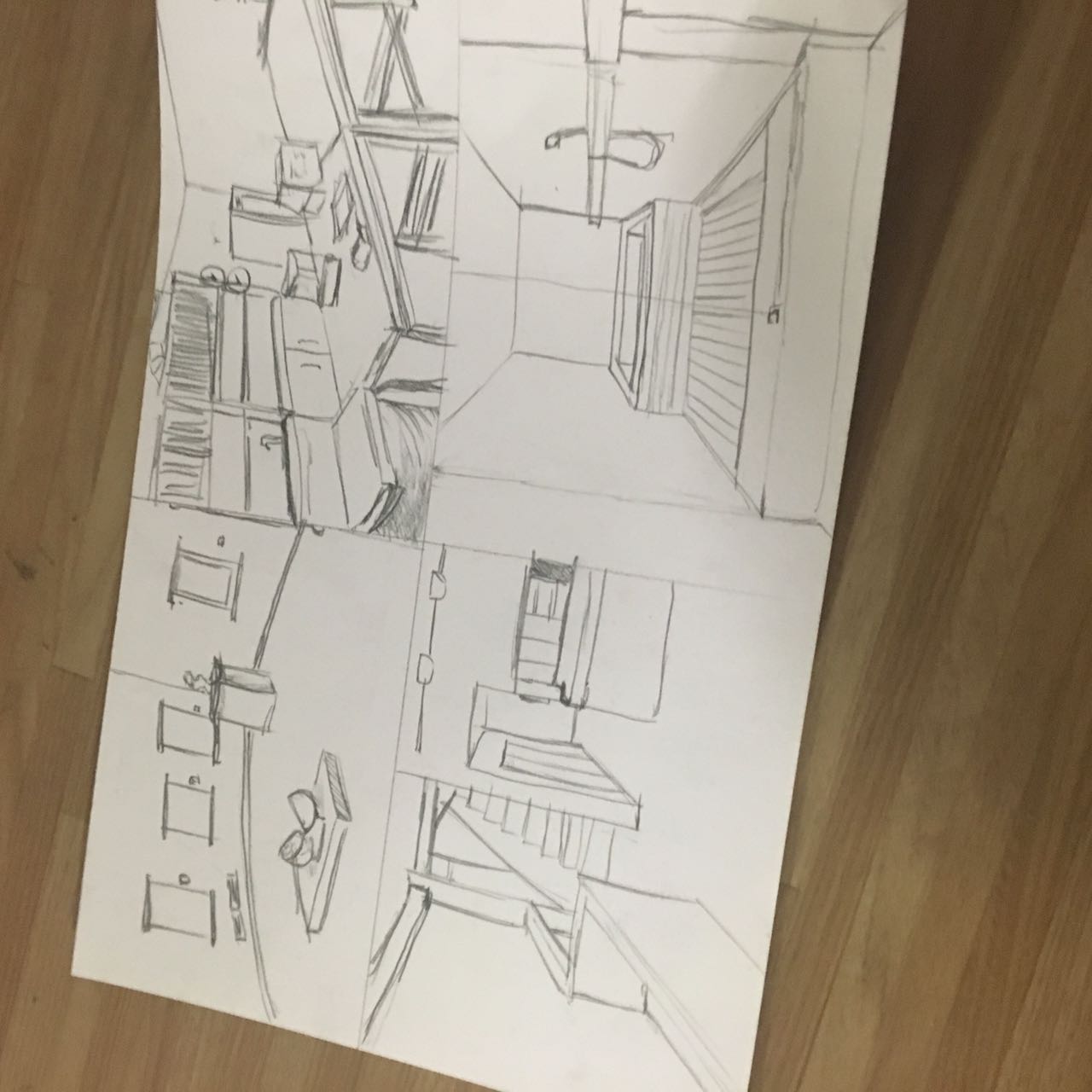
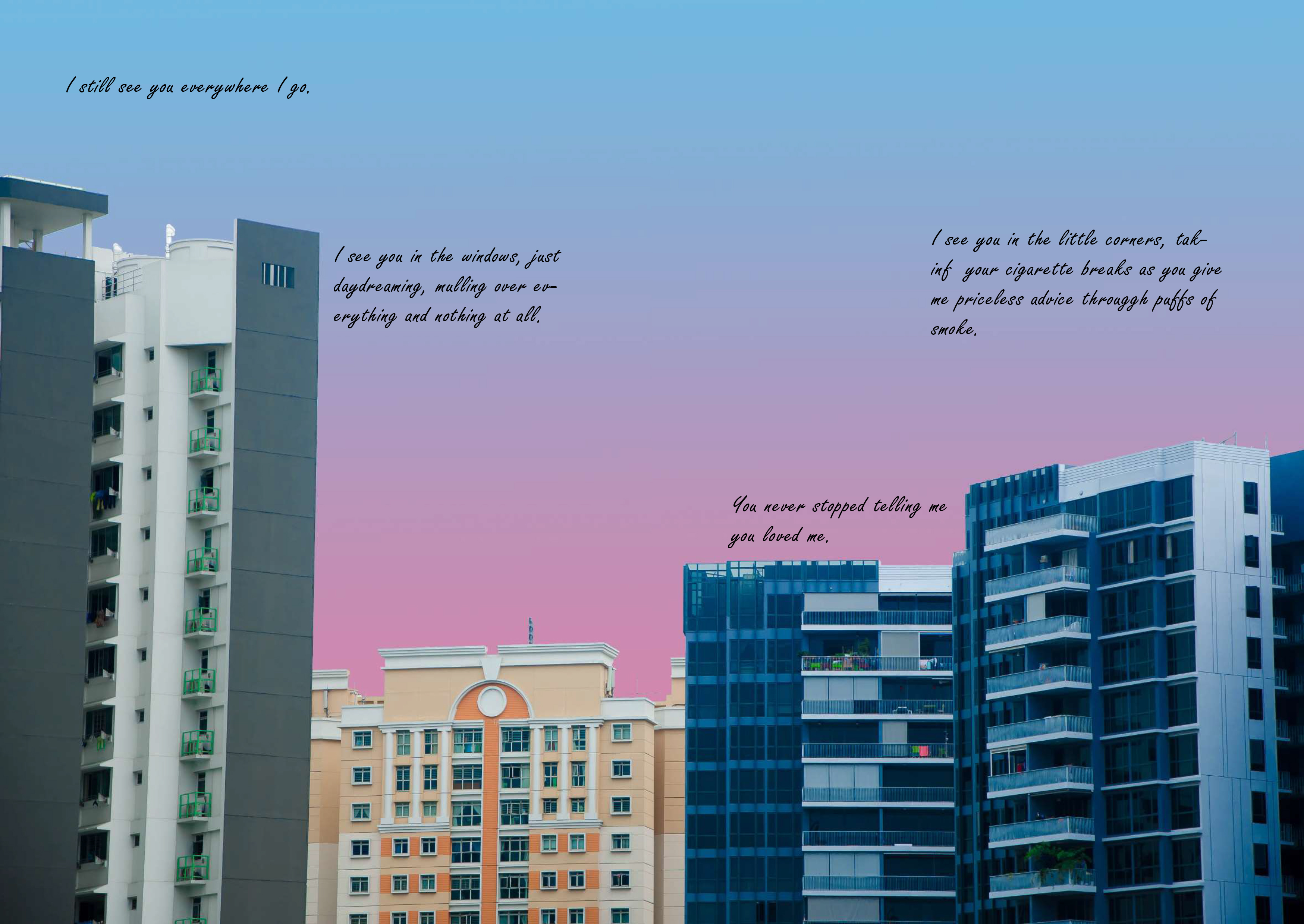
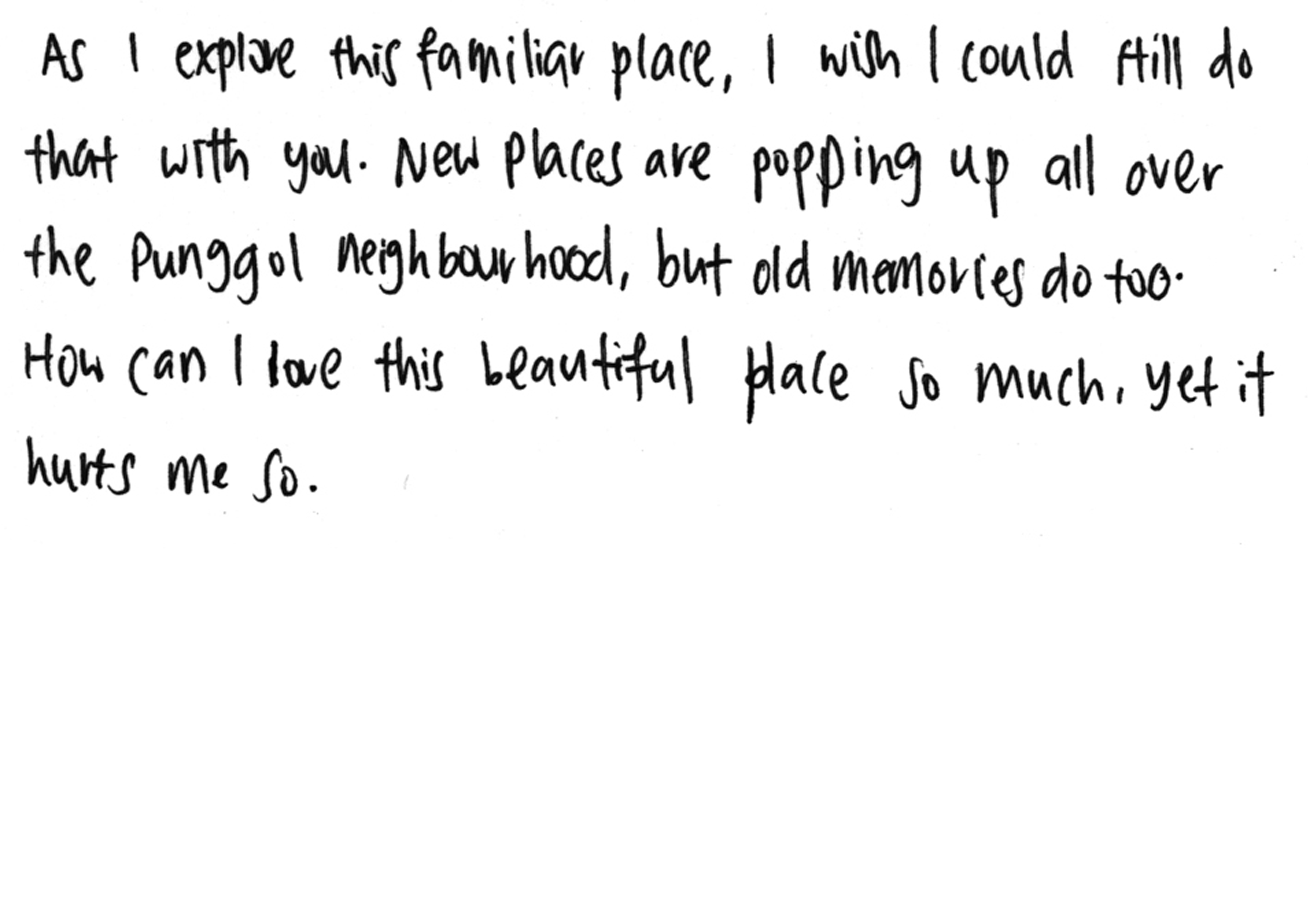
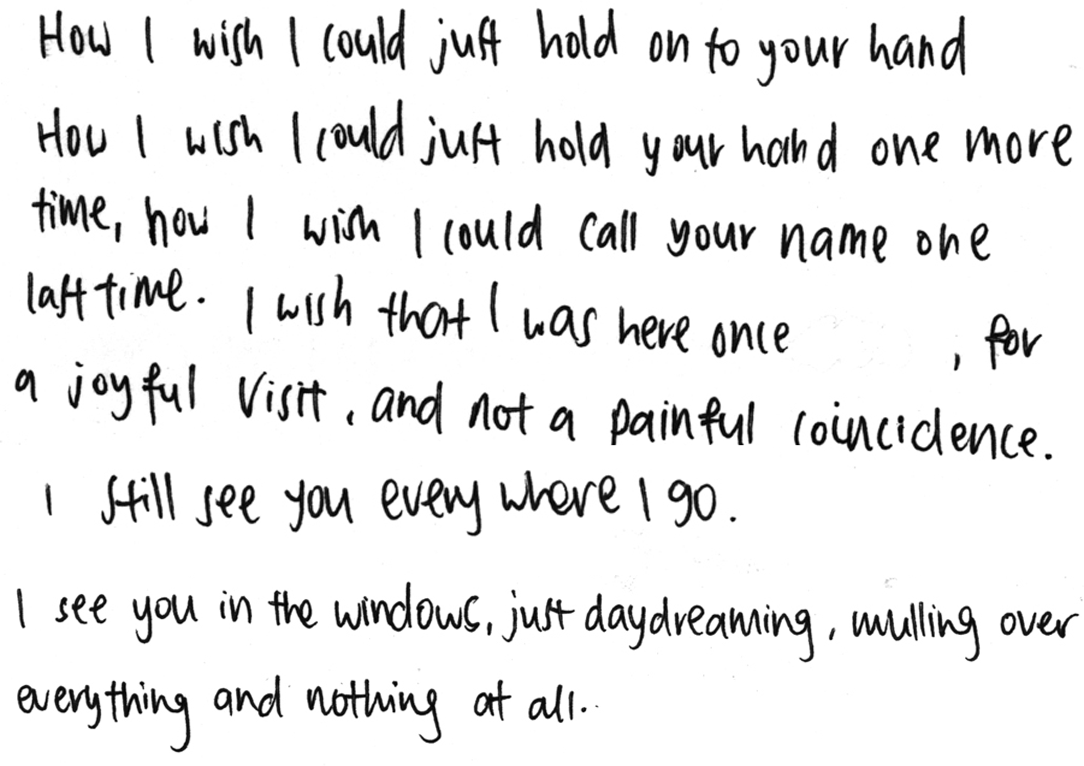
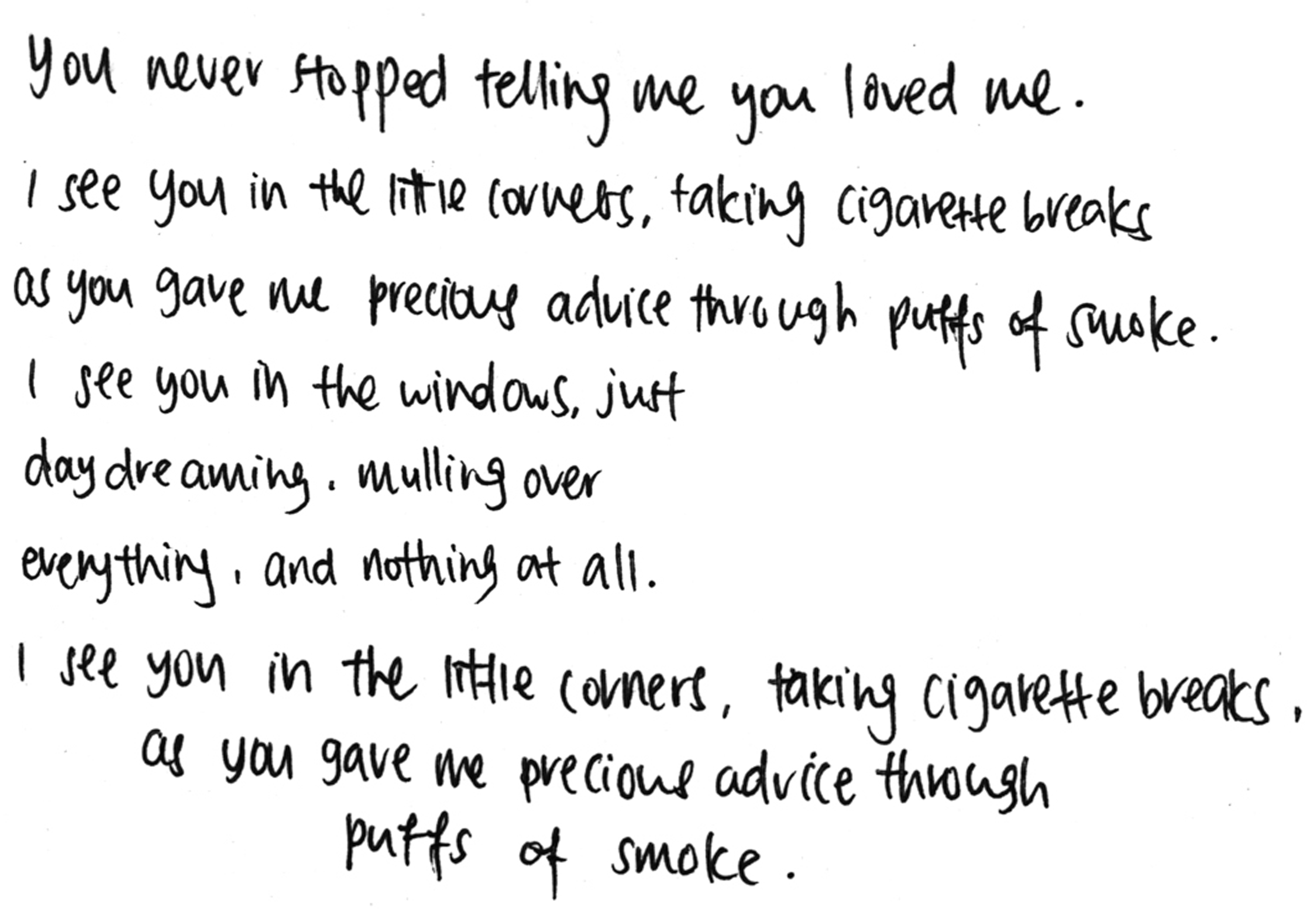
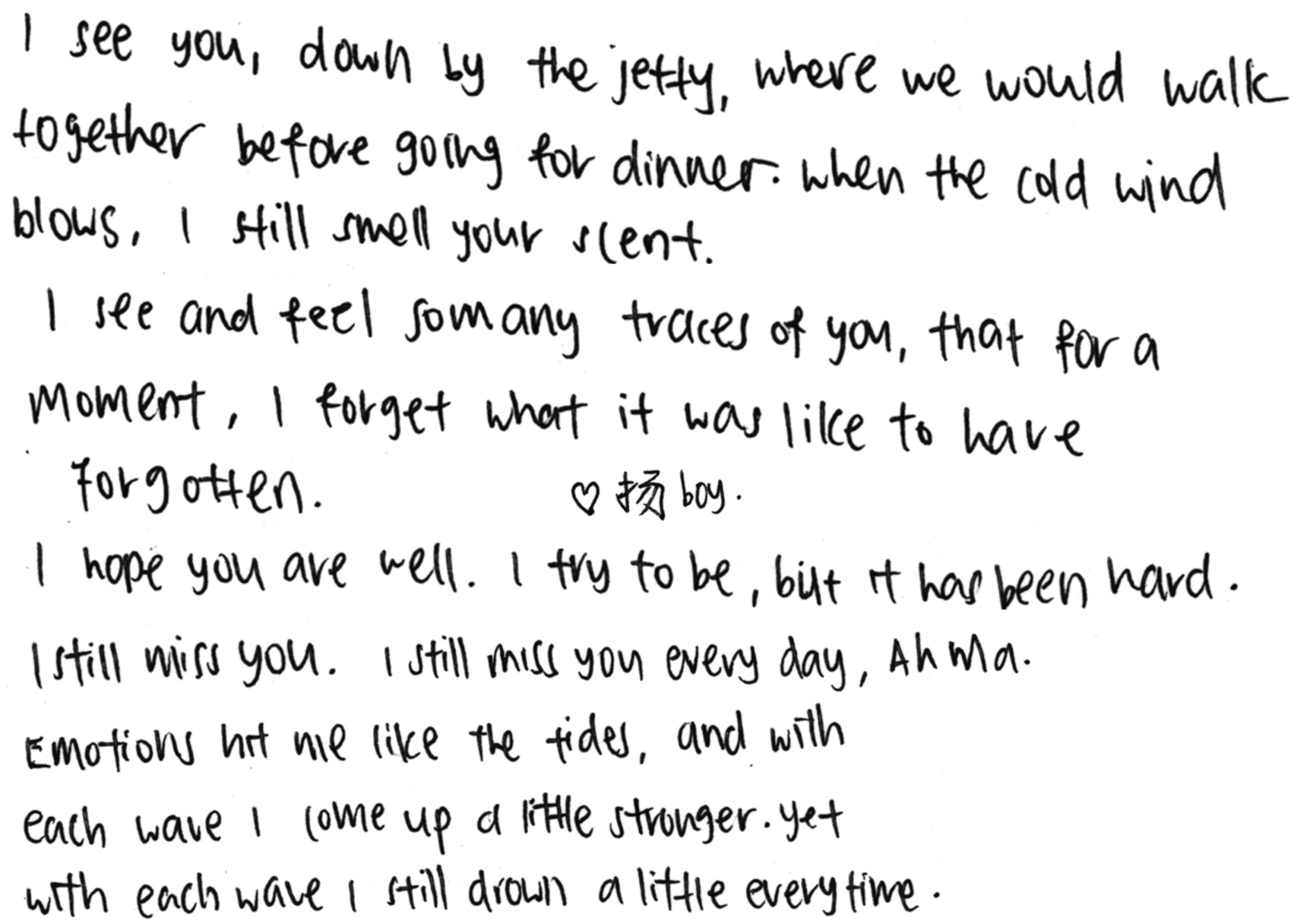
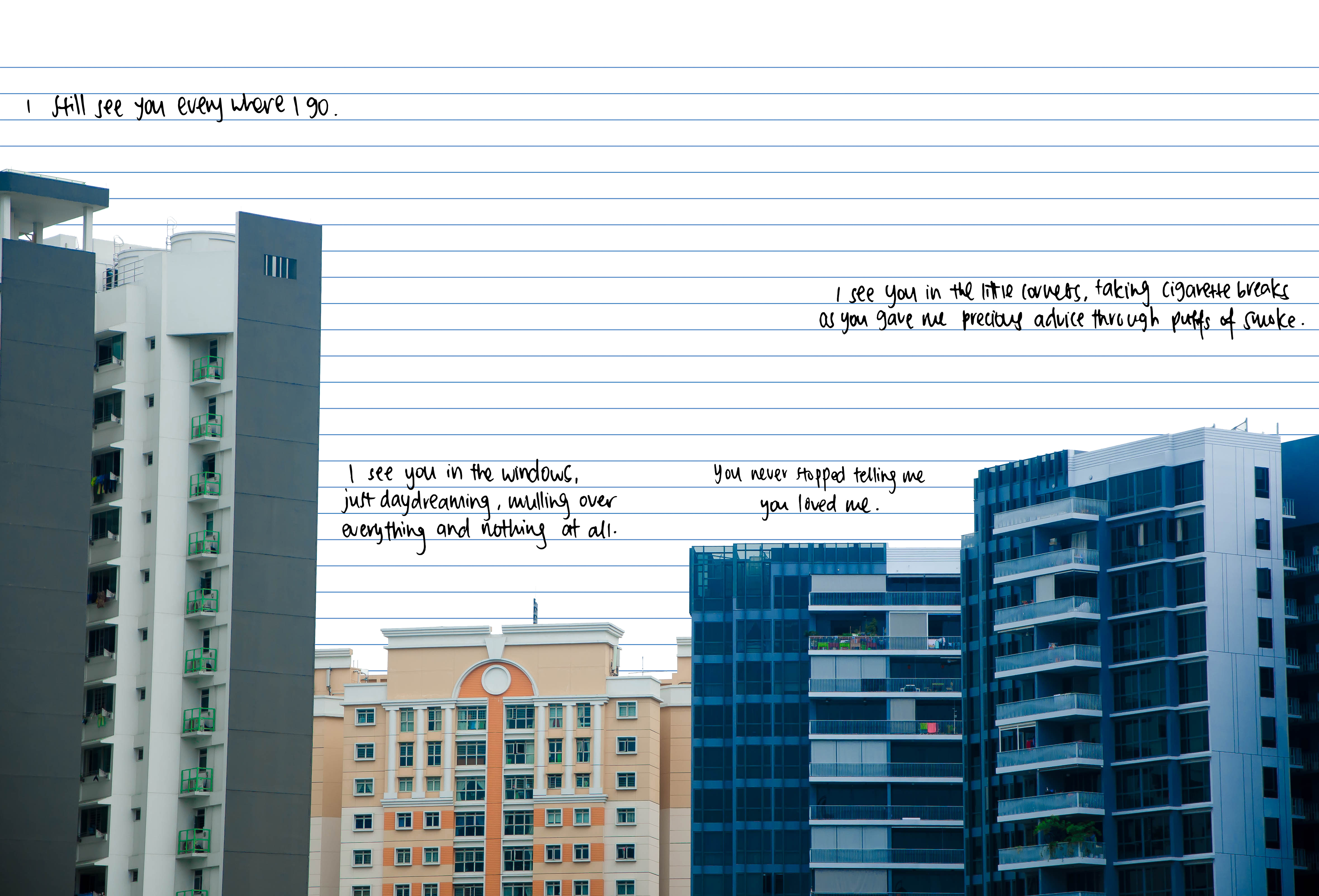
For page 3 onwards, I picked familiar sights to me in order to give the viewers an insight into my mind, of what I saw. I then used the text and narration to let them understand how I felt, and what I was feeling.
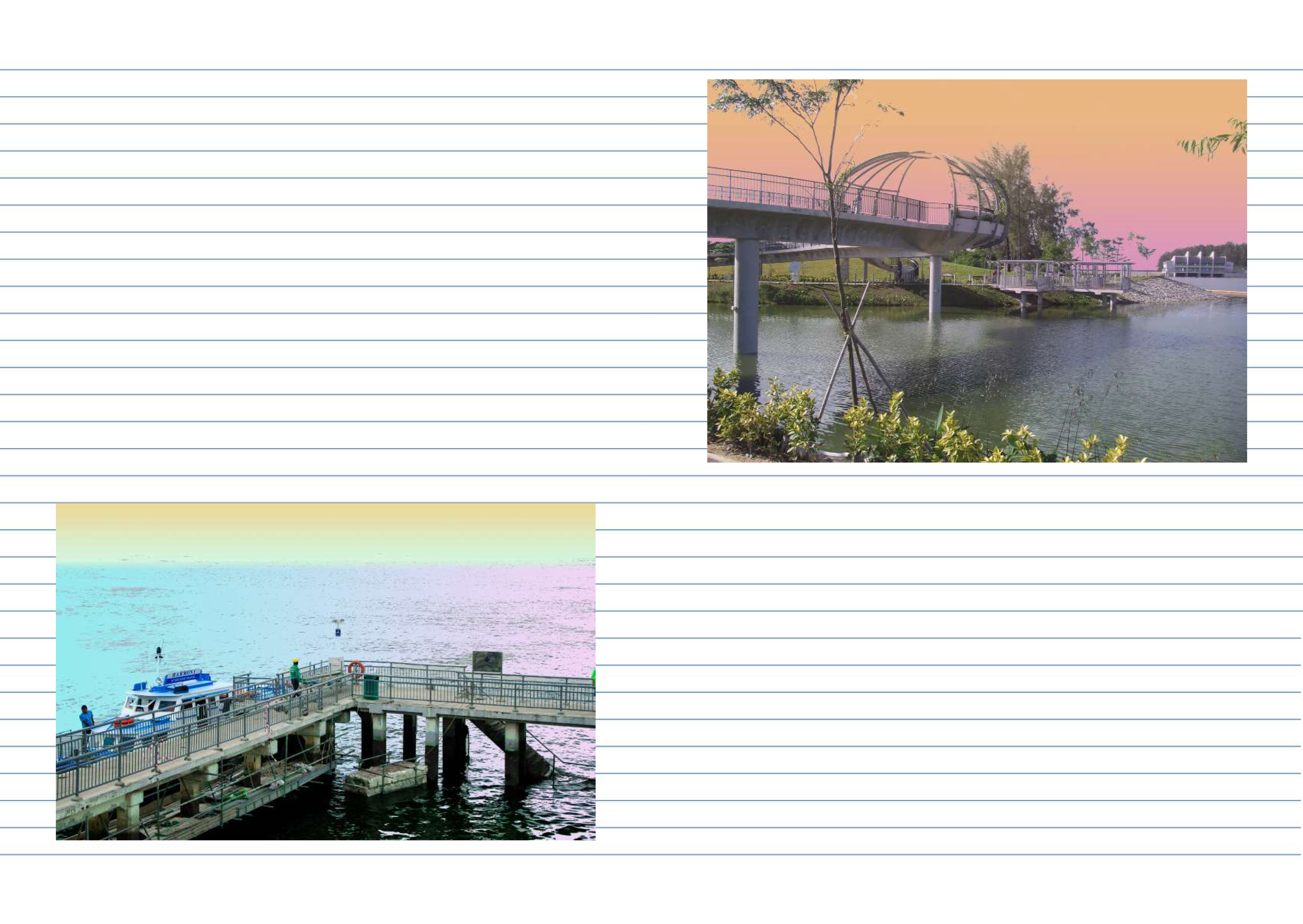
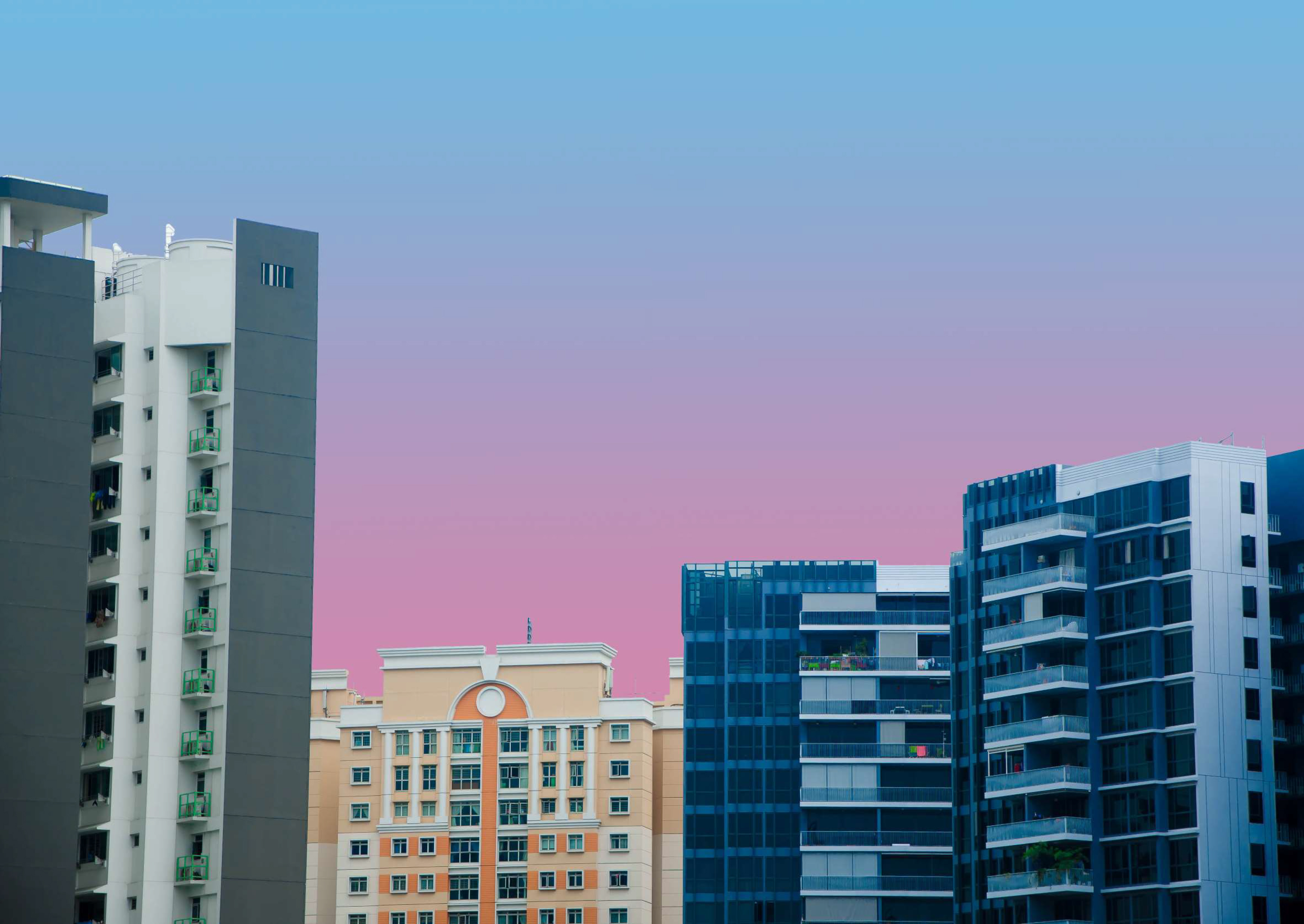
For pages 3/6 and 4/5, parts of the image were altered to have a different colour palette. It was mainly large blocks of the area like the sky or the sea. This was because I wanted a very ethereal effect to it as if the whole time it was like a daydream. Also, the colours chosen were quite light, the reason being these images initially were supposed to be superimposed as the backdrop for each facing page, and the text was supposed to go onto the picture directly. However, I decided against it as I felt like photography isn’t supposed to be the key focus of the zine, and it is also not my strong point either. Despite changing the layout, I decided to keep the altered photos anyway.
After which, I had to explore the font and how I should arrange the text, so that it is able to convey the subtle emotions within my narration through the whole zine. I asked Mimi if I was able to write directly onto the zine, which I can’t. Because my own handwriting makes the whole theme tie together as very personal, I had to work my way around that and figure out how I was supposed to do so.

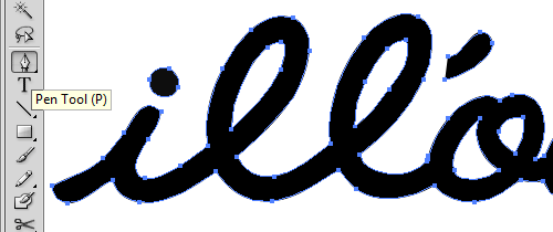
So I went on to ideas like creating a font with my own handwriting. I figured that I was able to do so through a website that gives you a template to write all the alphabets, which you then scan as a digital copy before uploading it onto the site, where it would convert your handwriting into a font! It was through myscriptfont.
This is an example of a template.

And this is an example of what it looks like after I filled out the blanks!

Because it was difficult for me to find a time to head to ADM to scan this template, I was not able to use my own font in time for the consultation with Mimi. Thus, I picked a script font that most similarly matched my handwriting, and play with the layout of all my texts.


For the consultation, Mimi seemed to like, or the very least was ok with the design because of the theme of it being a diary. However, 2 major opinions she felt needed to change was:
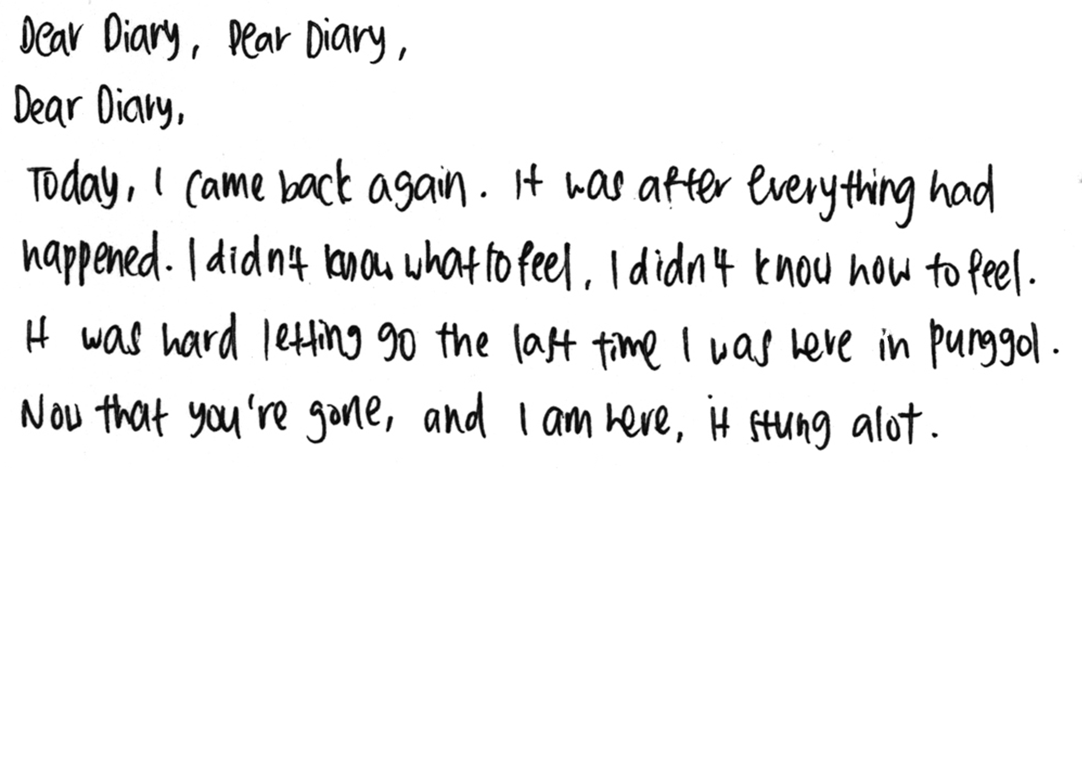
Some examples of my scanned handwriting:
After consideration, I did follow through with point 1, but for point 2 I only added drop shadows to the image to make it less flat. I did not add the decorative elements mainly was because I did not have any, and it seemed weird to me to fabricate some. For the scotch tape marks, I did not know how to properly add the visuals onto the image, nor did I have the time to explore before test printing, hence I did not go through with it in the end. I would rather exclude things that I cannot make look nice aesthetically, than to sloppily place something there to add more visual elements for my zine.
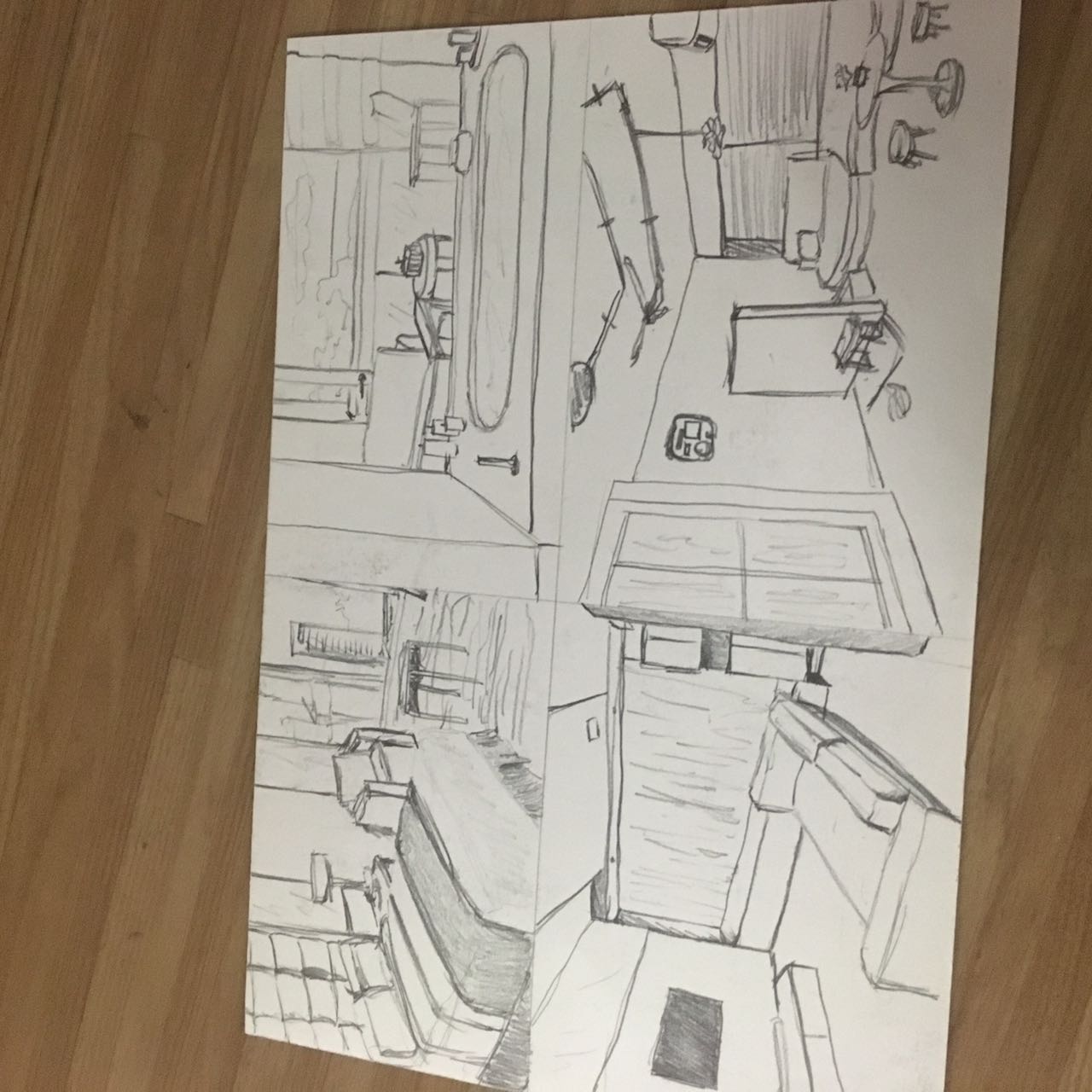
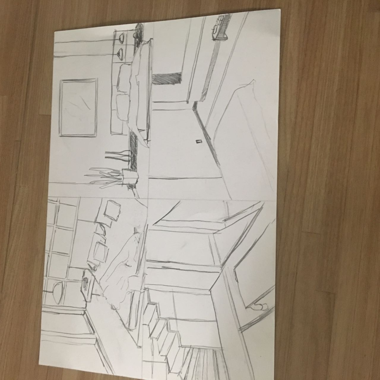
Thus, this is the final result of what my zine looks like.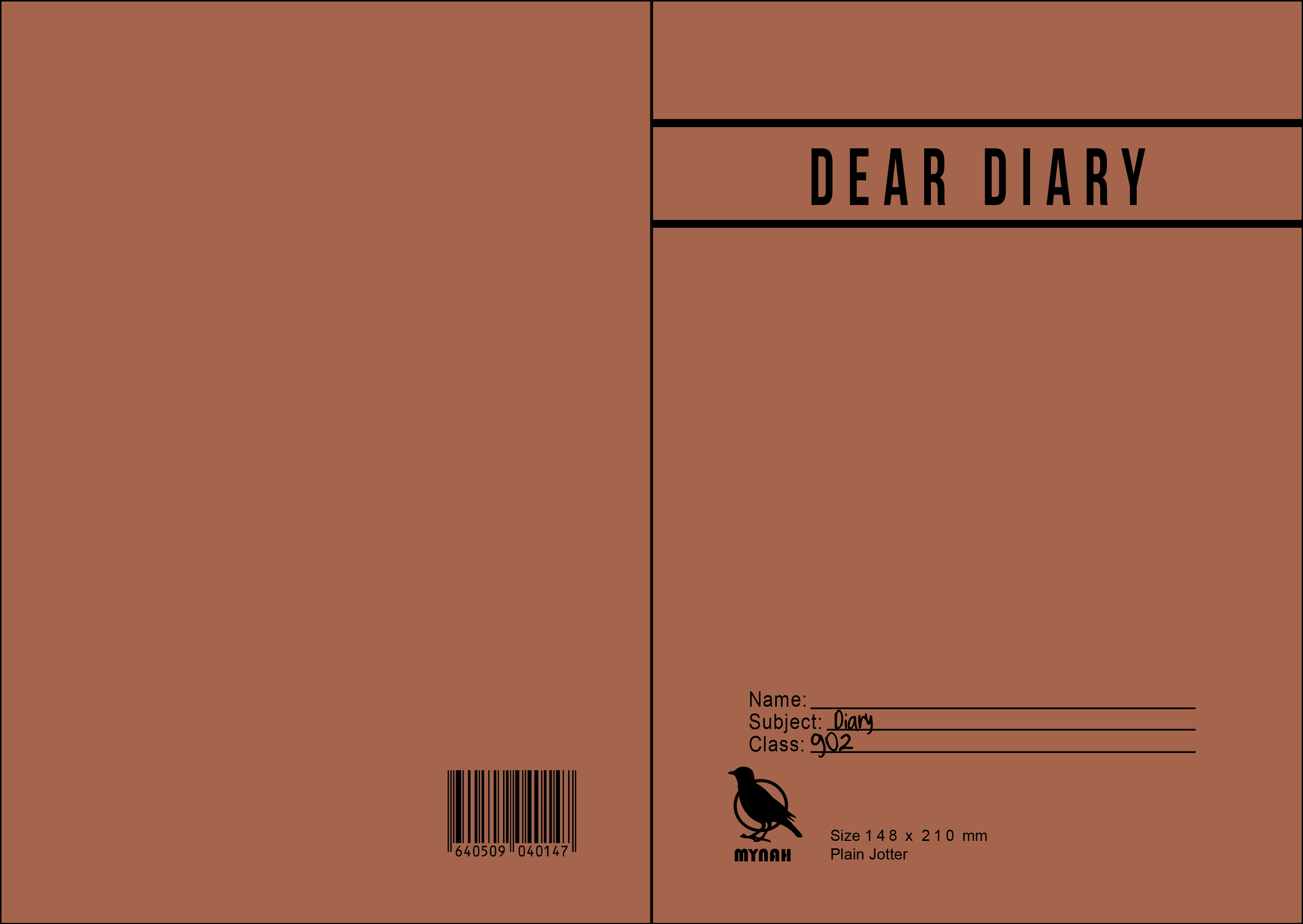
For pages 4/5, Mimi also advised to remove the pastel background and replace it with the jotter lines to still keep the theme because for those pages, the lack of it made the whole zine seem off. Overall, I like the whole idea and layout of my zine, and I am very pleased with how it turned out in the end (:
And now, it’s only left the binding for my zine!
Stay tuned for my very final (probably very short also) post on ZINESSSS.
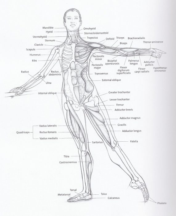
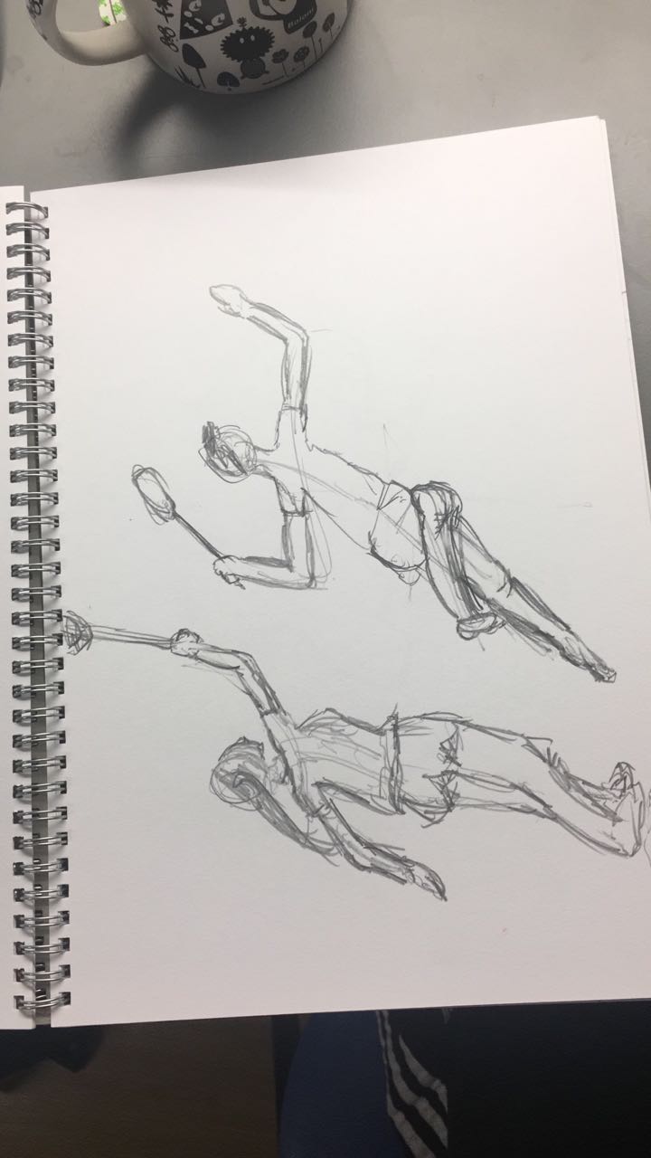
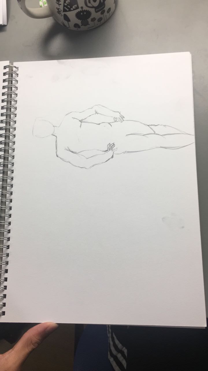
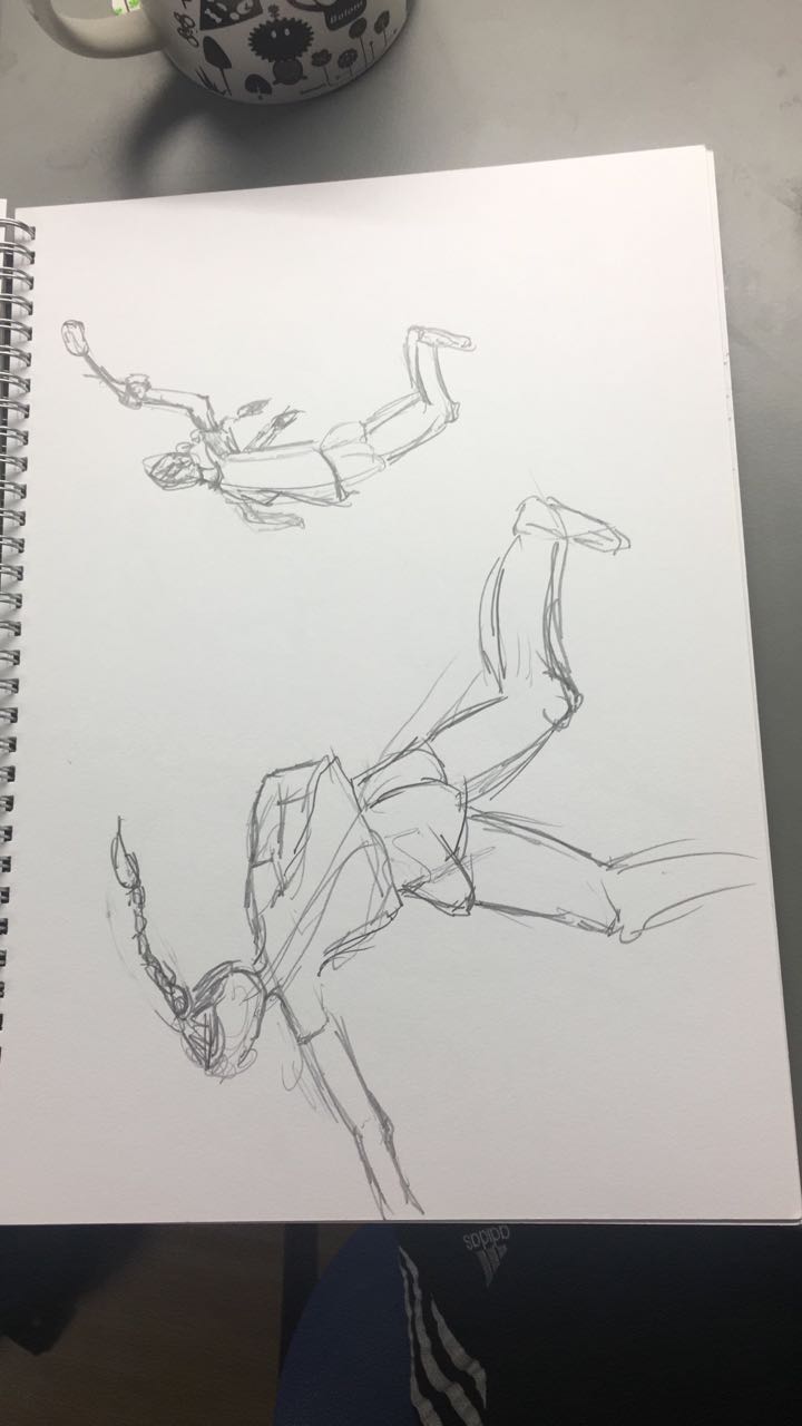
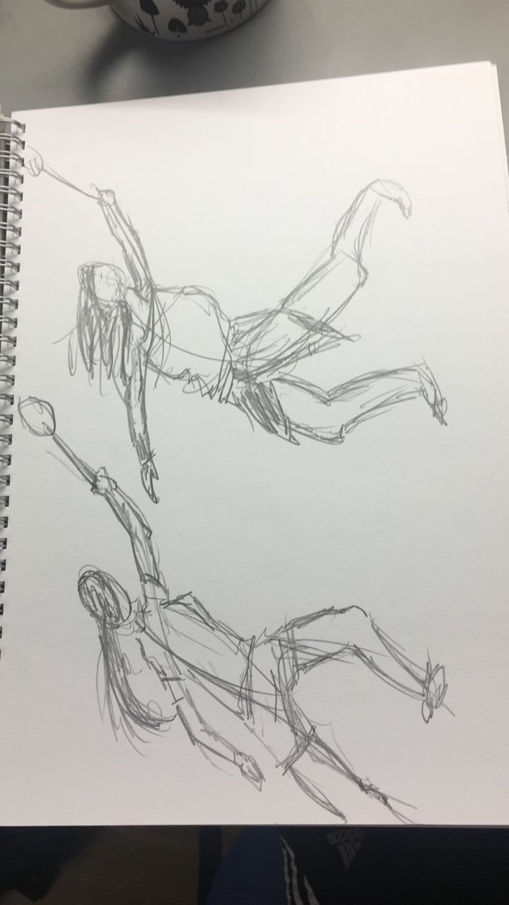
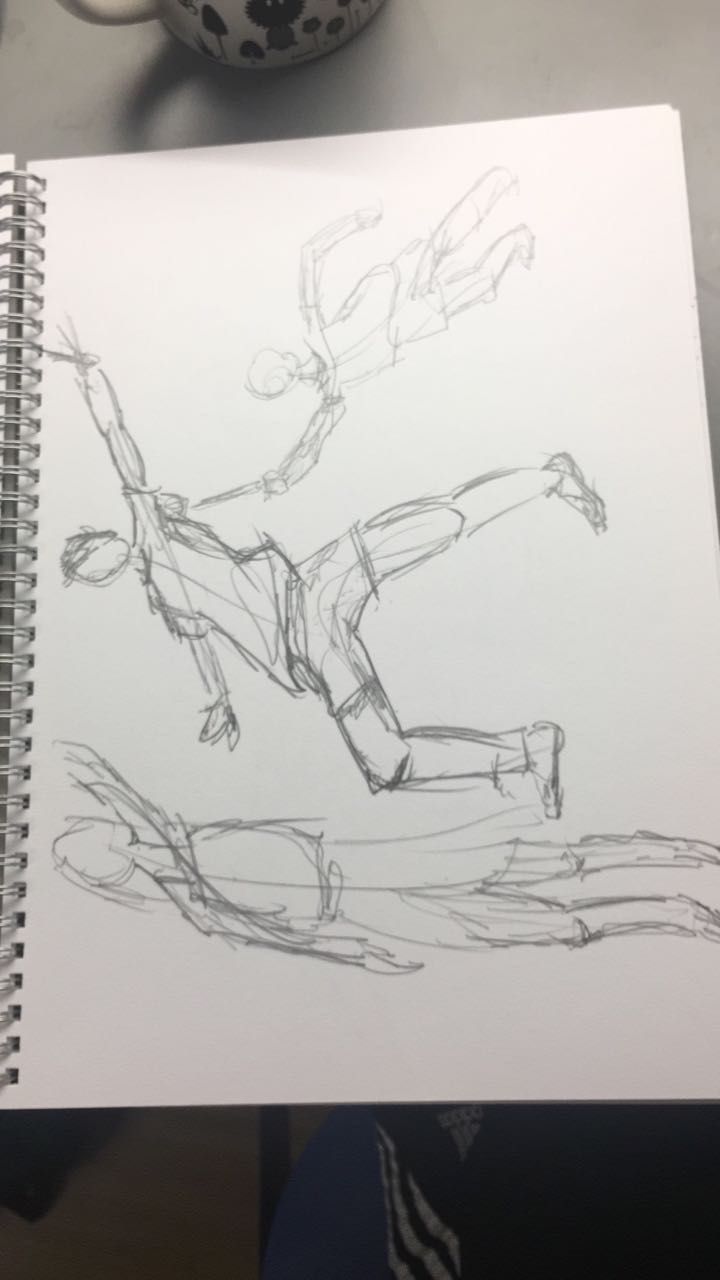
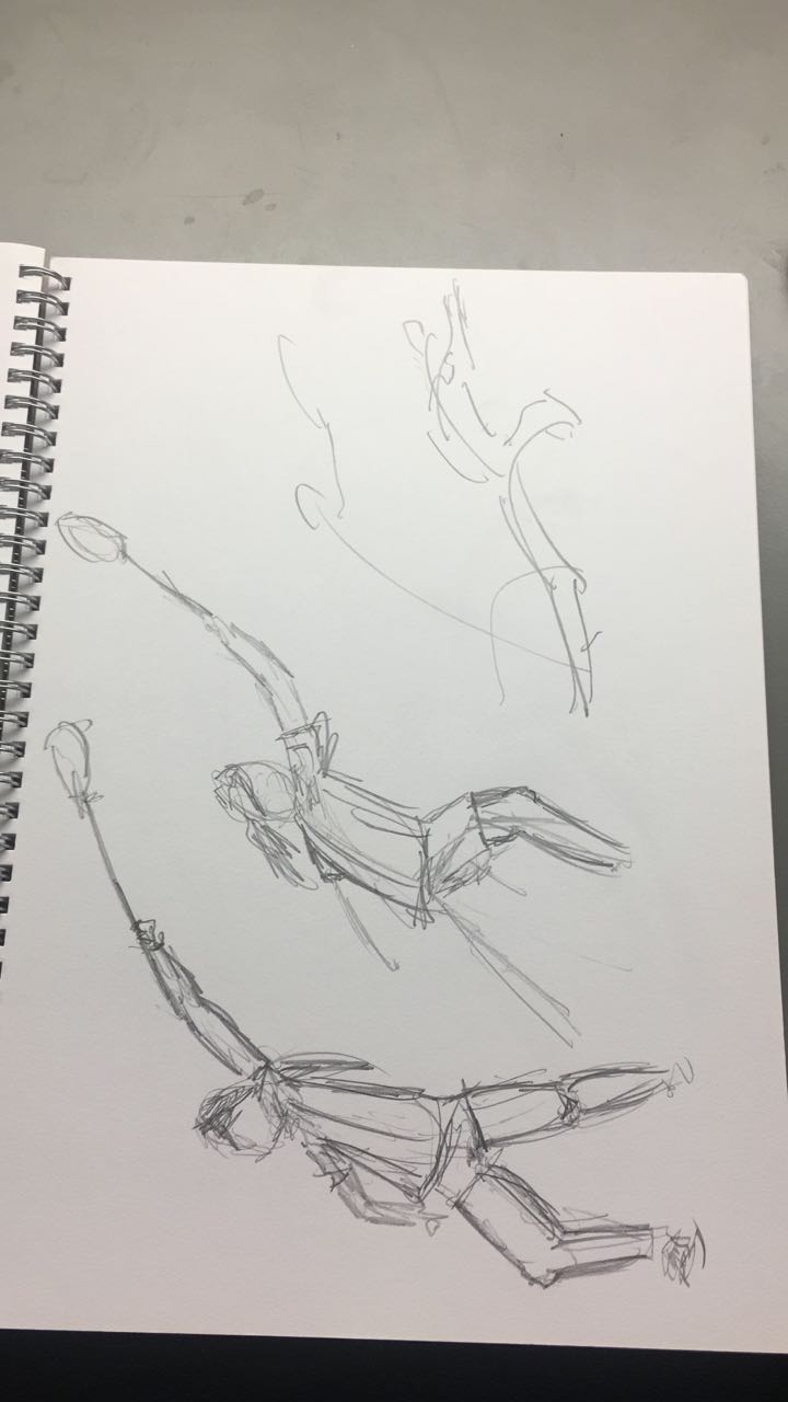
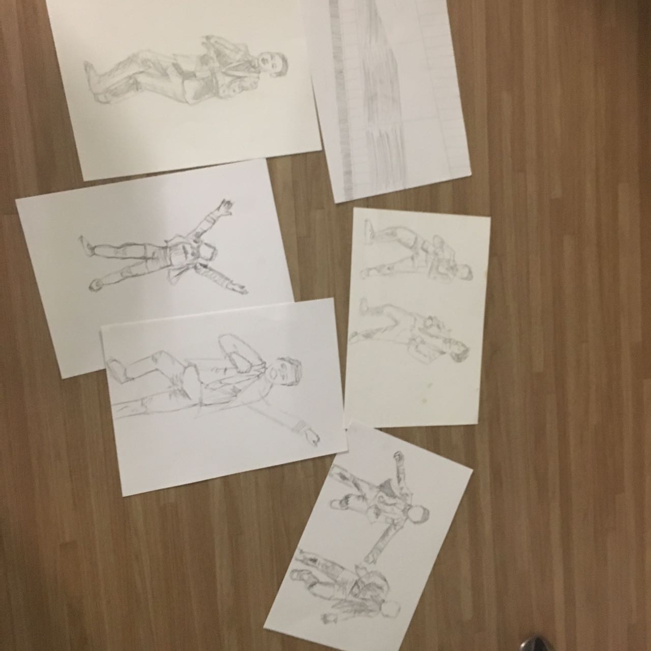
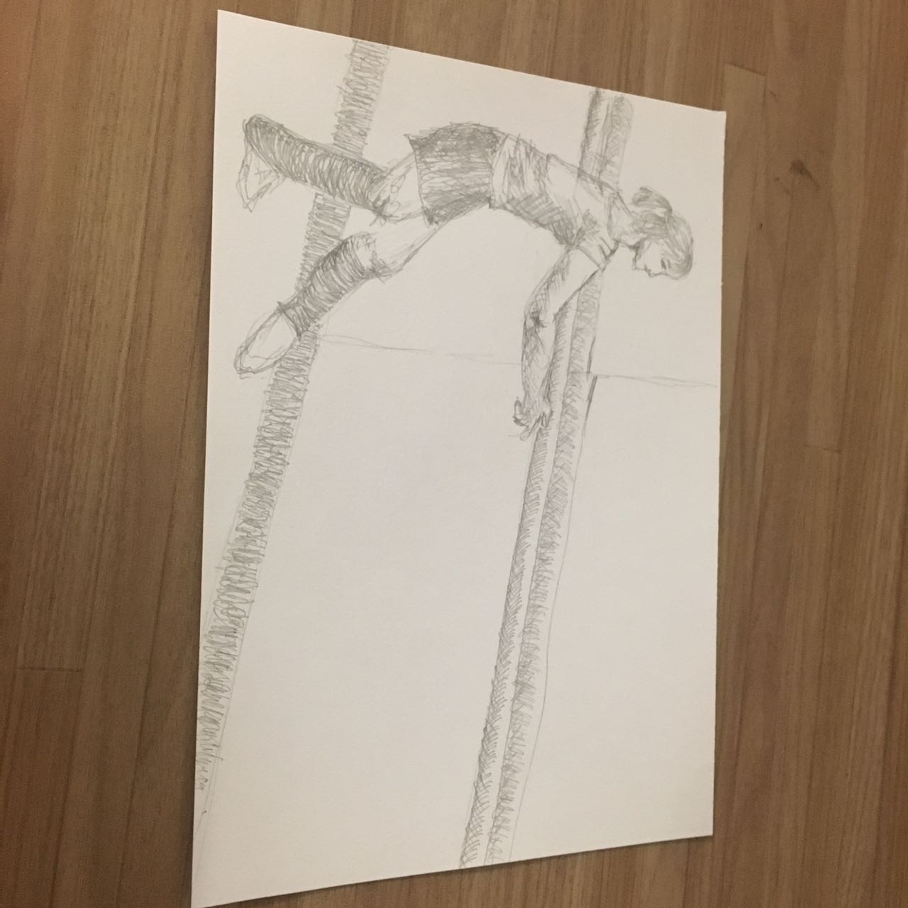
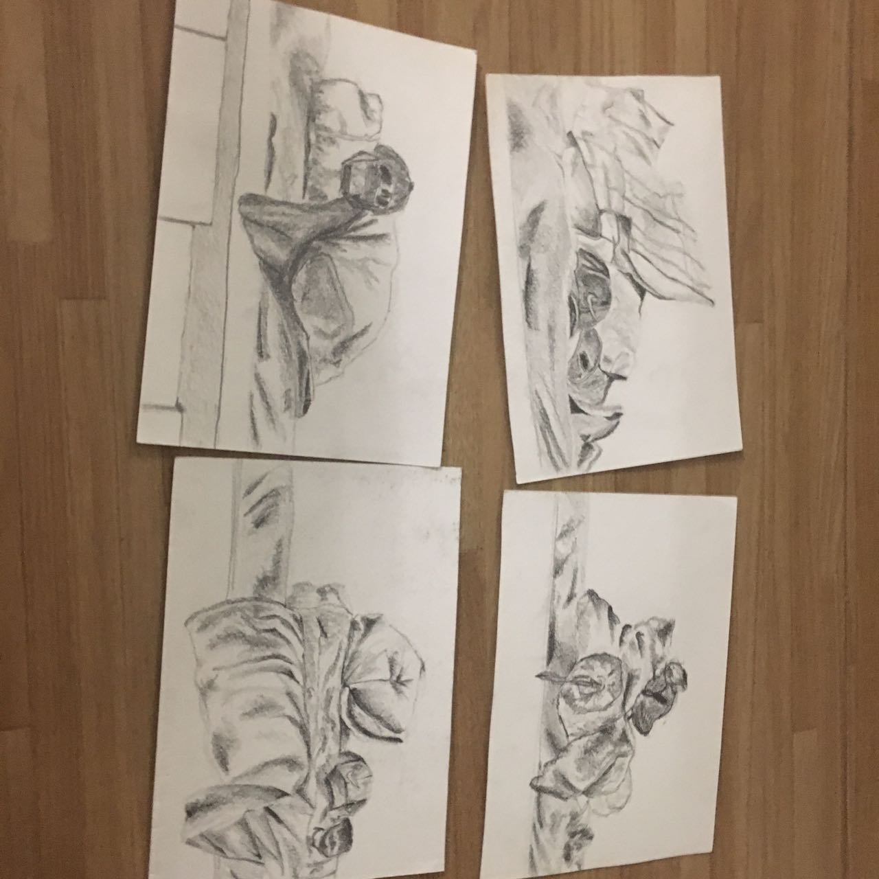
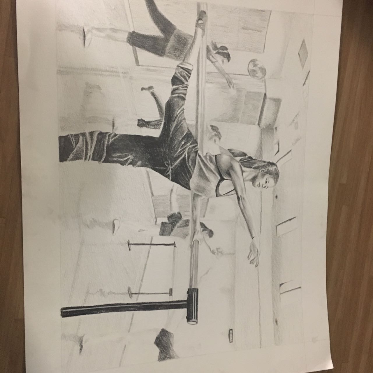
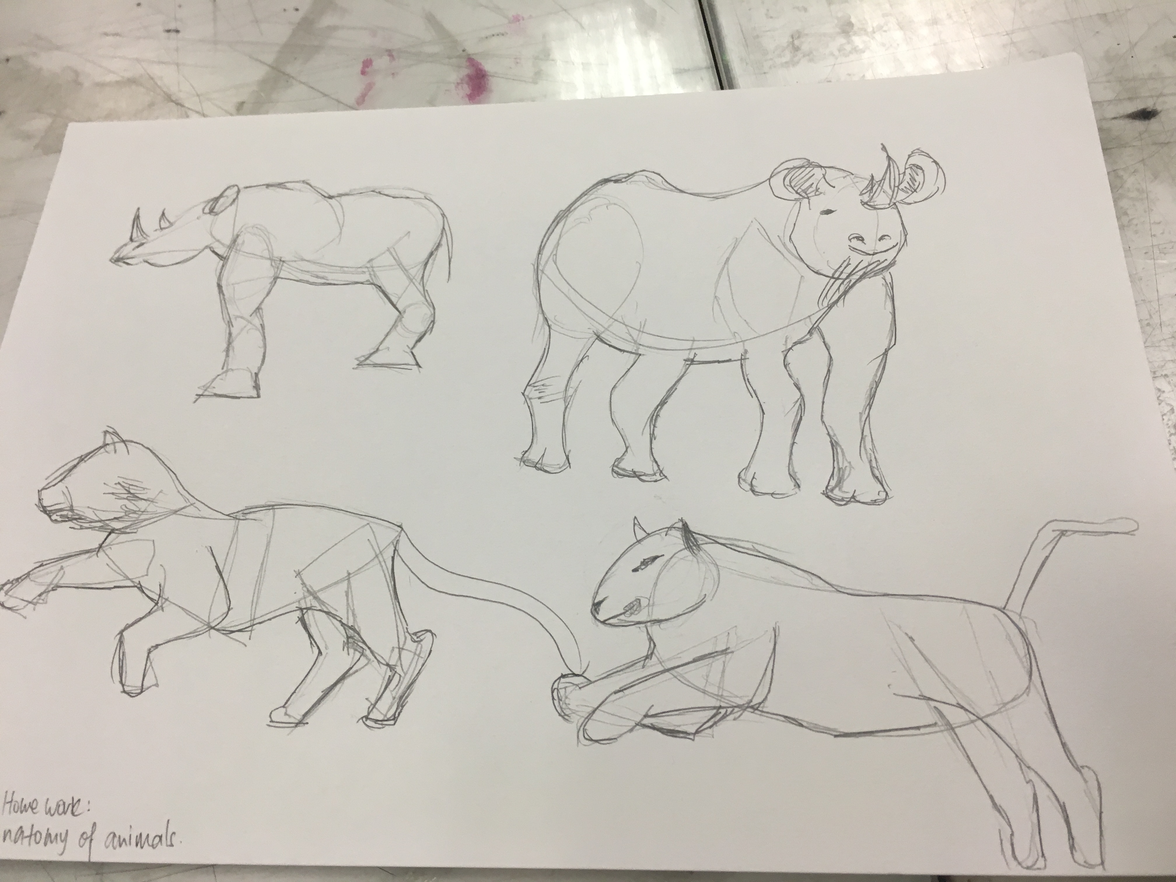
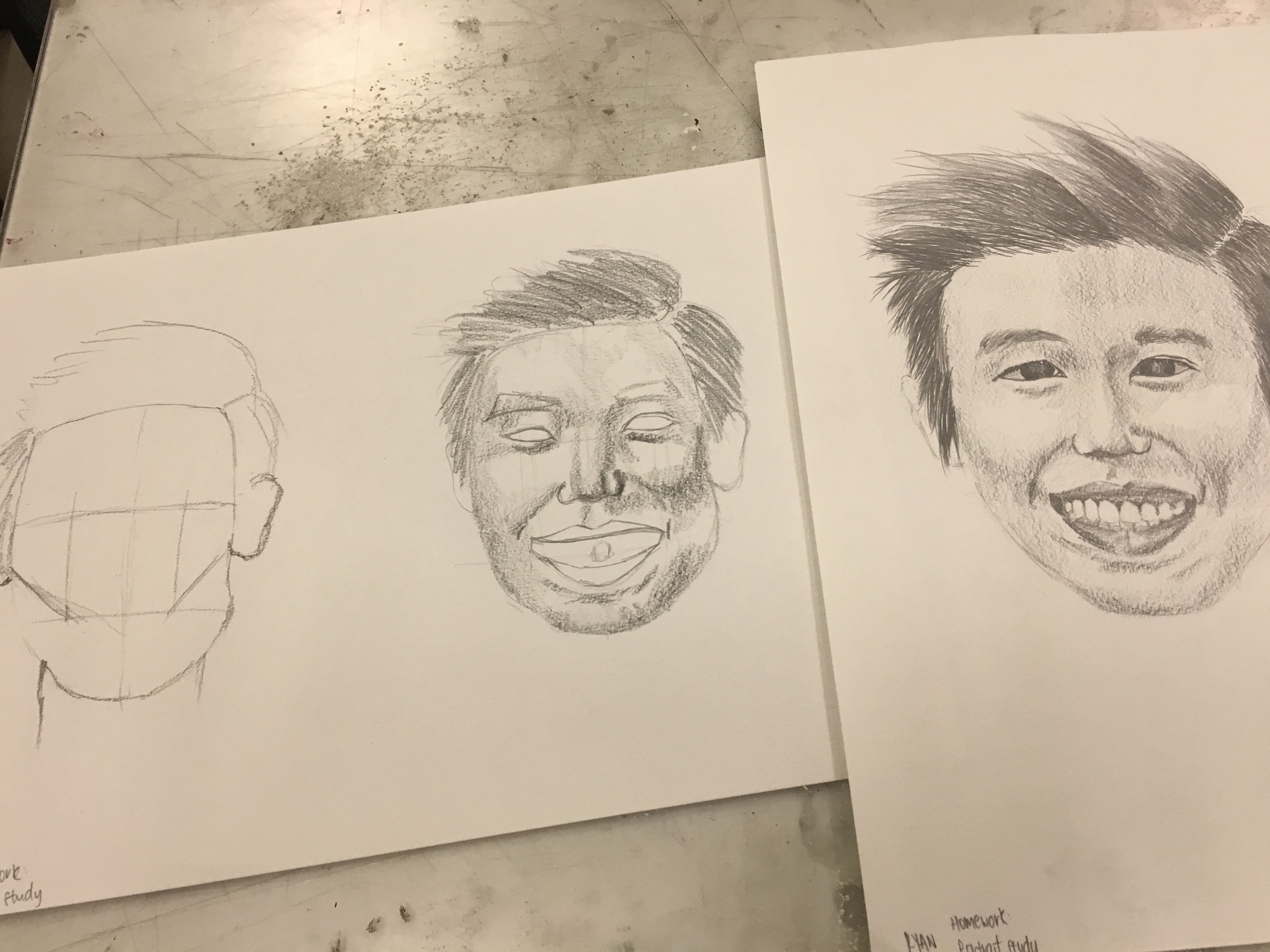
So, for our final artwork, Professor Woon Lam has given us the liberty to decide and compose an image in any medium we want for our final piece. The catch is that all sketches exploration and the final piece’s size should total up to A1, the other is to encapsulate all that we’ve learnt about human anatomy this semester. In a bid to understand what I want, I must first know what are my options. With that, I took to the internet to go find out more on what I can understand about the anatomy, before I begin deciding on how to compose my image.
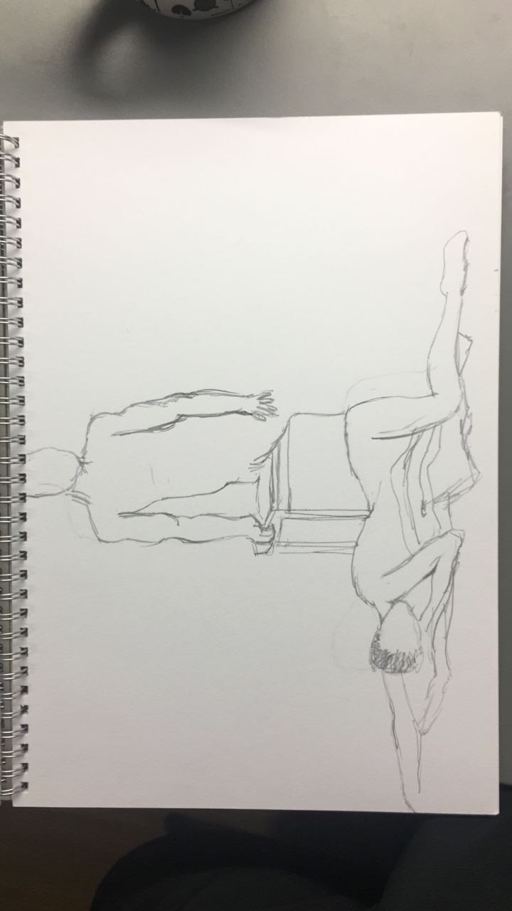
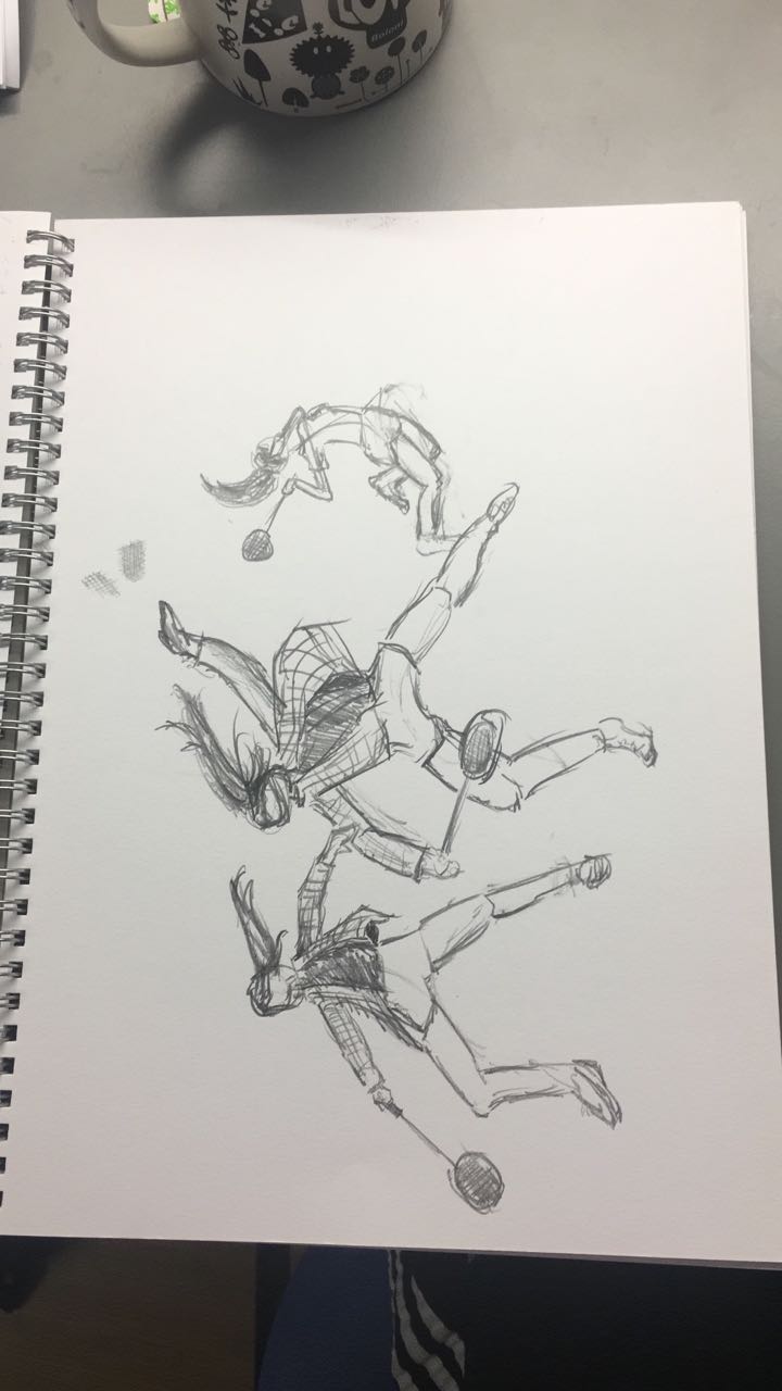
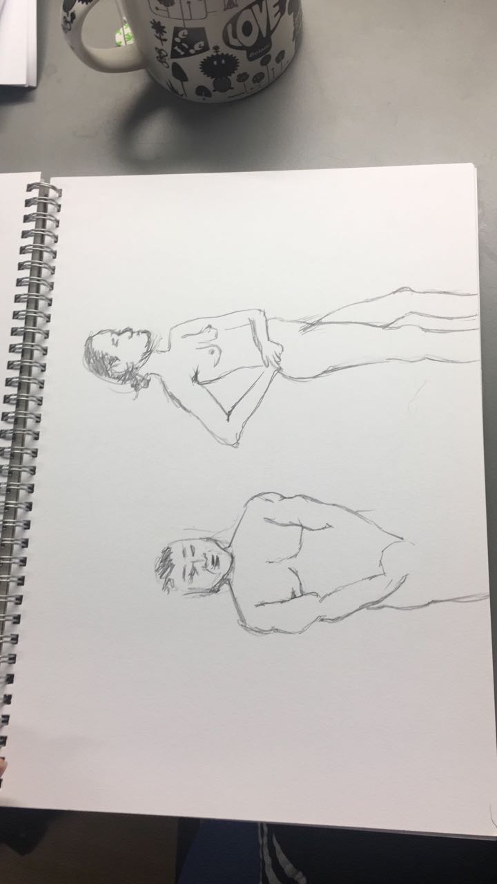
Because of my nature as a dancer, I wanted to use that as my theme in my design. When dancing, it is a way of understanding how my body works and moves physically. With this project, I feel like I can do so in a more theoretical approach.
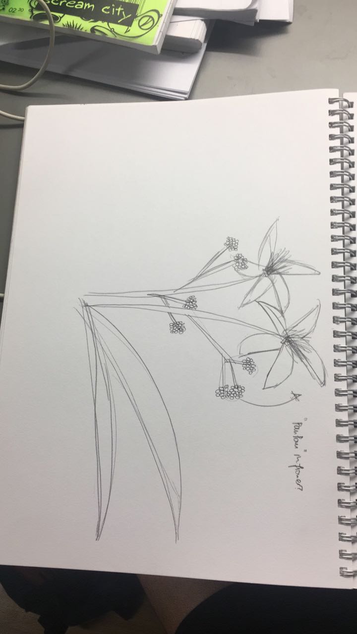
Some images that I’ve found are as follows:


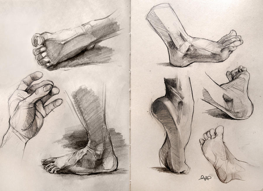
I feel like my final piece and my exploration sketches should show how I intend to delve deeper in how our joints and muscles work together, to produce visually pleasing moves, and interesting body compositions.

Stay tuned for my upcoming sketches!
noun
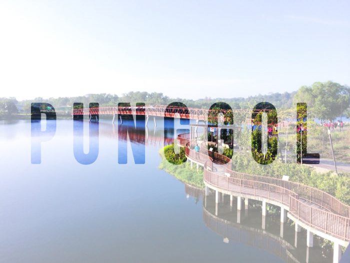
So for our latest project for 2D, we were required to design a “zine” for a place that we have been allocated.
These places can be any major towns and districts in Singapore. Examples include Jurong, Paya Lebar, Pasir Ris, Marine Parade and Hougang. Karma struck me when I was teasing a friend to get Punggol, because of its really far location, and I got it instead. At first, I was a little disgruntled because of its relative location to where I stay. However, it took me long enough to realise I had an advantage because of the number of times I have visited the town. This was because my grandmother stayed there and I always visited on the weekend.
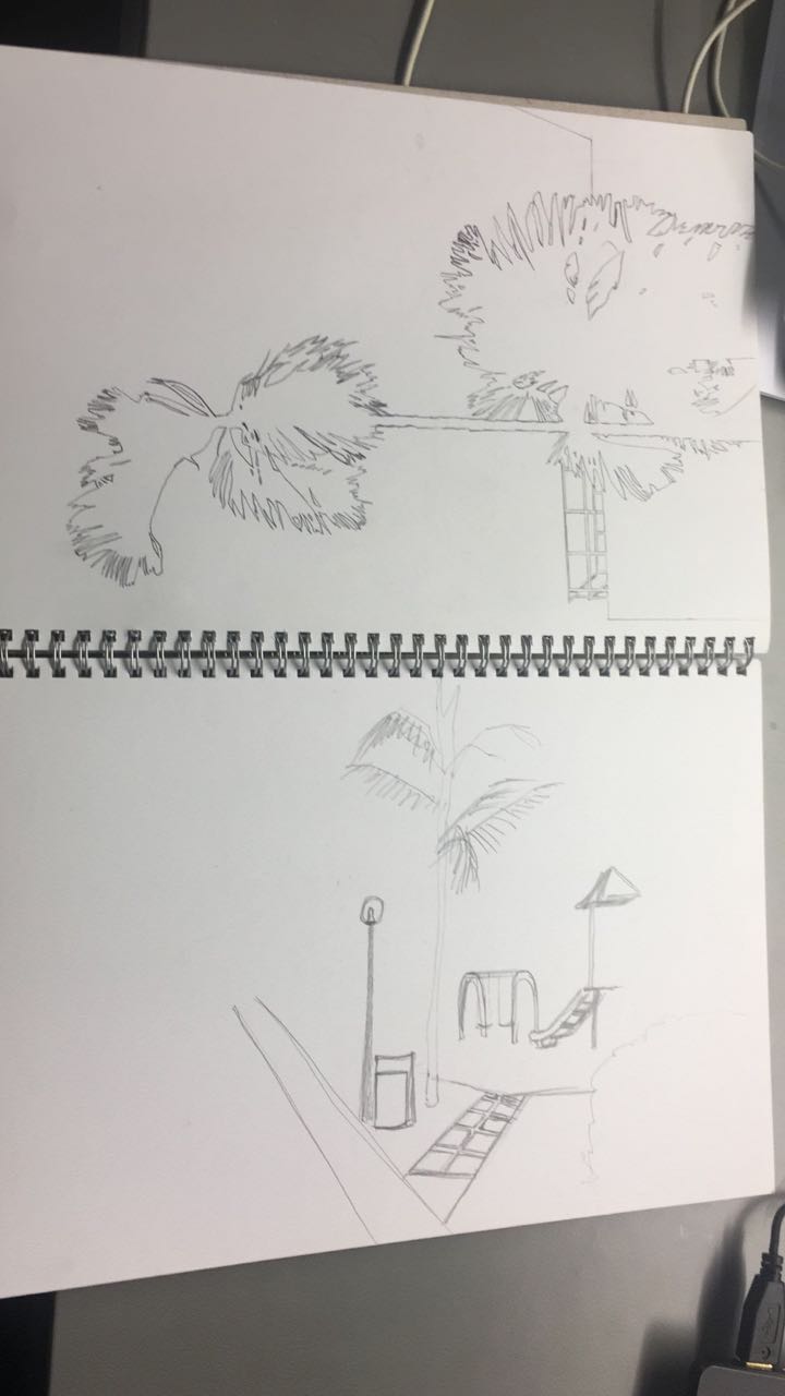
So I paid a visit to Punggol on one of the days where I had no class. Here are some of the photos that I took.
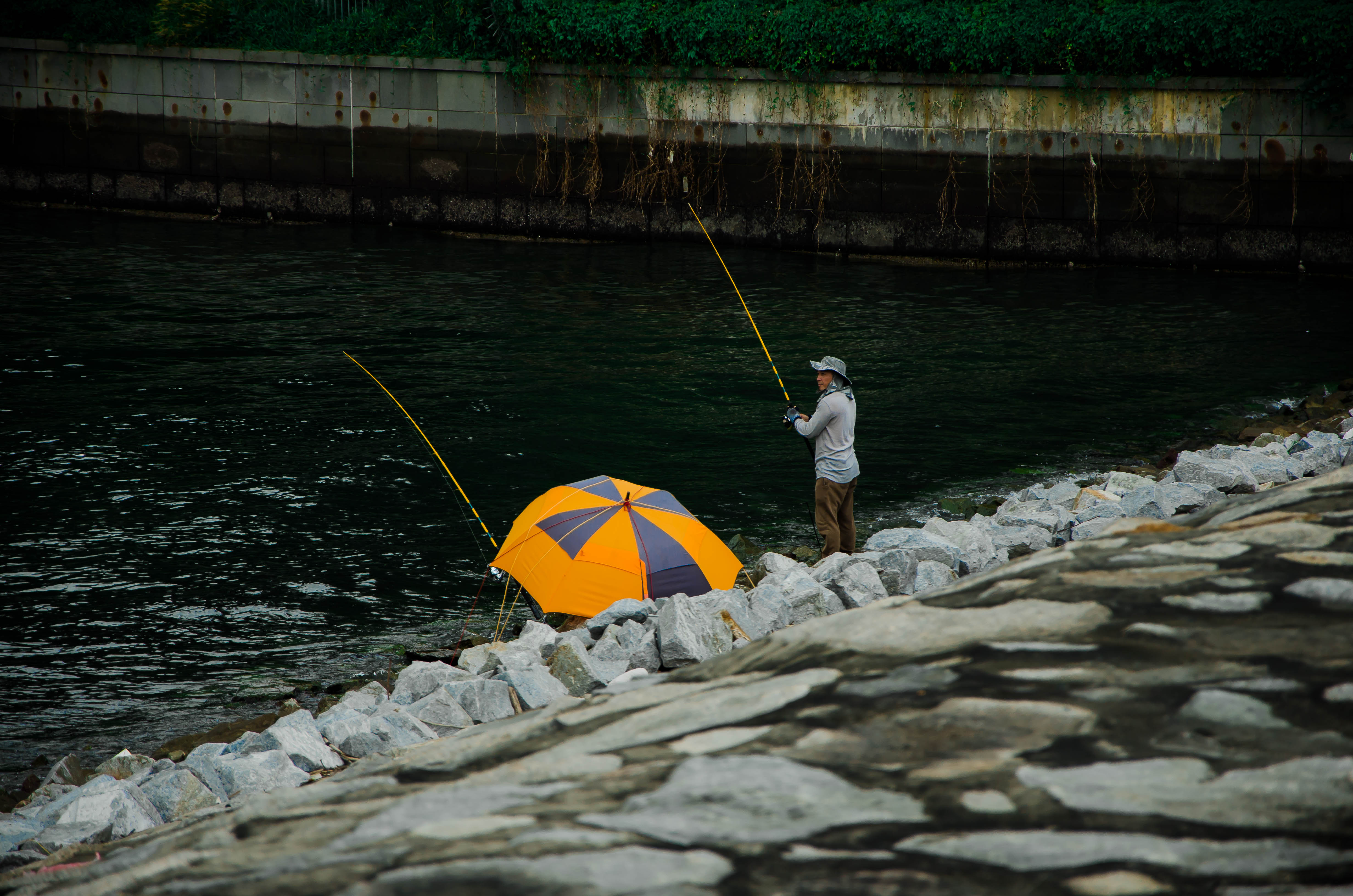
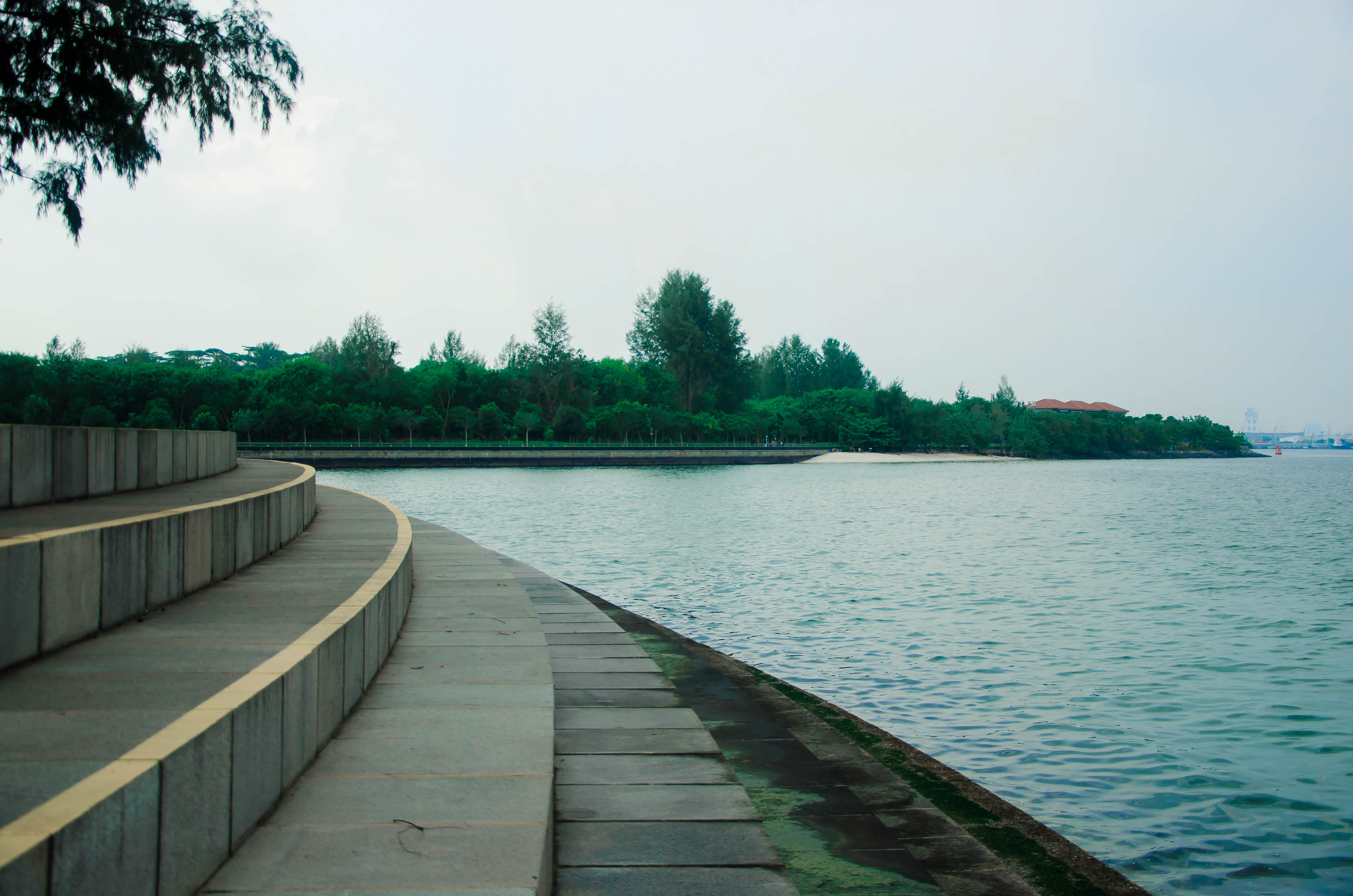
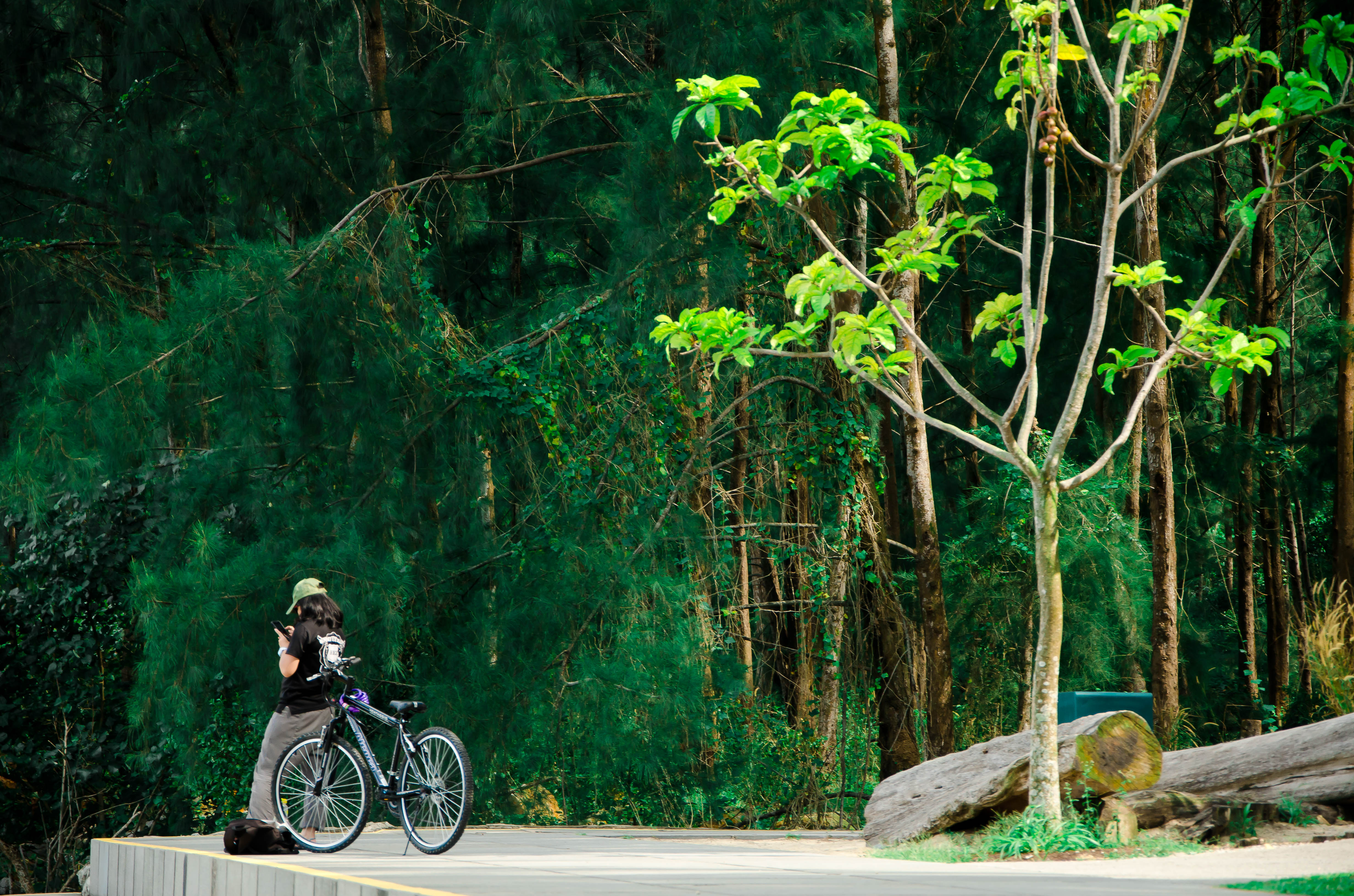
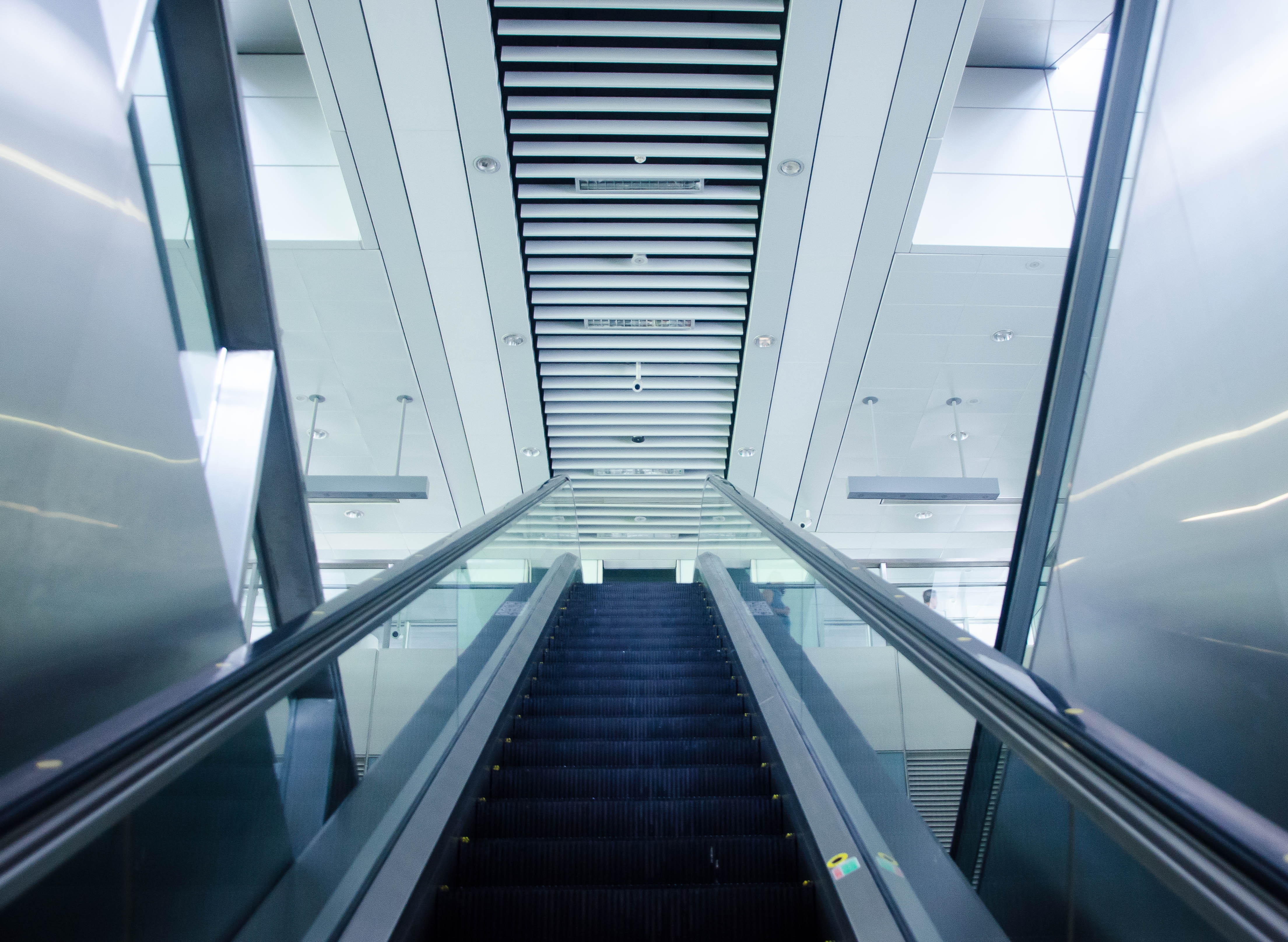
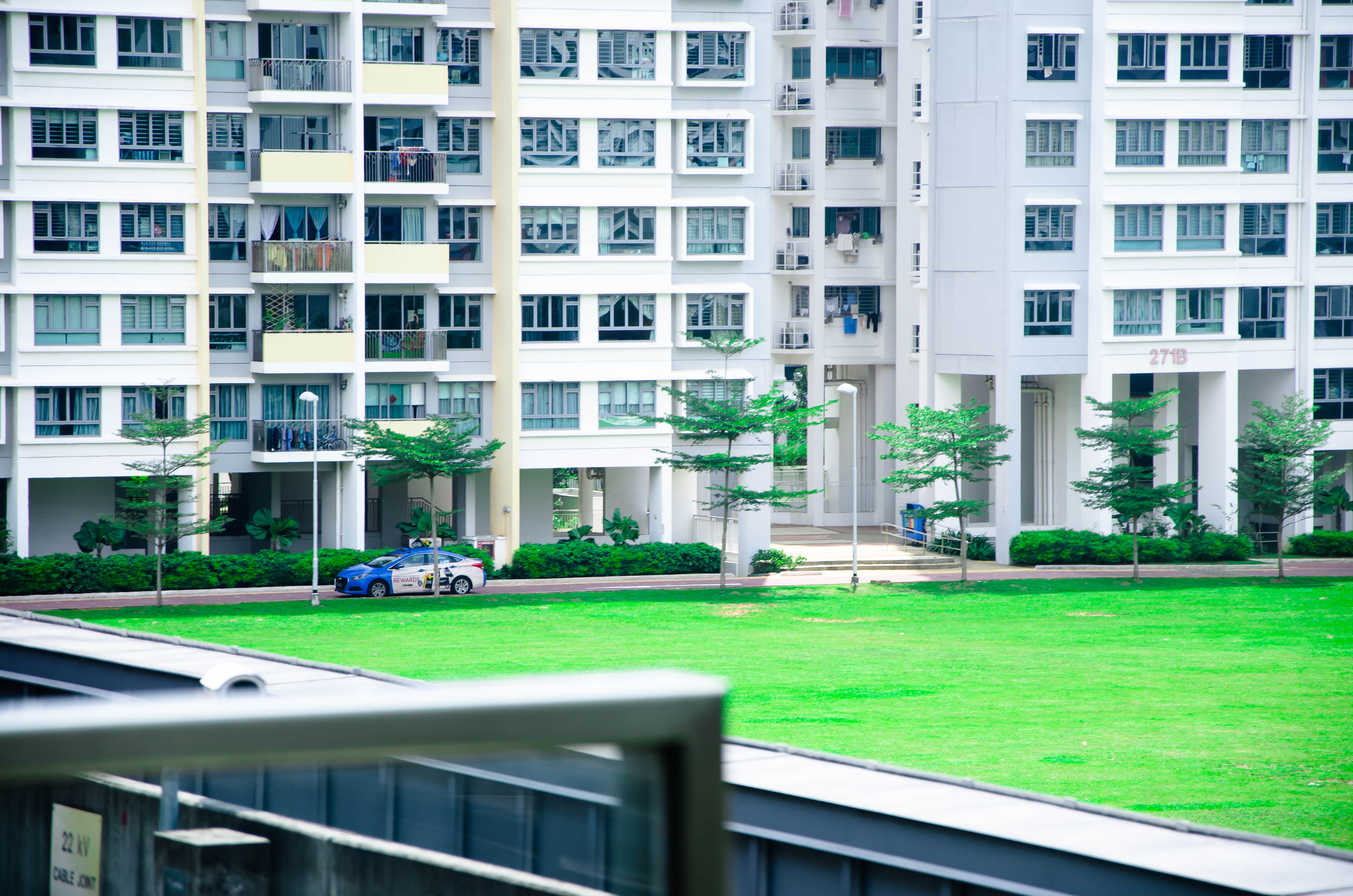
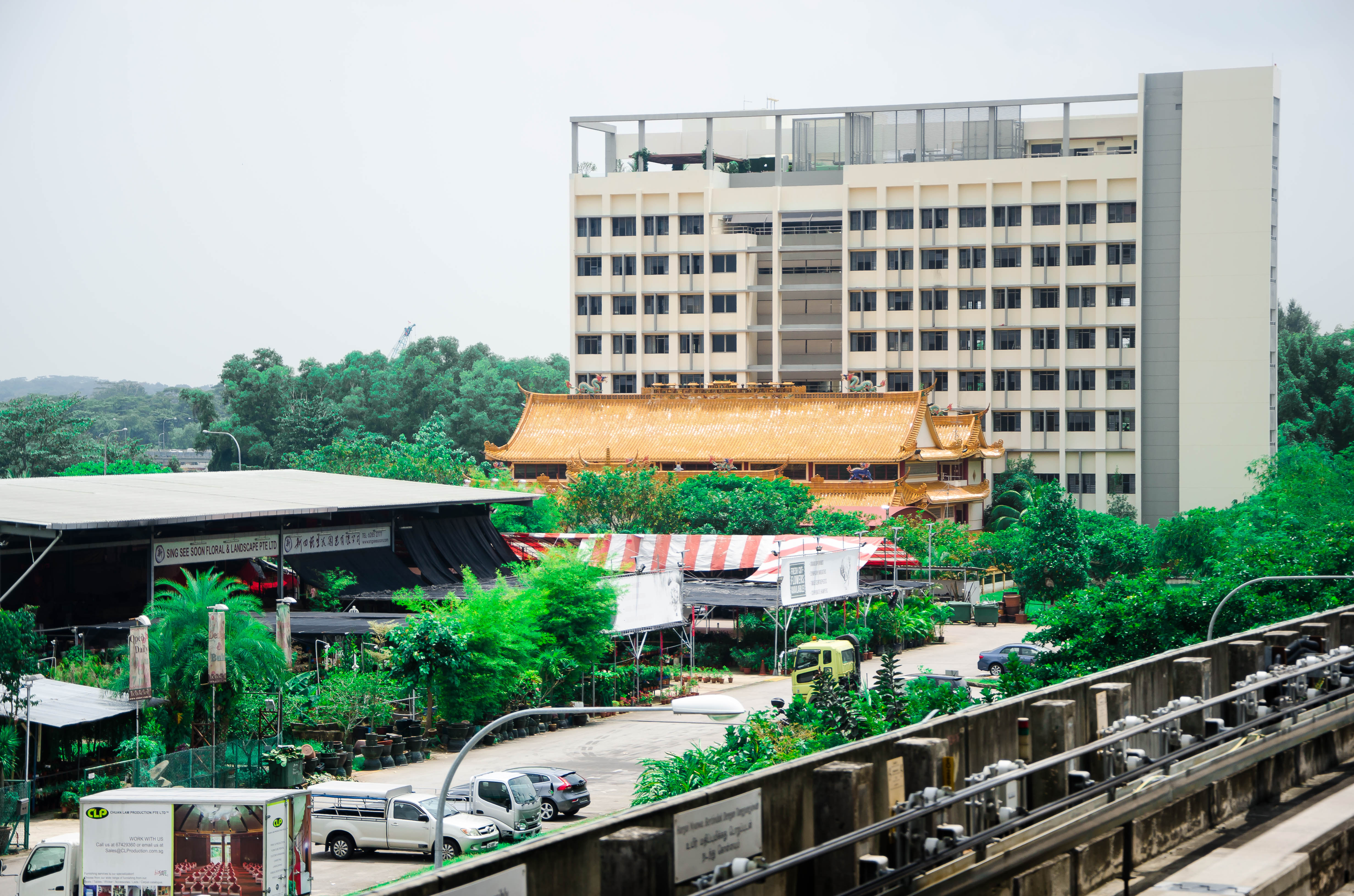
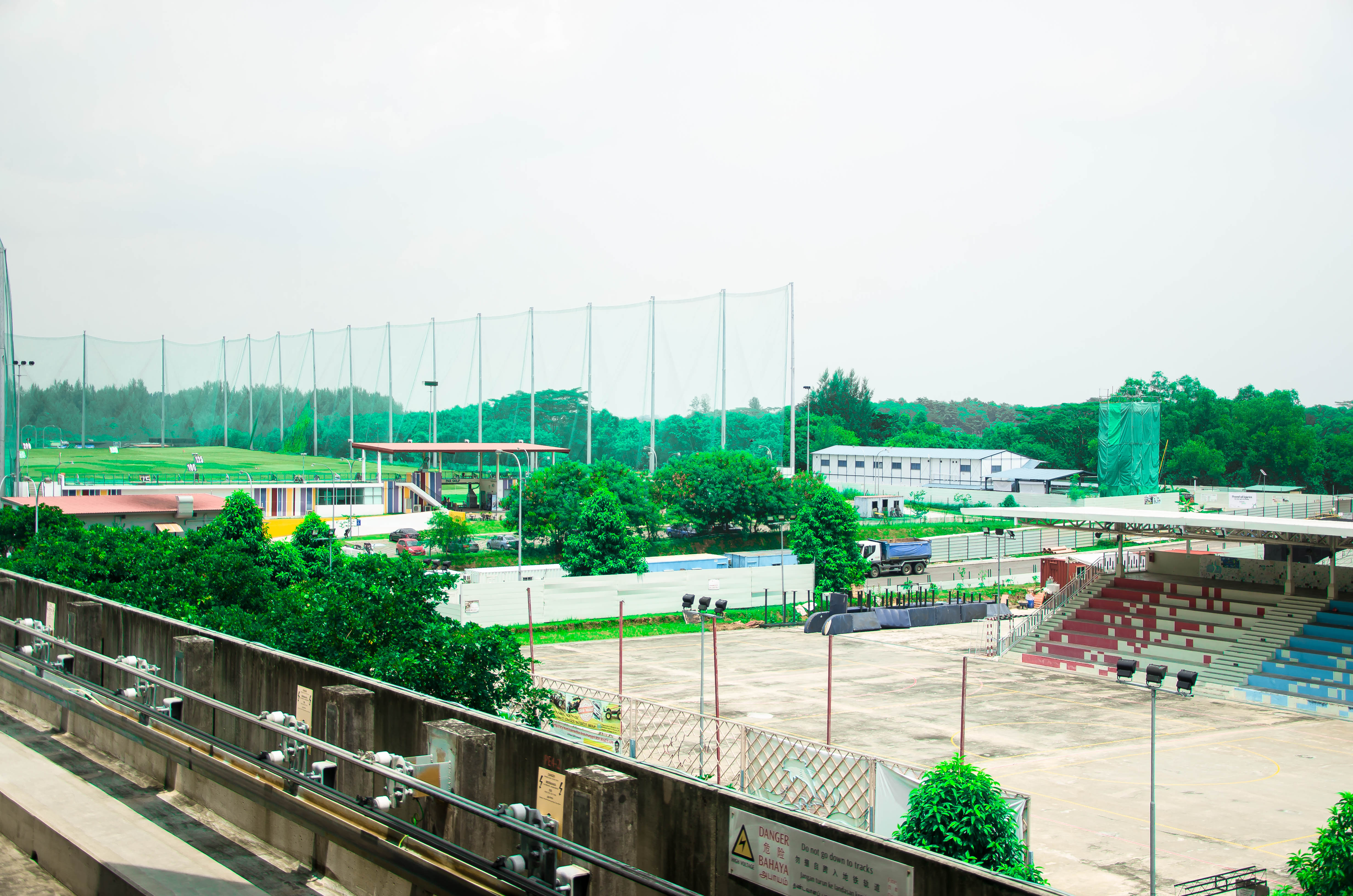
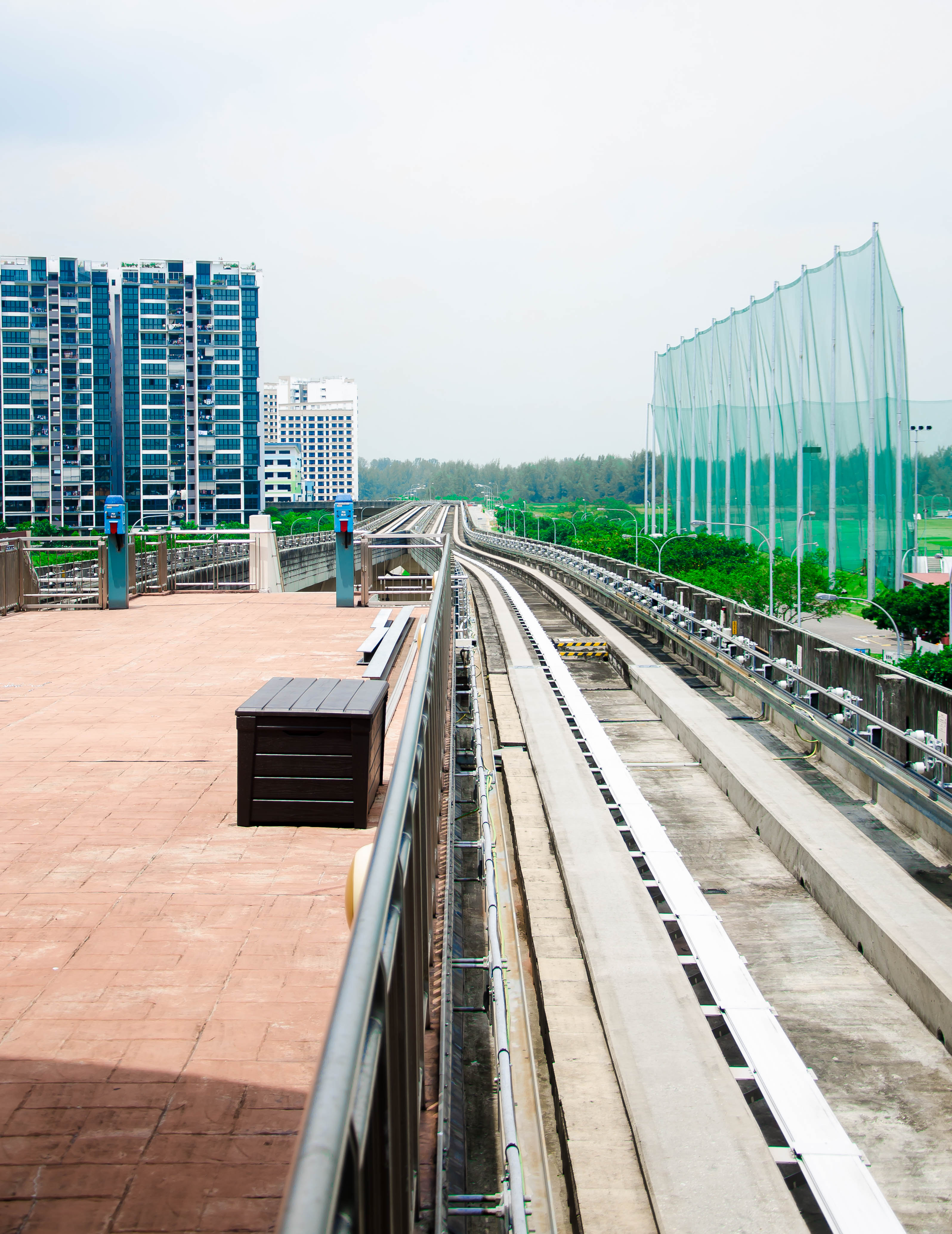
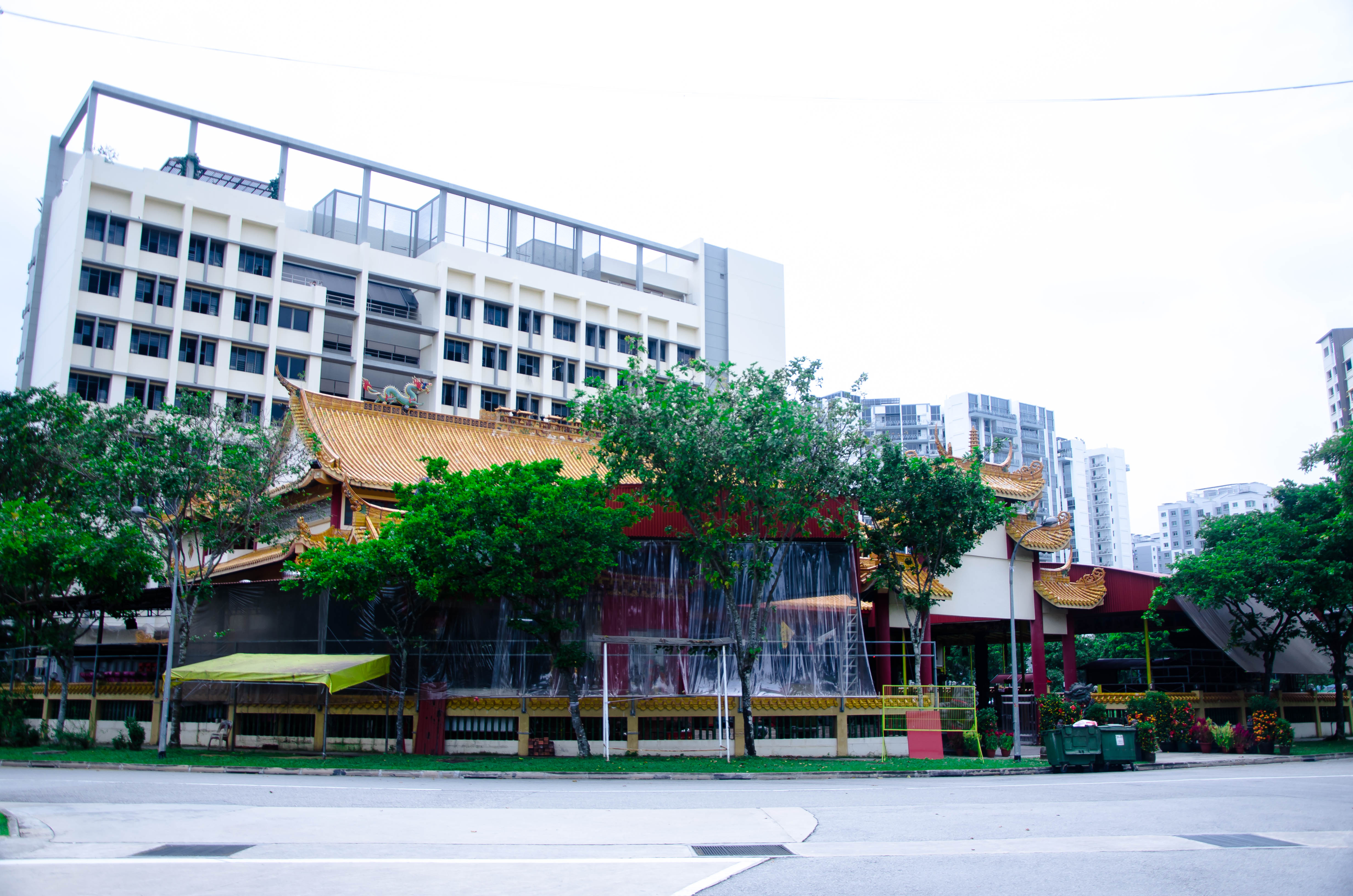
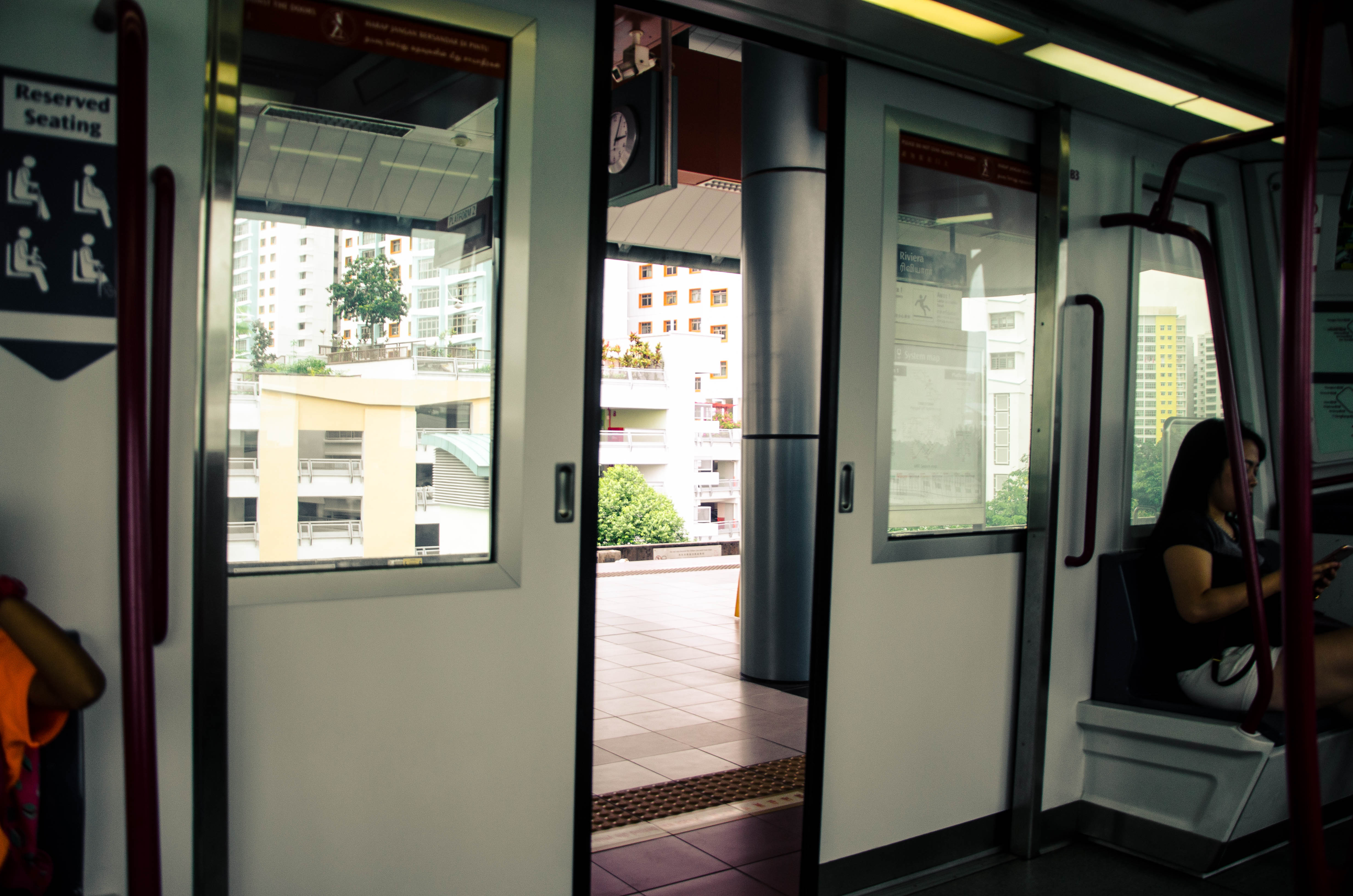
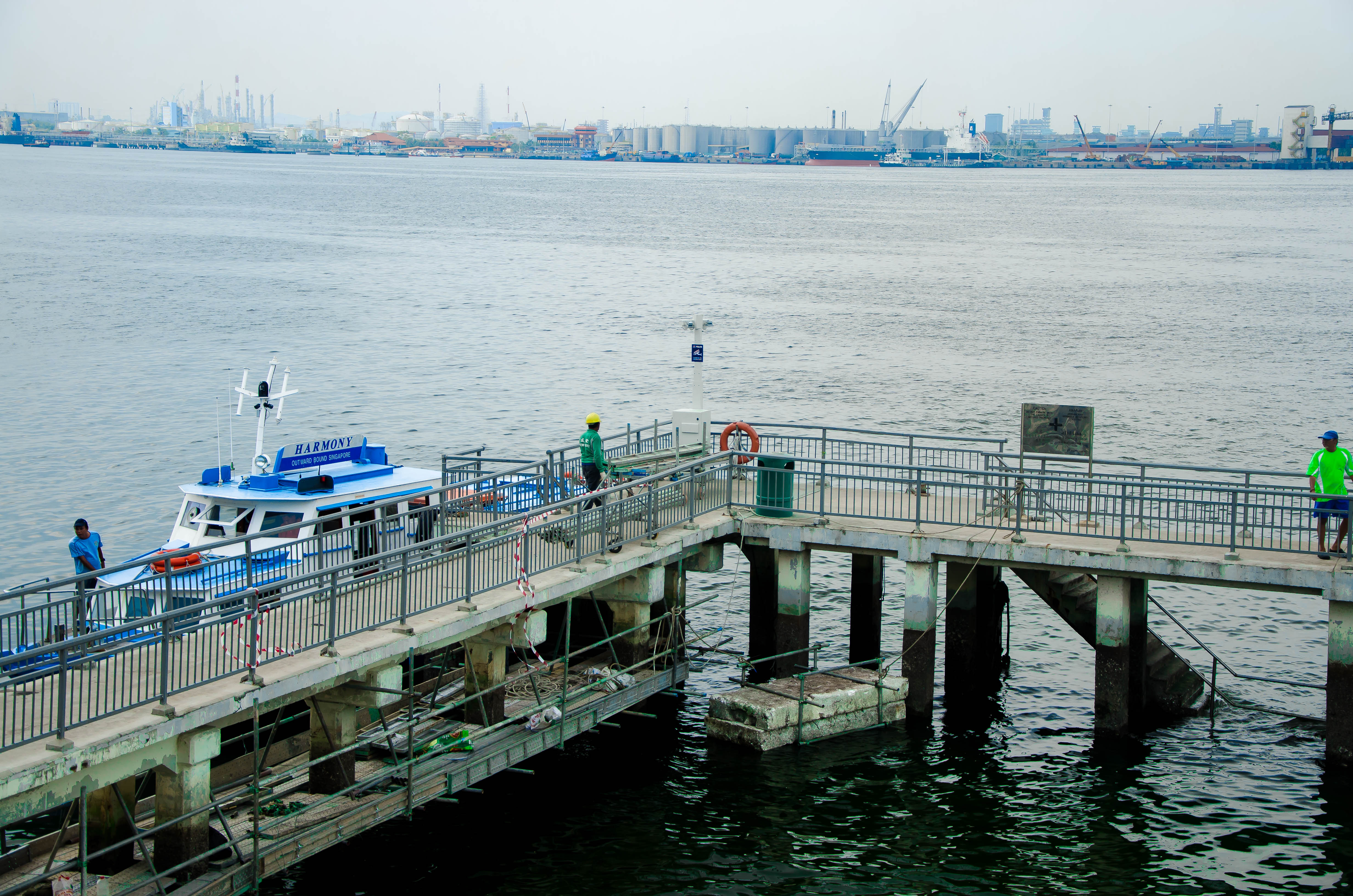
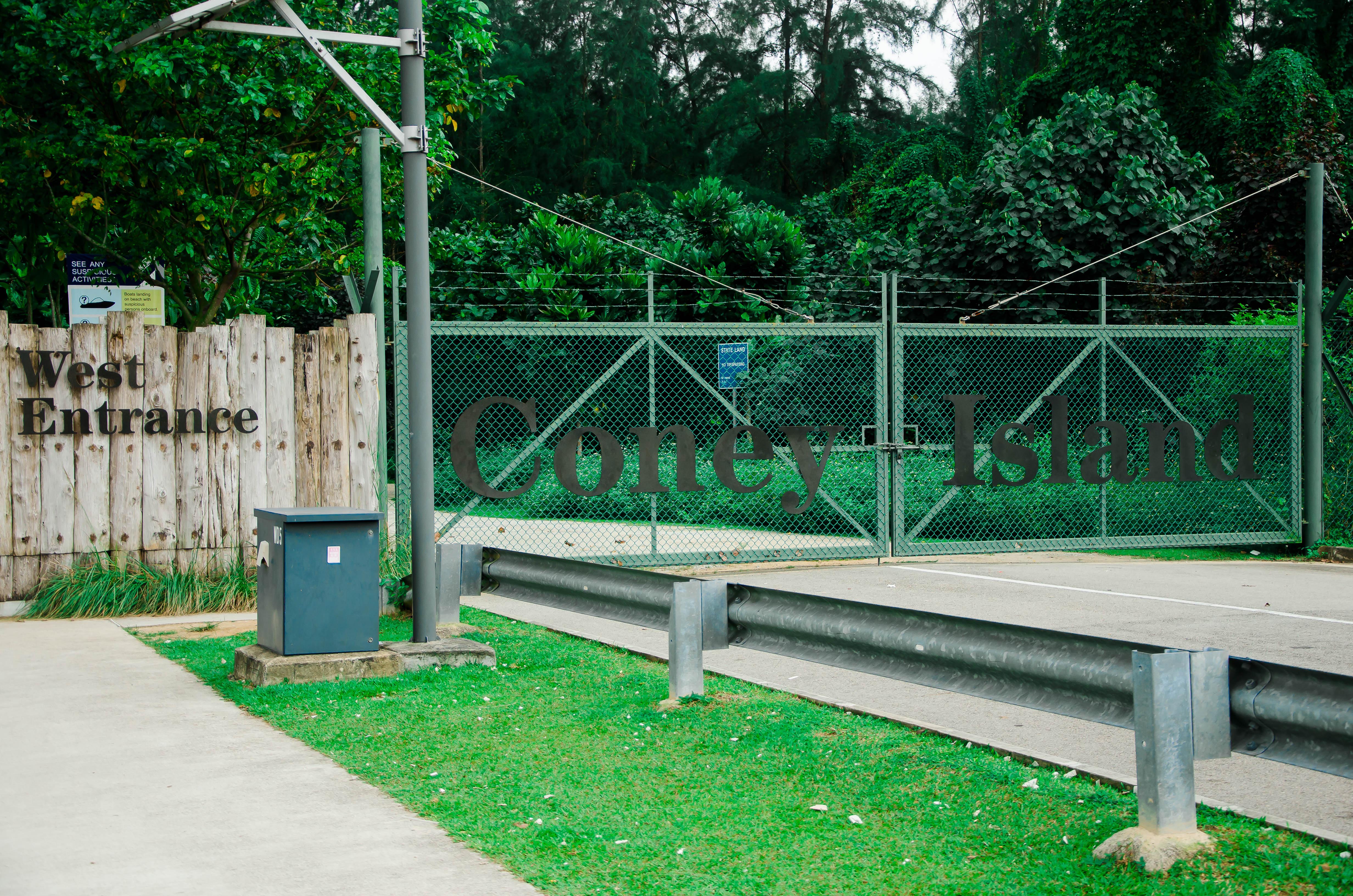
I really wanted to encapsulate the very peaceful and serene feeling I get when I visit this place.

Developing on my theme, because of how personal this place was to me, I wanted to show that by creating my zine in such a manner that it seems very personal to me. I thought about it for awhile, and what better way to express my inner thoughts than through a diary entry? It can become a portal into my inner thoughts and feelings for my viewers; to see things that I see and feel what I feel.

Then, what would I write about? I wanted to speak about my grandmother, who was staying in Punggol. Unfortunately, she passed away on the first week of school. I wanted to dedicate this piece of work to her, and my memory of her. Hence, I wanted to recreate that sense of nostalgia that I felt whenever I think of her. I decided on designing it to seem old school, with a whole jotter book layout, just to make the viewer feel like they are travelling back though time.

With that, my designing began.
(End of part 1)
As we embark on our final 4D project for this year of foundation, we were tasked to research on and write about 3 controversial artists of our selection, with “scandalous” works of either video or performance art installation.
Here are my 3 chosen artists:
Having already studied Damien Hirst during my times in junior college, I already knew how controversial an artist Damien was. Some of his most famous works include the submersion of corpses of animals submerged in a formaldehyde solution. The work seemingly has not many connections to its title, most of the time exploring on Hirst’s recurring theme of death, preserving the dead bodies. What made the works controversial, however, was the fact that Damien took a dead shark and submerged it into a preserving solution, and called it art. Many critics have argued against his contributions to the art world, and whether what he does can be considered art.
Furthermore, it was suspected that the formaldehyde solution could have been leaking dangerous and poisonous fumes, endangering the lives of the viewers in the museum. It has since been debunked, however, one cannot completely rule out it is not a possibility.

The Chapman brothers are a pair of artists that never take themselves too seriously. They have been criticised as not having any technical abilities whatsoever. However, people do not notice that they have an incredible talent in manipulating the media to generate the attention that fuels their line of work. When Jake Chapman was quoted to have said that it was pointless to bring children to galleries, and that they are still children and not “human” yet, many artists spoken out against Chapman. However, art critic Will Gompertz had this to say.

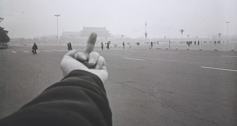
Ai Weiwei was an artist that got his name out there through blogging on the Chinese social media platform Sina Weibo. Through this, he “turned out a steady stream of scathing social commentary, criticism of government policy, thoughts on art and architecture, and autobiographical writings.” One of his most famous art series was the Study of Perspective series. It was one in which he simply pointed the middle finger to many famous monuments, almost in a way, telling the government to f- off.
Silhouette, value and the final combined piece!
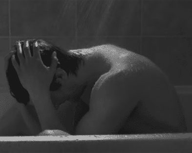
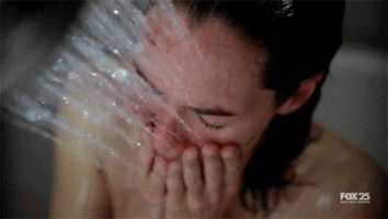
They say that the place where you get the best ideas and where you reflect the most is when you take a shower. A relaxing shower can be a journey deep within yourself, thinking through the things that bother. Let yourself go into the mellifluous sound of the running water. It is an alleviation where you truly feel like you don’t have to worry, where you don’t have to be anything but yourself. As the hot water engulfs your body, feel yourself sinking into your own reverie.
Moving into a space of communal living, I am adjusting to the fact that sometimes, my most private moment with myself, seems invaded by others. Yet, at times I feel myself getting lost in the euphony new noises that surround me.
For this project, I wanted it to be very personal, yet very intimate as well. When I first heard that it was going to be a soundscape, I immediately thought of the bathroom, as when I am showering, I focus and relax with the sounds around me. I wanted to try and recreate that safe space so that others can feel what I feel and show what this private moment and space means to me.
Some challenges I faced were things like people coming in and intruding my recordings and startling me. Others also include not knowing how to set the proper mic volume because too soft would result in not getting the full sound, while too loud increased excess noise. It was also hard deciding an arrangement, as this was a soundscape, and not a song, hence there was no 5 6 7 8s to rely on.
I’m glad that I got the opportunity to embark on this project, because it sparked an interest in me to further this idea, and become a video series of song covers.

QUE SERA SERA // IDEALISATION
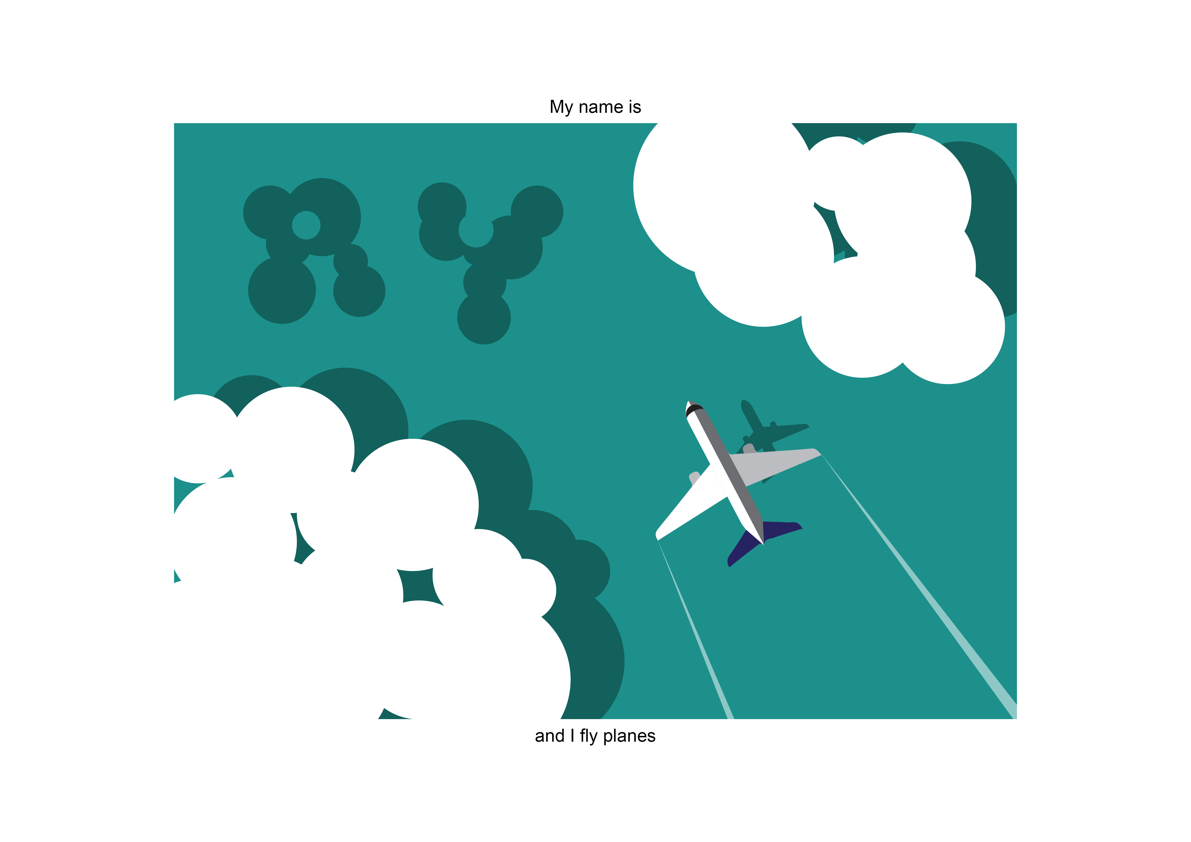
First off, for my english name I will be using “ry” instead of “Ryan”, because it’s the nickname given to me by most of my friends.
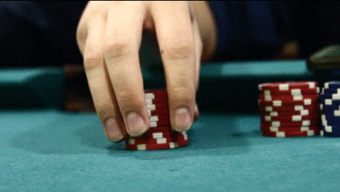
Initially, for this project, I wanted to do a gambling theme that was consistent throughout my 4 works.
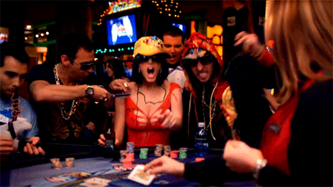
This was because I had a lot of avenues to insert my name and present it as typography. Examples include the face of playing cards, Mahjong tiles as well as poker chips.
I also initially wanted to compose my pieces through the use of photography, and then digitally alter them using photoshop afterwards. However, my camera was not functioning properly, thus I had to look towards using a different medium. Also, I felt that using such a similar theme through all 4 works created a lack of variation, and would seem to be boring.
However, my camera was not functioning properly, thus I had to look towards using a different medium. Also, I felt that using such a similar theme through all 4 works created a lack of variation, and would seem to be boring. Hence, I decided on the use of illustrator (something that I’ve never done) and to branch out my overall theme. Due to the multiple failures, I decided to change the theme to ‘jobs that I’ll probably never achieve’. Yay?
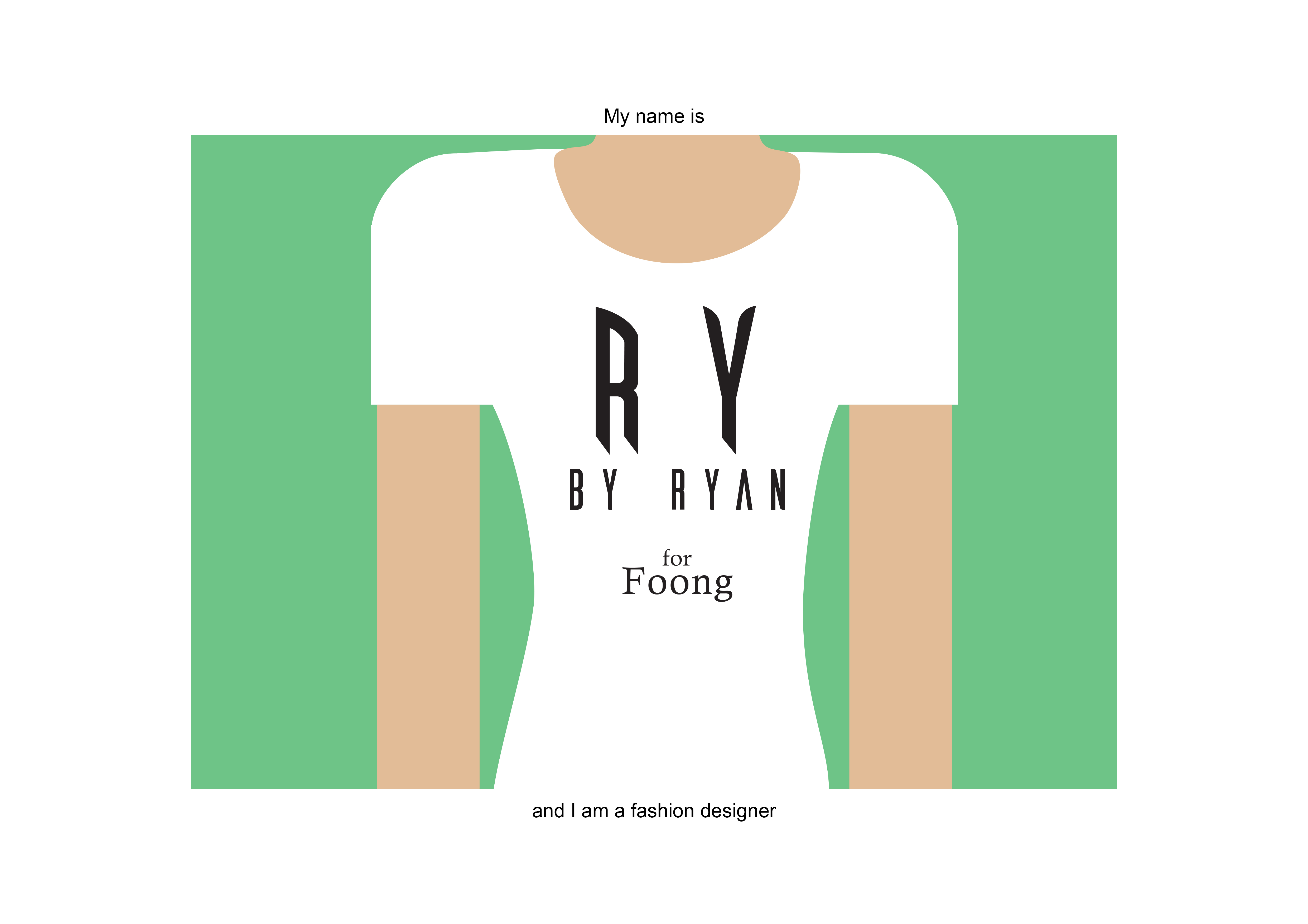
Jobs chosen:
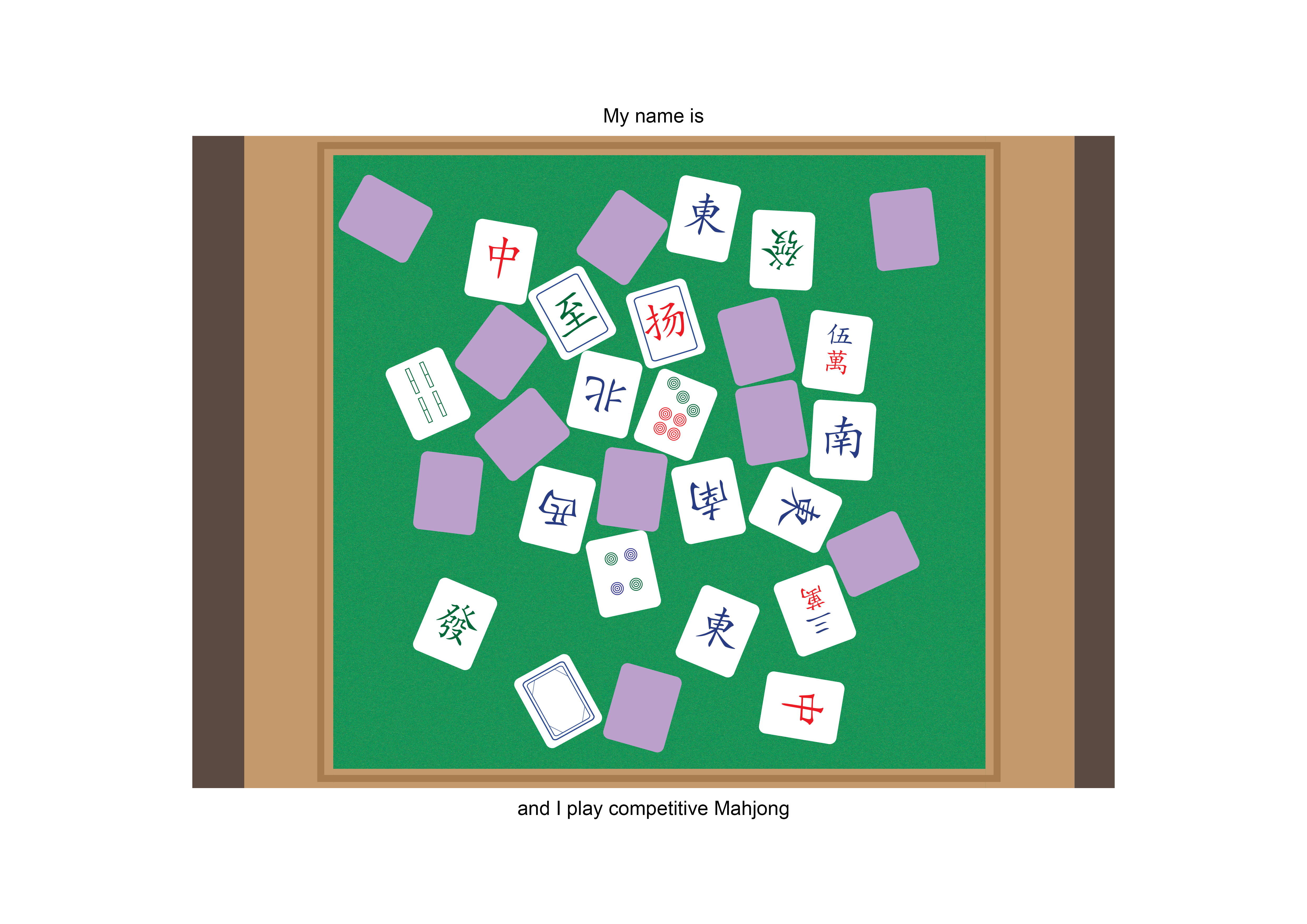
 Tiles.
 Bubbles? Condensation? Foam?
 Plane? Clouds? Shadows?
 Measuring tapes? Prints? Cloth?
In doing my research, I learnt that a lot of clever typography that creates visuals that links the word to the actual object is called a calligram.
42 Clever Calligrams That Visualize The Meanings Of Various Words
On top of that, I decided to find more reference pieces that I want my works to look like, and hopefully they would turn out the same!


I liked how these works were minimal enough not to complicate the picture, yet it was complex enough to carry what it needed to say forward.
QUE SERA SERA // PROCESS
So I had several iterations of works, due to the process of trial and error on illustrator.
Work 1:
`
Work 2:
Work 3: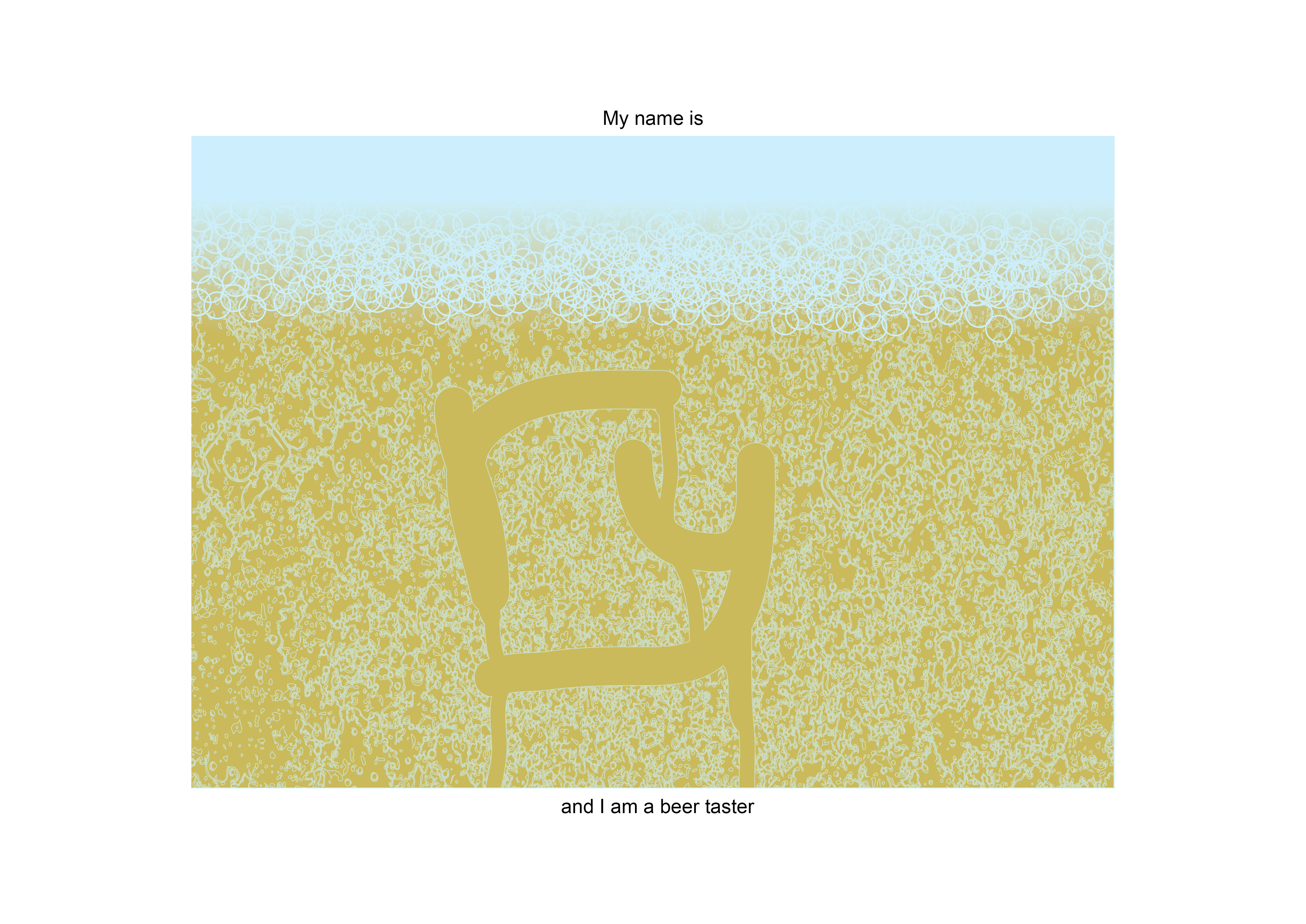
work 4:
QUE SERA SERA // CHALLENGES
Mainly, this whole project was quite challenging to me, because I don’t use illustrator, and it was quite tough for me to learn the ropes and produce 4 compositions by the end of the project.
Also, another challenge that I faced was that I was afraid to play around and modify the typefaces enough, which made it seem like I was using stock typefaces.
On the bright side, I managed to learn many new things from my classmates, one of my favourites is ‘drop shadow’. Now my mahjong tiles won’t look as flat!
P.S. Always remember to publish under the correct class and categories.