Project 2 Part 1: Zine-Neighbourhood Explorer Research

For the second project, we were given a neighbourhood to explore and find out interesting areas in the specific place. The neighbourhood i got was Redhill. I was just glad that it is still on the green line and it’s not that far from school.

So, of course before heading down to Redhill to explore, i did some research about the place and where to go. Redhill isn’t really a place with unique places of interest but it has a history? We all do have some memory of hearing how the name Redhill came about when we were younger.

The legend basically started a long time ago when Singapore was merely a little sleepy fishing village. To cut the long story short, in these early years, the fishes that had sharp, sword like mouths used to swim up to the shore and attack fishermen, making it unable for them to venture out and fish. Nobody had any idea what to do then.
So one day, a young boy,  who lived on the hill came up with a solution. He advised the Sultan to use banana tree trunks as a wall to ward off the attacks, as the fishes mouth would get stuck in the tree and they can kill the fish more easily.  This plan worked very well, and the fish eventually stopped attacking.
However, the boy became a hero in the eyes of the villages and the Sultan became to be threatened by him, growing paranoid that the villagers might want this young boy to become the next ruler and overthrow him. His paranoia increased day by day, until one day, he ordered a small squad of his elite guards to assassinate the boy in his sleep. That night, the head of the this team took out his kris (wavy blade dagger) and stabbed the boy in the heart. Killing him instantly.
The blood that flowed out would not stop gushing out of the wound, and the young boy’s blood coated the hill that he lived. None of the villagers knew who ordered the boy kill, but that it was a tragic event, and to commemorate this event, they called the hill Bukit Merah (Red Hill) to remember this boy.

There are many versions of the legend but this is the one i remembered and read on the internet!

Then i searched for places to go in Redhill and found some places:
-Redhill Market
-Enabling Village
-Delta Sports Complex

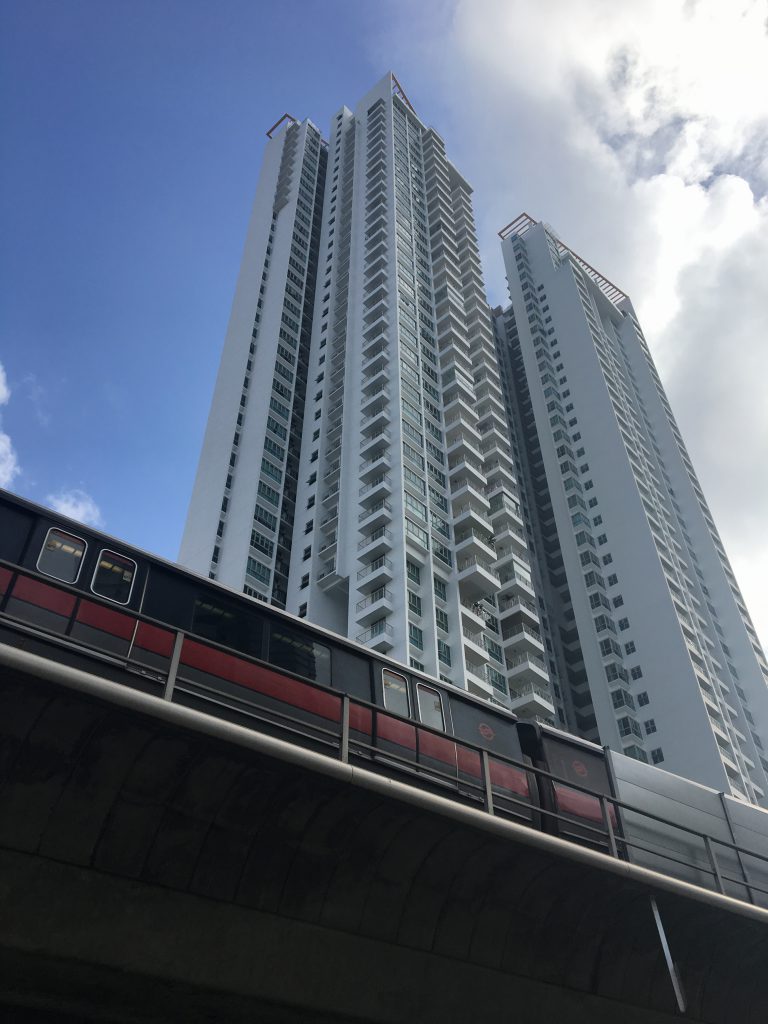
So on Thursday, Huimin and I went to explore each of our places together since it was just a few stops away 🙂 Immediately after we stepped out of the Redhill MRT station, we were greeted by super high HDB Flats! Its actually very cool to me because i live in Pasir Ris and the highest flats i see if probably less than 15 storeys. These flats here are at least 30 floors high!!

img_2788

img_2789

img_2790

We decided to walk to a direction for less than 5minutes after the MRT station… and we ended up heading to Alexander Road (Queenstown) and Tang Lin Road (Orchard???) LOL, Redhill is really very small actually. It is like once you walk towards a certain direction for a while, you will not be in Redhill itself anymore HAHAHAHAH

img_2791
This stretch of road has many buildings of different car brands.

img_2792
A temple we walked pass while heading to the other direction instead of Tang Lin Road.

img_2793

img_2794

Still pretty impressed how tall these buildings are! 😛

img_2795
Manage to go to one of the old HDBs there which has many little shops at the first level. These flats are mostly 2-3 Room flats as the doors of the houses are so close to one another!

img_2796

img_2803
If you look closer, you can see each unit is very near to one another

img_2805
Towards Enabling Village. The roads are actually quite hilly (cause redHILLLL hahah) but honestly there are a lot of slopes and curve in the small roads.
img_2808
This place reminds me of a community club but it is actually a place that have a long history in education and training, having formerly been the Bukit Merah Vocational Institute and the Employment and Employability Institute. The site has been extensively retrofitted for easy access by visitors who have disabilities.

img_2809

img_2810
Cute wall arts.

img_2813

img_2811-min
A kindergarten

img_2814-min

img_2816-min

They have many gyms and fitness corners as well in this “Village” which is really interesting compared to other community clubs. Then, we realised that almost all places in Redhill are accessible to gyms and other forms of exercise. We even saw a super muscular and fit old man walking around. Thus we concluded that the people living in Redhill do have an active lifestyle HAHAHAHA.

img_2820
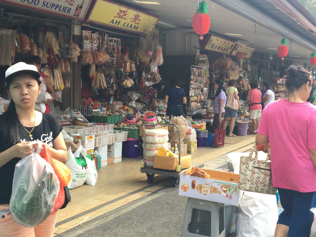
Next Stop: REDHILL MARKET

img_2821

img_2824

img_2825

img_2829

img_2830 img_2836

img_2838
I
t feel abit like Bedok Market to me and the food at the hawker is probably pretty good but we didn’t try them hahaha

img_2842

img_2843 img_2844
Delta Sports Complex which we didn’t go in to explore due to lack of time

img_2847

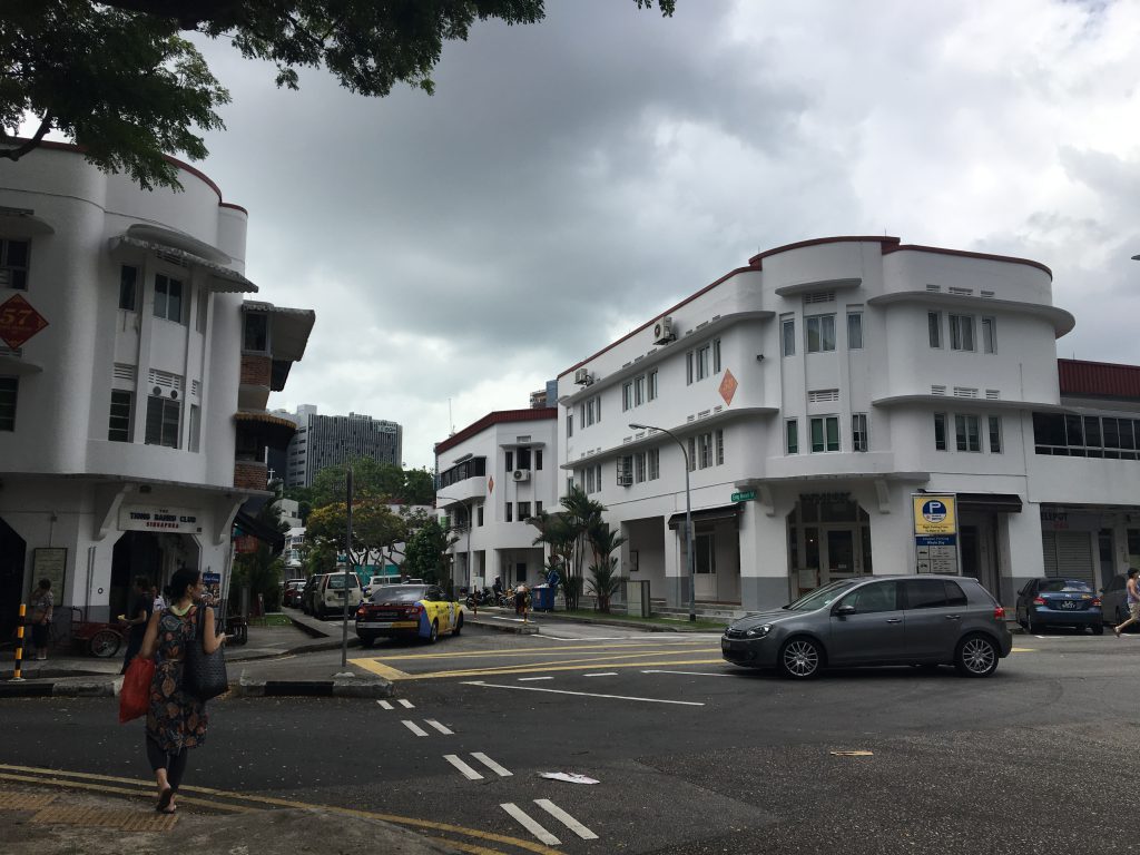
Pretty pastel coloured flats which was so pretty!! This was actually the end of redhill and we were on the way to Tiong Bahru since its really near redhill i decided to explore abit on tiong bahru too! (Told ya redhill is pretty small)

img_2850-min

img_2853-min

img_2859-min

img_2860-min

img_2861-min

img_2862-min

Went to the Tiong Bahru park which was VERY SMALL

img_2866

img_2868

REALLY PRETTY RESIDENTAL HOUSES!!!

img_2874

img_2877

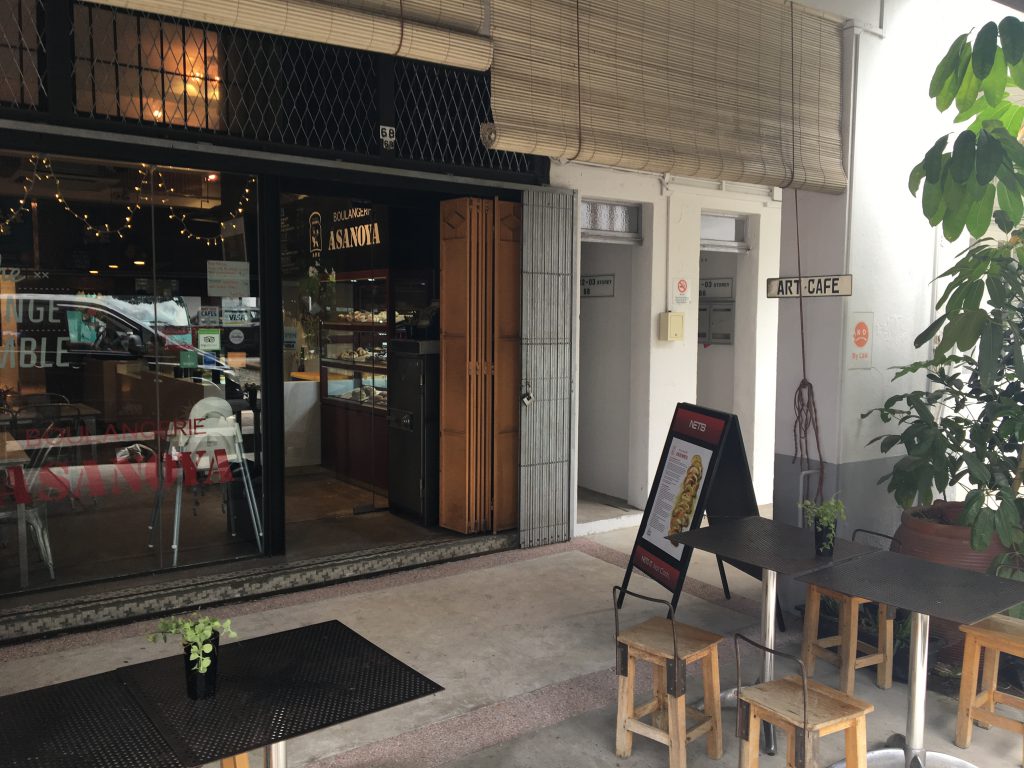
Many cafes along the road around tiong bahru market:

img_2878

img_2881

img_2882

img_2883

img_2884

That’s it for my exploring part! 🙂


Project 1: Que Sera Sera FINAL

These are my 4 final compositions! 🙂

dentist-final

cleaner-final

“Chia” here is depicted as the dust, thus the composition looks a little dirty and dusty. It is linked from the dentist composition where the stick of the broom is actually the mirror tool top from the first composition.

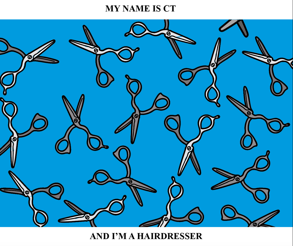
hairdresser-final

When two broom stick intercepts with one another, it becomes the blade of the scissors, thus i decided to link them together in this way for it to flow into the hairdresser composition.

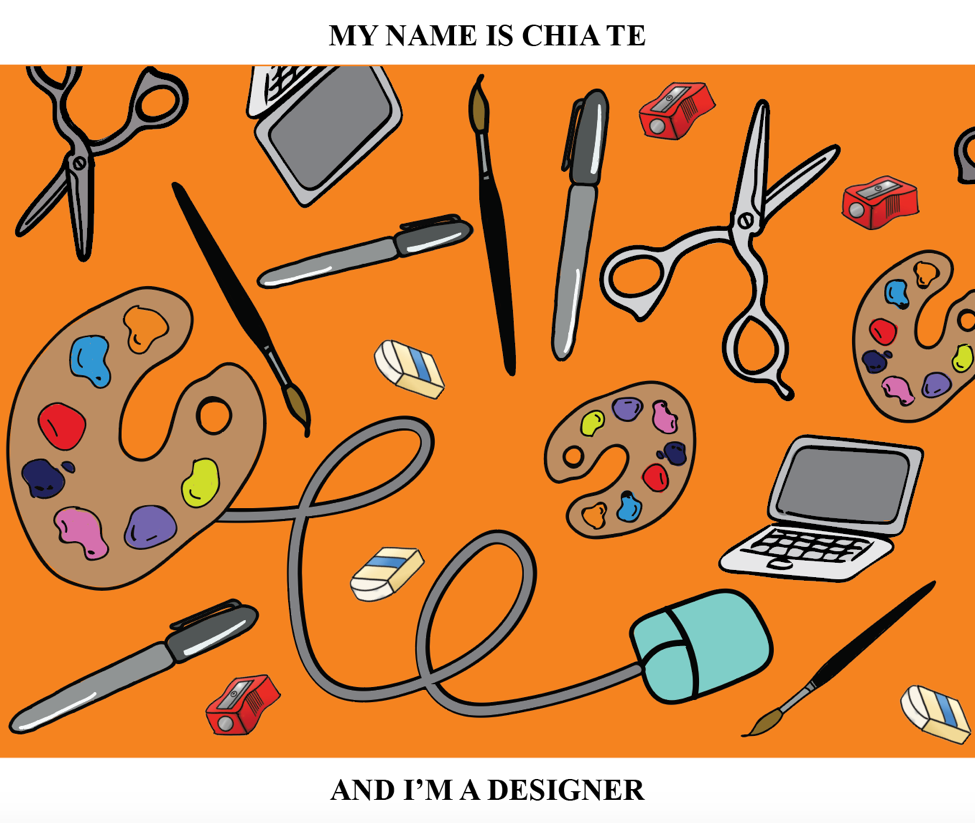
designer-final

For this composition, i decided to put my full name in showing that it is now a clearer job i am working towards to instead of just putting in my initials where it may be read as another person’s name. This composition is the most colourful and i added the most tools to it as i wanted it to be the most distinct one among the other 3 composition as this is something closer to my dream job at this moment in time.

all-final

Finally, this is how all of them are linked together. I made use of split complementary colors for this whole 4 compositions, trying to use the pop-art effect on my final project.

colourwheel

img_2571 img_2573

Overall, i would say i really enjoyed doing this project despite all the tedious process i faced from Ai which i’m glad i tried to do this whole project digitally. 🙂 I learnt a lot from this project on how to incorporate typography into visuals and how colours play such an important role visually. Thanks for all the feedback and i will improve more on future projects! After seeing all my classmates compositions, i feel that everyone really put in a lot of effort and all of them really did a great job! :))

Project 1: Que Sera Sera Process

Before starting on this project, I thought of what jobs i really wanted to be when i was younger and how it gradually changes along the way when i grew older due to the difficulties faced on achieving it along the way.

I shortlisted 5 jobs at the beginning which was:

  1. Dentist
  2. Cleaner
  3. Hairdresser
  4. Netballer
  5. Designer

DENTIST

I always wanted to be a dentist since young as i was never really afraid of going to the dentist and in fact, i actually like it a lot. Many kids would cry when they reach the Dental clinics but i would be a little excited every time cause i really like the smell of a dental clinic HAHAHAH. Also, i used to always pluck out my baby teeth myself when i was younger when it was of course, very shaky. Thus i took triple science in Secondary school and i realized that i can’t do science for nuts, however it didn’t really kill me yet as my results were still acceptable. Only until i entered JC and i stubbornly continued taking Biology and Chemistry which i knew i couldn’t take it anymore as I’ve been failing very badly throughout my 2 years. It was too much content and i really couldn’t absorb any of it.

Due to all these failures i faced, i got really demoralized at a point of time when i really wanted to give up which brings me to my next job.

CLEANER

There is a sterotypical way of thinking that if you don’t study well, you would end up being a cleaner as you don’t need any qualifications to do this job. Thus, for a period, i was really afraid that i would end up as a cleaner or a road sweeper due to all the failures I had after taking science all my life.

HAIRDRESSER

However, to persuade myself that i could actually get a proper job, i thought of an easy way out to my failures. I could just take up a hairdressing course in other schools and just take over my dad’s shop since he owns a salon himself. Therefore, my third job is a hairdresser. Which was something very interesting and new to me.

NETBALLER

Or maybe i thought that since i am bad at science and studying, i decided to focus on what i am actually pretty good at which is playing sports in particular Netball. However, a job that i can think of for being a good netballer is just simply representing the country for it and making into the National team which i never pursued due to my studies.

DESIGNER 

Lastly, after all the failures and difficulties faced along the way, i still got into a local university and studied something i always had a interest in but never thought of pursuing further since i do not have a strong background for Arts. However, everything somehow worked out and i am in ADM now, thus, a job i want to be now would be a designer.

IDEATION:

In the end, i decided to leave out the job as a netballer and chose the other four jobs: Dentist, Cleaner, Hairdresser and Designer for this project.

As i brainstormed on how i wanted to illustrated the jobs out, it was tough thinking of how to incorporate initials of my name into the compositions as well. Then i decided to go with a cheeky and happy approach to this project since its something that i wanted to be and i was young and how it gradually changes along the way. Therefore, i wanted to use bright colours for all the 4 compositions and somehow link them together since it is pretty much a short story of my life.

An approach i really want to take was to have a repetition of a tool that is required in the job to represent the job-
For example Dentist, teeth and some other tools could be used. Hairdresser, scissors, comb?
I also sketch out some of the tools, thinking how to link them from one composition to another to make all of them to have a similar tone to all the compositions.

img_2686

Also, i wanted to do a full on digital to try to experiment on Ai and photoshop since i have never learn them before. I a decided to draw out on a wacom for all the equipments.

I started with the Dentist composition and it turned out something like this at first:

picture1

However, after the first consultations, Joy suggested that i don’t add any text into the compositions and instead use the tools to form out my name.

scissors

Before adding colours to it.

coloured

Making use of the whites from the scissors by playing with colours to bring out the initials “CT”.

Next, another difficulty i faced was the colour i should use for the compositions. I wanted the Dentist job to be bright then it fades for the cleaner job, increase in the brightness of the colour again for the hairdresser and for the designer, it will be bright and clear. Then i decided to find some artist reference i could use for the colours.

  1. Keith Haring:

keith keith2

I really how he uses contrasting colours to bring out the subject making it look very fun and happy.

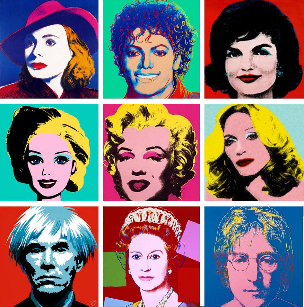
2.  Andy Warhol

andy andy2

Andy Warhol uses more of the pop-art techniques which was effective as well in bringing out the content to the eyes.

I got inspired by all of these pictures and decided to use split complimentary colours for my compositions but i have yet to think about which colours until the last part.

2

The thought of how to link such tools was another big problem cause i wanted all my 4 compositions to be close together showing how each job evolved into another through the tools.

img_2687

Whether the compositions should be placed into one straight line or a rectangle (2 at the top, 2 on the bottom) was another consideration i had in mind. As i continued to work on the dentist composition, i decided to incorporate my name in this way:


den

The mirror tool makes out “TE”. 🙂

For the other compositions i was thinking of a way to insert my name as for this kind of repetition composition, it is best if the words don’t have many letters or it would be too complicated.

Names: Chia Te, Te, CT, Chia, 21? (my favourite no.)
I scraped the idea of my chinese name as it was too much strokes to it and it would definitely make the composition very messy.

These are parts of my process mainly only for the first two compositions and i’ll have another post on my final compositions! 🙂 Thanks for reading!!

Assignment 1: Present Identity

For this project, we will have to explore the relationships between form and material in making an object defined by a specific identity and then make a gift for a client in our class. My client is Cally and after the short interview with her, i gathered some informations which i think it may be useful. This are some of the likes and dislikes i found out about her that day, which led me into exploring some gift ideas that she might like.

img_2608

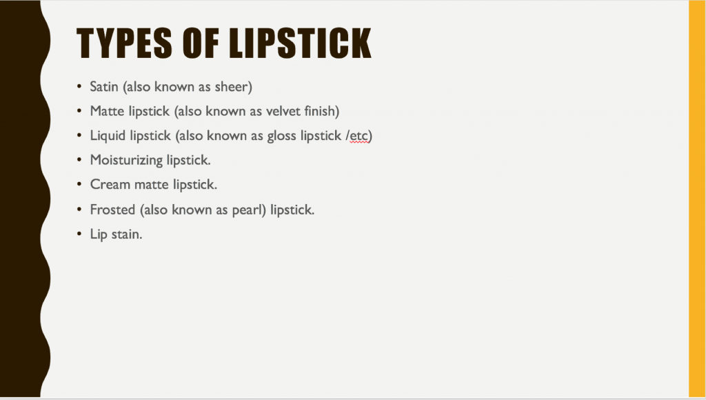
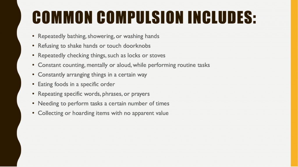
As i consulted Peter after interviewing, we were asked to research on 3 words that is not linked at all to do a presentation so as to further expand our thoughts on gifts. My three words were: Obsessive Compulsive Disorder (OCD), Types of chilli in Asia and Lipsticks.

These are the short presentation research slides:

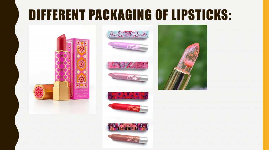
giftlipsticklip lip2

lip3chilli-1 chilli-2 picture1ocd1ocd2

ocd3

From all the information i wrote down earlier, i realised that since she likes travelling overseas especially more towards the western countries where chilli is usually not available as it does not suit the taste of the locals, i decided to go with making a chilli travel pouch for her. As a person who really LOVES chilli,  she will be able to conveniently bring the pouch around when she travels and not worry about not having any spices/ sauces in her food. 🙂

BEFORE EXECUTING THE PLAN 

I had several design in hand before trying to figure out which is actually the best and most convenient, since travelling is a main point to take note of. The product should be something not very bulky and heavy. Another consideration was also the material used and how the chilli containers are supposed to fit into the “Travel Pack”. Colour wise was also an issue although she does not particularly dislike any colour.

After much consideration, i decided to go with the material of thick felt as it is firm but soft, which makes it very comfortable to hold and it will be flat when no container is inside, which makes it easy to keep, just like a thin piece of cloth. Also, i wanted to add a waterproof plastic layer with a zip attached to it in the pouch to prevent the accidental chilli spillage. I decided to use velcro as well so that the chilli containers can be changed and taken out easily for my client to use. Therefore, she can also switch the types of chilli around and decides which ones she want to bring.

Lastly, to hold everything together, there will be a rubber strap attached. I decided on the colour grey for the felt as it is a dark and classy colour where it would not get dirty easily. The zip i chose was red to go along well with the transparent containers that will have chilli inside them.

MATERIALS:

img_2500
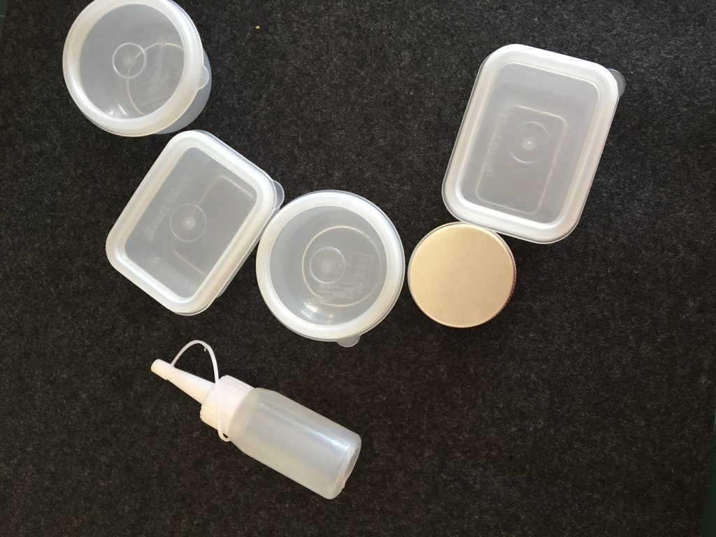
Some of the containers

img_2502 img_2511

The sewing machine i used (which was hell!!!!!)

FINAL PRODUCT OF THE GIFT!
img_2521  img_2523  img_2548 img_2549

img_2519 img_2518

img_2550

Two long strap of velcro sewn for containers to be pasted on them.

img_2552

Types of chilli include: Garlic chilli sauce (the tube-like container that can be squeezed), Sambal Belacan, Shrimp (Chinchalok) Chilli Sauce, Chilli Padi, Homemade chilli and chilli powder.

img_2553 img_2554 img_2555 img_2556

Overall, i think it was a great experience in learning how to use the sewing machine although it was a tedious process and the workmanship could be better as well! Maybe the containers could be of the same type and size as well, but then again there are there are different kinds of chilli. However, i am glad that Cally really liked the gift! :))