PROJECT 3: FINAL AND PROCESS

Overall, I’m really satisfied with my brochure although there is things to improve on as well. The cover page is a little to plain compared to the contents inside hence maybe more illustrations can be placed at the front page to evoke the fun element into it. All in all, I think i really learnt a lot through this brochure project as it allows me to be more conscious of the flow and the white spaces as well as to control the image such that it does not look too rigid.

TASK 3: DESIGN REFINEMENT & MOCK UP

Feedback from sharing in class:
-Need to play with scale of image
-Tighten slogan
-Pull Arts & Heath upwards
-Mute the background more so it wont be distracting
-Incorporate into a circular shape

Thus, after the feedback, i decided to change the background and decrease its opacity to mute it further, and then added a few more elements to create an oval around the texts. I resized the text body size as it was too huge previously, changed the colours to fit a colour palette of about 5 colours.

FINAL:

TASK 2: DESIGN EXPLORATION

I only managed to digitalize one of my ideas, which has the slogan “DISCOVER, RECOVER” but later changed to “Discover & Recover from ART” which is then changed again to “Discover & Rejuvenate through ARTS” as recover sounded like the patients were really sick and it might remind them about their illness.

However, after the class, i realised that the splashes in the first design was too much like a water bucket splashing although it was supposed to be paint splattering. Hence, the colour is very important for the background.

Sidewalk City: Ho Chi Minh City’s Sidewalk Life Reflective Essay

This chapter introduces Ho Chi Minh City, Vietnam’s sidewalk life as a case in the midst of the current global instigation where governments and people are searching for new ways to use such an important public space. The author, Annette Miae Kim, has written about her personal experience and observations of HCMC where she has stayed for several years. Her interest in exploring the sidewalk city was adventurous and admirable. She is the Director of the Spatial Analysis Lab (SLAB) who wrote about her journey of research and analysis of public spaces from a historical and geopolitical contextualization to visual narratives and further applications in the other chapters. As a foreigner who has researched on HCMC for a long time, it is an interesting point of view to this book, as rapid immigration and urbanization is taking place throughout the years as she returns to HCMC. I do agree that sidewalks have the potential to be an extraordinary place for people to connect with space and it is economically safe and act as a form of transport system which creates a vibrant and memorable city.

Ho Chi Minh Sidewalk city 1990s
(https://saigoneer.com/old-saigon/old-saigon-categories/6527-30-photos-of-1980s-1990s-saigon)


Ho Chi Minh sidewalk  2013
(Khellon. “Bui VIen Street.” Dreamstime. Accessed September 26, 2017. https://www.dreamstime.com/editorial-stock-photo-bui-vien-street-ho-chi-minh-city-vietnam-nov-st-famous-bachpacker-expat-area-city-image50448523#.)

This chapter mainly outlines fundamental problems such as political, social issues and how they can be resolved specifically with the issues in HCMC through Kim’s three techniques of practice.  First, “spatial ethnography” which combines ethnographic research with the spatial awareness of the design theory. Second, a theory of property rights of public space that focuses on daily property rights instead of economic rights to private property. Third, a practice of “critical cartography” in which it is the mapping of new knowledge of urban spaces. These three points are the main points I will be covering on the later part of this reflective essay. However, to map out on these practices, some of the questions like what exactly would constitute to the map and what cannot be mapped out has to be constantly thought about.

To start off, Kim backs up her thoughts on HCMC with many different case studies to further guide readers to know more about public spaces in general explains how sidewalks are able to integrate both physically and socially. This leads me to her first point on spatial ethnography. I do agree with her points on how it is important to consider the social processes of the place before redesigning the place. I feel that to be able to design a space is something all designers can think of, but to create a space where a community is able to adapt to it and not misuse the space for what it is initially catered for, is a challenge. Two examples that were brought up, Bryan Bell’s project of incorporating school buses at abandoned sites to ease the convenience of transportation and the upgrading project in Indore, India during the 1990s. Both of these examples failed to understand the ethnography and situation of the locals on sites hence the project was backfired. Urban design should move on from idealized principles thus leading to a restriction in ideas and strive towards designing based on understanding and researching on the culture and what the social community is like in a place. As Kim mentioned, “”urban design has a responsibility to ethnography”, which will eventually determine if the outcome is remarkable as culture plays an important role in a sidewalk city.

Next, Kim mentions about property rights that may be a very wide topic to discuss about as it is subjective topic. It views public space in terms of socially negotiated and enforced entitlements and liabilities between property owners, police, street vendors, and the general public. It is true that property rights are not so much about a person owning the land but instead it is the system of claims to sidewalk space, the common understanding that develops and how it is connected to the larger institutions. The confrontation of the maps with the property rights discourse may lead to a better understanding of public space and more promising and creative ways to resolve public space conflicts. In the context of HCMC, some people view the sideway as a negative practice and thinks that Vietnam has to grow out of it. However, they did not realize that this sidewalk city in Vietnam is something unique about this place with a historical and cultural background which Kim mentioned in the early part of the chapter where “the urban design literature rarely finds anything exemplary in the developing world”. This can be further elaborated as to how developing countries are formerly seen as filthy but it is now the important engines of economy.

Lastly, Kim emphasizes on critical cartography which is a set of new mapping practices and theoretical critique grounded in critical theory and identify attributes of the maps that are taken for granted. From Kim’s point of view, she mentions that narrative is one of the main aspects as to how people view the sidewalk in Vietnam and who is allowed to use the space. Symbolic meanings of a place can be represented by things such as tire rings wrapped in shiny foil and crossed together which represents moped repair service, rattling sound of a toy snake to inform people that there is a massage place nearby. Such symbolic and special form of language brings colors to the culture of HCMC which I find it very interesting and fascinating. It is something that only one who is very familiar with Vietnam culture would decipher as it is a culture that is close to their hearts and anyone who visits Vietnam for the first time would not know what such symbols means. Personally, I have been to HCMC once with no knowledge of the city, as a foreigner, walking through the sidewalks was interesting, but I would not have thought that this city actually has such a deep cultural value to it as it almost felt merely like a street to walk across and explore without much thoughts. With this in mind, I actually wonder if Singapore has anything that is symbolic to us that most people would know? Could it likely to be the food or tourist attractions? Therefore, the map that Kim and her team has created on these sidewalk symbols appeals to me very much since it is an unusual way of mapping a city but yet it is able to act as a form of navigation.

Overall, I feel that this reading allow me to gain exposure to many different kinds of case studies and how urban design plays an important role in different distinct areas. Also, these forms of mapping allow us to create a story of a particular place which incorporates the social and cultural side of the city which leads to greater understanding of the space around us that we often overlooked. Also, I feel that it is important to understand the connection people have to the space and place itself, in order to create reasonable policies and regulations that meets the population’s needs.


Task 3: Colour Explorations & Final Design

After the last lesson where we had some feedback on our chosen logo, I decided to go with the same logo, but refining the visual weight for some of lines and also to work on the where i should put the words “Art On The Move” in the badge. 

This was my first attempt, and as mentioned, the feedback was that from a far, the lines were not distinct and the wordings were slightly awkward.
Michael mentioned that i could look at the 50% size and derive the shape of the pencil to incorporate it into the 100% one to add more visual weight. Hence i tried that and added colours after.

COLOUR EXPLORATIONS:

I wanted to explore warmer tones to show the sense of warmth through the button badge hence my colours are all within yellow-orange-darker shades of pink-red-maroon. It was pretty tough for me to choose a colour that allows the figure to stand out. Besides for the background of the badge, i mainly wanted it to be complementary to the turquoise vest that the volunteers would be wearing hence i chose the orange-y shade as shown below with the vest colour.

FINAL DESIGN:
My final design is a improved version of my third concept which is to show homeliness which serves as a form of distraction for the patients. I feel that this “Art On The Move” programme is mainly set up to allow patients to have fun where they could direct their thoughts away from the feeling people normally get when they are sick. Hence, people (Volunteers & Nurses) are around to take care of them and allow them to relieve their stressful mind by doing Art & Crafts. People, who plays and important roles to patients are represented through this logo i have design, which shows the chinese character “人” which is people in Chinese. To give some flow and movement to the person in the logo, i decided to depict him in a form where he looks like he’s rejoicing and having fun, leaping around. Hence, his legs are wide apart which is represented in a form of a twisted pencil. To balance out the slightly tilted figure, i decided to add the words on the left side of the person instead of being at the bottom of the legs. Also, I specifically emphasized the word “ART” and “MOVE” since this programme is indeed about doing art in many different ways.
Lastly, as for the colours, i chose maroon and yellow as they are both on the warmer side which conveys my concept of the warmth brought to the patients to let them know that there are people who care for them. Maroon signifies sacrifice and bravery and yellow signifies hope, happiness & positivity. These are mainly the traits of the volunteers and what this programme aims to achieve. 


Representation of badge as seen when placed on the turquoise vest.


Task 2: Translating & Exploring Design

From the 3 concepts we have chosen, we were suppose to do at least 30sketches and these are some of the sketches i did:

Concept 1: Engaging

Concept 2: Crafty & Fun

Concept 3:

These are some i really liked:

Thus, i decided to do a slight change to Concept 3 which is to allow patients to feel homely at the hospital so as to serve as a form of distraction. The keywords included are home, art tools/materials, warmth, people and fun. I really wanted to do something that is dynamic to represent fun hence i did some sketches to see how i can play with the art materials and a person, to allow it to be relevant to “Art On The Move”.
This leads me to a design which shows fun and freedom which brings back to my concept of serving as a form of distraction to the patients through this programme and how they can not only have fun through art and how they can interact with people. My final logo i have chosen and the colours i chose will be documented in the next post! 🙂


Chinese Heritage Centre


(image from:https://blogs.ntu.edu.sg/lib-wgwl/chinese-heritage-centre/)

The field trip to the Chinese Heritage Centre at NTU was a really fulfilling one as we learnt about the architecture of the building and the history behind it. Also, as we head to the Nantah Pictorial Exhibition which gave us a lot of details of the history of NTU and the important people that contributed as a whole. It was my first time visiting this place and it is actually one of the National Monument in Singapore which most of us didn’t know.

The Nanyang Lake.

Task 1: Information gathering and idea generating

Observation Notes:
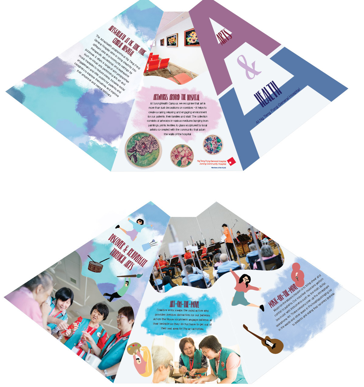
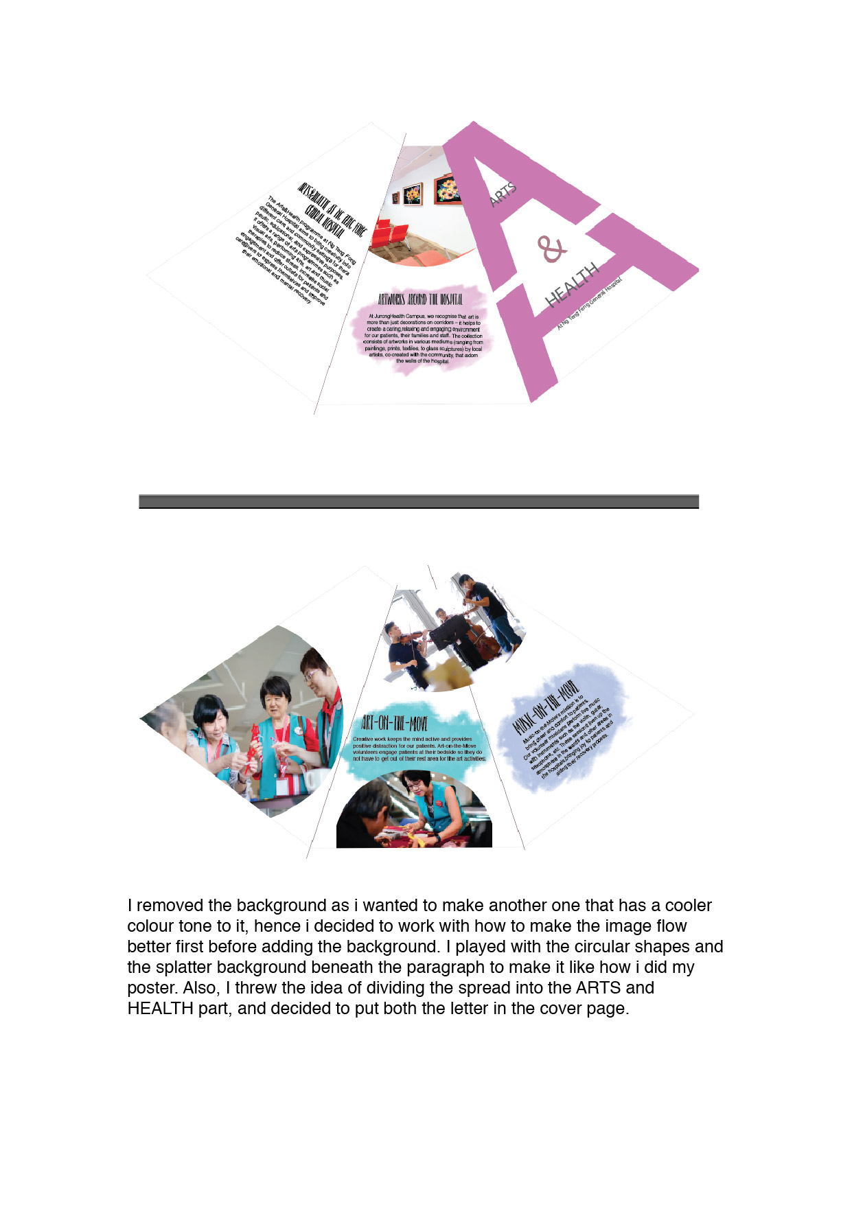
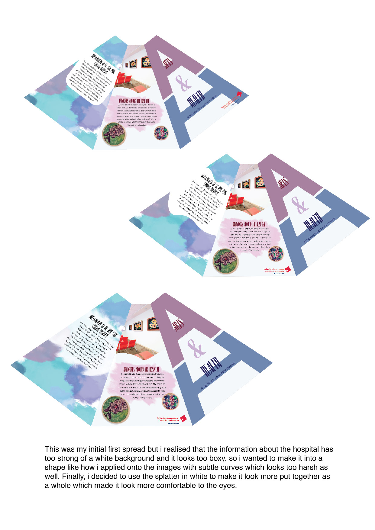
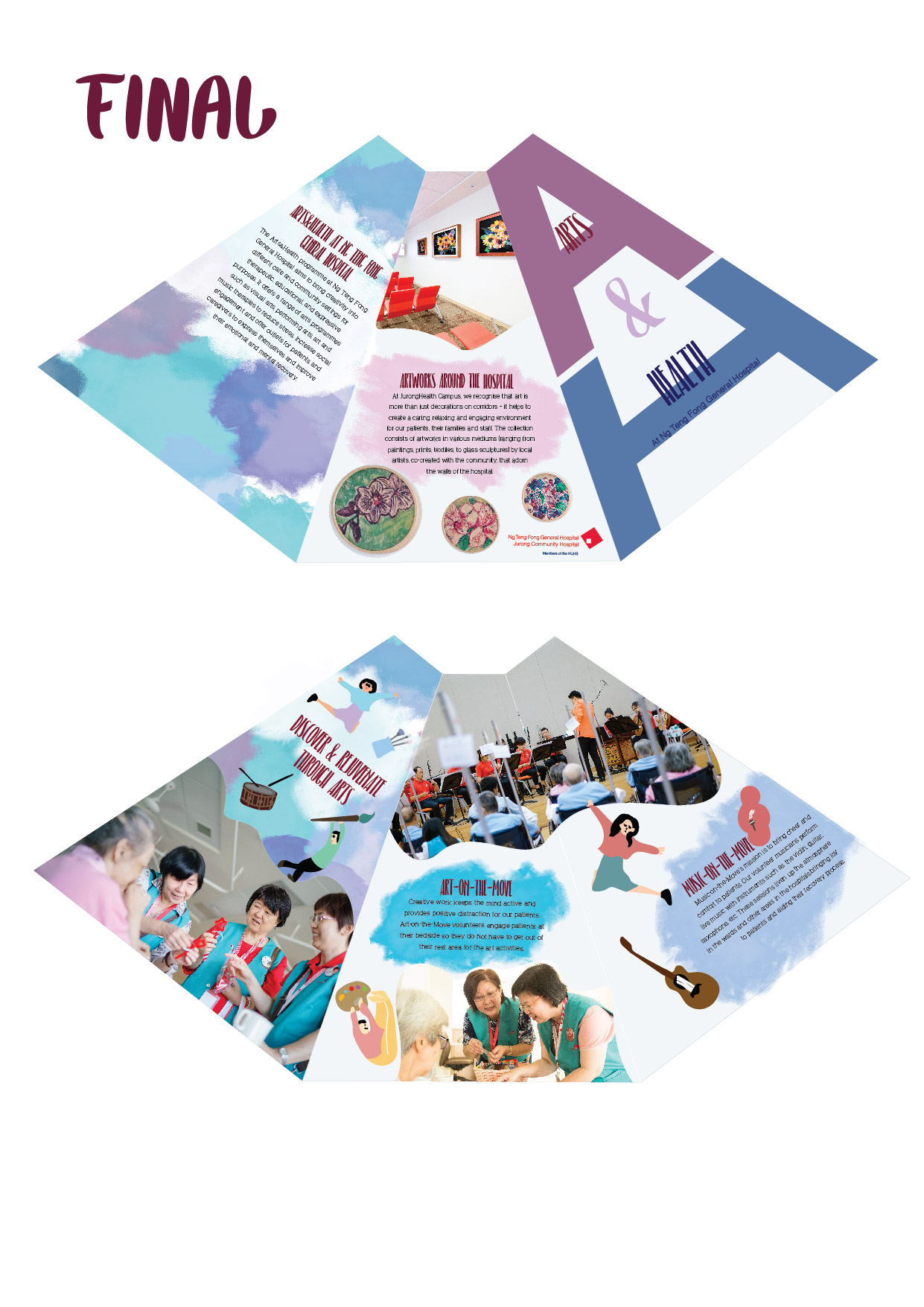
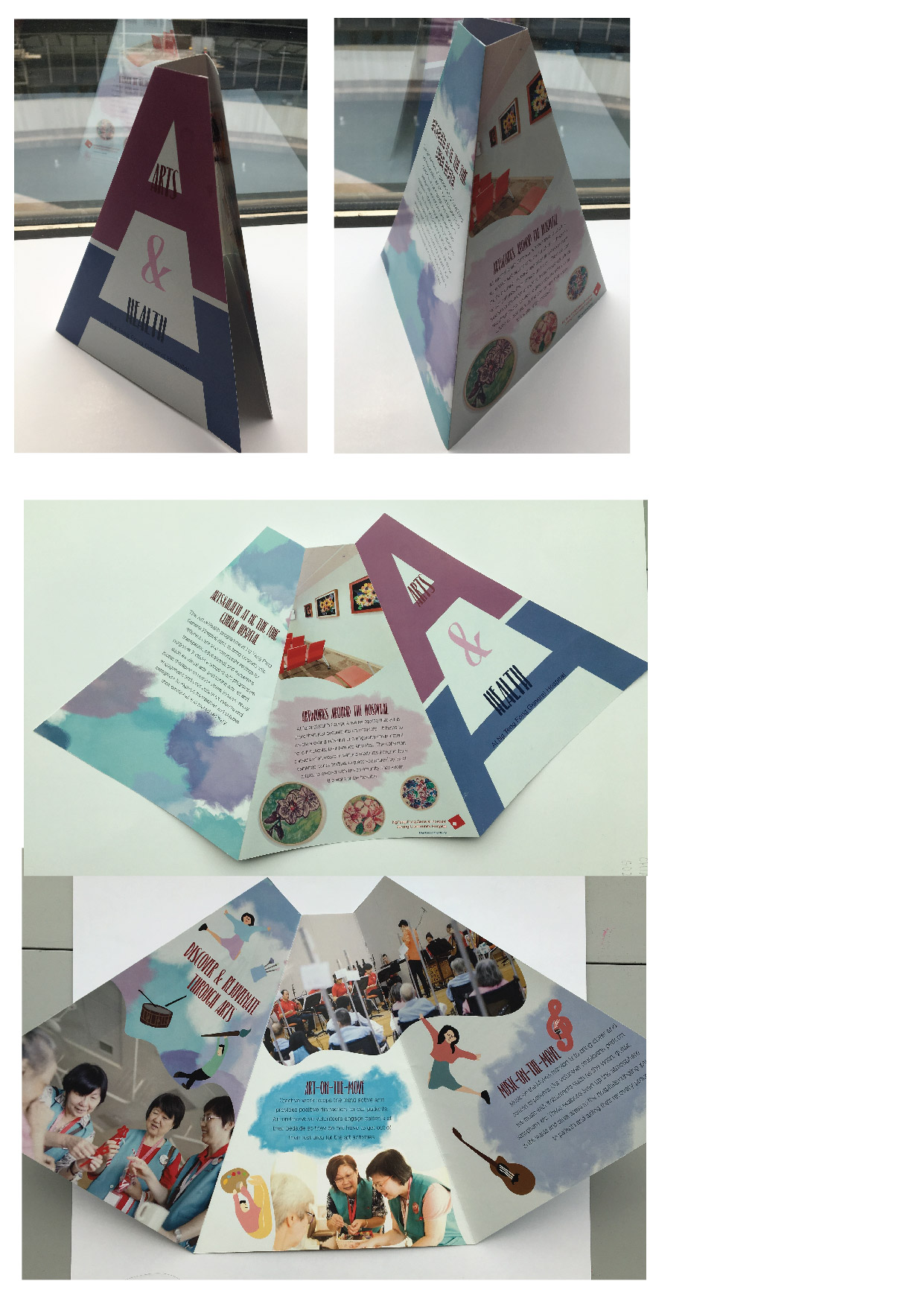
During our visit to Ng Teng Fong General Hospital last week, I realized that this particular hospital does not look like other hospitals such as KK hospital/ SGH. Instead of just having posters and some banners from the health promotion board, they actually include different artworks from various local artist and even artworks done by their patients such as the corner with batik paintings. I feel that it is a very good way to allow patients to be involved in these art activities which also helps in transforming the hospital into a more comfortable place for the patients. 

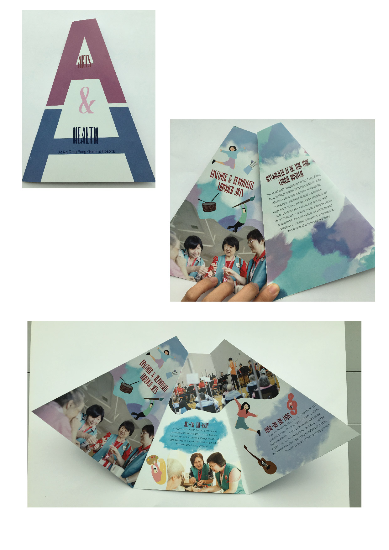
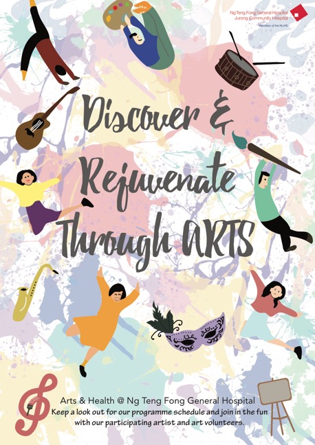
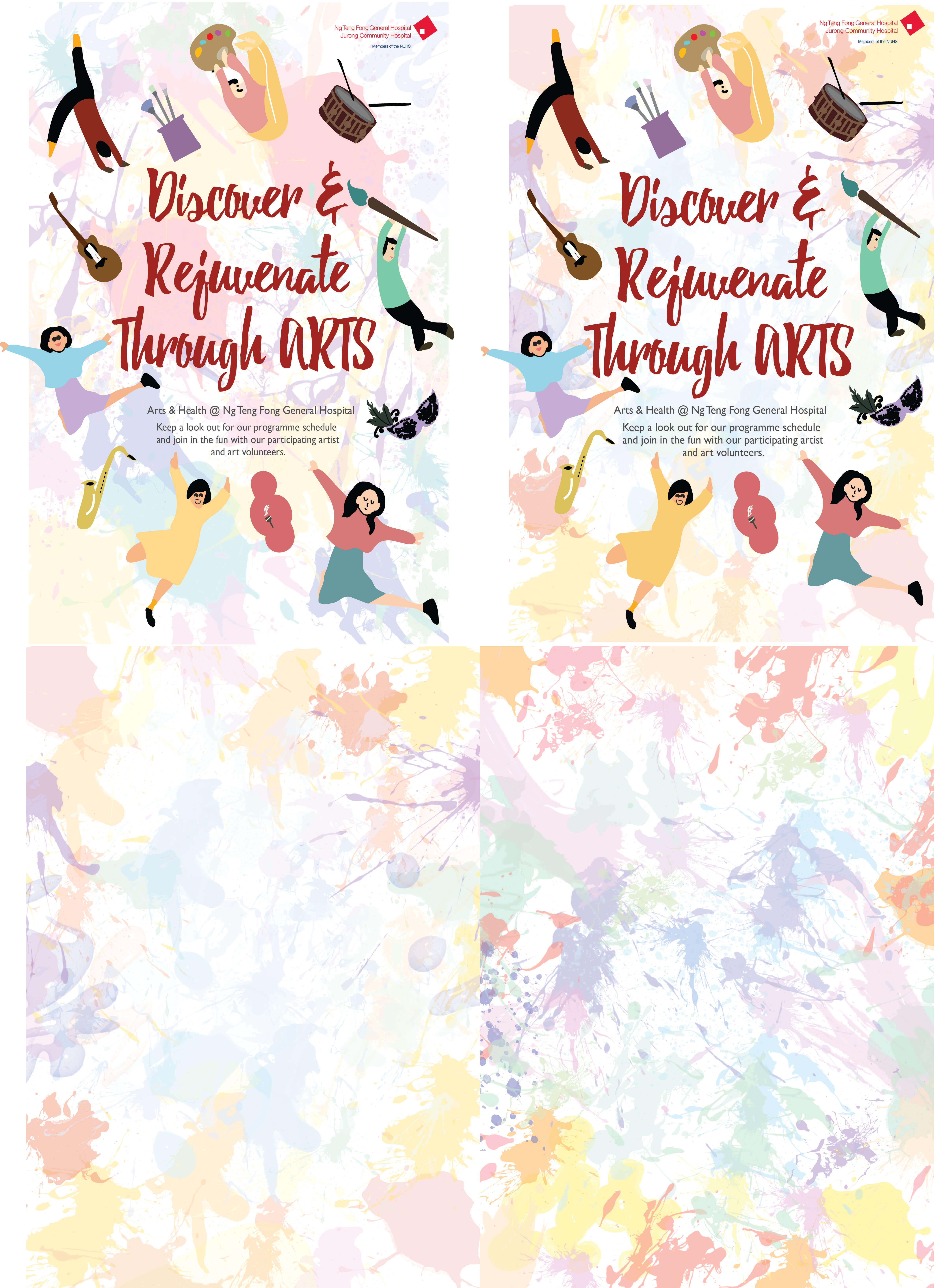
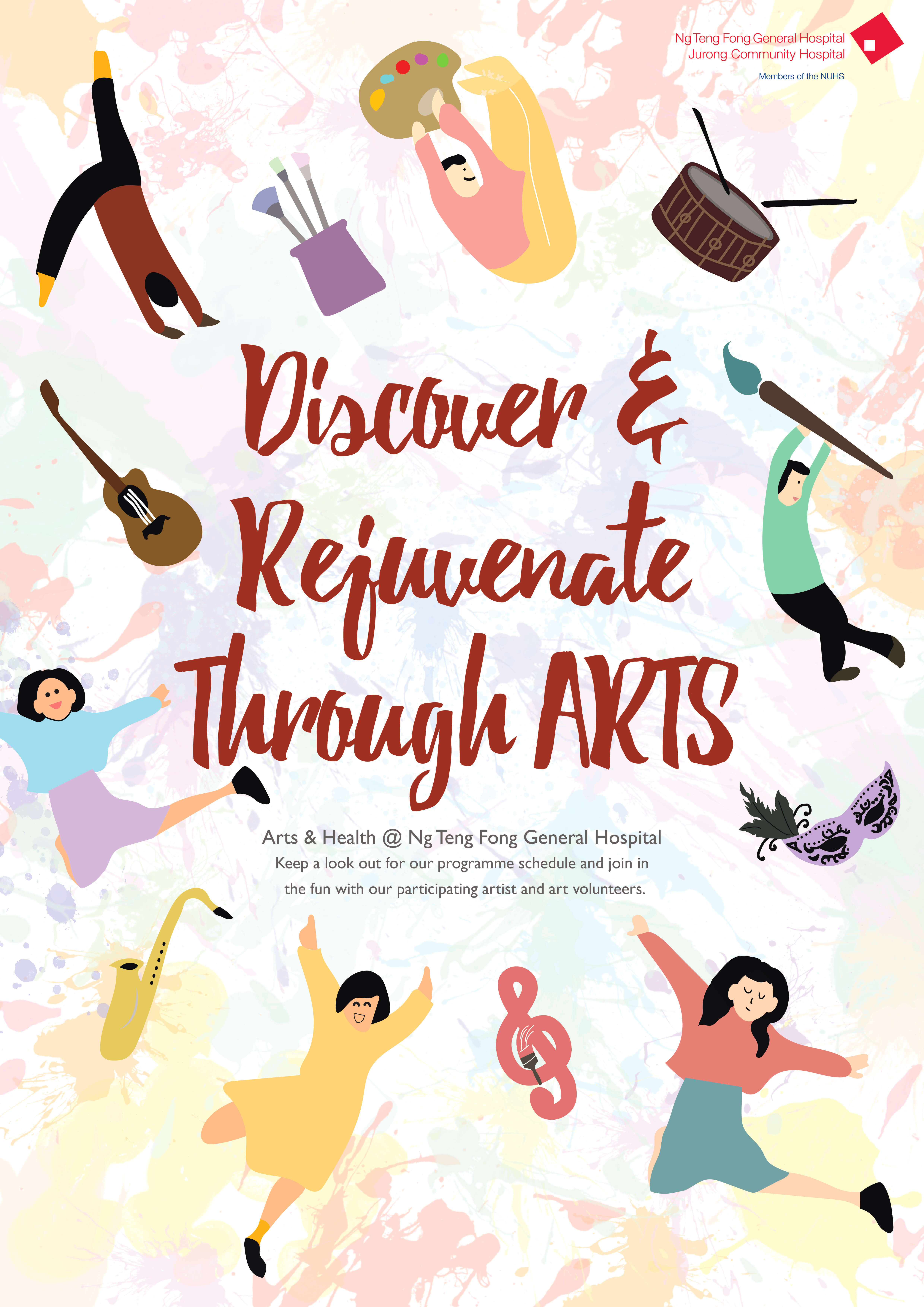
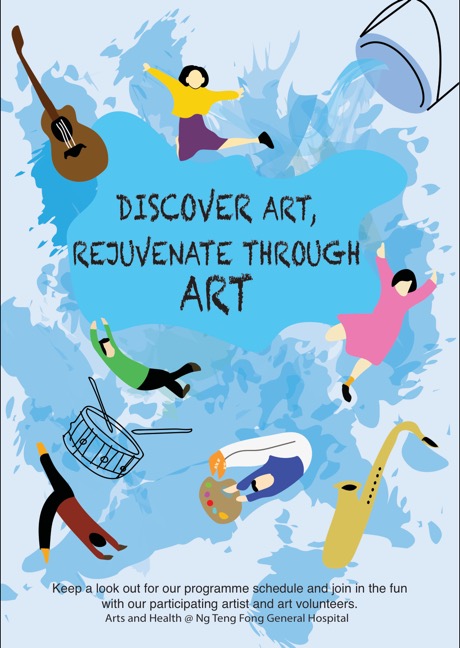
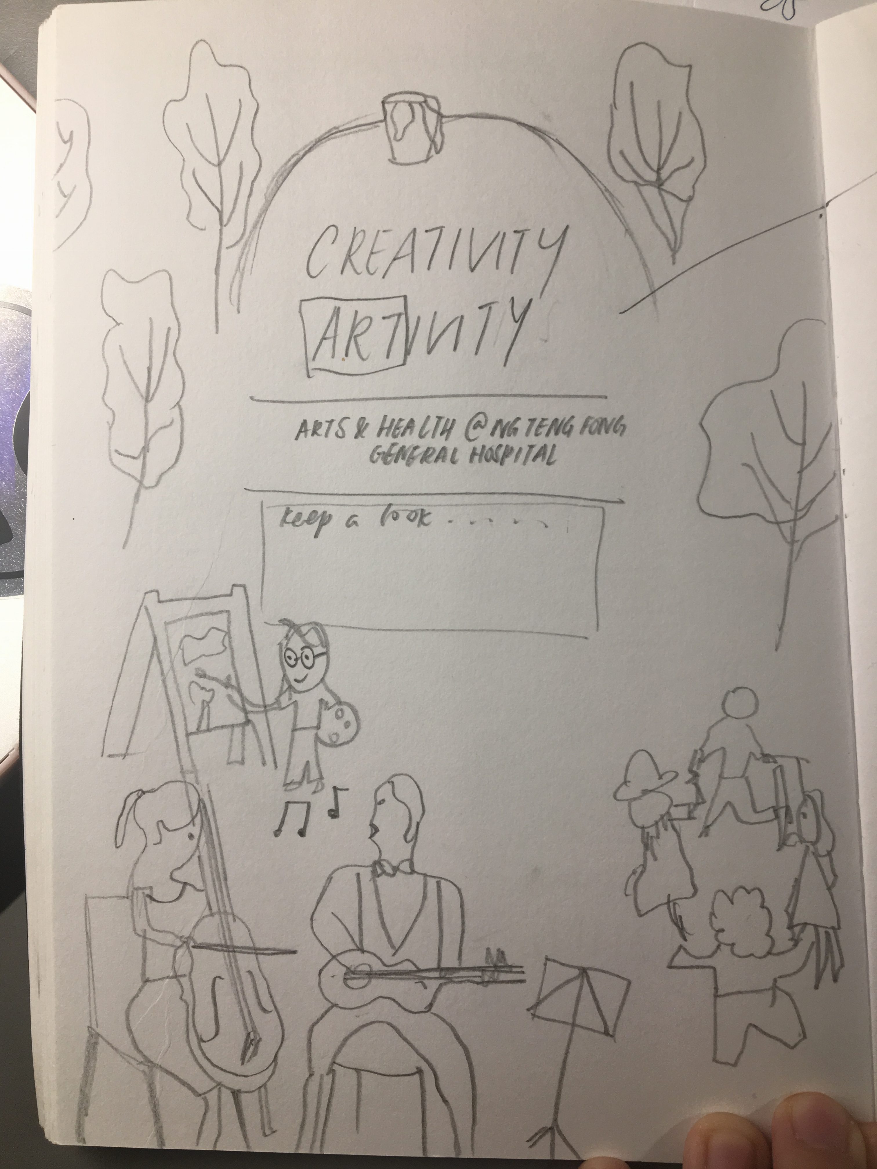
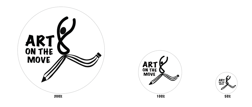
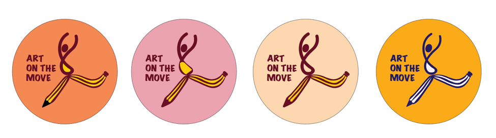
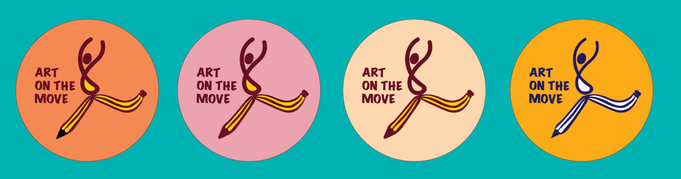
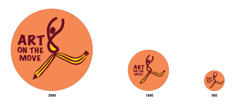
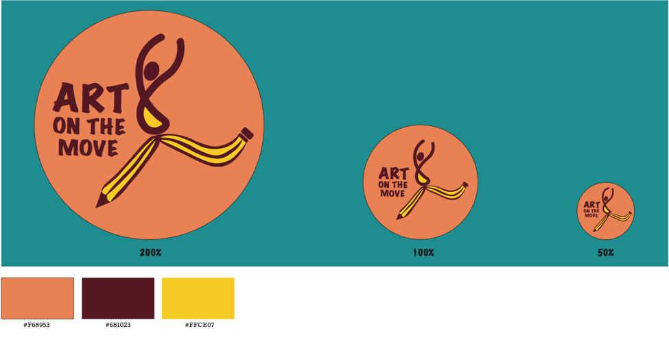
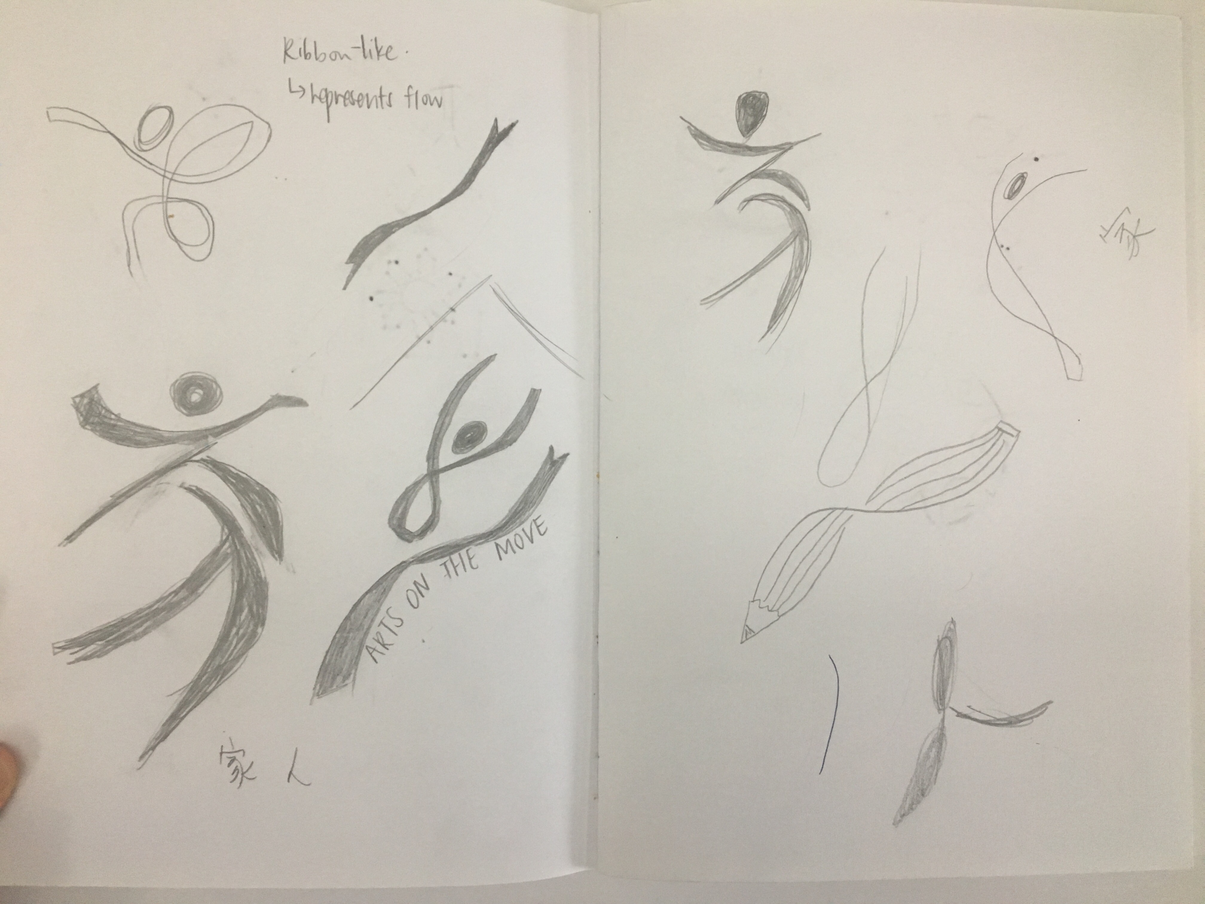
“Art on the move” aims to create a healing environment for our patients through art and craft. Thus, the aim of this project is to develop a logo design for this programme and apply it on button badges which will be worn by the volunteers. The design of the badge should represents the spirit and mission of the programme and volunteers where it appeals to volunteers so that they can collect these badges and feel a sense of achievement.

Brain Storming
List of words that reflects the programme and volunteers:
Connection, dynamic, imagination, transformational, community, interaction, inspiration, care, warmth, fun, exciting, surprise, active, engaging, colours, healing, hands-on, companion, freedom, friendly.

Design Short list & Rationale
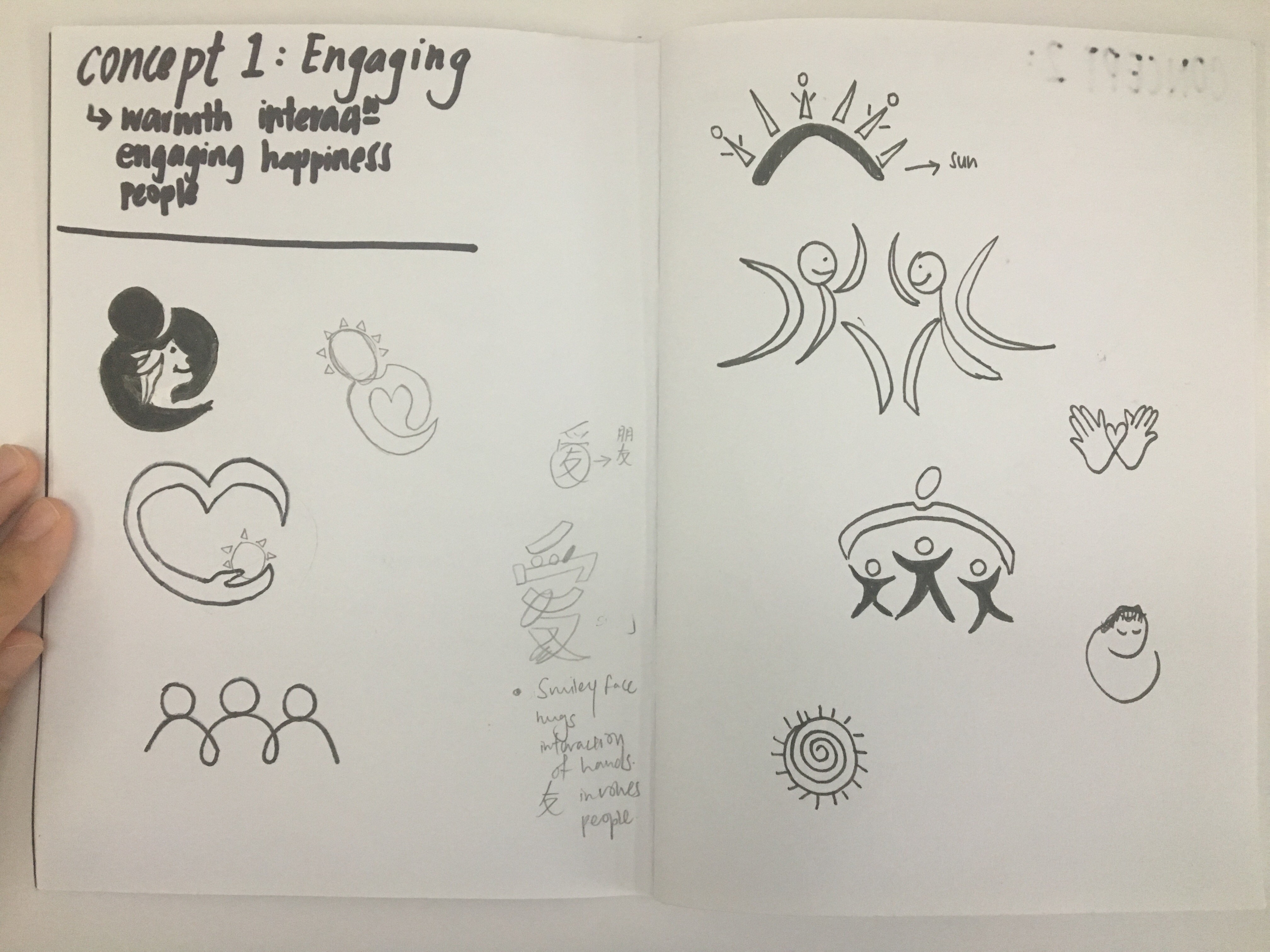
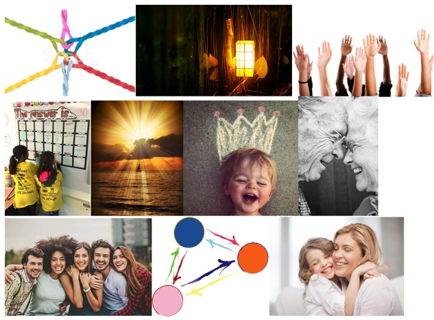
CONCEPT 1: ENGAGING
To depict how volunteers could really engage with patients and allow them to feel a sense of longing and make the patients feel comfortable and happy despite being in the hospital which can be very boring and lonely without any companion.

Keywords: Warmth, engaging, people, interaction, happiness

Mood Board:

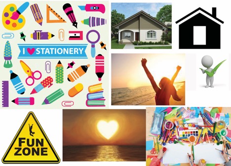
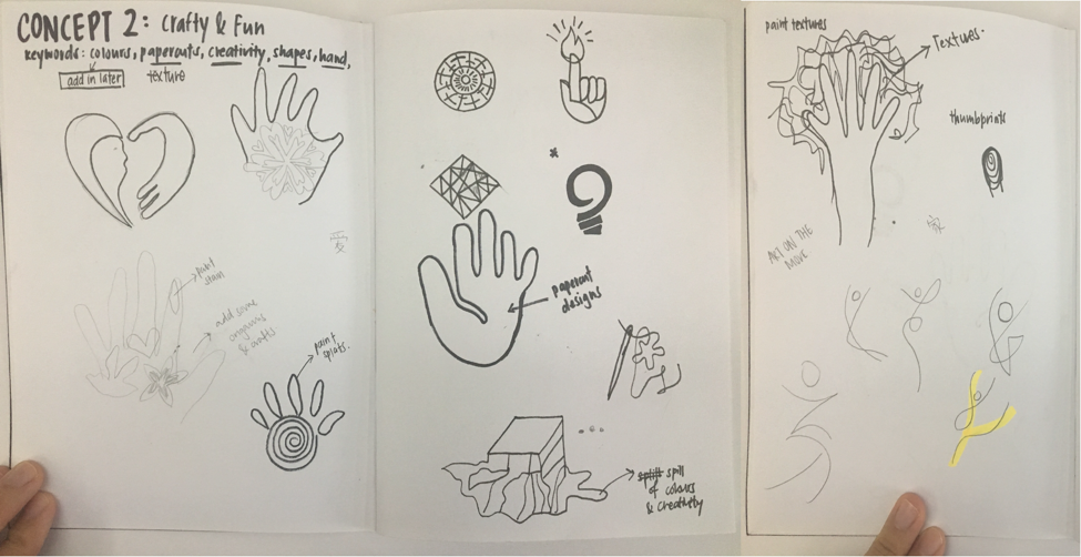
CONCEPT 2: CRAFTY & FUN

Since the Art on the Move mainly focuses on art and craft, i was thinking to incorporate fun into the activities that the patients do in the hospital. Also, since most of the activities would be hands-on, i would like to include hand/hands as well. Therefore this concept would include a range of bright colours and shapes similar to the coloured papers they use to make origami  and papercuts which i want to include into the logos for a more abstract and crafty look.

keywords: Colours, Papercuts, creativity, shapes, hands/hand

MOOD BOARD:

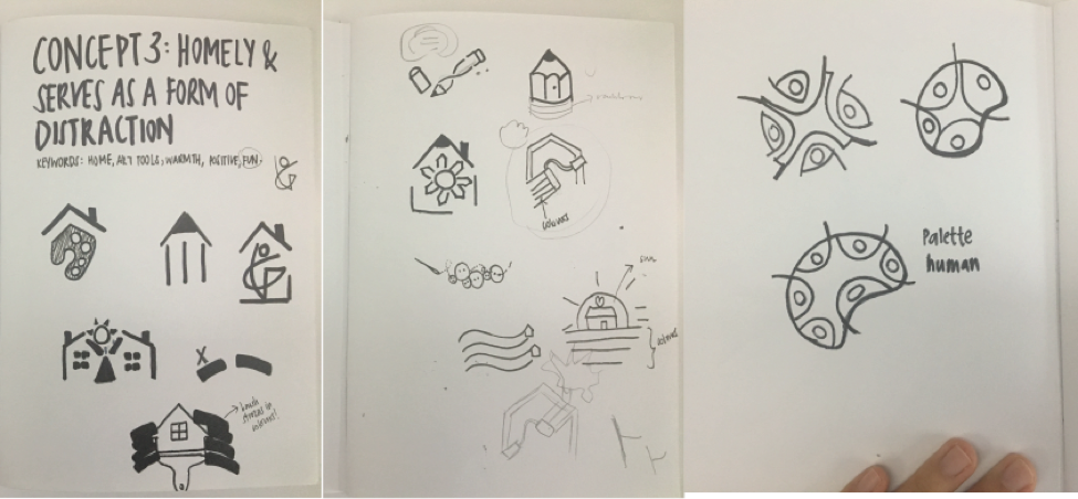
CONCEPT 3:HOMELY & IT SERVES AS A FORM OF DISTRACTION

The fact that being a patient is already not exactly a good thing, the hospital needs to be a comfortable and homely place for the patients. By having the programme Art on the Move, patients are able to do craft work which serves as a form of distraction and allow them to have fun while doing them instead of having the depressed feeling that they are at the hospital with nothing to do for them to occupy their time. 

Keywords: Home, Art tools (paint, pencil, markers etc), warmth, Positive, Fun

MOOD BOARD: