TASK 3: DESIGN REFINEMENT & MOCK UP

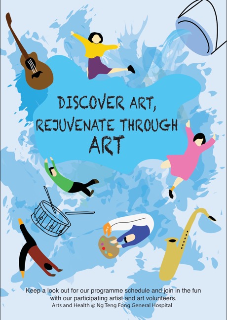
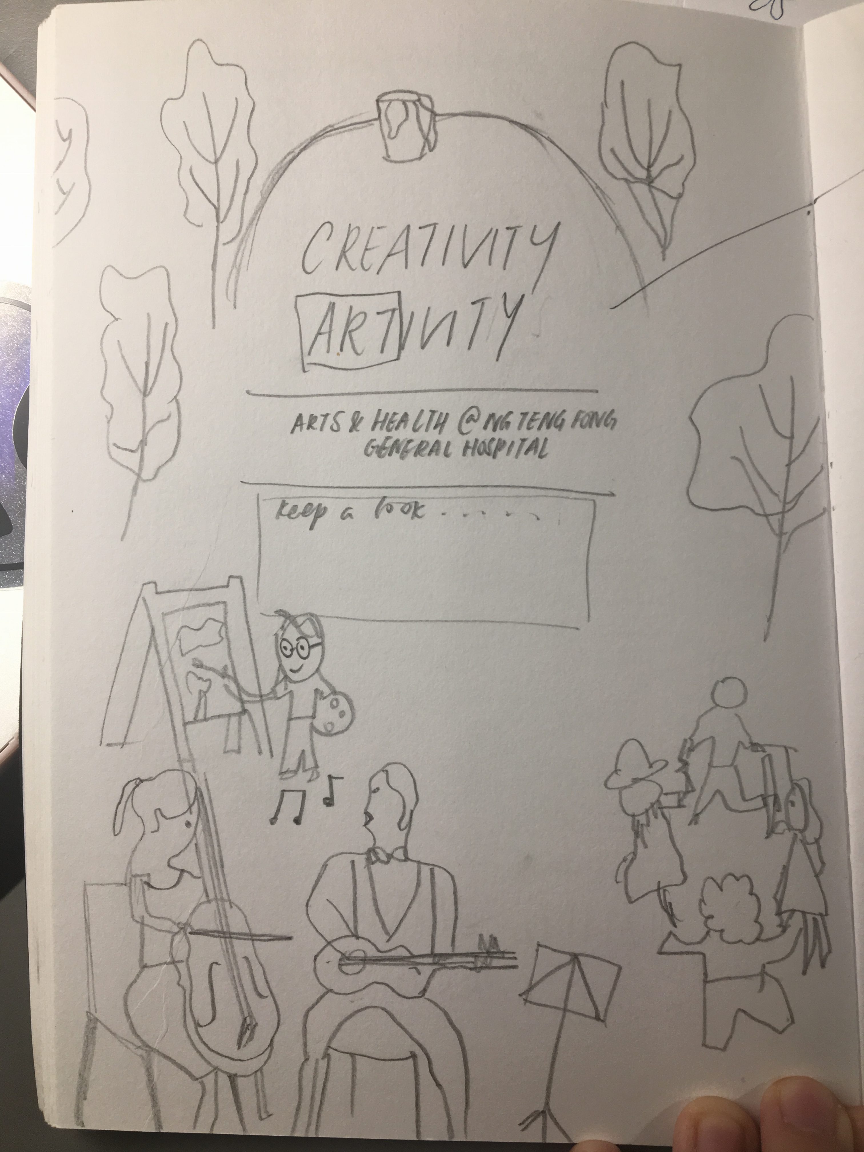
Feedback from sharing in class:
-Need to play with scale of image
-Tighten slogan
-Pull Arts & Heath upwards
-Mute the background more so it wont be distracting
-Incorporate into a circular shape

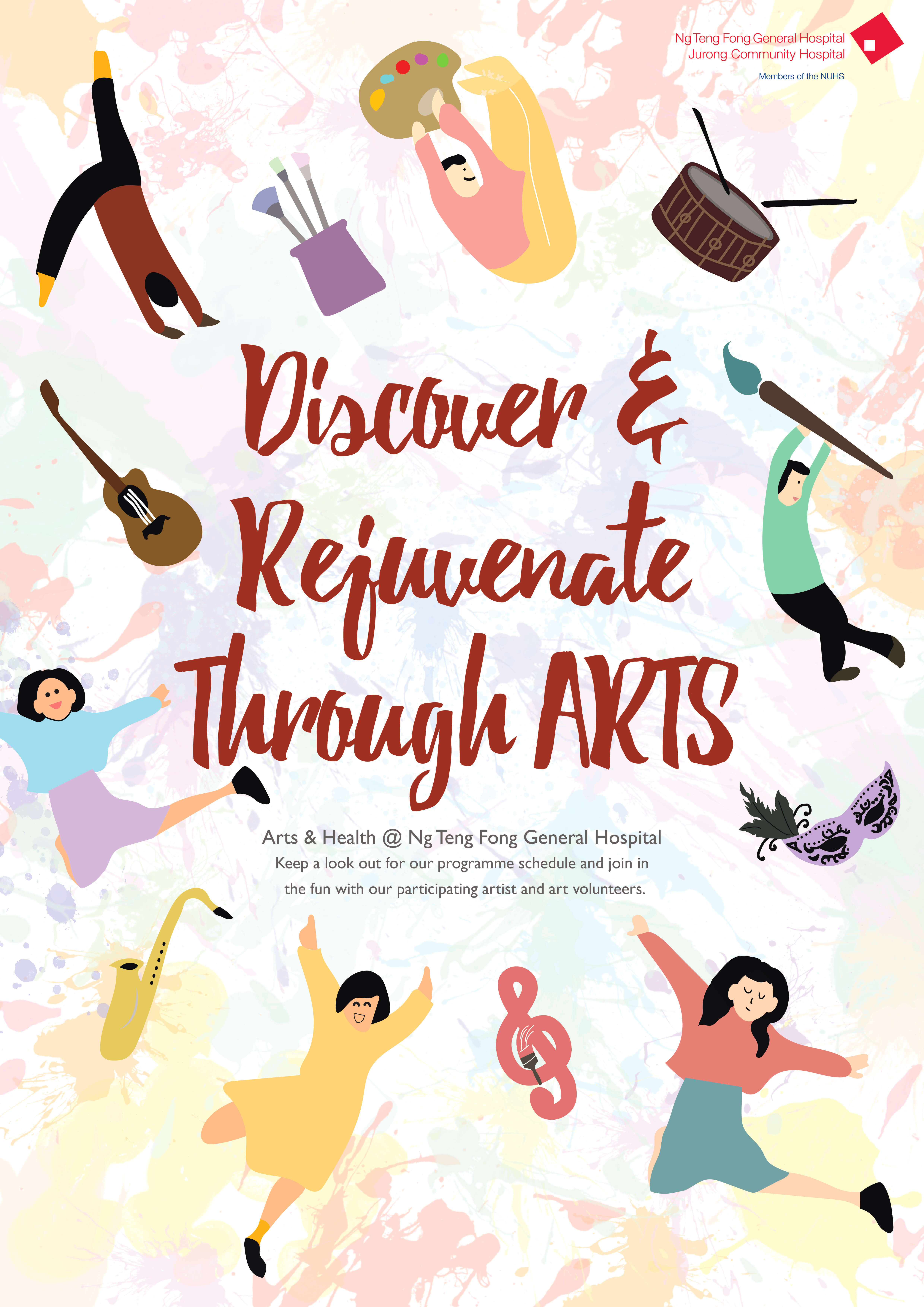
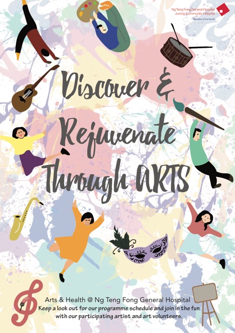
Thus, after the feedback, i decided to change the background and decrease its opacity to mute it further, and then added a few more elements to create an oval around the texts. I resized the text body size as it was too huge previously, changed the colours to fit a colour palette of about 5 colours.

FINAL:

TASK 2: DESIGN EXPLORATION

I only managed to digitalize one of my ideas, which has the slogan “DISCOVER, RECOVER” but later changed to “Discover & Recover from ART” which is then changed again to “Discover & Rejuvenate through ARTS” as recover sounded like the patients were really sick and it might remind them about their illness.

However, after the class, i realised that the splashes in the first design was too much like a water bucket splashing although it was supposed to be paint splattering. Hence, the colour is very important for the background.