PROJECT 3-Colour Theory Research

This is my research on colour theories and just wanted to type out and put in some images 🙂

1.MONOCHROMES HARMONY

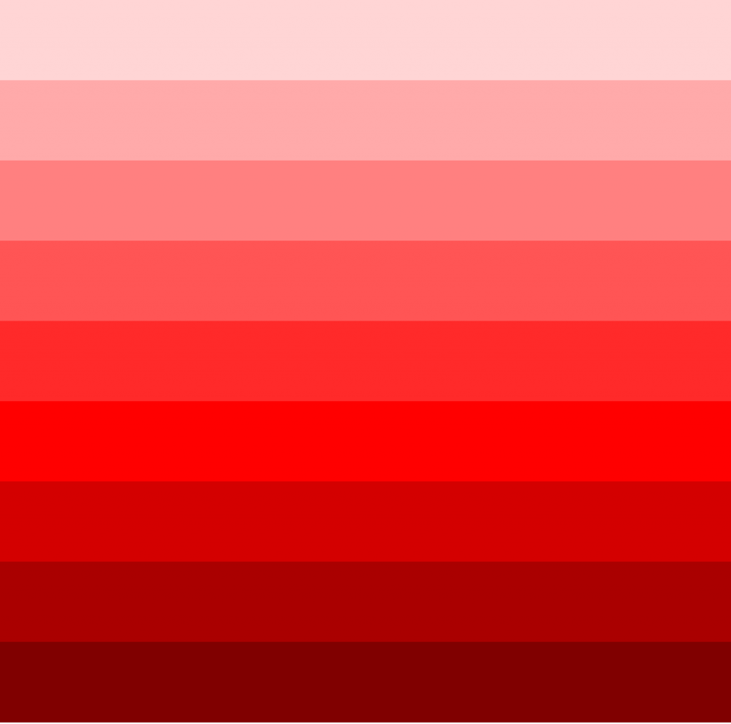
When I first looked at this word, I thought monochrome was just black and white, and after researching about it, it turns out that the colours of a monochromatic palette all share a single hue, but vary in brightness and saturation. White, black and grey are considered to be neutral. It is a basic colour scheme using only one hue in the colour wheel to create a variation of different values in an artwork. This creates a colour scheme that looks very clean and balanced as only one colour is used, creating images that are generally visually appealing, relaxed looking and simplistic.

As I was researching, I found this youtuber that explains quite well on a few different colour harmonies and just thought I would share it here:

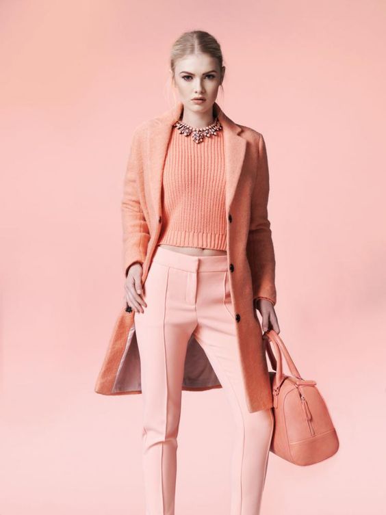
Examples of monochromes harmony:

red-hue

mono

really like this!!

monochromes-harmony_1

2.ANALOGOUS HARMONY

Also know as adjacent colours which on the colour wheel they are directly beside each other. Analogous colour palettes consist of different, but neighbouring hues. The constant property can be either the saturation or the brightness level or both. Usually one of the three colours predominates. Creates an image easy on the eye and comfortable for viewers to look at in which the colours goes nicely together. It is very popular in nature images such as forest where there are greens and yellows and ocean where there are blues and blue-green.

This is the same youtuber explaining analogous harmony:

analogous-harmony

3.ANALOGOUS HARMONY WARM AND COOL

Basically the colours in the colour wheel is divided into two groups: Warm and Cool.
Warm colours(Red, Orange and Yellow) are associated with the warmth of fire and sun.
Cool Colors (Blue, Green, and Violet) connect in the mind’s eye with the coolness of sea, sky, and foliage.

warmcoolcolours

warm-and-cool

warm

4.COMPLEMENTARY HUES

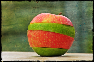
Colors that are opposite each other on the color wheel are considered to be complementary colors (example: red and green).
The high contrast of complementary colors creates a vibrant look especially when used at full saturation. This color scheme must be managed well so it is not jarring.
Complementary color schemes are tricky to use in large doses, but work well when you want something to stand out.
Complementary colors are really bad for text.

complementary

complementary

5. SPLIT COMPLEMENTARY

The split-complementary colour scheme is a variation of the complementary colour scheme. In addition to the base colour, it uses the two colours adjacent to its complement.
This colour scheme has the same strong visual contrast as the complementary colour scheme, but has less tension.
The split-complimentary colour scheme is often a good choice for beginners, because it is difficult to mess up.

splitcomplementary

Summary of the colour harmonies:

colour-harmonies

I never actually researched on colours before and i must say it is really interesting! i particularly liked the monochromes harmony one the most as i feel that the images are indeed very clean and simplistic looking which i might consider applying it into my project 3!

Still thinking of different settings to begin with and currently my mind is really blank 🙁 Hopefully, it’ll come to me soon!!!

Project 2: Forrest Gump RESEARCH

This research portion probably came in a bit late after all the critique has been done, but for sure i did it during the week where we just started this project!

So i researched on different movie quotes and artists that using surrealism and dadalism in their works with also some random researches found on pinterest with pictures i really liked.

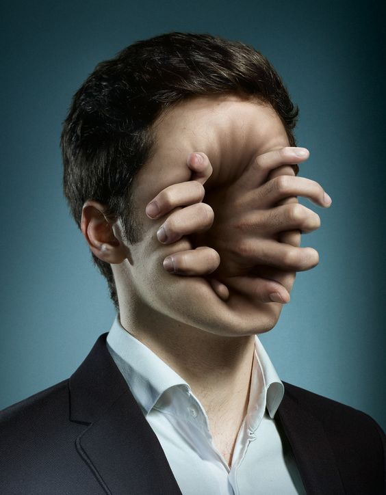
SURREALISM: a 20th-century avant-garde movement in art and literature which sought to release the creative potential of the unconscious mind, for example by the irrational juxtaposition of images.

I feel that surrealism is really interesting as it involves many things that you wouldn’t thought you can actually combine them together to form a surreal picture that some do make a lot of sense. Thus, i got inspired by the different unique pictures on pinterest and decided to take the approach of using surrealism in my chosen quotes for this project.

Here are some pictures i found really interesting:

surrealism_1

surrealism_2

surrealism_3

surrealism_4

surrealism_5

surrealism_6

DADA: Dadaism was an art movement of the European avant-garde in the early 20th century.

Dada was the first conceptual art movement where the focus of the artists was not on crafting aesthetically pleasing objects but on making works that often upended bourgeois sensibilities and that generated difficult questions about society, the role of the artist, and the purpose of art.

2d_11

dadaism

Some of the artist references i researched on

  1. Hannah Hoch:
    Höch was not only a rare female practicing prominently in the arts in the early part of the twentieth century – near unique as a female active in the Dada movement that coalesced in her time – she also consciously promoted the idea of women working creatively more generally in society. She explicitly addressed in her pioneering artwork in the form of photomontage the issue of gender and the figure of woman in modern society.

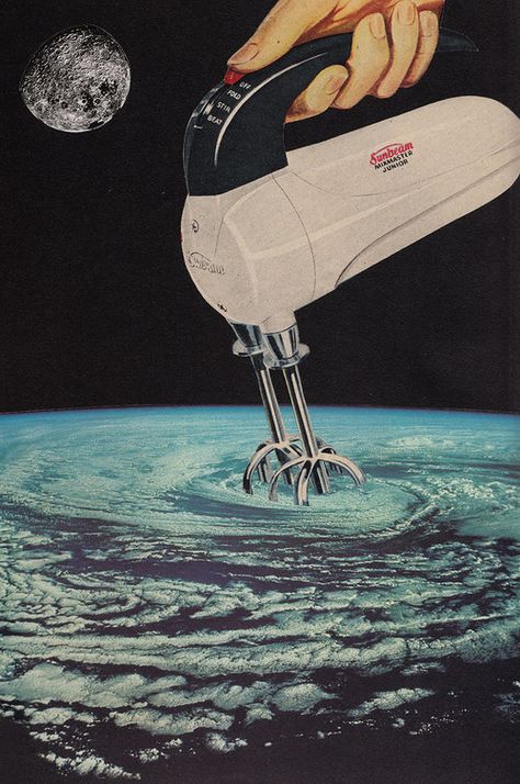
hannahhoch-cutwiththekitchenknifethroughthefirstepochoftheweimarbeer-bellyculture1919

04-hoch-the-great-mother
2. John Heartfield:

John Heartfield was an artist and a pioneer in the use of art as a political weapon. Some of his photomontages were anti-Nazi and anti-fascist statements.

2d_8

Some of the movie quotes i chose while researching was:

-“That’s the thing about pain, it demands to be felt” -Fault in our stars

-“Never forget who you are” -The lion king

-“To live will be an awfully big adventure” -Peter Pan

-“The deeper you go, the weirder life gets” -The life aquatic

-“Sometimes the right path is not the easiest one” -Pocahontas
For this, i actually thought of using runs of the right path where there is actually two different routes that one can go. However, after thinking about it, i feel that it might be too literal. 😛

-“Stupid is as stupid does” -Forrest Gump

-“The past is just a story we tell ourselves” -Her

These are the quotes i chose after deciding to interpret quotes in a dark and gory manner:

“Give a man a mask and he’ll become his true self” -The dark knight

“Pessimism is just a higher form of optimism” -The Innkeepers

“We are who we choose to be” -Spider-man

It was really hard to choose a common “tone” for all the four quotes as didn’t have any theme to begin with but i really wanted to do something using surrealism. Thus, i decided to work with the dark tone since it may leave an impact on the viewers.

PROJECT 1: WORK IN PROGRESS

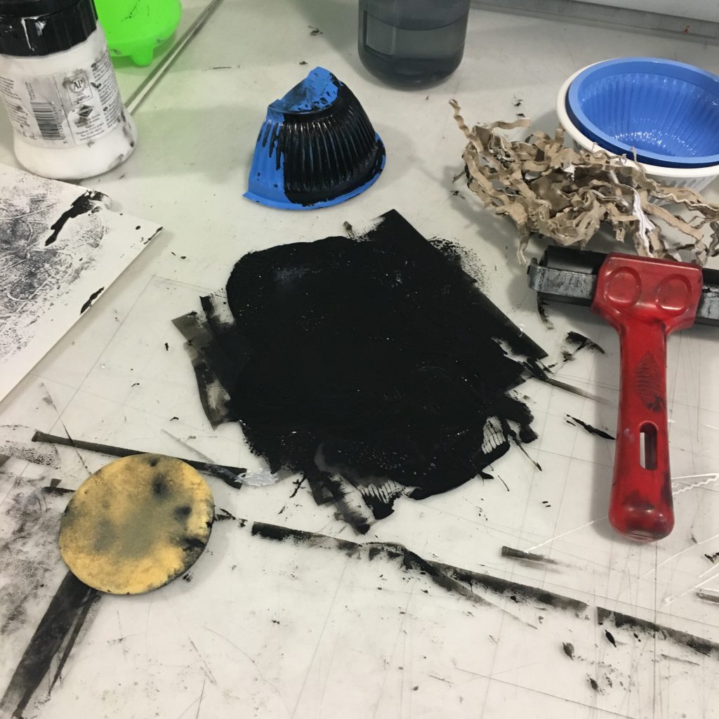
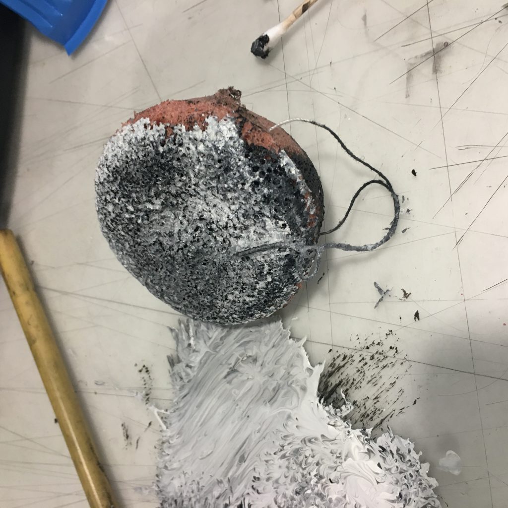
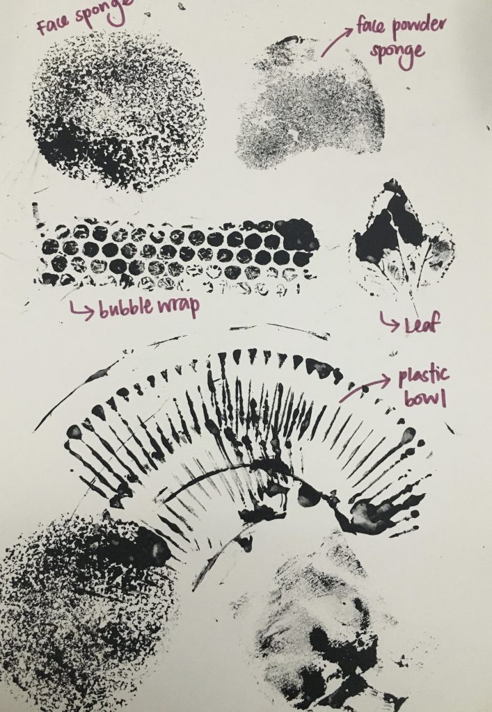
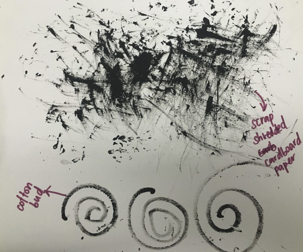
When we first received the project, I didn’t know what kind of concept I would want to do on and just thought that I should experiment with different kinds of materials and explore on what I can do with the materials. Most of the materials are pretty basic, like sponges, leaves, bubble wraps, plastic bowls, cotton buds etc basically the things you can mostly find at home.

This was a pretty challenging project but yet after weeks of exploration and brain-storming for different ideas, seeing the end product gave me a great sense of achievement and I really enjoyed the process.

Initially when I was coming out with concepts, I thought about two main concepts. The first one is emotions that we have every day, weekly, monthly and yearly. This first main idea consists of four groups of emotions, but I felt that they might be a little overlapping as what we feel on a daily basis can also be felt in the whole month itself which doesn’t sound very convincing at all.

So, the second concept is what I eventually chose: Emotions that can be expressed VS Emotions that can be felt but can’t be expressed. I came out with this idea as I remember seeing “unusual” words on social medias that describes a particular feeling that one feels but yet there isn’t an exact emotion that could express it. Thus, I thought I would go into this direction and research more on these words.

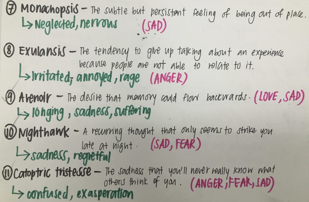
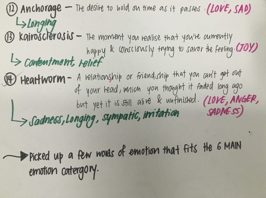
These are words I picked out that seem relevant to emotions taken from my visual journal:

IMG_8110

IMG_8111

IMG_8112

As you can see from all these meanings to the description of emotions that can’t be expressed, all of them actually have more than one kind of main emotion that can be felt. Therefore, they are mixed emotions that one cannot really express.

Thus I decided to work on it and thought that since they are mixed emotions, all of them should look very complicated and there should be a mixtures of materials used when creating the strip of each different feeling. However, there was a contemplation about it as it may all look too confusing to decipher that particular emotion that I am trying to show.

I had to figure out which kind of emotions could fit together to depict the mixed emotion on the strip.

IMG_7514

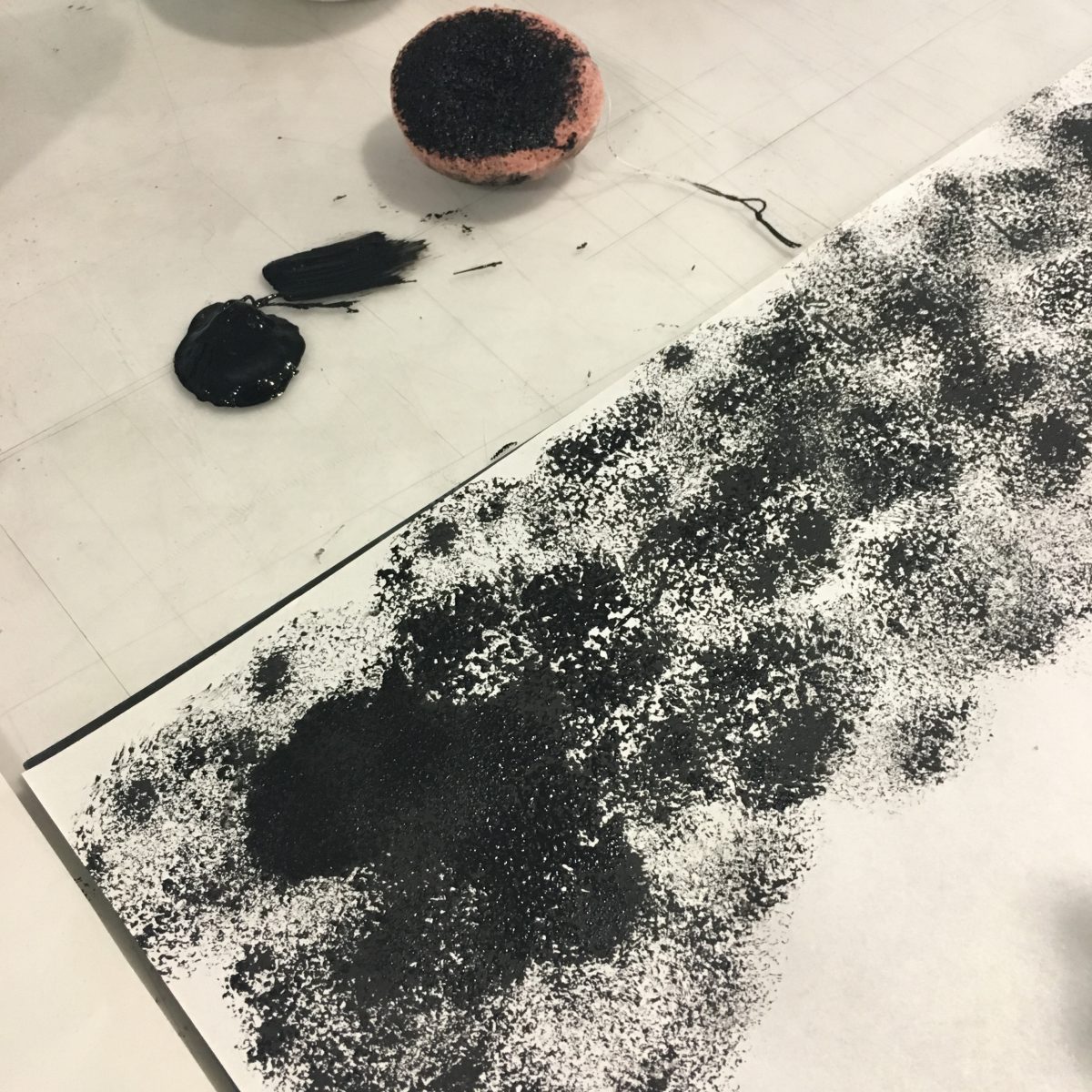
Some of the materials used while exploring

IMG_7515

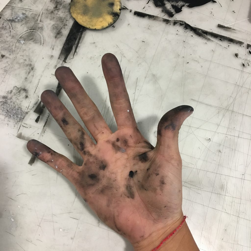
IMG_7513My finger prints are also a form of “material” used as well.

IMG_8113-min

IMG_8114

Outcome of the materials used with different techniques! I tried many different textures to mix and match and try to see which one is the most suited for a particular emotion that can’t be explained.

Therefore i feel that my work in progress is mainly from experimenting different textures myself and coming into a conclusion if the strip actually shows what the emotion it was trying to portray. My next post will be about the strips i have chosen and the explanation of why i chose that strip 🙂