After visiting Redhill for the first time as written in the last post, I decided to think in depth on what are the unique features of Redhill and what kind of information i can add into the infographics. At first, during the group consultation, i just wanted to do an infographic to guide the residents in Redhill on the different places they can go to since Redhill is a place that is pretty small and clustered. Another idea I had in mind was to do a guide for people to exercise in Redhill since I observed that the residents are mostly all really fit looking and thus to encourage more people to work out and exercise, my infographic could be about a rough routine that people follow to stay fit!
Thus, after much consideration, i decided to go with the exercise routine since it is a pretty fresh topic to work on compared to the normal boring guide around Redhill where most people would actually already know about. There were a lot of considerations to take note before starting on my infographic cause i really have no idea how I want my infographic to be and how it should look like.
To have a clear idea on how I should start, I wanted my infographic to be simple and clear (straight to the point) and my target audience was residents living in Redhill. Then, i sieved out the “healthy” places that people can go to which were:
1) Delta Sports Complex (Swimming complex, gym, running track included)
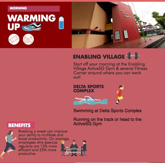
2) Enabling Village (Gym, fitness corners, Fairprice)
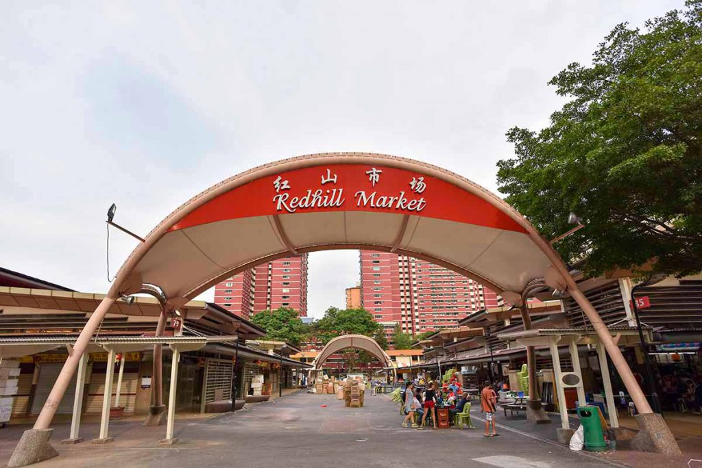
3) Redhill Market
Which I further picked out healthy food that people can consider- Chicken Rice, Teochew Porridge, Fresh Fruits and juice.
4) Bukit Merah Central- where there is a pretty renowned salad store
5) Tiong Bahru Park
Following up, I decided to do a routine kinda thing where people can follow once the day start and how to end the day. However, at that point in time, i was still considering if i should do something like a timeline, a route that flows accordingly to the Redhill Map or like a morning, afternoon and evenings routine.
Some reference that was quite useful:


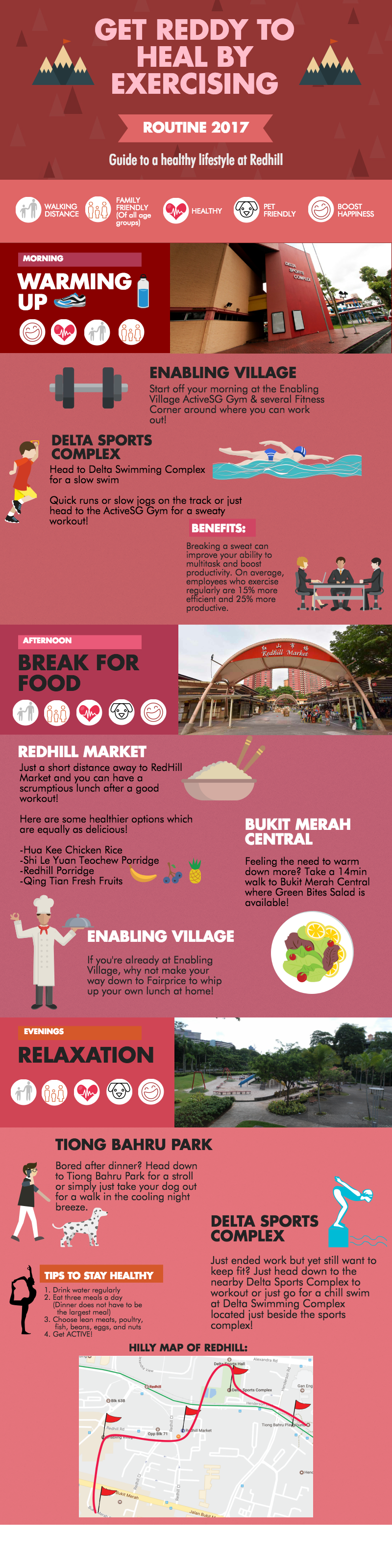
After that I decided on the title where people would not just throw the infographic away once they see it. I decided on: GET REDDY TO HEAL BY EXERCISING hahahha REDDY (RED) HEAL (HILL)= REDHILL!!!! i was quite proud of myself thinking of this pun heheh 😛
DIFFERENT PLACES THEY CAN HEAD TO IN THE ROUTINE:
Mornings-
Delta Sports Complex, Enabling Village, Swimming Complex
Afternoons-
They can eat at Redhill Market, Bukit Temah Central or simply just buy ingredients from Fairprice @Enabling Village to cook at home
Evenings-
Enabling Village
Tiong Bahru Park for a stroll
Sports Complex
Since there are only a few places they can go, i was actually quite scared that the places would turn out too repetitive in my infographic, thus it was important to add a balance of icons and words so that they won’t look like a copy and paste of details.
When i first started on the mornings: there were a lot of blank spaces everywhere and i didn’t know what image to put in. Then i decided to play with the sizes of the text to make it fill up the space instead of adding more pictures which may look very clustered and squeezy.
Oh yes, and for the colours wise, people who do not know what/where Redhill is, they would often associate it to Red, which is the distinct representation of Redhill, judging from the MRT station, the HDB flats which was the muddy red colour in the past and now it gradually fades to pinkish colour as more whites are added to the buildings. These are all from my observations which there are different shades of red involved in the buildings of Redhill.
Some examples would be the sports complex and the redhill market:
(Notice the flats behind have the shades of red too!)


The colour palette i decided to reference from in my infographic.
To sum things up, I wanted White to represent modernity hence the Red gets gradually lighter in my infographic and the pinkish tone is used at the end to represent how people are adapting to having a healthy lifestyle which then links to the idea of Pink of Health!
Also, I added a few facts here and there so that the target audience would know the benefits of exercising! Plus another pun(?) in the map i added at the bottom of my infographic for people to see Redhill as a big picture and know where are all the places!
YASSSS FINALLY after the wordy paragraphs on top, this is my final infographic!!

Pretty satisfied in general and I was really happy that there were many positive feedbacks! However, maybe it would be better if i could add more benefits to actually motivated the people reading this infographic to actually WANT TO exercise to stay fit. HAHAHAH although i assume most of them would already know since even the old people are so buff and strong 😛
I do not really have any idea on how to incorporate this into a zine yet but i’ll research more about it and post it in the next post. 🙂
Thanks for reading!


![INFOGRAPHIC PROCESS AND FINAL [PROJECT 2 (PART 1)]](https://oss.adm.ntu.edu.sg/a160025/wp-content/uploads/sites/823/2017/03/cover-825x510.png)