Zine part 2 (Reseach & Final)

Before I continue to my final process and outcome of Zine part 2, here is my link to my infographic from part 1:

RESEARCH- https://oss.adm.ntu.edu.sg/a160025/project-2-part-1-zine-neighbourhood-explorer-research/
FINAL- https://oss.adm.ntu.edu.sg/a160025/infographic-process-and-final-project-2-part-1/

INSPIRATION AND EXAMPLES OF ZINES

IDEATION:

Following my infographic, i wanted to follow the colour scheme of different shades of red. I decided to stick to yellow, orange and red for my background and decided to do a watercolour wash for all the spreads.

These are the backgrounds i used by using the watercolour brush on AI and then mixing it together

COVER PAGE AND BACK COVER:


I thought of this cover page at the end of my different spreads so as to tie the illustrations and background altogether.

1ST SPREAD:

Initially i just wanted to illustrate this obese lady on this spread only, but i decided to bring her along in all the spreads so as to make it more vibrant and fun.

2ND SPREAD:

Before- this was my test print and i felt that it was too dark and the readability is unclear. The background wasn’t very distinct in terms of water colour as well.

Final- Since i decided to add the obese woman in, i wanted to make my illustrations clearer thus i added a black outline to the mountains/hills to make it more distinct as compared to the previous one. I changed the watercolour sun and moon to something more illustrative as well.

For the content wise, i decided to incorporate the routine from my infographic to the middle spread so as to make the zine a more objective one linking to Redhill.

3RD SPREAD:

For this last spread, i wanted to add in recipes that is healthy for snacks and meals but i decided to go with small food type that can be snacked on in the everyday basis. I added the benefits of these food and show the transformation of the lady through a route to “good eating habits”.

OVERALL:
As for fonts, i decided to write my own for the titles and headers, so as to give it a more cohesive look to the zine.

YAY thanks for reading, finally ended 2D and I’ve really learnt a lot this semester and i think it was really interesting and i hope i had improved on my digital skills HAHAHAH 🙂 Thanks for the great 2 Semster Joy!! :))


INFOGRAPHIC PROCESS AND FINAL [PROJECT 2 (PART 1)]

After visiting Redhill for the first time as written in the last post, I decided to think in depth on what are the unique features of Redhill and what kind of information i can add into the infographics. At first, during the group consultation, i just wanted to do an infographic to guide the residents in Redhill on the different places they can go to since Redhill is a place that is pretty small and clustered. Another idea I had in mind was to do a guide for people to exercise in Redhill since I observed that the residents are mostly all really fit looking and thus to encourage more people to work out and exercise, my infographic could be about a rough routine that people follow to stay fit!

Thus, after much consideration, i decided to go with the exercise routine since it is a pretty fresh topic to work on compared to the normal boring guide around Redhill where most people would actually already know about. There were a lot of considerations to take note before starting on my infographic cause i really have no idea how I want my infographic to be and how it should look like.

To have a clear idea on how I should start, I wanted my infographic to be simple and clear (straight to the point) and my target audience was residents living in Redhill. Then, i sieved out the “healthy” places that people can go to which were:
1) Delta Sports Complex (Swimming complex, gym, running track included)
2) Enabling Village (Gym, fitness corners, Fairprice)
3) Redhill Market
Which I further picked out healthy food that people can consider- Chicken Rice, Teochew Porridge, Fresh Fruits and juice.
4) Bukit Merah Central- where there is a pretty renowned salad store
5) Tiong Bahru Park

Following up, I decided to do a routine kinda thing where people can follow once the day start and how to end the day. However, at that point in time, i was still considering if i should do something like a timeline, a route that flows accordingly to the Redhill Map or like a morning, afternoon and evenings routine.

Some reference that was quite useful:


After that I decided on the title where people would not just throw the infographic away once they see it. I decided on: GET REDDY TO HEAL BY EXERCISING hahahha REDDY (RED) HEAL (HILL)= REDHILL!!!! i was quite proud of myself thinking of this pun heheh 😛

DIFFERENT PLACES THEY CAN HEAD TO IN THE ROUTINE:
Mornings-
Delta Sports Complex, Enabling Village, Swimming Complex

Afternoons-
They can eat at Redhill Market, Bukit Temah Central or simply just buy ingredients from Fairprice @Enabling Village to cook at home

Evenings-
Enabling Village
Tiong Bahru Park for a stroll
Sports Complex

Since there are only a few places they can go, i was actually quite scared that the places would turn out too repetitive in my infographic, thus it was important to add a balance of icons and words so that they won’t look like a copy and paste of details.

When i first started on the mornings: there were a lot of blank spaces everywhere and i didn’t know what image to put in. Then i decided to play with the sizes of the text to make it fill up the space instead of adding more pictures which may look very clustered and squeezy.

Oh yes, and for the colours wise, people who do not know what/where Redhill is, they would often associate it to Red, which is the distinct representation of Redhill, judging from the MRT station, the HDB flats which was the muddy red colour in the past and now it gradually fades to pinkish colour as more whites are added to the buildings. These are all from my observations which there are different shades of red involved in the buildings of Redhill.
Some examples would be the sports complex and the redhill market:

(Notice the flats behind have the shades of red too!)


The colour palette i decided to reference from in my infographic.

To sum things up, I wanted White to represent modernity hence the Red gets gradually lighter in my infographic and the pinkish tone is used at the end to represent how people are adapting to having a healthy lifestyle which then links to the idea of Pink of Health!

Also, I added a few facts here and there so that the target audience would know the benefits of exercising! Plus another pun(?) in the map i added at the bottom of my infographic for people to see Redhill as a big picture and know where are all the places!

YASSSS FINALLY after the wordy paragraphs on top, this is my final infographic!!

Pretty satisfied in general and I was really happy that there were many positive feedbacks! However, maybe it would be better if i could add more benefits to actually motivated the people reading this infographic to actually WANT TO exercise to stay fit. HAHAHAH although i assume most of them would already know since even the old people are so buff and strong 😛

I do not really have any idea on how to incorporate this into a zine yet but i’ll research more about it and post it in the next post. 🙂

Thanks for reading!


Project 1: Que Sera Sera Process

Before starting on this project, I thought of what jobs i really wanted to be when i was younger and how it gradually changes along the way when i grew older due to the difficulties faced on achieving it along the way.

I shortlisted 5 jobs at the beginning which was:

  1. Dentist
  2. Cleaner
  3. Hairdresser
  4. Netballer
  5. Designer

DENTIST

I always wanted to be a dentist since young as i was never really afraid of going to the dentist and in fact, i actually like it a lot. Many kids would cry when they reach the Dental clinics but i would be a little excited every time cause i really like the smell of a dental clinic HAHAHAH. Also, i used to always pluck out my baby teeth myself when i was younger when it was of course, very shaky. Thus i took triple science in Secondary school and i realized that i can’t do science for nuts, however it didn’t really kill me yet as my results were still acceptable. Only until i entered JC and i stubbornly continued taking Biology and Chemistry which i knew i couldn’t take it anymore as I’ve been failing very badly throughout my 2 years. It was too much content and i really couldn’t absorb any of it.

Due to all these failures i faced, i got really demoralized at a point of time when i really wanted to give up which brings me to my next job.

CLEANER

There is a sterotypical way of thinking that if you don’t study well, you would end up being a cleaner as you don’t need any qualifications to do this job. Thus, for a period, i was really afraid that i would end up as a cleaner or a road sweeper due to all the failures I had after taking science all my life.

HAIRDRESSER

However, to persuade myself that i could actually get a proper job, i thought of an easy way out to my failures. I could just take up a hairdressing course in other schools and just take over my dad’s shop since he owns a salon himself. Therefore, my third job is a hairdresser. Which was something very interesting and new to me.

NETBALLER

Or maybe i thought that since i am bad at science and studying, i decided to focus on what i am actually pretty good at which is playing sports in particular Netball. However, a job that i can think of for being a good netballer is just simply representing the country for it and making into the National team which i never pursued due to my studies.

DESIGNER 

Lastly, after all the failures and difficulties faced along the way, i still got into a local university and studied something i always had a interest in but never thought of pursuing further since i do not have a strong background for Arts. However, everything somehow worked out and i am in ADM now, thus, a job i want to be now would be a designer.

IDEATION:

In the end, i decided to leave out the job as a netballer and chose the other four jobs: Dentist, Cleaner, Hairdresser and Designer for this project.

As i brainstormed on how i wanted to illustrated the jobs out, it was tough thinking of how to incorporate initials of my name into the compositions as well. Then i decided to go with a cheeky and happy approach to this project since its something that i wanted to be and i was young and how it gradually changes along the way. Therefore, i wanted to use bright colours for all the 4 compositions and somehow link them together since it is pretty much a short story of my life.

An approach i really want to take was to have a repetition of a tool that is required in the job to represent the job-
For example Dentist, teeth and some other tools could be used. Hairdresser, scissors, comb?
I also sketch out some of the tools, thinking how to link them from one composition to another to make all of them to have a similar tone to all the compositions.

img_2686

Also, i wanted to do a full on digital to try to experiment on Ai and photoshop since i have never learn them before. I a decided to draw out on a wacom for all the equipments.

I started with the Dentist composition and it turned out something like this at first:

picture1

However, after the first consultations, Joy suggested that i don’t add any text into the compositions and instead use the tools to form out my name.

scissors

Before adding colours to it.

coloured

Making use of the whites from the scissors by playing with colours to bring out the initials “CT”.

Next, another difficulty i faced was the colour i should use for the compositions. I wanted the Dentist job to be bright then it fades for the cleaner job, increase in the brightness of the colour again for the hairdresser and for the designer, it will be bright and clear. Then i decided to find some artist reference i could use for the colours.

  1. Keith Haring:

keith keith2

I really how he uses contrasting colours to bring out the subject making it look very fun and happy.

2.  Andy Warhol

andy andy2

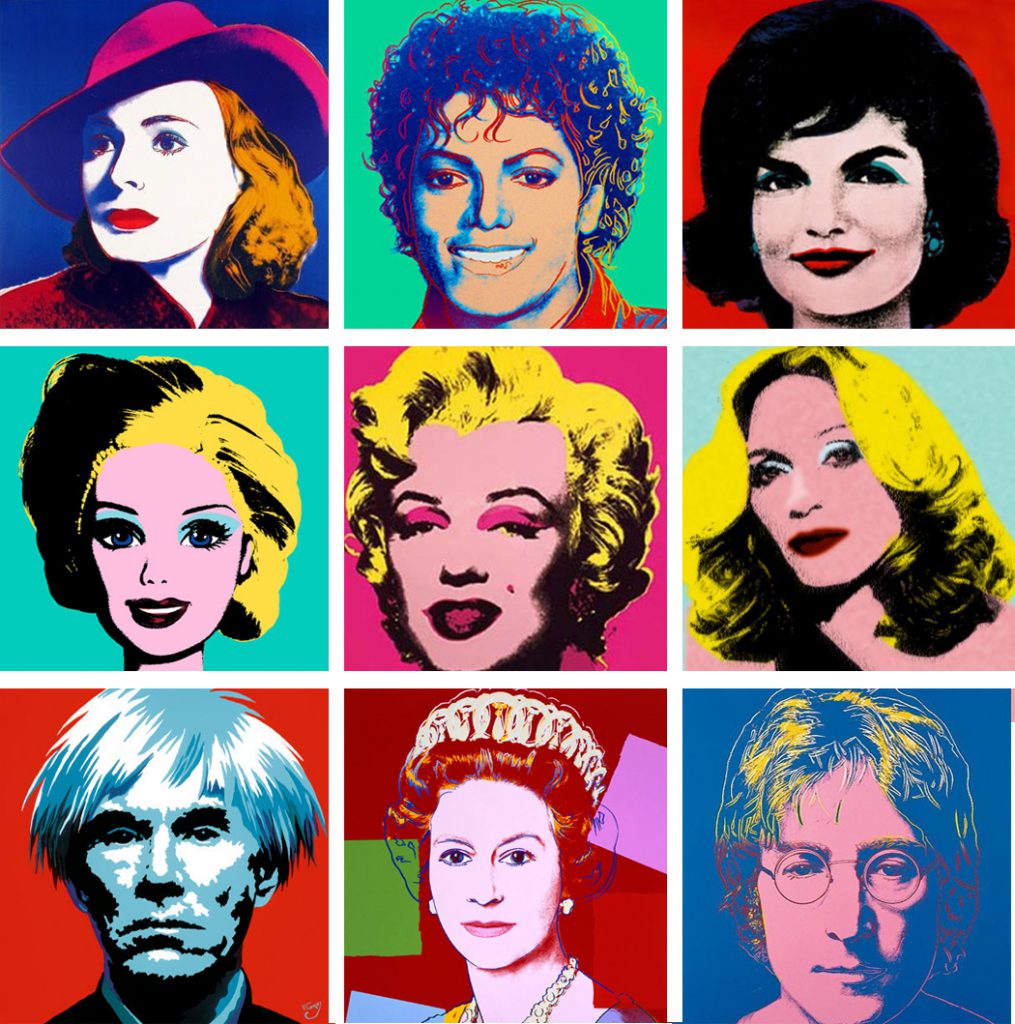
Andy Warhol uses more of the pop-art techniques which was effective as well in bringing out the content to the eyes.

I got inspired by all of these pictures and decided to use split complimentary colours for my compositions but i have yet to think about which colours until the last part.

2

The thought of how to link such tools was another big problem cause i wanted all my 4 compositions to be close together showing how each job evolved into another through the tools.

img_2687

Whether the compositions should be placed into one straight line or a rectangle (2 at the top, 2 on the bottom) was another consideration i had in mind. As i continued to work on the dentist composition, i decided to incorporate my name in this way:


den

The mirror tool makes out “TE”. 🙂

For the other compositions i was thinking of a way to insert my name as for this kind of repetition composition, it is best if the words don’t have many letters or it would be too complicated.

Names: Chia Te, Te, CT, Chia, 21? (my favourite no.)
I scraped the idea of my chinese name as it was too much strokes to it and it would definitely make the composition very messy.

These are parts of my process mainly only for the first two compositions and i’ll have another post on my final compositions! 🙂 Thanks for reading!!