3D Project 2: Conceptual Object Final

Most people see hair as a waste after they cut them in salons but yet why do people not see animals fur or birds feather as waste? Instead, we use them as clothing pieces for textures and prints, jackets, pillows and floor rugs.

Therefore, i decided to work with HUMAN HAIR that are cut away and left on the floor in salons and critique on hair as waste since no one actually use hair for anything purposeful.  I mean, even hair extensions and wigs are mostly not made out of real human hair, they are either synthetic fibres or horse hair (another animal!!)

Then, i thought of the fact that people go for hair for hope to shave their heads for a purposeful reason but yet the hair itself is a WASTE in the end cause nobody would actually collect hair. Despite the fact that hair is something somewhat significant to hairdressers just cause they do it for a living, the hair they cut everyday are ultimately thrown away as a waste as well.

Thus, i decided to make a pillow for this conceptual object cause it is mainly something we lie on everyday when we sleep, and since we don’t mind lying on goose feather pillow or cotton, why not lie on HAIR??

MATERIAL

For material wise, i wanted something that is clear so as to directly show people that yes, its a pillow that has hair inside. Therefore, i chose to use a plastic material since if cloth is being used, the hair would all pass through the cloth and it wont stay inside the cloth. Plus, by using plastic, it kinda looked like those inflatable pillows we buy which is initially what i wanted to use but then i couldn’t find clear ones, it’s all either coloured or patterned… And besides, the small hole for us to inflate the pillow wouldn’t be able to fit hair into it either.

PROCESS

Making a pillow seemed too simple although the process of sealing the freaking plastic together and making sure it stays is damn hard especially when hair keeps sipping through the tiny holes. I only manage to seal when i add lesser hair into the plastic.

Then, to make it look not so easy and simple, i decided to make 2 covers for the pillow WITH MORE HAIRRRR!! These are some of the pictures i captured during the process:

for the pillow, to give it more form and shape inside so that it doesn’t look like a chunk of hair, i threw in pony tails directly and i tried to braid it as well.


a GIF for my end product! :))

IMG_4866

Overall, pretty satisfied and i had fun with this project! :))

Assignment 3: EGO WIP+ FINAL

For this final project for semester 1, i feel that it was generally a really self-exploration one where I had to think of putting myself in various setting and how i react to it. After brainstorming in the first week, i decided to play with time. Basically in the different settings:
1) How TIME passes slowly
2) How TIME passes very fast
3) How TIME stops in my head
4) Me thinking of  where did all the TIME go to.

So, I came out with 4 different settings first:

  1. Where time passes slowly when I’m in a place where there is many people/strangers and I don’t know how or who to interact with, thus, being an introvert, I would tend to be very awkward and thus not knowing what to do in such situations but just hope that time passes by quickly so I could escape from this setting.
  2. Time passes by so fast when I’m overseas travelling. I am a person who really likes outdoor adventures and being in a new environment overseas. Thus, whenever i am overseas, time passes super quickly.
  3. Time stops in my head when I am day-dreaming. I get distracted very easily to the point where i could just stare into space and be in my own word even when I am doing work. I just feel that there is a moment where time actually stops and I will be pretty much oblivious to my surroundings.
  4. For the last setting, I think it is pretty common how some nights when we go to bed, we just tend to look back at our lives and sometimes just thinking of where did all the time go to. I personally tend to overthinking in such settings and the sudden realisation that I lost track of time due to busy schedules in my daily life.

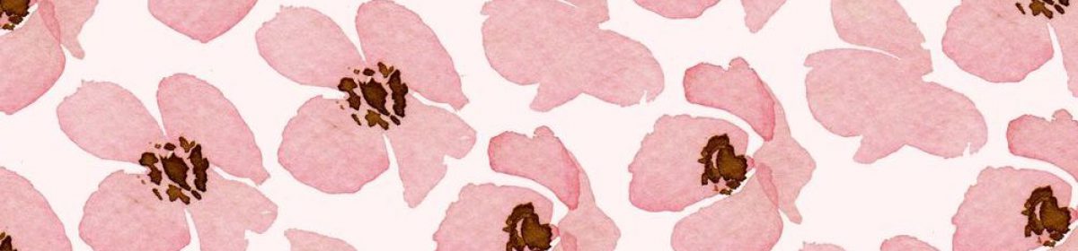
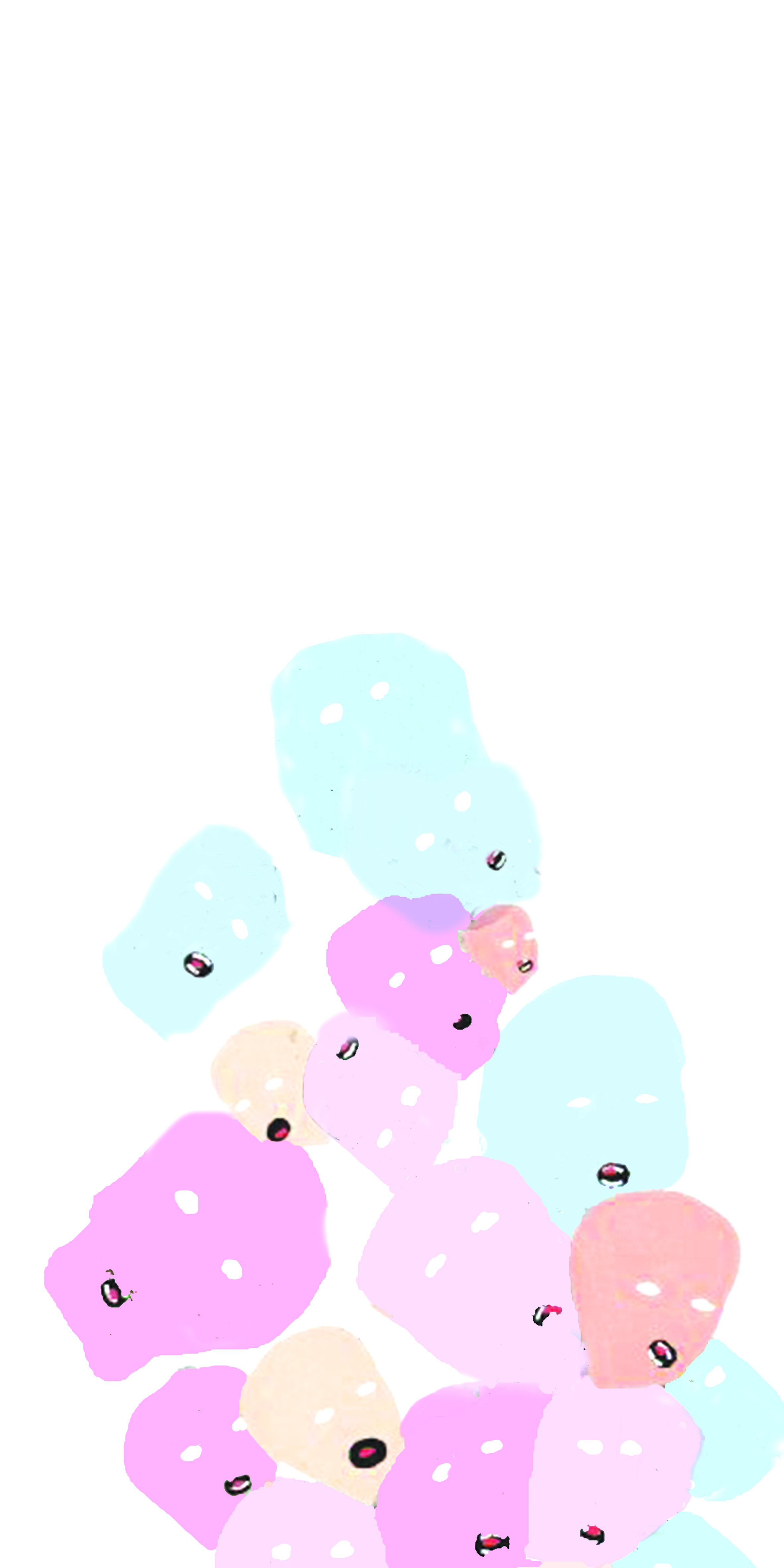
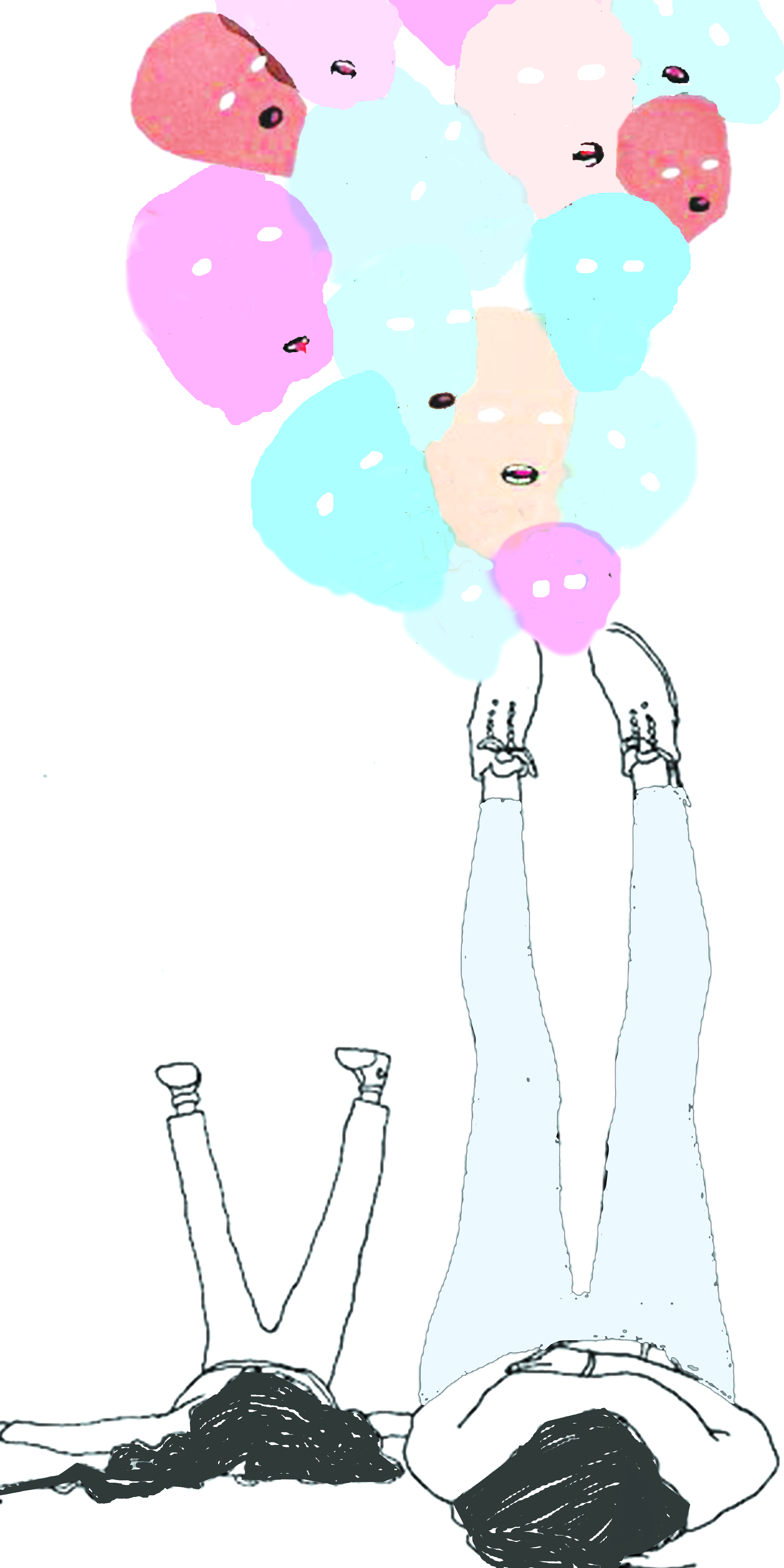
Then, i moved on to thinking about how i should do the “ME” part of the equation, whether to do 4 different sides of me or to have 4 “Me’s” combined together to form one ME. Initially, i wanted to do a portrait of me but cut into 4 squares, but it was really quite hard to crop of just my face and to make it so long in length wise. Thus, after wrecking my brain for the longest time, i decided to show how i grew as time goes by and how i am who i am today. The four squares would be a whole picture that represents ME as a whole. So for the extreme bottom square, it is the young me and the now me lying on the ground with our legs leaning against the wall, looking up. Then for the second and third box, there are all my emotions as i grew up, which depicts faces of different colours which represents different emotions. Next, paper-cuts of patterns that has a face and curves in it hooks together to form a big figure of a persons eyes and mouth on the first box. It shows how through different emotions of mine through my younger self and how, made me grow into who i am today.

final12final-copy
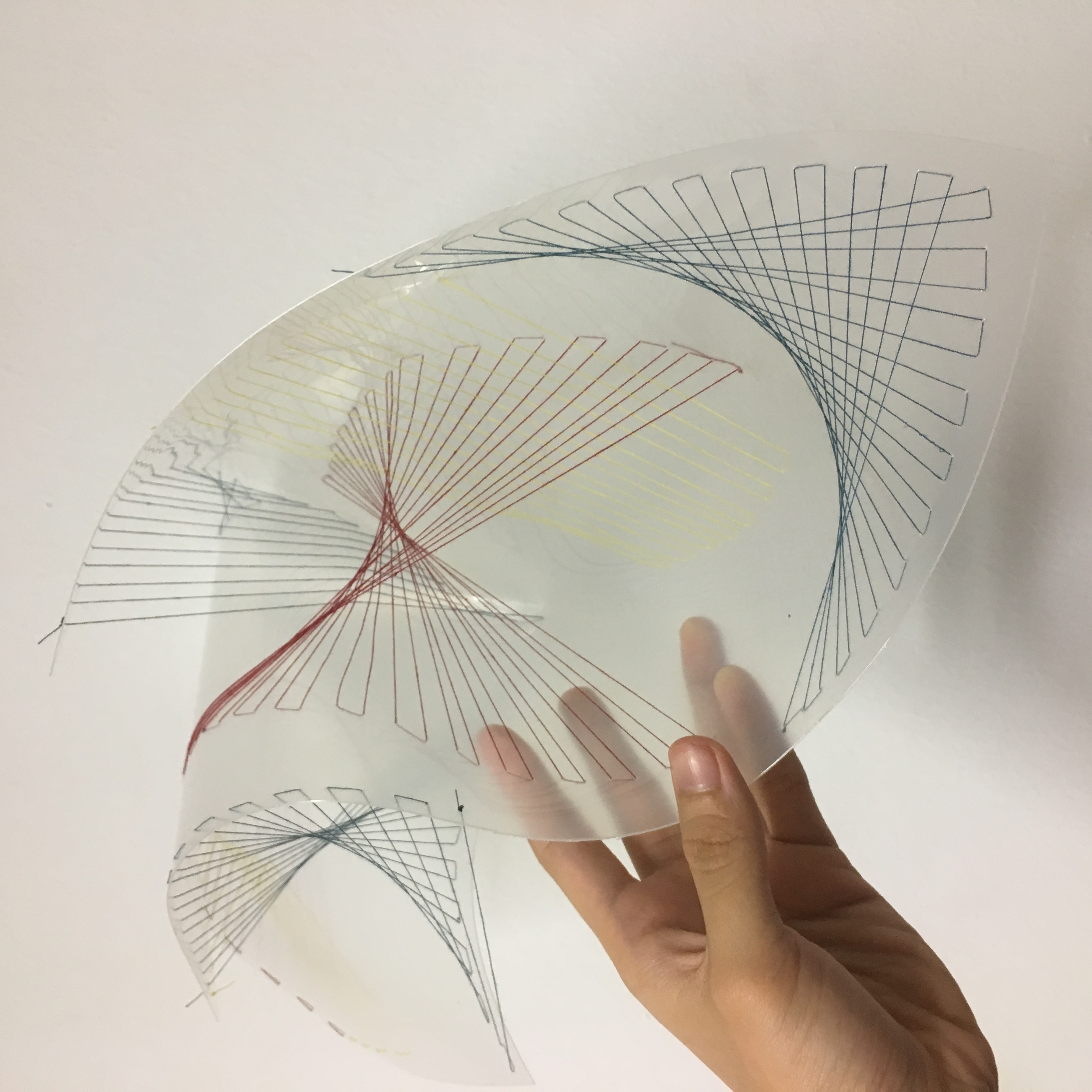
This is just my draft of the first three boxes without the paper cuts yet! Yeah, i wanted to portray it like that. The final one will be shown at the bottom! 🙂

Lastly, for the equals part of all the 4 equations, it was the hardest to think of how i want to show my reaction towards the 4 different settings.
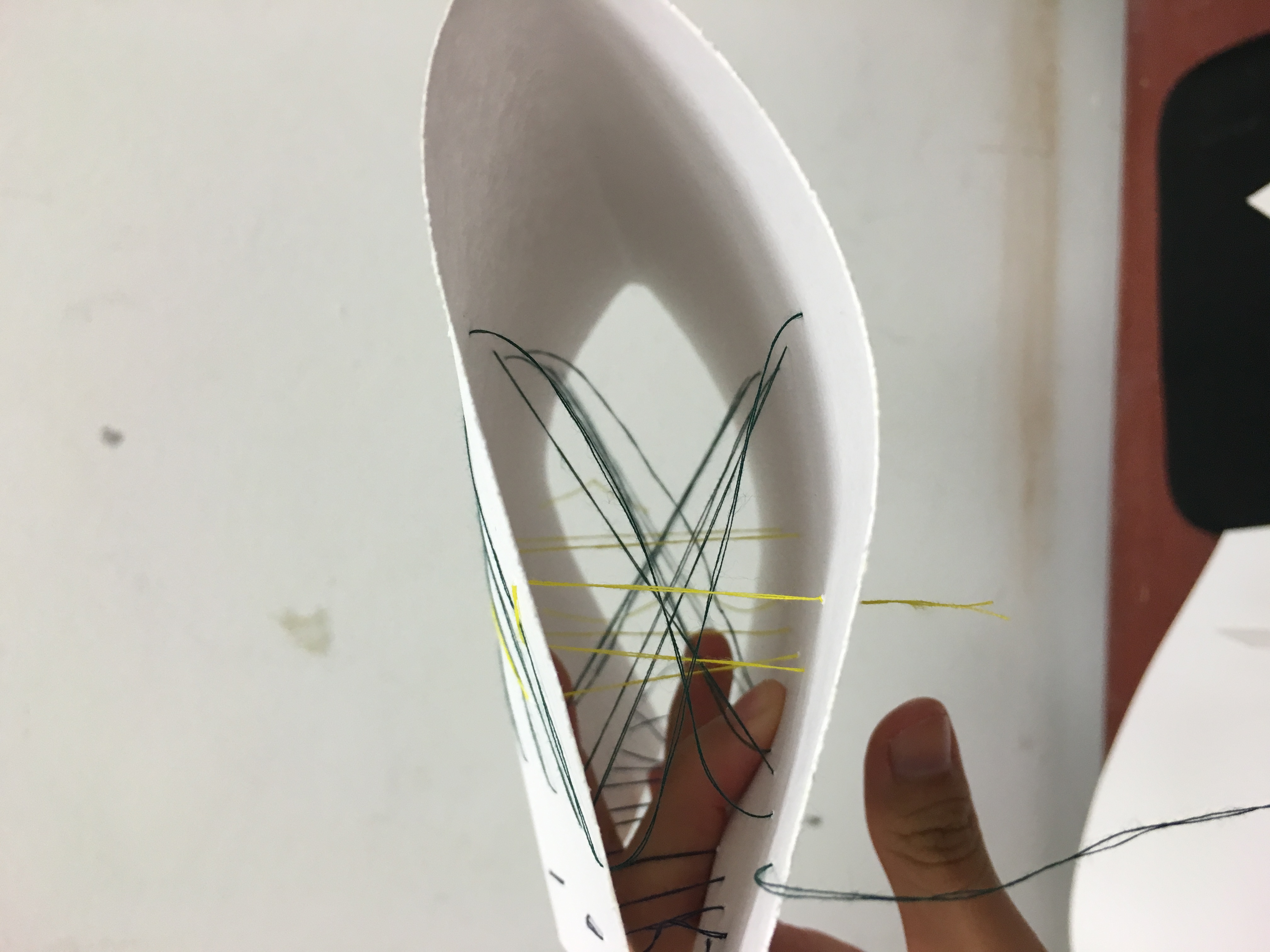
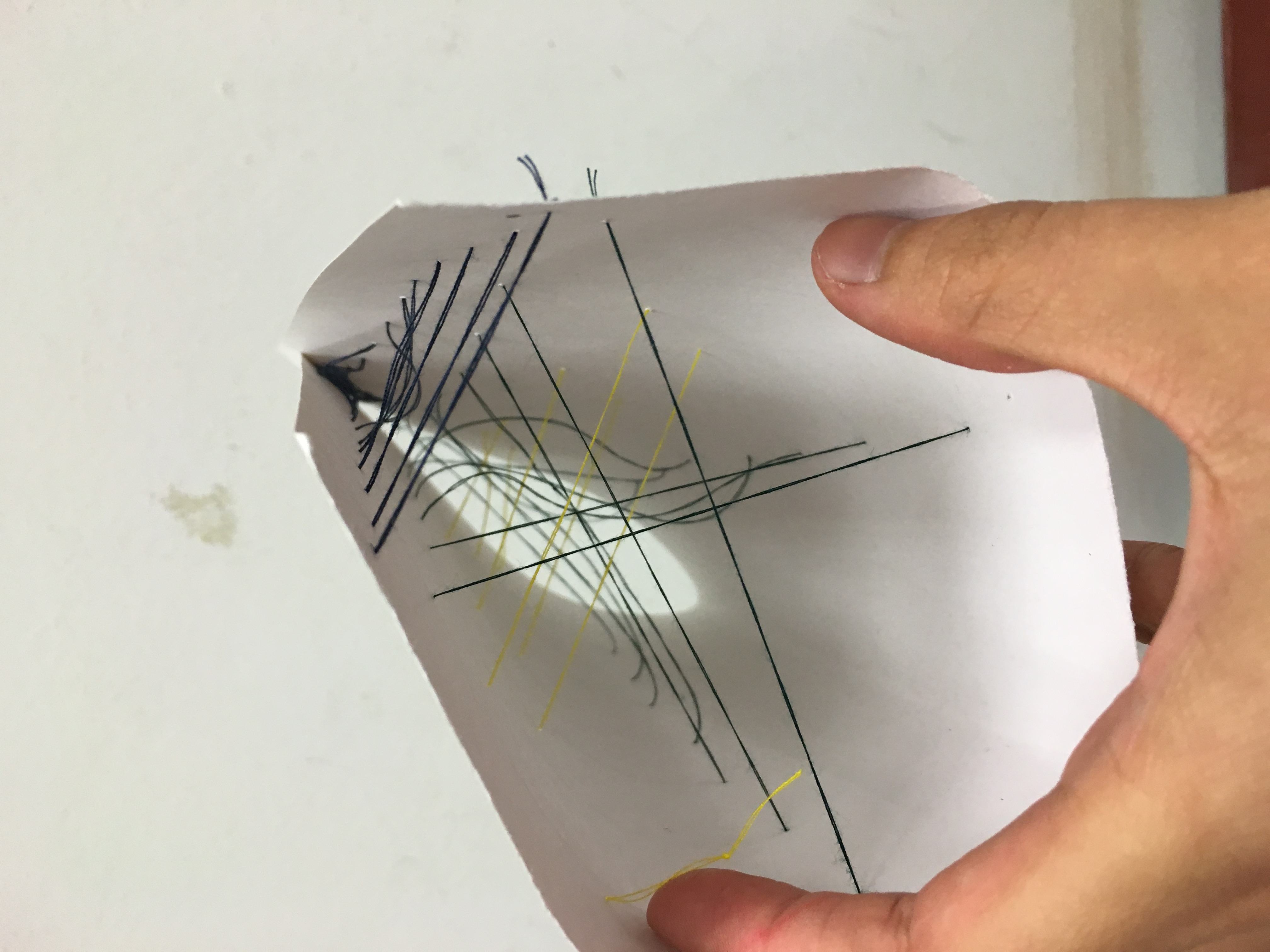
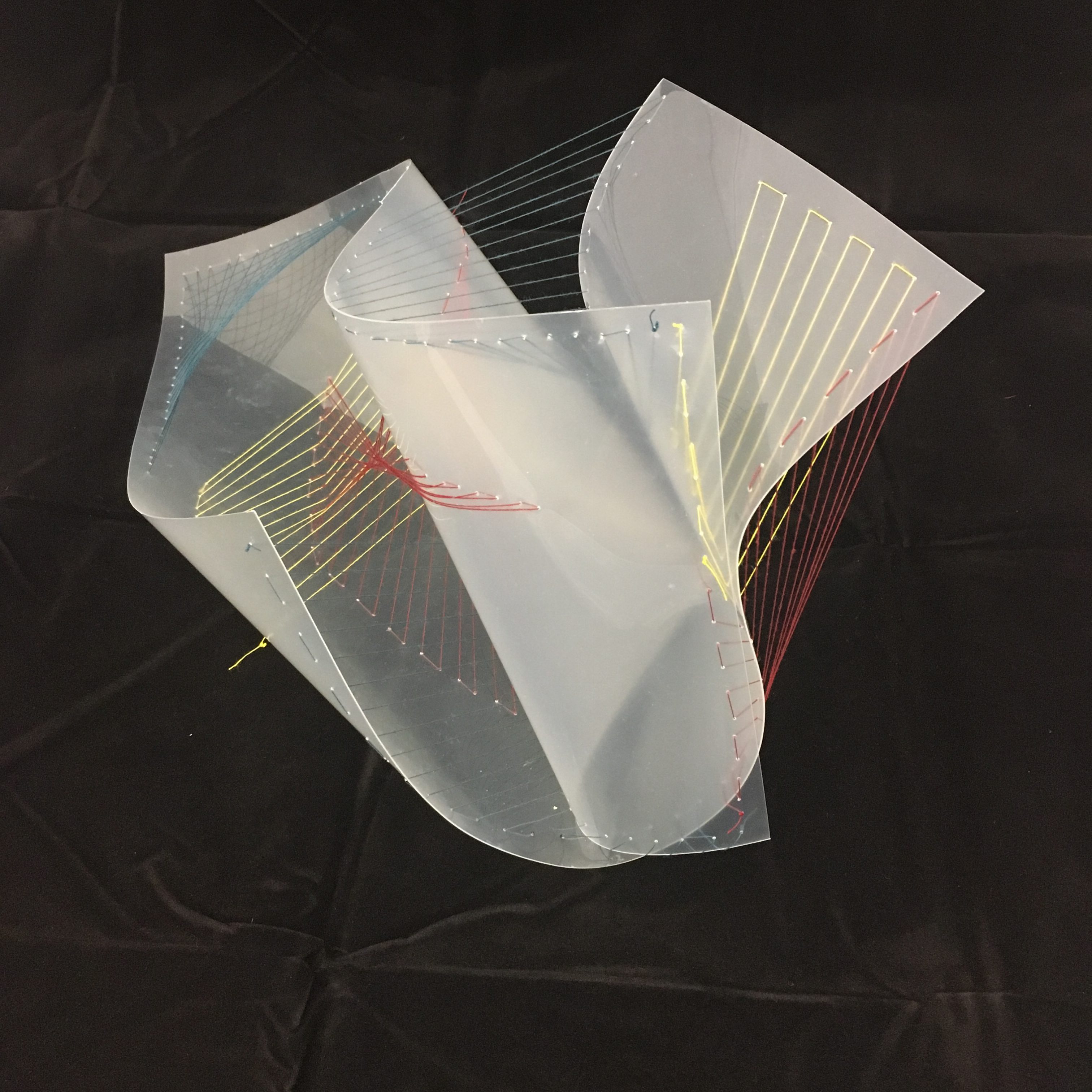
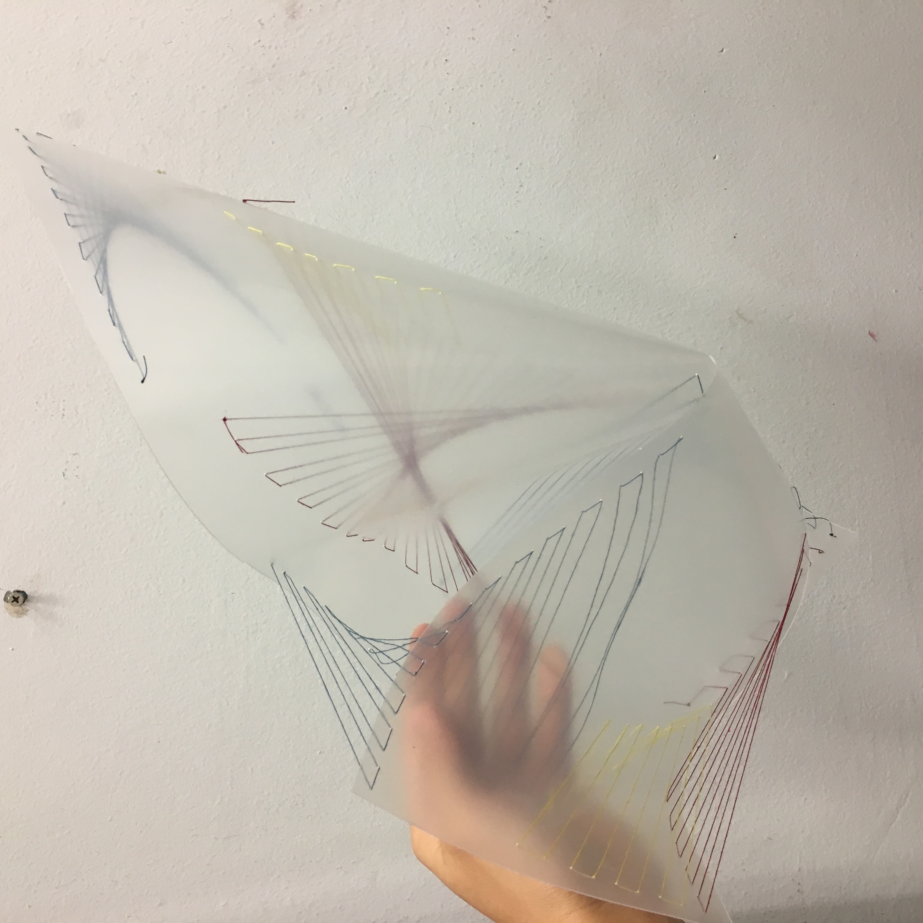
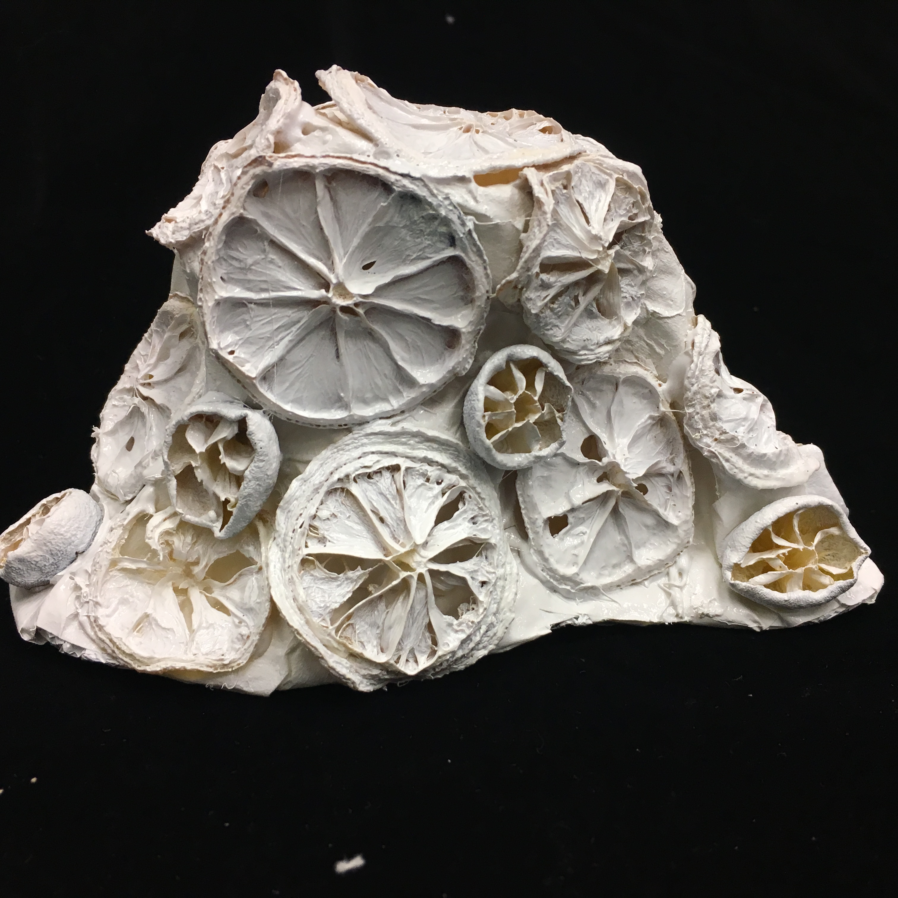
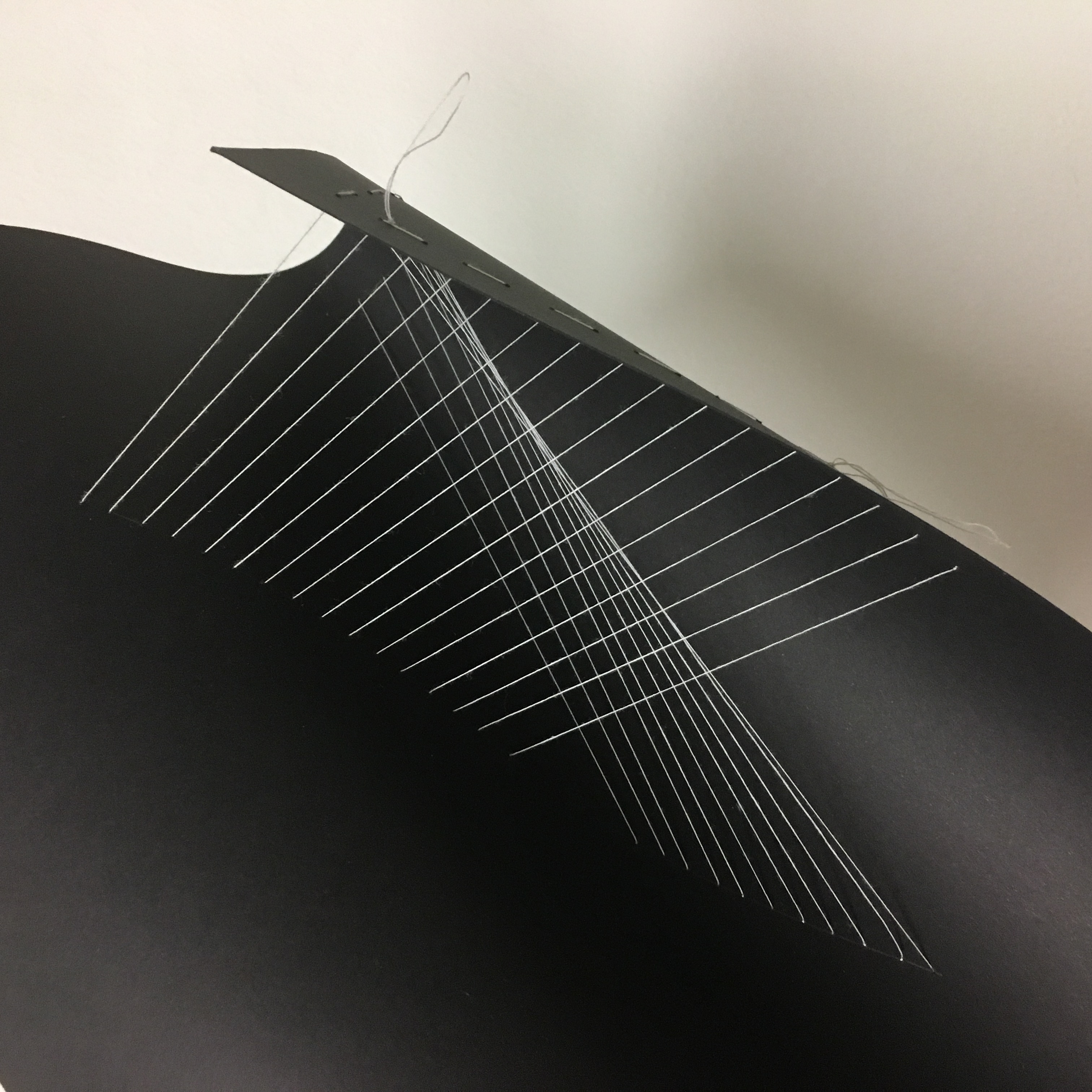
Still trying to stick to the paper cutting, i decided to go with it throughout the 4 compositions as well, such that there will be a little pop-up effect for all of them. I did it mainly because i really love paper cuts and i enjoy doing them, hahaha but it was a tedious process.

img_9871

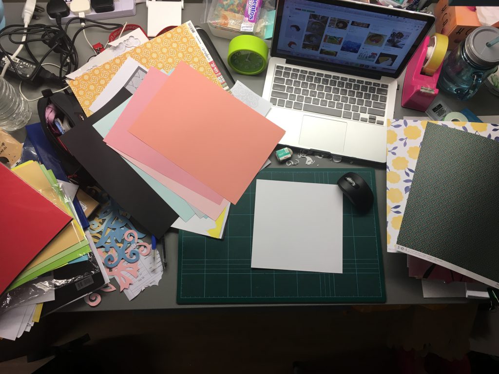
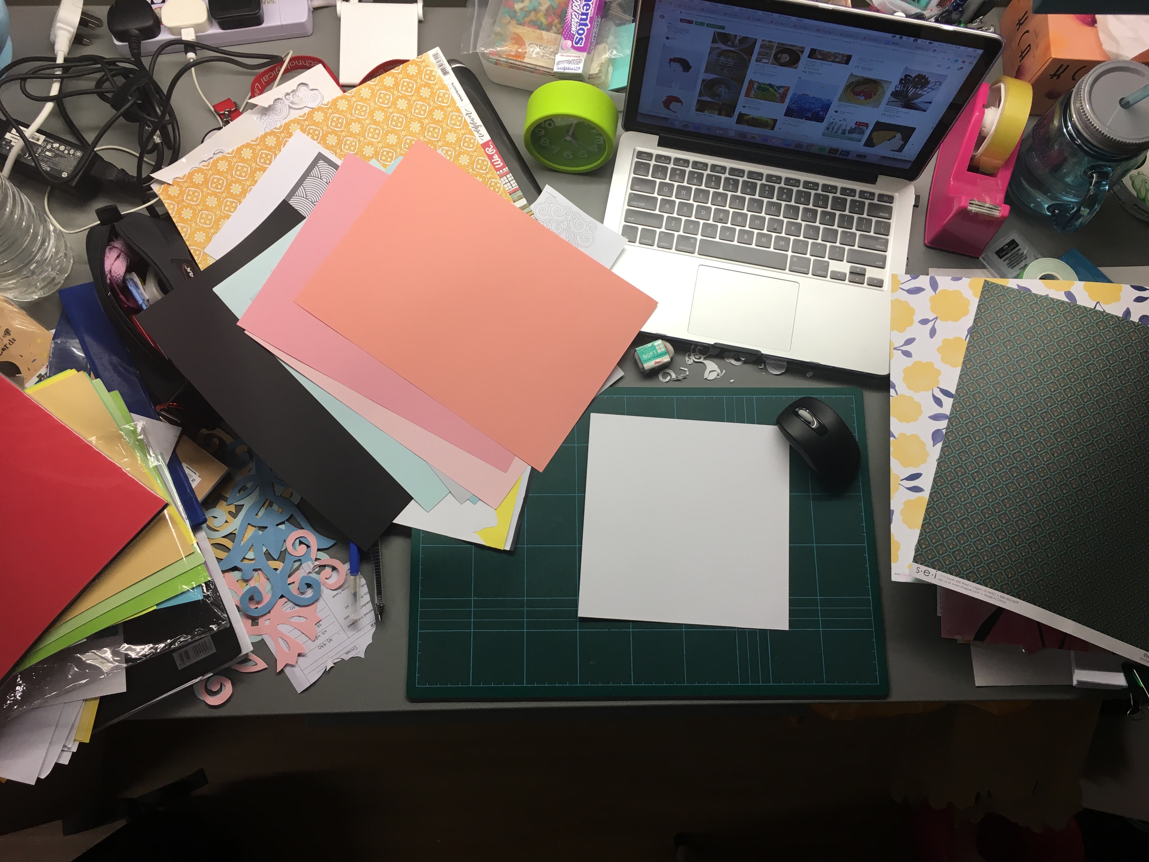
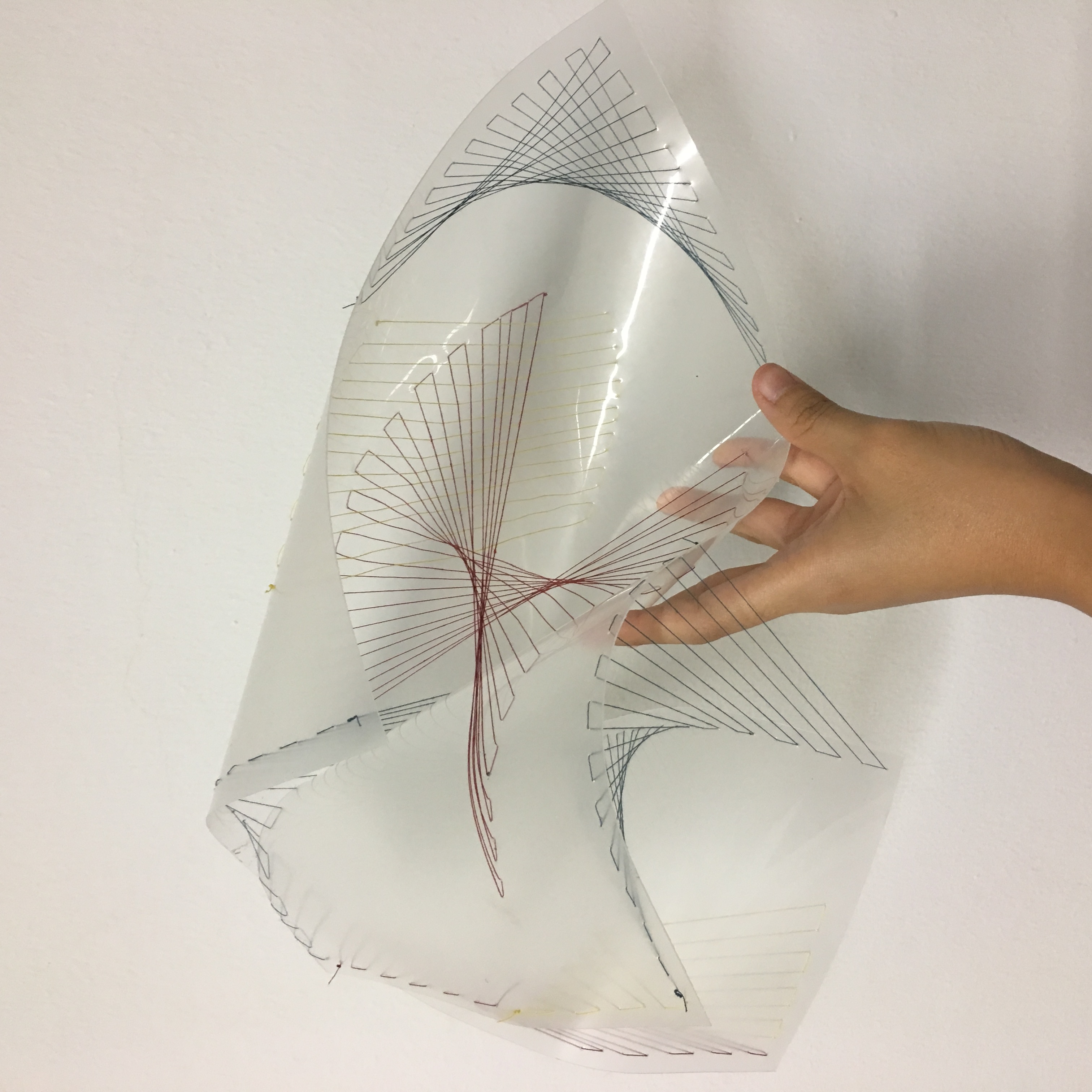
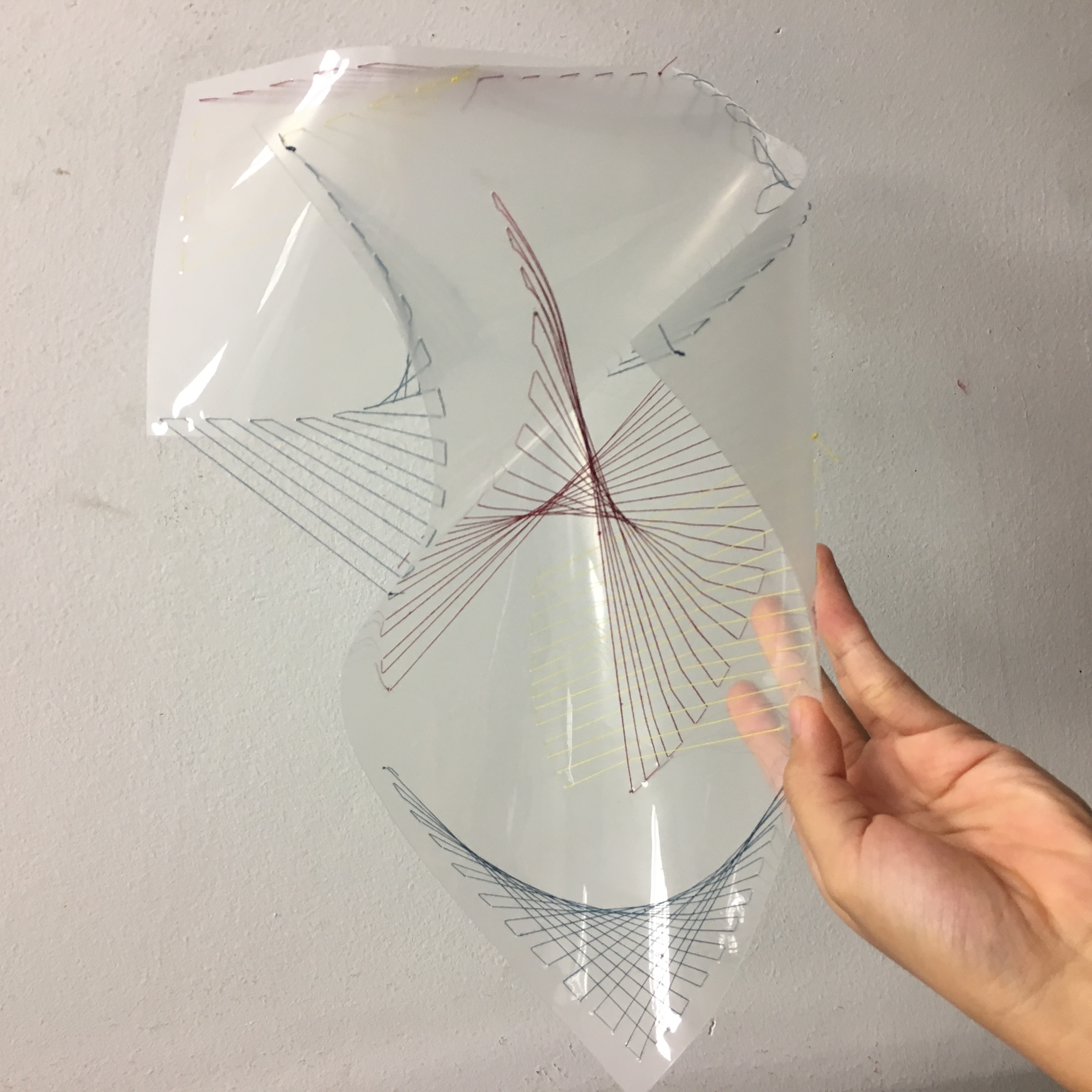
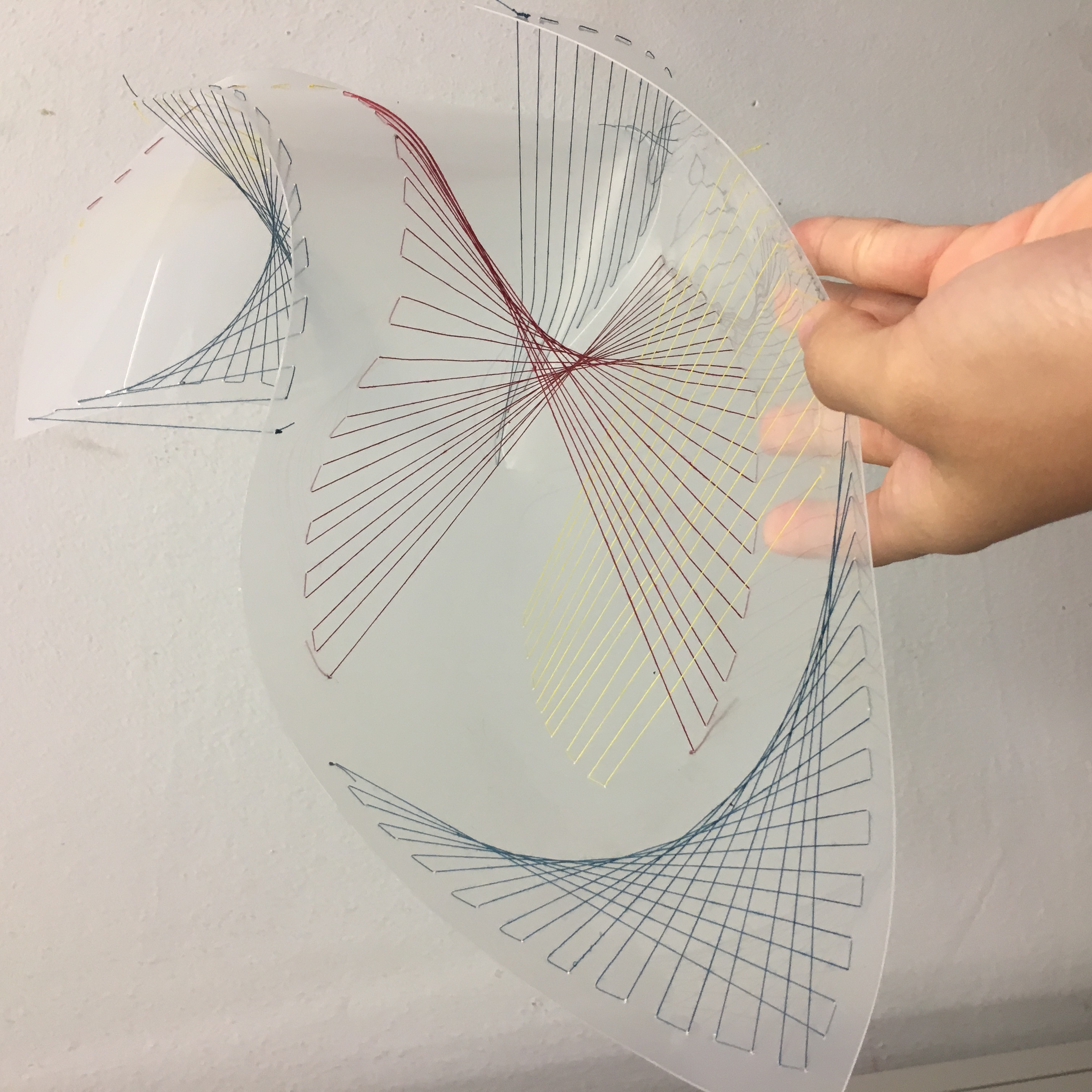
basically a picture that sums up my work in progress hahahah. Honestly, i was trying to get the concept right first before proceeding with my work! 🙂

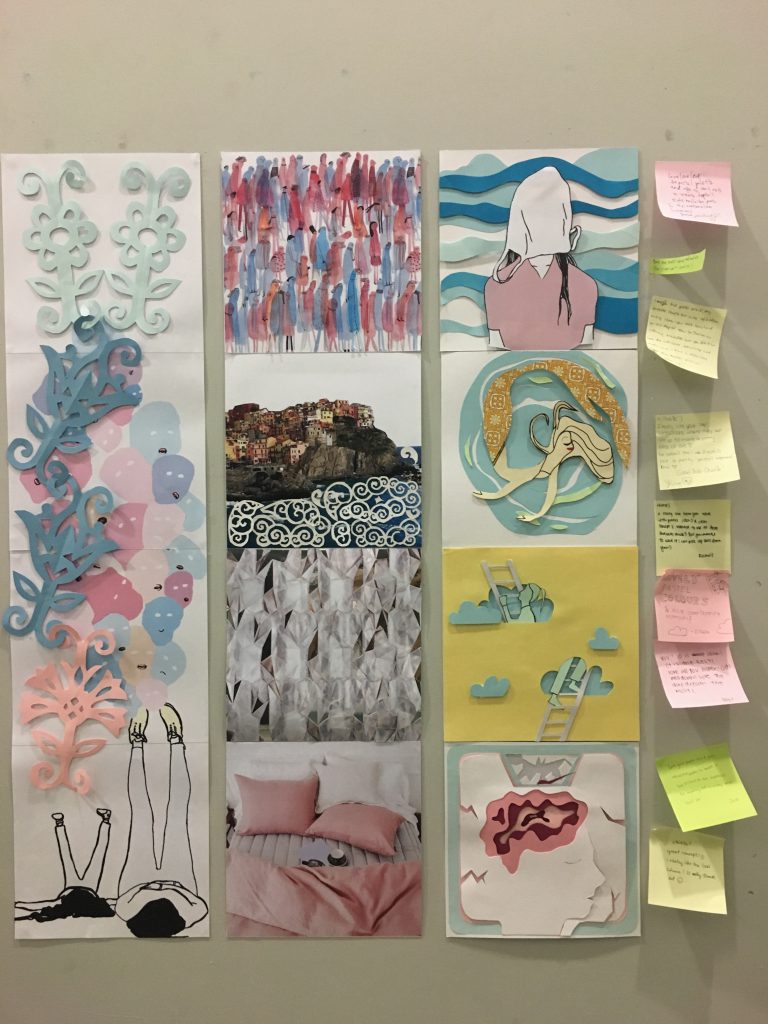
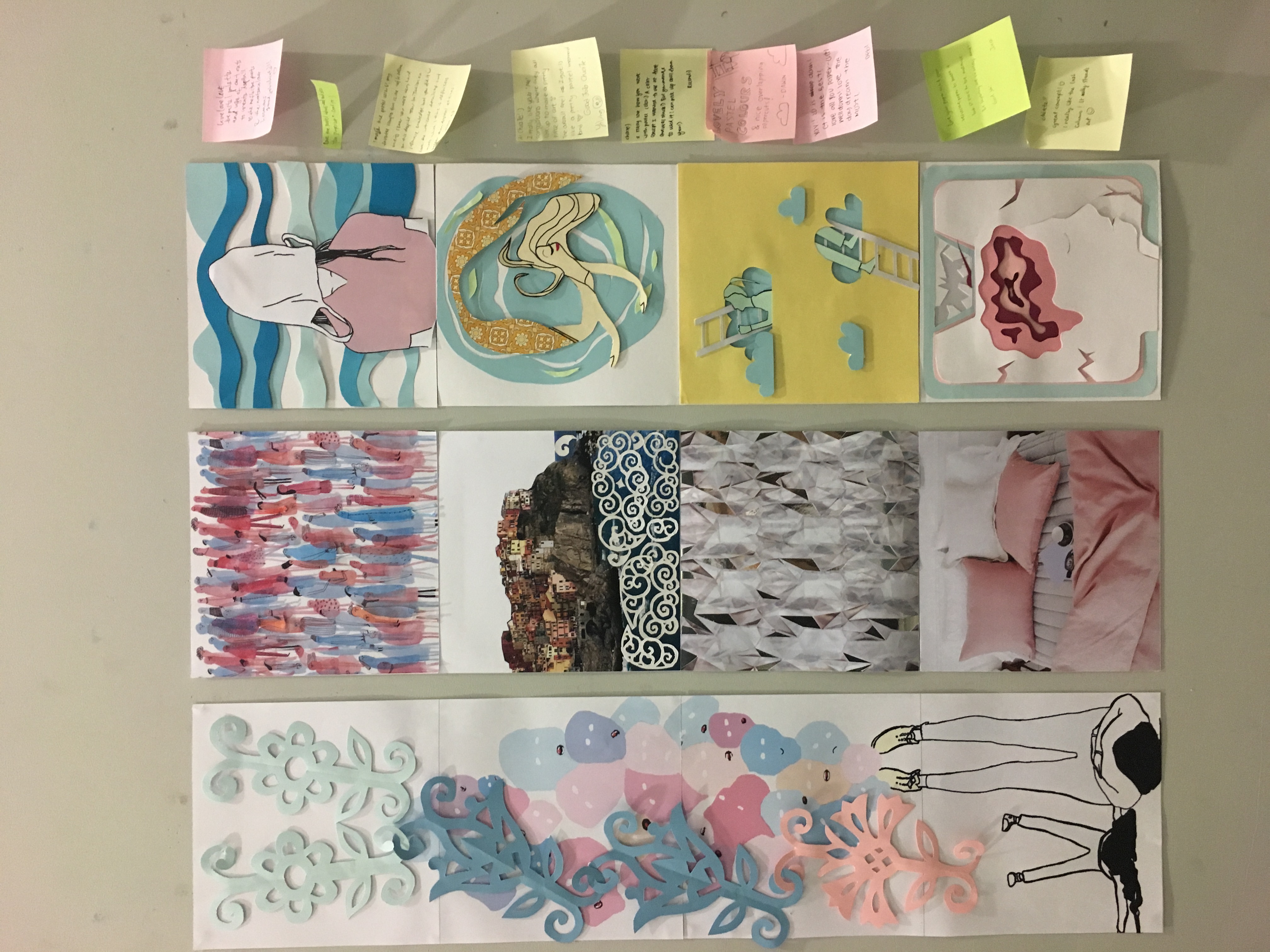
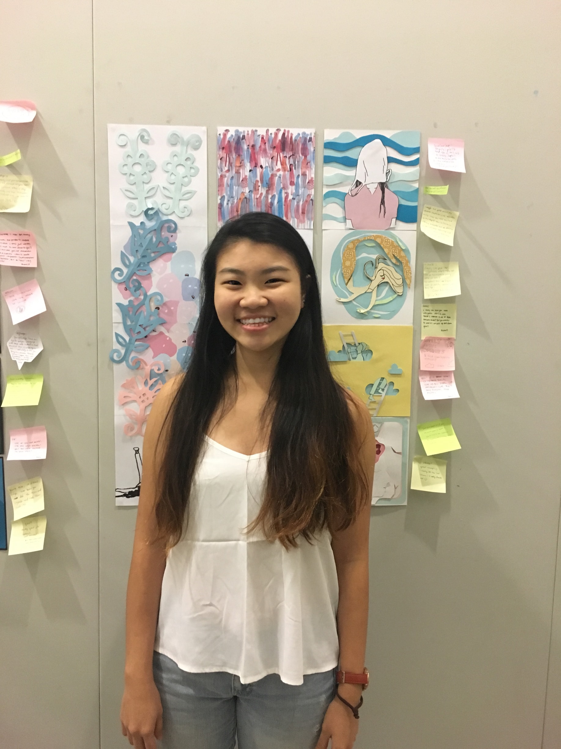
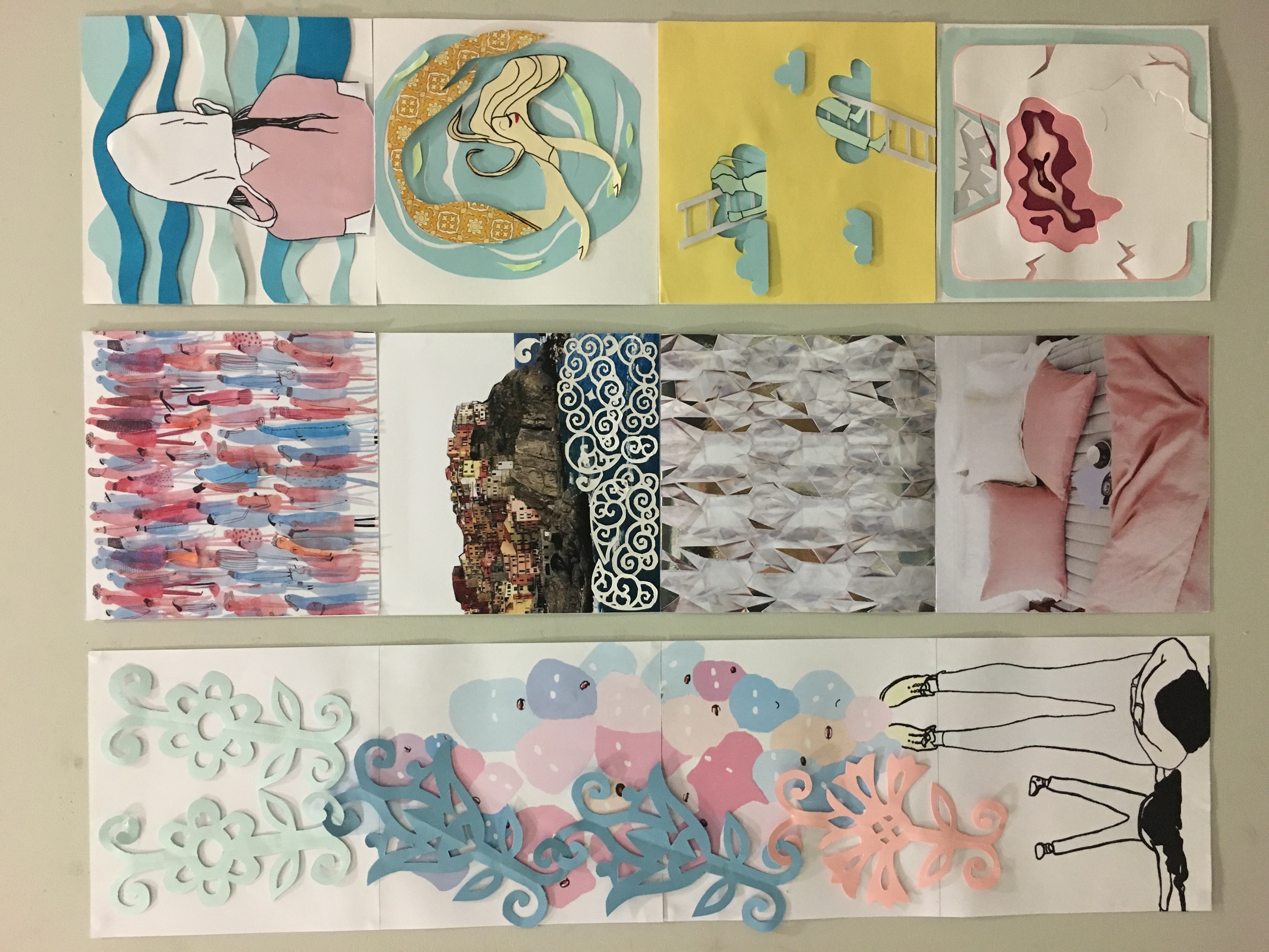
Moving on to my final project, this is all 12 compositions:

img_9971

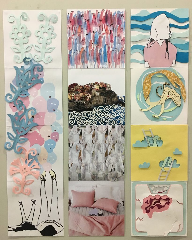
Starting with the Me part on the extreme left column, i made use of analogous colours.

me-finallll

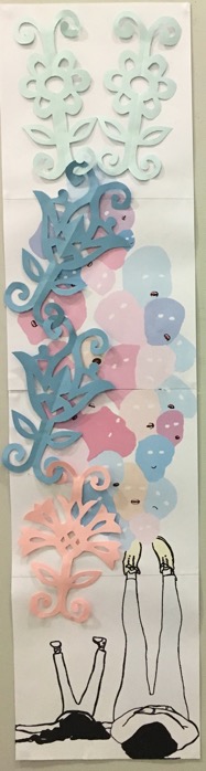
This basically show the young and now me looking up on all the different emotions and growing from to the top part where the paper cuts hooks together to form a bigger me.

These are the composition of the 4 different settings:

img_9930

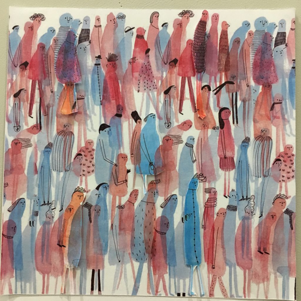
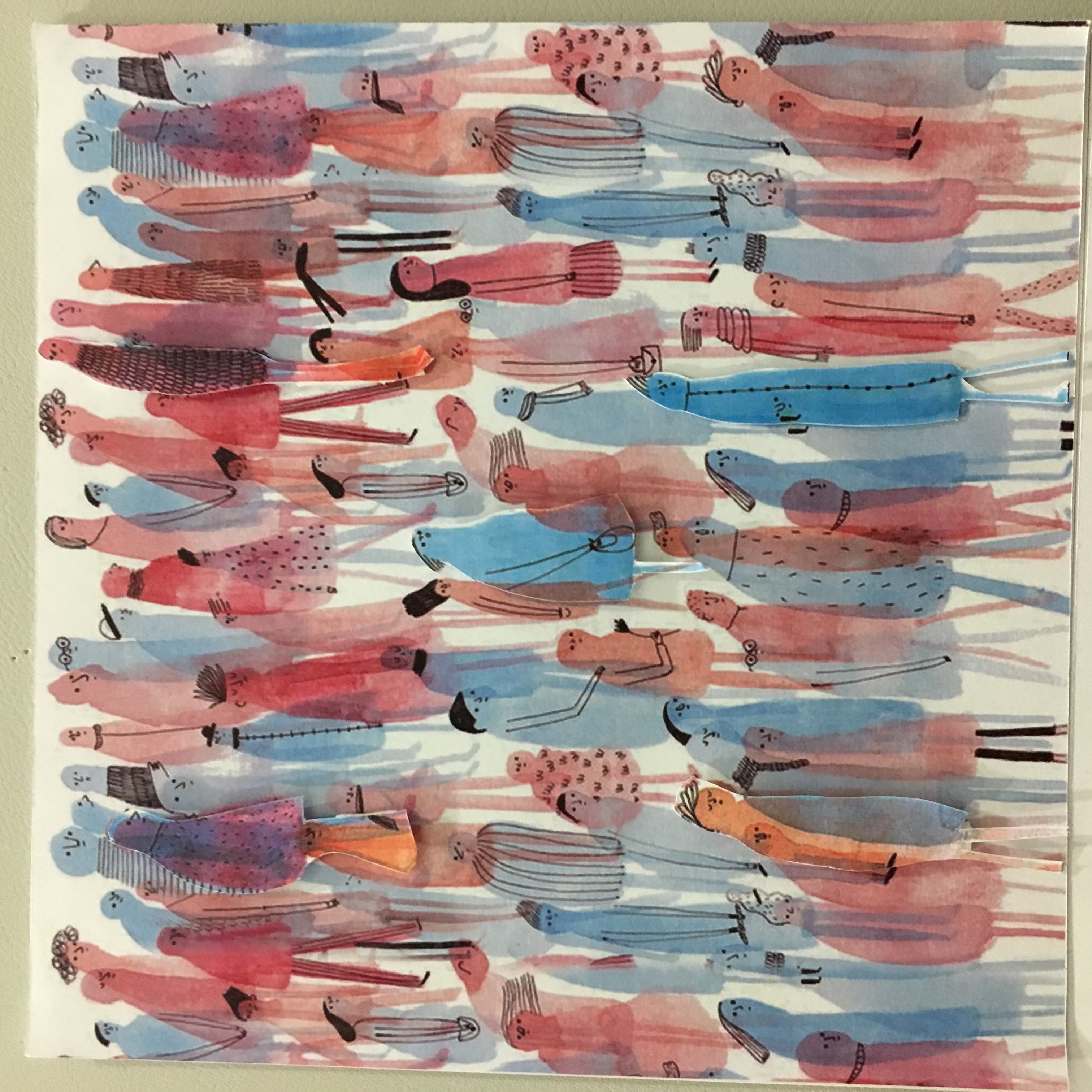
The first setting is a place where there is a crowd, filled with many people. Not sure if it’s visible here but there are actually a few humans popping out from the top left, right, center and bottom left and right! I made use of split complementary colours for this composition

img_9931

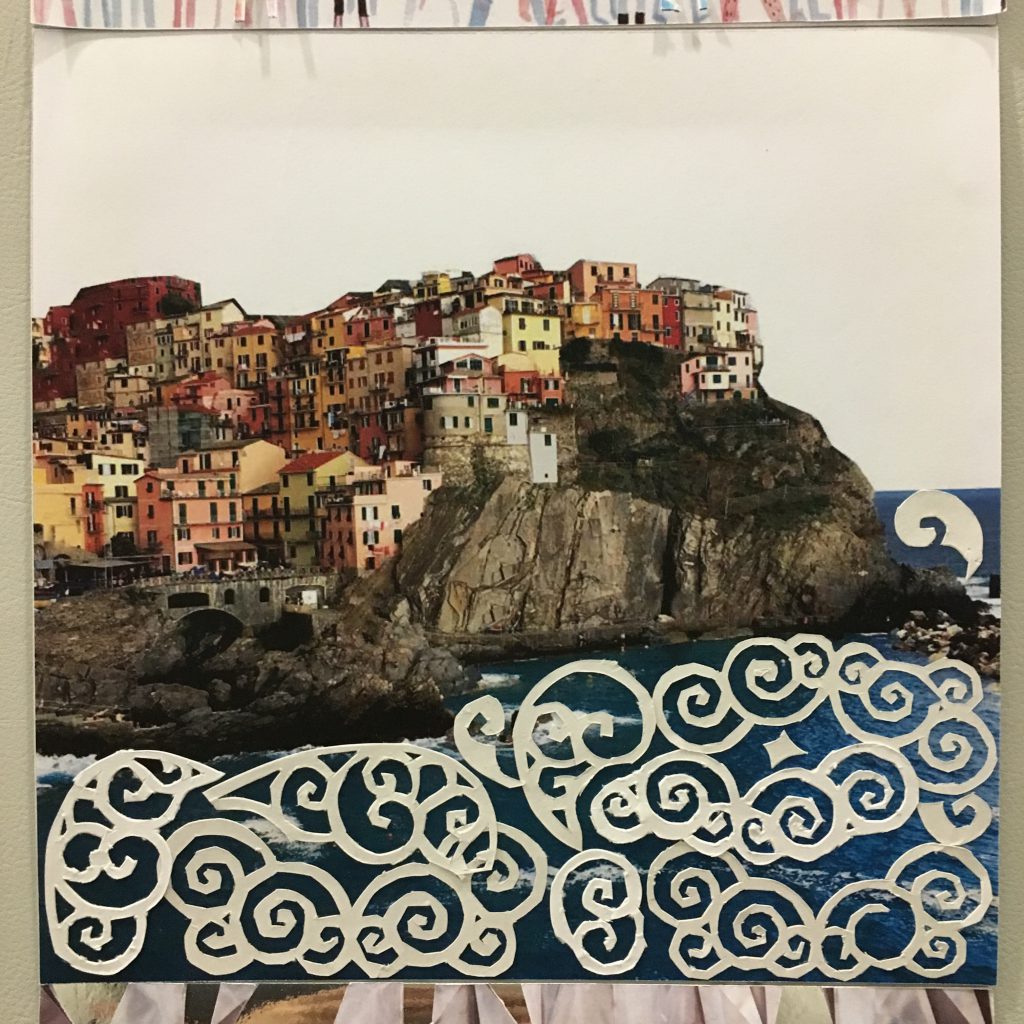
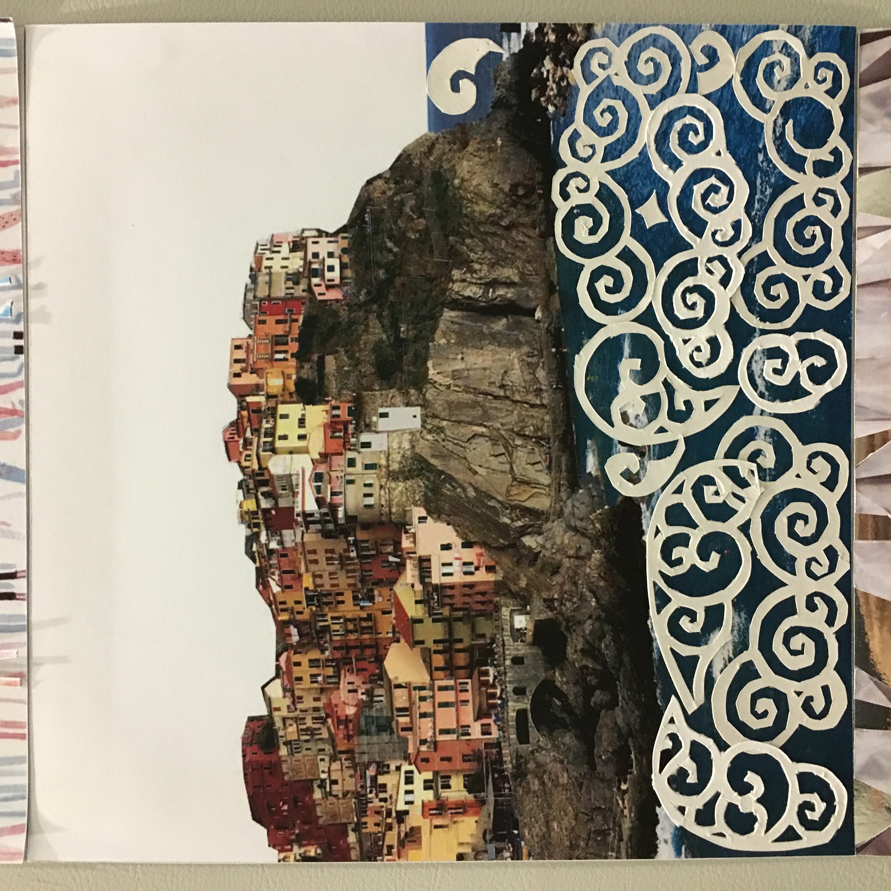
The second setting is the well-known Cinque Terre in Italy. I took this picture recently during my holiday and I edited the picture as there were green parts on the photo which is too “attractive” to the eyes. I removed the colour of the sky as well as I wanted to create an analogous harmony as well for this 🙂

italy-final-min

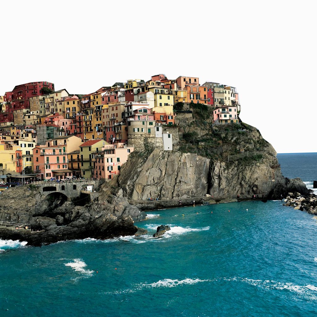
This is the edited picture before adding the white paper cuts on top of the waves 🙂

img_9932

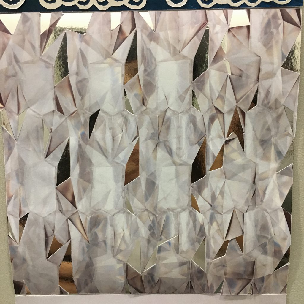
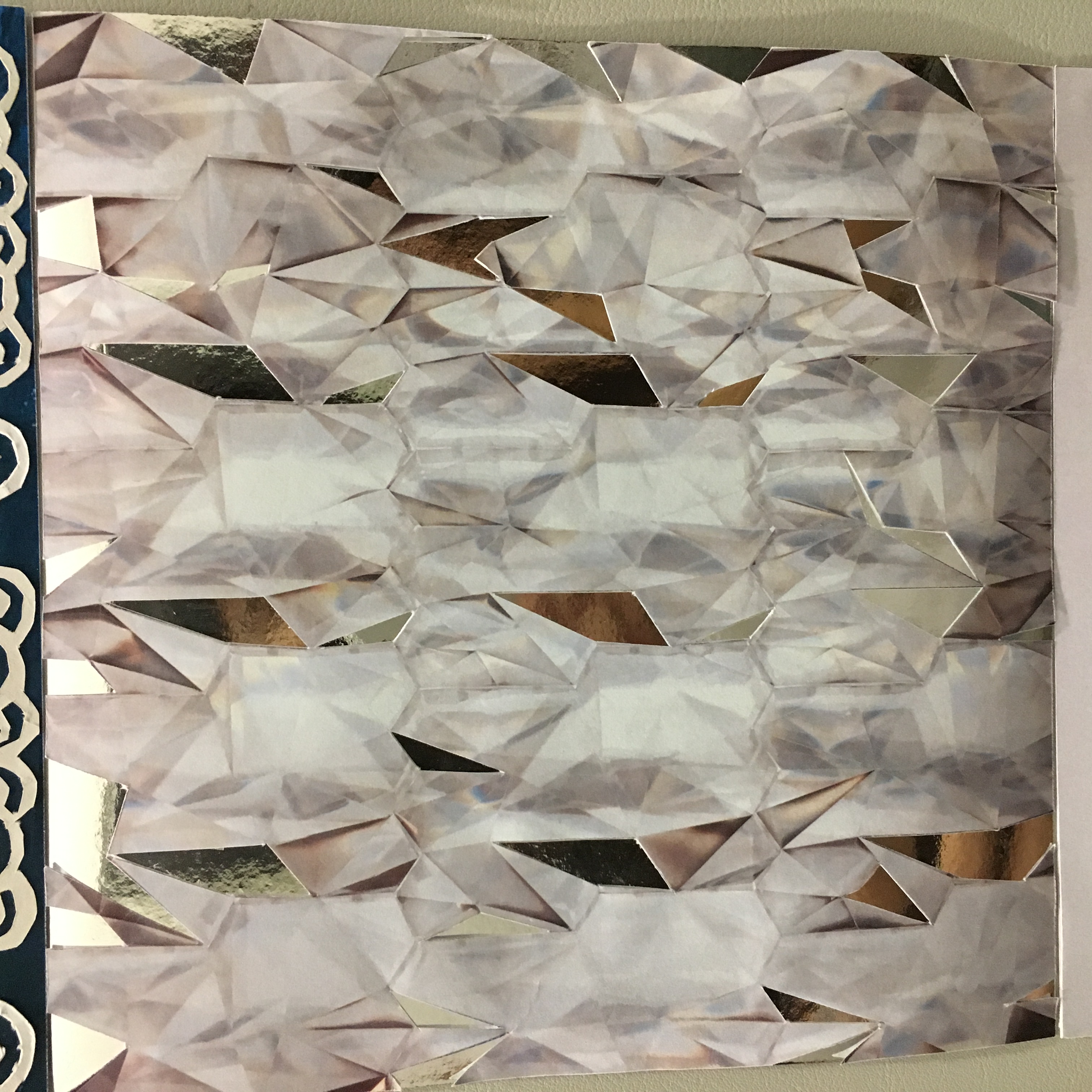
The third setting is a dreamy place when I am daydreaming, i made use of monochromatic theory on this and i added the silver paper beneath the picture i took when i was overseas as well hahah. I wanted to show more dimension to the picture such that its feels like when i am staring in space, it is another world to me.

bed-final

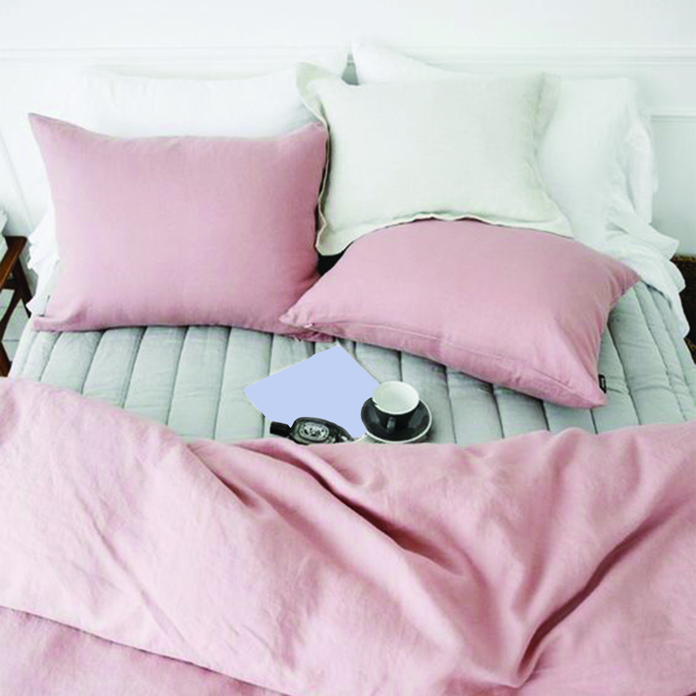
This is the last setting where it is a picture of a bed, it is actually lighter but not sure why its so dark in this. I made use of analogous colours as well for this.

Finally going on to the my reaction towards the settings (which i honestly like the most and spent the most time on these 4 compositions!!!)

img_9926

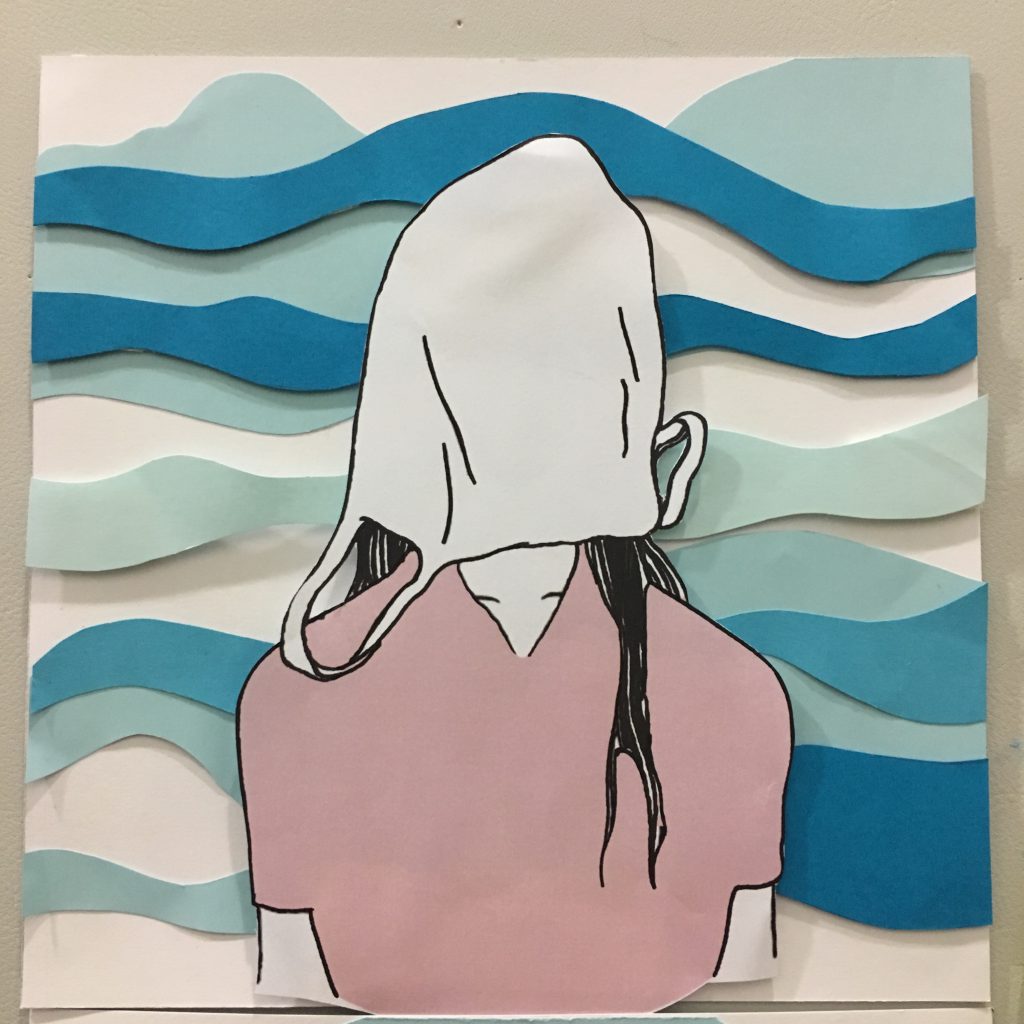
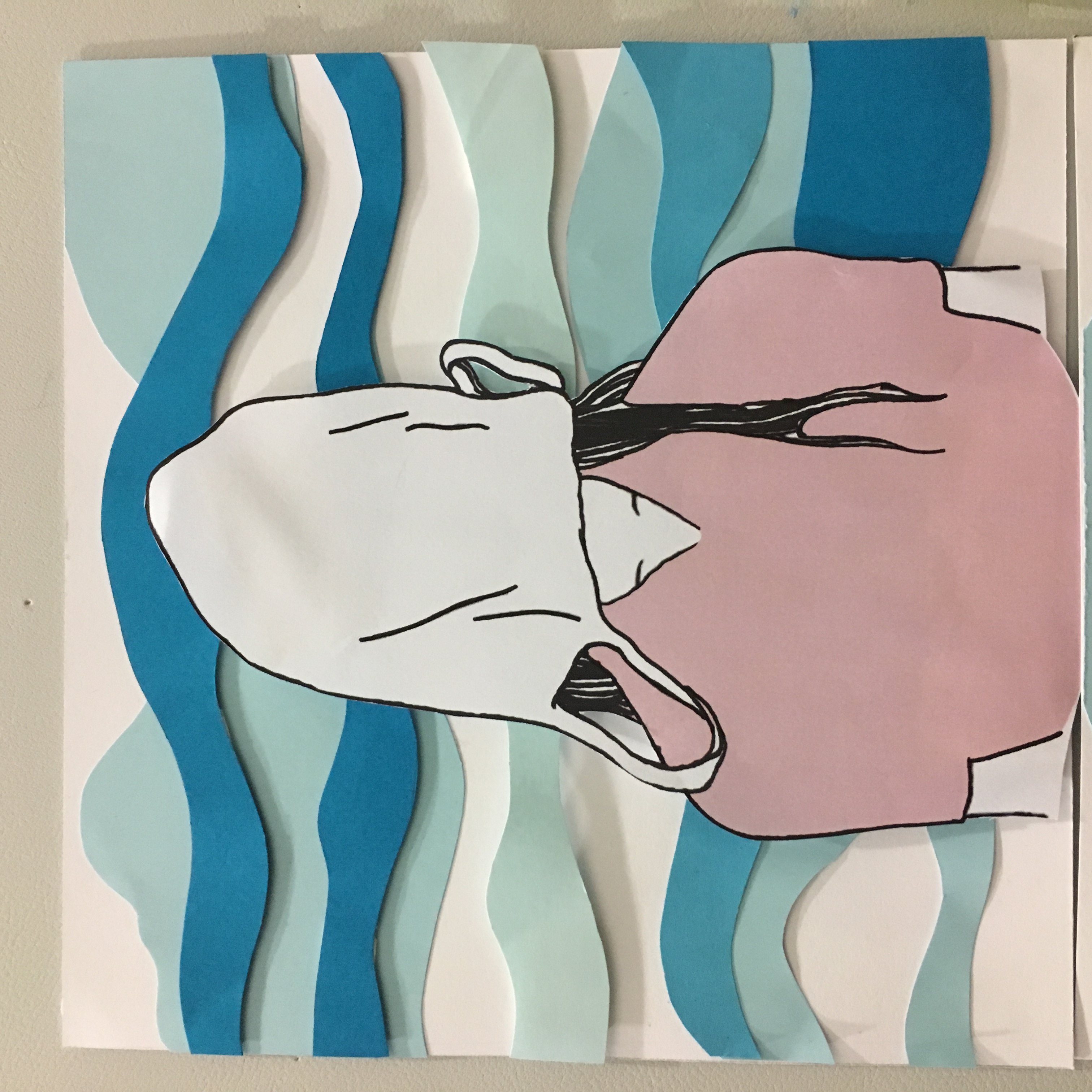
Me + a crowded place with a lot of strangers = Me drowning in a sea of people where i want to hide my face to avoid the awkwardness of interaction with random people.
Thus i made use of a plastic bag to cover the face, and the overlapping of different shades of blue to create the sea.
Thus during this situation, time passes very slowly.
This is both monochromatic and analogous theory used in a way. 🙂

img_9927

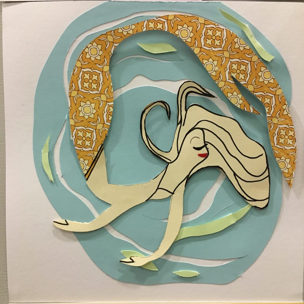
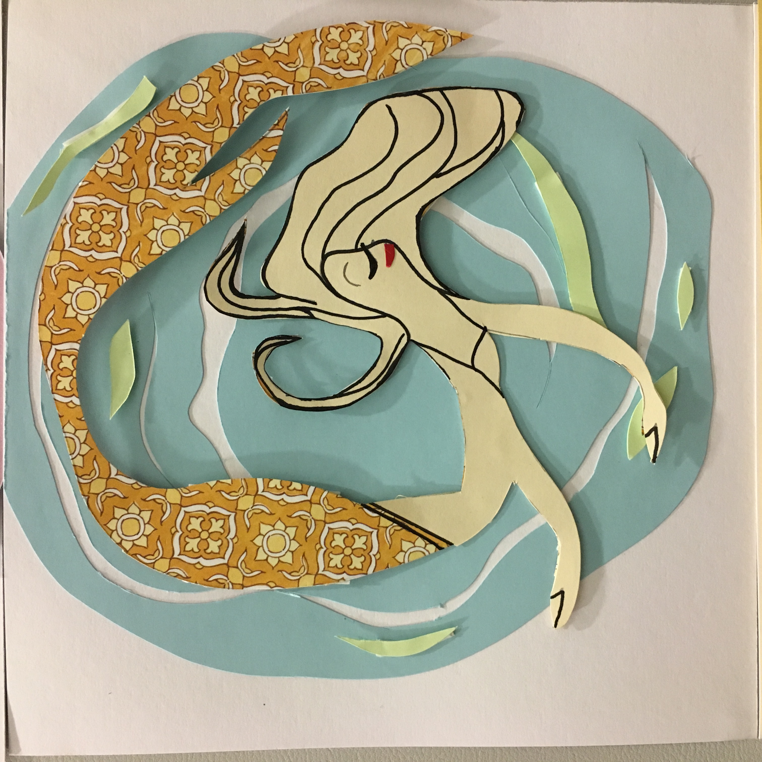
Me + Traveling to different places = Feeling very free and relaxed just like how a mermaid is feeling happy and free underwater water

This is the hardest composition to think of as i do not have any idea how to show happiness as a paper cut illustration… Then, i thought that since my other three reactions made use of an illustration of me, i wanted to include a person in this particular composition as well to complement the others. Therefore i chose a mermaid as a representation.
Also, when i am happy and enjoying life when travelling, time passes the fastest.
I made use of the analogous colour theory for this.

img_9928

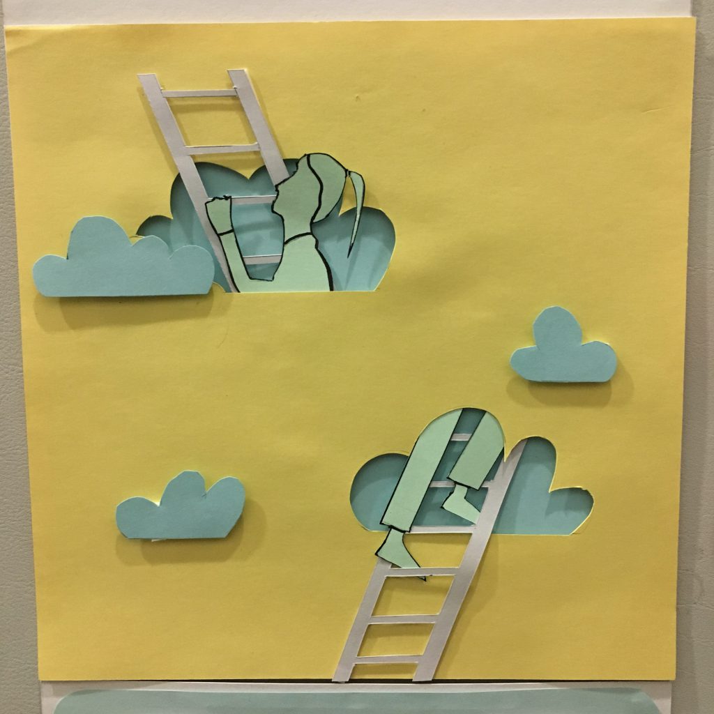
Me + a dreamy place = Me climbing up the ladder to my own world.
Again, i made use of analogous colour for this, yellow,green and blue. To depict me climbing up to another dimension such that the time stops in the real world as i am day-dreaming.
img_9929

Lastly,
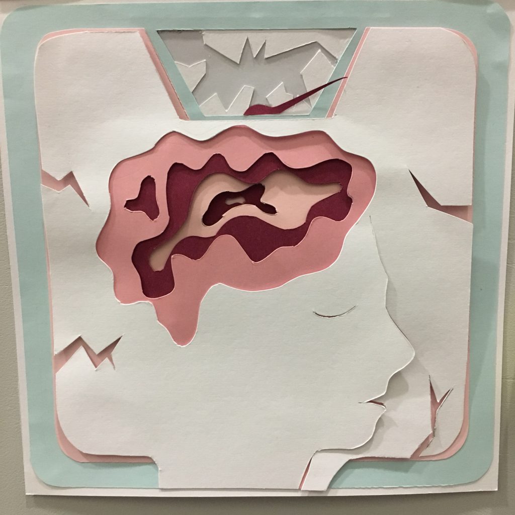
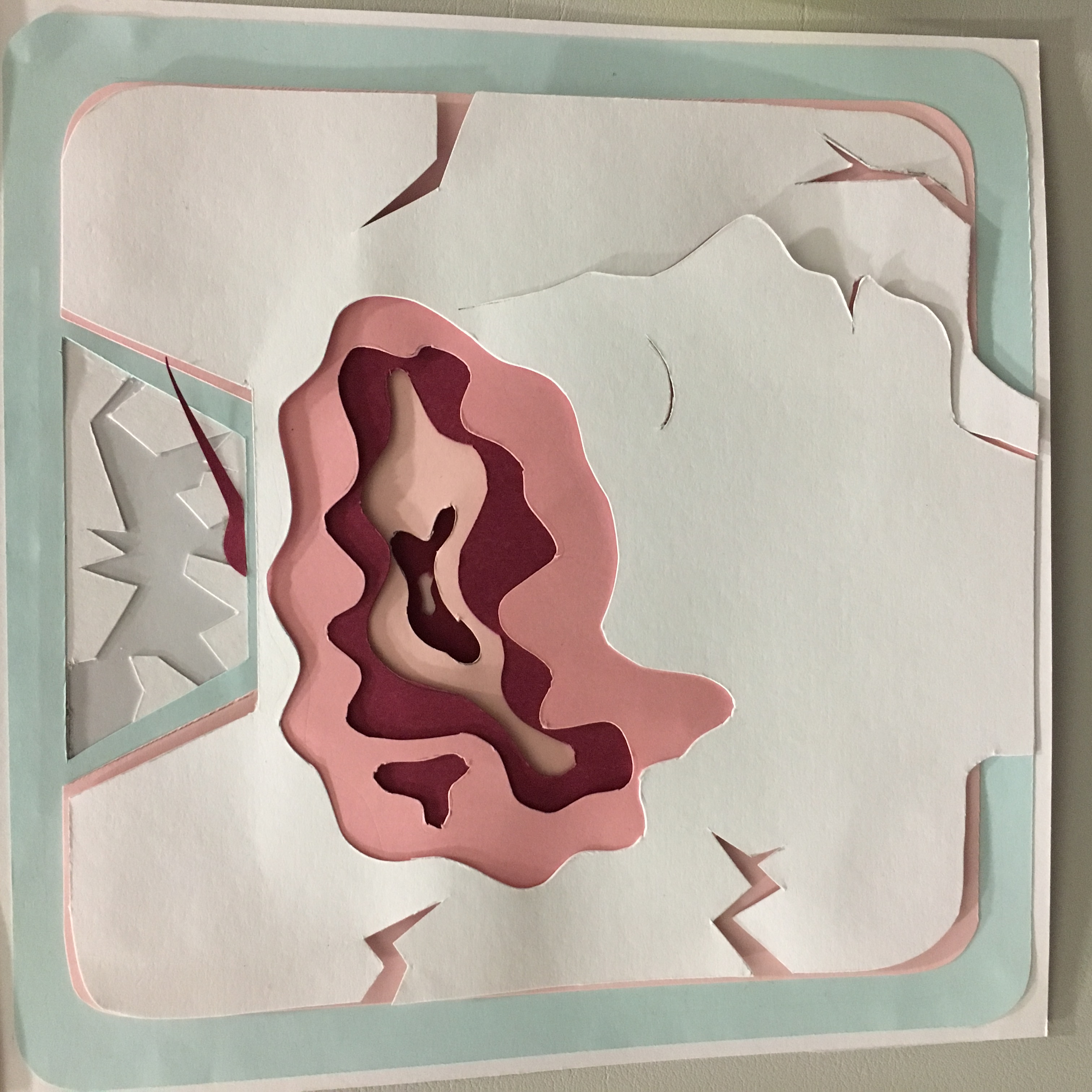
Me + My bedroom(the bed specifically) = My head on the pillow with my brains protruding out.

This is an emphasized composition where the pillow is actually represented by a weighing scale such that the scale is exceeded from the heaviest weight due to the heavy thoughts at night just before bed. Thus, it shows the emphasis on my brains that is over thinking, which results in my head getting so heavy that the “weighing scale” aka the pillow is exploding as seen from the cracks depicted.
This is the scene where i would lie on my bed just before i sleep and think, where did all the time go to.

Analogous colour is used as well for this composition. 🙂

Overall, my 4 equations uses mainly analogous colours which i know i have repeated it a lot of times on top 😛 I didn’t want to use too bright of a colour or too many different colour theories in the different composition as i want each equation to flow smoothly and not with the sudden burst of colours then the lighter tones of colours. Also, all of them revolves around the time I spent.
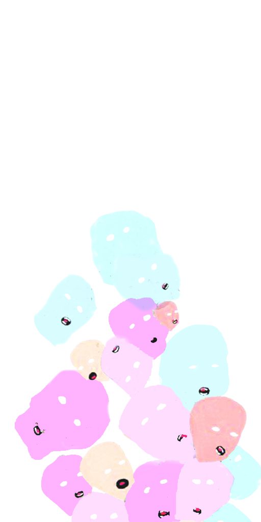
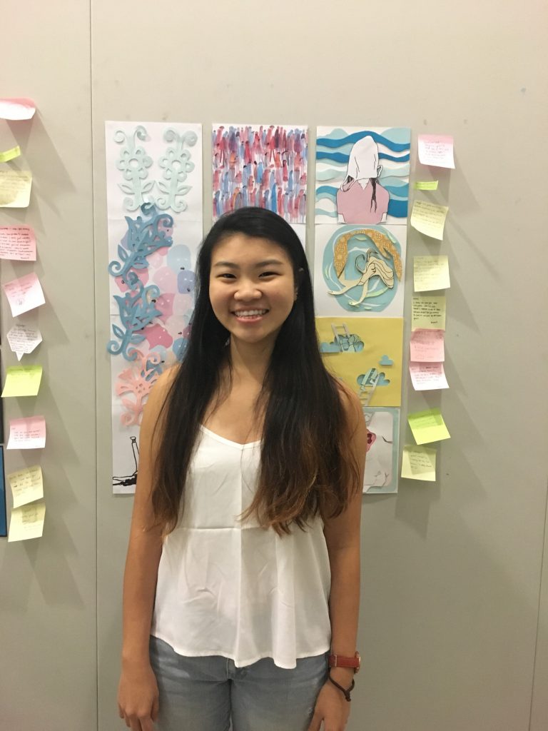
 

img_9941

Final work!!!! :))

img_0004-min

Awkward meeeeee (:
img_9952

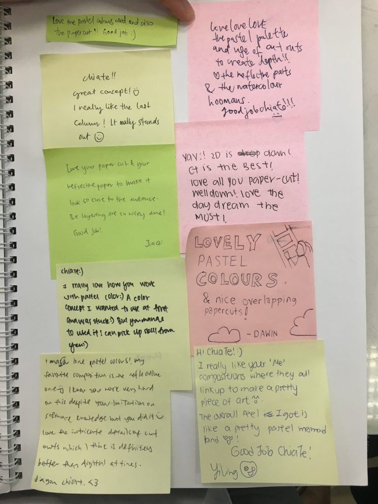
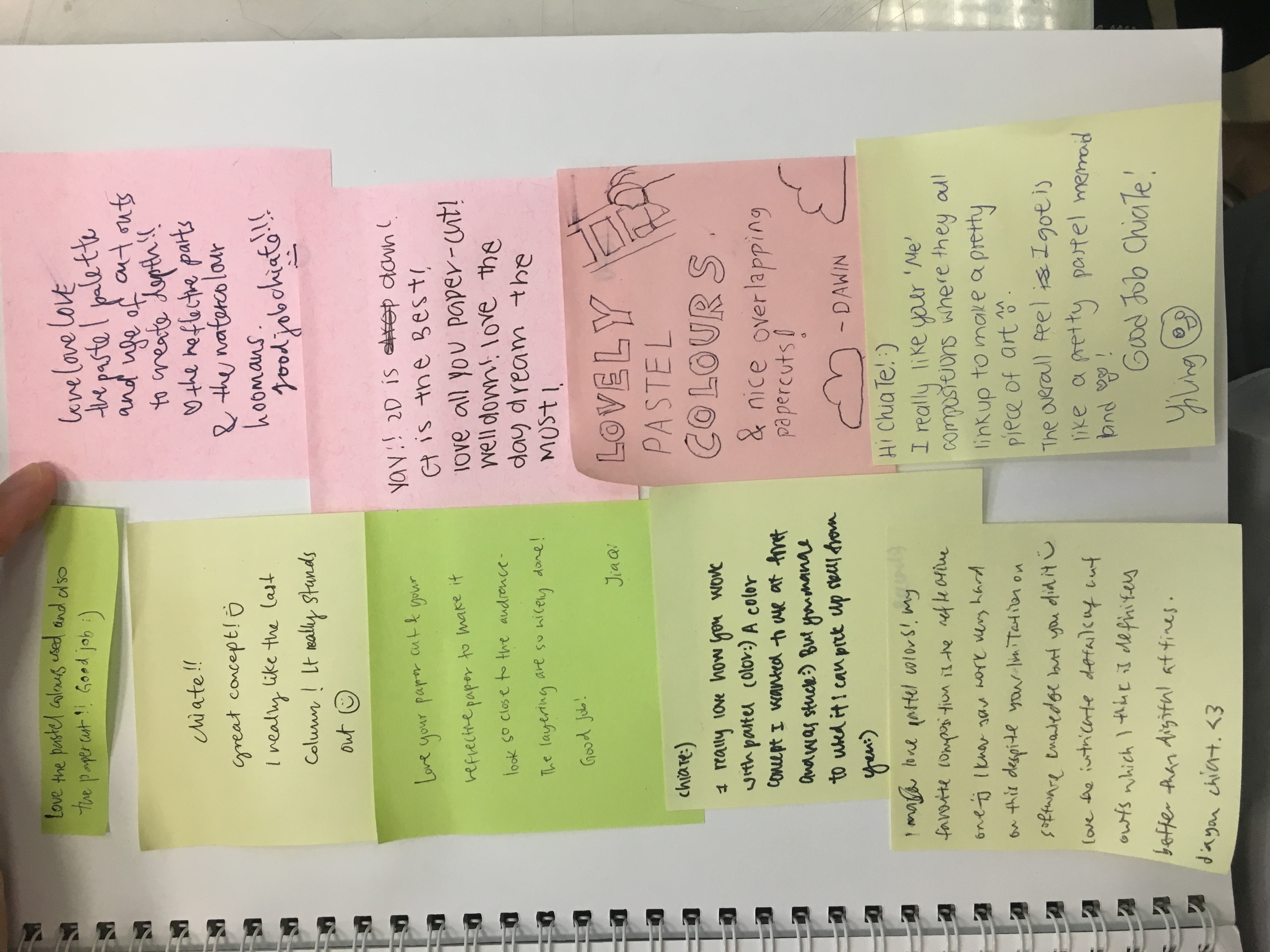
Comments from my classmates

Lastly, I really enjoyed this final project as i feel that it is very interesting and fun, although the thought of what colours to use was very tough at first cause there is really too much you can do with colours. I am pretty satisfied with this work but of course improvements can be made such that the composition of the bed and the last me part was too flat in comparison to the rest of my composition. However, i was afraid that my work would not look like a whole work done by one person but i guess it somehow did flow and I’m truly thankful for it hahahah.

Also, i think everyone did a really good job in their work as well!!!! Its seriously all super good and i liked them a lot!!! Looking forward to more Joy’s lesson with this bunch of amazing friends next sem!!! 🙂

Processed with VSCO with hb2 preset

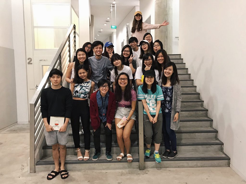
Class photo!!!!! GOOD JOB EVERYONEEEEE


FINAL ASSIGNMENT: TO BELIEVE OR NOT

For this project, I worked with Cai Jing and Debbie Ong on the horror genre. For this horror trailer, we are much focused on how chinese superstitions that are often warned of and reminded by the adults. Here are the links we studied and have incorporated common superstitions into the film:

Reference 1
Reference 2

Clipping toe-nails or finger-nails at night would bring ghost to that place.
Throwing rice grains on every corner of the house would chase spirits away.

After watching several film trailers, we understood that the introduction is usually smooth, in between filled with conflicts and at the ending, more climatic scenes would appear with the resolution that makes us wonder what will happen to the protagonist when at the end.

Moving on to our story… We have decided to name our film, 不信。不辛。 If you don’t believe in the presence of ghost/superstitions, misfortunes would happen on you.

Summary
Nicole and Valerie just moved in as first-year students into the school hall. They are roommates. Nicole is extremely superstitious due to her fear for the supernatural while Valerie on the other hand, is not. Curiosity had led Nicole to find out from her seniors that there was once a girl who was often outcasted and bullied in school, committed suicide around their block. Nicole shared the story with Valerie at night but being a scientific geek herself, everything that has no scientific explanations does not make any sense at all thus the disbelief.

After that night, trippy things began to happen. Nicole, alone in the room was studying until she received a phone call from Valerie that she would be late and to sleep early without her. A strong gust of wind entered the room, the windows spread wide as if something is coming in. Nicole became paranoid and started unleashing all her amulets out from her wallet. Before she sleeps, she started throwing grains of rice into every corner of the room in order to chase off spirits. Valerie who came back and happen to witness the moment got really upset and they quarrelled. Knowing that the spirit used to be a lonely and neglected girl, she is upset at Valerie for not wanting to acknowledge her presence. She begins to hunt Valerie while is sleeping or alone.

Storyboard

story-board1 storyboard2

Trailer

I would say this project is extremely challenging as it would require me to study many different trailers in order to know what makes a great one. When planning the story, filming or editing, my group mates and i have a lot of art direction or opinions ourselves which I would not say is a bad thing as the worst is not having any ideas to improve and contribute. Through this filming, I have understood more about the importance of a trailer, which is to make the audience care within this short 2 mins, convincing them that the movie is going to be worth the watch. Besides that, team wise I would say that in between we did tire ourselves out with ambitious time management and other assignments on hand but thanks to Debbie’s constant encouragement and motivational attitude, we managed to make it for today’s submission.

Regarding the consultation this afternoon, we have noted down the changes that needs to be made and will work further if time allows. But most likely we will : ) Overall, I am really satisfied by this trailer and its a joy working with both Caijing and Debbie!! 🙂

Project 2 Final Outcomes and Silk Screen Printing process

On week 8, we did Silk Screening for the every first time, it was a fun and interesting experience. We went in groups to the dark room to do our emulsions since they are not supposed to be exposed to lights. then we placed the board into the oven and waited for about half an hour before pasting our transparency onto the screen.

img_9245

This was the transparency i used to do the first silk screen printing as i feel that vectorized images would definitely be able to be printed out and yes it did! it turned out pretty well and i decided to redo it on my tote bag on week 9 partly because i didn’t have any other confirmed compositions that i really wanted to do.

i didn’t really take any pictures of my process but i don’t think there was any huge difficulties i faced while doing it hahah.

Moving on to my final outcome for Project 2, I chose to look into quotes that I am able to depict them in a dark/horror manner. So all my quotes are from different movies. I chose to do it this way as it will look creepy which may leave an impact on the audience looking at how I interpreted the quotes. Although some quotes may sound quite positive, I still chose to show it in a way where it is more of a gory and dark side to them.

The first quote is

“Give a man a mask and he’ll become his true self.” –The Joker from Batman

 chia_te_the_dark_knight_4

This quote may sound quite odd because usually when you give people a mask, it is for them to hide their true self.

However, to me, this quote represents that a person in a mask will only be his true self because he is not seen as who he is now by others.

Thus, he is able to do whatever he wants to anyone without being judged or found out by others who he really is as a person.

I personally feel that sometimes, we only show ourselves as how we want people to perceive us to be hence not exactly being ourselves with others.

By seeing it in a gory side of this quote, I made use of a girl with a stern and straight face like a doll who is dressed innocently. But yet she is holding an axe which has an arm coming out from it, holding a mask.

I personally feel that it shows how a person with a mask will only be themselves as they are able to do whatever they one since no one recognizes them with a mask. They can finally take revenge on people they do not like or have grudge against by killing them while wearing that mask.

Also, the background is a blurred forest-y place to show how a person might be lost in themselves due to the pressure of hiding their true self from others. Or another way to interpret it is that because of the mask they are wearing they might be lost in their true self such that they lose their mind to do unexpected things.

The second quote is:

“That’s the thing about pain, it demands to be felt.” –The fault in our stars.

chia_te_the_fault_in_our_stars_3

When I first started to do this quote, I had a head with several faces showing pain but after the consults and feedbacks, I feel that it was quite confusing as to how the pain is perceived because it seemed like both are physical pain felt by one.

2d_4
This is the first one i thought of doing, but i didn’t think it would work as well. So, I decided to have only one face but shows how many arms are actually pressing the face of a person.

I feel that this could show how pain is felt mentally as well due to the people around us giving us pressure where one may feel suffocated cause of the number of people giving you pressure you in life. The arms thus make up a face showing that the person is drowning from these pressures.

The suit is used as most stressful adults are businessmen where they may face more problems but it is also mainly because a suit requires a tie. By changing the tie into a rope almost choking a person, it shows how pain demands to be felt with just a powerless rope showing the physical aspects of pain. Also, the noose is meant to look quite tight to show the how pain is felt physically cause if it goes a little tighter the person might actually lose his life.
Initially, wanted to add another border around the head to show the loop of the rope, but it would then be too complex and complicated…

The third quote is:

“We are who we choose to be” –Spider-Man

chia_te_spider-man_2

The way I interpreted this quote is that everyone has a choice such that we choose our own path in life.

Thus, I put in a way such that the opened head of the human is a maze, showing the path of our own. The fountain pen shows how the path is used to carve these paths and to show how insignificant a pen is but yet it can leave a mark on a person head. Also, blood is shown dripping out of the forehead but I’m not sure if it looks quite extra.

I actually wanted to add the part of an open head but it doesn’t look very aesthetically pleasing hahahah and it was difficult to find a suitable tip of the head.

Last quote:

“Pessimism is just a higher form of optimism” –The Innkeepers

chia_te_the_innkeepers_1I perceived pessimism as always thinking of the worse solution to problems in any situation which to me is death. Thus on the left of the picture there is a girl hanging herself on a tree dead. I chose a tree because it has branches and it is able to show different angles of a tree and its uses.

Optimism to me is being happy which from the uses of the tree, happiness can be shown by playing a swing that is tied on the tree. One of the tree branches is actually a huge hammer which acts like a branch is placed there to illustrate how although the girl is optimistic and happy, she doesn’t know when she’s going to die.

Thus the hammer is not super near her but it’s as though as if she goes a little higher she may be dead like the girl on the left as well.

So i feel that although one can be optimistic, the result of all these thoughts is actually almost the same as pessimism.

img_9220These are my final 4 compositions. 🙂
img_9219With the tote bag that i silkscreened one of my composition onto 🙂

img_9215


Assignment 3: Morphogenetic Construction

For assignment 3, i decided to work on Corals. During my research and powerpoint presentation, I included pictures of dried corals,close up pictures of different kind of corals and identified the basic unit. Also, i looked into the Scanning Electron Microscope (SEM) pictures of corals.coral

picture1

2

3

4

5

After much consideration on which kind of coral i would want to do on, i decided to work on these similar geometric structure. I decided to do a paper mache sculpture for the shape of the coral, to show the units, i decided to use dried lemons and lime as i feel that it is able to give the texture of these corals and the shape of each unit is pretty similar as well.

astrangia-lineata-fossil-hexacorallia-miocene-epoch-virginia-united-f01r8j corals

dsc_2612

Here are the pictures of the process and final outcome of the units of coral i recreated:

img_9081

img_9201

Looking a little burnt and gross after putting it in the oven. However, i really liked the crispy texture!!!

img_9202

Trying to put them in order before pasting it on the sculpture which is made out of aluminium coated with toliet roll and white glue to harden it further. Also, i dented the aluminium so as to create depth so that the lime would be able to fit in since it cannot be cut into thin slices like lemons.

FINAL STRUCTURE:

img_9192

img_9193

img_9183

img_9195

img_9180

img_9179
img_9166

Spray painted it white so as to bring out the colour of how dried corals look like and also to see each unit clearer. Although it is not exactly aesthetically pleasing, I really liked this structure as the texture really gives off almost the same feeling when you touch a coral and the structure is not regular as corals vary in shape and sizes as well.

This assignment is really interesting as it allows me to play with different type of materials which was unusual for sculpture making. Overall, i think this is a pretty good experience working with lemon and lime. 🙂


TRUE POSSESSION (4D ASSIGNMENT 2)

Storyline:

This is a still image video is a story that shows how a boy who trains very hard to possess the skills of fighting. It can be seen from his concentration and dedication it takes as he jumps rope, practicing kicks and stretches to the extent that he trains his kicks using a wall.

This boy finally achieved the championship in the taekwondo competition after putting so much effort in training.

As this boy and his sister were walking home in a dark street, a stranger with a cap appears and approached them. Instinctively, the boy who possess great fighting skills moves his younger sister behind him. When confronted with danger, you might expect this fighter to use his skills for self-defence, however, what he did could surprise you.

The stranger pushed the boy to ask for money. The boy wanted to fight back as he clenched his fist hard. When this boy could have resisted or fought back to keep his money, he instead chose to give. He saw that the guy in the cap was acting in desperation. He had compassion. He then relaxed his fist and  reached out to his pocket and gave the stranger money.

His sister was shocked as to how he reacted and questioned him, “why didn’t you beat him up?” given his possessions of skills.

The boy replied, “He looks hungry and needs some money.”

So here is my video:

This short video ends with a phrase “IT’S NOT WHAT YOU POSSESS, IT’S HOW YOU POSSESS” I ended with this phrase as I feel that although you may have some skills that may give you the upper hand to do something, it does not always mean that you have to do it. It is your choice on how you want to use these skills to do the right thing.

Often as humans, I feel that we sometimes make the wrong decisions out of desperation, frustration or because we feel hurt. If we can seek to look at those who lash out at us for no apparent reason, trying to see what is going on underneath the surface, we may be a more compassionate person instead of acting rashly and using violence in the case of this story.

Being too quick to judge often leads us to make poor decisions involving others. Thus, even though the main character possesses the skills to fight and protect himself, he didn’t use it for violence for unnecessary situation and instead chose to take the push from the stranger and even gave him his money.


Process:
I attempted to make use of Wally Wood’s “22 panels that always work” when trying to capture different angle of the scene, such as the close ups on the object and the big head to show the expression of the character. Thus, from this assignment I managed to explore different angles to allow viewers to focus on the important subject and what I want to portray.

Also, I made use of the street lights to capture the scene by playing with the intensity of light in almost every picture. Thus, there is always one or two light at the background in the night scene which is inspired from one of the videos showed in class to show how framing is important thus the source of light allow one to focus on the subject in the dark in my video.

Lastly, to show the routine of the boy practicing hard with intensity, I showed a repetition of the scene where training at the void deck to depict the determination he had to train hard to eventually get the championship in the taekwondo competition.


Feedbacks and things to improve on:
The character makes the audience like him, able to portray the positive note in the video.

Repetition does show that the main character trains very hard.

Improvement mostly on the audio- better to make use of variations such that it does not seem to be intense all the way, by possibly playing with the volume and add more sound effects instead of using only one audio.

All in all, i feel that it was a fun process and i am glad that i am able to make use of what i learnt in class in this video! 🙂

Assignment 2: Point Line Plane

When we first received the brief of this assignment, i wasn’t really sure what i was going to do and i couldn’t picture how my final piece will look like. Knowing almost nothing about sewing, i actually struggle to see how the type of lines such that it changes the shape of the card. Thus, my study models are all simple lines sewn on them as i am trying to picture how the overlapping lines occur.

img_7974My very first study model hahahah it was honestly shitty.. As i said i knew nothing much about sewing thus this was me using the normal sewing technique of using two layers of thread 🙂 
img_7973The whole idea of this was me trying to “create” a cylinder looking object with lines overlapping inside of the cylinder.. BUT my paper was way to flimsy and thus it was just a disaster, it failed terribly. It was the first lesson when we actually get to try out and i was a bit disappointed with my failure cause everyone in class seem to do it so well? hahahah


img_8467

So before the next lesson, i decided to get thicker card and tried to sew more basic lines and it turned out better than my first model, obviously. Also i tried a circular crisscross looking one as well as seen on above picture.

img_8469Just basic lines across each other.

img_8470

Then, for the third model which i did in class, i wanted to do a swirl such that there is an intersection in the middle as the lines overlap. I drew a curve and a straight line and started from the extremes of each lines.
img_8319
Im just glad it didn’t turn out bad hahahah.

So… For my final 3D structure, having experiencing different types of lines that i could think of, i wanted to use different techniques to make a more dynamic shape/structure. Thus, i made a cut in the middle of the plastic card and sew it in a way it would distort the shape of the of the card.

img_8465

Which turned out like this!! 🙂 Honestly, pretty satisfied with it as it has a very 3-Dimensional shape to it and different types of planes can be seen in different angles as you turn the structure.

img_8463I only decided to use 3 colours (Red,Yellow,Blue) which are the main primary colours as i didn’t want it to look to complex in terms of the number of colours involved.


More pictures of the final piece:

img_8459 img_8461 img_8496I really like the dynamic shape it has! 🙂

img_8503

img_8504

img_8505

So, in order to get my threads to stay tightened, i actually tied a temporary knots after finishing a part and left a good amount of thread such that i can continue to knot it after the whole thing is completed. It helps a lot actually but eventually it still started to get loose on some parts.

All in all, I’m quite glad that i made improvement from my first model and although it was a tedious process of sewing, it was quite enjoyable! 🙂


MOVIE POSTER

IMG_7584

Title: Just Me
Genre: Documentary| Comedy
Story: Growing up, I didn’t face much of a problem as I feel that i had a wonderful and memorable childhood. Extremely thankful for my parents who were very understanding such that they are willing to give my two siblings and i freedom to do anything we want to without any expectations as long as we are happy with what we are doing. Of course in life there are phases where we feel extremely demoralised and sad on circumstances we face but yet there are also happy moments that we keep in our memories. However, the emotions we express to others might not be the same as what our minds are thinking.