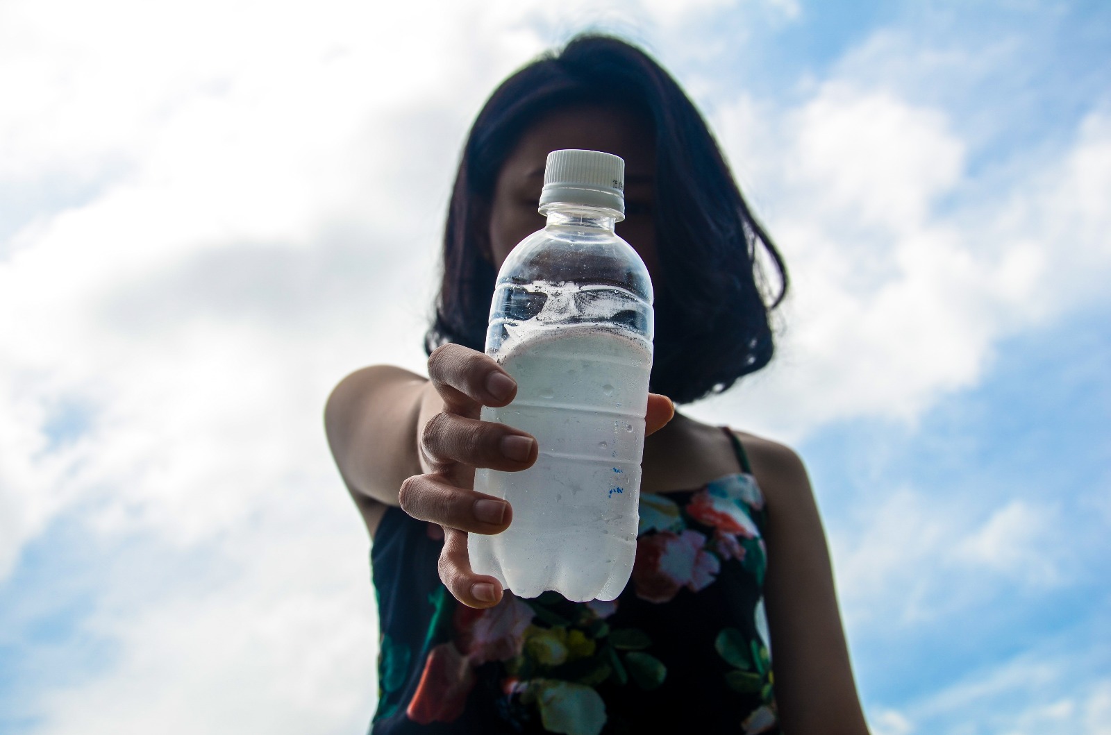
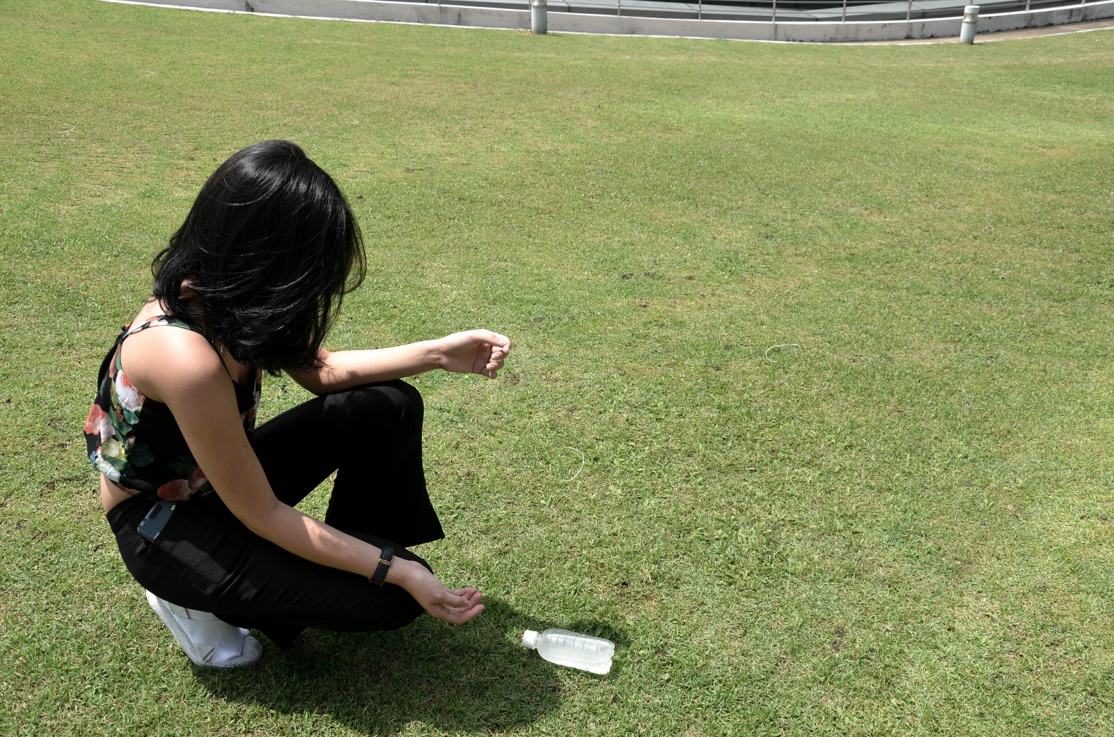
 The first try
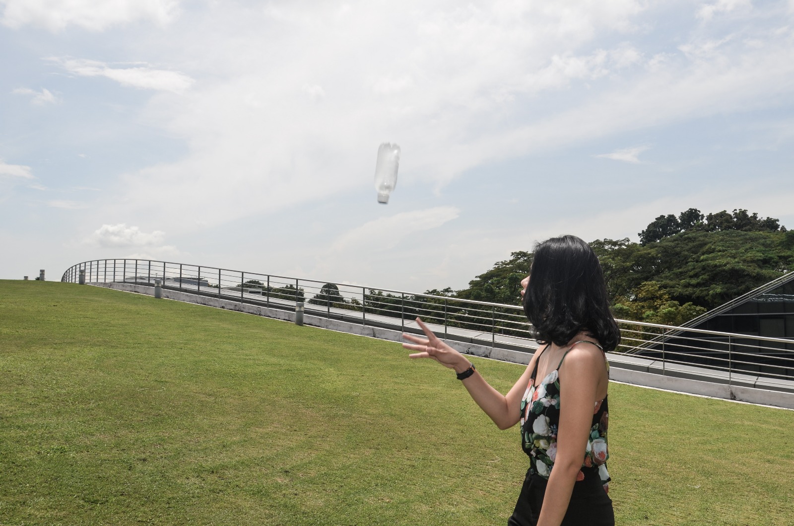
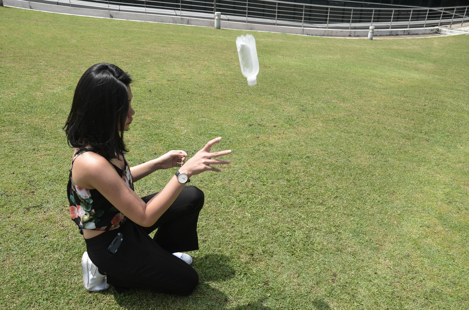
 The second try
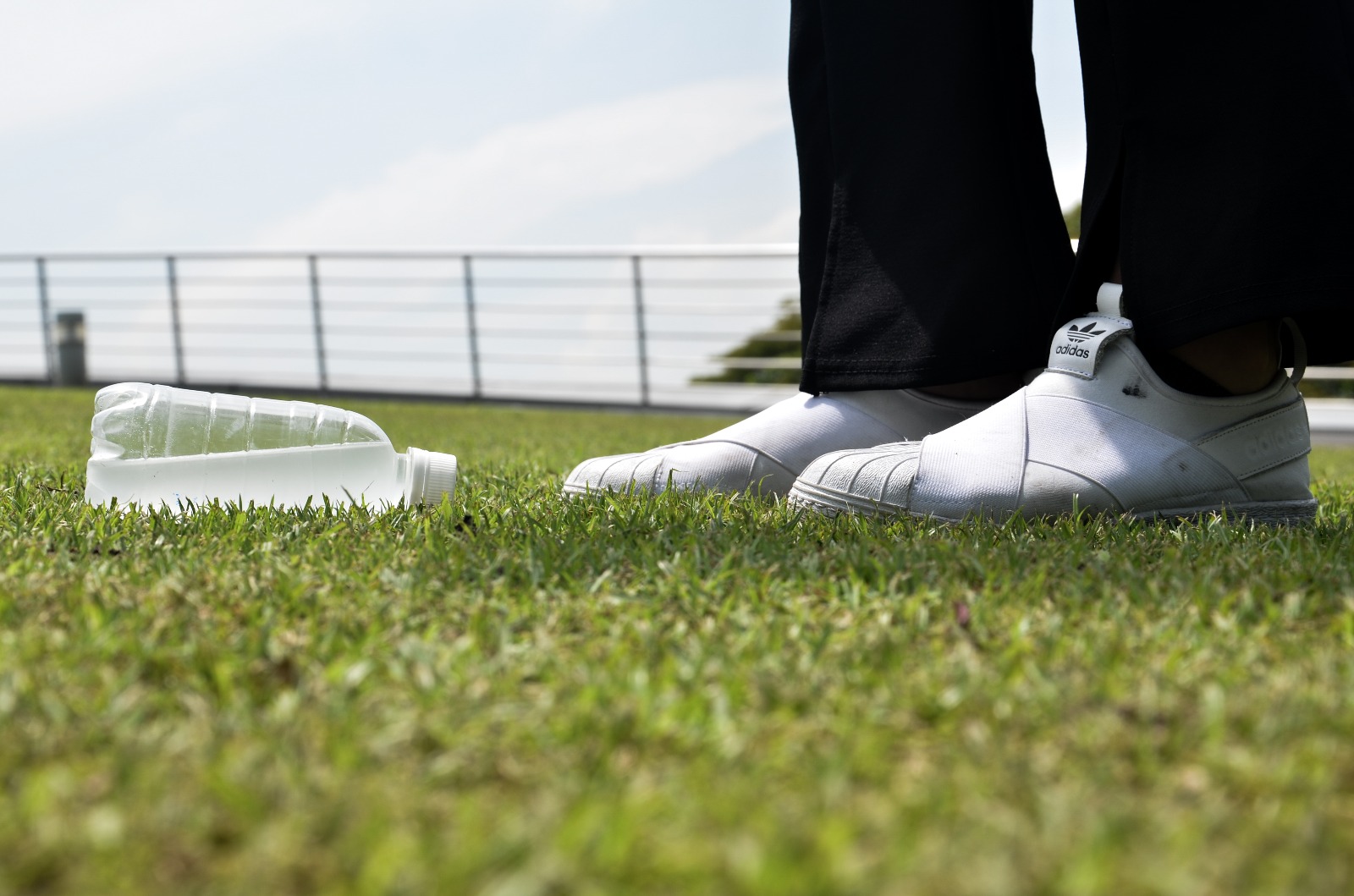
 “Nevertheless, I succeeded the third time”
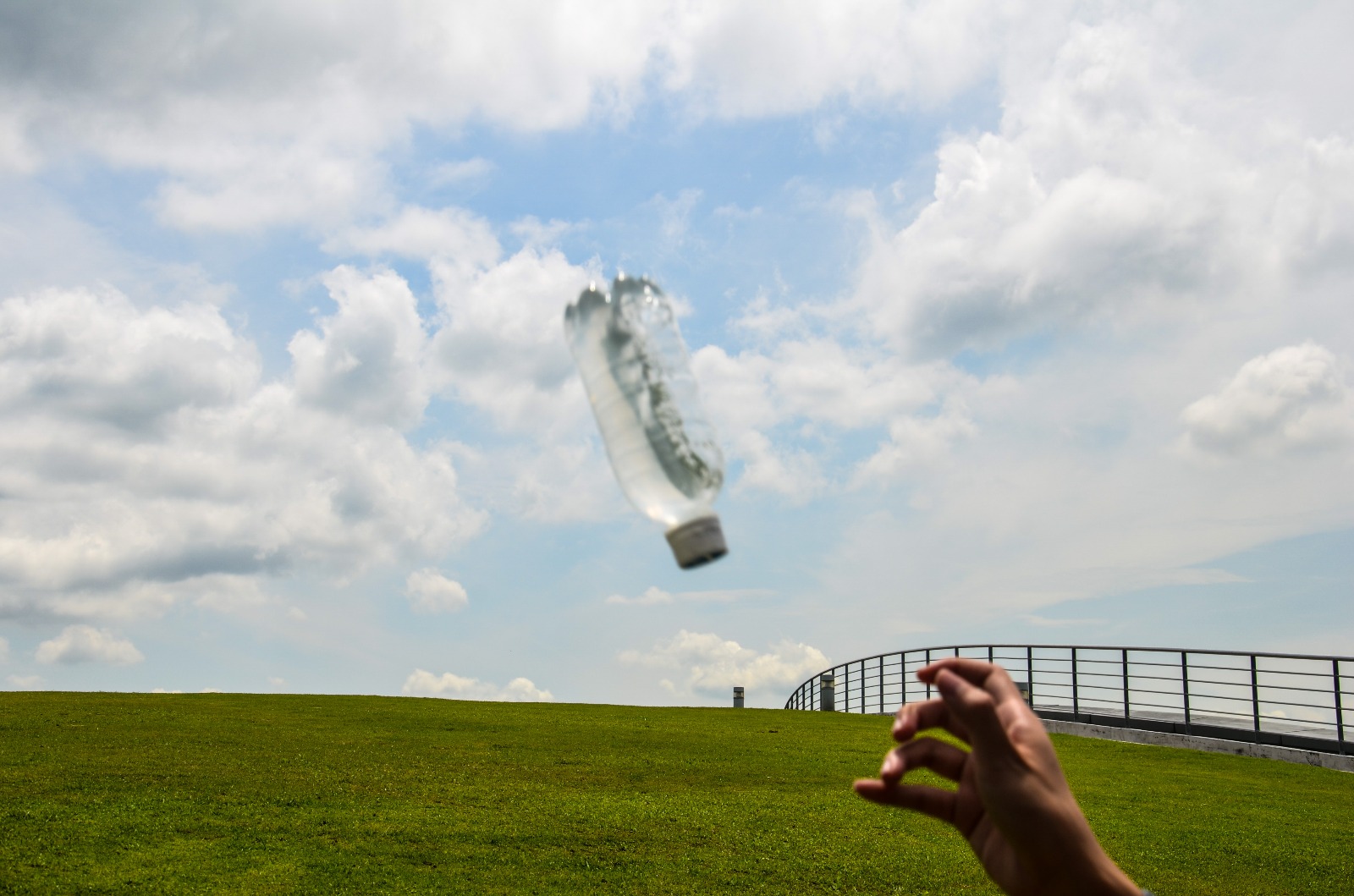
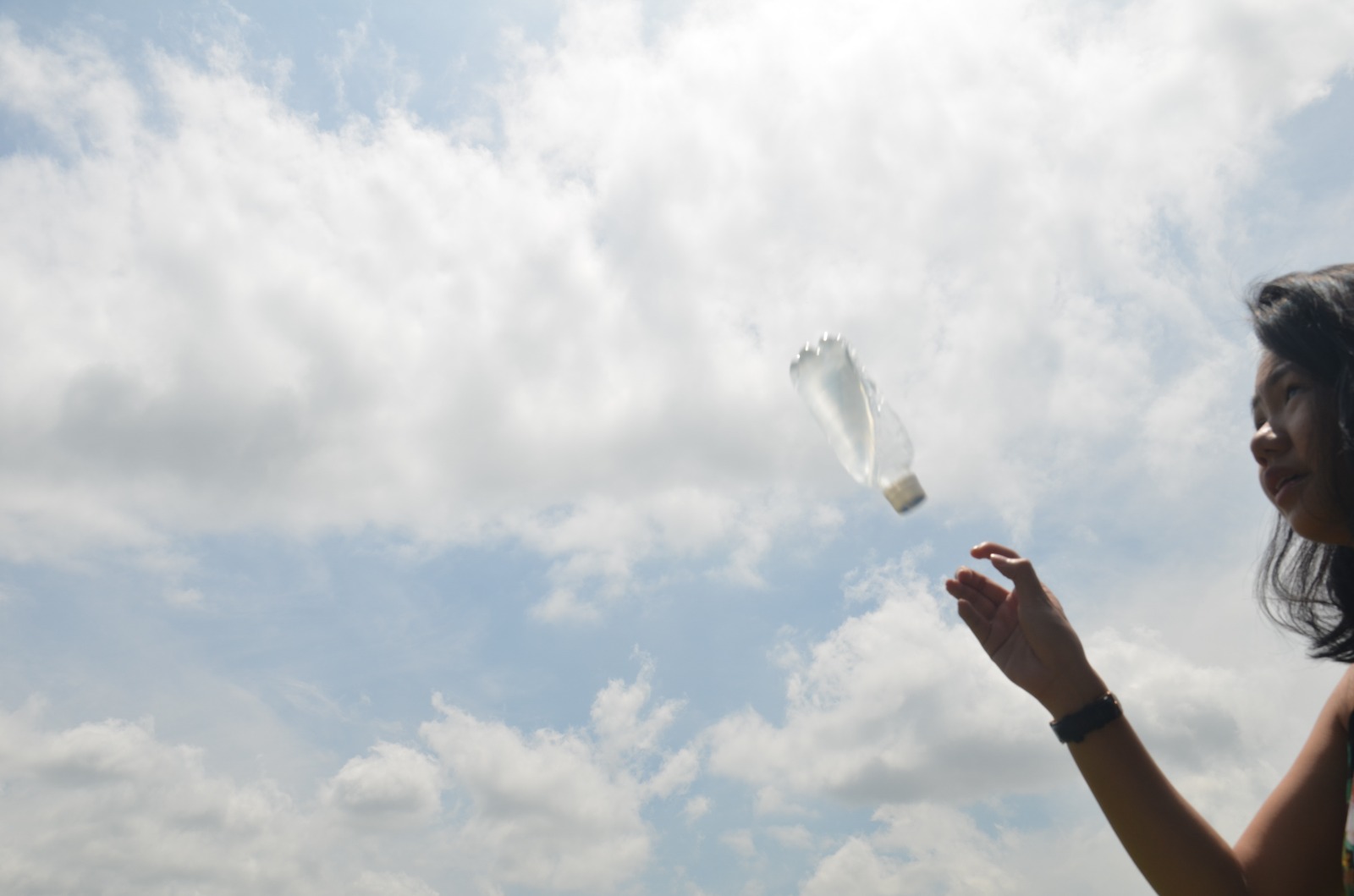
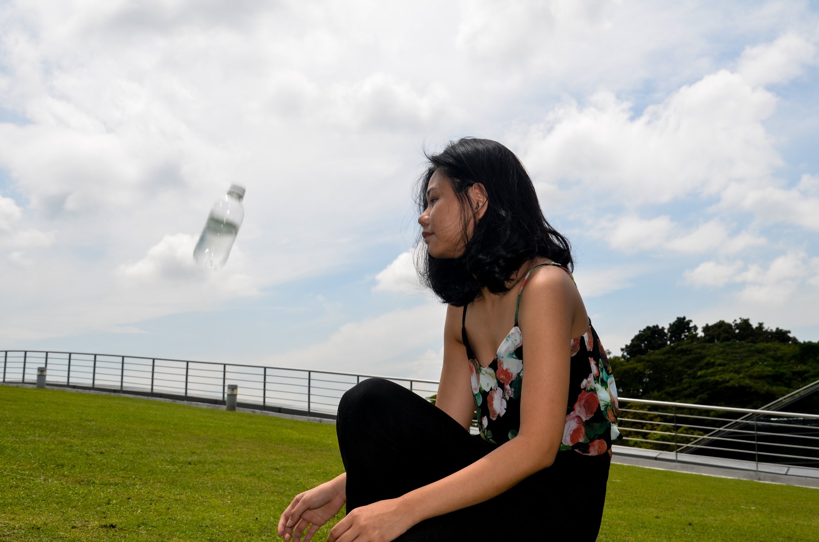
The first try
The second try
“Nevertheless, I succeeded the third time”
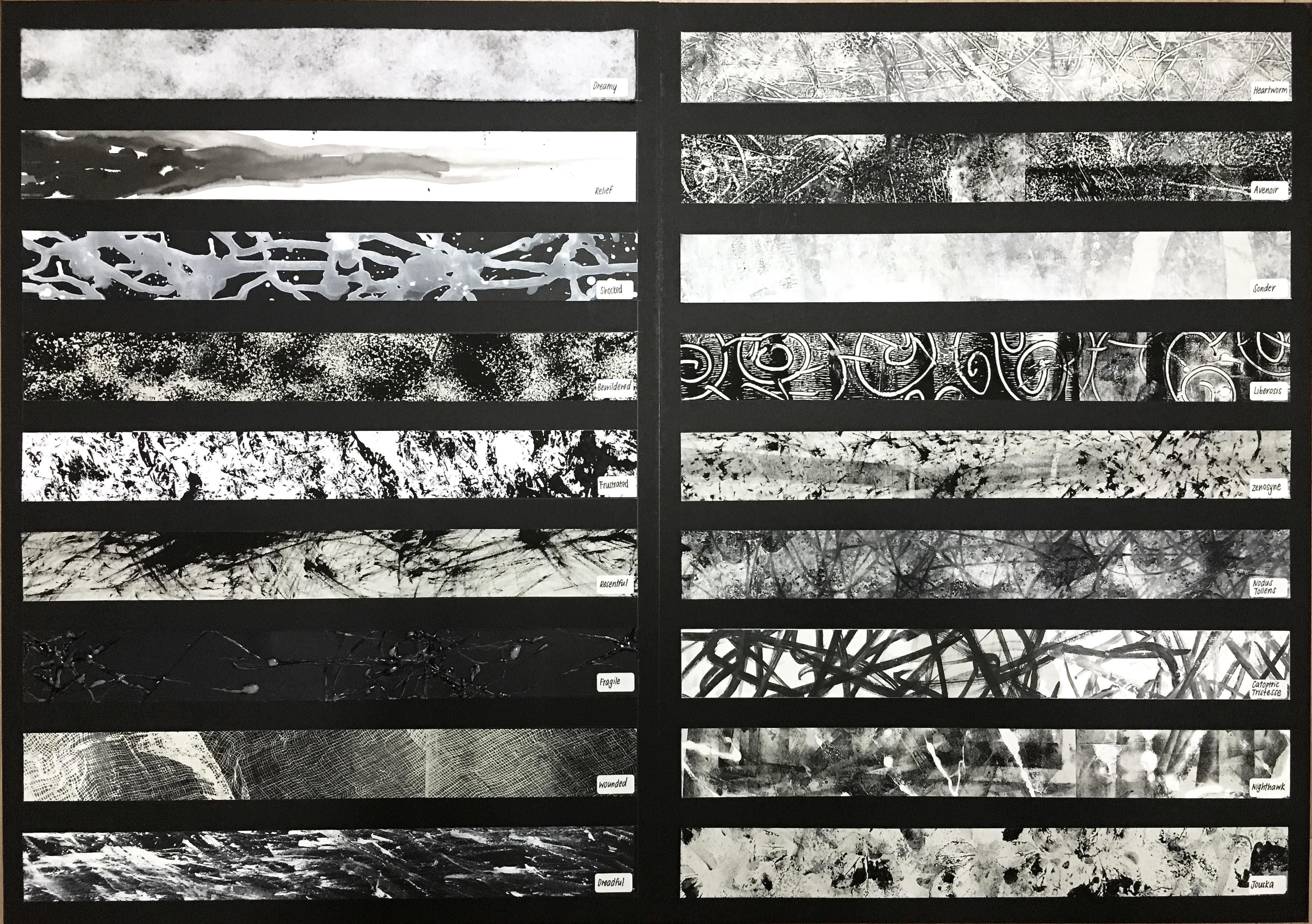
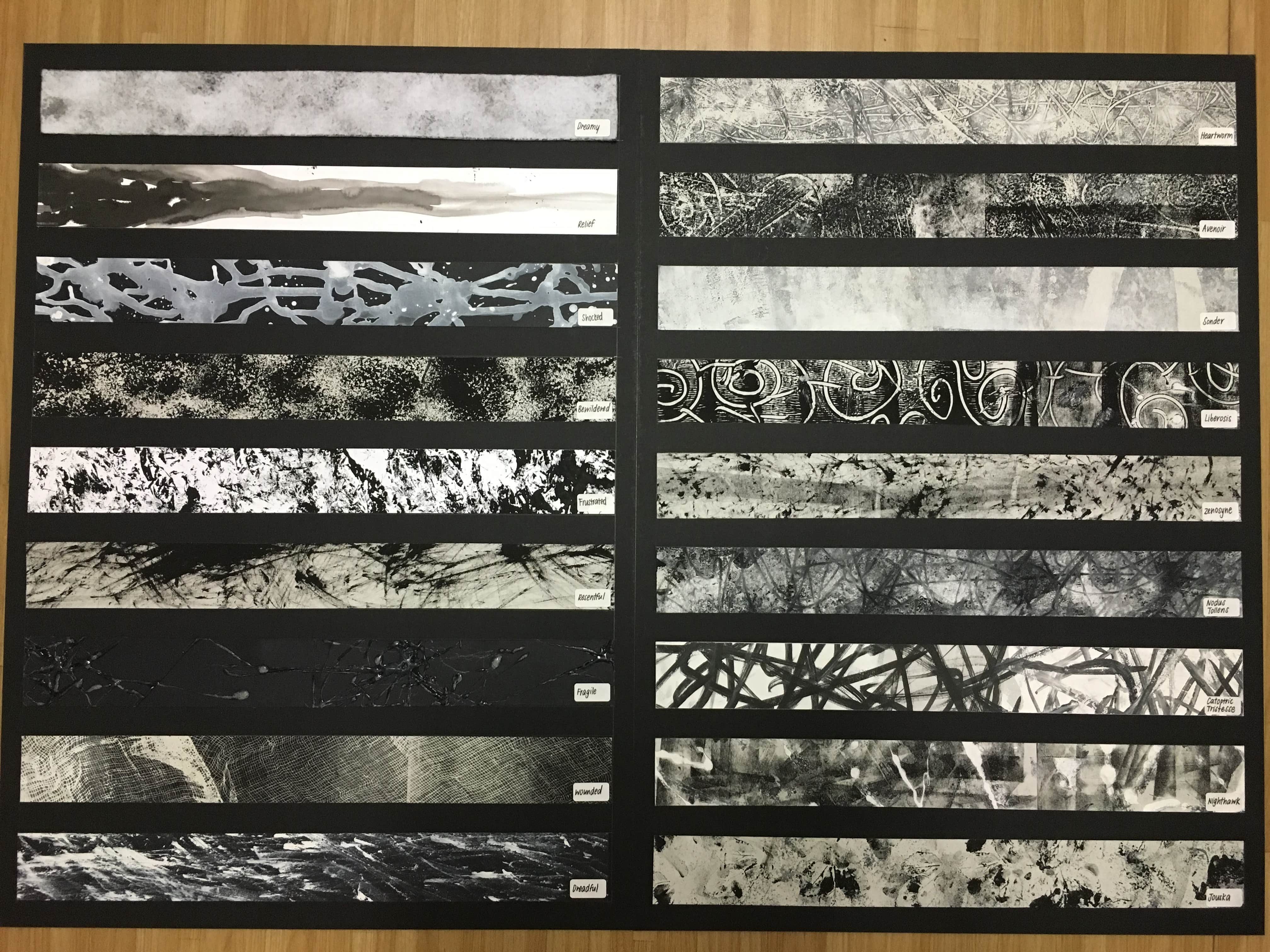
My concept on this project is to have two different categories, the first one being Emotions that are able to be expressed and the second one being emotions that can’t be expressed or explain yet it can be felt.
My approach to it is that the simpler emotions that can be expressed is used with one type of material whereas the emotions that can’t be explained is made from two or more layers and materials as most of them are mixture of two or more emotions expressed together. So the words that describe them has a name when I researched on them.
Top down:
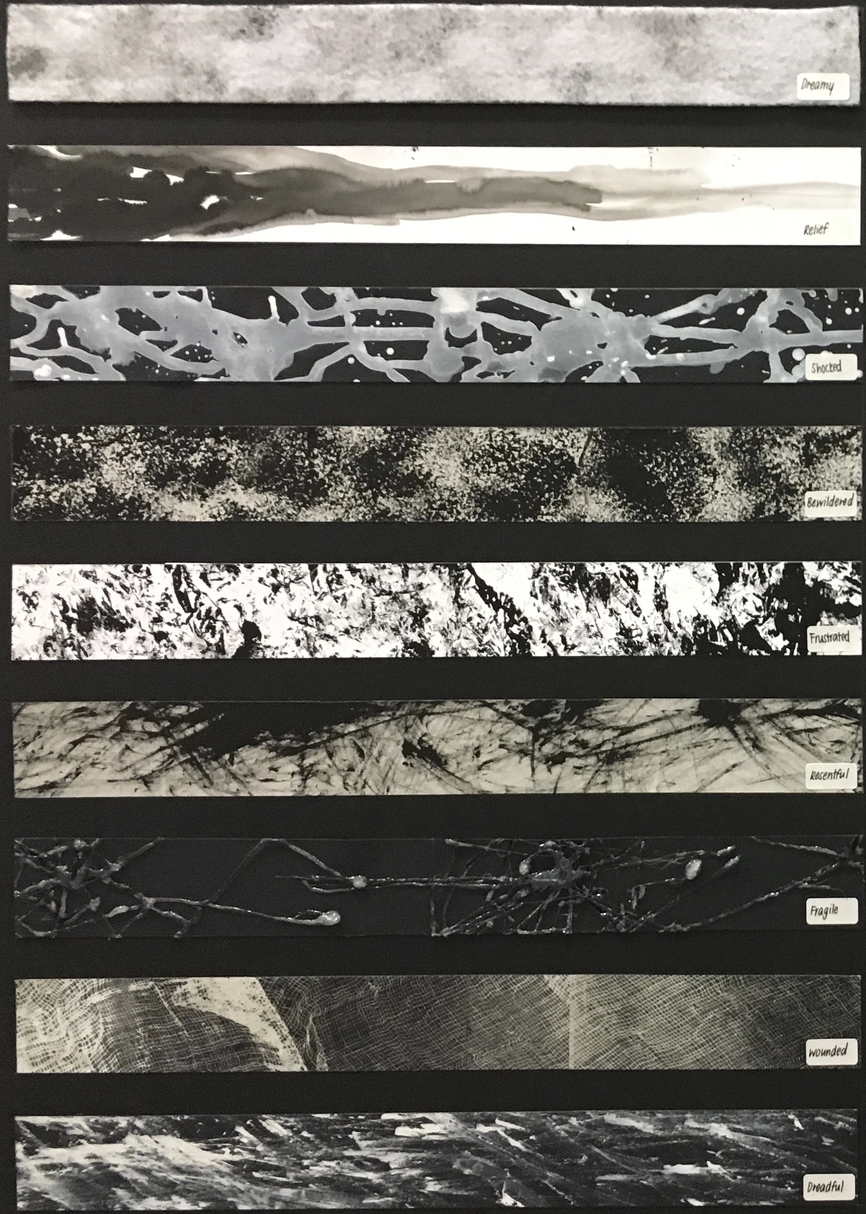 These 9 emotions as shown is the final piece that represents emotions that can be expressed. They are all made of one type material to show the simplicity of these emotions.
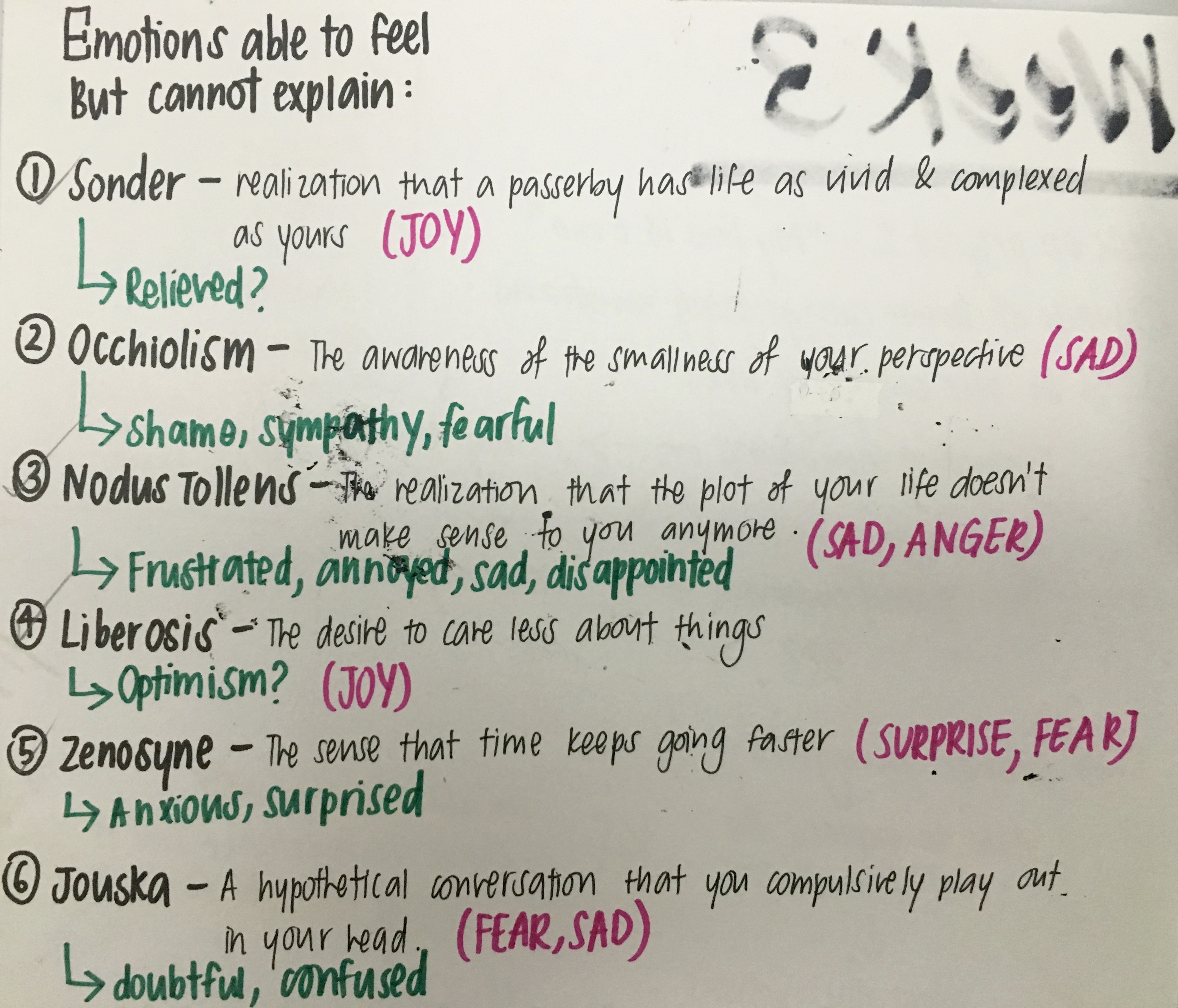
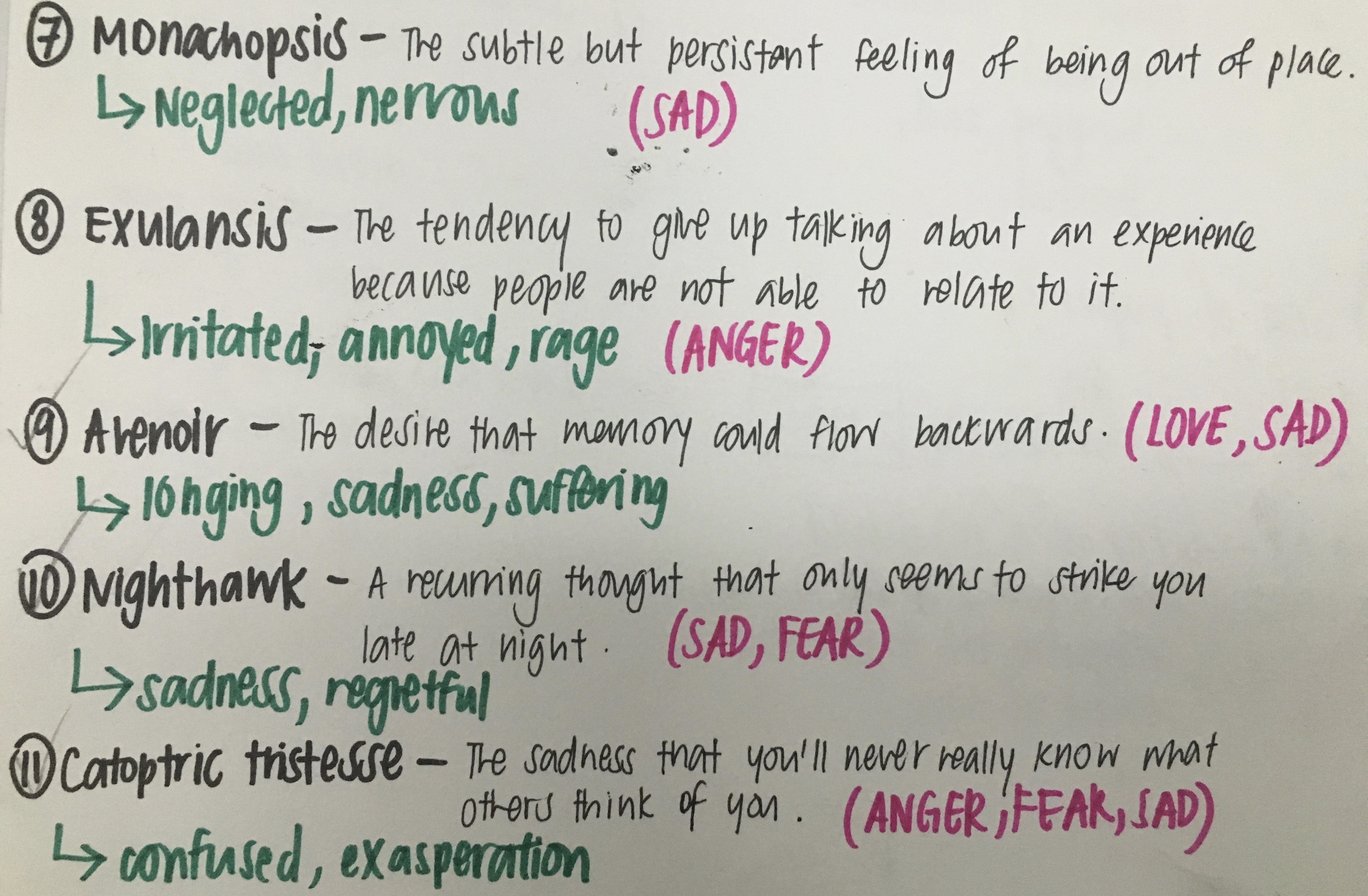
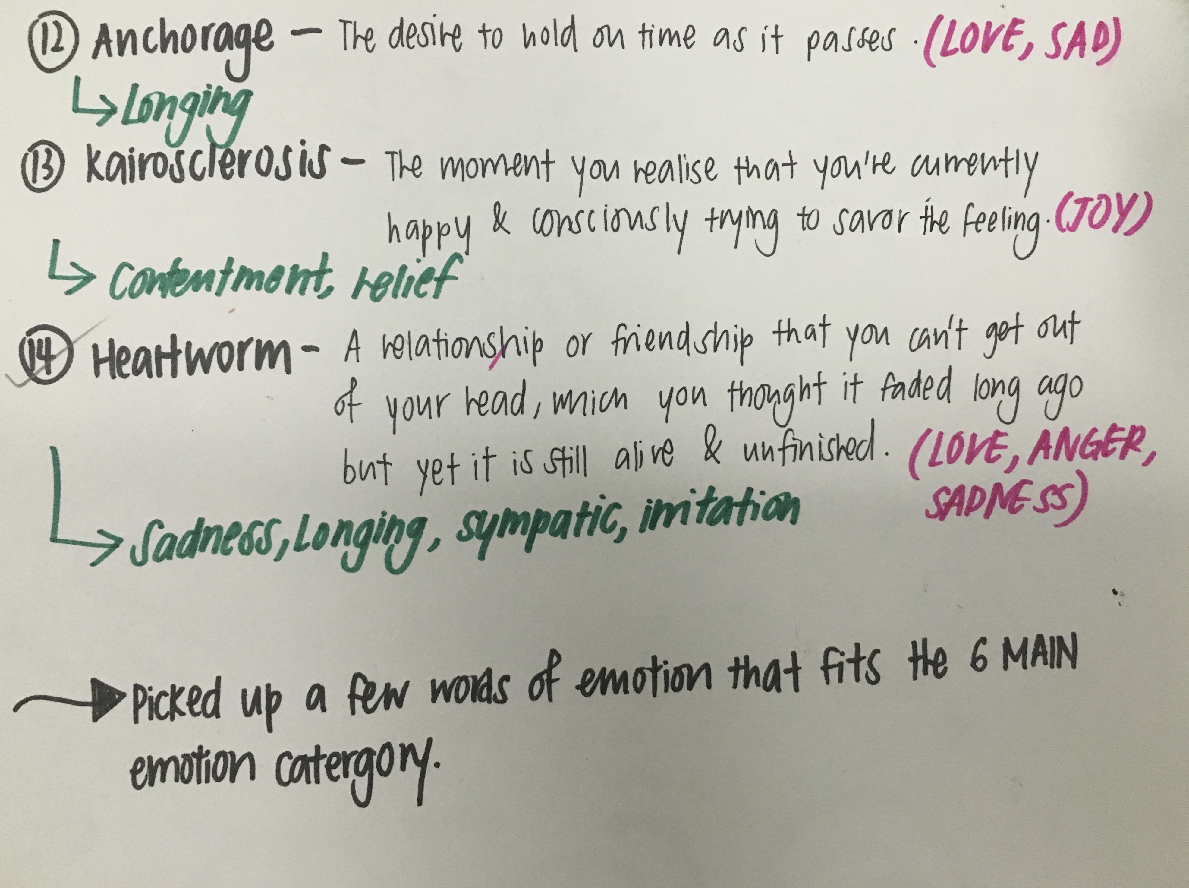
Going on to the second group: Emotions that can’t be expressed are all used with newsprint as I feel that since it is a mixture of emotions, the background of the strips can’t be seen in black or white. Also, from the work in progress, I actually found 14 of such emotions so I sieved out and selected the best 9 that fits the criteria of the 6main emotions the most.
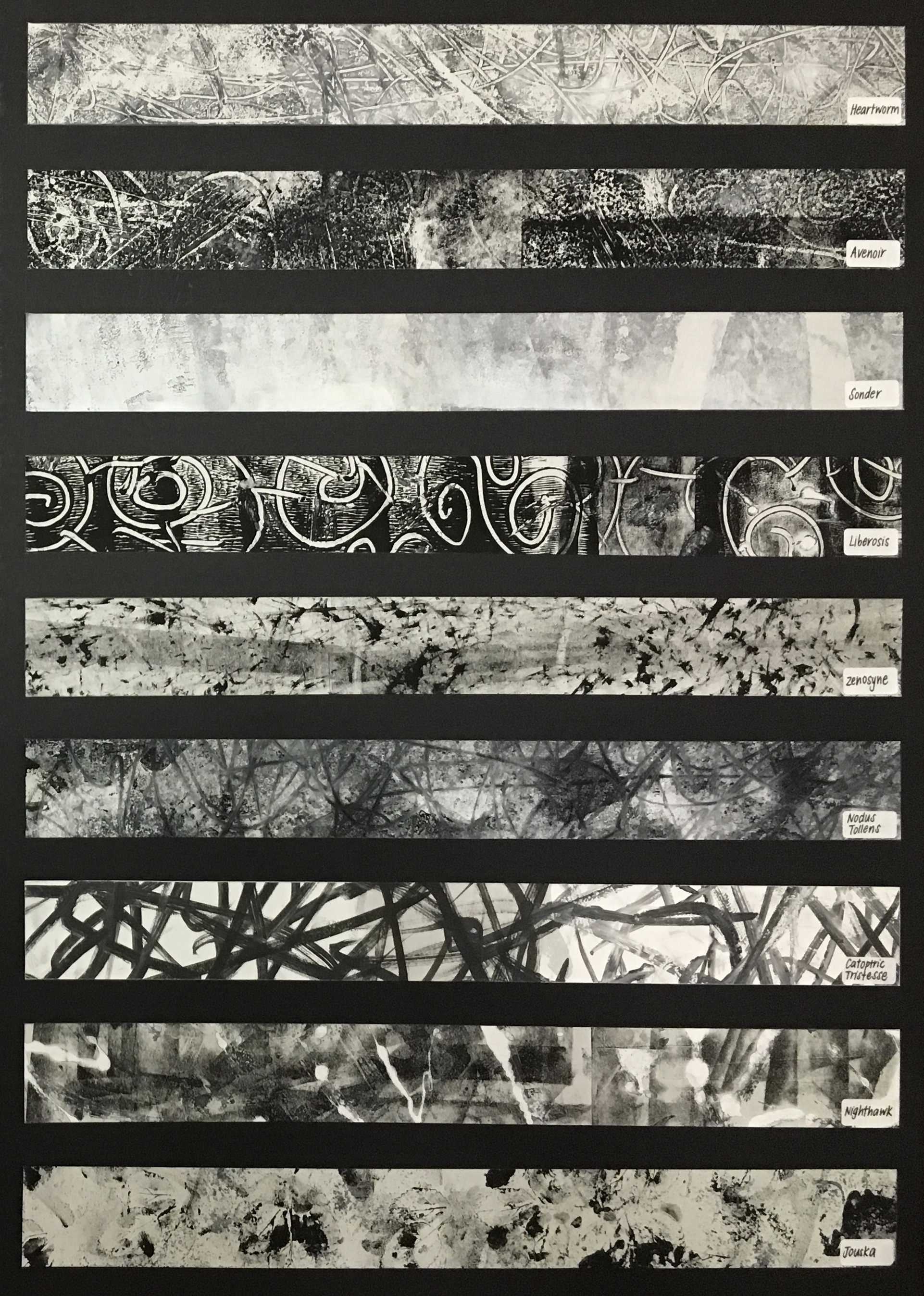
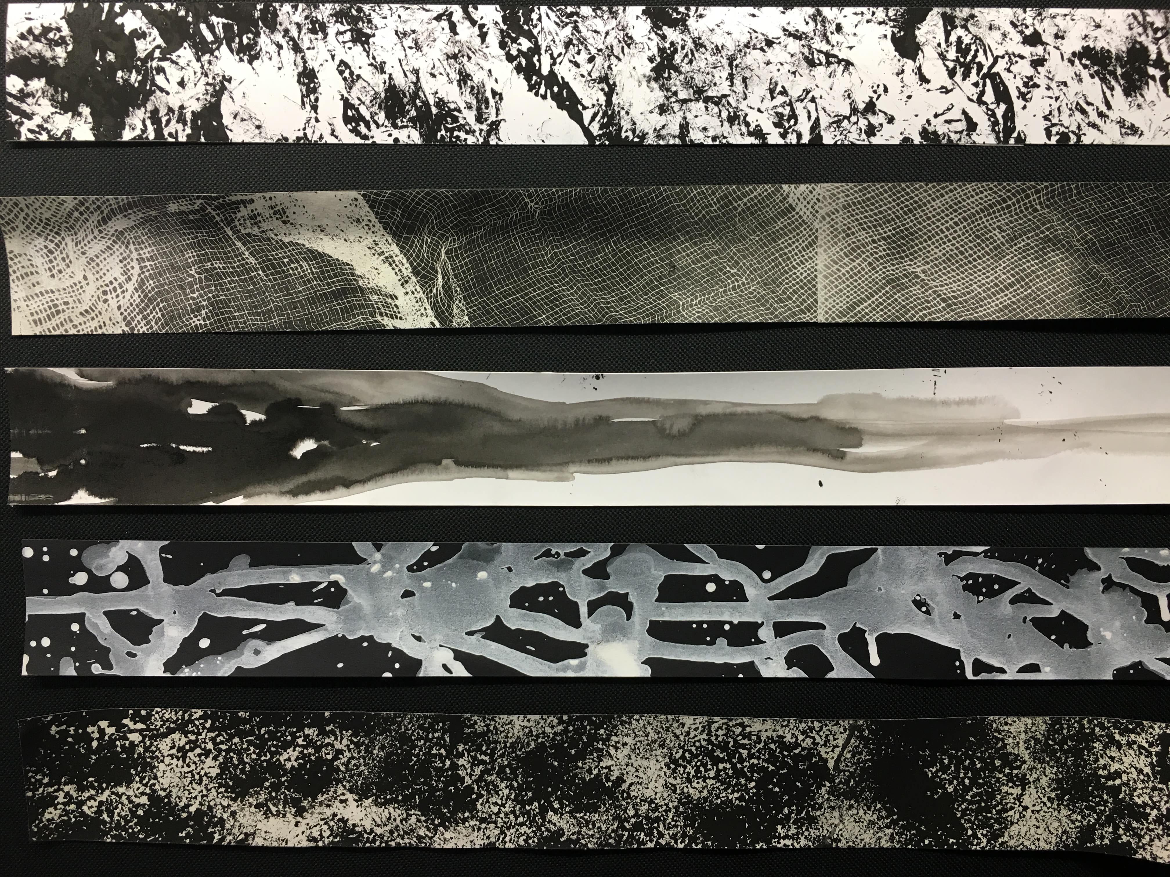
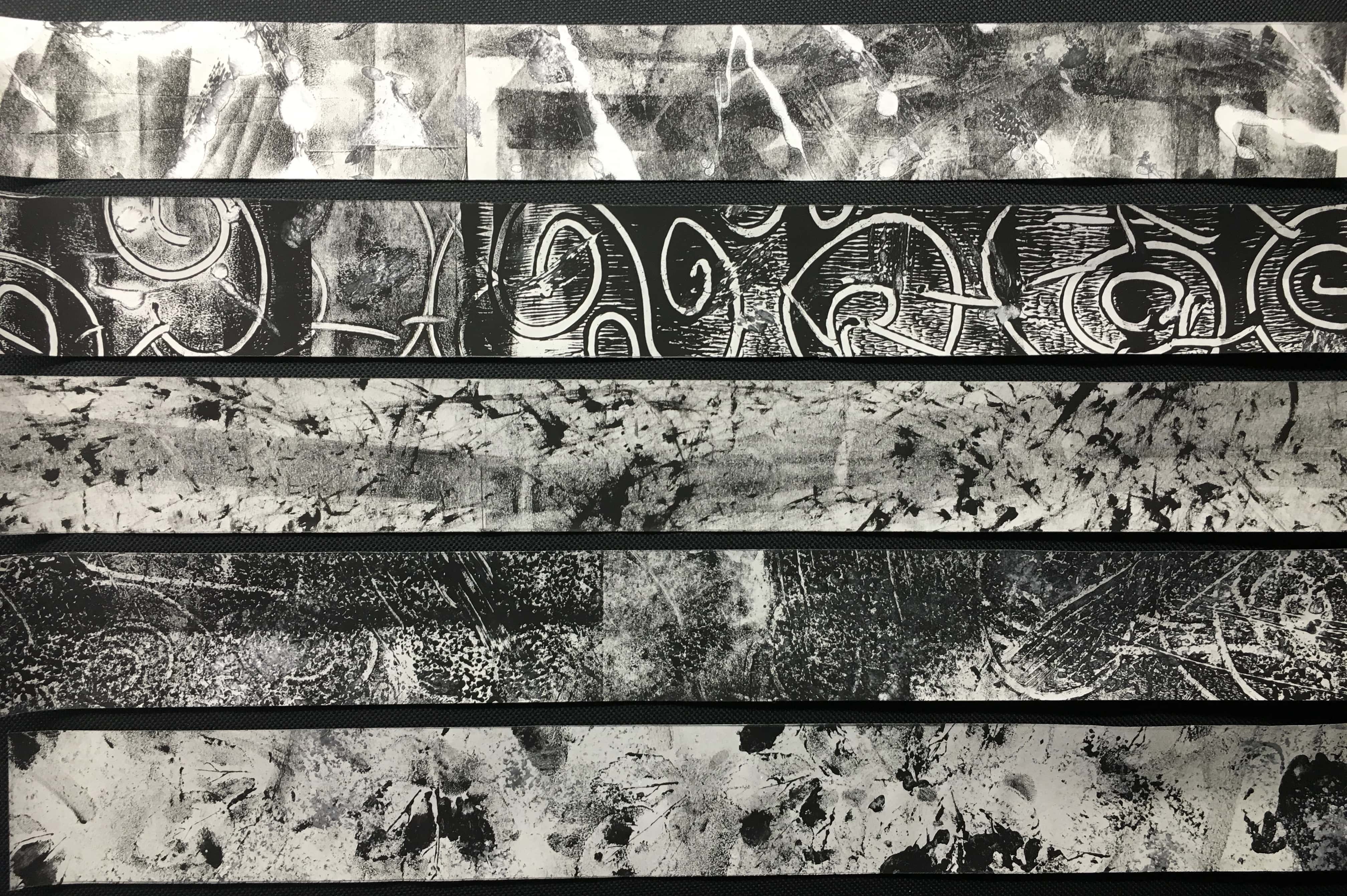
These are the close-ups of the strips (which may look very confusing at first):
FROM THE TOP TO BOTTOM:
Emotions: fearful, regretful and sad
Explanations: The black and grey gives an impression that it is continuously hunting someone and the white seem like it’s trying to escape from the dark, therefore creating an emotion of fearfulness.
Emotions: Optimism, Contentment, Pride
Explanations: The clear spirals on looks like happiness to me and the swirls are like when you want to care about something you just turn another way and decide to care less.
Emotions: Anxious, surprised, fear
Explanations: The black faded line at the back is supposed to represent the fear in one and the small black is actually gradually increasing in its intensity to show how time is going faster. Thus, I feel that it gives a very anxious and surprising emotion.
Emotions: longing, sadness and sufferings
Explanations: The black background represents the sadness and the white represents the memories. As you can see there are some faded swirls at the back it shows how the memories are fading but yet you want it to be clear again.
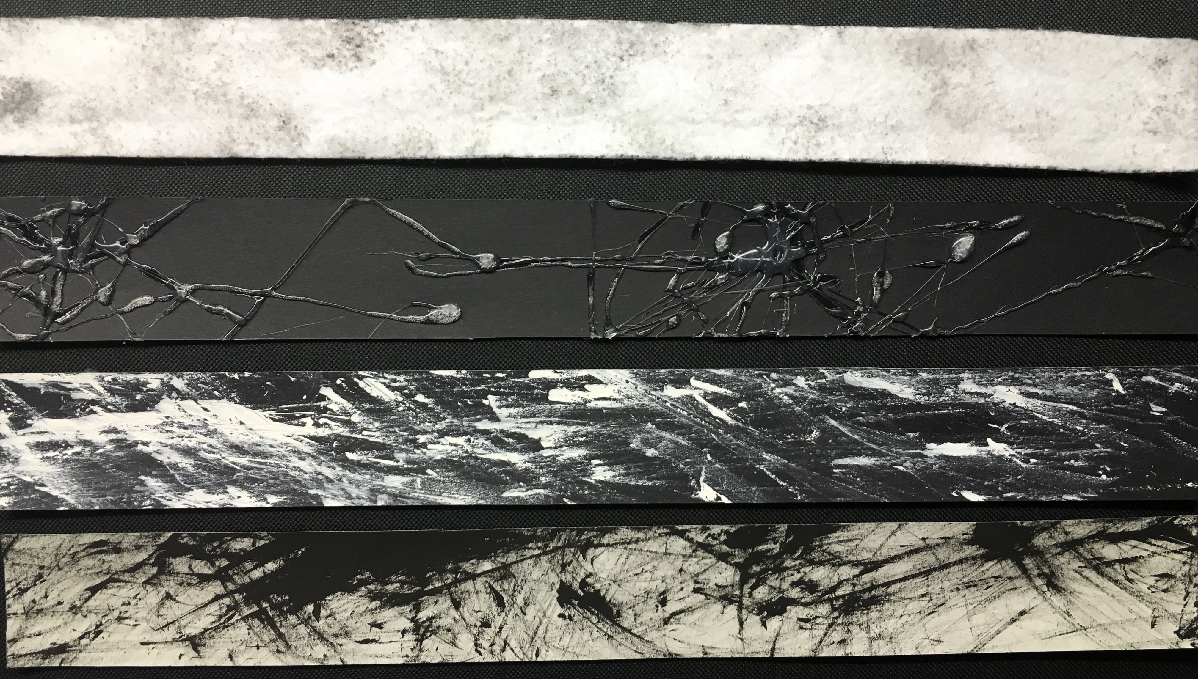
Emotions: Doubtful, confusion
Explanations: It is made with complexed materials to show the different patterns that depicts confusion. Leaves and face sponge with a bit of thumbprints randomly pressed.
From the group discussion in week 3, I realized that my friends thought that I used the sponge first followed by the leaves and the thumbprints which seemed very confusing to them to decipher which comes first. However, in actual fact, I used the leaves first then followed by the sponge. From the discussion, I felt that this piece of strip gave a lot of confusion hence It will be a great match to use it for Jouska as it has a mixed feeling of confusion and doubtfulness.
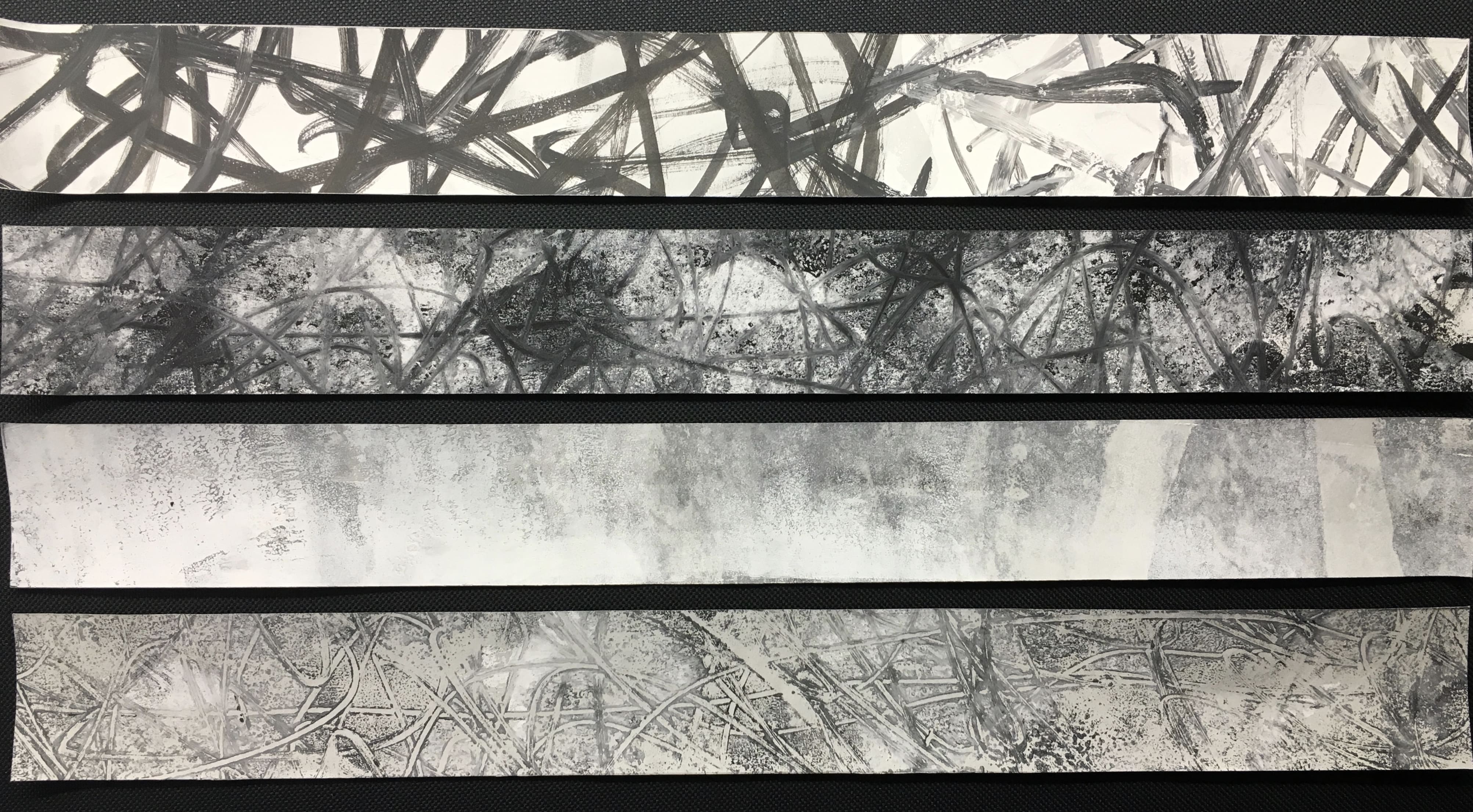
Emotions: Feeling of disappointment, sympathy, confusion, anger and fear
Explanations: The black strokes that seem to be all over the place represents the sadness and confusion one feel when they want to know what others think of them but yet they are not able to. If you look closely, there is actually a layer of thick white paint from the middle to the end of the strip which signifies the fear and sympathy one feels for themselves. This strip is not as clear as the others in emphasizing its emotions as it is more of the inner thoughts of a person which is almost invincible to others.
Emotions: Feelings of frustration, annoyed, disappointed, sad
Explanation: This is the most complexed and mixed feeling because there is a lot of different emotions together. The anyhow lines represents the annoyed feeling because you don’t really know what’s going on in your life and the frustration you feel is shown by the little black dots and its more of the black tone than white cause you’re feeling sad.
Emotions: Joy and relief
Explanations: One would secretly feel happy inside to know that they are not the only one going through a particular situation. Hence, the white is gradually fading represents a form of relief and satisfaction.
Emotions: Longing, sadness, irritation, confusion
Explanations: The faint swerved lines represents the irritation and confusion for the fact that it is a past relationship but yet it keeps getting back to the person. Whereas the greyish background portrays the sadness and longing one will feel as it might be a relationship that they wanted to salvage but yet they just can’t help but to end it. Thus it feels as though they want this relationship back again therefore the memories kept hunting them in their head. This state of mixed feeling shows the confusion of one’s feeling hence the random curves and intersection of the lines in the strip.
So one of the challenges I faced was thinking how to combine different materials to express the mixture of feelings that made me quite confused the more I did it. The 9 strips of emotions that can’t be expressed are all made from 2 or more materials to give it a more complexed look compared to the simple emotions that can easily be expressed by one.
FINAL PROJECT OUTCOME:
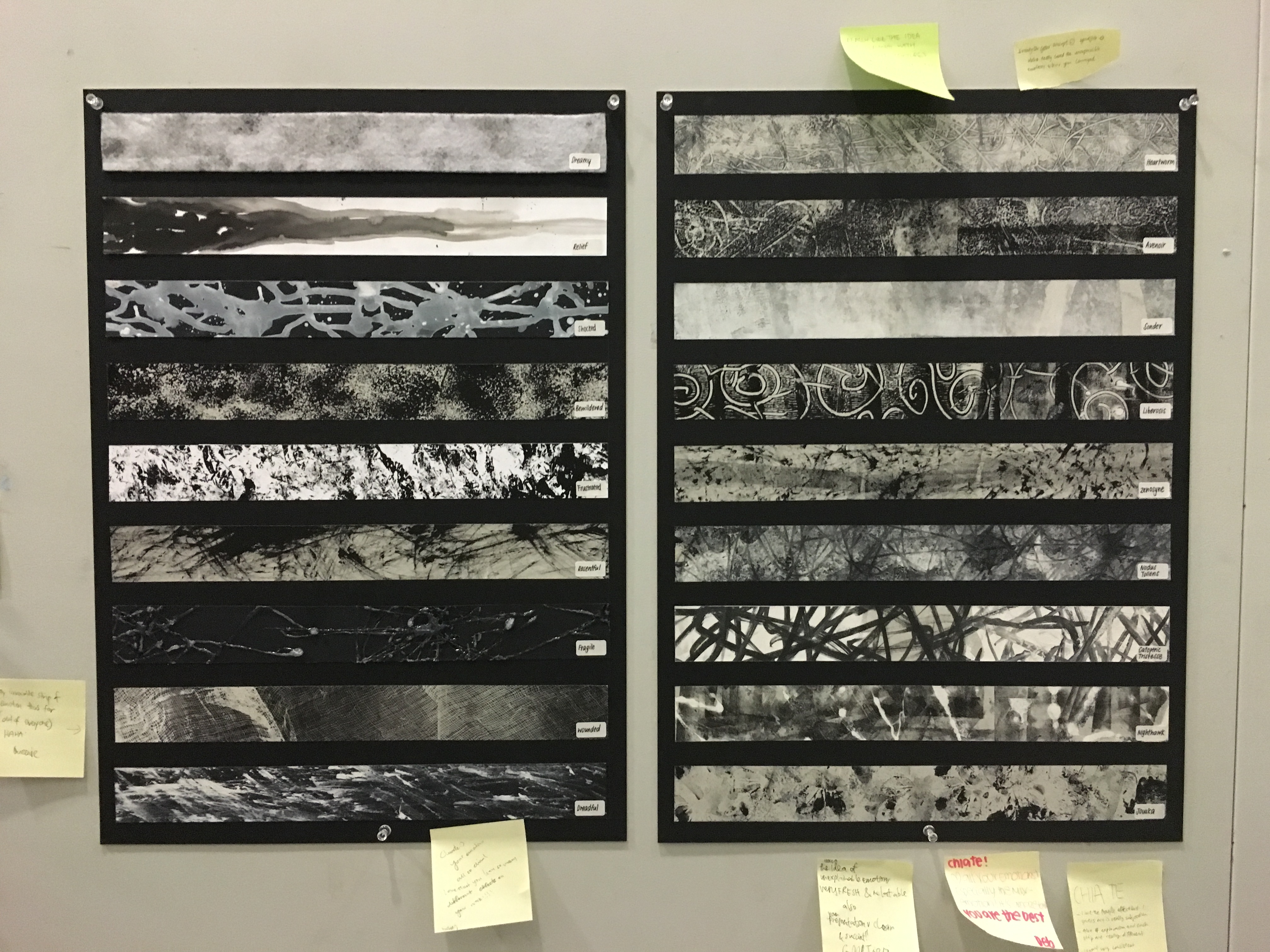
Project Critique:
Instructor’s feedback: Simple emotions should keep it more simple in terms on the outlook. Shocked and fragile seem too complicated for a simple emotion such that it might draw more attention compared to the complex emotions that cannot be expressed on the right.
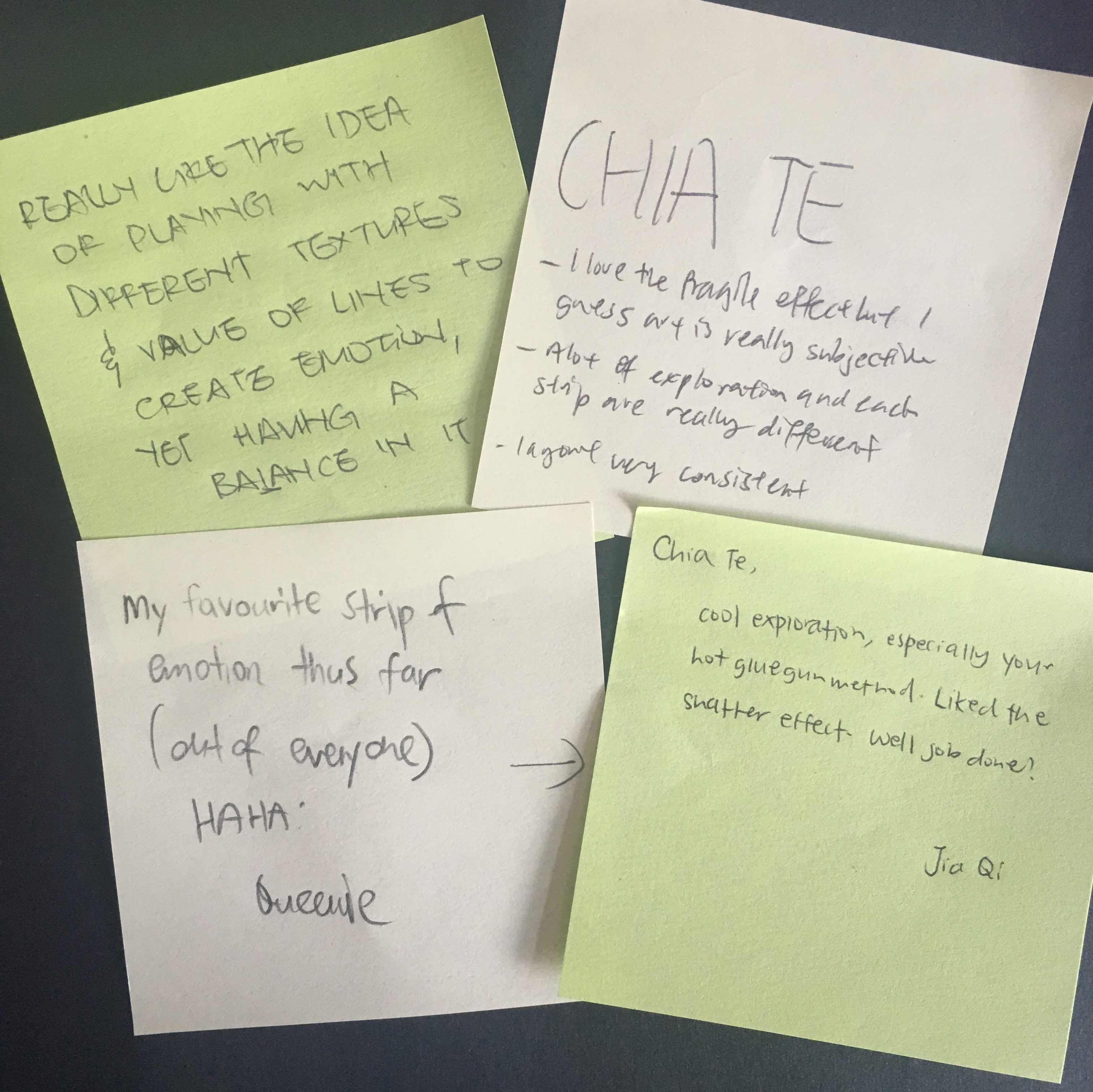
Classmates feedback:
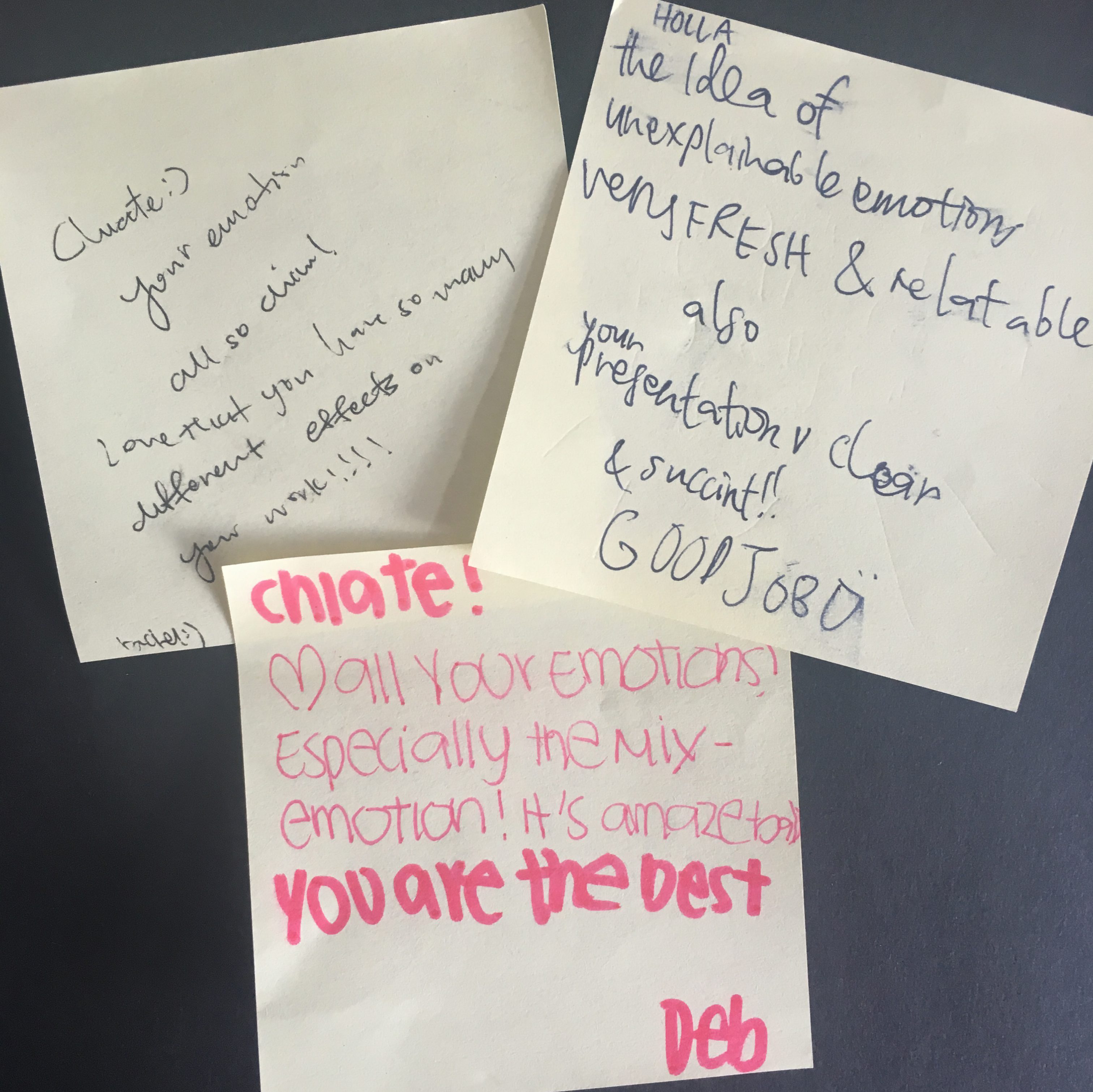
All in all, I really feel quite accomplished after finishing this project and honestly although it was a long process, i had fun doing it as it allowed me to really think about what i want to achieve for ever emotions. 🙂
When we first received the project, I didn’t know what kind of concept I would want to do on and just thought that I should experiment with different kinds of materials and explore on what I can do with the materials. Most of the materials are pretty basic, like sponges, leaves, bubble wraps, plastic bowls, cotton buds etc basically the things you can mostly find at home.
This was a pretty challenging project but yet after weeks of exploration and brain-storming for different ideas, seeing the end product gave me a great sense of achievement and I really enjoyed the process.
Initially when I was coming out with concepts, I thought about two main concepts. The first one is emotions that we have every day, weekly, monthly and yearly. This first main idea consists of four groups of emotions, but I felt that they might be a little overlapping as what we feel on a daily basis can also be felt in the whole month itself which doesn’t sound very convincing at all.
So, the second concept is what I eventually chose: Emotions that can be expressed VS Emotions that can be felt but can’t be expressed. I came out with this idea as I remember seeing “unusual” words on social medias that describes a particular feeling that one feels but yet there isn’t an exact emotion that could express it. Thus, I thought I would go into this direction and research more on these words.
These are words I picked out that seem relevant to emotions taken from my visual journal:
As you can see from all these meanings to the description of emotions that can’t be expressed, all of them actually have more than one kind of main emotion that can be felt. Therefore, they are mixed emotions that one cannot really express.
Thus I decided to work on it and thought that since they are mixed emotions, all of them should look very complicated and there should be a mixtures of materials used when creating the strip of each different feeling. However, there was a contemplation about it as it may all look too confusing to decipher that particular emotion that I am trying to show.
I had to figure out which kind of emotions could fit together to depict the mixed emotion on the strip.
Some of the materials used while exploring
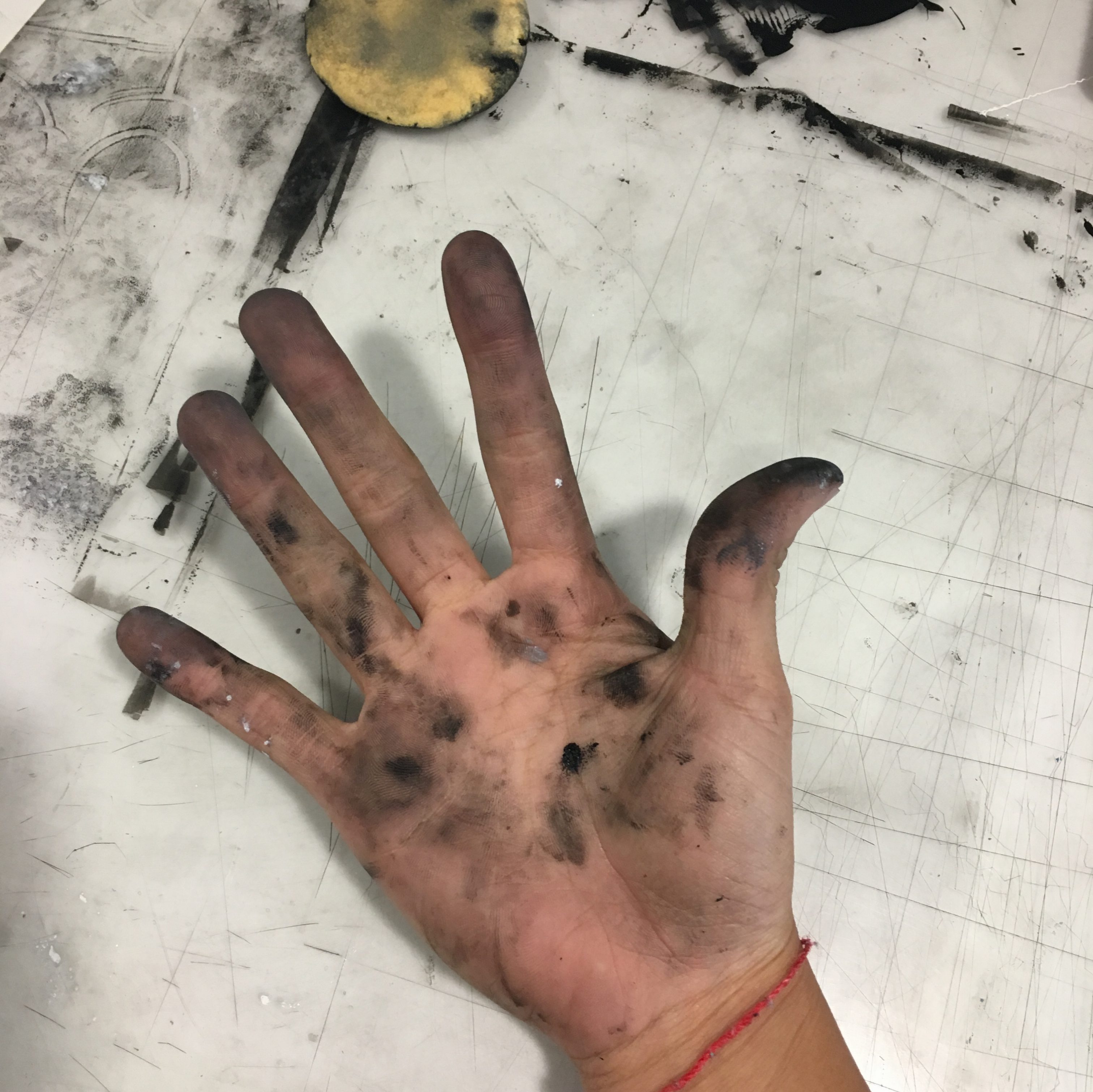 My finger prints are also a form of “material” used as well.
Outcome of the materials used with different techniques! I tried many different textures to mix and match and try to see which one is the most suited for a particular emotion that can’t be explained.
Therefore i feel that my work in progress is mainly from experimenting different textures myself and coming into a conclusion if the strip actually shows what the emotion it was trying to portray. My next post will be about the strips i have chosen and the explanation of why i chose that strip 🙂
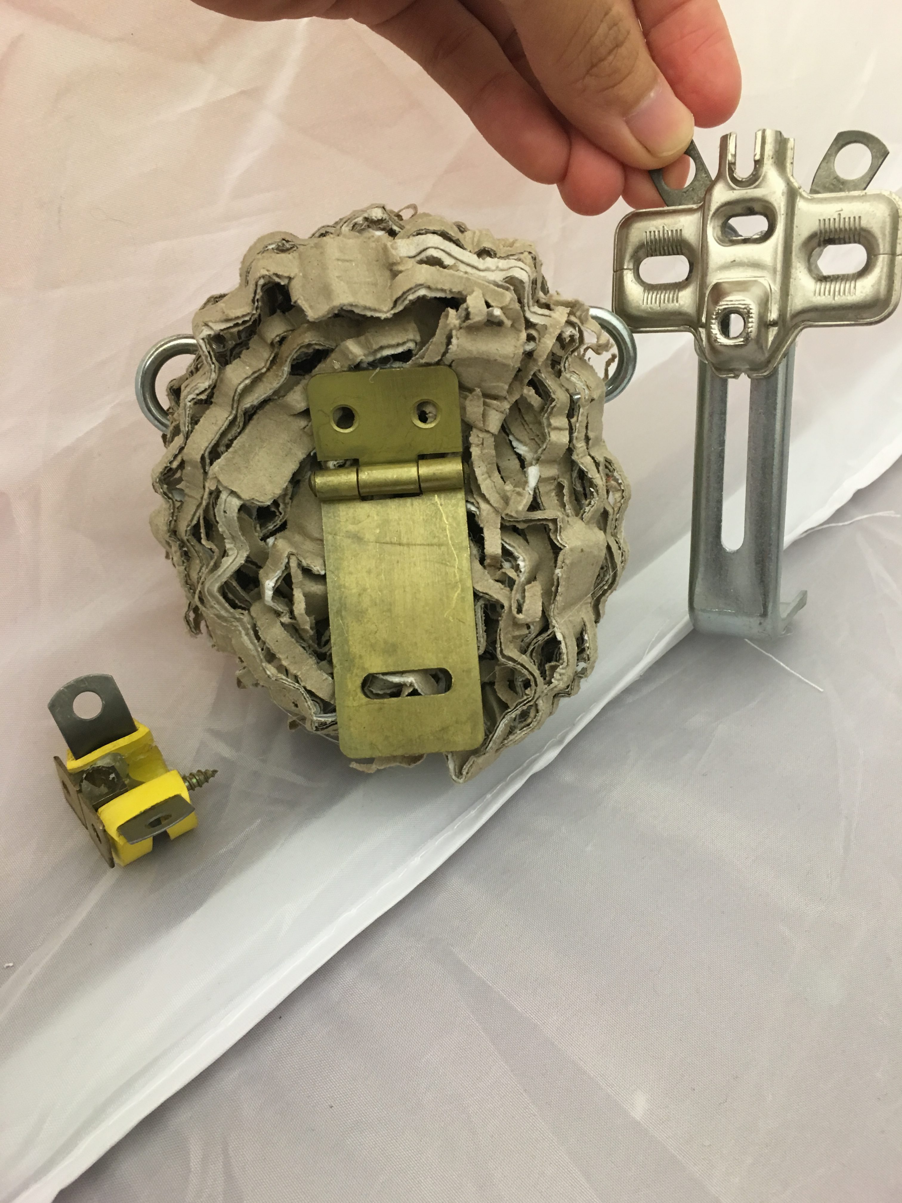
We were told to look for interesting objects from different hardware stores that can be used to create an animal. From that day, i managed to buy several items to transform them into animals when joined together with other tools.
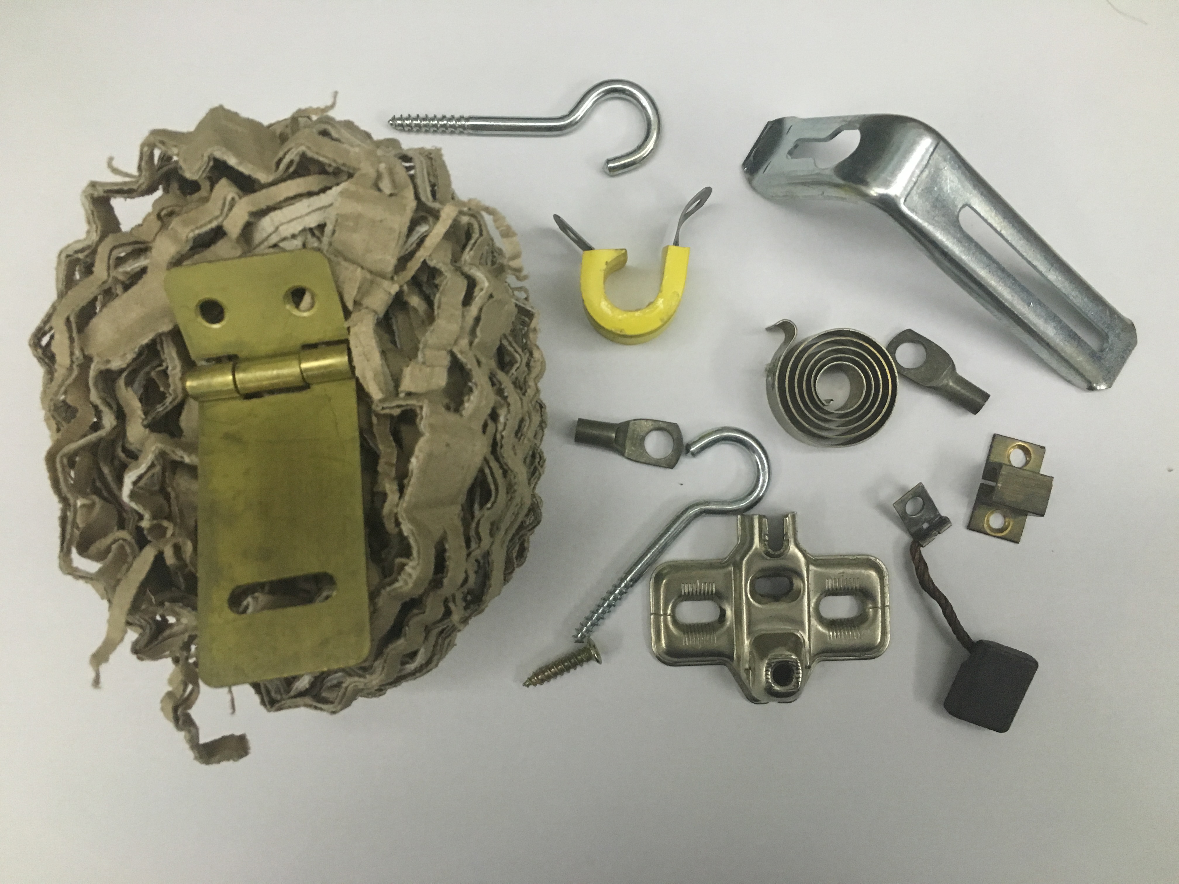 These were some of the items i bought and some were from my dad’s toolbox!
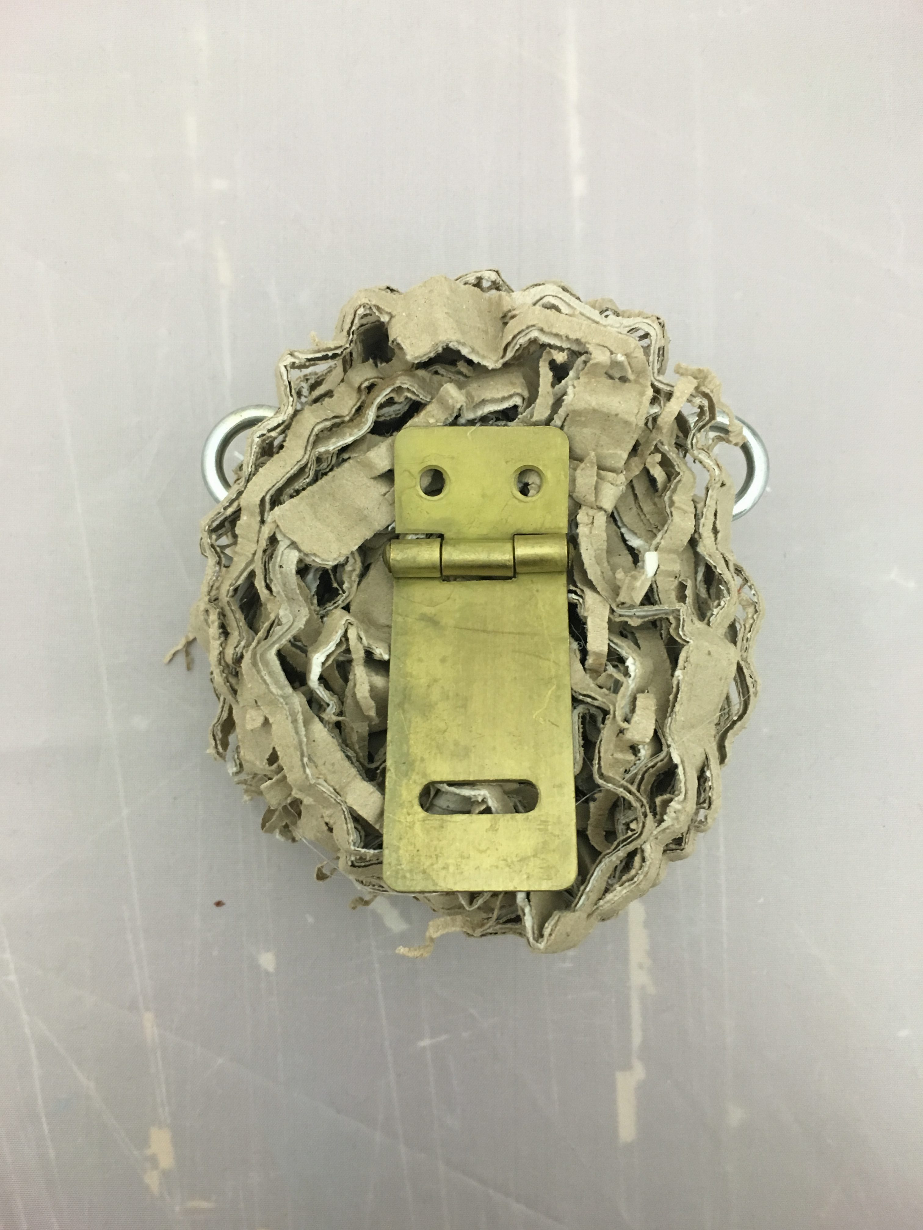
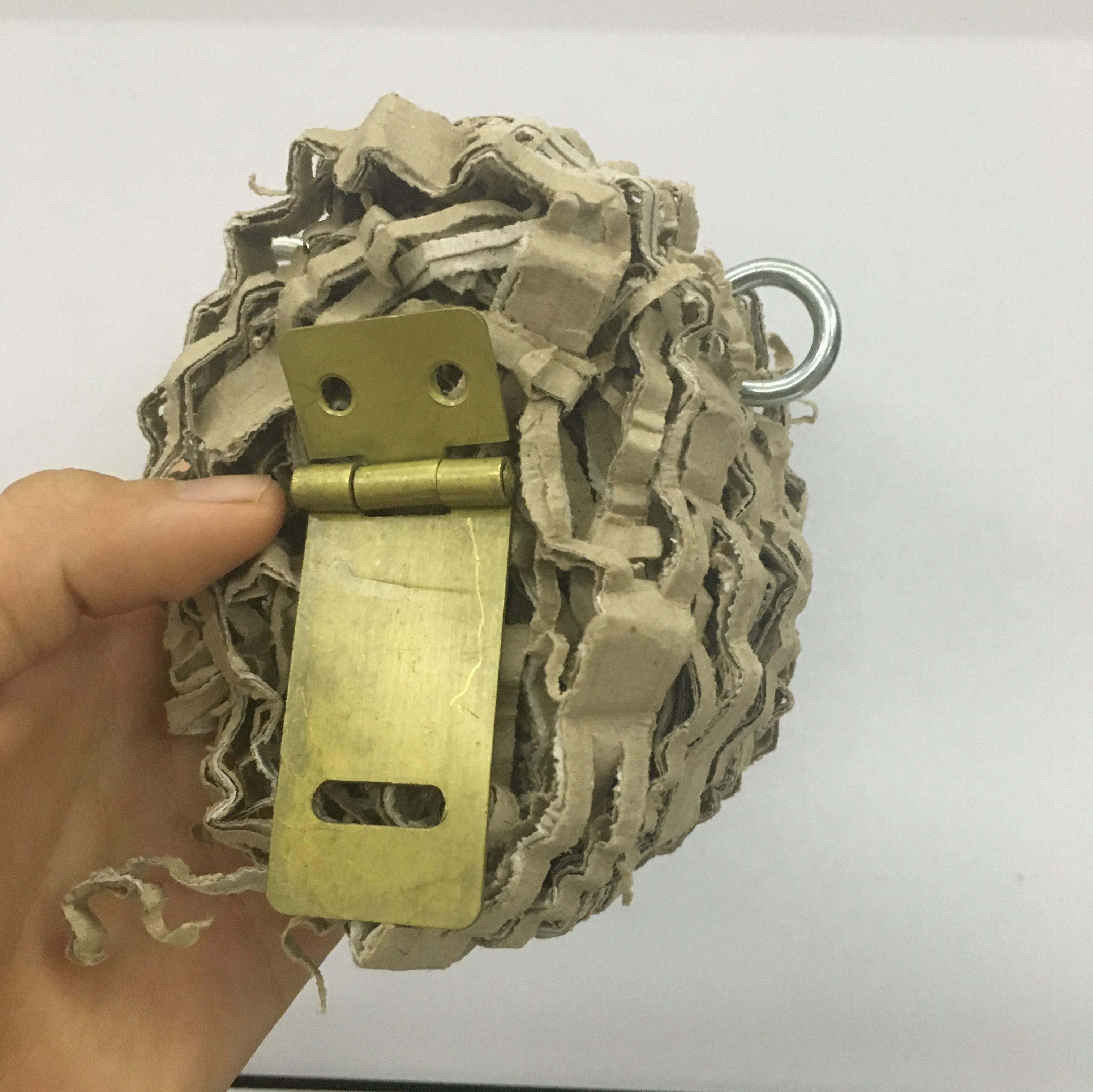
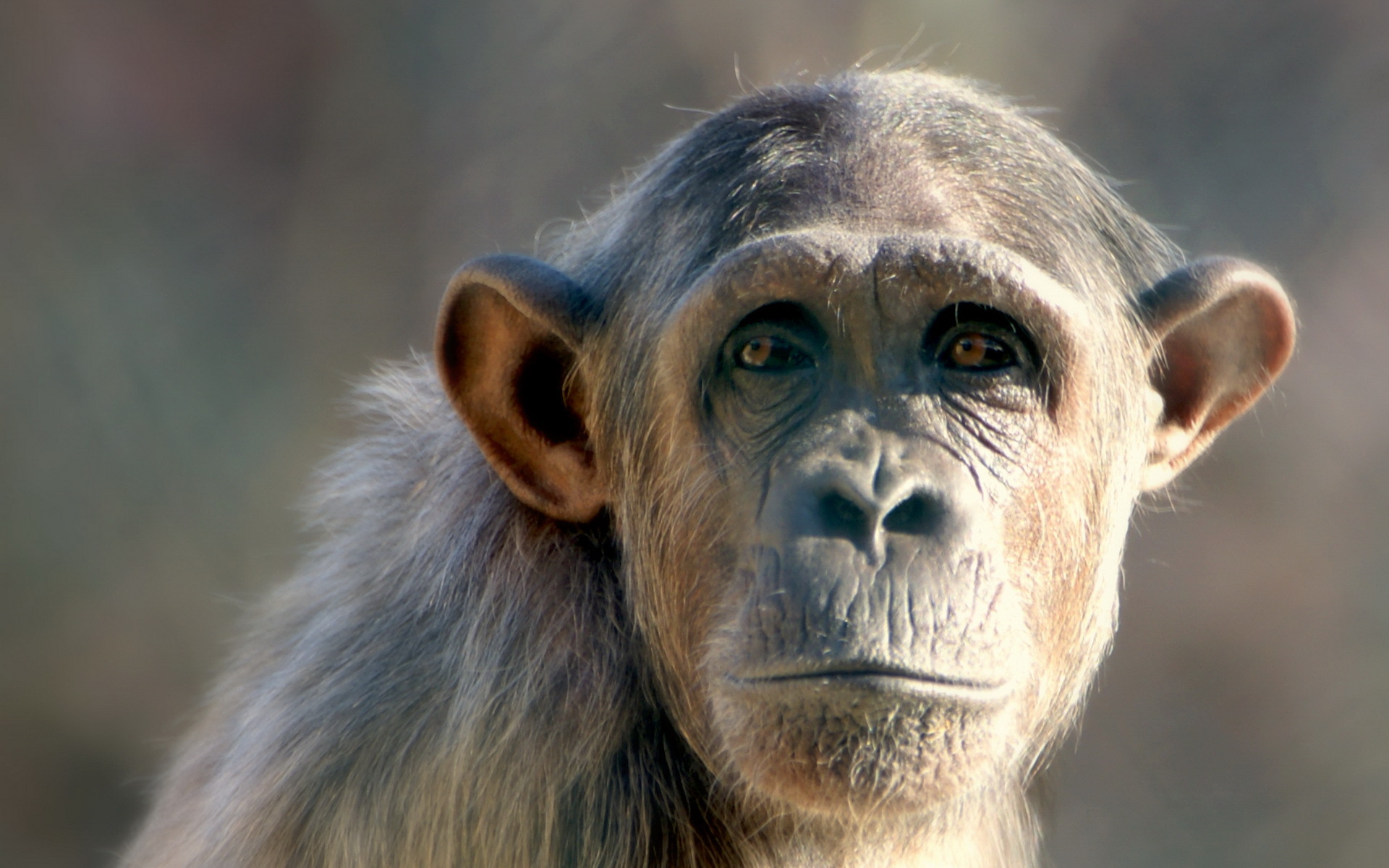
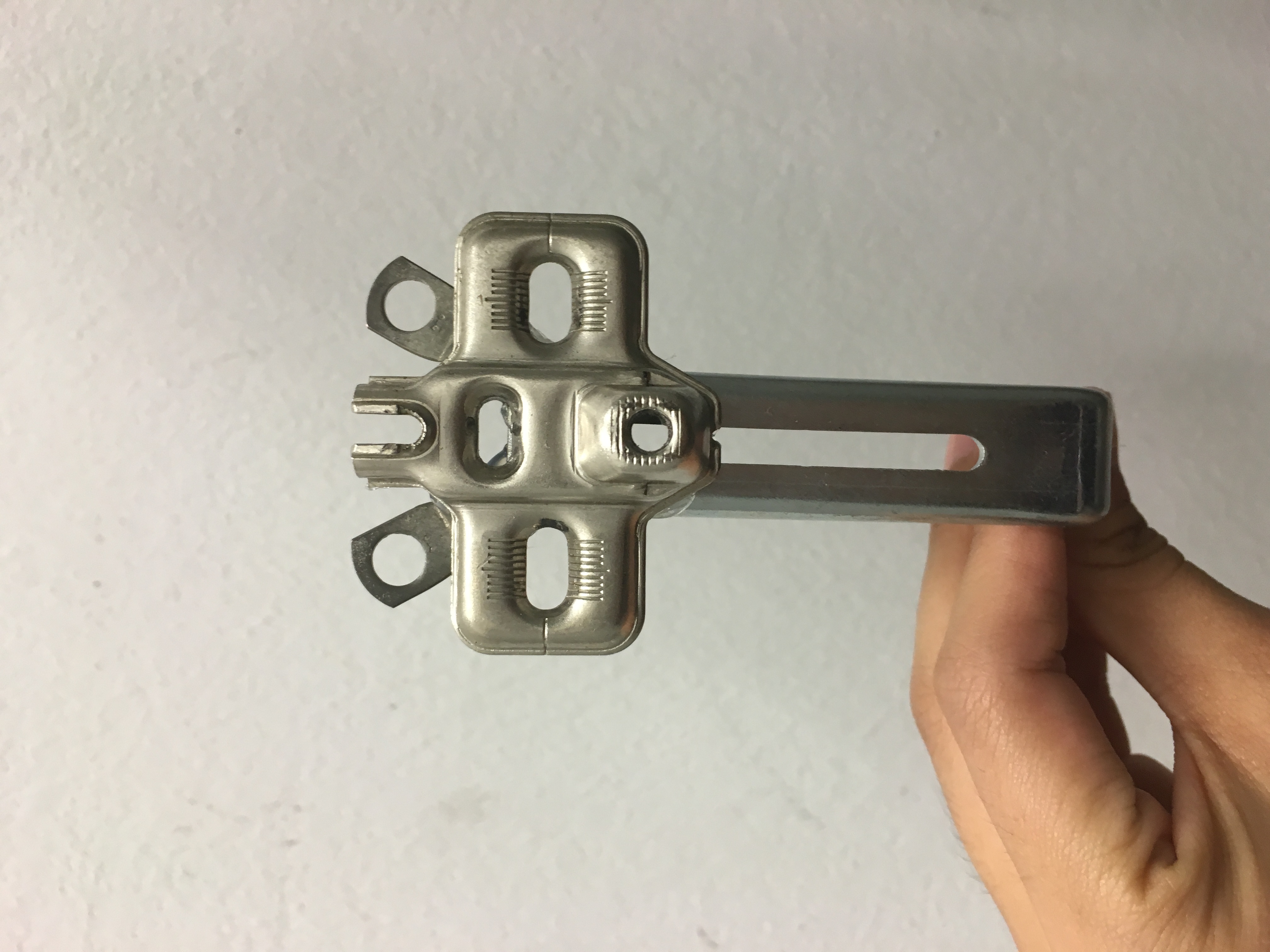
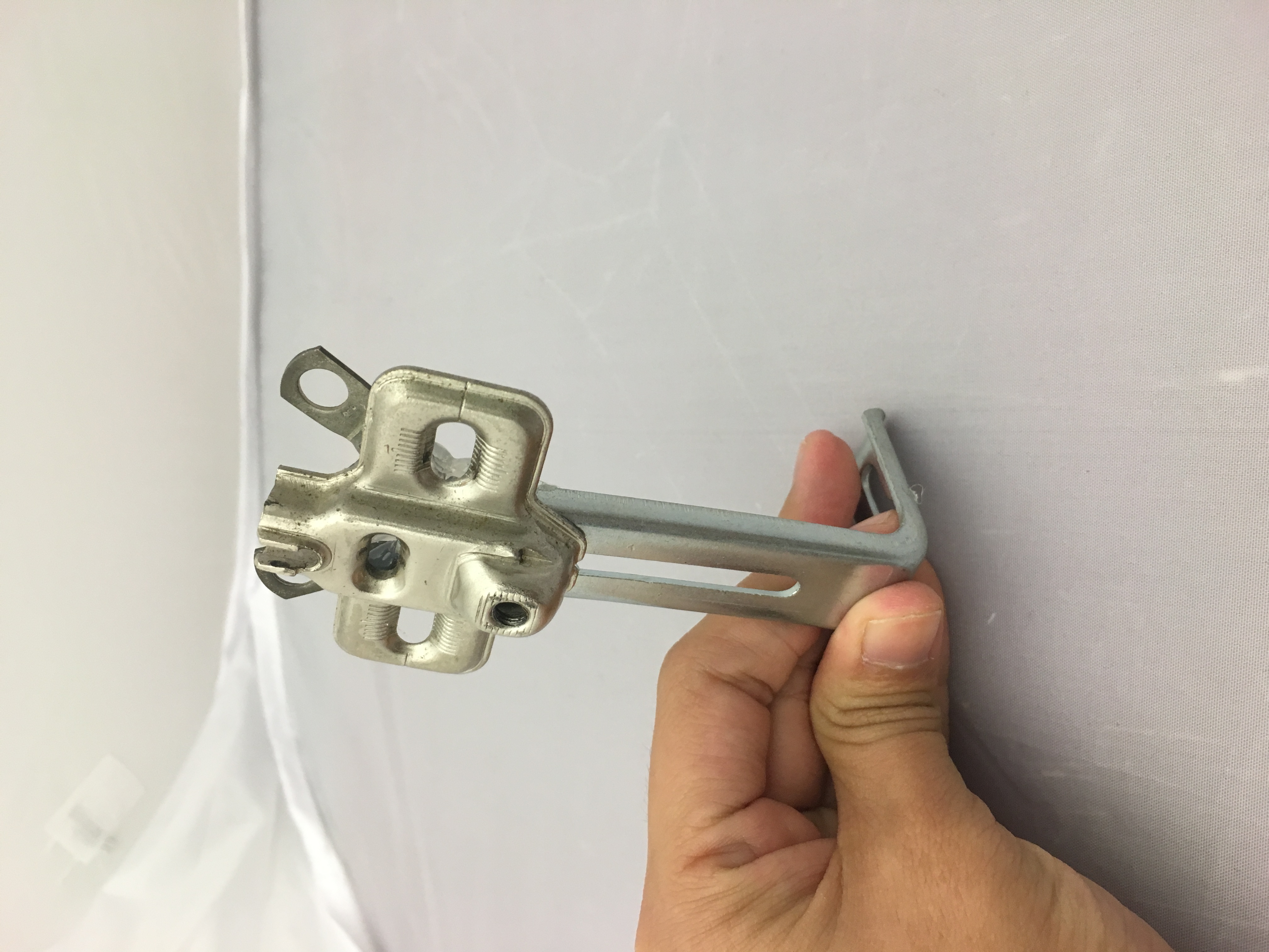
Animal 1: Can you guess what isit?
I found some shredded cardboard paper from the store which they didnt want it anymore and gave them for free 😛 For the hooks, i used it as the ears of this animal and i found a unique piece that could form the eyes and mouth of it. So yes, this is a monkey! 🙂
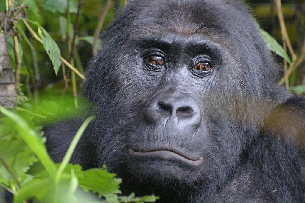
They do look similar right?
Animal 2! I think it’s pretty obvious once you see the distinct feature of this animal, which is actually the long neck!
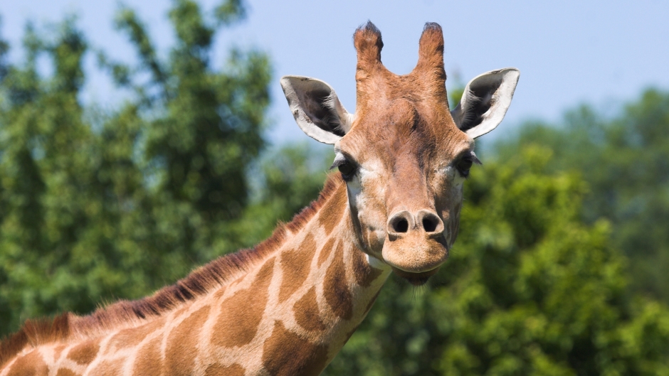
I added two little tools to makes up the two structure on the top of the giraffe head which is called ossicones.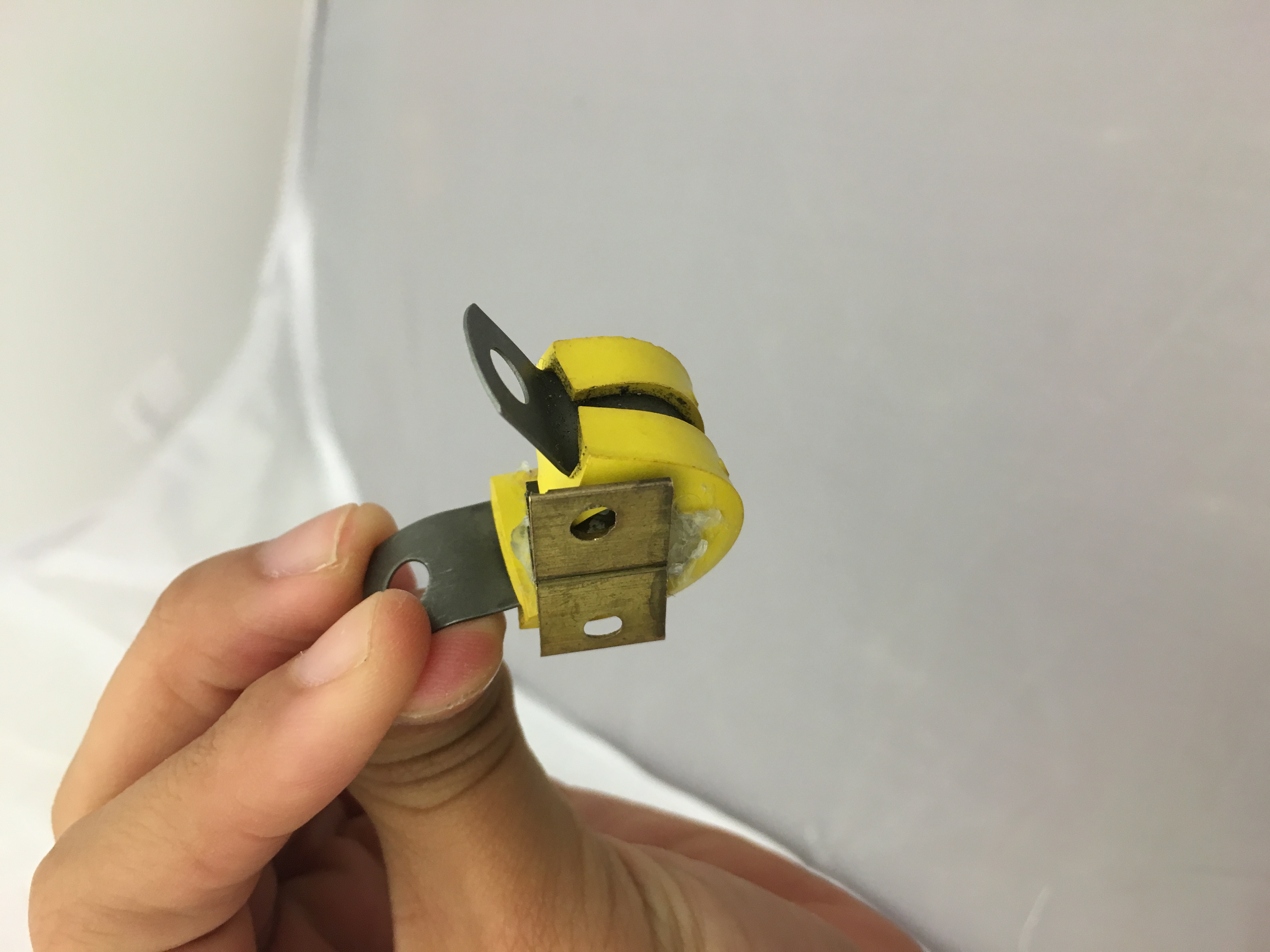
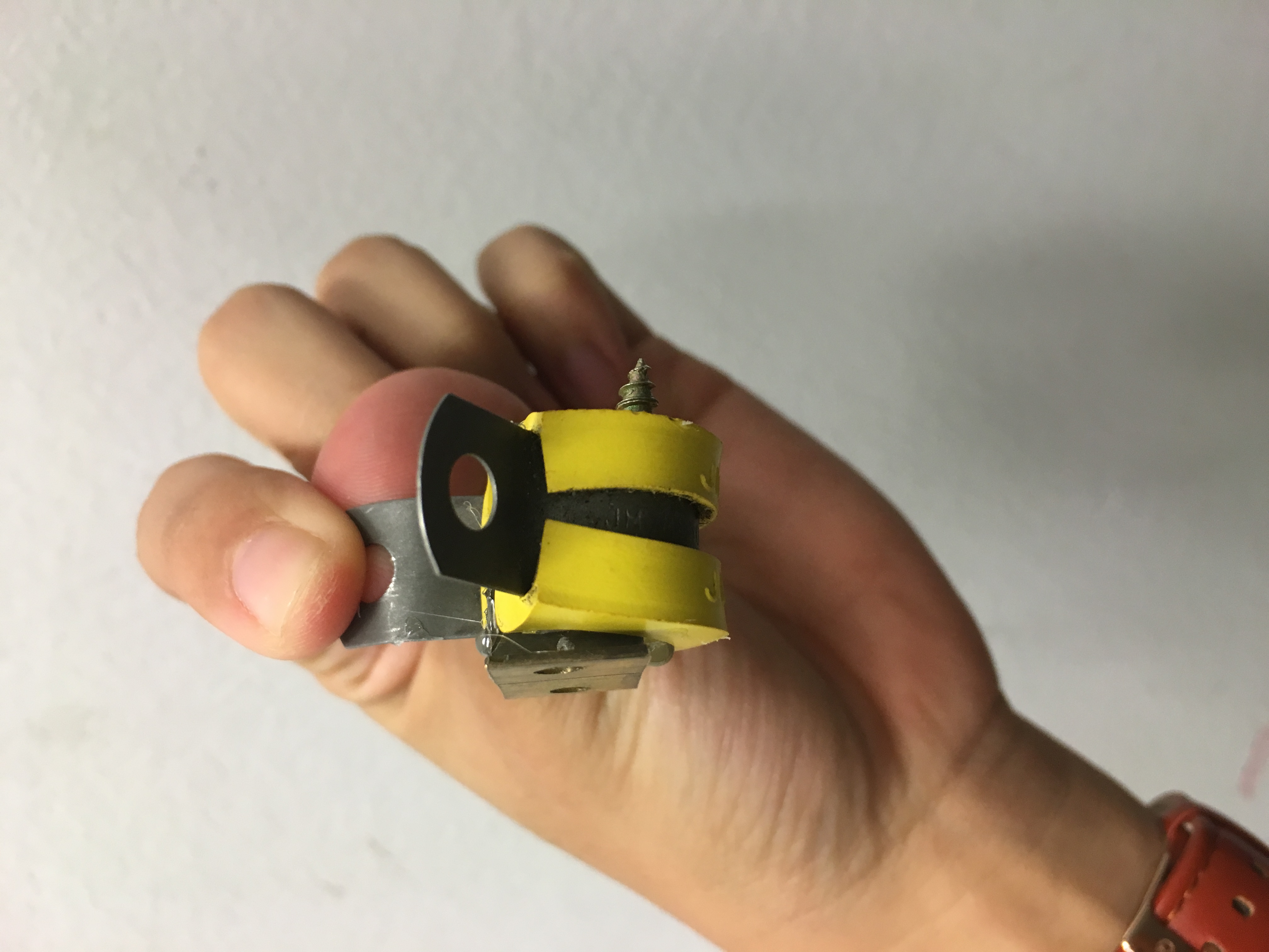


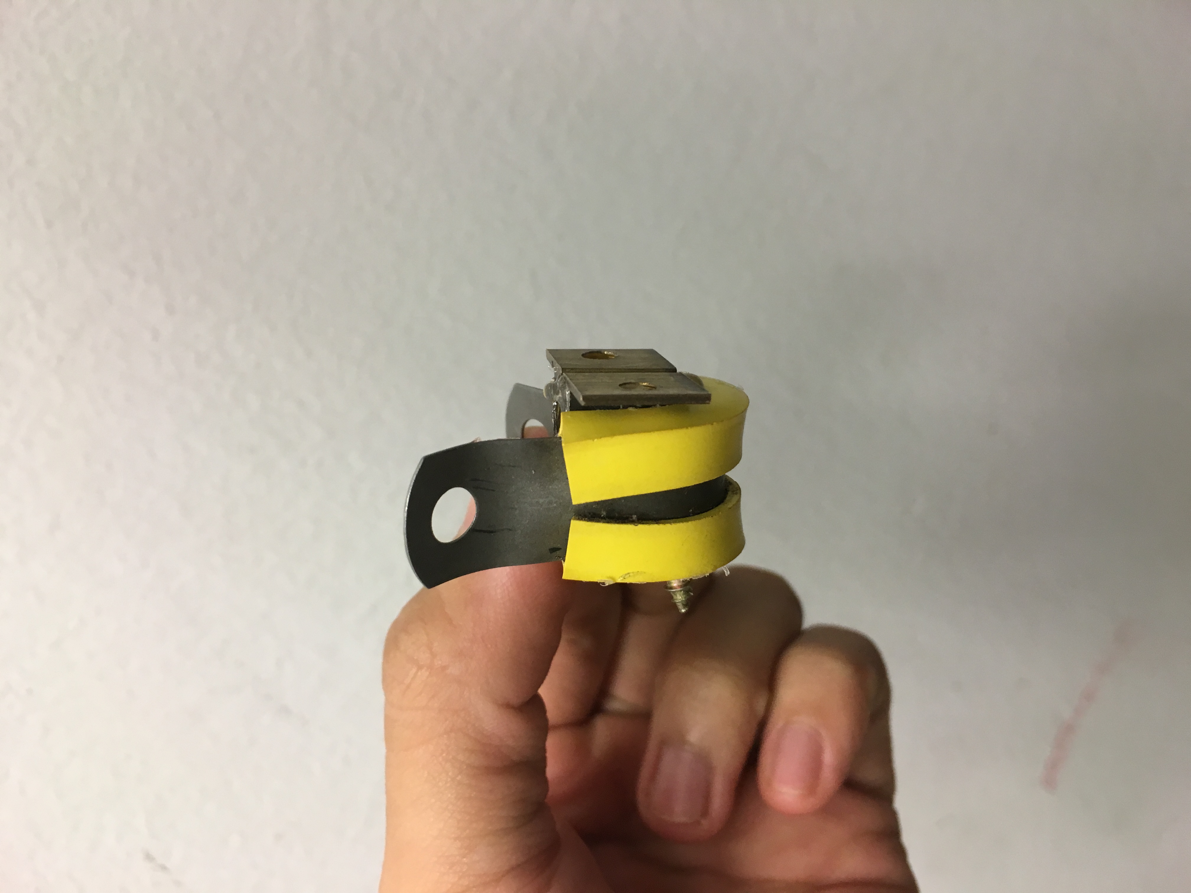
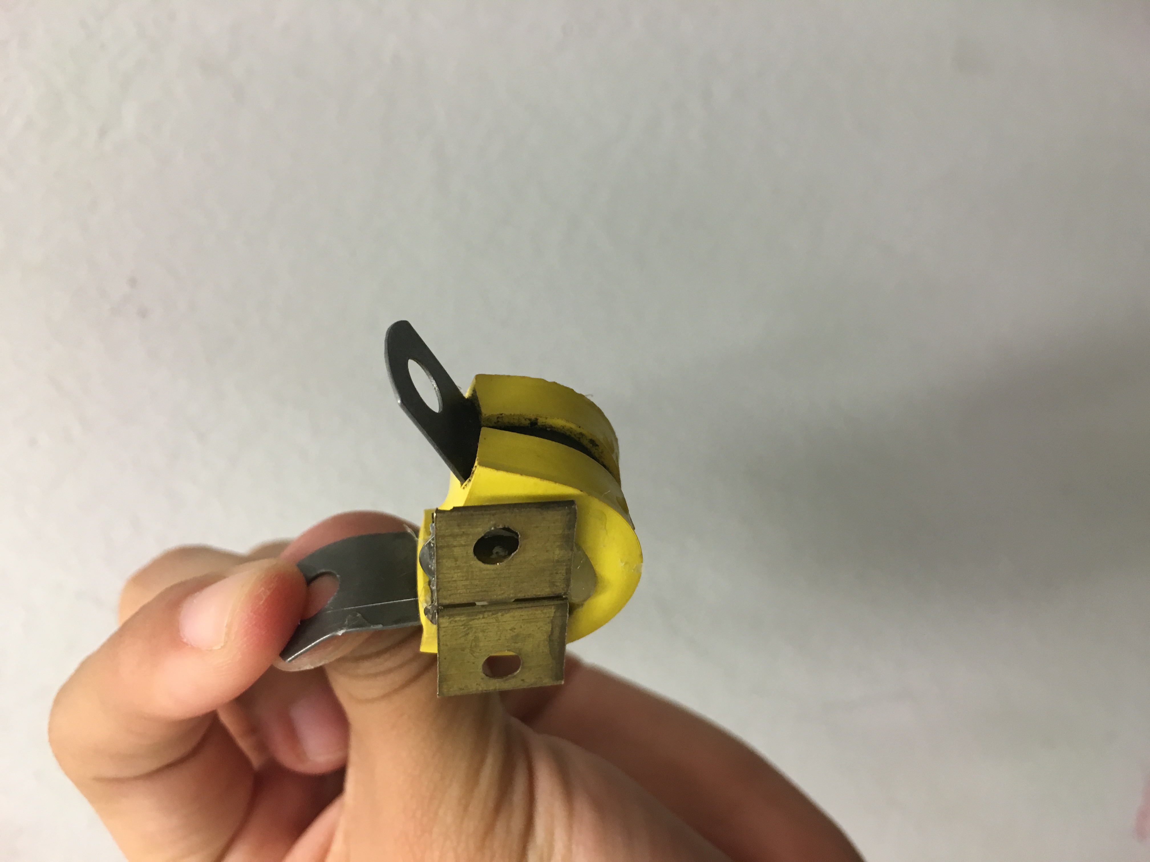
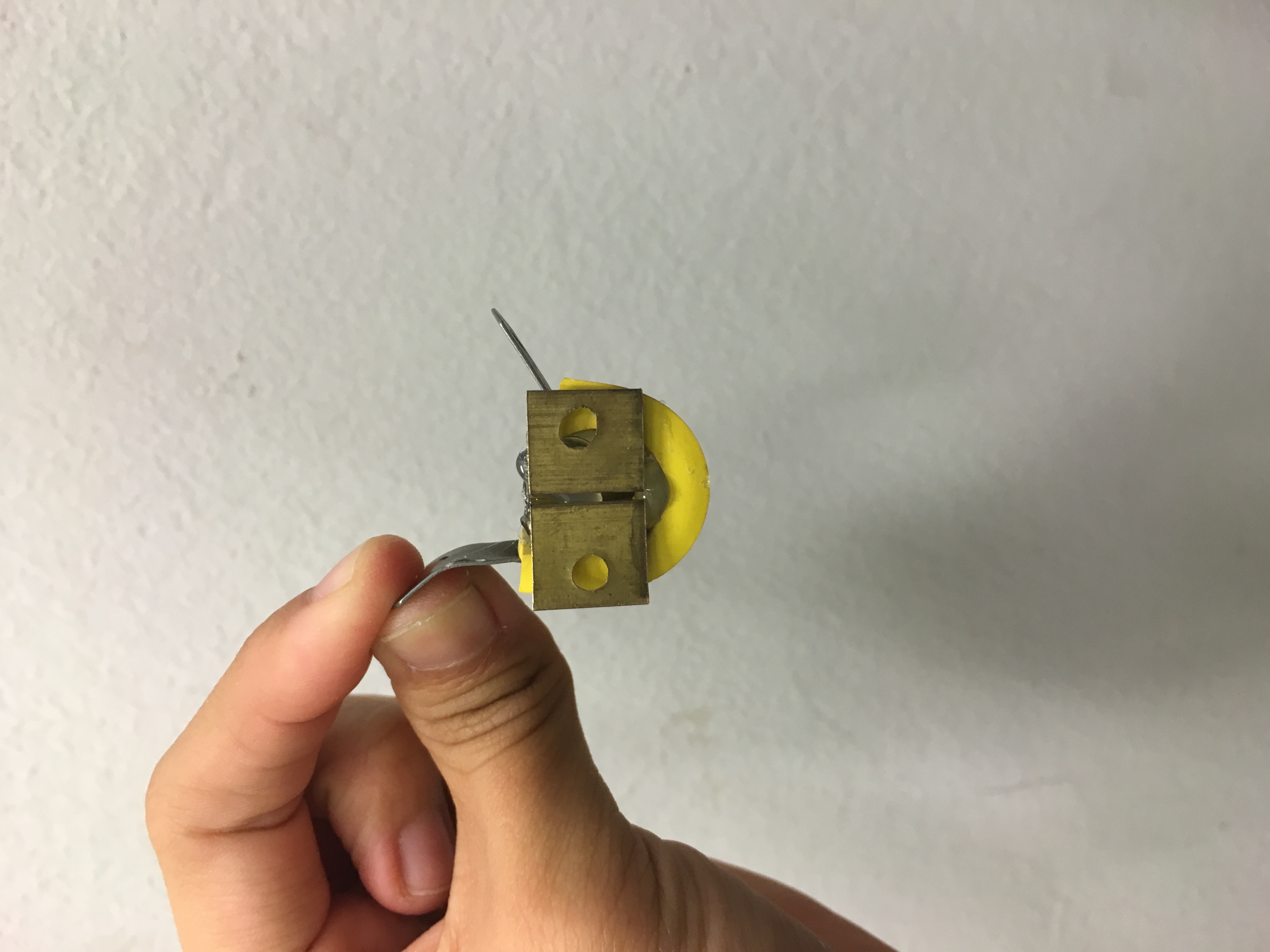
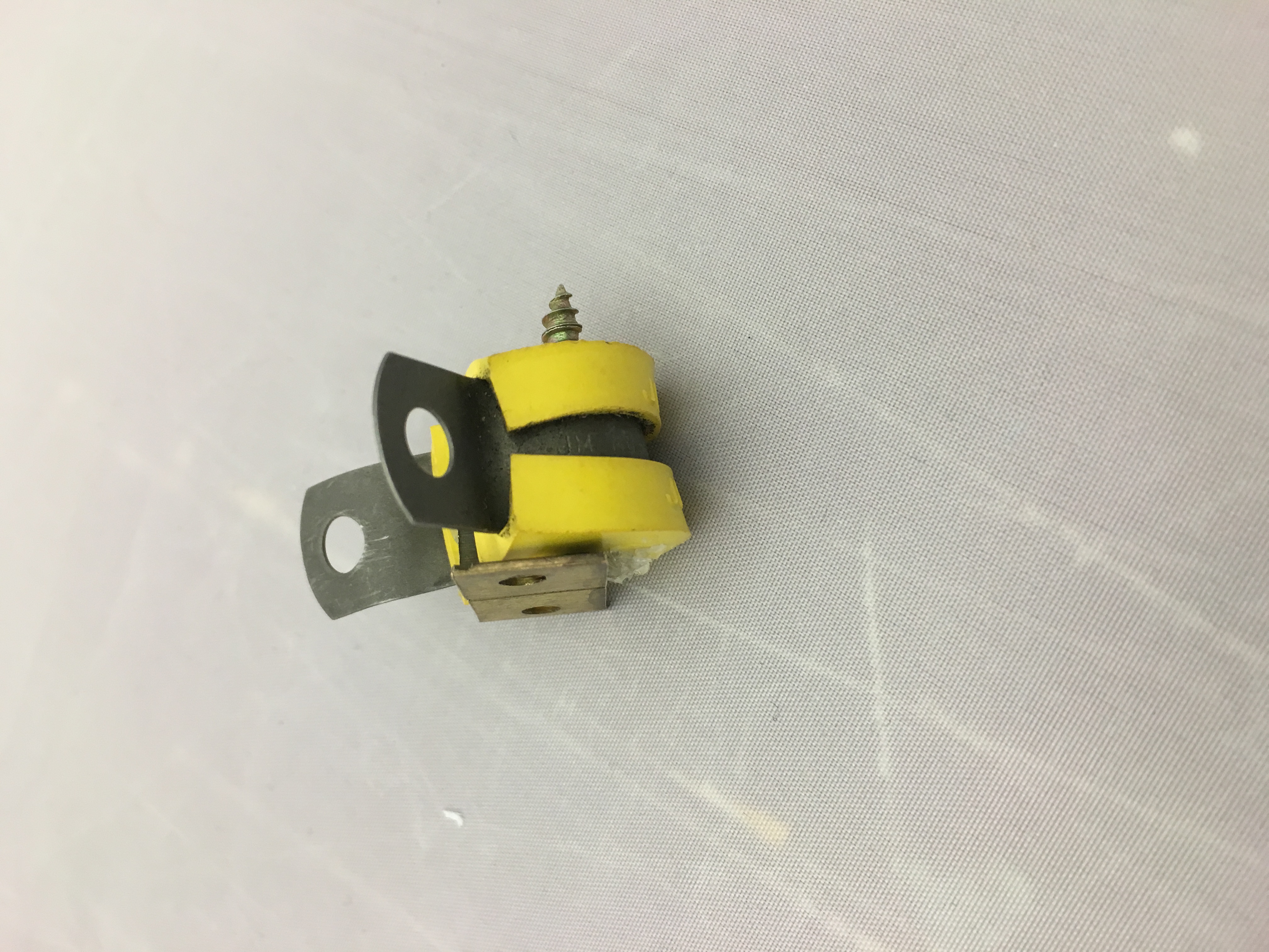
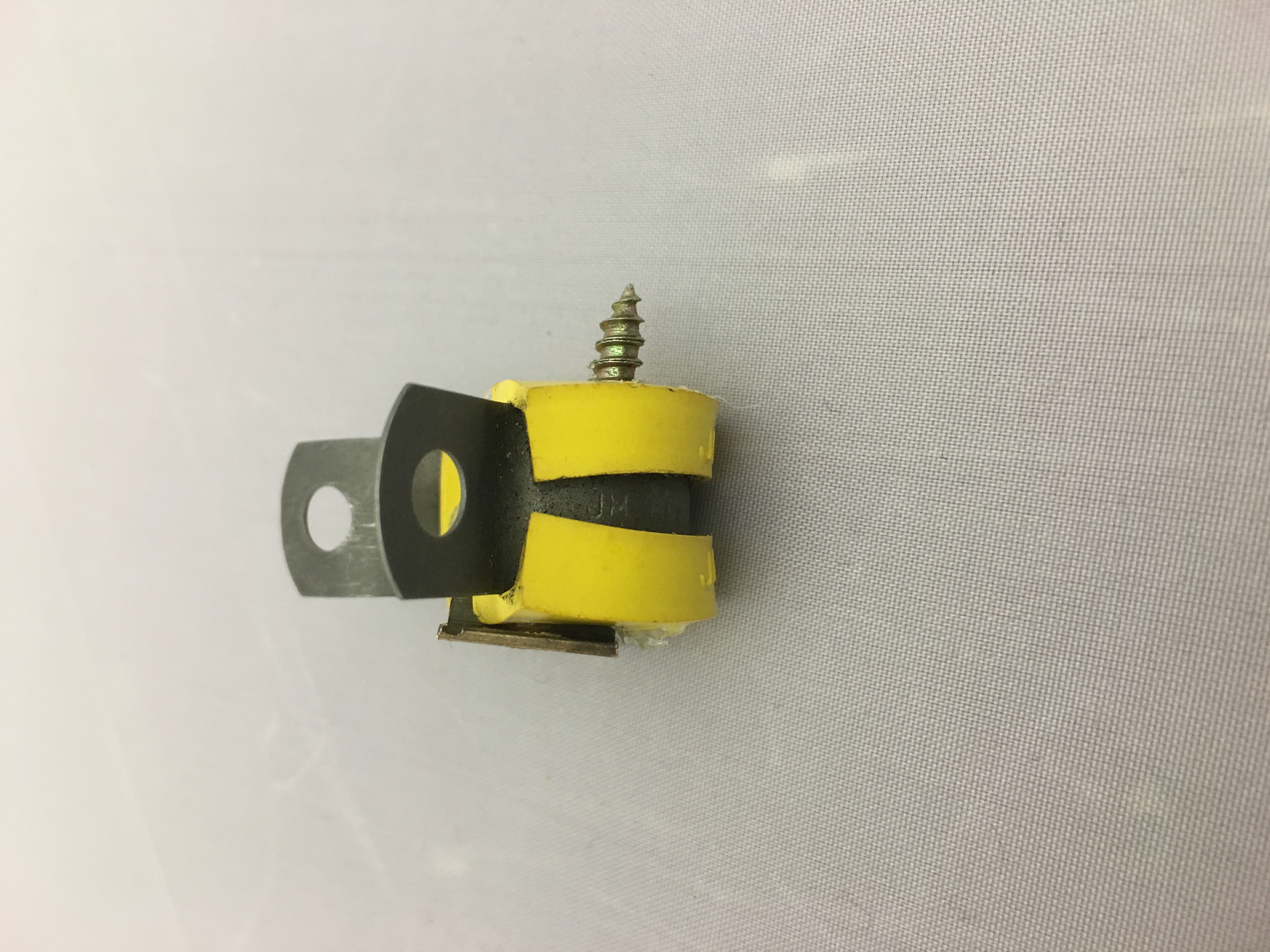 Last animal! Its quite obvious its a bumble bee right? Partly cause the item is yellow in colour and it looks like its black and yellow on the body. I added a screw at the back to show the bee’s stinger.
These three animals i made with used material concludes this project and i really had fun looking for materials and imagining what kind of animals does it look like when tools are joined together
For the last lesson, i managed to explore a lot more materials to use for mark making and i was pretty satisfied with what i have done that lesson. 🙂

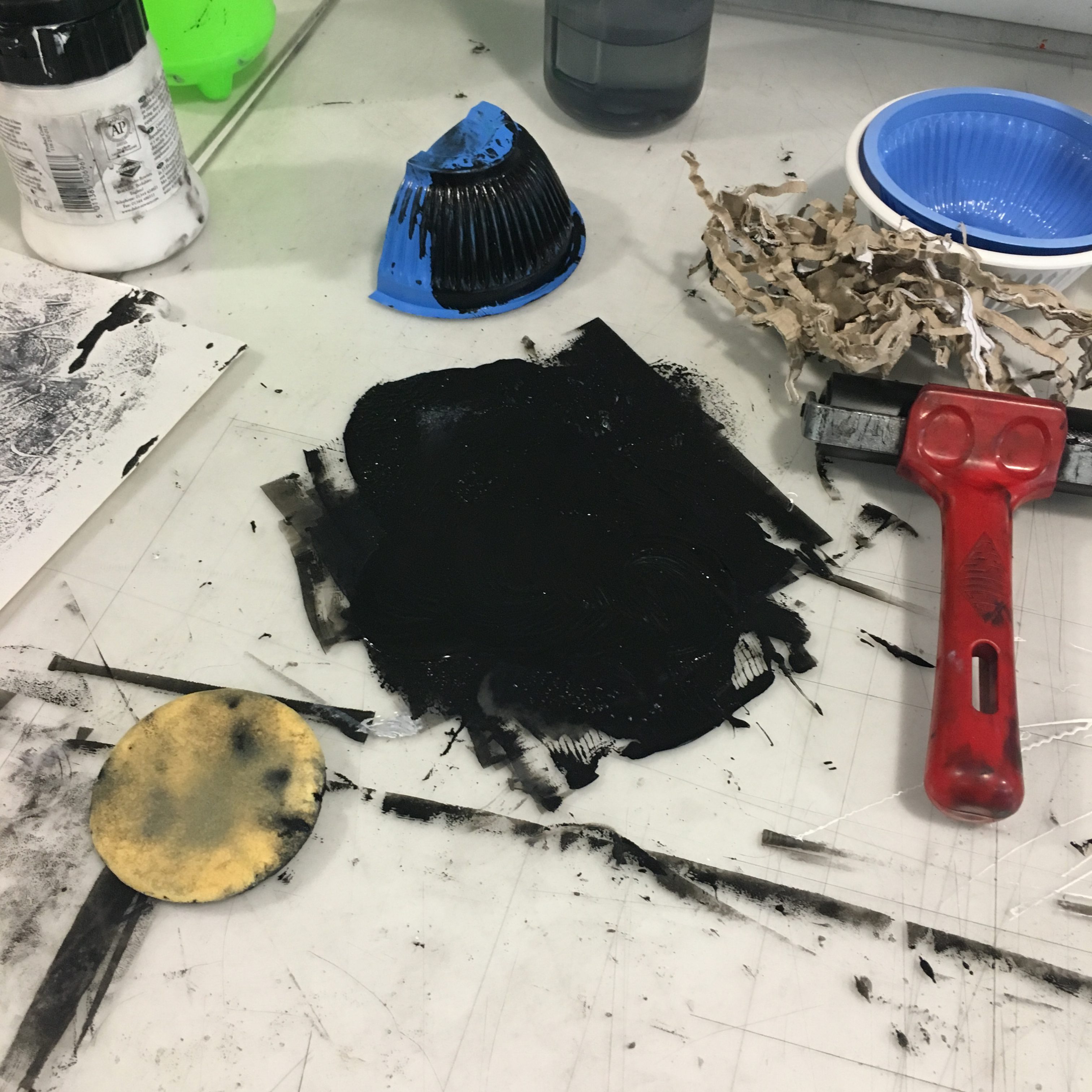
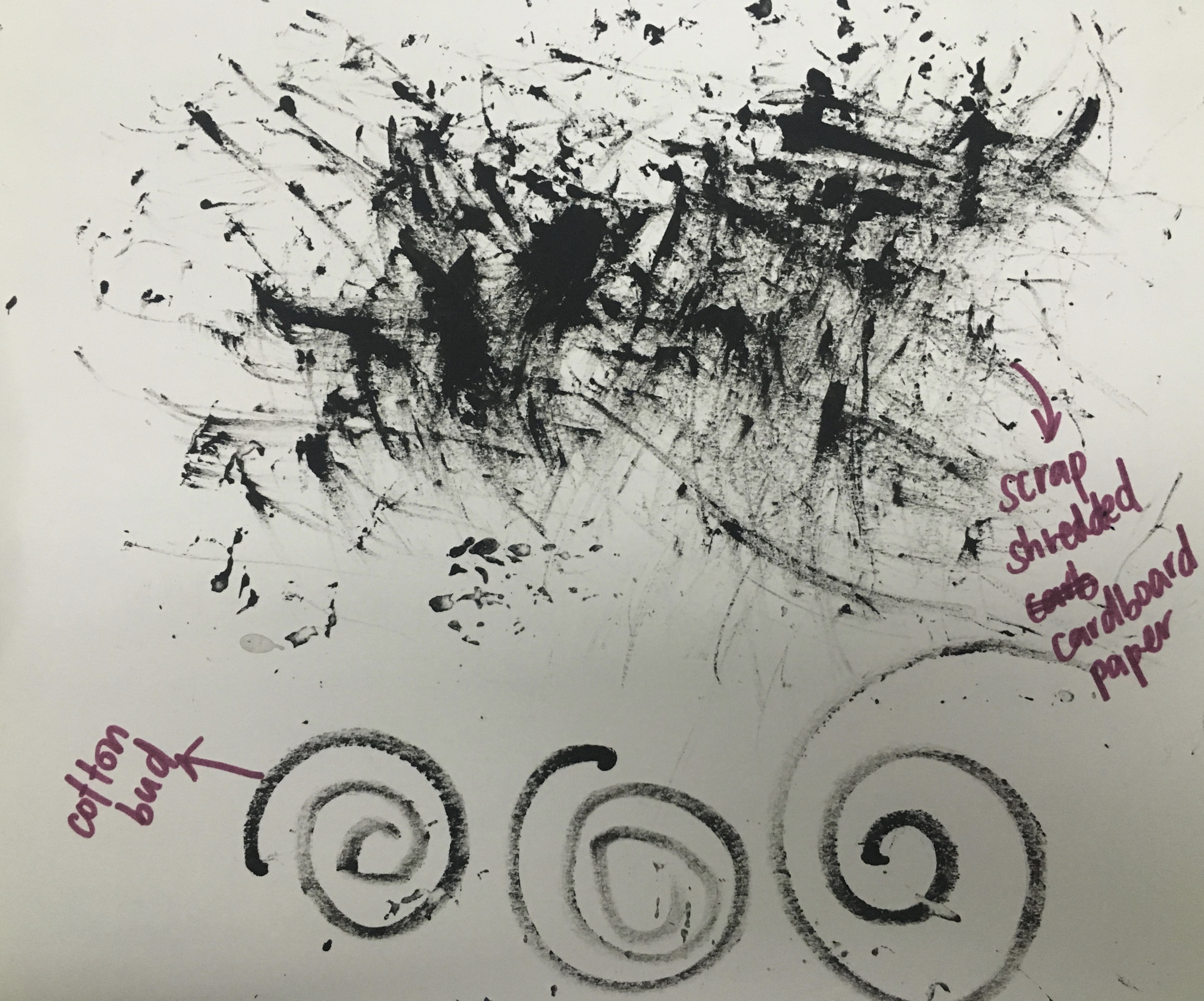
Brought the sponges i mentioned the other week that i didnt use along with some plastic bowls, cotton bud, waste cardboard scrap paper.
 manage to use the white paint as well which gives a nice shade of colour when its mixed with some of the black.

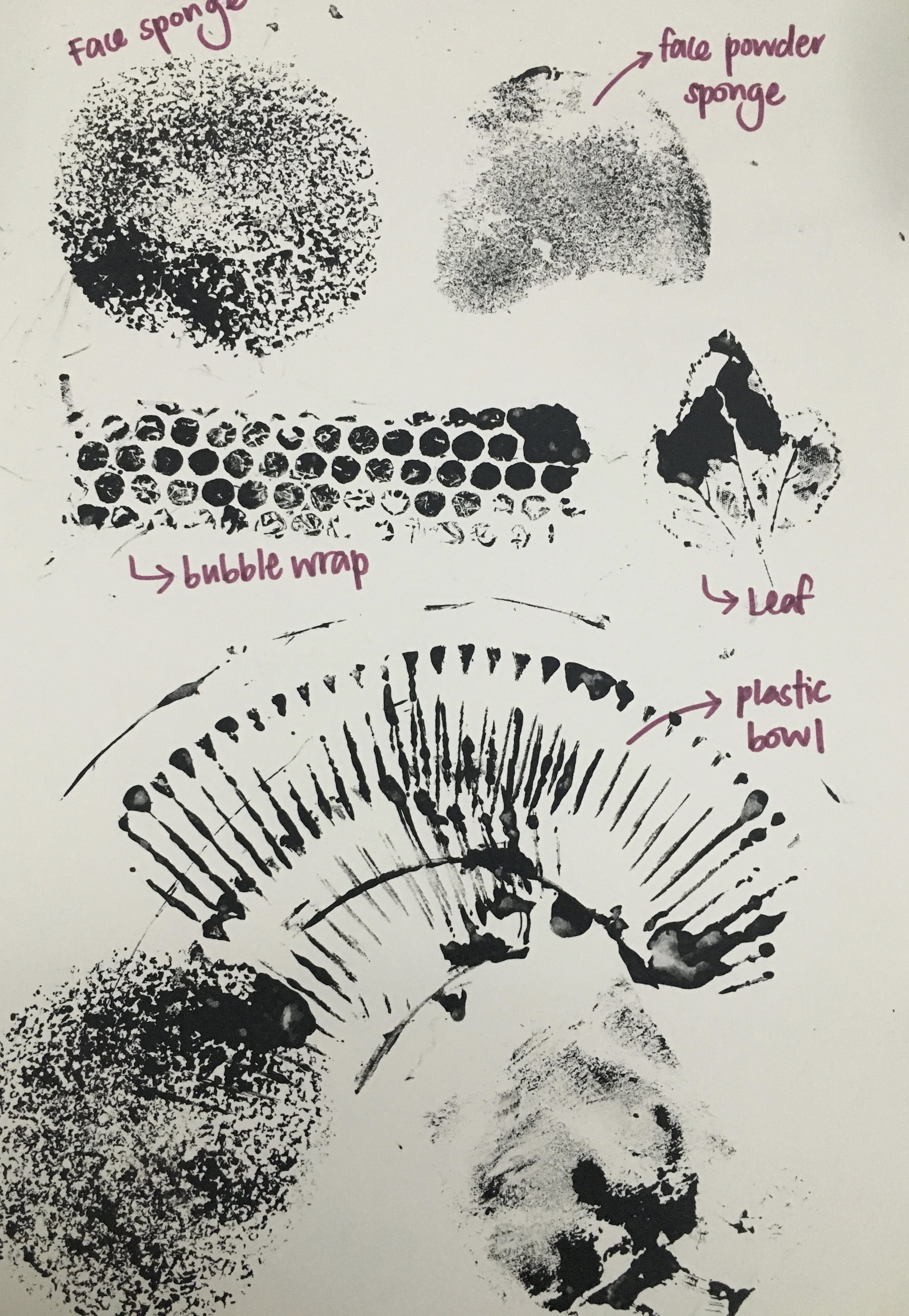
 prints the face sponge produced!

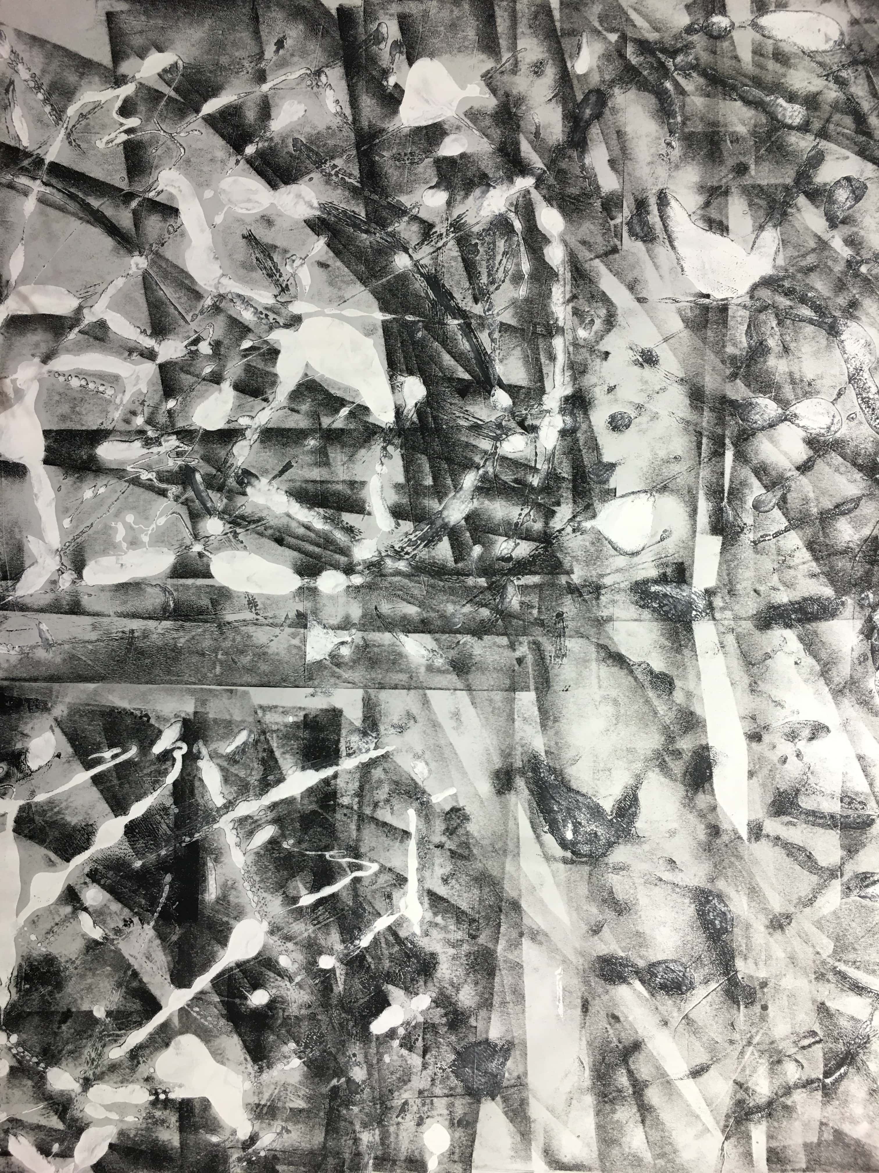
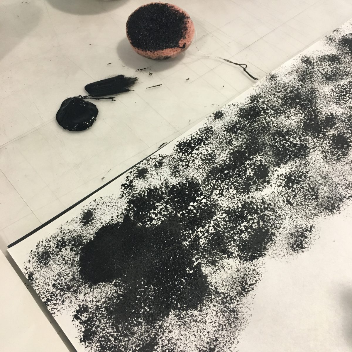
 For this, i used a paint brush to brush on the black square surface and used a roller to print out on the newsprint. It turned out pretty abstract and i really liked it.
 Done this with the scrap cardboard pieces which has an interesting outcome as well.
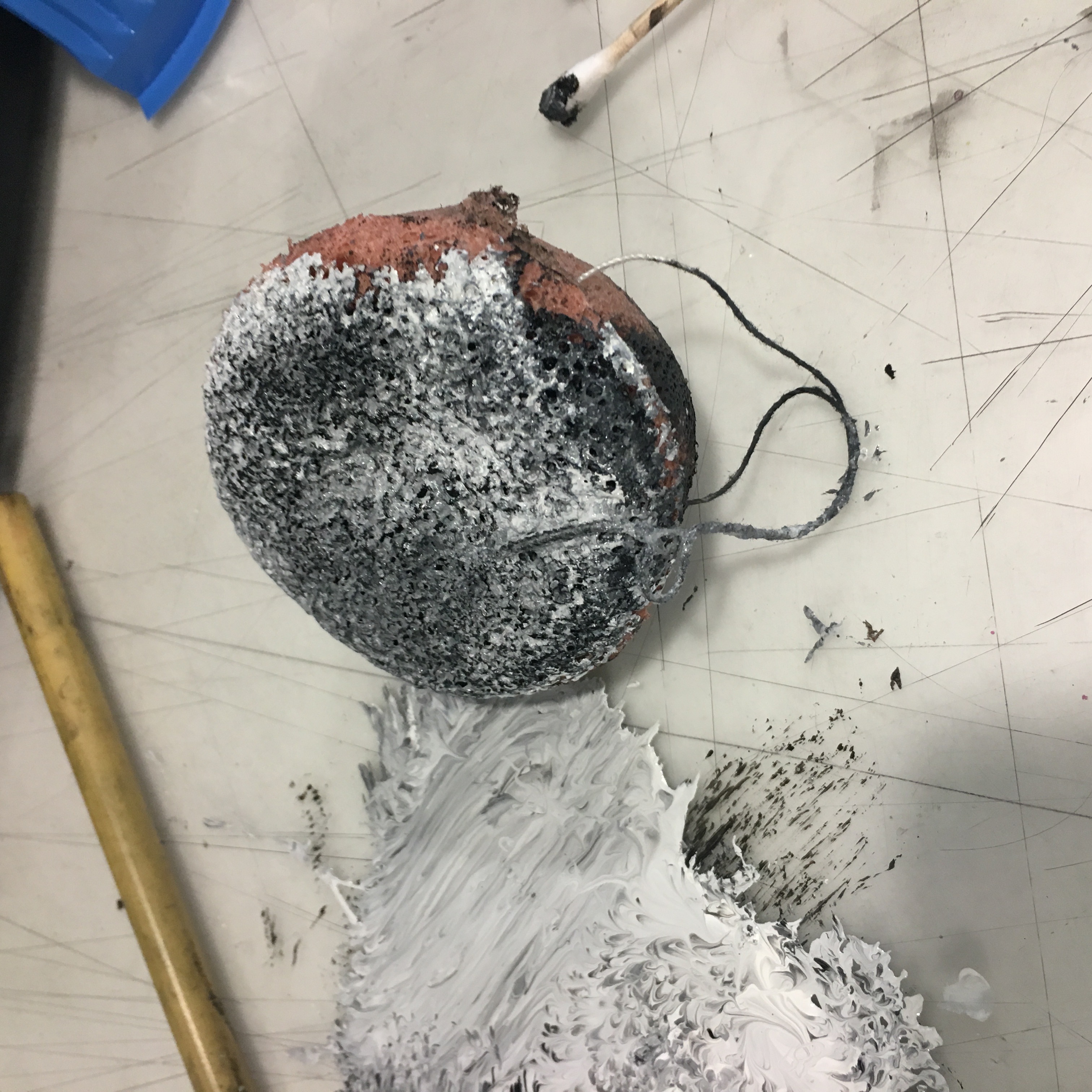
 Done with the plastic bowl, making prints with the surrounding texture.

Used a cotton bud to draw on the surface, trying out if geometric shape works.

Tried doing other swirls as well! 🙂

Tried with some leaves as well, which didn’t turn out as good.. Couldn’t really see the shape of the leaves. It was better when i smudge it in black paint and pressed it on the paper though!
here it is:


Lastly, the top half of this picture is using bubble wrap which gave a really nice visual texture! whereas the bottom half is another try-out of the facial sponge.
Overall, I’m really glad that i explored more this time and the outcomes were a lot better the previous time i did!
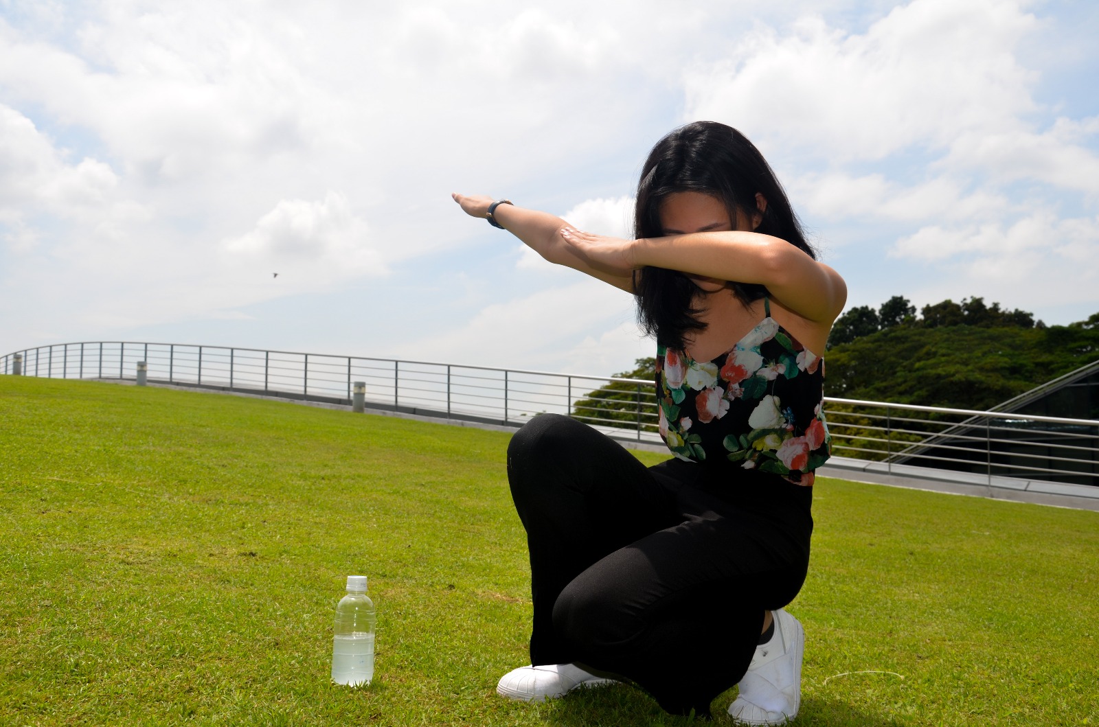
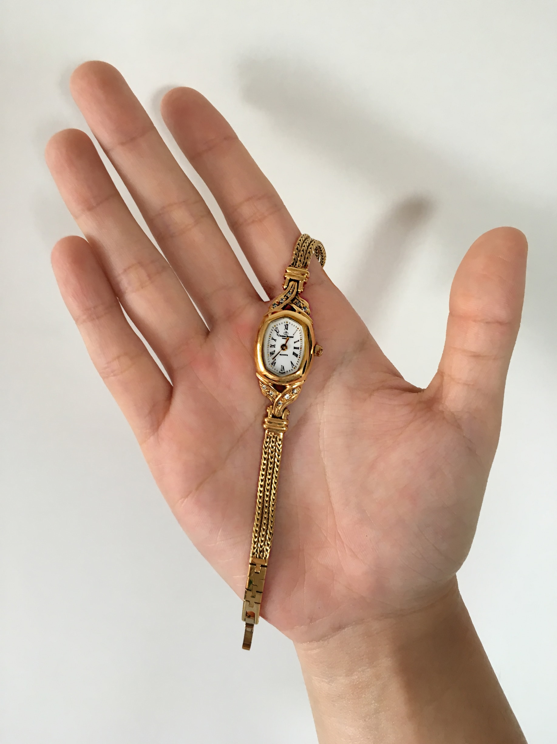
TASK 1: Object & representation of self
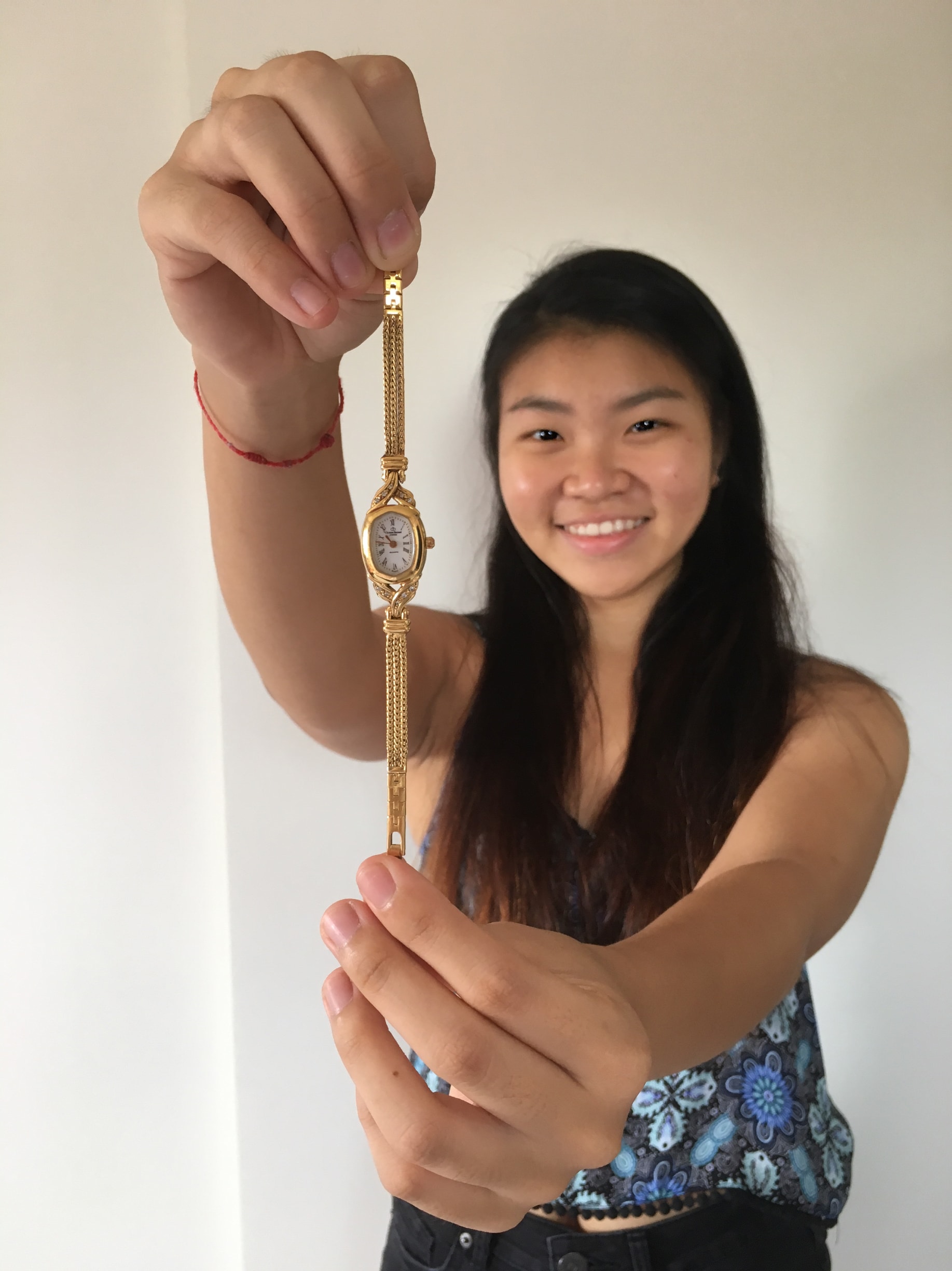
I chose to use this golden watch as this is one of the objects that is very significant to me. It was given to me by my mom who bought it about 24 years ago. Its actually a vintage watch and i really treasure it a lot. 
I feel that watches in general is very significant to my life as to me I interpret a watch as a timeless and rigid object but yet in contrast to us humans, a day goes by extremely quickly as time is ticking every moment. As the saying goes, “Time waits for no man”, it explains how we have to really treasure every moment of our lives as we cannot rewind time. It can also be explain by the fact a watch is a constant such that the design of this watch is made a point of time, years ago as shown in the picture below, where the details of the watch doesn’t change even after so long. As compared to us, we are constantly changing overtime and we are flexible in the things we do in our daily life which makes us who we are today.

Thus this explains why I took this picture in a way that the size of the watch face is comparable to my face to show an actual comparison. Also, I took it in a way such that the watch is focused whereas my face is blurred so as to convey that what i am going through now is still a blur and it takes time for myself to actually be clear of the things that I am doing in life. Or another interpretation is that we can never be very clear of what is going to happen ahead of time but yet we have to try our best to do what is right.
Lastly, the third picture i chose is a close up shot of me interacting with the watch where the watch is beside the life line of my palm which shows a contrast on how time actually defines one thus it is compared to the life line of my palm which represents fate as all of us change in some way or another overtime.
Here are some other pictures of the full body/ mid range shots of myself and the watch:


TASK 2: My World

The place I chose that is significant to me is the Pasir Ris Park playground and in particular the “Spider Web” which is shown in the first picture. It is about 3 stories high when you actually climb to the peak. It has been there for many years as it was my childhood playground since I was about 4. It is actually a really memorable and nostalgic place for me and even till now whenever I cycle with my siblings in the park I would definitely stop by this playground to rest or play the swing and occasionally climb this spider web.

This second picture that is focused on the rope and the route to the top is blurred as I am trying to convey the young me climbing this for the first time and I although wasn’t sure of what I am doing and what is ahead of me but I still do it anyway. Thus, climbing this spider web was a blur to me at that point of time. Another thing this photo has shown is that the rope has duct tape pasted over some parts to show that it is actually very old and yet it is still sturdy as ever.

Next, from the last picture i presented in class, I was trying to convey the view I saw when I was young where I didn’t think that I could actually reach the peak. It portrays the image I see when I have reached the peak for the first time, the sense of satisfaction just by looking down from the peak.
These are the other pictures that i took which i didn’t choose to present: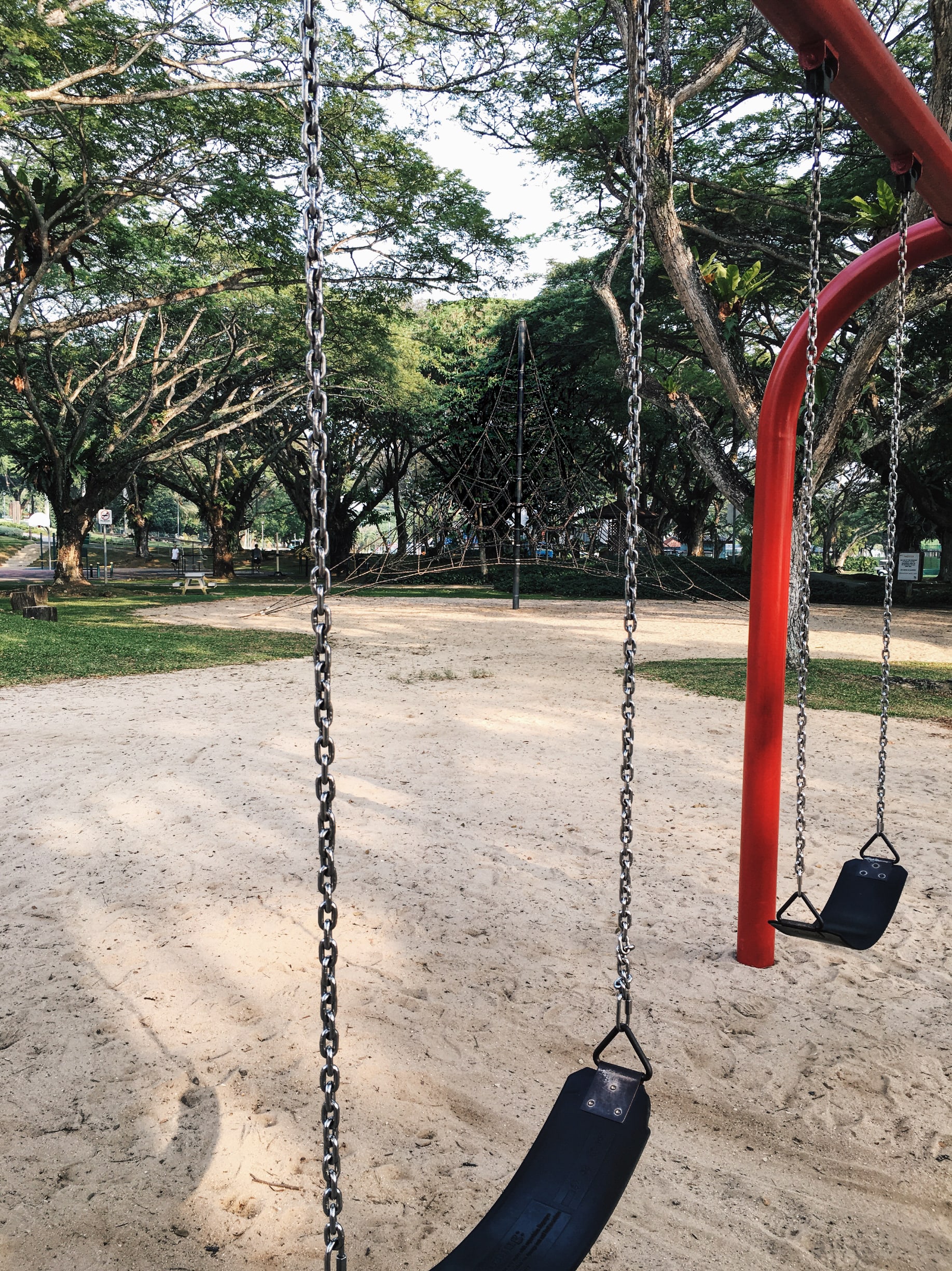 This shows how huge the spider web is such that it can also be seen from afar that actually attracts children to go there.

This explains the feeling of domination and being on top of the world as other facilities in the playground seem so small from the peak of the spider web.
This are the pictures presented in class. 🙂

Title: Just Me
Genre: Documentary| Comedy
Story: Growing up, I didn’t face much of a problem as I feel that i had a wonderful and memorable childhood. Extremely thankful for my parents who were very understanding such that they are willing to give my two siblings and i freedom to do anything we want to without any expectations as long as we are happy with what we are doing. Of course in life there are phases where we feel extremely demoralised and sad on circumstances we face but yet there are also happy moments that we keep in our memories. However, the emotions we express to others might not be the same as what our minds are thinking.
Mark making is a term used to describe the different lines, patterns, and textures we create in an artwork.

Welcome to Open Source Studio. This is your first post. Edit or delete it, then start blogging!


