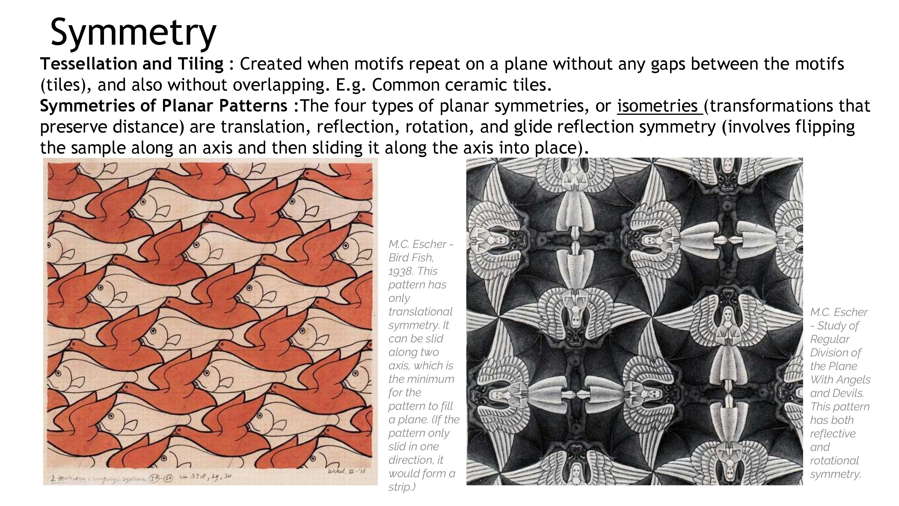
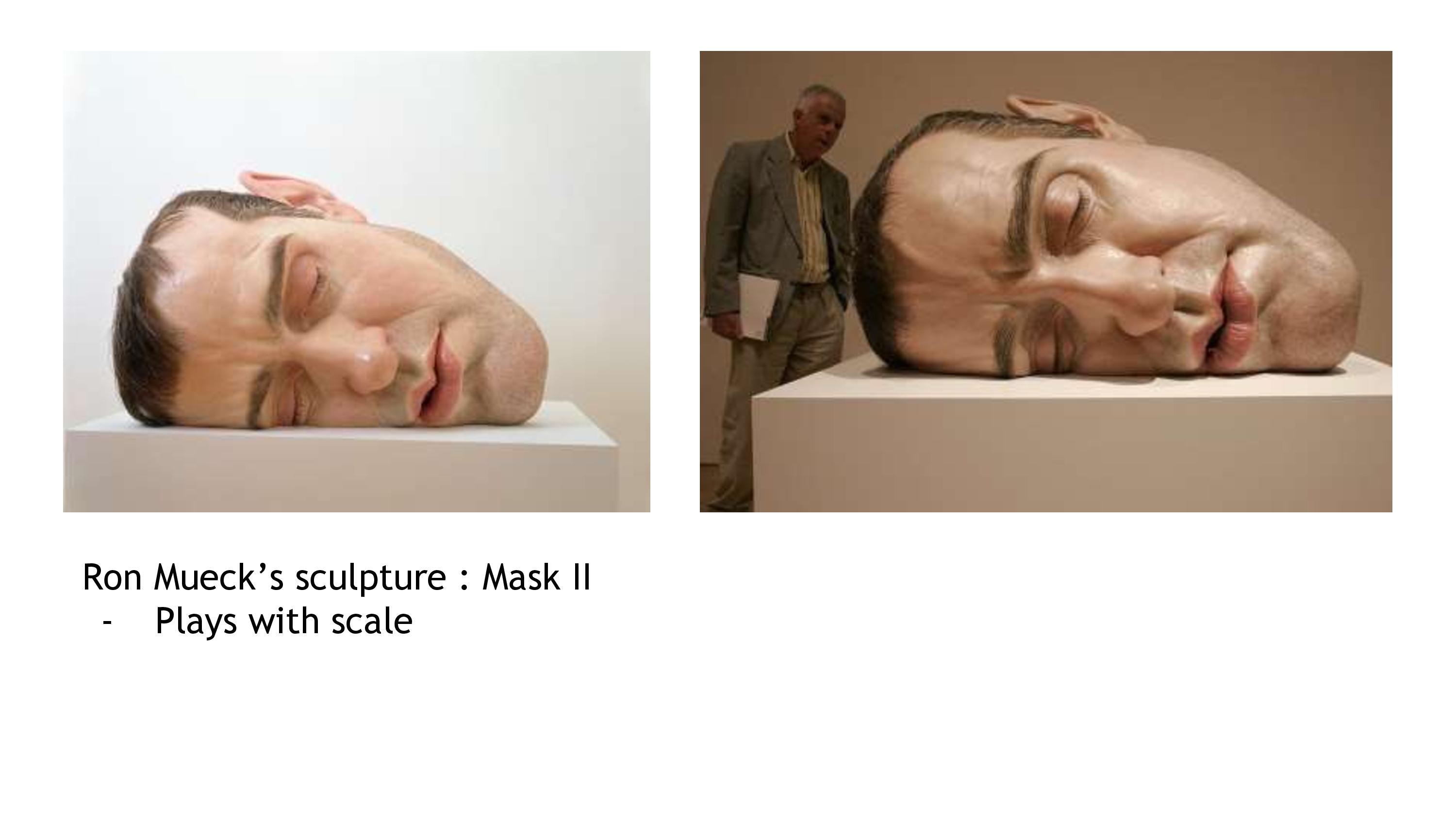
So here is the last post on the process that lead to my final Forrest Gump compositions . The previous part of the process, specifically presenting about dragon can be seen here !
My second quote is: ” There are a few warriors amongst us.” In this post I will cover some personal views about the issue of warrior and society.
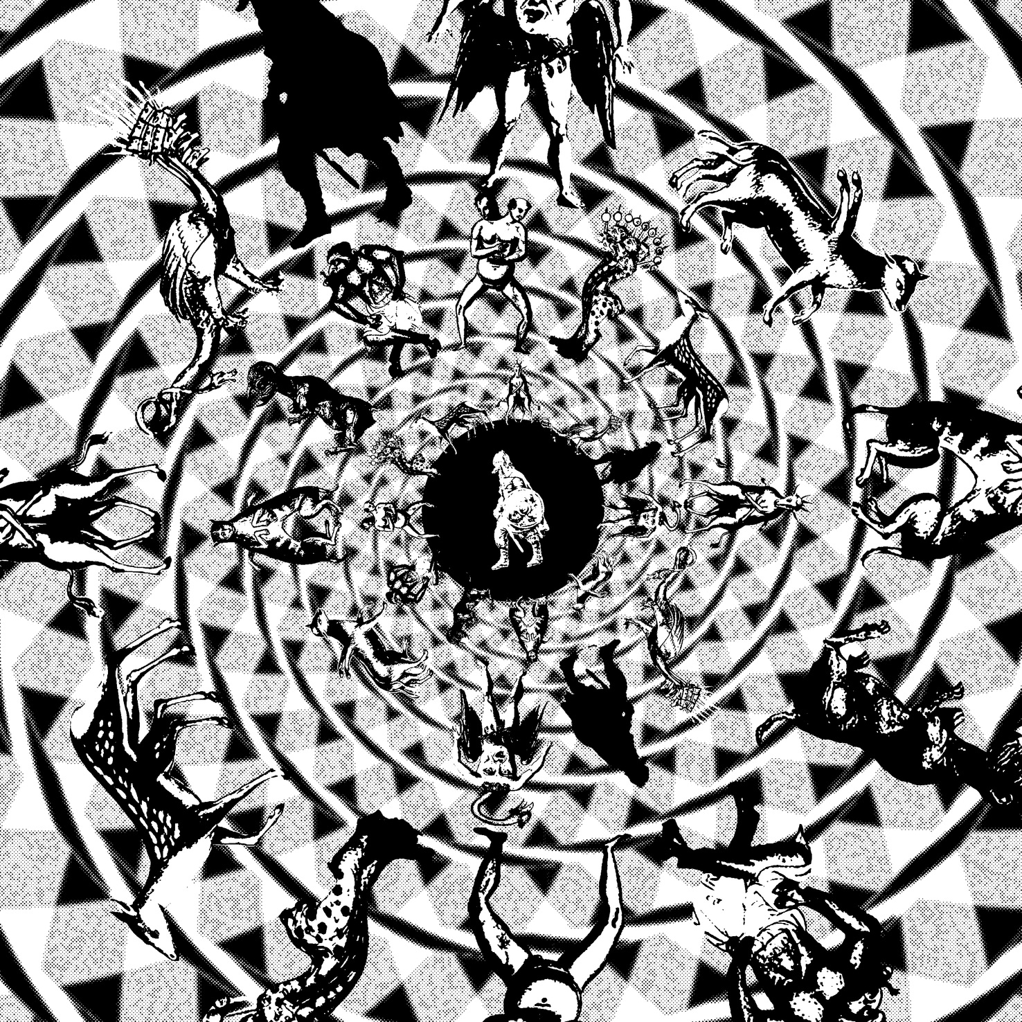
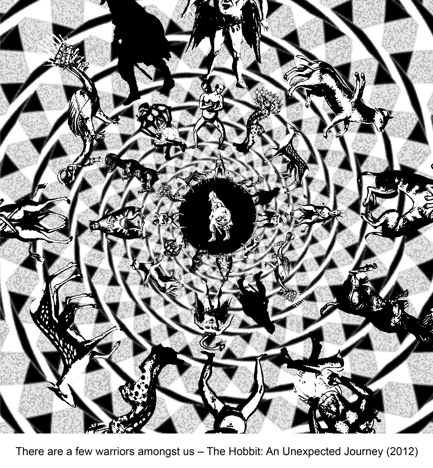
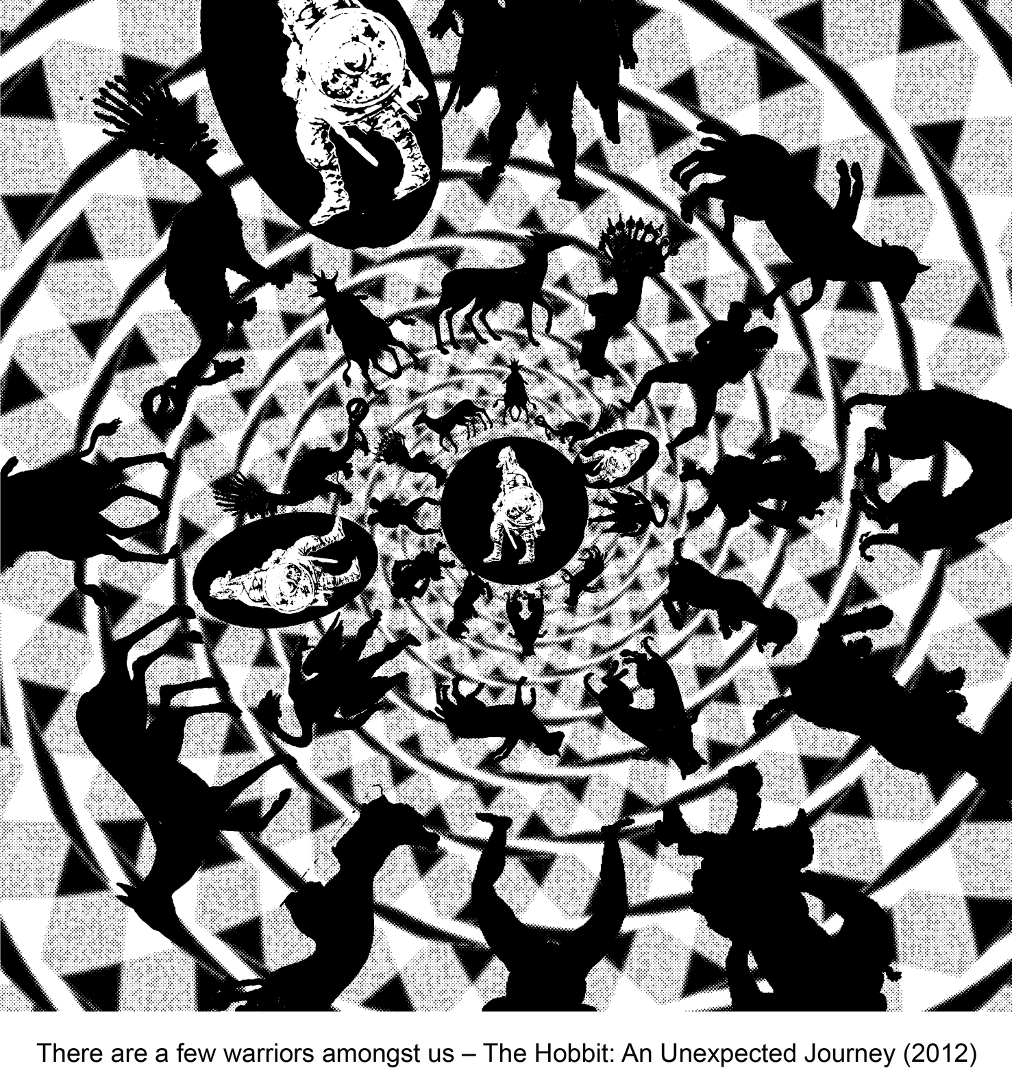
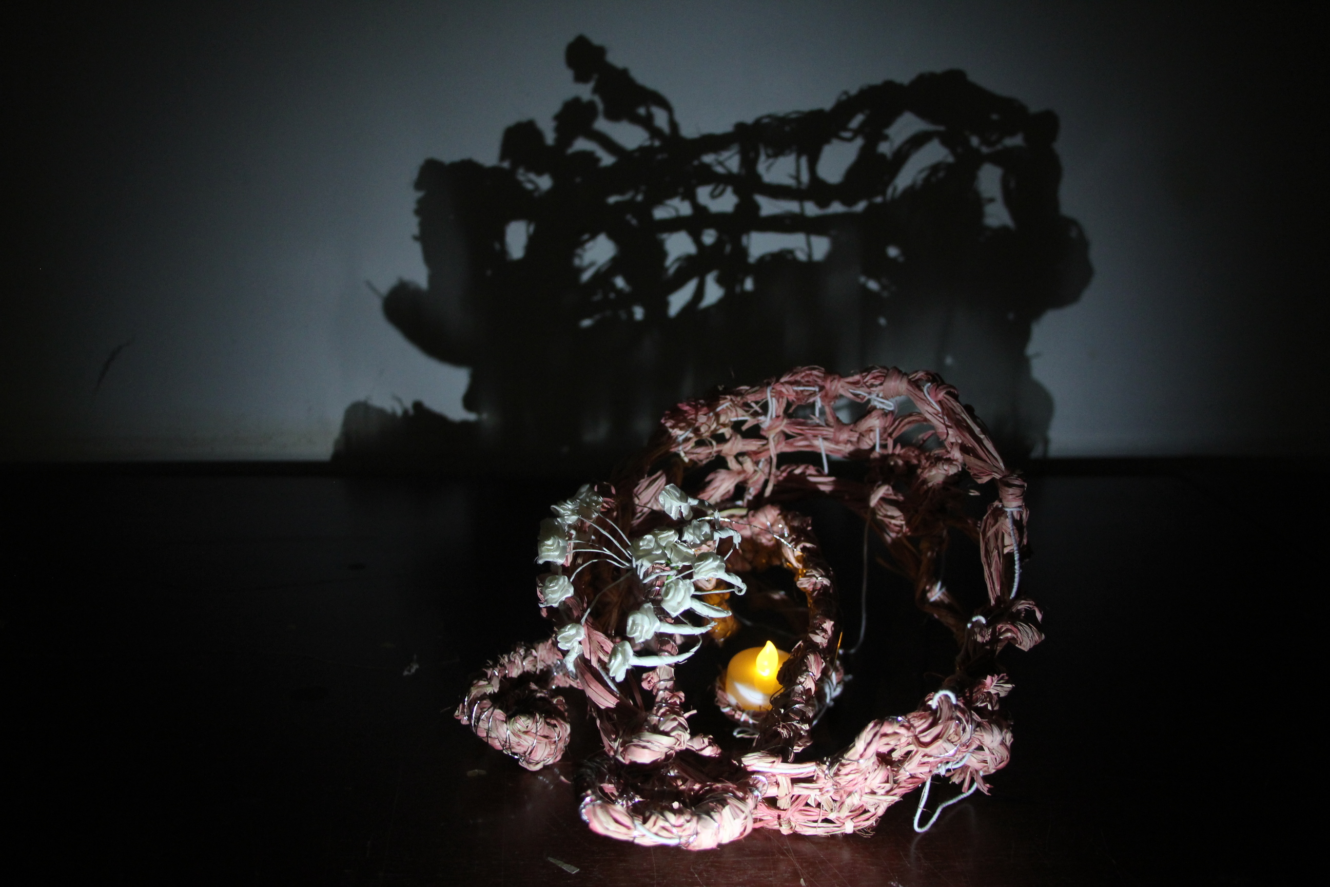
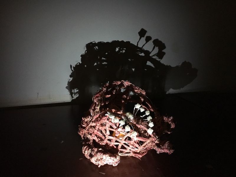
For my first composition, I portray ‘us’ as various and different type of weird beast and animal (e.g. two heads, six legs, chimera of many animals, etc). However in between those weird creatures there are a few human warriors. I used the spiral pattern to show that the focus is centralized on the real white warrior in the middle. At the same time I gave other warriors in the compositions black color to tell that the they represent the idea of warrior (its shadow), not necessary a warrior in a literal way (e.g. the idea of parents and teacher as warrior for children). I also want to say that everybody can be a warrior in their own way!
Composition 1: my very first Warrior Quote composition
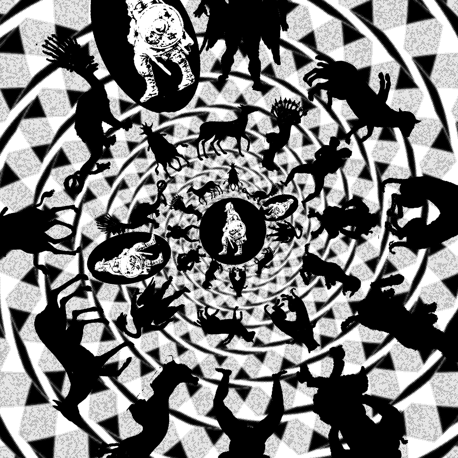
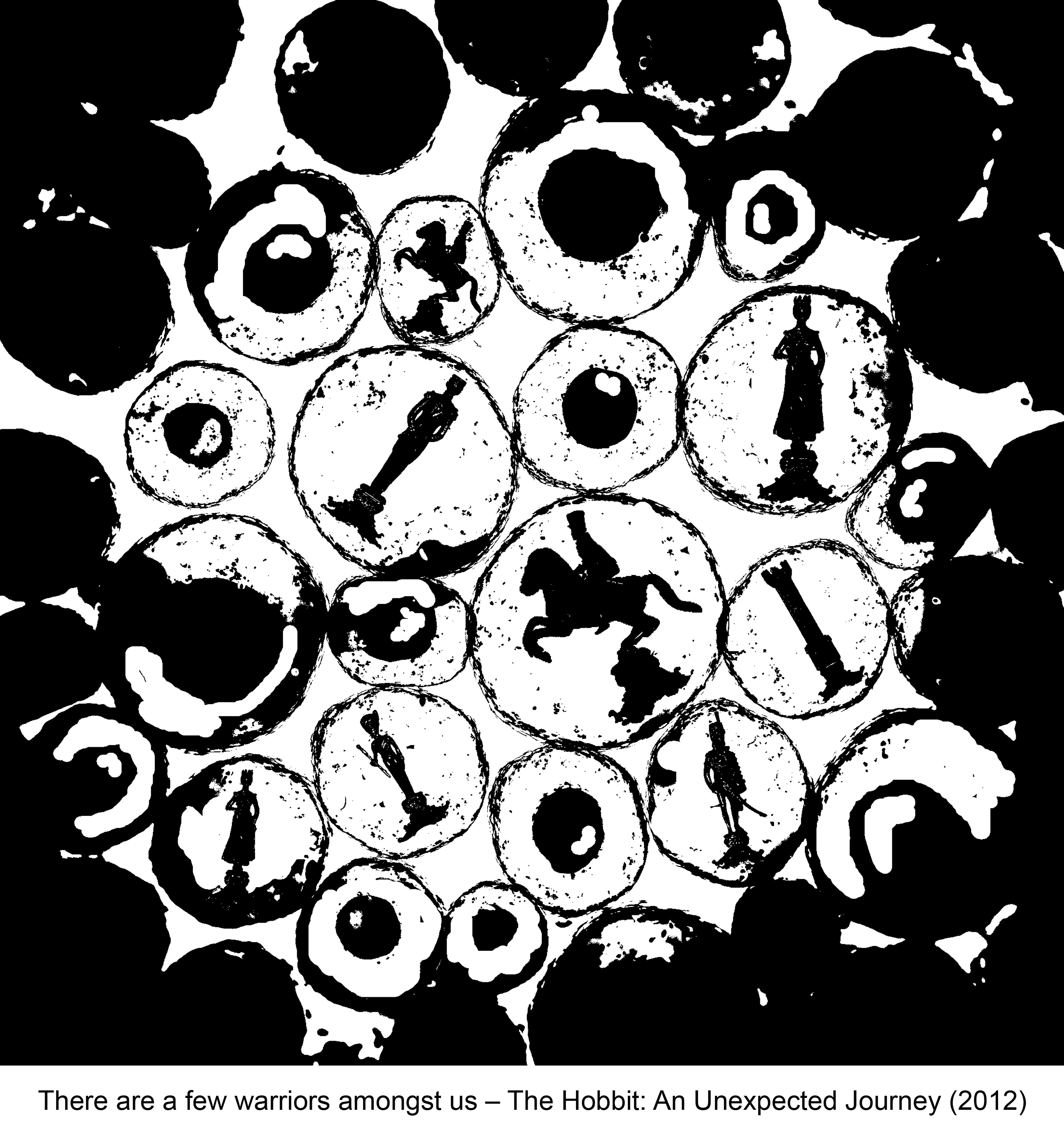
Other than that, I also tried to invert the color of the beast and warrior. I made the beasts to be black (shadow) while the warrior are all white. This composition portray the idea of a true warrior among a fake and unreal condition in the society. Maybe I am hoping anyone who see this can feel the idea of hope (warrior in every field) among the broken society.
Composition 2: the invert effect
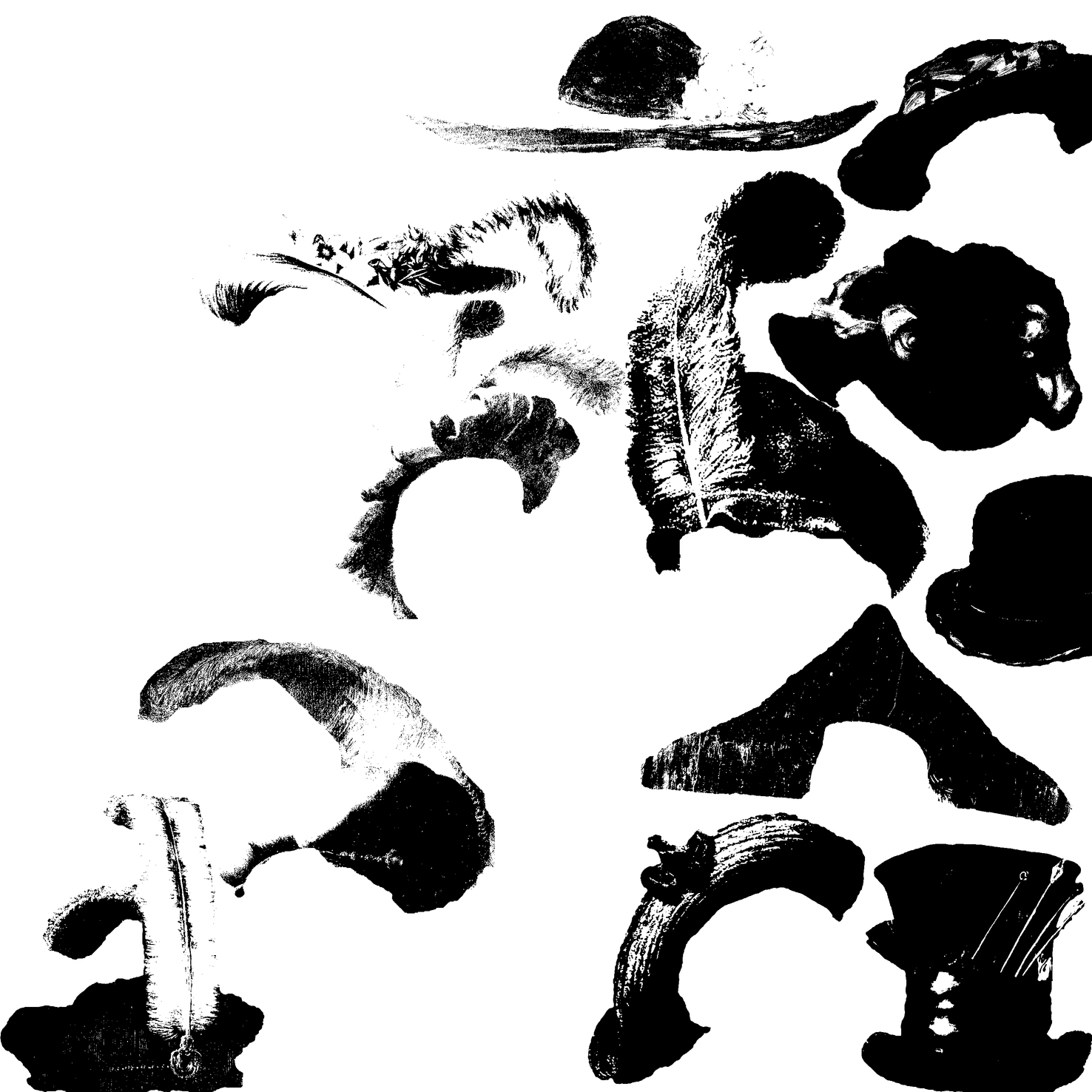
I also want to bring a message when planning the next composition. However this one is quite hard to be understood and did not fully successful to portray the Warrior Quote. I collected different types of hat to show different type of occupation and job in the society. I took all the hat from paintings to get the gradient and color effect. I also chose some warrior (military leader) hats (the one with feather, male model only) to bring the idea of warrior. At the same time, the position of those warriors hats is creating a figure of a woman wearing a hat in a long dress. Basically, I want this composition to show the role of woman as a warrior in the society. Also to break the stereotype of man is the only gender to be warriors. This is the part that is difficult to understand which made me not use it for final submission despite the hidden meaning.
Composition 3: the confusing composition for women warriors
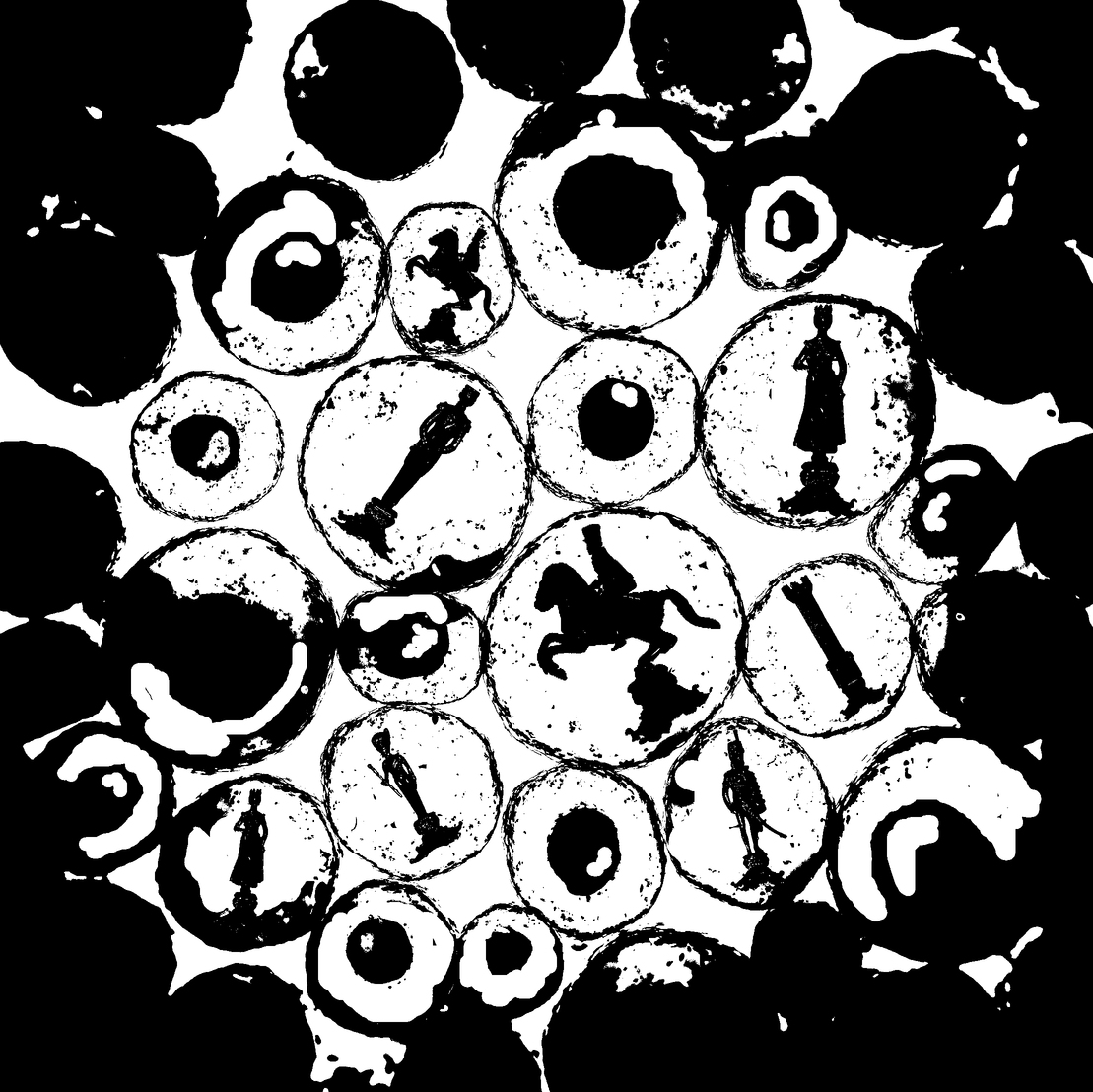
Next, another composition is again has the idea of society and the presence of warrior in any type of field in life. For background, I used the a picture of human cell to show that the seed of warrior is actually inside everyone of us. Then, I added chess pieces as my way of showing different role, status and level of people in our society. As for the warrior, I wanted the knight piece to be seen as the warrior among the many pieces. The warrior inside us want to show that whatever you are now, you can be anything you want! Honestly I really like the idea of using human cells, however due to the messy and not so clean edit, this composition may show unclear and confusing message, also giving the idea of laziness.
Composition 4: the warrior inside us
Finally, it is one of the composition I decided to be included as a final submission:
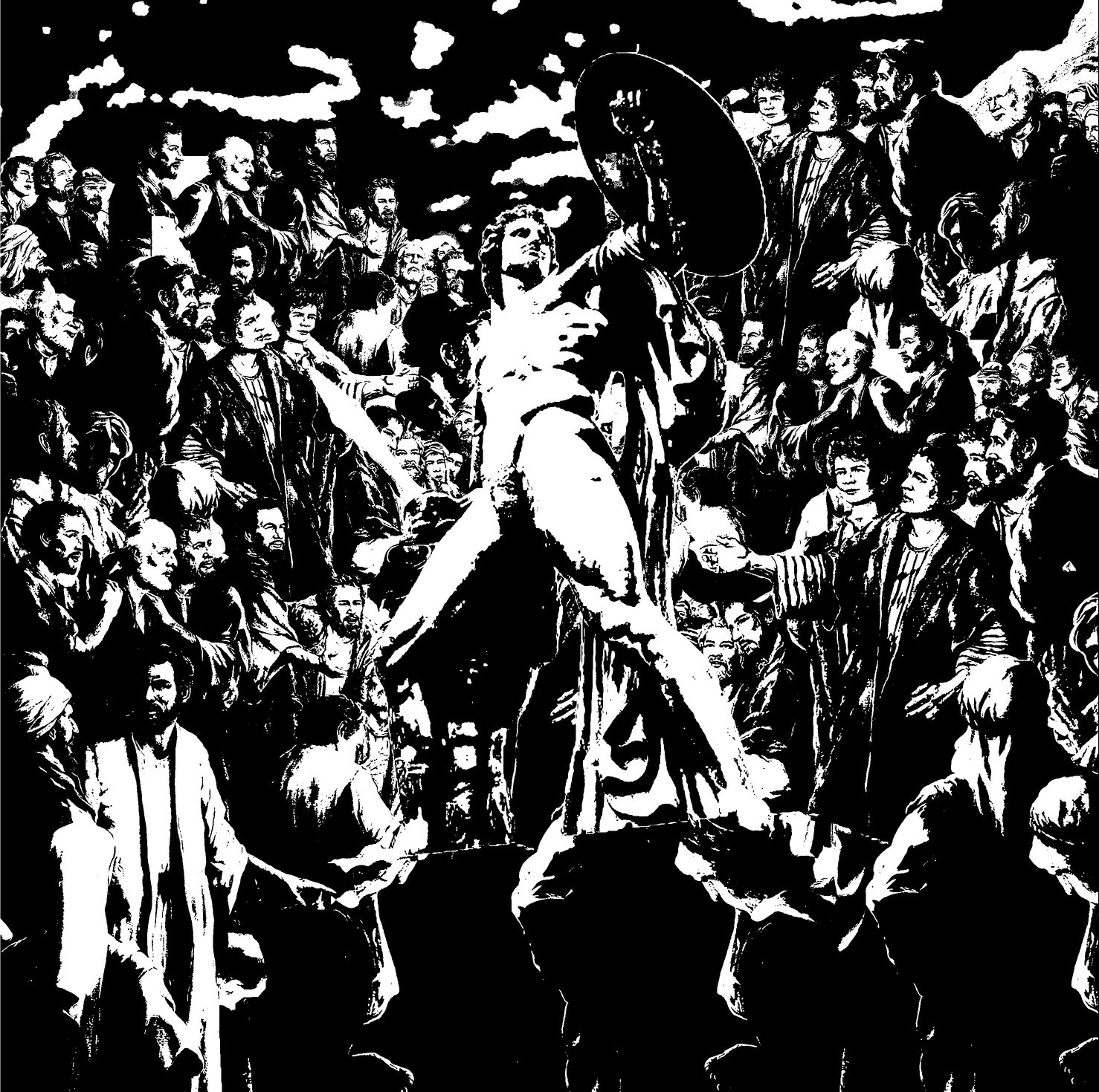
Composition 5: the warrior across time
This composition is about how the society is confused and wonder about the presence of a warrior among them. Some may be in awe but many are confused and did not understand how can someone be a warrior in real life and appear in their time. The picture of crowd I used is actually taken from a biblical and religious painting in which Jesus Christ was the real main attention of the confusion of the people. I want to bring the idea of confusion on the presence of a warrior in the society to show the fact that the idea of society warrior is not always accepted and welcomed by the people. Moreover, I purposely put the warrior and crowd that came from different era to show that this problem has been occurring every time despite the era we are living in (e.g. from the rejection of Jesus as Mesiah by the crowd in the past to the rejection of honest political figure because they are not as rich as the corrupt leader now.)
Basically that is all for my process. At the end I decided to use Composition 1 and Composition 5 to represent the Warrior Quote in my final submissions. I hope that this post can share some insights and maybe inspire others!
I chose the movie Hobbit: An Unexpected Journey (2012). Then I decided to go with 2 quotes: “The dragon has long been on your mind” and “There are a few warriors amongst us”.
I will do it chronologically from the very first composition I made.
I started from the first quote: “The dragon has long been on your mind”
Composition 1: My very first composition
I composed this while learning on posterise and threshold effect on photoshop. The result was not pure black and white and I didn’t really like the colour. Moreover, I didn’t really understand the project a first, hence I made it very very literal. Like literally a dragon is in one’s mind, and the person is represented as a skeleton to show that it has been going on for a long time (a lifetime).
After trying to understand the project and learn about the photoshop effect more ( I really like threshold! ) , I finally able to produce a much more decent composition.
Composition 2: My first decent composition
However the idea is still very literal as before. It shows someone from young till death (skeleton) who is having a dragon walking and passing through his head (mind). And I put a mandala to show a kind of explosion on the skeleton mind. I didn’t really like this one as the difference in media (doom taken from painting, some from statue, etc) make the change of age of the person messy.Moreover, I also had feedback that maybe the mandala and dragon composition will be enough.
After exploring more and more possibilities I finally had a composition which I really like.
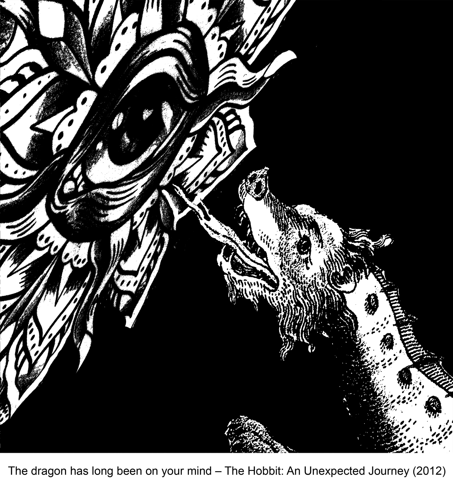
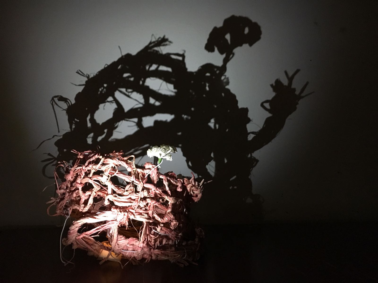
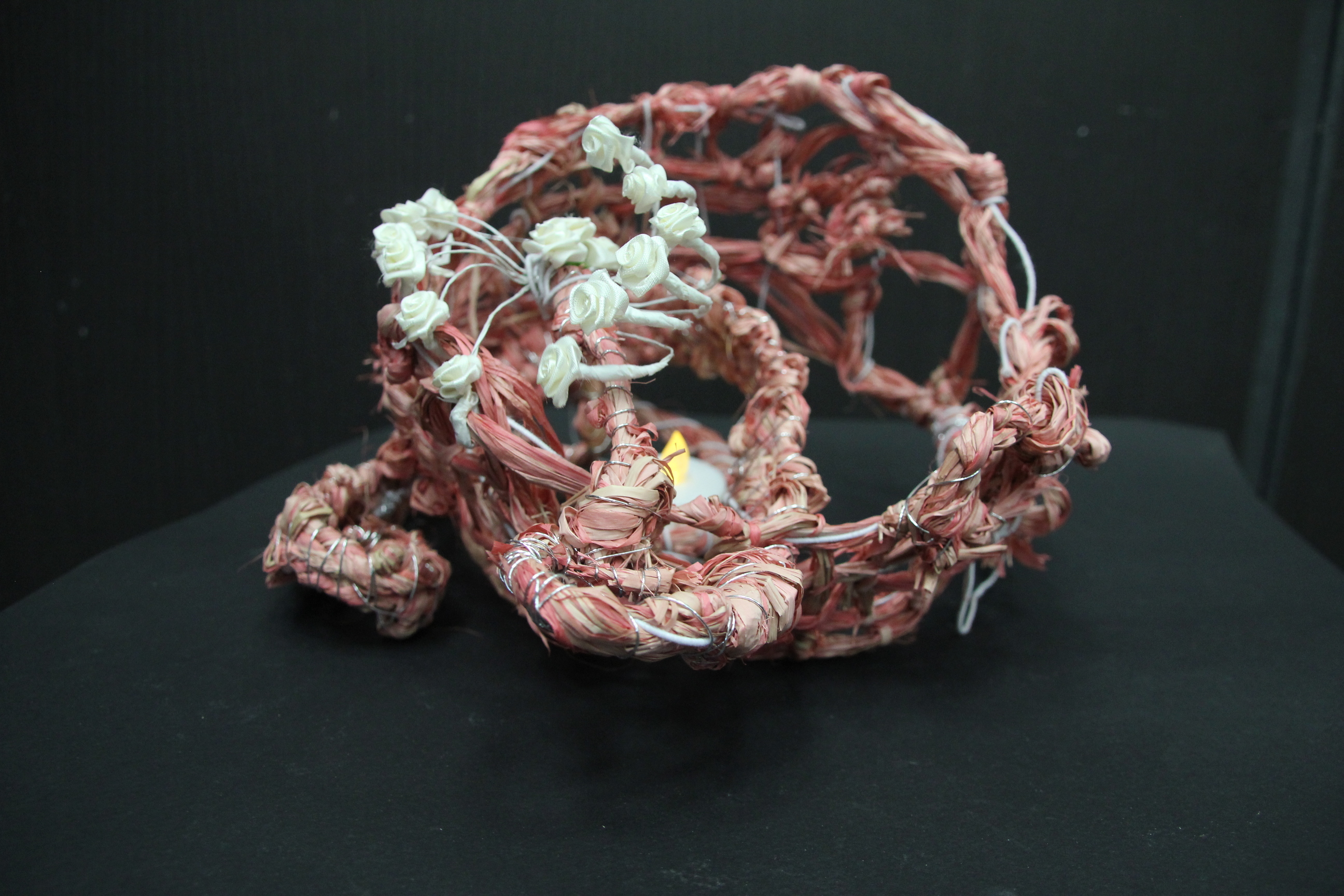
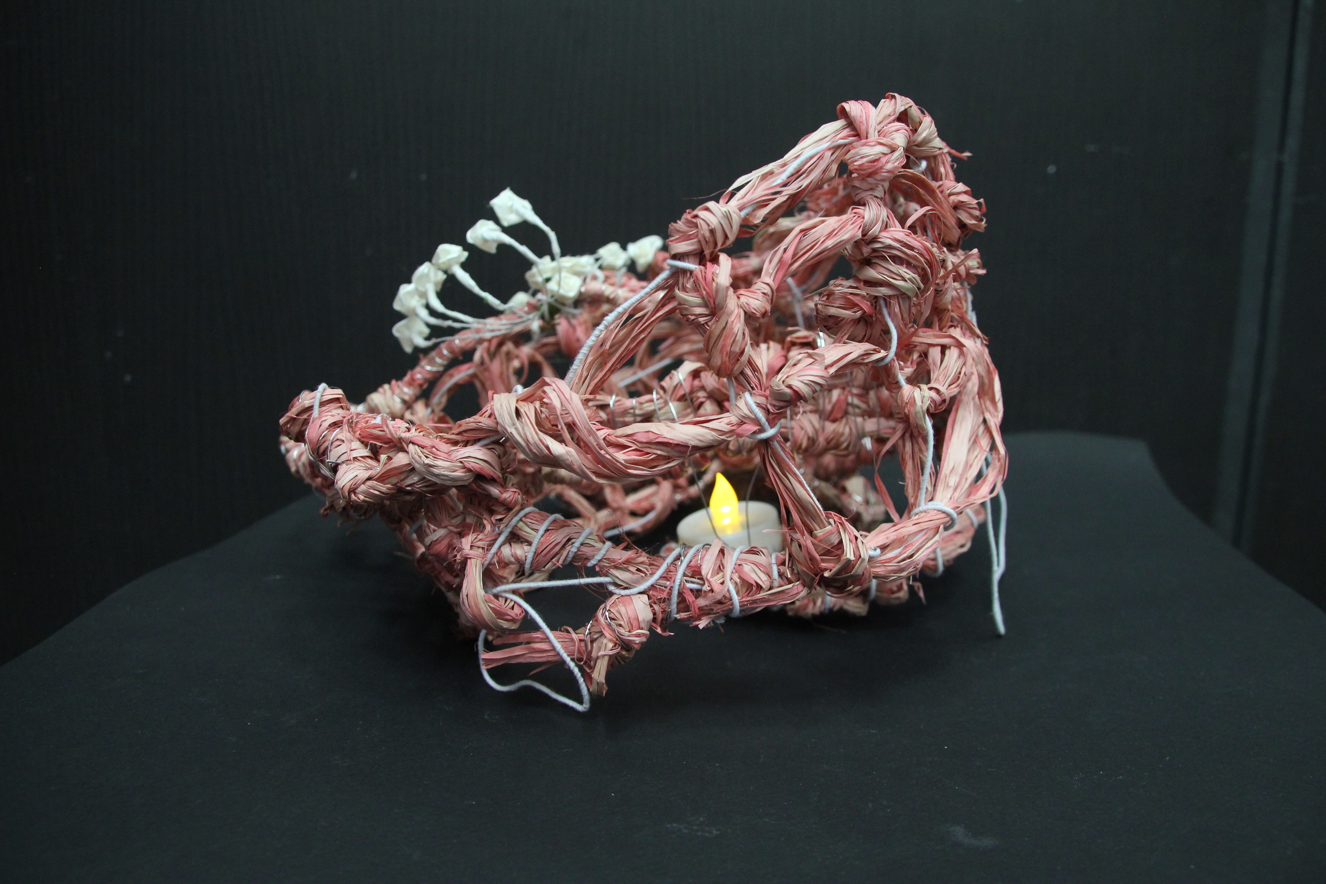
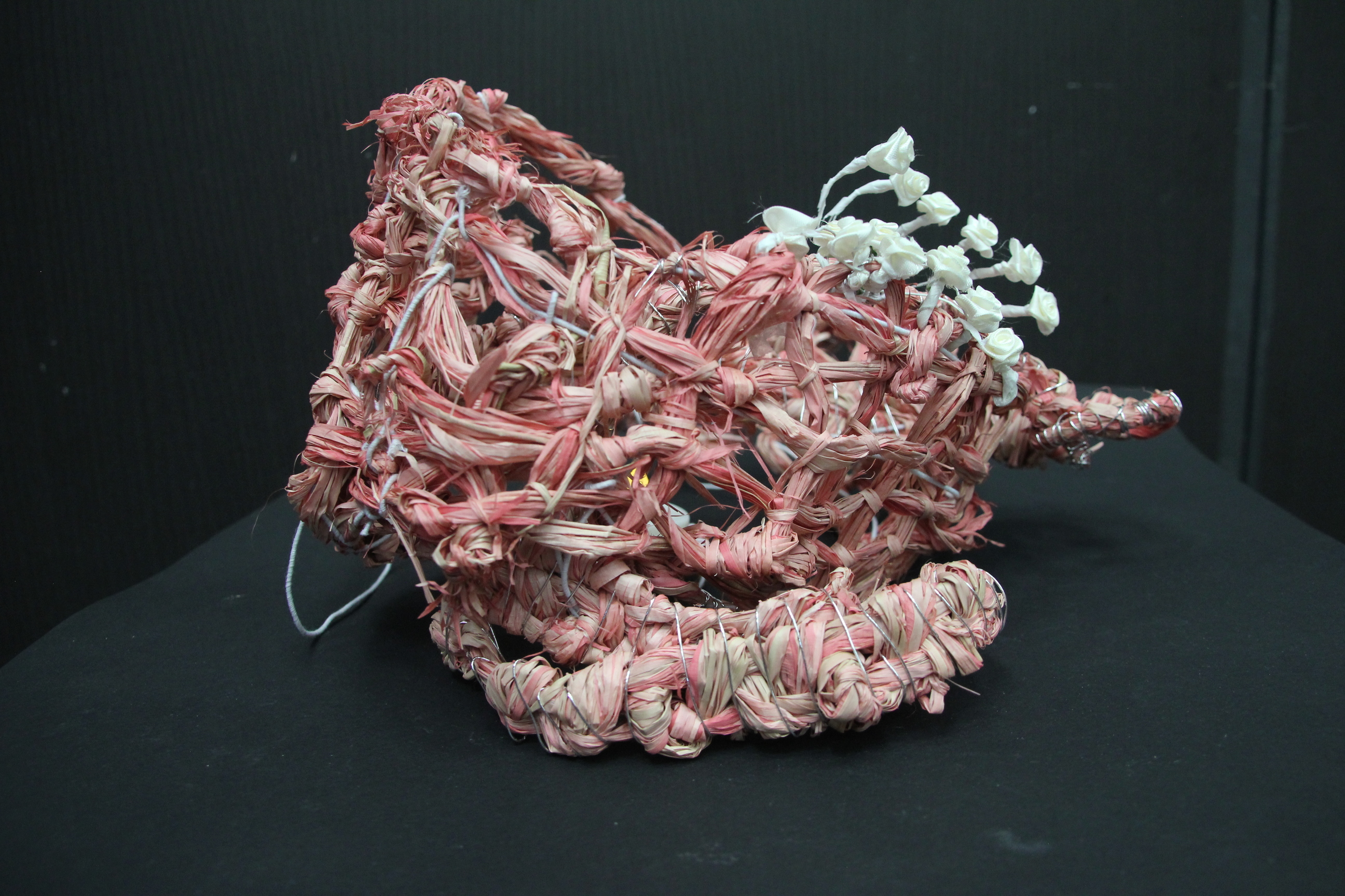
Composition 3 – black version
I really really like this one.
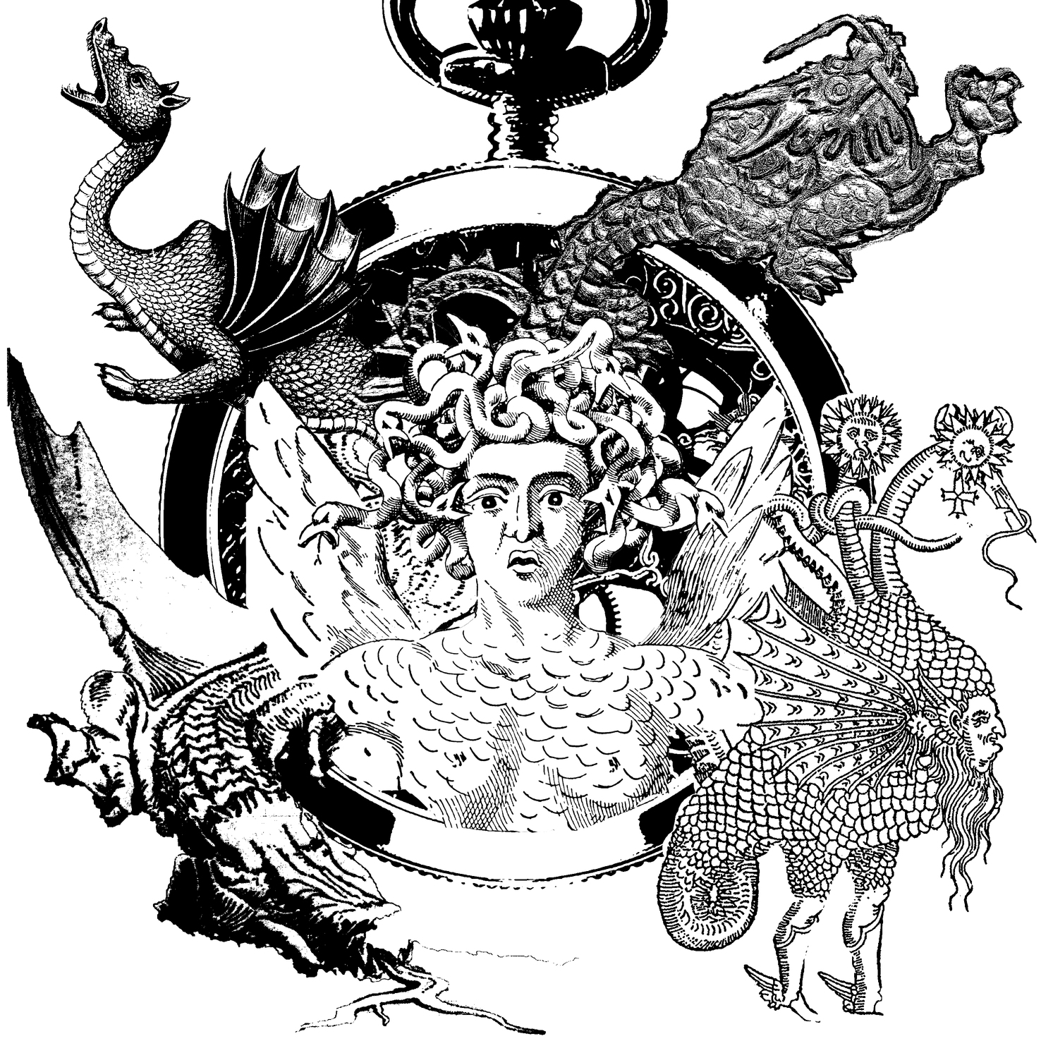
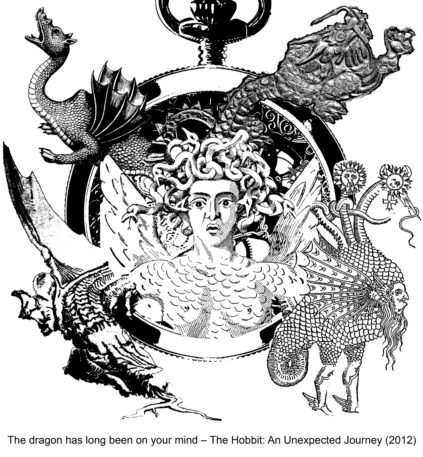
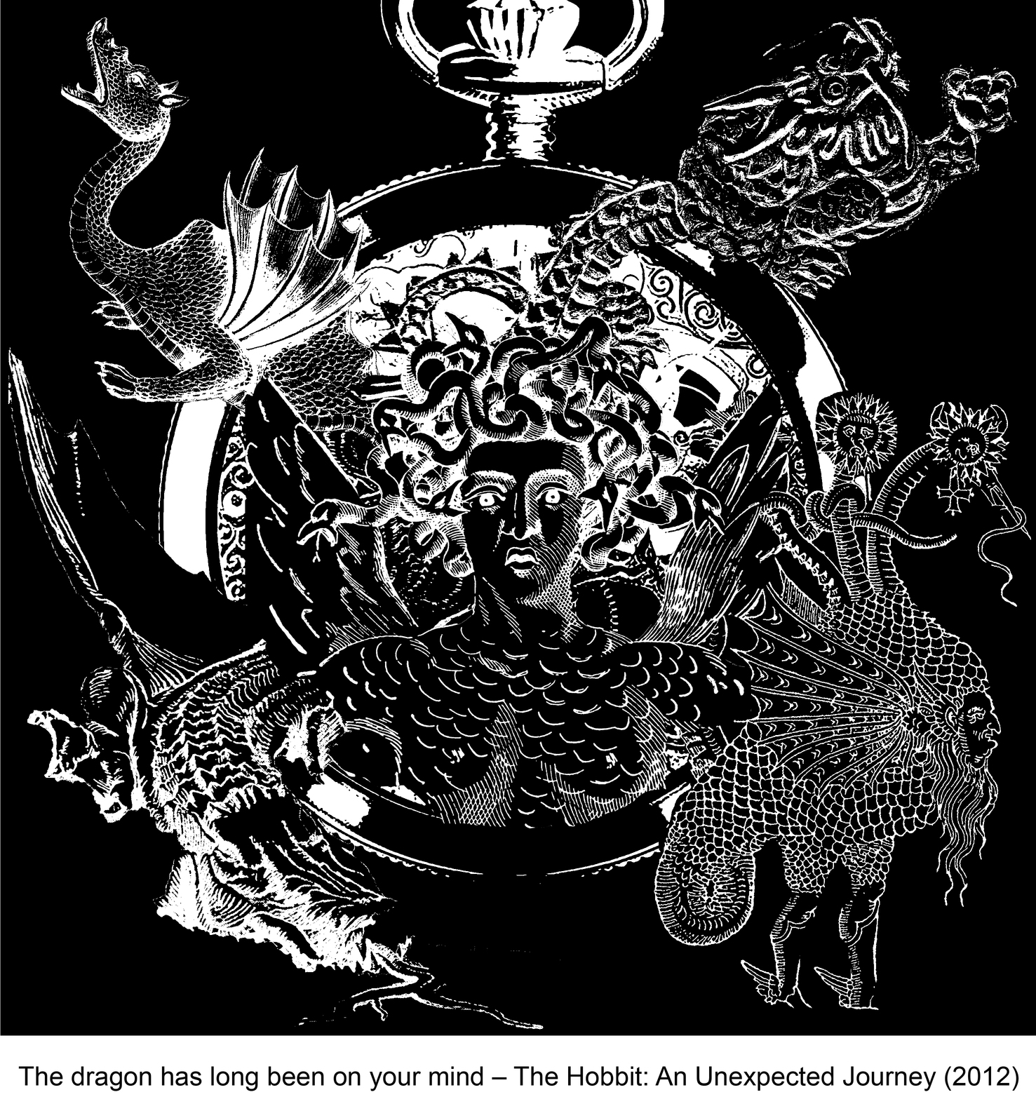
The pendant is used to represent time (long time) and dragons are coming out from the time. The dragons are taken from different type of media (painting, wood engraving, stone and drawing) to show the many dragon that has been thought of. And choice of weird type of dragon is to give the composition interesting and unusual image. The Medusa represents a person thinking about something and the head is just nicely complement the composition.
However, this after I made the inverse version, the picture come out nicer, less scary and able to portray the quote more. Hence I chose the white version of it to be one of the final compositions.
Composition 3 – white version
Another composition is below. It was made accidentally but people say that it is the best one out of my compositions.
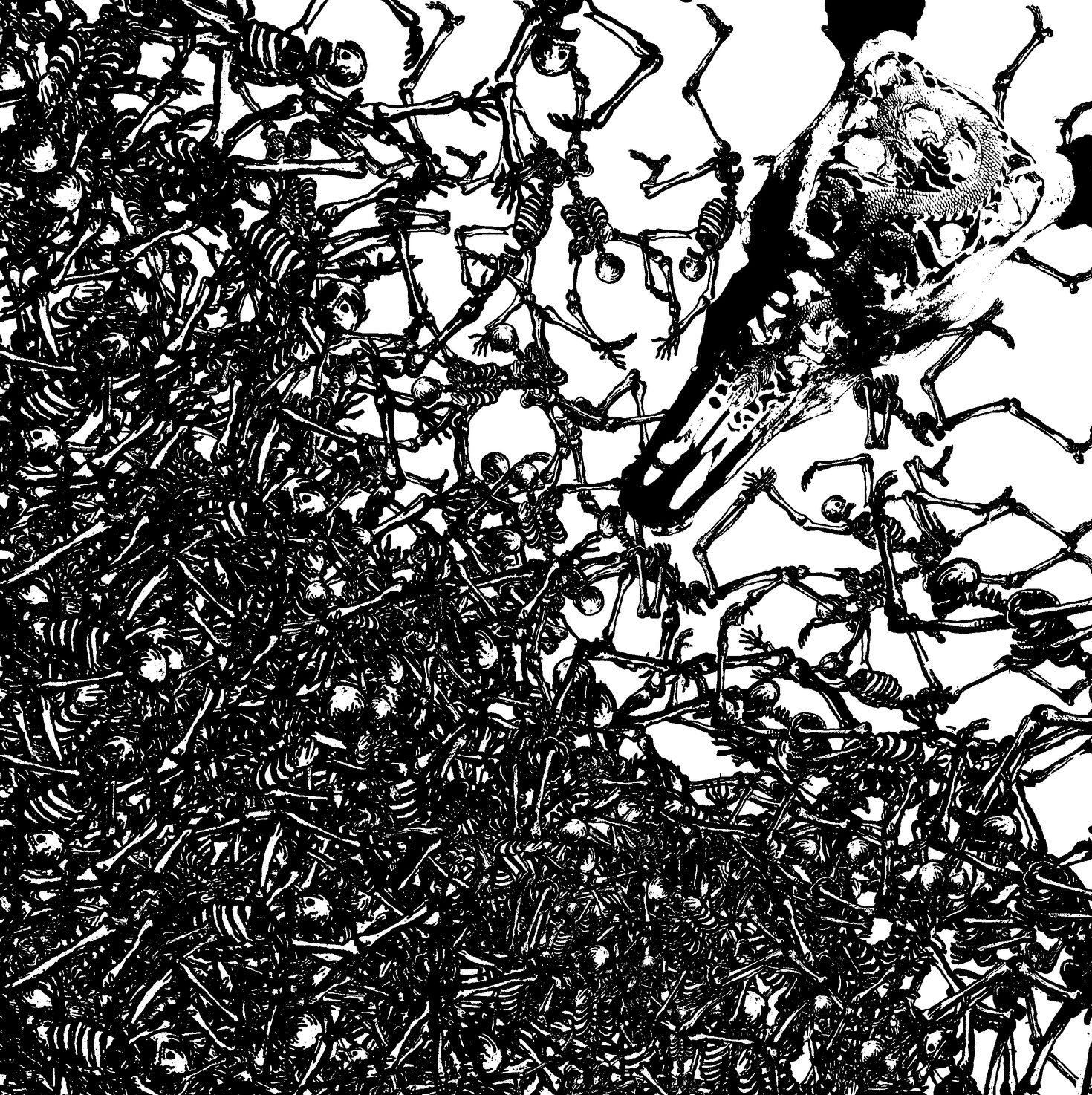
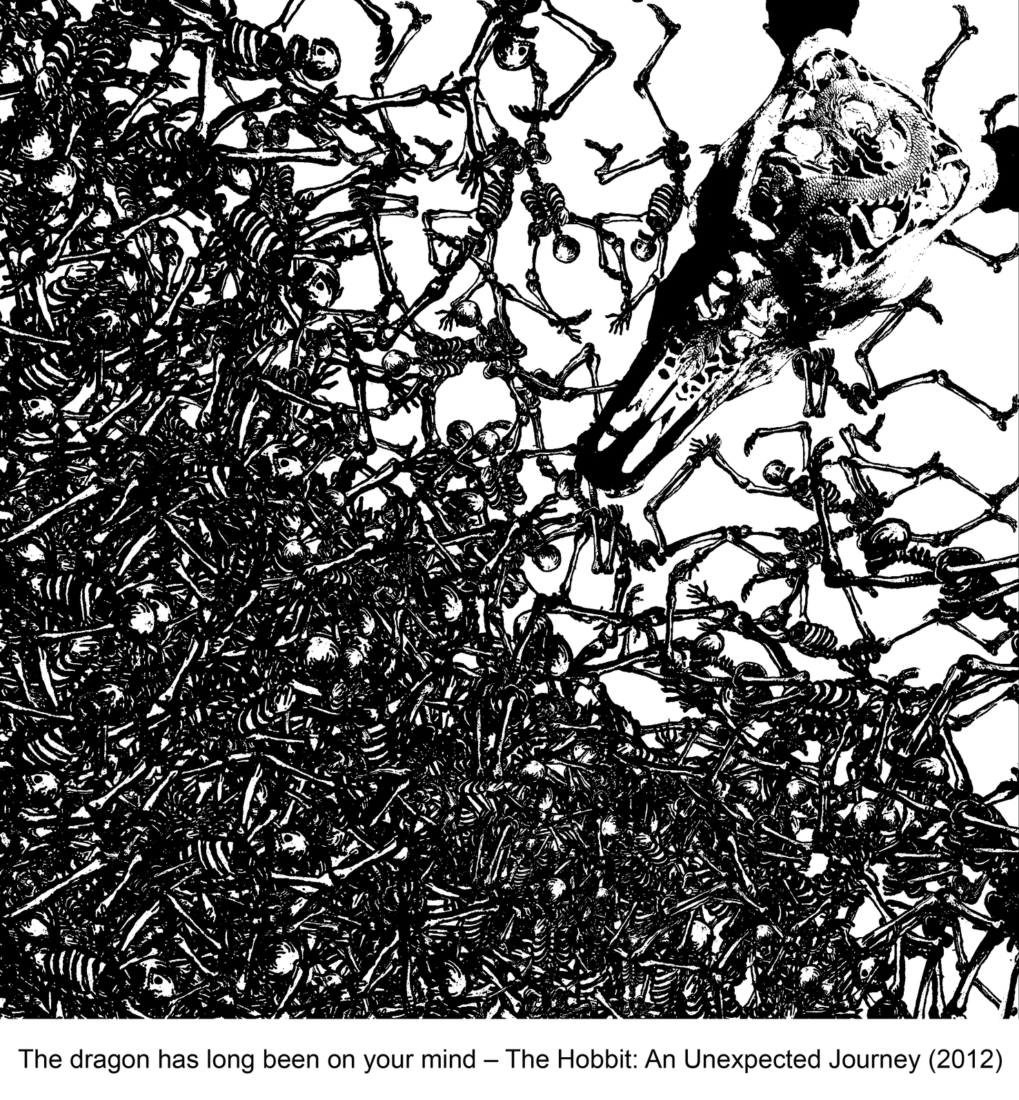
Composition 4: The lucky accident
Initial idea:
“The dragon has been long on your mind” may make the person going crazy from thinking of dragon his whole life, making me want to portray it by creating composition of dancing skeleton and dragon. The person too crazy that it represented by skeleton that endlessly dancing. Hence I used this cheerfully dancing skeletons as I planned to made a festive ritual between the crazy skeletons and dragon.
The dancing skeletons
However, as I keep on duplicating and duplicating the skeleton, a different and opposite mood is created. The final composition feels much more gloomy and dark to me. It is like the skeleton are now sacrifices for the dragon. As the mood of final composition is very different from my initial plan, I feel that this composition is accidental. But I like it a lot 😀
Finally, my last composition for this first quote:
Composition 5: the dragon and mind
It is a modification of composition 2, however it focuses on the dragon and explosion (mandala) more by removing the confusing human stages. The mandala in composition 2 is changed into the one with an eye in the middle to represent an explosion of mind instead. The dragon and ‘mind’ is purposely arranged like they are having an eye contact to show their connected and ‘fond’ relationship. However, as I want my final composition the balance (same composition for each quote), I have to choose only the best 2 of all this compositions, which were composition 3 and 4.
Thank you for reading! Post on part 2 process (the Warrior Quote) is here (coming soon)! And click here to see the final submissions for this project!
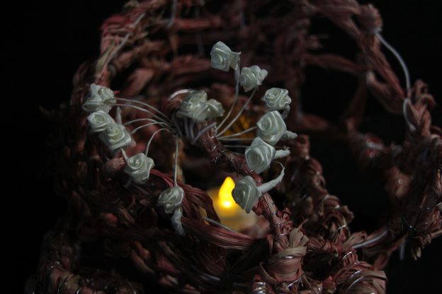
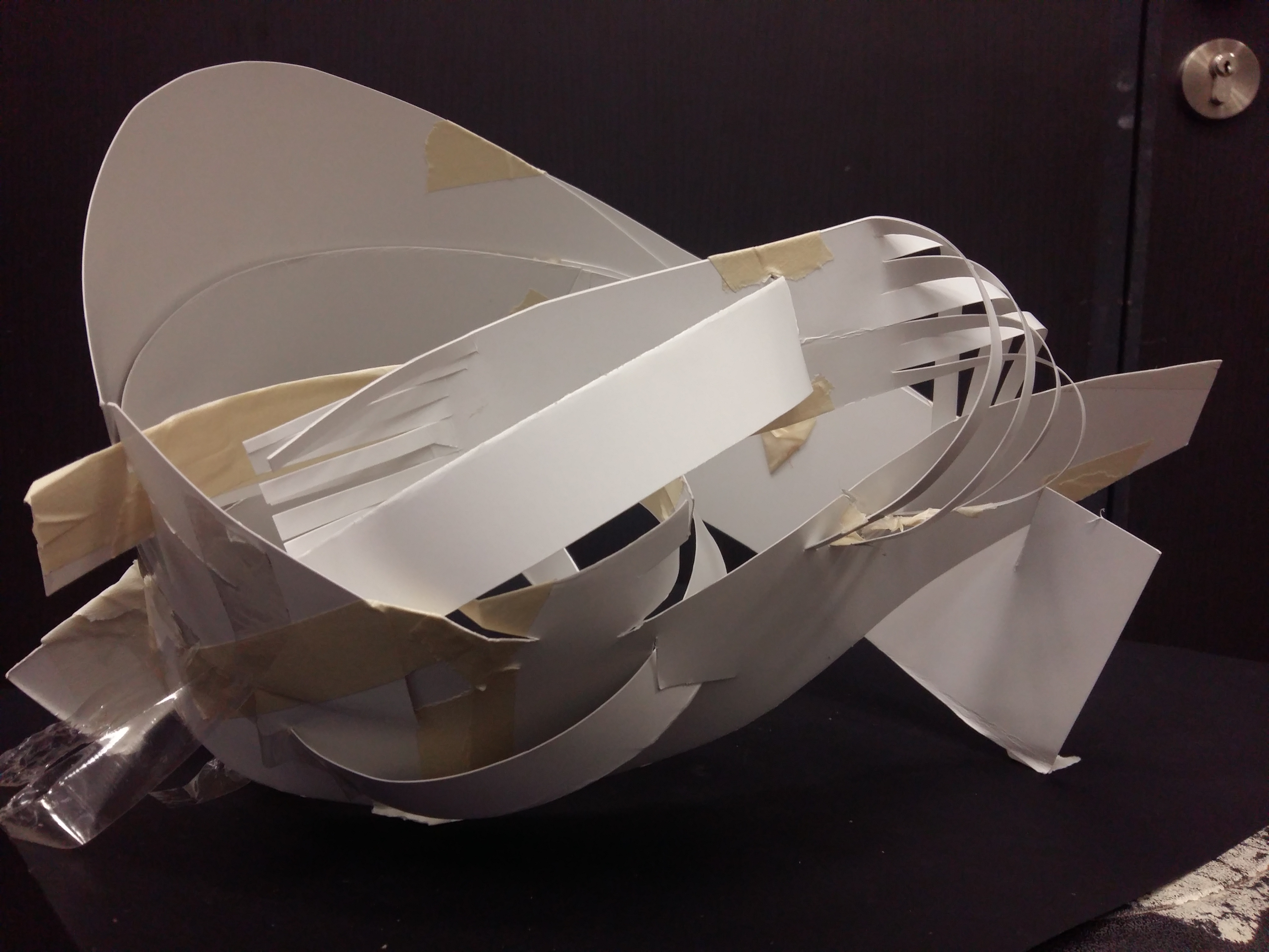
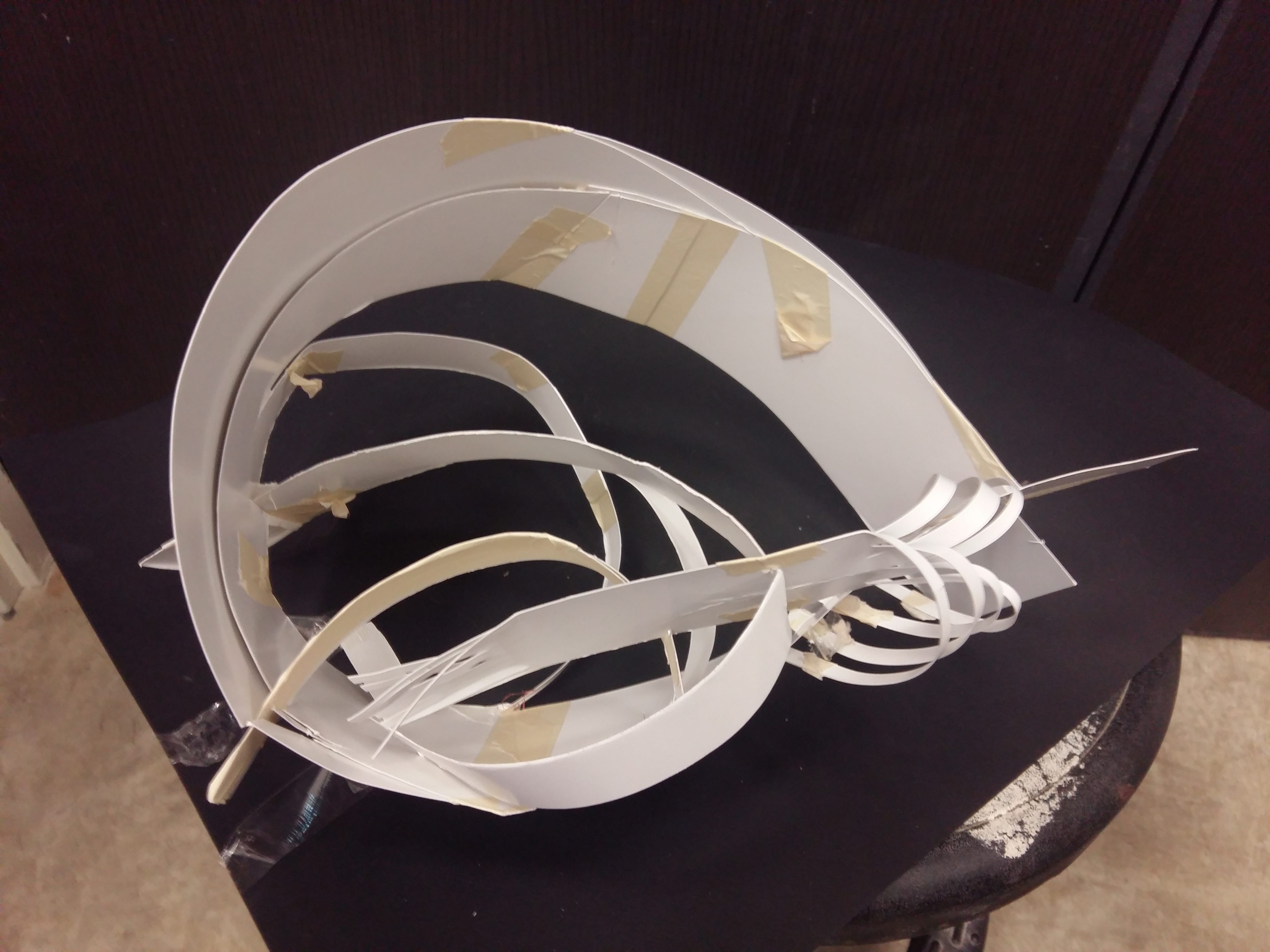
Following up the previous 3D post about individual model, group B revised and revised and finally came up with our submission for 3D Final Model and PDF.
Here is some photo taken of the final model:
Artcard Model Front VIewArtcard Model Top ViewApplication Model Front View – BrightApplication Model Front – DarkApplication Model – Shadow
Then we decided to make the model neater:
Updated application model – FrontUpdated application model – SideUpdated application model – BackUpdated application model – Side 2Updated application model – ShadowUpdated application model – Shadow 2
Here is some photos of us preparing for the Application Model:
Tools and Materials
Here is our PDF:
PDF cover pagePDF page 1: Original modelPDF page 2: Individual model inspired by original modelPDF page 3: Final model and analysisPDF page 4: Application 1PDF page 5: Application 2 and 3
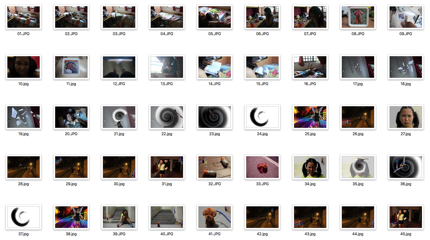
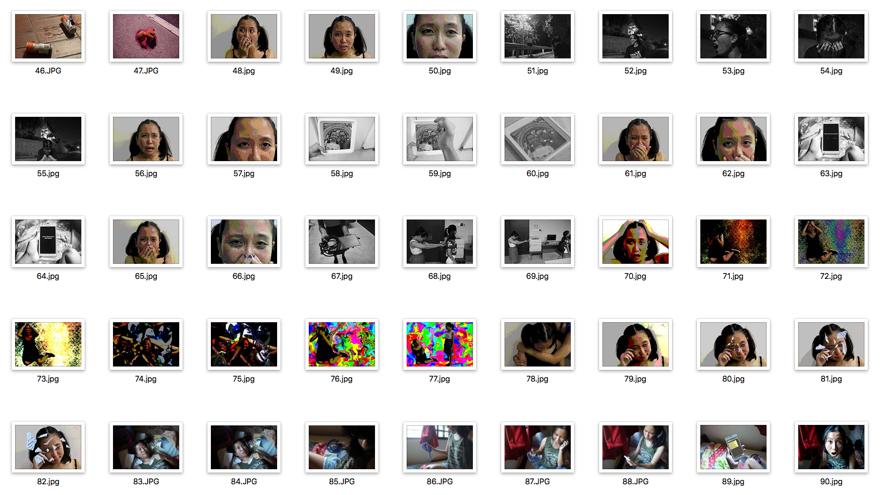
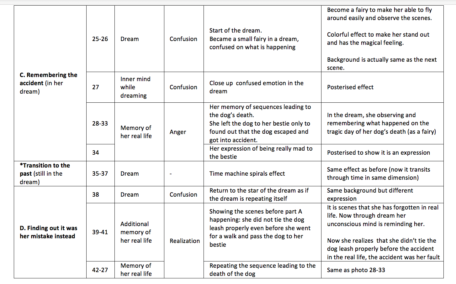
So for our 4D Project 2, we are required to take 90 pictures and combine them to tell a story.
Final Video:
Title: BFF 4 Life
Inspiration:
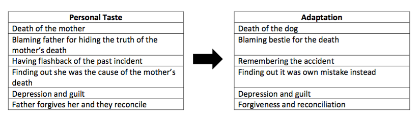
The main storyline is adapted form a Korean Drama titled ‘Personal Taste’. It was based on the main character (Park Gae-In) past.
Synopsis:
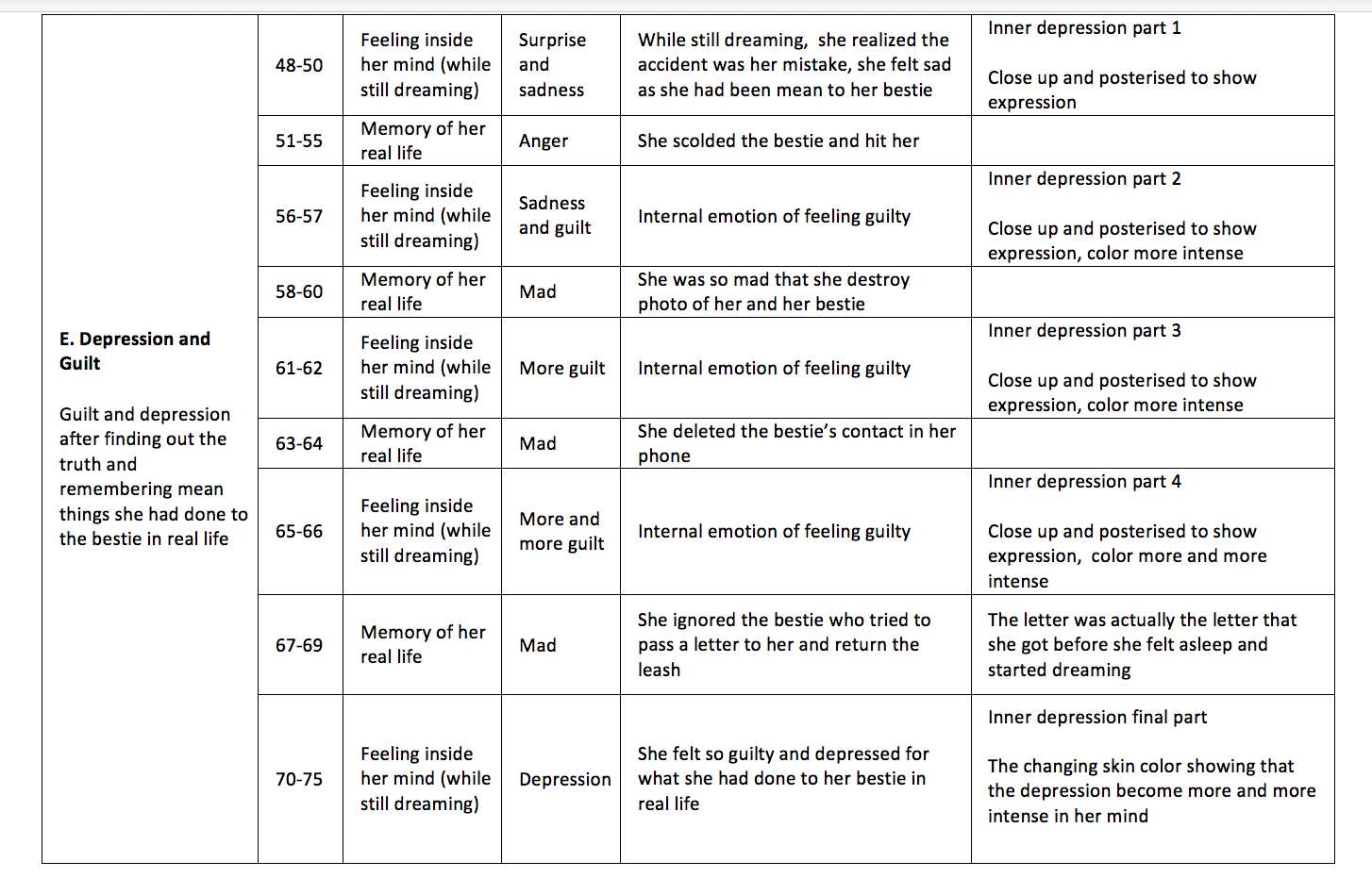
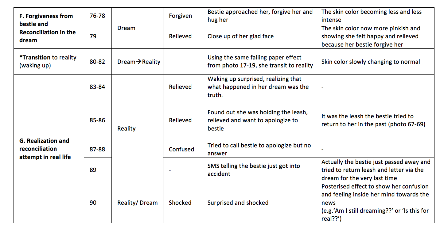
The main character just lost her dog due to an accident when she left her dog with her bestie hence she is blaming her bestie for the death. She got into a dream that recalls the night of the accident. During the dream her subconscious reminded her that actually she didn’t tie the dog’s leash properly before leaving it to her bestie, so actually it was her fault! Then she recalls all the bad and mean things she did to the bestie, feeling so guilty and depressed. However the bestie came to her dream, forgive her and they reconcile! 😀
The 90 photos:
More explanation on the scenes:
Artist references:
Posterised facial expression
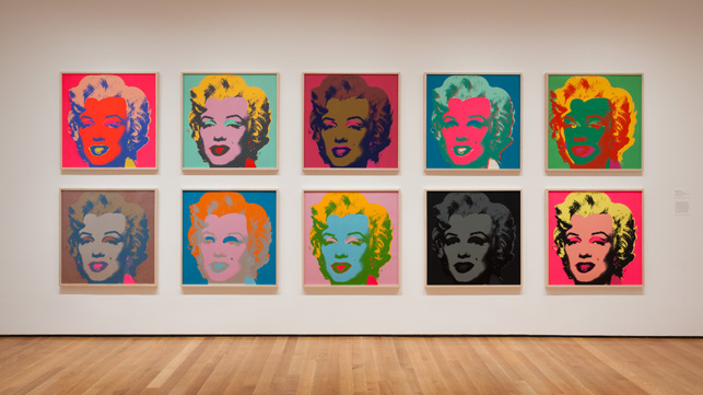
Inspired by Andy Warhol’s: The Shot of Marilyns. It is part of a mass-produced images of celebrities Warhol created in the 1960s. He painted Marilyn that had different brightly coloured background with different color and representational form to convey different sensations and emotions.
Installation view of Andy Warhol: The Shot Marilyns, 1960s
Hence, the facial expressions in my photos are posterise so that different color can help enhance the feeling and emotions conveyed (more intense color showing more emotional condition).
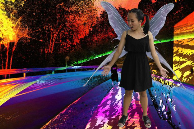
Colourful fairy effect
Inspired by fairy photos in Paul Johnson Photography , which show the fairy to be in bright color while the surrounding is dark, I decided to give the colourful effect when the main character became a fairy in the dream.
Paul Johnson Photography
Reflections: I realise that my story has become far too complicated for 90 photos. If I could redo it I will focus on simple but effective photos. Moreover, I should take another person to be the bestie to avoid confusion of the already complicated story. On the other side, I really enjoy the planning and execution process of this project.
Special thanks: To those who have helped me take pictures at weird timings and places of the day, really thankful and appreciate it :)!
Kezia Agatha : photos in the bedroom 😀
Angelysia Cardella: photos at Nanyang Hill in the middle of the night :”’)
Clarita Saslim: photos of facial expressions and movement with white background in ADM :))
Thank you for reading! I really enjoy this project and hope to learn more about 4D 🙂
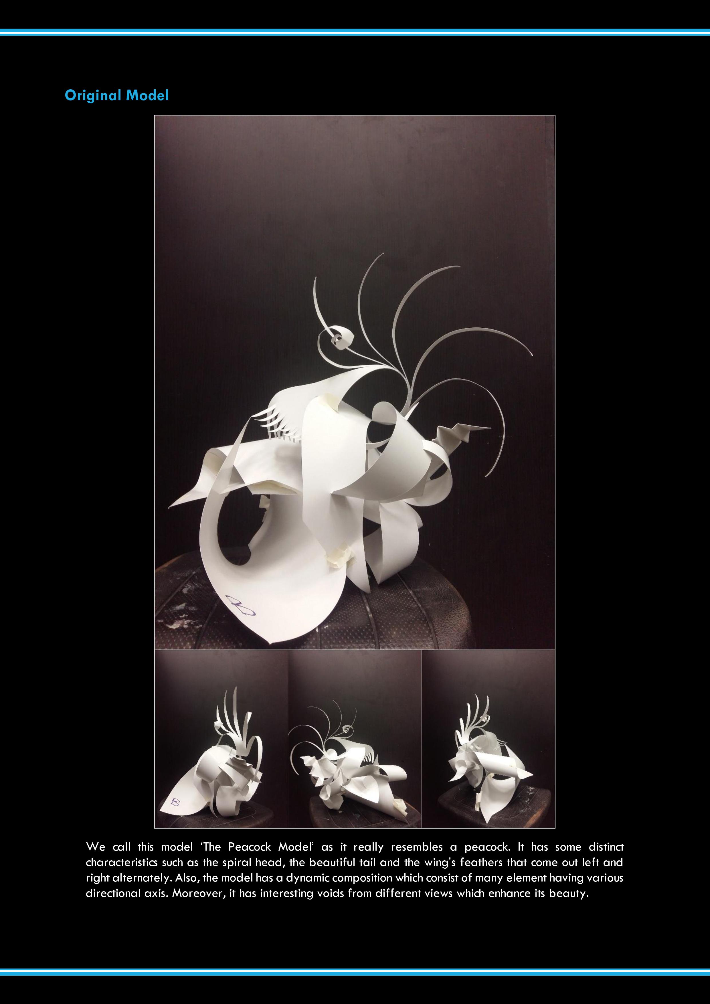
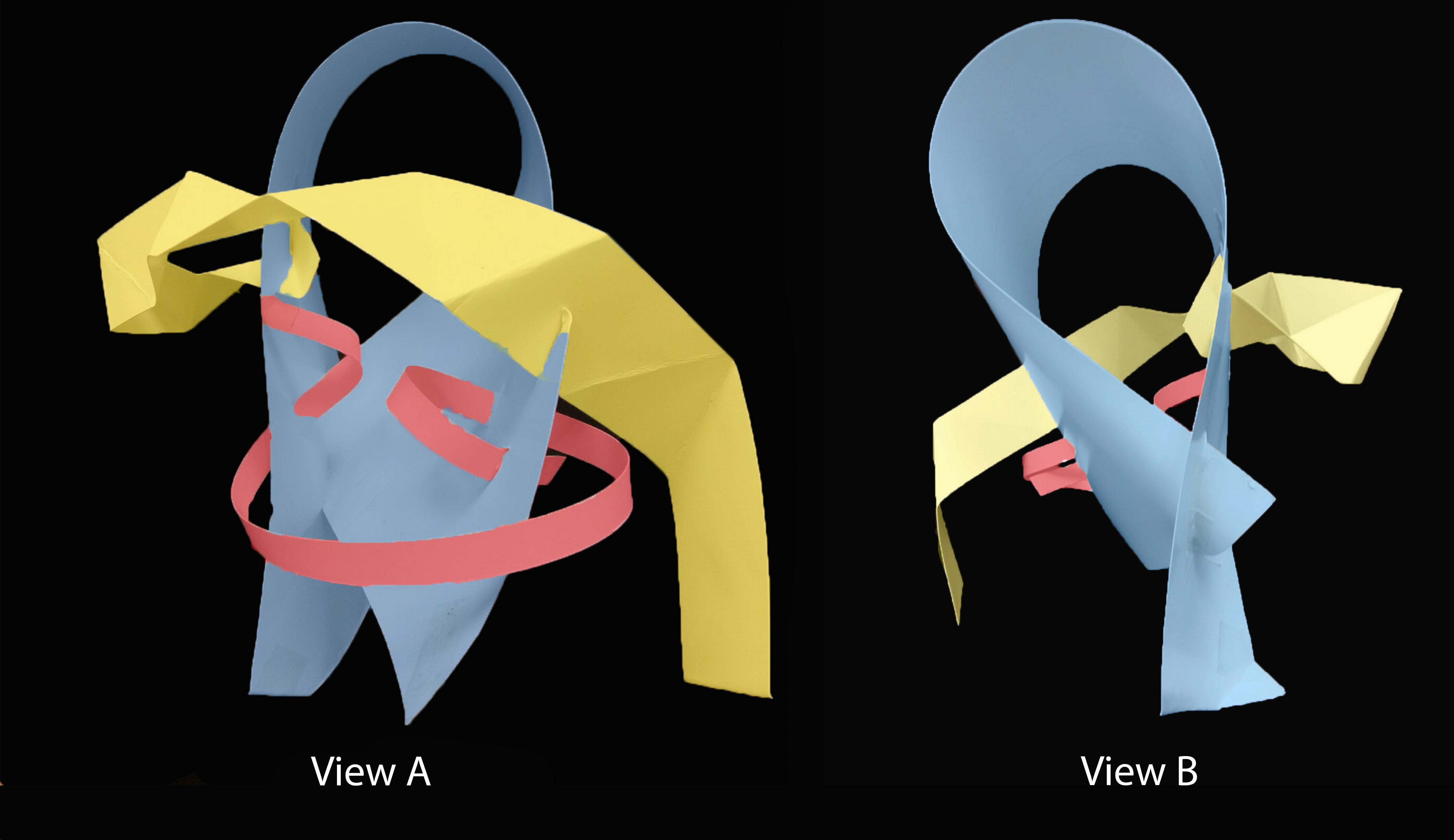
So below is group B (Candy, Najiha, Natasya) members’ individual model for the simplified version of our Peacock Model.
Individual Models
Candy’s ModelNajiha’s ModelNatasya’s Model
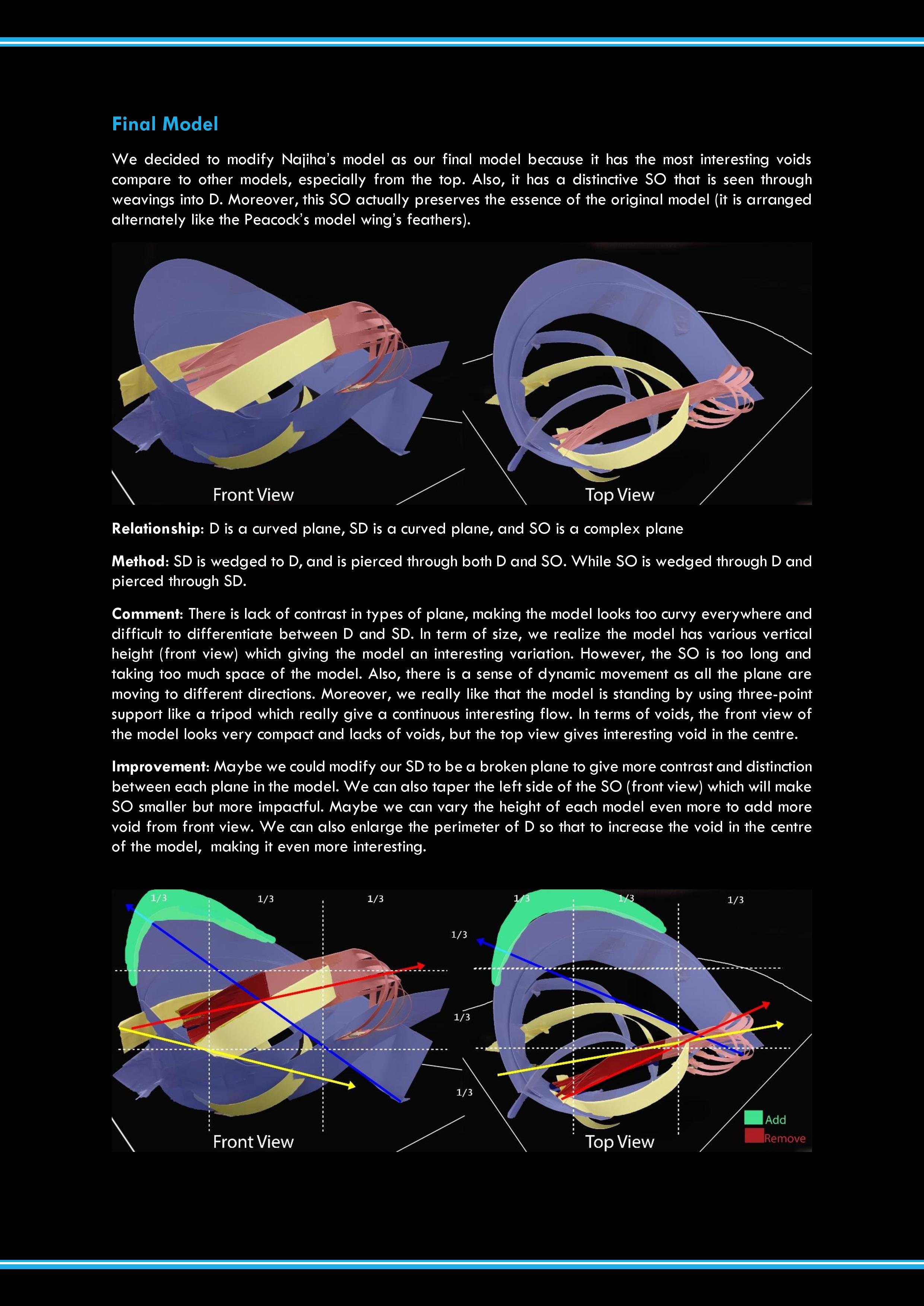
Final Model
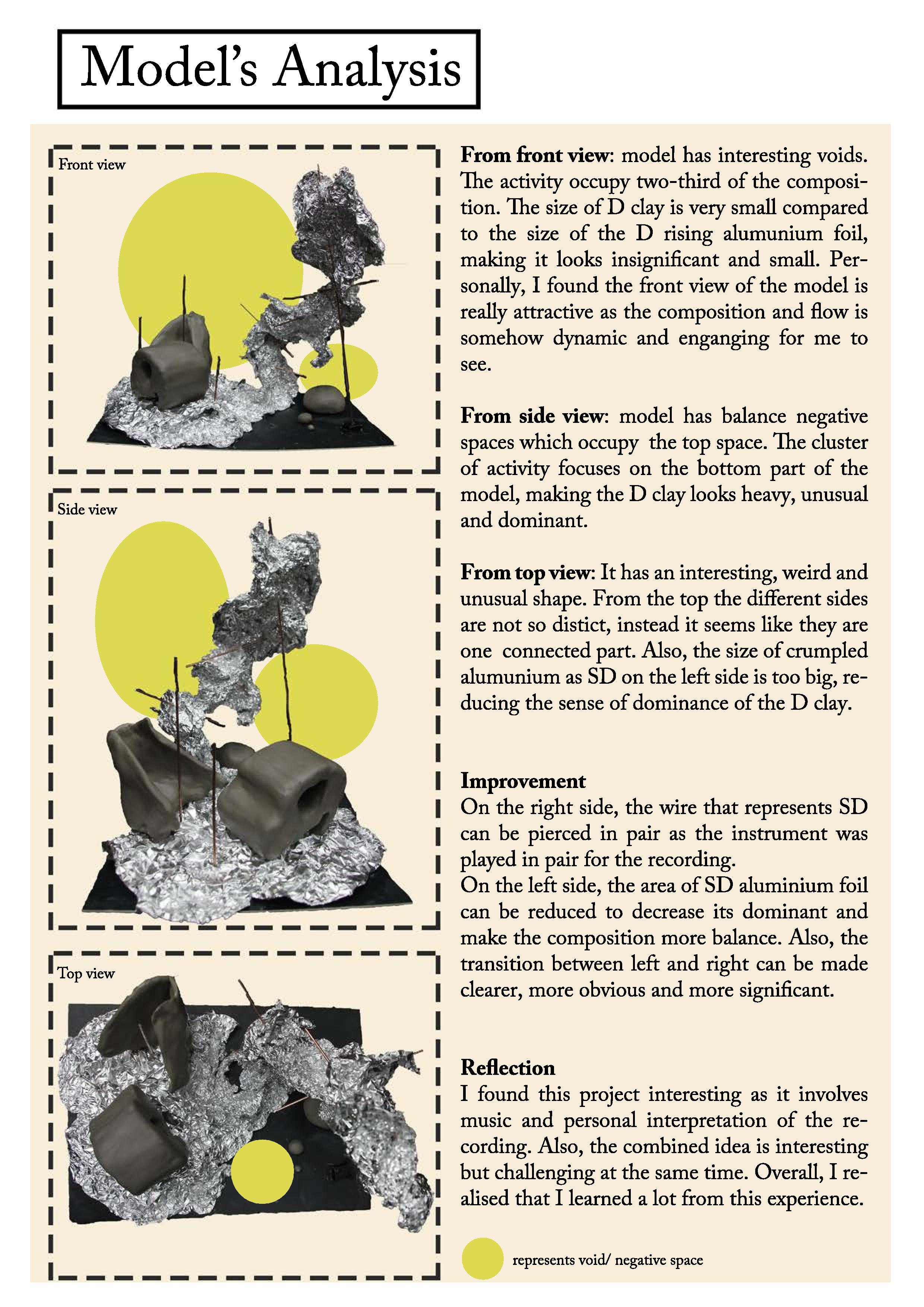
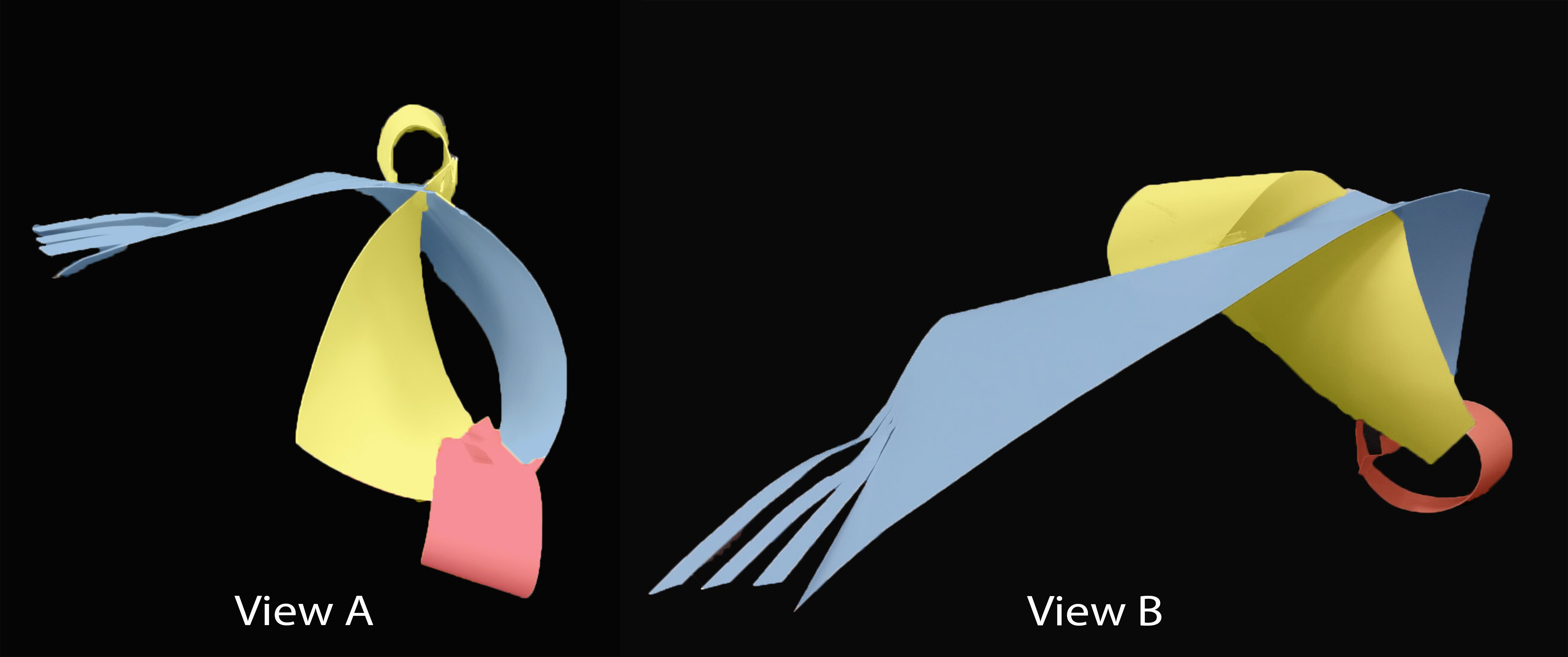
For our final model, we decided to combine all three models. The Dominant is taken from Candy’s D, Sub-Dominant of Natasya’s SD and Subordinate of Najiha’s SO.
This is roughly how it will look like followed by the improvements we will do when we make the final model.
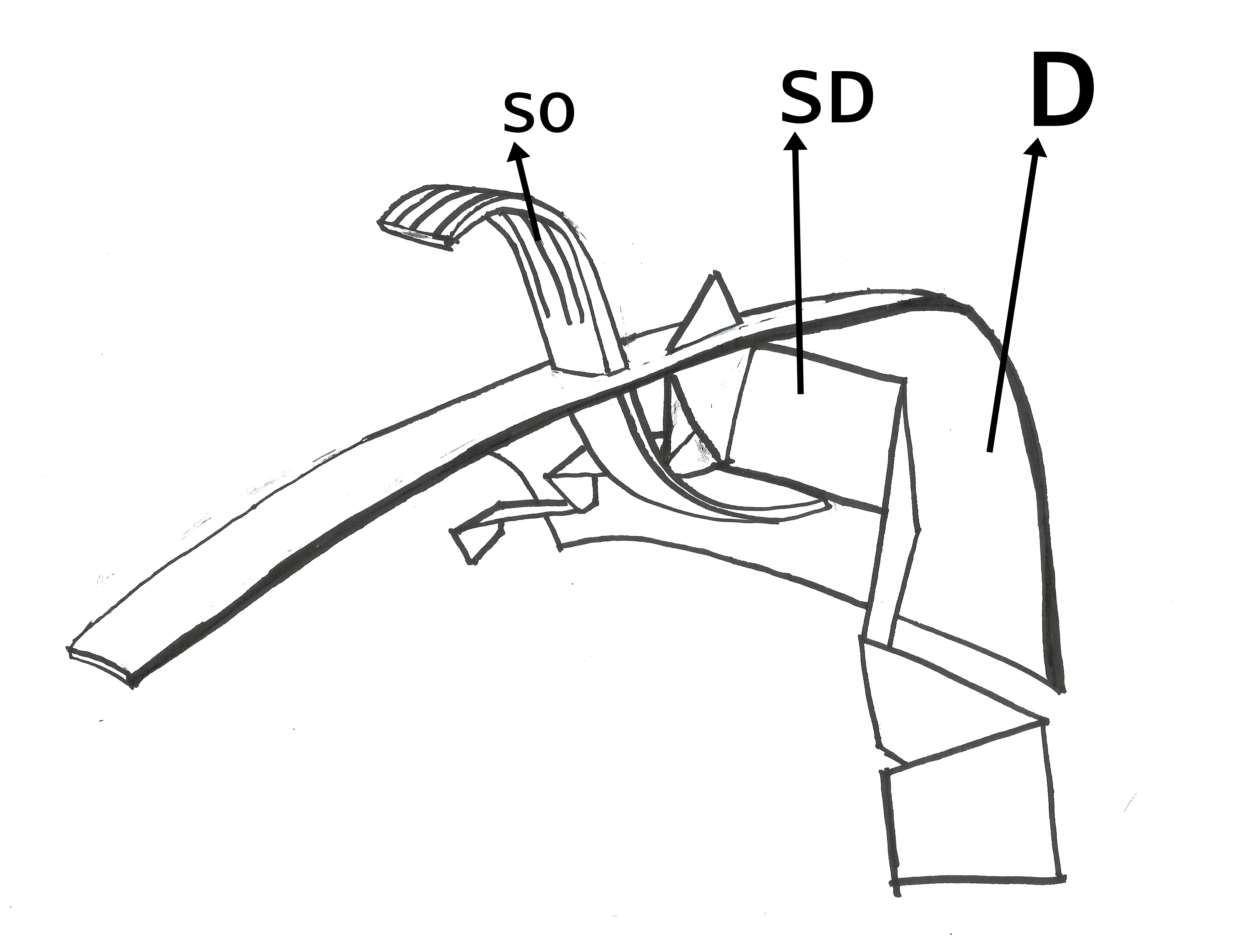
Group B final model sketch
Dominant: A curved plane from Candy’s D. Comment: It is not so dominating as the cluster of activity from SD and SO occupy almost half of the area and because D is vertically the shortest also. Improvement: We will make the D a lot bigger (vertically) so that the cluster of activity will only occur at the right one-third area. Also, it will increase the void and make D more interesting. Also, maybe we can adjust the shape of the part that touch the base to the be more pointy so that it act like a tripod instead of being a wall.
Sub-Dominant: A broken plane from Natasya’s SD, some part pierced through D. Comment: From above, the SD may look like from the same family as SO Improvement: We will adjust the SD to have more presence than SO from top view. Also, to make SD more interesting, more part can be pierced through D.
Subordinate: A bent plane from Najiha’s SO, pierced through D at the middle and cut to at the top part to keep the signature from the Peacock Model. Comment: It has an interesting shape that cut the D void. However piercing it at half making it looks common. Improvement: We will adjust the positioning of SO to make one-third only being pierced instead of half.
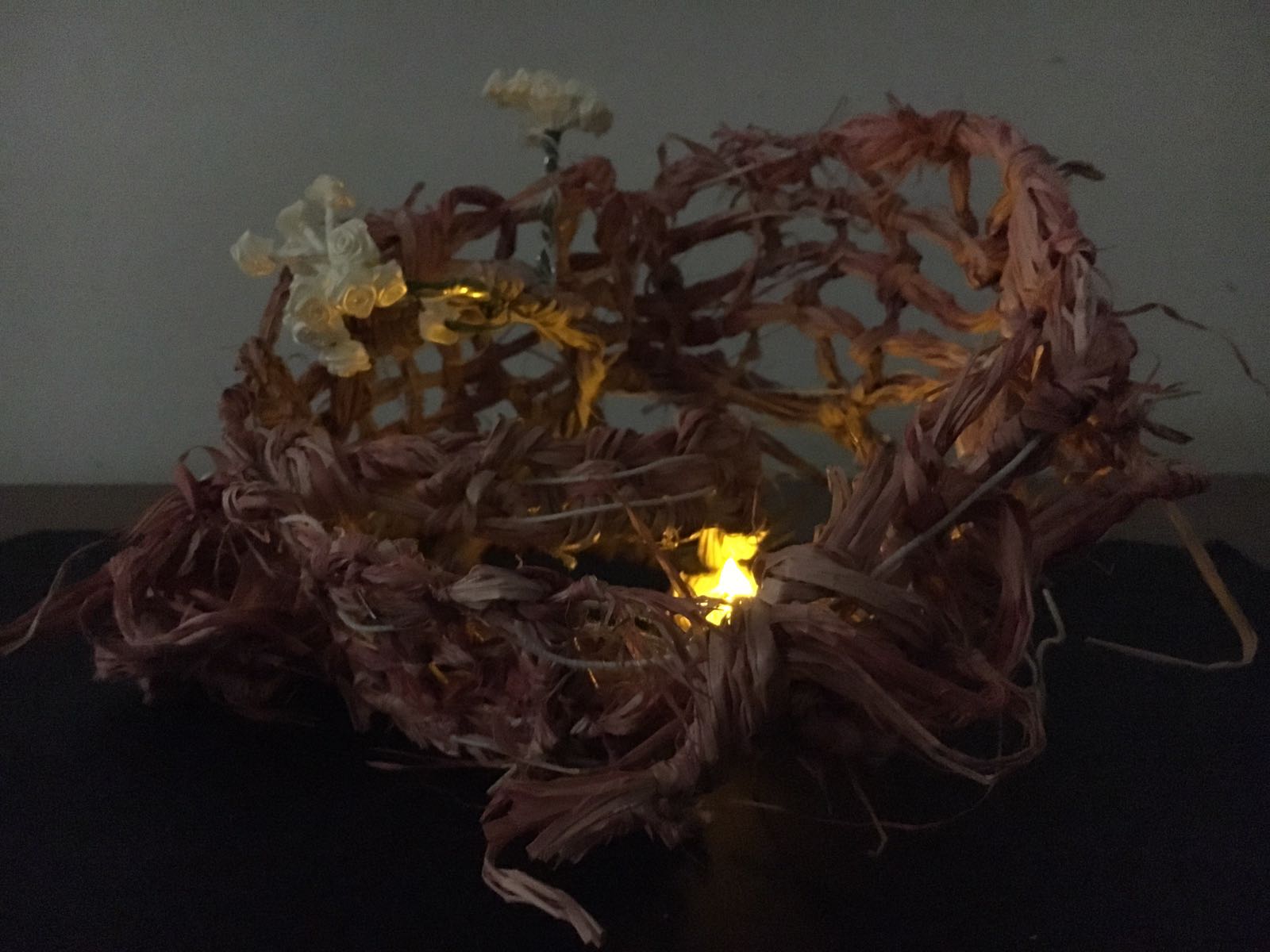
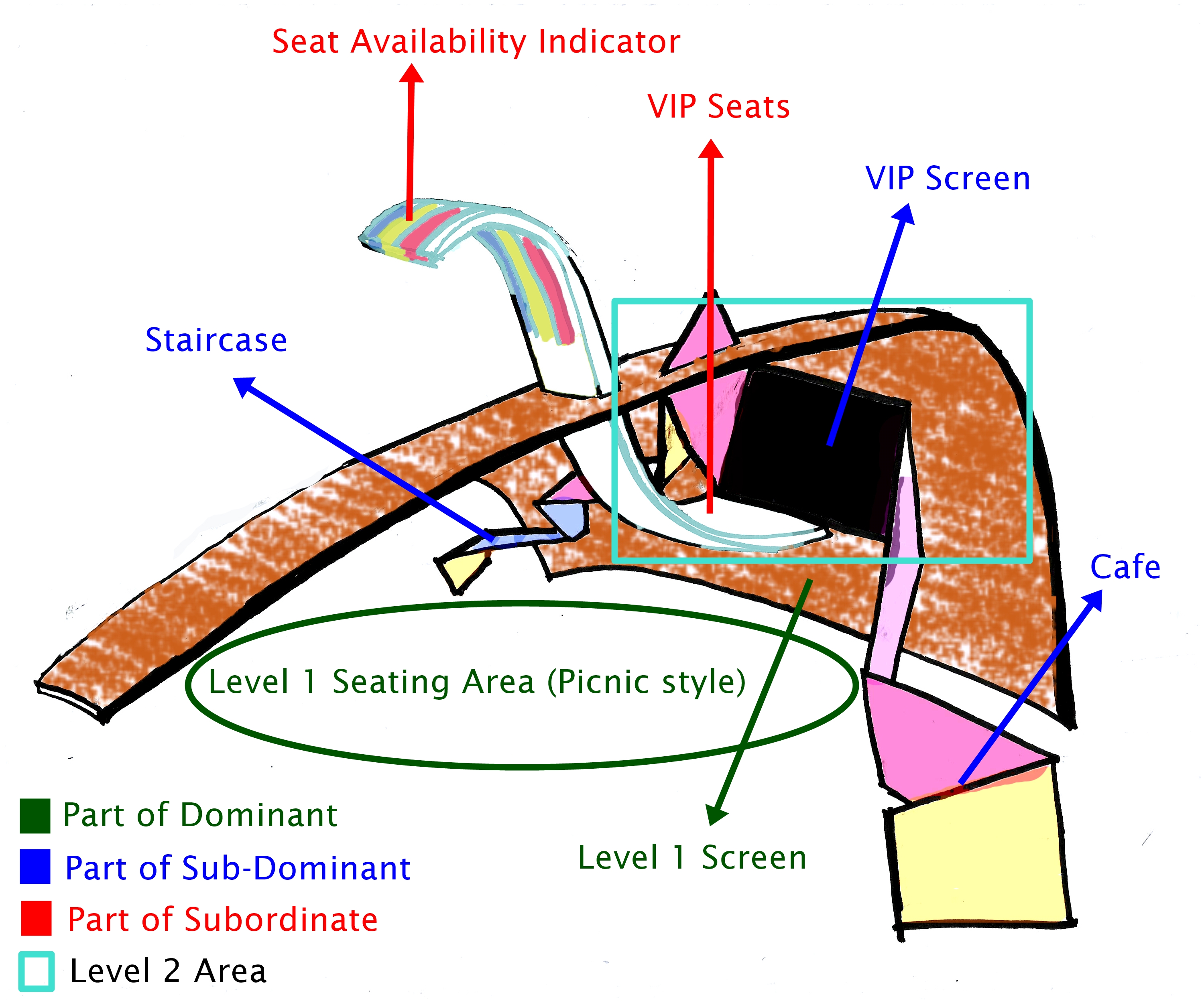
Final Model Application #1: The Seats that Float
The Seats that Float
It is a 2 level night outdoor movie screening exhibition.
The Dominant is used as the main building as well as the screen for level 1. The people who watch in level one is watching in a picnic style (seating on a mat on grass field).
While the Sub-Dominant is for staircase to go to level 2 as well as screen for the VIP Screening at level 2.
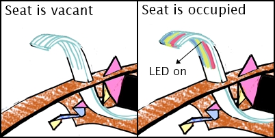
Lastly, the Subordinate has two part. the bottom part is for the VIP seating which is open for everyone but has limited space. The other part is VIP Seat Availability Indicator. Basically the LED light will turn on when the seat in VIP Area is occupied. It is to indicate to people outside whether there is still space in VIP Area.
Seat Availability Indicator
Proposed Materials
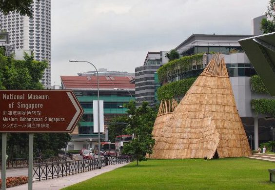
For real application, Dominant is made of straws, inspired by an exhibition at National Museum in 2013.
The Exhibition building that inspires us
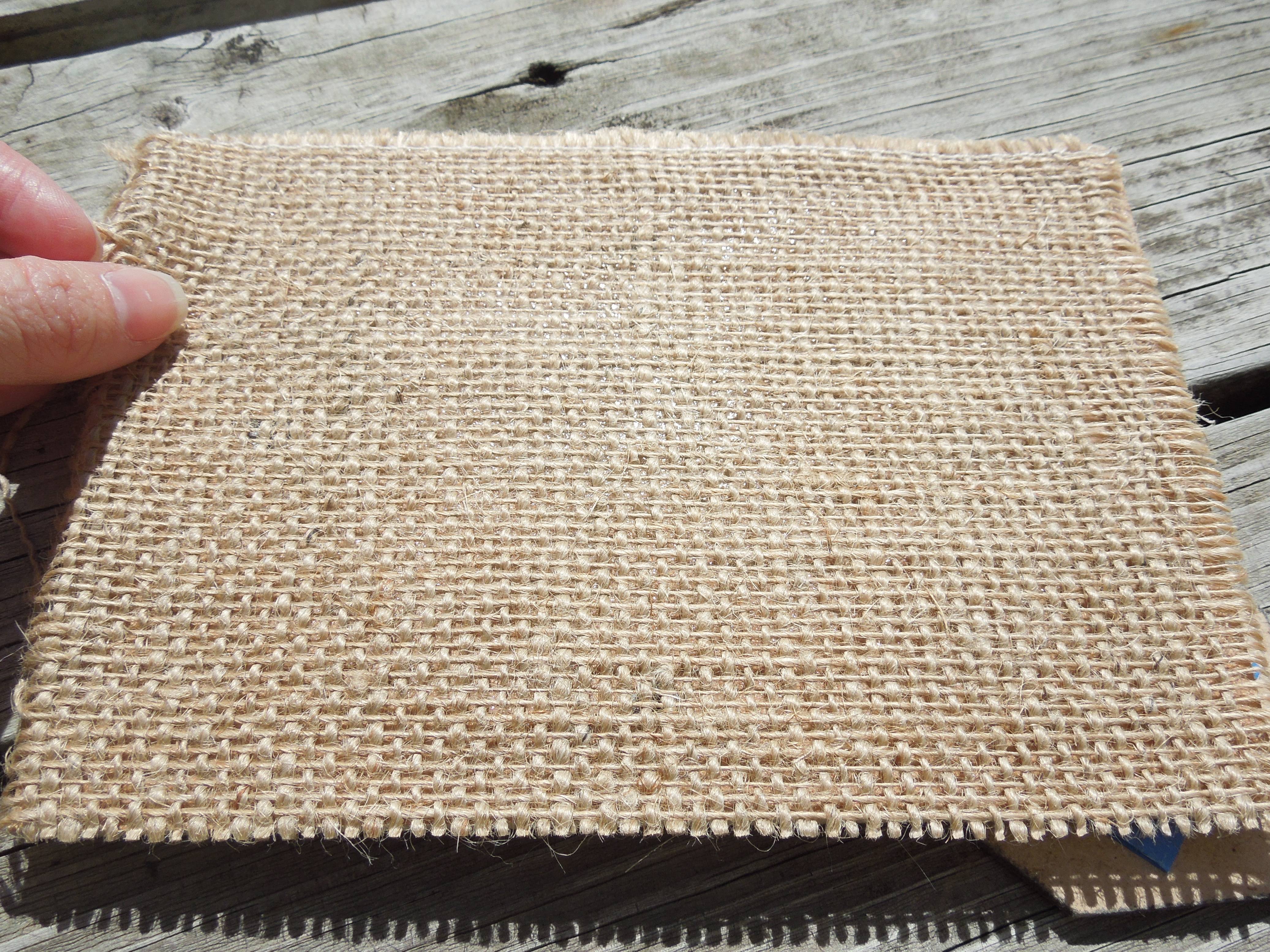
For the model, we are using wire as the skeleton, covered by a piece of burlap.
Burlap
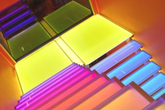
For the Sub-Dominant, the real application is made of glass treads with a multiple colors LED lighting, preferably dark colour.
Glass treads staircase
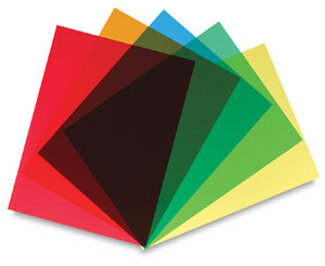
While for the model, we are using colorful acetate papers.
Acetate papers
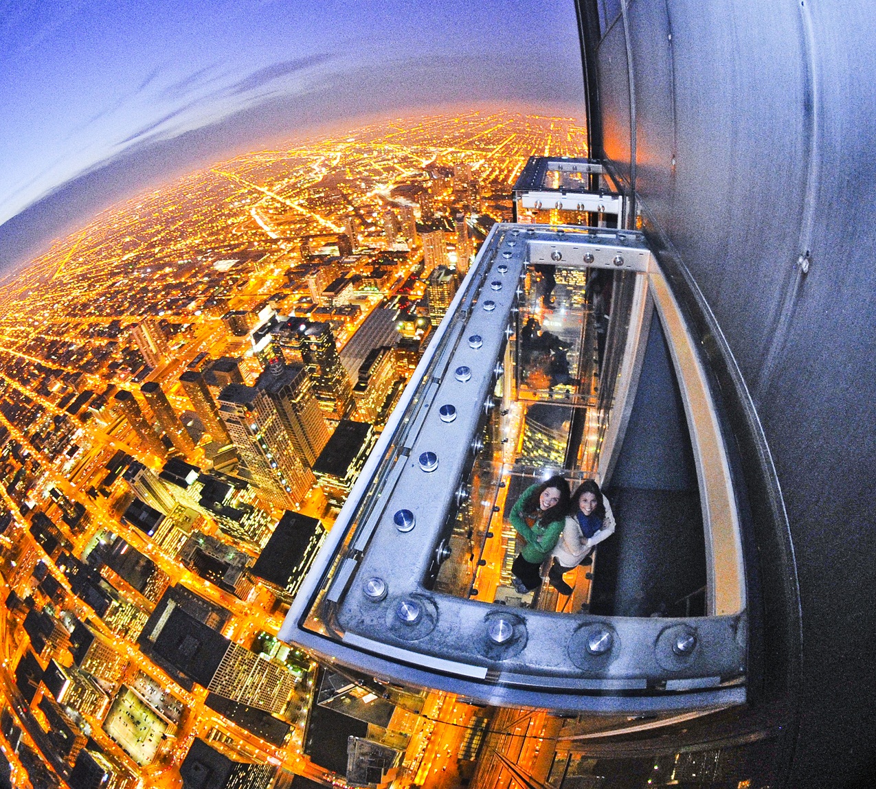
For the Subordinate, the real application is using fully tempered clear glass, like those used for skyscrapers’ skydeck.
The Ledge of Chicago, a skydeck.
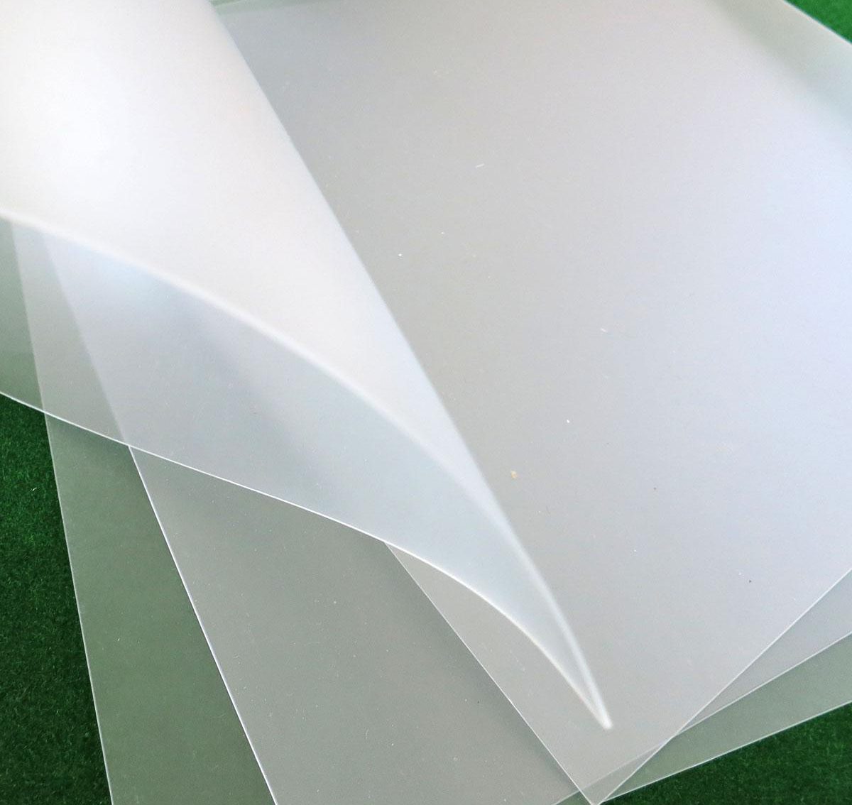
And for the model we are using thick a PVC matte sheet.
PVC Matte Sheets
Thank you! Really appreciate your comment and feedback 😀


