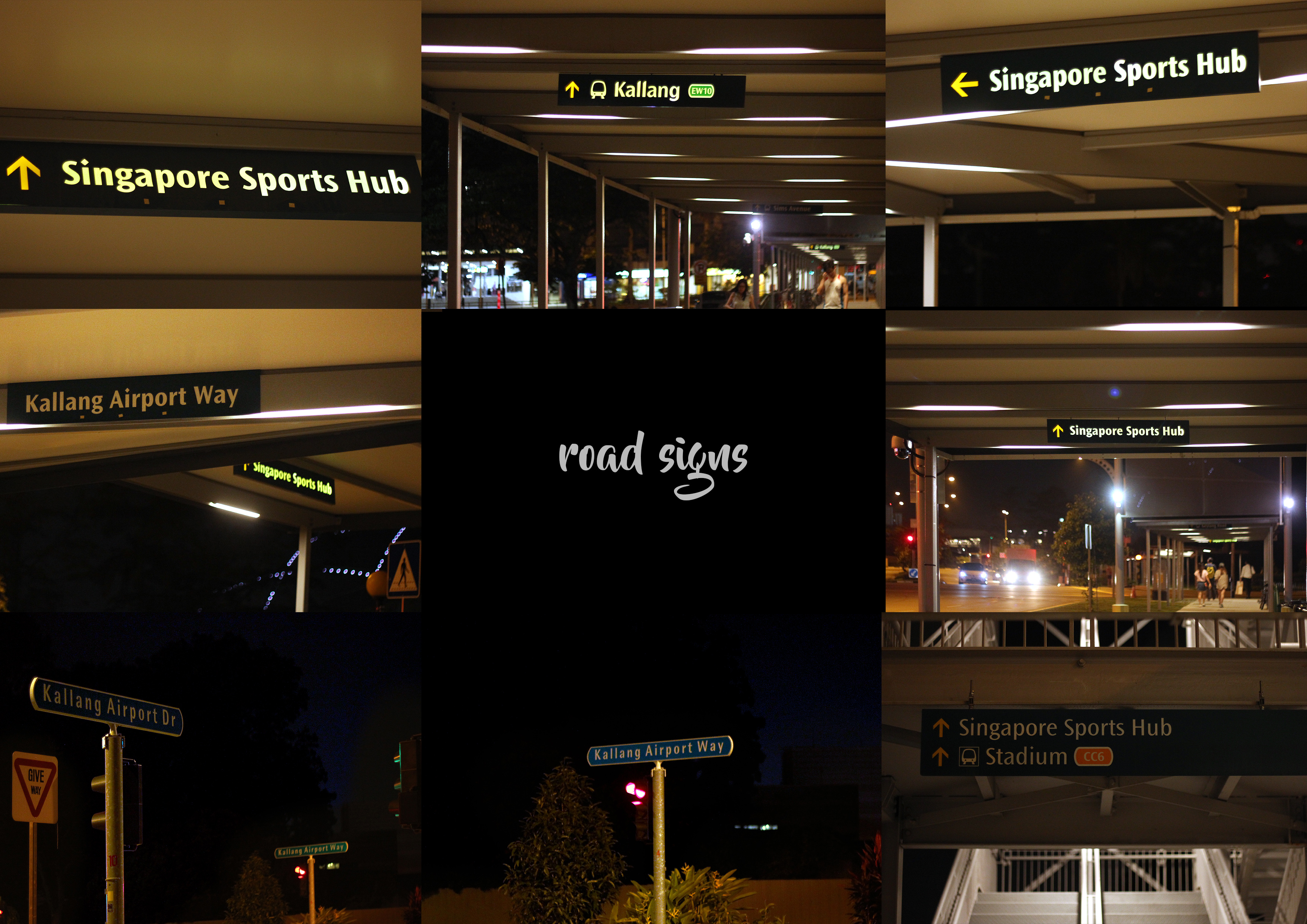
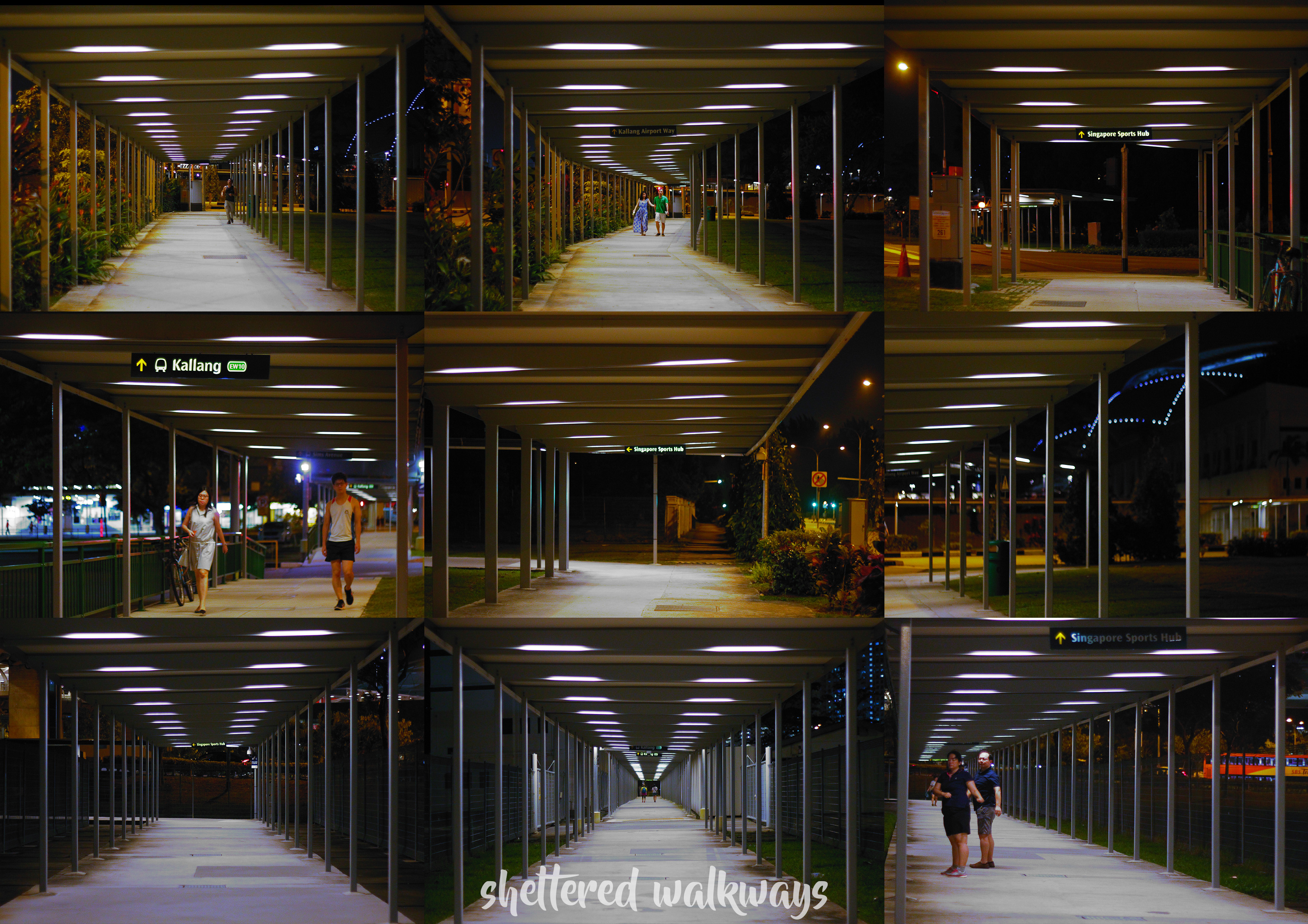
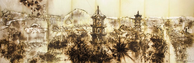
I decided to walk over the sheltered walkway to Singapore Sports Hub (SSH). And ya it was my first time walking there from Kallang MRT. And the way was fully sheltered except when crossing the roads.
On the way, there was some restaurants on the side of the road, and I considered to went there during the day and use ‘food of Kallang’ as one of the research.
The walk continued and all I saw was the sheltered way, not many cars and pedestrians. Just like normal Singapore at night. Significance are the sheltered way and road signs.
The Road SignsOn The WayThe Sheltered Walkways
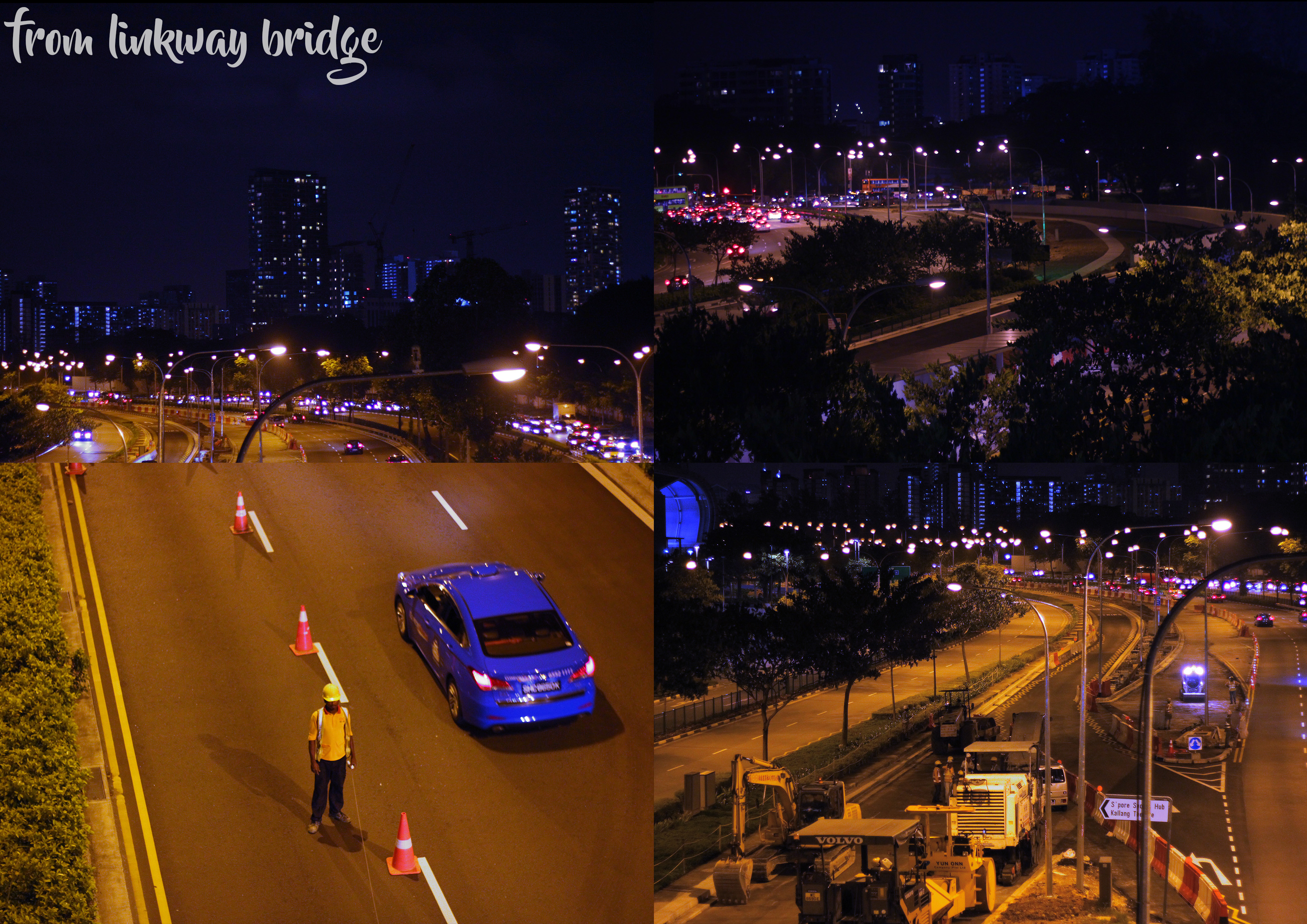
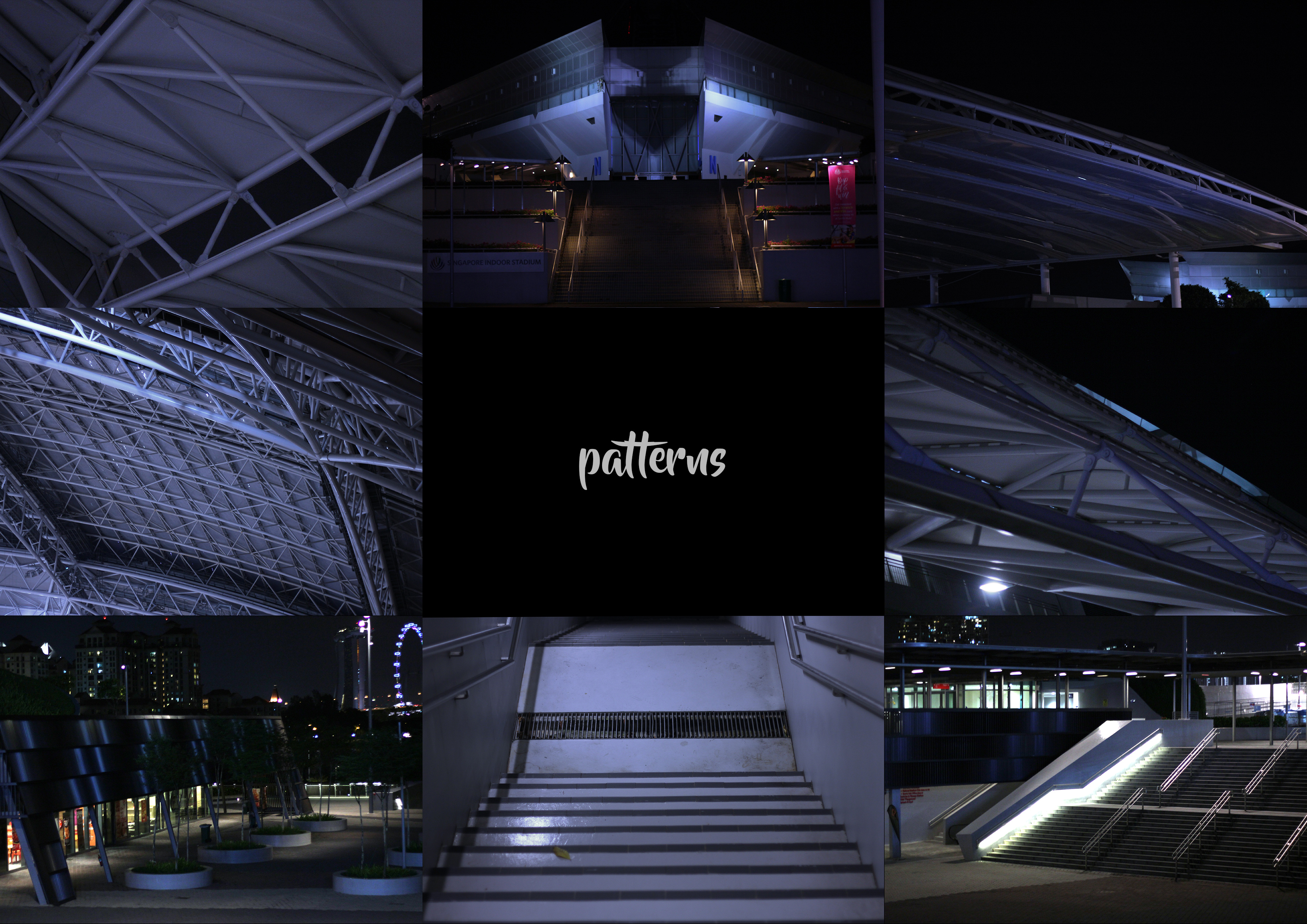
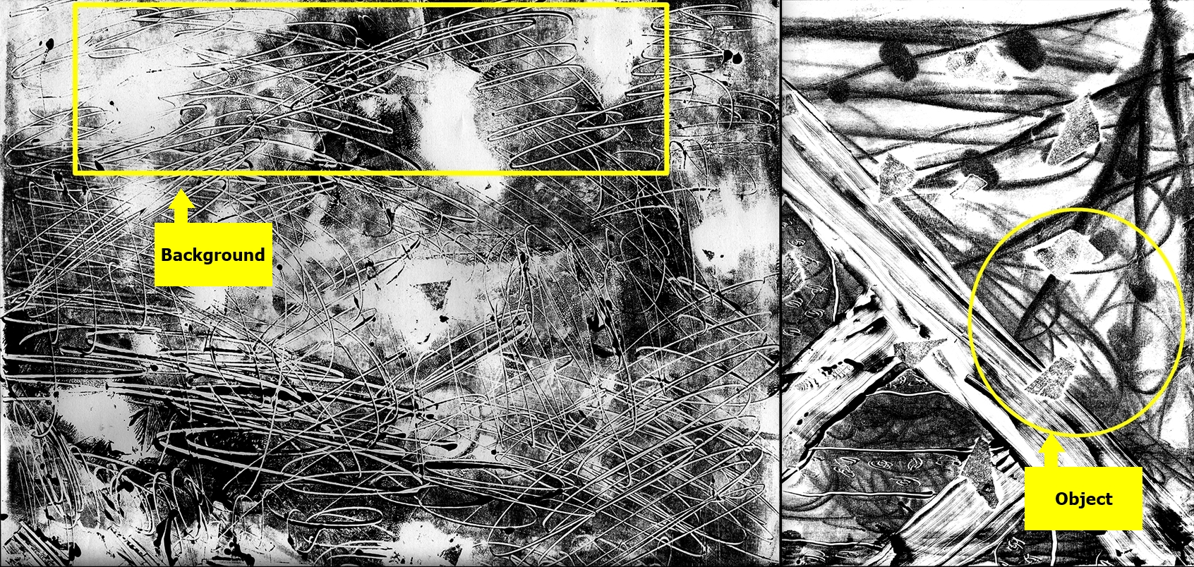
As the sheltered way finally reach Singapore Sports Hub, I reached the link way bridge to the SSH. The bridge has geometrical shapes in its architecture. I ended up taking a lot of pictures of the bridge. I didn’t thought there would be such interesting bridge. I chose the linkway bridge as my main focus. For complete photos, the slides are posted here.
View from The Linkway Bridge
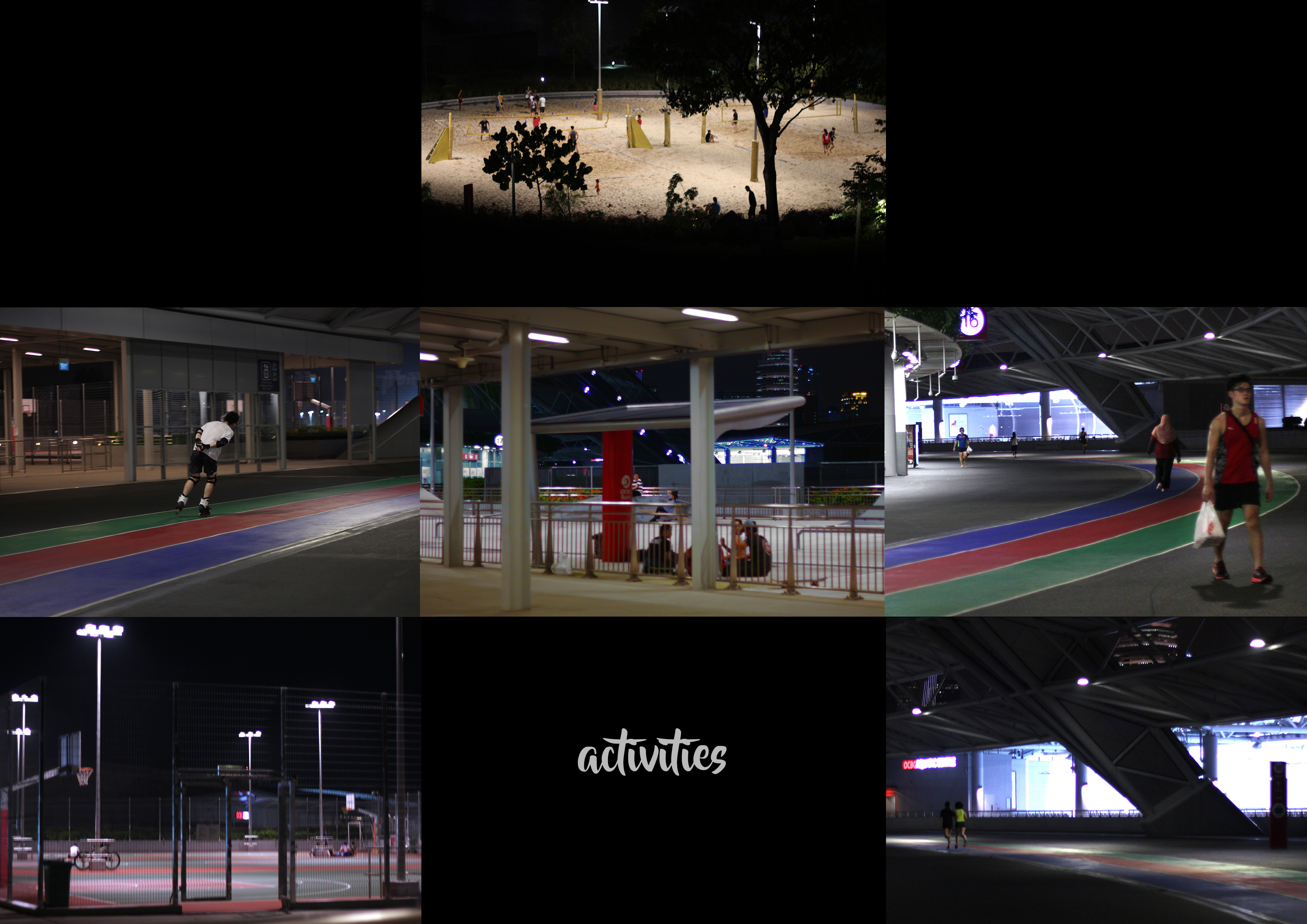
Continuing the journey, I finally reached the SSH. Having not explored the place before, I didn’t know that they would have outdoor field and arena for sports (thought all indoor). As expected, there were groups of people exercising and playing games around. I intended to approach them but they seemed occupied and tired..? So ya, I decided to do the interviews on my next visit when it is not the end of the day.
Some Activities
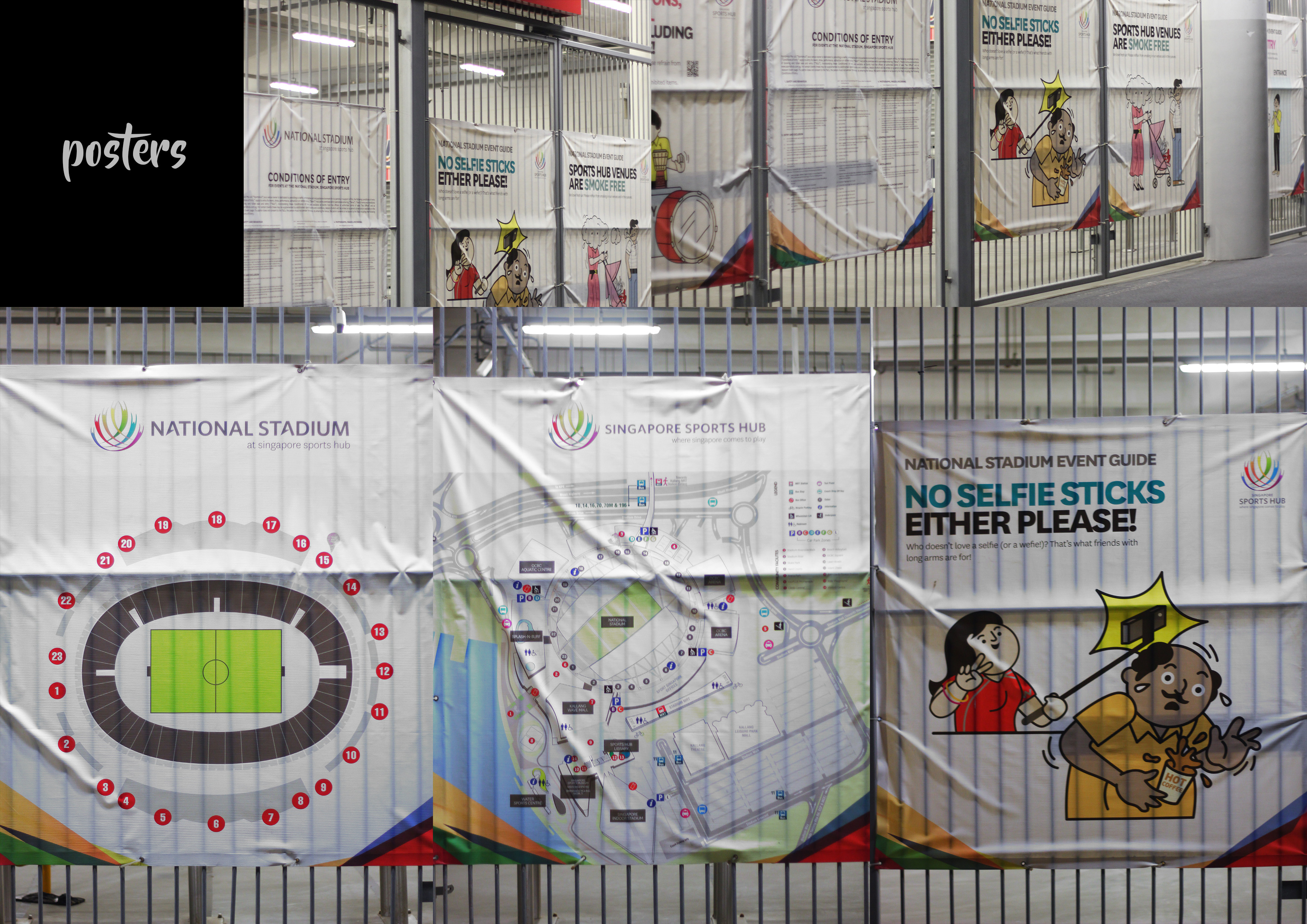
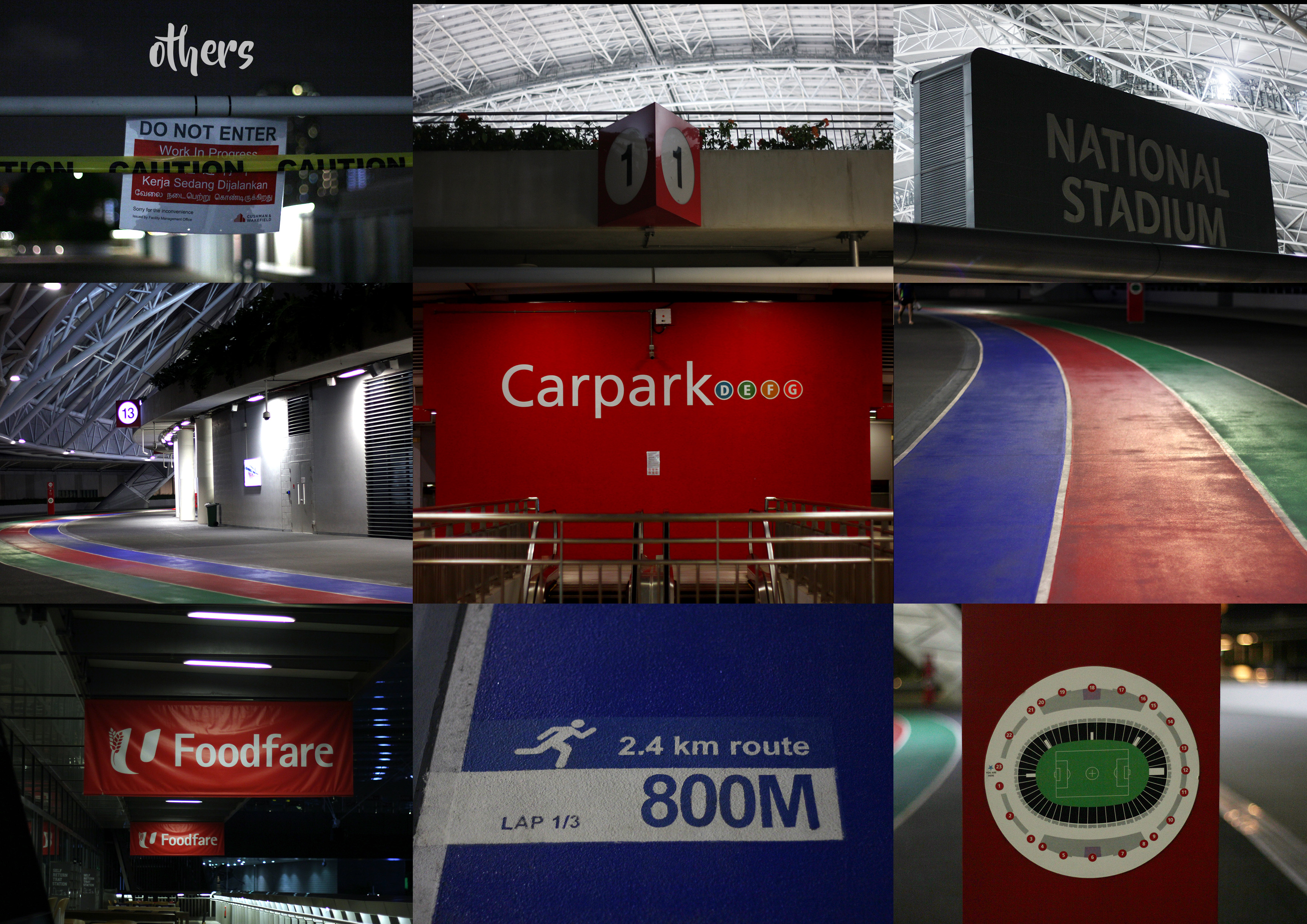
Then I continue to explore the SSH and took some more pictures.
Some PostersOther Interesting DetailsSome Architectural Patterns
Continuing the visit, another interesting and pretty thing I found was the night view of Singapore from the rooftop of SSH 🙂
The Pretty Nightview
Then, I needed to catch the MRT and walked my way to the Stadium MRT. Taking some pictures along the way.
Some Shiny Lights
And apparently even the MRT has a lot of geometrical pattern!
Overall, it was a short yet interesting trip for me. There were some elements that I want to explore more. So far the most interesting part is the architectural pattern of the linkway bridge.
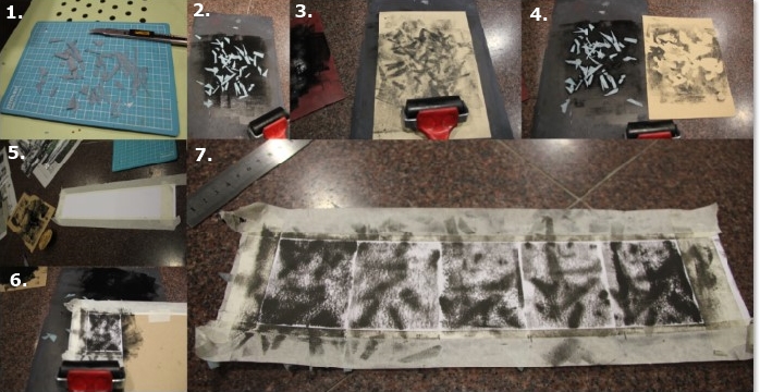
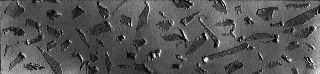
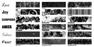
Hi guys! Here is the process of my handmade emo lines!
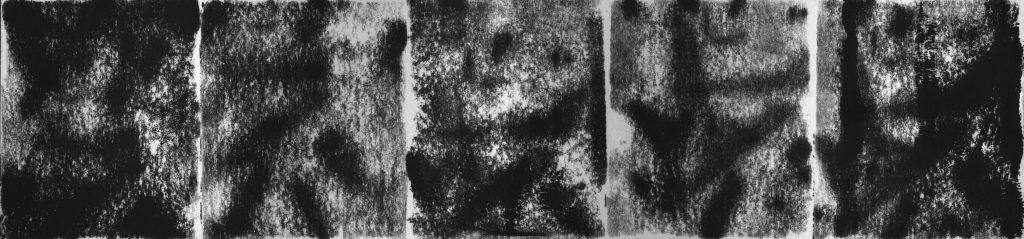
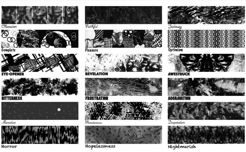
1. LOVE – Obsession
LOVE – ObsessionLOVE – Obsession Process
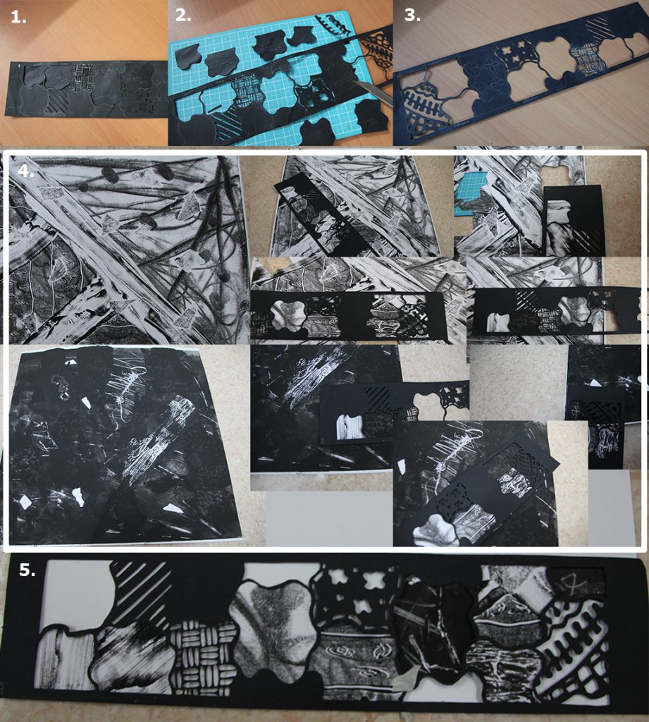
I used pieces of cut foam, put it under the paper and use the roller with thin ink to create the pattern. (image 1-4)
I divided the paper into five parts and roll it with various rolling movement and ink content, e.g. roll the roller vertically/ horizontally/ diagonally with thin ink/ thick ink to get various effect. (image 5-7)
I enhanced the level and brightness as well as contrast of the scanned image.
2. LOVE – Faithful
LOVE – FaithfulLOVE – Faithful Scan
I scratched the black paper to different direction to create the desperate and problematic effect and pasted a red paper behind it to enhance the effect.
I sewed a calm pattern using white thread on the paper.
Made the scanned image black and white, then multiply the sewed pattern to intensify the calmness and faithfulness.
3. LOVE – Jealousy
LOVE – JealousyLOVE – Jealousy Scan
I used a paper with mono-print pattern as the background then brush chinese ink with different pressure and various stroke direction to get the intended effect.
Edit the scanned image to black and white, multiplied it to intensify the jealousy effect.
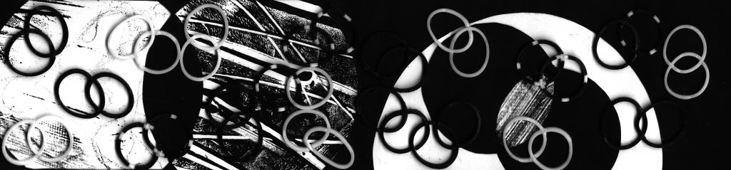
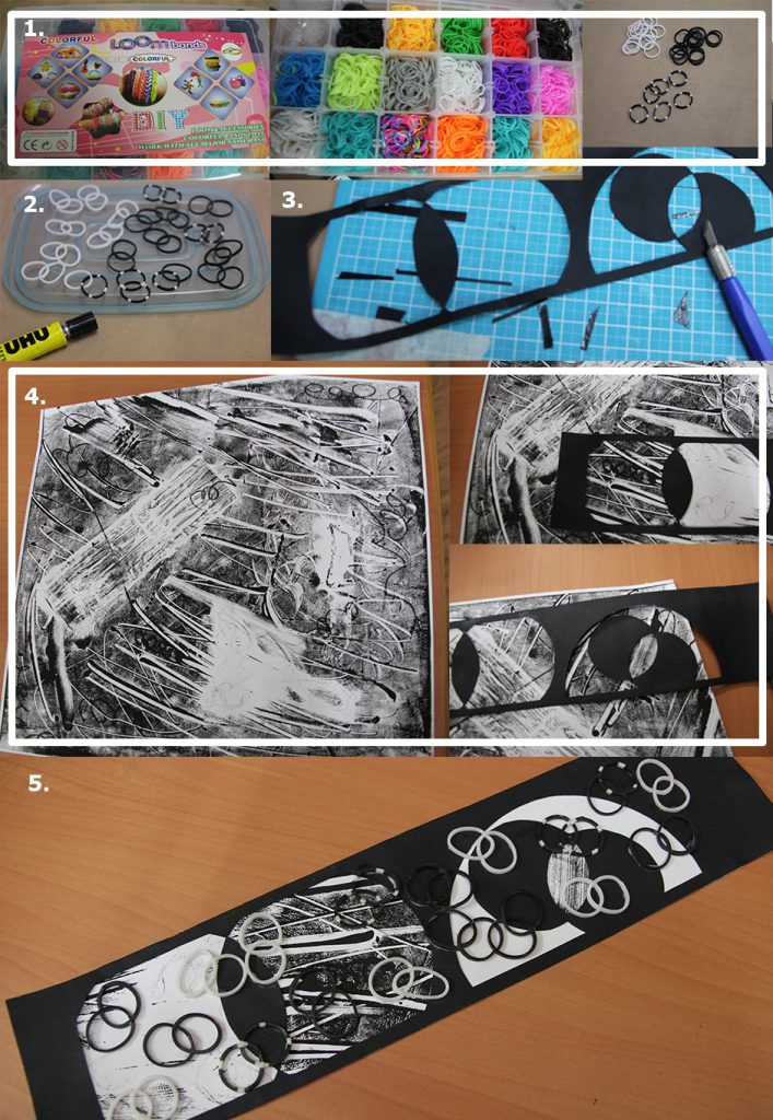
4. JOY – Complete
JOY – CompleteJOY – Complete Process
I took black and white loom bands and paired each 2 of them. (image 1-2)
I pen-knifed a black paper to create the vesica piscis pattern. (image 3)
I match the black paper to find suitable monoprint patterns to be included. (image 4)
I pasted the paired bands and created the final line. (image 5)
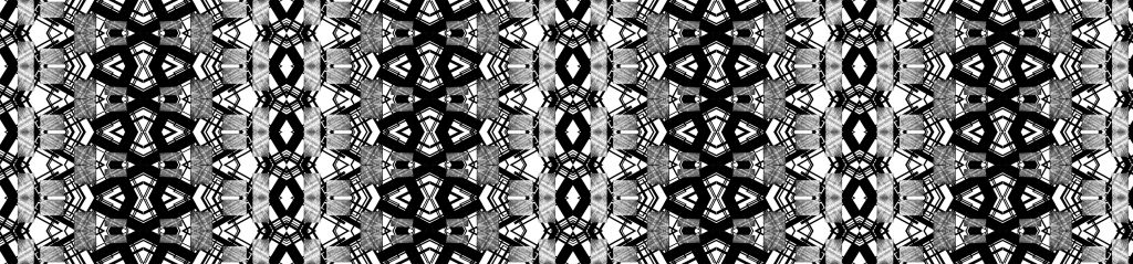
5. JOY – Pleasure
JOY – PleasureJOY – Pleasure Process
I drew the outline pattern of Batik Sekar Jagad and cut it with pen knife. (image 1-3)
I matched it with various monoprint to give individual effect on each part and created the final line. (image 4-5)
6. JOY – Optimism
JOY – Optimism
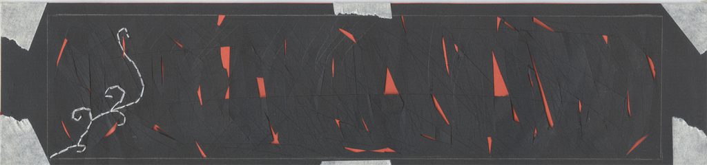
SURPRISE – Eye-Opener
It was made from the image of SUPRISE – Eye-Opener (above), the process will be explained at number 7.
The line was scaled down, multiplied and mirrored to create the pattern and final line of SURPRISE – Optimism.
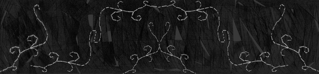
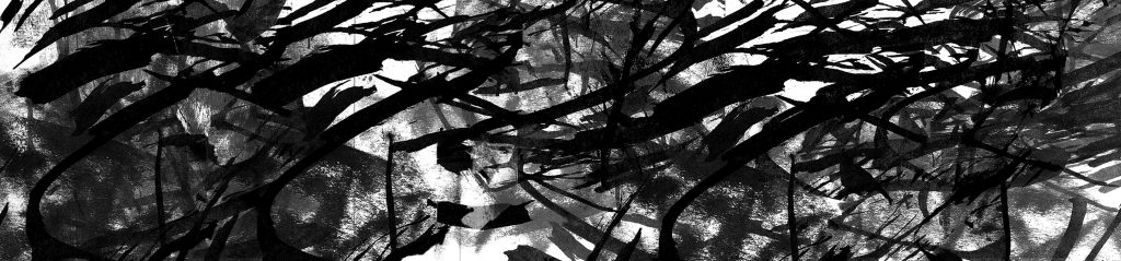
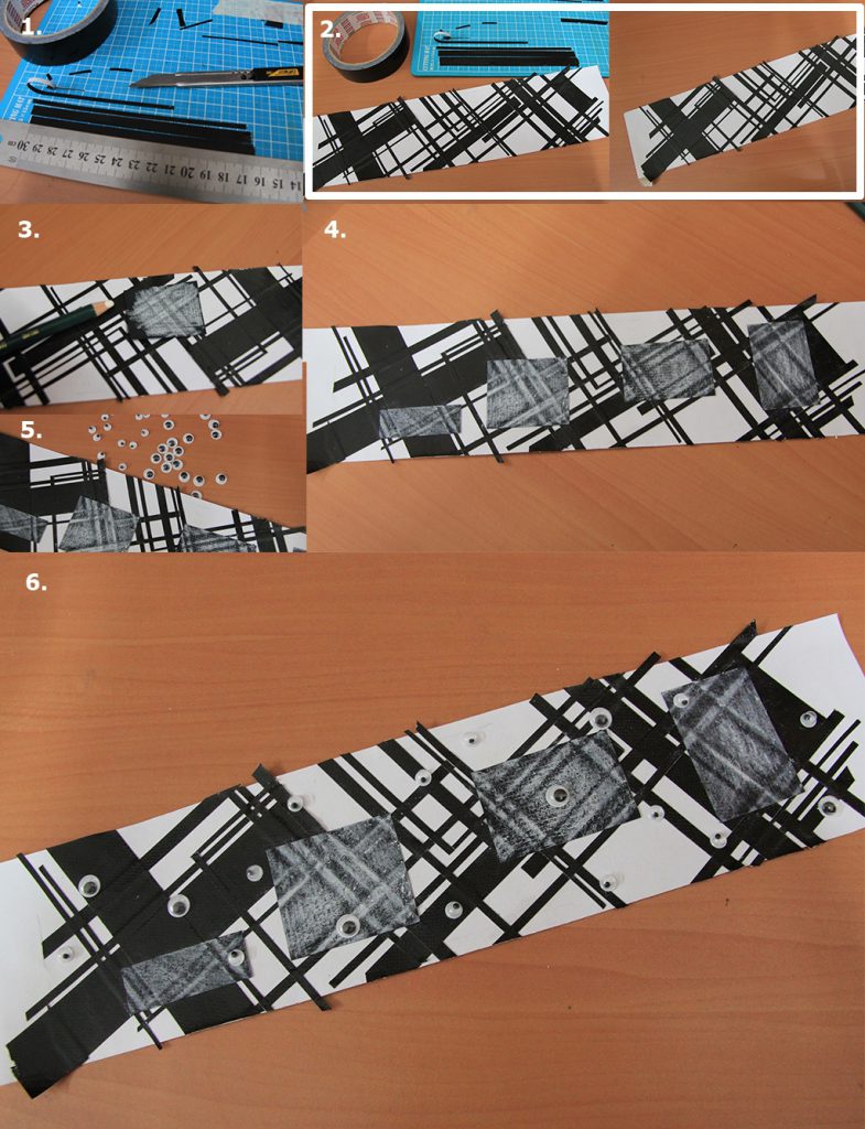
7. SURPRISE – Eye-Opener
SURPRISE – Eye-OpenerSURPRISE – Eye-Opener Process
I cut line with different thickness from black tape and paste them randomly but diagonally. (image 1-2)
I paste black rectangular black paper on top and trace it with white color pencil to create the reverse color effect due to the tape’s thickness. (image 3-4)
I pasted different sizes of plastic eyes on top to finish the final line. (image 5-6)
8. SURPRISE – Revelation
SURPRISE – RevelationFEAR – Hopelessness Scan
I used the same scanned image as for FEAR – Hopelessness (above), the process of making will be explained at number 17.
Then I adjusted the level and brightness to create the intended revelation effect.
I used one for background and one for the main object in the middle.
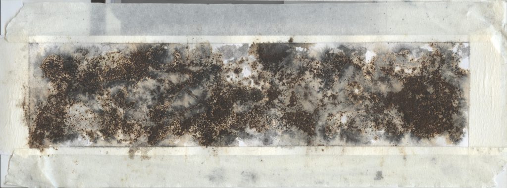
10. ANGER – Bitterness
ANGER – BitternessANGER – Bitterness Process
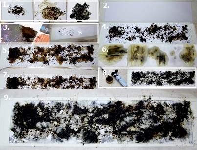
I did some experiment on coffee powder on paper. From left to right, coffee powder on paper, coffee powder on paper with addition of water, coffee powder on paper with addition of black water color paint. Then I tried to put the in microwave with intention to get a black effect, but nothing happened. (image 1)
I prepared the paper and white glue, spread the coffee powder on it. (image 2-4)
I gave some water and dried it with tissue paper as it was too wet.(image 5-7)
Then I added black watercolor paint. (image 8-9)
The scanned image is edited to black and white and adjusted to give more bitterness.
I did monoprint and use pencil at the back of the paper tho create doodles and random lines.
I scanned the part I want and edit the level to adjust the effect.
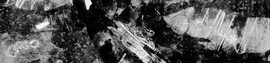
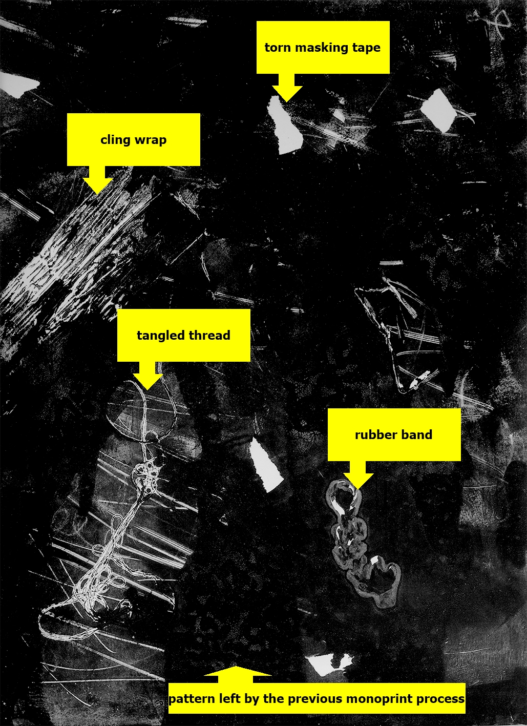
12. ANGER – Aggravation
ANGER – AggravationANGER – Aggravation Scan
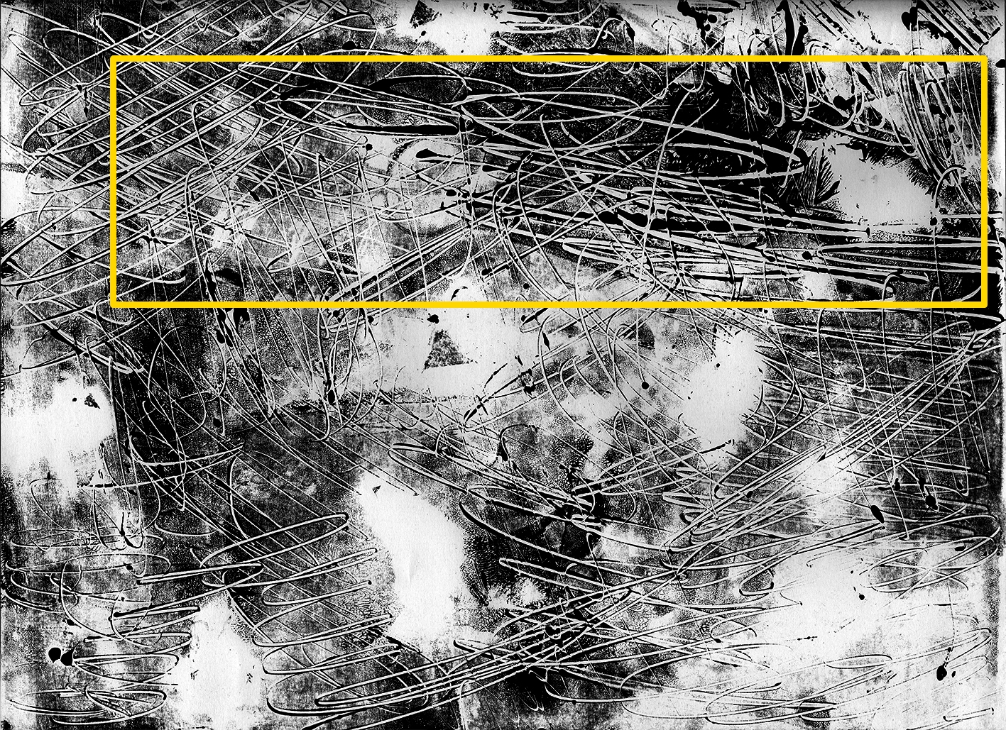
I created the monoprint using masking tape, cling wrap, rubber band, and thread.
I scanned and cut out the desired part to create aggravation.
13. SADNESS – Alienation
SADNESS – AlienationSADNESS – Alienation Process
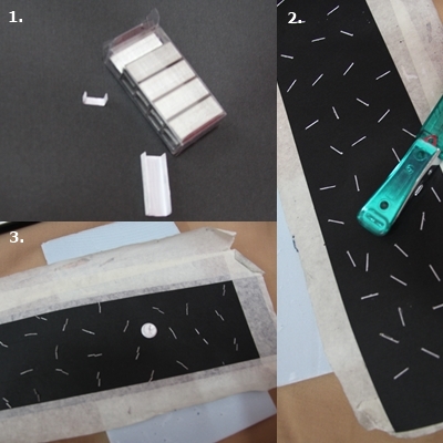
I painted staples (stapler bullet) and thumbtack with white acrylic paint. (image 1)
After put a foam below a black paper, I stapled the staples randomly on the paper and closed the open ends of the staples. (image 2)
I pasted one white thumbtack to give the alienation effect. (image 3)
14. SADNESS – Monotonous
SADNESS – MonotonousSADNESS – Monotonous Process
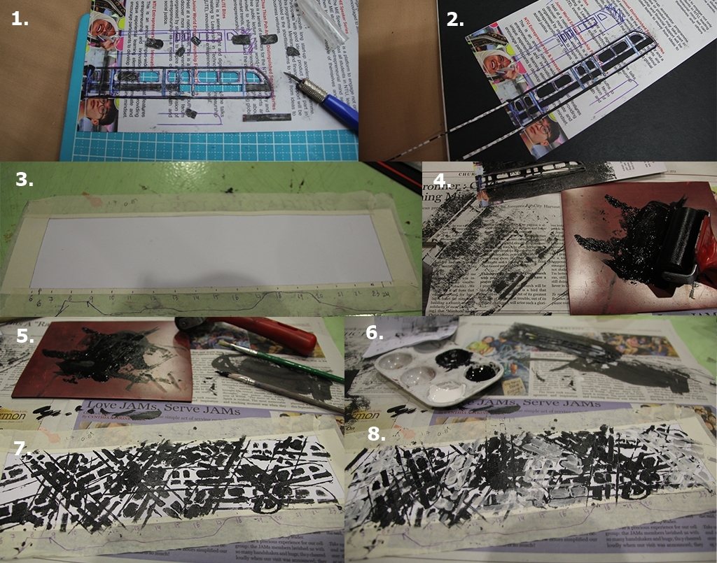
I created a stencil with the shape of a MRT. (image 1-2)
The paper was prepared, I marked the line from 0600 to 2400 with a graph to indicate the peak hour time of MRT. (image 3)
I tried using roller but the result was not as expected due as the stencil line was too thin. (image 4-6)
I decided to use acrylic paint to create the MRT. Black paint indicate the presence of MRT (the darker, the more peak hour) while white paint indicate the absence of MRT ( the lighter, the more non-peak hour). (image 6-8)
15. SADNESS – Despair
SADNESS – DespairSADNESS – Despair Process
I simultaneously tore and cut white felt fabric to create a pieces with many wool coming out of it. (image 1)
I prepared the paper by rolling roller with thin ink to give some light background. (image 2)
Dipping a felt piece to black acrylic and brush it on the paper, I repeated the process until the desired outcome, scanned it and enhance the despair effect. (image 3-5)
16. FEAR – Horror
FEAR – HorrorFEAR – Horror Process
I used hot wire foam cutter on white styrofoam at an non-perpendicular angle to create the melting and horror shape. (image 1)
Using roller and thick ink, I colored the white paper to create the mystery and and uneasy effect. (image 2)
I glued the styrofoam purposely with super glue as the glue will ‘eat’ some part of it, giving uneven thickness of styrofoam, enhancing the effect. (image 3)
After scanned, the level was edited and the final line was created.
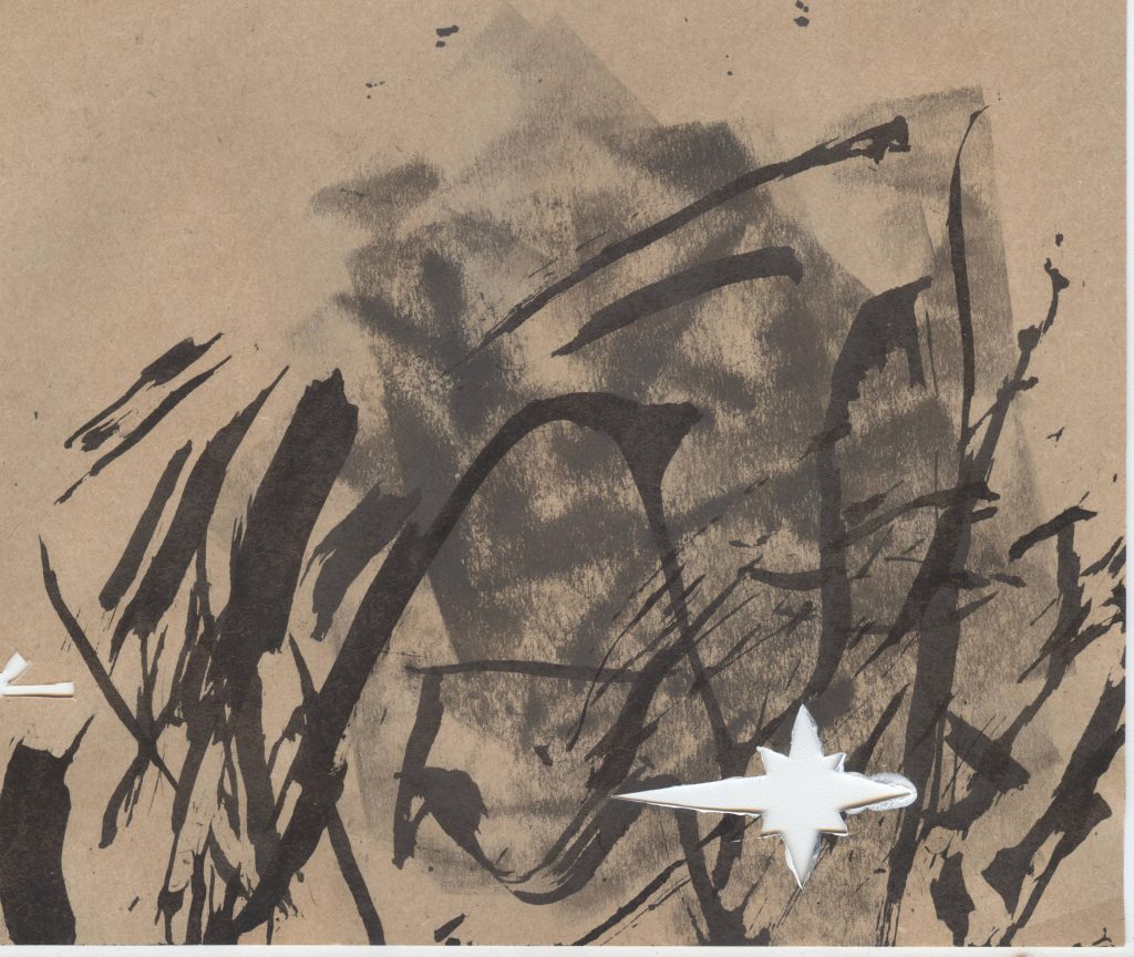
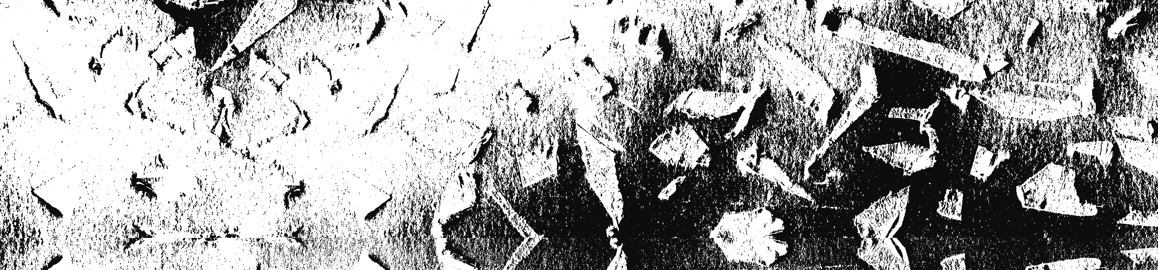
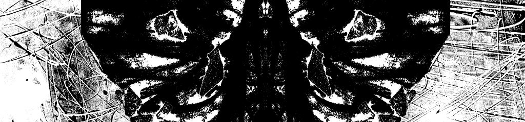
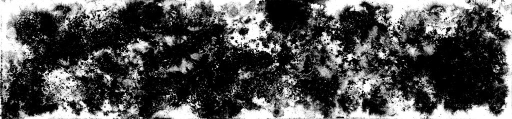
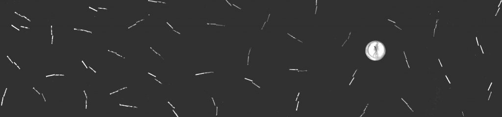
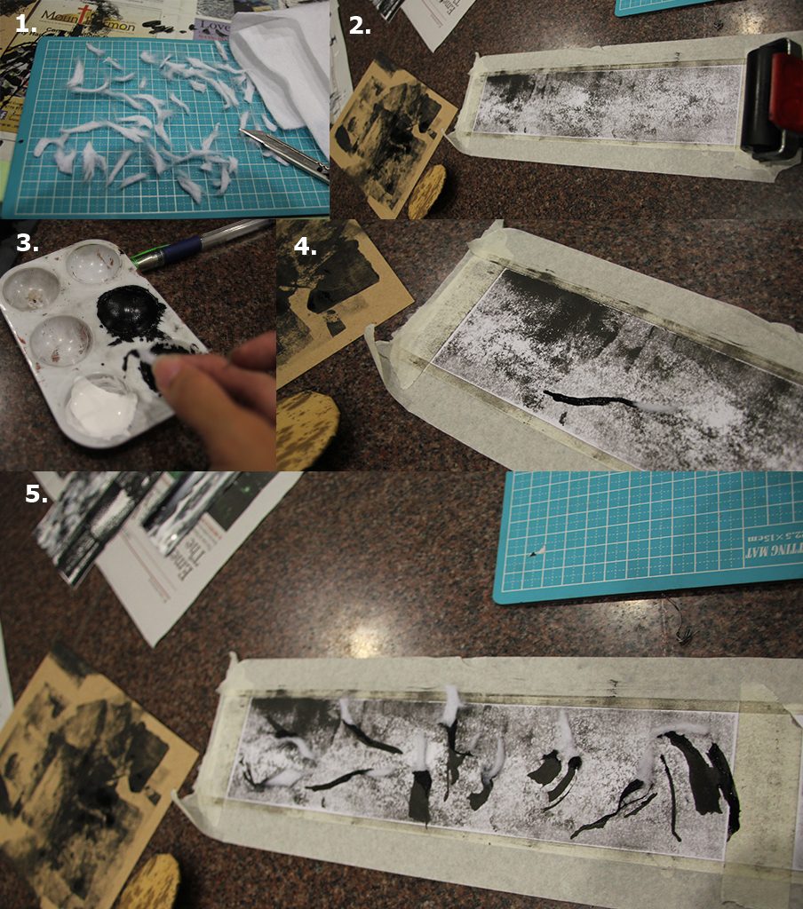
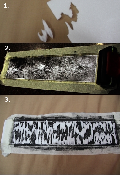
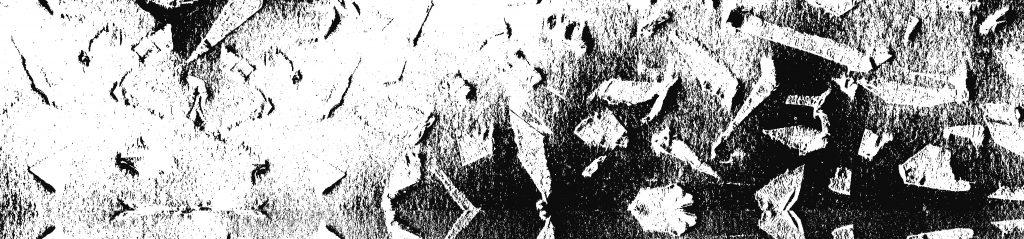
17. FEAR – Hopelessness
FEAR – HopelessnessFEAR – Hopelessness Process
After preparing a white paper, I tore of masking tape to pieces then paste it on a cutting mat. (image 1-2)
Then, I scratch it randomly with penknife. (image 3)
I pasted it randomly on the paper, scanned it and edit the level. (image 4)
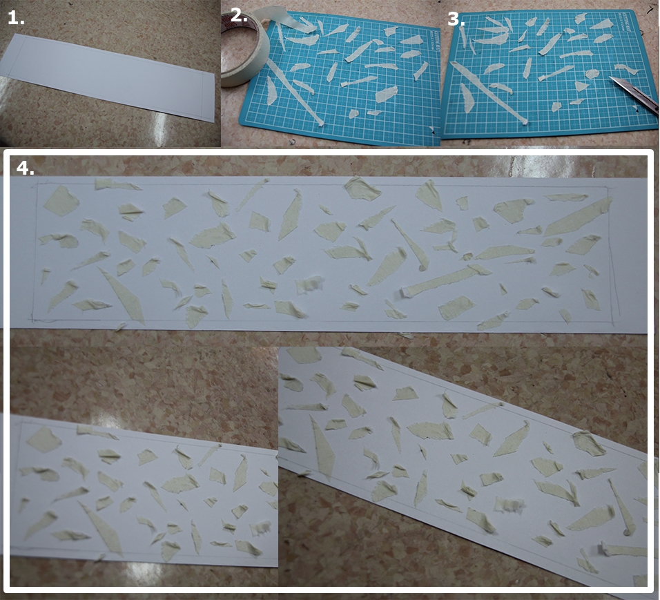
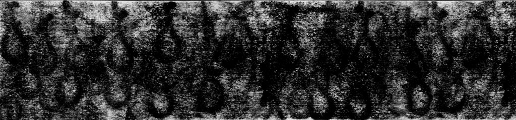
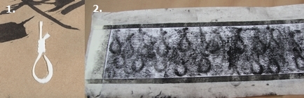
18. FEAR – Nightmarish
FEAR – NightmarishFEAR – Nightmarish Process
I created a piece of hanging rope and cut it out. (image 1)
I put the piece of cut rope under a white paper before rolling it with thin ink roller to capture the texture. I repeated the process until the desire effect. (image 2)
I enhanced the effect by scanning it and adjusted the level.
Thanks for reading! I am making a hard copy for this in order to keep the handmades, will be updating this post soon. Hope you enjoy it 🙂
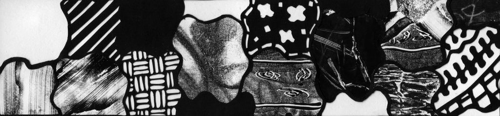
Hi guys! So up there is my final lines for our 2D Project 1 – My Line is Emo 😀
Let’s briefly go through them one by one!
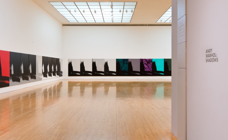
1. LOVE – Obsession
LOVE – Obsession
This line was inspired by Andy Warhol’s Shadows where he painted a single image 102 times with various light and shadow.
Andy Warhol: Shadows
The repetitiveness of the image make me feel his obsession in it.
Hence, my line was made of a single pattern with different direction of roller and ink quantity. However, the shifting of paper cause the material to move around hence there resulted pattern is similar but not the same!
2. LOVE – Faithful
LOVE – Faithful
The background was made of paper being scratched by penknife while the front was white thread being sewed in a pattern. The background resembles the trouble and hardship in a relationship while the white thread represents a pure love that stays composed and faithful at all times.
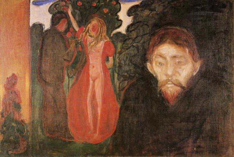
3. LOVE – Jealousy
LOVE – Jealousy
This line was inspired by Edvard Munch painting of Jealousy.
Edvard Munch, Jealousy, 1895
On the painting there is the “dark aura” of the jealous man, hence I try to develop and extend the jealous aura to be the line.
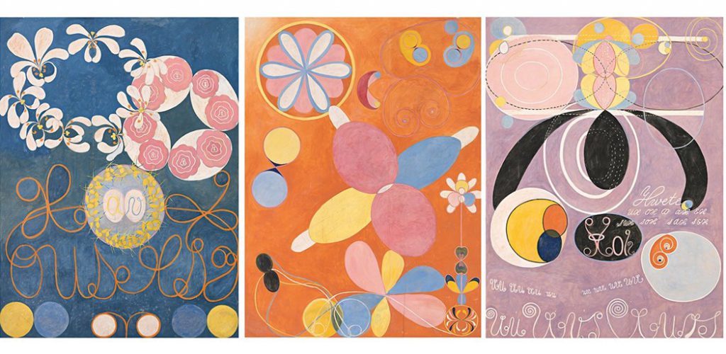
4. JOY – Complete
JOY – Complete
Inspired by Hilma af Klint, an abstract artist who used many symbols in her artwork.
Hilma af Klint, Courtesy of Stiftelsen Hilma af Klints Verk
One of the symbols she used many times was vesica piscis, it is the almond shape arising when two circles overlap and is an ancient symbol for the development towards unity and completion. Focusing on the vesica piscis, the line of complete was created.
5. JOY – Pleasure
JOY – Pleasure
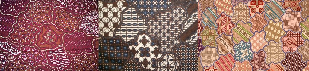
The line was made inspired by Indonesian famous batik motif of Sekar Jagad, the word “Sekar” means flower while “Jagad” means the universe.
Batik Sekar Jagad
This motif contains the meaning of beauty so that others would be fascinated to see. Taking the definition of beauty which is “the quality or aggregate of qualities in a person or thing that gives pleasure to the senses or pleasurably exalts the mind or spirit”, I decided to choose pleasure as the emotion.
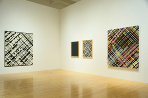
6. JOY – Optimism
JOY – Optimism
The line pattern looks like rays of light coming in from tall windows. Resembling that there are light and hope out there, giving the message that there is always good side in everything and to be optimistic at all times.
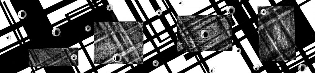
Ed Moses, A Retrospective of the Paintings and Drawings 1951 – 1996
It was explained in the exhibition advisory that the grid pattern was associated with logic and order. As such, I am adding the opposite colour rectangle shaded with white pencils and craft eyes. These addition were meant to break the ‘order’ and give unexpected enlightenment, eye-opener!
8. SURPRISE – Revelation
SURPRISE – Revelation
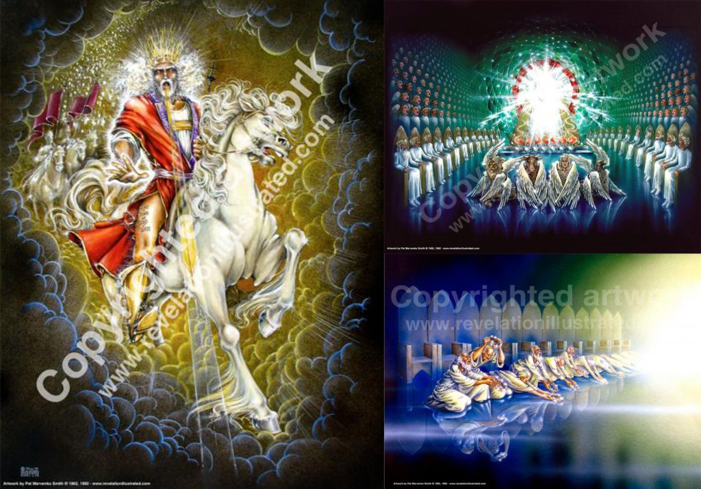
Revelation means “an act of revealing or communicating divine truth or something that is revealed by God to humans”. Inspired by “Revelation Illustrated” artworks, a series of paintings through the scripture message in the Book of Revelation of the Bible.
Revelation Illustrated Paintings
Most of the paintings is identified by the one source of light (represents God) in a darker surrounding of different situations, making the God shining and be the centre of attention. Using such concept, my line is showing one source of light on the left side while the other parts are darker. It resembles God (the light) who is shining (revealing truth) among the darkness, a revelation.
9. SURPRISE – Awestruck
SURPRISE – Awestruck
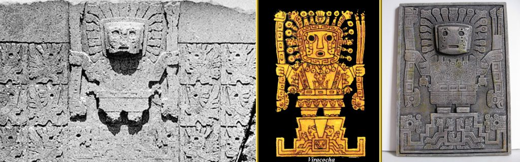
The focus on this line is the back pattern that can be seen as a face at a glance. The intense look and stiff face reminded me to Viracocha, a supreme god in the Incan mythology.
The Incan God of Viracocha
Also known as Huiracocha, Wiraqoca and Wiro Qocha, he was considered the creator god who formed the earth, heavens, sun, moon and all living beings. As such, the emotion is awestruck.
However there was no visible changes hence I decided to add black watercolour paint to give a darker shade of colour (like explosion). Because of the pattern and coffee powder used, the emotion is bitterness.
11. ANGER – Frustration
ANGER – Frustration
The deep scratch done during the mono print process was to represent the feeling of being frustrated. The lines made is unorganised, random and very messy. It shows inability to do things clearly and disappointment of unsuccessful work, frustration.
12. ANGER – Aggravation
ANGER – Aggravation
The line has many different elements which represents many things happening at once while the time is limited. It gives the feeling of urgency to do them, together with exasperation. And as the feeling is getting worse, it became aggravation.
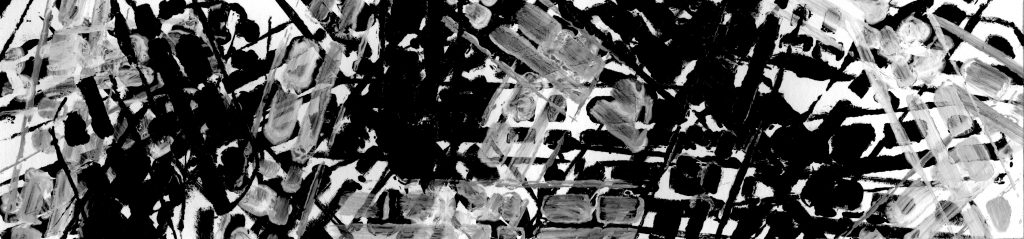
13. SADNESS – Alienation
SADNESS – Alienation
The one and only thumbtack between tens of staples on the paper represents the loneliness of the tack. Also, the contrasting shape different between circular wide thumbtack perfectly contrasts the small straight shape of staples shows the differences that may cause the feeling of not belong, alienation.
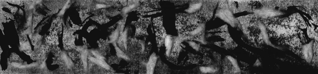
14. SADNESS – Monotonous
SADNESS – Monotonous
The line was made of a MRT Stencil. It was arranged from left to right to be time from 6 am to 12 am. The black colour represent the presence of MRT while the white means the absent of MRT. Using the time of peak hour and off-peak hour in Singapore, the darker the area the more crowded the MRT is (peak hour), vice versa. Since travelling is a daily routine for commuter, some may see it as something mundane and monotonous.
15. SADNESS – Despair
SADNESS – Despair
Pieces of white fabrics were dipped into black paint then used to etch a line on the paper before being pasted. The white fabric represents innocent and pure human while the black paint represents dark and deep problem in life which tinted the pure self while the etch shows the scar that those problems left behind. On the line, the pasted fabrics are means that the problems in life is not ending yet and the high quantity of it showing one’s despair.
16. FEAR – Horror
FEAR – Horror
The pattern can be easily relate to horror and eerie feelings. It looks like the common representation of haunted places and dark caves. It can also be related to blood pouring down, giving the terror and alarm feeling, hence horror.
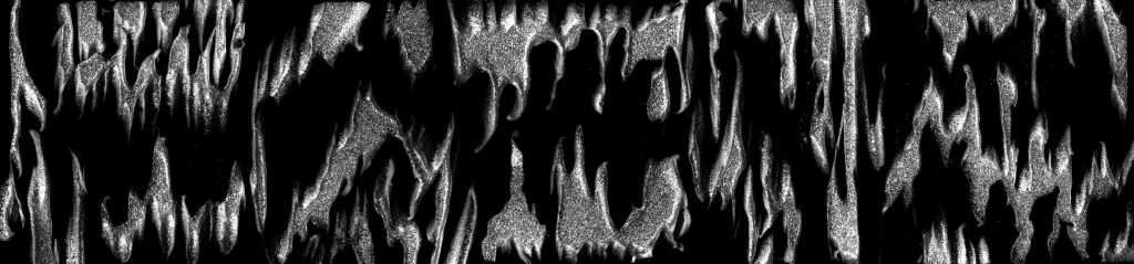
17. FEAR – Hopelessness
FEAR – Hopelessness
The pattern looks like scattered glass pieces. It resembles loneliness and the break of a life. It also can easily be related common movie scene in which the character is so stressed that they break the mirror, showing the depth of there depression. And many times, such scene ends with the character attempting suicide as they are really portrayed to be hopeless.
18. FEAR – Nightmarish
FEAR – Nightmarish
The line consists of many suicide hanging rope, being put as one like it was an arena to suicide. In a way, it represents hell where many deaths presence, as well as the existence of ghost and supernatural creatures. We stereotype them as bad and hence giving us negative feelings and emotions, not forgetting terrible nightmare!
So, those are my final lines! Will be posting the process soon, hope you enjoy it 🙂