I am one with the force, and the force is with me. That is a memorable quote from the latest Star Wars movie, Rogue One, and it’s about what went through my mind when I worked on my next typography, which clearly is something fictional, yet rather cool to be if it could be a reality.
There’s tons of cool Star Wars typography, even in merchandise. Here’s a Star Wars pendant:

Here’s one that I really like:
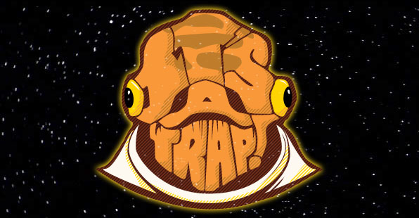
The title of the work is “Ackbarpography” and it was created by artist Carl Mitchell, a designer and illustrator. What I found cool was that the words in the typography is a memorable quote said by this character in the movies, and has a little bit of comedic value to people who have watched the movie and recognize this character/quote. I’ve looked at ton of Star Wars typography while working on my own design because it is interesting, though most of them do not fit what I am looking for.
(too many to list them all here)
But enough of that, back to the assignment!
I started off by looking up on how space looks like in Star Wars. Unlike the colorful space photos provided by NASA, which shows the Milky Way, or some distant colourful galaxy or nebula, space in Star Wars is very simple and classic. It’s just stars shining on empty space. It’s very clean.
So I followed this simple design and chose it as the background for my typography.
![]()
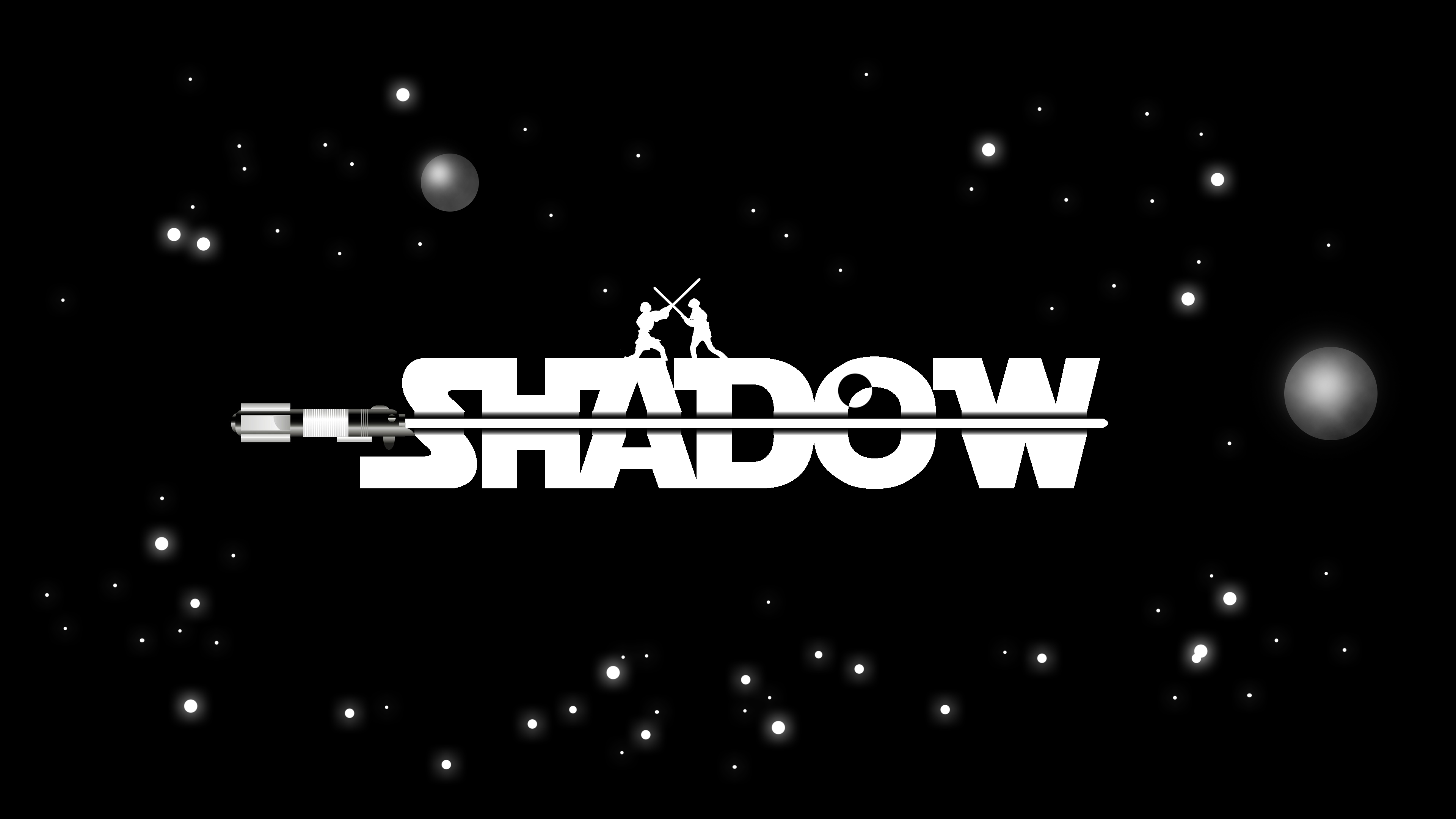
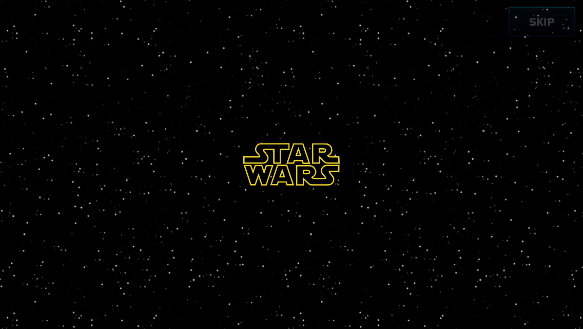
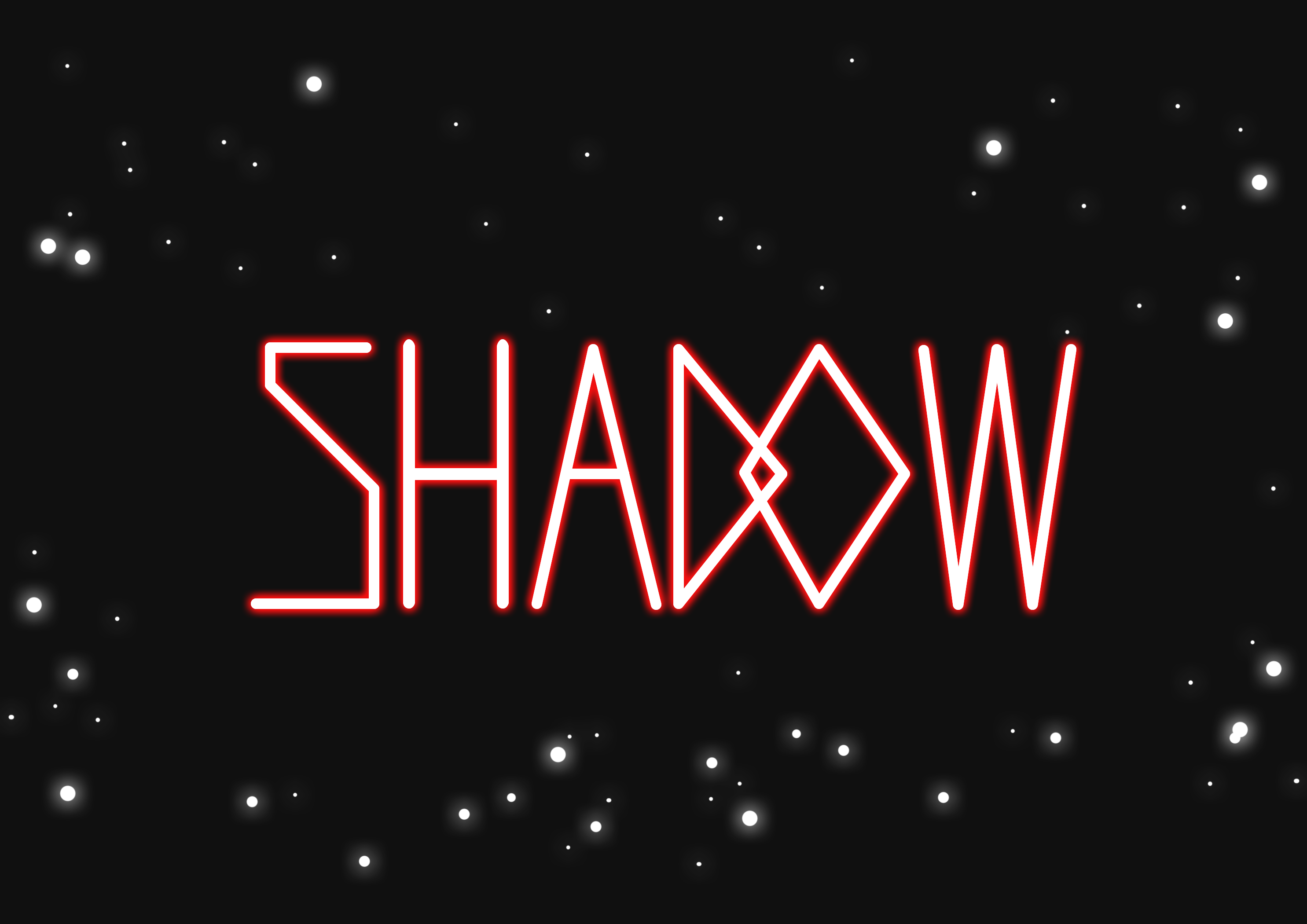
The very first Star Wars movie is a very classic movie with a very simple story, and I wanted my design to convey that simplicity and classic style too. So I then emulated the font used by the Star Wars logo, which you can see above, to produce this:
 I used negative space to imply the beam of the lightsaber, cutting through the words, and added the silhouettes of Anakin and Obi-wan Kenobi fighting each other on the top. Both characters are (or were) Jedi, and their lightsabers clashing convey the occupation perfectly.
The idea of Jedi is that at the bottomline, they are powerful warriors who use swords. However, apart from the silhouettes of the two Jedi, this design did not seem to communicate the idea of “warriors” very well as the main focus is on the typography.
So I began working on another design. The trademark of Jedi is their laser swords, also known as lightsabers. It is something easily recognizable, and it conveys the idea of Jedi being fighters/warriors very well.
I did a simply draft, using just the lightsaber beams. It looked a little bit too plain, and I wanted to give the idea of them being fighters. In Star Wars, there are Jedi and Sith, the good and bad guys respectively. They use different coloured lightsabers, so I decided to add colours to denote that there are two sides – the bad guys (represented by red lightsabers) and the good guys, represented by green and blue.
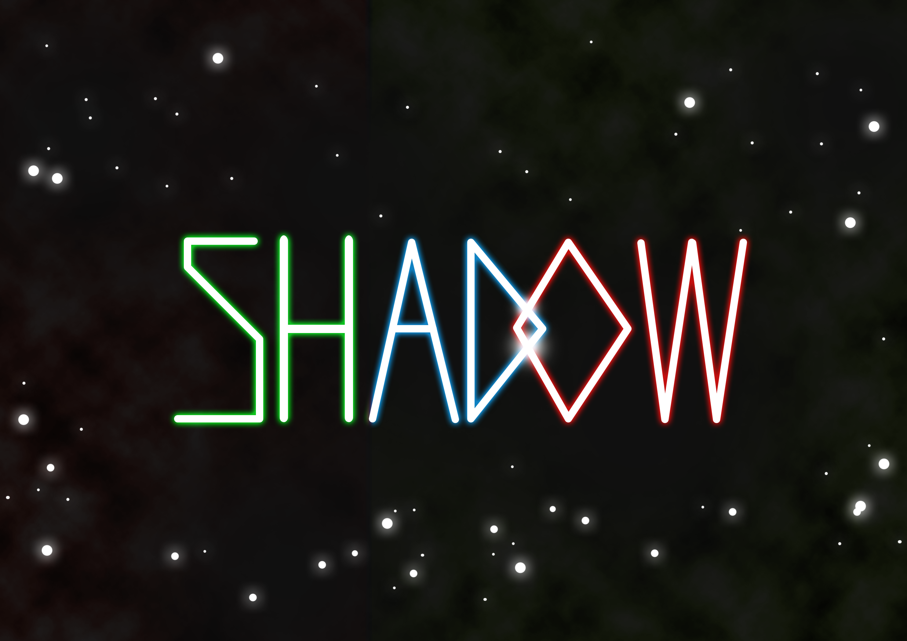
The idea is to make the lightsabers of different colours clash with each other. Now it was time to add the lightsaber hilts.
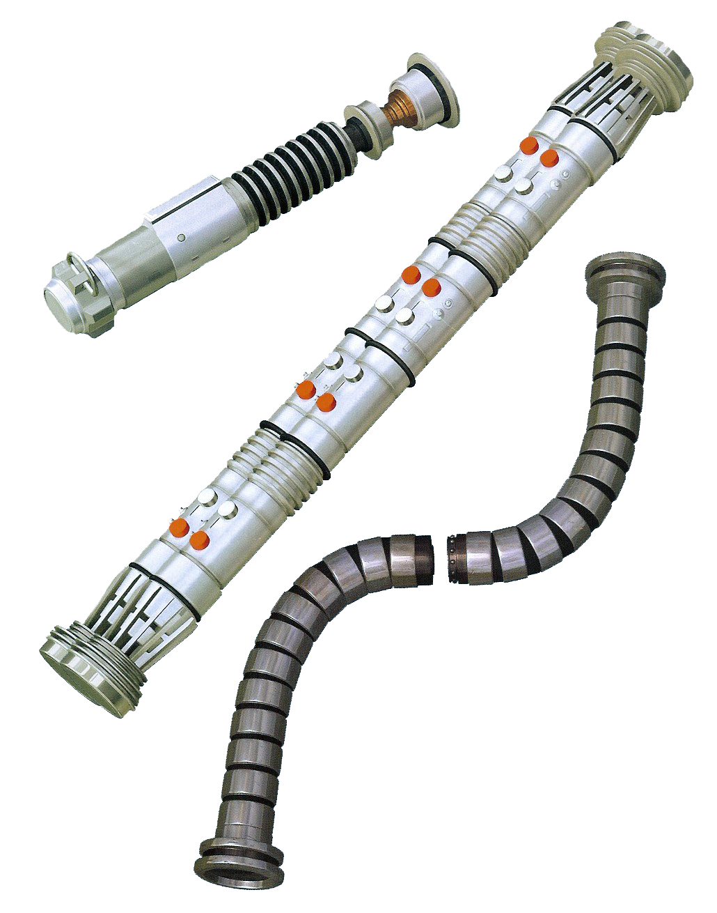
Most people recognize the simple, single beam lightsaber, but there are actually different lightsaber types (S-shape, C-shape, T-shape) that can be combined to produce the typography I want. Of course, being a Star Wars fan, I already knew that there were different shaped lightsabers, but I still went on and researched about the different lightsaber types anyway, so that I can produce interesting typography with it.
By combining the different lightsaber hilts and beams, I can produce a believable typeface made of lightsabers.
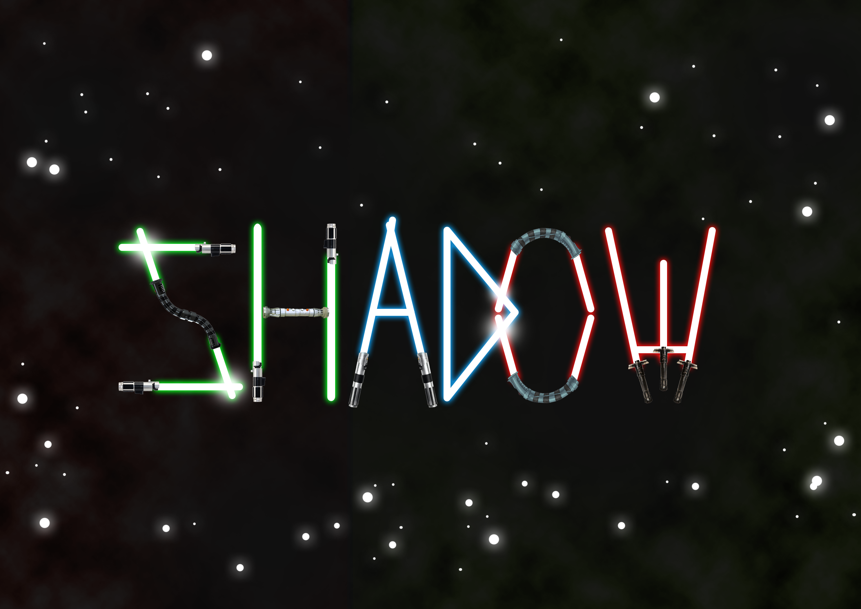
In the end however, it was commented that this design looked rather childish, and I also felt the first design looked more classic and professional, so I went back to touching up and improving the first design.
The comment I got was that the lightsaber beam isn’t very obvious even though the negative space implies it is there, it looks more like a black lightsaber, so I went back and filled it with an actual beam. I also added some planets which kind of look like the Death Star in the movie, but that’s just a secret reference for those who know Star Wars anyway!