
My profession for this design is actually *spoilers* a Pianist.
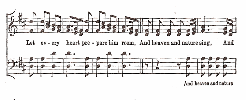
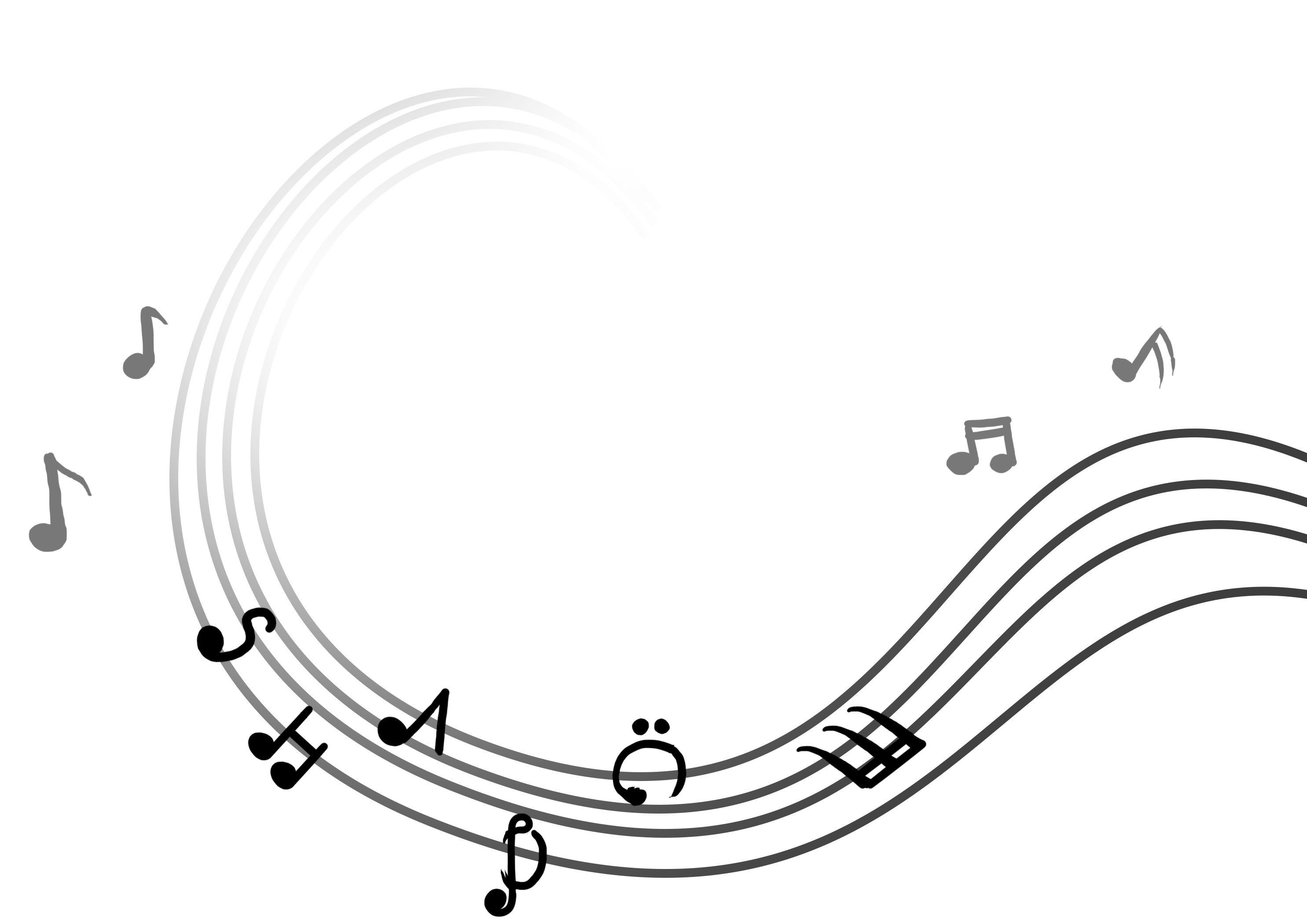
So for this design, I looked at musical notes and piano sheets.
This inspired me to use musical notes as a typography for my design.
I designed the letters in my name to look like musical notes and as a background, I used the lines of a piano sheet, which is a familiar representation to most people. I threw in various musical notes along with it, but at a lowered opacity so it does not distract the viewer from my name.
But I wasn’t very confident about stopping with just this idea. I wasn’t sure how to move forward with this profession, so I just kept it and now the task was to try to make it more interesting.
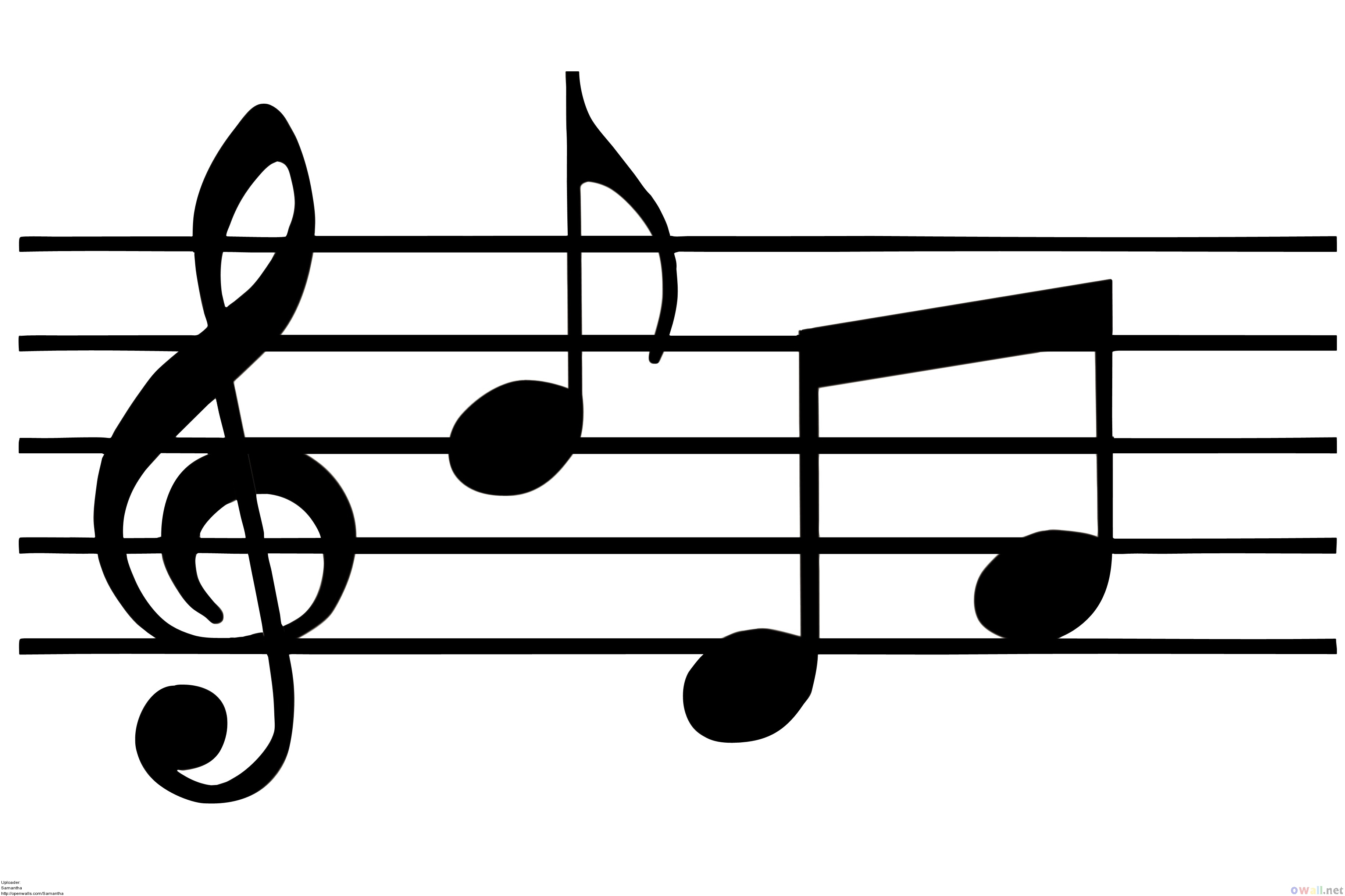
Here is another image of musical notes I found, but the artist had made it more dynamic by introducing elements of scale and giving it a flow, so it looks more fluid like and less symmetrical.
I tried to apply these techniques to my work. But I think it still did not look very good or inspired.

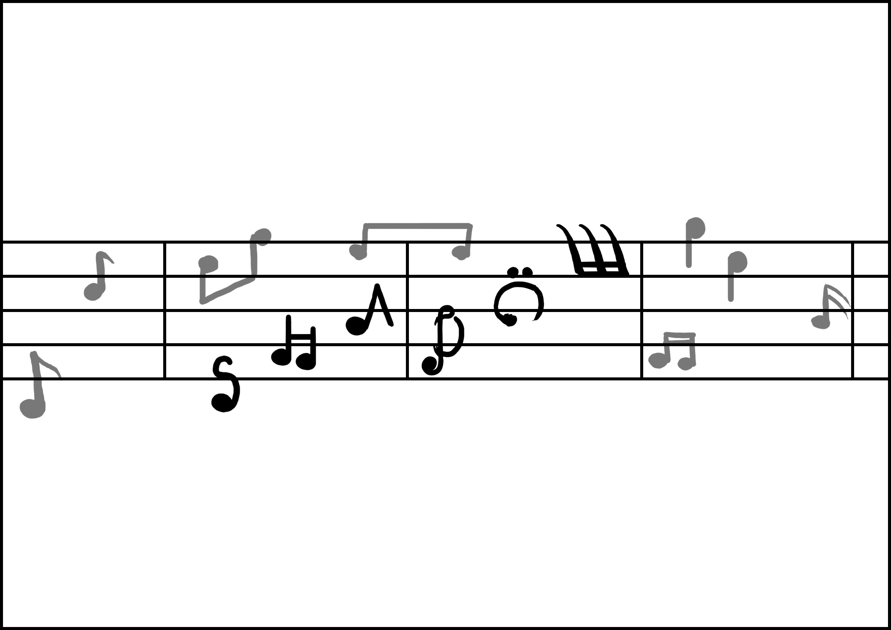
I had yet to clean up the design, but just by looking at it, I think it looked worse than the first design honestly. So I was back to the drawing board.
I then had a breakthrough when I looked at the work of other artists:


I then decided to try experimenting with merging piano and typography. And this was my first design:

I wondered about applying negative space but I wasn’t too creative with going about it so I just kept working on it.
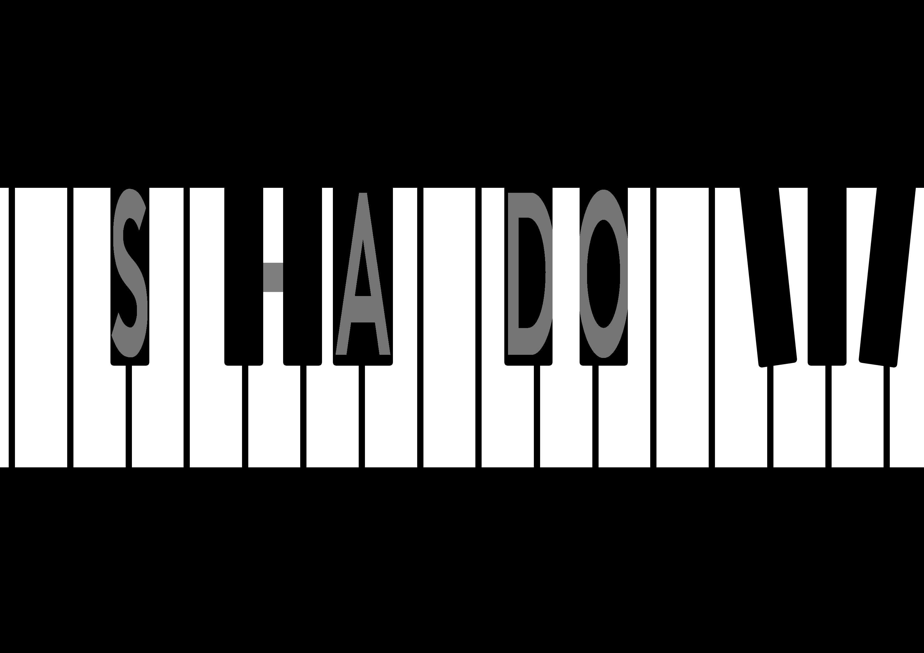
I then tried focusing on using the black keys as the main typography, having letters in them.
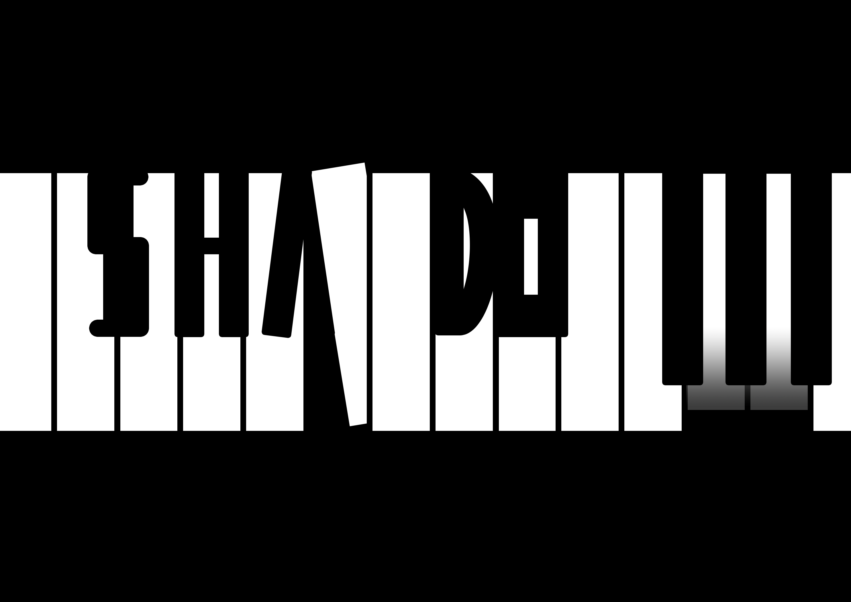
Then I thought, why not just make the typography as the actual black keys? I played a bit with the rotation of one of the white piano keys to create the letter ‘A’ with the negative space, and modified the black keys a bit to show the other letters.
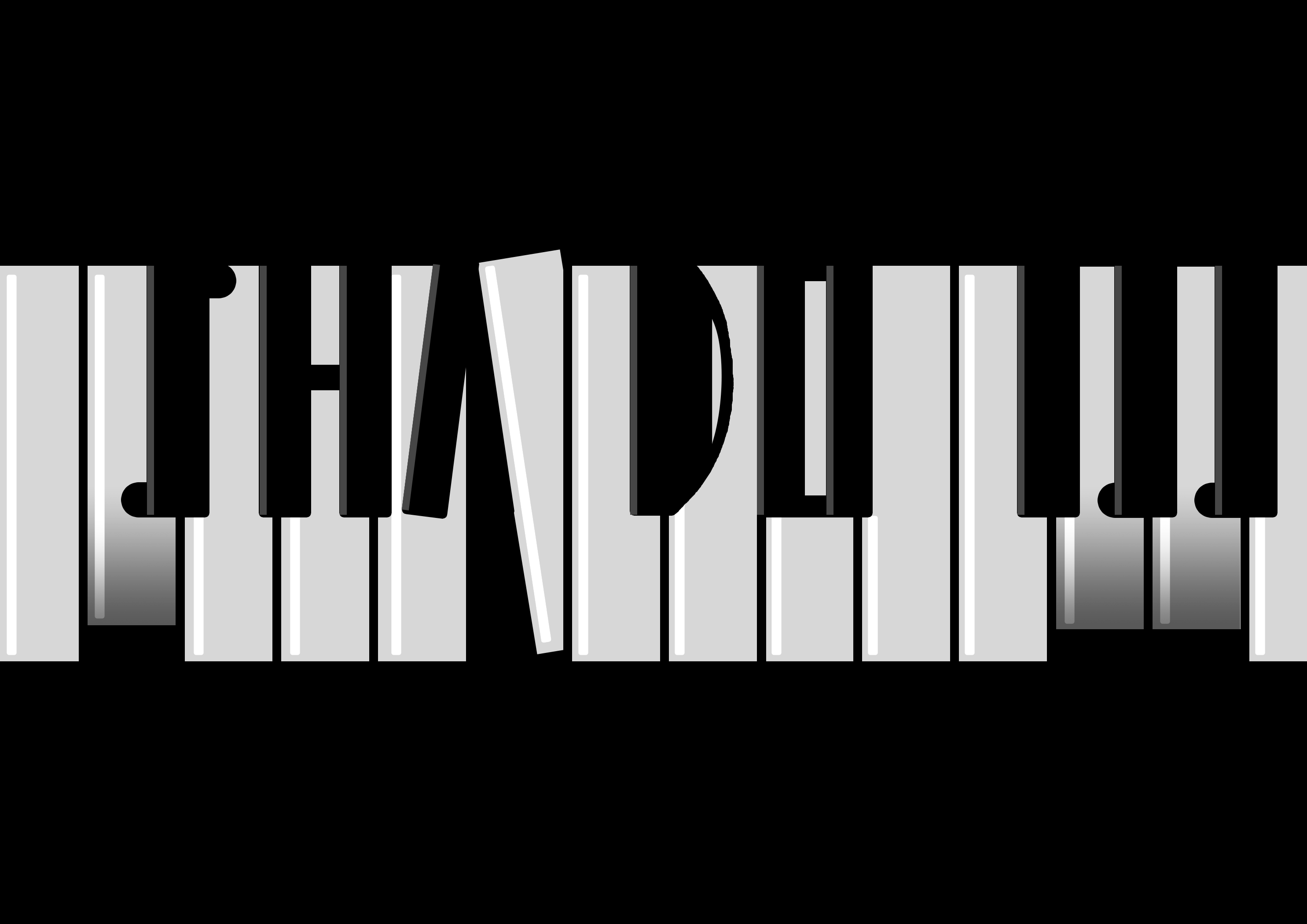
I couldn’t decide which design emoted better. I felt like the first design was more clean and simple, but the second design was more clear and direct.
Que Sera Sera – Final Reflection
This assignment exposed me to typography and how we can use it to communicate ideas. It really made me think about how we perceive things – like when I think about gardening, what’s the first thing that comes to peoples’ minds or my mind? We all have different perceptions of things, but sometimes there are common things or objects that pop up in our heads when we hear about something.
So aside from learning about typography, it made me think about how we perceive things, and how we associate images with objects or ideas, or semiotics in other words.
As for typography, I learned more about using kerning and tracking to make my typography look better, either more dense or less cluttered, which I applied in one of my designs (see Process #3). We can play with the distance between the alphabets, change the way the text is displayed – make it curvy and playful, or make it straight. It’s almost as though we were giving the text itself a character.
I also learned that there are different styles to typography. Some designs are more image-based, while others are more on the typeface.
We can make our own fonts, or we can use others’ fonts and modify them. Not only that, we can even add designs into the typeface itself. We can subtract or add negative space, play with lines and shapes to communicate an idea through the words.
I also learned about how colours can help in communicating with the typography. Using green as a background helped to assist the typography and show that it is something plant-related (Gardening). Of course, this only works if the typography itself is already able to communicate Gardening very closely. The colours merely help to confirm that idea, strengthening it so that the audience won’t be too doubtful.
Oh, one more thing I learned was that ideas can still change during execution. While executing my piano design, I was constantly changing and tweaking things digitally even when I had sketched out my rough idea. I think this applies to a lot of the work we do here. We may think we have a very clear idea in our minds, but when we actually execute it, we may find a lot of things that we can improve on, flaws in the design that we may have never thought about until we make it and show it to other people. So yes, the design process is full of iteration, as people say.
I suppose that’s all for this assignment. As a bonus, I actually stumbled into this really interesting article which made me really eager to learn more about typography.
Que Sera Sera – Bonus Research?
This is actually part of Research but I did not know where to put it, so here it is!

Above are the concept designs for Folk Tale, a game. I have never played the game, but came across their design process while researching about typography.

This forum post by the game developers talks about how they designed the game logo, and it inspires me as a game developer because I had to create game logos as well, but back then I had no prior knowledge about typography.
Their post is very informative, and it goes through how they added an outline to increase readability, how they removed foreign elements that distract the viewer. Moreover, they talk about how they manage to convey the art style of their game through the design of their logo, as well as how the addition of a ‘sword’ portrayed the genre of their game (adventure).
It really wow-ed me, and I think this is a very good post that I think aspiring game artists should read. I hope that we will get to come across more of such material because it’s interesting to look at the processes of other people too and learn from them!