
Psycho (1960) – Shower Room Scene
A psychological horror film by Alfred Hitchcock. This was the scene that was highlighted as one of the most interesting scenes in the movie. I was curious to find out how Hitchcock had directed it to make it so impactful to the audience, so I chose it!
Fun fact: The blood in the scene is actually chocolate syrup!
00:00~2:21
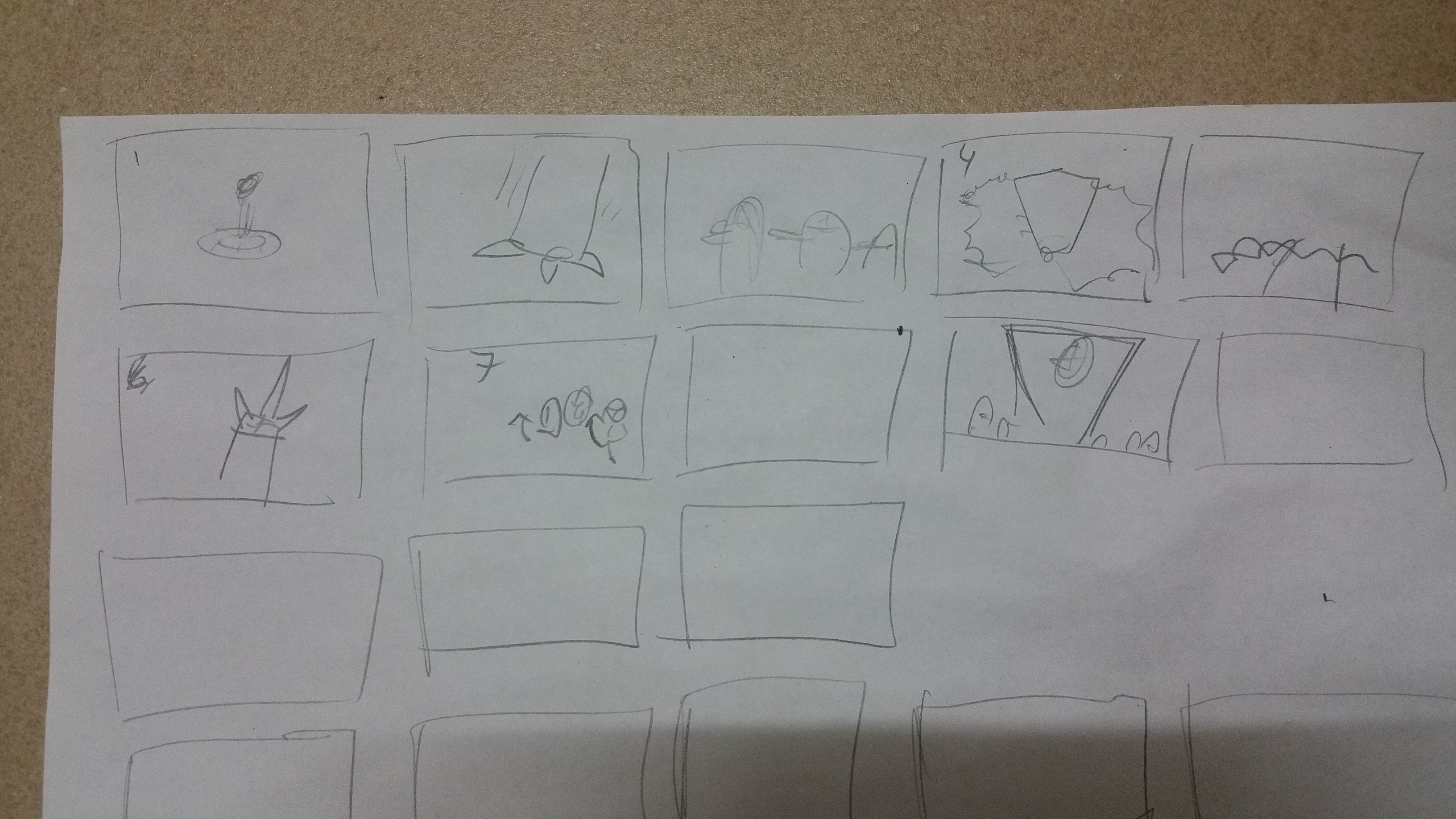
Storyboard

Analysis
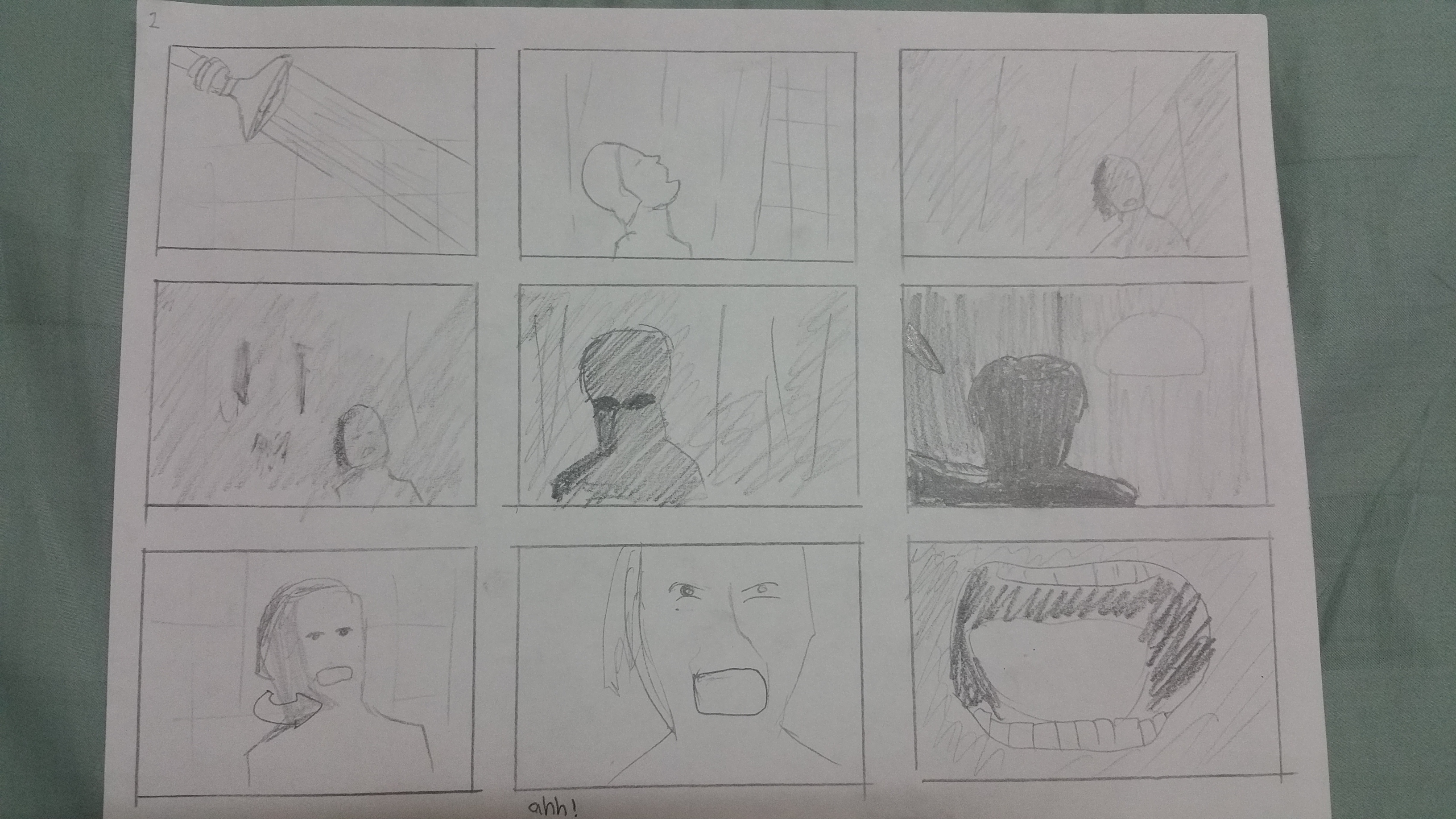
The movie being in black and white helped me see the tones really clearly. Compared to the other storyboard, I noticed one thing as I was drawing. There were a lot less “details” in Hitchcock’s shots, especially the starting scenes. They were kept simple and plain, often showing just the subject against a wall or curtain.
Something I also noticed is how he has different “angles”. At the start, he films the lady’s legs stepping into the bathtub at a low angle (worm’s eye), then later has a high-angle shot on the killer in one of the shots. I think it was to give a distorted look, to make you feel uneasy as you watch her enter the bathtub, like the Dutch angle. To me, the switch to a high angle shot later on showing the killer also amplifies how the killer is “triumphant” over his victim, as though he is above her and winning the fight.
I felt that Hitchcock showing the woman bathing from all camera angles at the start made me feel safe, that there was nothing to be afraid of, until he switches to a shot where the bathroom curtain is behind her.
Suddenly there is a contrast in tone behind the curtain, and it amplifies the tension in the scene and the scene splits into background and foreground because of the introduction of the figure, with the curtain separating the two layers of depth.

The camera slowly zooms in onto that scary looking black figure, whom the audience only sees as a silhouette against the light in the background. I noticed the light appeared a few times as I was drawing the storyboard, which I think is to make the silhouette stand out and have a greater contrast in tone. It felt to me Hitchcock knew how important it was to light his scenes since he wanted this movie to be shot in black and white.

The quick cuts during the stabbing were also very effective at portraying the violence, like as if the killer was stabbing her in rapid succession. Even though we don’t see the knife physically pierce her skin or flesh, we can feel the violence from the quick motions of the killer’s hand as it swipes past the camera.
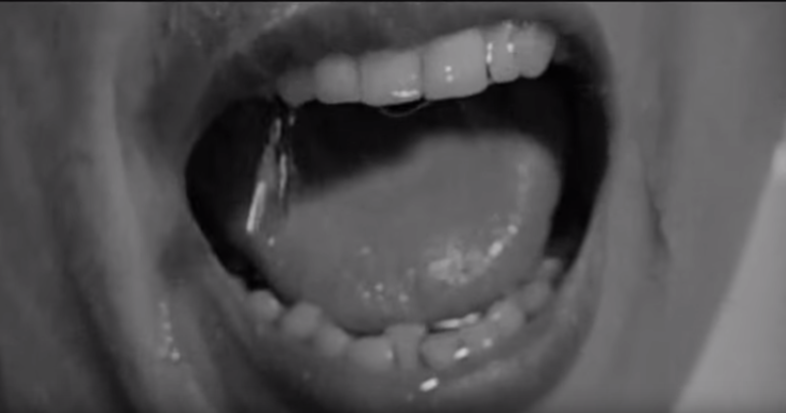
He also uses a number of extreme close ups during the stabbing, on the woman’s mouth as she screams, so even when her scream isn’t that loud, I can almost hear her pain.
Finally, the scene approaches its conclusion. Hitchcock shows just her hand in the frame on the wall, sliding down, showing how the last of her breath and life is disappearing as the hand descends unti 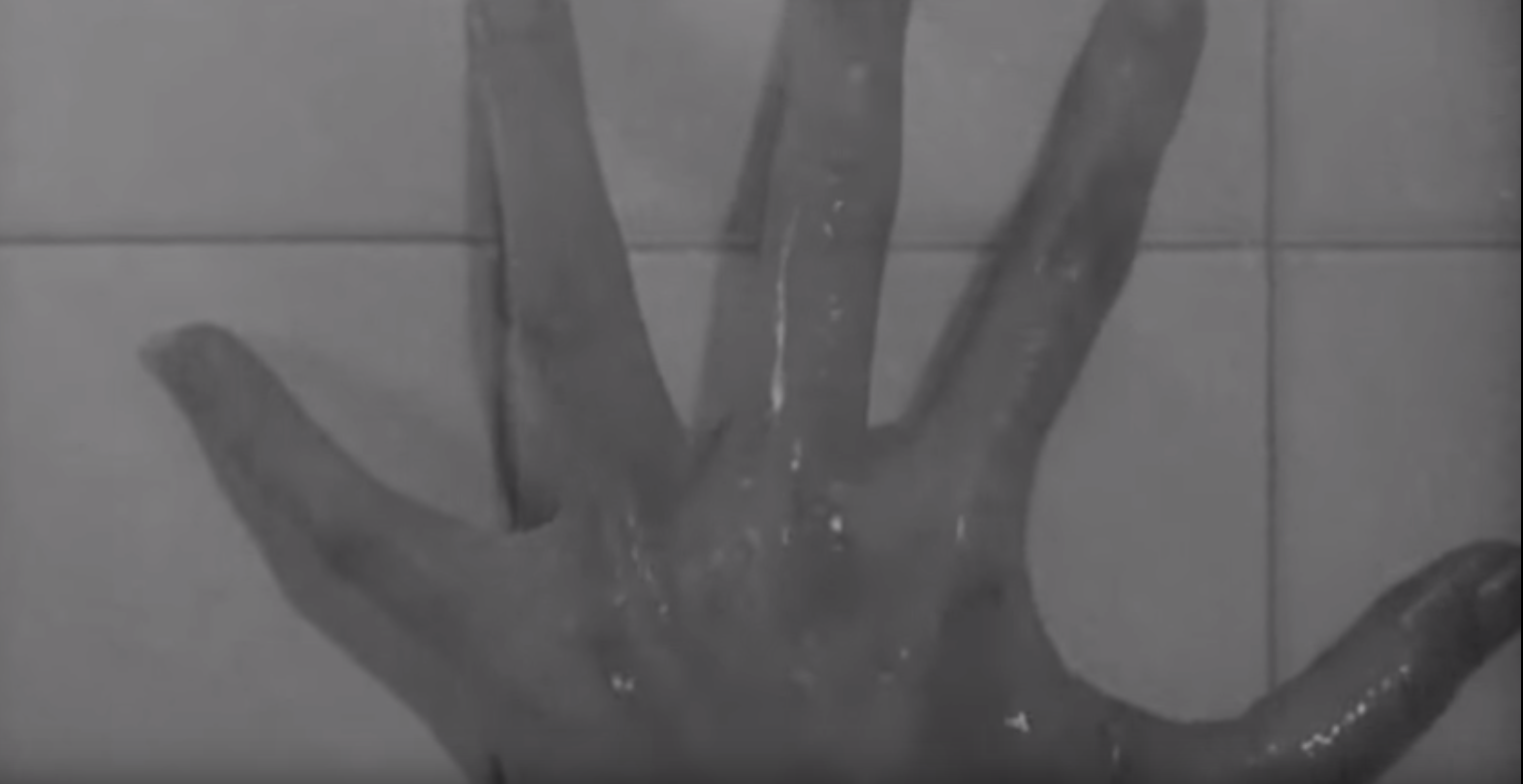 l it is out of the frame.
Star Wars: The Clone Wars (2006 Animation)
I really love Star Wars! And the reason behind that is this animation made back in 2006. I watched it on Cartoon Network, and as a kid, this blew my mind away. This particular video may be of a fight scene, but I only want to focus only on the first 3 minutes, which is the build-up, rather than the fight itself. The build up prior to the fight scared me as a kid. I was so scared before the fight even began. It was just so full of tension, and I could feel the fear of the characters in this scene. And now, I want to go back and see what made this scene so visually powerful to me as a kid.
00:00~2:50
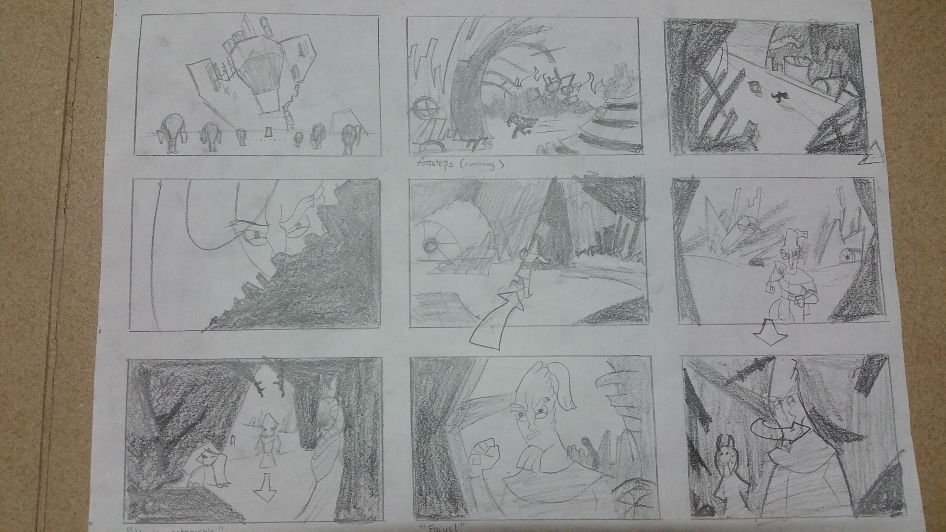
Storyboard


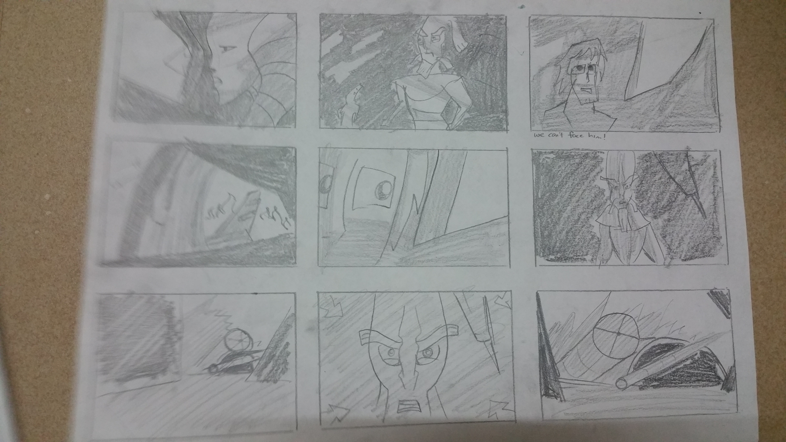

Analysis
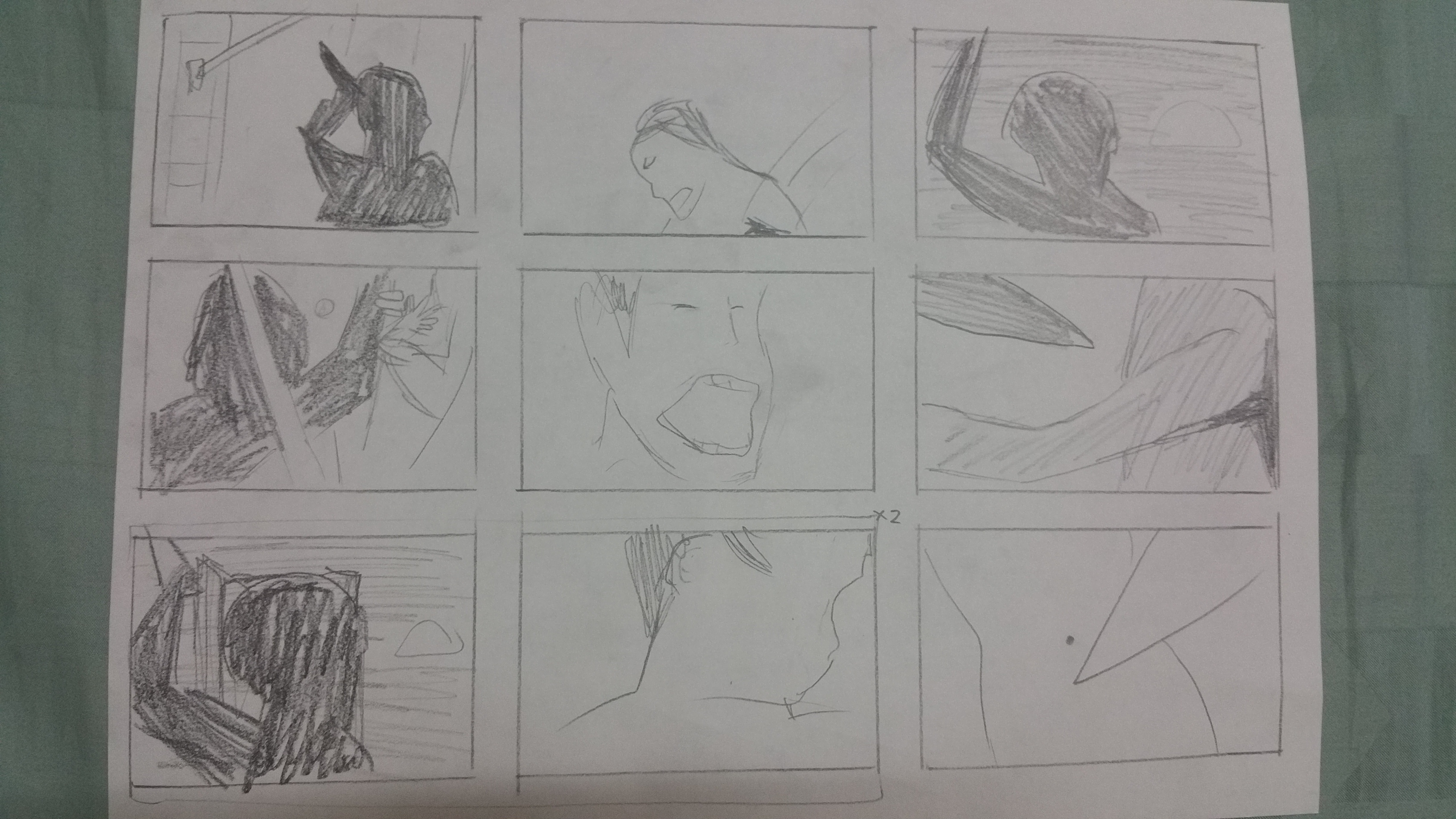
The scene starts by showing an army of battle droids (the dark blue evil-looking robots that are shooting a bunch of red lasers in a certain direction). I notice a lot of overlapping of the droids, especially in the first few frames.
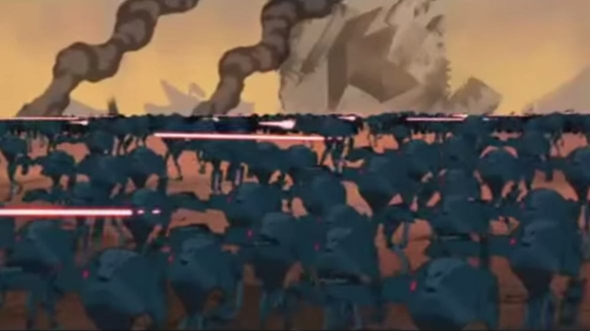 The overlaps helped to create depth, and drawing the droids in varying and contrasting sizes really helped to achieve the depth required to make the battleground look really really huge, and you feel overwhelmed by how the droids appear to stretch across the horizons in one of the frames.
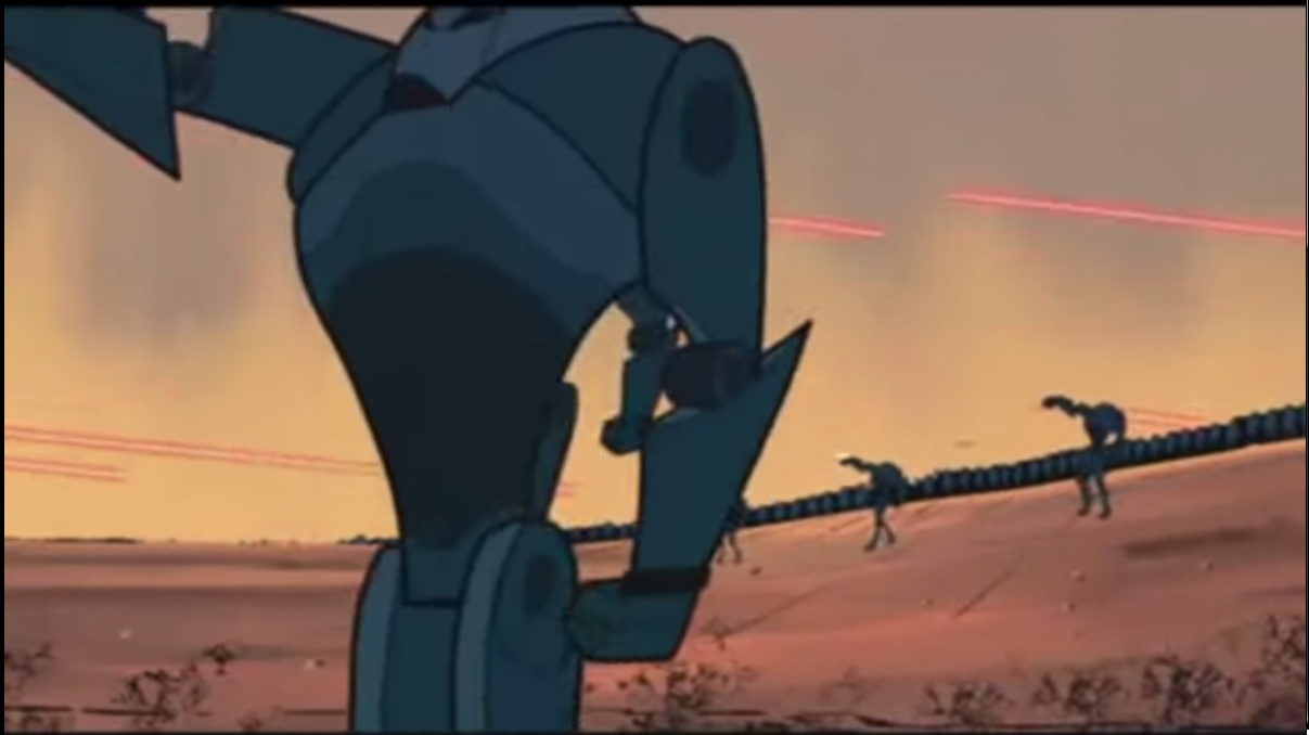 One of the frames has an aerial shot, a bird’s eye view, which achieved something the other frames didn’t show as effectively – it showed the scale of the battleground and the explosions show how “destroyed” and broken the ship is.

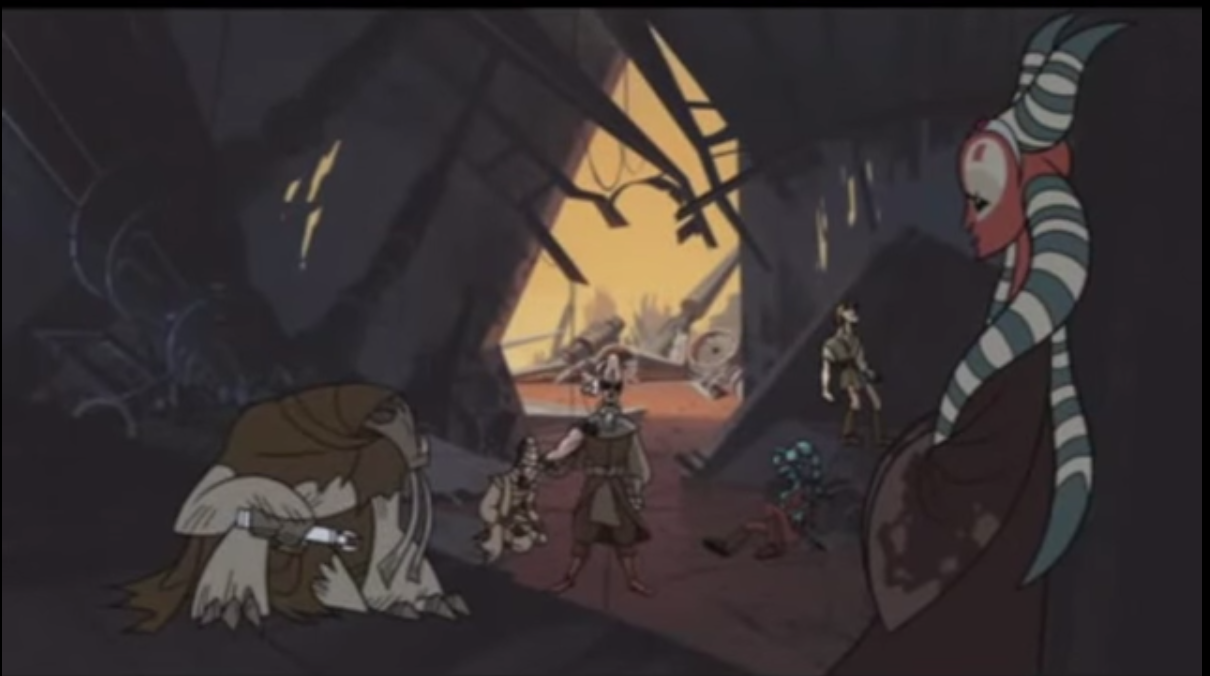
In terms of storyline, the purpose of this scene was to introduce a powerful antagonist. We first capture a glimpse of him when he raises his white claw, which against the dark army of droids, captures our attention immediately.

Immediately after this, we see all the droids stop attacking, and we know this guy in the white cape and clad in white everything is the boss, the commander, the big guy. The way he is framed in front of the ship and at the center of the frame also places importance on him.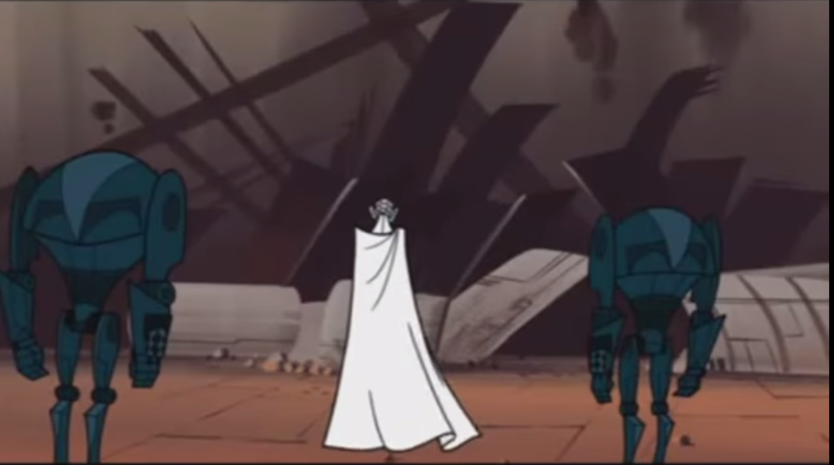
From then on, it switches perspective. I don’t see the droids anymore as I dive into the ship. I start to see quite some tonal contrast, and I find it interesting. It’s as though we were peering through the debris and makes me feel like I’m there in the wreckage. It also directs my eye to the silhouetted man that is running through the debris.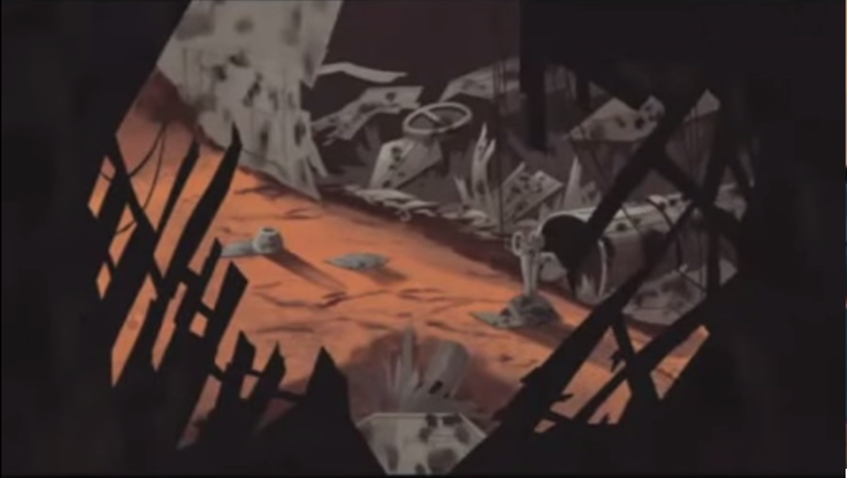

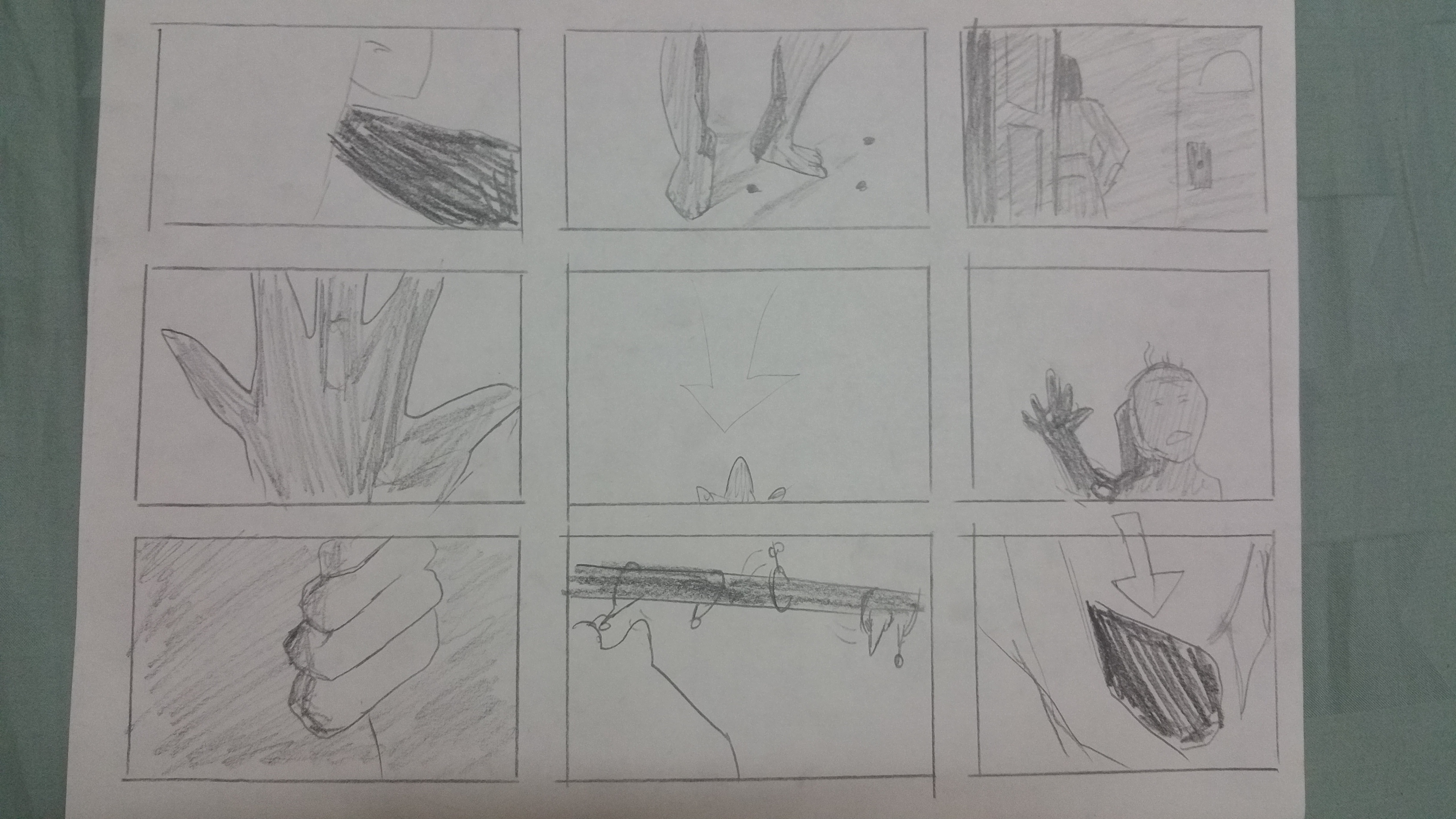
Then, the people (revealed to be Jedi) have gathered inside a hideout. Now, the composition is mostly of darker colours as they are in the shadows, with occasional lighting from outside, which we see through cracks in the wall or holes which the Jedi eventually use to peer through, to see what’s outside.
The scenes then show the Jedi nervously trying to pinpoint the source of the sound which they are hearing. They can’t exactly tell where it is coming from, and we as the audience are equally confused by the cuts.
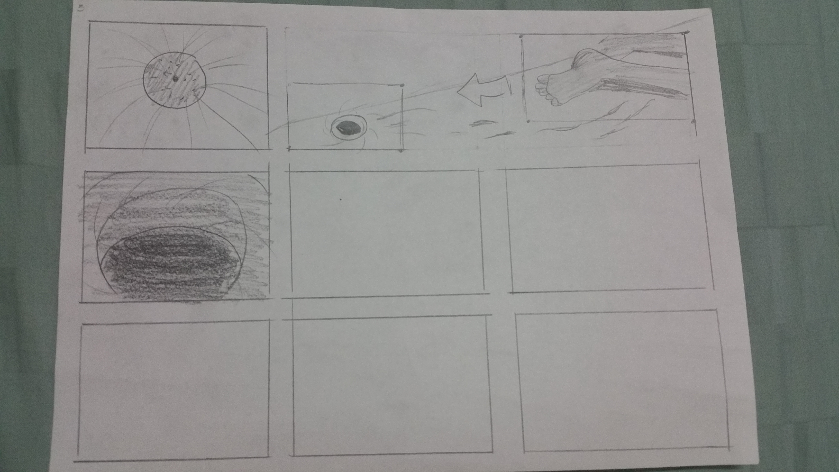
The shot goes from this in an earlier frame: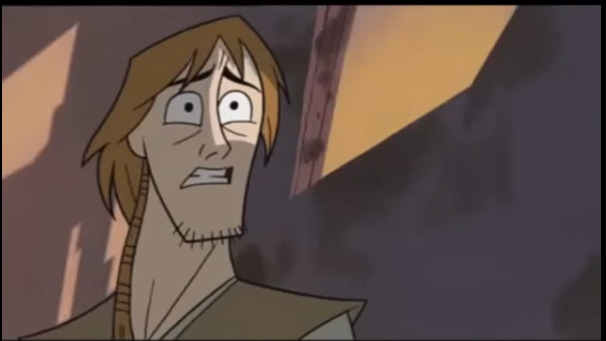 To the environment, and then back to this:
 And then back to the environment.
There are many cuts to show the same environment, the same ones the Jedi are looking at and the director cuts between the character and environment while gradually zooming in onto the character/the background. It creates a lot of tension. Nothing is happening, but the way the sequence is cut and slowly centering on something makes us feel that something is about to happen, we just don’t know what.
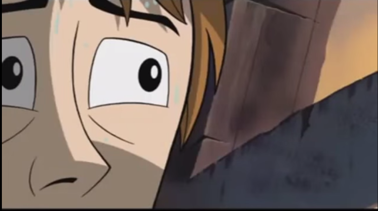
The frames now go from close ups to extreme close ups, and the framing manages to show us anxiety of the people within the building, from letting us see their perspiration to showing their eyes darting from side to side.


Overall this scene definitely sticks to me as a very tense scene, and manages to make the bad guy feel extremely intimidating. I hope I don’t have to face such a scenario in real life.