I was given feedback to work on my layouts and provide more sketches for my zine. I’m planning to use traditional mediums, like water colour and colour pencil. It’s quite hard to figure out what style, colour and illustration to work on, as requested by Ms Mimi. I wasn’t so familiar with different types of illustrative styles by artists and how they tell a story. I only knew I could use those mediums and make subjects appear realistic. So, I had to do my own research and search for artists, whose works and styles would be quite interesting to follow.
Just to recap on concept;
- – “Urbanature” is title of my zine
- Tells a story about Punggol
- Removal of trees and forested areas to make way for tall flats
- Tall buildings appear dull and boring, but high and mighty
- Trees and habitats are left with little space, due to construction
- Ending: Tall buildings and nature can live side by side
- Moral of story: Punggol residence shows how man-made and nature can live can co-exist
- Aerial view of Waterway Terrace
I’m planning to work this colour theme. I got them from Adobe Kuler and played around “triad” colours.
Or maybe this one. Because they have warmer tones to it, which I’d like to have for some colours used in my zine.
Found from Pinterest:
Artist Ref: Alina Chau
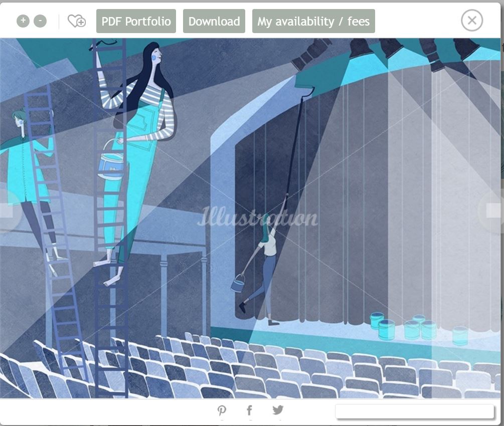
Artist Reference #2: Rosanna Tasker
Approach
There are two main elements to Rosanna’s approach. The first stages of her work are created using natural media – pencils for the line work, and gouache paints, applied to separate layers using a light box. This, and the rich papers she uses, gives her work its unique, handcrafted feel. Images are completed digitally, using Photoshop to clean them up and add the finishing touches.
Style
Delicate lines and gentle textures are woven together to depict elegant, elongated figures and forms. She loves to experiment with scale, and nature usually plays a big role in her art. Rosanna chooses a limited palette for each piece, sometimes punchy, sometimes subtle, but always in keeping with the brief.
Source: http://www.illustrationweb.com/sg/artists/RosannaTasker/view?agenthelp=2
**
Rosanna’s works are quite interesting, especially with the use of colours. Her colour palette seem to be very limited, consisting of only blue hues and a bit of yellow to complement it. The use of yellow, actually brings out more emphasis on the subject matters.
Her style is simply a mix of traditonal and photoshop to make it neat.
I decided to go for a more warmer tone for the colour scheme. After scanning, I edited those pictures using photoshop.These were the outcomes:


