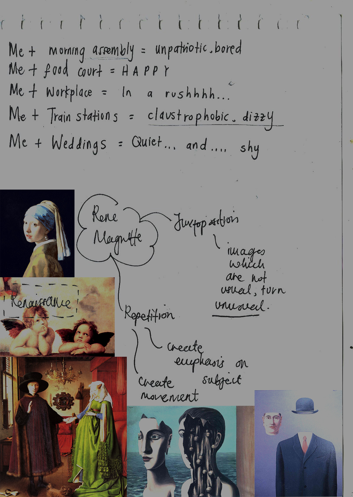
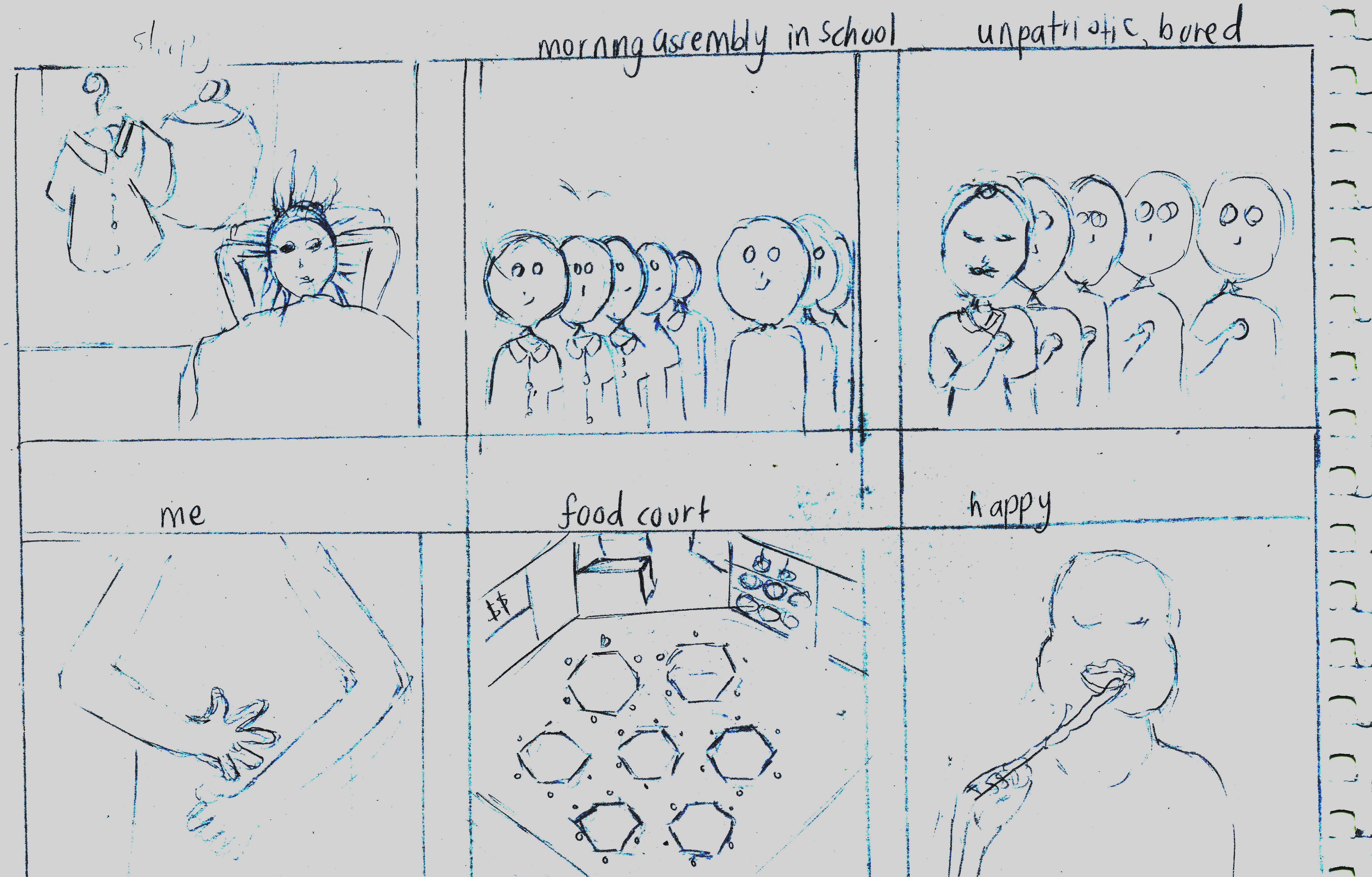
So, for this project, it was about me. We started out making thumbnail sketches of “Me + a social setting = My reaction”. I’ve made plenty of sketches below.
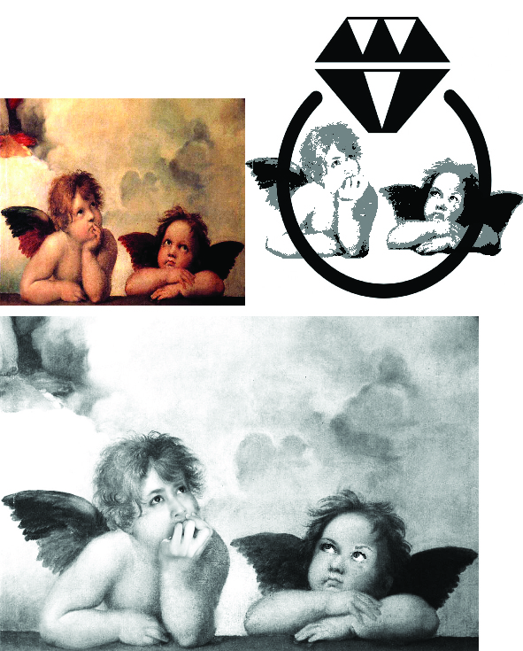
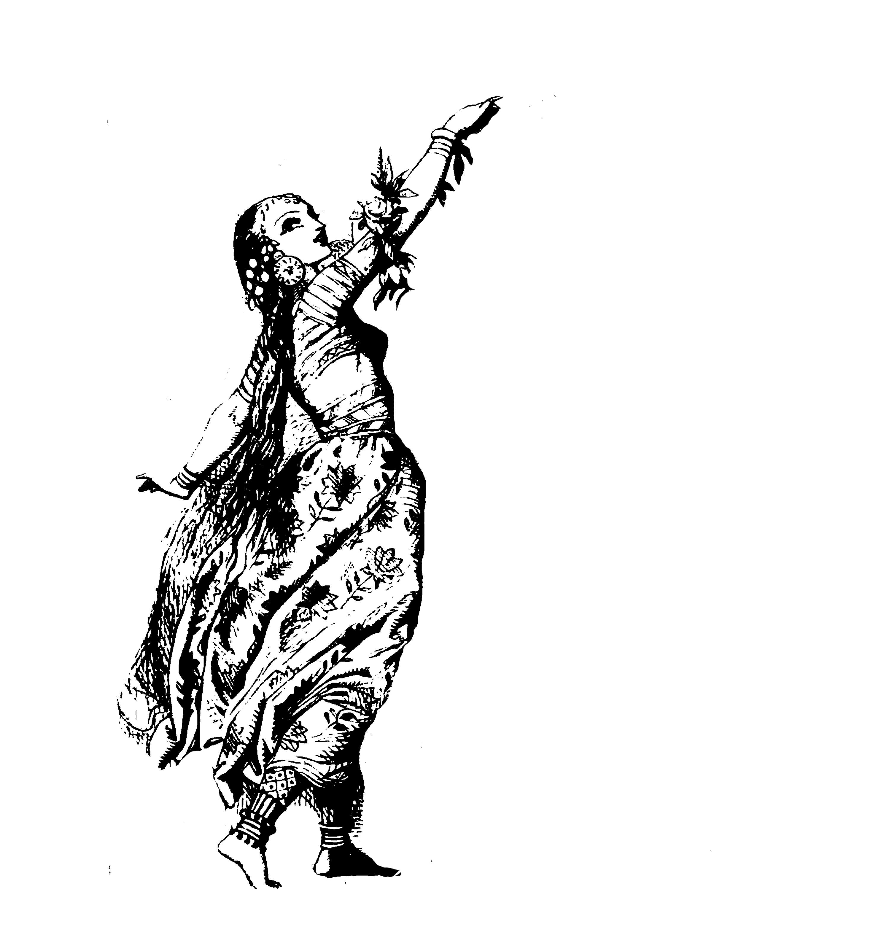
The ideas I had were quite narrative and literal. It had to be “abstractified”, so I had a hard time trying to make it more abstract. With the help of metaphors, symbols and some Photoshop here and there, I managed to make out some thumbnails. Ms Ina advised me to use some famous Renaissance paintings or portraits and incorporate that into my thumbnails as well. I’ve made some in the form of putting some of my faces in there.
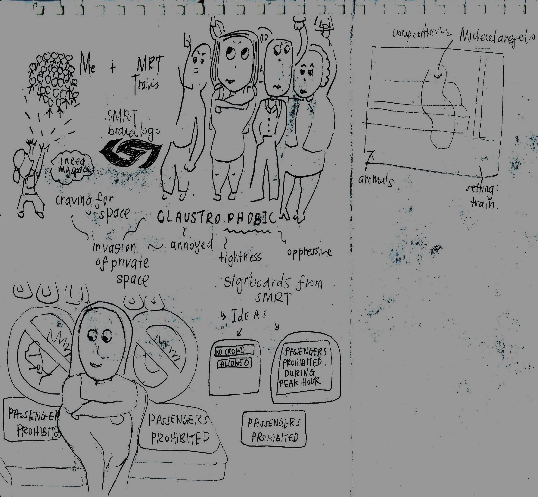
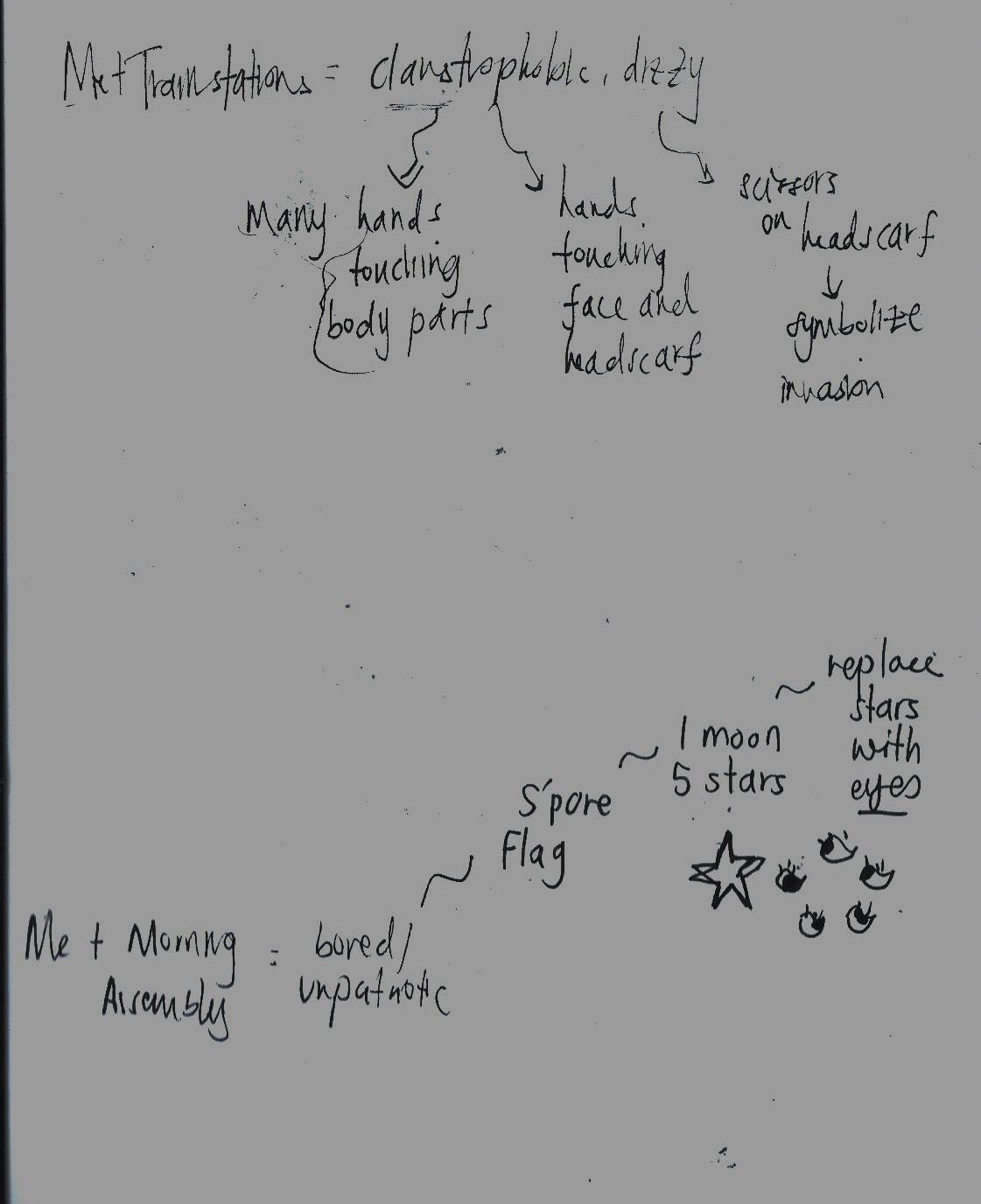
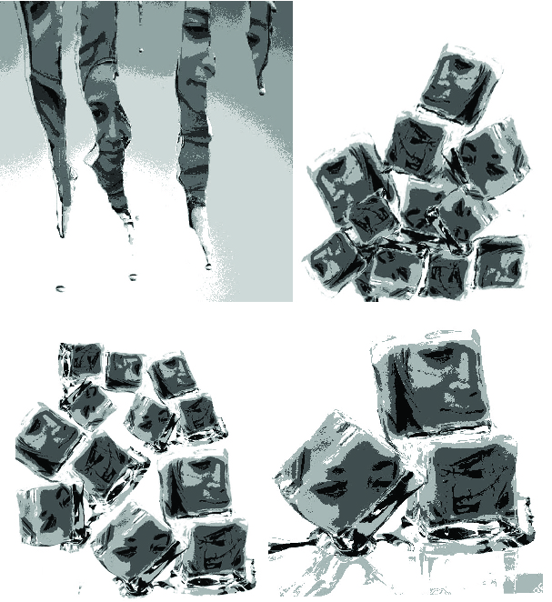
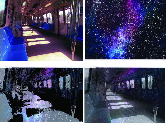
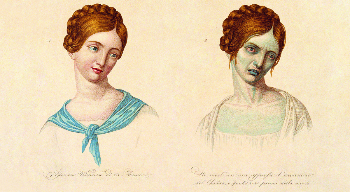
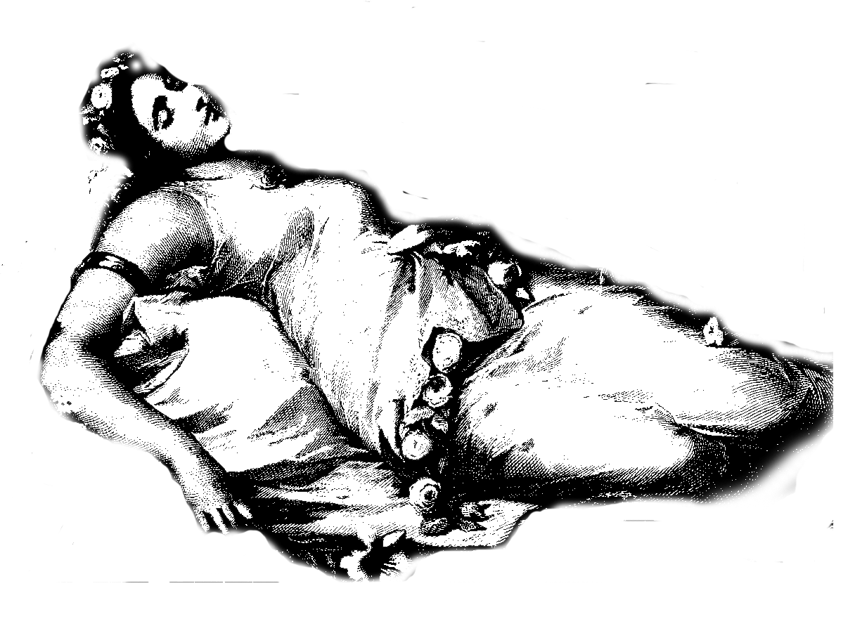
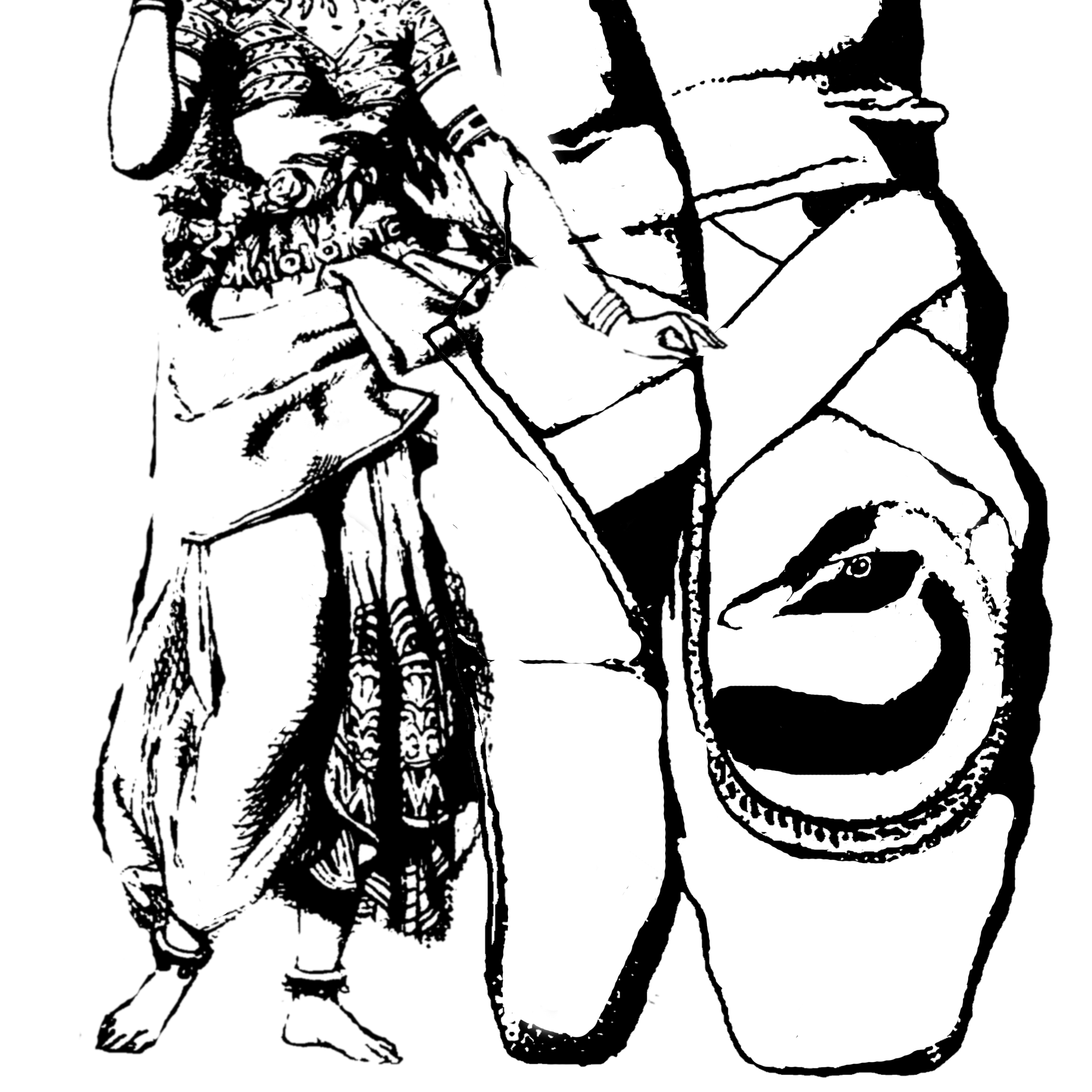
I added cracks in this portrait. It was subtle. That “cracking” part was to show a kind of fragility in myself. I’m not made of glass or anything like that, but I guess this is about me being emotional, in a way. I also added drapery effect over my face, to show my sense of shyness, or hiding behind a curtain. It’s like another way to hide my true identity. Getting rid of the face completely was also interesting as well. I liked this part the most, because it’s unusual for a famous portrait of a female, to have no face.I used ice and out some random pics of myself in there. These dices of ice are meant to show shyness and uneasiness. And the place where I usually go through this are.. weddings! I thought ice and melting ice was symbolic, in a way. It does show how I “freeze up” in a social setting like a wedding. It’s not always uncomfortable when I’m there, but it can make you uneasy at times.MRT trains as the social setting. It’s the place where you are being squeezed in , and invaded by random strangers, especially during peak hour. I added this galaxy background and put that as inner part of the train, I thought it gave off a cool effect.
In the meantime, I’ll be exploring more ways to “abstractify” my ideas about “Me + Setting = My Reaction” and wait for feedback from Ms Ina on the current images I have, as above. The next processes I’ll post soon, will probably be improved versions on current thumbnails, and the use of colours for them.q
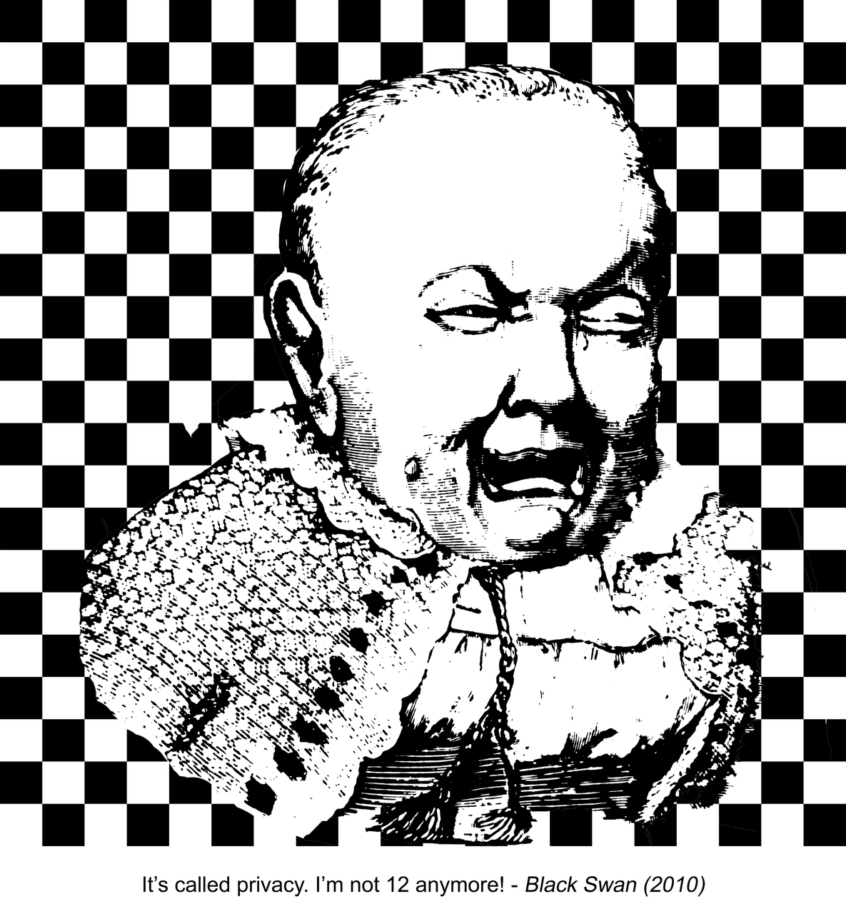
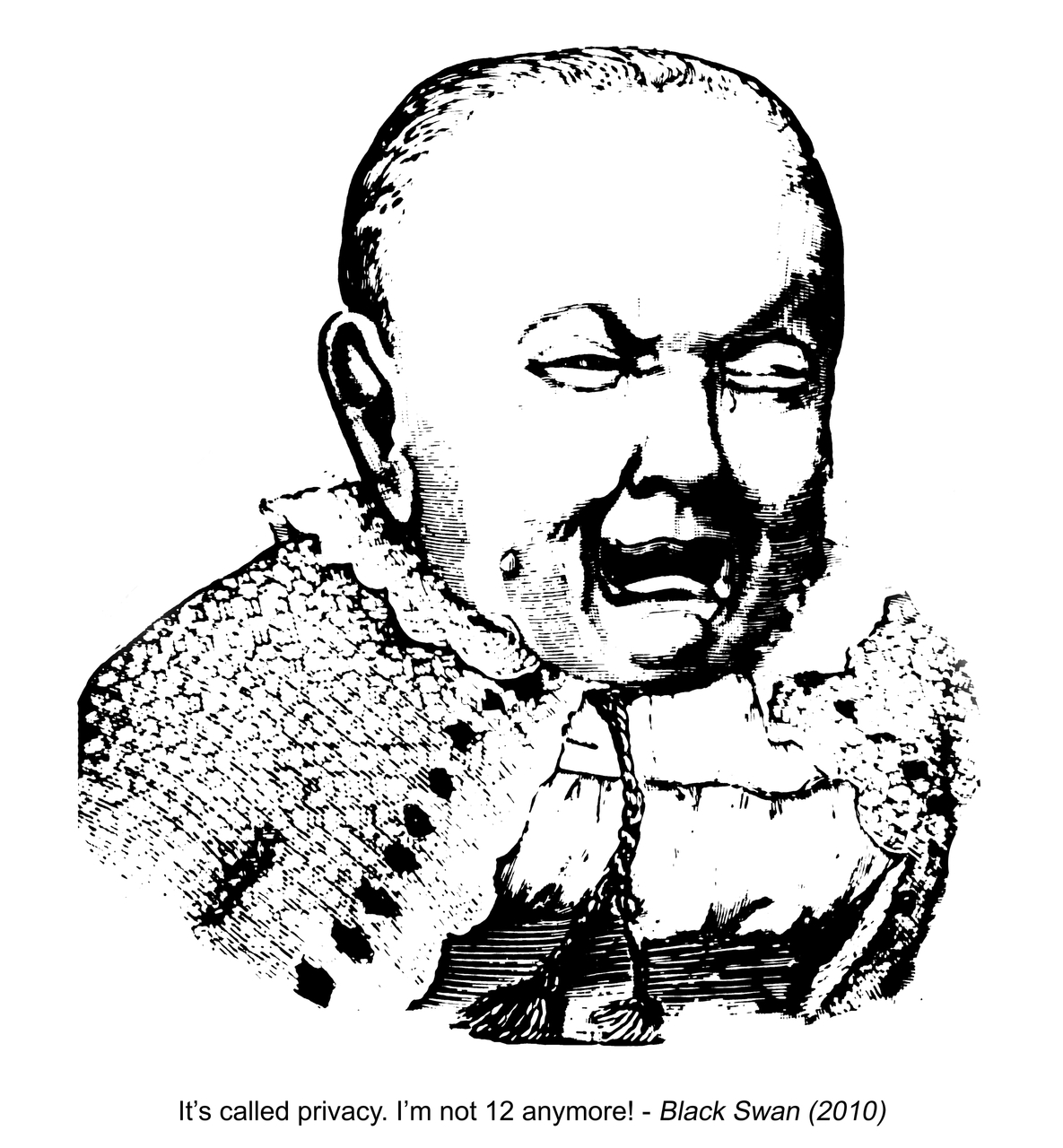
A young person wanting to be taken seriously. Yet this person is wailing like a child.
So I basically edited some photos like little girls and cute babies online, and found the following.
I also took images of people looking like they’re “prying into people’s lives”. People watching over you, being watched, looking out the window.
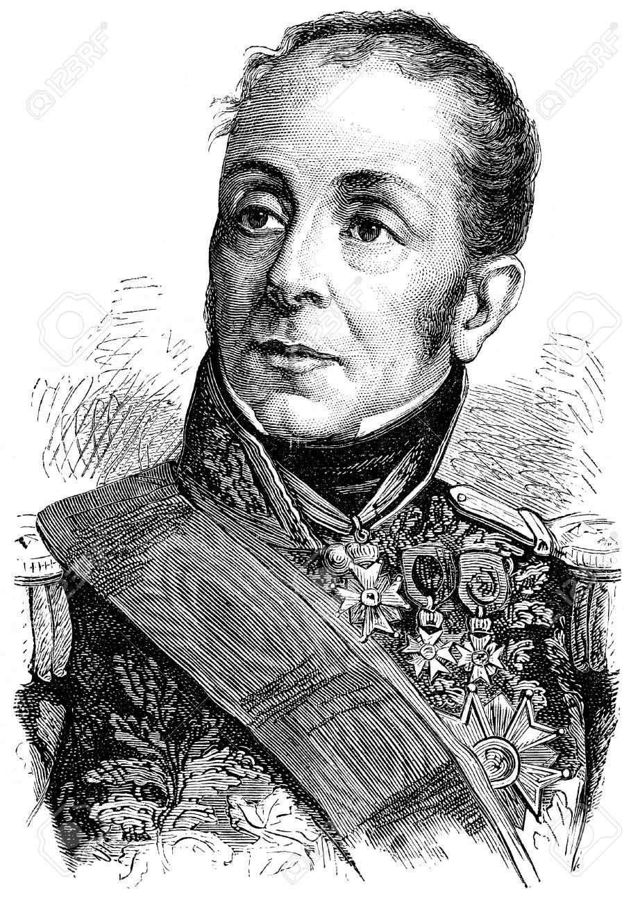
Grouchy, vintage engraved illustration. History of France – 1885.
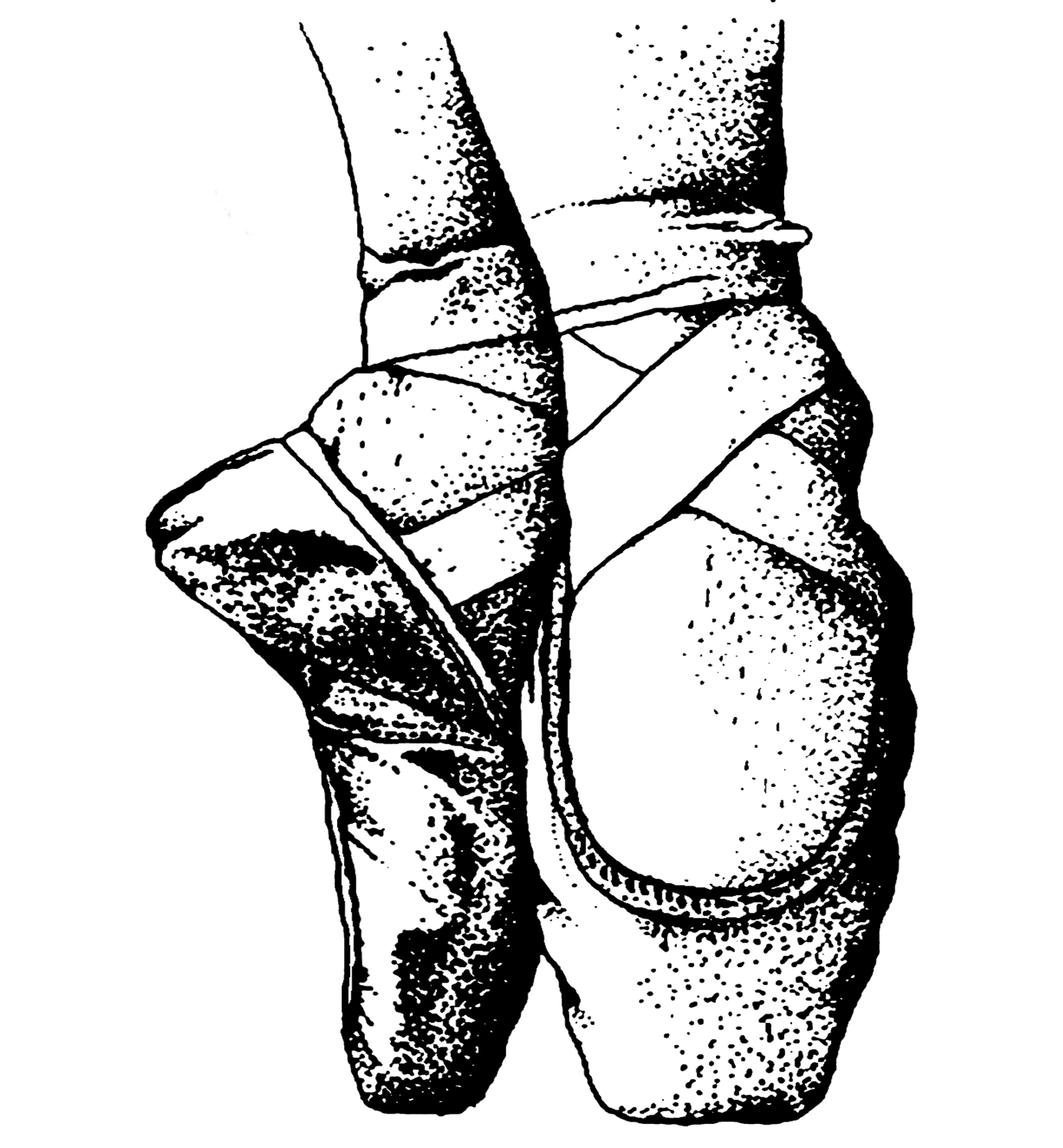
As you can see 2 kids peeping through the curtain. The curtain reminded me of a section of medieval dresses as seen here( below). The curtain reminded me of the dress’ opening. So I wanted to try merging stuff together – like this pic at the bottom of a ladies’ dress.
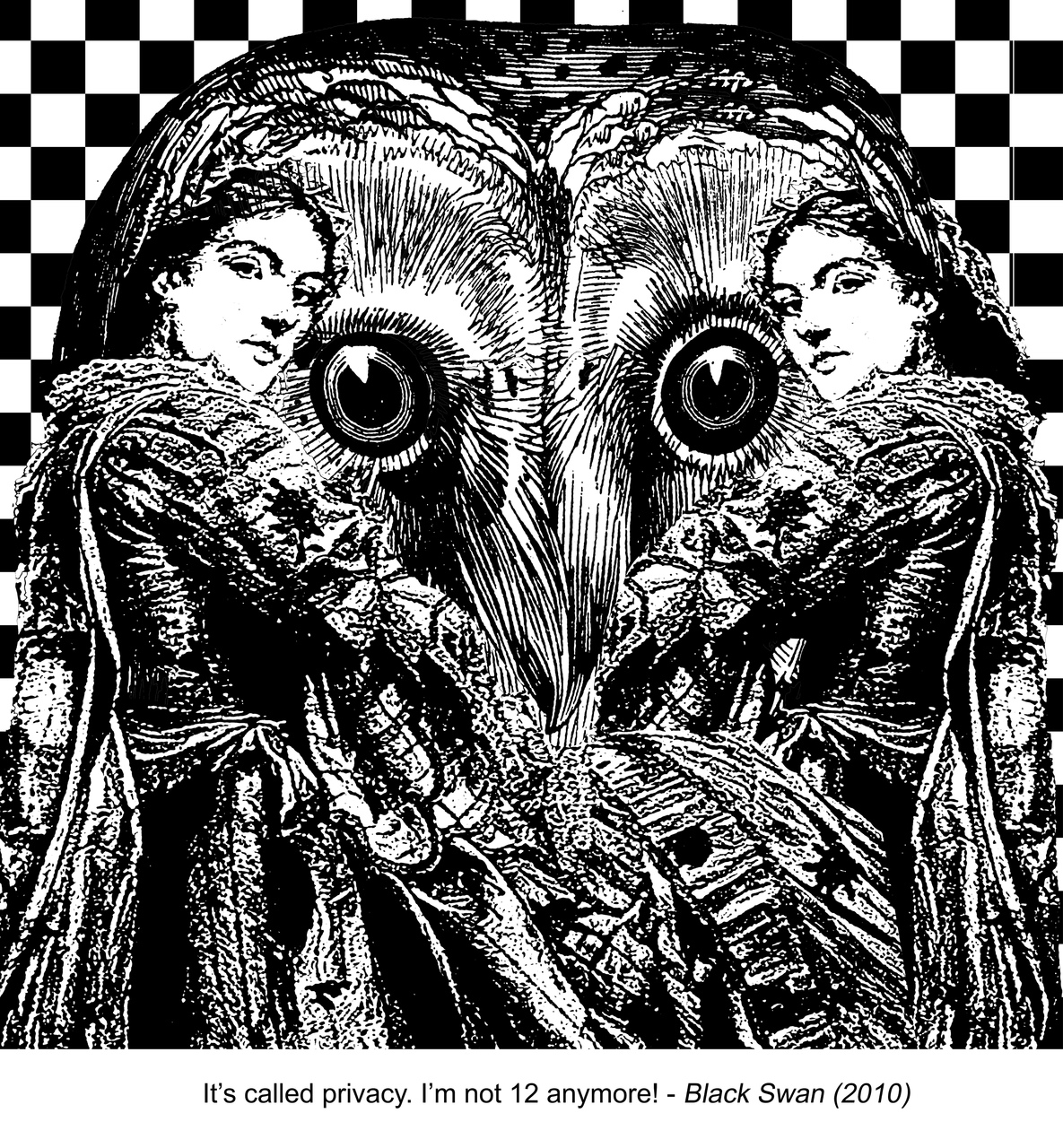
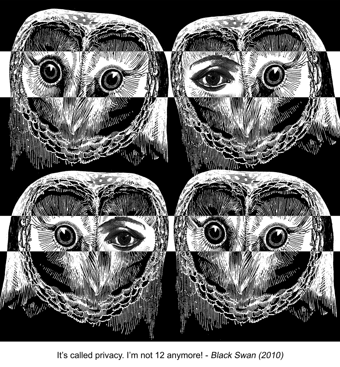
From looking at all these, I had a few compositions in mind to rep the quote: “It’s called privacy. I’m not 12 anymore!”
– compilation of people looking out the window, so these come in form of boxes, with people looking into viewer’s eyes
– baby wailing in agony of people watching over him
– baby wailing with small rpepttion shapes of people “raining” on the background
– owls “spying” on you
– merging a subject being watched + a subject who’s a watcher
This was the idea of a baby with “prying” people surrounding him. I wanted to use checkered pattern, and add in a bit of shuffling of it, as a way to contrast. Besides that,the repeeated picture of the ladies looking out the window is a way to portray invasion of privacy. In response to that, the adult baby goes “It’s called privacy. I’m not 12 anymore!” *wails like a baby*
As you can see 2 kids peeping through the curtain. The curtain reminded me of a section of medieval dresses as seen here( below). The curtain reminded me of the dress’ opening. So I wanted to try merging stuff together – like this pic at the bottom of a ladies’ dress.
But the composition did not work out though.
After getting some one on one feedback by Ms Ina, I had to make mae changes to my final compositions. Here they are:
This was one of my finalized works, from Process part 1.
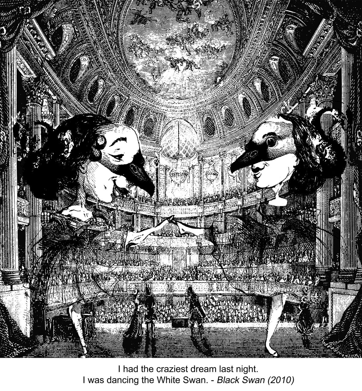
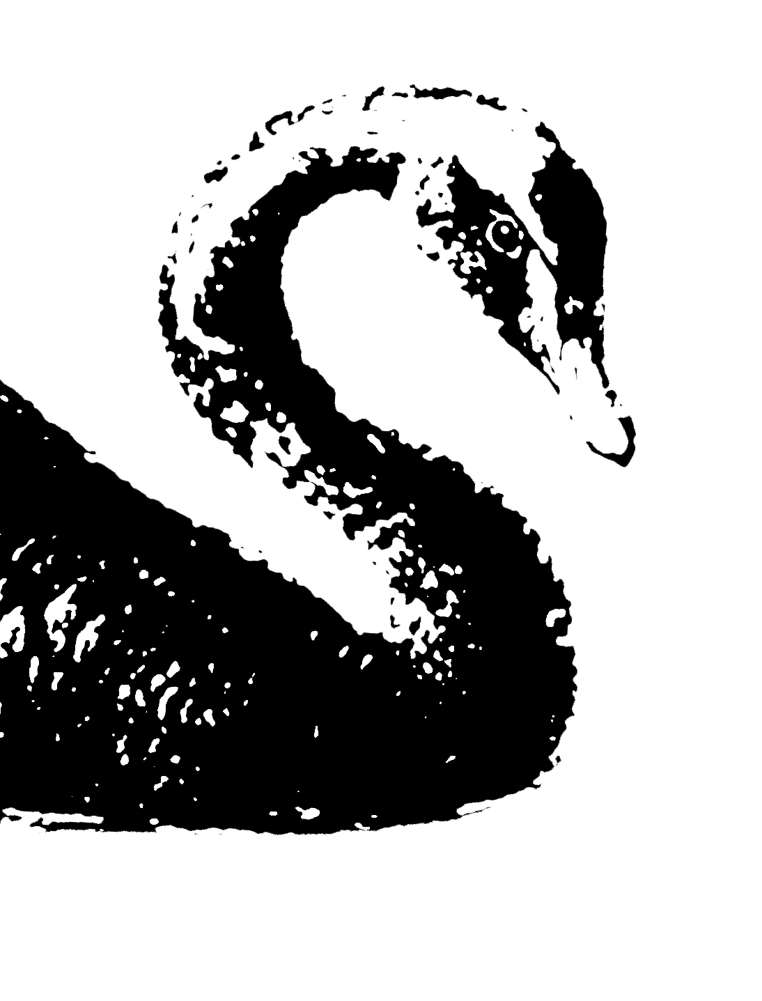
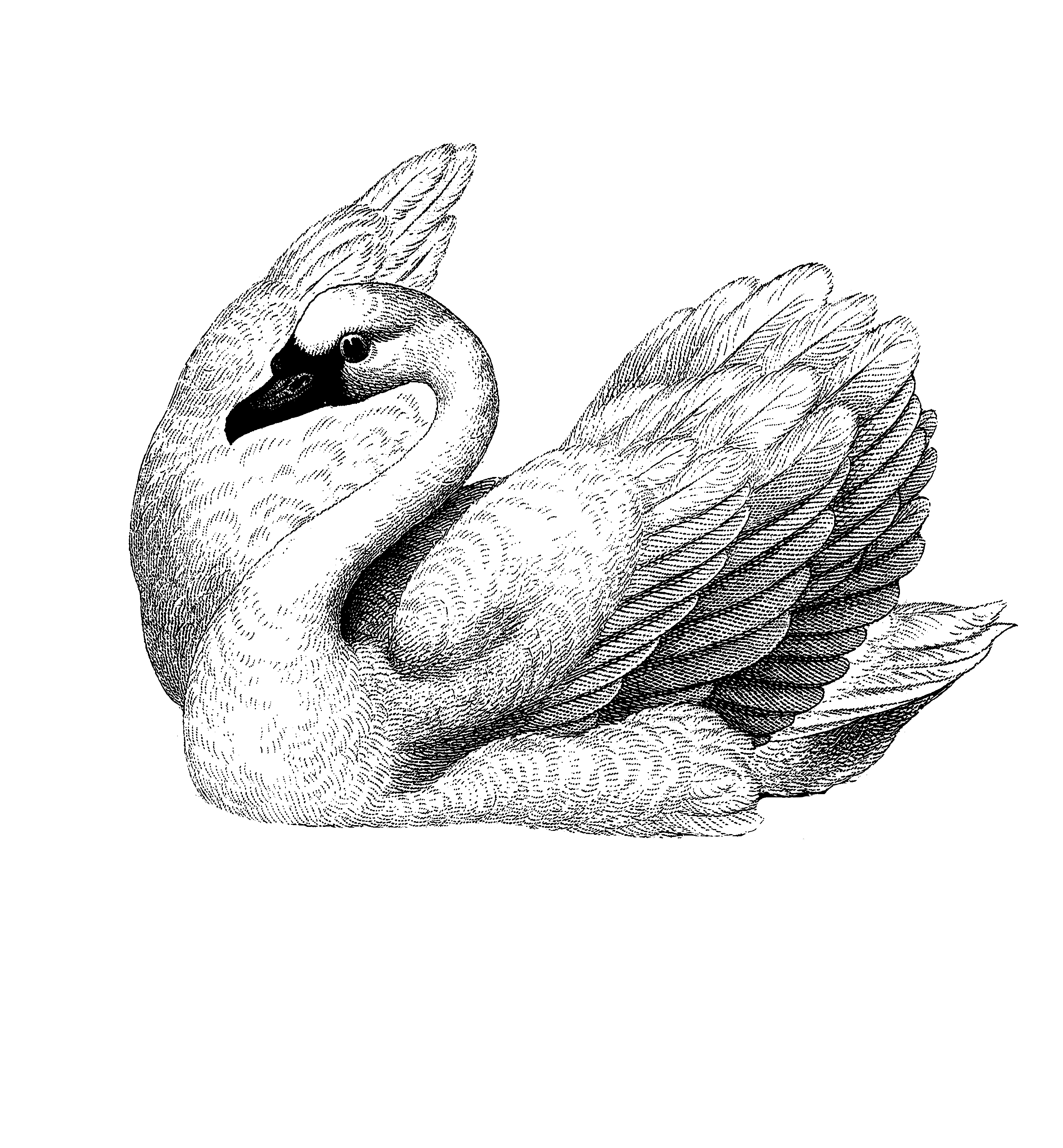
“I had a dream last night. I was dancing the White Swan.”.
-Black Swan(2010)
These are what I picked out when I was searching for visuals relating to the quote:
Dreams, sleeping, swans, and girls dancing, ballerinas.
Eventually I came up with these compositions…
Sample 1
Sample 2
Sample 3
After asking Ms Ina what she thought about those, I decided to just choose one out of these. I think they’re somewhat similar so I can’t pick them all out at once.
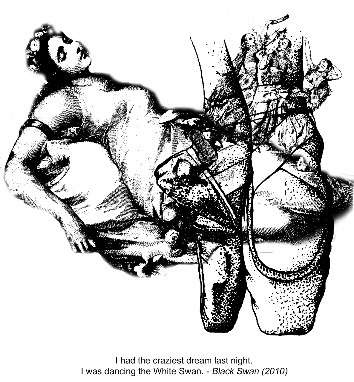
Sample 1 was out of the picture because the head was being chopped off and Ina didn’t like that lol. But what I liked about this one is putting a swan in the ballet shoe. I like to merge pictures together , so I thought it’d be nice to fit the swan inside the shapes, so that there’s meaning behind it. Swan + ballet shoe = dancing the White Swan, as portrayed in movie!
It was fun making Sample 2 because I loved the 3 dancing ladies. I didn’t want to put them around the shoe or elsewhere because I think it’d be a bit “off”. Again, I merged them with the ballet shoes and put them somewhere in there. Overall, not as simplistic as Sample 1 and it’s very literal.
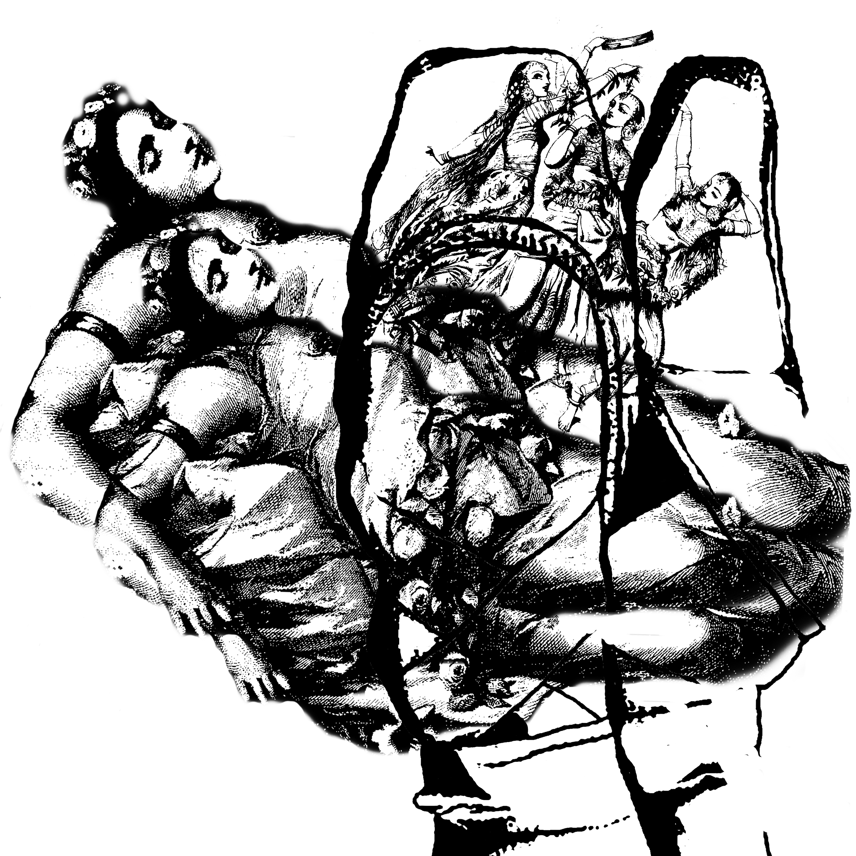
Similarly, Sample 3 was done the same as previous. I guess I wanted to add a bit of depth to the composition. I just double the sleeping lady, and changed the way the ladies are put in.
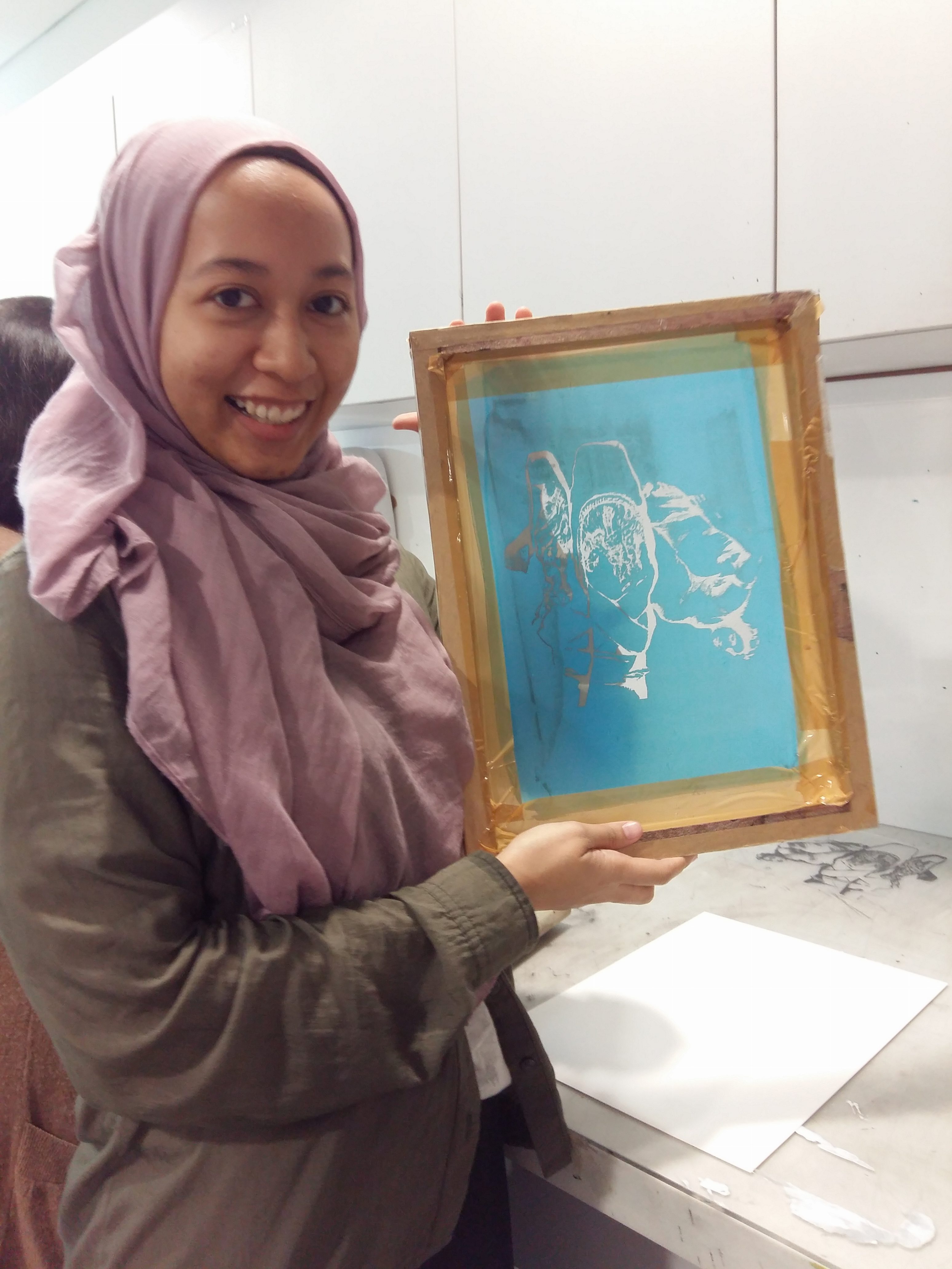
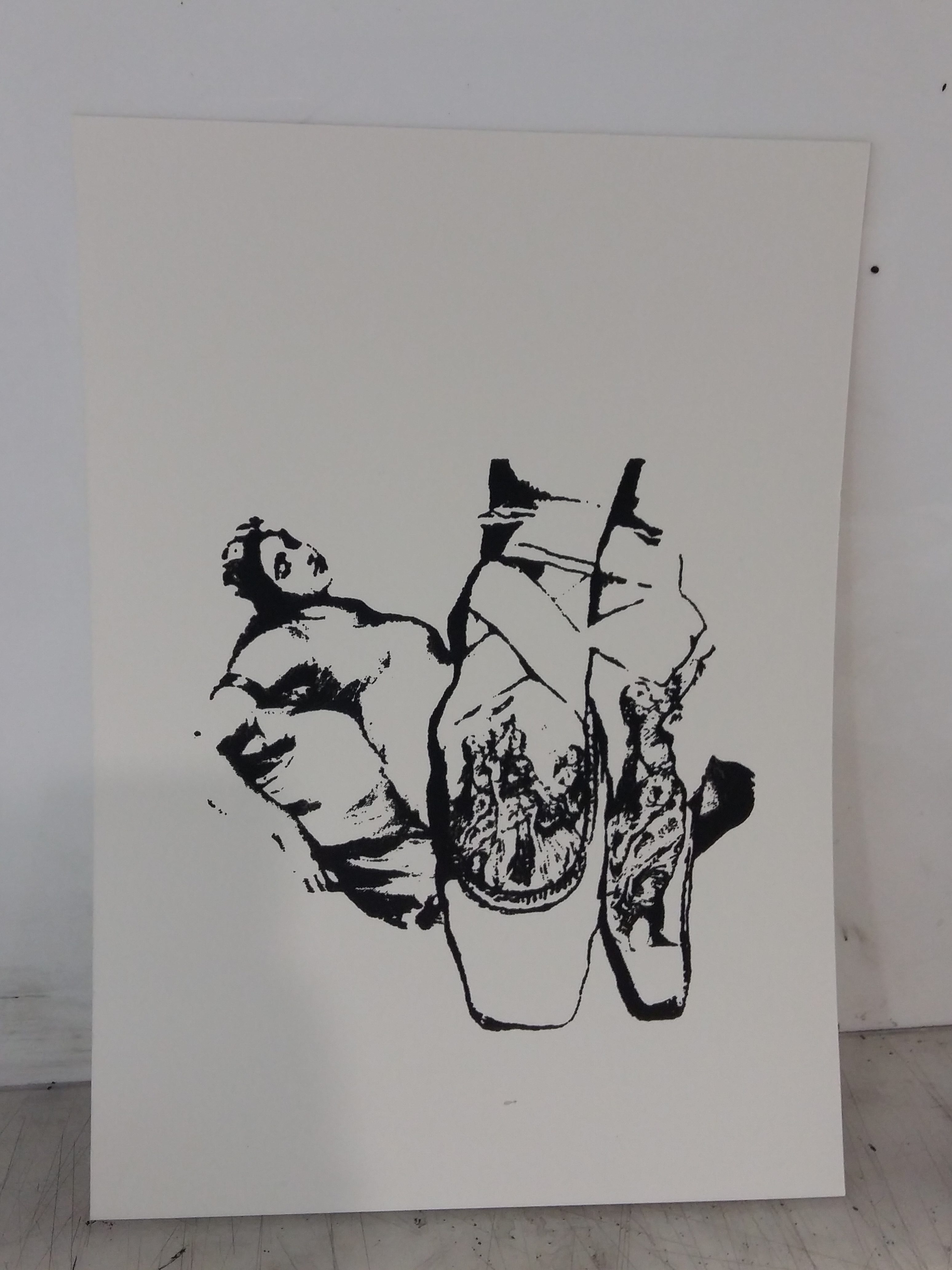
Done some more research and googled “old engravings stages”. I wanted to add a setting so there’s a base I could work on. I did some silkscreen printing on the previous 3 samples, but there something I didn’t like about the outcome. It was kinda meh…..
So, after much photoshopping, I came up with these. They’re my finals.
I tried to use emphasis on the 2 dancers, through the use of scale. By upping the scale a bit, it will focus your attention more on them as the main people in the picture. Sincee there’s this mirror effect going on with the 2 ladies, I had to choose a background that is similar as well. Something like Symmetry.
The movie Black Swan had characters where dancer would dress as either White or Black Swan. And their ballet costumes from their tutu to their masks and their hairclips all resembled to that of a swan. So with Photoshop, I played around with the head of a swan and overlap it on the subjects’ faces. That was fun to make, because it really did look like they are wearing masks. It was fun to adjust the swan’s eyes and matching it with the other features of the subjects like her lips and nose. It matched so that’s awesome.
The least obvious part, I think, was the hairdo. If you notice the swan heads are actually part of the hairdo. Their heads kinda stick out of the dancer’s hair, looking like a bun. These pictues below are the original ones. It’s not that obvious.. but you can make it out in the picture.
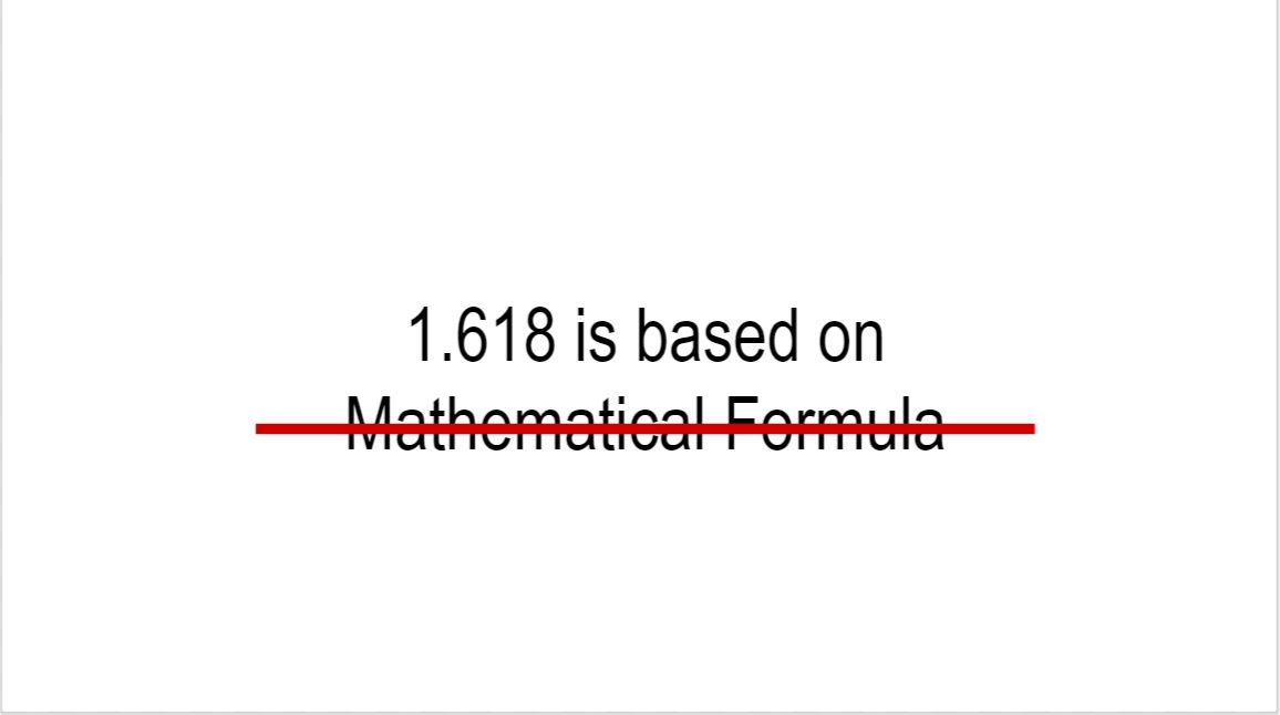
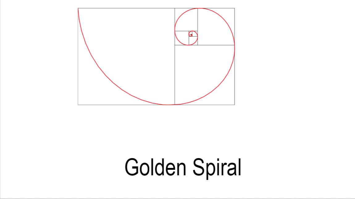
To get this number it involves maths but since im bad at maths, im not really gonna touch a lot on how to get that number. But basically to get that golden ratio number iits based on a specific formula
Imagine u have a finite line called a. And there is a random point on a that separates the lines into two different lengths. We r gna call the longer one b and the shorter c. now if u were to divide the length of b by c and its equal to a/b then those two numbers will be in the golden ratio
Based on that ratio u can create sth called the golden spiral. It serves as the basis of the golden ratio tool
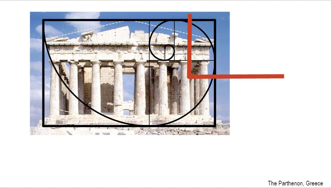
The idea is that when u overlay the golden spiral on top of the artwork, im taking leonardo da vincis mona lsia as an eg, you want the focal point which is her face to lie in the intersection of those two red lines. So for eg, if u want to take a portrat pic of soemone u would want the eyes to be around that line
the top of the columns and base of the roof line are in a close golden ratio proportion to the height of the Parthenon.This demonstrates that the Parthenon has golden ratio proportions because the focal point that is the frieze (the part above the column) lies around the intersection of the red lines and the columns that is the secondary focus lie on the rest of the golden spiral
Golden ratio is everywhere around us. As u can see on this twitter layout, the tweet which we click on acts as the focal area as it is on the intersecting rlines. The rest of the secondary tweets which we r not reading flow out around the ohter parts of the spiral
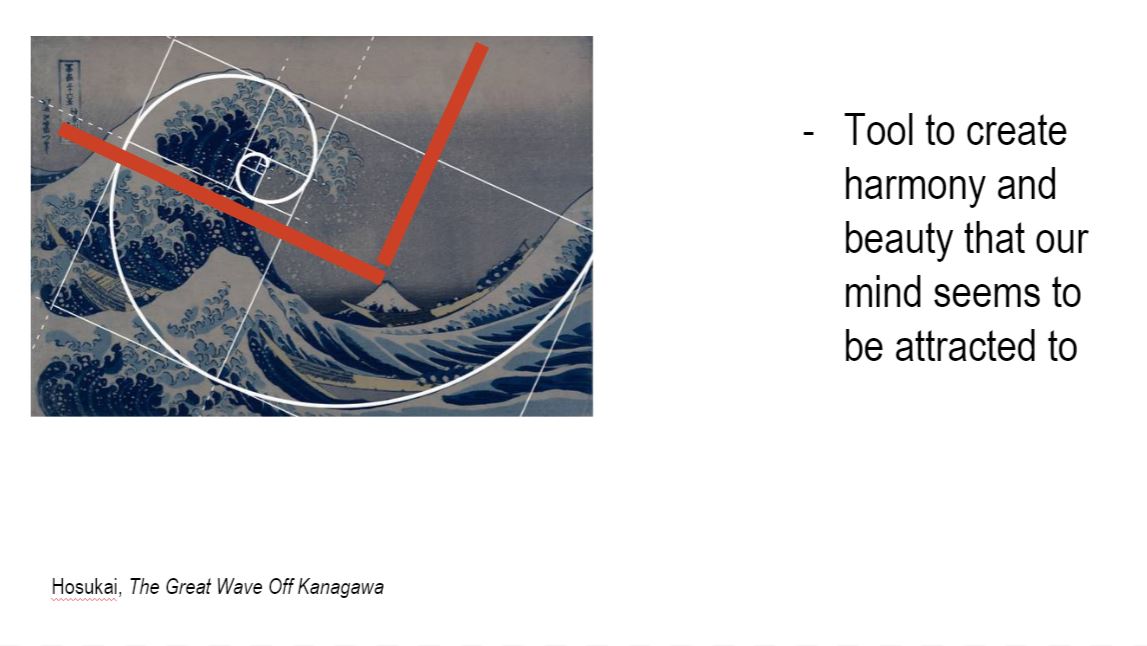
As you can see int his Great Wave painting our eyes are immadiately diverted to the area around the red intersecting lines and then it slowly flows to the other areas of the golden spiral. This makes thw whole painting aesthetically pleasing and not too overwhelming on the eyes
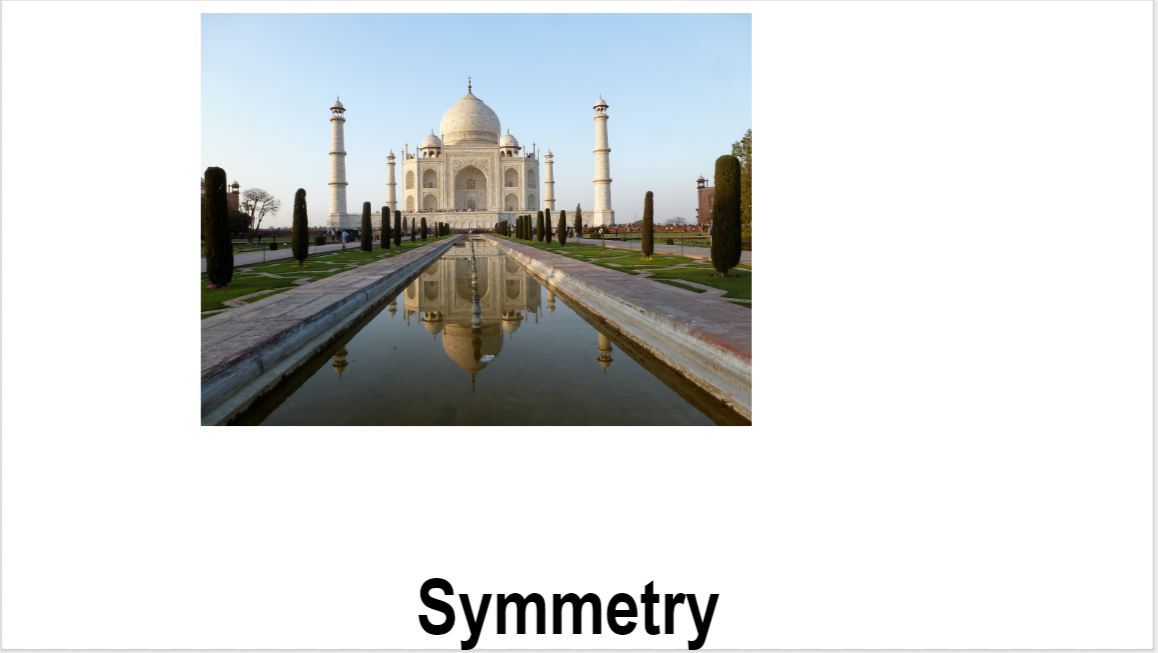
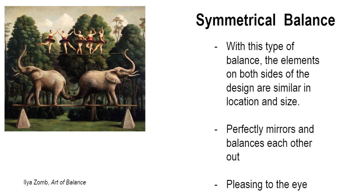
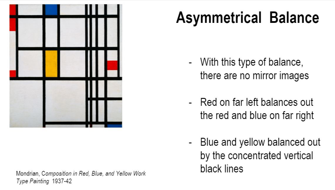
When it comes to symmetry theres two types symmetry and asymmetry. Ill be talking abt symmetry.
U can easily imagine that if a line was drawn in the middle, the left side would be virtually identical to the right
There is a same cluster of subject matter on both side of the artwork
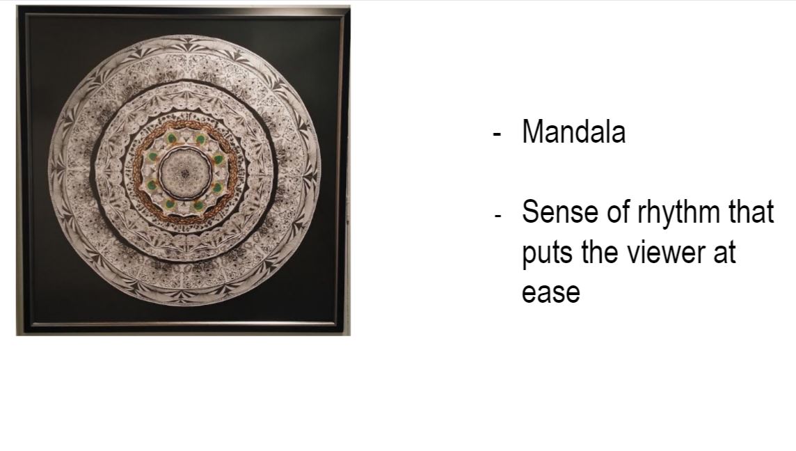
Did this for a levels. If u were to cut the mandala into a quadrant and repeat it, it mirrors the exact image
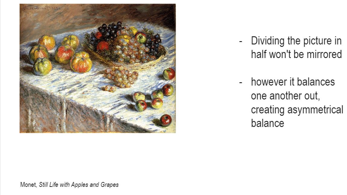
Each side of the design is different one huge tri on the left and 3 small tri on the right yet still balanced
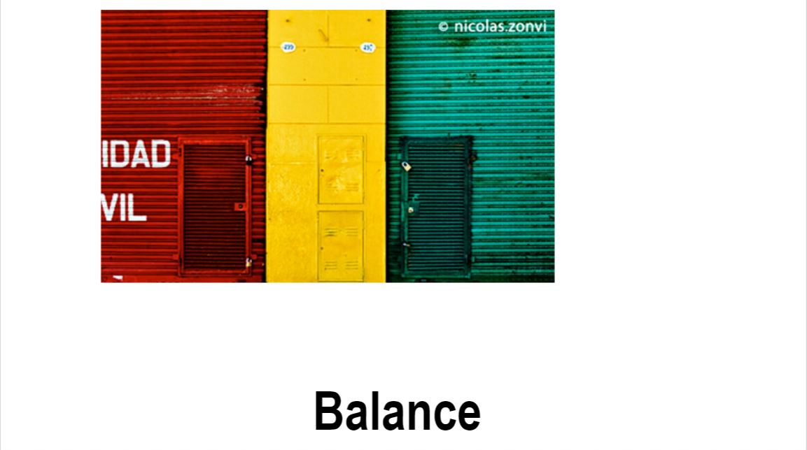
Symmetry and asymmetry are similar because they both exhibit a sense of balance.
Eg.
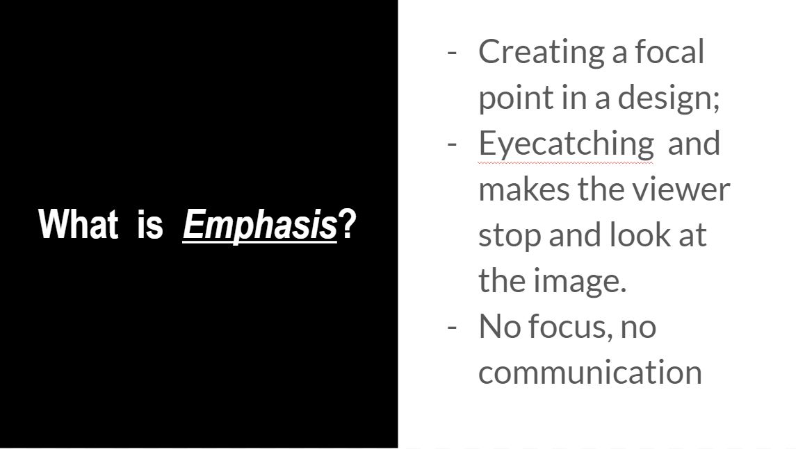
Emphasis creates a focal point in a design; it is how we bring attention to what is most important.
Emphasis is what catches the eye and makes the viewer stop and look at the image.
Without emphasis, without getting the viewer to look at the image, communication cannot occur.
You see a person hidden under a rainbow coloured umbrella. She’s walking in the snow. Everything else is covered in white except for the umbrella. And the thing that pops in your eye is the umbrella. This shows how that emphasis is placed more on the rainbow. Contrast in colours is being used, to show emphasis.
Similarly, contrast is being used here. What is being emphasised in the small dot , in a midst of big black dots of similar size and colour.
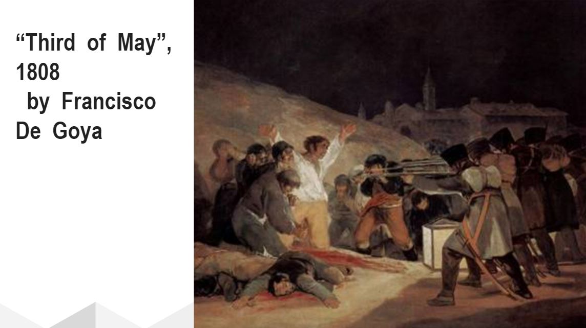
Emphasis can also be created by placement. Placement meaning the way some elements are being put also creates emphasis as well. We see a row of soldiers holding rifles standing side by side. As rifles are directed towards one directiom, that is a form of emphasis. Emphasis is put on the men in white with his handup in the air.
Implied lines all directed toward the same place can create a focal point there. Isolating an element from the others by its position in space will also create emphasis.
Implied lines, which also come in the form of subjects, all directed toward the same place can create a focal point there. Isolating an element from the others by its position in space will also create emphasis.
An important thing to remember about emphasis is that if everything is emphasized (all text is large and bold, all images are animated or flashing, everything is in bright colors) then nothing will stand out, nothing will be emphasized, nothing will grab the viewer’s attention.
Everything that you see has no focul point, and it becomes super messy.
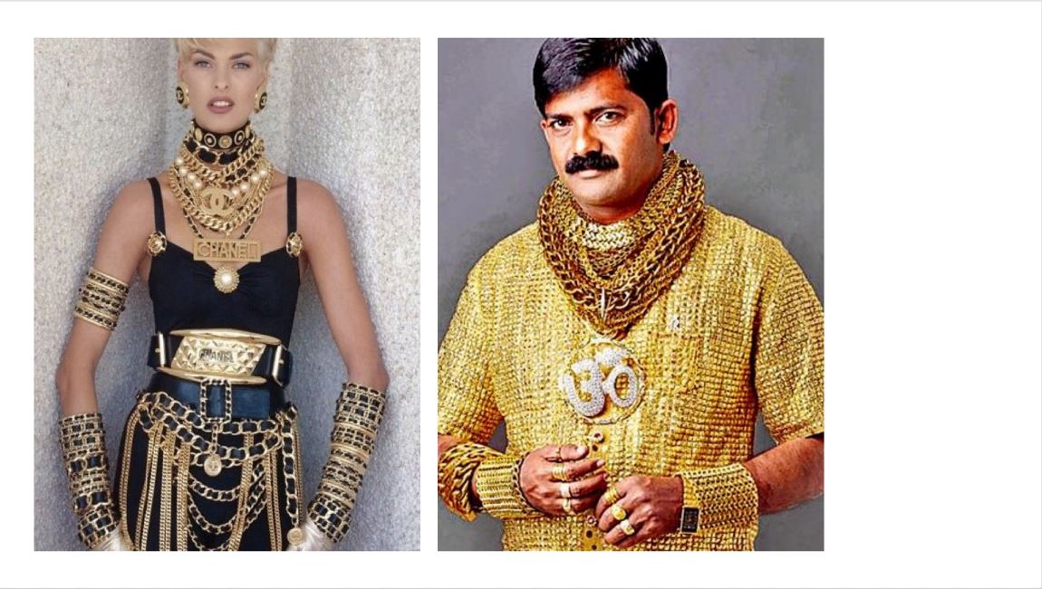
Fashion no-no’s: Too much emphasis as seen here. These two appear to be wearing lots of gold. Even if you look at them indivudally, your eye tend to wander around the gold. There’s no focal point, so you don’t know what is being emphasised here.
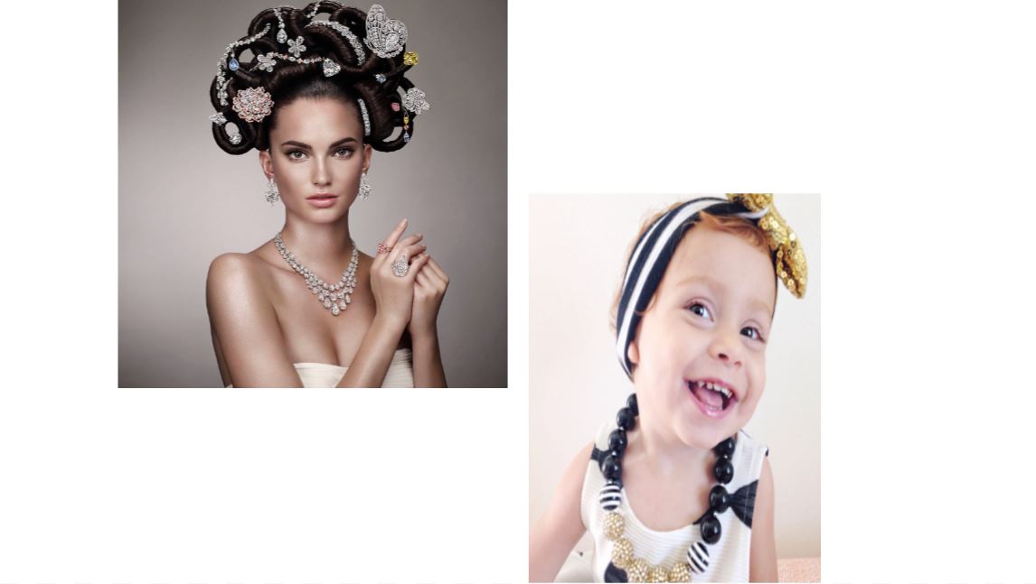
Both of these girls covered in jewellery but not as much as the ones before them. A good amount of emphasis put on the way jewellery is being put in model’s hair. Your eyes are much directed to her hair, her focul point. Then it drops down to her earings, her necklace and then those 2 small rings on her finger. So, there’s emphasis on the jewellery, your eyes are working around from top to bottom, making it easy on the eyes
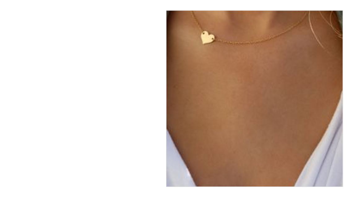
Similarly, as we see in someone’s neckline area, we see heart shaped necklace. What draws our attention is the the thing that stands out the most, that is the little heart shape here.
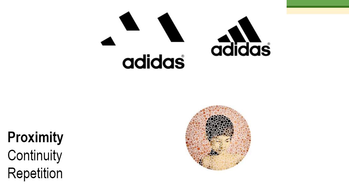
There’s this theory called gestalt theory of visual perception. What it means is basically our eyes, by default, tend to find meaning when seeing elements placed together. This means that you as a person, is actually looking for a connection, and for unity in the designs.
So when it comes to unity, there are 3 ways our group elements together and form a whole.
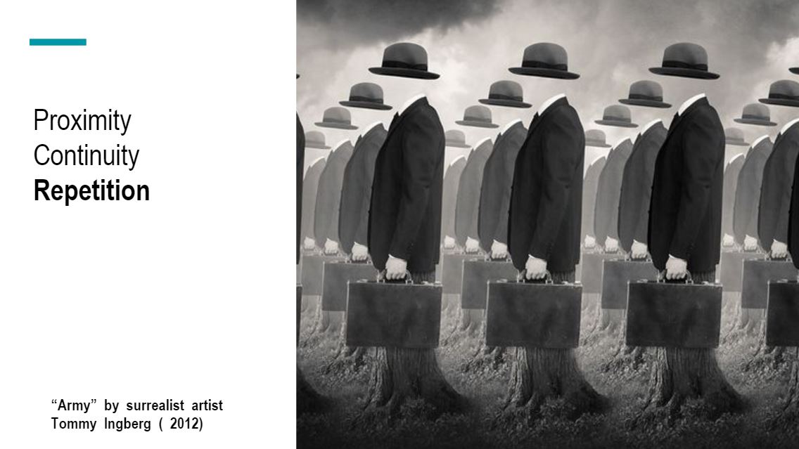
Proximity
continuation
Repetition
Proximity is based on grouping by closeness; the closer elements are to each other, the more likely we will see them as a group. Proximity is one of the easiest ways to achieve unity.
Continuation means that something (a line, an edge, a curve, a direction) continues from one element to another. The viewer’s eye will follow the continuing line or edge smoothly from one element to other and the mind will group the elements because of this connection. Implied lines are one example of continuation.
Repetition is based on grouping by similarity; elements that are similar visually are perceived to be related. Any element can be repeated – line, shape, color, value or texture – as well other things such as direction, angle or size. Repetition helps unify a design by creating similar elements and is one of the most effective ways to unify a design
Repetition is based on grouping by similarity; elements that are similar visually are perceived to be related. Any element can be repeated – line, shape, color, value or texture – as well other things such as direction, angle or size. Repetition helps unify a design by creating similar elements and is one of the most effective ways to unify a design
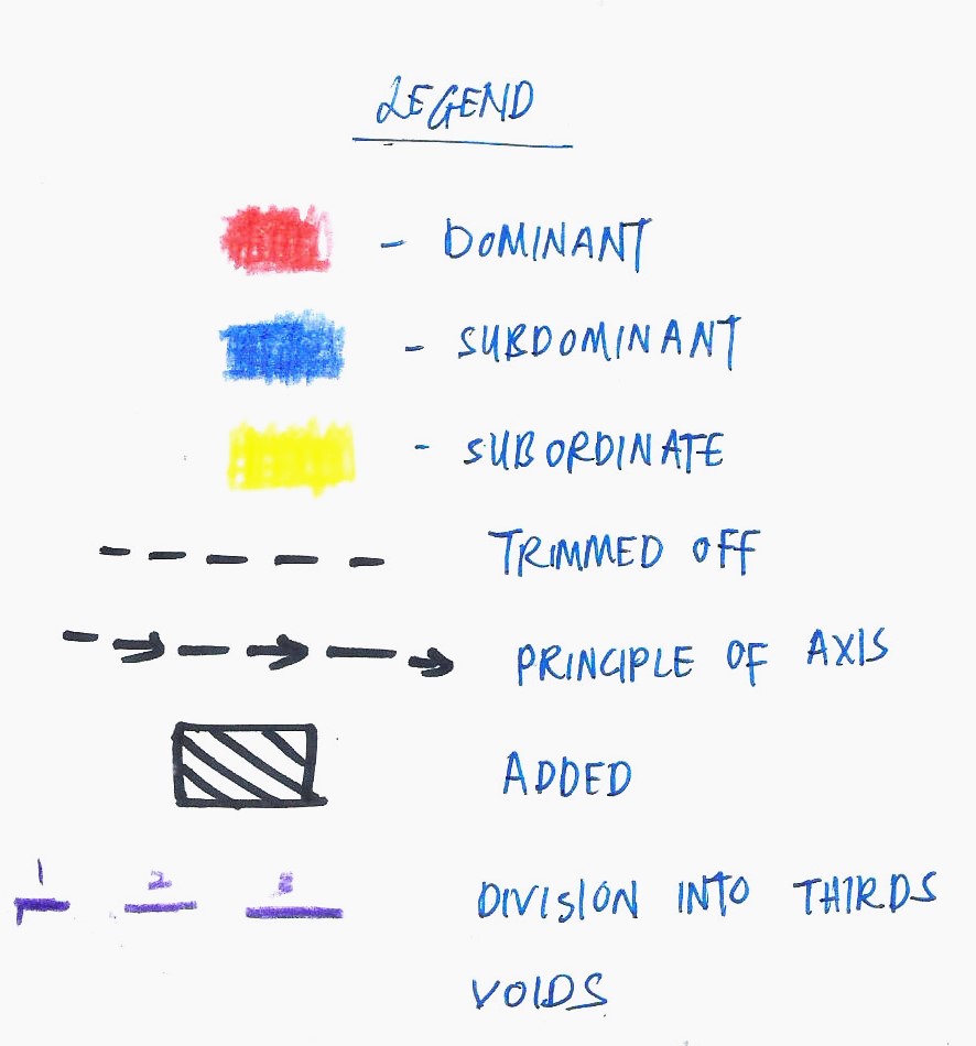
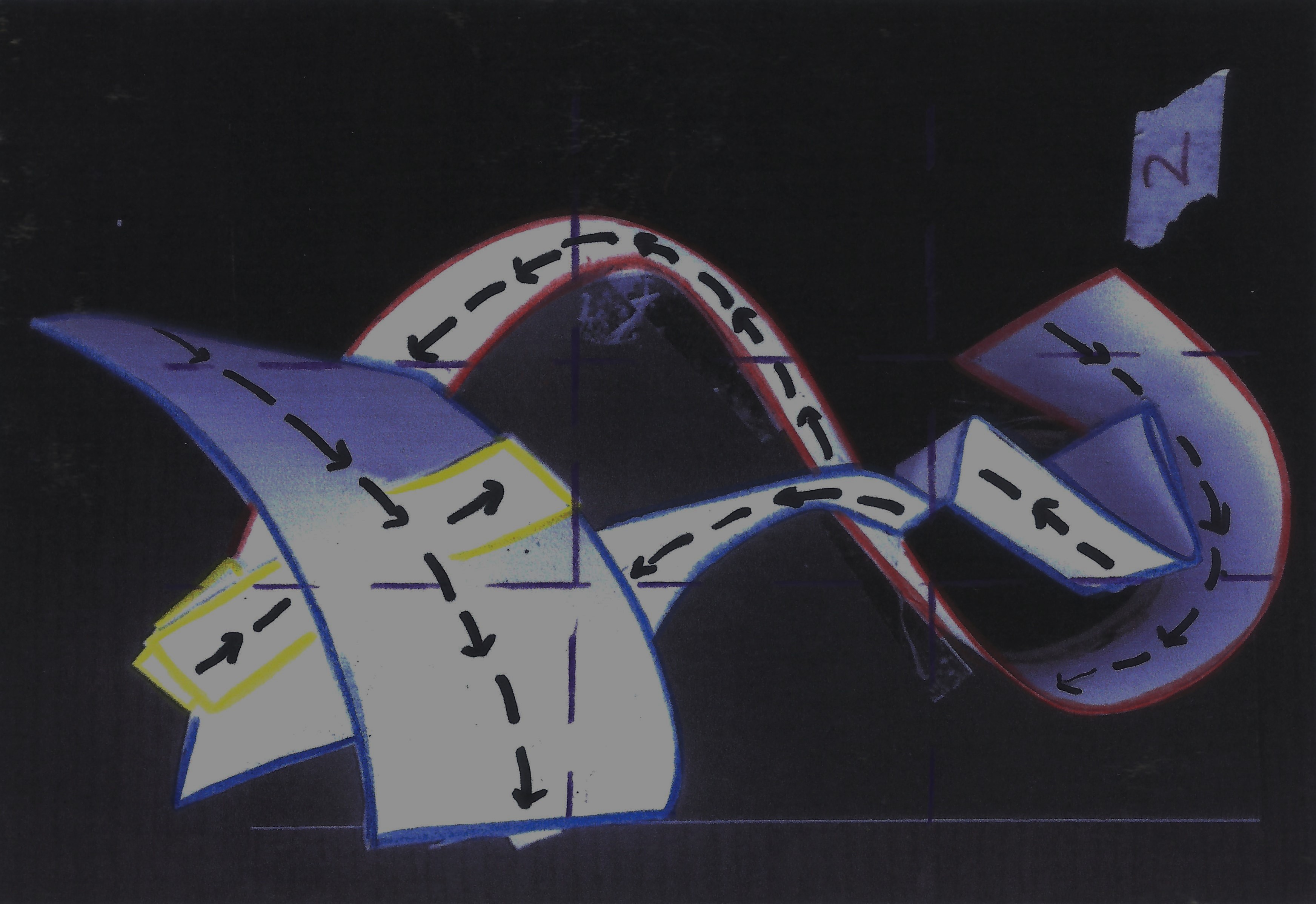
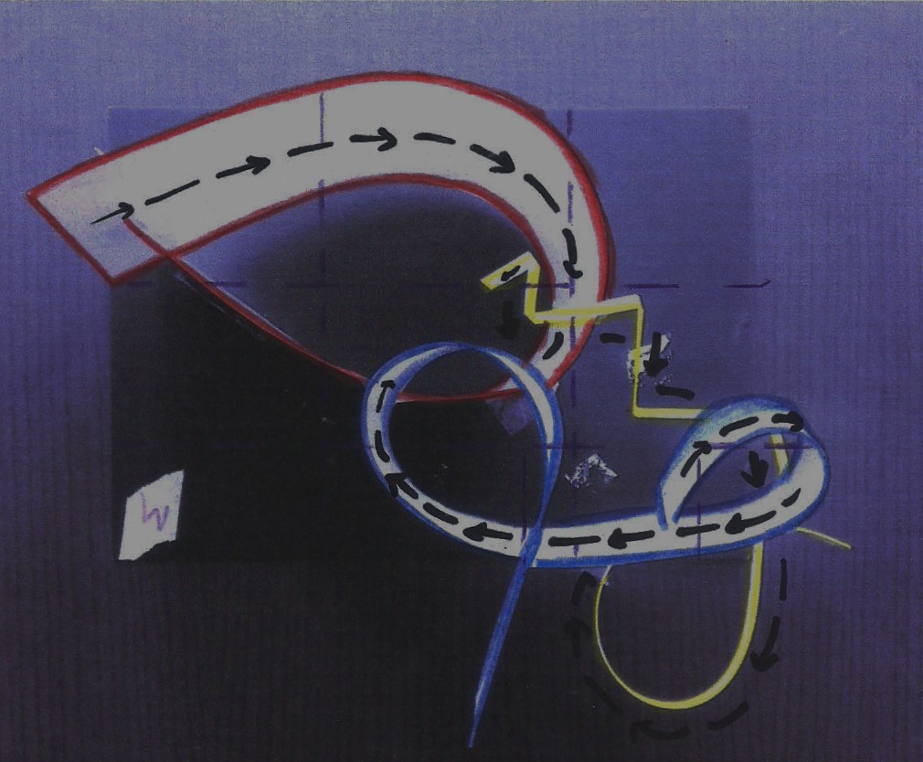
Voids are white in colour. Correction tape is used to show void.
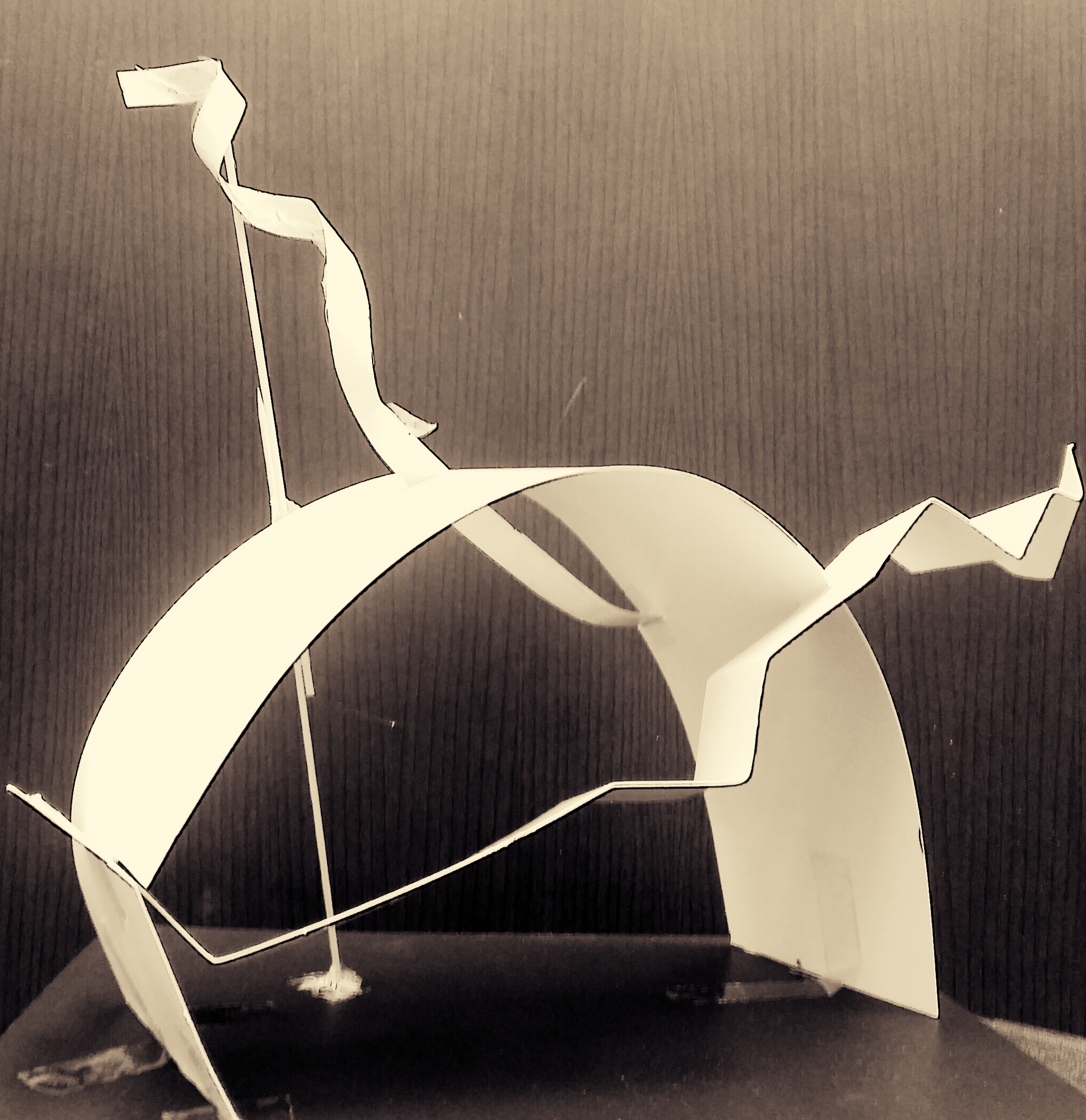
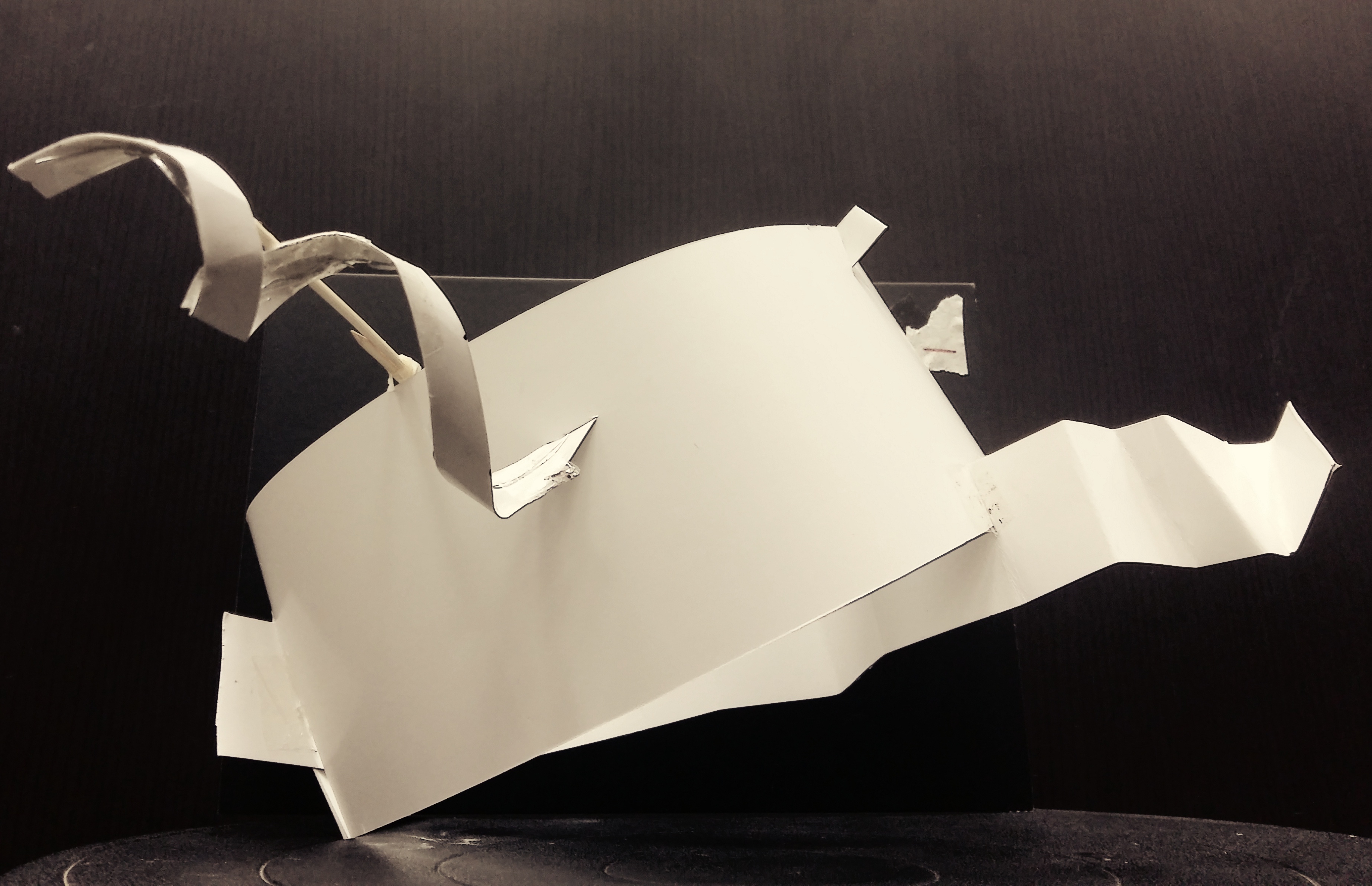
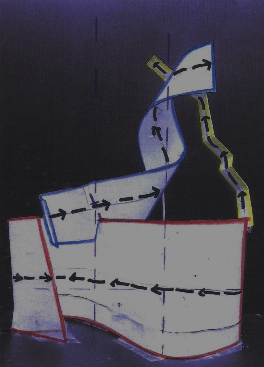
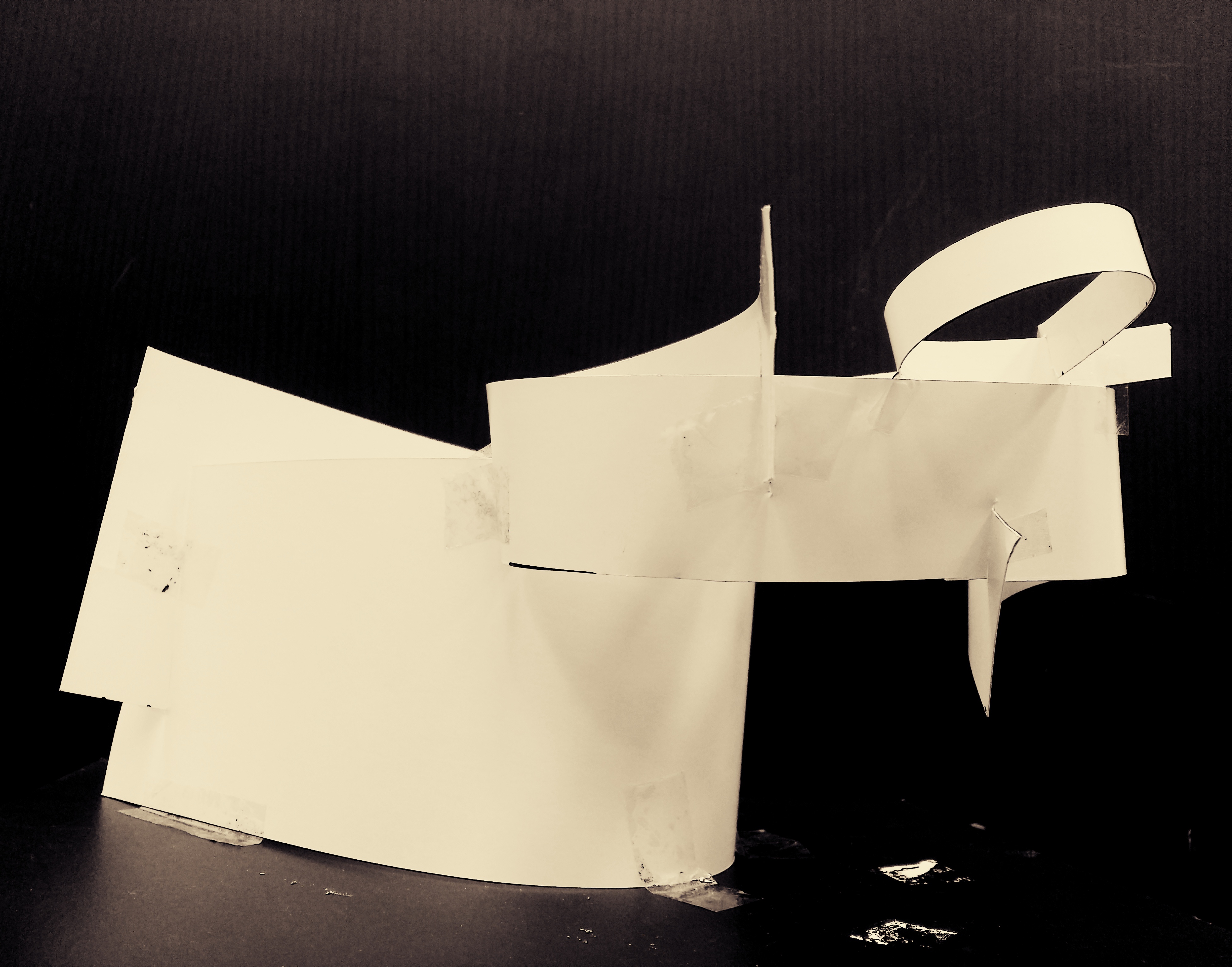
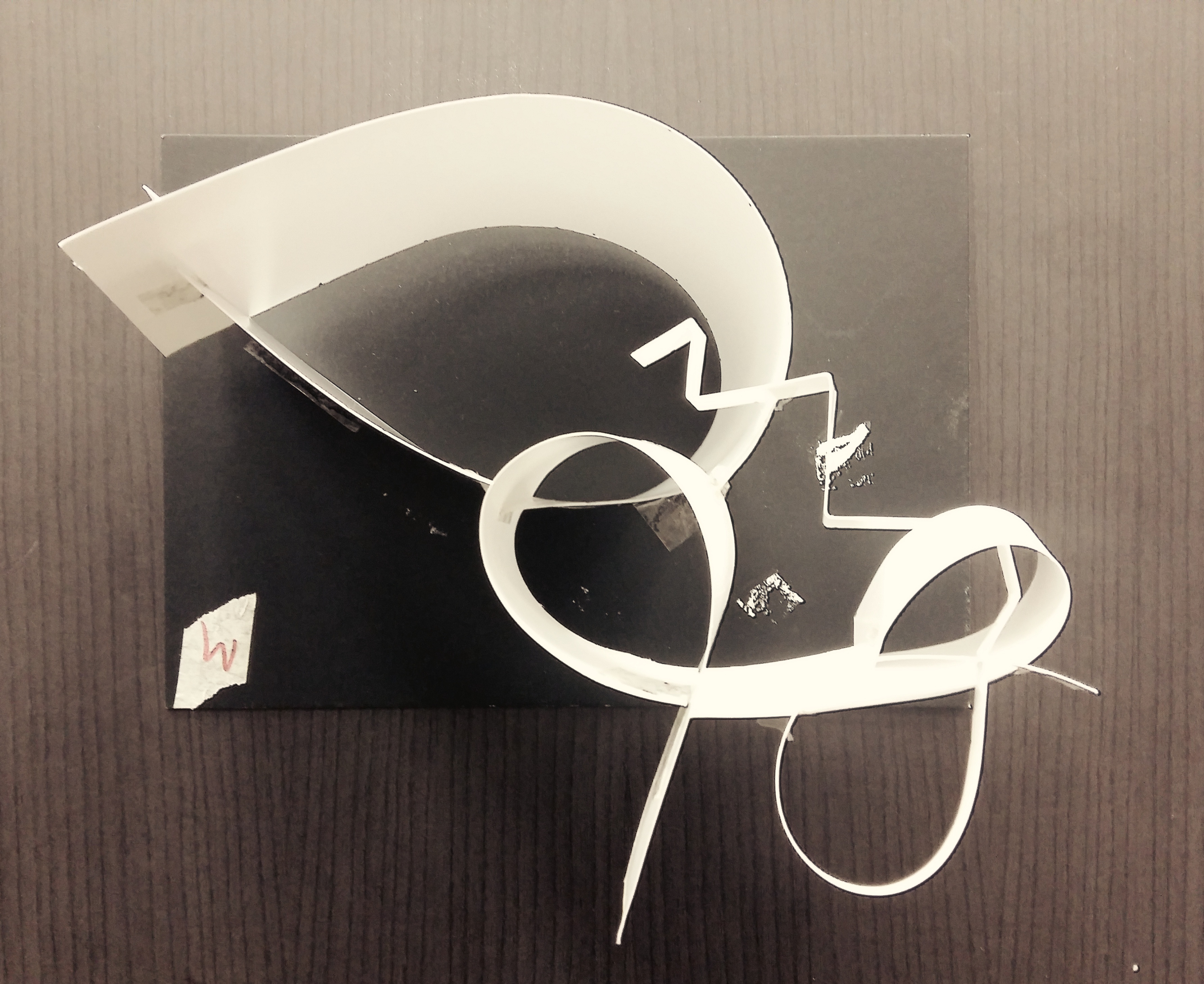
MODEL 1: “THE SNAKE YOU NEVER TAME”
Side view of “The Snake you Never Tame”
Top view of “The Snake You Never Tame”
MODEL 1: “THE SNAKE YOU NEVER TAME”
Named this after I realized this looked like a snake coming out of this shell. A snake doesn’t like shelter. It stays in the wild, and it looks like it’s trying to reach out of its shell, to escape into the wild.
Voids:
D: below the arch
SD: shares the same void as D, but other 3rd is its own void
SO: shares a bit with D, but has its own void at upper 1/3
Improvements in voids:
More of SD to extend out of D. So that they don’t share same void.
1/3 Rule: SD starts from bottom 1/3 and stretches sideward by 1/3. Extends to the right.
As right side has a lot going on, the left needs the same as well. Without adding symmetry, SO’s thinner and longer shape is pierced out from D. it is pierced out from 2/3 of D and towards the left, which is empty. It spirals out to give its distinctive look from others.
Used: Wedging, piercing
______________________________
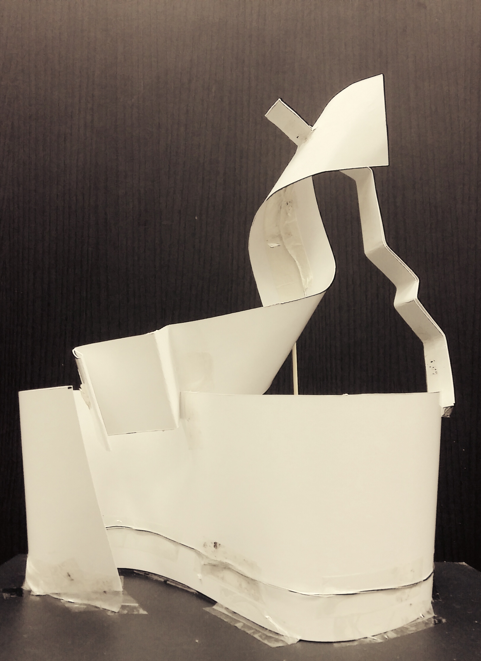
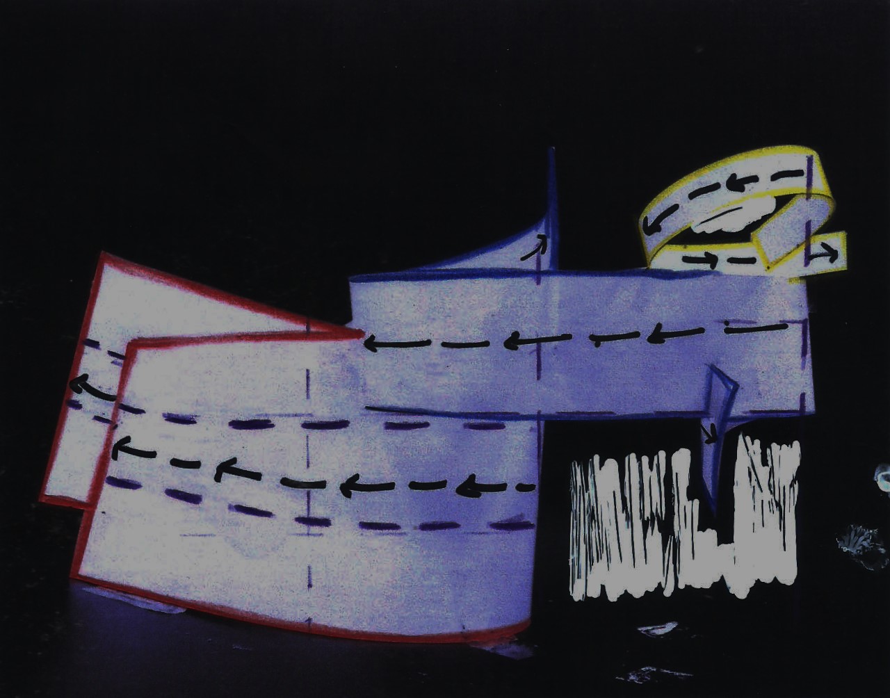
MODEL 2: “NICE GUYS FINISH LAST”
Side view of “Nice Guys Finish Last”
Voids are in white.
Top View of “Nice Guys Finish Last”
Voids are in white
MODEL 2: “NICE GUYS FINISH LAST”
The blue and red seems to look like 2 big guys fighting for that one girl (in yellow). As alpha and “dominant” the red may be, the nice skinny nerdy boy in blue takes home the prize. From the side view, you see the blue standing on top of the defeated guy in red. Then he hugs the beautiful girl in yellow. Moral of the story: Nice guys finish last!
D curves at every 1/3 of base.
Improvements in 1/3 rule:
SD’s length is too long. Trimming it shorter and piercing more of its portion out of D would be better. Also, it would have its own void as well.
Improvements in Voids:
SD and SO might share the same void. SD can develop its own void by making SO shorter. This allows SD more void to take up on its own.
1/3 Rule: SD is wedged at D’s 1/3.
SD could be better improved by intersecting at SO’s upper third.
SD to be trimmed to 2/3 as it looks similar to SO and SD.
Additional: Wedging, piercing
______________________________________
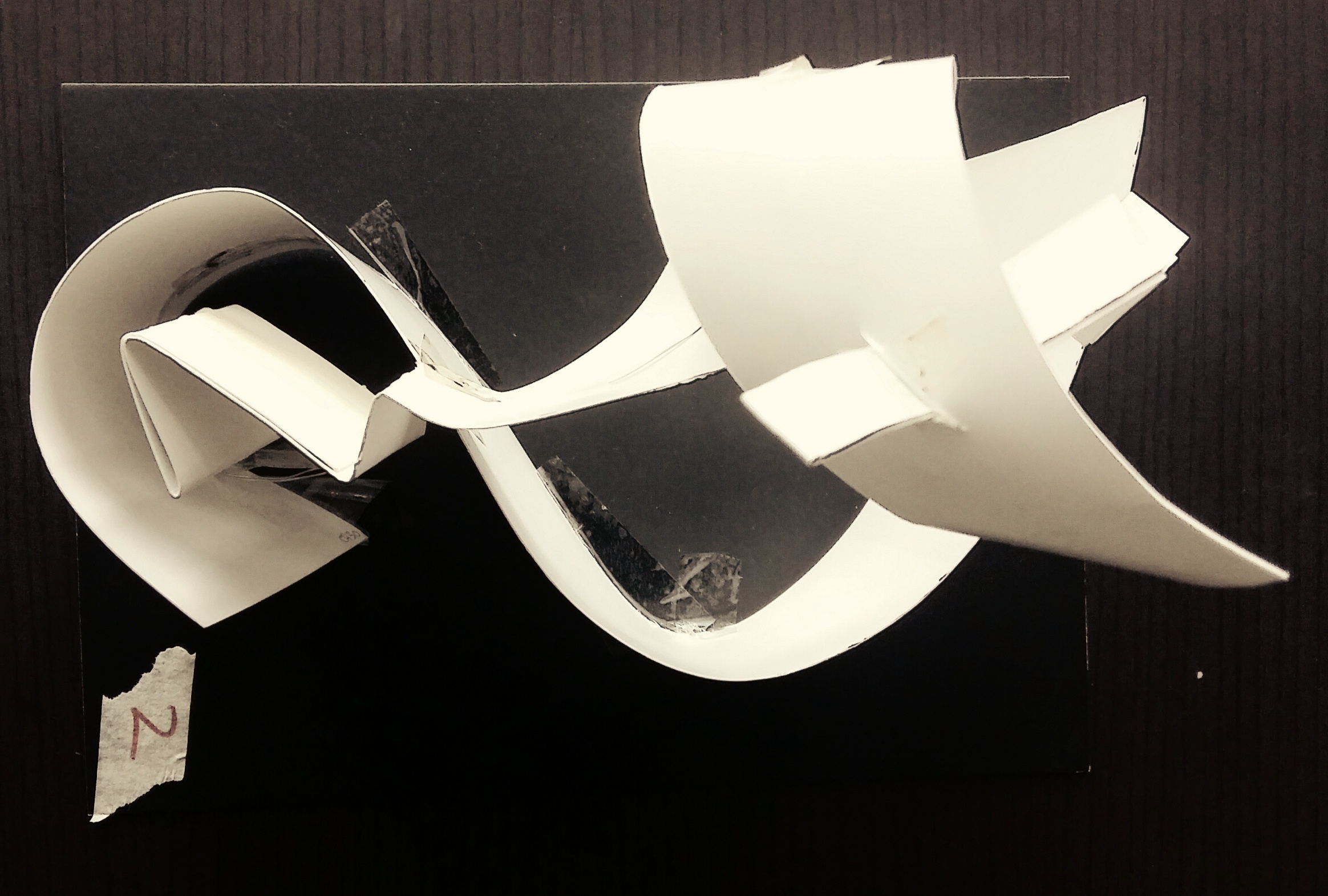
MODEL 3: “THE NO RIBBON PROJECT”
Side View ” The No Ribbon Project”
White are voids.
Top View of “The No Ribbon Project”
White are voids.
MODEL 3: “THE NO RIBBON PROJECT”
All three elements follow the same oval shape. With similar intersections, it looks like a ribbon tied up. Since there’s no application, I named it the no ribbon project.
Voids to be improved:
SO shares same void as SD, so by putting it up like a spiral pointing upwards, this creates void on its own.
1/3 rule to work on:
Lengthwise, D should be longest, hence SD needs to be shorter ( by folding it further to appear shorter than D).
Height wise, the SO needs to extend it’s spiral upwards, to give height. Also, this create 1/3 rule where D is below 1/3 and SO is upper third.
Wave-like cuts at bottom of D. This removes flat surface of D, giving viewers other elements to “peek through” with holes at bottom.
Final model. (Update as of 16/9, the SD is thinner due to similarity in terms of volume to SO.
Above application is Model 2. Below are my applications for Model 2.
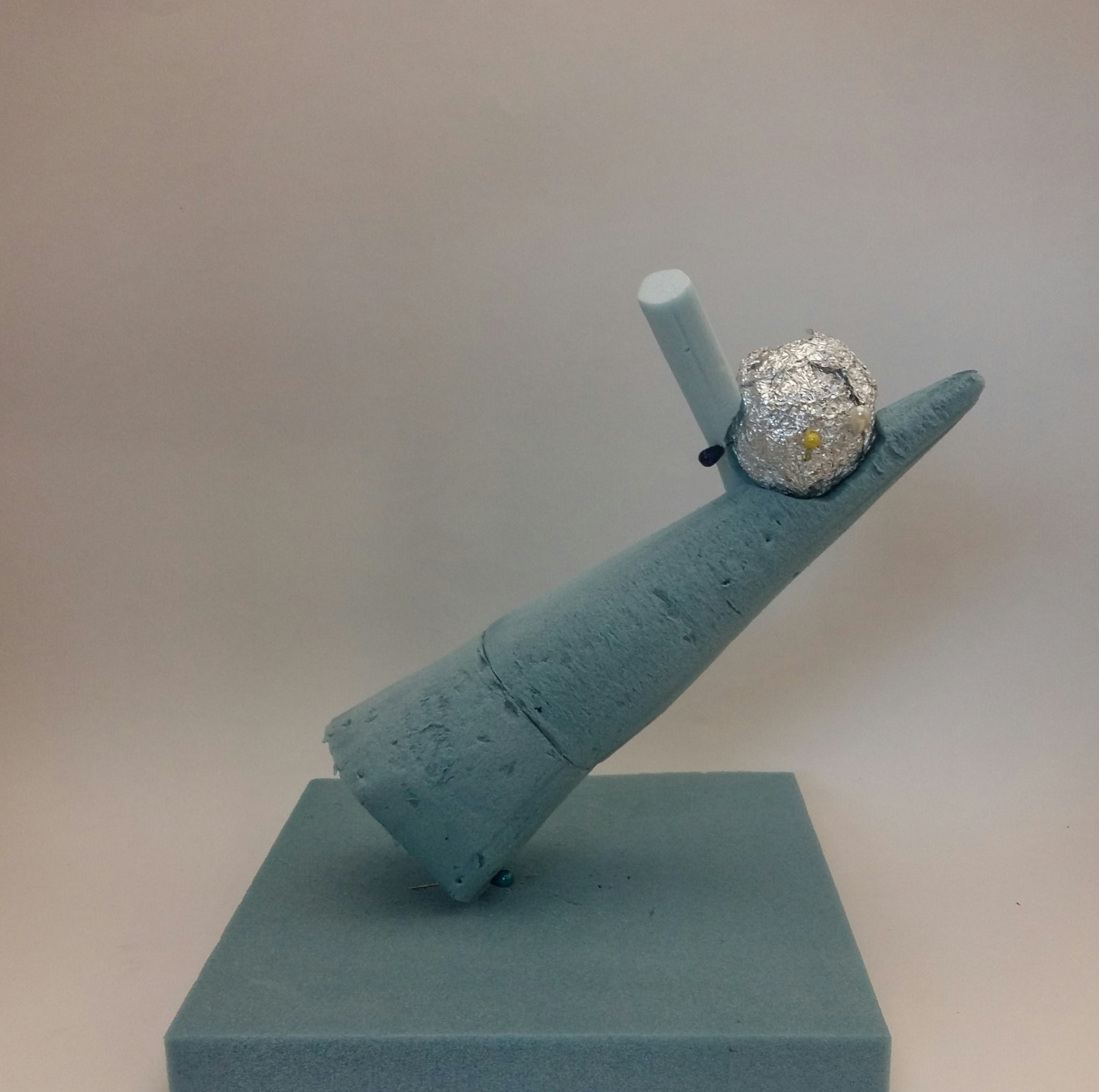
First one is called “ChoCorn Froyo”. In short for Chocolate + Corn + Froyo, this hot-cold dessert is made up of a grilled corn-on-the-cob, and it is topped with froyo ( frozen yoghurt ). A wafer stick is planted at the side and a ferrero rocher is placed in between. I thought this hot-cold dessert would be good because it’s shape is different from any other typical food desserts which are normally flat. The SO that is the ferrero rocher, would give a chocolatey taste on top of the warm corn and cold yoghurt, thus adding a bit of chocolatey + crunchy taste!
“Chocorn Froyo” designed in Photoshop. After review with Ms Cheryl on 16/9, wafer stick should be smaller. This makes the rocher bigger and more prominent than the wafer stick.
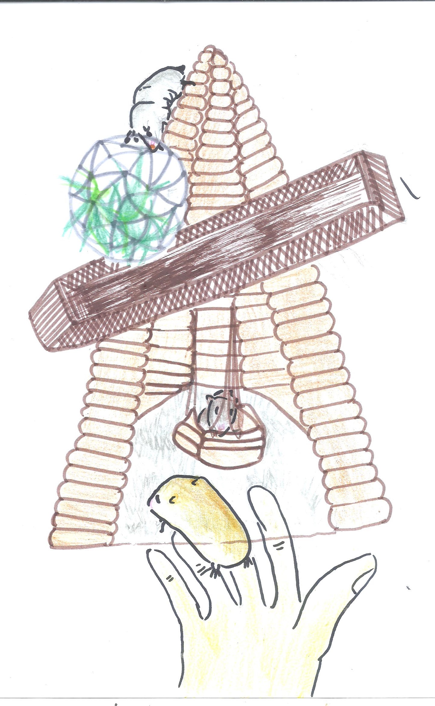
Also, another application would be a playground specially for hamsters – “Ham-Ground” for short. ” Ham-Ground” is sketched out as seen below. Wood is used for both D and SO because it has rough texture and doesn’t get hot easily. That makes it hamster-friendly because they can easily climb up and down the “hill” with their small and fragile legs.
Next, a “bridge” and “food corner”, that is made up of a wooden SD and metal SO respectively. The slanted bridge would be for the hamster to get a good view of the top or maybe slide up to down for a cheap thrill. After a tiring workout of climbing up the “hill” and playing “slide”, they can take a break in the food corner, where it is a metallic sphere containing all their favourite foods. I think the metal adds a bit of contrast to wooden material, and it would be good in keeping their foods or themselves warm and some physical protection from annoying human fingers.
The ground of the cone, would be made up of soft rug/fabric. This would allow a hamsters a softer feel of their legs after a hard workout climbing around. It is also a good hideout to rest.
Change of position of SD – from mid centre of D, to upper right centre. Sd is now placed at upper 1/3 of D 1/3 of Sd is removed, so that SD’s deimater is not similar to SO. Change of position of SD – from mid centre of D, to upper right centre. Sd is now placed at upper 1/3 of D 1/3 of Sd is removed, so that SD’s deimater is not similar to SO.
Final 1a
SO and SD are switched.. Now the sphere is SD, cone is SO. Instead of placing it near SD, it is placed on its opposite side.
Final 1b
SD appeared too distinct and too long, hence I cut it short. The length of Sd is now 1/3 of diameter of SO.
To give asymmetry to overall look, SD is slighty elongated, at one side. This gives balance to D that mostly titled to right. So SD balances that out.
Final model. (Update as of 16/9, the SD is thinner due to similarity in terms of volume to SO.
Final model. (Update as of 16/9, the SD is thinner due to similarity in terms of proportion to SO.
final 3a
Final model. (Update as of 16/9, the SD is thinner due to similarity in terms of proportion to SO.
final 3b
Overall, I chose Model 2 because I could visualize something good out of it. I thought of a hamster playground and some dessert to make out of Model 2. The dominant cone would be quite exquisite in terms of the way it would show food, when normally food is presented flat. On the other hand, the spherical shape reminds me of a hollow ball I used to buy for my hamster. Just like a hamster wheel, the ball contains the hamster and it gets to roll around the house whenever and wherever. So, that’s why I’d make Model 2 into something useful for hamster- like a playground of some sort. 🙂
This is irritation. The little specks of white dots that form little lines, and droplets remind me of those cone shaped ice solids. The ones that you find in the frozen water droplets.. This was done using monoprint which covered paint marks. I switched the colours around and gave out this look. This is the irritation.
This would be envy. At first I thought they resembled cockroaches with their oval shaped body and antanneas popping out of it. It’s horrid look which is placed in neatly alterantive places, makes it portray emotion of envy. Method: Monoprint over feather duster, photoshopped the end of the feather, as seen in delicate ends of the feather.
This is definitely rage. From afar this looks like a camera zoomed in to the moment where it snaps the shot of water being splashed. There is some commotion and chaos in this pattern because of its irregular shapes, and lack of rigidness. I thought Rage would suit this well. Again, monoprinted over plastic wrapper, and used photoshop to merge different parts together like a rope.
Fear:
This would show horror the best. There’s somethign about the delicate ends stretching out to the middle part, that makes it look very creepy looking. It’s like small little arms stretched out from the sides, ready to rip you apart. Again this was used using the feather duster where I edited out the ends. This gives it the look.
This would be nervousness. The crammed spaces being filled by this big patterns of something all huddled together, one side more than the other. I thought this was a good choice to show nervousness – in which normally you would feel a little uneasy and tight.
Joy:
Relief: The soft gradient from white to black, and folds of the gauze give off a soft emotion- relief. Method: Monprint over Gauze, PS
This is pride. The contrasts are strong and some are faint. they are neatly layered side by side, but still a bit relaxed and a little slanted off to the sides. Thiss reminded me of pride, because those lines look like they are reaching up. Method: Straws cut in small strips and lined together. Monoprinted over straws, and use of repetition in PS.
This is Euphoria. The large balloons overlapping each other in large scales. they take up a lot of the spaces. That shows a lot of positive emotions and that includes euphoria.
Love:
Affection. At first, they look like stick figures doing a tribal dance – holding hands, and shaking heads all at the same time. The faint lines which overlap each other, and the turn of the lines gives a sense of softness to this line pattern. I thought the softness showed affection. Method used: Monoprint over folded plastic wraps.
Longing. The overlapping of big lines and the strong contrasts, and the alternate patterns give a sense of longing for something or someone. Kind of like an attachment. Method: Raffia strings in monoprint.
Fondness – because I think the squiggly lines and maze-like patterns gives off a nice overall look to it. Some are bolded bits and some are thin, adding variety to this pattern. Thought it reminded me of those Eqyptian tribal patterns that has a meaning I don’t understand. Method: Handrawn.
SADNESS:
The little specks are like rain droplets – small but significant. the faintness of it also adds a layer of meaning to this – it is hopelessness.
This would be sympathy. The layering of leaves, on top of the other, creating a darker contrast compared to the rest resemles to that of a shelter- a shelter from harm. I thought sympathy would greatly match this. Method: Painted over leaves and paste it over paper and scanned them. This is different from monoprinting where I get to control amount of paint and control contrast in producing this effect. This is sympathy.
Suffering
SURPIRSE:
This would be astonishment. This pattern reminds me of a maze within a maze, where sometimes you bump into road blocks (black) and some shortcuts that makes your walk easy and smooth ( faint). Method: I used a makeup wedge-looking sponge, cut off some holes in one section till it looks destroyed. Those holes and (lack there of) makes up line patterns, when monoprinted over. Thus, giving this pattern/
Amazement.
Surprise. By far, not my best, but this was difficult to tell what emotions it showed.
D– The guitar body forms the dominant. The curves that bend outwards and inwards are there to help the guitar rest firmly on your lap.
SD– The guitar neck that points upwards is the subdominant. It stretches out of the mid portion of the guitar body. That makes it easy for one to grip the neck firmly and bring it around wherever you go.
SO– That would be the “headstock”. It’s the part where you see those 6 “switches” for the guitar strings, and you can twist and turn the switches as and when you like it.
Another SO could be the sound hole. It’s the circular hole in the body. What make it the SO is the fact that it gives contrast to the large surface surrounding it. Also, since it’s a hole, it works in giving the guitar sound an echo.