Project 2: Progress


poster-1cb84c07-8f89-48a2-be3b-b87d697bc4c3-1
The movie poster.


“I had a dream last night. I was dancing the White Swan.”.

-Black Swan(2010)

These are what I picked out when I was searching for visuals relating to the quote:


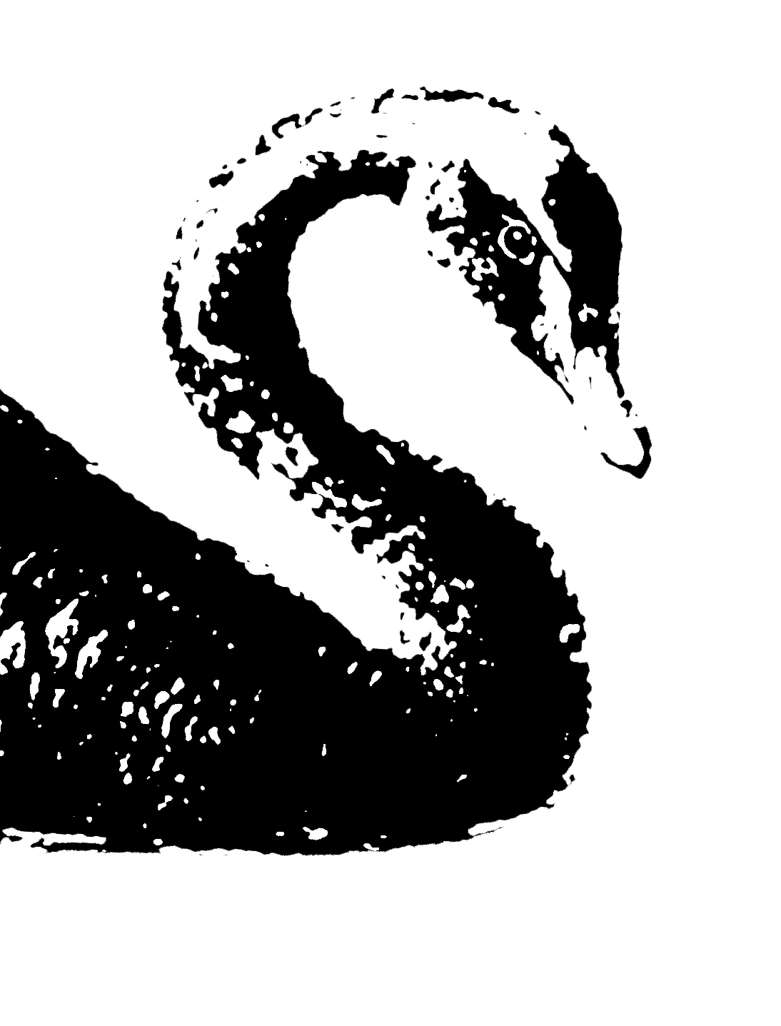
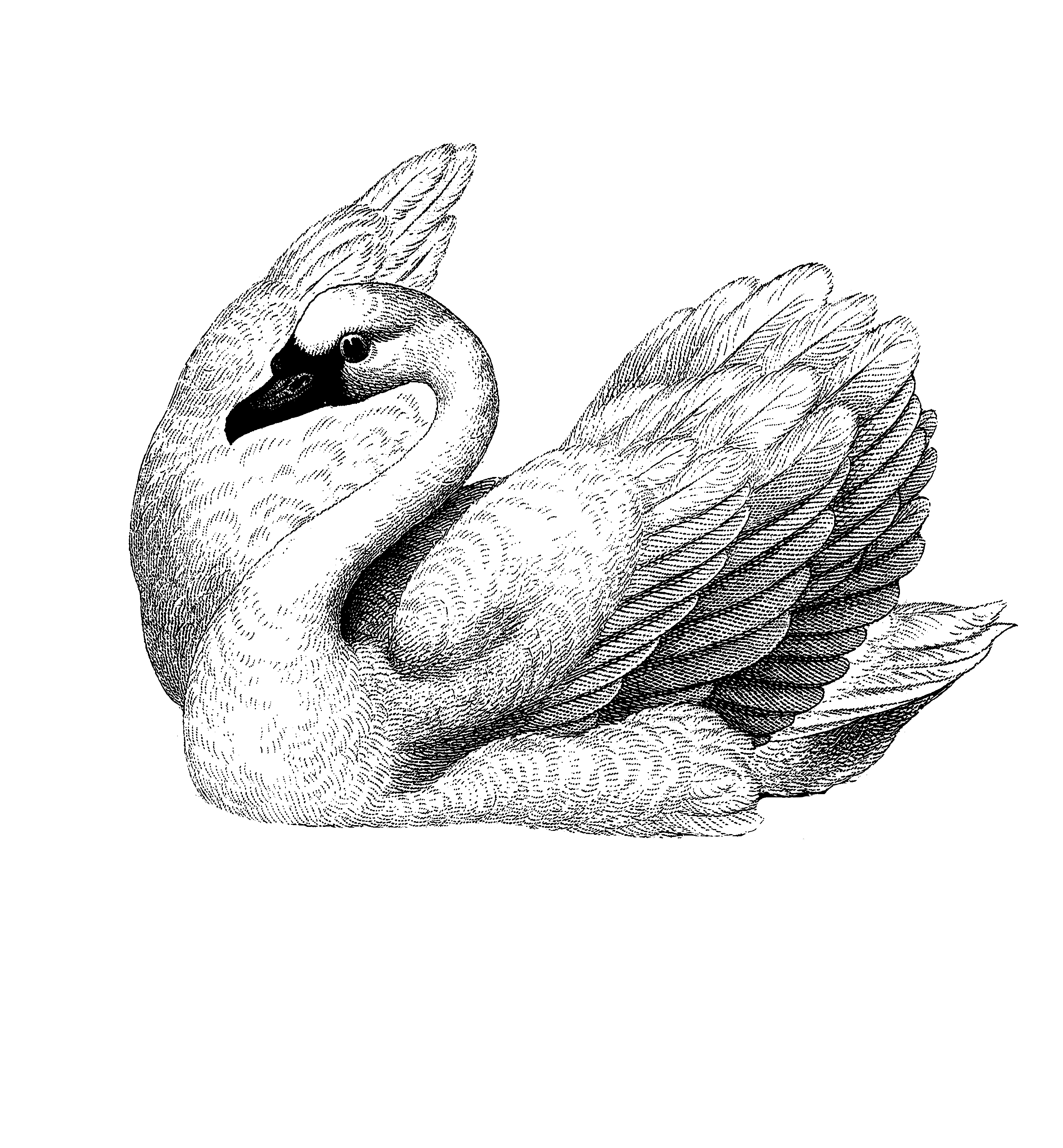
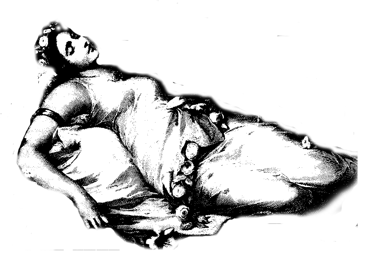
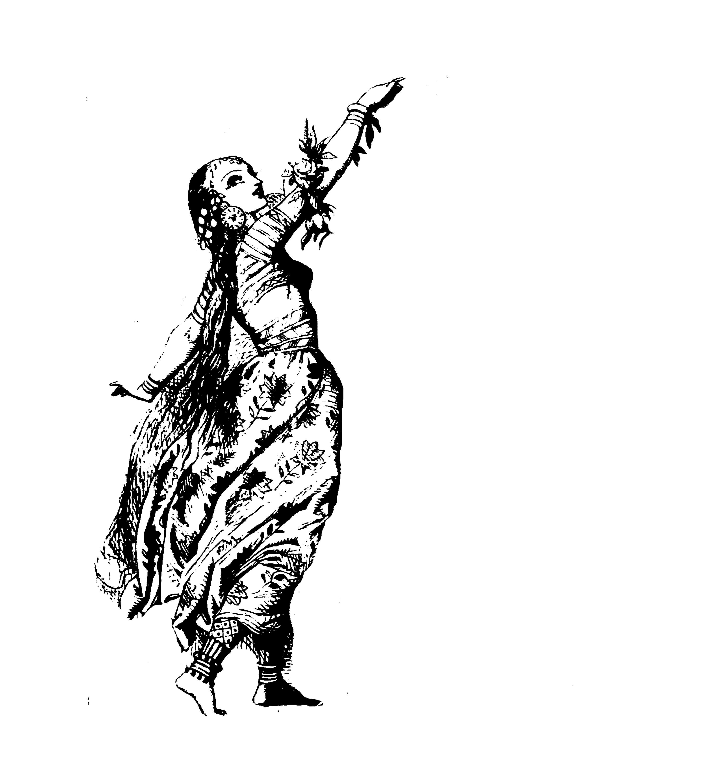
Dreams, sleeping, swans, and girls dancing, ballerinas. 

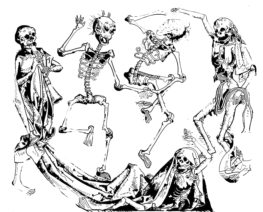
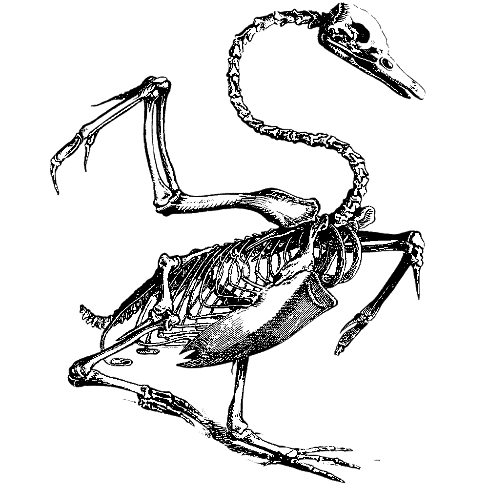
Eventually I came up with these compositions…

After asking Ms Ina what she thought about those, I decided to just choose one out of these. I think they’re somewhat similar so I can’t pick them all out at once.

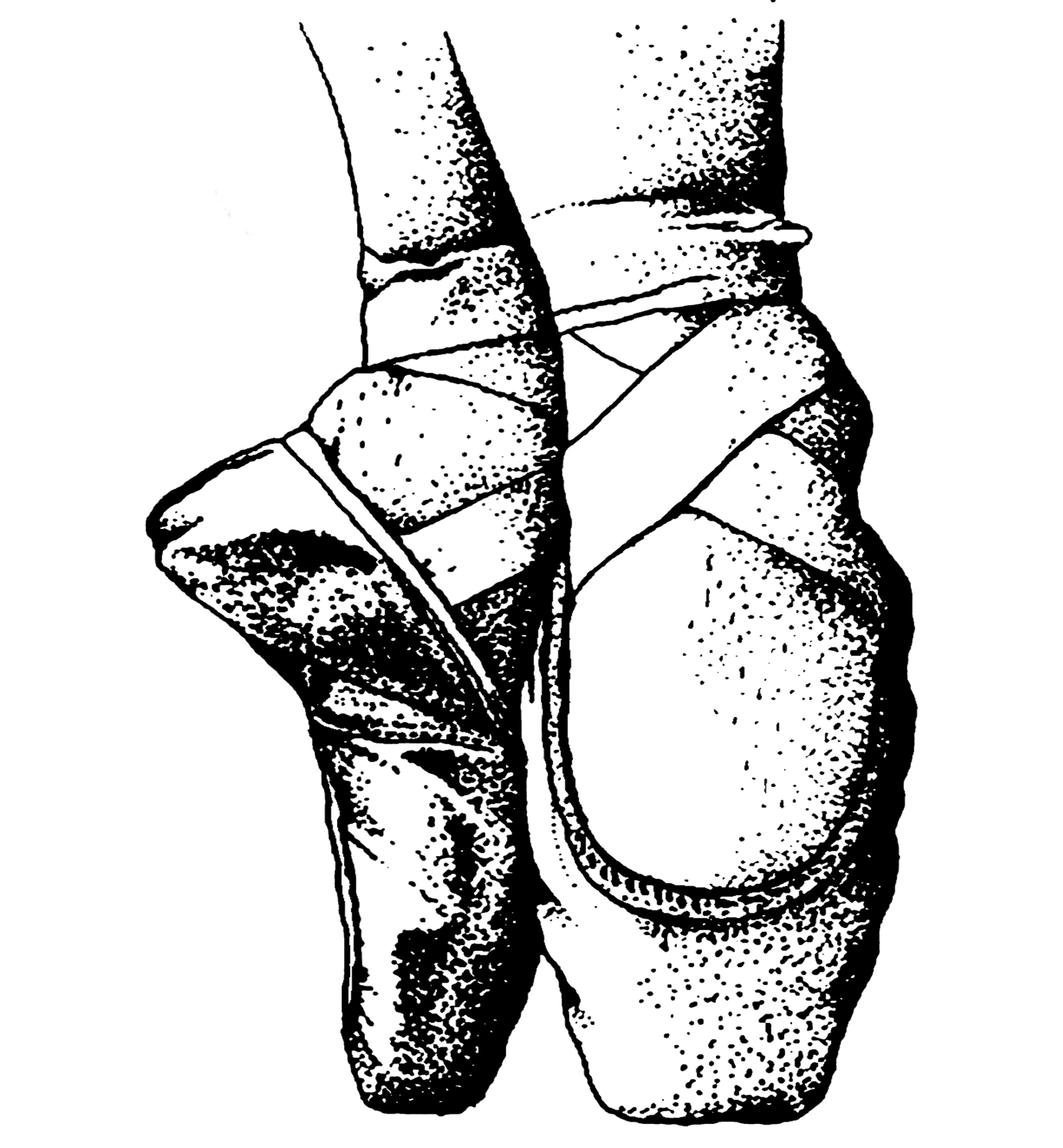
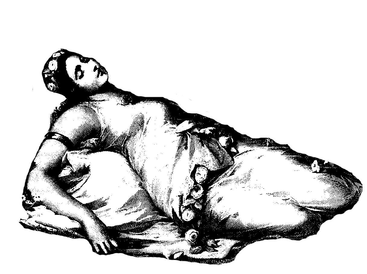
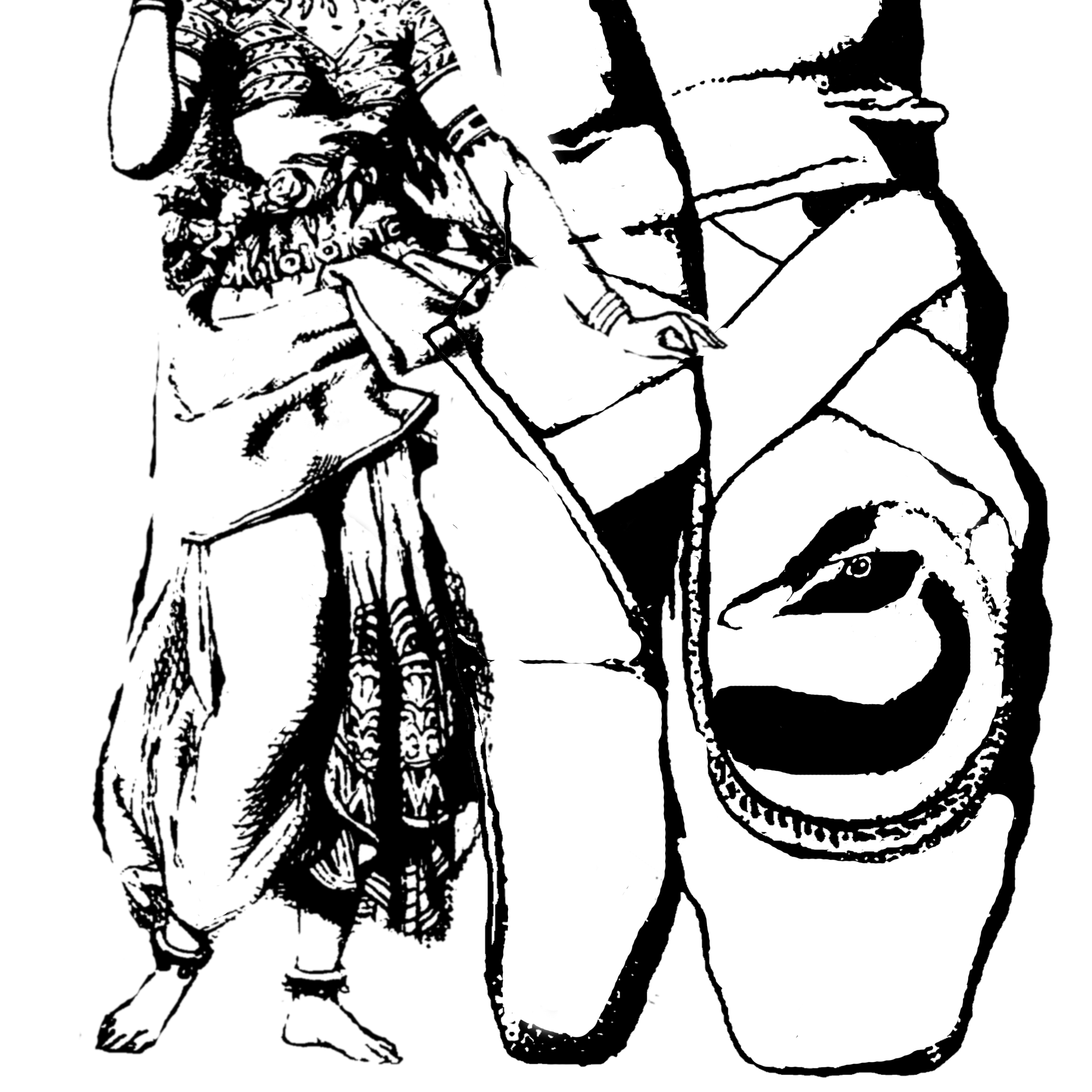
Sample 1 was out of the picture because the head was being chopped off and Ina didn’t like that lol. But what I liked about this one is putting a swan in the ballet shoe. I like to merge pictures together , so I thought it’d be nice to fit the swan inside the shapes, so that there’s meaning behind it. Swan + ballet shoe = dancing the White Swan, as portrayed in movie!

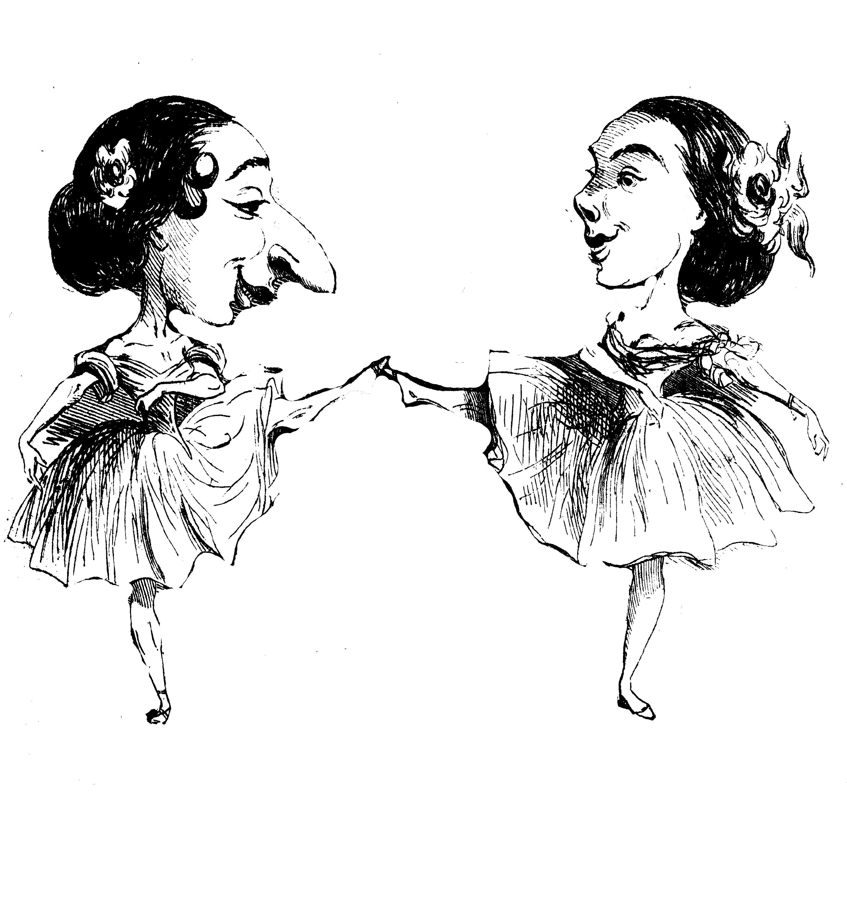
It was fun making Sample 2 because I loved the 3 dancing ladies. I didn’t want to put them around the shoe or elsewhere because I think it’d be a bit “off”. Again, I merged them with the ballet shoes and put them somewhere in there. Overall, not as simplistic as Sample 1 and it’s very literal.

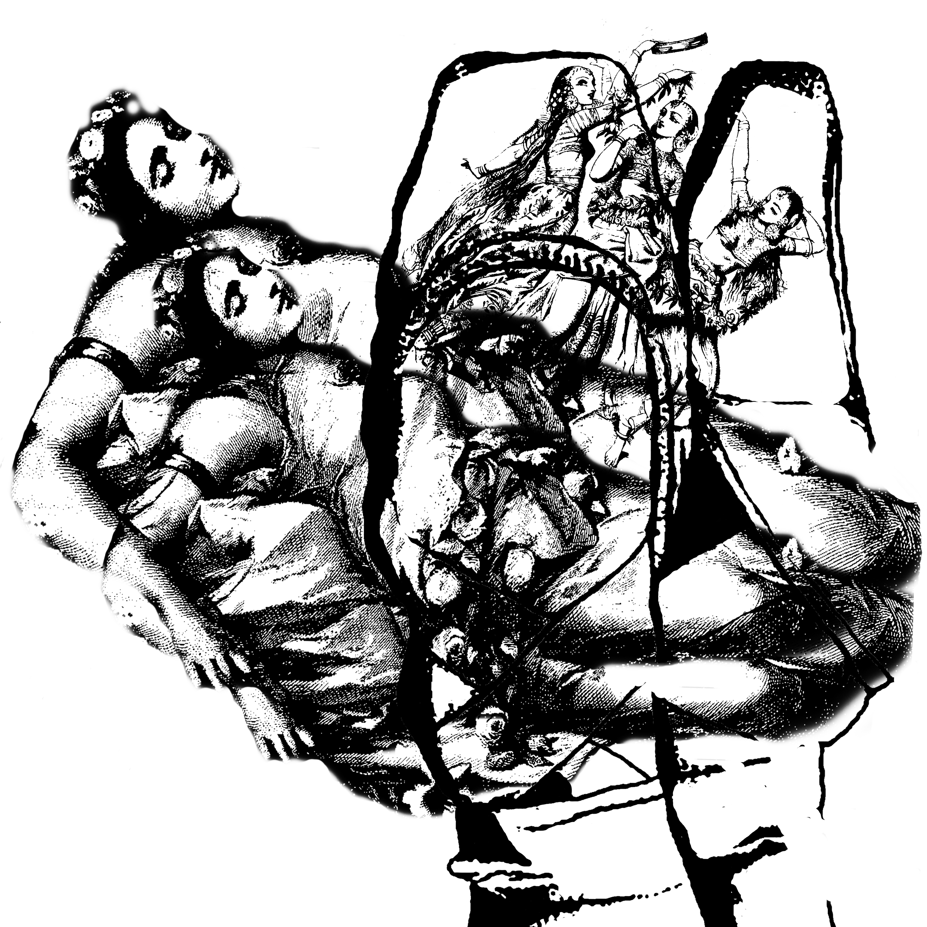
Similarly, Sample 3 was done the same as previous. I guess I wanted to add a bit of depth to the composition. I just double the sleeping lady, and changed the way the ladies are put in.


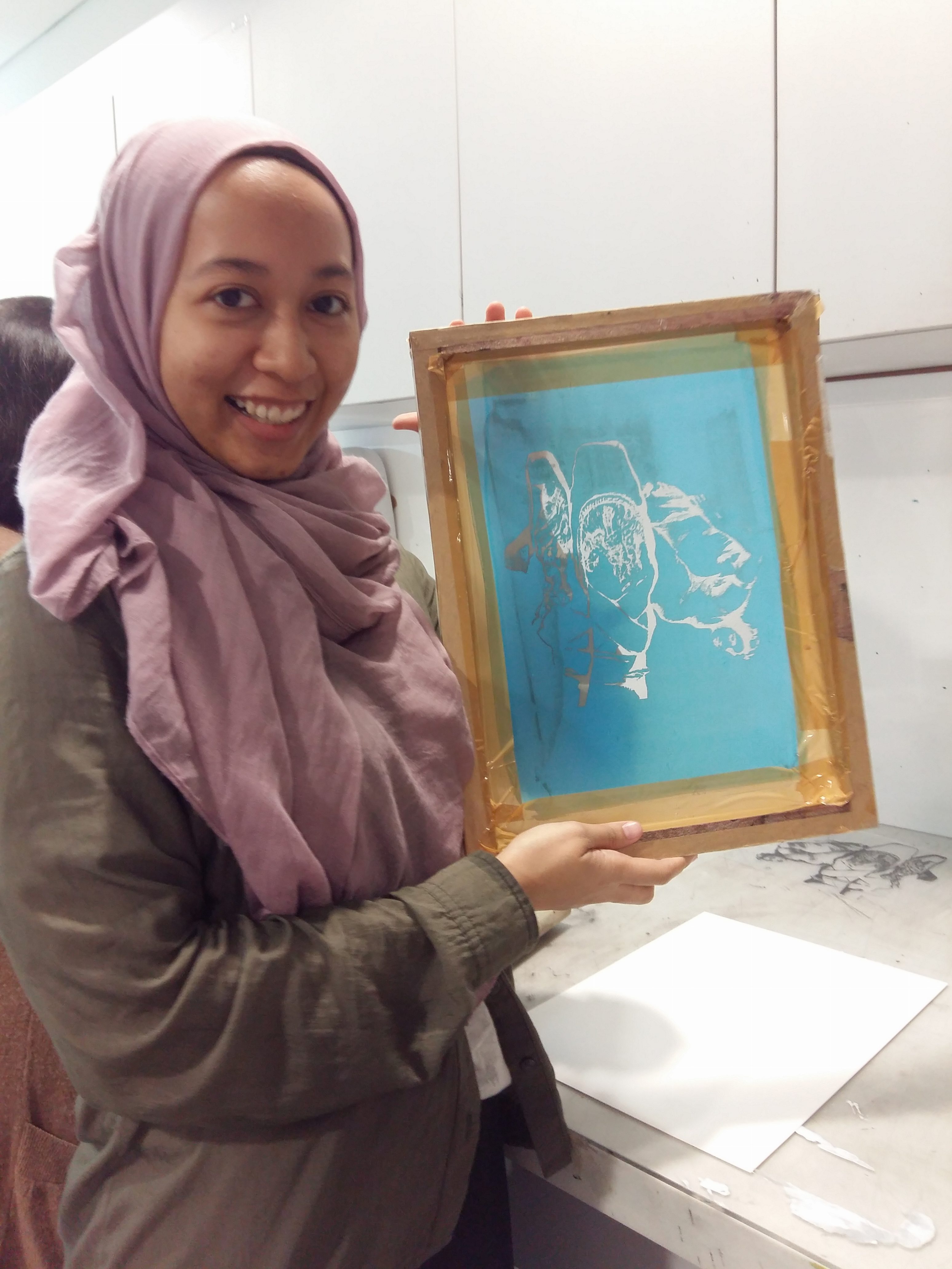
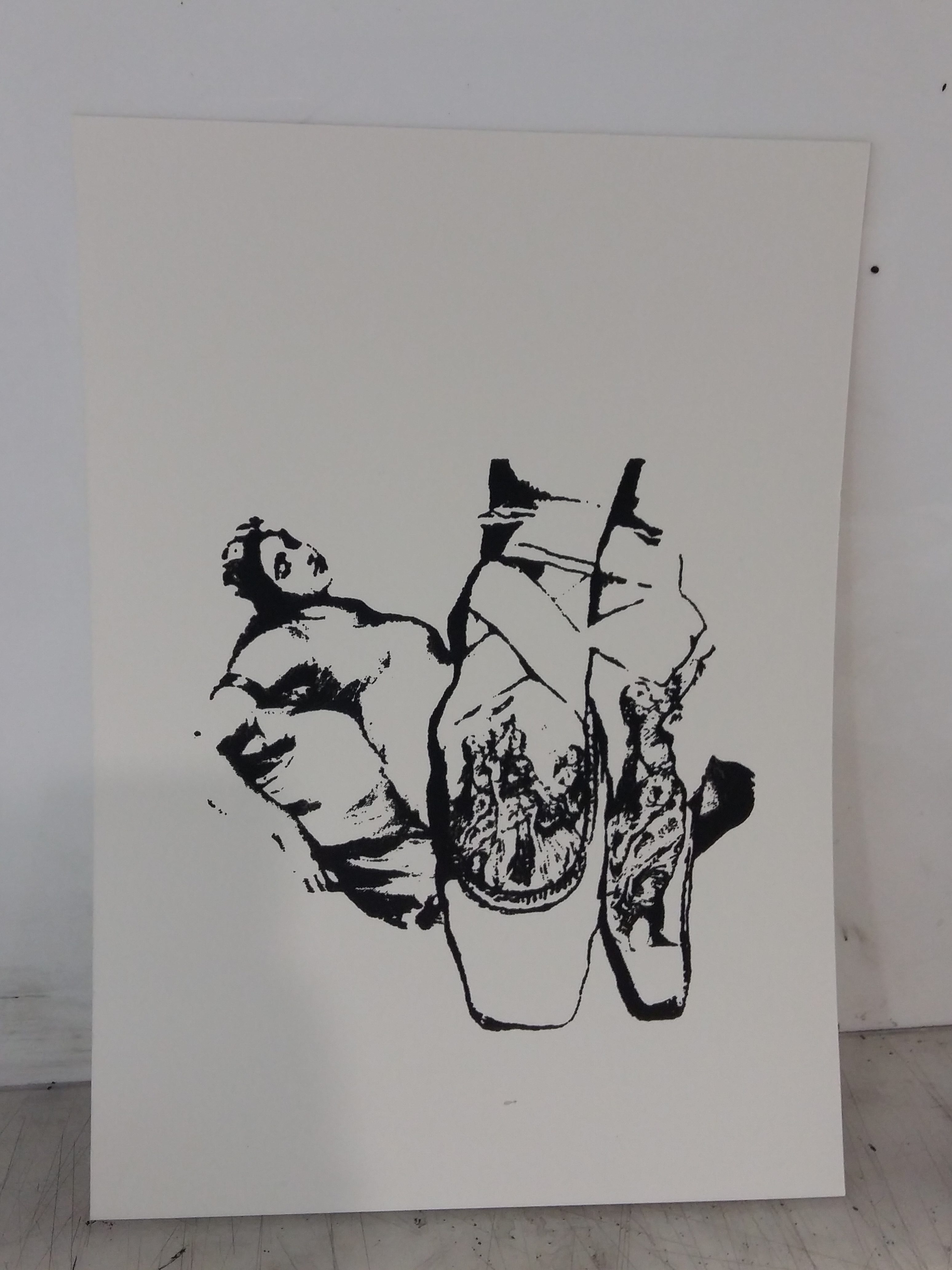
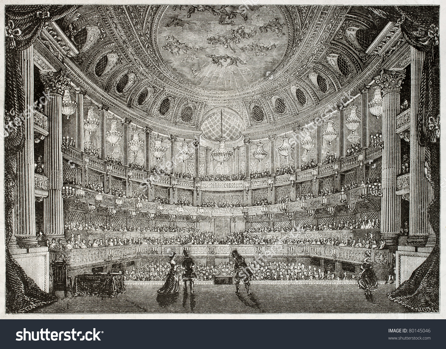
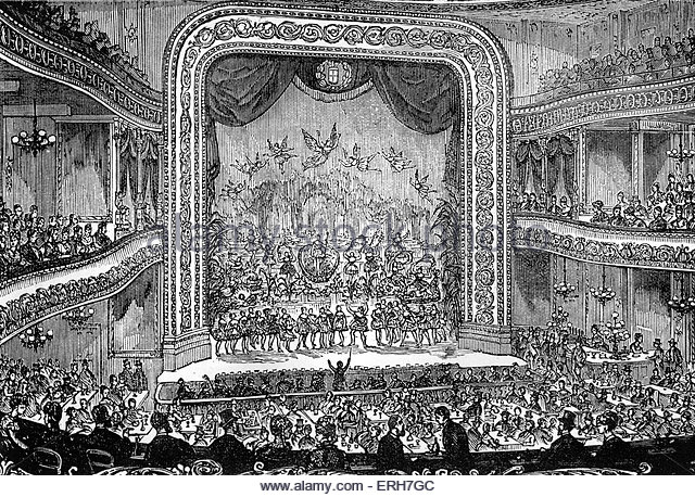
Done some more research and googled “old engravings stages”. I wanted to add a setting so there’s a base I could work on. I did some silkscreen printing on the previous 3 samples, but there something I didn’t like about the outcome. It was kinda meh…..


So, after much photoshopping, I came up with these. They’re my finals.

final-22_easy-resize-com

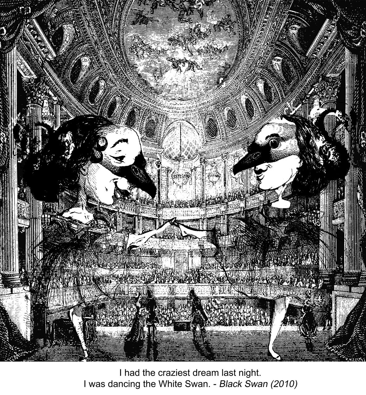
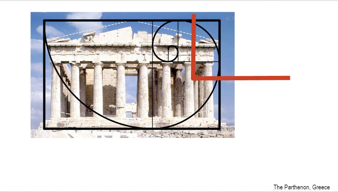
I tried to use emphasis on the 2 dancers, through the use of scale. By upping the scale a bit, it will focus your attention more on them as the main people in the  picture. Sincee there’s this mirror effect going on with the 2 ladies, I had to choose a background that is similar as well. Something like Symmetry.

The movie Black Swan had characters where dancer would dress as either White or Black Swan. And their ballet costumes from their tutu to their masks and their hairclips all resembled to that of a swan. So with Photoshop, I played around with the head of a swan and overlap it on the subjects’ faces. That was fun to make, because it really did look like they are wearing masks. It was fun to adjust the swan’s eyes and matching it with the other features of the subjects like her lips and nose. It matched so that’s awesome.

The least obvious part, I think, was the hairdo. If you notice the swan heads are actually part of the hairdo. Their heads kinda stick out of the dancer’s hair, looking like a bun. These pictues below are the original ones. It’s not that obvious.. but you can make it out in the picture.

Golden Ratio, Balance, Asymmetry, Emphasis, Unity!

References:

https://blog.psprint.com/designing/golden-ratio-apply-graphic-design/
https://www.youtube.com/watch?v=9CiS3SU4lk0
https://www.designbyday.co.uk/golden-ratio-graphic-design/
http://study.com/academy/lesson/symmetrical-balance-in-art-definition-examples.html


Actual Slides: https://docs.google.com/presentation/d/1Lkkd1W_Yn2QOU2dvxr-cgETTO851uVE54dnoVSFOf7I/edit#slide=id.g16c1aa74c8_0_109

Planar Construction: 3D Sketch Models + 2D Analysis

legend
Voids are white in colour. Correction tape is used to show void.

MODEL 1: “THE SNAKE YOU NEVER TAME”

MODEL 1: “THE SNAKE YOU NEVER TAME”

Named this after I realized this looked like a snake coming out of this shell. A snake doesn’t like shelter. It stays in the wild, and it looks like it’s trying to reach out of its shell, to escape into the wild.

Voids:

D: below the arch

SD: shares the same void as D, but other 3rd is its own void

SO: shares a bit with D, but has its own void at upper 1/3


Improvements in voids:

More of SD to extend out of D. So that they don’t share same void.

1/3 Rule: SD starts from bottom 1/3 and stretches sideward by 1/3. Extends to the right.

As right side has a lot going on, the left needs the same as well. Without adding symmetry, SO’s thinner and longer shape is pierced out from D. it is pierced out from 2/3 of D and towards the left, which is empty. It spirals out to give its distinctive look from others.

Used: Wedging, piercing

______________________________

MODEL 2: “NICE GUYS FINISH LAST”

legend

MODEL 2: “NICE GUYS FINISH LAST”

The blue and red seems to look like 2 big guys fighting for that one girl (in yellow). As alpha and “dominant” the red may be, the nice skinny nerdy boy in blue takes home the prize. From the side view, you see the blue standing on top of the defeated guy in red. Then he hugs the beautiful girl in yellow. Moral of the story: Nice guys finish last!

D curves at every 1/3 of base.

Improvements in 1/3 rule:

SD’s length is too long. Trimming it shorter and piercing more of its portion out of D would be better. Also, it would have its own void as well.

Improvements in Voids:

SD and SO might share the same void. SD can develop its own void by making SO shorter. This allows SD more void to take up on its own.

1/3 Rule: SD is wedged at D’s 1/3.

SD could be better improved by intersecting at SO’s upper third.

SD to be trimmed to 2/3 as it looks similar to SO and SD.

Additional: Wedging, piercing

______________________________________

MODEL 3: “THE NO RIBBON PROJECT”

legend

MODEL 3: “THE NO RIBBON PROJECT”

All three elements follow the same oval shape. With similar intersections, it looks like a ribbon tied up. Since there’s no application, I named it the no ribbon project.

Voids to be improved:

SO shares same void as SD, so by putting it up like a spiral pointing upwards, this creates void on its own.

1/3 rule to work on:

Lengthwise, D should be longest, hence SD needs to be shorter ( by folding it further to appear shorter than D).

Height wise, the SO needs to extend it’s spiral upwards, to give height. Also, this create 1/3 rule where D is below 1/3 and SO is upper third.

Wave-like cuts at bottom of D. This removes flat surface of D, giving viewers other elements to “peek through” with holes at bottom.

__________________________________________

The end.

x

Najiha


Final Application: “Chocorn Froyo” + “Ham-Ground”


Final model. (Update as of 16/9, the SD is thinner due to similarity in terms of volume to SO.

Above application is Model 2. Below are my applications for Model 2.

First one is called “ChoCorn Froyo”. In short for Chocolate + Corn + Froyo, this hot-cold dessert is made up of a grilled corn-on-the-cob, and it is topped with froyo ( frozen yoghurt ). A wafer stick is planted at the side and a ferrero rocher is placed in between. I thought this hot-cold dessert would be good because it’s shape is different from any other typical food desserts which are normally flat. The SO that is the ferrero rocher, would give a chocolatey taste on top of the warm corn and cold yoghurt, thus adding a bit of chocolatey + crunchy taste!

application-final
“Chocorn Froyo” designed in Photoshop. After review with Ms Cheryl on 16/9, wafer stick should be smaller. This makes the rocher bigger and more prominent than the wafer stick.


Also, another application would be a playground specially for hamsters – “Ham-Ground” for short. ” Ham-Ground” is sketched out as seen below. Wood is used for both D and SO because it has rough texture and doesn’t get hot easily. That makes it hamster-friendly because they can easily climb up and down the “hill” with their small and fragile legs.

Next, a “bridge” and “food corner”, that is made up of a wooden SD and metal SO respectively. The slanted bridge would be for the hamster to get a good view of the top or maybe slide up to down for a cheap thrill. After a tiring workout of climbing up the “hill” and playing “slide”, they can take a break in the food corner, where it is a metallic sphere containing all their favourite foods. I think the metal adds a bit of contrast to wooden material, and it would be good in keeping their foods or themselves warm and some physical protection from annoying human fingers.

The ground of the cone, would be made up of soft rug/fabric. This would allow a hamsters a softer feel of their legs after a hard workout climbing around. It is also a good hideout to rest.


application


x
Najiha

Curvilinear Volumes: 2D Sketches

20160912_143732-1

Model 1 View A + View B


Overall, I chose Model 2 because I could visualize something good out of it. I thought of a hamster playground and some dessert to make out of Model 2. The dominant cone would be quite exquisite in terms of the way it would show food, when normally food is presented flat. On the other hand, the spherical shape reminds me of a hollow ball I used to buy for my hamster. Just like a hamster wheel, the ball contains the hamster and it gets to roll around the house whenever and wherever. So, that’s why I’d make Model 2 into something useful for hamster- like a playground of some sort. 🙂

Props As Signifier

Pictures Signifying  Signifier

Pictures Signifying Signified

Project 1: My Line Is Emo

Anger:


Fear:


Joy:


Love:


SADNESS:


SURPIRSE:

Project 1: Picture Story – Curating Self


From these 3 pics, you see me walking up the stairs, a landscape shot of HDB flats, and a window frame with clothes hung over it. From this order, they kinda reflect the traits that I have in me. First off, I’d describe myself to be a very explorative person, explorative in learning about new things, new beliefs, new ideas and learning about people and places. Explorative could also come in learning about the mysterious, and the taboo.

I am quite a reflective person myself. I like to have a bird’s eye view of what’s going on in my life, my habits, my work, school, , everything! Especially when I consider myself to be always on the go, always on the rush, always looking forward to something, it helps to kinda take a step back and relax.

The window frame you see with clothes hung over it- they’re not mine lol. But it shows the private person that I am. I value privacy, and my personal space, because I think I’ve come across way too many incidents where people have crossed the line, which brings me to this story I’ll share you one.

One night I was laying down in my bed, and from across the window there are HDB flats too. While I was laying down, I looked out the window and saw a black figure standing by the window. This window was from across the block, but I could make out a human figure from it. When I got up to look out the window and watch this figure, “it” moved off.

Worst case scenario; it was a man creeping up on me through my open window.

That pic I took reminded me of how from then on, that’s how I’m gonna fill up the spaces on my open window. It also carries the meaning of “leave-me-alone” kind of privacy.


The object I chose is the headscarf. For those of you who don’t know, wearing the headscarf and dressing modestly isn’t a Malay thing, but it’s a Muslim thing. On top of wearing loose clothes, Muslims also wear the headscarf because it’s an Islamic obligation. So for me, the moment I walk out the gates I wear the headscarf, because I’ll be out in public. At the same time, the moment I walk in to my home, I rip them off. What’s special about this is because it’s a big part of my appearance – an extra layer of cloth over my head and wearing them out in public, and in the heat. It’s quite a hassle but it’s something that I have to live with, anyway.

The next picture reflect the struggle I have with pinning up my scarf, especially when it goes messy. Not always the neatest, but the annoying heat and hair coming out of it – that’s the look I give when I’m annoyed. Annoyed by the struggle that comes from sweating a lot and fixing you “hair”.

Next, this brings me to the vanity that comes with donning the headscarf. This vanity of wearing the headscarf from dressing like a model and wearing it for the latest godforsaken trends, esp on social media. It can be quite demoralizing when I have to wear it to look trendy. So I tend to feel self-conscious because of that. There are days where I’m suppose to wear this out of respect for a religion, not for some lameass beauty standard. Nevertheless, the vanity that come with wearing it, stays there.

Cindy Sherman’s artworks like “Untitled Film Stills”  was a good reference for me to show that “vanity” photo. Mirrors are a  good prop to show that so I used tha. With the slanted medium shot, it would give off that “how will people think if I look like this?” kind of setting.

“Untitled Film Stills” by Cindy Sherman


Over here, the places which means a lot to me are the local market place, and the walkway to school. Both places bring a lot of memories for me as a child because the market, which was just asit was back then, reminds me of my days tagging my mother along to the market. From watching her pick out gross wet fishes, picking out the most orangest orange and watching my mum bumping into her neighbours and doing the usual “hey how are you” ( in malay) at the local market, was something which happened a lot back then.

As for the walkway to school, the pathway brought back a lot of memories of me walking to and fro to school with my buddies. the fact that it was a loong walk kinda reminded me of how back then it neveer felt like time flew by fast. But now as it is the path that connect itself to a jogging path which I visit often, the place is simply like a trip down to memory lane.

The pic with the vending machine also adds on to the meaning of the walkway to school. It was a frequent stop where me and my then, friends would pick out snacks and buy drinks and “lepak” around that area til the sun went down. With the way it was captured, with the white space, and empty seat, I think it does reflect the emptiness of the place and nostalgic element of the picture. I guess it does reflect a bit of the current nostalgic feeling I’m feeling.

x

Najiha

D, SD and SO in honey cornflakes!

D- The yellow cornflakes. They’re covered in honey, sugar and butter all melted and mixed in a pan, where they get scooped into little cups, smelling sweet as honey!

SD- The little white cups that gives the cornflakes it’s shape. Also adds a bit of decoration with it’s white,  pleated cups.

SO- The rainbow sprinkles and the chocolate rice on top of it all! They add a bit of charm and colour to the yellow cornflakes. This SO makes a lot of difference to an otherwise dull honey cornflake.


They’re all in my tummy now.

x

Najiha