


23/03 Exercises

2/04 /2019 Exercises
6/04/19


23/03 Exercises
2/04 /2019 Exercises
6/04/19
You must be logged in to post a comment.
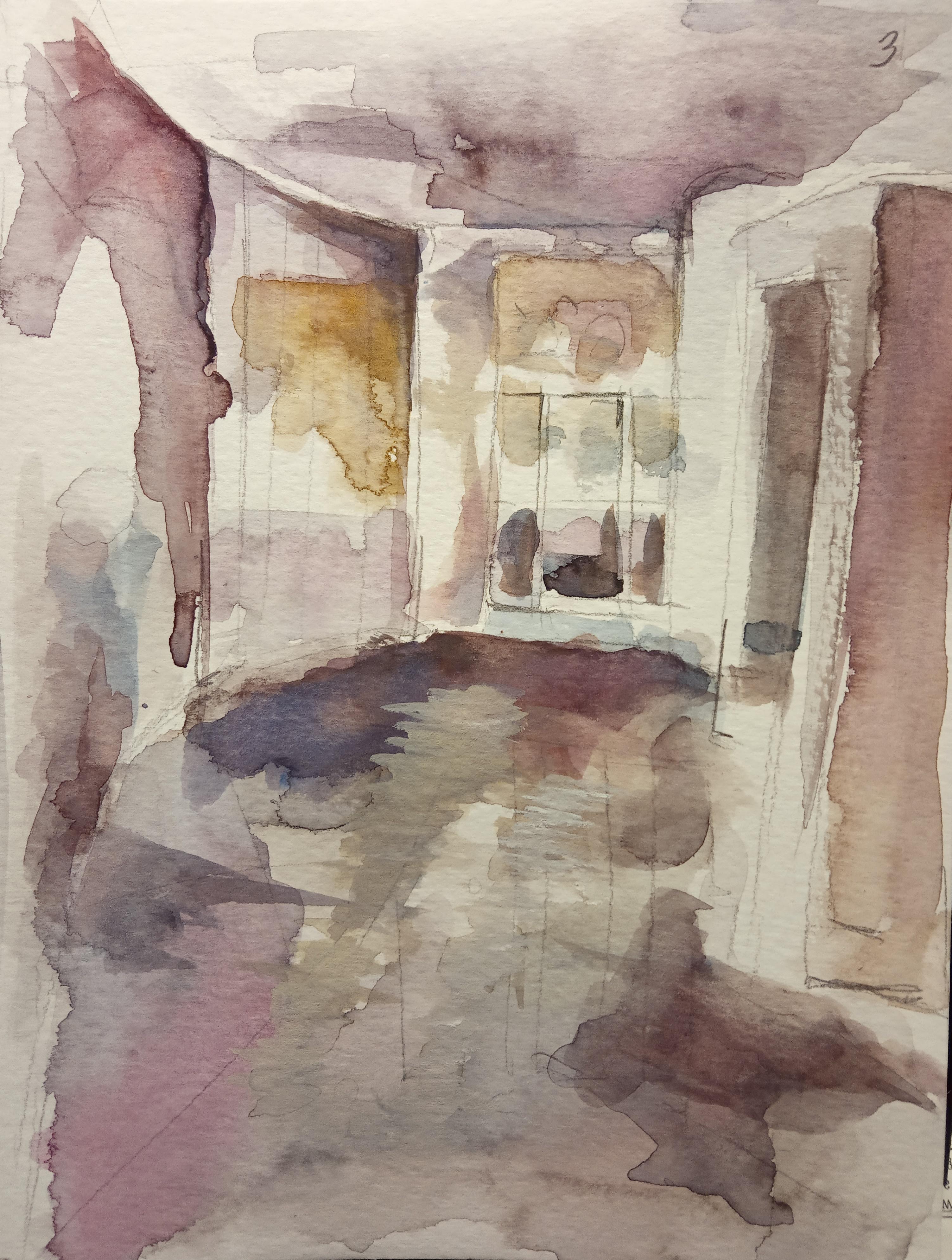
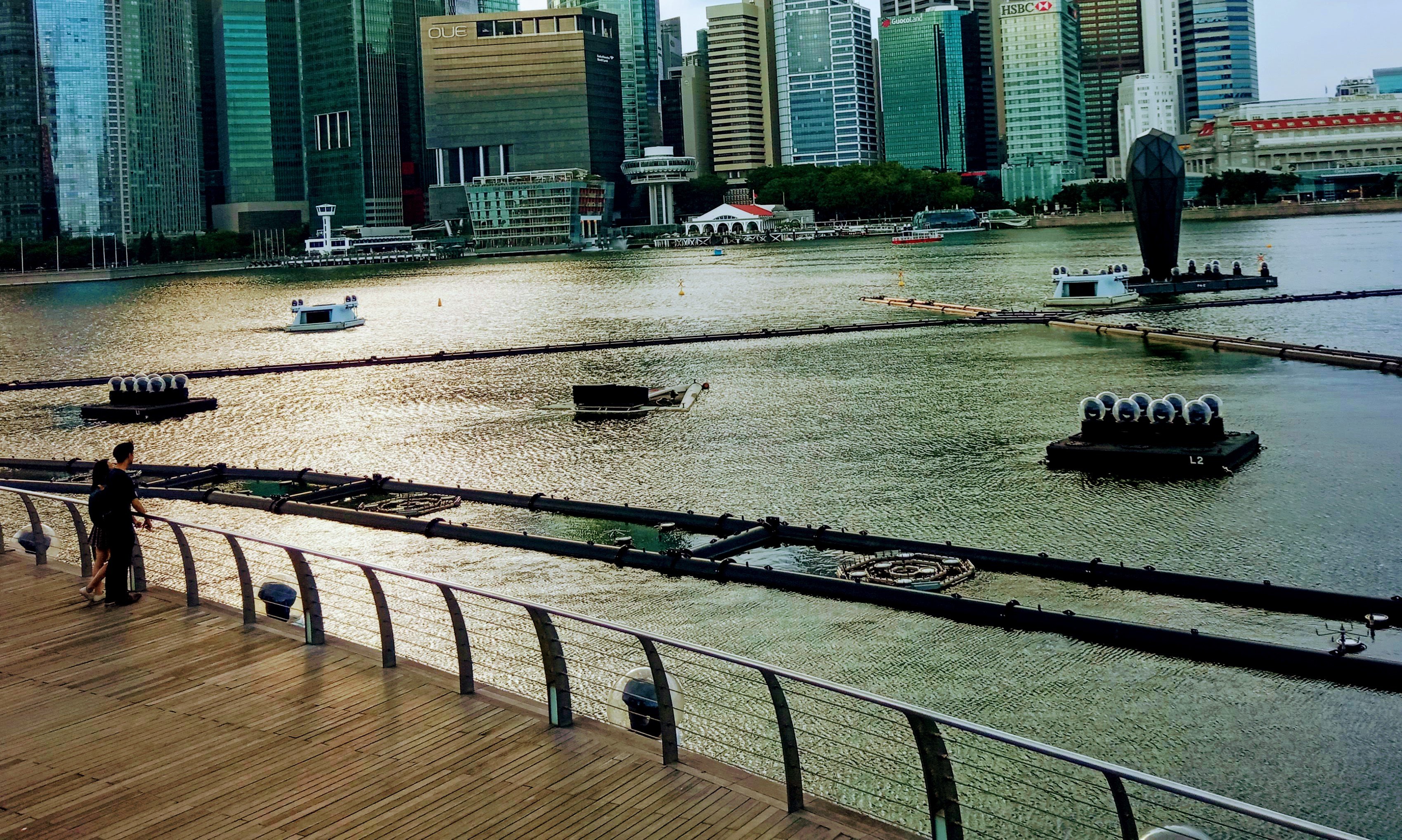
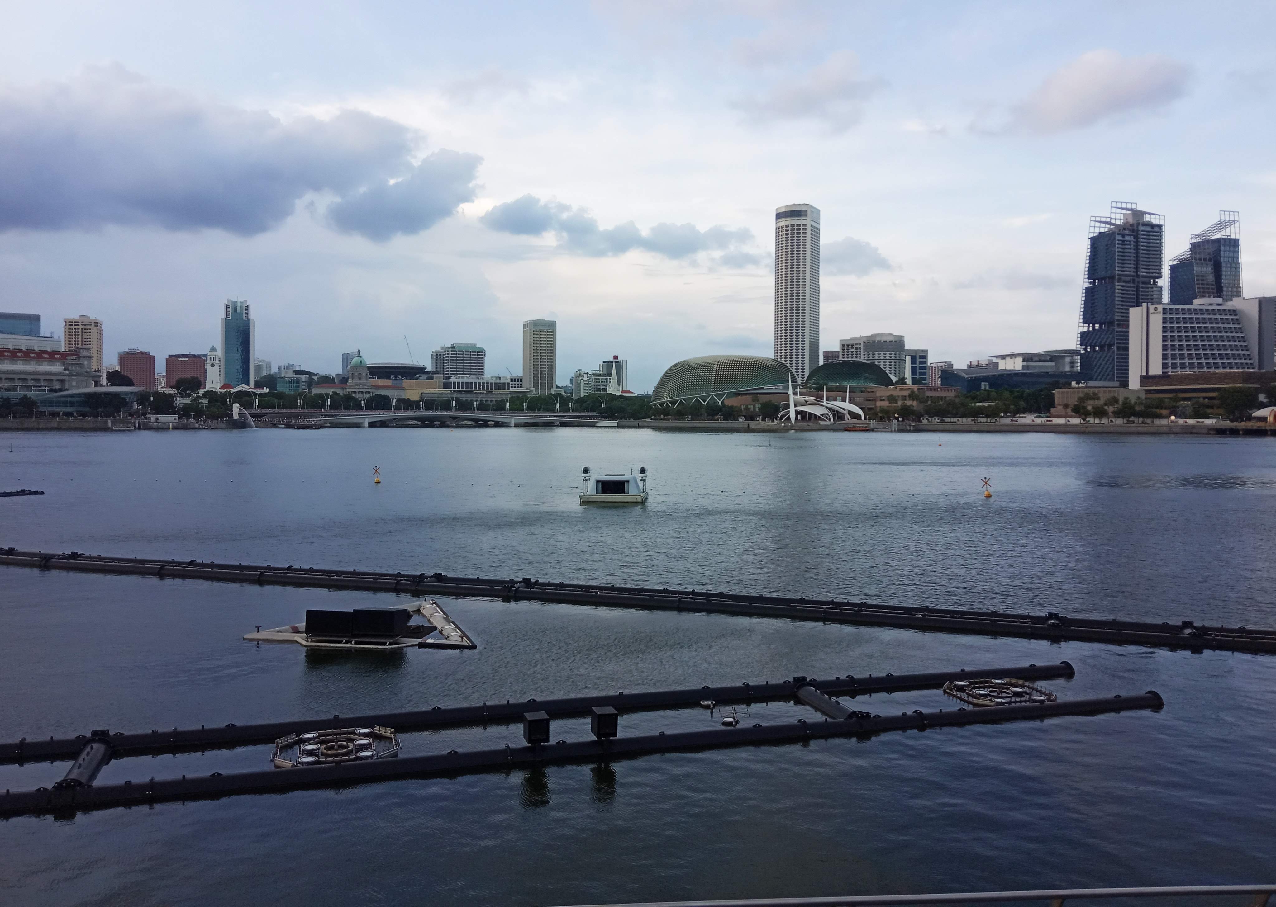
The colors are getting better. Need to control the shapes although some edges can be soft and broken, the overall shape has to look a bit structural or firm because it is still a rigid wall or an architectural element. You can also explore other range of colors. Now the colors skews purplish red. You can shift the colors to other hue zone too, like a bit more ultramarine, or a bit more yellow ochre or a bit more brownish green.
Ok will do, thanks for the feedback
Hi Mr woon Lam,
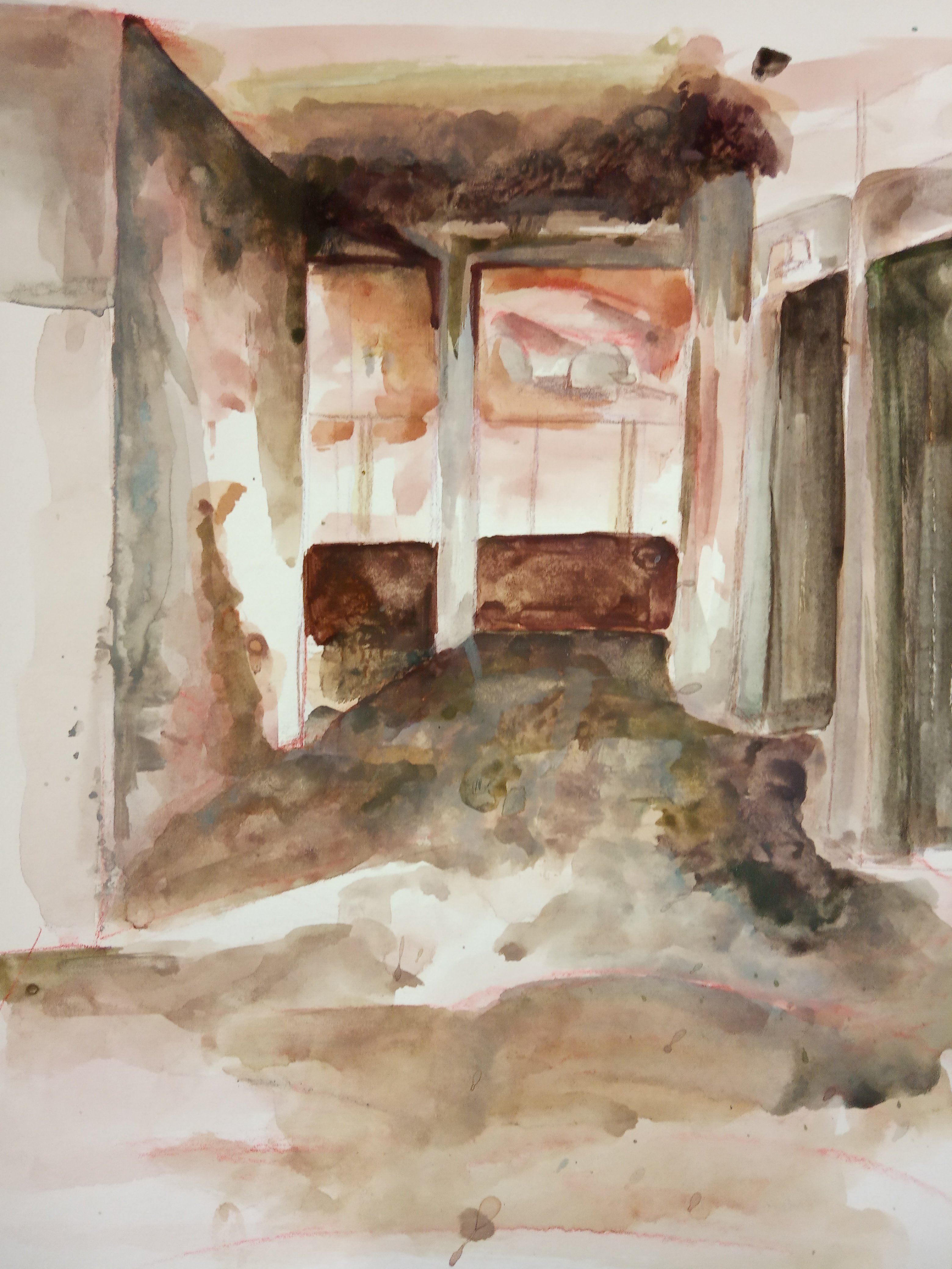
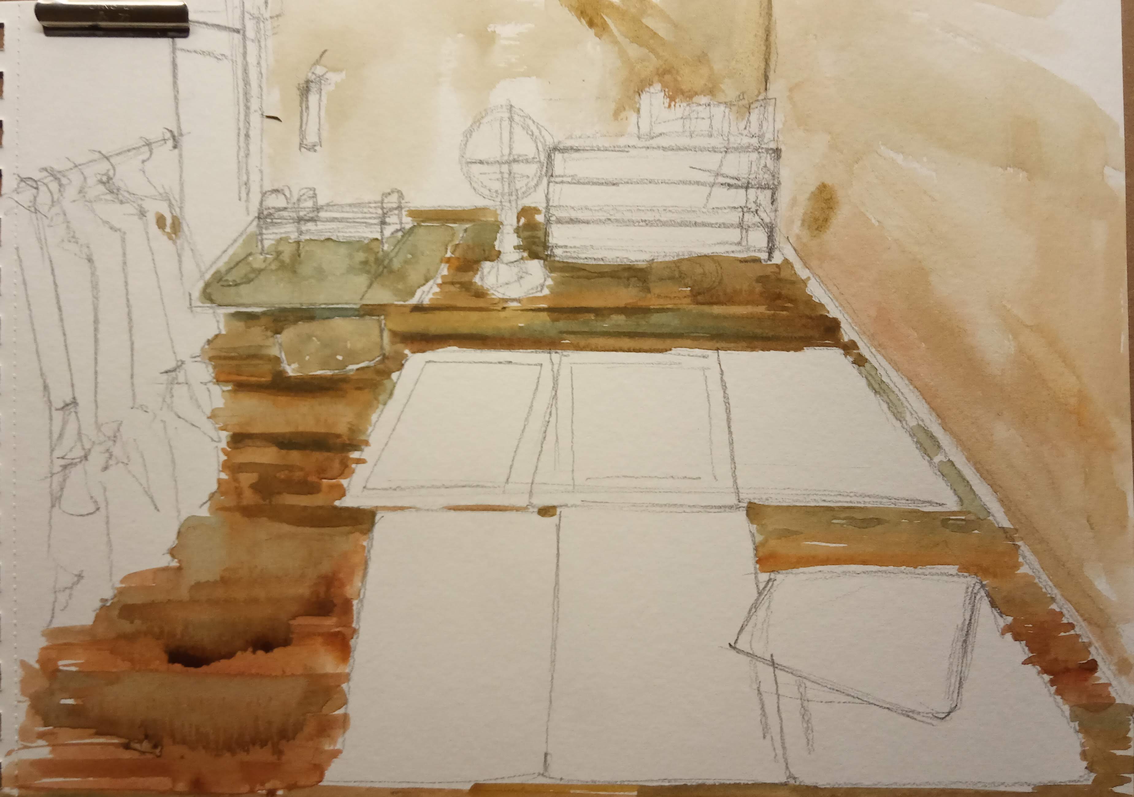
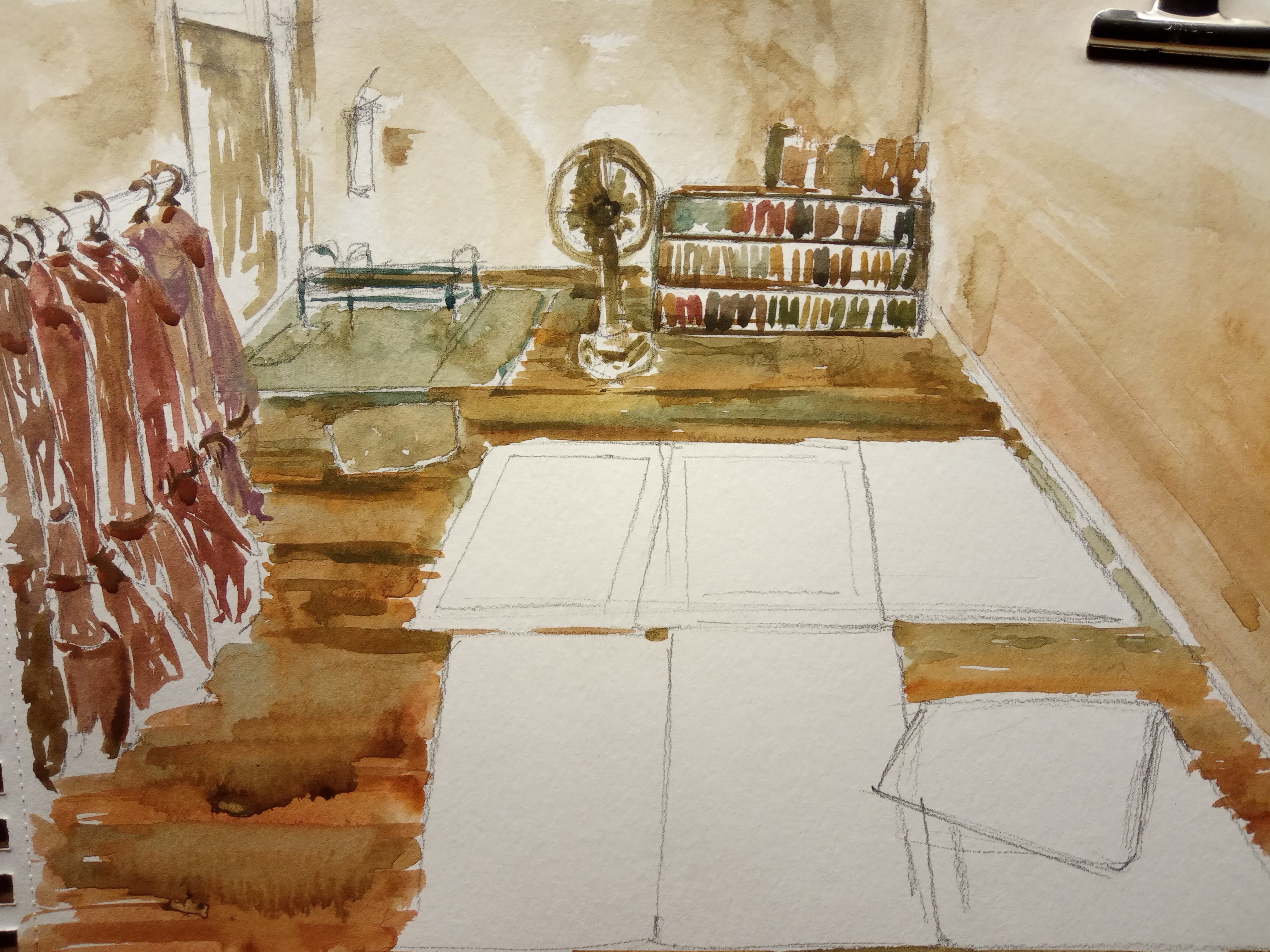
I added some hard edges with the darker colours, and added some utramarine and yellow orchre into my brown mix. How do they look now? Picture 7&8.
Najiha
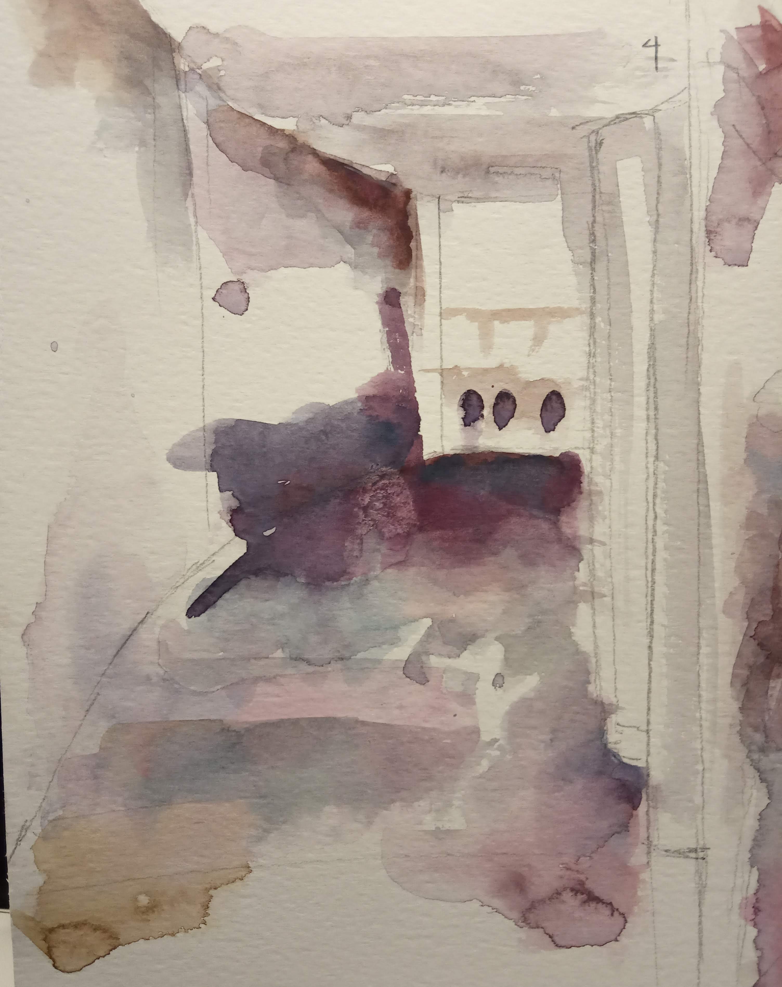
Better now. Some gradation has to be slower. Can’t change to white too fast, else it will look to sudden. Some, you can sacrifice the white.
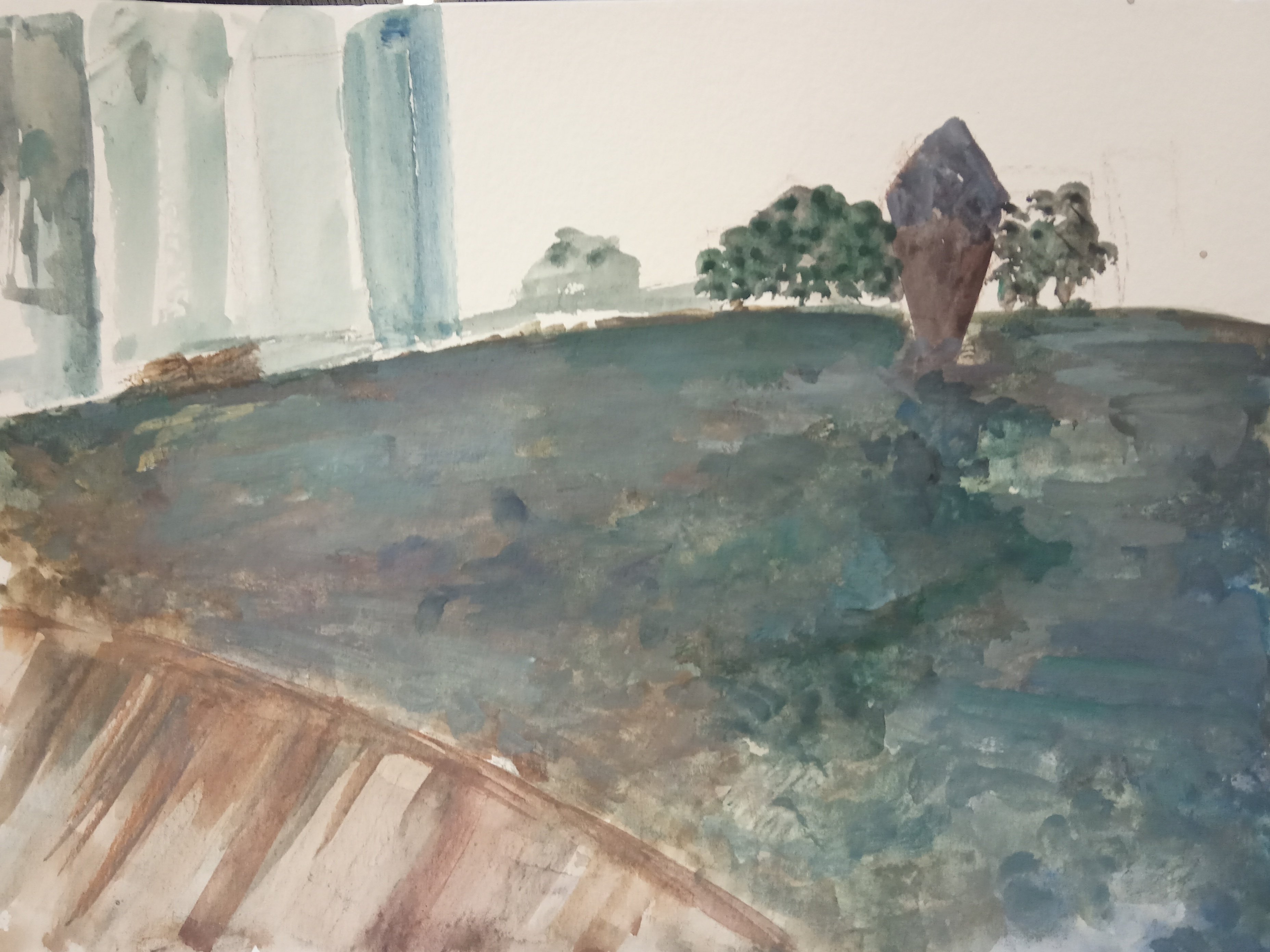
A few things to take note: 1. Because there are similar sizes of objects in the image. They tend to reduce the design dynamics. So you may have to change the sizes of arrangements or density of placement.
2. I realize that you paint pigment still has a bit more pastel feel. Maybe some of them at low in pigment concentration. Try out some from your friends’ and see if you need to get one or 2 tubes to substitute your current ones, especially the darker colors like dark brown or ultramarine blue.
3. As for the tonal design, please do some black and white sketches to get some ideas before working on the actual image.
Thanks a lot. Good efforts.
Alright, will do. thanks.
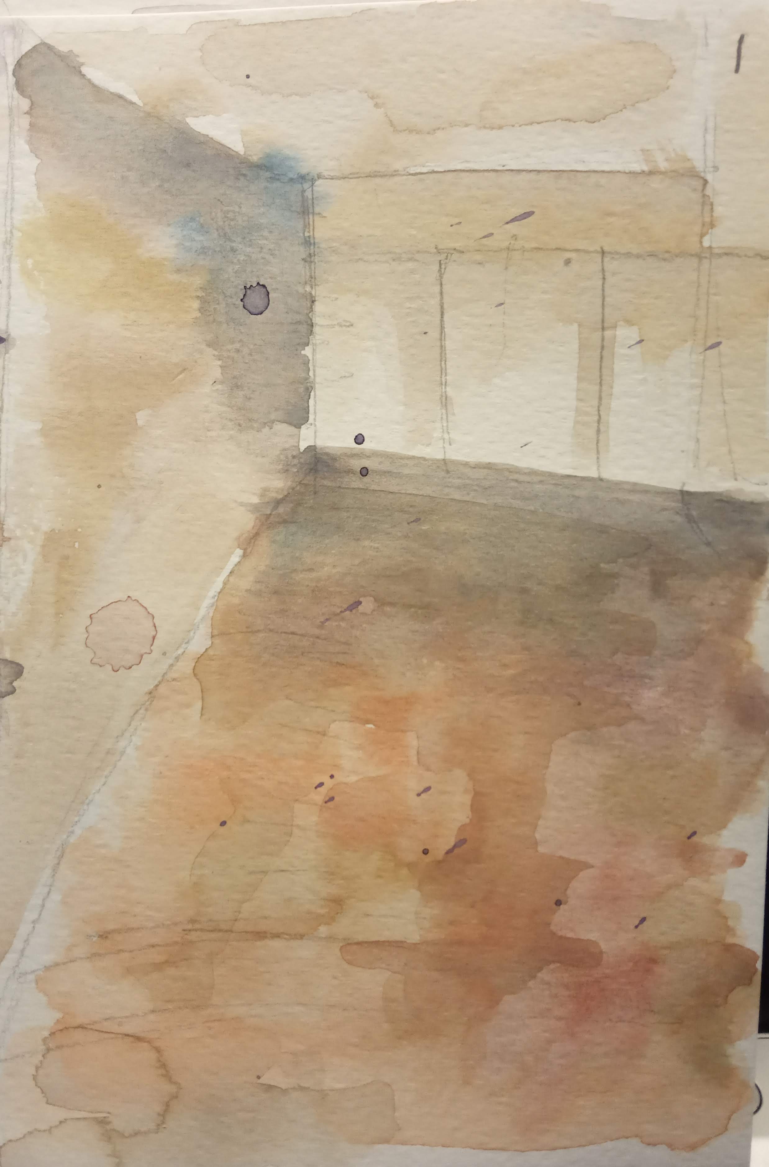
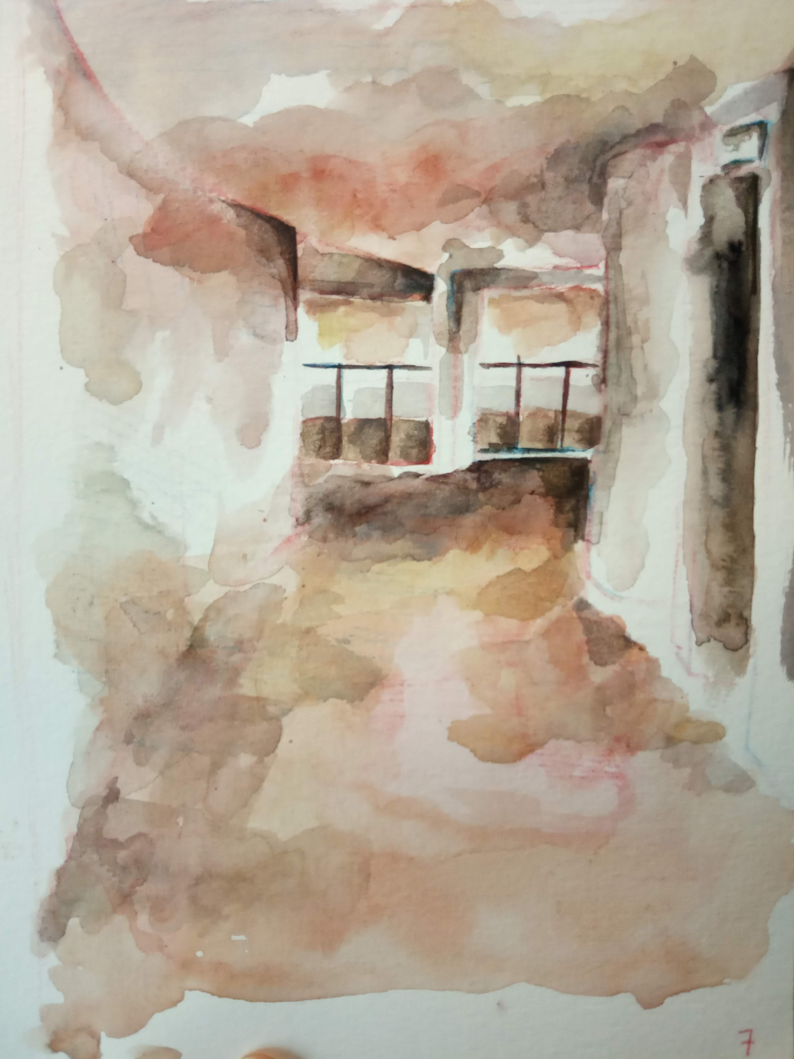
For the last interior painting, please take note of the broken edges (white edges). They may make the objects look torn and the white shapes are unstable too. So when you leave this kind of edges, you must know the necessity. For the colors, your brown and grays can have some minor amount of mixtures of slightly chromatic colors from all different hue Or to be safer, you may use different hue based browns to expand the richness of browns (like yellow brown, red brown, orange brown, gray, green brown, van dyck brown / sepia)