
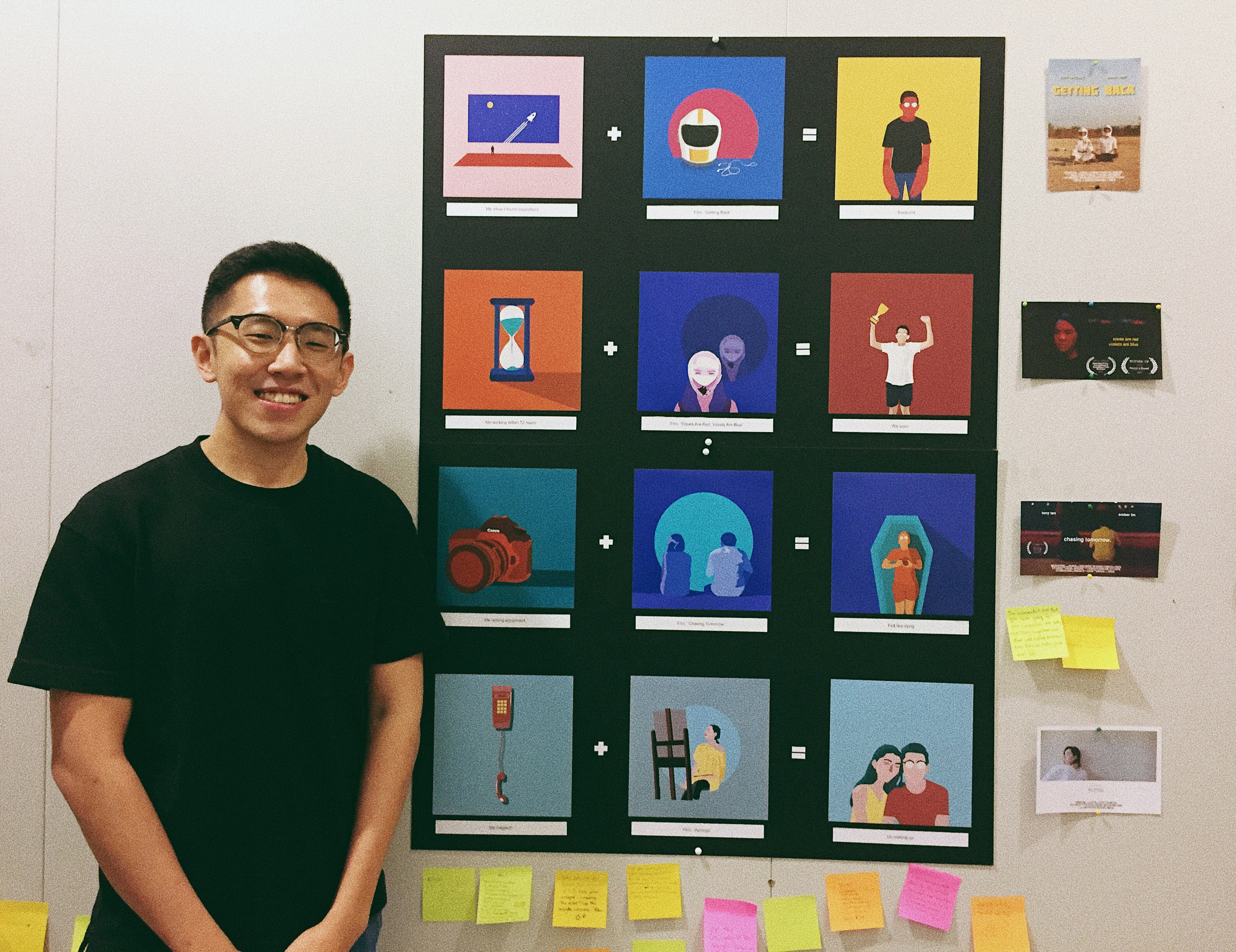
INTRO
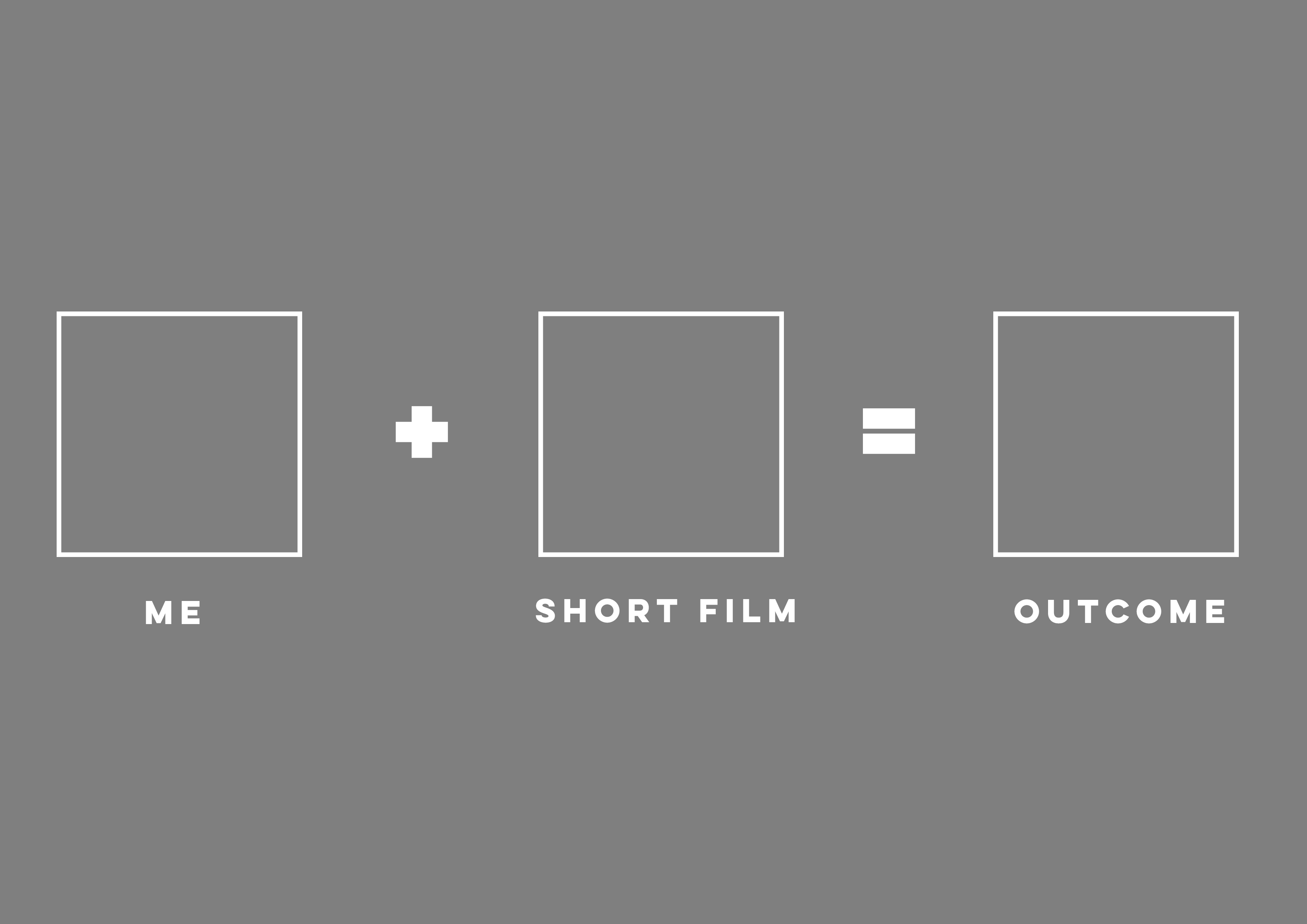
For this project, the concept I have gone with is the exploration of myself during the production of 4 different short films I did in the past.
The first box being about myself & what or why inspired me to do this film, the situation box represented by that 1 key element of the film & the outcome was what resulted in the making of each of those films.
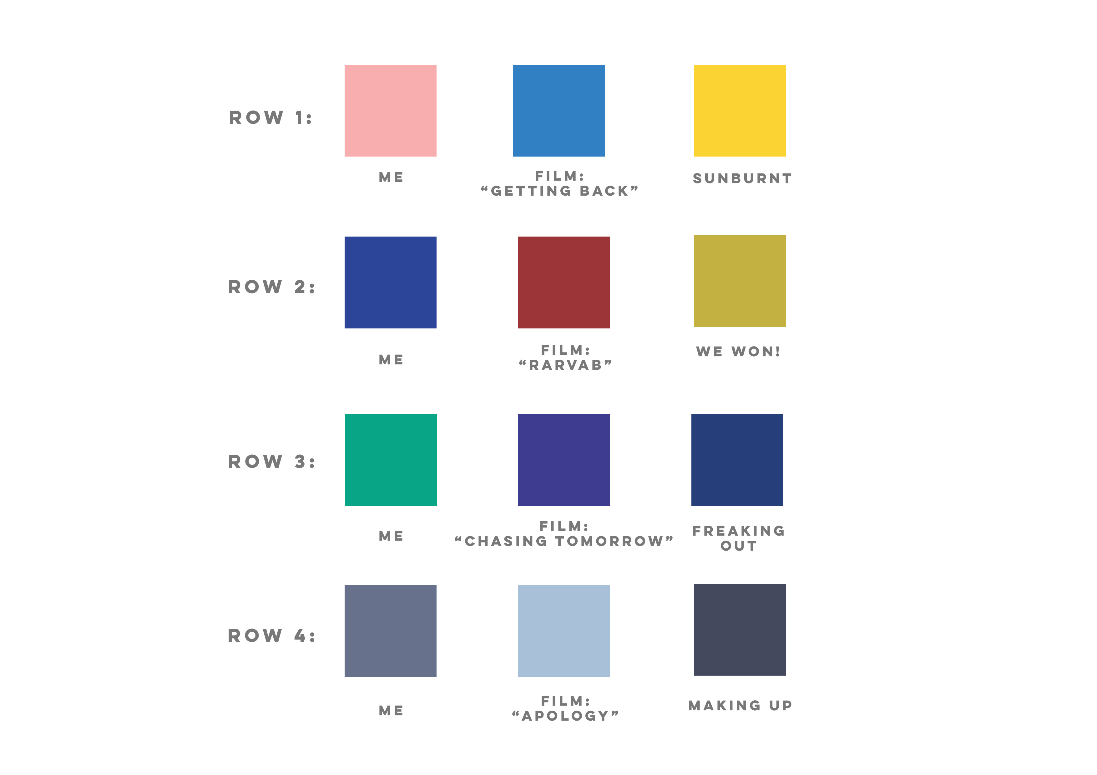
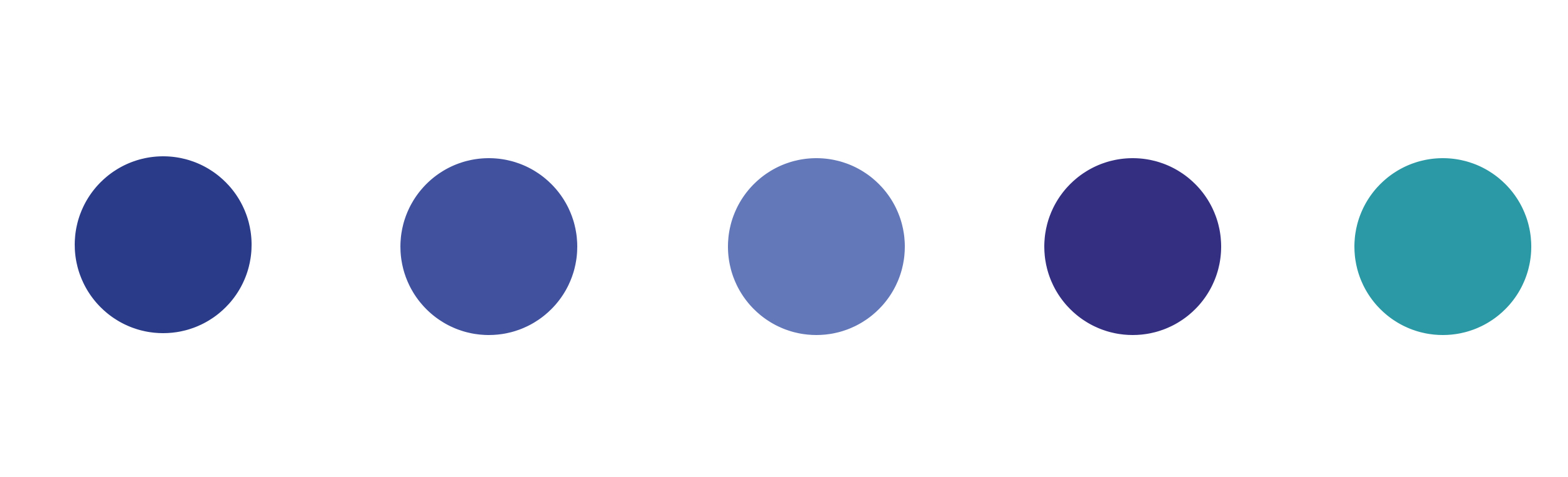
I first started this project by coming up with an colour plan to represent each row. This colour scheme I came up was determined by the colours that was most prevalent in each one of the films that I made.
1. “Getting Back”

2. “Roses Are Red, Violets Are Blue”
3. “Chasing Tomorrow”

4. “Apology”

My colour plan:
ARTIST REFERENCE
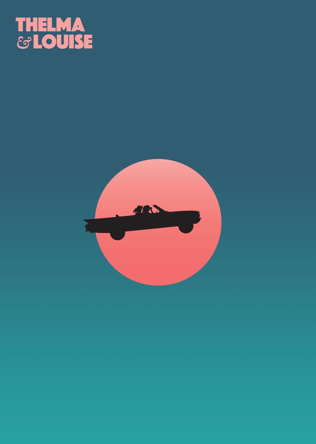
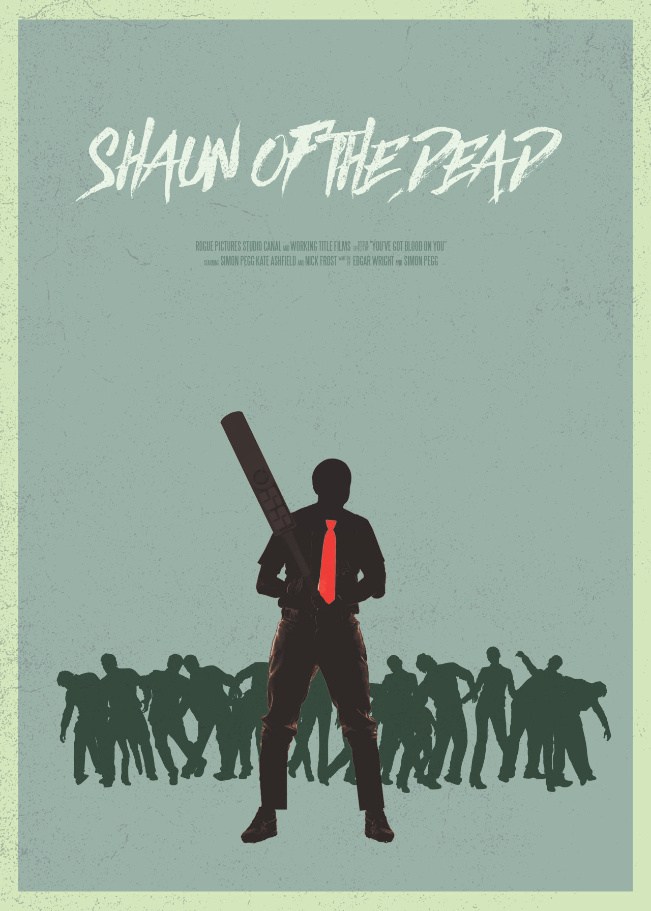
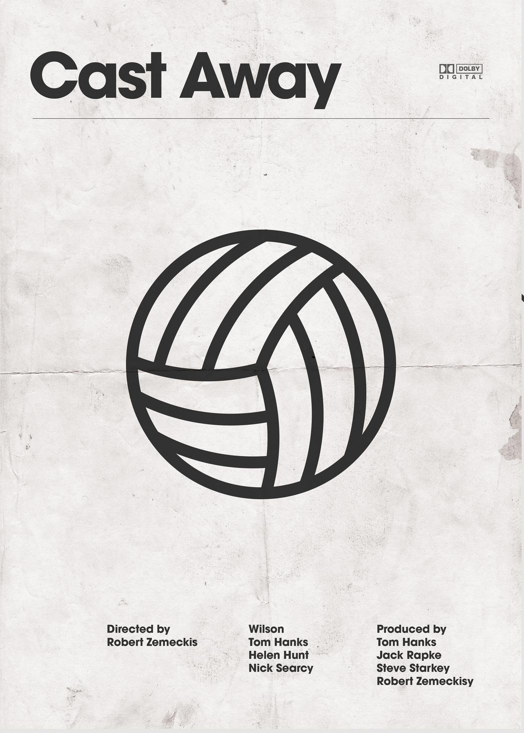
I was inspired by the minimalist poster designs done by artist Peter Majarich. As I was creating designs inspired by my films, it was natural of me to adopt a style that was reminiscent of film poster designs.

PRODUCTION
For all the 4 rows, I was trying to keep consistent with the elements I chose to use within each box to properly represent what I did.
The 1st box of myself is being represented by an object instead.
The 2nd box is a key scene that takes place within the film with a consistent circle motif that also has meaning within the context of the film.
The 3rd box is what happened to me after the production of that film is represented by different versions of myself.
ROW 1:

For the first row, it was during the production of a sci-fi film titled “Getting Back” I did for a film competition organised by NASA.
For this whole row I adopted a triadic colour theory to create a harmonious and lively colour scheme representative of the light-hearted feeling in that film.
Me:
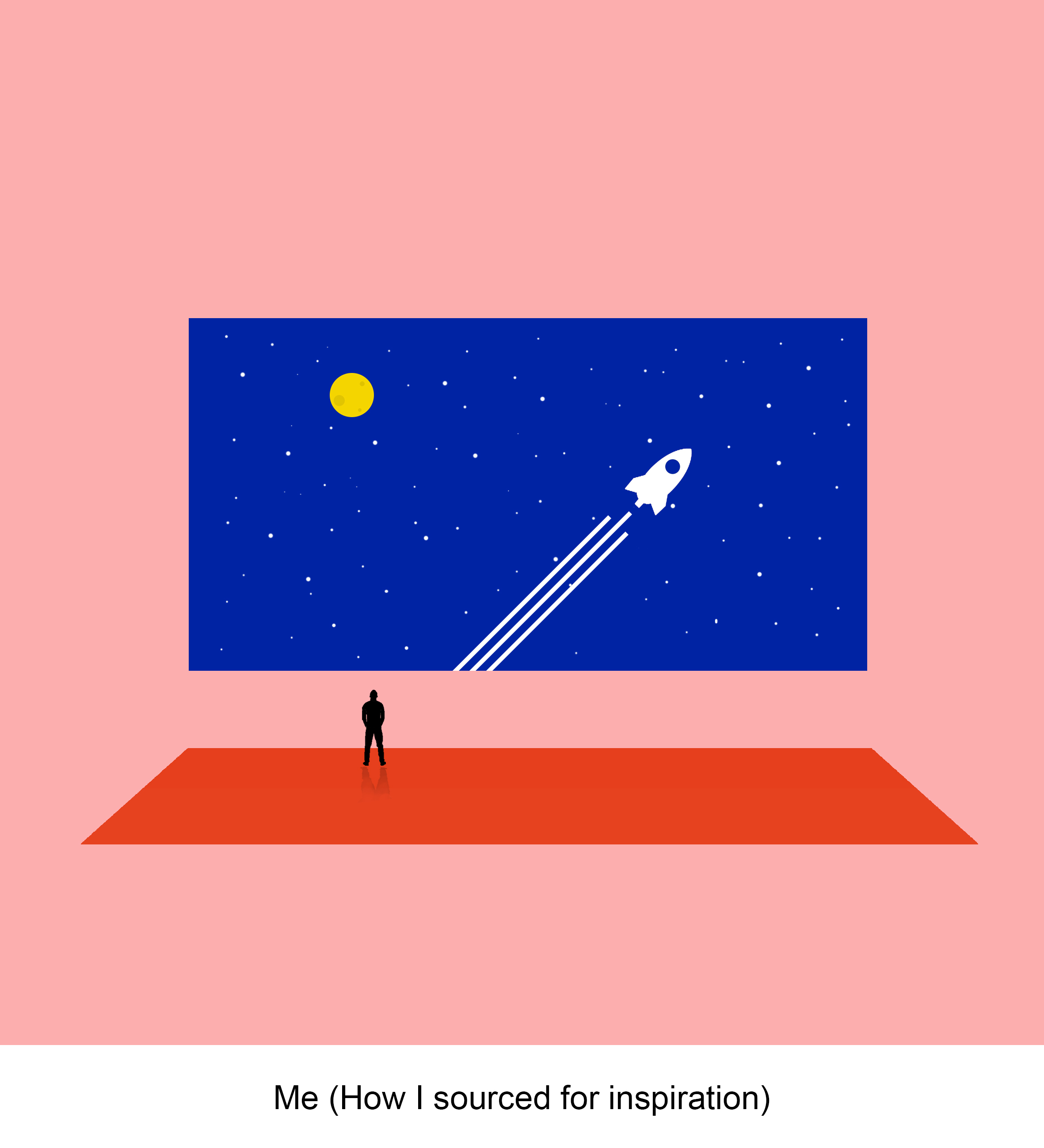

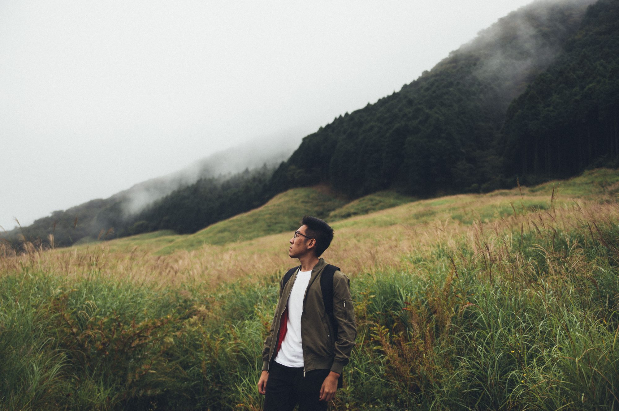
For the first box, the composition represents me finding inspiration for the film. For the colour scheme, I decided on using the colours of the NASA logo, which is red, blue & white. But I changed the moon to a yellow to bring focus to the person looking up at it. It is to show a guy looking at a cinema screen that looks like he’s looking out of a window looking out of space.
This was representative of me watching various sci-fi films to find inspiration for this film.
Situation:
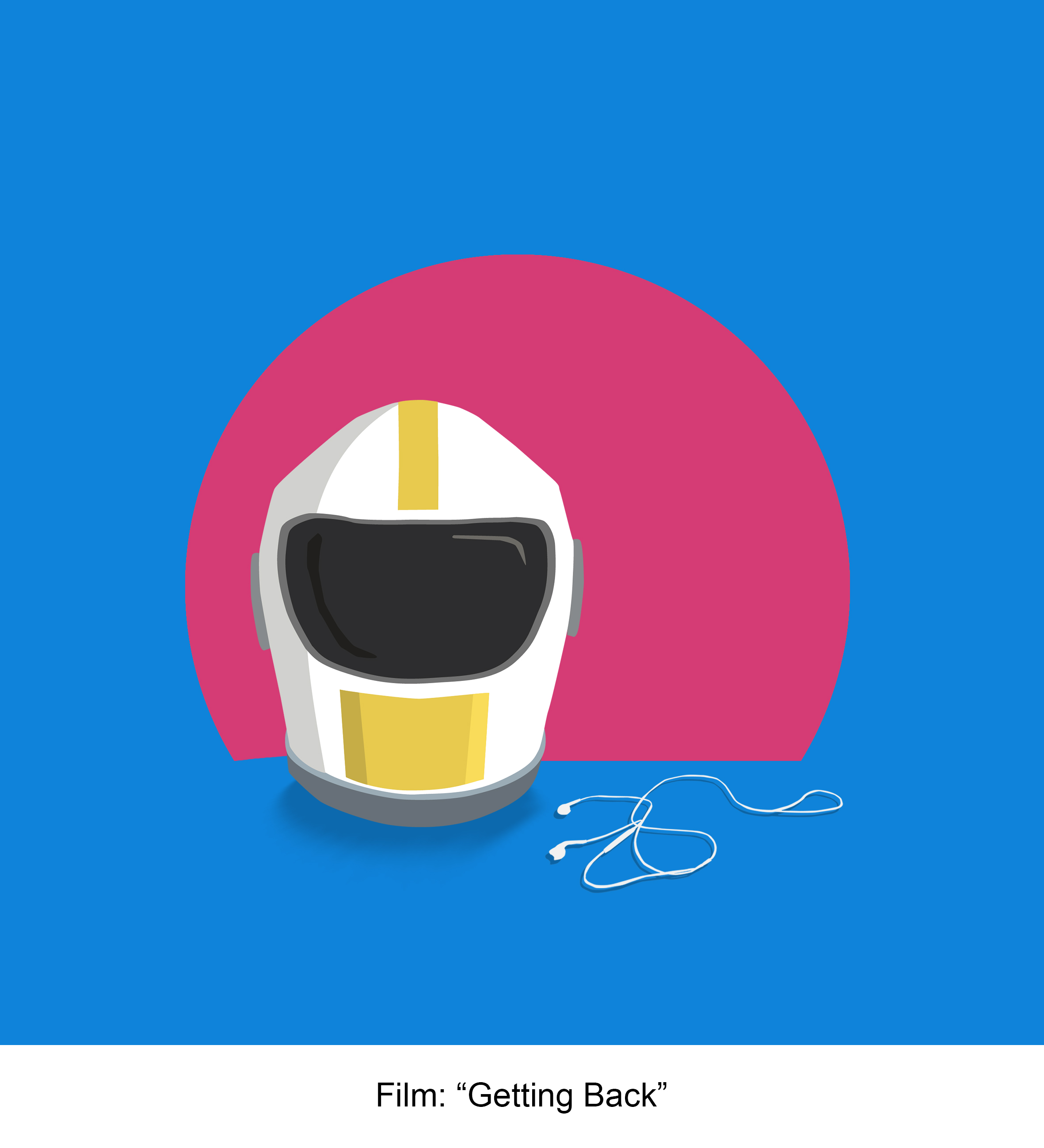

I started off with a base colour of blue as the background for my 2nd box.
I added a pink circle that was representative of the sunset in the climax of the film & a yellow colour on the helmet to balance out the blue. These 3 colours created a harmonious triadic colour scheme which I adopted for this row.
Outcome:
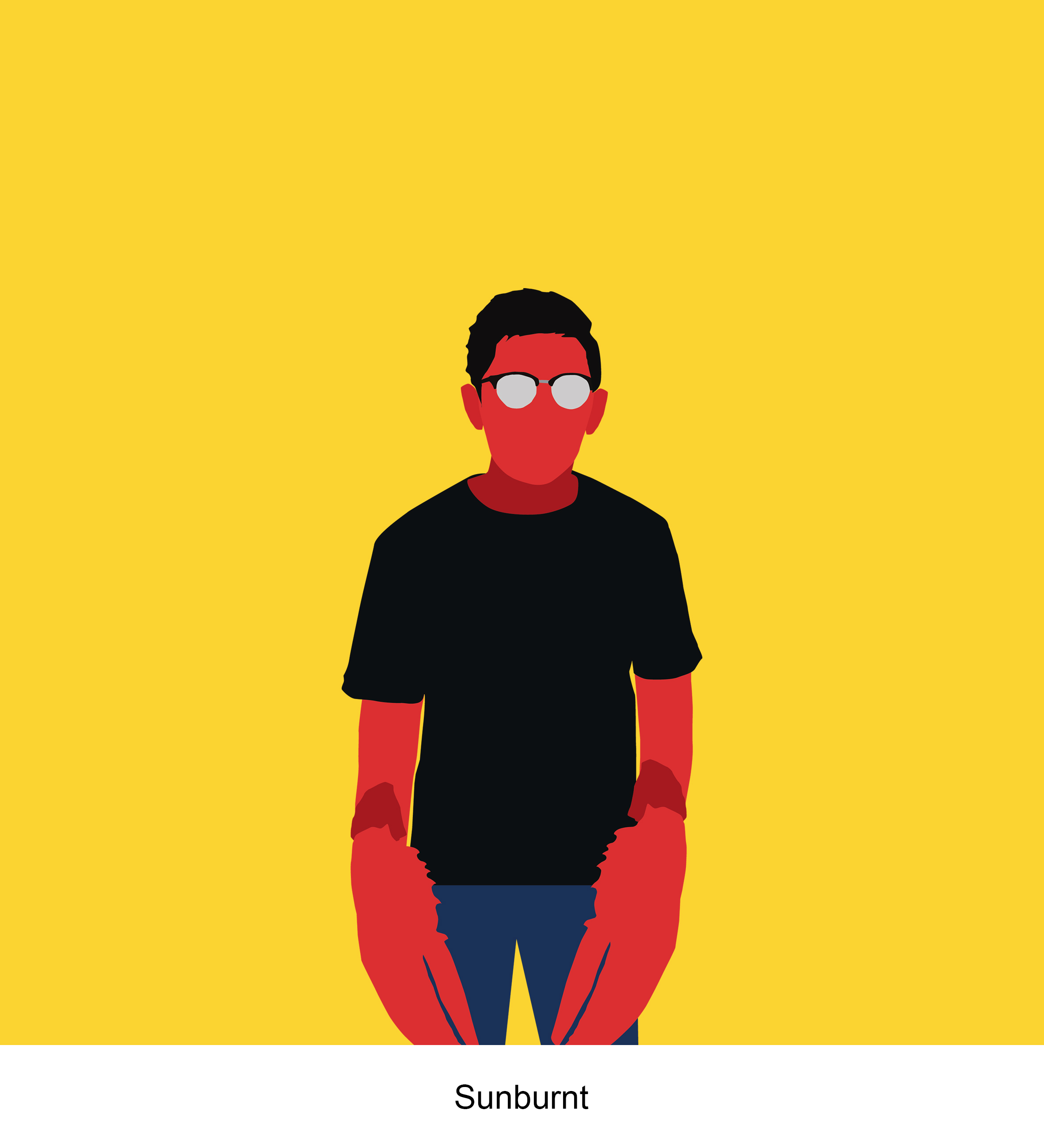

For the 3rd box, the outcome of me making this film resulted in my crew & I being badly sunburnt after a 7 hour shoot at Tuas. I started by using a red to represent myself being sunburnt, then adding yellows & blues to complement the red, so that it wouldn’t be as striking within the composition.
ROW 2:
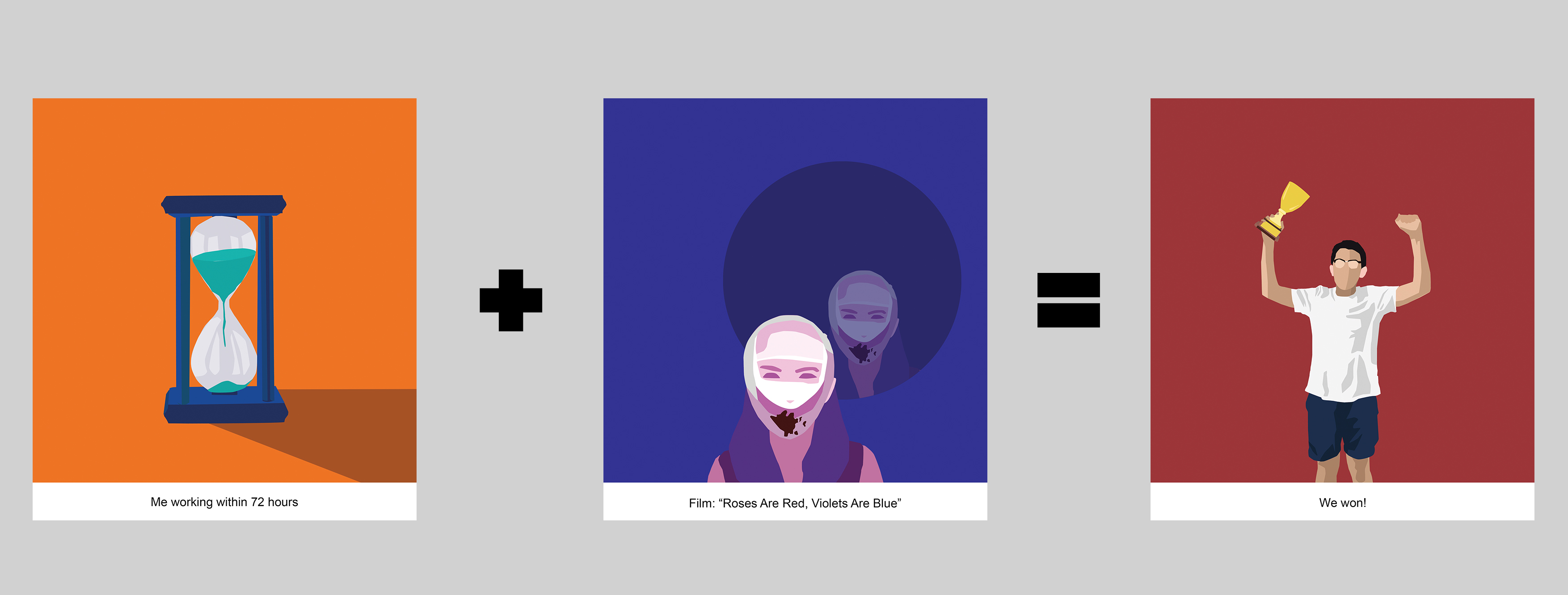
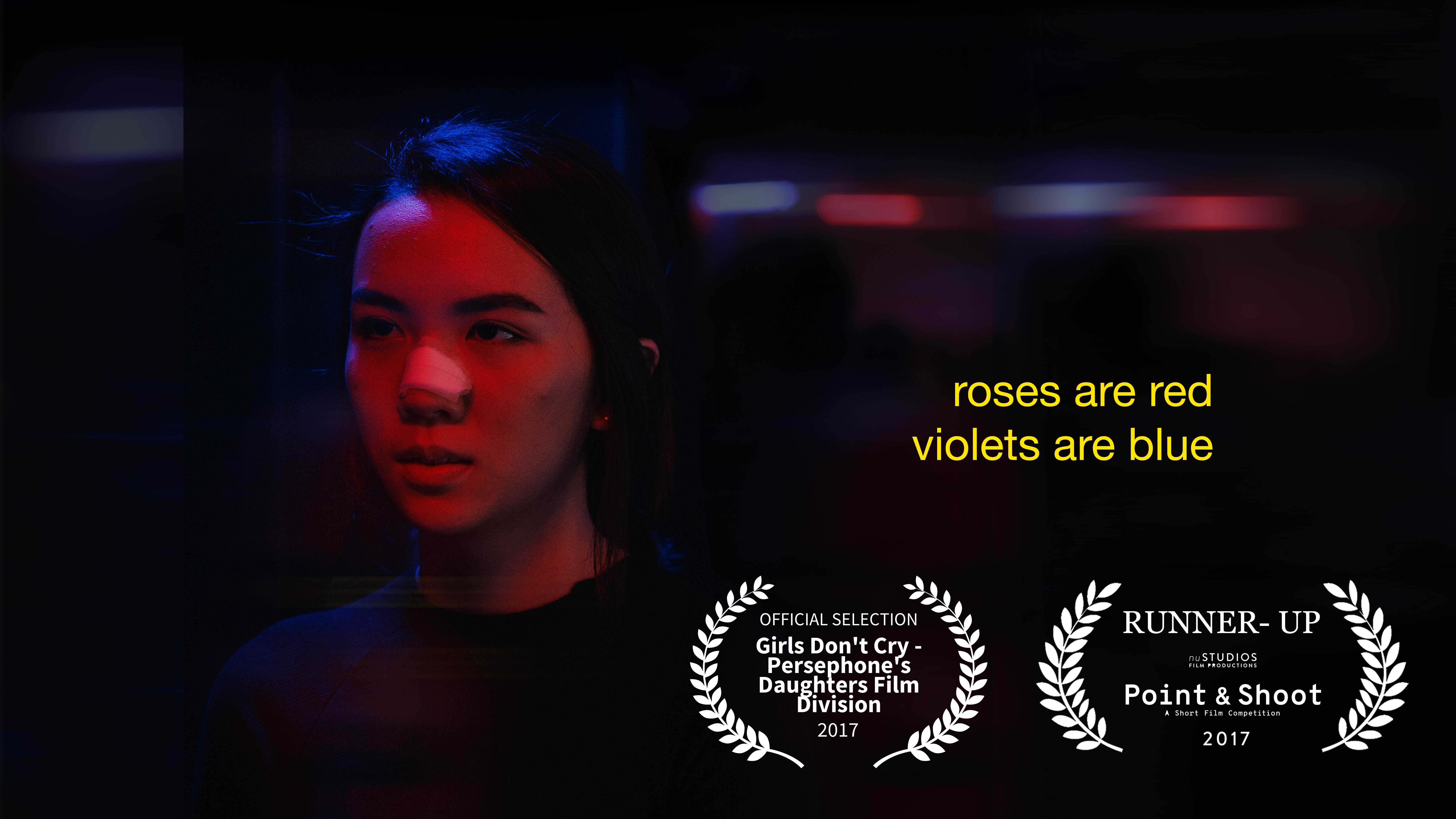
For the 2nd row, this was a film titled “Roses Are Red, Violets Are Blue” that I made for a 72 hour film competition.
Me:
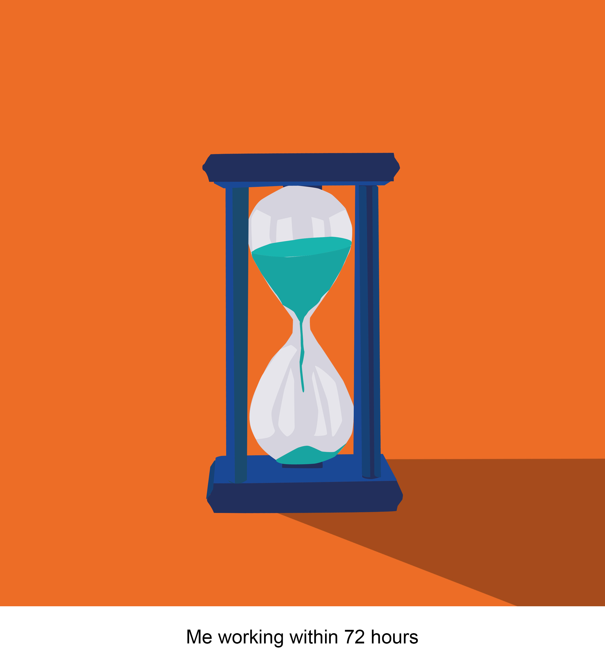

Since I was working with a tight deadline for this film, I used an hour glass to represent the short amount of time I had to represent how I felt during the production of this film.
Using a split-complementary colour theory for this box, I used blue as the base colour of the hourglass with blue-green colours for the sand & the orange in the background to complement the blue so that it isn’t too harsh on the eyes.
Situation:
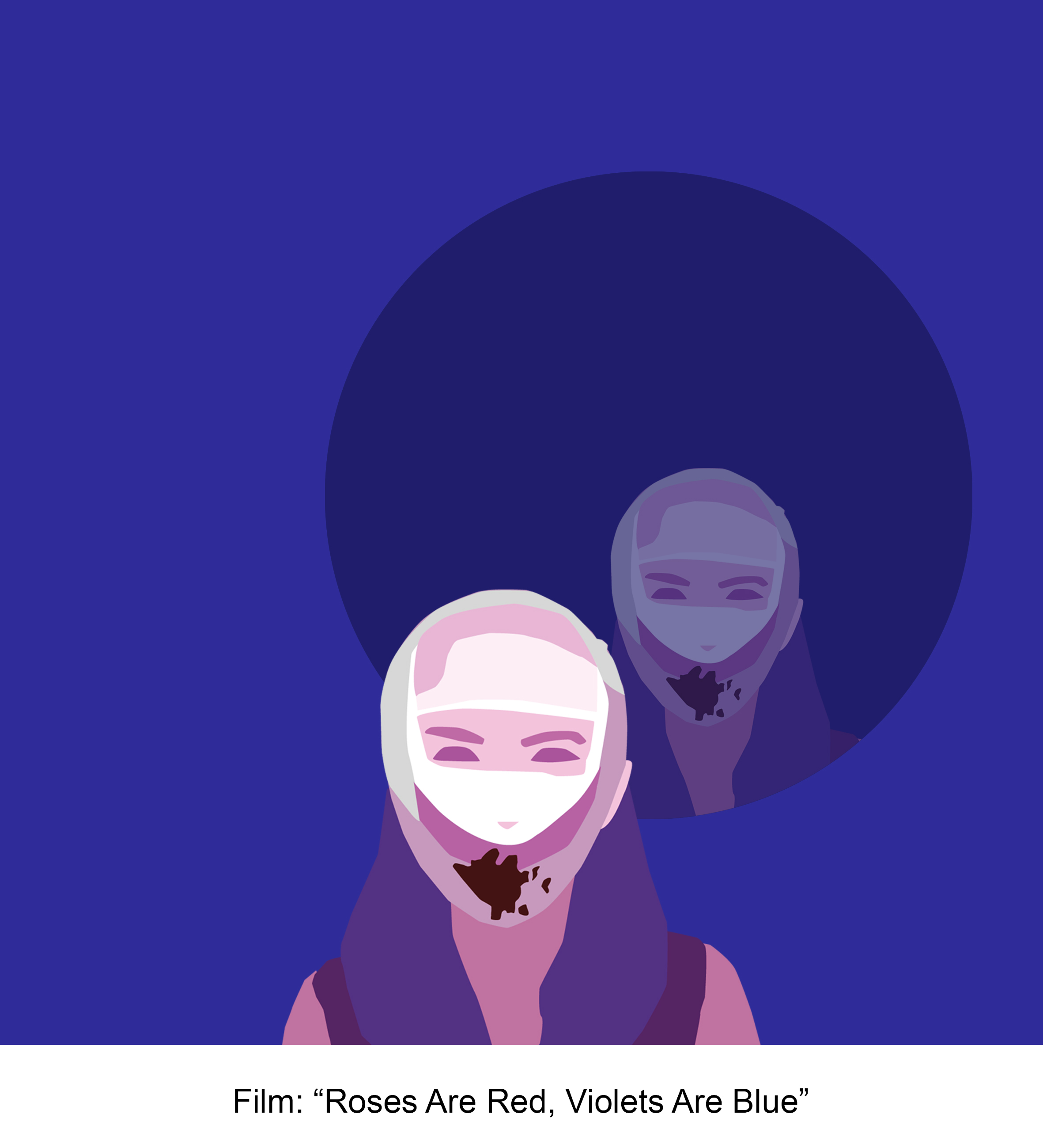

As the film that I made for this competition was more experimental & consisted of darker themes, I adopted an analogous colour scheme as I didn’t want the composition to appear too vibrant, but at the same time, keeping it easier on the eyes.
As the film’s central theme was about image & self-beauty, the circle was representative of a mirror or reflection that comprises of the protagonist who in the film was looking at herself throughout a mirror the whole film. This was to keep consistent the circle motif going for the 2nd box of all the rows that I have started for the 1st row.
Outcome:


The outcome of my team & I making the film which was an unexpected one as we won 2nd place for the competition which caught us all by surprise. I used split-complementary colours for this composition to bring attention to the yellow of the trophy which I wanted to be the main focus of the composition. But, at the same not wanting to make it too harsh, I then used red in the background & blue in my pants complement with the yellows.
ROW 3:
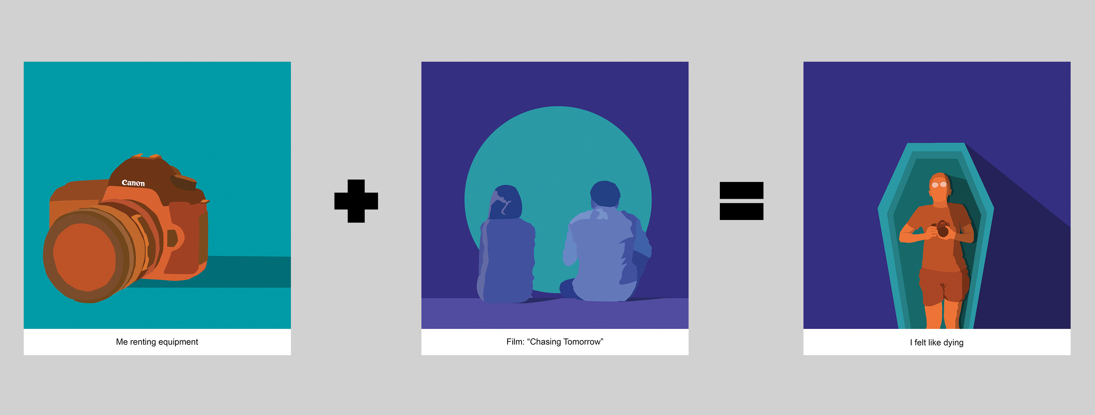
For row 3, it was the film I made for my diploma plus’ final year project titled “Chasing Tomorrow”. There was a major unfortunate event that took place just the day before I was scheduled to film due to last minute cancellations for the female cast that happened right after I had just paid $500 for equipment rental.
Me:
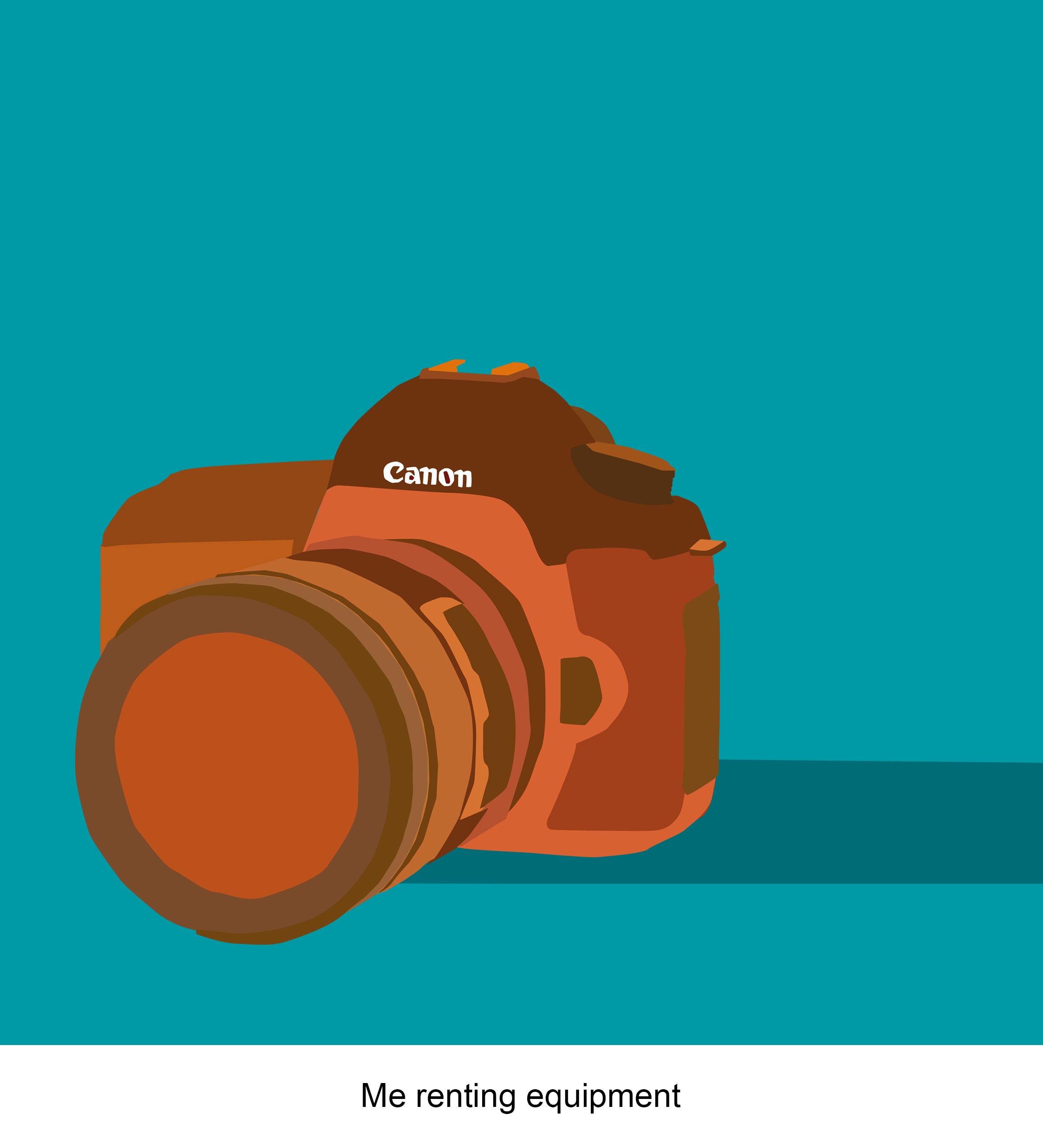

I used a complementary colour scheme of orange & blue-green in the first box of myself. This was to bring a striking focus to the camera that was representative of me having rented the equipment for the shoot.
Situation:
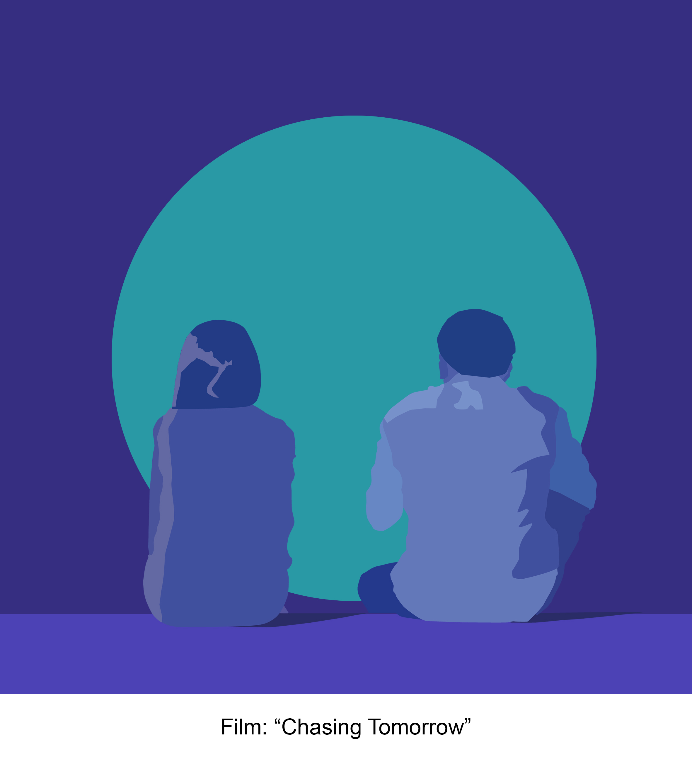
As this film takes place entirely at night, I used an analogous colour scheme as I wanted the composition to look as though the 2 characters are sitting in the moonlight. The analogous colours helps it to look calming on the eyes, just like the particular scene that takes place within the film.
The circle motif is used here once again as a visual representation of the moment where the 2 characters share a conversation under the moonlight.
Outcome:
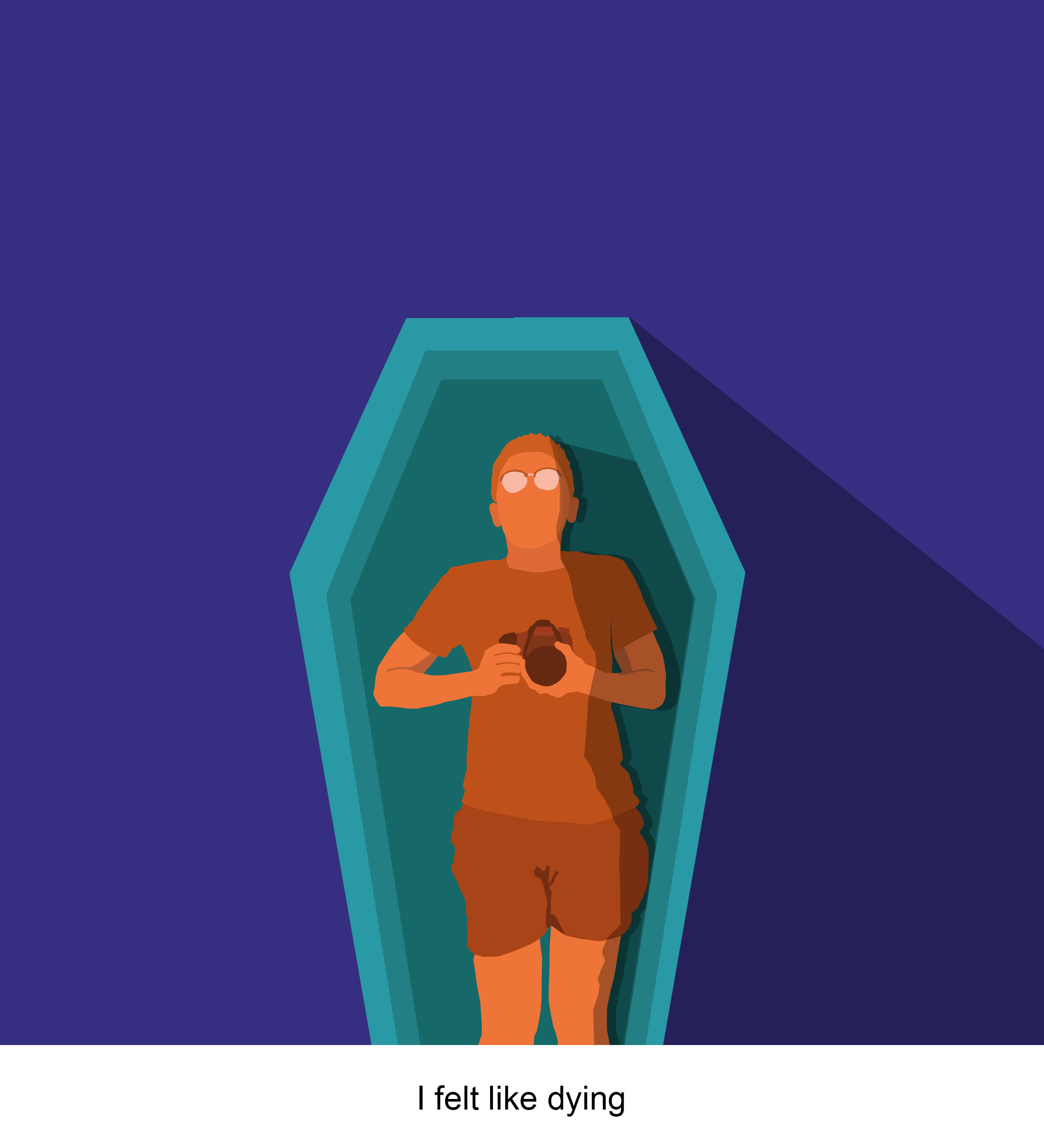

For the 3rd box, me renting equipment plus the production of this film resulted in myself feeling like dying just right before the production of the film. I represented this by showing myself lying in a coffin holding the camera that I had just rented. Going with split-complementary colours, I used orange as the base colour to bring attention to myself and then using blue-green for the coffin & blue-violet for the background to complement with the orange.
ROW 4:

For the final row, this was a film I made for one of the projects for the Foundation 4D module. The film was titled “Apology”, as I made with a double meaning that serves both as a narrative short film as well as an apology to my girlfriend due to my own neglect of her during the busy school period I was going through at the time.
Similarly to the first row, I adopted a triadic colour scheme for this entire row to harmonise the colours of the row as it was also representative of the melancholic feeling of this film.
Me:
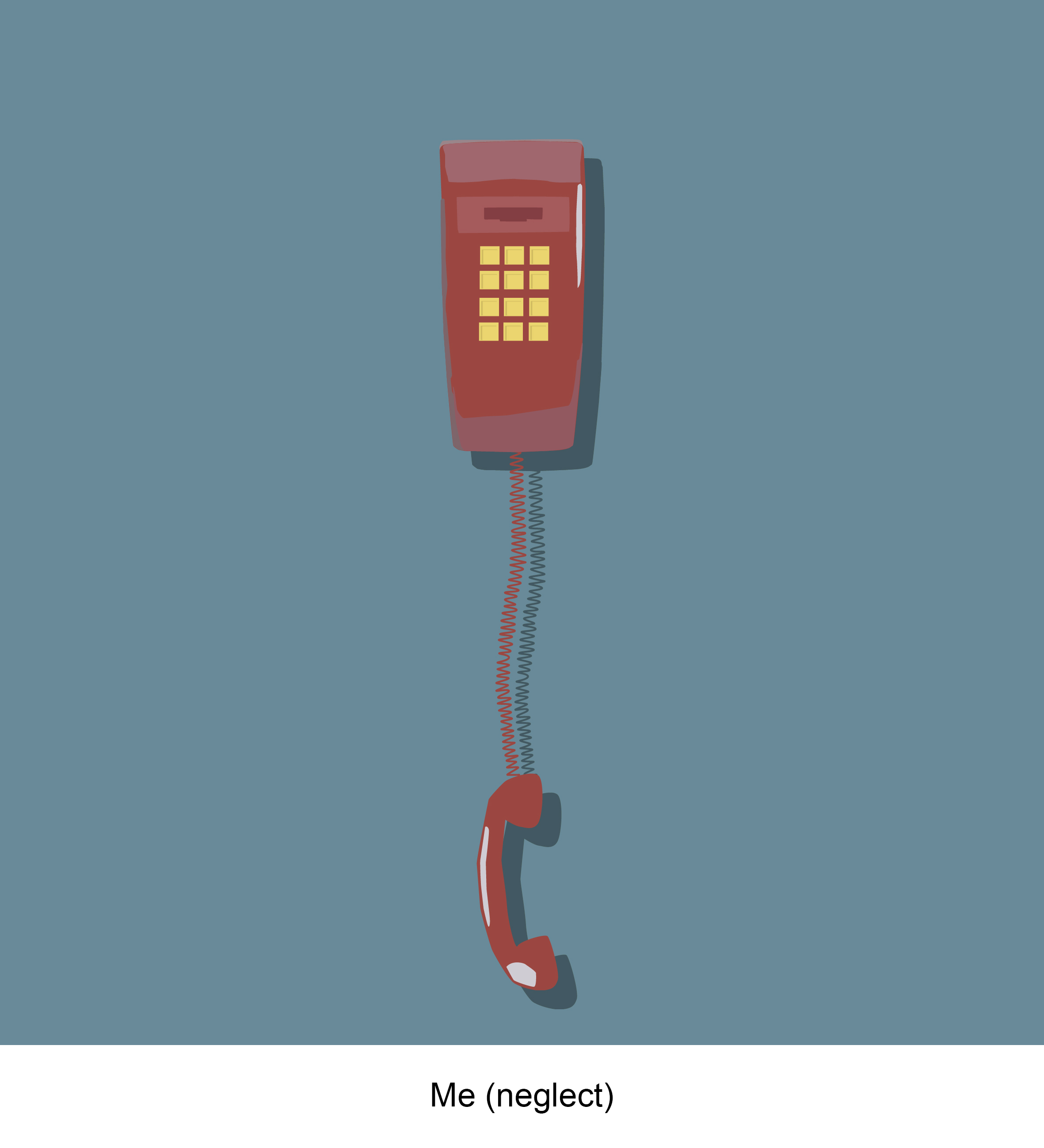

In the first box, I used an unanswered phone to represent my own neglect of my girlfriend. The red was to bring focus of the phone, which is then balanced with the use of yellow of the buttons & the light blue in the background.
Situation:


In the 2nd box, the yellow from the buttons is now used on the protagonist’s clothes to bring focus to her. But at the same time, I used a reddish brown colour for the easel & the blues in the background & circle around her to balance the composition.
The circle motif was used here as a way to show how this film was centred around this 1 character that we follow throughout the film.
Outcome:


And for the last box, the outcome of me making this film resulted in my girlfriend & I making up. I used red on myself which was previously used from the phone I used to represent myself. The yellows used on my girlfriend came from the protagonist’s clothes which the film was centred around & was also how I represented her in the film.
These 2 colours were used to bring attention to both us in the composition. We are sitting together harmoniously as we made up as the result of me making this film, the blue-green in the hair & light blues in the background once again used to balance out all the colours.
CRITIQUE
FINAL THOUGHTS
Overall it was a very fun project for me as I was able to touch Adobe illustrator again & re-learn creating vector designs that I felt were a major improvement compared to what I was doing back in year 1 of poly when I had a graphic design module.
I was also quite happy with how the designs came out especially for the 2nd box as I feel they can now be used as minimalist interpretations for my short films!
For me, the challenge & major learning point from this whole project was the concept of colour theory. Previously when selecting colours for my designs, I would just go with what I felt looked good & not keeping in mind the rules of complementary colours, analogous colours etc. What I’ve learnt from this is definitely crucial to me, as not just for the use in graphic design, but for other areas of my work (e.g. film), I can now apply these concepts of colour theory to create more visually striking compositions.
Also, a big thanks to Joy for helping me throughout the process of this whole project (and project 2 as well), figuring out the colour schemes with me & always giving me suggestions & ways to improve my work. Even at times when I felt my work looked complete, her suggestions would catch me off guard & was something I would have never noticed. These little suggestions along the way actually helped me refine my work further & made it look more aesthetically pleasing in a way that I didn’t think could have been possible. I really appreciated all the consultations I had with her that helped me really create work that I am rather proud of.
It’s a bittersweet ending to end of the module but I’m glad to have learnt & created so much work that I never thought I could within this short period of time!