Final Video:
Password: a
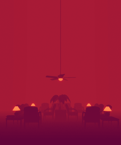
Final gif:

Artist Statement/Concept
Being born in the 90s, I fall under the generational demographic otherwise known as the millennial. There are many personality traits of our group of people, ranging from the positive to negative.
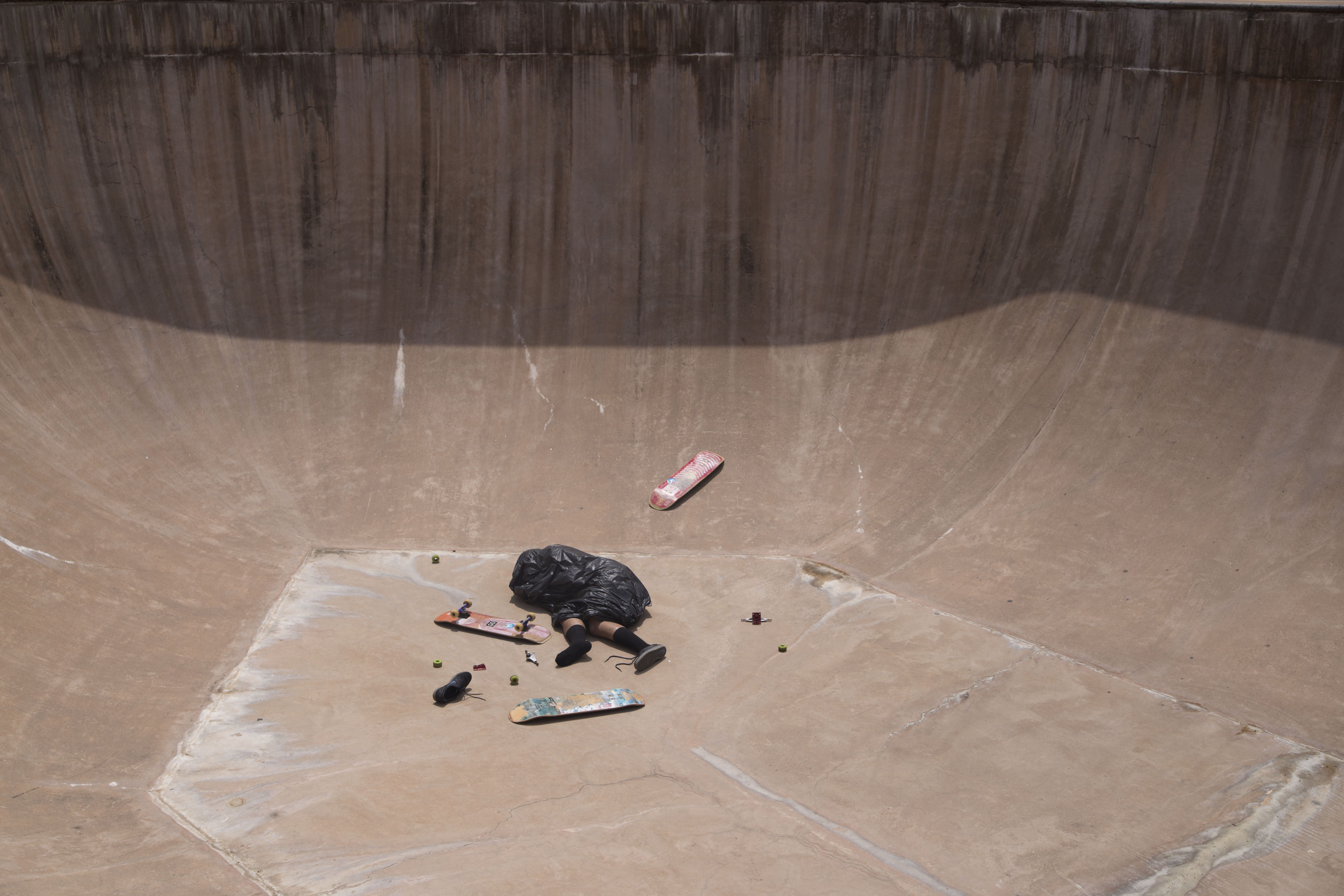
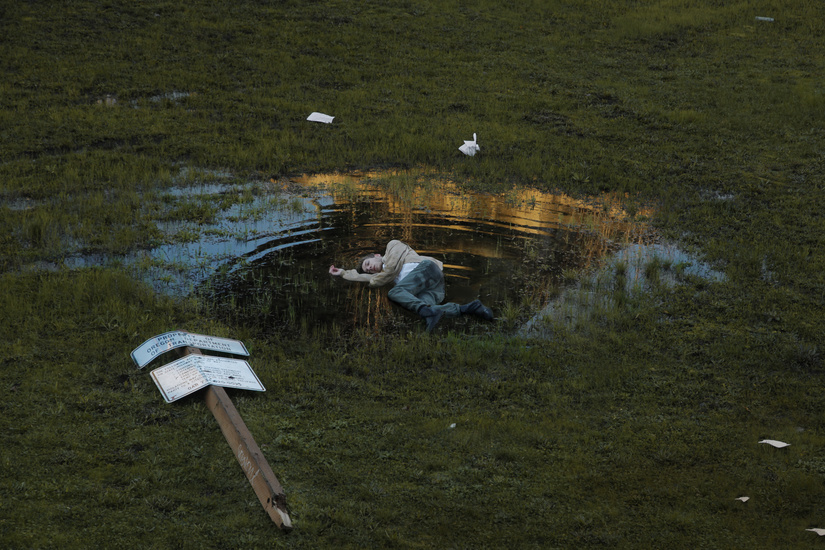
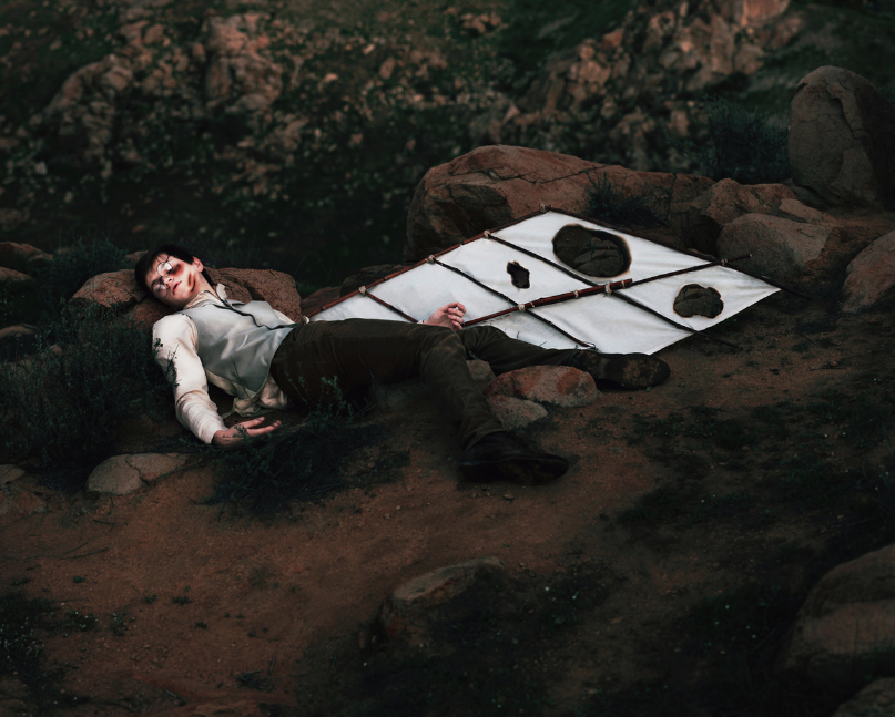
When I set out to create this image, I was hoping to explore the negative side of my own experience as a millennial. Negative traits such as self-entitlement, arrogance, thinking we know how to run the world and being sheltered from reality are some of the traits I felt that I embodied in my personality as a millennial. To put it simply, I or we are considered trash, I used trash to represent this as we are useless, just thrown on to the ground as we lay to waste & do nothing with our own lives. At least that’s the negative stereotype that came with the title.
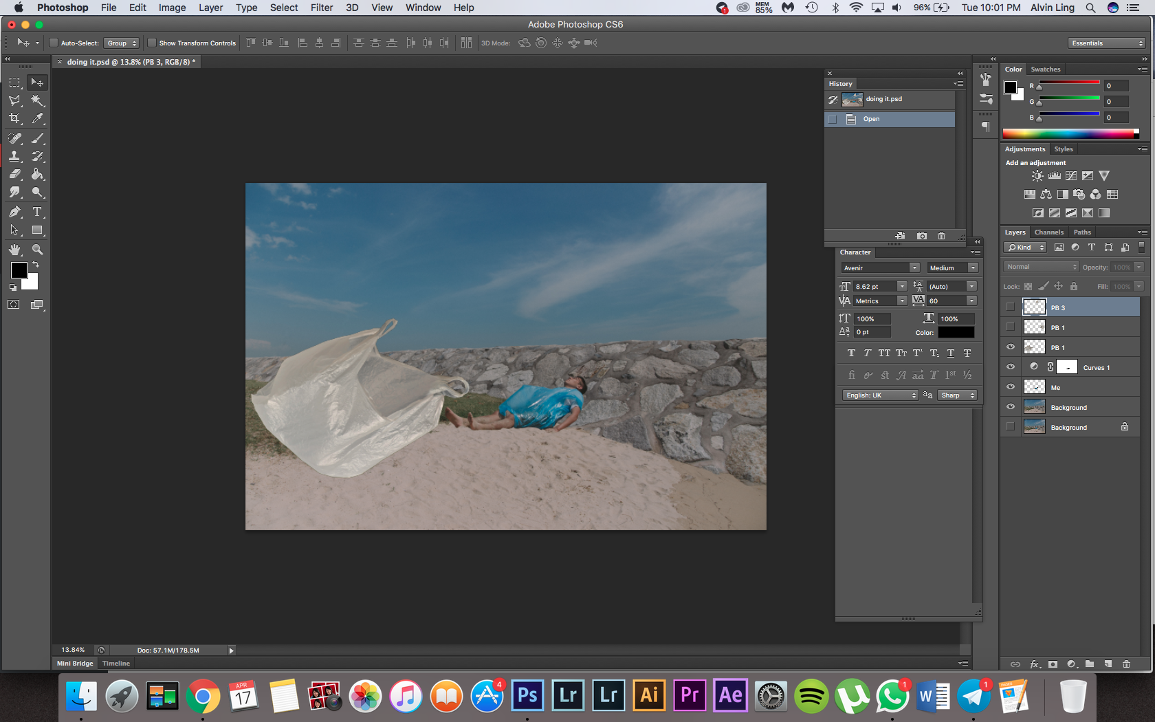
As you can see in my image, I have strewn a trash bag on to myself as I lie down in the vastness of this empty beach lying there asleep or ‘doing nothing’.
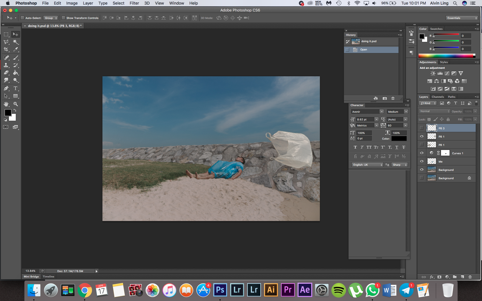
That was the concept when creating the original image, as this assignment was to create a moving image, it was a good opportunity to push the concept further and make the image more dynamic. I did this by adding other empty plastic bags floating in the wind. They move slowly as this is representative of this sedentariness I want to capture in my image as I am lying down asleep. The plastic bags are empty, representative of millennial stereotype as just being airheads and seemingly being able to hold a lot of things but are in actual fact just completely empty.
Technical Decisions
Before I started the animation process, I broke down the image into 2 parts, creating a separate layer of just myself and another of just the background. I had to use the clone stamp tool to paint in the background to recreate it after I removed myself from it.
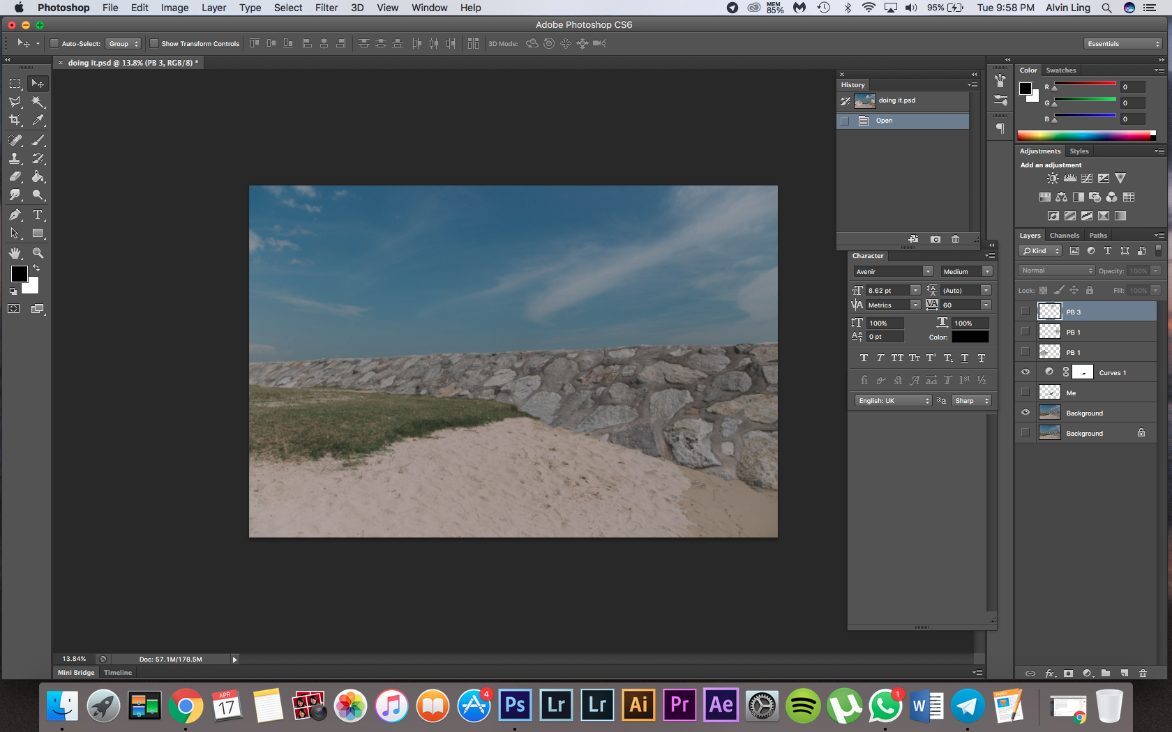
Background layer
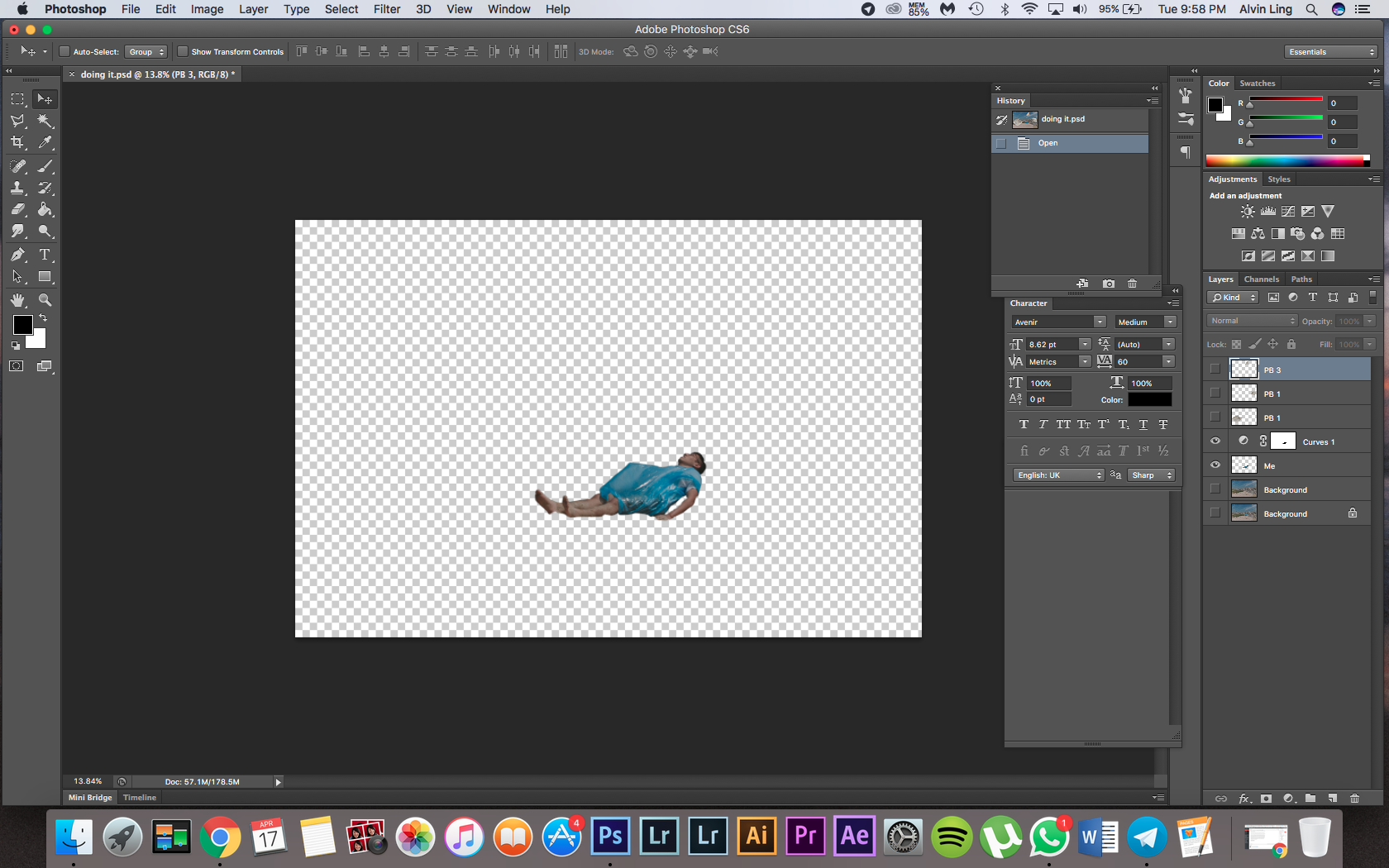
Me layer
Afterward, I added 3 separate layers of empty plastic bags PNG files on top of the image so that I can use this for the animation process during After Effects. Breaking down the plastic bags into separate layers makes it easier during the animation process as they are all in individual layers.

The first thing after dragging the Photoshop file into After Effects was to create a new camera and enabling the depth of field settings to create a sense of perspective in the image.
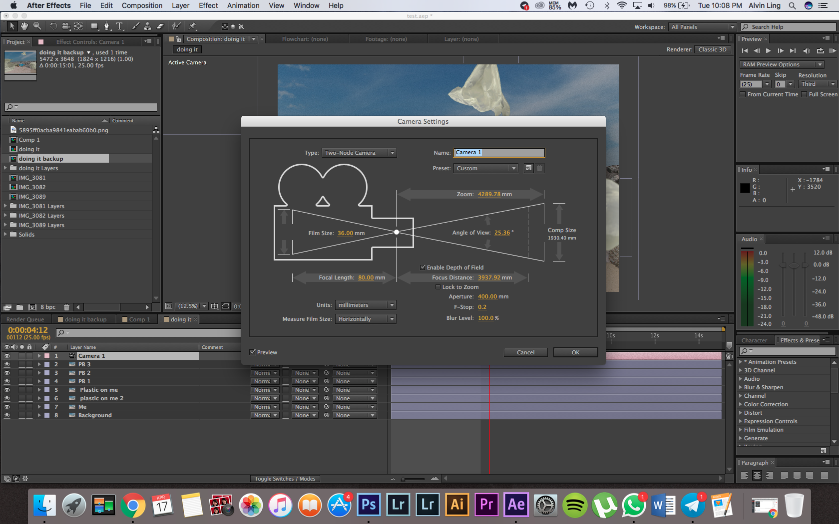
After enabling 3D on my layers, the next thing I did was to move the position of my plastic bag layers, as I wanted them to be in the foreground of the image and out of focus, I moved them closer to the camera, but locking the camera’s focal point on my image and background plane.
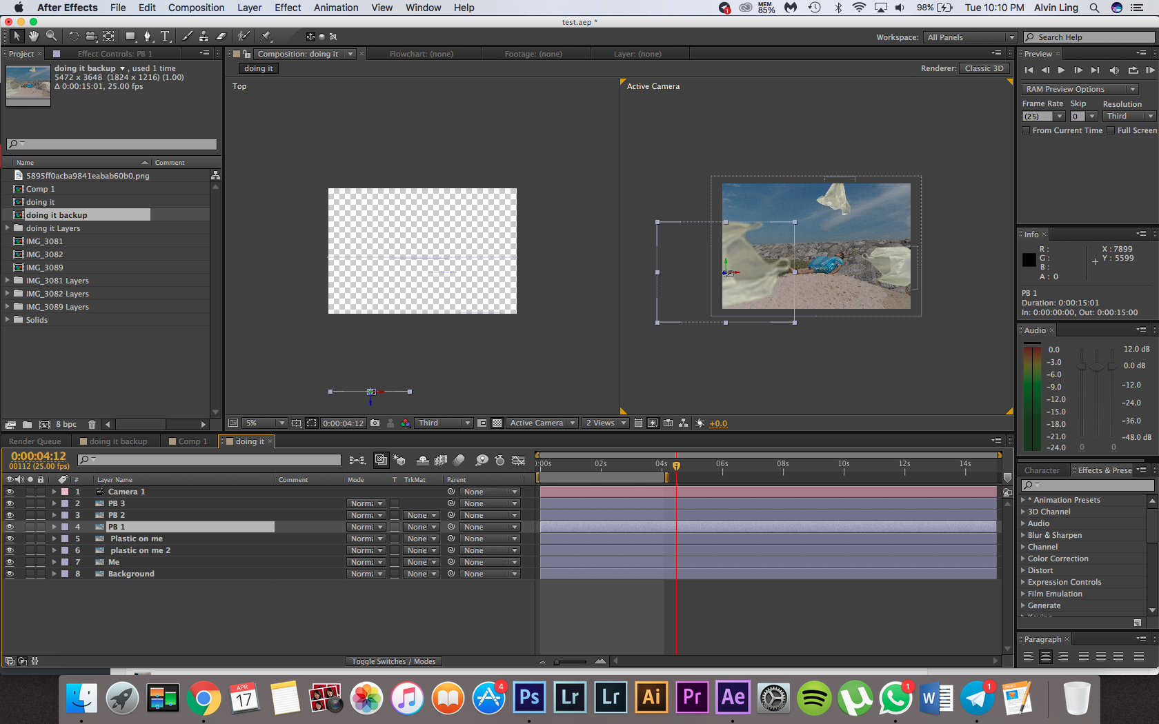
I started by animating the camera to move forward, this helped to create a sense of depth and movement as it moved past my plastic bag layers and closer to me.
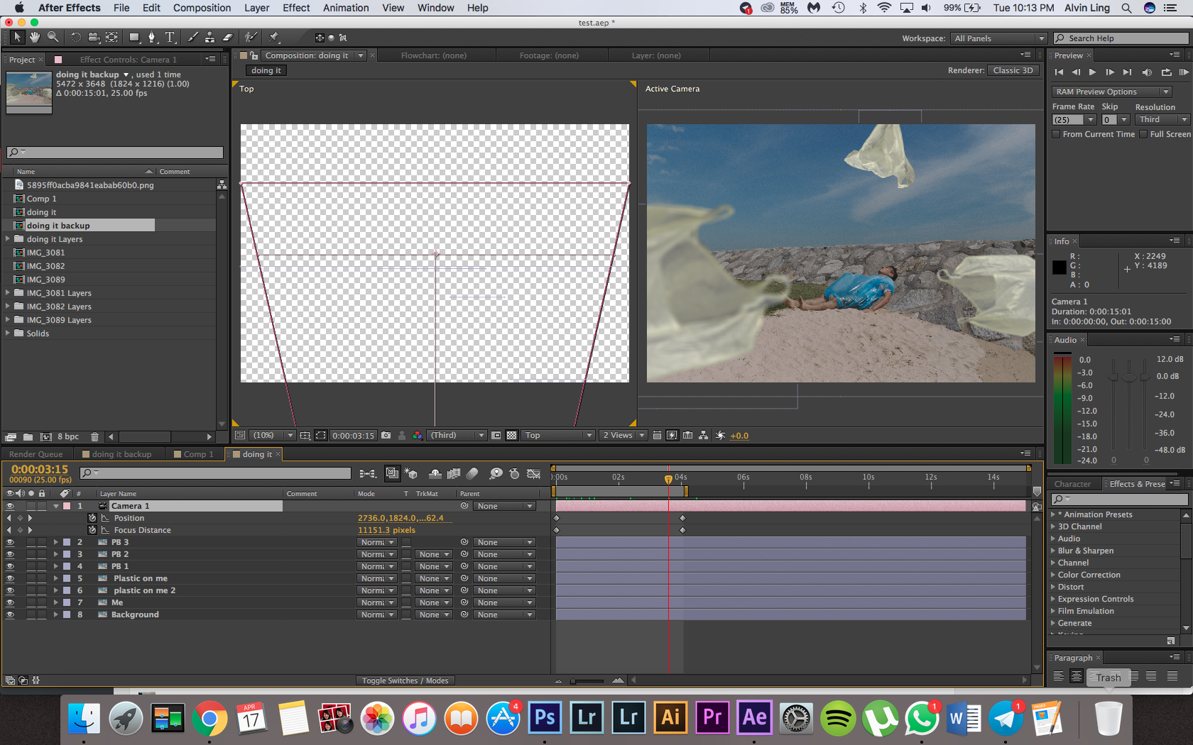
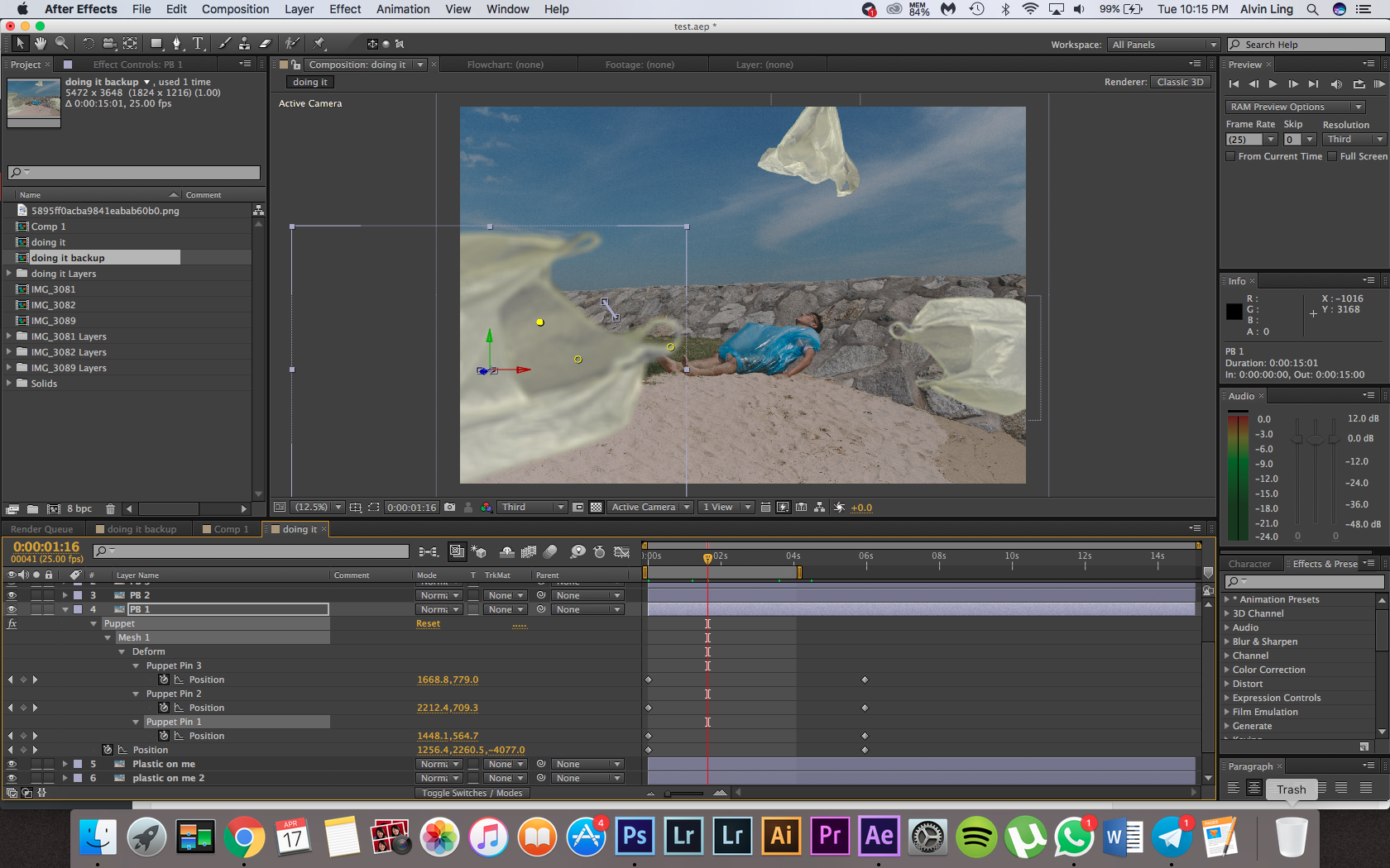
Next, to make the plastic bags have the floating effect I wanted, I used the puppet tool to create points on the layer, I then key framed the position of the points as the camera tracks in, I animated it to look like it’s floating in the air. This was done for all 3 plastic bag layers.
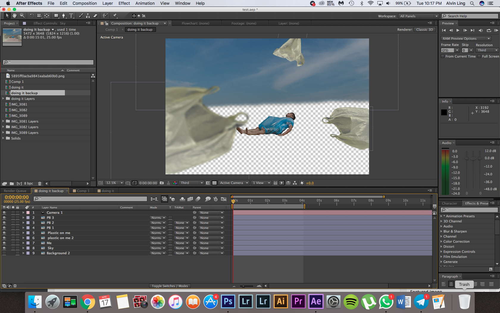
The movement was close to what I wanted for this gif, but I realised something was a bit off, and that was the sky was too still as everything else was moving.
What I did was to duplicate my background layer and do a quick rotoscope of the sky, with the sky as a new layer, I moved it behind my background plane and scaled it up to fit the image. I then just did a small position keyframe to move it as the image tracks in.
Just for minor details, I rotoscoped out the plastic on myself and created puppet points and key framed them as well to move back and forth to simulate the wind effect I was creating in my image.

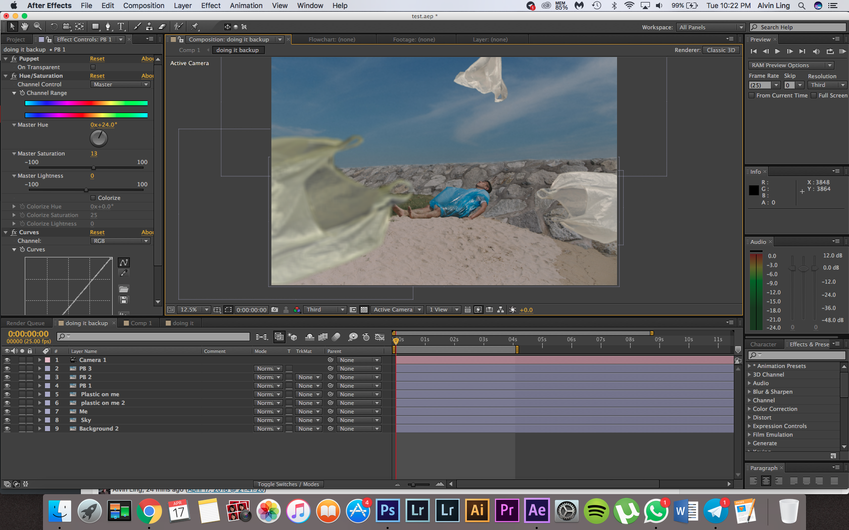
Lastly, I used a curves adjustment as well as a hue/saturation adjustment on my plastic bag layers to blend the lighting of it into the image and change the colour of the plastic bag to a bit more of a dirty green colour.
And with that my final gif was created!
Artist references
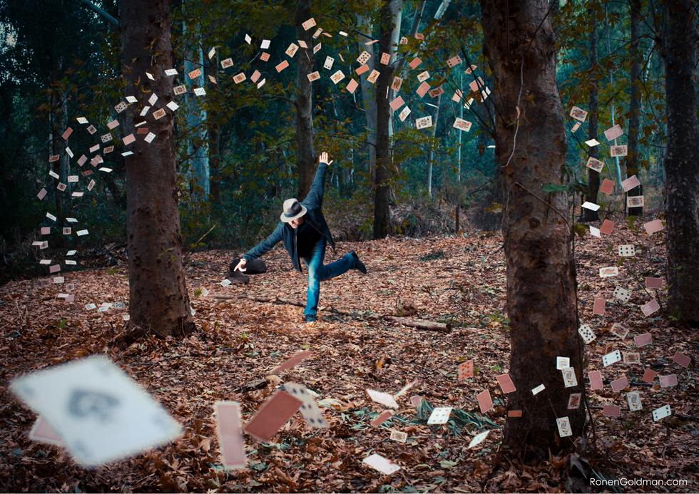
1. Ronen Goldman
Ronen Goldman is an Artist and Conceptual Photographer based in Tel Aviv, Israel. He specializes in creating “Photo-Dreams” – conceptually constructed photographs illustrating his various dream states. I was inspired by his compositions and framing, employing the use of objects that come into the foreground to create a sense of movement and depth in a still image.

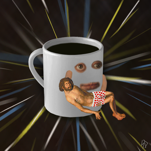
2. Scorpion Dagger (aka James Kerr)
James Kerr, better known as Scorpion Dagger has created hundreds of GIFs that warp Renaissance artwork into a collection of surreal, irreverent animations. I was inspired by the subtleties he employs in his gifs, creating small and simple animations but yet are effective in terms of image-making.
3. Carl Burton
Carl Burton creates soothing and peaceful gifs to look at. The slow subtle movements he creates in his work definitely inspired me to employ this sense of calmness in my own image-making.