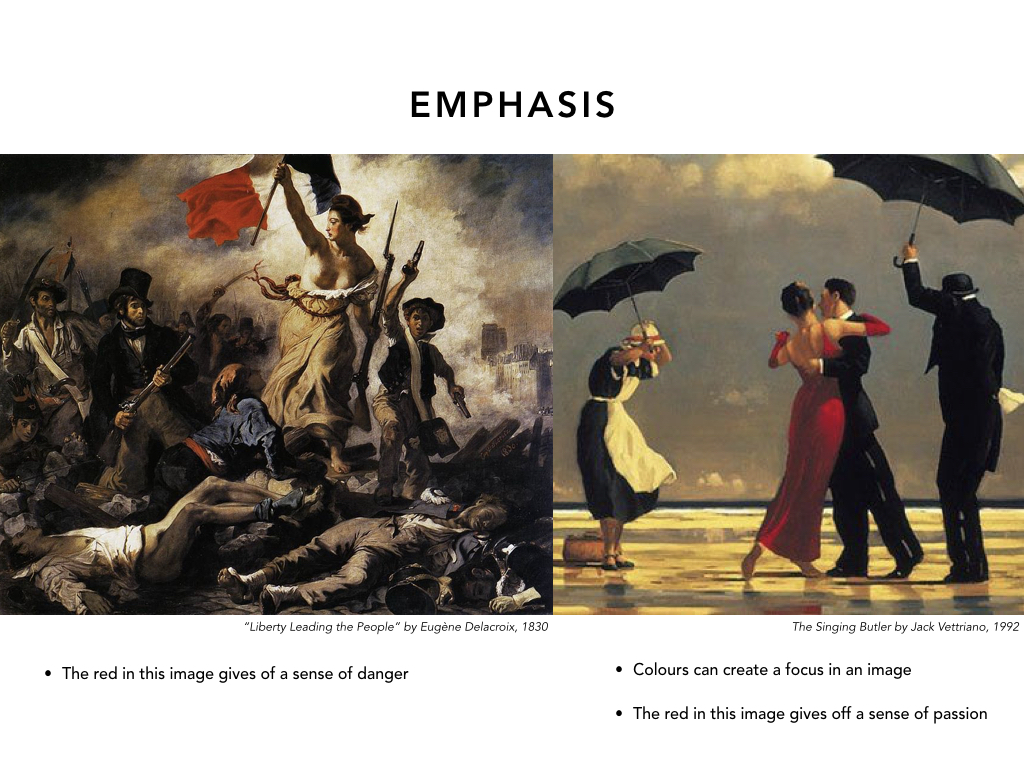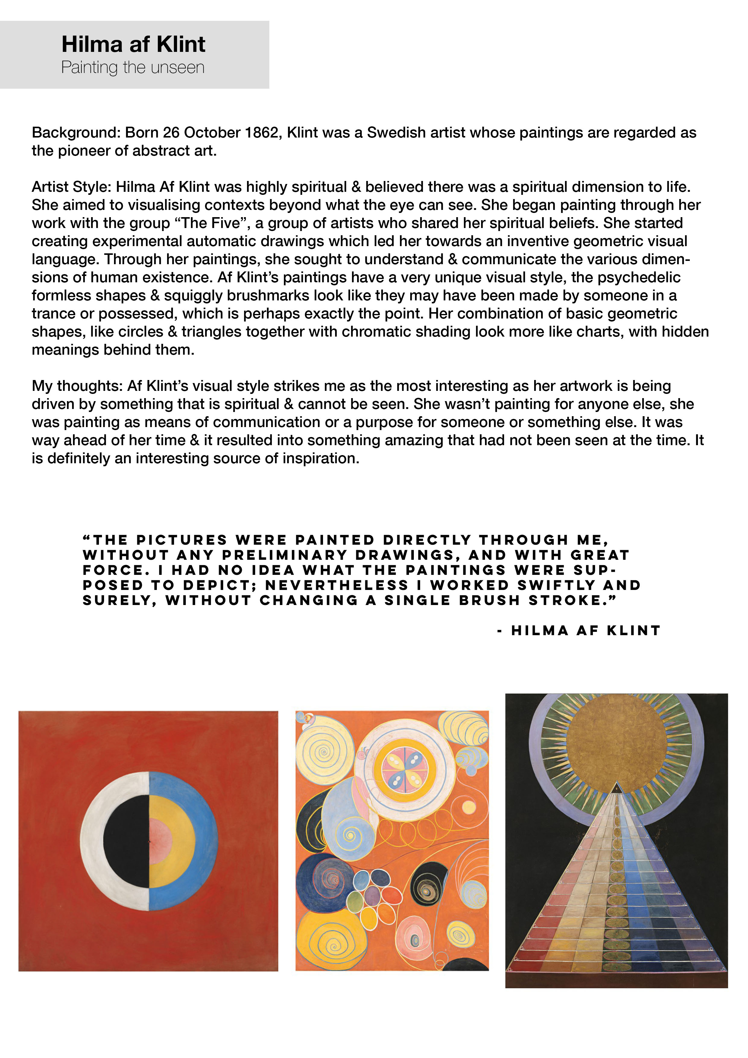
For project 1, we were tasked to create a short film told with only 7 shots under the theme “the seen & the unseen”.
Due to the limitations of shots, how I approached to best tell this story was to set limitations for myself.
These 2 things were set in mind before I even began pre-production, which was to keep the film within a single location & following only a single character.
Pre-production
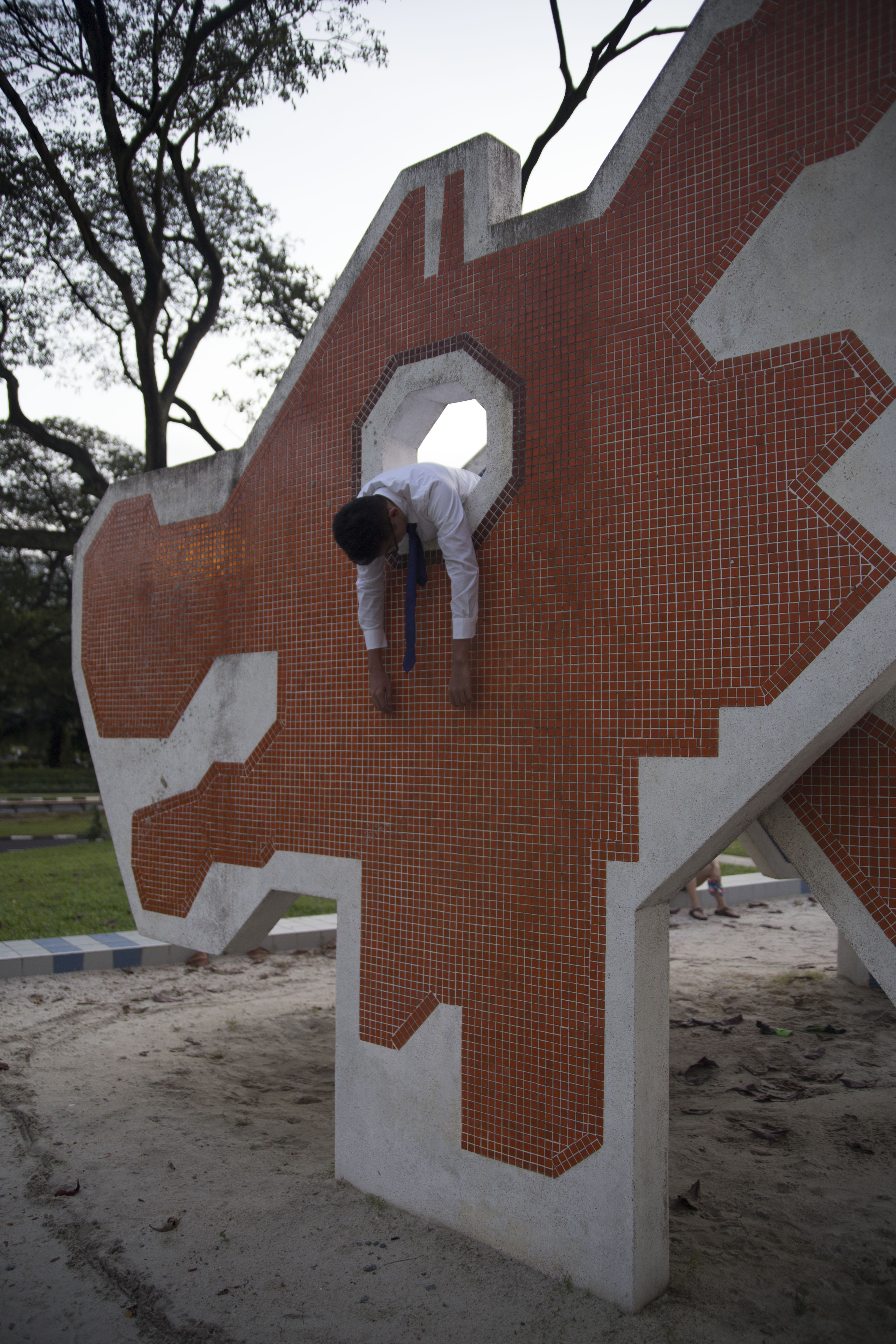
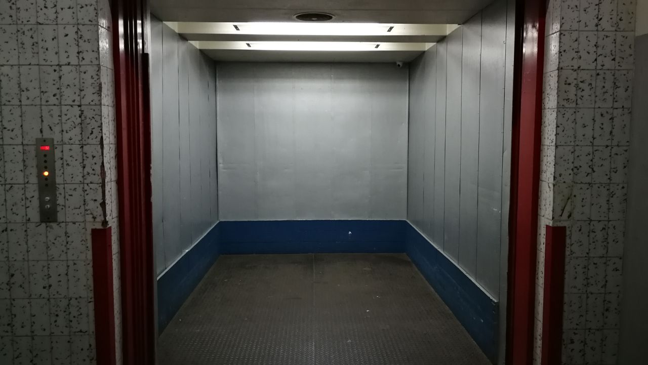
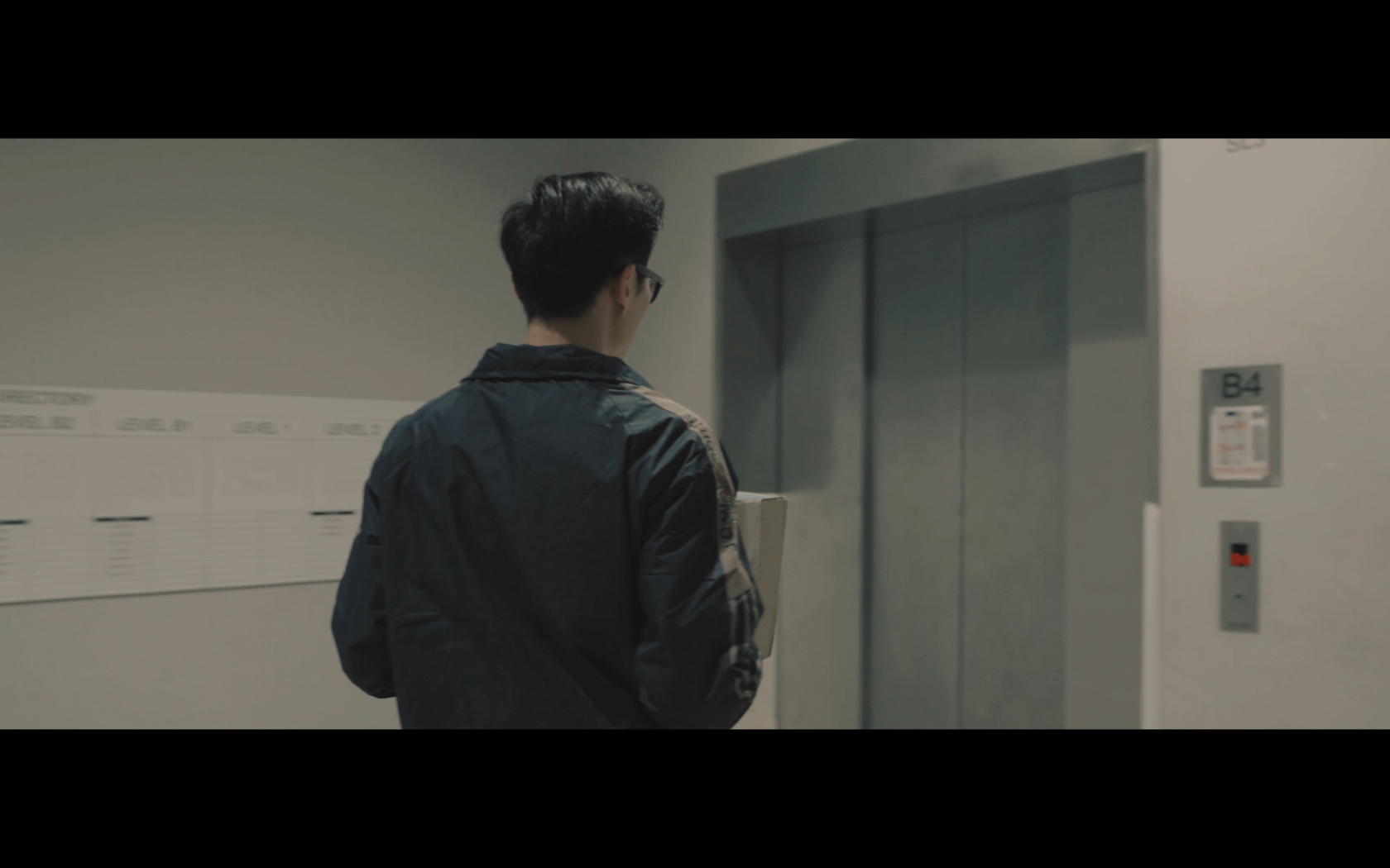
I first came across this lift by chance in an industrial area & knew I wanted to use it as the location for this film. I figured having an unsuspecting character trapped within the confinements of this space would be something interesting to explore.
The character I came up with was a deliveryman who unluckily gets stuck in the lift while making a delivery. The genre I was trying to go for was a bit more towards something like a dark-comedy. But those are the hardest things to write.
However coming up with what happens next was the trickiest process, I spent a long stressful time trying to figure this out. But, long story short, I discussed the idea with a group of friends & bouncing ideas off each other definitely helped to come up with the idea you see in the film.
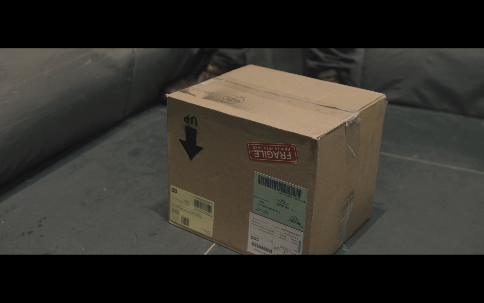
The key point that we made in the discussion was to play on the words ‘this way up’, as that was what is normally printed on the front of parcels as to avoid damaging the contents.
Placing that in the context of the lift, I figured it would parallel how the lift is also going up. Which led me to the final idea of the box being a controller for the lift.
Script


The script for the film was fairly simple, just a 2 page script of what happens in the film.
Location recce & test shots
I headed back down to the location to have a look at the lighting & the space. I also shot some test stills to understand the limitations of the space & to know what lenses to use for certain shots.


Test shots
Backup location
But as with every production, unfortunately after emailing the management of the building, they did not allow me to use this location for the shoot & I sourced for a backup location.

I planned to go forward with the shoot at the 1st location done in secret from the security & only kept this one as the backup location. I tried as much as possible to avoid using the backup location as it didn’t really suit the look I was trying to go for. (More on that during production)
Shot list
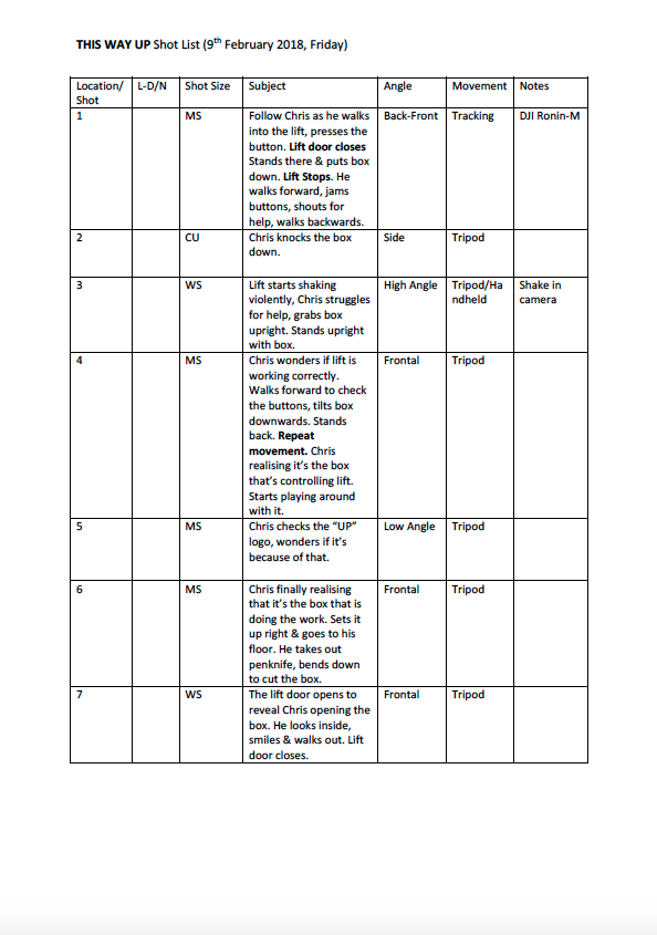
This was my shot list consisting of the 7 shots, it was crucial to have each shot progress the story due to it’s limitation.
My main challenge was the opening shot which I wanted it to be a 1 take shot introducing the character as well as setting up his predicament.
From a story point of view, the 1 take also symbolises the smooth-sailing unsuspecting deliveryman as he journeys into this magical lift. The first cut only happens when he trips over the box which sets things in motion.
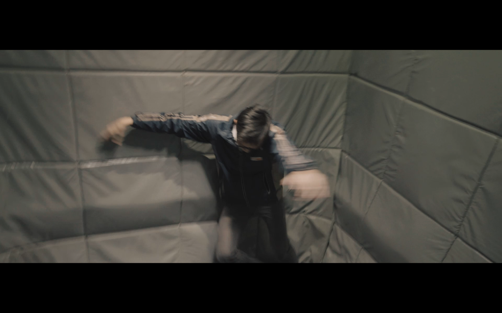
Other considerations were also having the actor physically mimic the lift stopping shake in camera so that the stopping of the lift could be added later on in post-production.
One exception was my 3rd shot, I did 2 variations of the same shot, one handheld & the other, a still shot. This was in case I needed to add a digital camera shake in post.
Casting
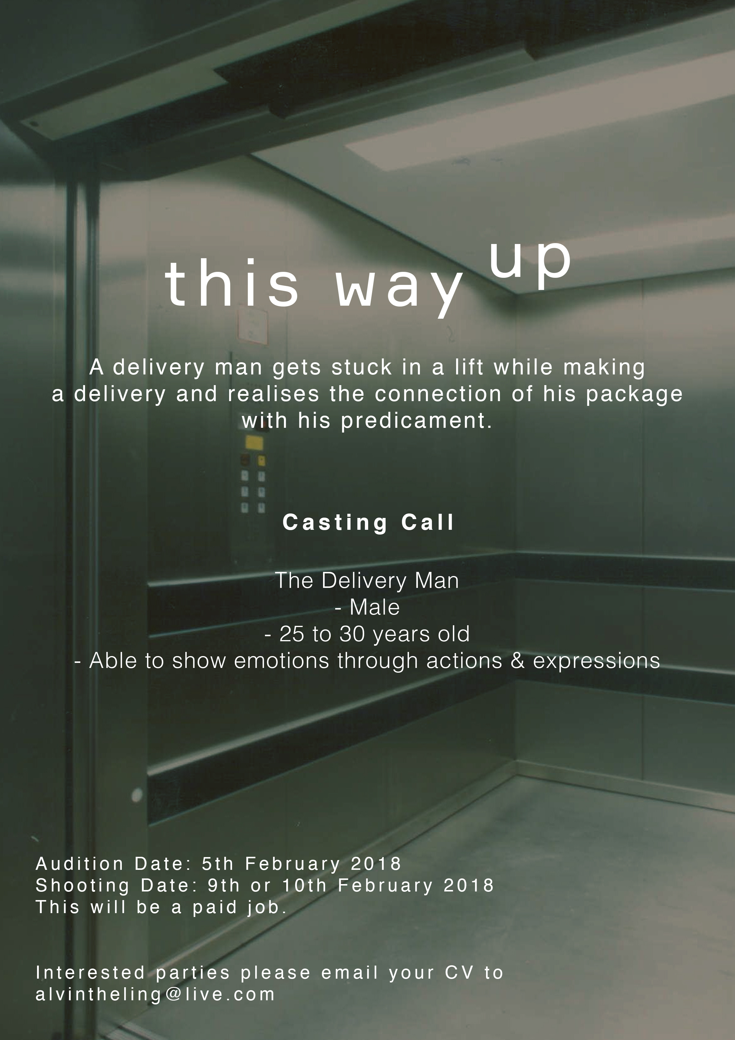
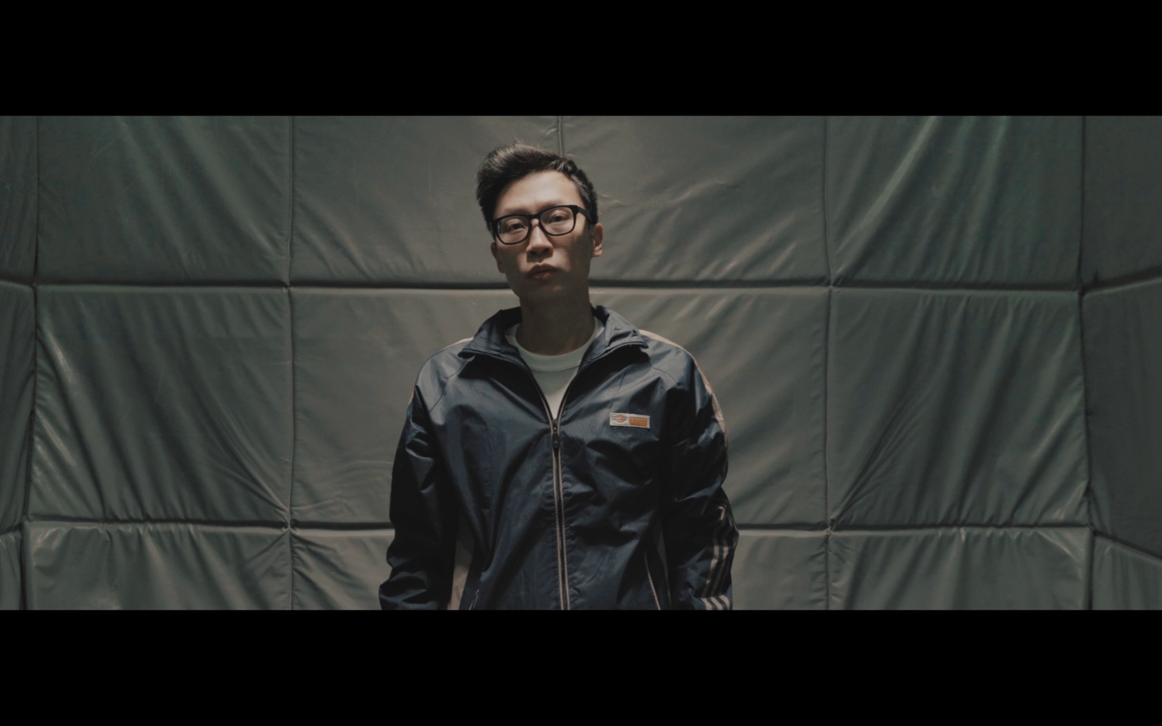
I was initially going to do casting for this film, but it was quite fortunate that a classmate of mine worked with my lead actor, Christopher before.
I’ve seen Christopher’s previous work & he has also auditioned for a previous film of mine before. I knew he could convey the mannerisms & expressions of the character with no dialogue & would be a great fit for the role.
Fortunately it all worked out as he was free during the production dates & was interested in the story as well.
We met a couple days before the shoot for a rehearsal & also just getting to know each other better.
Production design
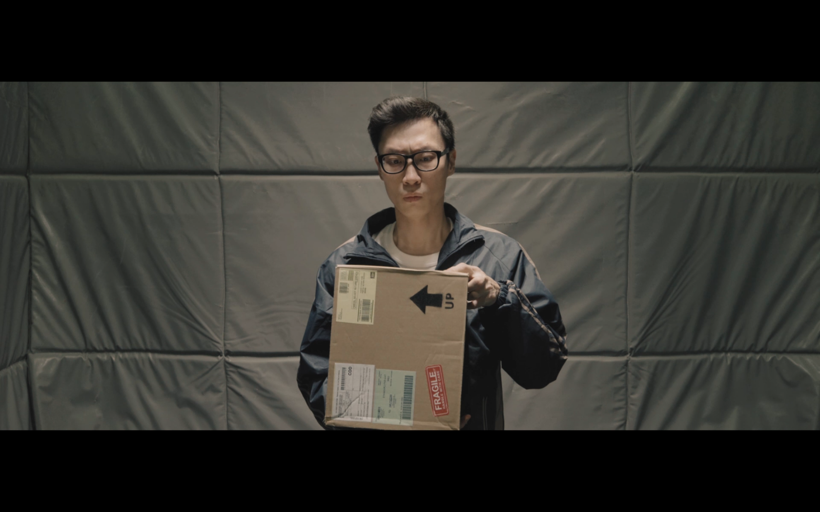
The box was crucial to this story, I had to find the perfect sized box as well as the little details that went on it, especially the ‘UP’ label. I designed a specific label for it to be placed onto the box, having it blend in with the box but at the same time being noticeable enough for the story.
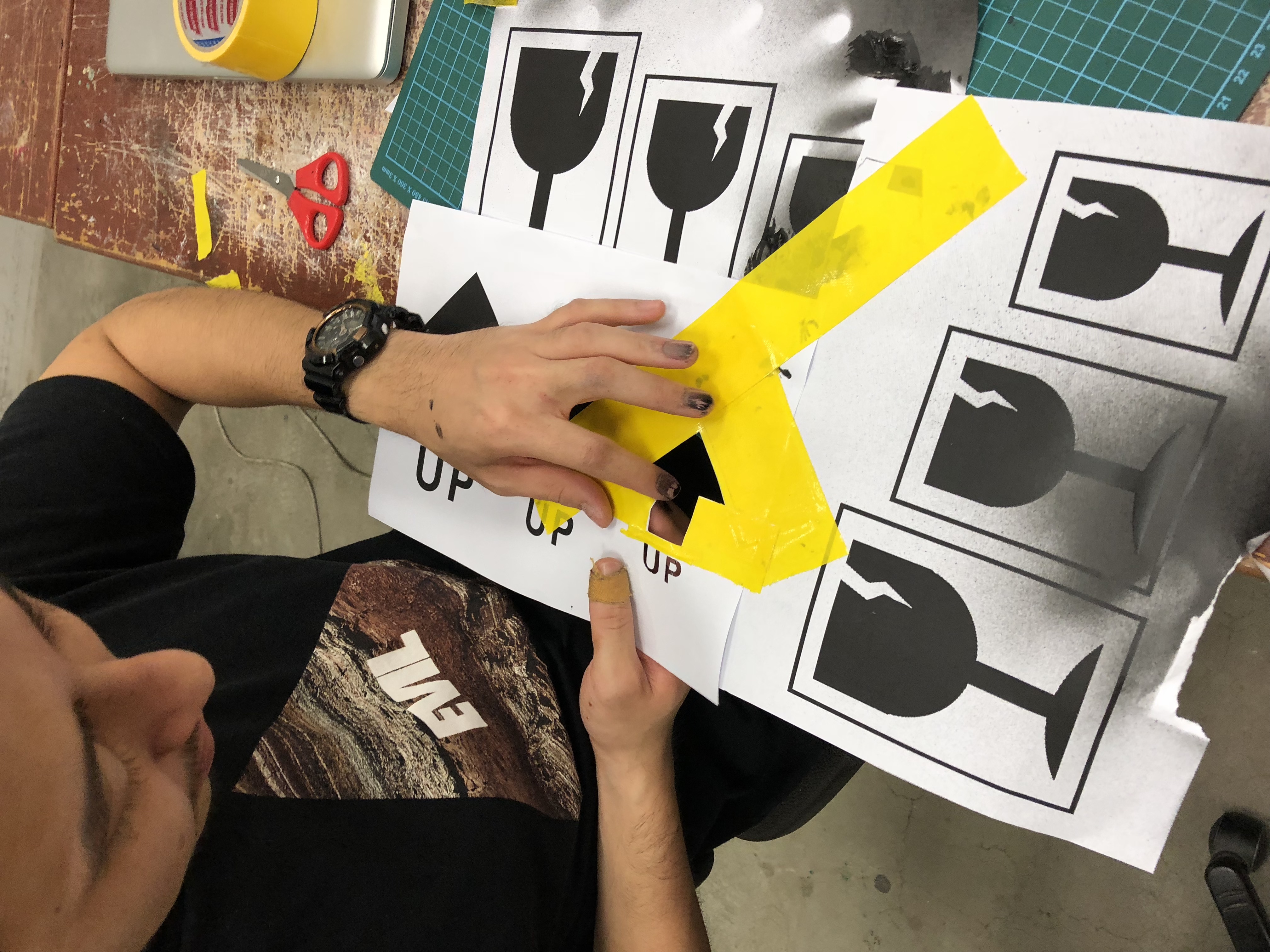
Prepping the stencil to spray paint on to the box
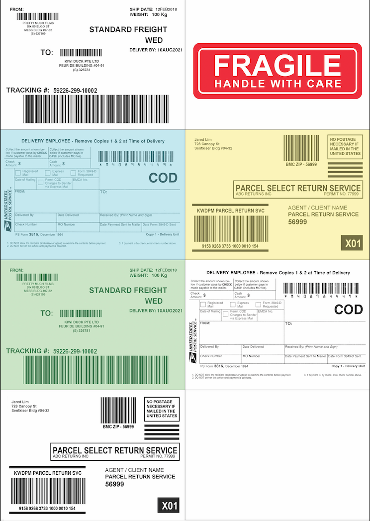
Some fake labels which I created & printed on to sticker paper
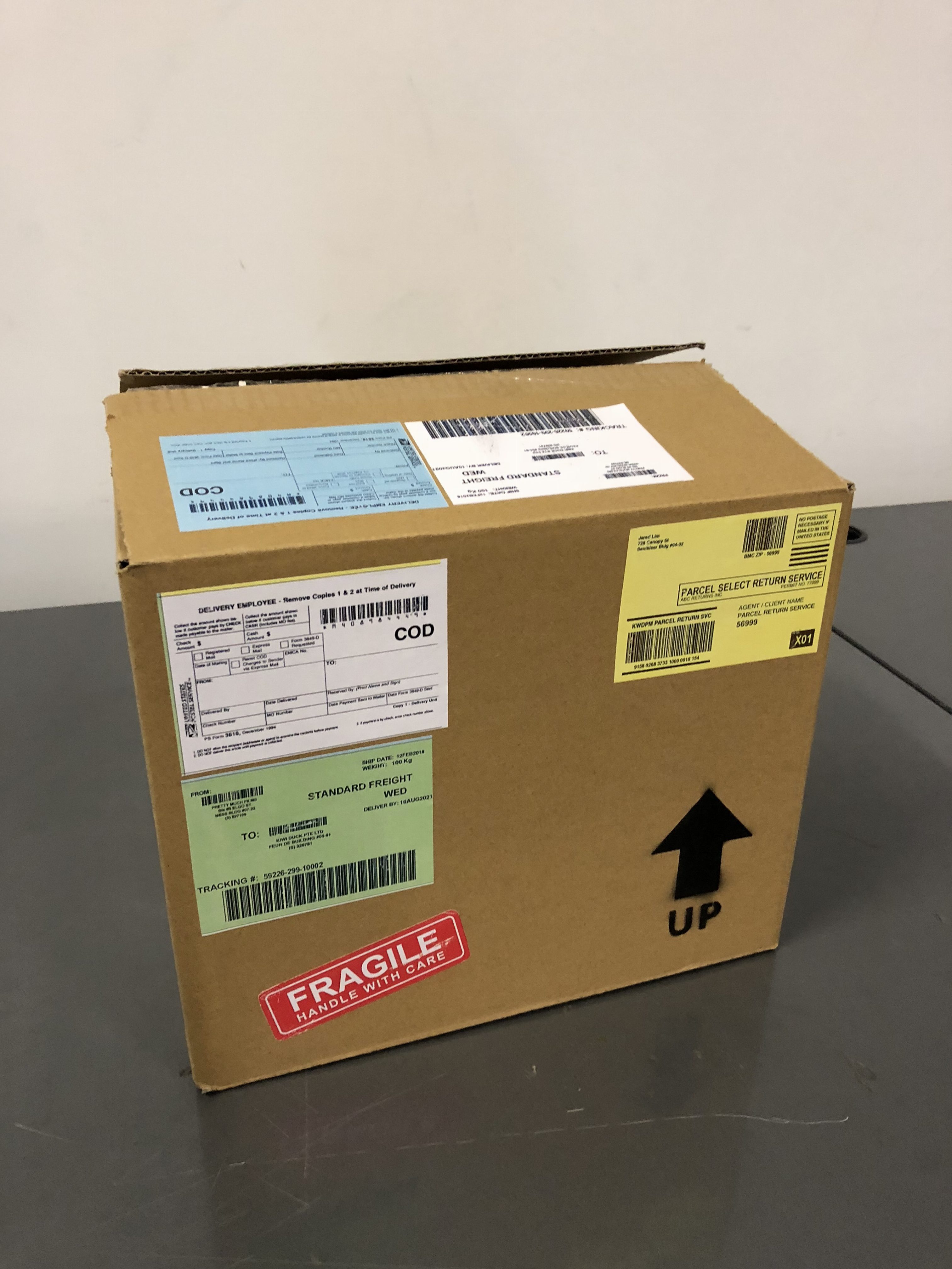 Final box
Production
Production day was tricky! My plan was to shoot in secret while not alerting the security, I made sure the crew that came to the location did not sign in with the guards so as to not alert them.
I also specifically told my cast to wait outside the building & I would fetch him to bring him into the building.
But as with Murphy’s law, things that went wrong, went wrong. My cast ended up talking to the guards while waiting & revealed to them that we were shooting today & the guards wanted to confirm with the management whether we were allowed to shoot there.
I spent an hour trying to convince them to allow us to shoot there, but they rejected all our requests.
I initially felt a bit defeated & exhausted from trying to convince them, but my crew & I packed our stuff & headed over to our backup location.
We were supposed to start at 8pm & end around 12am. But we reached our 2nd location at 1030pm, started the setup & began the shoot at 11pm.
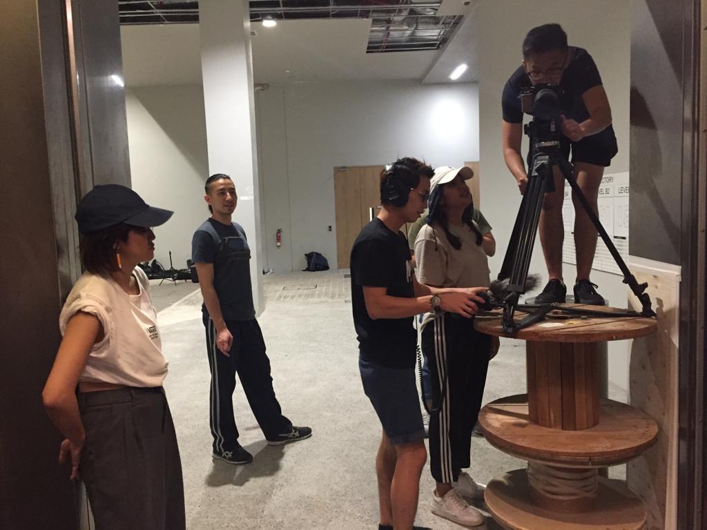

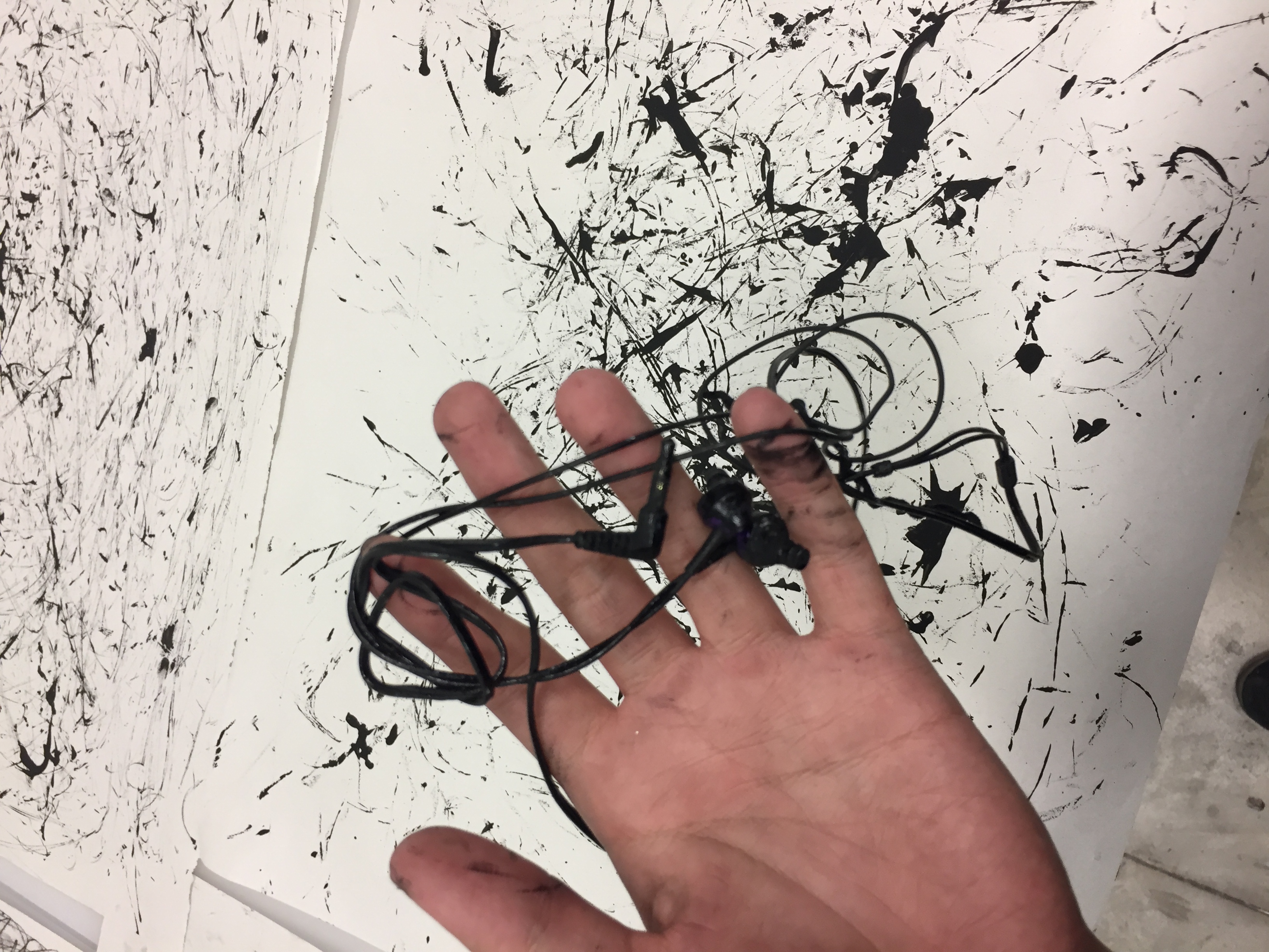
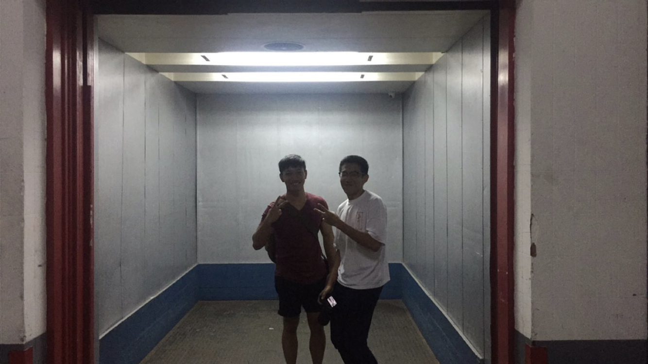
Production BTS
But thankfully, we managed to wrap the shoot by 1:30am. Only taking about 2 & a half hours to finish shooting as compared to my planned timing on the callsheet which was about 4 hours.
Extremely grateful to my amazing team which really came through for me & for giving me tons of moral support I needed especially when things went wrong. Also for the quick setup & assisting me wherever needed.
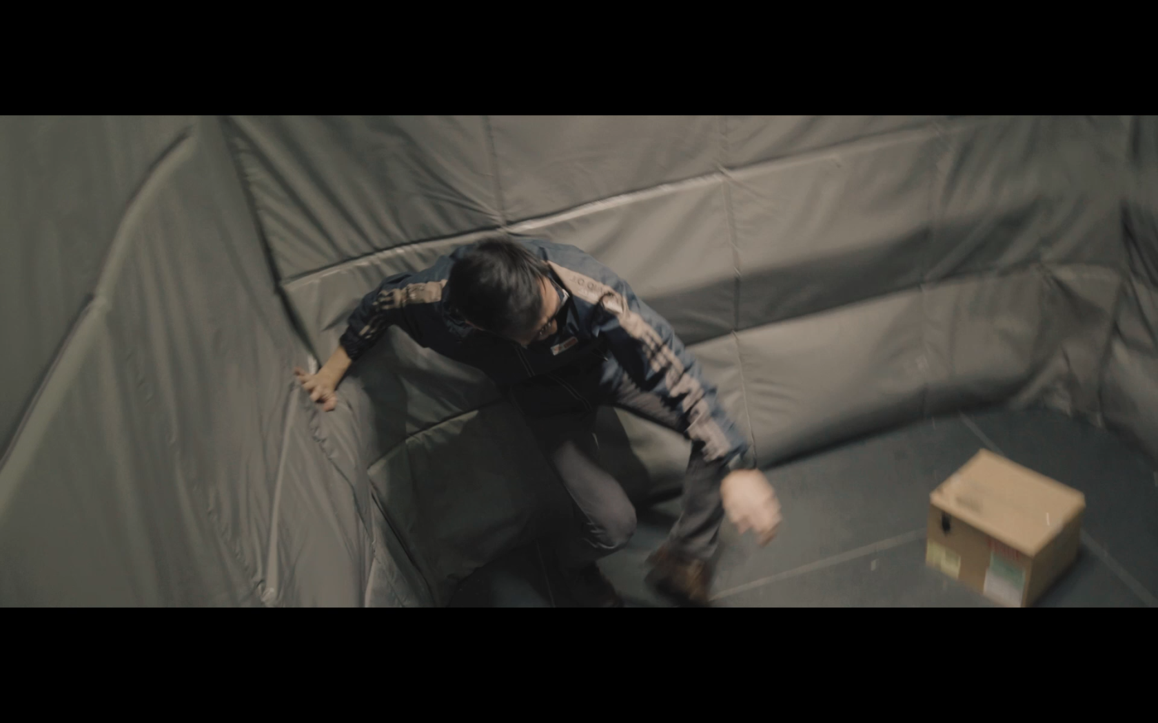
The change in location also ended up being a blessing in disguise as the padding of this lift helped create an environment that looks similar to the inside of a box. Also, since this location had no security, I was free to shoot here as long as I needed & had more time to do more takes & rehearsing with regards to how he plays with the box.
Since I was directing & shooting this film, this allowed me to also have more time to frame better while rehearsing at the same time.
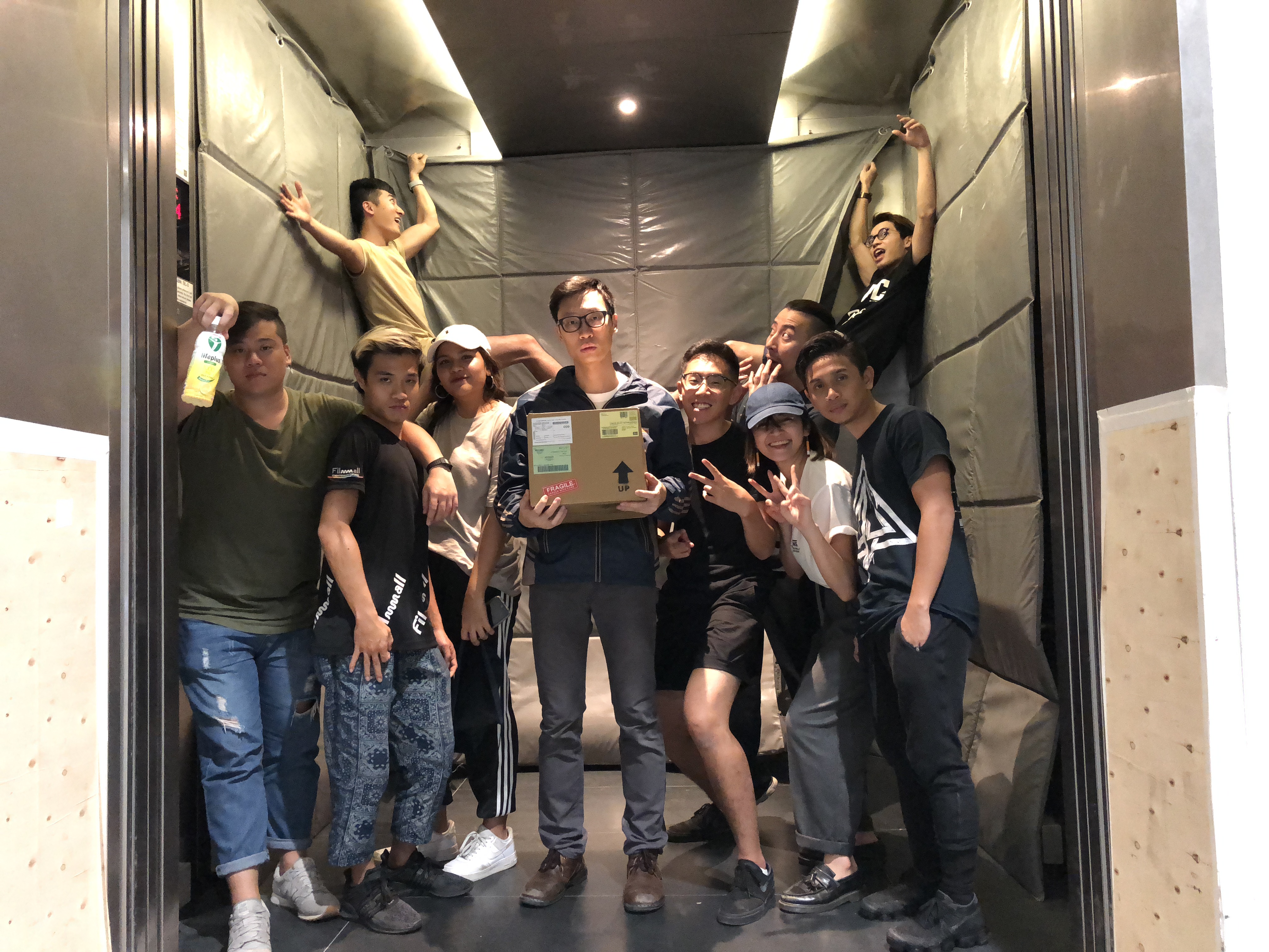
Kiwiduck films!
Shots breakdown
Shot #1:

For the first shot, it was a continuous long tracking shot which I used to establish a couple of things.
One was the character & him entering the lift, secondly was when we show the box which the audience may or may not take notice of, thirdly was when he places the box down & the lift stops, lastly was when he shouts for help & steps back.
Shot #2:
This is when the character tips over the box, I used a single shot for this to place emphasis on the box.
Shot #3:
The 3rd shot was to show the effects of the lift when the box is out of the character’s hand. I ended up using the handheld version of the shot as it felt more natural & the movement matched the character’s.
Shot #4:
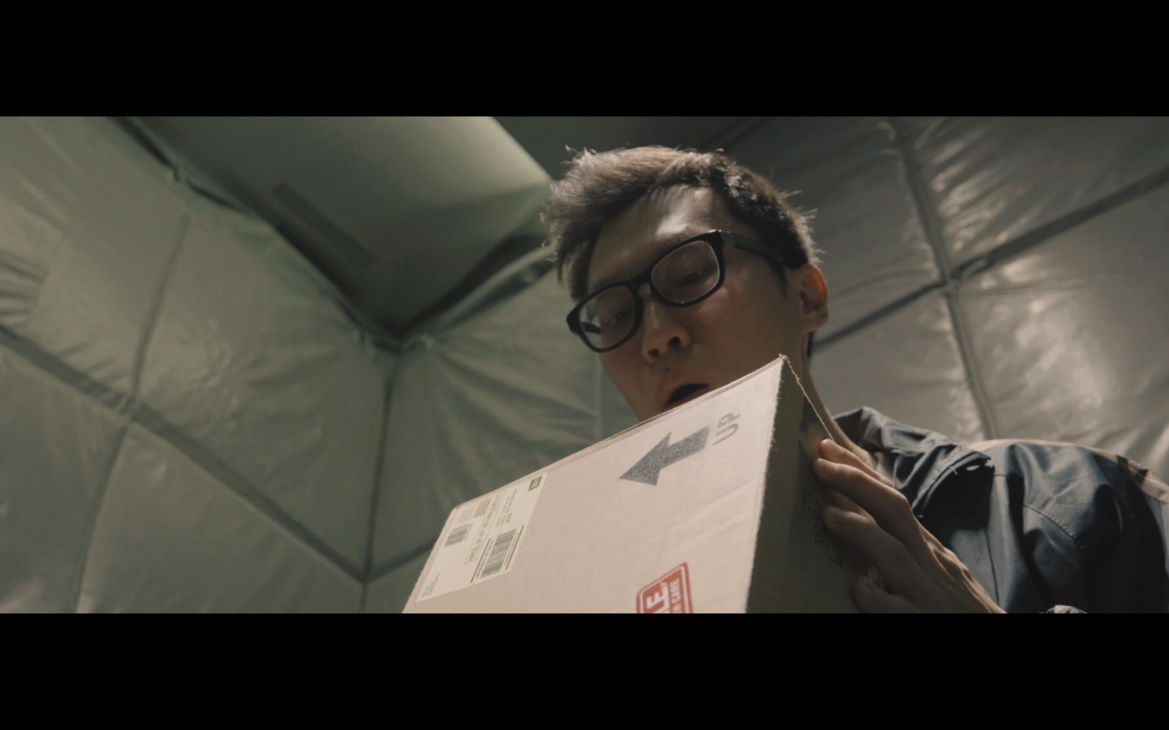
The 4th shot was the moment of messing around & discovery of how the box works & relates to the lift. I had to let this shot play out for a bit as I wanted it to have this comedic element to it & also to control the pacing of the film.
Shot #5:
This was an important shot as well as it was the moment of realisation for the character & how he can use the box to control the lift.
Shot #6:
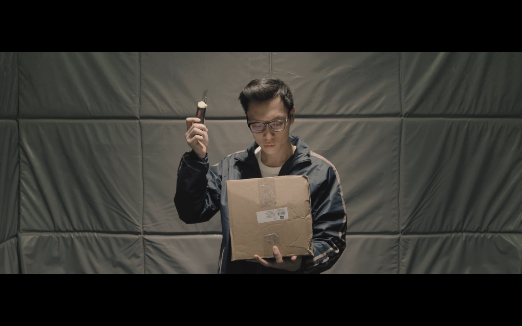
This shot was to show the character’s understanding of the box as he rides it all the way up to his desired level. However after reaching his floor, the lift doors remain closed. He figures maybe cutting open the box to see what is inside will help him understand what’s going on.
Shot #7:

The last shot happens outside the lift, as he opens the box, it correlates with the opening of the lift door, symbolising the box as the lift he is in. He looks inside & smiles, but it is never revealed what is inside the box. This was just to add a fantasy element to it & leaving the audience to wonder what is inside it.
The seen & unseen element of the film was how this unsuspecting label on the box that we usually never see ends up being of crucial importance to the mechanics of the lift. We journey with the character as he begins to see & discover the label as well.
Post-production
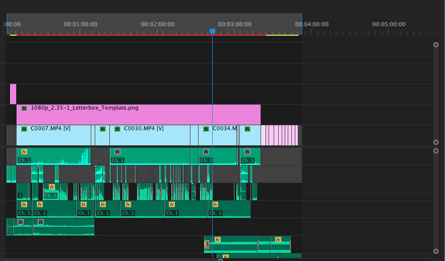 Final timeline
Sound design was crucial to this film as we never get to see the levels of the lift, it was important to convey the movement of the lift through sound.
The pacing of the film was also important as it had to have this gradual sense of discovery as we learn the truth about the box with the character. The climax had to come in in a way that felt just nice & ties the whole film together.

 Before & After
With the colour grading, I went for something a little green-ish, this choice was to match the aesthetic of the lift as well as giving it a somewhat dark yet magical look.
Final film
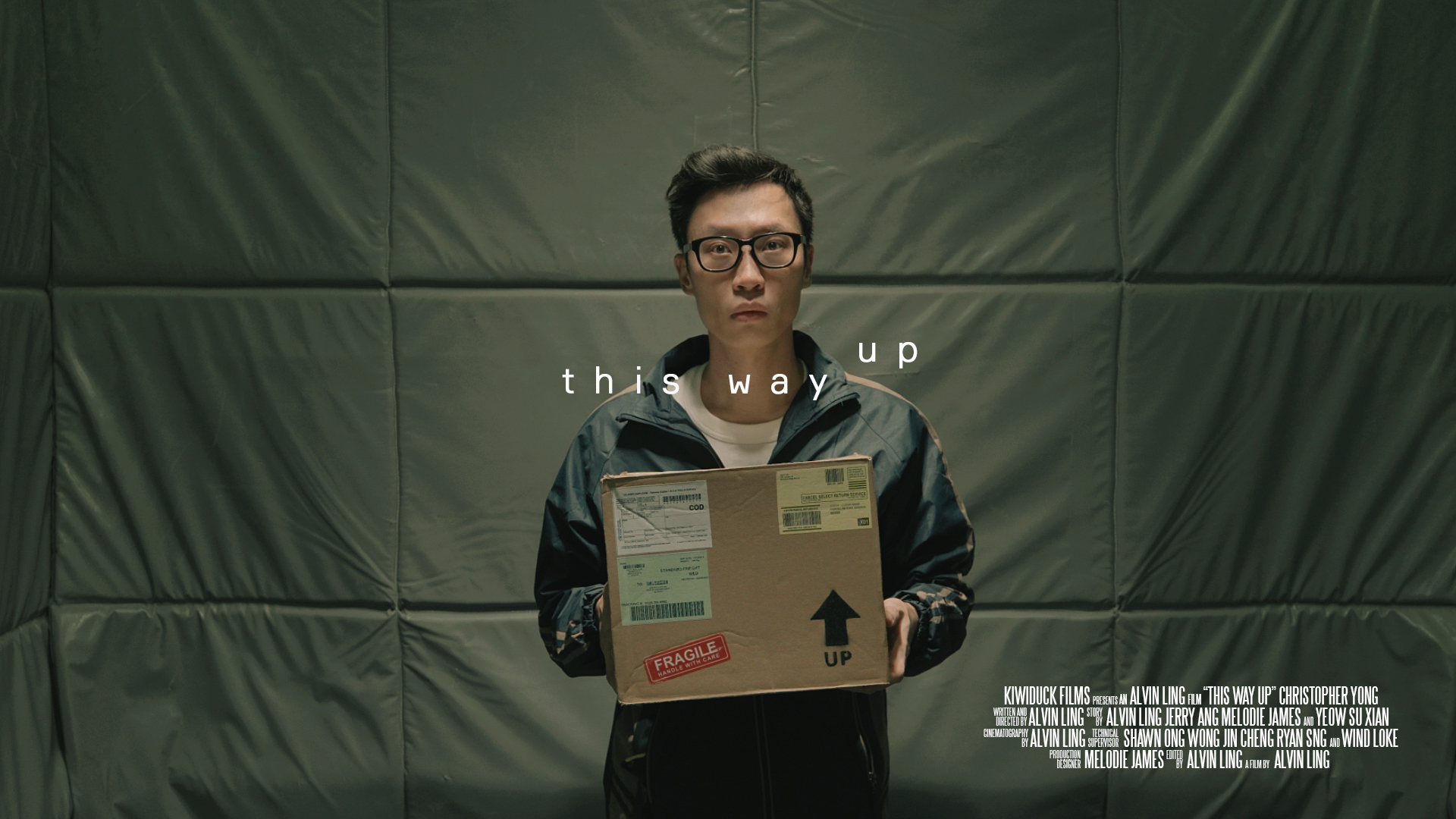
It was definitely a crazy & fun-filled process leading up the final film, but it was all in good fun. Do enjoy the final film!