After watching videos on how to code jumping, I realised there’s a lot more depth to jumping than I thought: for example, it can mean a world of difference if you allow the player to control movement while in air, or not. So, I decided to focus on jumping exclusively.
It’s playable-ish up to the 3rd or so bug, but I haven’t built the maps for the rest. I also haven’t actually tied the bug effects to the picking up of bugs; in this video, it’s literally just pressing the relevant key when you get the bug.
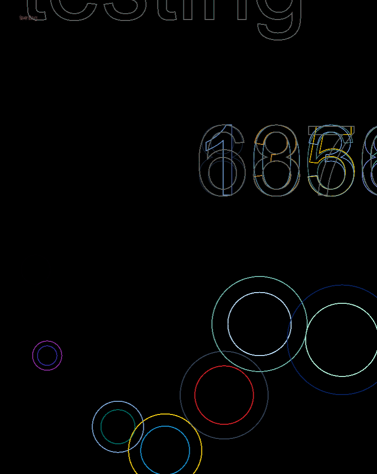
I’ve coded in all the required variables, except for dropping through platforms (i haven’t figured that part out yet, so watch out, prof, i’m coming to your inbox). Here’s another video to show the effects:
Issues which I have not figured out how to solve:
Aforementioned dropping through platforms
I can’t seem to find a suitable code which works with what I have, and me trying to hack at it doesn’t really work
Jumping lines when dialogue is ongoing (e.g. even though there’s 5 lines, only the first line shows)
Apparently tied to number of other dialogue box-using objects; when I reduce to only 1 Person, the dialogue plays fine
If I disable movement while the dialogue box is open, if the player is moving when dialogue is triggered, they will slide on forever until the dialogue box closes
I have.. No solution. It’s definitely related to the playerMovement() function, but I don’t even know why it would happen.
TO-DO FOR NEXT WEEK
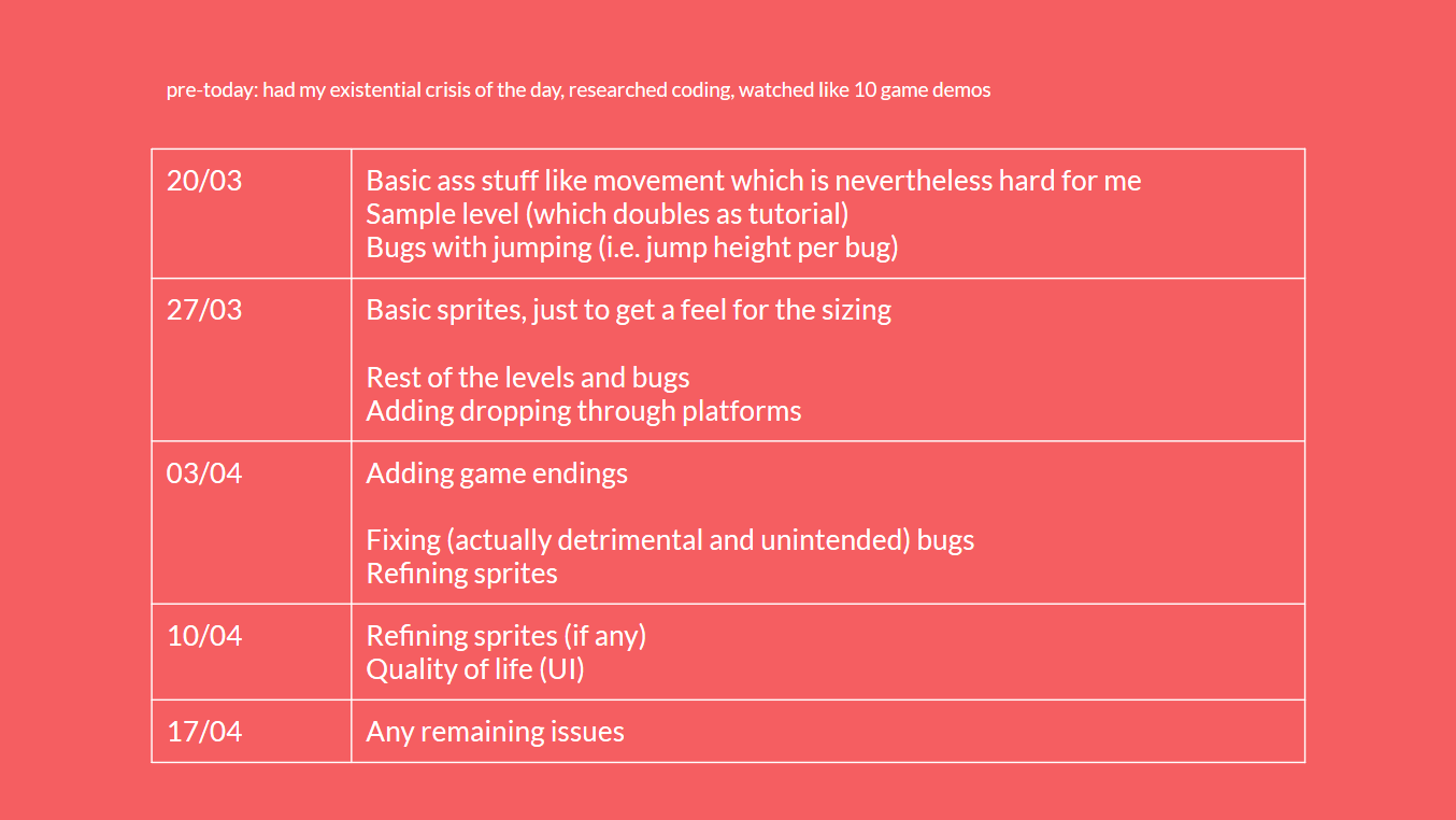
I know I had a timeline, but I realise I greatly underestimated how important sprites are: the sizing will definitely be off once I implement them. Of the aforementioned issues, too, the only really significant one for now is the 1st one. So, I’ve decided to change it slightly:
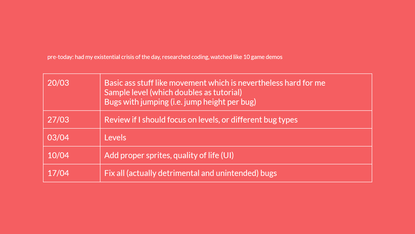
previous version of timeline
new version of timeline
I can see quite a few issues cropping up, like a) the sizing going haywire, b) the block tiling for platforms failing, c) failing to reference the correct bug, despawn it properly, or change the correct value, or d) the fact that my current Player has a really fun spin, to the extent that there’s no “right side up”: if I add a proper sprite, I might have to include code which stops it from doing so. (Unless I actively decide to make it have no right-side-up.)
What’s that about “game endings”? Well,
MORE IN-DEPTH CONCEPT ADJUSTMENT FROM LAST WEEK
My stretch goal is to amplify the emotional aspect, in terms of the parallels between “a buggy game” and “sadness over being incompetent”. As such, I’m thinking of having 3 endings, which have different activation conditions, and which correlates to “your relationship with bugs”.
I don’t know if I should spoil it, but I’m likely to forgo it since no time, so I’ll only talk about it if it comes to it, and just stick to the ~happy village life where you help the villagers catch bugs~ story.
The villagers may or may not have a role to play in this, which is why I’ve added them. That’s quite tedious, though, so I might leave them as hint-givers, as per right now. (They also don’t have changing dialogue based on changing progression rates, because I did that before, and boy, it was not fun.)
(It’s also kind of boring to only reach places just to get bugs, so I put people as hint-givers to mediate that.)
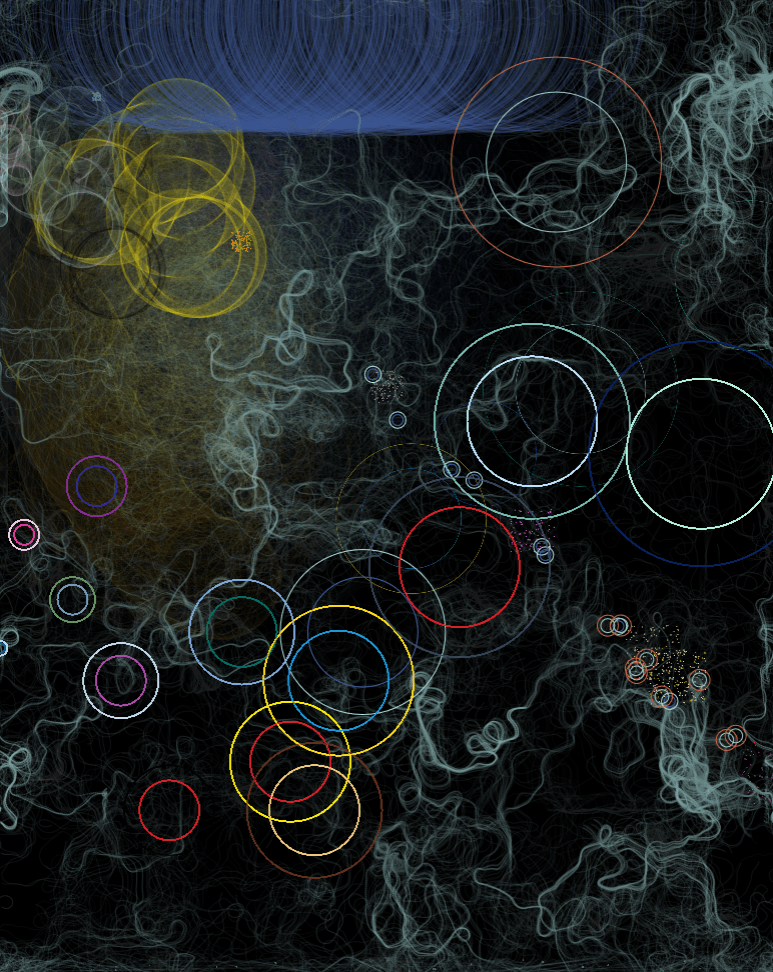
Last week, I came to class with multiple instances of code. The downside was that I genuinely had no idea how it would turn out, or any direction to guide me towards that end, so I figured that Lisa’s suggestion to incorporate data visualisation was a good idea.
Again, the theme of Fantasy is with respect to the fantasy of actualising impossibilities through technology, but I also used a more innocuous data set, in honour of something which is coming soon:
Yes, it’s a visualisation of theFinal Fantasy franchise.
PROCESS OF SETTING UP THE DATA
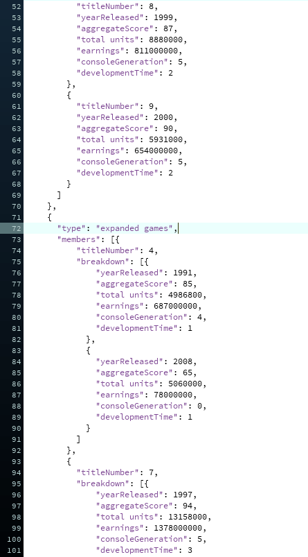
I have never touched data visualisation in my life, so I looked up tutorials by, once again, Coding Train. I decided against using real-time data, since it’s complicated, and there’re no API resources for the entire franchise (only FFXIV has a dedicated following). Instead, I created a JSON-based dataset; in total, there’s about 850++ lines of code.
I ran some tests to ensure that the data could be accessed properly, as well, and properly incorporated into other codes:
Random positioning, with ellipse sizes corresponding to the installment number.
Same as before, but width corresponds to year released
Combining flow field and ellipse codes
Location and size based on statistics, like yearReleased
With noise-based displacement (division)
With noise-based displacement (/10)
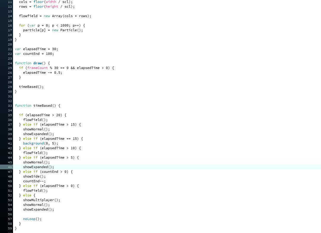
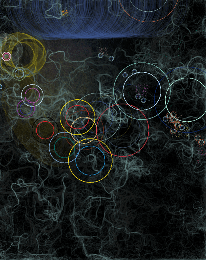
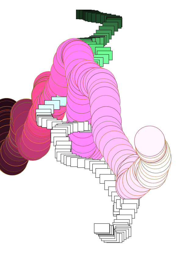
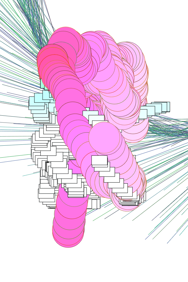
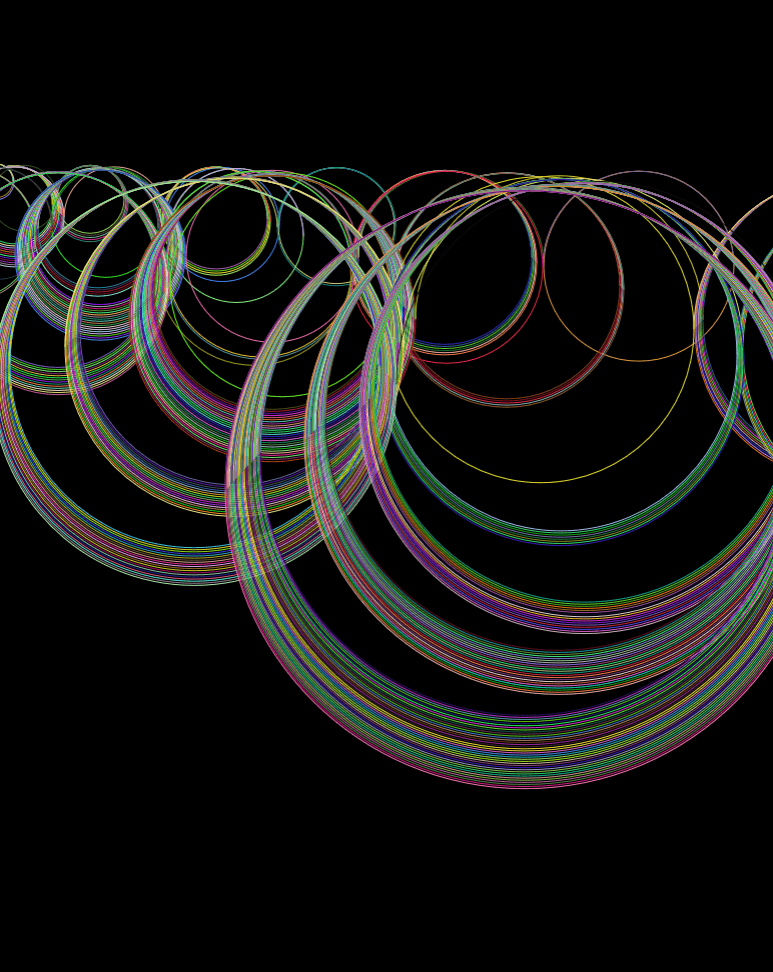
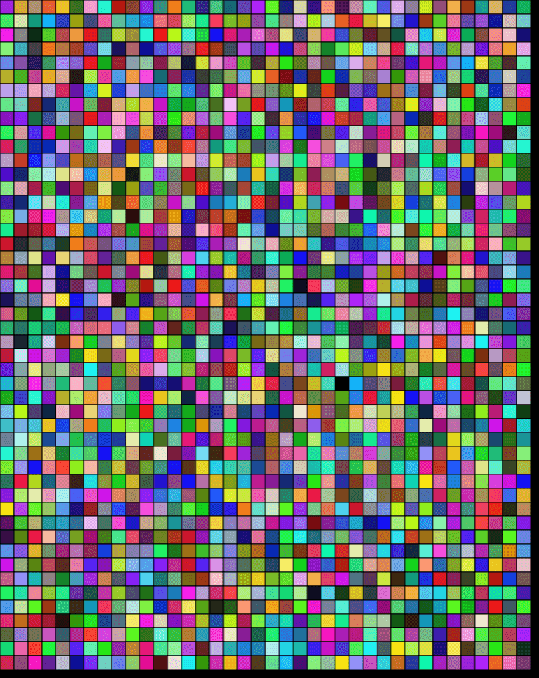
After which, I began testing different ways to combine data with visuals, and put them all together in a not-painful-to-look-at way:
testing high opacities
testing low opacities
opacities with increments based on totalUnits
opacities proportional to totalUnits
testing expanded games dataset
combining 1st and 2nd datasets
random positioning without loop
random positioning with loop
random positioning without scaling to 1987
trying different timings
trying different translate()
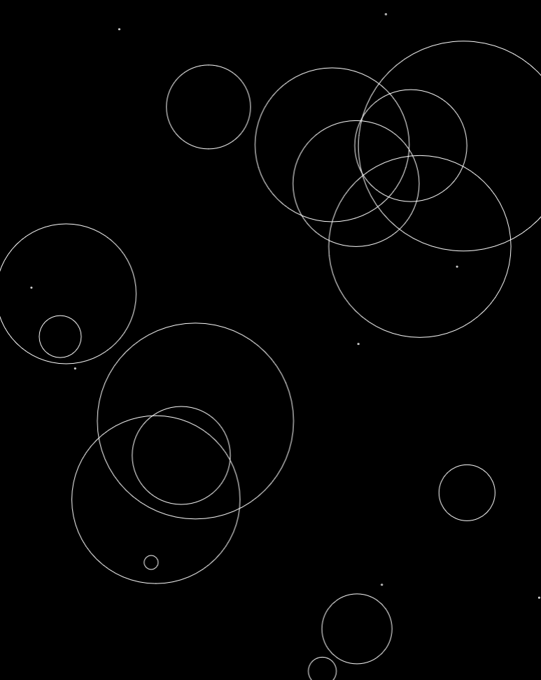
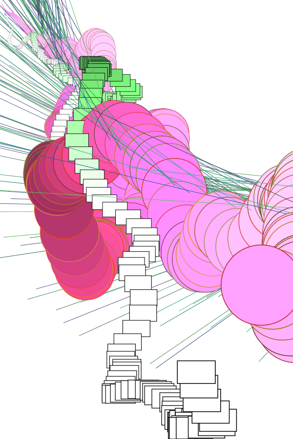
The details regarding which data set corresponds to what visuals are available on the page. Nevertheless, there’re some fun facts which are fun only if you understand Math and Final Fantasy, such as that a) patterns are easily observable once you know what drives it, and b) that outliers make for… Interesting visuals.
Main installments (the most prominent ellipses) are evenly spread out across the width, and in order, because it’s based on the year it was released
Specific positions of MMO expansions and side games are random, but nevertheless revolve around an static origin point
Everything in the top right is there because 1) it’s recent, and 2) it has outrageously bad reviews (i.e. original FF14 & the FF15 expansions)
Also, interestingly, a previously mentioned possible guiding philosophy was how basic elements come together to create complex forms. Due to that ellipses were used for practically everything, it surprisingly came to fruition as well.
but it was really difficult to try to capture in a static medium, because my concept requires things which don’t exist yet, and it’s definitely hard to understand without context; so, I did some world-building, and here is a really short and really lo-fi thing which tries to capture the kind of time and space in which it exists
it’s better to view at the link ↑↑
if you’re reading this, i’m fully aware that this isn’t the kind of thing you should present to a potential client, so advice on how to properly capture the idea in a poster / infographic without subjecting people to abstract confusion would be loved
As per the last post, I decided to work with generative illustrations. Where the theme is something like “the Fantasy of actualising impossibilities through technology”. And, of course, I don’t have pencil compositions, or even drafts of what I want. Here are the two main reasons why:
1. GENERATIVE STUFF JUST… DOESN’T GO WELL WITH PLANNING
As summarised by Spittel, there are two approaches to generative art: a) have no results, and let the computer generate as you play around, and b) have a very finalised idea, only allowing little randomisation.
I wanted to go for a mix of the two: keeping a vague idea of what I want the overall form to be like, while allowing the computer freedom to generate the exacts of what it turns out to be.
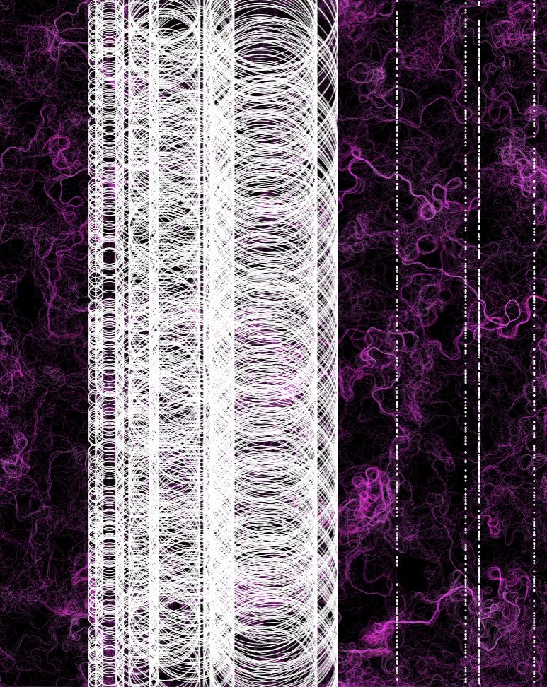
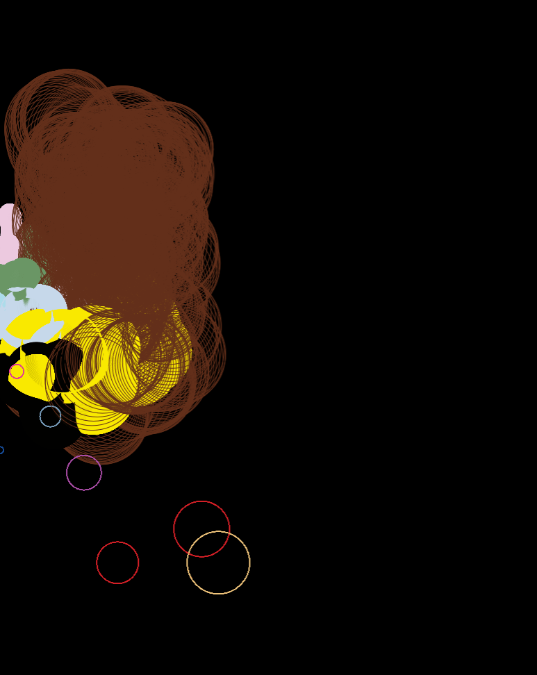
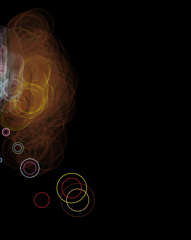
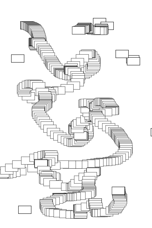
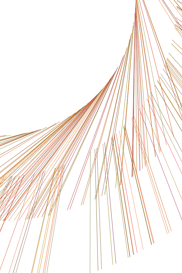
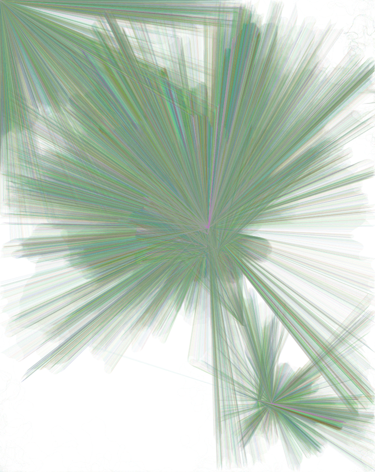
Automatic line makings, to get a gist for the overall form. As can be seen, it will likely involve many arcs, curves and loops, and a tall form which isn’t symmetrical.
But, intention probably won’t match up to action, because
2. IT REALLY DEPENDS ON MY PROGRAMMING ABILITY
I can draw decently well, but coding full-fledged physics is……. While I wanted to aim for something like Shvembldr and/or Nick Taylor‘s emergent, organic forms, I’m not sure that it’s possible at my current level. The most I can do is probably to work with basic elements, like lines and circles, and randomise their colours, positions, and sizes.
As such, it seems unlikely that I can find a way to code the piece to be particularly close to whatever I would envision. Still, I’ll outlaw patterned works like cccbtt, where I think it’s too structured: the point is to show off how amazing technology is, which is more evident when more complex functions like sin() is involved.
SO, TO START OFF…
After looking into different scripting languages, I decided to go with P5.js.
Their tagline aptly summarises why: it has “the power of Processing times the reach of JavaScript”. In other words, it can achieve more than web-based Javascript alone, while being more accessible to creators and audiences, since it’s for web.
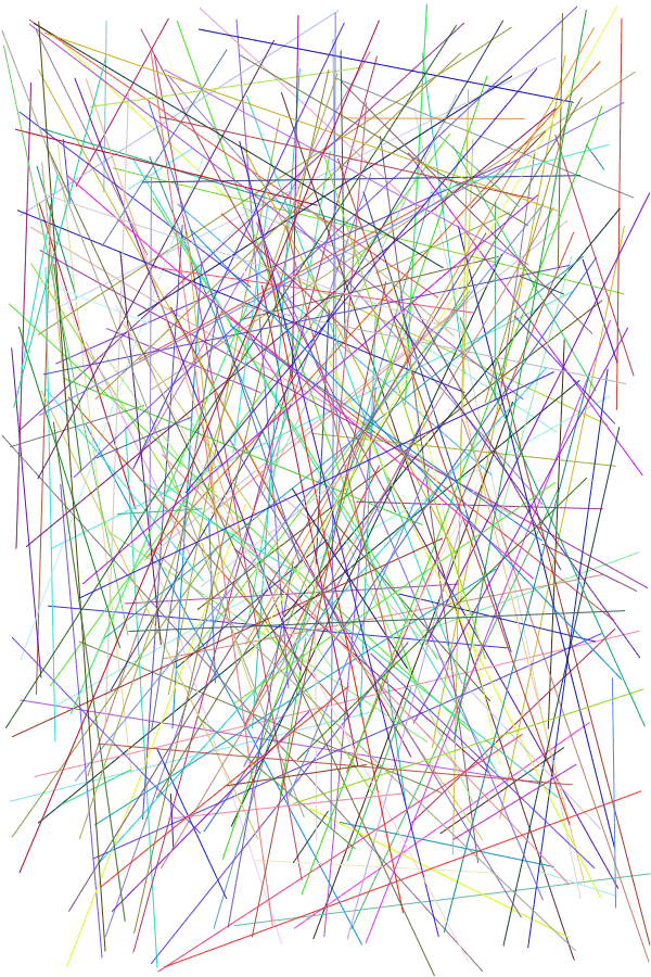
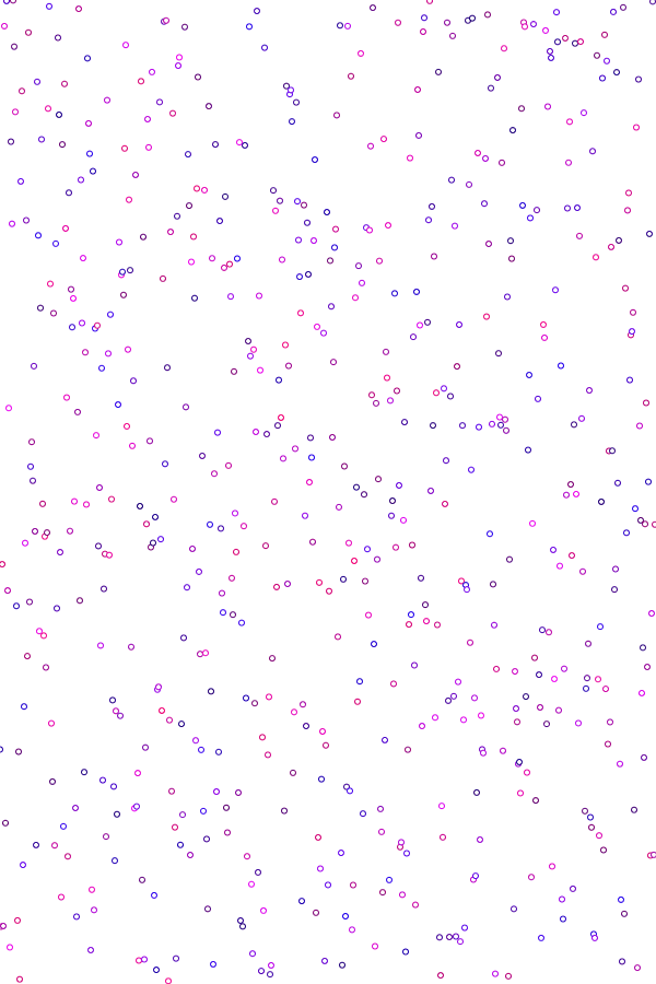
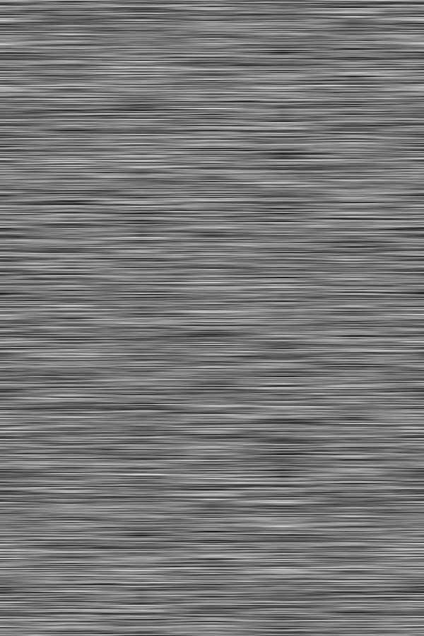
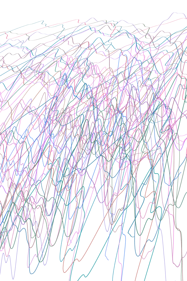
As I’ve said, I don’t have pencil sketches, because it depends on how fast I learn. Instead, I just experimented wildly with codes that I learned, using random() and noise() on parameters like the x-y coordinates, or scale().
Here are some things I learned (or refreshed, it’s been a while since I’ve touched Java/Script) during the spring break:
From there, I picked out elements I liked, and tried combining them, or messing around even more. Half of this were not intentional, just that I didn’t really do object-oriented programming, so, uh.
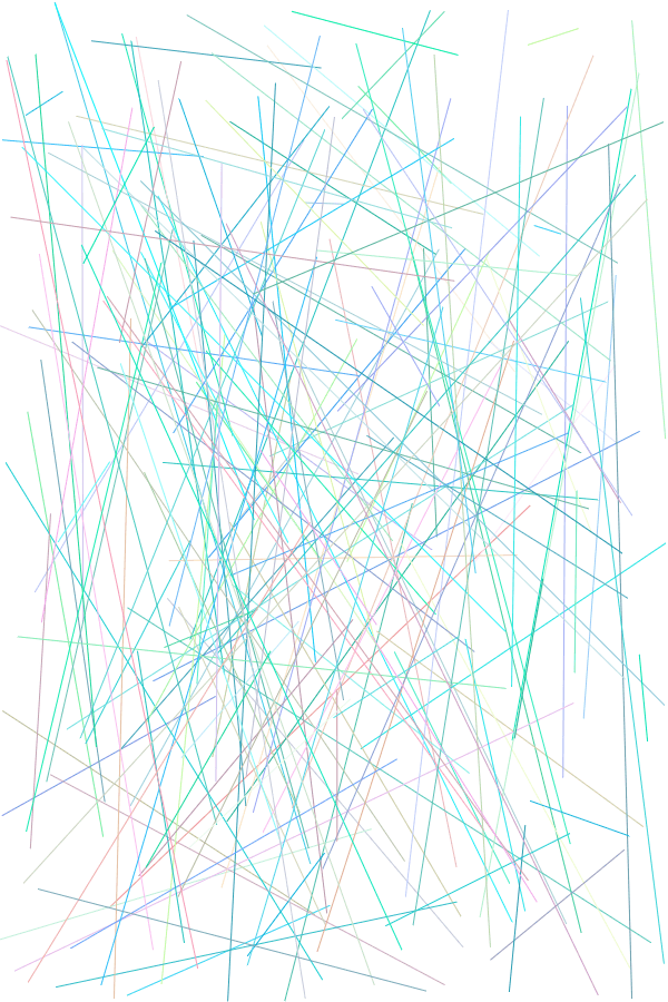
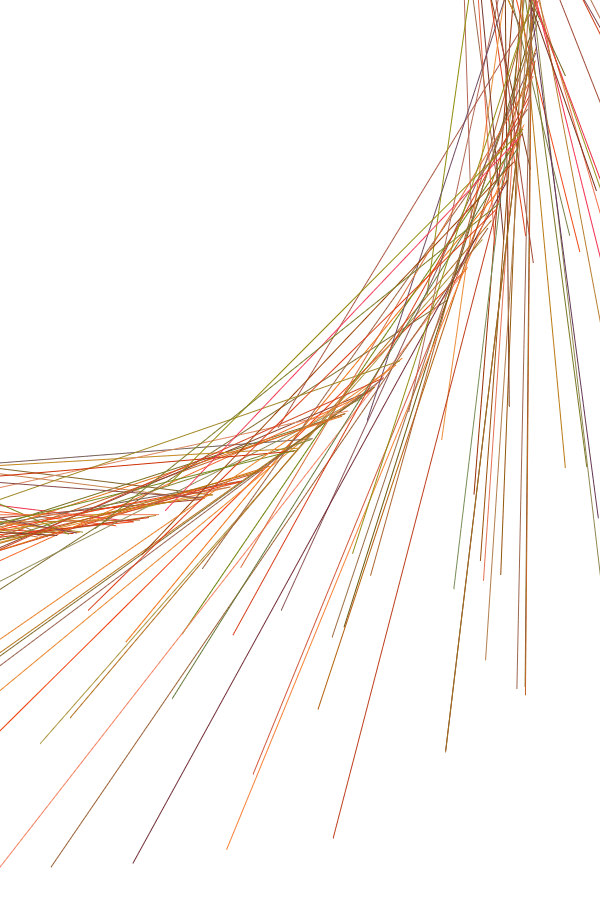
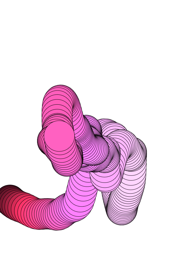
I guess my first “pencil composition” would thus be something like this:
A SECOND “PENCIL” COMP
My second pencil composition tried to be more aware of the working style for generative pieces. Interestingly, there’s a sense in which coding is a “collage”, because you rarely write code from scratch: it’s usually about modifying other people’s codes to suit your needs.
As such, you’ll see that most of the practices here are based off codes that I grabbed elsewhere, like by The Coding Train:
i submitted at 0943, checked again around 1330, and was disappointed, as always, that i uploaded the wrong file, there’re bugs. life is suffer
VERSION BY-200214
Implemented base version of Tetris
Includes generating blocks, falling mechanic, movement, rotation, play area, line clear, collison
Implemented variations
Assigned to Key Pressing
Changed constants to variables
Included variations for falling speed, reverse controls, auto-rotation, camera zooming, changing block types
VERSION BY-200221
Cleared up unnecessary code
Compiled into a single script, than attached to multiple objects
Removed GetOutOfJailFree & HOLD indicators
Implemented HISTORY indicator of past variations
200221 Shah (player) & Mus (key presser)
Shah is visibly done with Mus, who is abusing his abilities
It’s quite funny nevertheless
Falling Speed of Blocks is outrageous at 0.1f
Impossible to play at all after a certain point
An additional suggestion to go the route of a key presser who has to fulfil certain tasks before he can ruin the player’s life, e.g. minigames, or a timeout
200221 Kee Yong (player) & Shah (key presser)
Pretty much exactly the same sentiments
200221 Wei Ting (player) & Me (key presser)
Wei Ting is doing acceptably alright, since I try to act like an impartial algorithm
Not enough variations to be intriguing
In other words, rerouting the variations to activate through an impartial algorithm at specific invervals, than a partial algorithm at random intervals
VERSION BY-200228
Modified variations to a random algorithm, from key pressing
Implemented UI
A NEXT indicator area, to show the upcoming piece
SCORE tally of various items, such as total time elapsed
HISTORY indicator of last 5 variations
Fixed bug where I Piece didn’t rotate around the correct point
Fixed bug where O Piece rotates
Fixed bug where Zoomed Camera doesn’t follow the falling piece
Cleared up unnecessary code
Removed variations for changing height and width of play area
VERSION BY-200301
Modified algorithm to be weighted, than 100% random algorithm
Instead of picking a random variation, the algorithm now picks a type of variation, then rolls for an outcome. 75% odds of getting a favourable outcome for that variation
Implemented new variation types
~2% chance for in-game music to change to 1 of 4 songs
~4% chance for in-game background to change to 1 of 5 backgrounds
Implemented SCORE system
Implemented counters for things like Total Number of Blocks, Total Time Elapsed, and so on
Implemented score algorithm, giving different weights to different segments contributing to score
Implemented Tutorial at start of game
Implemented Restart option (R) & Tutorial Skipping option (S)
Implemented Speed Up (Q and/or W)
Fixed bug where counter and visible grid didn’t align
200301 Prof (player)
Confused by names of variations,
Can’t tell what variation is occurring,
Doesn’t know that effects stack (than being dispelled),
Despises the auto-rotation (especially in conjunction with high falling speed)
Confused by information overload of UI
Total score of about 8.6k
200301 Wei Ting (player)
Too focused on playing the game itself,
Doesn’t notice that variations are occurring and affecting gameplay,
Just thinks she’s not good at Tetris
Total score of about 1.3k
In other words, fix the UI and information hierarchies.
VERSION BY-200306
Modified algorithm conditions and weights
If the same variation is called up, instead of having no effect, it may reroll to give another another variation
Impossible to get absolutely no effect for a round. Increased chance of failing a roll to 40%, from 25%
Modified Rotation Lock, from auto-rotating clockwise once per second, to rotating clockwise once per left/right keys pressed
Modified SPD function
Pressing Q and/or W will cause falling speed of blocks to increase, not just the countdown to variations
Modified UI by, like, a lot
Modified HISTORY segment to ACTIVE segment, which states presently-active variations than past variations
Modified SCORE indicator area, to only show at the end of a game
Modified text for about everything to be less Debug.Log-based
Implemented bar (and removed text) in indicating countdown
Implemented icons and animations for Key Press functions (Q, W, S, R)
Implemented tutorial image for Movement keys
Modified activation conditions for certain keys
Restarting (R) and Skipping Tutorial (S) now requires holding for 1 second, than pressing the related key once
Modified SCORE counters
Reduced max Score to 99 999, than 9 999 999
Reduced Speed Up bonus
Increased Line Clear bonus
Implemented Game Over condition
Fixed bug where I Pieces and O Pieces weren’t centralised in the NEXT indicator area
I won’t say it was my favourite work, but I felt like I had to write about La Camera Insabbatia / The Chalkroom / 沙中房間 (2017) by Laurie Anderson & Hsin-Chien Huang. After all, it looks like it’ll be most relevant to my mid-term project.
https://wsimag.com/art/34423-la-camera-insabbiata
It turns out that my like/dislike opinions tend to conflate with the given questions, so I’ve grouped it accordingly.
LIKE: HOW THE AUDIENCE INTERACTS
The most enjoyable part was, definitely, the responsiveness of the work itself. There were very few points where my immersion was broken by some failure of the engine, such as “failing to speed up at a rate which is adequately proportional to how much I stretch my arms”, or “a noticeable time lag between scene transitions”. In other words, kudos to the programmers!
(Also, a special commendation for the fact that they foresaw that people like me would intentionally try to clip through the ceiling, and made the necessary adjustments.)
A possible extension, in my opinion, is more freedom of expression. Understandably, it’s easier to separate it into different rooms, and I appreciated the variety of ways in which the audience could interact (which is already very impressive). If we could do multiple things at any given time, though, it would be even better. For example, if I could fly while making the voice structures.
LIKE: THE JUSTIFICATION OF THE MEDIUM
It so happened that there was a waiting area where we could sit and watch a video documentation, while waiting for your turns. It also so happened that I was hesitating about my project, when the subtitles displayed similar kinds of thoughts to the ones I was struggling with:
https://www.youtube.com/watch?v=n0_0k-Xwksw
Other parts of the video also mentioned how The Chalkroom is about “traveling inside one’s mind and memories” and that VR is about “directly influenc[ing] peoples’ perception of themselves”.
Those were ideas I appreciated, where there is a sense that VR must have something unique to it, that it can contribute. Right now, much of it is about inducing illusions through deceiving the eyes. What can we do with that, then? I think the work’s attempt to explore that is commendable, where it made extensive and effective use of VR as a medium.
DISLIKE: THE INDIVIDUALISM OF THE CONCEPT
I’d like to clarify that this is likely an effect of that I’m (probably) not part of their target audience. That is to say, their installation is targeted towards people who don’t focus enough on their self. That’s not something I have an issue with, where I already have a high tendency to do that. As a result, rather than liberation, I felt incredible dread.
I understand their viewpoint, that freedom comes with looking into oneself and letting go of material things. It’s true that many people might focus too much on insignificant things which might tie them down. As someone often withdraws into myself, however, I can’t say I endorse the artists’ stance. We can’t ignore the consequences of gaining freedom: of becoming detached. To cut a long story short, I stopped enjoying things, because it seemed so meaningless to put effort into the ephemeral external world. I don’t need to hear about how to go into myself, I need to hear about how to go outside myself.
In other words, the message is good, but just isn’t for me.
DISLIKE: A TINY, MINOR NOTE
As a rule of thumb, I’m not fond of narration in self-centered games… I understand that it’s for the sake of people who might be unfamiliar with VR, but it feels like it’d be more immersive if you thought about things yourself, than having a voice in your ear, telling you what they want you to feel and/or do.
LIKE: THE GENERAL PRESENTATION
Just to summarise, it’s a solo exhibition space, featuring mainly muted tones like grey or beige, and mostly dimmed, warm lights. This visual consistency remains from the moment you enter and wait, to playing the game itself. That’s pretty neat, looks good, and preps you mentally through visual cues, like the chalkboard-themed walls.
The colours and lighting of the place matches the insides of the VR experience
DISLIKE: THE WAITING EXPERIENCE
I understand that it’s a matter of limited resources, where each player needs their own headset, and a technician to work it out. Nevertheless, it also seems that they wanted to discourage us from being spoiled, where we weren’t given live in-game footage, and we weren’t given a proper space to watch others playing. They tried to occupy us with a video and benches, but that can only occupy one for so long before it loops again. Unless the queue is incredibly short, and each person takes less than 10 minutes, one will definitely shift their attention to their mobile phone or something instead, breaking the immersion.
Other than the temperature taking counter, this + the benches are the only real things of interest for the waiting people
Instead, there’s so much space outside of the VR area that could potentially be used. For example, you could put an actual chalkboard and/or touch screen wall for people to occupy themselves with. It’s thematically relevant, and it would highlight how VR is different from analog and/or non-immersive environments. That might definitely fall into the range of “too extra”, though.
Alternatively, something like “banning mobile phones” or “making us wait in separate cubicles” might help to get into the headspace of being isolated.
APPLYING TO MYSELF
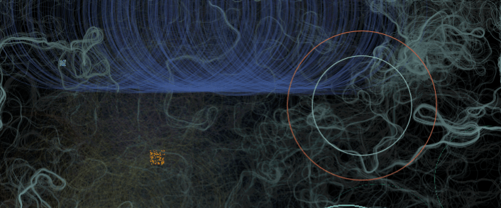
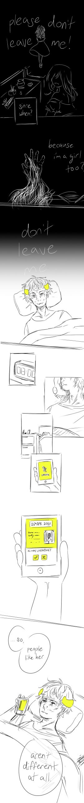
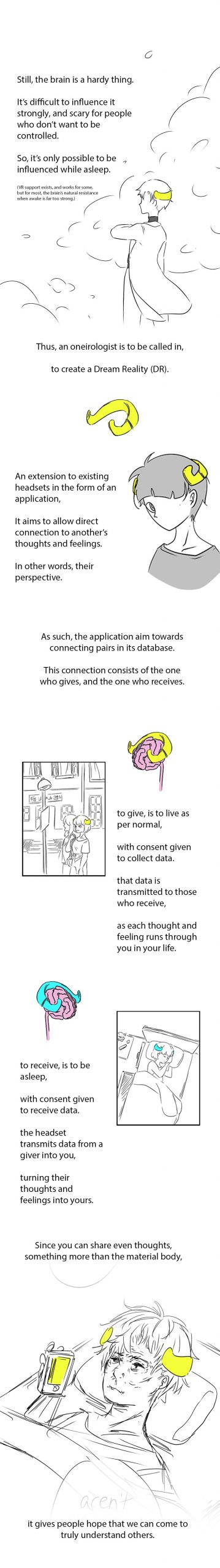
Where my concept similarly has the idea of “being in a mental space”, I think The Chalkroom and VR definitely have merits. I’ve been having problems with visualisation, especially where my ideal work appears to be heading towards some kind of futuristic technology which doesn’t exist yet. It includes, after all, the extraction of thoughts from a person, processing that neurological data, and inserting it into another person’s dream. Even VR is still limited by the physical, where you have to decode the visual input to acquire the meaning. I’m not really sure what to feel about that.
I do feel like some level of world-building is needed to make my project sound comprehensible, so a documentary of sorts, like the one shown while waiting, might be an effective means of conveying the message. Like, imagining how to explain VR to someone who doesn’t know VR.
Regardless, there’s a significance difference between The Chalkroom and what I have in mind, where they focus on the relationship of the self with the self, while I aspire to focus on the relationship of the self with the other. As such, perhaps it might be good to deviate, by having multiple people in the same space, or collaborative content. Maybe.
RANDOM THOUGHTS WHICH AREN’T RELEVANT, BUT…
I felt like the wire could be used less as a limitation than as a feature. (It looks like a zip line….. Or like it belongs to a 2D game with linear movement…. If you get my drift………)
![[W10IfD] a final post for assignment 2](https://oss.adm.ntu.edu.sg/a170027/wp-content/uploads/sites/1810/2020/03/ifdimgfina3-638x510.jpg)


![[W9GD]](https://oss.adm.ntu.edu.sg/a170027/wp-content/uploads/sites/1810/2020/03/Screenshot-120-825x510.png)
![[W9IE] i’ve lost 3 years of my lfie to this](https://oss.adm.ntu.edu.sg/a170027/wp-content/uploads/sites/1810/2020/03/ss11642-1-825x510.jpg)
![[W9IfD] turning data into forms](https://oss.adm.ntu.edu.sg/a170027/wp-content/uploads/sites/1810/2020/03/ifdmockup01-1-825x510.jpg)


![[W8IE] hi i’m not coming to class and i don’t even have a proper poster because i’m just like that™,](https://oss.adm.ntu.edu.sg/a170027/wp-content/uploads/sites/1810/2020/03/Screenshot_2020-03-11-W8IE-825x510.png)

![[W7IfD] making pencil comps for a digital generation is, uh,](https://oss.adm.ntu.edu.sg/a170027/wp-content/uploads/sites/1810/2020/03/pencil1-638x510.jpg)


![[W8GD] wow. i havent been this early since…….. since… since……?](https://oss.adm.ntu.edu.sg/a170027/wp-content/uploads/sites/1810/2020/03/200308-4-2-2.jpg)
![[W7.5GD] Suffering](https://oss.adm.ntu.edu.sg/a170027/wp-content/uploads/sites/1810/2020/03/Screenshot-102-825x510.png)
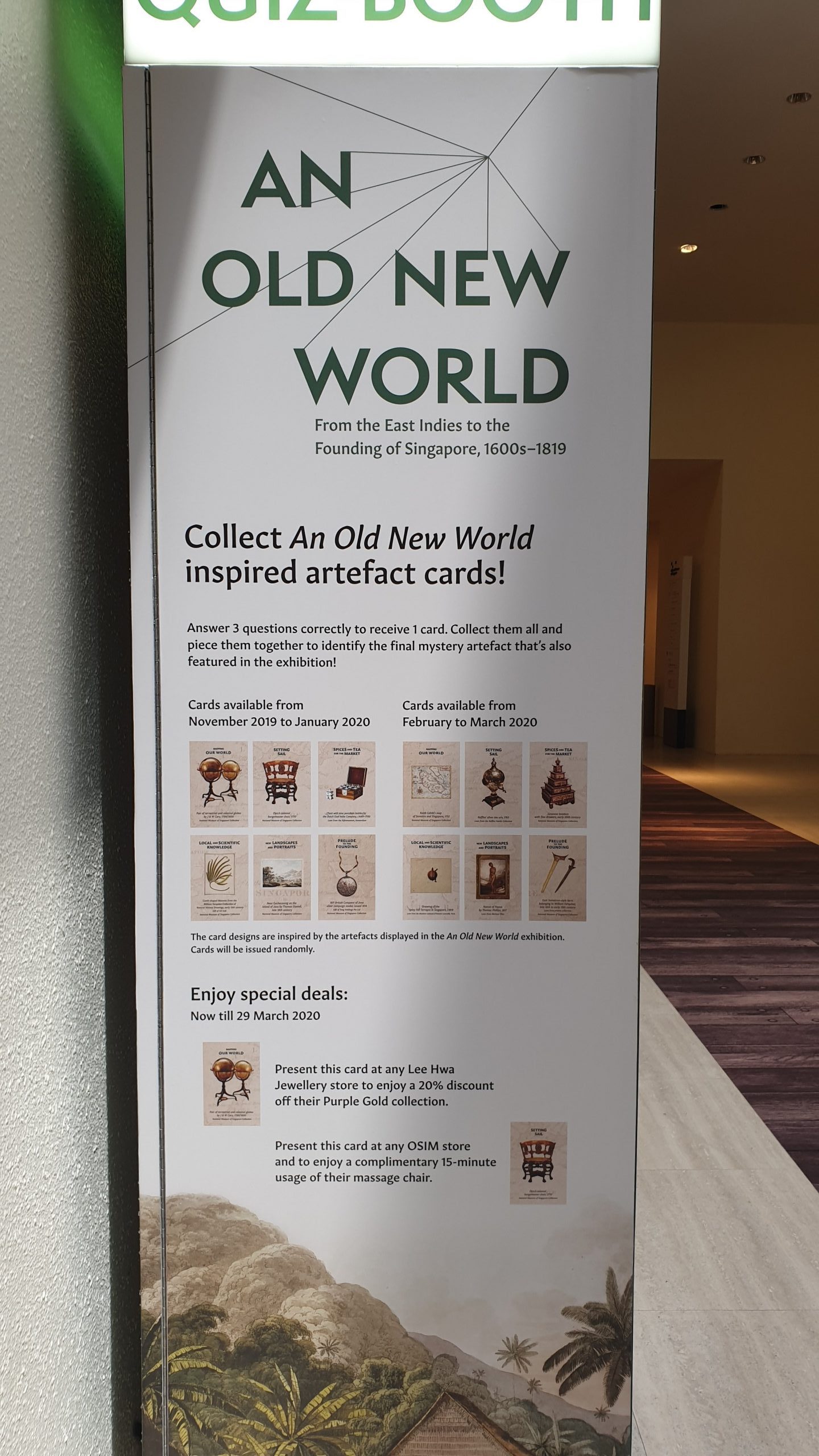
![[W7IE] national museum, it’s an art and more](https://oss.adm.ntu.edu.sg/a170027/wp-content/uploads/sites/1810/2020/03/20200226_120224-825x510.jpg)